3. Catalog
Odds are, the last time you walked into an unfamiliar grocery store, you took a look around to determine where the things you needed might be located. Ranch dip? That’s probably on the snack aisle next to the potato chips. Steaks? Probably in the back at the butcher’s counter. Asparagus? Produce section.
While spotting your favorite brand of ranch dip, though, did you notice all the other products that caught your eye along the way? Sure, there were the things you expected—chips, cookies, crackers—but what about those neat-looking things on the end-cap? The fancy new chocolate-dipped graham crackers that come in animal shapes that your kid is bound to love?
Had you not been there in person, you may have never known about them. Had you not managed to determine which aisle the ranch dip was on, you may have given up and gone without. Had you not been able to see your favorite ranch dip alongside all the others, you may not have found out your second-favorite brand was on sale.
Grocery shopping is an everyday sort of activity that most adults rarely view with a critical eye, but what if you’re a web designer working on a commerce site, or a photographer with a portfolio site, or a design director for the web team at a news organization? You can learn a few things from grocery shopping.
Namely, because the act of getting oriented in an unfamiliar place and locating items by scanning an environment and narrowing options is so ingrained in our lives, the behaviors a user exhibits on a commerce site and those she exhibits in a grocery store are virtually identical. But the analogy hardly ends there. The catalog model used by e-commerce sites is also used in quite a few other contexts—in fact, it’s the basis for an enormous number of sites.
And the design of a catalog can make or break a user’s experience.
Description
When we make a selection from a catalog, we generally follow the same three steps. First, we winnow down our top-level choices. Next, we select one of the items from the collection. Finally, we validate our choice by looking over the item to make sure it’s what we want.
But this process, which appears incredibly simple, is just as often supported online in devastatingly bad form as it is done well. You may not be familiar with the sites that have executed a solution to this process poorly, however, as most of them only exist on the Web for a short time.
Hopefully, you see our point.
To properly support the selection process, you must do far more than simply list out items and add price tags to them, but also far less than you might think.
Since our natural human behavior is to follow a three-step process in choosing an item, it’s only logical that a supporting design address each step.
In direct conflict with the widely hypothesized notion that users hate to click, the catalog framework actually employs more steps than are needed from a technical standpoint, simply because human behavior demands it. (Incidentally, the notion that users hate to click is entirely false; users don’t mind clicking at all as long as they believe their clicks are taking them closer to their target content.)
The elements in the catalog framework all work to support the selection process.
Context of use
Because so many activities involve item-selection, it can be surprising how many site types feature the same basic information architecture that we point to here as the catalog framework.
E-commerce sites support the activity of locating and purchasing products. Library sites support locating and checking out materials such as books, DVDs, and video games. Portfolio sites, for individuals and companies alike, support learning about and viewing examples of previous work. News sites support identifying and reading news stories and columns. The list goes on. And a great many sites support these activities in an almost identical fashion. It’s so common, in fact, it’s almost shocking that there are still sites on the Web today that fail to emulate this basic organizational structure.
Sure, each of these vertical sites brings with it a set of niche-specific solutions, but at the core of each of these (and many more site types) is a simple architecture that guides a user from high-level divisions to detailed, low-level content.
Unlike many other frameworks, the catalog framework isn’t typically nested within a larger context—the catalog usually is the context. That is, most of the time, the catalog represents the site’s core. There may be many additional branches in the information architecture, such as whole sets of pages dedicated to company information or experiential micro-sites, but since the catalog supports the core activity for most of these sites—the activity of locating and choosing items, for whatever reason—it is usually by far the most prominent and common task flow found in these site types.
That said, catalogs can certainly be but a small piece of a much larger site, and they can even be positioned in an almost ancillary way. Such is the case for Discovery Channel’s site, Shopping.discovery.com, as shown in Figure 3.1.
Figure 3.1 The Discovery Store catalog is a sub-section of the larger Discovery site.
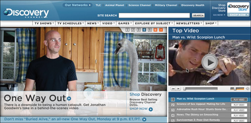
The Discovery Store, as it’s called, isn’t the main event by any means. It is accessed by clicking a small graphic in the upper-right corner of the main site at Discovery.com, which primarily offers descriptions of the channel’s shows and schedules alongside news, games, and video clips. Users visiting the site are more likely to arrive seeking information than opportunities to buy, so the store is presented separately, almost as an afterthought.
Task flow
The catalog framework represents a basic task flow: users simply move from a high-level category page to a gallery of content within that category, and then on to a content page via the simple act of selecting an item to be viewed.
You’ve probably traversed this task flow hundreds, if not thousands, of times and perhaps not even realized it.
Co-requisites
Because many web users rely heavily on search functions to quickly locate items within a catalog, the search framework (see Chapter 4) is an essential part of any catalog site. As discussed later in this chapter, however, it’s important that the roles of these two frameworks not be confused—they serve distinct purposes and should be viewed and treated as separate task flows.
Related
Many e-commerce catalogs enable and encourage users to create accounts so they can better manage items, orders, and so on, and increase their commitment to and investment in a particular site. For more about this, please visit webanatomy.rhjr.net, and learn about the account-management framework.
Elements
The catalog framework is composed of just four elements, but as you’ll see, each one is incredibly important. They are the Category page, Gallery page, Content page, and Guided Links.
This rather unassuming list is the backbone for a huge chunk of the web as we know it.
Category page
First in the series of screens that compose the catalog framework is the category page. Jared’s research team at UIE calls these “department pages” because they represent what’s sold in a store’s departments, but the term can just as easily be applied to a section of a news site, such as World News and Politics; a genre division in a music site such as Rock and Pop; and so on. In fact, a site’s home page can often be classified as a category page with its high-level overview of site content.
To uncover the power of this type of page, UIE once took a hard look at the many different strategies for organizing content on sites.
In 2002, the team at UIE examined the e-commerce sites for a number of popular retailers to see how they handled the problem of categorizing large numbers of products, to see if the design teams behind these sites came up with different methods, and to see which methods were most effective. (The results of this analysis are discussed later in the chapter). Starting with a study on apparel and home goods, UIE looked at thirteen different sites, each with a similar product set.
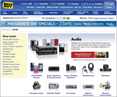
Every site had similar characteristics. First, they split their content into just a few top-level categories, such as Women, Men, and For the Home. Second, they all offered galleries (more on this in the next section). And finally, their galleries all linked off to content pages (more on that in the Content Page section, below). Figure 3.2 and Figure 3.3 show a sample of a category list and gallery page.
Figure 3.2 BestBuy.com features a number of categories.
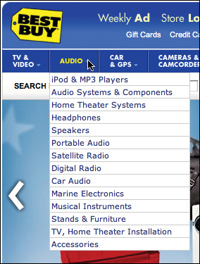
Not much has changed since UIE’s 2002 study—major e-commerce sites all still have category, gallery, and content pages in common. And category pages are what facilitate the first of the three item-selection steps: winnowing.
Figure 3.3 Like most online retailers, Best Buy uses gallery pages.
The pages do this by dividing the vast array of a site’s content into high-level groups of related content that support a user’s mental model of how those things relate to each other. The term Rock on a music-purchasing site should, and likely will, include any and all music that a user would consider rock music. The term Technology on a news site should link only to stories on technology.
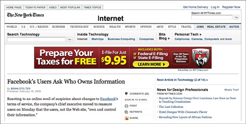
Figure 3.4 NYTimes.com offers a number of category pages.
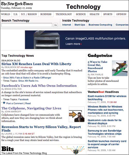
NYTimes.com offers a number of major categories, including World, U.S., Business, Technology, and so on. Each category page does essentially the same thing as a department page on a commerce site: it offers a way to winnow down options and select a specific item. However, news sites often use a combination of category and gallery pages (discussed in the next section) in which the category page also offers links directly to articles instead of to gallery pages.
A subtype of the category page is what UIE calls the “search-department” page, which is a search results page that has been customized for certain search terms to offer department-style information. On BestBuy.com, for example, a search for iPod leads to a search-results page that looks more like Apple’s home page than Best Buy’s typical search results.
Figure 3.5 BestBuy.com offers search department pages for select products.
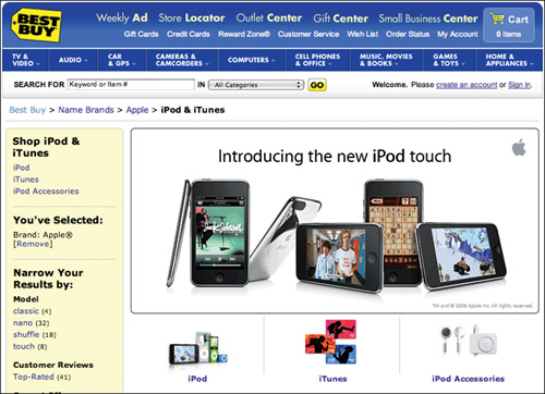
This approach might be taken for popular search terms, products that span several categories or break down into several subcategories, or perhaps because of promotional agreements with the product’s parent company.
Search department pages don’t usually live forever, though—they are often in place only for a short time, eventually replaced by standard search results once the search term no longer requires such extra attention. (For more about search department pages, see Chapter 4, Search.)
As you can see, grouping related content under major categorical headings simply helps a user weed out sections of a site that are irrelevant to her target content and hone in on the ones that are likely to meet her current needs.
From here, she can move on to selecting an item.
Gallery page
The selecting step—step two in the three-step selection process—occurs by way of gallery pages.
Galleries are a catalog site’s hardest working pages. They are what separate those users who find the content they are seeking from those who don’t. A well-designed gallery page will drive users to success every time, while a poorly-designed site will only serve to drive users away.
And in UIE’s study, while the number of items and the specific information that was presented in each gallery varied, all of the sites basically presented the same types of information, such as the item’s name and price (on commerce sites), as shown in Figure 3.6.
Figure 3.6 Gap.com offers product names and prices on its gallery pages.
For a gallery page to be effective, it must answer any questions in the user’s mind related to making a selection.
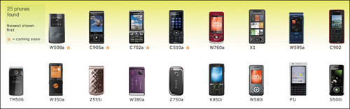
Suppose, for example, that Sony Ericsson wants you to purchase one of their mobile phones, and it has 17 models from which to choose. And suppose that to help you, the company provides a list of available phones on its web site.
W502a, C905a, C702a, C510a, W760a, X1, W595a, C902, TM506, W350a, Z555i, W380a, Z750a, K850i, W580i, P1i, S500i
Would you like the C702a or the X1? How about the TM506?
What’s the difference, you ask? Sony Ericsson won’t tell you until after you’ve chosen the phone you want. Only then will the site inform you about your chosen model’s features.
What do you mean you can’t decide? We’ve given you all the information that the designers of SonyEricsson.com give every user who comes to its site to view these phones. To discover which phone they want to buy, users get to choose from the preceding list.
Now, to be fair, the site does offer accompanying images of the phones.
Figure 3.7 SonyEricsson.com offers photos of its phones, but no descriptions.
Now you know which phone to choose, right? The X1 looks pretty slick. It probably has all the features you want. Right?
The designers at Sony Ericsson worked hard to create a gallery of all the available phones so users could choose one. However, they left out a critical component: the information that those users will need to make their choice. Unless the users are already intimately familiar with the phone they want, supplying model names and pictures doesn’t help.
And Sony Ericsson’s designers aren’t the only ones who struggle with providing a gallery that can help users choose their desired mobile phone. The designers at Motorola did practically the same thing with their gallery page, as you can see in Figure 3.8.
Figure 3.8 Motorola took the same approach as Sony Ericsson.
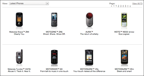
Besides the addition of pithy descriptions, Motorola’s list doesn’t give any more information for choosing a phone than the Sony Ericsson site. It’s unlikely a user will pick the phone of her dreams from this list.
The design patterns used to facilitate item selection from a gallery page can vary wildly, and which ones get used depend entirely on the purpose of a site and the user’s context and goals at any given moment. Following is a breakdown of some of the patterns that might be used within the Catalog framework to facilitate the selection process.
Quick Look
On commerce sites, the Quick Look pattern enables users to see a larger version of a product image without clicking through to the item’s content page (discussed in the next section). Quick Look often also enables users to add an item to the shopping cart, choose basic configuration options (for example, color and size on clothing sites), and get fulfillment information, such as the item’s price and estimated delivery time.
Item Identifier
Almost all gallery pages provide some sort of identifier for the items shown. A book on Amazon.com is identified by its name. An article on NYTimes.com is identified by its headline. A car is identified by its make and model.
Item Image
Item images simply provide a glimpse of the product to help the user discern its appearance from other items on a gallery page. Images are commonly used on commerce sites to show off products, and are usually offered as thumbnail-sized images—just large enough to entice the user to click through to the content page for an item.
Short Item Description
Short item descriptions provide high-level textual information about an item when item images are insufficient. For example, on commerce sites, a short item description is used when images of a product don’t help a user discern the differences between products. When shopping for hats, images of each hat are useful, but when shopping for digital SLRs, which generally look similar to each other, images will be less helpful, so a short item description can help the user identify differences between items.
When a gallery lacks the information a user needs to make an informed decision, she has to resort to pogo-sticking. Named after the children’s bouncing toy, the term describes those times when a user jumps up and down through the hierarchy of the site, hoping she’ll eventually hit the content she desires.
When a user is locating accessories for phones she already owns, for example, she knows the phone model and she knows she wants to see which accessories are available for that model. In such a case, it’s likely the Motorola gallery will work. But when the user is choosing a new phone—the next one she will purchase—she may not know the phone model, and the little information she may know about what she is looking for (for example, large, easy-to-press buttons or an email capability) isn’t communicated in the gallery. She’ll have to resort to pogo-sticking to complete the task, bouncing back and forth between product pages.
UIE’s analysis of usability tests shows that pogo-sticking rarely helps users find their target content. In studies of e-commerce sites, for example, sixty-six percent of all purchases occurred without any pogo-sticking at all—the users purchased the first selection they chose from the gallery two-thirds of the time. And when users did pogo-stick, the more they did so, the less they purchased.
This extended to other catalog sites as well: studies showed that users who didn’t pogo-stick found their target content fifty-five percent of the time, whereas those who did pogo-stick succeeded only eleven percent of the time.
To make this case further, consider the very complex process of buying a home. Applying for a mortgage, especially if you’ve never done it before, can be a confusing world of unfamiliar jargon.
Many banking sites handle mortgages similarly to Citibank.com, whose gallery page includes a section called What You Get. It states, without fanfare, that fixed-rate, adjustable-rate, and FHA/VA mortgages are available and it offers links to each one.
Figure 3.9 Citibank’s gallery could work well if you already know what you need.
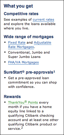
That probably works well if you already know exactly what you need, but what about home buyers facing these terms for the first time? How do they decide? It seems Citibank’s designers assumed users would pogo-stick through the two choices to figure it out.
Clearly, it’s important to include as much information on the gallery page as is necessary to inform a user’s decision. For Sony Ericsson and Motorola, this could mean providing a short list of features next to the photo of each phone. For Citibank, it could mean briefly describing each type of mortgage, or dividing the page into subgroups, such as First-Time Buyers and Current Owners, to help the user better determine which mortgage is appropriate. On a news site, it could mean writing informative headlines that offer a glimpse into the story’s content or displaying a snippet of the story itself.
Another bank, Wells Fargo, took a slightly different approach to its gallery of mortgage options. While it offers the same content, its galleries (and there are multiple versions, depending on which path you take through the site) provided copy to help users decide which link to click (for example, “Gives all qualified buyers the opportunity of putting only 3% down on a primary residence and taking advantage of flexible qualifying guidelines.”)
It doesn’t end there, however—the order of the items on the gallery page is also relevant. According to UIE’s research, users expected the most important items to always be listed first in the gallery. In fact, they often didn’t even realize when a list was sorted alphabetically—if the first few items weren’t of interest, they often assumed the rest would be even less interesting.
Regardless of its effectiveness, it is from the gallery page that a user makes her selection and moves on to the content itself.
Content page
The content page, also called the details page (as in, Product Details), is where a user can finally validate her choice. She can finally review the content she stepped through the site to find. She can add the book to the shopping cart. She can read the article. She can scan the reviews and decide whether or not to purchase the digital camera.
In other words, the content page delivers the prize at the end of the hunt. On commerce sites, it may feature user reviews, information on relevant promotions, usage and maintenance data, configuration options, and much more. On a news site, in addition to the desired article, it may offer sharing options, an RSS feed for the item’s parent category, and perhaps even reader comments.
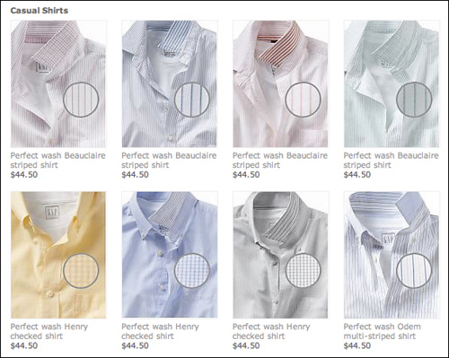
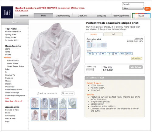
On Gap.com, as shown in Figure 3.10, the content page provides a short product description and information about how to care for the item, options to choose a size and color, and an option to view a larger image of the product.
Figure 3.10 Content pages on the Gap offers descriptions, images, and more.
On NYTimes.com, as shown in Figure 3.11, the content page offers a way to click through to the next article in the parent category, a link to the most popular articles for the category, and a commenting system so readers can discuss the story.
Figure 3.11 NYTimes features links to other articles and a commenting system.
But content pages don’t always deliver what a user needs to validate his or her decision.
A common practice in the online consumer electronics industry, for instance, is to require retailers to hide a product’s price from the shopper until she has put it into her shopping cart. Only after the shopper puts the product into the shopping cart is the price revealed. If the shopper then decides she doesn’t want the product, she has to remove it from the cart to avoid purchasing it.
While watching people shop on sites that employ this practice, UIE’s researchers have seen many shoppers show extreme frustration at the practice. When asked why they think the retailer does this, they feel it’s some sort of trick—that the retailer hopes they’ll make a mistake and buy an unwanted item by accident.
It isn’t a trick, but rather a contractual requirement that the retailer has with the manufacturers. It’s called the Minimum Available Pricing (MAP) policy and it allows large-volume retailers to sell products at a discount.
The agreement goes back decades, put into place to give smaller mom-and-pop retailers a competitive advantage against big box retailers. The original idea was that the big retailers couldn’t advertise their lower prices (which are lower because of their huge ordering capability), but could share the price once the customer was in the store. When these retailers went online, the shopping cart had to emulate the in-store experience.
The retailers are trying to follow the rules and give their customers great prices, but the customers think there’s something devious about it.
The designers at BestBuy.com came up with a clever workaround. They still require that the user take special action to see the price—as necessitated by the agreement—however, instead of showing the shopper a shopping cart with the product in it, they display a pop-up that has the price and two buttons: Checking Price—Remove from Cart and I Want To Buy—Keep in Cart.
Behind the scenes, BestBuy.com puts the product into the shopper’s cart for the duration of the pop-up. If the user indicates she is just checking the price, the system automatically removes it from the cart. Only if she indicates she wants to buy the item does it remain in the cart.
When UIE’s researchers measured brand engagement before BestBuy.com implemented this solution, they found a large dip in shoppers’ perceptions of the brand after encountering a MAP situation. After making this change, UIE saw the brand strengthen. By investing in the new design, shoppers now feel BestBuy.com is on their side and is not trying to deceive them. Clearly, it’s very important that the right information is conveyed to users as they try to validate selection decisions.
Once again, a variety of design patterns can be used to facilitate this task and influence the user’s behavior. When it comes to a user’s need to validate her item selection, in fact, the list of patterns is quite long. Following is a summary of many of these patterns.
Long Item Description
Building on the short description from the gallery page, the long item description simply provides an extended overview of the product, potentially including things like technical information for electronics equipment, editorial reviews for books, and so on.
Image Gallery / View Larger Images
In commerce sites, image galleries (usually containing just a few images) are often offered so the user can see the product in several ways, either in different contexts (clothing worn on different body types, for example) or at different angles (front, back, and so on). This type of gallery generally offers a View Larger option so that thumbnail images can be shown by default, thereby conserving screen real estate, while still providing a way for users to see larger versions of each image.
Fulfillment Details
This information lets users know how much an item costs and how quickly it can be delivered.
Availability
Item availability, in addition to simply providing status information, is often shown on a Content page to instill a sense of scarcity. A user who thinks a product has limited availability may believe the item is more valuable and therefore feel more compelled to order it.
An example from outside the world of goods and services is event sites. A professional conference may have a maximum capacity of 200 people. As seats are purchased, that number continually decreases, potentially making the remaining available seats more enticing to interested visitors who remain undecided.
Lists
On commerce sites, wish list and simple shopping list features can be provided to give users a way to mark items for future reference. This pattern can build commitment on the part of the user—the act of compiling a list increases the likelihood that the user will return to the site.
Configurator / Configuration Options
A pattern more complicated than most, the Configurator enables users to select from a series of customization options for a product. On a clothing site, the user may choose a size and color. When ordering a drum set, the user can choose the type of cymbals, drums, stands, and sticks she wants. On MiniUSA.com, a user can fully configure a Mini Cooper, save the result, and use it to order the Cooper of her dreams. By giving the user various ways to choose the exact configuration she wants, this pattern helps her feel comfortable that she indeed made the right product choice.
Social Influence patterns
Social influence patterns include review, rating, recommendation, and referral features—patterns used to influence a user by way of social behavior. Reviews are frequently offered on product pages to quell a user’s concerns about a product. Ratings offer a fast mental shortcut for deciding whether or not the product is of reasonable enough quality. Recommendation functionality gives users a way to put their stamp of approval on a product without getting so involved as to write a review. And a referral function enables users to tell their friends and colleagues about a product.
Again, the patterns used within the catalog framework can vary greatly depending on the purpose of a site and a user’s goals at a particular moment, and it’s vital that these patterns be chosen carefully.
Regardless, the Content page represents the end of the trail—the point at which the user finally makes a decision about whether or not to purchase an item, read an article, or something else. The user starts with an array of choices, she makes a selection, and she gets the information she wants.
Category. Gallery. Content.
Winnow. Select. Validate. Simple as that.
Guided links
In another study conducted in 2001, UIE looked at how to get users to find valuable content that they weren’t already aware of upon first visiting a site.
This is an important problem when dealing with large sites in particular, because these sites are constantly adding content. E-commerce sites add new products. Product-support sites add hints for successful use. Intranets add new information to help employees be more efficient. How does a user discover the new content?
UIE’s research showed that users were three times more likely to find this additional content if they used the category links on the home page instead of by using the site’s search function. In an effort to understand more about why this was happening, UIE’s researchers dug a little deeper into the data.
It turns out that one main clue is what people do after they find their target content.
Target content is the information that people come to a site to find. Studies show that most site visitors have a purpose on a site. For example, few people go to www.ups.com just to see what UPS is all about. Instead, they go when they have a specific need, such as tracking a package, finding the nearest drop-off location, or opening a new account. Users come to the site with a goal and do their best to achieve that goal. But what happens after they’ve achieved it? How do designers drive users toward that valuable content they didn’t know was there?
UIE’s research turned up some surprising statistics. Apparently, the way users get to the target content affects whether they’ll continue looking or not.
UIE’s study of thirty users found that if the participants used the site’s search function to locate their target content on the site, only twenty percent continued looking at other content after they found the target content. But if the users used the category links to find their target, sixty-two percent continued browsing the site. Users who started with the category links ended up looking at almost ten times as many non-target content pages as those who started with the Search box.
Search, even when designed well, only lets users see what they are looking for. If they ask for shoes, they get shoes. But category links mimic what happens in real life. In a study that involved watching people shop in the mall (with their permission—not by stalking!), shoppers who went into stores specifically to buy shoes ended up purchasing other products, like sweaters, as well.
When users are exposed to the categories, they unknowingly become educated on the other content available on the site. Many users in the study told UIE’s researchers that they were making mental notes to “go back and see” the other content while they located their target content.
With Search, there is no opportunity to see what else the site has to offer (unless Search is broken and therefore provides content the user didn’t ask to see). Quite simply, Search is too specific.
Guided links are the solution to that problem.
Guided links are nothing complicated—they’re simply links to other content within a site—but their existence is key to a user’s ability to winnow, and as such, just about every category, gallery, and content page in every major catalog site on the web offers guided links.
Figure 3.12 JCPenney.com offers links to other types of shirts.
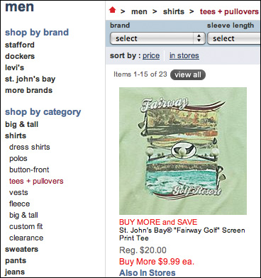
On JCPenney.com, after you drill down into the Tees and Pullovers sub-category, (within the Shirts category in the Men’s department), links are offered in the sidebar to gallery pages for many of the shirts JC Penney’s offers.
Bestbuy.com’s In-Ear Headphones sub-category offers links to galleries that highlight specific brands, features, price ranges, and even colors.
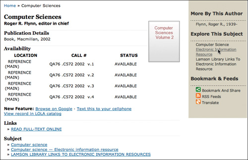
In the library world, Plymouth State University (http://library.plymouth.edu/) uses Scriblio, an open-source library catalog system built on top of WordPress, as the front-end of its catalog system. PSU’s site not only offers the standard combination of category, gallery, and content pages, it also features guided links along the way so that a user can identify additional material relevant to target content.
Using guided links, users can access other titles by a specific item’s author, galleries for related subjects, and even the library’s full item record.
Guided links do exactly what they say they do: they guide users to other content. More clicks. More viewed items. More value for users. More goals met for the business.
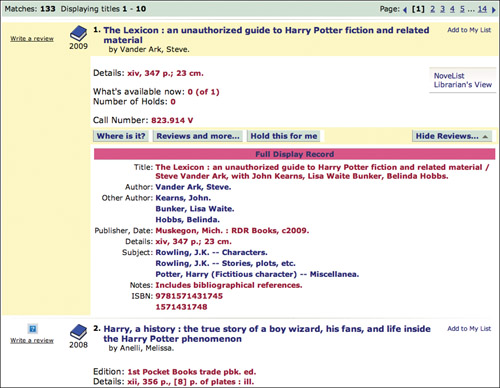
Figure 3.13 The Scriblio system for library sites features guided links.
Design Criteria
Back in UIE’s 2002 study—the lessons of which are very applicable to this day, and which other, more recent research supports—the main difference between the sites studied were the category pages. Among the thirteen sites studied, UIE’s researchers found five different types of category-page design. Most sites listed the categories in a left-hand navigation panel, with the galleries for that category listed in the page’s main content area. However, some got clever.
The Gap and Victoria’s Secret (www.gap.com, www.victoriassecret.com) both used menus rather than pages to present top-level categories.
Old Navy (www.oldnavy.com) used a combination department and gallery page on which the navigation sometimes contained galleries and sometimes contained products.
Lands’ End (www.landsend.com) used a design containing both product descriptions and departments.
Finally, Eddie Bauer (www.eddiebauer.com) combined text lists of all the products in the department with a toggle to see the pictures for a gallery.
After realizing that there were five basic types of department pages, the goal became to see if the different types made a difference in user behavior. While UIE expected differences between individual sites, it wasn’t clear if one type of design would outperform the others.
As with many of the company’s e-commerce studies, UIE invited participants to its facilities with a list of products to buy. Participants were given the money to make purchases and told to purchase as many of the items on their list as possible. In this particular study, forty-four users shopped for a total of 687 products. After watching people shop on the sites, the UIE team compared their behaviors.
The sites with the standard left-hand navigation, such as Macy’s, performed the worst, selling the least amount of product. Lands’ End’s design, featuring both product descriptions and department pages, performed the best. Old Navy’s combination department-and-gallery design came in second.
In the study, the number of pages that a user visited before they put something into their cart was inversely proportional to purchasing. The more pages they visited, the less they bought. (Remember, these users knew exactly what product to locate and were ready to make a purchase.)
Looking at the number of pages visited before a user put something into the cart, users who traveled through Lands’ End’s design made purchases by visiting one-third as many pages as Macy’s users. Lands’ End users saw fewer visits to wrong galleries—galleries not containing the user’s desired content (often forcing the user to hit the Back button—a clear sign of a problem).
These days, however, many sites with multiple levels of organization, such as BestBuy.com, support a user’s winnowing process via several category levels spread across multiple pages, and it’s a safe bet that major retailers wouldn’t do this unless it worked in their financial favor. This tells us, then, that it isn’t a high number of clicks that decreases a user’s desire to buy, but rather a high number of incorrect clicks. The more pages a user visits that fail to deliver her target content, the less likely it is that she’ll complete her task through a given site.
So the right path to innovation seems to lie in making the item-selection process more accurate.
To determine how to make the process more accurate, we must look at what the current standards tell us about human behavior and extrapolate design criteria that will lead to a new and improved design.
First, we know that people like to explore catalogs. It’s the web equivalent of window shopping. A user who doesn’t immediately know what she wants to purchase needs a way to look around and discover content. A user who knows what she wants but doesn’t know what it’s called needs a way to follow the scent of trigger words along the hierarchy to narrow down the possibilities. A user who knows exactly what she wants and even knows precisely how to search for it still needs the opportunity to look around and discover related items she perhaps didn’t know existed.
Second, we know that users tend to follow the three-step item-selection process of winnowing, selecting, and validating.
Third, we know that even with a sound offering of guided links, not every user classifies content according to the same taxonomies through which most catalog sites are organized. One man’s Trash is another man’s Treasure.
How can we address these things?
How can we prevent incorrect clicks differently than through the nebulous goal of designing better category and gallery pages? How can we enable and encourage site exploration without knowing exactly which words every user associates with certain items? And is it possible to support the three-step item-selection process without strictly using the aforementioned catalog elements?
The answers are in the design criteria.
Support exploration
As previously mentioned, web users rely heavily on search functions to locate known items within a catalog. With this in mind, it can be easy to believe that a catalog site need not include all the standard elements, but instead rely exclusively on a site-wide search function. After all, search can deliver users to their target content much more quickly than by drilling down through an elaborate hierarchy of categories and content.
But as you probably realize, the fact that people use search functions doesn’t necessarily mean they rely on site-specific search. In reality, they very commonly rely on outside search engines such as Google and Yahoo! to locate products and other items, and simply visit the sites that appear within the first few results. For this reason, and several others we’ll discuss in a moment, it’s vitally important not only that catalogs enable browsing methods, but also that the pages included in that process maintain unique URLs, as well as appropriate page titles and content. This way, search engines can index the content and these pages can appear in search results, thereby driving traffic to a site.
To put this in context, consider what happens when sites are not structured in this way by looking at the anti-pattern of the standard catalog architecture. (Whereas a design pattern is a common solution to a common problem, an anti-pattern is a common ineffective solution to that problem. It’s a solution that should not be used, but is used frequently enough to have become a pattern and its ineffectiveness must be pointed out.)
The Clinton-Macomb Public Library site (http://cmpl.org) is built upon a library catalog system called Polaris. While it is purportedly one of the best library catalog systems on the market, Polaris goes against the standards established by the many successful sites that feature a catalog architecture, including the retailers discussed in this chapter. When users seek out content on the Clinton-Macomb library site, they are not given the option to browse through categories, nor are they shown gallery pages from which to choose items.
In fact, the system offers no category pages whatsoever, and item details are divulged entirely within search result pages rather than on separate content pages.
This is a problem for several reasons.
First, of the 687 shopping expeditions observed in UIE’s e-commerce study, users only used the site’s search engine twenty-two percent of the time. That means they used the categorization scheme to locate the desired products seventy-eight percent of the time. Since there are no category pages in the Polaris system, a user’s basic and strongly preferred ability to browse is taken away. She has to search—there’s no other way to locate content. The first step in the three-step selection process is winnowing. There is no winnowing without category pages.
Figure 3.14 Polaris, problematically, shows product information within search results pages.
As a result, serendipity is also stripped away—there’s no way for her to accidentally discover the additional items she didn’t already know about. She can only seek out the things she knows she wants, not those she doesn’t know she wants.
Second, public libraries in particular depend on state and federal financial support for virtually everything—paying staff, holding library events, running community programs, funding collection development—you name it. Without the unique URLs that come from having content pages, catalog items cannot be separately indexed by search engines. The problem is obvious. Drive more traffic into the library and circulation goes up. Increased circulation compels the government to provide the library with more money, making it a better resource for its community, which in turn drives more traffic into the library. This all starts with a user’s ability to find materials at her local library by running a quick Google search. By taking indexable content pages out of the equation, Polaris could be causing its customers to lose enormous opportunities.
Third, the lack of content pages (and lack of unique URLs for items within search results) hinders the user’s ability to bookmark content. Without a unique URL, the user can, at best, bookmark the search results page, return to it later, and click to display item details within the results. (To Polaris’ credit, users can indeed bookmark an item within the search results, but since the bookmark URL is created according to the item’s current rank in the results and not its title or product ID, an item whose results rank changes in the future will result in a broken bookmark.)
Fourth, without separate content pages, the user is kept in the context of search results, attempting to validate her item selection through what is essentially a gallery page, where other items on the page can easily distract from the user’s evaluation of the item. There is a quite a bit of information to be sorted through for any given product in a library catalog, and showing it all within a set of search results makes for a muddled experience at best.
So why would Polaris design its catalog system this way? For the same reason many others do—to enhance its application based on a faulty understanding of a high-quality user experience. Often, web teams seem to think they can help their users simply by reducing the number of clicks it takes to accomplish a given task. This, of course, is patently wrong—the quantity of clicks doesn’t matter one bit compared with the basic need for clarity as a user tries to complete tasks.
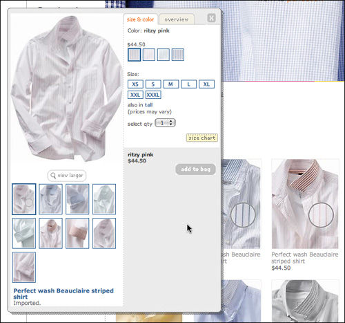
Incidentally, Gap.com currently employs a variation of this technique. Via a Quick Look option that displays when a user rolls over an item on a gallery page, Gap displays an overlay that enables the user to choose a size, add the item to the shopping cart, and other things (Figure 3.15). The key difference, we believe, is that Gap isn’t using the technique to provide information about the product—part of the winnowing process—but rather, they’re enabling the user to take action on that item. And unlike Polaris, Gap uses this solution in addition to, rather than instead of, content pages.
Figure 3.15 Gap.com offers a Quick Look option, but still provides a content page.
What this means is that it may be possible to consolidate the item-selection process—not by stripping out the information and functions of the category, gallery, and content pages, but by distilling them down to one or two steps rather than three. This is risky business, of course—Polaris intended to do exactly what we’ve suggested and ended up with a search engine masquerading as a catalog that fails to meet the needs of either.
But consider what Panic did when it started selling T-shirts online.
First, Panic offers a very limited selection, so the site doesn’t need category pages.
Second, all of Panic’s shirts are made the same way, so instead of listing product care information for each one, the company created a single About Our Shirts page. Shirts that come in different colors are shown side-by-side, instead of appearing on a single content page with a configurable color option. Clicking on a shirt produces a small popup window containing several more images of the shirt. The only other things a user needs to make a shirt selection are the ability to choose a size and quantity and add it to the shopping cart. Panic can meet this need without content pages.
Figure 3.16 Panic.com avoids using category pages by way of a single-screen shopping interaction.
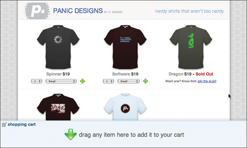
As seen in Figure 3.16, below each shirt image appears its price, as well as options to set an order quantity, choose a size, and add it to the cart. The shopping cart itself lives at the bottom of the page; users can either drag T-shirts into the cart or click the plus icon next to each shirt.
The sum total of all these factors is that Panic is able to deliver its entire catalog site through a single page, which not only supports a user’s item-selection process, it also entirely avoids the problem of incorrect clicks. The user is never at risk of visiting an irrelevant page and having to click the Back button to retreat and begin again.
We don’t have access to the results of any usability studies of Panic’s site, nor have we seen its metrics, but the site has offered essentially the same design for several years running, so we imagine the approach is working well for the company. If nothing else, it offers catalog designers a fresh idea.
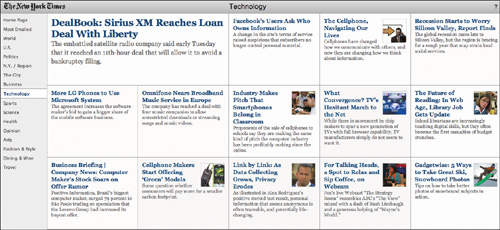
NYTimes offers another alternative with its experimental Article Skimmer, located at prototype.nytimes.com/gst/articleSkimmer/.
Using a wildly untraditional design, NYTimes offers a way for users to quickly scan the top stories for any given category simply by clicking category names and scanning headlines. Sure, NYTimes.com already supports this behavior, but the Article Skimmer does so in a very different way—it consolidates the headlines from all the top stories into a single viewable space. It even shows snippets from each article to better inform a user’s decision to click or not to click. This makes it possible to scan the top stories from across the entire site in as little as a minute or two.
Figure 3.17 The NYTimes article skimmer makes quick work of scanning headlines
At the most basic level, we must support a user’s need to explore a catalog without explicitly searching for known items or categories.
Beyond this, though, we can ensure that users find content according to their own mental models about what those items are called.
Expose the taxonomy
In order for users to find content according to their ideas about what the content is, what it means, and what it should be called, we can offer users the ability to create their own tags for content, thereby associating a variety of terms to each item to improve its findability.
Amazon faces a constant organizational nightmare—it offers millions of products, all of which users must be able to find on demand and by accident.
While Amazon led the way back in the early ’90s by dividing its content into sections via a tabbed interface, it eventually outgrew the very same model it made famous. There were simply too many categories. Too much content. While the company has gone through many variations on its navigation scheme since then, one of the more intriguing options it has offered is the ability for users to tag products.
Figure 3.18 Amazon.com lets users choose their own words for organizing products.
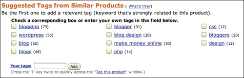
Instead of clinging to a stringent taxonomy of its own making, Amazon handed the reigns over to its users and made the taxonomy extensible (thereby turning it into a folksonomy). Amazon customers can now decide for themselves how products should be classified. In the future, they’ll be able to find content again according to their own preferences, and they may help countless other users in the process by creating tags that match other users’ trigger words.
Encouraging exploration and expanding the possibilities for what terms site visitors can use to locate content are not revolutionary concepts by any means, but as design criteria, they can certainly lead to new ideas. With any luck, one day we’ll see major commerce, library, knowledge base, news, and other catalog-based sites following a paradigm that supports user needs without transposing real-world processes into web interactions verbatim.
Maybe one day, a week’s worth of grocery shopping will be done with just a couple of clicks.