5. Sign-up
Spinscape launched its web-based mind-mapping application in July 2008, promising to offer a slew of compelling features to rise above the competition and make mind-mapping easy. A mind map, as Spinscape.com states, is “a diagram, or set of diagrams, used to represent words, ideas, tasks, or other items linked to and arranged radially around a central key word or idea.” At its core, it’s a method of generating and organizing ideas, collaborating with others, solving problems, and making decisions. But since mind-mapping is a new concept to many people, it’s likely to raise many questions as users experience the Spinscape home page for the first time:
Users who make it past the first set of questions and feel inclined to keep going will have a new set of questions.
In fact, these are questions users have about many sites when they experience them for the first time. On Spinscape.com, these questions may be difficult to answer, even for those already familiar with mind-mapping.
Figure 5.1 Spinscape tries to tell us what it offers.

Spinscape tries to tell us what it offers: “A visual way to organize your information online.” It also tells us, simply through the presence of a sign-in form, that yes, we will probably need to create an account. But how does it communicate the level of difficulty we can expect to face as we get started? How do we create an account? How do we know the reward will be worth the effort? How does it explain the concept of mind-mapping?
The answer, as you might guess, is that it doesn’t. At least not at a glance, which is how we need it. To understand mind-mapping, we must watch the video or access the So What is Mind Mapping? page. To learn about the feature set, we need to visit the Spinscape Advantages page. To move forward, we have to locate the rather inconspicuous Get Started link at the bottom of the home page.
But this is not how we like to answer questions. We like to scan a page and get as many answers as we can in as short a time as possible. Eyes darting. Unconscious impressions forming. What will Spinscape do for me? Tell me. Right now!
Spinscape makes use of just two of the six elements in the sign-up framework. It misuses another. It forgoes the other three. Tsk, tsk.
Description
The purpose of the sign-up framework is to convince visitors to register and become subscribers. Active members. Paying customers. Its intention is not only to address objections that site users may have prior to signing up, but also, and perhaps more importantly, to entice them.
The framework is composed of just six key elements, and while they may appear small and insignificant, each can be absolutely critical to success. Each one can mean the difference between losing a visitor and gaining a customer. The framework as a whole can mean the difference between a one or two percent conversion rate and a ten percent conversion rate. Thousands of dollars, or tens of thousands. Millions, or tens of millions.
The purpose of the sign-up framework is first and foremost to answer the questions that appear in the user’s mind as his eyes dart around the screen. But its real job is to appeal to the unconscious, where decisions are made. To incite a visceral reaction just strong enough to make him crave this unknown thing. To give him just enough information to compel him to want to learn more. To grab his attention just enough to convince him to take action.
In essence, the sign-up framework exists purely to persuade, and then to enable a user to act on his new impulse to dive in.
Context of use
The sign-up framework applies to applications that require users to register to save, publish, store, or otherwise take ownership of or manage the content they create. These applications are often presented as stand-alone sites that visitors can access for the first time only via top-level marketing pages, such as the home page or a Learn More page. However, applications like this can also exist simply as a section of a larger site.
TurboTax and H&R Block, for example, require that users create accounts prior to using their tools for tax preparation. Netflix and GreenCine require registration before users can have rented DVDs shipped to their homes. Blinksale and Freshbooks require accounts before they can be used to create and manage invoices.
This framework does not apply to conversions in a commerce context, such as the purchase of a product through a retail site. For example, it is not necessary to register prior to purchasing a floor lamp on Target.com—in fact, it is never necessary to register on the site.
The sign-up framework is used primarily within the top-level marketing section of an application site or microsite, but can also bleed into the application itself (more on that in the Blank Slate section below). The marketing section can include the home page, a Learn More page, and any other public page through which you can directly or indirectly encourage a visitor to register (such as by highlighting the features and benefits of the application). It also frequently includes a stand-alone registration page.
Task flow
With regard to task completion, the sign-up framework is very simple. Typically, a user explores the home page and possibly a Learn More or Features page, scans any relevant (and short) descriptions, and at some point accesses the registration process. He then completes the registration form, is confirmed as a new member, and then begins using the application. An alternative task flow, as discussed in the Blank Slate section, is one in which the user can begin using the application before registering, only being asked to register after it becomes absolutely necessary to continue.
Elements
Following are the elements included in the Sign-up framework.
Value proposition
The moment a user wonders what a site can offer him and why it’s important, the value proposition begins to offer answers. As designers, if we can’t communicate the purpose of an application at a glance, we risk losing the user’s attention, and attention is one of the hardest things to earn.
To quickly explain to a user what an application is about, the written word is one of the best tools around, but it’s ineffective to simply toss up a paragraph-long welcome message, as few people read generic greetings. Instead, it’s best to provide something short, catchy, and noticeable. To this end, a text-based value proposition should be a finely crafted elevator pitch for a very short elevator ride. It can be a statement ranging from just a few words to a sentence or two.
However, simply crafting an effective set of words isn’t enough—the value proposition must appear in a prominent place where users are likely to see it, as in this example from Twitter’s former home page.
Figure 5.2 Twitter describes its purpose.
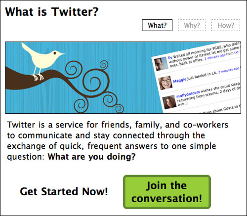
With just a short blurb, Twitter describes its purpose and implies the possible benefits of using the service. And with this text prominently displayed on the home page, it’s easy to notice, so someone who has never heard of the site, or perhaps doesn’t understand Twitter based on what they’ve heard or read, can quickly get a sense of whether or not the site will be relevant and useful.
However, Twitter’s value proposition contains twenty-nine words—likely too many for the average drive-by visitor to process at a glance. The more easily the blurb can quell a user’s concerns, the better. In this regard, Blinksale does more with less.
Figure 5.3 Blinksale does more with less.

In just seven words, Blinksale communicates exactly what it does and what the user can gain from using it. These words were carefully chosen, and each one helps ensure that drive-by visitors can quickly learn about the site. Specifically, three of the seven words in the statement—easiest, invoices, and online—are keywords that are vital to Blinksale’s pitch.
Easiest. Invoices. Online. Everything a user needs to know.
Spinscape included a value-proposition statement—“A visual way to organize your information online.” However, burying this site description in the header area of a design, within a long block of text or somewhere else, can greatly reduce a user’s ability and oft-unconscious desire to notice, read, digest, and act on the information.
The key, as illustrated by both Twitter and Blinksale, is to ensure the value proposition is in plain sight. Front and center. What will Spinscape do for me?
Tell me. Right now!
Investment Breakdown
During a satisfaction survey run by a major airline, flight attendants handed each passenger a card upon leaving the aircraft that directed them to the airline’s site and offered a nice incentive for filling out the survey.
While many customers started the survey, few finished, often stopping at a step requiring them to enter their ticket number (found on the boarding card stub). The users didn’t realize they’d need this information and couldn’t easily lay their hands on the stub when asked for it.
Many applications require the user bring something to the process, such as a customer number, a credit card, or a copy of their car title. When the application doesn’t warn users up front to gather this information, it surprises them during the process, often causing them to consider whether it’s worth the effort to continue. (This is compounded by their increased suspicion that they’ll be surprised by more unidentified required information.)
In addition to needing information, users are often surprised when the application requires more time than they’d originally planned. Sometimes this is because the application requires more effort to learn and use than the user realized.
Users expecting a fast interaction suddenly are pressured because the application requires more time, which they may not have available. If the application doesn’t set the proper expectations, an otherwise positive experience can quickly become frustrating.
Again, usability testing can help when designers pay careful attention to the expectations users form. Asking users what they think they’ll need before they start the task (including both auxiliary information and time requirements) can help you determine whether or not expectations are clear.
Field studies can also help you identify the contexts of use. A team might discover, for example, that necessary receipts are unavailable because the user has already turned them in for reimbursement, requiring another validation method, such as online lookup.
In the context of signing up for an application, it’s important to communicate what the user will need to learn and do to begin reaping its benefits so that she can gauge the level of investment required to start being successful with it. Here, Blinksale succeeds again.
Blinksale’s home page features six small info-graphics, each of which reveals a benefit-slash-feature of the application. In the moment when a Blinksale visitor is deciding whether or not to become a customer, each of these blocks can help turn the hesitant into the self-assured and the skeptical into the confident.
Figure 5.4 Blinksale uses small info-graphics to reveal its benefits and features.

Simply put, people need to know what they’re getting into. So this second element—the investment breakdown—provides information beyond what the value proposition can communicate, such as what features exist and how they can be used.
While it serves simply to highlight the benefits and features of an application, what the investment breakdown ultimately conveys is how hard the application is going to be to use. If it looks like work, the investment will feel cumbersome. If it looks simple, the investment will feel light and easy to overcome.
Note also that this isn’t just a breakdown of the user’s required investment. Beyond the value proposition, this element provides a secondary method for communicating what the application is meant to do, so the visitor can understand it in more depth.
“The easiest way to send invoices online” value proposition tells visitors quite a bit about the site’s purpose, but the six graphics that make up the investment breakdown get into the particulars. Here, users learn—in just six little blocks—that they can choose an invoice template, send invoices by email, import client contact information from Basecamp, tag their invoices, and more.
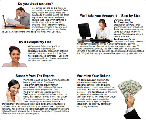
By contrast, TaxSlayer.com’s investment breakdown is an example of how small differences in the details of a design can have a dramatically different affect.
TaxSlayer.com’s investment breakdown appears toward the end of its home page. Using several small graphics, the site attempts to quell concerns, highlight features, and entice users. However, instead of stripping its message down to just a few words, TaxSlayer.com juxtaposes each graphic with an entire paragraph of text. Tiny text. Text that can barely be read, as seen in Figure 5.5.
Figure 5.5 TaxSlayer juxtaposes each graphic with an entire paragraph of text.
What should have been one of the most persuasive elements on the entire Web site is now a distraction, a jumble of information to be entirely ignored.
For an investment-breakdown element to be at its most effective, it has to evoke a quick emotional and visceral response. It is not the time to wonder, If less is more, then how much more is more?
If there is more to know than what can be said in a small area of the home page, consider adding a Learn More page to the site and use it to feature a screencast or screen-shot tour of the application, with extended descriptions of major features.
Lastly, while telling users how long it typically takes to sign up and get started isn’t necessarily common enough to include in this framework, it is smart, and therefore recommended as a best practice. Blinksale addresses this with the simple statement (Figure 5.6) at the bottom of the home page, “Start sending invoices in about 5 minutes!”
Figure 5.6 Blinksale reveals how long it will take to get started.

To potential customers, this means that even if they ultimately decide not to use the application, they will have only wasted about five minutes making that determination. Now, even five minutes can be a long time, but it sounds like a small investment. In addition, many visitors will feel more comfortable when a clear expectation, such as this one, is set up front.
Spinscape doesn’t communicate the time it would take to get started with mind-maps. In fact, it doesn’t include an investment breakdown at all.
Testimonial
To leverage the principles of Authority and Liking from social psychology, which describe the natural inclinations people have to believe the words of respected authorities and people like themselves, SpinScape could have provided a simple testimonial or recommendation. A short quote conveying something positive about the product could have gone a long way toward convincing site visitors to become registered users.
The Authority principle reflects the very human tendency to trust those we see as being in a position of authority. A marketer, for example, may be more prone to believe a product is worth using if marketing legend Seth Godin says something positive about it. A usability professional may be more prone to buy a certain book if Don’t Make Me Think! (New Riders) author Steve Krug recommends it.
In other words, simply adding a short testimonial to the home page from a known and respected authority figure can often inspire a visitor’s sense of trust. On Squidoo.com, for example, the New York Times is cited as saying that Squidoo is “a home where bloggers can plumb those obscure passions.” The Times is a highly respected source, so it becomes easier to trust the site.
Similarly, the Liking principle reflects our human tendency to trust people we see as being like ourselves. On Amazon.com, a customer who writes a product review can have remarkable influence over whether another customer purchases or avoids the product simply because the reviewer’s name is Joe and he lives in Jacksonville. These facts remind the potential customer of himself, even if the demographic association is loose at best. (In fact, displaying the reviewer’s name and location is generally more persuasive than showing the review alone.)
On Spinscape, a glowing recommendation from another designer or developer—someone you see as similar to yourself—could have helped convince users the application was worth a second look.
When a testimonial is used in conjunction with the investment breakdown and the other persuasive elements in the sign-up framework, it reinforces a user’s developing belief that the application is worth exploring. If used alone, it can have the same effect, but it is likely to be less potent.
Call to action
Once you have sufficiently piqued the user’s interest, you can use a quick call-to-action statement to tell him what to do next. A call-to-action statement is simply a short phrase, written as a command and worded to compel the user to take action.
When trying to convince a visitor to become a member, the call to action can be, and often is, created in as few as three words:
However, an effective way to get visitors excited about an application and build momentum is to let them move forward without requiring registration. You can instead offer a call to action that entices the user to do something tangible with the application. In other words, instead of Sign up now! consider a call to action such as Create your first invoice now! or Write your first post now! or something else.
The idea, simply put, is to drop visitors straight into the deep end. Enable them to do something as quickly as possible. Let them splash around for a bit before being asked to commit. This gives the visitor the freedom to experiment with the application, easing the pain of handing over his email address to create yet another account on yet another site.
An early version of the TripIt home page did this well.
Figure 5.7 Triplt describes how to get a travel itinerary.

To start using this trip-itinerary-sharing application, the user simply emails an itinerary from any major travel service (airline, hotel, and so on) to [email protected], and gets back a sample of a shared itinerary. And the user can do this as many times as he likes—the only reason to sign up is to share his itinerary with other people.
If it’s not necessary to ask visitors to register before they get started with your application, then don’t. Get them moving forward by encouraging them to do something with the product itself and ask for registration information only when it becomes necessary (this is often referred to as lazy registration). The simple act of using the application, in fact, can be quite persuasive—a user who has already started learning and benefiting from an application is more prone to sign up, and a registrant who has prior experiences with an application is likelier to be a more committed user.
Spinscape badly misused the call-to-action statement when it included the words Get Started at the bottom of its home page. Get Started should link either to the registration page or the application itself, but instead it leads to a page that simply provides links to a couple of tutorials. In fact, there is no clear way on the site to access the registration form. In using the call to action in this way, Spinscape set a false expectation, broke convention unnecessarily, and gained nothing by doing so. It’s likely that this decision negatively affects the site’s conversion rate.
It’s also important to note that the call to action should not be written in the form of a question, but rather as a direct command.
Blank slate (a.k.a Immediate Engagement)
Of course, nothing offers a more compelling reason to sign up than a great user experience, so it’s important to make sure that the user’s first step is one that leads him into a five-star hotel room rather than off a cliff.
Many applications have what’s known as a blank slate—a screen designed to be filled with user-generated content but that is currently devoid of that content, leaving the user wondering what to do next.
The primary objective is to walk the user through the answer to every question he might come up with. Ultimately, the goal is to make sure that the user’s goals in any given moment are met.
Here are a couple of examples:
First is Basecamp, a Web-based project-management system that features the ability to create messages and to-do lists, set project milestones, and chat with other people on the project. When a new project is created in Basecamp, several of the main tabs feature a short screencast.
Figure 5.8 Basecamp fills its blank slate with instructive screencasts.
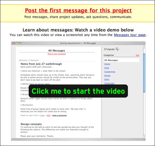
When a user sees the Messages screen for the first time, for example, his goal is to figure out what the page does, why it matters, and how to use it. To answer all three questions, all he needs to do is click to watch the video for a crash course on the value and usage of each major feature on that screen.
With any luck, the user’s next goal will be to take action, so above each screencast is a large, red link that tells him how to do just that. To get started, the Messages tab tells users to “Post the first message for this project.” By offering this, the user can click once and start being productive.
Without the screencast and large red link, he would be left with a mostly empty screen that offers no clues about how to get started. In other words, a blank slate. Your goal is to avoid leaving the blank slates blank by filling them up with useful information and entry points that get your users moving forward—things that facilitate immediate engagement.
The screencast and red link in Basecamp set the barrier to entry very low by giving new users a way to get familiar with the tool in just a minute.
The one caveat to this example is that Basecamp requires the user to sign up before creating his first project. Photoshop Express, from Adobe Labs, does better by offering a Test Drive button on its home page. Instead of requiring sign-up, Photoshop Express lets the user dive in without asking for personal information.
Figure 5.9 Photoshop Express lets users dive in without entering personal information.

Upon clicking Test Drive, the user can experiment with the application using preloaded images, so he can find out what he can do to the images he’ll eventually upload himself and how the application can benefit him. No blank slate here—instead, the user can become immediately engaged. In less than five clicks, he can go from the home page to editing a photograph. He can sign up at any point using the Join Now button, and the application prompts him to sign up whenever he tries to do something that requires it. (Registration is indeed required to perform most tasks on the site, but users can experiment with basic functionality a bit before being asked to register.)
The key to getting the user moving is to give him the information he needs, right when he needs it, and then get out of the way. If he signs up for the application at this point, it’s more likely he’ll do so because he’s confident he really wants to use it.
Registration form
Of course, to sign up at all, the user will need the last and most critical part of the sign-up framework: the registration form itself. Unfortunately, many things can go wrong in the moment a user tries to complete a form, and registration forms are certainly no exception.
First, a user can make plenty of mistakes. He can choose a user name already in use, enter mismatched passwords, skip a required field, forget to check a Terms of Service check box, or any number of things.
Second, a user with a half-hearted commitment to signing up can be deterred by a lengthy registration form, suddenly deciding it’s just not worth the time or energy.
Third, a registration form with a tricky confirmation process can lead to confusion and end up frustrating the user. For example, many registration processes require that the user check his email for a message that is automatically sent upon registering and ask him to click it to confirm the address is legitimate. But what happens when he fails to notice the message to check his email? What happens if he gets distracted by a phone call or some other occurrence and forgets?
Registration needs to be painless. After having done the hard work of getting a person to sign up, the worst thing you can do is alienate him in this important moment.
When the registration process is designed well, it not only enhances a user’s trust in an application, it can further solidify his commitment to using it.
To ensure a smooth process, first remove anything from the sign-up form that isn’t absolutely required. In most cases, all that’s needed is the user’s name, email address, and password. In many cases, it’s not even necessary to acquire the user’s name (though it is a nice personal touch to use his name in newsletters and such later).
PearBudget, for example, requires only an email address and a password.
Figure 5.10 PearBudget requires only an email address and password.

If you need your users to build up more comprehensive profiles in an application, save this step for later whenever possible. Get them signed up first, and get the details later.
Keeping the form as short as possible lowers the barrier to entry, especially when employing so-called lazy registration, which lets the user start using the application without registering.
Additionally, since everyone makes mistakes on even the simplest forms, be sure to include real-time form validation so that users can catch and correct their mistakes as they are made, and make sure error messages are written to tell users how to do things correctly.
Surprisingly, Spinscape’s registration form, at the time of this writing, is is quite difficult to find. It doesn’t have its own page; it’s positioned next to the sign-in form on the Sign In page. There is no clear path to the page, and the site’s entry points often lead to unexpected places.
With just a few design tweaks, Spinscape could likely dramatically increase its conversion rate.
To learn more about the design of Web forms, there’s no better authority than Luke Wroblewski, Senior Director of Product Ideation and Design for Yahoo. His book, Web Form Design: Filling in the Blanks (Rosenfeld Media), is the most thorough resource on the market. For information specifically on sign-up forms, see his blog post “Sign-Up Form Patterns,” at http://www.lukew.com/ff/entry.asp?702.
Design Criteria
As you can see, most of the elements in this framework exist purely to persuade. The value proposition makes the application sound exciting and useful. The investment breakdown shows off the best features. The testimonial convinces the user that people like him or people he respects recommend it. The call to action compels him to get moving.
By taking a close look at what the sign-up framework truly accomplishes, we can extrapolate key design criteria to inform possible improvements and alternative methods.
Communicate a clear value proposition
First, as discussed earlier, our applications must communicate a clear value proposition. But it’s important to understand that what matters is not the form in which a value proposition is communicated, but that it is communicated at all. The value-proposition element, in fact, is named according to its intention, not its design. In other words, though it’s very often presented as a textual statement, such as a tag line or slogan, it doesn’t have to be.
Figure 5.11 Hulu communicates its value proposition through a single button.

For example, noticeably missing from Hulu.com is any sort of text-based statement describing its purpose. What it offers instead is an auto-advancing slide show of television-show synopses, each of which appears adjacent to a button simply labeled Watch Now. A user who has never been to the site—who has never even heard of Hulu.com—can almost immediately deduce that the site enables him to watch TV shows online via a quick glance at these combined elements.
Allrecipes.com also lacks a value-proposition statement. There the value of the site is communicated almost entirely by the domain name itself.
This approach works best when an application has a single focus—Flickr is for sharing images, YouTube is for sharing video, and so on. The primary activity that the application supports can be communicated in a number of ways beyond using the written word.
Again, we’re not advocating that you do only what has been done before—to simply copy successful sites without any thought to the context and purpose of your own application. Explore ways to communicate the value proposition without using a single word. If the scope of the application is focused on a single activity, then communicating that activity may be a relatively simple task.
Set expectations
One of the primary goals for the investment-breakdown element is to set expectations—to let users know how much work will be involved in getting started. Setting expectations is vital to convincing a user that the reward for taking action is worth the effort of doing so.
Figure 5.12 Senduit sets expectations without offering an explicit investment breakdown.
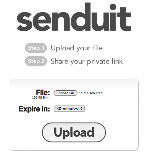
Senduit.com does an effective job of setting expectations without offering an explicit investment breakdown. Granted, it’s an extremely simple application—all it does is provide users with a temporary URL for sharing a file—but the required effort level is communicated by nothing more than two numbered steps that contain a total of seven words.
Spinscape could set expectations by showing a screen shot of a sample mind-map—one that illustrates the value of mind-maps.
Demonstrate that it works well
Of course, because users also need to feel as though an application is trustworthy, it takes a little more than clear expectations to convince them to get moving. While a testimonial is a great way to reassure users, it’s hardly the only way.
Leveraging the idea of social proof, the home page for BasecampHQ.com offers this statement:
Trusted. By. Millions.
This statement encourages the user to believe, at least subconsciously, that if millions of users trust it, then surely some of those people are like the user—in the same situation, with similar needs—and that some of them are bound to be people the user can respect or admire or trust, so it must be a decent application.
Also, by letting users experiment with an application prior to signing up—by providing a method for immediate engagement—they can see for themselves that it works well (assuming, of course, that it does work well). No special design elements required.
Encourage action and enable progress
Hulu’s Watch Now button is a one-click call to action composed of just two words against a faux–3-D button graphic. It couldn’t be simpler. It also couldn’t be more effective.
The call to action most often is a button—or is at least positioned next to a button. In addition to a button’s text label, though, part of what makes this solution enticing are the affordances (attributes of a design that implicitly suggest how it is to be used) a button communicates by way of its faux–3-D appearance. The drop shadow. The gradient that makes it look tactile.
On many start pages—customizable home pages such as My Yahoo—modules can be dragged and dropped to organize the content on the page. On iGoogle, for example, rolling over the title bar of a module results in the display of an icon version of the move cursor, indicating that the module can be dragged. Design details like these are key to showing a user what can be done and how to do it, and affordances are used in the context of start pages to compel a user to begin customizing his page. You can apply this idea to the first steps of application usage in much the same way.
Beyond encouraging the user to take action, however, it’s important to enable him to take productive actions. The act of signing up is a barrier—it’s not part of using an application and it doesn’t lead the user to the results of his efforts. It doesn’t help him see the value of the application. Instead, consider applying the idea of immediate engagement by letting the user use the application before you ask them to hand over personal information.
Associate the user to the user’s actions
You may have noticed that the examples we’ve offered in this section so far are not the kinds of applications the sign-up framework applies to—they are not walled gardens for which a user must register in order to create or use data. This is because, frankly, not every application that currently requires registration actually needs to.
A registration form asks a user to supply his name, email address, and possibly other information to create a unique database entry that intrinsically couples the user to his actions and content. It doesn’t have to be done this way.
Figure 5.13 Drop.io foregoes the need for registration.

Drop.io, another file-sharing application, forgoes the need for registration despite the variety of features it offers that enable users to manage files. To create a storage area for shared files, you simply choose a keyword to use in a custom URL (drop.io/keyword). No email address required. A password can be created if the shared files need to be protected, but it is optional.
And to use TripIt for the first time, you simply forward a travel confirmation email to receive a sample TripIt itinerary. Building on this idea, an application could simply use the email address to auto-create an account for the user so he can effectively sign in later on, and perhaps create a password. An email address is perfect as a unique database identifier, and a password is all that’s needed to protect an account, so an application could limit what it asks for to these two things, and ask people to provide more information over time. Aside from decreasing the initial investment of getting started, this process can gradually reinforce a user’s commitment to the application. (People tend to strongly prefer to stay consistent with their own prior actions, so in theory, the more actions a user takes toward building a profile and establishing a history on a specific site, the more committed to it the user becomes.)
One of the least tapped areas of exploration in application design is that of nonstandard ways to couple users with their actions. Ask yourself, Can we use something other than a form? Do we really need more than a single piece of information to create a database entry for the user? And does the process of coupling a user to his data have to be separate from core-application task flows, or can we present it more organically?
If you can acquire a user’s profile information through actual usage of the application, instead of by sending him through a stand-alone process that has nothing to do with its use (such as a registration form), you reduce the user’s initial investment. As such, the user no longer has to decide to sign up—the user essentially “signs up” the moment he takes action on the site.
On sites where registration is necessary, most of the elements in this framework are essential; you should include, at a minimum, the value proposition, call to action, registration form, and at least one of the other elements.
However, a system designed to create a user account without an explicit registration process can achieve its conversion goals without this last piece of the sign-up framework. Signing up can then become a natural, organic process that results from regular use.
Imagine that.
The web without registration forms.