6. About Us
At this point in web history, few people haven’t heard of Amazon, but suppose for a moment that you are one of them. Or that despite your familiarity with the site, you are interested in learning about how the company got started, what it hopes to achieve in the coming years, or whether or not it’s involved in any charitable activities. To do this, you look for a link labeled About Us, or something similar.
On Amazon.com, you don’t find it.
The site offers financial info, press releases, corporate governance, contact methods, and more, but you’ll have to try hard to find anything at all on the company’s backstory, culture, mission, and so on. In fact, this content does exist, but it’s found on the Careers page, so you may only find it if you’re looking for a job. And, strangely, there is far more information available about Amazon on Wikipedia than there is on Amazon’s own site.
So with no information, will you trust the site? Can you be sure that Amazon is a reputable company and that your order will arrive? Can you trust the company with your credit card information?
It may seem trivial to document something so common and obvious, but the About Us framework shows the value of looking beyond design patterns and exploring interaction design frameworks. While About Us sections are found on most websites, no pattern library we’ve seen has documented it. And there are important questions to be asked:
Just like any other framework, About Us works to achieve specific goals, and its seemingly mundane chunk of content has just as much room for innovation as anything else. Understanding these goals is key to reinventing the way About Us works for your oganization.
Description
About Us doesn’t always literally mean about us—the framework just as easily and commonly applies to individuals as organizations. In fact, About Us can be found in some form on just about every site type there is, from corporate sites to walled-garden web applications, from giant retailers to hobbyist bloggers. If a person has anything at all to say, and puts it online, an About Us section helps visitors learn more and begin to trust the site.
As with all the other frameworks in this book, we’ll start by taking a look at what About Us is and what it does right now, we’ll pull design criteria from it, and then we’ll explore some possibilities for achieving the framework’s goals in different ways.
As we’ve said, About Us is a trust builder. It is not, however, generally used as a primary trust builder—that’s better left to the rest of the site. A retail company’s shopping experience, promptness of delivery, quality of customer service, and follow-up have a far bigger impact on user trust than anything About Us could possibly offer. But it can help establish an initial sense of reliability and competence, and simply let users know there’s an actual company or person behind the site. It makes the inhuman human. To that end, it’s worthy of a second look, and could certainly benefit from some fresh ideas.
Context of use
Users typically read About Us when they want to know more about a site, often during their first few visits. Users turn to it when they want to contact the organization for some reason in person—via phone or by physically visiting the company, whether for customer support, to make recommendations, or simply to ask a question. (This can occur at any point during the life of a user’s relationship with a site.)
Task flow
Users can usually access About Us via the persistent, or global, navigation of a site. It’s frequently found in the header area alongside things such as the Sign In/Out option and My Account link, or perhaps even links to Help, site tour, and features pages. It’s also commonly found in the footer, alongside other persistent links. Well-established brands such as Best Buy and Macy’s, for example, bury their About Us entry points down at the bottom of their page templates.
About Us may span several pages or it may be just a single page that contains only high-level information. Merrill Lynch’s About Us section, for example, includes quite a few pages, covering a range of information from a company overview to quick financial facts.
Figure 6.1 Merrill Lynch includes multiple subsections in its About Us section. As a company for whom trust is extremely important, that’s a smart decision.

Regardless, About Us usually lives within the top-level marketing section of a site’s architecture so that users can quickly access this information when they first enter a site, whether because they’re unfamiliar with the site owner or because they need or want more information about the company or individual.
Users simply click the About Us link (or one with a similar label, such as About or About [Company Name]), wherever it may live, to visit the About Us page or section.
Elements
Following are the elements included in the About Us framework.
The company story
Collectively, the pages of About Us comprise the story behind a company or individual—one that, at least partially, shapes a user’s feeling and perspective about that person or organization.
Many About Us sections start with an overview of a company or a site owner’s biography—something friendly enough for media write-ups, but comprehensive enough to capture, in a nutshell, what makes the person or company worth paying attention to.
Imagine, for example, a scenario in which you want to purchase a digital metronome with a headphone jack and a secondary tone for accented downbeats. A friend tells you about a site that offers one. You’ve never heard of the site or the company behind it, and upon visiting the site for the first time, you discover that it indeed offers exactly what you want, but you wonder how much you can trust the company with your credit card information and whether or not the order and delivery process will meet your needs.
To learn more, you click over to the About Us page. There, you find out that the site belongs to a privately owned retail store in Boston, Massachusetts. According to the company overview, the store opened in 1976, is owned by Chelsea and Brian Craig, carries a variety of musical instruments as well as songbooks, offers musical lessons, and donates to the neighborhood high school’s music program. The page also offers the store’s physical address and a phone number you can call to speak directly to store employees.
From here, you may feel compelled to seek out discussions about the store on Yelp.com or through other means, but being the benefit-of-the-doubt kind of person you are, you decide this description is sufficiently believable and decide to give the store a chance. After all, you need the metronome for class on Monday so you can work with your students on tightening up their sense of rhythm.
Between the store’s background story and the assurances elsewhere on the site that shipments always go out within 24 hours and can be rushed to you for a small additional shipping fee, you’re satisfied enough to carry on. You add the metronome to your cart and complete your purchase.
Imagine, also, a very different situation where the site features no backstory. No address. No phone number. No donations to the high school music program.
What do you do in this second situation to determine the trustworthiness of the site? Perhaps you look it up on Yelp. Perhaps you Google the company name to see if anyone else has discussed the store. Maybe you post a message on Facebook to see if any of your music-teacher friends have bought from the company before.
More likely, you decide all this work just isn’t worth the effort and instead Google the name and model number of the metronome, which you now know because you found it on the first site.
About Us offers a shortcut. Instead of scouring the web for information, we start to trust the company by believing what it has to say about itself. Instead of hunting for second opinions, we let the fact that the store donates to the local high school appeal to our good natures and decide the store must be worth our trust. A well-composed overview can go a long way. The more persuasive the story, the more persuaded we tend to become.
But the company story is not always as simple as a short overview. Through the About Us sections of name-brand sites, for example, we can learn about a company’s business creed, goals, history, and much more, and this can take up far more than a single page.
Even after drilling down into the Our History section of Target.com—one of many sections in the About Target area of the site—it takes several pages just to tell the story of how Target became Target, how it made its mark in the retail world, and how its tradition of community involvement developed.
Figure 6.2 Target’s story includes a customer-oriented mission statement and company history, but also information on how Target gives back to its neighboring communities, innovates the shopping experience, and puts an emphasis on great design.

The About Target section contains subsections about the company’s mission, community outreach, focus on design, stores, culture, efforts to minimize its environmental impact, awards, corporate responsibility, and partners, and each of these sections spans several more pages. The Target story, and the company’s commitment to telling it, is large enough that it spans at least a couple dozen pages of information.
Financial status
Notice also that Target’s About section offers a subsection called Investors, aimed at people who have a stake in the company’s financial stability and future. This section is usually specific to public companies because they are required to make financial information available, but it can also appear on sites for private companies or organizations actively seeking funding.
An example of a public company’s financial section is the Investor Relations section of TimeWarner.com.
Figure 6.3 Note that the links in the main content area of Time Warner’s financial section are exactly the same as the items in the sidebar menu, with simply a line of additional detail.
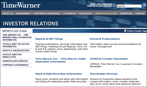
This single screenshot can hardly detail the intricacy and scope of a financial section, but it does offer a glimpse into what types of information might be included. Time Warner’s Investor Relations section, as you can see, offers the subsections Reports and SEC Filings, Stock and Debt Securities Information, Events and Presentations, Shareholders Services, and Corporate Governance.
The decisions behind what does and doesn’t get displayed in the Financial section alone are complicated enough that we considered presenting it as its own framework, but we’ve opted to spare you the gory details. It should be noted, though, that a financial section is another kind of trust builder. People considering buying stock in a company, spending a substantial amount of money on a provided service, or even ordering a digital metronome can use the financial information on a site to determine the trustworthiness of the organization.
When funding the construction of a new building, for example, you have only one shot to get it right, so hiring the right architecture firm and builder is crucial. Potential clients will seek out as much useful information as possible to maximize the odds of success. A section on a firm’s financial status can help quell concerns about its viability and how likely it is to stay in business long enough to finish the project.
In Chapter 7, an example of a niche-specific framework illustrates how to identify frameworks within your own industry or even just within your organization. The financial-status aspect of About Us could easily be one such framework. If you work for a public company, consider exploring the financial section of your company’s site to identify the elements it has in common with other public companies, what things are different and why, and what user-needs these elements serve to meet. By understanding the purpose and benefits of the section, you may be able to imagine more effective ways to communicate the information and do a better job of building trust for stakeholders.
Client list
Service companies, such as consulting companies and vendors, often provide a client list. The client list is not always within About Us—sometimes it is its own section—but we think this information still falls under the About Us framework.
The client list is entirely about trust building. There is no other purpose for displaying this information than to encourage potential clients to trust that you can do, and have already done, good work for reputable companies. These clients can be used as references, testimonials can be displayed as social proof of the quality of a vendor’s work, and a healthy client list can even convince investors of a company’s merits.
Many client lists are simply that—lists of client names. However, a client list’s persuasiveness is far more potent when the list includes links to something that demonstrates the results of the work. For example, a client list for a web design firm that links directly to sites or applications the firm designed is far more persuasive than a simple list of company names. This way, site visitors can take a firsthand look at the firm’s work and judge the quality themselves.
Happy Cog Studios, one of our favorite design firms, offers another great approach, as shown in Figure 6.4: its client list links to write-ups about the projects the company worked on, how the team approached each one, and what their responsibilities were.
Figure 6.4 Happy Cog offers project descriptions so potential clients can gain insight into their work and process.

Team profile
Smaller companies often offer a page of team member and management profiles. This profile, shown in Figure 6.5, also from Happy Cog, begins with a column of annotated head-shots, and extends into individual pages about each of the firm’s team members.
Figure 6.5 A team profile page gives a sense of the human beings behind the products.

Happy Cog’s founder, Jeffrey Zeldman, is a world-renowned expert on web standards, but a potential client who had not already read Designing with Web Standards (his best-selling book on the subject), or had not seen him speak at An Event Apart (which he cofounded with Eric Meyer), or hadn’t even read A List Apart (his must-read e-zine for web designers), wouldn’t necessarily have that information prior to visiting the site. A quick read through Jeffrey’s bio in the About section of Happy Cog’s site offers the visitor a path to start building trust in Jeffrey’s abilities and in the organization as a whole.
These team profiles also help visitors develop a sense of who’s who on the company totem pole by identifying which person holds which title. At User Interface Engineering, Jared is Founding Principal. At Peachpit, Nancy Aldrich-Ruenzel is Vice-President/Publisher. If you’re talking to someone other than Jared or Nancy, About Us reveals that you’re probably talking to someone who can’t sign checks or contracts. But if you’re talking to Peachpit’s Scott Cowlin about marketing, you’re probably in the right place.
Press releases and news
To further build on a company’s story, many sites offer a running list of company-related news stories and press releases within About Us. Press releases serve to keep a site’s audience up to date on events, management changes, and other announcements, while news pages enable a company to proudly spread the word about media coverage.
Figure 6.6 Posting articles from third party sources can reassure prospective customers that the company is reputable and that other customers have had positive experiences.
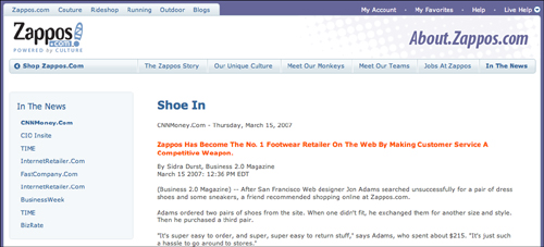
Zappos.com reposts articles that appear in magazines and on news and financial sites. The site has been talked about through many press outlets, including Time, BusinessWeek, Fast Company, and others, and simply reposting the content on the site creates a lasting way for customers and interested visitors not only to learn about the coverage, but also to enhance their trust in the company.
The obvious tendency is to exclude negative press, but as this chapter’s Design Criteria section illustrates, there are ways to deal with negative press that don’t entail ignoring it, such as by engaging in open conversation with customers via social networking sites and other forums. If the press coverage itself does not shed positive light on a company, the company can at least react in a constructive fashion and use the opportunity to address concerns and regain some of the trust that may have been lost as a result.
There is no particularly complicated method to display press releases and news articles—they are typically just offered as a list of linked and dated article titles. Adobe Systems, which, like many big companies, gets far too much press to maintain a complete collection, divides the home page of its Press Room section into categories, including Press Releases, Corporate News, Product News, and Developer and Social Media News Releases. And it only maintains a list of recent articles, offering just enough to help customers build trust and get timely information. There may be no real benefit in offering a complete archive if all a visitor is likely to need is the most recent content.
Jobs
Besides encouraging a visitor’s trust, companies also need to inspire confidence in the minds of potential employees. Job seekers need to know a variety of things about any company they apply to, including what positions are available, what’s required to be considered for those positions, the benefits of employment, and even what the company culture might be like.
If the selection of available jobs is small enough, it can simply be offered as a list of job titles that link off to job descriptions and candidacy requirements. However, a large company with multiple offices, thousands of employees, dozens of products and functions, and a slew of layers on the org chart can’t quite get away with a simple list of open positions. Companies in this league typically have to kick things up a notch and create a whole subsystem designed solely to facilitate job hunting and application processes.
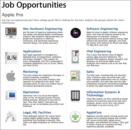
To even list the available positions at Apple, the site’s About Apple section divides jobs into two major types—Apple Pro and Apple Store. Under Apple Pro, designated for people interested in joining corporate teams, positions are then divided into departments, including Sales, Marketing, Operations, Mac Hardware Engineering, Software Engineering, and much more.
From here, you can click through to a category page (see the catalog framework in Chapter Three) about a particular department for a description of its primary functions, see what types of jobs are available within it, and then access a list of current job openings. Of course, once you find a job title that looks relevant, you still need to jump to the content page to read about the position in detail. And if you manage to find a job that looks right for you, only then do you find out what’s involved in the application process.
But the Jobs section hardly ends there.
Figure 6.7 Big companies may need subsections within the jobs subsection. This page from Apple doesn’t even show the complete collection of Jobs categories, only the Apple Pro portion.
While trying to entice job-seekers to explore opportunities, it’s beneficial for a company to highlight the finer points of its corporate culture. Many companies, including Apple, forego this content, possibly to their detriment. Those that do provide it do so in wildly varying ways.
Office Max delivers its glimpse into company culture in the most bland and undramatic way possible—through three paragraphs of text about how the company is focused on people. That’s right—a company claiming a focus on people used mere text to deliver its message, practically guaranteeing that the people it’s so dedicated to are bored stiff as a result of reading about its commitment. It’s hardly inspiring.
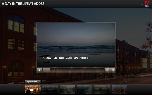
Adobe, however, as one might expect with all its design and multimedia prowess, delivers a rich and engaging microsite about its culture, featuring high-production video vignettes about life at Adobe, the top ten reasons to work there, its community involvement, employee activities, green initiative, and even its core values. (See Figure 6.8.)
Figure 6.8 Adobe uses video to illustrate life at the company.
Top that, Office Max.
So, once again, the Jobs section within About Us could be pulled out and made into a separate framework. But this notion only helps demonstrate how sites and applications comprise a whole collection of anatomical systems, and without each of them, the larger system would fall short, failing to meet the broader goals of the company and its users.
Contact
The final piece of About Us is by far one of the most important. Even Fortune 500 companies that are household names and offer no backstory in their About Us sections need to offer paths to contact the company.
But despite its importance, the contact section requires little explanation. Customers need technical support. Job seekers need directions. Vendors need shipping addresses. Potential customers need sales information. The list goes on. The only difficulty for any organization is deciding which information to offer.
A consultant with a home office will probably not want to list his address for all to see—he should hand over those details only when needed. But a phone number (for a separate business line, of course) can be helpful to people who might need a quick answer and can’t wait for email. A Fortune 500 company, on the other hand, can have multiple offices in multiple cities and a different 800 number for everything from customer service to advertising inquiries.
Adobe‘s contact section, as shown in Figure 6.9, is far less extensive than its area for jobs, but still offers a good representation of the kinds of information to expect from the contact section of a large company.
Figure 6.9 Note the “Select a country or region” drop-down menu at the top of the screen. Adobe has users worldwide and any of them should be able to find an appropriate contact number from the site.
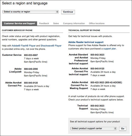
Again spanning multiple pages, the Contact Adobe section offers phone numbers, office locations, paths to inquire about technical support, billing support, and sales information, and even lets users offer general feedback.
Another type of contact information—one usually given a larger and more obvious access point—is the store locator. (Of course, this applies only to retail sites for companies with brick-and-mortar stores.) This may or may not be included in About Us, but even when it is, a button is usually offered in a prominent location, such as the persistent site navigation, specifically for accessing a list of store locations. If it’s a short list, the landing page can be a simple list of stores with their phone numbers, hours, and addresses. When stores are located in multiple geographic areas, users are typically asked to enter a zip code as a filter so the locator can list stores within or near the specific area.
Figure 6.10 Target’s store locator lets you find a store with the department you need. If your closest Target doesn’t include a pharmacy, the locator can find one farther away that does.
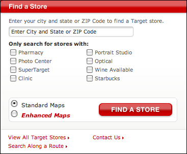
Because Target stores come in a variety of shapes and sizes and don’t always include the same departments, the site’s Find a Store interaction offers optional filters beyond asking for a zip code, so that users may locate only stores with portrait studios, pharmacies, photo centers, and so on.
However, designs that ask for more than a zip code can be deceiving; designers must be sure to communicate exactly what information is needed for the search to be effective.
Gap.com doesn’t actually need the user to enter a complete address to find the nearest store, but it appears that way because its store locator page gives no indication of which fields, if any, are required. It’s unlikely that there are so many Gap stores in a single zip code that the user can’t determine the closest one from the results himself, so asking for an exact address doesn’t necessarily help anything. Removing these fields would simplify the process and speed up the interaction.
Figure 6.11 Gap.com asks for more information than it truly needs, and makes it difficult to tell which information is required.

(As a sidenote, Gap’s store locator is also an interesting example of when instructions go too far. It’s fairly obvious that one must complete the form and click a button to run the search, but there is a numbered list on the left that makes it look like it may be far more complicated. This can make users suspect that the instructions say something important, but since they won’t be any likelier to actually read the instructions, this lengthy bit of text will unnecessarily cause users to doubt themselves and give up.)
The final type of contact method is, of course, the mighty contact form. Many books have covered the ins-and-outs of web forms, so we won’t rehash the topic here. Just know this: whenever a contact form is a feasible option—for contacting customer service, inquiring about sales, disputing a billing issue, and so on—be sure to offer one in addition to phone numbers. It simply makes good business sense to eliminate the cost of phone support as much as possible when web correspondence will do the job. Internet service providers don’t charge more for long-distance email.
Design Criteria
Despite the array of elements that can make up the typical About Us section, the framework only really serves a couple of key purposes. First, it helps users trust an organization, whether a small design firm or a mammoth megacorporation. Second, it facilitates communication so users can call, email, or visit a company; apply for a job without visiting in person; or simply keep up on recent press mentions.
But the limited scope of About Us doesn’t mean there’s no room to do things differently. Indeed, we can achieve the goals of About Us in different ways than are traditionally used, and we can do so more effectively.
There are two primary paths to mixing things up in About Us, and they map directly to the two things we’ve stated are the purposes of the framework.
First, we can explore new and/or better ways to establish brand trust. Second, we can open up communication lines more than they’ve ever been opened before.
Establish brand trust
Whether for a basement blogger or a Fortune 500 company, the important thing for About Us is that it helps users build trust. The company overview, as well as culture, team, press, financial, and client information all serve this purpose. About Us, however, could—and perhaps should—be reserved for delivering information and not used as a trust-builder, because no matter how convincing it might be, it’s still loaded with content provided by the very company it’s supposed to be about, which makes it inherently biased.
Fortunately, About Us is hardly the only way to lay the groundwork for brand trust.
Arguably, the best way to build trust is to deliver great products (or services), because great products generate word-of-mouth campaigns. Word of mouth is the most powerful form of marketing around, because people trust the recommendations of people they see as being like themselves far more than they trust the word of anonymous marketers with pithy metaphors designed to patronize as much as entertain. Customers who tell their friends and coworkers about a great product have far more power than most marketing departments can achieve.
The subject of how to develop a great product is well beyond the scope of this book, but we can say with the utmost confidence that great products are the best tools a company can have.
Imagine for a moment a product that you see as being great. Maybe it’s an iPod or iPhone. Perhaps an appliance with an offbeat design. Or maybe a feature of your car that that you think is particularly nice. Because you like it, it’s more likely that you’ll tell your friends about it, and odds are that your mentions will influence their purchasing decisions later.
To exploit this idea, you need a great product. That’s the hard part. Beyond that, though, you can take your energy off of writing riveting copy for the About Us section and, instead, put it into creating ways for your customers to talk about your products. In other words, instead of trying to build user trust yourself, you can let your customers do it for you.
Many online retailers support ratings, reviews, recommendations, and referrals to do exactly this, but they’re generally tied to products the retailers themselves didn’t create. A company that encourages its customers to rate and review its own products is in an even better position to earn great trust from new and repeat visitors alike (assuming, of course, that the displayed results are unbiased).
Of course, there are other ways to establish trust—in fact, the next design criterion could actually be classified as a subcriterion, because it has the same goal.
Open communication lines
The boilerplate collection of About Us content performs the simple job of letting visitors know whom they’re having a marketing conversation with—who’s inside the company walls, what the organization does, and so on—but in the Web 2.0 era, these sections are missing something that could be important: a list of how the organization connects to and converses with its community, such as through social networking sites.
As the authors of The Cluetrain Manifesto so aptly pointed out many years ago, markets are conversations. As such, sites can, in addition to identifying contact information, start pointing to the places where the conversations really take place—where a company’s biggest fans and worst enemies can talk to a representative of the people listed on About Us. Where the us can talk back.
JetBlue Airways and others, for example, have dedicated team members to man their Twitter updates. Other companies should follow suit.
At Zappos, CEO Tony Hsieh is an avid Twitter user, and reportedly he encourages the staff to post freely about the company’s goings-on while they’re at work. Instead of banning call-center employees from using the web, as many companies do, Zappos encourages its customer-support representatives to talk openly about life at Zappos.
Figure 6.12 The important thing about this page is not the text of the biography, but the link underneath it that says, “Follow Tony Hsieh on Twitter.” Zappos CEO Tony Hsieh communicates directly with his customers every single day.

And while JetBlue doesn’t explicitly list its social networking activity on its site, the company is represented on Twitter, regularly using its feed to point out great fares, respond to customers who post about the airline, and even offer discounts.
Best Buy’s Connect section points customers to blog posts, YouTube videos, and Twitter posts generated by its own employees, whether the content is related to Best Buy or not.
Figure 6.13 Best Buy lets employees throughout the company share blog posts, videos, and tweets with the rest of the world because, as the company says, “they have something interesting to share.”

Another option—and one that’s gaining in popularity—is for a company to create an account with Get Satisfaction (getsatisfaction.com), where customers can post any questions or comments they have. Other readers respond to provide answers or offer their own insights, but the companies themselves can also respond, adding as many employees to their account as they wish to communicate directly with their users.
Yet another possibility is to appoint people to read and respond to blog posts, forum questions, and other social network updates. Not only does this help a company listen more closely to its customers to hear what they want, what they like and don’t like, and so on, it also creates an opportunity to address negative press and complaints. Through this open communication, you can acknowledge dissatisfied customers and give them avenues to resolve their issues. Of course, companies can and should also reply to happy customers—simply thanking the people who like a company or product enough to talk about it can build on the trust they already feel.
There’s no grand trick to figuring out how to establish brand trust. Just put out a good product, be honest, fair, and friendly with your customers, and then give them ways to talk about their experiences, and a way to talk to you.
In the end, it’s not really about us. It’s about them.