1. The Case for Frameworks
In 1998, usability expert Rolf Molich gave nine teams three weeks each to evaluate the webmail application www.hotmail.com. The experiment was part of a series of what he called Comparative Usability Evaluations (CUEs), which he began in an effort to identify a set of standards and best practices for usability tests. In each test, Rolf asked a variety of usability teams to evaluate a single design using the method of their choosing.
From the teams’ documented results of one such test—called CUE-2, as it was the second test in the series—an astonishing trend appeared.
Despite claims that usability professionals operate in a scientific fashion to determine the problems within an interface, usability evaluations are, at best, less than scientific.
In an interview with Christine Perfetti (formerly of Jared’s company, User Interface Engineering, or UIE) about his evaluations, Rolf said this:
In CUE-4 (http://www.dialogdesign.dk/Summary3.htm), run in 2003, a total of seventeen teams were hired to evaluate www.hotelpenn.com, which featured a Flash-based reservation system developed by iHotelier. Of the seventeen teams, nine ran usability tests, and the remaining eight performed expert reviews.
Collectively, the teams reported 340 usability issues. However, only nine of these issues were reported by more than half of the teams. And a total of 205 issues—sixty percent of all the findings reported—were identified only one time. Sixty-one of these issues were identified as “serious” or “critical” problems.
Think about that for a moment.
In order for the Hotmail team to identify all of the “serious” usability issues brought out by the evaluation process, it would have to have hired all nine usability teams. In CUE-4, to spot all sixty-one serious issues, the Hotel Penn team would have to have hired seventeen usability teams. Seventeen!
Asked how development teams could be confident they are addressing the right problems on their websites, Rolf concluded,
Asked if he felt usability testing would play a major role in creating usable websites in the future, Rolf went on to explain,
We think Rolf’s answer was incomplete. First, although usability testing is perhaps no more accurate or reliable than an expert or heuristic evaluation performed by a lone reviewer when it comes to determining whether or not you’re focusing on the most significant problems—the problems whose solutions will reap the biggest benefits for the effort put into solving them—usability testing can and does offer incredibly useful insights about how people interact online, and should still very much be considered an essential tool.
Second, any evaluation or discovery method must be put in context. Page views and time-spent-per-page metrics, while once considered standard measures of site effectiveness, are meaningless until they are considered in context of the goals of the pages being visited. Is a user who visits a series of pages doing so because the task flow is effective, or because he can’t find the content he is seeking? Are users spending a lot of time on a page because they’re engaged, or because they’re stuck? While NYTimes.com surely hopes readers will stay on a page long enough to read an article in full or scan all its headlines, Google’s goal is for users to find what they need and leave a search-results page as quickly as possible. A lengthy time-spent metric on NYTimes.com could be indicative of a high-quality article. On Google.com, it could indicate a team’s utter failure.
Regardless, usability evaluations can’t tell designers how to design well; they can only help identify problems in designs already created. It’s on this point that Rolf’s next statement really resonates:
Huge libraries. Building blocks. Thoroughly tested.
If you’re wondering what Rolf’s story has to do with the book you now hold in your hands, those words contain the answer. This is a book about those building blocks. Not principles. Not concepts. Not code. Building blocks.
The first goal of Web Anatomy: Interaction Design Frameworks That Work is to take a close look at these building blocks—to identify them, take them apart, and diagnose what they do and why they work—so that we, as designers, can start “assembling [them] into full-blown websites” that yield “a high degree of usability.”
But that’s just the first goal. We have several more. Specifically, we hope Web Anatomy will solve three types of problems that seem to reappear during every web project.
First, the task of translating a high-level understanding of an application’s goals into low-level design details can be brutal, like trying to turn a vapor cloud into a brick wall with one hand tied behind your back and the other one lacking a magic wand. Figuring out where to start can be the most difficult step in the entire process, and even when you think you’ve got it all sussed out, it’s hard to know you’re not missing something crucial. How can you be sure you’re truly meeting user needs when you’re busy supporting business goals?
Second is the problem of standards versus innovation. Too often, standard means boring. We can probably all agree that the best part of any design project is devising a solution nobody has previously thought up. These moments are exhilarating—they get the heart pumping and the adrenaline flowing. But on most projects, these moments are few and far between. That’s because even in the most innovative projects, the portion that counts as never-been-tried-before is only maybe twenty percent of the project. The remainder is standard support functionality. This work doesn’t get the heart pumping or the adrenaline flowing—it’s just nose-to-the-grindstone, must-do work that is part of every project. As such, we tend to neglect it.
Somewhere, right now, there’s a team creating a new design that includes some amazing, never-before-seen functionality. But to take advantage of that groundbreaking work, users will need to sign in.
Sign-in functionality isn’t new, it’s not exciting, it’s not very challenging to develop, and teams repeatedly have to design this functionality as if it has never been built before. This makes the tedious work of designing yet another sign-in interaction quite dull, but ignoring this work leaves the team open to big problems. Because it’s not the sexy part of a project, it’s likely to get neglected; this can result in an unusable and frustrating experience for users, and can cost an organization revenue.
On the flip side of this, innovation can be a problem as well. If you’ve been focused on designing usable interfaces for a while, you may have noticed the same thing we have: usability and innovation too often appear mutually exclusive. Cool and usable can make for terrible bedfellows.
Live.com suffered from this problem during its first release, which included the controversial infinite scroll design pattern. The approach was meant to eliminate the problem of forcing users to wait for new pages to load whenever they wished to go beyond the initial result set, instead loading them all into a single page as users moved through them. The reality, however, was quite different. Users, who were entirely unfamiliar with this shift in paradigm, easily became frustrated when they could never seem to reach the end of a results page and quickly dismissed the idea because, frankly, the site didn’t behave like Google. While infinite scrolling may have been cool, it was remarkably confusing for users and therefore completely ineffective. (See Chapter 4 for more details from this story.)
In our desire to make waves in the market, we need to create brilliant interfaces, but we need to do this without sacrificing ease of use, and doing this well can be incredibly difficult. When we break away from standards, we risk designing interfaces that our users simply don’t understand. Frameworks give us a way to standardize the boring support functionality so that we can spend less time reinventing and more time inventing.
Finally, there’s the problem of doing more with less. Web teams are getting smaller—many are half the size they were ten years ago—but organizations are expecting more and more from each team. At the same time, projects are more sophisticated than ever. To save time and energy, teams now have to think about using what’s been done before. As we said, teams constantly have to design sign-in functionality as if it has never been built before. But it has been built before—teams all over the world have built sign-in interaction into their applications a million times—and yet there they are, doing it all over again. All this re-creation and reinvention is remarkably inefficient. To reduce the effort required for that work (and make it possible to spend more time on the fun, exciting innovative parts), teams need designs they can reuse.
Reuse is the new priority.
Reuse Strategy
At the core of the solution to all of the problems we’ve described thus far is that very simple idea. Web teams, more and more every day, need to develop solid reuse strategies.
Reuse strategies divide into three types of libraries: patterns, components, and interaction design frameworks. These libraries can give a team speed and efficiency by letting them leverage the rich history of things implemented before.
We’ve found that teams that build out a reuse strategy see tangible benefits. First, they can quickly kick off their design process by starting with a collection of work that is, at its most basic level anyway, already done and can be quickly pieced together into the beginnings of a working design. These teams are also more likely to complete a design in less time, even with all the nuances and details that make for a great user experience. Next, their designs are more likely to have a high degree of usability and behave consistently across the entire set of functionality despite their having devoted less time on the relatively unexciting support functionality. Finally, the teams iterate more quickly, giving them a chance to play with the design while it’s still malleable.
Patterns, components, and interaction design frameworks each play a different, essential role in a team’s reuse strategy. In the next chapter, we’ll take a close look at each of these library types, but first, a brief introduction.
Patterns: a catalog of desired behaviors
Inspired by the architectural patterns of Christopher Alexander, which he wrote about in the 1977 book A Pattern Language: Towns, Building, Construction (Oxford University Press), design patterns were the first piece of the reuse puzzle. Alexander looked at the specific behaviors of how people lived and worked, and created reusable descriptions of how a building’s architecture could support those behaviors. The pattern didn’t lock architects into cookie-cutter designs, but instead gave them a resource to ensure they got all the details right.
Today’s design patterns are similar. For example, let’s say a user needs to enter a date while booking a reservation. What are the different designs that could support entering a date? A free-form text box with a parser? Three numeric tumblers, representing month, day, and year? A calendar pop-up, where the user just points and clicks?
Each option represents a design response to the same behavior. When the team specifies the response that works best for them (and their users), they can codify it in a pattern. Future teams, needing to respond to that desired behavior, can now respond similarly, meeting established user expectations while leveraging the previous work.
Figure 1.1 A pattern document from the Yahoo Design Pattern Library

Components: taking advantage of reusable code
Beyond patterns, however, developers needed an easy way to reuse specific code.
Once we choose which pattern to use, it’s time to consider its implementation. For a pop-up calendar to work, dates have to appear on the screen. The calendar has to respond to the mouse clicks. It needs to look like it is part of the rest of the application. This is where components come in.
Components specify the design response at the pixel-level. Because they often are represented by their code, components embody specific interaction behavior. They are functioning design solutions complete with styling elements such as fonts, colors, and layout.
Developers use components to piece together the specifics of a design. Once built, they are ready-made elements that can be easily plugged into any new screen. This speeds every part of the development process, from early prototypes to final deployment. In short, a component is a code-complete, modularized, and implementable version of a design pattern.
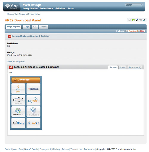
Figure 1.2 Component documentation, as presented on Sun.com
Frameworks: the final puzzle piece
The interaction design framework—the subject of this book—is the newest member of the trinity. Whereas a design pattern is a common solution to a recurring problem, an interaction design framework is a set of design patterns plus other elements and information, used together to guide the design of a complete system or site context.
Like the human body, every web app is made up of a group of anatomical systems that work together to create the larger whole. And each system contains a collection of individual parts, each with its own purpose and function. If we take a close look at the anatomy of successful (and unsuccessful) websites and applications, we can not only identify the elements that are most typically used to meet user needs in a variety of contexts, but also learn quite a bit about human behavior to improve upon these standards and take our designs to the next level without sacrificing usability.
Figure 1.3 A framework document

In other words, if we simply look at what’s already working well, and why, we can give ourselves a solution to both problems: a starting point for the design, and insight into how to create better-stronger-faster interactions that are just as easy to use as the old classics.
For example, in Chapter 4, we describe that a sign-up framework is composed of several design elements all typically used to encourage users to sign up for an application. Each element can, by itself, be considered a design pattern. The elevator pitch, for example (a short statement about the app’s value proposition), is used to quickly and efficiently let people know what a site or an application might offer—but although an elevator pitch answers a question in the user’s mind and therefore solves a problem, it’s not a very meaningful problem. Rather, it’s part of a much larger problem—the problem of how to convince people to sign up for your shiny new web application.
Rather than supply a narrow solution to a narrow problem, a framework handles more complex problems. It offers guidelines for the design of whole contexts.
When a user arrives at a new site and is trying to figure out whether or not to sign up, the sign-up framework makes a clear pitch, answers questions, offers a way to get started, and provides a way to register. No single design pattern can handle all this. It’s the combination of these elements that really solves the problem. Further, no single design pattern can tell us how to meet all these user needs, nor can it tell us why they need to be handled in the first place.
To fill this void, frameworks describe entire subsystems of patterns. A sign-in subsystem needs a pattern where users enter an ID and password. But it also needs a pattern for password recovery, a pattern for setting up the ID initially, a pattern for creating new IDs, and a pattern for changing the password.
Teams identify and document frameworks by looking at other designs and extracting their commonalities. These elements become a checklist for a complete system, helping the team ensure they have all the right patterns to start their design.
Frameworks are at a high level of abstraction. They don’t speak to specific branding or visual design requirements—that’s filled in by components, which are, in turn, based on individual design patterns. Rather, frameworks are the larger anatomical systems that help designers choose which patterns to use in the first place. These anatomical systems, we believe, in conjunction with patterns and components, are Rolf’s building blocks.
Pushing beyond standards
Beyond providing an effective means by which to iterate quickly and produce usable designs, however, frameworks also offer insight into the rationale behind existing standards. Through an anatomical lens, designers can reverse-engineer the logic that led to such design decisions in the first place, and can then use these insights as principles on which to base new, more innovative designs. We’ll talk about this aspect of frameworks and much more in Chapter 2.
Distributing the workload
The benefits of reuse, it should be noted, don’t come for free. Identifying reusable elements takes time and practice, documenting the elements can be time-consuming, and keeping the libraries up-to-date is an ongoing and demanding task.
Turning this into a trinity of patterns, components, and frameworks helps, however, because the work can then be distributed between the designers and the developers.
Because components are close to the final implementation, it’s common that development team members manage this library. Meanwhile, since interaction design frameworks focus on the larger experience, we expect to see design team members take charge here. The pattern library is often a joint venture between design and development.
While small organizations can keep the library up-to-date with minimal effort, larger organizations should expect to need a significant curation effort. Its curators need to encourage team members to identify new elements for the library and perhaps add to it directly, while making sure existing elements are kept current. Since the libraries are a shared resource, the entire team shares the responsibility for the curation. This division of labor prevents any one person from carrying the burden of keeping the libraries useful. It also has the side benefit of keeping the libraries ever-present in the work life of the team members, reminding them of their availability.
Once built out, these libraries can become a powerful resource for design teams. They can inform the design process, speed delivery, and make good design the path of least resistance. The long-term cost savings from a reuse strategy more than compensates for the initial investment of developing one.
Together, these three libraries constitute what we call The Reuse Trinity. In the next chapter, we’ll describe all three in depth and look at their relationship to each other before diving into several major frameworks to shed light on how they came to be.
New answers to old problems
By looking at the web as a collection of anatomical systems and identifying the ones that relate to your own projects, it’s possible not only to jump-start your design process, but also to glean the insights you need to devise cutting-edge solutions that still work well for users, do more with fewer resources, finish projects in less time, and ensure that designs are usable from the very beginning.
Through frameworks, we get clear guidelines based on current standards. We also get a better way to see the possibilities and start putting together superior user experiences. What we don’t get is a list of one-size-fits-all rules.
In other words, interaction design frameworks are just that. Frameworks. They serve as guidelines for the design of systems and contexts. They can be seamlessly strung together into complete solutions. They can (and should) be adapted, stylized, customized. They compose the building blocks of a usable design. But best of all, they can tell us how to evolve.
Questions, answers, and inspiration
As we worked on this book, Robert spoke about interaction design frameworks several times in workshops and conference sessions. During these sessions, Robert took note of the questions audience members and workshop attendees asked, and based on these questions, we progressively altered the content and structure of the book to address these points. Instead of simply delivering a reference book of frameworks, we felt it would be vital to very clearly communicate why they’re important, what comprises them and why, what to consider when using frameworks in your own design projects, how to identify and share frameworks, how to document them, how to fit them into your design process, and how to make full use of their potential for informing innovation.
So in this book, we start by taking a close-up look at patterns, components, and frameworks and how they work together to form a complete reuse strategy. Then we examine several significant frameworks with the goal of revealing their history and effectiveness, as well as teaching you how to dissect the web in this new fashion and glean important insights on how these frameworks became standard and what can be learned from them. Next, we show you how to complete a project using frameworks, highlighting the adjustments you can make to your process to take full advantage of these new resources. Finally, we show you how to identify and start using frameworks within your own organization.
With any luck, by the end of this book we’ll inspire you to start your own huge library of thoroughly tested interface building blocks.