4. Search
Google is arguably the most trusted name in the world when it comes to search tools. In fact, users are frequently put off when an on-site search engine doesn’t look or work like Google, and as a result question whether it can be relied upon for high-quality results. Without knowing exactly what’s so effective about the search master, most people simply trust it. For many, it’s a fact of life—puppies are cute, bugs are icky, and Google just works.
But how did Google get to be so good, and how can we apply lessons from Google to on-site search to generate effective results and commonsense interactions? What elements do we need for a good search engine interface and how do they need to work?
At first glance, the search framework might appear simple. For example, in July 2008, Chiara Fox of Adaptive Path had this to say about one of the framework’s key elements (http://www.adaptivepath.com/blog/2008/07/14/designing-search-checklist/):
Chiara’s list is indeed a good start and should be no surprise. However, while the list of elements to include here is nothing shocking, there’s far more to designing a good search framework than the results page alone, and there’s far more to consider when adapting this framework to your own site than meets the eye. And that’s what the bulk of this chapter is about.
The true challenges of search are in understanding why people search in the first place, how they use the results, what types of results to show, what information to include in them, and how to handle each possible type of search outcome. Once again, the elements of the framework themselves aren’t meaningful until they’re put into the context of the problems they solve.
Description
The search framework lets users locate specific content using a consolidated task flow as an alternative to traversing a site’s hierarchy via its global and local navigation. By searching for items directly, users can frequently bypass the exploration process: instead of looking through category and gallery pages, users simply pull up a set of content links related to a specific query and click straight through to content pages. There’s no need to negotiate the site’s navigation and risk making a wrong choice.
Of course, only in a perfect world with a perfect user is search really that simple. In reality, search brings a whole set of problems of its own, each of which you will need to consider when adapting the search framework to your own designs. To understand these considerations, we must first understand the psychology that makes search necessary.
Context of Use
Web designers often say they spend a great deal of their limited time and resources working to improve their on-site search engines because, they believe, some people always rely on the search engine to reach their target content. They find further support for this assumption from Jakob Nielsen, who, in his book Designing Web Usability (New Riders), asserts that more than half of all users demonstrate “search-dominant” tendencies by going right to the search engine when they first visit a web site looking for content.
If this were true, designers would have their work cut out for them. Devising and producing a site that supports both visitors who prefer using the search engine and those who gravitate toward links presents a substantial challenge. Teams with limited resources find themselves having to support two separate paths to the same content. With perhaps thousands of pages of content, maintaining separate location tools becomes a monumental task.
In 2001, UIE’s researchers put the user search-dominance theory to the test by conducting a study on e-commerce sites.
In the study, thirty users performed 121 different shopping tasks. Each user visited between three and six websites, shopping for items they were interested in purchasing. No two users were interested in exactly the same products.
If the search-dominance theory were true, a subset of these users should have always relied on the search engine to find product information, while others relied on the links. If at least a few users didn’t consistently rely on the search engine, then the idea of search dominance would be in question.
Also, when looking individually at each site in the study, not all the users who visited a particular site should have employed a single strategy; samples of each kind of user behavior should have come up with each site.
To illustrate this point, consider the city or town where you live. Some of its inhabitants are right-handed, some left. In any restaurant in town on a Saturday night, you should expect to find some mix of lefties and righties. It is highly improbable that only right-handers would populate a random restaurant on a random Saturday night. UIE had a similar hypothesis for these web sites: it seemed highly unlikely that only search-dominant users would use a site during a given series of tests. Some of those users were bound to use links more than search.
The data from the study showed that there wasn’t a single user out of thirty who always used the search engine first when looking for product information. While users often suggest that they have a preference for search, none of the users in the study actually were search-dominant. There were, however, some link-dominant users. About twenty percent of the study participants, in fact, chose links exclusively.
But even stranger, on fifty-three percent of the sites tested, each visitor stuck with a single location strategy—the same strategy employed by all the other visitors to that site. On twenty-one percent of the sites, every single user who visited the sites used search exclusively, and on thirty-two percent of the sites, users used only the links on the site. (The remaining forty-seven percent were a mixed bag, with users using both search and links.)
This implies there is something inherent to a site’s design, rather than each user’s hard-and-fast preference, that causes users to choose either the search engine or the links.
In other words, it appears that certain sites are search dominant, not users.
The data also indicated that one of the factors that predicted whether users would initially start with search or with links was the type of product being sold on the site. Certain types of products lend themselves better to being searched. For example, users typically rely on search to find a specific book or CD (more on this later), but tend to use links to find a particular item of clothing. The nature of the content on the site, it seems, can play a huge role in whether it is a search- or link-dominant site.
Users also often gravitated to the search engine when the links on the page failed to satisfy them in some way. Users seemed to use the search engine as a fallback after failing to pick up scent (a sense of the correct path to take to locate information) on the home page. UIE’s study produced more evidence to support this behavior. UIE’s researchers observed many home-page link failures that forced users to rely on the search engine.
Put another way: remember the winnowing step of item-selection that we identified in the catalog framework? Well, search is what gets used either when users can’t sufficiently winnow on their own via catalog navigation or when the items being sought are easily searched for by name.
The lack of evidence to support the user search-dominance theory implies that teams may need to think about concentrating their efforts on a single content-location method. Depending on the specific content on the site, teams might want to focus specifically on either the search engine or the links, not necessarily both. UIE’s testing suggests that focusing the resources on a single approach can dramatically improve the user’s experience.
Regardless, it’s clear that search is primarily used not because some people strictly prefer it or because it’s faster, necessarily, but rather because a site lacks the trigger words a user may be seeking, or because of some other design-related reason. Trigger words are words that match the user’s mental model of what she is seeking—for example, a Lunch Specials link when a user is seeking information on lunch specials.
Plainly and simply: the number one reason people use search systems is to resolve an error condition—the error of being unable to find content via site navigation.
Task Flow
When all the planets in the solar system are properly aligned, the task flow for a search is simple: the user enters a search term into an input field, clicks an accompanying button, often labeled “Search,” and is taken to a results page that lists possible matches to her query. The user clicks the first result, which, naturally, goes to the exact content she wants to find, and is taken to the content page for that item.
In the article “The Power of Defaults” (http://www.useit.com/alertbox/defaults.html), in fact, Jakob Nielsen describes a 2005 study performed at Cornell University in which users clicked the top item in a set of search results forty-two percent of the time, regardless of whether or not it was the best result. Eight percent chose the second result. Even after the researchers switched the top two results, users still chose the top result thirty-four percent of the time. In short, users really want to believe the search engine always offers the correct result first.
So what happens when it doesn’t? Do users click the Back button, read through the rest of the results, and make a second, more appropriate choice, perhaps sifting through several pages of results to find the right one? Hardly.
Rather than go through ten pages of results—or even more than one page—a user is far more likely to modify her search term and run a new search. Only a small percentage of users will continue on to a second page of results, whereas most users, most of the time, will opt to modify the search term.
Clearly, this simple three-step task flow—enter search term, view results, click—is far less reliable than it may appear. We continue this discussion throughout the rest of this chapter.
Elements
The elements of the search framework are few but powerful, and they facilitate the search process from beginning to end for users who find themselves in need of alternative pathways to information when site navigation proves insufficient.
The search framework is comprised of the Quick Search, Search Results, Advanced Search, Filters, and Pagination design patterns. Unlike many patterns, however, these patterns can subdivide into multiple types depending on the purpose and scope of the solutions they address.
Quick Search
Quick Search is frequently nothing more than a simple input field with an adjacent button for submitting search queries, placed on the page where it can be found quickly and easily. But it’s also frequently more complicated, and there are quite a few factors to consider when designing one.
Figure 4.1 Cancer.gov—s Quick Search implementation is representative of the most typical form of the design pattern.
![]()
Most important is to understand why users jump to Quick Search in the first place: this insight should serve as the basis for all subsequent search-related design decisions. As we’ve already discussed, users don’t rely on search simply because they are search-dominant people, but rather because some content lends itself to search very well, or because a site otherwise lacks a user’s trigger words. To put this in context, consider the difference between sites such as Amazon.com and Cancer.gov.
Amazon has one of the best on-site search capabilities on the web. But surprisingly, the reason it works so well is the same reason that search may not work so well on your site.
Amazon’s vast collection of books, CDs, DVDs, and videos make up what we call uniquely-identified content, which users easily search for simply by entering specific information—which they frequently already know. That is, people identify books by title and author, and they identify CDs by artist, title, and song titles. Almost every time a shopper looks for a specific book or a CD on Amazon, she types in one of these identifiers.
For instance, when a book shopper in UIE’s study entered Sum of All Fears, Amazon returned seven different editions of the Tom Clancy book. Amazon didn’t suggest any other books containing the words sum or fear in the title—just seven editions of that single book.
When users search for uniquely-identified content and the users know what those identifiers are, then search works very precisely. In a UIE study conducted with thirty-five online shoppers, the search returned useful results ninety-nine percent of the time for CDs and videos.
But this process of searching for uniquely-identified content is the exception to the rule. In most cases, users are looking for content for which they don’t already know the name. Consider the behaviors most likely put in practice on these four sites:
• Amazon.com contains mostly uniquely-identified content, and users are very likely to know (and therefore search by) a product’s name, or some reasonable facsimile.
• BestBuy.com contains mostly uniquely-identified content, but because electronic equipment often features meaningless model numbers, users are less likely to know or search for these products by their exact names (like Mitsubishi WD-65735) and therefore more likely to search by category or product type (such as hi-def television).
• Gap.com contains some uniquely-identified content, but since clothing items frequently have nonspecific names, users are very likely to search by category or product type, with occasional exceptions.
• Cancer.gov contains mostly non–uniquely identified content, and since it’s unlikely users know the names of articles on the site, users are very likely to search by topic rather than by the name of a piece of content.
On Amazon, you can search for a Harry Potter book by its title, its author, or a variety of other identifiers, but this is only true because Harry Potter–related items have identifiers. In UIE’s study, however, for non–uniquely-identified content such as toys, apparel, or pet supplies, search only worked thirty-one percent of the time. Most web content lacks these memorable identifiers, making it very difficult to produce a decent set of search results. And indeed, this is where Amazon starts to get into trouble. In addition to selling books, the site offers electronics (among a huge variety of other types of products). What terms did users in UIE’s study enter when searching for a DVD player? Well, they didn’t enter Panasonic DVD-RV31K DVD Player (Black) (the product’s actual name). They didn’t even enter Panasonic (the manufacturer). When users sought DVD players, they typed DVD player.
This is typical for non–uniquely-identified content. When looking for a pair of Frye boots, one user typed boots. Another user, looking for colored pencils, entered craft supplies. A user looking for pearl earrings typed not earrings, just the very generic jewelry.
While there are non–e-commerce sites that have uniquely-identified content, they are rare. The United States Patent and Trademark Office (PTO), for example, lets users look up trademarks by attributes such as name, trademark holder, and the attorney of record. Search for James Spool under the attorney of record, for example, and you’ll get a peek into Jared’s father’s work. But the PTO is the exception, not the rule. It is more likely that the majority of content on your site will fall into the non–uniquely-identified category.
And even on sites full of uniquely-identified content, there are exceptions when users want to find something by a means other than using the identifiers. For example, one user who had been listening to Celtic music every morning on the radio wanted to purchase a good introductory CD to the genre. Typing celtic into Amazon’s Search box revealed 889 results, but provided no sense as to which CD would be a good introduction.
In other words, although designers are often incredibly tempted to follow Amazon’s lead, the site you should probably pay the most attention to from the list above is the one that matches the model of most sites: Cancer.gov.
Figure 4.2 Non-uniquely-identified content makes for more complicated search result requirements.

When trying to locate non–uniquely-identified content, site navigation (such as category links) is the way to go. On Cancer.gov, when searching for an article on, say, brain cancer, users will be more satisfied using the site navigation rather than by searching. A user is unlikely to know an article by its name or author when visiting the site for the first time (or even the tenth), and therefore will locate content one page at a time, one link at a time. And this isn’t a bad thing; UIE’s research indicates that, contrary to popular opinion, users don’t mind clicking a few more times as long as they believe each click draws them closer to reaching their intended goal. And increasing the number of pages a user views creates opportunities for businesses to expose that user to more content, including ads.
The caveat, of course, is that this approach only works when a site provides the right trigger words. Users turn to search functionality when they can’t spot their trigger words—when site navigation fails them. In other words, when people use search systems, they’re trying to find links to content they couldn’t find otherwise. They’re trying to create links that aren’t already there.
(For an in-depth look at trigger words and how they affect a user’s ability to locate content, Jared’s report “Designing for the Scent of Information” is available for purchase at http://www.uie.com/reports/scent_of_information.)
You can safely rely on your site’s search system when you meet all three of the following conditions:
1. Your content is uniquely identified.
2. Your users are familiar with the identifiers.
3. Your users want to use those identifiers as the mechanism for locating the content.
To determine whether or not you meet these conditions, look no further than your search logs. If you spot a lot of category names, like jewelry or men’s pants, instead of specific content references, then your content is non–uniquely identified content. If you don’t meet any of these conditions, you’ll need to find another navigation strategy for your users to succeed.
Beyond this strategic view of search, there are also quite a few low-level details to consider, such as a search field’s position on a web page, its constancy throughout the site, field label, button label, and whether or not to offer a category menu or autosuggest functionality. We’re leaving these details, however, to the curators of design pattern libraries. Our intention is not to document these patterns in this book, but rather to offer insight into why they are included in this framework and how they affect a user’s experience with searching on a site.
Search Results
There are just two types of search results pages and four possible outcomes for any given search.
The first type of results page is the Search Gallery, and it’s the one with which you are probably most familiar. It’s simply a gallery, like that in the catalog framework discussed in Chapter 3. The only significant difference is that the collection of results presented on a search gallery page is created entirely on-the-fly based on the user’s search.
Figure 4.3 Gap.com features a search gallery, the first type of search result page.

In other words, the search gallery is a straight results page. The one you expect to see every time you run a search. The one Google uses.
One significant caveat with many search galleries is that they suffer the same problem as standard galleries: in the vast majority of cases, search results all receive the same treatment regardless of which design patterns might be most helpful for specific items. Since images are helpful for many items on Bestbuy.com, such as headphones, images are then used for all of Best Buy’s products, including digital SLRs (single-lens reflex cameras), where images become significantly less helpful.
Regardless, search galleries are by far the most pervasive type of results page. In fact, every search engine we’ve ever seen delivers results in this format, including those that also offer the second type of results page: the search department page.
A search department page is a set of results that closely resembles a category page from the catalog framework. It may look different than the other category pages on a site, but its scope is the same. It presents links to an array of galleries and encourages users to further winnow their options before showing them a specific gallery. The search department page is basically a trick the designers use when a site has results that span too many categories to intelligently organize them in a search gallery page.
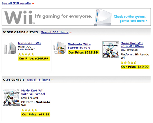
A shopper’s search for Nintendo Wii on Bestbuy.com, for example, could be a daunting challenge for site designers. Does the user want the Wii game system, games that go with the system, accessories, branded clothing, toys, or something else? There’s simply no effective way to guess the user’s desires, and the only way to cull this truckload of possible items into a search gallery is to organize them into labeled sections. Of course, once you do that, you create, essentially, a category page.
Figure 4.4 BestBuy.com offers a search department page to highlight products related to the Nintendo Wii game system.
Search Outcomes
Regardless of the type of results page, there are four possible outcomes for a search.
• Exact or very relevant match. The user is offered results that lead her directly to the content she is seeking. This happens when the user searches with terms that match those used by the site and, specifically, within the content the user is seeking. This is ideal, as it puts the shortest distance between the user and the desired content.
• Related items. The results are related to, but not quite, what the user is seeking. This might occur when the site lacks the exact content the user is seeking or when the user searches using slightly different terms than those that would lead to exact matches.
• Irrelevant results. The user is offered results that are in no way related to the content she is seeking. This happens, of course, when a user searches using terms that don’t match the site’s terms, but it also happens when a search system is ineffective. For example, a search on Men’s Pyjamas that returns every result that contains Men isn’t helpful.
• No results. The search yields no results whatsoever. This occurs either when users search using too many keywords for the site to produce matches, when a user misspells search terms, or when the site simply has no matching, or even relevant, results. Particularly rigid search systems might also show no-results pages when the user simply uses natural language rather than specific tags. No results can be good if no relevant content exists on the site, but if the content is there and the user simply isn’t finding it, it’s a problem.
The first outcome in the above list is by far the best. The other three, however, can lead to disaster because, as it turns out, users really don’t try too hard to succeed with search. In looking at the search patterns of thirty users shopping on e-commerce sites, UIE’s researchers focused on those search attempts where search failed to help the user find a result. Interestingly, forty-seven percent of the users who failed only tried the search engine a single time. Another thirty percent tried twice. Less than twenty-five percent tried more than twice to get the search engine to produce a successful result.
Now, the designers of many of the tested sites went to great lengths to get users to continue searching. They put in encouraging search tips that said things like, “Try a new search using different terms.” However, there was no evidence that these tips encouraged any user to search again. They mostly assumed that the first (or maybe second) try was the best they were going to get. For example, Bed Bath & Beyond’s site encouraged a user who was searching for curtains to “use a generic term like pans or coffee to broaden [her] search and increase the number of items found.” What, exactly, is a generic term for curtains? These results indicate that designers get one, possibly two chances to help users find their content via search. If most of the users don’t find what they want in the first try, it is unlikely they will ever find it.
Incidentally, these results aren’t unique to e-commerce sites. For years, similar results have been seen on intranets, corporate and institutional information sites, and any other type of site with a search capability. The data from UIE’s e-commerce study simply proves what has long been suspected. More and more, UIE’s ongoing research indicates that search has to be perfect. Users expect it to just work the first time. Every time. Most search systems, however, don’t even come close. In fact, the more times the users in this study searched, the less likely they were to find what they wanted. On a single search, users found their content fifty-five percent of the time, whereas users who searched twice found their content only thirty-eight percent of the time. None of the users in the study who searched more than twice ever found their target content. The users (less than 25 percent) who persevered still did not reach a positive outcome.
The number one motivator for revising and running new searches was the “no results” message in response to a query. Most users give up when they see it (although some do try their query a second time).
Here’s what happened in the study:
• On the first search attempt, twenty-three percent of users got a message indicating there were no results.
• Of the users who kept going, forty-four percent got a no-results message on the second attempt.
• If they still persisted, fifty percent got a no-results message on the third attempt.
• One-hundred percent of those who persevered through a fourth attempt got a no-results message.
In theory, as people use a search system, they should get better at making it perform. After all, each successive interaction is an opportunity to learn the idiosyncrasies of the tool. But in UIE’s study, users didn’t seize the opportunity. For users who didn’t succeed up front, things went rapidly downhill.
Encouraging users to continue with helpful hints doesn’t help. As we mentioned before, many sites provide hints on the “no results” pages that try to encourage users to enter different search terms. Unfortunately, the presence of these hints didn’t improve the odds that a user would get better results the next time around.
A telling fact is that the users in the study were asked specifically to go to sites that had the content they were seeking, but one out of every five users landed on a no-results message on their first attempt. This indicates that there is something fundamentally wrong with the design of many search systems.
The key for designers seems to lie in getting users relevant results on the first try. The sites that do are most likely to succeed.
Advanced Search
The most known version of advanced search is likely the one accessed via an Advanced Search link, usually positioned next to a Quick Search field. But this is probably not the most frequently used version. How can this be so?
To begin with, advanced search in its traditional form isn’t as widely used as one might expect. Informal observation has shown us that it’s extremely rare to come across a group that consistently uses advanced search, and outside that group, it’s hardly used at all. In fact, it’s possible that the only people who really care about advanced search are librarians, and perhaps people in similar situations. Librarians have an almost constant need to find very specific information for customers, and this information is often obscure enough that a plain old search just won’t cut it. These searches may involve not only finding obscure information, but also locating the information in specific media types or in certain editions or versions, and being able to verify the reliability of the information. Advanced search can work wonders for cases like these. But most people aren’t in this situation most of the time. For most users, most of the time, advanced search is overkill.
But there is a second type of advanced search that is used quite frequently, and it doesn’t at all appear advanced. We’ll call it Qualified Quick Search.
Qualified Quick Search is a form of Quick Search that requires additional criteria—qualifiers beyond keywords—to be effective. The search requirements on travel sites are a prime example.
For example, to book a flight on Southwest.com, users are asked to choose the departure city, arrival city, departure date, return date, and the number of adults and children who need tickets. The car rental site Hertz.com asks for the city where the car is to be rented, pick-up and drop-off times, and the desired car type. To book a hotel room on Hilton.com, users specify the city and state in which they’ll be staying, check-in date, check-out date, how many guest rooms are needed, and whether or not to expand the search to all Hilton hotels and to a wider geographical area.
Figure 4.5 Hilton asks users for check-in and checkout dates as part of its Qualified Quick Search.
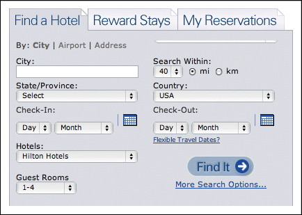
For any of these sites to provide good results, they need to know a lot more information than that the user wishes to “schedule a trip to Atlanta.” They can’t deliver meaningful results until they have an exact collection of details.
Figure 4.6 Cancer.gov points users to a separate search option specifically designed for clinical trial searches.

Cancer.gov offers a variation of this, also with the goal of meeting a specific need. Users looking for clinical trials are unlikely to know how to search for them through the site, so the site designers created a page enabling users to search for clinical trials, which includes a variety of qualifiers. What makes this different than advanced search? Frankly, nothing, save for the choice in wording. Instead of an Advanced Search link, it offers a Search for Clinical Trials link. The problem with advanced search is that users don’t necessarily think they have advanced problems, but rather simpler problems they don’t know how to solve. Simply changing the label can change the user’s level of agreement with the functionality.
Supplying the search form for clinical trials also educates users on the factors distinguishing one trial from another. A trial’s status, phase, treatment type, ID, and sponsor are all things that narrow down the options. But if their only option for doing so were a Quick Search field, would every single user on the site know to enter all of this information? Not a chance. But they may learn from this alternative functionality and apply that knowledge later on.
Amazon and many other sites offer a simpler case. Since typical search terms can fall across a number of categories (such as the search for the Nintendo Wii, whose results span electronics, toys, clothing, and others), these sites often add a drop-down menu to their Quick Search implementations. In doing this, they ask users to qualify their search terms with specific criteria, much in the same way that Southwest asks users to qualify their search with departure and return dates.
This, then, is a version of advanced search, in that it requires qualifiers beyond that of simple keywords. But it’s also quite different from advanced search, because these criteria are usually required rather than optional, and few criteria are needed, whereas advanced search frequently offers a vast array of filtering options. It’s simpler—it asks only that a user better qualify her search before running it. Hence, Qualified Quick Search.
When designing an on-site search system, it’s important to consider whether or not advanced search is necessary. There may be a selection of users who will occasionally benefit from it, but if your site is like most—that is, its primary users are not librarians—you can probably get away with not building an advanced search page. If, however, you need very specific information from every user before you can deliver any sort of meaningful results, Qualified Quick Search may be the perfect solution.
Filters
Filters are another form of advanced search, with two key distinctions.
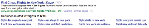
First, filtering options usually appear only after an initial search has been run, with the goal of helping users reduce the options generated by an initial search, while at the same time increasing the accuracy of the results. On the travel-booking site Kayak.com, as shown in Figure 4.7 for example, once a user has specified her initial qualified search criteria, such as her travel dates and destination, Kayak’s search results page offers a sidebar filled with options to further narrow down the choices. This elaborate set of filtering options would be overwhelming if presented on the home page, where the goal is to get the user started as painlessly as possible, but on the results page—in the context of search results, alongside them—this sidebar gives the user the power to see how she might further improve her results, and do so without modifying her search to include all the information the site needs to generate better results.
Figure 4.7 Because they feature a background color used throughout the search results design and don’t stand out, Kayak’s filtering options can be difficult to spot.
Second, filters can be presented in a wide variety of ways. They can be as simple as keyword links that go to subcategories or other content pages; or they can be as elaborate as a collection of sliders, check boxes, and radio buttons that trigger real-time updates. Kayak offers these real-time updates as well. By limiting the airlines and times of day a user prefers to fly, she can easily pare down the results to see only those that perfectly match her criteria. And this happens as soon as the user changes a setting in the sidebar filters: the list of search results auto-updates so she can almost immediately see the effects of the changes rather than wait for the page to reload with a new set of results.
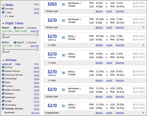
The caveat to using filters is that for users to take advantage of them, they have to first notice them, and this can actually be trickier than it might appear. Kayak users often entirely ignore the sidebar full of filtering options and instead scroll through as many results as it takes for them to find the flights that match their needs. (Because travel-related searches almost always begin with a Qualified Quick Search, and because Qualified Quick Search typically asks for specific information without allowing the entry of free-form search terms, travel booking is one of the few situations in which users persevere through a potentially large number of results without modifying their search criteria.) Of course, going through all those results can be quite time-consuming, but users who don’t notice the filters often appear to think that doing so is their only option. The key, then, is making sure the filters are noticeable. If positioned in a sidebar, for example, filters can be made more noticeable via the use of a background color that stands out against the background of the search results page itself. One site Robert reviewed recently used the same background color in the sidebar as in the page’s header area (orange, when the results area had a white background), and as a result, the company’s usability tests showed that users were not having much success finding and using the filters. (Your results may vary, of course, but as a rule, color contrast is a very good way to draw the eye to a specific page area.) But again, there are many ways to present filters—a sidebar full of filter controls is but one of them. The designers at Orbitz.com made its filters appear as part of the search results themselves.
Figure 4.8 The Orbitz design team integrated filters into the result set.

Along the top of the results area, Orbitz features a matrix showing a selection of airlines offering flights at different price points. As the user hovers her mouse over a square in the matrix, an alternative background color is shown to highlight that square, as well as the column and row headings that indicate the number of stops on the trip and the airline offering the flight. Since the prices themselves are shown, the matrix blends right in with the results themselves, making the filters a seamless part of the search process.
As you can see in Figure 4.9, Google takes an arguably simpler approach: suggested search terms are offered via two rows of links at the bottom of each results page, allowing the users who make it to the bottom of the page to simply click once to run a modified search. That is, if the user actually sees the links. And as we’ve pointed out, the odds aren’t particularly great that a user’s results will improve beyond the first search.
Figure 4.9 Google puts its filtering options directly in context–in line with other results, at the bottom of the page.
Pagination
As part of its status as the gold standard in search, Google has popularized many design patterns, one of which is the pagination pattern. The interface, which offers a series of linked page numbers that are bookended by Previous and Next buttons, enables users to navigate back and forth between a set of search results pages, as well as skip ahead or back several pages at once.
Google may not have been the first site to make use of this particular pattern—it was used by several popular search engines prior to Google’s inception back in 1997—but the all-powerful search site almost certainly made it the most popular version of a pagination interface on the web. Since Google implemented the pattern, it’s been emulated on countless systems, including other major search sites, and even a huge number of catalog sites from news to commerce. Unlike most others, however, Google opted to instill a sense of playfulness into the design by increasing the number of letters (specifically, the letter O) in the name Google according to how many numbered page links are shown on a given results page.
Figure 4.10 Google’s pagination interface, the defacto standard for search systems.
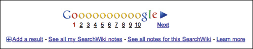
Although this playfulness contributes to the personality of the Google brand, it’s by no means a necessary quality. The important part, from a usability perspective, is that the interface provides a method for getting back and forth within a series of pages. And it does that just perfectly. Showing page numbers sets an expectation that there are more results that can be easily accessed. Offering Previous and Next buttons with adjoining arrow icons gives users a sizable hit area and keeps them from struggling with the much smaller numbered links. Styling the current page number differently communicates to users where they are in the set of results pages.
It’s when designers get crafty with pagination design, in fact, that things start to get messy for users. The prime example of this is the so-called infinite scroll pattern. The idea is simple: rather than distribute results across a series of pages, all results are loaded into a single page. On paper, this makes sense, as it eliminates the need for users to click to access results beyond the initial set and wait for new pages to load. However, infinite scrolling breaks a number of expectations for users and causes quite a bit of confusion (and perhaps even a broken keyboard or two).
Based on informal observations, because users expect to encounter the pagination interface at the bottom of results pages, the lack of one can be an unwelcome surprise. For example, in an informal study, users were asked to find a specific photograph buried deep within a set of results for an image search with an infinite scroll. One user, who was typical of the users in the study, went to great lengths to reach the end of the page. At first, he used the mouse to drag the scrollbar down. When this didn’t work, he moved his mouse to the small arrow control at the bottom of the scrollbar and began clicking repeatedly to see if that helped. When this failed him, he resorted to the down-arrow button on the keyboard. When even this didn’t help, he began pressing the button with more force, apparently believing that the sheer power of his intention would give him the desired result, much in the same way a video game player twists his body in all directions hoping to manipulate a character into moving in the right direction. Eventually, he started mashing down the button with enough force that the sound was audible in a screen recording of the experiment. That poor keyboard took quite a beating that day.
Again, puppies are cute, bugs are icky, and Google just works.
On a more thematic note, the pagination interface is a good example of the limitations of design pattern documentation. On the popular pattern library site Welie.com, the pagination pattern (which the site calls the “paging” pattern) includes a problem description that simply states, “Users need to browse through a large list of items looking for the item that interests them most.” While this statement indeed describes, quite literally, the problem that the pattern solves, it doesn’t say anything truly meaningful about the user’s real problem. It doesn’t reveal how the pattern fits into the larger context of searching—the when, how, and why of search. Here again is why frameworks are a necessary evolution of design patterns. Frameworks put design patterns back into context.
Design Criteria
In part, the design criteria for the search framework are a reaction to the category framework, because search is the fallback option for users when category navigation fails. As we’ve seen, for search to be effective, it must not only work immediately and according to users’ expectations, it must also support the use cases where site navigation simply doesn’t get users to the information they need.
Contrary to many frameworks, however, the design criteria for search are remarkably obvious. The rules are no different than what you should do for almost any site, for any audience.
Offer multiple paths to content
One way to improve search, counterintuitively, is to take the focus away from search by improving navigation throughout the rest of the site. Again, design criteria are the motivators behind a design—rules about what the design is intended to accomplish for users. It is for this reason that “offer multiple paths to content” is a criterion for the search framework. When a site’s content predominantly comprises non–uniquely identified content, the best way for a user to accomplish her goal of finding information is to entirely avoid search and rely instead on pathways through the site’s information architecture.
In practical terms, this means that the very thing that causes users to search in the first place can actually help improve the rest of your site. Remember, people search when the site’s navigation has somehow failed them. By poring over users’ search habits on your site, you can identify ways to tweak the navigation or information architecture to improve their ability to find the content without search. This is not to say you should rely exclusively on site metrics for all your decisions—on the contrary, you should put the site metrics in context by watching users to sort out why they search the way they do—but you can certainly make some changes based on metrics alone. If you can clearly see that lots of people are searching for jeans on your men’s clothing site, it’s likely they are not finding a link to the category in the expected place, alongside other category navigation. If the terms being searched are generic enough to qualify as categories, then primary navigation can be tweaked. If the terms are lower level, such as baby-doll T-shirts, then you can change the navigation within the Women’s Ts category to make these items more findable.
However—and this should go without saying, but it’s a typical enough reaction that it bears mentioning—don’t make changes to your site navigation based on search terms that were entered just a few times. Look for clear and obvious trends. Usually, only the top search terms are candidates for changes to the navigation. When you base site changes on minor actions rather than major trends, you make task completion more difficult for the majority just to enable the edge-cases of the minority. Never sacrifice ease of use for the many based on the actions of the few.
Associate content to user terminology
When organizational words on the site don’t match the user’s trigger words, the user is more likely to search, to identify and try out an alternative method of locating content. However, it would be a nightmare for most sites to try to include every possible trigger word on every page; and in fact, doing so would likely dramatically decrease the site’s usability. So when users do go to search, it’s vital that it work exactly as expected. To this end, it’s important to associate site content with as many different terms—keywords, tags, and so on—as possible so that any search term a user enters will lead to good results. This metadata—information about information, data that describes data—is vital to creating a search system that just works the first time. Every time.
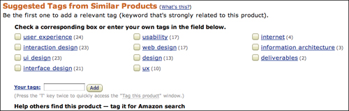
Amazon puts this idea to work by encouraging users to associate products with keywords themselves (Figure 4.11). By allowing users to designate their own keywords for a given product, Amazon not only continually builds its library of associated keywords, it also gives users yet another way to become involved with the site.
Figure 4.11 Taking action increases a user’s commitment to a site, so Amazon puts its users to work while simultaneously building user loyalty.
Make the content easy to identify
Memorable things are findable things.
When searching for a digital camera, it can be quite difficult to remember a name that includes a model number like XJ7220. A camera named the Echo 3, on the other hand, is easier to remember, which then makes it easier to talk about with other people and search for on a site. When content is named using simple terms, it is easier for you to remember it, search for it, and communicate it to others.
You may not have any control over what products are named, but you might influence naming conventions for all sorts of other content on your site. You can create shorter article titles, for example, to make them more memorable. Page titles can be kept short and simple so that users can easily recall them later on. The page title “The Art and Science of Our User Experience Strategy Process” is much less memorable than “Our User Experience Strategy.”
However, it’s important to use the short and long versions of content links at the right times. In a site’s main navigation, short and concise is better. “About Us” is a perfectly appropriate label for global navigation, as it says what the subsequent page is called and what it is likely to contain (information about the organization). Within content, however, and search results pages, it’s generally better to use longer link labels, as they help a user feel confident that the subsequent page will indeed contain the content she expects. For example, the statement “We’ve done several experiments in this area” (with experiments as a link) leaves a sense of ambiguity. Where will the link on experiments lead? Will it be another site? A page listing this organization’s experiments? A page that describes just one of the experiments? The revised statement “We’ve done several experiments in this area, including one in which we tested a cat’s ability to defy gravity” is far more likely to leave the user feeling confident that the link leads to a page about an experiment involving a cat and its attempt to defy gravity.
Again, memorable content is findable content. So, while not every site can emulate Google’s success at just working the first time, every time (though they should most certainly try), most sites can dramatically improve their search systems by putting the framework elements identified in this chapter to work and using search data and usability test results as a guide for improving site navigation.