Chapter 9 Styling Sizes, Borders, and Margins
Understanding the CSS box model is crucial for getting your designs to behave as you want them to. —Craig Campbell
- Understanding the CSS box model
- Setting the width and height of an element
- Adding padding around an element’s content
- Applying a border to an element
- Surrounding an element with a margin
When you learn about design, one of the first concepts that comes up is the principle of proximity: Related items should appear near one another, and unrelated items should be separated. This practice gives the design clear visual organization, which makes it easier for the reader to understand and navigate the design. The principle of proximity applies to your web page designs as well, but there’s a problem. If you stick with the browser’s default styling, your web page elements have no proximity structure; no elements are grouped or separated, so there’s no organization. Fortunately, CSS offers a robust set of properties that enable you to apply the principle of proximity by sizing, spacing, and separating elements on the page. You learn about web page layout in earnest in Part 3, but this chapter introduces you to some vital foundations.
The Anatomy of an Element Box
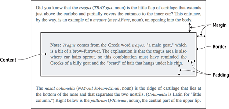
The key to getting your web page content to bend to your will is to understand that every element you add to a page—every <div>, every <p>, every <span>, even every <strong> and every <em>—is surrounded by an invisible box. Why is that such a big deal? Because you can use CSS to control many aspects of that box, including its height, width, spacing, borders, and position on the page. To get there, you need to become acquainted with the various parts of the box.
Figure 9.1 gives you an abstract look at the basic box parts, and Figure 9.2 shows how these same parts affect some actual page content.
Figure 9.1 The main parts of an element box
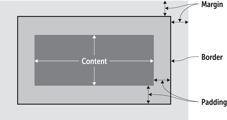
Figure 9.2 The element box parts as they appear with actual page content
At the risk of over-repeating myself: every element in web design is a rectangular box. This was my ah-ha moment that helped me really start to understand CSS-based web design and accomplish the layouts I wanted to accomplish. —Chris Coyier
There are four parts to each element box:
- Content —This area is the inner rectangle of the box, consisting of the content—such as some text or an image—that's contained within the box.
- Padding —This area between the content and the border represents extra whitespace added outside the top, right, bottom, and left edges of the content area.
- Border —This part runs along the outer edges of the padding area and surrounds the content and padding with lines.
- Margin —This area is the outer rectangle of the box, representing extra whitespace added outside of the top, right, bottom, and left borders.
The combination of the content area, padding, border, and margin is known in CSS circles as the box model. Surprisingly, this box model applies not only to the usual block-level suspects (such as <div>, <h1>, and <p>), but also to all inline elements (such as <span>, <em>, and <a>). Why is the box model so important? There are two main reasons: appearance and positioning.
Appearance is crucial because the box model enables you to control the whitespace —the padding and margins—that surround the content. As any designer will tell you, making good use of whitespace is a key part of any successful layout.
Positioning is vital because CSS also gives you quite a bit of control of where the element boxes appear on the page. Rather than the default—and boring —layout of one element stacked on the next all the way down the page, CSS offers box model-related properties that let you shift each box to the position that gives you the layout you prefer.
Keeping all this in mind the best you can, it's time to turn your attention to the useful and powerful CSS properties that enable you to manipulate any element box. First up: changing the box dimensions.
Lesson 9.1: Setting the Width and Height
Covers: The width and height properties
Online: wdpg.io/9-1-0
Web browsers perform a great many automatic calculations when they load a page. Two of those automatic values are the width and the height of each element box on the page, which are set according to the following guidelines:
- The width of each element box is set to the width of the element's container, which by default is the width of the browser window.
- The height of each element box is set to a value that’s tall enough to contain all the element's content.
Remember
I should clarify here that these calculations apply only to block-level elements such as <div> and <p>. Inline elements such as <span> and <a> flow with the text, so width and height are ignored.
Master
If you want to work with an inline element's width, height, and other block-related properties but keep the element inline, add display: inline-block to the element's CSS. To make the element a true block-level element, add display: block, instead.
One of the main tenets of good web design is that you should override these and similar browser defaults so that you have maximal control of the look and layout of your page. To do that with the dimensions of any block-level element box, use the CSS width and height properties. These properties take any of the CSS measurement units you learned about in Chapter 7, including px, em, rem, vw, and vh. You can also set width or height to a percentage or to auto (the default, which allows the browser to set the dimensions automatically).
Beware
You should rarely, if ever, set an element's height property. Setting the height is useful for images, but with text, there are too many variables to know for sure whether everything will fit into the height you specify. Let the content create the element’s height naturally.
At this point, you may be asking yourself an important question. When you set the width or height, which of the element box's four rectangular areas—content, padding, border, or margin—are you sizing? Intuitively, you might guess the border, because that area contains the content and padding, or what feels like the “inside” of the element box. Surprisingly, that's not the case. By default, the width and height properties apply only to the content area. That's most unfortunate, because when you size an element, to get its true size as rendered on the page you must add the values of its padding and border. If that sounds like an unnecessarily complicated way to go about things, you're right. Instead, you can set the box-sizing property to border-box for the element:
element {
    box-sizing: border-box;
}
Master
Rather than apply box-sizing to individual elements, assign it once by using the universal element (*), and it will be applied to every element. Also, if you ever want to return to the default sizing behavior for an element, use the declaration box-sizing: content-box.
This code tells the web browser to apply the width and height values all the way out to (and including) the border of the element box. Note that the margin is not included in the width and height.
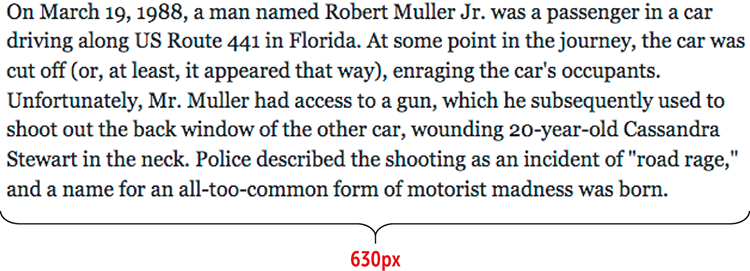
The width property is useful for setting the text line length for optimum reading. For ideal screen reading, your body text blocks should contain between 50 and 80 characters per line (including spaces and punctuation). In most cases, a line length of around 65 characters is optimum, but it’s okay to set a longer line if you’re using a larger font size or a shorter line if you’re using a smaller font size. You set the line length by adjusting the text block’s width property. Consider the text shown in Figure 9.3.
Figure 9.3 In the default width on a large screen, the line lengths of this text are too long for comfortable reading.

Play
If you set the height of an element, you may find that its content overflows its element box. To control this behavior, you can use the overflow property. Online:wdpg.io/9-1-4
With line lengths of well over 150 characters, this text is hard to scan. You can fix that problem by adjusting the width of the text's containing element, as shown in the following example.
Example
Online:wdpg.io/9-1-1
This example reduces the width of the containing div element to make the line lengths easier to read.
Web Page
CSS
div {
    box-sizing: border-box;    ①
    width: 630px;    ②
}
① border-box is applied.
② The width is set for the ideal line length.
HTML
<div>
On March 19, 1988, a man named Robert Muller Jr. was a passenger in a car driving along US Route 441 in Florida. At some point in the journey, the car was cut off (or, at least, it appeared that way), enraging the car's occupants. Unfortunately, Mr. Muller had access to a gun, which he subsequently used to shoot out the back window of the other car, wounding 20-year-old Cassandra Stewart in the neck. Police described the shooting as an incident of "road rage," and a name for an all-too-common form of motorist madness was born.
</div>
Play
You can specify a maximum width for an element by using the max-width property; similarly, you can set the minimum width by using the min-width property. Online:wdpg.io/9-1-3
Lesson 9.2: Adding Padding
Covers: The padding-* properties
Online: wdpg.io/9-2-0
In the element box, the padding is the whitespace added above, below, to the left, and to the right of the content. If you add a border to your element, as described in Lesson 9.3, the padding is the space between your content and the border. The padding gives the element a bit of room to breathe within its box, ensuring that the content isn't crowded by its own border or by nearby elements.
You set the padding by applying a value to each of the four sides:
element{ padding-top:top-value; padding-right:right-value; padding-bottom:bottom-value; padding-left:left-value; }
Each value can take any of the standard CSS measurement units, including px, em, rem, vw, and vh, or you can set the value to a percentage. Here's an example:
.pullquote {
    padding-top: 1em;
    padding-right: 1.5em;
    padding-bottom: .75em;
    padding-left: 1.25em;
}
You can also use a padding shorthand property to set all the padding values with a single declaration. You can use four syntaxes with this property, as shown in Figure 9.4.
Figure 9.4 The syntaxes of the padding shorthand property
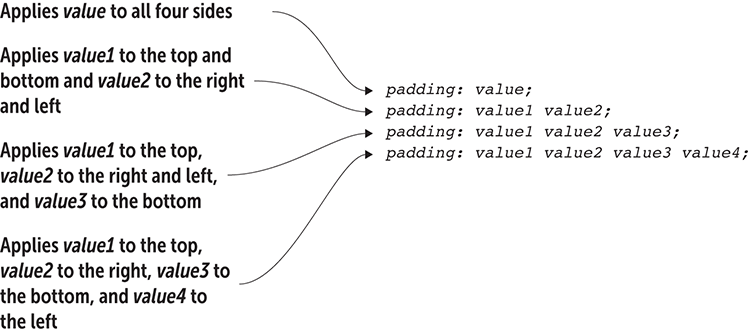
You can duplicate the rule in the preceding example by using the shorthand syntax as follows:
.pullquote {
    padding: 1em 1.5em .75em 1.25em;
}
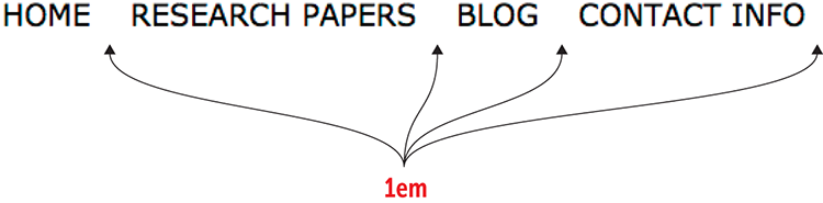
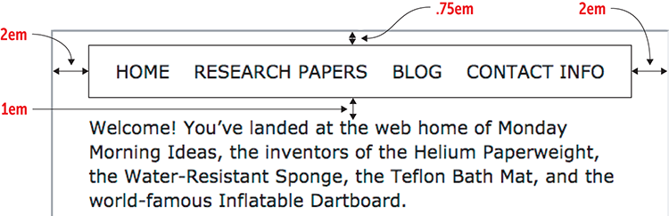
To see how you can use padding to make your web page more readable, consider the simple navigation bar shown in Figure 9.5.
Figure 9.5 A navigation bar without any horizontal padding
Master
This example transforms an unordered list into a navigation menu by doing two things: setting the ul element's list-style-type property to none to hide the bullets, and setting the li element's display property to inline-block, which tells the browser to treat the items as blocks but display them inline.
The big problem is that it's impossible to tell by looking how many navigation items there are. You could have as many as six (Home, Research, Papers, Blog, Contact, and Info) or as few as three (Home, Research Papers Blog, and Contact Info). To fix this problem, you can use padding to add some horizontal breathing room between the items, as shown in the following example.
Horizontal navigation with tight spacing between nav items is a common issue I often encounter on otherwise well-designed sites. Without adequate padding, navigation items begin to run together and become more difficult to quickly scan. —Jeremiah Shoaf
Example
Online:wdpg.io/9-2-1
This example uses the padding-right property to create space between elements in a navigation menu.
Web Page
CSS
ul {
    list-style-type: none;
    text-transform: uppercase;
}

li {
    display: inline-block;
    padding-right: 1em;    ①
}
① padding-right is applied to the li elements.
HTML
<ul>
    <li>Home</li>    ②
    <li>Research Papers</li>    ②
    <li>Blog</li>    ②
    <li>Contact Info</li>    ②
</ul>
② The li elements
See it
To see an animation of how the browser adds the padding in the above example, open the example in the Web Design Playground and click the See It button. Online:wdpg.io/ 9-2-1
Lesson 9.3: Applying a Border
Covers: The border-* properties
Online: wdpg.io/9-3-0
In the element box, the border is the line that defines the outer edge of the padding on four sides: top, right, bottom, and left. In this way, the border comes between the element's padding and its margin. The border is optional, but it's often useful for providing the reader a visual indicator that the enclosed content is separate from any nearby content.
Use It
Add a border to an element to provide a visual indication that the content is self-contained or separate from the surrounding page content.
To create a basic border around an element, use the border property, as shown in Figure 9.6.
Figure 9.6 The syntax of the border property
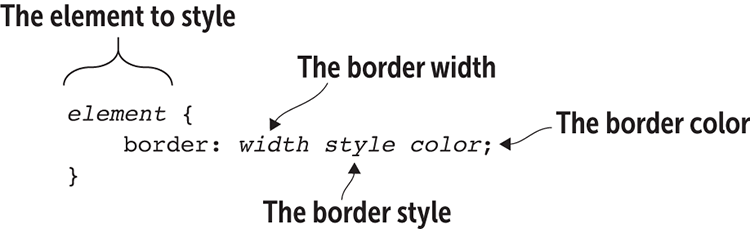
The width value can take any standard CSS measurement unit, including px, em, rem, vw, and vh. You can also set the value to any of the following keywords: thin, medium, or thick. For the style value, you can use any of the following keywords: dotted, dashed, solid, double, groove, ridge, inset, or outset. For the color parameter, you can use any of the color names that you learned about in Chapter 4.
Here's an example:
.pullquote {
    border: 1px solid black;
}
This rule defines the pullquote class with a one-pixel wide, solid, black border.
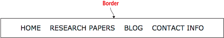
The following example takes the navigation list from Lesson 9.2 and adds a border around it.
Example
Online:wdpg.io/9-3-1
This example adds a border around the navigation menu.
Web Page
CSS
ul {
    border: 1px solid black;    ①
    padding-top: .75em;    ②
    padding-bottom: .75em;    ②
    list-style-type: none;
    text-align: center;    ③
    text-transform: uppercase;
}

li {
    display: inline-block;
    padding-right: 1em;
}
li:first-child {    ④
    padding-left: 1em;    ④
}
① The border
② Padding added to the top and bottom
③ The items are centered.
④ Extra padding on the left
HTML
<ul>
    <li>Home</li>
    <li>Research Papers</li>
    <li>Blog</li>
    <li>Contact Info</li>
</ul>
Use a border when you need to separate content into logical sections if your design requires content to be separate, and without it the design would appear cluttered. —Andrew Stoker
One odd detail may have you furrowing your brow: The li:first-child element gets a padding-left value of 1em. What's going on? Recall from Lesson 9.2's example that you needed to add 1em of padding between the menu items to separate them. You did that by using the padding-right property, but doing so also meant adding 1em of padding to the right of the Contact Info item. To compensate for that extra padding on the right, you need to add an equal amount on the left so the menu centers properly. The li:first-child rule adds the required padding to the first li element.
Play
The CSS box model can be confusing at first because it’s hard to visualize the box that surrounds each element. To help, use the outline property, which adds a line around the outside edge of the box border. The outline property uses the same syntax as the border property. Online:wdpg.io/9-3-3
Lesson 9.4: Controlling the Margins
Covers: The margin-* properties
Online: wdpg.io/9-4-0
In the element box, the margin is the whitespace added above, below, to the left, and to the right of the border. The margin lets you control the space between elements. Positive margin values, for example, keep the page elements from bumping into one another or overlapping, and also keep the elements from brushing up against the edges of the browser viewport. On the other hand, if your design requires elements to overlap, you can achieve this effect by using negative margin values.
You apply the margin by setting a value to one or more of an element’s four sides:
element{ margin-top:top-value; margin-right:right-value; margin-bottom:bottom-value; margin-left:left-value; }
Each margin value can use any of the standard CSS measurement units, such as px, em, rem, vw, and vh. You can also use a percentage or the auto keyword (to have the browser set the margin automatically to fit the available space). Here's an example:
.pullquote {
    margin-top: 1.5em;
    margin-right: 2.5em;
    margin-bottom: 2em;
    margin-left: 3em;
}
Master
Positive margin values serve to push the element away from surrounding elements (or the edges of the browser viewport). Sometimes, however, you'll want to bring elements closer, and you can do that by setting a negative margin value. Online:wdpg.io/9-4-5
Use It
Margins are especially useful for establishing the spacing between your page's text blocks, particularly its paragraphs. A good general rule for spacing each paragraph is to set the bottom margin to 1em.
As with padding, a margin shorthand property lets you apply the margins by using a single declaration. Figure 9.7 shows the four syntaxes you can use with this property.
Figure 9.7 The syntax possibilities of the margin shorthand property

You can rewrite the rule in the preceding example by using the shorthand syntax like so:
.pullquote {
    margin: 1.5em 2.5em 2em 3em;
}
It's important to remember that the web browser sets a default margin for all the elements by using its internal style sheet. That sounds handy, but one of the key principles of web design is to gain maximum control of the look of the page by styling everything yourself. A big step in that direction is adding the following code to the top of your style sheet:
We think of our CSS as modifying the default look of a document—but with a "reset" style sheet, we can make that default look more consistent across browsers, and thus spend less time fighting with browser defaults. —Eric Meyer
html, body, abbr, article, aside, audio, blockquote, button, canvas, code, div, dl, dt, embed, fieldset, figcaption, figure, footer, form, h1, h2, h3, h4, h5, h6, header, iframe, img, input, label, legend, li, nav, object, ol, option, p, pre, q, section, select, table, tbody, td, tfoot, th, thead,  tr, ul, video {
    margin: 0;
    padding: 0;
}
This code gets rid of the browser's default margins and padding on all these elements, enabling you to adjust these settings yourself as needed on your page. If your page is small, you can use the following simplified version:
* {
    margin: 0;
    padding: 0;
}
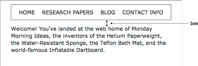
Note, however, that you do need to set your margins. To see why, Figure 9.8 shows the simple navigation bar when the margins have been reset to 0.
Figure 9.8 The navigation bar without any margins
Play
You can also use a margin trick to center a child element vertically within its parent. Online:wdpg.io/9-4-4.
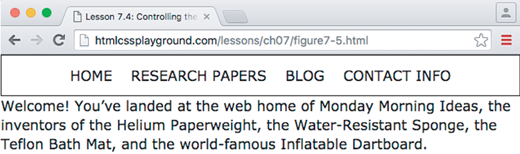
As you can see, the navigation bar is rendered tight to the top, right, and left edges of the browser window, with little room between the bottom of the navigation bar and the text. To fix this problem, you can set the navigation bar's margins to add some welcome whitespace around it, as shown in the following example.
Example
Online:wdpg.io/9-4-1
This example uses the margin properties to create space around the navigation menu.
Web Page
CSS
ul {
    border: 1px solid black;
    margin-top: .75em;    ①
    margin-right: 2em;    ①
    margin-bottom: 1em;   ①
    margin-left: 2em;     ①
    padding-top: .75em;
    padding-bottom: .75em;
    list-style-type: none;
    text-align: center;
    text-transform: uppercase;
}
div {
    margin-right: 2em;    ②
    margin-left: 2em;     ②
}
① Margin properties applied to the ul element
② Margin properties applied to the div element
HTML
<ul>
    <li>Home</li>
    <li>Research Papers</li>
    <li>Blog</li>
    <li>Contact Info</li>
</ul>
<div>
Welcome! You’ve landed at the web home of Monday Morning Ideas, the inventors of the Helium Paperweight, the Water-Resistant Sponge, the Teflon Bath Mat, and the world-famous Inflatable Dartboard.
</div>
Play
If you've set an element's width, you can quickly center the element horizontally by using the declaration margin: top/bottom auto, where top/bottom is the value for both the top and bottom margins. Online:wdpg.io/9-4-3.
Watch Out for Collapsing Margins!
In the preceding example, I added margin-bottom: 1em to the ul element to separate it from the div text. Suppose that I decide that I want 2em of space between these elements, so I adjust the div rule as follows. Figure 9.9 shows the result:
div {
    margin-top: 1em;    ①
    margin-right: 2em;
    margin-left: 2em;
}
① A top margin added to the div element
Figure 9.9 The div text with a 1em top margin added
No, your eyes aren’t deceiving you: The space between the navigation bar and the div text is exactly the same as it was before! What's going on here is a tricky CSS phenomenon known as collapsing margins. When one element's bottom margin meets another element's top margin, the web browser doesn't add the two values, as you might expect. Instead, it determines which of the two margin values is larger, and it uses that value as the vertical margin between the two elements. It throws out the smaller margin value, thus collapsing the two margins into a single value.
Master
If you do want extra vertical space between two elements, you can increase the larger of the two margin values (setting margin-bottom: 2em on the ul element, for example). Alternatively, change the collapsing margin to padding (such as by replacing the margin-top property with padding-top: 1em on the div element).
RemembER
The left and right margins never collapse. Also, margin collapse doesn’t occur for elements that are floated or positioned absolutely (see Chapter 8).
If you ever find that the top or bottom margins of one or more page elements are behaving strangely—that is, are bigger or smaller than you think they should be—there's an excellent chance that collapsing margins are the culprit.
Summary
- The four main parts of a CSS element box are the content, the padding around the content, the border around the padding, and the margin around the border.
- You specify an element's dimensions by setting its
widthandheightproperties. - You add padding around an element's content by using the four padding properties:
padding-top,padding-right,padding-bottom, andpadding-left. Alternatively, use apaddingshortcut property, such aspadding:toprightbottomleft. - The simplified border syntax is
border:widthstylecolor. - You add a margin around an element by using the four margin properties:
margin-top,margin-right,margin-bottom, andmargin-left. Alternatively, use amarginshortcut property, such asmargin:toprightbottomleft.