Chapter 15 Project: Creating a Photo Gallery
People love photos. If you start publishing photos, they will quickly become the most popular part of your site. —Brian Bailey
- Planning and sketching your photo gallery
- Choosing typefaces for your page
- Adding the header and navigation links
- Adding the image thumbnails
- Adding dynamic captions and links to full-size images
Unlike with your first two projects—the personal home page that you built in Chapter 5 and the landing page you built in Chapter 10—you now know enough to create a page that looks like it was designed and coded by a professional. If that seems like a stretch at this point in your web-design journey, this chapter will prove that I'm right. Here, I'll take you through the construction of a full-featured photo gallery, complete with dynamically generated captions, links to full-size versions of each thumbnail, and much more. You'll be leveraging many of the tools and techniques that you've learned so far, including class selectors, the CSS box model, images (of course), and layouts. Let's get to work!
What You’ll Be Building
This project is an online gallery for showing off your photos. The page will consist of at least half a dozen thumbnails, which are reduced-size versions of your images. The idea is that a site visitor should be able to click one of these thumbnails to display the full-size version of the image. Each thumbnail should also display a short caption that describes the image.
On the surface, this project is a simple one. Truthfully, the resulting page will look simple, as well. It will look nice, mind you, but it will project to the visitor an air of simplicity. The fact that the site looks unsophisticated, however, doesn't mean that it's built that way. As you'll soon learn, this page has some rocking technology under the hood, including a flexbox-based layout, viewport-based sizing, and sophisticated positioning techniques.
Getting Your Photos Ready
You should begin this project by getting at least some of your photos ready to use. You'll want to use JPEGs for everything, because they give you smaller file sizes while maintaining good photo quality. You'll also need two versions of each image: a regular-size version and a thumbnail version. In the page layout I use, all the thumbnails need to be the same size. It doesn't matter what size you use, but in my project, I resized all my thumbnails to a 300-pixel width and a 200-pixel height. The full-size versions can be whatever size you want.
Beware
Your full-size images can theoretically be any size, but bear in mind that large photos may weigh in the double-digit megabytes. You don't want to use too much compression on these versions, so keep the size within reason. I used 2048x1365 images in my project.
Master
If you're not sure what size thumbnails you want to use, use a single image for now and repeat it throughout the gallery. When you've settled on the ideal size, you can process the rest of the photos you want to use.
Sketching the Layout
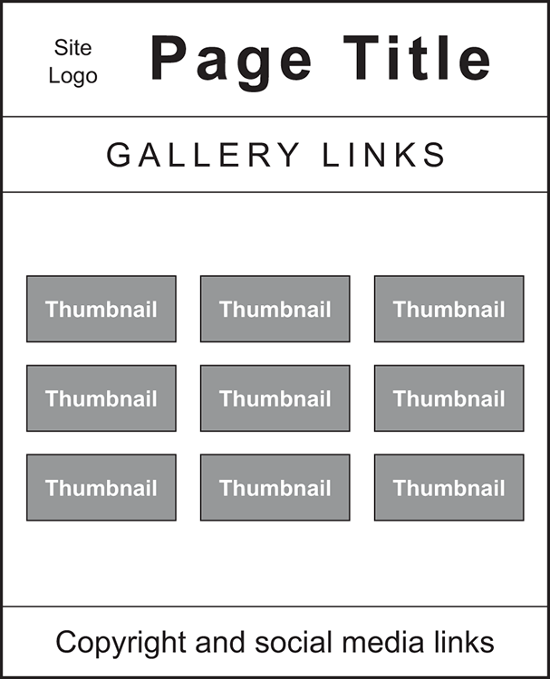
As you’ve seen in the earlier projects (see Chapters 5 and 10), your web projects should begin with a pencil and paper (or whatever variation on that theme you're most comfortable with). You're learning how to design web pages, and any design worthy of the name always begins with a quick sketch to get an overall feel for the page dimensions and components. Quick is the operative word. You don't need to create an artist's rendering of the final page. As shown in Figure 15.1, you need to lay out the main sections of the page and indicate the approximate location, size, and contents of each section.
Figure 15.1 shows the layout of a page with the following four sections:
- A header with a site logo and title
- A navigation area with links to other gallery pages
- The main section of the page containing the image thumbnails
- The page footer with a copyright notice and links to social media sites
With that out of the way, it's time to turn your attention to the typeface or typefaces you want to use for the page.
Figure 15.1 Before diving in to the page's HTML and CSS details, use pencil and paper to get a sense of the overall page layout and content.
Choosing Typefaces
This page has little type, so the choice of a typeface shouldn't take up too much of your time. There are three areas where your choice of typeface will come into play:
- Heading —Something that looks handwritten would be nice. For my project, I'm going to keep things simple and use the default
cursivetypeface. For something that has good coverage on both Windows PCs and Mac, you could go with Brush Script MT. - Navigation and footer —The text here consists mostly of links, so a nice, clean sans-serif font is a good choice. For my project, I'm going with Calibri (installed on most Windows PCs) and Optima (installed on most Macs).
- Thumbnail-image captions —These captions are fairly small, so I recommend a typeface that remains readable even at small sizes. I'll stick with Calibri and Optima for my captions.
In my CSS, I'll use the following declarations to specify these families:
font-family: cursive;
font-family: Optima, Calibri, sans-serif;
Now turn your attention to a color scheme for the photo gallery.
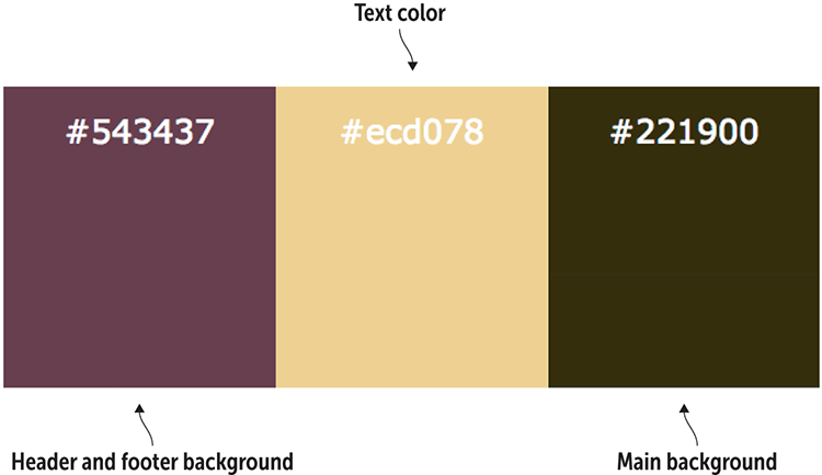
Choosing the Colors
This page is simple, color wise, so you don’t need to build an elaborate color scheme. In fact, in my version of this project, I'm using just three main colors:
- Header and footer background —This design looks balanced when the header and the footer have the same color. Because the main background (discussed next) should be relatively plain to show off the thumbnails, the header and footer background gives you a chance to pick something with a bit of pizzazz to liven up the page.
- Main background —This area takes up the bulk of the page, and it's used to show both the image thumbnails and the navigation links. A color such as black or dark versions of gray, brown, or blue work best for this purpose.
- Text —This color needs to read well in all three sections of the page: header, main, and footer. Assuming these sections are using dark backgrounds, an off-white color such as
#eeewould work fine, as would something along the lines of a not-too-bright yellow.
Figure 15.2 shows the colors I chose for my project.
Figure 15.2 The color scheme for my project
With the page layout sketched and your typefaces and colors chosen, it's time to make things more concrete (virtually speaking) by translating everything into HTML and CSS code.
Building the Page
To build your photo gallery, start with the skeleton code that I introduced you to in Chapter 1. From there, go section by section, adding text, HTML tags, and CSS properties.
The Initial Structure
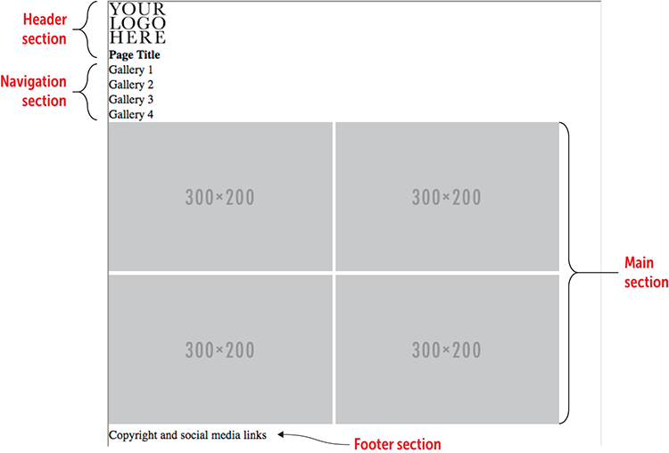
To get things started, take the basic page structure from Chapter 1 and add the gallery layout. I'm going to use the HTML5 semantic elements:
- The page header section uses the
headerelement, and it consists of two items: animgelement for the site logo and anh1element for the site title. - The navigation section uses the
navelement, and it consists of an unordered list of links to other pages of the gallery. - The main section uses the
mainelement, and it consists of severalimgelements, each of which points to a thumbnail version of a photo. - The page footer section uses the
footerelement, and it consists of a copyright notice and links to several social media sites.
Try This
Online:wdpg.io/projects/photo-gallery/01
Here are the elements that make up the photo gallery's initial HTML structure.
Web Page
HTML
<header>    ①
    <img src="/images/your-logo-here.tif" alt="My logo">    ①
    <h1>Page Title</h1>    ①
</header>    ①
    <nav>    ②
    <ul>    ②
        <li>Gallery 1</li>    ②
        <li>Gallery 2</li>    ②
        <li>Gallery 3</li>    ②
        <li>Gallery 4</li>    ②
    </ul>    ②
</nav>    ②
<main>    ③
    <img src="http://placehold.it/300x200" alt="">    ③
    <img src="http://placehold.it/300x200" alt="">    ③
    <img src="http://placehold.it/300x200" alt="">    ③
    <img src="http://placehold.it/300x200" alt="">    ③
</main>    ③
<footer>    ④
    <p>Copyright and social media links</p>    ④
</footer>    ④
① The header section
② The navigation section
③ The main section (the image thumbnails)
④ The footer section
Remember
The initial page layout also includes a CSS reset that sets the margin and padding to 0 and the box sizing to border-box.
The gallery isn't much to look at right now, but you’ll soon fix that problem. You start by setting up the page's overall layout.
The Overall Layout
After spending all that time learning how to use flexbox in Chapter 12, you'll be pleased to hear that you'll be putting that effort to good use here, because this project uses flexbox for all its layout.
Get things rolling by setting up the initial flexbox container. The <body> tag will do nicely for that purpose, and you’ll use it as a single-column container, which gives you a vertical main axis. You want the items aligned with the start of that axis (that is, the top of the page). You also want everything to be centered horizontally, and you want the footer to appear at the bottom of the screen, even when there isn't enough content to fill the rest of the page. The following example shows you how to set everything up.
Try This
Online:wdpg.io/projects/photo-gallery/02
This example shows you how to configure the body element as a flexbox container for the entire page.
CSS
body {
    display: flex;    ①
    flex-direction: column;    ①
    justify-content: flex-start;    ①
    align-items: center;    ①
    min-height: 100vh;    ②
    font-family: Optima, Calibri, sans-serif;    ③
    background-color: #221900;    ③
    color: #ecd078;    ③
}
① Set up the flexbox container.
② Set a minimum height.
③ Apply a font stack and the background and text colors.
Remember
Flexbox now enjoys near-universal browser support, so to keep things simple and uncluttered, the code you see here and on the Playground doesn't include any vendor prefixes. If you need to support old browsers, however, use Autoprefixer (https://autoprefixer.github.io) to generate the prefixes.
The one comment I'll add here concerns the min-height property. By declaring this property to be 100vh, you're telling the browser that the body element is always at least the height of the browser's viewport. Having the body element height greater than or equal to the height of the viewport ensures that the footer section appears at the bottom of the screen, even if there isn't enough content to fill the viewport vertically.
The Header Section
The header section consists of a header element that contains two items: an img element for the site logo and an h1 element for the site title. You also want the header to have the following features:
- Because the header background is different from the page background, the header will look best if it extends across the width of the browser window. To do this, declare
width: 100%on theheaderelement. - The site logo and title should be centered both horizontally and vertically within the header. Configure the
headerelement as a flexbox container with a horizontal main axis and bothjustify-contentandalign-itemsset tocenter.
The following example shows the HTML and CSS that I used to accomplish these goals and to style the rest of the header section.
Try This
Online:wdpg.io/projects/photo-gallery/03
This example styles the photo-gallery header section as a flexbox container that centers the site logo and title horizontally and vertically.
Web Page

CSS
header {
    display: flex;    ①
    justify-content: center;    ①
    align-items: center;    ①
    padding: 1em 0;
    width: 100%;    ②
    background-color: #542437;
}
h1 {    ③
    padding-left: .5em;    ③
    font-family: cursive;    ③
    font-size: 3em;    ③
}
① The header is a flexbox container.
② The header uses the full window width.
③ Styles for the site title
HTML
<header>
    <img src="/images/ampersand-photography.tif" alt="Ampersand Photography logo">
    <h1>Ampersand Photography</h1>
</header>
The Navigation Section
The next area of the page is the navigation section, which consists of several links to other gallery pages. This section uses the nav element and contains an unordered list of links. Here's a list of the goals you want to accomplish for this section:
- The links should be centered both horizontally and vertically within the navigation section. Set up the
navelement as a flexbox container with a horizontal main axis and bothjustify-contentandalign-itemsset tocenter. - The links should appear as a horizontal bulleted list without the bullets. To do this, configure the
ulelement as a flexbox container and set thelist-style-typeproperty tonone.
The following example shows the HTML and CSS that I used to accomplish these goals and to style the rest of the navigation section.
Try This
Online:wdpg.io/projects/photo-gallery/04
This example styles the photo gallery's navigation section as a flexbox container that displays the unordered list items horizontally.
Web Page
CSS
nav {
    display: flex;    ①
    justify-content: center;    ①
    align-items: center;    ①
    width: 100%;
    background-color: inherit;}
nav ul {
    display: flex;    ②
    list-style-type: none;}    ②
nav li {
    padding: 1em 2.5em;    ③
    text-transform: uppercase;}    ③
① The nav is a flexbox container.
② The ul is a flexbox container, and its bullets are hidden.
③ Styles for the li elements
HTML
<nav>
    <ul>
        <li><a href="gallery1.html">Gallery 1</a></li>
        <li><a href="gallery2.html">Gallery 2</a></li>
        <li><a href="gallery3.html">Gallery 3</a></li>
        <li><a href="gallery4.html">Gallery 4</a></li>
    </ul>
</nav>
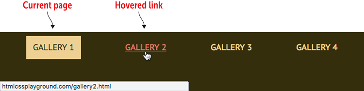
You should see two problems with the navigation links right away:
- The link text is the standard blue that browsers use for links. By default, links don't pick up the parent's text color, so you need to tell the browser to use that color for links. In most cases, the easiest way is to declare
color: inheriton theaelement.
Master
You could declare the page's text color explicitly, but if you decide to change the text color later, you have to make the change in two places: the body element and the a element. When you use inherit, the a element automatically picks up any change you make in the body element's text color.
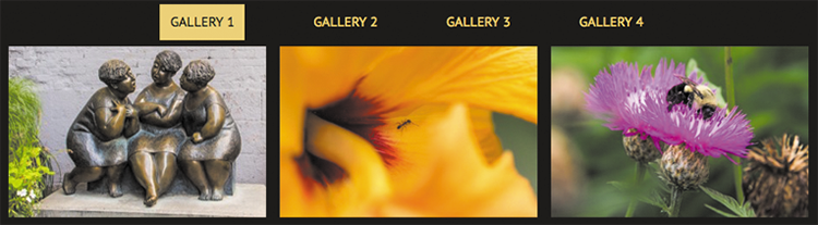
- Nothing indicates which gallery page is currently being displayed. To solve this problem, apply a special style to the navigation text for the current page. I created a class named
current-pageand used it to style the currentlielement with the background and text colors switched.
The following example shows the revised navigation links.
Try This
Online:wdpg.io/projects/photo-gallery/05
This example styles the navigation links to use the body element's text color. It also adds a class named current-page to the current page item to use reverse text.
Web Page
CSS
.current-page {    ①
  padding: .75em;    ①
  background-color: #ecd078;    ①
  color: #221900;    ①
}    ①
a {
  color: inherit;    ②
  text-decoration: none;
}
a:hover {    ③
  color: #d95b43;    ③
  text-decoration: underline;    ③
}
① The current-page class creates a reverse text effect.
② The a element inherits the body text color.
③ Hover styles for the links.
HTML
<nav>
    <ul>
        <li><span class="current-page">Gallery 1</span></li>
        <li><a href="gallery2.html">Gallery 2</a></li>
        <li><a href="gallery3.html">Gallery 3</a></li>
        <li><a href="gallery4.html">Gallery 4</a></li>
    </ul>
</nav>
The Main Section
The real meat of the photo gallery is, of course, the photos themselves. The basic idea of a gallery is to display a thumbnail of an original photo and enable the visitor to view the original. The simplest way is to set up each thumbnail as a link that points to the original, as I've done in the following example. Note, too, that I set up main as a flexbox container that centers the thumbnails horizontally and allows them to wrap.
Try This
Online:wdpg.io/projects/photo-gallery/07
This example sets up the main element as a flexbox container. The flex items are the photo thumbnails, each of which links to its original photo.
Web Page
CSS
main {
    display: flex;    ①
    justify-content: center;    ①
    flex-wrap: wrap;    ①
    max-width: 960px;    ②
    font-family: Optima, Calibri, sans-serif;
}
① The main element is a flexbox container.
② Set the maximum width.
HTML
<main>
    <a href="/images/image01.jpg" target="_blank">    ③
    <img src="/images/image01-thumbnail.jpg" alt="Thumbnail for image 1">
    </a>
    <a href="/images/image02.jpg" target="_blank">    ③
    <img src="/images/image02-thumbnail.jpg" alt="Thumbnail for image 2">
    </a>
    <a href="/images/image03.jpg" target="_blank">    ③
    <img src="/images/image03-thumbnail.jpg" alt="Thumbnail for image 3">
    </a>
    etc.
</main>
③ Open each linked image in a new tab.
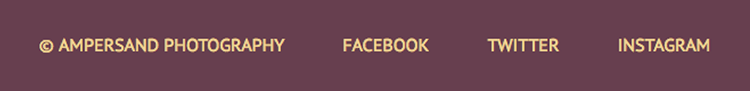
The Footer Section
The final element of the photo gallery page is the footer section, which you’ll use to display a copyright notice and links to social media sites. To align these items horizontally and vertically, configure the footer element as a flex container.
REMEMBER
In this project’s main element, the secondary axis runs vertically, so the declaration align-content: flex-start tells the browser to keep all the thumbnails aligned with the top of the main element.
Note as well that you want the footer element to appear at the bottom of the page, even when the main element doesn't fill the browser window vertically. You need to set the main element's flex-grow property to 1 to force it to fill in the space. That solution creates weird vertical spacing in the thumbnails, however. To fix that problem, add align-content: flex-start to the main element. The following example shows how.
Try This
Online:wdpg.io/projects/photo-gallery/07
This example configures the footer element as a flex container and adds properties to the main element to force it to fill any empty space between the main and footer elements.
Web Page
CSS
main {
    display: flex;
    justify-content: center;
    flex-wrap: wrap;
    align-content: flex-start;    ①
    flex-grow: 1;    ①
    max-width: 960px;
    font-family: Optima, Calibri, sans-serif;
}
footer {
    display: flex;    ②
    justify-content: center;    ②
    align-items: center;    ②
    width: 100%;    ③
    padding: 1em 0;
    text-transform: uppercase;
    background-color: #542437;
}
footer p {
    padding: 0 1.5em;
}
① The main element now fills the space down to the footer.
② The footer element is a flexbox container.
③ The footer uses the full window width.
HTML
<footer>
<p>© Ampersand Photography</p>
<p><a href="#">Facebook</a></p>
<p><a href="#">Twitter</a></p>
<p><a href="#">Instagram</a></p>
</footer>
Beware
When adding a copyright notice, you may be tempted to include the word Copyright and the copyright symbol (©), but using both is redundant. Use one or the other, but not both.
Adding a Few Tricks
As it stands, your photo gallery is a decent page that looks good and works well. That may be all you’re looking for, and if so, you need read no further. If you've been thinking that the gallery is a bit ho-hum and run-of-the-mill, however, the next few sections show you how to add some dynamic and useful features to the gallery.
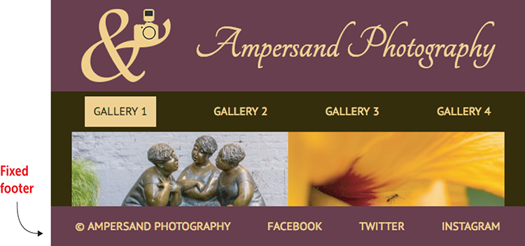
Making the Footer Fixed
Earlier, you set things up so that your footer section displays at the bottom of the screen even if there isn’t enough content in the main section to fill the browser window. When the main element has more content than will fit in the browser window, it pushes the footer down, and the user must scroll to see it. What if you prefer to have your footer always visible?
You can implement the following:
- Set the
footerelement'spositionproperty tofixed. - Set the
footerelement'sbottomproperty to0, which tells the browser to fix the footer to the bottom of the viewport. - Add some padding to the bottom of the
mainelement to ensure that the last of its content isn't obscured by the fixed footer. Set thepadding-bottomvalue to the same value as the height of thefooterelement (3.5em, in this case).
The following example shows the added code that accomplishes all these tasks.
Try This
Online:wdpg.io/projects/photo-gallery/08
This example fixes the footer element to the bottom of the viewport.
Web Page
CSS
main {
    display: flex;
    justify-content: center;
    flex-wrap: wrap;
    align-content: flex-start;
    flex-grow: 1;
    max-width: 960px;
    padding-bottom: 3.5em;    ①
}
footer {
    display: flex;
    justify-content: center;
    align-items: center;
    position: fixed;    ②
    bottom: 0;    ③
    width: 100%;
    text-transform: uppercase;
    background-color: #542437;
}
① Bottom padding on main equals the height of footer.
② The footer is fixed.
③ The footer is positioned at the bottom of the viewport.
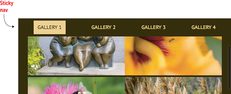
Making the Nav Bar Sticky
You may not be interested in having a fixed footer, but it's a common layout request to have the navigation bar onscreen full time, no matter how far down the user scrolls. In this case, however, you can't use the same technique that you used for the footer in the preceding section. If you fix the nav bar in place, you also have to fix the header; otherwise, you'd end up with some ugly scrolling. But fixing the header is a waste of screen real estate, so you need a different solution.
One possibility is to switch the positions of the header and nav elements. With the latter now at the top of the screen, you could declare position: fixed and top: 0 on the nav element, and add padding-top: 3.5em to the body element.
Play
The full code for the fixed nav element is available on the Playground. Online:
That solution is a nice one, but what if (like me) you prefer the nav element to appear below the header? In that case, you can turn to a relatively new CSS position value called sticky. Combined with a specific top or bottom value, sticky tells the browser to scroll the element normally until it hits the specified position and then stick in place.
To set this feature up for your navigation bar, you need to do the following:
- Set the
navelement'spositionproperty tosticky. - Set the
navelement'stopproperty to0, which tells the browser to stick the nav bar when it's scrolled to the top of the viewport. - Set the
navelement’sz-indexproperty to a positive number (such as 10) to ensure the nav bar always appears on top of the rest of the page elements as they scroll by.
Beware
The sticky value is in the early stages of becoming a full member of CSS. As I write this book, it's supported by the most recent versions of Google Chrome, Mozilla Firefox, Apple Safari (desktop and iOS), Microsoft Edge, and Chrome for Android, but not by Internet Explorer.
Remember
To make an element sticky in desktop and iOS Safari, you need to use position: -webkit-sticky.
The following example shows the code you need to add to make this happen.
Try This
Online:wdpg.io/projects/photo-gallery/10
Web Page
CSS
nav {
    display: flex;
    justify-content: center;
    align-items: center;
    position: sticky;    ①
    top: 0;    ②
    z-index: 10;    ③
    height: 3.5em;
    width: 100%;
    background-color: inherit;
}
① Make the nav sticky.
② Stick when it's scrolled to the top.
③ Ensure that it's always visible.
Adding Dynamic Captions
One thing your photo gallery lacks is captions for the thumbnails. One straightforward way to add captions is to wrap each thumbnail in a div and configure that div as a flex container with flex-direction set to column. Then you could add the caption as, say, a figcaption element, and it will appear below the thumbnail. The following example demonstrates this technique.
Try This
Online:wdpg.io/projects/photo-gallery/11
This example shows one method for adding captions below each thumbnail.
Web Page
CSS
.image-thumbnail {    ①
    display: flex;    ①
    flex-direction: column;    ①
    align-items: center;    ①
}    ①
① A flexbox div wrapper surrounds each image and caption.
HTML
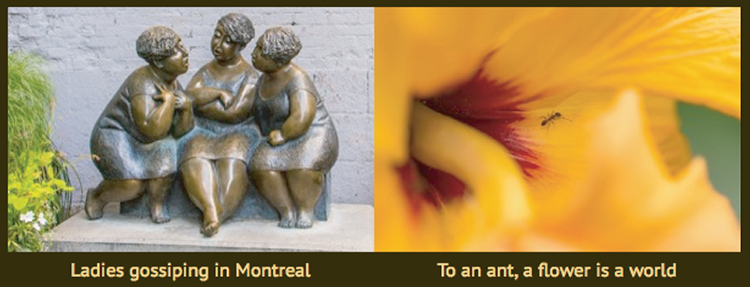
<div class="image-thumbnail">    ①
    <img src="/images/image01-thumbnail.jpg">
    <figure>
        <figcaption>Ladies gossiping in Montreal</figcaption>    ②
    </figure>
</div>
<div class="image-thumbnail">
    <img src="/images/image02-thumbnail.jpg">
    <figure>
        <figcaption>To an ant, a flower is a world</figcaption>    ②
    </figure>
</div>
① A flexbox div wrapper surrounds each image and caption.
② The captions
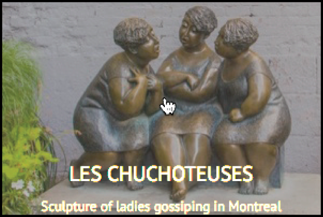
That solution works fine, but I'd like to show you a more advanced technique that comes with a considerable "wow" factor. In this technique, you keep the figcaption wrapper but add the image-caption class and expand it with p elements that you can use for both a caption title and the caption itself:
<div class="image-thumbnail">
    <img src="/images/image01-thumbnail.jpg">
    <figcaption class="image-caption">    ①
        <p class="caption-title">Les Chuchoteuses</p>    ①
        <p class="caption-text">Sculpture of ladies gossiping in Montreal</p>    ①
    </div>    ①
</div>
① The caption title and text is enclosed in this figcaption.
Your goal is to hide the caption and display it only when the user hovers the mouse over the thumbnail. In your CSS, you set up the image-thumbnail class with relative positioning and a width and height equal to the actual width and height of the thumbnail image:
.image-thumbnail {
    position: relative;
    width: 300px;    ①
    height: 200px;    ①
}
① Set these to the same dimensions as the thumbnail.
Now that image-thumbnail is positioned, you’re free to use absolute positioning on the image-caption class. That's important, because you want to style this class with the same width and height as the thumbnail and then position it in the top-left corner (that is, at top: 0 and left: 0) so that when you display it, it covers the thumbnail. Here's the full CSS for this class:
.image-caption {
    display: flex;    ①
    flex-direction: column;    ①
    justify-content: flex-end;    ①
    position: absolute;    ②
    left: 0;    ②
    top: 0;    ②
    width: 300px;    ③
    height: 200px;    ③
    background-color: rgba(32, 32, 32, 0.75);    ④
    color: #ecd078;
    opacity: 0;    ⑤
}
① Caption is a flex container.
② Positioned absolutely at top left
③ Same dimensions as the thumbnail
④ Dark gray, slightly transparent background
⑤ Hidden by default
Notice that you’ve set up a flex container with a vertical main axis and the items aligned with flex-end so that they appear at the bottom of the container. The background color is set to a dark gray that’s slightly transparent, so you’ll still be able to see the thumbnail. Finally, the caption has opacity set to 0, which means that it’s hidden by default.
To show it, add the hover pseudo-class to the image-caption class and use it to set the opacity to 1:
.image-caption:hover {
    opacity: 1;
}
Figure 15.3 shows an example.
Figure 15.3 Hover the mouse over a thumbnail to see the caption.
Play
The full code for this example is available on the Playground. Online:
From Here
The final version of the photo gallery (mine is shown in Figure 15.4) is a great showcase for your photos. (If you want to get your code on the web sooner rather than later, check out Appendix A for the details.)
Figure 15.4 A full-featured photo gallery
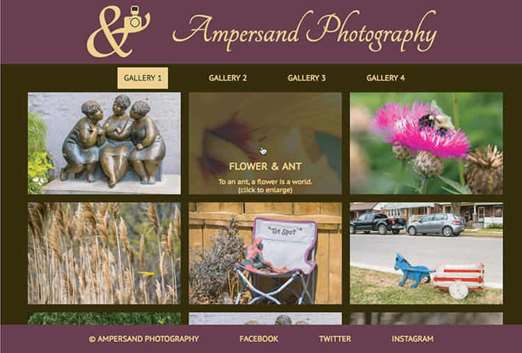
Even though you’ve built a full-featured photo gallery (especially if you added the extra features from the last section), you still have many ways to add to or modify the gallery. You can always add more images, of course, and if you have a ton of photos to show off, you can add more gallery pages. You can also change the colors, try different typefaces and type sizes, and so on.
Summary
- Prepare thumbnail and full-size versions of the photos you want to display.
- Sketch out the photo gallery you want to build.
- Choose the typefaces for the page title and text.
- Choose colors.
- Build the initial page structure: the barebones HTML tags and the global CSS properties applied to the
bodyelement. - Add the flexbox layout.
- Fill in and style each section one by one: header, navigation, main, and footer.
- Optionally add a few tricks such as a fixed footer, a sticky nav bar, and dynamic captions.