Chapter 20 Project: Creating a Portfolio Page
An online portfolio is a great branding tool that every job seeker should have. It is a great way for candidates to differentiate themselves, offer insight into their personalities, and showcase their talents. —Alexandra Janvey
- Planning and sketching your portfolio page
- Choosing typefaces and colors for your page
- Adding the page text and images
- Adding contact information
If you do creative work—illustration, writing, music, fine art, or even web design—you owe it to yourself and your career to put yourself out there and tell the world how talented you are. How do you do that? Social media is the standard way of blowing your own horn these days. That's fine, but when you use someone else's platform to talk yourself up, you're giving up lots of control over how you present yourself. It's always better to control your own message, and the best way to do that is to build your own online presence. For creative types, that online stake in the ground should include a portfolio page that showcases your best or your most recent work.
This chapter takes you through the process of putting together a simple portfolio page. I'll be concentrating on many of the techniques you learned here in Part 4 (such as in-page links, typography, and colors), but by the end, you'll see how to build a sophisticated portfolio page that'll put your best creative foot forward.
What You’ll Be Building
This project is a basic portfolio page, which refers to a page that’s designed to show off some of (or even all) your creative work. It's the online equivalent of a hard-copy portfolio that starving artists have been lugging around from patron to patron and employer to employer for decades. The main idea of a portfolio page is to show off your creative work to people who may want to buy it or may want to hire you to do your creative thing. If your creative work is a hobby, by all means use your portfolio page to show off your side projects to anyone you can persuade to stop by.
Sketching the Layout
You've been through several of this book's projects by now, so you know the drill: Begin by using a pen or pencil to draw the basic layout on a piece of paper. This drawing gives you a kind of blueprint to use when you start throwing around HTML tags and CSS properties.
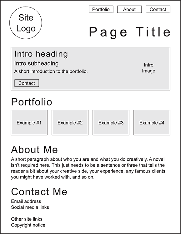
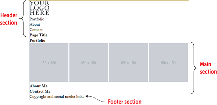
Figure 20.1 shows the example that I'm going to use for my portfolio page. This page is a variation on a layout that's sometimes called five boxes: one large box that serves as your introduction followed by four smaller boxes that you populate with your portfolio images.
Figure 20.1 shows the layout of a page with the following six sections:
- A page header that includes a logo, a page title, and a few links to other page sections
- A short introduction to the portfolio
- The portfolio with four examples of my work
- A section that tells the page visitor about me and my work
- A section that enables the reader to contact me
- A page footer with a copyright notice and links to social media
The first task on your portfolio to-do list is to choose the typeface or typefaces you want to use for your page.
Figure 20.1 Before you start slinging HTML and CSS, draw up a quick sketch of the page layout and content.
Choosing Typefaces
Although the portfolio itself consists of images, your portfolio page contains a decent amount of text, including headings and body text —the large blocks of nonheading text that comprises the bulk of your portfolio's words. Because a good chunk of your audience will be reading your page on the screens of laptops, tablets, and smartphones, it's important to take a bit of time up front to choose typefaces that will be legible and readable on these smaller screens.
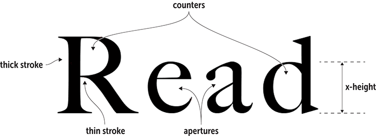
You can visit Google Fonts (https://fonts.google.com), view a typeface, type some text, and then eyeball the result to see how good it looks and how easy it is to read. But if you want to be a bit more methodical, certain criteria are common to typefaces that render well on small screens. Here are four things to look for when you're auditioning type on Google Fonts (or whichever font provider you use), each of which is demonstrated in Figure 20.2:
- Large counters —A counteris the enclosed negative space inside letters such as A, R, d, and g. A large counter enhances character legibility.
- Large apertures —An apertureis the partially enclosed negative space inside letters such as C, S, a, and e. A large aperture also enhances legibility.
- Medium to large x-height —The x-height is the distance from the baseline to the top of lowercase letters such as x and o, or to the top of the bowl in letters that have ascenders (such as d and h) or descenders (such as g and y). A decent x-height (say, half the font size or more) usually leads to large counters and apertures.
- Low to medium stroke contrast —Extremely thin strokes can get lost on a small screen, making text difficult to read. Look for typefaces that have a minimal difference between the thinnest and thickest strokes.
master
Notice that letters such as a and e have both a counter and an aperture, meaning that a larger counter implies a smaller aperture, and vice versa. To ensure these common characters render well onscreen, look for an x-height that’s more than half the font size.
You could build your page with a single typeface, but mixing two typefaces—one for headings and the other for body text—adds dynamism and contrast to the page. My preferred use is a sans-serif typeface for headings and a serif typeface for body text, but I'm going to reverse these preferences for my version of the project. For your own portfolio page, feel free to use two serif or two sans-serif fonts. The only criterion to look for is that the two typefaces work in harmony, which means that they have similar legibility characteristics: counters, apertures, x-height, and stroke contrast. Finally, make sure that each typeface you choose comes with the fonts you require, which at minimum usually means regular, italic, and bold fonts.
Figure 20.2 When deciding on a typeface that will render well even on small displays, look for larger counters and apertures, good x-height, and low stroke contrast.
Google Fonts offers hundreds of typefaces and dozens that work well on even the smallest screens. How do you choose? It's certainly fun to play around on the site, but if you prefer a starting point, Table 20.1 lists a half-dozen body and heading typeface pairings that work well (and an alternative sans-serif font for headings).
Table 20.1 Recommended Google Fonts Pairings for Headings and Body Text
| Headings | Body | Body (Alternative) |
| Playfair Display | Open Sans | Raleway |
| Merriweather | Fira Sans | Merriweather Sans |
| Source Serif Pro | Source Sans Pro | Lato |
| Domine | Roboto | Open Sans |
| Lora | Varela Round | Lato |
| Roboto Slab | Roboto | Raleway |
For this project's headings, I'm going to use one of my favorite text typefaces: Playfair Display. This is a gorgeous font that offers nice big counters and a generous x-height. It has a high stroke contrast, but that shouldn’t be much of a problem for the larger heading sizes I’ll be using. Playfair Display comes in six fonts, so it has a style for every occasion. For the body text, I'm going to use Open Sans, one of the most popular sans serifs on the web. It's a sturdy typeface that features large counters and x-height, as well as minimal stroke contrast. A less-popular but still excellent alternative is Merriweather Sans, the sans-serif companion to Merriweather.
To use Google Fonts to link to Playfair Display’s bold and bold italic fonts, and to Open Sans’ regular, italic, and bold fonts, I'll use the following <link> tag:
<link href="https://fonts.googleapis.com/css?family=Playfair+Display:700,700i|Open+Sans:400,400i,700" rel="stylesheet">
In my CSS, I'll use the following declarations to specify these families:
font-family: "Playfair Display", Georgia, serif;
font-family: "Open Sans", Verdana, sans-serif;
Remember
Although it's unlikely that Google would fail to deliver your linked fonts, there could be a lag before the fonts show up. To ensure the browser doesn't display the default serif or sans-serif while it waits, add a system font to your stack. Georgia (for serifs) and Verdana (for sans serifs) are installed on almost all new computers.
With the page layout in place and your typefaces chosen, your next job is to pick out a color scheme.
Choosing a Color Scheme
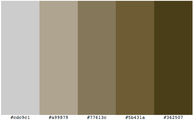
The colors you choose depend on the type of portfolio you're highlighting and the overall image you want to project. The example I'm going to use is for a book restoration and repair service (which is, alas, hypothetical). I want to use colors that exude warmth (because people who love old books enough to want them restored tend to be warm, gentle folk) and security (because those same people don't want to give their precious books to just anyone). Rich brown colors can set both emotional tones quite effectively. Using the Web Design Playground’s Color Scheme Calculator (see wdpg.io/colorcalc), I chose a monochrome color scheme based on the color value #77613c, as shown in Figure 20.3.
Figure 20.3 A monochrome color scheme based on the hex color value #77613c
With the page layout in place and your typefaces and colors chosen, it's time to translate this rough sketch into precise HTML and CSS code.
Building the Page
To build out your portfolio page, start with the skeleton code that I introduced you to in Chapter 2. From there, go section by section, adding text, tags, and properties.
The Initial Structure
To start, take the basic page structure from Chapter 2 and add the portfolio layout, using the HTML5 semantic page layout tags:
- The page header section uses the
headerelement, and it consists of three items: animgelement for the site logo, a navigation area that uses thenavelement and consists of an unordered list of links to other items on the page, and anh1element for the page title. - The main section uses the
mainelement, and it consists of severalsectionelements, each of which is a container for a different section of the page. - The page footer section uses the
footerelement, and it consists of a copyright notice and links to several social media sites.
Try This
Online:wdpg.io/projects/portfolio-page/01
Here are the elements that make up the portfolio page's initial HTML structure.
Web Page
HTML
<header>    ①
    <img src="/images/your-logo-here.tif" alt="My logo">    ①
    <nav>    ①
        <ul>    ①
            <li>Portfolio</li>    ①
            <li>About</li>    ①
            <li>Contact</li>    ①
        </ul>    ①
    <h1>Page Title</h1>    ①
    </nav>    ①
</header>    ①
<main>>    ②
    <section>>    ②
        <h1>Portfolio</h1>>    ②
        <img src="http://placehold.it/150x150" alt="">>    ②
        <img src="http://placehold.it/150x150" alt="">>    ②
        <img src="http://placehold.it/150x150" alt="">>    ②
        <img src="http://placehold.it/150x150" alt="">>    ②
    </section>>    ②
    <section>>    ②
        <h1>About Me</h1>>    ②
    </section>>    ②
    <section>>    ②
        <h1>Contact Me</h1>>    ②
    </section>>    ②
</main>    ②
<footer>    ③
    <p>Copyright and social media links</p>    ③
</footer>    ③
① The header section
② The main section
③ The footer section
Remember
The initial page layout also includes a CSS reset that, among other tasks, sets the margin and padding to 0 and the font size to 100%.
The portfolio page is about as bare-bones as pages come right now, but it won't stay that way for long. I’ll turn now to structuring the page's overall layout.
The Overall Layout
As you might imagine, putting together a layout nicknamed five boxes simply cries out for a flexbox-based structure, and that's what you’ll add here. You want the content to be centered in the middle of the browser window. To accomplish this task, use two main flexbox containers for the overall structure:
- The initial flexbox container will be the
bodyelement. By configuring this element withflex-direction: rowandjustify-content: center, you create a single-row container in which all content gets centered horizontally. - For the content itself, nest a
divelement inside thebodyelement. Thatdivis a flexbox container withflex-direction: columnandjustify-content: flex-start, which gives you a single-column container with the content aligned with the top of the container.
The following example shows you how to set everything up.
Try This
Online:wdpg.io/projects/portfolio-page/02
This example shows you how to configure the body element and a nested div as flexbox containers for the entire page.
CSS
body {
    display: flex;    ①
    flex-direction: row;    ①
    justify-content: center;    ①
    min-height: 100vh;
    margin-top: 1rem;
    font-family: "Open Sans", Verdana, sans-serif; >    ②
    background-color: #cdc9c1; >    ②
    background-image: radial-gradient(circle farthest-side at center top, hsl(0, 0%, 100%) 0%, #cdc9c1 100%);>    ②
    color: #362507;    ②
}
.container {
    display: flex;    ③
    flex-direction: column;    ③
    justify-content: flex-start;    ③
    max-width: 60rem;    ④
}
① Set up the main flexbox container.
② Apply a font stack and the background and text colors.
③ Set up the nested flexbox container for the content.
④ Set a maximum width for the content.
HTML
<body>
    <div class="container">
    </div>
</body>
Remember
Flexbox now enjoys near-universal browser support, so to keep things simple and uncluttered, the code you see here and on the Playground doesn't include any vendor prefixes. If you need to support old browsers, use Autoprefixer (https://autoprefixer.github.io) to generate the prefixes.
The Header Section
The header section consists of a header element that contains three items: an img element for the page logo, a nav element for the navigation links, and an h1 element for the page title. I also want the header to have the following features:
- The page logo should be aligned with the left side of the content container, and the navigation and title should be aligned with the right side of the content container.
- All the header content should be centered vertically within the header.
The easiest method is to use flexbox, so configure the header element as a flexbox container with a horizontal main axis and align-items set to center. For horizontal alignments, separate the header into left and right sections by using div elements.
The following example shows the HTML and CSS that I used to accomplish these goals and to style the rest of the header layout.
Try This
Online:wdpg.io/projects/portfolio-page/03
This example adds the HTML code for the header and the CSS for the header structure.
Web Page

CSS
header {
    display: flex;    ①
    justify-content: center;    ①
    align-items: center;    ①
    padding: .5rem 0;
    width: 100%;
}
.header-left {
    flex: 1 0 33%;    ②
    text-align: left;
}
.header-right {
    flex: 2 0 67%;    ②
    display: flex;    ③
    flex-wrap: wrap;    ③
    justify-content: flex-end;    ③
}
① The header is a flexbox container.
② The left header gets one-third of the width; the right gets two-thirds.
③ The right header is a flexbox container.
HTML
<header>
    <div class="header-left">    ④
        <img src="/images/portfolio-logo.tif"    ④
alt="This Old Book logo">    ④
    </div>    ④
    <div class="header-right">    ⑤
        <nav>    ⑤
            <ul>    ⑤
                <li><a href="#portfolio" class="btn">Portfolio</a></li>  ⑤
                <li><a href="#about" class="btn">About</a></li>    ⑤
                <li><a href="#contact" class="btn">Contact</a></li>    ⑤
            </ul>    ⑤
        </nav>    ⑤
        <h1>This Old Book</h1>    ⑤
    </div>    ⑤
</header>
④ The left side of the header
⑤ The right side of the header
With the header structure set up, you can tend to the styling of the header elements. The logo is fine as is, but you need to turn the navigation links into proper buttons and to style the page title. The following example shows the HTML and CSS that I used.
Try This
Online:wdpg.io/projects/portfolio-page/04
This example styles the header elements.
Web Page

CSS
h1 {    ①
    padding-top: 1rem;    ①
}    ①
.btn {    ②
    background-color: #362507;    ②
    padding: .25rem .75rem;    ②
    border-radius: .75rem;    ②
    font-size: 1rem;    ②
    color: #cdc9c1;    ②
    text-transform: uppercase;    ②
}    ②
nav ul {    ③
    display: flex;    ③
    list-style-type: none;    ③
}    ③
nav li {    ③
    padding-left: 1rem;    ③
}    ③
a {    ④
    text-decoration: none;    ④
}    ④
a:hover {    ④
    color: #362507;    ④
    background-color: #cdc9c1;    ④
}    ④
h1 {    ⑤
    font-size: 4rem;    ⑤
    font-weight: bold;    ⑤
    font-family: "Playfair Display", Georgia, serif;    ⑤
}    ⑤
① The h1 element is given some padding.
② This class turns the navigation items into proper buttons.
③ This CSS styles the list of navigation items.
④ This CSS styles the links (regular and hover).
⑤ This CSS styles the page title.
Of special note here is the btn class, which you saw earlier applied to the <a> tags in the nav section. Each a element is a bulleted-list item, and the purpose of the btn class is to turn the content of each li element (the link text) into a proper button. Here’s what the btn class does:
- It adds a background color.
- It adds padding around the text.
- It uses the
border-radiusproperty to round the corners. - It sets the font size and color, and converts the text to uppercase.
Master
The border-radius property rounds the corners of an element. You can specify a measurement value (the higher the value, the more the corners are rounded), or you can enter a percentage (a value of 50% rounds the borders into a circle, for example).
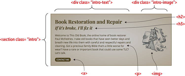
The Portfolio Introduction
The portfolio introduction serves to bring the reader into your page by offering a quick overview of what you do creatively. It should have a title and perhaps a subtitle, a short paragraph, and another link to your contact section.
In the following example, I've styled my page introduction with dark brown text (#362507), an h2 title, an h3 subtitle, a clickable button, and a related image for visual interest. To keep everything nice and neat, I set up the introduction (using a class named intro) as a flexbox container.
Try This
Online:wdpg.io/projects/portfolio-page/05
This example adds the introduction to the portfolio page.
Web Page
CSS
.intro {    ①
    display: flex;    ①
    align-items: center;    ①
    margin: 2rem 0;    ①
    width: 100%;    ①
    border: 3px solid #77613c;    ①
    color: #362507;    ①
    font-size: 1.25rem;    ①
    background-color: #a99879;    ①
    background-image: radial-gradient(ellipse closest-corner at center,    ①
#cdc9c1 0%, #a99879 100%);    ①
}    ①
.intro-text {    ②
    flex: 2 0 67%;    ②
    padding: 2rem 0 2rem 2rem;    ②
}    ②
.intro-text p {    ②
    margin: 1.5rem 0;    ②
}    ②
.intro-image {    ③
    flex: 1 0 33%;    ③
    padding-right: 2rem;    ③
    text-align: right;    ③
}    ③
h2 {    ④
  font-size: 2.5rem;    ④
}    ④
h3 {    ④
  font-size: 2rem;    ④
  font-style: italic;    ④
}    ④
h2, h3 {    ④
  font-family: "Playfair Display", Georgia, serif;    ④
}    ④
① The CSS for the intro class
② The CSS for the intro-text class
③ The CSS for the intro-image class
④ The CSS for the headings
HTML
<main>
    <section class="intro">
        <div class="intro-text">
            <h2>Book Restoration and Repair</h2>
            <h3>If it’s broke, I’ll fix it</h3>
            <p>Welcome to This Old Book, the online home of book restorer Paul McFedries. I take old books that have seen better days and breath new life into them with careful and respectful repairs and cleaning. Got a precious family Bible that’s a little worse for wear? Have a rare or important book that could use some TLC? Let’s talk.
            </p>
            <div>
                <a href="#contact" class="btn">Contact Me</a>
            </div>
        </div>
        <div class="intro-image">
            <img src="/images/portfolio-intro.tif" alt="Illustration showing several old books">
        </div>
    </section>
</main>
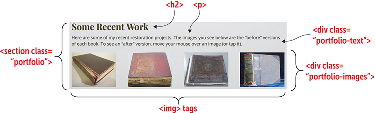
The Portfolio
Next is the real meat of the page, which is the portfolio itself—a series of images that show off your work. When deciding how much to show, you have three choices:
- Show all your work. This option is the way to go if your portfolio is small. If you have a big portfolio, you can show it, but it may be better to show just a subset and then link to a second page that shows everything.
- Show your most recent work. This option is a good one if you think that your newest stuff is particularly good, if your style has changed recently, or if you've landed some high-profile clients.
- Show your best work. This route is the one to take if you want to really show people what you can do.
A typical portfolio has one to three rows, with two to four images per row. You'll want to precede the portfolio with a heading and perhaps a sentence or two as a lead-in. The portfolio itself should be configured as a flexbox container to make everything look tidy. The following example shows how I did all this on my portfolio page.
Try This
Online:wdpg.io/projects/portfolio-page/06
This example adds the portfolio to the page.
Web Page
CSS
.portfolio {
    margin-bottom: 1rem;
}
.portfolio-text p {
    margin: .5rem 0 1.5rem;
    font-size: 1.25rem;
}
.portfolio-images {    ①
    display: flex;    ①
    justify-content: space-between;    ①
}    ①
.portfolio-image {
    position: relative;
    cursor: pointer;
    margin-bottom: 1rem;
}
① The portfolio images are housed in a flexbox container.
HTML
<section class="portfolio" id="portfolio">    ②
    <div class="portfolio-text">    ③
        <h2>Some Recent Work</h2>
        <p>Here are some of my recent restoration projects. The images you see below are the “before” versions of each book. To see an “after” version, move your mouse over an image (or tap it).</p>
    </div>
    <div class="portfolio-images">    ④
        <div class="portfolio-image">
            <img src="/images/portfolio-book1-before.tif">
            <img class="image-overlay" src="/images/portfolio-book1-after.tif">
        </div>
        <div class="portfolio-image">
            <img src="/images/portfolio-book2-before.tif">
            <img class="image-overlay" src="/images/portfolio-book2-after.tif">
        </div>
        <div class="portfolio-image">
            <img src="/images/portfolio-book3-before.tif">
            <img class="image-overlay" src="/images/portfolio-book3-after.tif">
        </div>
        <div class="portfolio-image">
            <img src="/images/portfolio-book4-before.tif">
            <img class="image-overlay" src="/images/portfolio-book4-after.tif">
        </div>
    </div>
</section>
② The portfolio container is a section element with class and id portfolio.
③ The portfolio text container is a div element with class portfolio-text.
④ The portfolio images container is a div element with class portfolio-images.
The portfolio content resides in a section tag to which I've assigned the portfolio class. Note, too, that I assigned the id portfolio, which sets up this section element as a target for the header's Portfolio navigation link you saw earlier.
The portfolio text resides in a div with class portfolio-text. It consists of an h2 heading and a p element for the lead-in sentence.
The portfolio images reside in a div with class portfolio-images. It consists of several div elements (with class portfolio-image). For most portfolios, you need only include an img element within each of these div elements. In my project, however, I wanted to present before and after images, with the latter appearing when the user hovers the mouse over an image (or taps an image on a portable device). To do that, I added a second img element with class image-overlay. Here's the CSS for that class:
Use It
The idea of having before and after images in your portfolio is useful for many creative pursuits, including furniture repair, art restoration, fitness training, hair styling, and interior decoration.
.image-overlay {
  position: absolute;
  left: 0;
  top: 0;
  width: 200px;
  height: 156px;
  z-index: 1;
  opacity: 0;
  transition: opacity 1.5s ease;
}
.image-overlay:hover {
  opacity: 1;
}
The overlay uses the same dimensions as the before image, and it's positioned absolutely at the top-left corner of the div element with class portfolio-image (which uses relative positioning to set a positioning context for the after image). The overlay is given a z-index value of 1 to make sure it appears on top of the before image, and it's given an opacity value of 0 to prevent it from appearing when the page first loads. Then the hover event changes the opacity value to 1 to make the image appear. The transition property in the image-overlay class animates the appearance of the overlay.
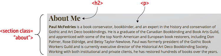
The About Section
The next element of the portfolio page is the About section, which you can use to toot your own horn in whatever way you feel comfortable. You can talk up your education, your work experience, your appointments, your awards, and so on. Use whatever works to supply your portfolio the bona fides required to persuade potential clients, employers, or sponsors that you have the creative chops they're looking for.
The About section is simple: a heading followed by a paragraph of self-aggrandizing text. The following shows an example.
Try This
Online:wdpg.io/projects/portfolio-page/07
This example adds the About section to the portfolio page.
Web Page
CSS
.about {    ①
    margin-bottom: 1rem;    ①
}    ①
.about-text p {    ①
    margin: .5rem 0 1.5rem;    ①
    font-size: 1.25rem;    ①
}    ①
① The CSS for the About section
HTML
<section class="about" id="about">    ②
    <div class="about-text">    ③
        <h2>About Me</h2>
        <p><b>Paul McFedries</b> is a book conservator, bookbinder, and an expert in the history and conservation of Gothic and Art Deco bookbindings. He is a graduate of the Canadian Bookbinding and Book Arts Guild, and apprenticed with some of the top North American and European book restorers, including Don Palmer, Rose Eldridge, and Betsy Taylor-Newlove. Paul was formerly president of the Gothic Book Workers Guild and is currently executive director of the Historical Art Deco Bookbinding Society. Working with both institutional and private clients, he has restored hundreds of books over the years.
        </p>
    </div>
</section>
② The About container is a section element with class and id about.
③ The About text container is a div element with class about-text.
The About content uses a section element with the about class. I also assigned the id about, which sets up this element as a target for the About navigation link in the header.
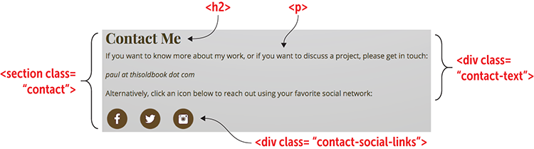
The Contact Section
The final element of the main section of the portfolio page is the all-important Contact section, which is where you give interested visitors one or more ways to get in touch with you. At minimum, you should supply an email address, but you'll almost always want to include one or more links to your social networking profiles.
FAQ
Can I have people contact me using a form? A form is a great way to get a message, but it’s not ideal for most new web designers because it requires a script to process the form data. However, some services on the web not only enable you to build a form, but also process the data for you. Check out TypeForm (https://www.typeform.com) and Wufoo (https://www.wufoo.com).
The Contact section is straightforward: a heading, a lead-in paragraph, and your email address and social network links. The following shows an example.
Try This
Online:wdpg.io/projects/portfolio-page/08
This example adds the Contact section to the portfolio page.
Web Page
CSS
.contact {    ①
    margin-bottom: 1rem;    ①
}    ①
.contact-text p {    ①
    margin: .5rem 0 1.5rem;    ①
    font-size: 1.25rem;    ①
}    ①
.contact-social-links a {    ①
    margin-right: 1.5em;    ①
}    ①
① The CSS for the Contact section
HTML
<section class="contact" id="contact">    ②
    <div class="contact-text">    ③
        <h2>Contact Me</h2>
        <p>If you want to know more about my work, or if you want to discuss a project, please get in touch:</p>
        <p><i>paul at thisoldbook dot com</i></p>
        <p>Alternatively, click an icon below to reach out using your favorite social network:</p>
    </div>
    <div class="contact-social-links">    ④
        <a href="#" class="contact-social-link"><img src="/images/facebook-round.tif" alt="Facebook icon"></a>
        <a href="#" class="contact-social-link"><img src="/images/twitter-round.tif" alt="Twitter icon"></a>
        <a href="#" class="contact-social-link"><img src="/images/instagram-round.tif" alt="Instagram icon"></a>
    </div>
</section>
② The Contact container is a section element with class and id contact.
③ The Contact text container is a div element with class contact-text.
④ The Contact social media container is a div element with class contact-social-links.
Remember
When you add your email address to the Contact section, make sure that you don't display the address in plain text so that the address isn’t harvested by spammers. Instead, obfuscate the address in a way that fools the spammers' bots but is still straightforward for a human to decode.
The Contact content uses a section tag with the contact class and an id value set to contact, which enables this element to act as an anchor for the Contact button in the header and the Contact Me button in the portfolio introduction.
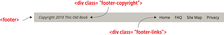
The Page Footer
The final element of the portfolio page is the page footer. As you can see in the following example, I used the footer to display a copyright notice and some links to other sections of the site.
Try This
Online:wdpg.io/projects/portfolio-page/09
This example adds the footer to the portfolio page.
Web Page
CSS
footer {    ①
    display: flex;    ①
    padding: 1em 0;    ①
    border-top: 1px solid #a99879;    ①
}    ①
.footer-copyright {
    flex: 1 0 50%;
    text-align: left;
    font-style: italic;
    font-size: 1.25em;
}
.footer-links {
    flex: 1 0 50%;
    text-align: right;
    font-size: 1.25em;
}
.footer-links a {
    color: #362507;
    margin-left: 1em;
}
① The footer is set up as a flexbox container.
HTML
<footer>
    <div class="footer-copyright">    ②
        Copyright 2019 This Old Book
    </div>
    <div class="footer-links">    ③
        <a href="#">Home</a>
        <a href="#">FAQ</a>
        <a href="#">Site Map</a>
        <a href="#">Privacy</a>
    </div>
</footer>
② The footer copyright notice is a div element with class footer-copyright.
③ The footer site links container is a div element with class footer-links.
The footer content uses a footer element that’s configured as a flexbox container. The copyright notice (with class footer-copyright) is a flexbox item aligned to the left, and the site links (with class footer-links) is a flexbox item aligned to the right.
Beware
When adding a copyright notice, don't add both the word Copyright and the copyright symbol (©), because this is redundant. Use one or the other, but not both.
From Here
The final version of the portfolio page (mine is shown in Figure 20.4) offers a solid start for getting the word out about your creative work.
Figure 20.4 A portfolio page, ready for the web
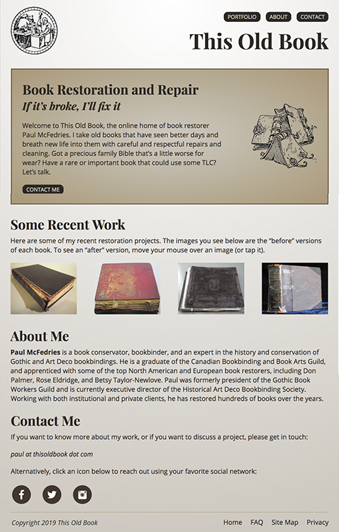
The biggest thing missing from the portfolio page is responsiveness. The page looks good in desktop web browsers and even on some tablets in landscape mode, but the design breaks on smaller screens. I'll leave you the exercise to add media query breakpoints (see Chapter 13) that help the page look good all the way down to a smartphone.
This is the last chapter of the book, but that doesn’t mean it’s the last chapter of your web-design education. Far from it. Be sure to pay a visit to the Web Design Playground (https://webdesignplayground.io/) for lots of examples, exercises, and tutorials that will help you sharpen your skills and expand your knowledge. See you there!
Summary
- Sketch out the page you want to build.
- Choose the typefaces for the headings and body text.
- Choose a color scheme.
- Build the initial page structure: the barebones HTML tags and the global CSS properties applied to the
bodyelement. - Set up your main flexbox containers.
- Fill in and style each section one by one: the header, the portfolio introduction, the portfolio itself, the About section, the Contact section, and the footer.