
Chapter 7
Optimization Best Practices and Test Ideas for Different Page Types and Flows
Now that you have learned some essential website optimization fundamentals that will help kick-start your efforts, in this chapter you will discover and start to use best practices and test ideas for many different types of pages. This includes the all-important home page, product and service pages, and other key conversion flow related pages like checkout. You will also learn the importance of optimizing the mobile versions of your webpages.
Chapter Contents
- Week 19: Focus On and Optimize Your Home Page
- Week 20: Optimize Your Product, Service, Lead Generation, and Other Key Pages
- Week 21: Optimize Your Shopping Cart and Checkout Flow
- Week 22: Identify Other Key Pages and Flows for Optimization
- Week 23: Optimize Your Website’s Mobile Experience
Week 19: Focus On and Optimize Your Home Page
This week’s focus is on one of the most important aspects of your website, your home page. It is critical to spend considerable time testing and optimizing this page for two major reasons. The first reason is because it often forms the all-important first impression of your whole website, and just as a book often gets judged by its cover, millions of websites get judged by just by looking at their home page. Worse still, this judgment usually occurs within very few seconds, often as few as three seconds (as some studies claim). And who really wants their website judged wrongly or unfairly?
Second, depending on how well your home page is optimized, this can have a major impact on the number of downstream conversions on your website. In the extreme, if the visitor leaves your home page immediately (which is known as a bounce) then obviously there is zero percent chance of them converting in that visit. A well-optimized home page will act like a welcoming committee and inform and guide the visitor through their choices, ultimately increasing the chances of them engaging and converting for your website goals.
This week you will learn some great best practices to make sure your home page is judged well by your visitors and engages and converts them the best it can.
Monday: Learn How Your Home Page Is Being Judged and Check the Bounce Rate
The first thing you need to do this week is to learn how your home page (and therefore website) is likely being judged and how to get a better idea of its performance by checking the number of visitors currently bouncing from your home page upon arrival.
Understand How Your Home Page Is Being Judged and Perceived
As mentioned in the introduction, it is critical to test and optimize your home page because it is a page where your visitors will often judge the whole of the website. This becomes even more important when you consider that your home page is often one of the most common entry points to your website, so it is often the first page your visitors see and react to.
Even if they arrive at your website on another entry page, visitors will often go to the home page to get a better idea of what your website is about. Therefore, if your home page doesn’t do a good job of conveying benefit and value of your website to your visitors and they badly judge it, they are much more likely to leave it and not convert for your goals.
So that you can get a better idea of what your visitors might be thinking, first you will learn some common judgments, perceptions, and associations that visitors can have about a website just by looking at its home page. Here are some common negative ones that visitors may have, which you need to make sure doesn’t happen:
- The visitor doesn’t like the layout or organization of the website.
- The visitor doesn’t understand what they can do on the website.
- The visitor feels overwhelmed with choices or content.
- The visitor hates seeing so many ads.
- The visitor thinks the website doesn’t look trustworthy or safe.
In contrast, here are some positive associations that visitors can have about a website after looking at just the home page, which you need to try and convey:
- The visitor thinks the website looks professional, credible and safe.
- The visitor enjoys the color scheme and design of the website.
- The visitor understands what they can do on the website.
- The visitor understands the clear choices they can click on first.
Any of these judgments and perceptions by your visitors can be formed very quickly, so it’s vital to understand what they may be thinking in the critical first three to five seconds. To help you obtain this feedback about your home page, other than using some of the page-specific feedback tools that were covered in Chapter 5, there is a specific tool that will help you. It’s called FiveSecondTest (www.FiveSecondTest.com) and allows you to gather feedback based on a user’s five-second experience of your home page (or any page you want to submit to them for testing).
To make use of this tool you simply submit your home page and create a few questions that you want users to answer, and they will be shown these after they have been shown your home page for five seconds. Ideally you want to ask questions such as “What was the one thing you remembered the most?” or “Based on this home page, what do you think you can do on this website?” The tool then gives you some great options for reviewing your question answers, including a word map where you can more easily see the most common words used in them.
This is a very low-cost tool, with even some free options, so I suggest you get a set of responses about your home page using this tool—at least 20—to give you a better idea of what they are thinking. This will then give you some ideas of how to optimize and correct any misconceptions by tweaking your home page.
Check Your Bounce Rate to Understand Your Home Page’s Current Performance
One of the best ways to see if your visitors are judging and perceiving your home page negatively is to see how many of them are immediately leaving upon arriving on it. When this occurs, this is known as a bounce, and the percentage of these occurring on your homepage can be understood by using the bounce rate metric. The higher this bounce rate is, the more this suggests that your home page is being judged poorly and has problems that need testing and optimizing.
You can find out how your homepage is currently performing for this very useful metric by looking at a pages report in your web analytics tool. Simply add in the bounce rate metric for this report (and to understand how this is calculated and how this differs from exit rate, see the upcoming note), change the date range to the last 30 days, make sure your home page on this report, and then note down the bounce rate for it.
In terms of interpreting your home page bounce rate percentage, if it is below 25 percent that means your home page is doing a very good job already; if it’s between 26 percent and 50 percent, there is definite room for improvement. If it’s over 50 percent then you have some major issues that need addressing.
To help you improve this bounce rate metric on your home page, over the rest of the week you will learn best practices to do this and help engage and convert more of your visitors. But first, you need to see if there are underlying traffic source issues causing higher bounce rates on your homepage.
Check Bounce Rates for Major Traffic Sources to Your Home Page
Sometimes it might not be the design or contents of your home page that causes visitors to bounce. Instead, sometimes this can be due to having low quality sources of traffic for it. For example, your home page may be search engine–optimized for the wrong keyword, and therefore causes visitors to bounce because they aren’t finding what they expected.
Therefore, you need to dig a little deeper and see if any of your major traffic sources bounce particularly high. The best way to do this is by applying filters by traffic source on your homepage bounce report that you just pulled. Many of the most common ones should already be there for you to use and filter your report. In Google Analytics, you simply have to change the filter in the drop-down list and check organic search or paid search, for example (as you learned about in Chapter 2). You should then make sure you have visitor segments built for each of your major traffic sources, and then apply each of them. When applying these major traffic source segments, note any sources of traffic that have a particularly high bounce rate.
Once you have found problematic high-bouncing traffic sources, you should then figure out what is causing this traffic to bounce at a high rate and attempt to address the issue with that source of traffic (for example fix the link messaging of the source or fix any poorly performing keywords).
Tuesday: Find Out What Your Visitors Click and Do on Your Home Page
You should never presume you know what your visitors are doing on your homepage and what links or page elements your visitors are clicking on, even if you helped create or design it. This is because visitors may instead be often doing or clicking on something you don’t really want them to or intend them to. Therefore, today it’s important that you find out exactly what your visitors are doing and clicking on your home page to give you better insights.
First you need to understand what they are clicking on by making use of click heat map tools that you learned about in Chapter 5, either by using the tools built into your web analytics tool, or a dedicated tool like CrazyEgg.com. Go ahead and run a click heat map for your homepage for the last seven days of traffic and note down patterns you observe.
If you notice a high percentages of clicks on nonessential links on your home page and few clicks on what you actually want your visitors to click on (which match your use cases you created in Chapter 4), this represents a sign of a poorly performing home page.
I also suggest that you check if your visitor click patterns vary depending on whether the visitor is a first time or repeat visitor. Often you might find that repeat visitors are clicking on particular things (especially login buttons), whereas new visitors often are more exploratory and click on a broader set of links.
Next you need to get some feedback regarding what your visitors are looking at on your home page—this can be different than what they are clicking on. To do this you should use a visual recording tool like ClickTale (which we reviewed in Chapter 4), gather some recordings about your home page and then analyze the results to gain insights. Again see if repeat visitors do different things than first-time visitors.
Last, you should get some good visitor feedback about your home page—their feedback is excellent for gathering ideas to test and optimize it. This feedback can be obtained using visitor feedback tools like UserTesting.com, and also by using page-specific survey or feedback tools (as reviewed in Chapter 4). Go ahead and ask them questions regarding what they think of your homepage, for example what they like and don’t like, and how they would like it to be improved.
Now that you have begun to better understand what your visitors click and do on your home page, for the remainder of the week you will learn some best practices to start testing and optimizing it.
Wednesday: Shorten and Declutter Your Home Page
Far too often, website home pages become dumping grounds for online marketers, who simply add new promotions, features, or news to them without any thought to the visitors’ experience and what they want them really to do or click on. Worse still, they often don’t switch out old content for this new content, so the page gradually gets longer and more cluttered. This then unfortunately has the negative effect of confusing visitors about what to click on or look at first.
In fact, one of the key reasons for visitors to abandon a home page is because they are overwhelmed with choices and don’t know what they should do next. Therefore, today you focus on this to make sure your home page isn’t guilty of this.
First, you need to go ahead and take a look at the length of your website’s home page. Unless it’s a media website that focuses on showing many news pieces or articles, your home page should be fairly short. By short, ideally you shouldn’t need your visitor to scroll very far down to look at the main contents of it, and your most important calls-to-action (CTAs) should be above the page fold (as discussed in Chapter 6). E-commerce website home pages can be a little longer because they need to feature different types of products and deals that they offer, but these should be limited to no more than two or three times page fold height.
Next, you need to understand which elements can be removed from your home page. To do this you need pull up that click heat map report that you just looked at that shows you what visitors are clicking on the most on your home page. If visitors aren’t clicking on a major element of your home page, chances are that you can remove this feature (or test redesigns of the module if it’s something that relates to one of your major goals or use cases).
Based on what you find, you should then run a quick inclusion/exclusion test to determine the impact of removing, one by one, some of the least-clicked modules and links on your home page. This test will help identify several things with low impact on conversion to take off your home page to help shorten and declutter it.
To give your home page a start in the right direction, here are some prime candidates to test removing or shortening to declutter and improve perception of your entire website:
- Old website/company news or old press releases
- Large numbers of promotional banners (focus on and restrict to just two or three)
- Long lists of products that you sell (restrict to 5–10)
- Banner ads (for home page only—particularly the leader-board banner)
- Long blocks of text images that don’t add value or help visitors decide what to click
- Job postings or information
- Company management or investor information
Thursday: Give Your Visitors a Few Clear Choices to Meet Their Needs and Your Goals
Now that you have learned how to declutter and shorten your home page, next you need to learn how to focus it so that it meets the few biggest needs of your visitors better. This is because your home page should act as a springboard to get your visitors off the home page and deeper into the section of your website that most meets their needs. This is best achieved by showing them prominent links and buttons on your home page that allow them to easily choose from and start doing what they want to do on your website.
If you have an e-commerce or media website, this is usually solved by having good navigation menu category options, a prominent search box, and links to your latest deals and products or content (refer back to Chapter 5 if you want to revisit how to optimize these links and navigation items).
If you are a lead generation website or are only selling one main service or product, ideally you should offer your visitors no more than three main choices, because any more and you will risk confusing them as to what they should click on. To understand which choices to promote to them, you need to revisit the five major use cases that you developed for your website back in Chapter 4.
First, you need to run a test to see which three of your five use cases engages your visitors the most on your home page. To do this, create a simple button for each of your five major use cases, and then run a multivariate test with these buttons shown above the fold to find the combination of the three use case buttons that gets the highest click through rates.
Second, once you have determined your three most valued use case and CTA buttons to add to your home page, you should test the copy, presentation, and location of them to see what engages your visitors the most. Ideally you need to place these above the fold and make them fairly prominent, with some graphical treatment.
Don’t just simply forget about the other two major use cases, though; you should also clearly place links on your homepage to these. Just don’t make them as prominent as the three most engaging ones you found through testing.
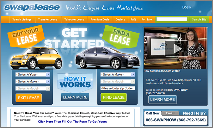
Swapalease.com has a particularly great example of offering three main CTAs for their important use cases on their home page, as you can see in Figure 7-1.
Figure 7-1: Example of a home page with three clear calls-to-action for major use cases
Friday: Learn Other Testing Ideas for Your Home Page
Today you will learn about several other test ideas and best practices that will work for any kind of website home page.
Test Adding Social Proof Elements to Your Home Page
To help influence your visitors better, you should make use of social proof best practices on your home page. As discussed in Chapter 5, there are several types that you can use, some of which will work particularly well on your home page. The first one that often influences well is to test showing customer/sales numbers, such as the number of satisfied customers you have or number of products available/sold. The second type of social proof that will usually work well on your homepage is to test adding some expert reviews or testimonials from customers, ideally in the form of a video.
Optimize Usage of Content Sliders
Next you should try optimizing usage of a content slider at the top of your home page. These are very popular and are often great for highlighting promotions, product or content. Used well they can better engage and convert your visitors for your goals, but used poorly they can annoy visitors. Here are some test ideas and best practices for using these, which are usually found at the top of a home page:
- Test the height and width of these (don’t have it use all of the “above the fold” page space, as this will push down other important content).
- Test adding good CTA buttons to your slides in it, and test the imagery used (particularly people in them), as discussed in Chapter 6.
- Test using targeting in the slides to meet the needs of your first time and repeat visitors better; as discussed shortly.
- Test offering tabs, links or thumbnails to help visitors understand the contents of your slider, and offer navigation buttons.
- Don’t make them too long or rotate too quickly or visitors may miss an important slide; limit number of slides in them to five, and three seconds per slide is recommended.
Always test usage of these though—sometimes it may even be better to just show a strong static promotion instead of a rotating slider. For a good example of content slider being used on a home page, see the example in 7.2.
Figure 7-2: Example of a good content slider on a home page
Use Real Estate Tests to Find the Optimal Order of Major Page Elements
After you have figured out which of your home page elements are most important to show on your home page (as discussed earlier), you need to run tests to find out which positions on your page have the greatest influence on conversion. Rather than just adding new things to the bottom of your page, or guessing at which order to place your new elements, you should run a real estate test to find the best order. For example, you could test moving up the latest deals module, or move down marketing/news-related items. You should then do follow up A/B tests to improve the contents of these high influencing elements to lift conversions even further.
Target Relevant Content for New and Repeat Visitors and Repeat Purchasers
Rather than offering a “one size fits all” home page, you should target major visitor segments to show them more relevant content that will meet their needs better (as discussed in Chapter 4). This is best targeted and shown in highly visible modules on your page (such as content slider just discussed), and will often result in more engaged visitors who will convert at a higher rate.
On your home page you should target new visitors by showing helpful content, such as first-time user information, or entice them by offering coupons for their first purchase. You should also try to target repeat visitors by showing them content relating to their favorite category (called content affinity targeting, as you learned about in Chapter 3).
You can also test targeting repeat purchasers by showing them upsells or new products that relate to what they purchased.
Remember that you can’t do this targeting in Google Website Optimizer. This forms a major reason for you to upgrade your testing tool if you have that tool, to one that does offer targeting.
Test Adding a Navigation Sidebar on Your Home Page
If you don’t currently offer a left-hand navigation side bar, you could also try testing adding one that contains your major site sections, newest content, and most popular content. Many home pages make great use of these to aid and improve visitor navigation.
Week 20: Optimize Your Product, Service, Lead Generation, and Other Key Pages
No matter what type of website you have, you are more than likely going to have at least one category page, product or service page, lead generation page, or a pricing list page. These are key pages that influence a visitor’s decision making process and the performance of them can have a significant impact on your website’s conversion rates. Therefore, today you are going to learn about how to best test and optimize these pages to help further increase your conversion rates.
Monday: Optimize Your Product Pages
Your product pages are another of the most important pages to optimize because they have such a big impact on your conversion rates and success metrics. Today you will learn how to analyze the performance of your current product pages, and more important, some great ways to test and optimize them. If you don’t have any product pages on your website, you can skip ahead until you find a type of page that your website has.
Identify Your Current Product Page Performance
Before you learn about test ideas for your product pages, it’s important to understand how they are currently performing. The easiest way to determine performance for product pages is by looking at the number of visitors who exit your website on a product page, which is known as the exit rate.
It’s important to look at this metric, because as discussed last week, bounce rate would only indicate performance of your product page for visitors who directly arrive on it from external sources. Exit rate takes into account the performance of the page no matter if the visitor came from another of your pages first, or arrived from an external source.
The higher this exit rate percentage, the more it means your visitors aren’t being engaged and influenced to purchase from these page and the more it needs optimizing.
To find this exit rate for your product pages, log in to your analytics tool, run a pages report and find your product pages (or product page template or grouping), and then add in the exit rate metric. Pick a date range of the last 30 days to give you a better current understanding of page performance.
To give context to your current exit rate metric, below 25 percent means your product page is performing well, between 26 percent and 50 percent, means definite room for improvement and over 50 percent means there are some major issues that need addressing. Note down this current exit rate because you will be revisiting this in later months to see how your efforts to improve it are faring.
There are other more advanced and complicated ways to measure performance for product pages, such as determining the ratio of product page visits to clicks on “Add To ”buttons, or setting up and analyzing a conversion goal that includes your main product page as the first step and the order confirmation as your last step.
If you have too many product pages to analyze individually, you may be able to set up additional analytics tracking to analyze them as one group (or content type). This involves some extra tagging on them to signify them as a product page content or page type—consult an analytics expert if you wish to set this up. Analyzing them as a group is better than analyzing just one or two, because individual product page performance may be skewed by the price or interest levels per product.
Learn Test Ideas and Best Practices for Product Pages
Now that you understand the current performance of your product pages, here are some test ideas and best practices to begin optimizing them:
- A bullet point list of product features/details (or a few short paragraphs)
- Technical details (size/weight/product specification)
- Options available (state any different colors available or sizes etc.)
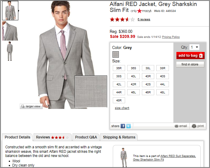
Figure 7-3: Example of showing savings on product page
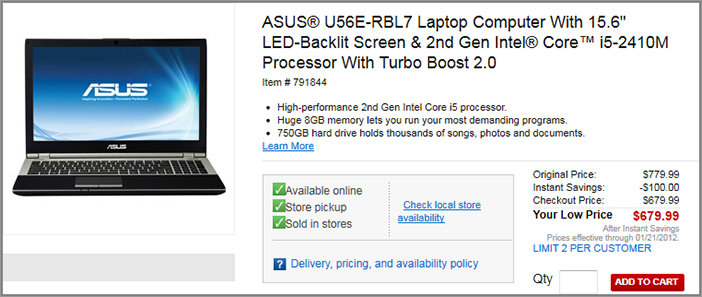
Figure 7-4: Example of a product page with good usage of tabs
Tuesday: Optimize Your Service Pages
Many websites sell services instead of physical products. These can be either web-based services (like an email tool) or offline based services (like bank services). These types of websites have pages that describe the service being sold, and are often called “features” pages. These service pages require different best practices to optimize, and today you will learn how to best do this and optimize them. If you don’t have any service related pages on your website, you can skip ahead until you find a type of page that your website offers.
Identify Your Current Service Pages’ Performance
Identifying your service pages’ performance works very similar to identifying current performance of product pages that was discussed yesterday. Please refer back to that and follow the same best practices, and determine the exit rate for your service pages for the last 30 days. You can use a similar exit rate grading system to understand your service page performance too (with over 50 percent indicating many problems that need fixing). You then need to note this current rating down because you will be revisiting this in the last chapter to understand how your optimization efforts have fared for these pages.
Test Ideas and Best Practices for Service Pages
Here are some specific best practices and things to test in order to optimize your service pages:
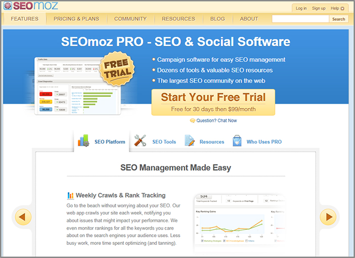
For an example of a good service page that contains many of these best practices mentioned above, see Figure 7-5, which shows the services page on SEOmoz.org.
Figure 7-5: Example of a service page using many best practices
Wednesday: Optimize Your Lead Generation Pages
Another very important type of page to optimize is lead generation pages. These pages have a main goal of trying to get visitors to sign up for something using a form, which represents a lead for the receiving online business to then try and convert, hence the name “lead generation.” These types of pages are fairly common on several types of websites, and many marketers create paid search landing pages specifically to drive traffic to and generate leads from. Today you will check the performance of these pages and then learn some best practices and tests to optimize them.
Check the Performance of Your Lead Generation Pages
Just as you needed to do for your other key pages reviewed so far, first you need to understand the current performance of your lead generation pages. This helps you set a benchmark that you can later revisit to see how well your optimization efforts have fared. So go ahead and log in to your web analytics tool and find the exit rate for your lead generation pages, and use a date range of the last 30 days. If you are pointing traffic directly to them, you should also use bounce rate to determine performance.
Best Practices to Test and Optimize Your Lead Generation Page
First, let’s review some general things you need to test and optimize for your lead generation pages. Most of these things you need to test and optimize for these pages have already been covered in detail in earlier chapters. The only additional thing you need to pay particular attention to is the actual form on your page, which you learn about shortly. Try testing some of the following things:
- Test using bullet point lists of benefits and features instead of long blocks of text.
- Test shortening your page and make sure your CTA is above the page fold.
- Test showing a great testimonial, if possible with video.
- Test which supporting image or hero shot you use.
- Test the headline and subheaders.
- Test showing number of customers to build social proof.
- Test showing client logos and media mentions to build social proof.
- Test showing risk reducers like guarantees or free trials.
- Test different color schemes including background and header.
- Test adding a demo or sales video about your product or service.
- Test offering something for free as incentive to complete the form (such as a coupon, free trial, or e-book).
- Test removing elements that may be distracting (using an inclusion/exclusion test).
- Test moving the form to a separate page, and instead focus on a bigger CTA button to begin the signup process on another additional page.
A good example of a landing page that uses many of these best practices can be seen in Figure 7-6 at Intuit.com. They even tested moving the signup form to an additional page and replaced it with a call-to-action button instead, as just mentioned.
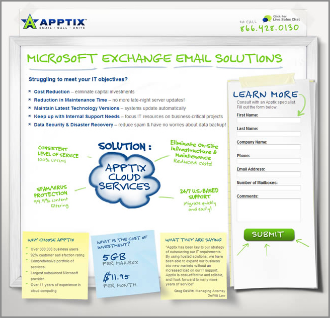
For another example of a unique well-designed lead-generation page, see Figure 7-7. This has a particularly eye-catching design that might help contribute to improved conversions.
Figure 7-6: Example of a good lead-generation page with a button instead of a form
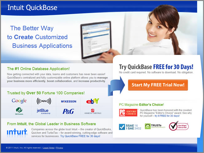
Figure 7-7: Example of a good lead-generation page with a unique design
Other Best Practices for Paid Search-Landing Pages
There are also specific things you should do if you are using paid search to send traffic to your landing pages. Driving this kind of traffic to these pages can result in very high conversions on your website because the traffic is so targeted, particularly if you use the following best practices:
Best Practices to Test and Optimize Your Lead-Generation Forms
To increase the conversion rates of your lead generation pages it’s important that you spend considerable time testing the actual form on these pages. This will often have the biggest impact on optimizing these pages and generating more leads from them. Here are some things you should test doing in particular to optimize your form:
In Chapter 8, you will learn more about testing and optimizing forms that are longer, such as registration and signup forms, and also about specific details for testing and optimizing newsletter forms.
Try a Testing Tool Specific to Optimizing Lead Generation Pages
You could also try using a testing tool specifically designed to help improve conversion rates on lead-generation pages. This tool is called UnBounce.com and was mentioned in Chapter 2. It allows you to make use of great lead-generation page templates that already make use of many of the best practices mentioned throughout this day. This tool also allows you to easily test many things like different page layouts, button types, and text to see which versions convert better. It’s fairly low cost, and you don’t need any website programming knowledge to create or test these lead capture pages.
Thursday: Optimize Your Category Pages
Many websites have category pages of some sort, particularly ones like e-commerce or media websites that feature many types of products or content.
Offering these general category pages allows visitors to better explore what your website offers, and they are vital for showcasing the different things that a visitor can do in each subsection of your website. Today you will learn some best practices to test and optimize these pages, both for general websites ones, and ones specific to e-commerce websites.
Understand Your General Category Pages Performance
Just as you needed to do for your other major types of pages you learned about in this chapter, you first need to understand the current performance of these types of pages. This helps you set a benchmark that you will revisit in the last chapter to see how well your optimization efforts have been faring. Therefore, go ahead find your exit rate for your category pages in your analytics tool.
Best Practices to Test and Optimize Your Category Pages
Here are some best practices and test ideas that will help you optimize the performance of any type of category pages:
Figure 7-8: Example of a good category page that includes personalization
Best Practices to Test and Optimize Your E-commerce Category Pages
If you have an e-commerce website, your category pages are very important to optimize. This is because optimized usability and functionality of these pages will help your visitors explore and find what products they are looking for much quicker and help increase conversion rates. These e-commerce category pages are also often the same type of page as used for internal search results pages on e-commerce websites.
In addition to the general category best practices just discussed, here are some things that you need to do to optimize these e-commerce category pages in particular.
Show Products in a Grid or List Format and Offer the Ability to Change Display Options
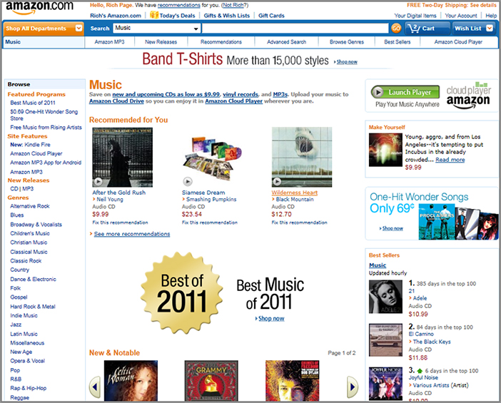
The more traditional way of showing products on category and subcategory pages is to use a grid format, which ideally should contain no more than 20 per page and have clear pagination links. You might also want to try testing showing results in a list format—much as Amazon.com is now doing instead of a grid layout.
Your e-commerce category pages should display details for each product by using an image and the name of the product and also have a CTA button for the visitor to click on to learn more or buy the product (and the name and image should also act as product links too). You should also show the price of the product and any relevant savings.
You need to test all of these elements to find the style that increases conversions the most, in particular the size of the thumbnails. If they are too big it will be hard for visitors to scan many products per page, and if they are too small they won’t be able to see the product image well enough. You should also be sure to test the CTA button for different wording and styles to see which versions increase conversions the most.
To help visitors decide on which products they want to click and learn more about, you should also show your star ratings next to each of your products. This will help increase click-through rates in addition to help build social proof for your products (refer back to Chapter 6 to revisit best practices for these ratings).
For a good example of an e-commerce category page that exhibits many of these best practices, see the example of Staples.com in Figure 7-9. They even offer the ability to switch between list view and grid view, and offer “quick view” functionality (which will be discussed shortly).
Figure 7-9: Example of an e-commerce category page designed with best practices
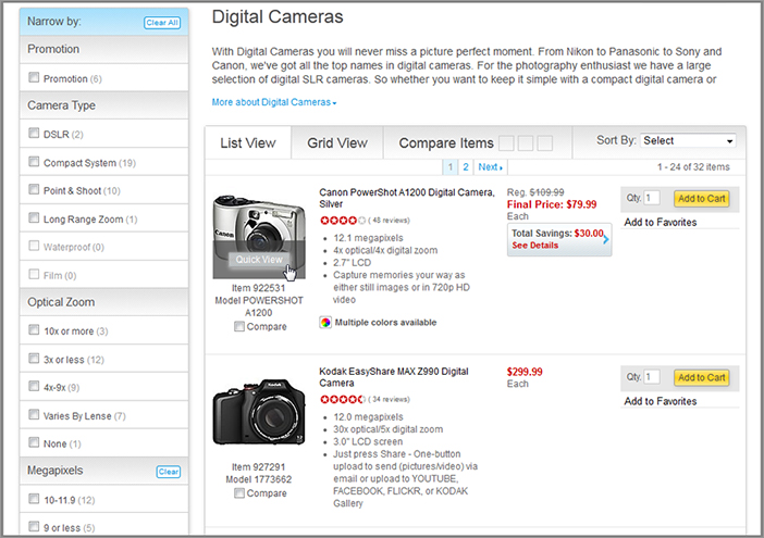
You could also go further by allowing visitors to personalize how the products are displayed by changing the number of products seen per page (including a “show all” link), the size of the image thumbnails, and if possible, an option for showing the products in list format instead of grid format (more like traditional search results pages).
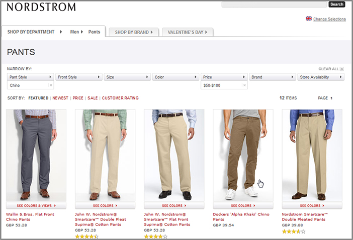
Add Functionality to Filter and Sort Products Shown
You need to include functionality that allows visitors to filter and sort the products they are seeing on your category pages. This will greatly enhance their ability to find exactly what they are looking for more quickly and increase the chances of them converting and purchasing.
Depending on exactly what you are selling, there are many of these filters you will need, such as subcategory, brand, prince range, color, size, and average rating. This filter functionality can be shown in two ways, by using checkboxes in the left-hand sidebar, or by using multiple drop-down menus just above main area where you are showing your products. You should also allow visitors to use multiple filters at once and give them options to easily clear and reset the filters they are currently using.
In addition to filtering, you also need to have clear options that allow the visitor to sort the current selection of products being shown on the page. Depending on what you are selling, this should include criteria like sorting by lowest and highest price, highest customer rating, and newest. Again, this filtering option can be added in the left-hand side bar or placed in a drop-down menu at the top of the products.
For an excellent example of offering this filter and sort functionality on an e-commerce category page, see how Nordstrom.com is now doing this in Figure 7-10.
Figure 7-10: Example of good filter and sort functionality on an e-commerce category page
Use Quick View Functionality to Make It Easier to See Extra Details
Rather than your visitors having to click and visit separate pages for each of the products they want to know more about, you should enable them to see key extra information while staying on your category page. This should come in the form of adding a quick-view button for each product that pops up a box showing a larger image and extra key details about the product. You should test how this quick-view box appears, either by hovering over the button or product image or by clicking on the button to see which version helps increase conversion rates. To see an example of this quick-view button on an e-commerce category page look back to Figure 7-9.
Friday: Optimize Your Pages That Compare Product or Service Options
If you are selling something with different price and features options and you have a page that compares these, it’s important that you optimize these pages, too. The goal of these pages is to provide good decision-making information to visitors; never just simply state all your different options and leave it up them to decide which level to sign up for. Not helping the visitor choose may cause anxiety for them and cause them to leave because of a lack of understanding of the best option to pick. Today you will learn some best practices to help influence their decision and increase conversion rates on these pages. If you don’t have these types of pages on your website you can skip ahead to next week.
Check the Performance of Your Product or Service Options Page
In the same way you did for your other key pages reviewed earlier this week, first you need to understand the current performance of these types of pages. This helps you set a benchmark that you will check in this last chapter to see how well your optimization efforts for this page have been doing. So go ahead and log in to your web analytics tool and find your exit rate for this page.
Best Practices to Test and Optimize Your Product or Service Options Page
Here are some best practices and test ideas that will help you optimize these types of pages, including an example of a well-designed one:
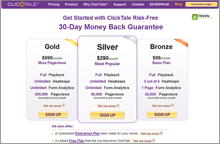
For a good example of a service comparison page that contains many of these best practices, see how ClickTale.com does this in Figure 7-11.
Figure 7-11: Example of a good service comparison page
Week 21: Optimize Your Shopping Cart and Checkout Flow
This week, you’ll learn how to best test and optimize your shopping cart page and checkout flow. This is critical for e-commerce websites and can have a major impact on many key success metrics including shopping cart abandonment rate, number of products ordered, and the website’s overall conversion rate.
If you have a website that is not related to e-commerce, and you are not selling any products or services, you should skip ahead to Week 22.
Monday: Check Your Shopping Cart and Checkout Flow Conversion Rates
First of all, today you need to check how well your shopping cart and checkout pages are currently performing and converting. This will help you understand which pages of your flow are problematic and need optimizing the most. This will also form a benchmark that you will then revisit in the future to determine how successful your optimization and testing efforts have been.
You will now learn about four great success metrics to help you understand and measure shopping cart conversion rates in your analytics tool.
Check the Exit Rate of Your “Item Added to Shopping Cart” Page
A simple way to check your performance of these pages is to check your exit rate for the first page in the checkout conversion flow. This is the page that visitors see after they have added items to their shopping cart and is usually called the shopping cart page.
An exit on this exact page means they are abandoning your checkout process prematurely and that you need to optimize it (as you will learn about on Tuesday). If the exit rate is very high for this page (above 70 percent), it means your visitors are usually not influenced enough by this page to continue to purchase the products they added to their cart.
To find this, log in to your web analytics tool, look up this page in your pages report, and then add in the exit rate metric (and change to the last 30 days). Even if you use a pop-up message to signify additions to the cart instead of a page (that will be reviewed later), you can still tag that pop-up page with analytics code and measure the performance of it in the same way.
However, realize that this rate is likely never going to be very low (less than 25 percent) because quite often visitors will add another product to their cart in a later visit before purchasing all at the same time or simply may not be quite ready to purchase the items added yet.
Check the Exit Rate of Your Order Review Page
This is the final page that visitors see before they confirm their purchase. To find the exit rate for this, look for this page in your analytics pages report, change the date range to the last 30 days and pull in the exit rate metric again. Ideally there should be a low exit rate because if they have gone this far down the checkout path, there should be few reasons for them to leave it, unless they see something wrong.
If the exit rate for this page is high (above 30 percent), it means visitors are wary about something they have seen (or not seen) on it and have abandoned it prematurely; therefore you need to optimize this page (which you will learn about on Thursday).
Check the Checkout Completion Rate and Shopping Cart Abandonment Rate
The checkout completion rate metric represents the percentage of visitors who start and complete your checkout process. The inverse of this is called the “shopping cart abandonment rate” metric, and is the number of visitors who leave your shopping cart checkout before completing it.
No matter which definition you use, it represents the simplest but most important and revealing metric to help analyze your shopping cart checkout performance. It can be calculated in a web analytics tool by using a calculated metric (checkout completion rate is the number of visits to order completion page divided by the number of visits to “add to cart” page, then multiplied by 100 to get the percentage). Some tools even allow you to define this metric when implementing the tool.
You can also find this checkout completion rate metric in the web analytics’ funnel or fall-out report for your checkout pages, which you will learn about shortly.
Calculate this conversion rate now using data from the last 30 days and see how it is currently performing. This will also set a benchmark for you to revisit in the last chapter to understand how your optimization efforts have fared.
Ideally you want this checkout completion rate to be fairly high. Anything below 60 percent means you have great opportunity to test and optimize your checkout pages, and below 25 percent means you have major things that need optimizing and improving urgently.
Next you should set a target for what you want this completion rate to be. However, bear in mind there is no definition of a perfect percentage rate because every online business is different and will vary depending on many things, like your website’s value proposition and number of competitors you have. The main goal is to set a target for and improve your current percentage rate; even small percentage point improvements can yield some amazing increases in revenue.
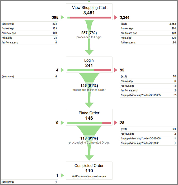
Check the Funnel Report for Your Checkout
This goes funnel report goes deeper than checkout completion rate and helps you understand which pages of your flow your visitors are most often dropping out of and where they are going. This is great for understanding which pages of your checkout flow are most problematic, helping you identify which ones to pay extra attention to optimizing.
This report is available in the leading web analytics tools. For example in Google Analytics you find this by looking at the Funnel Visualization Report, which is found under the Goals section of the menu. In this report, for each stage you will see the percentage of visitors who are converting to the next page of your checkout flow, and at the bottom it will show the percentage that completes the checkout (the checkout completion rate as just discussed). In Adobe SiteCatalyst this is called the Fallout Report, and it gives you more flexibility in which pages you want to include in this report.
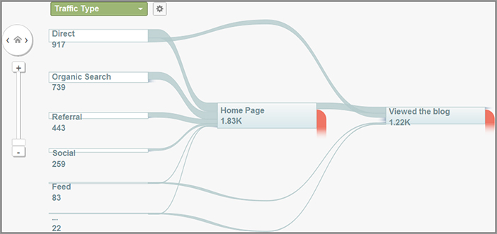
Figure 7-12 shows an example of a Google Analytics Funnel Report for a conversion flow.
Go ahead and run this report in your web analytics tool and analyze the last 30 days of data. In particular you should always look for the page that has the highest drop-off rate because optimizing that will give you the biggest lift in your checkout completion rate.
Now that you can better understand how your shopping cart and checkout is currently performing, you will learn some best practices and test ideas to help improve these pages and these success metrics.
Figure 7-12: Example of Funnel Report in Google Analytics
Tuesday: Optimize Your Shopping Cart Page
Once a visitor has shown enough interest in your one of your products to add it to their shopping cart, this signifies the start of the all-important checkout flow. If your shopping cart page is not fully optimized and easy to use, visitors will abandon this critical first page of your checkout flow. This therefore means your checkout completion rate will be reduced, regardless of how well you optimize the rest of the pages in your checkout—the abandoners won’t even see them.
To maximize your checkout completion rate (and therefore your overall website conversion rate), today you will learn best practices and test ideas to optimize your shopping cart page.
Make It Obvious to Visitors That They Have Successfully Added Items to Their Cart
Websites far too often don’t do a very good job of clearly indicating that the visitor has added something to their shopping cart. This often frustrates visitors, who may accidentally add multiple versions of the same product to the shopping cart or may not understand where they have been taken to after adding the item to the cart.
To prevent this frustration and increase the chances of your visitors continuing to checkout, you should always at the very least send them to your shopping cart page after they click the buy button, with clear messaging saying they have added an item to it.
As another solution, you can test using a pop-up box to inform them of this and a summary of their cart contents. This is good because this enables them to continue to shop without having to see the shopping cart each time, and it may result in a greater number of products per order. Make this pop-up clearly visible, in the center of the screen ideally, and don’t just pop it up in the top-right corner as visitors may miss this, particularly if the pop-up doesn’t stay up for long.
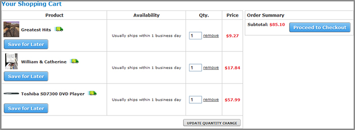
Clearly Show Shopping Cart Items and Allow Visitors to Manipulate Contents
Visitors are going to want to check the current contents of their shopping cart and easily adjust its contents by removing items or changing quantities if need be.
To do this you need to clearly state the products currently in their cart (with links that take the visitor back to the product page for each item if they need reminding). You also need to allow them to easily delete items or change quantities (ideally by using update and remove links or buttons on this page). In case they aren’t ready to buy all of the items in their cart yet, you should also show a link or button next to each cart item that allows them to save it for later purchase. Buy.com does a great job of offering all of this functionality in their shopping cart, as you can see in Figure 7-13.
ASOS.com takes this functionality even further by allowing visitors to change sizes and colors of the items in their shopping cart, all without having to leave this page. This apparently had a great impact on lifting their conversion rates, so you should try and test implementing this type of functionality to change cart item details too, if relevant to what you are selling.
Figure 7-13: Example of a shopping cart that is easy to check and change contents for
Don’t Surprise Visitors with Total Costs, Taxes, or Hidden Fees Later In Checkout
One way to frustrate your visitors and potentially cause them to abandon the checkout is to not fully show upfront all costs associated with your order. To prevent this from happening, your shopping cart page should always display your total cost with a breakdown of charges, including estimated taxes and shipping costs and any other less-obvious costs (for example surcharges or non-standard taxes if you have them).
Provide Clear Calls-to-Action for What Visitors Should Do Next
There are two important things you need to clearly highlight on your shopping cart page so that visitors know what to do next. First and most important, you need to clearly show a button that allows the visitor to proceed to checkout. This button should ideally be above the fold, and repeated below the contents of the shopping cart so there is a greater chance of them seeing it.
Second, many visitors won’t be ready to check out at that point because they want to continue shopping. Therefore, you need to also show a button on your shopping cart that states “continue shopping.” Don’t make it as prominent as your checkout button though, as ideally you obviously want to get them to check out at that moment.
Keep Your Shopping Cart Simple and Without Distractions
The main thing that your shopping cart needs to do is to show enough details to satisfy your visitors into checking out, and to not distract them with other things that may result in them not completing the purchase. Therefore, you should run inclusion/exclusion and real estate tests to understand which elements and locations on your shopping carts have the most impact on your conversion rates.
In particular, test removing unnecessary links or promos, particularly for competing promotions, and test removing unrelated promotional ads if you have them on this page. The only thing that often works well is to include recommendations for related items—this often increases the average number of products per order, as you will learn about shortly.
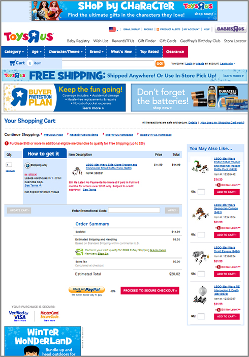
For an example of a very busy shopping cart that is filled with ads and promotions, all competing for the visitor’s attention, see ToysRus.com in Figure 7-14. This shopping cart could be easily improved just by running inclusion/exclusion tests to removing these and focus the page better.
Figure 7-14: Example of a shopping cart with many distractions
Place Trust and Security Seal and Text on Your Checkout Page
As discussed in Chapter 5, adding trust and security seals and related text on your checkout-related pages helps to relieve visitors’ security anxiety at a point when it is most likely to be high. Therefore, the first place you should test adding these is on your shopping cart page, in particular testing placing a security seal and text right by your checkout button. This quick simple test will likely improve your shopping cart completion rate, and you should also try testing several different types of seals and text, and their locations, to see which variation has the highest impact on checkout completion rates.
Make Good Use of Related Product Recommendations
To increase revenue for your online business, you should try and influence the average number of products per order from your visitors. To help increase your visitors’ products per order you should test placing related product recommendations on the shopping cart page.
There are a couple types of recommendations you can test making that will usually work better on this page than other pages. First you can test showing items that are complementary or an accessory to the items in the cart, and you can also try showing items related to those in the cart, particularly ones that are currently on sale. Amazon.com does a great job of doing this on their add-to-cart page, as you can see in Figure 7-15. REI.com also does a great job of this by showing related cheaper products like accessories, which have found to convert higher than showing more expensive items.
Figure 7-15: Example of recommendations on a shopping cart page
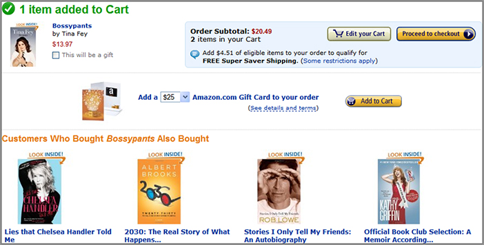
The key thing is to always show relevant products for these recommendations. Showing irrelevant ones will have the opposite effect on conversions because you will end up annoying visitors who think that it seems to salesy. Instead you should always tell them why they are seeing the products being recommended, ideally by showing and testing a descriptive title for this recommendations box (as Amazon.com also does).
As you learned earlier, there are some great tools to help you create and automate running these recommendations, such as Adobe Recommendations and Monetate.
Wednesday: Optimize Your Checkout Flow
So your visitor has decided to begin the checkout after adding something to their cart. Congratulations! However, there are still many hurdles that you need to clear before they successfully (and happily) check out and buy your product. Unfortunately many websites have poor checkout flows, and having just one poor performing element of it can result in premature checkout abandonment. Today you will learn some best practices and test ideas to help get more visitors through your checkout and increase your conversion rates.
Don’t Make Visitors Have to Register before They Can Purchase
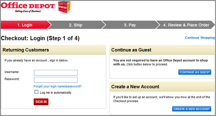
Visitors may not always want to sign up for an account on your website before purchasing something, and if you force them to, this may reduce your checkout conversion flow. As a result, you should always allow visitors to check out without the need to register.
To do this, on the first page they see after the visitor clicks on the checkout button (this usually is the “login or register to continue” page), you need to show a CTA that lets them check out as a guest. This should be in the form of a button that says something like “check out as a guest” or “check out without an account,” along with support text. On this page you should also show options that allow existing users to log in and options for new visitors to create an account.
OfficeDepot.com does a great job of making it easy for any type of visitor to understand their options for checking out, as you can see in Figure 7-16.
If your visitors are checking out as a guest, you should then offer them the chance to create an account after they have finished checking out, and explain the benefits of doing so (for example, it remembers your details to save you time buying in the future, it offers newsletters and coupons, and so on). Registering will usually increase the chances of them coming back, and often gives you the ability to send them marketing campaigns (if they opt-in to them), so you should try and influence them to do this.
Figure 7-16: Example of good visitor checkout options
Show a Progress Bar at the Top of Your Checkout Pages
You should always show a checkout progress bar at the top of each of your checkout pages. This helps your visitors by letting them know how many steps are in your shopping checkout flow, and what step they are currently on. For this you should show the step number for each step, and arrows pointing to the right between each step so visitors can understand how many steps are ahead of them. Look back to Figure 7-16 to see a good example of this progress bar on OfficeDepot.com.
If you have many steps in your checkout flow (more than four or five), you should consider testing reducing and condensing them to fewer pages, because this often can increase checkout completion rates—visitors often don’t like having to go through many steps. Combining the billing and shipping pages into one page is a great way to reduce checkout length and is definitely worth testing.
Conversely, if you have only one or two pages in your checkout flow but they are longer and contain many fields, you should test splitting these up into three or four pages, as this may seem less overwhelming for visitors and increase your checkout conversion rate.
Display Customer Support Options in Your Checkout Flow
Your visitors’ purchase anxiety levels are usually the highest during your checkout pages, and you need to help relieve this by showing support options on these pages. To do this and help improve your checkout completion rates, you should test clearly showing your support phone number and email address on these pages and, ideally, also test showing a live chat support option for immediate support help (as discussed in Chapter 5).
Make It Easier for Your Visitors to Complete Your Forms
How good is your error validation when visitors are filling in the forms in your checkout pages? Many checkout flows are abandoned purely because a visitor gets an error message while filling it in and doesn’t know how to remedy it.
To help improve this, when your visitor makes an error you need to highlight the field in red that they need to fix, and also show a prominent message at the top that explains what is wrong and how to fix it. You should use friendly sounding easy to understand language (like “you forgot to enter your ZIP code”) and never use technical sounding error messages or error numbers.
You should also remember to test removing unnecessary or non-mandatory fields to see what impact that has on your checkout completion rates.
In Chapter 8 where optimizing forms is discussed in more detail, you can learn more about these topics, including example screen shots.
Improve Your Billing and Shipping Address Sections
The billing and shipping pages are two areas of the checkout flow that often represent a big source of frustration for visitors and often result in premature checkout abandonment. Here are some best practices to help reduce the chances of this occurring, therefore improving your checkout completion rates:
- Allow visitors to copy their billing address to their shipping address, and vice versa, because this makes it quicker and easier to complete these sections. This is best achieved by having a checkmark next to both billing address and shipping address sections asking the visitor if they want to use the same address for both. You can see an example of this in Figure 7-17.
Figure 7-17: Example billing address same as shipping option
- Offer newer, additional purchase methods other than just credit cards and virtual checks. In particular you should test adding installment payment options like BillMeLater (www.billmelatersolutions.com), which are proving very popular and often help increase checkout completion rates.
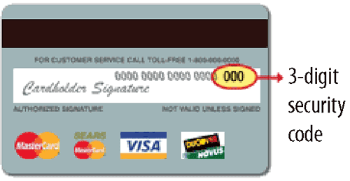
- A particularly troublesome billing related field is the credit card security ID field (often known as CVC code), and many websites fail to explain what this is very well, thus causing checkout issues. Therefore, right next to this field you should show an example of what this is and where the visitor can find it on their card. This can also be achieved by having a help link next to this field that pops up an image with more details (see Figure 7-18).
Figure 7-18: Example of a credit card security ID image explanation
- Allow the visitor to store their main shipping address (and other addresses) in their account to use in their future visits. Doing this helps repeat purchasers complete the checkout process quicker and easier and is particularly great for visitors who often ship to different friends and family and also ship to work and home addresses.
Thursday: Optimize Your Order Review and Confirmation Pages
The last two pages of your checkout flow are also very important to pay attention to and optimize. These are the order confirmation and review pages where your visitors review their order before placing it and where you confirm their order. Today you will learn some test ideas and best practices to optimize these pages.
Optimize Your Order Review Page
The order review page is essential for you to optimize because it can make or break your order for two main reasons. First, if you don’t show them something they expect (or don’t expect), and second, visitor purchase anxiety will be the highest at this final point of the checkout process. To increase the chances of them placing their order and to relieve their anxiety, you need to clearly show all of the following things on this page:
- Items and quantities being ordered
- Total costs (including shipping and tax)
- Shipping destination
- Estimated shipment and delivery dates (particularly important for holiday periods)
- Customer support options
If you don’t show all this information that visitors will want to double check (and give them options to easily edit), there is a much greater chance of the visitor abandoning the checkout early. And don’t confuse or irritate them by showing them things they don’t expect to see either, such as unexpected additional fees or costs, delays with shipping, or stating items are out of stock.
Optimize Your Order Confirmation Page
The order confirmation is often largely overlooked by online marketers, because the all-important conversion has finished upon load of this page. However, this page represents not only a way to communicate about their current order, but a high potential place to continue to engage the customer and help increase future conversion rates from them.
Instead of simply stating to the visitor that they have completed their order, here are some ways to test and optimize this page:
- Always thank the visitor for their order (simple, but effective).
- Include a reference number so the visitor can track their order.
- Tell the visitor how they can track their order (if it’s being shipped).
- Add an area that features product recommendations and upsells relating to the product the visitor just purchased.
- If you have coupons for future orders, test showing them here.
- Show options for the visitor to create a full account, including benefits of doing so.
- Show options to sign up to your newsletters or product updates.
You should also optimize your order confirmation emails with the same type of messaging, because they form a more permanent record for visitors to refer back to and check. This will be covered in more detail in Chapter 8 where you will learn about email optimization best practices.
Friday: Learn Other Advanced Shopping Cart Best Practices
Today you will learn about some other newer and more advanced technologies and best practices to help lift the checkout completion rate of your shopping cart even further.
Test Ways to Retain a Visitor’s Shopping Cart Items
Most shopping carts only remember added cart items when the visitor comes back if they were logged in at the time of adding them. Consequently, many items added to carts may be forgotten if they weren’t logged in, reducing chances of them being purchased in the future.
To get around this, you should use shopping cart functionality that remembers any items that they added, whether they were logged in or not. This is called a persistent shopping cart and uses cookies to remember shopping cart contents. E-commerce websites like Amazon.com and Buy.com do a great job of offering this. To implement this, you will have to consult your IT team to see if they can create this functionality, or consider evaluating another shopping cart that offers it.
If you are already using a shopping cart that offers this advanced functionality, test increasing the length of the cookie expiration associated with it so that it remembers longer. This is because, depending on which cart you are using, some expire within a few weeks, negatively affecting your chances of your visitors ordering products added to cart if they come back after that point.
Test Using Shopping Cart Recovery Automated Emails
Website visitors who place products into shopping carts and leave before purchasing them are very hot prospects to convert in the future. Unfortunately, though, many websites don’t do anything or very little about this and let this potential purchase and conversion go to waste. To increase the chances of getting these visitors to come back and finish their purchase, you should test use shopping cart recovery automated emails.
These automated emails work well because they allow you to easily inform visitors if they still have items in their shopping cart and encourage them to come back and finish the order. Some good tactics to use in these emails are using wording stating that prices may change or that items may go out of stock soon if they don’t finish the order. You could also test going for a simpler approach and ask them if they had an issue with their shopping cart, using wording like “Oops—was there a problem with your shopping cart?” Usage of advanced emails like this will be covered in much more detail in Chapter 8.
Week 22: Identify Other Key Pages and Flows for Optimization
Every website is different, with its own value proposition. As a result, it means that depending on your exact website, you will likely have many other important conversion influencing types of pages and flows that need to be identified and optimized.
Today you will learn how to make advanced use of your web analytics tool to analyze and find these other types of less common flows and pages. Once you have found good candidates, you should then use the best practices from this book to test and optimize them and increase your website’s conversion rates even further.
Monday: Identify Issues with Top Entry Pages and Optimize
Today you will focus on analyzing the pages that visitors most often arrive on your website, which are called entry pages. Regardless of how they relate to your main conversion goals, your top 20 entry pages are very important to optimize because they form a considerable amount of traffic to your website for you to influence and convert for your goals. If you don’t optimize these pages, your visitors may leave your website before you have a chance to influence them, thus having a negative impact on your conversion rates.
The best way to understand if there are issues with these top entry pages is to understand how often your visitors are immediately leaving your website upon arriving on it (known as a bounce as previously discussed). This can be easily determined by running a Top Pages report for the last 30 days of data, and then pulling in the entries and bounce rate metrics. If you need to calculate bounce rate manually, you need to take your single access metric and divide that by your entries metric, then multiply that by 100 to get a percentage.
Then go ahead and review your top entry pages for any pages have a relatively high bounce rate, which is considered anything above 40 percent. Make a note of any of these pages because they form excellent optimization candidates to better influence and convert your visitors on (using the general testing best practices and ideas found in this book).
You should also realize that some pages will naturally have a higher bounce rate though, like media or publishing websites where visitors often just come to read articles they find in search engines and then leave. However, you can try and manipulate your visitors to stay longer by using related links as you learned about in Chapter 5.
Last and very important, quite often, because of how your website may be being linked to or ranked in search engines, some of your top entry pages may not be ones that relate closely to your conversion goals. If some of your problematic entry pages don’t really relate to your goals, you should consider adding related CTA links on them to try and drive visitors into pages that will help influence and convert them better.
Tuesday: Identify Issues with Top Exit Pages and Optimize
Now that you have found your most problematic entry pages to your website, you need to find your most problematic exit pages; in other words the pages that your visitors most commonly leave your website from. These pages are great candidates to optimize, because doing this will mean your visitors will stay on your website longer and stand a higher chance of engaging and converting for your goals.
Rather than using and finding the bounce rate for these exit pages, you need to use the exit rate metric instead. This will give you a more complete picture of which pages your visitors are most often leaving your website from; bounce rate only works for entry pages (only pages that your visitors directly land on from an external source).
To find your top exit pages you need to run a Top Pages report in your analytics tool. Change the metrics to include visits and exit rate on this report and then re-sort your pages using the exit rate metric to find the highest percentage exiting ones. Don’t forget to use 30 days as a date range because this will give you a better current understand of exit page performance.
However, sorting this will often show many pages with very little traffic that aren’t great candidates to optimize. To fix this, before you do that re-sort, you should export the top 20 visited pages from your Top Pages report into Microsoft Excel and then re-sort them in Excel. Doing that means it will rank your top 20 visited pages by the highest exit rate. This way you can prioritize which ones needs optimizing first.
Exit rate is often a default metric on top page reports for analytics tools, but if you need to add this manually to your report, you need to calculate this metric. This is done by taking the exits metric and dividing that by the visits metric, and then multiplying that by 100 to get a percentage.
Once you run this top 20 highest exited pages, note any pages with exit rates of higher than 40 percent because these are great candidates to optimize to make sure that visitors don’t leave so soon. Note down ones associated with any of your conversion goals in particular, as optimizing these will have an even greater impact.
In order to optimize these pages, if they are associated with any types of pages discussed in this book so far (or in the rest of the book), then use the test ideas and best practices for that type of page. If they aren’t mentioned in this book, one simple way to try and keep your visitors on your pages longer is to use related links at the bottom of these pages. As discussed in Chapter 6, these act as a great way to improve visitor flow to make sure visitors don’t leave if they don’t know what to do next.
You should also make sure you find the exit rate for common through-flow pages like category pages and search results pages to see if these are problematic. These pages should never have high exit rates because if well optimized, they should act as filters for your visitors to drill down and find what they are looking for and should not be exited from very often.
Wednesday: Identify Issues with Your Other Top Conversion Flows
For the rest of this week, you will learn how to find other pages that, when optimized, will have a great impact on your conversion rates. These all involve using advanced analysis reports and best practices in your web analytics tool.
Today you will learn how to identify issues with your top conversion flows, other than ones like your shopping cart, registration or signup flows discussed in this book. While these are usually the most common types of conversion flows on websites, if you have a more unusual website that has a unique approach to selling or engaging your visitors, sometimes you may not be fully aware of your top ones.
The best way to find your other top conversion flows is to find which series of pages most often result in reaching your goal completion page(s).
You can do this in advanced analytics tools by running a top paths report (or similar report) that shows you the most common visitor paths on your website and drop off rates, and then customize this to focus on your conversion related pages. To customize it, you need to use your main conversion event pages as the last page (whatever defines conversion success, like a thank you page), and then add wild cards to the two or three previous steps. As an example of doing this in Adobe SiteCatalyst, you would use the PathFinder Report and use a “precede pattern.” You then use the wild card for any previous pages, and for the final page of the flow use the one that constitutes conversion success. It will then show you the most common flows to your conversion success page. You can do a more basic version of this in Google Analytics using the Reverse Goal Path Report, but it doesn’t show you the drop off rate between the pages.
After you have found your other top conversion flows, you need to identify which pages of your flow have the highest drop off rate because they are great candidates for optimizing. Doing this will result in an increase in overall conversion rates for your website, much like after optimizing other conversion flows like shopping checkout pages. The first page of the conversion flow is usually the most important page to optimize first, because if you don’t fix that, it doesn’t matter how good the rest of your conversion flow pages are because many of your visitors won’t even see them.
To help you understand what these other more unique top conversion flows might be for your website, here are some examples of ones that may occur quite often:
- Newsletter signup that involves many visitors seeing a newsletter example first
- Service signup that involves many visitors seeing a demo page first
- A product page that involves many visitors from a subcategory page first
Thursday: Look for Issues with Traffic Sources Leading to Your Conversion Flows
One thing that is often neglected by online marketers is taking their top website conversion flows a step back to examine possible issues with traffic sources. This is because if the visitor arrives on your website from a search or other external source expecting to see something in particular, and they then don’t see it, they will often abandon your page prematurely, no matter how good it is. This is often referred to as message continuation or scent-trail issue, and you need to make sure it doesn’t happen on your website.
It is important to find these traffic source scent-trail issues because if you fix any ones leading to your top conversion flows, then you will get more visitors deeper into these flows and convert more of them.
The first traffic sources you need to evaluate for scent-trail issues are ones relating to your search engine top keywords and then your top referring websites. We will now discuss these in more detail.
Check the Performance of Top Search Keywords to the First Page of Your Top Conversion Flows
One of the major culprits of scent-trail traffic source issues are caused by badly performing search engine keywords. This can be caused by either web pages that have been optimized for the wrong keyword, or keywords that have poor results descriptions in search engines.
To find these poorly performing keywords, particularly for the first pages of your top conversion flows, you can do a couple of things. In Google Analytics, they now have a new report called a Goal Flow report that you can use, as highlighted in Figure 7-19. In this report, you simply change the first step to become your top search engine keywords.
Figure 7-19: Example of a Goal Flow Report in Google Analytics
Next, you should take these top keywords that show up in this report, and then search for them on Google (and Bing) to see how relevant your web pages are for each of these keywords (checking for scent-trail and message continuation issues). Look for the keyword wording of the listing to make sure it’s relevant, in addition to the actual page it’s pointing to.
If you find problematic pages, you need to do more SEO on them so they rank for a more relevant keyword, or improve the wording associated with the keyword in the search results so that it’s more relevant (and compelling) to click on.
This is particularly important to check for your paid search keywords, because you don’t want to be wasting money on these ads. You can also check keyword issues in Google AdWords for ones that have alerts on low quality, because these are probably not converting well and bouncing too, requiring fixing.
As the second way of doing this analysis, in some advanced analytics tools you can even determine the influence of each keyword on any of your conversion goals. For example you can do this advanced technique using the order participation metric in Adobe SiteCatalyst, and pull that in on your top search keywords reports. This means you can take an even better look at which of your keywords are not influencing your goals very much, and see if there are any SEO issues with them that can be fixed.
Check the Performance of Top Referring Websites to the First Page of Your Top Conversion Flows
Next, you need to do a similar thing, but instead of checking for the top keywords arriving on your first conversion flow page, you need to look for issues with referring websites. To do this in Google Analytics, simply change the first step in your Goal Flow Report to focus on referring websites instead of keywords, or run a manual report to find the top referring websites in analytics tools that don’t offer this type of advanced report.
Then check each of these referring websites to see if there are any scent-trail issues—you may find that they are linking to a poor choice of page on your website, or using link wording that sets incorrect expectations. If you find any offending referring websites, you should contact them and get them to tweak the link wording to become more relevant, or the page they are pointing to so that it links to a more relevant page.
Friday: Identify Other Pages with High Impact on Conversion to Optimize
Today you will learn about an advanced way of finding high impact conversion-related pages to optimize, and also some examples of other pages that are likely to have high potential to influence conversion.
Use Participation Metrics to Find High-Impact Conversion-Related Pages
If you have an advanced web analytics tool, you can understand which pages most influence your conversion rates; in other words, which pages are most often seen by visitors before they convert. Because these influential pages that you can find are so often seen before conversion occurs, any tests and improvements you make to them will have a greater impact on increasing your conversion rates.
One way of doing this is by using advanced metrics called participation metrics to find out which pages are most often associated with conversion. This process of finding influential pages is often called attribution analysis.
You can run this attribution analysis using participation metrics in several advanced web analytics tools. For example, when you set this up in Adobe SiteCatalyst, each conversion that occurs on your website is worth 1 unit, and this gets split up and credited to any pages that were seen by the visitor in the lead up to conversion. For example, if your visitor saw five pages in the buildup to purchasing, each of the five pages would get 20 percent of the conversion credit, which would equate to 0.2 conversion credit.
For each of your pages the conversion credits are then totaled up by the tool to give you a participation metric rating—the higher this is, the more often the page is seen on the path toward conversion, and therefore the more influential it is on your conversion rates. To help you understand this metric better, the tool also shows this as a percentage across all of your pages.
This great participation metric can be set up to work on multiple conversion goals, including orders, leads, signups, and even on revenue.
To set up these advanced metrics and report on this, you will have to work with your web analytics tool vendor, because each tool has a slightly different way of doing this. For an example of how this works in Adobe SiteCatalyst, visit this link: http://blogs.omniture.com/2010/03/11/summit-topic-3-participation/. Bear in mind also this can’t be done in Google Analytics.
If you can set this up, you should pull in your participation metric on your top pages report (for the last 30 days), and then re-sort your pages by this metric. This will reveal to you the pages that currently participate most in your conversions—and you may find pages that you may have thought would have had very little impact, but turn out to have high impact.
Once you find these top conversion influencing pages, you can try and optimize these even further to get even more juice from your conversion rates.
Examples of Other Potential High-Impact Conversion Pages
To help you think of some good examples on your own website, here are some suggestions of often ignored, but potentially high-impact conversion related pages:
- Logout page
- Login page
- Account-related pages
These examples all are typically seen after an initial conversion has occurred, so little conversion attention is often placed on these. You can influence your conversion on these high trafficked pages by promoting and linking to your other conversion related pages, for example by showing related products, deals and promos (and using targeting works great here to increase the relevance to visitors).
Week 23: Optimize Your Website’s Mobile Experience
The recent growth of the mobile web continues to explode with the ubiquity and popularity of smart mobile phones, with a growing percentage of users now getting their Internet fix via these instead of their regular desktop or laptop computer.
Mary Meeker, a leading Internet analyst at Morgan Stanley, even went so far as to state that “Within the next five years, more users will connect to the Internet over mobile devices than desktop PCs.”
Unfortunately though, websites viewed on these smart mobile devices are fraught with many usability and conversion related issues because of the smaller screens viewing them. Because of the slower connection speeds on these too, visitors are also usually much quicker to exit from slow loading mobile websites to find a faster loading one.
Therefore, to help reduce this potential negative impact, this week you will learn and start using some best practices to build and optimize a mobile website to satisfy this growing population of your mobile visitors.
Fortunately for you, many websites are currently doing a very poor job of optimizing their mobile website version (or don’t even use make use of one), so adopting these best practices can help form a great competitive advantage, and have your competitors’ website visitors coming to your mobile optimized website instead.
Monday: Check the Percentage of Mobile Traffic, Conversion Rate, and Bounce Rates
Today you will learn how to check how much mobile traffic your website currently gets, and understand how your mobile website visitors are currently performing in comparison to your regular website visitors.
First, you need to check the current percentage of your visitors that are using your website on a mobile device; you may be surprised at how large this percentage is.
To find this mobile visitors percentage rate, you need to look at your mobile reports in your analytics tool and pull the number of mobile visits to your website in the last 30 days. Then divide that by the overall number of visits to your website in the same period, and multiply that by 100 to get a percentage.
To help give you an idea of what is a significant mobile visitor percentage, a recent study by ComScore in late 2011 found that 7 percent of all U.S. website traffic is driven by smart mobile phones and tablets, with two thirds of that coming from smart mobile phones. Therefore, around 5 percent is an average number of mobile visitors on your website, and over 10 percent can be considered a significant number.
Next you need to understand how these mobile visitors’ conversion and bounce rates compare to the rate of your regular website visitors. To do this you need to first create a visitor segment in your web analytics tool for the visitors who use your website on a mobile platform (using the steps discussed in Chapter 2).
Once you have done this, you should check your website conversion rate for this mobile visitor segment and see how it compares to your normal website conversion rate. If it is much lower, this is an indicator that your mobile visitors are having issues and therefore the mobile version of your website needs optimizing.
The next thing you need to find out for this mobile visitor segment is the bounce rate for your top 10 pages. Simply pull a Top Pages report for this mobile visitor segment, then pull in the bounce rate, and then see how these compare to the bounce rates of regular visitors to those pages.
This can help you understand any pages that are problematic for your mobile visitors in particular, and will help you understand which are in need of optimizing the most. This is very important to check and compare for your conversion flow related pages like your checkout flow, signup or registration pages.
Tuesday: Check What Your Website Looks Like on Mobile Devices
It’s important to understand that your website can look very different on the small screens of smart mobile phones. Depending on how your website scales and resizes on them, it can have disastrous consequences on usability for your website, thus having a major negative impact on your conversion rates. There are also several non-standard browsers on less popular mobile phones that can have even worse effects on this.
Therefore, today you need to check how your website looks on mobile platforms to uncover any potential issues like these that your visitors might be having.
Luckily there is a great tool called MobiReady.com (www.MobiReady.com) to help you automate checking your website on the many leading mobile browsers (like those found on Blackberry, iPhone and Android phones), and also provides you with detailed error reports.
Even if you have already tweaked your website so that it looks better on smart mobile phones, it is still important to recheck this because mobile browsing standards often change very quickly.
Also bear in mind that if you have a high proportion of visitors that are iPhone and iPad based (over 10 percent) and if you have critical website elements like navigation built with Adobe Flash, you may want to consider rebuilding these with another technology like HTML 5 or JavaScript. This is because at the time of writing this, Adobe Flash content unfortunately doesn’t work on those devices.
Ultimately, even though you can make some tweaks to your website so that it works slightly better on mobile smart phones, you need to go a step further and create an alternative mobile version of your website that your mobile visitors will see. This will meet their needs much better, and will increase the chances of them engaging and converting on it. You will learn how to create and optimize this over the next few days.
Wednesday: Understand the Need for a Mobile Version of Your Website
As just discussed, rather than just fixing your website so that it looks a bit better on mobile phone browsers, you need to build a separate alternative version that better meets the needs of your mobile visitors.
To help you understand the reasoning of why you need to have this separate mobile version of your website, consider the negative impact of visitors having to use your regular website on a smaller mobile phone screen.
First it’s much harder for your visitors to navigate and use your website on a smaller screen with no mouse. This means it’s much more difficult for them use important parts of your website like navigation menus, buttons and forms. Second, it means they have to rely on zooming in and out (often by pinching the screen) to see all of your web page content in detail.
And when you combine that with the problem of much slower internet connections on mobile phones causing much slower loading pages, browsing your full website on a mobile phone is really not good for your visitors (and therefore not good for your website conversion rates either).
Now that you have hopefully realized the importance of creating this separate alternative mobile website version, today you will understand some options for doing this.
Use a Tool to Help You Create a Mobile Version of Your Website
A great way to dip your toes in the world of mobile website optimization is to use a tool that will convert your regular website into an additional mobile version too. This is often much cheaper and quicker to build this way, although it won’t give you as much flexibility as building your own custom mobile website (which you will learn about tomorrow).
There are several levels of functionality (and therefore price) of these tools. On the lower cost but lower functionality end is MoFuse.com (www.MoFuse.com). For a more customizable tool but with higher cost, there is Mobify.com, (www.mobify.com) which gives you greater control and flexibility, easy deployment and great tracking options. See Figure 7-20 for an example of a mobile website version of alibris.com created using the Mobify.com tool.
Figure 7-20: Example of a mobile website version built by Mobify.com

And if you have a blog for your website, there are also specific tools that you can use to create a mobile version of your blog, such as WPtouch Pro (www.bravenewcode.com/store/plugins/wptouch-pro).
Detect Mobile Visitors and Redirect Them to a Mobile Version Instead
Regardless of how you build your mobile website version you need to make sure your mobile visitors automatically get redirected to it. Most tools used to create mobile website versions will handle this for you, but if you are building your own, you need to handle this yourself.
The best way to show your mobile website version to the right visitors is to automatically detect if the visitor is using a mobile device to view it, and if so, immediately redirect them to your mobile version. This acts sort of like having a traffic cop who redirects visitors to the right place. This can simply be done by using JavaScript to detect visitors on any mobile platform and redirect them to the mobile version of the website.
As an advanced technique, you may also want to consider redirecting your tablet device visitors to a tablet-specific website version that caters to the unique finger swiping navigation capabilities of these tablets.
Thursday: Optimize the Mobile Version of Your Website
Today you need to learn several best practices for optimizing your mobile website version to better meet the needs of your visitors and convert more of them.
Some of the tools you just learned about will allow you to implement some of these, particularly the more expensive tools like Mobify.com; however, many of these best practices will require you to custom-build your own mobile website. In the long run you should aim to build a custom version by either gathering enough resources to build this in-house, or gaining the budget to outsource the creation of this to an agency. This is even more important to custom build if you have a high percentage of mobile website visitors.
Use a Single Column Layout, Auto-expand Width and Larger Fonts
One of the most important things to do is to make sure your mobile website looks better at a lower resolution. To help you do this, there are three best practices that will also ensure greater usability for your visitors. First you need to limit your mobile website to a single narrow column, and to never make a visitor have to scroll horizontally.
Second, unlike regular websites, your mobile website needs to auto-expand to fill the width of mobile browser resolutions (called responsive web design). This is important because this width can vary hugely between smaller-screen smart phones like the keyboard-based Blackberry phones (as low as 320 pixel width) and the large screens of the iPhone4 and Android phones. However, avoid being tempted to use responsive web design across mobile and your regular websites, as you really need to build separate versions that cater to each type of visitor’s needs better.
Last, to make your mobile website version text more readable, you also need to make sure you are using larger fonts than your regular website—this is very important when you consider how small the screen is. Often you can achieve this by using responsive web design, so the smaller the resolution, the larger the font is automatically scaled up.
Optimize the Speed of Your Mobile Website
As discussed earlier this week, visitors are even pickier when it comes to waiting for web pages to load on mobile browsers than on regular browsers and often give up if it takes longer than a few seconds to load.
The best way to optimize and improve the load time of your mobile version is to make it very light in terms of code and design, with minimal usage of images and visual design aspects. Making use of simple CSS code is a great lighter way to achieve a good website design without needing images, and you should also avoid using slow loading visual elements built with JavaScript or Adobe Flash, as these will take much longer to load on mobile websites.
You should also use the web page load time analysis tools that were mentioned in Chapter 5 to measure how fast your mobile pages are loading and to identify any issues to fix.
Focus Your Mobile Pages on Search and Navigation
Given the small screen size and lack of ability to use a mouse to interact with pages on most smart phones, it is much harder to navigate through mobile website versions. Therefore it’s critical that you simplify and improve the navigation options on your mobile website to compensate for this.
One of the most important elements to prominently show on all of your mobile pages is a search input box, either at the top (important on home pages) or at the bottom of pages. In the tool box you should also use auto-predict search functionality and spelling correction to assist visitors with their ability to search without a traditional keyboard.
Next you need to make sure you show simplified single-column navigation options that allow the visitor to easily see your category pages, ideally by using drop-down menus because they take up less space. On the home page more space can be devoted to this navigation menu, and you can use icons to help your visitors visually identify categories. For a good example of this, see the Staples.com mobile website in Figure 7-21.
Figure 7-21: Example of a mobile website with good search and navigation options
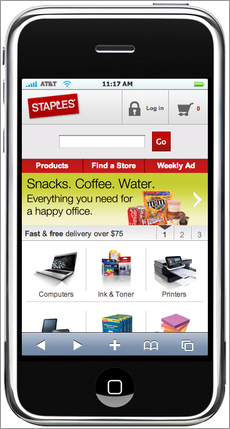
These best practices are particularly important to apply for mobile website home pages, because if visitors can’t immediately understand how to navigate or use a search, they will leave and try and find a mobile website that does a better job with this.
And on your interior mobile pages, you should also make sure you add breadcrumb navigation links at the top as a way of navigating because these are much more useful here than on regular websites.
Think Functional Rather Than Pretty, and Think Clean
Don’t waste space on your mobile pages, because every pixel counts—much more than on than a regular website. Try and simplify your pages as much as possible, and really think whether each module or option you are showing is needed or could be shrunk in size.
You should also avoid using overly elaborate visual elements, because these often take up too much space—cleaner and functional mobile web page design is the goal here.
In particular, you should not use promo or banner ads on your mobile pages, because they can take up a huge percentage of the first visible area that a visitor sees, increasing the chances of them not seeing what they want and leaving prematurely.
To help you discover what elements are needed and what are influencing conversions the most, you can also use inclusion/exclusion and real estate tests on your mobile pages.
Put a Link to the Full Site on Each of Your Mobile Pages
One of the simplest but most important things you need to add to the bottom of your mobile web pages is a link to see the regular full website. This is important to offer just in case your mobile version is a scaled-back version and doesn’t solve some of your visitors’ needs, or they simply want to see the regular full version instead. This is very frustrating for the visitor if they can’t do this and is a cause of many unnecessary premature page exits on mobile websites.
Make Your Fields and Buttons Bigger So That Visitors Can Click Them Easier
Research has found that visitors make twice as many mistakes when using buttons and forms on mobile devices than on regular websites. This is because it’s much harder to interact with website elements like forms and buttons precisely without using a mouse.
As a result, it’s very important to make buttons, form fields and other interactive elements much larger so that visitors can click on and interact with them much easier. This is particularly important to do for form fields that are found on login and register and purchase related pages. This is often known as making your website elements “fat finger” friendly.
Check Your Checkout and Other Key Conversion Flow Pages in a Mobile Browser
If you aren’t optimizing your critical conversion flow mobile pages that lead to conversions, then all the great work optimizing the rest of your mobile website will be wasted. This is because visitors will not put up with poorly designed checkouts, registration or signup processes that aren’t very usable on mobile smart phones, and will often leave your mobile website to find one that makes it easier for them to use.
In particular on these conversion flow pages, you should make sure your fonts are easily readable and your buttons are easy to see and click.
So go ahead and check how easy it is to use your conversion flow pages, and always get feedback from your visitors using tools discussed in Chapter 4. Overall, to increase your conversion rates you need to make it as easy as possible for your visitors to check out or step through your other key conversion flow pages.
Test Your Mobile Pages to Optimize and Increase Conversion Rates
One last important point to convey is that you shouldn’t just build a mobile website, forget about it and move back to testing your regular website. You need to continue to test your mobile website to improve how it engages and converts. You can use many of the test ideas in this book for your mobile pages, particularly regarding buttons, headlines and forms, because they will often have a big impact on your mobile website conversion rates—just make sure they look good and are usable on smaller screens!
Friday: Consider Making an App Version of Your Website
Apps have become wildly popular with the explosion in the use of smart mobile phones like the iPhone and Android phones and have become an excellent way of delivering content in a mobilized, miniaturized fashion. Many savvy marketers have begun to take advantage of this trend by creating app versions of their websites so they can be downloaded on these smart phones or tablets. Yes, doing this will definitely add to the “cool” factor of your website, but rather than just automatically thinking you should do this for your website, there are several things to consider.
First, specific types of websites will benefit more from this. If you have a particularly unique or feature rich website, then these are great candidates for creating an app version of your website. This is because you can take advantage of greater coding and design functionality in apps that are harder to pull off in traditional mobile browsers (for example, because they get downloaded first rather than constantly loaded each time, they can be more bandwidth-intensive). However, there are some drawbacks to this. App versions of websites can be harder to update and control after the visitor has downloaded them, so it’s hard to test and push changes live to all of your app website version users easily. They can also be deleted very easily. In other words, don’t rely on this option instead of a creating a mobile version.
And last, don’t force your visitors to download the app version of your website when they are on your mobile version, as this will frustrate your visitors and cause them to bounce. Ask them once initially, and then only occasionally in the future, not every time.