
Chapter 8
Keep Them Coming Back—Optimize for Repeat Visits
Repeat visitors are often the most engaged type of website visitor and will often convert much higher than first-time visitors. This week you will focus on this to help increase your website conversion rates. You will learn best practices and test ideas that will get more of your website visitors to come back, including how to test and optimize specific web pages and email campaigns to encourage repeat visits.
Chapter Contents
- Week 24: Focus on and Generate More Repeat Visits
- Week 25: Optimize Your Registration or Sign-Up Pages to Get More Repeat Visits
- Week 26: Optimize Your Email Marketing Efforts to Get More Repeat Visits
Week 24: Focus on and Generate More Repeat Visits
This week you are going to learn more about the importance of getting visitors to come back to your website. These visitors who are returning to your website are known in web analytics tools as repeat visits (or repeat visitors) and can have a great impact on increasing engagement and conversion levels on your website.
Monday: Learn the Importance and Benefits of Repeat Visits
Today you will learn about the importance and benefits of increasing the number of repeat visits on your website.
The major reason is that visitors who come back to your website are usually more interested and engaged in using it than first-time visitors. This is because they have already visited your website, are more likely to know more about it, and often know more about the benefits of using it. Even more important, because they are more engaged, repeat visitors are much more likely to convert for your website goals than first-visitors to your website are.
Therefore, generating a higher number of repeat visits often increases the overall engagement and conversion rates of your website.
Focusing on repeat visitors also has another major benefit; it is usually much cheaper and easier to attract these than trying to attract new visitors. Instead of having to always rely on running extensive and costly online marketing campaigns to attract new visitors, your repeat visitors will come back to your website at little or no cost (unless they use paid search ads to get back to your website).
This is one of the key reasons that more money should be spent initially on optimizing websites before spending considerable budget on driving new visitors to it—it will make your marketing campaigns much more cost effective, because more repeat visitors will come back for free from these as a result of a more optimized website.
A great way to increase the chances of your visitors coming back to your website is to increase the opportunities to capture their email address. This email address often gives you permission to stay in touch with and market to them via email campaigns, and encourage them to return to your website.
Another good way of increasing visits is by creating and promoting content on your website that increases the chances of visitors coming back to use it. If you make them register or sign up to access this content, you will often also get the benefit of using their email address to market to them.
It’s also important that you use your web analytics tool to understand which traffic sources your repeat visitors come from most and least, and what content on your website influences them to return. Once you have analyzed this, you can focus on and improve these traffic sources and content so that they increase the number of repeat visits from your visitors.
For the rest of this week, you will learn in more detail about how to get visitors to come back to your website and increase the chance of them engaging and converting.
Tuesday: Check Your Repeat Visits and Analyze for What Causes Them to Come Back
Today you will check your current levels of repeat visits, set a target, and then analyze what is currently causing them to come back most often. This will help you understand how your website is currently performing and creates a benchmark for to review in the future to monitor your efforts to optimize this repeat visit rate. You should also set a target for this too.
The first thing you need to do is check and benchmark your repeat visit rate and then set a target for it. In Chapter 2 you should have already done this, so if you haven’t, you need to log in to your web analytics tool and see what your repeat visit rate for the last 30 days is, and then set a realistic target; a 20 percent improvement in this is not unrealistic.
Next, it’s important to understand what elements of your website or sources of traffic are causing your visitors to come back. This means you can focus on frequently returning sources to emphasize them further, and understand and optimize sources that aren’t currently returning as often that really should be. To do this you need to set up a high return rate visitor segment in your analytics tool, which should be defined as at least five visits per unique visitor per month. To help you do this, refer back to Chapter 2 where you set up other visitor segments.
Setting this visitor segment up allows you to track these frequently returning visitors to help you understand and analyze what they are doing that is causing them to come back, such as their traffic sources or content they visit.
After you have collected a few weeks’ data for this high return rate visitor segment, you can start to analyze patterns to help understand what is causing visitors to come back most often. Here are two things to look at that will help you analyze this better:
Wednesday: Obtain More Visitor Email Addresses to Market to and Encourage Repeat Visits
One of the best ways to get a visitor to come back to your website is to obtain their email address and send updates and newsletters to them. Because of this, you should increase your efforts to capture as many email addresses as possible. Today you will learn some best practices to help you do this.
However, first it’s important to mention that you should always get your visitors to opt-in to receive your emails, and don’t buy and import third-party email lists, as emailing un-opted in visitors like this will often come across as spam and get you in legal trouble.
Create a Newsletter and Prominently Promote It on Your Website
One of the easiest ways to obtain more email addresses is to get visitors to sign up for a newsletter on your website that offers value to them. To capitalize on this, try to create a weekly or monthly newsletter that contains latest related industry, product, and news content about your website. This newsletter keeps your website on your visitor’s mind and is a great way to get visitors to come back to your website. You should also promote signup to this newsletter across modules on your website and explain the benefits of doing so, which is a subject that will be covered in more detail in Week 25.
Allow Visitors to Sign Up for an Account or Member Profile
Many websites give visitors the option to create an account or a member profile. This usually provides some benefit to the visitor, such as saving their details or enabling them to communicate with other visitors on the website. The benefit of doing this is that when visitors sign up for these, they have to provide their email address. And if they opt-in to receive emails from you, you can send them emails to encourage them to come back.
Therefore, if you don’t already offer the ability to create either of these on your website, you should consider offering it as a way to increase the number of email addresses you receive. Then don’t forget to promote on your website that you can now register for an account or member profile, and the benefits of doing so.
Offer Visitors Something for Free in Exchange for Email Address
As discussed in Chapter 5 in the theory of reciprocity, giving your visitors something of value for free will increase the chances of them feeling obligated to buy from your website or use it.
When you test offering them something for free on your website, you should make them fill in their name and email address in order to receive it. You could entice them by offering free coupons, a free trial, a free ebook, or a product/industry whitepaper. Not only do you get their email address in order to send the free item to them, but you increase the chances of them engaging/purchasing with you in the future to reciprocate.
This free content is a great traffic driver to your website too, and if you promote this free item well enough on your website (and create marketing campaigns around it), it will greatly increase your traffic levels and the number of email addresses that you get.
However, don’t forget to clearly state that you won’t spam them when they give their email address to you (which is a subject you will learn about next). You should also only email them about things relating to what they signed up for and not just add them to a general mailing list; otherwise, they will consider this as spam.
Always Reassure the Visitor When Asking for Email Address
Back in Chapter 5 you learned about visitors’ common security and privacy concerns when giving their personal information to websites. This is very prevalent when visitors are asked to submit their email address, as many people think they are going to get spammed. If you don’t allay these fears and anxieties, you will greatly reduce your ability to generate email addresses to send email marketing campaigns to.
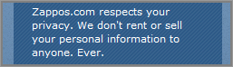
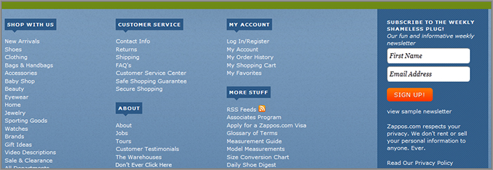
To help address this, next to any form asking the visitor for their email address, you should clearly state your security and privacy policy (with a link to your page that explains this in more detail). In particular, you should state that you won’t spam them, sell, or rent their email address. Zappos.com does a very good job of using this messaging, as you can see in Figure 8-1.
Figure 8-1: Example of email address reassurance messaging
Set Up Auto-Responder and Follow-Up Emails
A great way to increase the chances of visitors coming back to your website is to make better use of the email addresses that you receive. One of the best things you can do is to set up and make use of auto-responder and follow-up emails. This will be discussed more in Week 26.
Next, you will learn that another great way to get email addresses is to create content that not only requires visitors to give their email address to register for it, but also brings visitors back to use it.
Thursday: Create Content That Encourages Visitors to Come Back More Often
To encourage your visitors to come back more often, you should also create content on your website that engages them. Today you will learn some ways to create this engaging content that is designed to bring them back to use it.
Start a Related Online Community
A great way of producing engaging content to bring your visitors back is to create a community section on your website. This allows your visitors to communicate and engage with other members on your website, usually in the form of participating in forums and discussions. This online community should be free of charge, and members should get their own customizable profile and be able to contribute their own content, including discussions, photos, and videos. To help run this, you would need to find a community administrator who is willing to take on this task. You would also need to try and attract a critical mass of users; otherwise, it might not flourish.
There are several inexpensive community platforms that you can use to build and easily customize an online community for your website; Ning (www.ning.com) is a particularly good option to evaluate.
Start Creating a Related Blog
Another way to engage your visitors with great content is to create a related blog with engaging original content and prominently show options for visitors to sign up for your blog updates via RSS feeds or email.
If you produce great content for this, it will increase the chance of visitors signing up to receive it. To help you do this, you can use guest authors to write for your blog, including those in related industries. A great source of content can be the contents of your newsletters, which is particularly good if you don’t have much time to create additional content for your blog.
To encourage visits to your website from the feed reader, you should use just a snippet of the full blog article when you are creating your RSS feeds, and include a link for them to read the full article. If you don’t do this, visitors will simply read your content in their RSS feed reader (like Google Reader) and won’t actually visit your website that much (unless you can provide them good reasons in your articles to use other features on your website—then you could let them read the whole article in their feed reader).
A good tool to help you manage and customize your RSS feeds is Feedburner.com (http://feedburner.google.com).
Regularly Create Original Content
The better your website content, and the more often you produce new content, the more likely that your visitors will come back to it naturally. This content can also form the backbone of your newsletter campaigns, too. Creating content in a series works particularly well, and you should give your visitors the option to sign up to read these through RSS feeds like those just mentioned.
Creating regular new fresh content is also great to help improve your search rankings because they give rankings boosts to websites that do this.
Friday: Retarget Your Repeat Visitors via Contextual Banner Ads on Other Sites
Today you will learn about an advanced way to bring visitors back to your website that will usually result in much higher engagement and conversion levels from them.
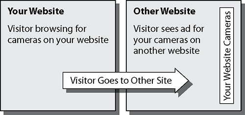
Online advertising technologies have advanced so much recently that you can now use highly relevant banner ads to bring visitors back to your website. This is done by targeting and showing them more relevant ads relating to content they had previously seen on your website. This is known as ad remarketing or retargeting and helps keep your website top-of-mind for when your visitor is finally ready to come back to your website. If and when they click on these ads and come back, they are usually much more likely to convert on your website than normal visitors.
For example, a visitor browses cameras on your website; then the next day they visit one of their favorite other websites and quickly notice banner ads for your website advertising the cameras they had seen on your website. They may notice your prices are cheaper than those on the other sites they have since browsed, click on your banner ad and purchase the camera they wanted on your website. For a visual representation of this, see Figure 8-2.
Figure 8-2: Visual representation of ad retargeting
This can be used for many things, not just for advertising products. For example, you could retarget your visitors with ads that explain the benefits of your service, or target them with coupon codes.
You can take your ad remarketing to an even higher level by applying tests in your banners ads to find best performing click through rates, and you can even use advanced targeting to reach particular types of visitor segments who have been on your website.
However, be careful what definitions you use to trigger this future ad remarketing when visitors are on your website. Don’t just trigger it for something they see a few times on your website; you need to make sure they really are interested in it before you retarget them. If you don’t do this, you will risk wasting these remarketing ads on your visitors, possibly frustrating them if the ads don’t really appeal to what they wanted on your website.
To learn more about setting up this ad retargeting, there are a number of options for you to evaluate, including tools within Adobe Test&Target and Google Doubleclick. (www.google.com/doubleclick). There are also ad networks that are set up specifically for you to do this, such as AdRetargeting (www.adretargeting.com) and AdRoll (www.adroll.com).
Even though this is often more expensive than traditional banner advertising, it can often yield much higher visitor return visit and conversion rates. Therefore, if you have the budget to test this, you should definitely consider using this method to bring visitors back to your website.
Week 25: Optimize Your Registration or Sign-Up Pages to Get More Repeat Visits
To increase the number of email addresses you receive from visitors and therefore improve your chances of repeat visits, when visitors sign up or register on your website you need to optimize the related pages for these conversion flows. There are many things you can to do optimize these, and today you will learn some best practices and test ideas for doing this.
Monday: Check the Performance of Your Registration or Sign-Up Pages
First, you need to understand how your registration or sign-up pages are currently performing for conversion rates and other engagement metrics. This helps you set a benchmark that you can later revisit to see how well your optimization efforts have fared for these pages and the resulting many extra visitors that come back from doing this.
To do this, you need to check the completion rate of these page flows and the drop off rates between the pages. As discussed when optimizing checkout conversion flows, you can do this by running a funnel report in your web analytics tool. For example, in Google Analytics you simply pull the Funnel Visualization Report for your registration or sign up flow pages and check for the overall conversion rate of this and the pages that show the highest drop off rate (this first requires you to set up a goal for this conversion flow with all relevant pages within it). This is great for understanding which pages of your flow are problematic and need most optimization attention.
In your web analytics tool, you should also check the exit rate for the first page of your registration or sign-up page, so you can see how engaging it is or how much friction it is causing for your visitors. If the exit rate for this page is higher than 50 percent, you should definitely test and optimize it using best practices found later this week.
Now let’s examine some best practices and test ideas for these types of pages that will increase conversions and result in more email addresses for you to send email campaigns to.
Tuesday: Focus on the Benefits of Signing Up or Registering
One of the most important things that your sign-up or registration process needs to convey is the benefits of doing so to your visitors. Today you will learn how to do a better job of this to increase the amount of visitors that complete the process.
A common mistake that many website designers and marketers make is to simply place links to register across their websites and expect visitors to naturally know the reasons why they are being asked to register or sign up or the benefits of doing so. This is because these people are usually far too close to the website and don’t put themselves in the shoes of a potential visitor whom they are trying to persuade to register or sign up.
Therefore, you should never presume they know these reasons and benefits, and go ahead and put yourself in your visitors’ shoes to see if your website makes the reasons why a visitor would want or need to register or sign up obvious.
The best way to make sure they at least see these benefits is to prominently display these before they arrive on your registration and sign-up pages—for example, on your home page or top entry pages. You should also test using bullet points to convey these benefits, as you learned about in Chapter 6.
It’s also particularly beneficial to explain whether it is free to sign up or register, and you should also state how long it takes to complete the process (for example, that it takes less than one minute). This is because visitors are more likely to be persuaded to join or sign up if it is free, and they also like to know how much effort is likely going to be needed from them before they invest time in trying to do so.
If you test all of these best practices you will more than likely get a good boost in the completion rates for your signups and registrations.
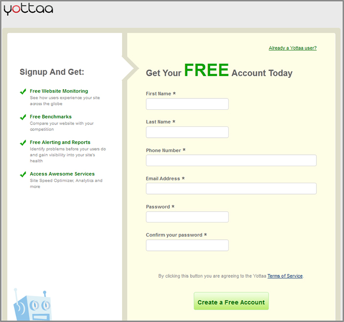
Next, it’s critical that you then repeat these benefit bullet points on the registration or sign-up pages. An ideal place to repeat these benefits on registration pages is at the very top, or in a sidebar next to the form fields. As you can see in Figure 8-3, Yottaa.com does a great job of showing the benefits of signing up with them (as well as emphasizing that doing so is free).
You should also avoid making use of pop-up windows or light boxes as registration or sign-up pages. While it can often look “cool” on your website to do this, it can often have negative connotations for conversion rates. This is because they often restrict the space to successfully convey benefits and some are hard for the visitor to figure out how to close when not needed or navigate through (often causing them to leave in frustration).
Figure 8-3: Example of showing benefits on a sign-up page
Wednesday: Optimize Your Sign-Up and Registration Forms and Pages
Next, you will learn about other major ways to optimize these sign-up and registration pages. In particular, one of the most critical things to optimize on your registration and sign-up pages is the forms on them that ask your visitors for information. This is because in order for your visitors to successfully register or sign up, they need to complete your form quickly and easily without encountering any frustrations that may cause them to abandon the process.
Remove Unnecessary Fields in Your Forms
One of the simplest and quickest ways to increase completion rates of your forms is to remove fields that aren’t really necessary or mandatory.
Just because any extra nonessential information may be valuable to you or your sales team doesn’t mean you should ask for it, or even worse, make it mandatory—remember that website visitors are still very wary of giving away their personal information, particularly with the rise of personal identity theft.
Common examples of fields that can have a negative impact on form completion rates and should be considered for removal are date of birth, phone number, and income bracket. To help you find potential fields to remove, go ahead and run inclusion/exclusion tests on your current set of form fields to see which ones negatively impact form completion rates the most.
State Which Fields Are Mandatory on Your Forms
To help improve your form usability and completion rates, you should place a bolded asterisk next to your form fields that are mandatory, with an explanation of this at the top of the form. This is because it’s frustrating for a visitor to not know which fields are mandatory, which often causes incomplete form error messages.
Ideally you shouldn’t even have fields that are not mandatory anyway, and you should ask yourself why you even need the field if it’s not, and test removing them.
Improve Your Form Completion Error Validation
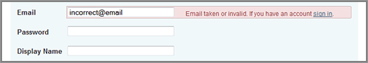
One of the biggest causes of premature abandonment of a registration or sign-up page is due to poor handling of error messages that appear after a visitor does something wrong when submitting the form. Instead of just refreshing the page with a vague or technical sounding error message at the top of the page, you should employ best practices like highlighting the field in red that contains the error, with red text next to it that explains how to remedy the error. This is known as contextual error validation (displaying an error message where the error is). For a good example of this error message handling, see Figure 8-4.
Figure 8-4: Good example of form error validation
Another best practice is to use inline validation. This is where each field is validated while your visitors progress through your form, and means they don’t have to wait until they submit the whole form to fix any issues found and risk confusing them. For example, you should validate email addresses for the correct format and also check username availability as soon as the visitor clicks out of that corresponding field and onto the next one.
Also, reducing the likelihood of error messages for fields that are left blank is another reason to indicate which fields are mandatory, as just discussed.
So go ahead and review how your forms handle error messages to see how they fare, and then test making these improvements to help increase form completion rates.
Optimize the Number of Steps in Your Registration or Sign-Up Process
Now you know some best practices to optimize the fields in your forms, it’s important to optimize the actual steps and process of signing up or registering, and the pages associated with them.
First, if you have numerous pages in your sign-up or registration flow, you should consider testing condensing these to fewer pages. Often having fewer steps to register or sign up can seem less daunting to the visitor and can help increase the chances of them completing the process. Ideally you shouldn’t require them to have to go through more than three pages to sign up or register for something, as this will decrease the chance of them completing it.
However, on the flip side, you shouldn’t cram all your fields into just one page if you have more than 10 fields, as visitors can be overwhelmed by this and abandon your page, therefore you should test splitting these longer forms up into two pages. Sometimes having a very short first step page will make the visitor think that the sign-up is very easy, and increase the chances of signing. The main point is to test varying the number of page steps to find a flow that increases signup completions the most.
Just as you learned about optimizing a good checkout page flow, you should also make use of a progress bar at the top of the pages and show step numbers. This helps indicate to the visitor how many steps are ahead and where they currently are in the flow.
Thursday: Optimize Your Newsletter Sign-Up Forms
As discussed in Week 24, a great way to encourage people to come back is to create a newsletter and get them to sign up for it. To be able to do this effectively, it’s also important to optimize the way that visitors sign up for your newsletters. To help you do this, today you will learn some best practices for optimizing these to increase your newsletter opt-in rates.
Don’t Make It Mandatory for Visitors to Fully Register to Receive Your Newsletter
To increase the chances of your visitors signing up for your newsletter, you should require as little information as possible from them to sign up. Other than a form for their email address, the only other thing you might want to include is a field for their name and check boxes to signify which newsletters they want to sign up for (if you have multiple). You can always ask them for more registration information after they have finished signing up for the newsletter.
In a nutshell, don’t make them have to sign up for a full account to sign up for your newsletter because this may deter them from doing it.
Test Using Newsletter Sign-Up Modules across Your Website
You should make it as easy and quick as possible for people to sign up whenever they want to; don’t make them have to click to a newsletter info page first to be able to sign up.
The best way to do this is by using a newsletter sign-up module that has an email input box and submit button. The best place to have these is in the sidebars or footer of your website because this will also promote your newsletter much better across your website, and will give it more exposure. These modules should also contain links to learn more about the newsletter, a few words about the benefit, and links to your newsletter samples and email privacy policy.
As a good example of a newsletter sign-up module that follows these best practices, Figure 8-5 shows how Zappos.com does it in their footer.
Figure 8-5: Good example of a newsletter sign-up module
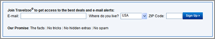
Restate Your Email Privacy Policy to Help Relieve Visitors’ Email Sign-Up Anxieties
As you learned about earlier in this chapter, to reduce visitor email sign-up anxieties and increase email sign-ups you need to reassure your visitors that their email address will be safe.
One of the best places to restate this is right near your email sign-up buttons. This reassurance messaging should explain that the visitor’s email address won’t be sold, rented, or used for spam purposes. TravelZoo.com does a great job of trying to relieve this anxiety, as you can see in Figure 8-6.
Figure 8-6: Example of privacy reassurance near sign-up box
You should also provide a link near your sign-up button to your privacy policy page so they can learn more details about it.
Use a Newsletter Details Page to Show Images of It and Benefits
Don’t presume that visitors will know the benefit of signing up to your newsletter. To increase the chances of them signing up, you should create and allow them to visit a newsletter details page. This should explain the benefits of signing up (for example to get the latest news or coupons), ideally shown in bullet point format, and also examples of the newsletter, either in the form of links for past newsletters or screenshots.
Friday: Test Other Ways to Increase Completion Rates on Your Registration or Sign-Up Pages
Today you will learn about several other best practices to help increase the completion rates of your registration/sign-up forms, ultimately helping to get your website more repeat visits and better conversion rates.
Test Your Calls-to-Action and Headlines
First, you need to test the wording and style of your calls-to-action (CTAs) and headlines on your sign-up and registration pages. For example, you should test emphasizing words like “free to join” or “takes less than two minutes to join” if any of those are the case. As you will remember from Chapter 6 where you learned much more about this, these headlines and CTAs have a very strong influence on your conversion rates, so you should test and iterate on them for these pages.
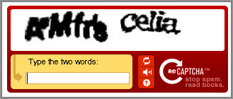
Optimize Your Captcha Boxes
Visitor validation tools have now been added to many website sign-up and registration pages. These get visitors to read something and then type in what they see or the answer in order to prove they are human; they are often referred to as Captcha or ReCaptcha boxes. While these benefit the owners of the website by limiting the number of robots and spam coming through, unfortunately they often really frustrate the users of them. A very common complaint from users of these is that the verification words are too hard to read and therefore takes many attempts to complete the form. In really bad cases, visitors will often give up on it, causing them to abandon a sign-up or registration page entirely.
As a result of this issue, you should always check how hard your codes are to read and fix if they are usually too hard and always offer the ability for the visitor to change the phrase or word if they can’t understand it. To prove this point, Figure 8-7 shows an example of a very hard Captcha code to read.
Figure 8-7: Example of hard-to-read ReCaptcha words
As an alternative form of human validation to test, you could ask simple math questions or use the service provided by SolveMedia (www.solvemedia.com).
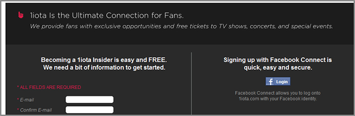
Offer Third-Party Website Registration Functionality
A newer best practice to increase registration and sign-up rates is to skip the need for your visitors to fill in your registration pages altogether, instead allowing the visitor to register with their login credentials from another popular website like Facebook, Yahoo, or AOL.
This functionality allows visitors to instantly register with your website without the need to give their details to your website. Using third party login credentials like this also makes it much easier for your visitor to remember their username and password when they come back to your website, and visitors may often feel safer knowing their login and registration information is not being stored on your website.
Therefore, you should test showing functionality for this prominently on your registration and sign-up related pages and see how much it increases your registration or sign-up completion rates. Figure 8-8 shows a good example of third-party sign-up options to the right of the 1iota.com sign-up page.
Figure 8-8: Example of offering third-party website registration functionality
Test Your Order, Registration or Sign-Up Confirmation Pages
As mentioned in the shopping cart optimization week (Week 21), online marketers often pay little attention to their website order confirmation pages, which is unfortunate because they are prime candidates for engaging your visitors further to get them to come back and convert for other goals. Your registration, sign-up, and newsletter opt-in confirmation pages are also prime candidates to optimize for these same reasons.
Here are several things you should test adding on your confirmation page, no matter what the confirmation is for:
- Test upselling other related information or products.
- Test adding quick-start steps section so that visitors know what to do next.
- Test adding most popular or most useful links section.
- Test allowing visitors to create a full account (if they haven’t already).
- Test allowing visitors to change their newsletter subscription offers.
Next you will learn how to optimize the emails you send to your visitors in attempts to get them to come back and convert.
Week 26: Optimize Your Email Marketing Efforts to Get More Repeat Visits
As you learned about over the last two weeks, once you have got your visitors’ email address you can send them email campaigns if they have opted-in. This often results in a much higher chance of generating repeat visits from them and converting them in a future visit for your other conversion goals.
It’s important build on this by improving and optimizing your email marketing efforts they receive because doing this will increase the chances of them coming back to your website and engaging and converting. And realize that influencing and converting them doesn’t actually end on your website—it should continue in your emails that you send to them.
Regardless of how well you think your email marketing efforts are performing, even if they have very high open rates or click through rates, there are many best practices to help improve them even further. Therefore, for the rest of this week you will learn best practices and test ideas to optimize many types of email marketing campaigns, including your confirmation emails and follow-up emails.
To improve your chances of success with this, it’s also important to know that ideally you should have someone within your company dedicated to email testing and optimization efforts.
Before you move on though, you need to take a quick snapshot of your current email marketing performance levels, so that you can measure how effective your improvement efforts have been. To do this, you need to log in into the tool that you use to send your emails, and work out averages for the following key metrics:
- Open rate (percentage of recipients who open an email)
- Click-through rate (percentage of recipients who click a link in the email)
- Click-to-open rate (percentage of openers who click a link in the email)
Monday: Learn Best Practices and Test Ideas for All Email Marketing Methods
Today, you will learn about some best practices and test ideas that apply to any of your methods of email marketing.
Optimize What Your Emails Look Like with Images Turned Off
It’s important to realize that many email readers have images turned off as a default setting, which can have a major impact on your emails. If your visitors do have them turned off in their email readers, this results in them not seeing your images, and instead only seeing a small red X and a blank image.
This is particularly problematic if you have images in your emails that consist of or contain calls-to-action, or if the whole email is image based.
There are several ways to help remedy this issue. First you should always make sure you place alt tags on any of your images, as these word tags will show instead. Next you should also make use of additional text links in your emails for your calls-to-action to increase the chances of them being seen.
To fix this you can also try using CSS to create your buttons instead of using images, or you can try combining background images with regular text to achieve the same look of an image, which is good because this will also still show the button text if they have images turned off.
Optimize What Your Emails Look Like on Mobile Phones
A significant amount of internet users are now reading their mail on smart mobile phones like iPhones and Android phones. According to a recent study by the Relevancy Group, as many as 39 percent of consumers currently access one or more of their personal email accounts on a mobile device. Therefore, you need to check what your emails look like on the leading mobile devices and their much smaller screens to identify and fix any issues you see.
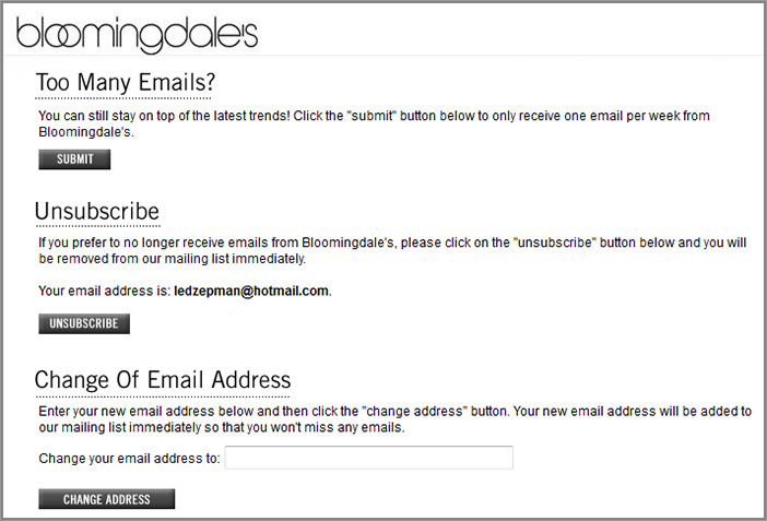
Offer Alternatives If Readers Want to Unsubscribe from Emails
If visitors click on the unsubscribe link in your emails, rather than simply letting them unsubscribe on your website, you should suggest other similar newsletters or alerts that they may be interested in. Or you could suggest that they can change how often they receive emails that they get, so they get them less often. Bloomingdales.com has a great example of this on their unsubscribe page, as you can see in Figure 8-9.
Figure 8-9: Example of offering alternatives to un-subscribers
Check and Improve Your Email Delivery and Bounce Rates
While it’s important that you optimize the contents of your emails, you also need to increase the chances of your visitors even receiving your emails in the first place. Various things can cause an email to not get delivered (like spam) or bounce (such as emails that get returned to the sender because the email address no longer exists).
One of the main things you need to ensure is that your emails don’t get considered as spam by email account providers. Any good email marketing provider should offer options to spam check emails, so you should use this option to ensure higher delivery rate every time you are sending a major email campaign.
Another good way to increase the chances of your email being delivered is to include a link at the top of your emails that asks the visitor to add your online businesses’ send email address to their address book to ensure future delivery of your emails.
You should also ensure that your email service provider is doing their most to ensure very high delivery rates and low bounce rates, as this can vary in quality depending on cost of service.
Get Subscribers to Opt-In to Your Emails
Lastly, it’s important to reiterate that you need to get your visitors to opt-in to receive your marketing emails before you do so, otherwise they will be considered spam. This opt-in involves them checking a box on one of your sign-up or registration forms saying they agree to receive emails (for example future updates, news or offers), and then send them an automated email asking them to confirm their opt-in request. If you send emails to addresses that haven’t been opted in, this will increase the chance of your getting spam complaints from the recipients, getting your emails blacklisted, and possibly getting your online business in legal trouble.
Tuesday: Run Email A/B Tests to Find the Most Engaging Emails
Just as it’s very important for you to run many tests to optimize your website, you also need to run many tests in your emails to optimize them. This will ensure that your emails meet the needs of your readers better, and increase the chances of them being engaged by your emails and returning to your website, hopefully to convert for your goals.
Therefore, today you will learn some great test ideas for optimizing your emails. First though, let’s review some ways of testing in your emails.
If you are using an advanced email marketing tool, it should include some ability to do email A/B testing. This enables you to send completely different versions of emails to your visitors to see which ones convert better.
If you don’t have an email marketing tool that offers testing capabilities (or has poor capabilities) you should consider upgrading to one that offers this, such as MailChimp (www.mailchimp.com), dotMailer (www.dotmailer.com), or Lyris (www.lyris.com).
As another option for you to consider, some advanced testing tools like Adobe Test&Target allow you to test images in your emails (only images because text can’t be switched out in emails very easily using testing tools).
Test Your Email Subject Lines
Testing your subject lines is the first thing you should be doing because it’s the easiest and most important thing to optimize your emails and increase open and response rates. If you don’t optimize them and your subscribers don’t even open your email, then it doesn’t matter how much time or effort that you put into optimizing the content of your emails because they won’t even be seen.
Go ahead and start doing some testing of your subject lines to see if you can improve your open rates. Here are some best practices for testing subject lines:
- Put your most important point at the start of it, in case it gets cut off.
- Keep it relatively short.
- Use personalization.
- Spark their interest.
Don’t just optimize one set of email subject lines either. You should ideally test the subject line before you send any large email campaign to increase response rates because each campaign is likely to have different goals and need different approaches to increase open rate. To find more ideas for testing subject lines, refer back to Chapter 6 for best practices on writing headlines, as these also work well here.
Use Name Personalization in Subject Line and Email Content
Personalizing emails can really help increase open rates and click-through rates. This is because studies have shown that people love hearing and seeing their name and are more likely to be engaged when it’s used effectively. Using personalization also makes your email readers think that the person sending the email already knows you, which usually builds trust and the likelihood of them opening or responding to the email.
Most email marketing tools allow you to personalize your email by inserting the recipient’s first name or full name in the subject line or email body. To understand the likely great impact on your open rates, go ahead and create a few tests that insert the recipient’s name into the subject line and the greeting (for example, “Hi Rich, Have you seen…”).
Segment and Target Your Emails to Make Them More Relevant
As you have learned throughout this book, targeting content that is more relevant to different visitor groups is a great way to increase conversions. You can do the same for your email marketing efforts to increase the chances of them engaging and clicking through to your website. This can be done in most advanced email marketing tools.
In other words, don’t just send all of your email subscribers the same emails; you need to target particular visitor groups better. For example, you should segment your visitors who haven’t opened any email from you or visited your site in several months and send them an email encouraging them to come back. You could also try sending follow up emails to users if they don’t open the initial email within a set time period. As another good idea, you could also segment and target your email recipients by city or state to make regional offers.
Shorten Your Emails
It’s important to design your emails to be shorter to increase the chances of someone reading and engaging with them. Recent studies from MarketingExperiments.com have shown that halving the number of words on emails increased click-through rates by 16 percent. The best way to do this is reduce long blocks of text and use bullet points instead, using the best practices you learned about in Chapter 6.
In addition to this, your email text should provide teasers to entice the reader to come back to your website to see more (with usage of “read more” links). Don’t just cut and paste chunks of content from your website, with no call to action to read more on your website.
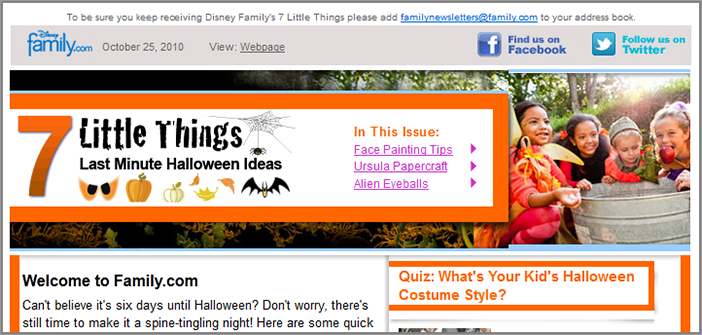
Test Including Useful Links at the Top of Your Emails
To help highlight key articles or important links in your emails, you should test adding a useful links menu area at the top of your emails. This should include links for your main calls-to-action and articles or features in your emails, or links for the major categories on your website. It should also include useful links for changing subscription options (including unsubscribe), deliverability tips, and a way to view the email in a web browser.
This lets your email readers know the most important links in your email and ensures that your best content is shown in the email preview pane, which is often not very tall.
This is also important to do for your emails that contain a considerable amount of different content, like your newsletters. Figure 8-10 shows a good example of this in Family.com’s newsletter.
Figure 8-10: Example of useful header links in an email
Test Different Headlines and Calls-to-Action
Last, and very important, remember to test your headlines and calls-to-actions because these usually have the greatest influence on whether your visitor engages with your email and clicks through to your website. Use the best practices discussed in Chapter 6 to optimize these.
Wednesday: Create and Optimize Your Confirmation Emails
Another important way to help increase email engagement and the chances of visitors coming back to your website is to use great confirmation emails. Done right, this email can set great future expectations, but if done poorly or not all, it can frustrate and alienate a potential repeat visitor. To help you with this, today you will learn some best practices that you should adopt and test in your confirmation emails.
Optimize Your Product Order Confirmation Emails
If the visitor has just ordered something from your website, not only do you need a good order confirmation page (as discussed previously), but you also need to send them an order confirmation email immediately.
This should contain full details of their order, costs, expected delivery date (or download links if the product is web based), and customer support details. If you are shipping their order, ideally you should also include a link so that the customer can actually track their shipment.
To encourage repeat purchases from them, you should include any relevant coupons or discounts in this that apply to future purchases. You could also consider testing adding upsell items, or items related to what they just purchased. Just make sure you keep it relevant and not overly sales-like.
Optimize Your Registration Confirmation and Welcome Emails
If the visitor has just registered or signed up on your website, rather than just sending them a basic email registration confirmation to say thanks, you should do much more with this.
Instead, you should turn this into a welcome email that also contains recommended next steps for the visitor to take, and top content they would likely be interested in. This will increase the chances of the visitor understanding what they should do next and how to make best use of your website, resulting in them coming back to your website more often.
Thursday: Create and Optimize Your Follow-Up Emails
If you are selling products or services that require more significant efforts to get your website visitors to buy them, you should consider using a carefully selected series of follow-up auto-sent emails to try and convert them over a longer period of time. For example, if you are offering a free trial of something, you can use these follow-up emails to gradually educate them on reasons they should purchase the full service—no need to rely on hard-selling them in your regular marketing campaigns.
A well-created series of follow-up emails can actually make your readers think you are personally sending emails to them and having a one-to-one conversation with them, often increasing their level of engagement and chances of them returning to your website and converting in the future.
These are different from regular newsletter emails, retail news email updates, and marketing emails, because these follow-up emails have the express goal of trying to get the visitor to purchase over a series of carefully created auto emails.
To help you create, manage, and automate the sending of these, you need to use specialist email marketing tools like Aweber (www.aweber.com) or Constant Contact (www.constantcontact.com). Some other more generic email marketing tools offer some limited automated follow-up email functionality too.
To increase the likelihood of recipients of these coming back to your website and eventually converting, today you will learn what to put in these follow up emails and how to make best use of them. This should be used in conjunction with the other email best practices covered earlier this week. And don’t forget to make sure they opt-in to receive these emails first before you send them!
Plan a Good Series of Follow-Up Emails and Vary Their Contents
The first thing you should do is create a long term plan for your follow-up emails that is designed to engage and get your readers to come back to your website and convert them over a period of months. Don’t just send many follow-up emails over the first week and then stop, because not only will this increase the chance of spam complaints, it will limit your chances of longer term success.
For the first few of your follow-up emails you should provide as much value to your readers as possible and avoid selling or promoting anything, or you will risk them unsubscribing or accusing you of spam (even though they have opted-in). Only once the visitor has built up trust with your emails can you do this.
For example in the first follow-up email you could ask for feedback, then the next week focus on “best of” or helpful articles, and then in a future week focus on a specific product or service benefit. Varying the type of emails you send will keep them engaged longer and increase the chances of them eventually converting.
Make Your Emails Seem Like They Are a One-to-One Communication
A great way to increase the effectiveness of your follow-up emails is to make them seem more personal and not just mass-emails. This is best done by personalizing the email with the reader’s name in the subject line and welcome message. (You could even test placing a signature at the end of the footer with your name on it.) Readers are often more likely to click links in personal sounding emails like these than ones that seem like mass generic emails that sound like they are being sent to hundreds of people at once.
Use Different Follow-Up Emails for Prospects and Customers
If you eventually manage to convert your reader over time through these follow-up emails, you should take them off this initial follow-up list and move them to a customer follow-up list instead. By doing this you can send them support and “how-to” emails to help them make better use of the product or service they just purchased. If you don’t do this, you will frustrate your visitors by trying to get them to purchase something they have already purchased, and they will unsubscribe (and possibly complain of spam).
Friday: Try Using Advanced Email Optimization Techniques
Today you will learn about some other advanced email optimization techniques to increase the chances of your visitors coming back and converting.
Test Using Shopping Cart Recovery Auto-Emails
Sending shopping cart recovery emails can work very well for enticing shopping cart abandoners back to your website to complete their conversion. In fact in a recent survey by eConsultancy, 84 percent of companies who sent emails targeting cart abandoners saw an increase in conversions. Yet the same report stated that relatively few online marketers actually use this tactic, so using it represents a great way of gaining competitive advantage, too.
In their most basic form, these auto-triggered emails can just be a subtle reminder to your visitors that they still have items left in their shopping cart. This is something that Amazon.com makes use of that you may have encountered before.
You should test making more advanced use of these though. Many online marketers have had great results by using wording in them to communicate urgency—for example, that prices may go up soon or items may not remain in stock for much longer. You could also try and influence them to complete their purchase by offering discounts relating to purchasing it.
Figure 8-11 shows a good example of a shopping cart recovery email being sent from Alaska Airlines.
Figure 8-11: Example of a shopping cart abandonment email
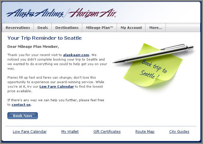
It is best to send these emails shortly after visitors abandon your shopping cart because this is the most critical time to get them back to your website before they forget completely (strike while the iron is still hot).
To help you create these advanced emails, there are companies that specialize in offering these advanced email marketing services such as SeeWhy (www.seewhy.com) and RedEye (www.redeye.com), which also offer other trigger-based email services.
You can also set these up by linking your email marketing platform to your web analytics tool, and synching up data for when a visitor triggers a certain event (abandoning shopping cart) to then push this event alert to the email tool, which looks up the email address of the visitor (if they have been there before and registered) and sends the shopping cart recovery email to them. You will need to work with a web analytics consultant to implement this on your web analytics tool and email marketing system though because this not an easy process.
Send Reminder Emails for Inactive Registered Users
Don’t just rely on your visitors coming back to your website naturally, because they will often forget about you after a while. In order to get these inactive visitors to come back to your website, you need to try pulling them back using email reminders.
This is best done by setting up functionality that enables you to send auto-timed emails to registered users based on periods of account or login inactivity. For example if a visitor hasn’t logged in for 60 days, or hasn’t posted in your community for 90 days, this could trigger an auto-email reminder to them.
In those emails you should mention some of the benefits of your website, which they may have forgotten about, and new features. To convey these reminder messages in your emails, you need to say something like, “Hi there, we noticed that you haven’t logged in for over 60 days and wanted to check in to remind you of X.” You could also try enticing them back by offering special coupons.
Send Emails to Purchasers for Reviews of Recent Purchases
Sending emails to recent purchasers asking them for a review is not only a great way to get more reviews for building social proof of your website, but it is also a great way of engaging and getting them to come back to your website. These auto-emails should be trigger-based and sent about a few weeks after a visitor makes a purchase and not sent immediately (this gives them time to receive it and make initial use out of it).
If you are lacking reviews on your website, to encourage more you could offer some kind of incentive for them to give one, like a discount on a future purchase.