

Here in the 21st century, people want quick, handy chunks of visual communication via smartphones and tablets as well as traditional electronic screens and printed material. We scan for pictures and headlines that pique our interest. We may or may not read further. There may or may not be anything further to read. We may be moving so fast that we need to absorb it at a glance or miss it altogether.
More and more, everyone from news organizations to advertising agencies relies on infographics to deliver content to audiences. Infographics—as in information graphics—present information graphically. Partner the reporter’s nose for sniffing out a good story with the designer’s eye for visualizing it, and you’ve got infographics.
The Art of Cutting to the Chase
Sometimes an infographic tells the story faster and better than words. Consider this example:
A recent poll showed that 20 percent of the residents in Precinct A voted for candidate Smith, 10 percent voted for candidate Jones, 65 percent voted for candidate Doe, and 5 percent voted for write-in candidate Anderson.
Or We Could Go This Route:

But today’s infographics go way beyond performing a supporting role to a main news event. First, infographics are not just for journalism—or even business communications. Second, infographics can tell a deeper, broader and nowadays evolving story better than text or certainly raw data alone. In many instances, an infographic is easier and faster to wrap the brain around than a paragraph of explanatory type, whether news, advertising, public relations or those “assembly required” diagrams we love to hate.
Before sharing best practices for designing such things as maps, bar charts, fever graphs and timelines, we’d like to talk a little about the evolution of infographics.
A Terse History of Infographics
USA Today usually gets credit for popularizing modern infographics. And colorful charts and graphs remain hallmarks of USA Today’s design for busy readers. But people were using graphics to deliver information well before the 1982 origins of USA Today.
The earliest humans on the planet shared information in pictures carved and painted on rocks and caves, not to mention tattooed on bodies. All over the globe, ancient peoples documented themselves and the world around them in pictographs from Japanese Kanji derived from Chinese ideographs to Egyptian hieroglyphics.

Is anyone out there?
Carl Sagan and a multidisciplinary team developed this plaque for the exterior of NASA’s Voyager space probe. The plaque was designed to communicate basic information about the human race, including what we look like and where we come from.
More recently, NASA’s Voyager interstellar space probes, launched in 1977, carry information-rich diagrams. Just in case we’re not alone. No joke.
In modern history, infographics recruited the aid of sound and motion while working in the TV business. Infographics went 3D with the invention of video games. With the great Web migration, infographics reinvented themselves as interactive. Color graphics, sound effects, animation, 3D perspective and interactivity all working together increased the communications capability of infographics exponentially. Use of infographics increased exponentially as well.
You Might Need an Infographic If…
Infographics are an excellent tool for your designer’s toolbox, but they aren’t perfect for every situation. They are best used when:
» You need to communicate quickly.
» A verbal or written account is too complicated—or tedious—for comprehension.
» Your audience can’t hear or read well—or at all.
A self-consciously ironic, though not exhaustive, infographic about types of infographics. Purity is not required. Mix and match. Or invent a new form.
Text Boxes
Profiles
Bio-Box
At-a-Glance
In-a-Nutshell
Quick Tips
Fact Box
Horse Races
Ordinal Lists
Outlines
Rankings
Ratings
Scores

Two-fers
Before-After
Pro-Con
Problem-Solution
Compare-Contrast
Sequences
Demos
How-Tos
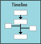
Timelines
Maps
Locator
Geological
Data/Statistical

Diagrams
Cutaways
Schematics
Diagrams
Figures
Illustrations

Charts & Graphs
Pie
Bar
Fever
Scatter
Flowchart

Choosing the right infographic for the job is equally important. Sometimes your topic offers clues to suggest a certain kind of infographic is suitable. For example, people as key actors—heroes, villains or victims—suggest bio boxes. Dates imply a timeline. References to geographic areas such as neighborhoods, floor plans or precincts hint at maps.

Word or tag clouds.
This word cloud visually displays the most commonly used words in this chapter. Free word cloud generators are easily found on the Internet.
Where do Infographics Come from?
Despite their complicated appearance, many types of charts and graphs are easily generated using common word processing, spreadsheet or presentation programs. For more advanced needs, or instances when you need more control over your colors or formats, programs designed specifically for creating charts and graphs are available. There are even online services for creating infographics. Some are free, and others are subscription-based.
Infographics also can be drawn from scratch using graphic design software. This might be your only option if you need a highly specialized infographic like a diagram.
If your layout is Web-based, then plug-ins, widgets and shared code snippets can populate your site with some types of charts and graphs. Embedding maps is perhaps the most common example of this practice. Widgets that generate word or tag clouds are also common. Word clouds and tag clouds visually represent the frequency at which particular words appear in a given context, such as a research report or an entire social media network. A “big” word means it shows up often; a little word means it is relatively rare.

Infographics on autopilot. Once you install the right bit of code or plug-in on your website, infographics like this poll will automatically update with audience input.
Dynamically-Generated Infographics.
To take the concept of the embedded Web infographic further, some graphics automatically update themselves as new data is collected and added to the source. Your website can display the results of an informal poll while poll data are still being collected, for example. Other websites with content to share may offer code snippets, plug-ins or widgets. You might add code to your site to display the week’s highest-grossing movies or perhaps updated weather information.
Some infographics needs can’t be met with pre-existing shared code. In these cases, Web developers can be hired to code solutions for mining, assembling and displaying the desired data. There is a wealth of existing data on the Internet that can be tapped to create all types of infographics. Or a developer can help you collect entirely new data. What if, for example, the local college Web team developed and posted an interactive campus map accessible via a website or a smartphone app? Imagine the instant ability to report, avoid and dispatch repairs to dangerous walkways, burned-out light bulbs and buildings in/ accessible to wheelchairs.
Quality control. While it is possible to find online generators for many infographic forms, the results might not be the best quality. For more complex infographics like timelines and diagrams, the best approach may be a custom design.
Multimedia Infographics
The methods for generating infographics and the means for collecting data have changed. But so have infographics themselves. While charts and graphs were once largely static visuals printed in hardcopy, it is now possible to create rich multimedia infographics.
Consider a diagram showing the flow of air through a heating, ventilation and air conditioning (HVAC) system. In print, we would use arrows and ordinal numbers to signify directional and sequential flow. We would add a short block of explanatory type.
But in today’s electronic formats, infographic designers would animate the airflow. High-end animation would simulate 3D perspective and might even feel something like a theme-park ride to viewers scooting along the ductwork.
In addition to typographic explainers, audio could add the recorded sound of water flowing through the liquid desiccant waterfall, along with studio sound effects and perhaps some music. Voiceover narration could add yet more information and help accommodate the visually impaired.
So when you’re brainstorming infographics, don’t forget to concept for interactivity and multimedia. No need to go gonzo, but take advantage where available and appropriate to your project’s objectives.

Next generation diagrams. Active diagrams like the HVAC diagram above are great for print. For the Web, we can take the diagram one step further by adding interactive animation and audio.
Illustration by Dimitar Dimitrov, Team Florida, U.S. Department of Energy Solar Decathlon 2011.
Gonzo multimedia infographics bring up a good point about combining and linking infographics. In the newsroom, a graphics package reports a story by using multiple types of graphics together. These often are anchored by a focal illustration or lead graphic and supported by related smaller graphs, charts, timelines, bio boxes, etc. The combination of well-crafted story, photos and infographics makes one-stop-shopping of visual appeal, in-depth information and at-a-glance comprehension.
We have two recommendations about packaging graphics:
1. Don’t avoid packaging stories because you’re not in the news business. Visual storytelling can be effective and useful in any public communication context, including PR, advertising and social networking.
2. Plan, plan, plan. Without serious coordination, a graphics package may result in visual information overload. Creating successful graphics packages requires significant preparation and cooperation. This may mean enlisting the help of photographers, illustrators, animators, researchers and writers, not to mention Web pros.
Most anyone can create simple charts and graphs. Effective graphics packages are the product of professional team effort.
Too much of a good thing? Infographics are excellent communicators, but too many in a homogenous layout makes you want to skip them all. Apply what you’ve learned about layout (remember focal point, movement and flow?) to make powerful infographics packages that engage and communicate.
Charts Can Lie: Infographic Ethics

Who supports the amendment?
Each pie chart below contains accurate data. Yet each chart tells a completely different story. Poorly executed charts can be downright misleading. In this case, plotting cherry-picked numbers creates a false impression.
As with all public communication, there are ethical guidelines to follow when creating infographics. Here we cover a few of the biggies:
Can you spell plagiarism and copyright? Never reproduce someone else’s graphic without permission. And after you get permission, you must credit your source. Usually graphics sources are noted in the lower left corner. Same goes for attributing the sources of your information.
Stick with the facts, please. It should go without saying that guessing at or making up information to fill in the blanks of an infographic is a career-ending no-no. But we’ll say it anyway: In infographics, the word is “information,” not “fiction.” Keep it factual from credible sources you can corroborate and attribute. If you have holes in your information, work harder at your research to fill in the blanks. Or drop the graphic.
Speaking of filling in the blanks with credible sources, do be critical about the sources of data. Who pays the research bills? What are the agendas of your sources and their funding arms? Perpetual skepticism is not simply an occupational hazard of the information business. It’s a prerequisite. That fact segues to the ways so-called objective numbers can mislead.
Statistics (and people) can be shifty. There are two big ways you can get in trouble when using numerical data: 1. The numbers are flawed to begin with. 2. Your presentation of the numbers is questionable or misleading. Avoid both.
If you didn’t collect the data for your infographic, put on that skeptical hat. Track down the original study to give it the once over. If you’re clueless about stats, enlist the expertise of someone with a clue.
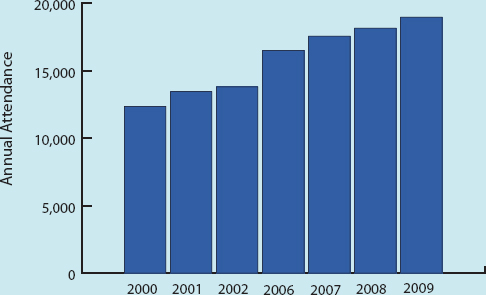
Missing something? This bar chart gives the impression of consistent annual attendance increases. But the chart doesn’t actually include data for the years 2003– 2005. For all we know, attendance dropped sharply in those three years.
Even if the original data are good, your graphical representation of the data may not be. Some common ways to ruin perfectly good stats include:
» Cherry picking numbers to prove your point
» Failing to adjust money for economic inflation (or deflation)
» Inflating the significance of large numbers if they represent a small percentage of the whole (or vice versa)
» Specious comparisons (like comparing apples and oranges)
And there are others. So if you don’t know what you’re doing in the research and quantification department, partner with someone who does.
On the other hand, don’t be one of those wimpy math-phobic communication types. Don’t let numbers intimidate you. Read a book. Sign up for a class. Take an expert to lunch.
Being ethical also means accounting for diversity. Account for the diversity of your infographic audience. People respond best when you invite them to identify with your visual messages. Beyond being inclusive, stay alert for images and text that are inaccurate, inappropriate, unfair or injurious.
We’ve fast-forwarded from ancient cave painting to multimedia infographics. We’ve also suggested when infographics may be useful, along with some ethical hazards to avoid. Time for the fun part: the design how-to.

Not just for news reporting. Infographics and graphics packages, whether print or electronic, can be used to great effect in newsletters, magazines and annual reports.
Reproduced by permission of the National AHEC Organization.
Everything we’ve covered so far will serve you well in designing and evaluating infographics, starting with research, brainstorming and thumbnail sketches. You’ll also use what you know about grids and layouts, along with the elements and principles of design, including Gestalt. Your knowledge of color, typography, photos and illustrations applies here, too.
A word to the wise as you incorporate infographics into your layouts: Test before you launch. Never just assume folks understand your infographic. Allow us to share a cautionary tale. In 2004, Hurricane Charley devastated a completely unprepared Port Charlotte, Fla. In a research project shortly thereafter, a University of South Florida graduate student discovered two facts: One, people living in Port Charlotte misinterpreted the hurricane maps that weather forecasters use to predict the uncertain paths of storms. Study participants did not understand what the maps were supposed to communicate. Two, those widely used hurricane maps had never been audience-tested for comprehension, although scientists intended the maps to save lives. Sobering.
Parts of an Infographic
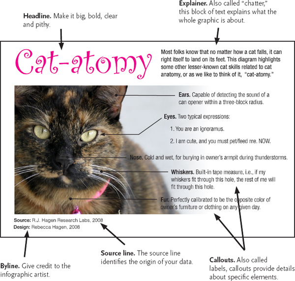
While accounting for audiences and employing the basics of good design, follow these tips on designing infographics:
Design Tips for All Types of Infographics.
Infographics must be able to stand alone. This is perhaps the most important thing to remember when designing any type of infographic.

Don’t forget unity. Choose a color scheme for your charts and graphs that coordinates with your overall design scheme.
Small embedded photo © Nicholas Larento - fotolia.com
If people are scanners searching for interesting things to look at, then the infographic may be the only thing the viewer sees. Infographics shouldn’t rely on information buried somewhere else.
Thoroughly research your topic before you begin. It does make sense to understand the material you’re attempting to illustrate. You won’t be able to facilitate others’ understanding if you don’t get it, either.
Use a grid to organize and structure your infographic. Think of your infographic as a design within a design. The same rules for good layouts work for specific graphics and infographics, too. As in larger layouts, a grid provides order and organization for the various parts of your layout, such as explainers and callouts. Aligning elements to a grid provides cohesion and unity, and it will help your reader understand the flow of the graphic.
Group things. As you create your graphic elements, be sure to cluster related items, and leave ample negative space between items to prevent confusion. Employ proximity. Remember, clustering is good, and clutter is bad.
Choose a design scheme compatible with the overall design. Think colors, fonts and other design details. If you’re creating an infographic for an existing website or serial publication, there may be a style guide that specifies the look of design elements. If there is no style guide, you’re hired. You get the job. Create a style guide in order to maintain similarity and unity.
Use care if your graphic must appear in black and white. Color is one of your greatest allies, providing organization and way-finding for viewers. If you can’t use color for your infographic, be clever with grayscale. But each gray should vary from the last one by at least 20 percent, or else the eye has a hard time telling them apart.
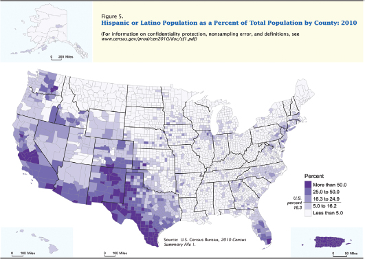
Data maps. Maps are commonly used to show location. But plotting location data also can be effective in identifying patterns. The colors in this map clearly identify Hispanic population centers in the United States.
Map reproduced from The Hispanic Population: 2010. 2010 Census Briefs, May 2011. United States Census Bureau.
Give credit where credit is due. Attribute. Cite. This goes for the source of your data and the source of any photos or illustrations you use.
Minimize ornamentation. You’re shooting for a clean comprehensible infographic. Cutesy backgrounds and other embellishments can detract from your message. Easy does it.
Keep the writing tight. Keep headlines and titles short. If possible, explain your subject and purpose in six words or less. For explainers and label text, keep your writing concise and in the third person. Use action verbs.
Tips for Common Infographics.
Maps. Put your map on a grid and eliminate unnecessary details, called “map fat.” Streamline and simplify. Be sure to include a scale showing distance. Include a legend as needed and directional indicators (at least North, if not all four directions), and indicate reference points for your reader.
Pie charts. Pie charts are intended to show parts of a whole. The full circle represents 100 percent. So don’t forget to indicate what the “whole” is. This ain’t no mystery. Then slice your pie portions accurately.
Maps are a common infographic form. There are several types, including locator maps, geological maps and statistical maps.
Reproduced by permission of USF Health.


Data visualization. Data visualization is the art of rendering collected data in graphic form. On the simple end of data visualizations are basic pie and bar charts. On the opposite end are complex diagrams such as the above semantic analysis.
Reproduced by permission of Guy Hagen.
Fever charts. Known for their spikes and valleys, fever charts are good for showing change over time. A background grid helps readers quickly grasp the trends. Remember algebra, slope and “rise over run”? Didn’t think so. But you do need to know that the Y-axis equals the rise going up and down vertically. What are you measuring? The stockmarket? Rainfall? Daily traffic? That’s your Y. The X-axis is always time or “run,” running left (from the past) to right (into the future). In 3D, the Z-axis pushes out towards the viewer.
Bar charts. Bar charts are good for comparing things. Generally, use horizontal bars—except if you’re dealing with time. If your bar chart shows change over time, revert back to the idea of time as horizontal “run” going left to right, and lay in your bars as vertical blocks and towers. In either case, label each bar with the actual number it represents. Once again, a grid in the background helps clarify relationships visually.
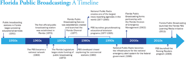
Timelines. Timelines are excellent for sharing history, providing context, demonstrating cause and effect, etc. The rules say it’s good practice to limit a timeline to 10–20 items or “frames.” The best timelines are visually to scale or proportional to the time range they represent, which suggests enlisting the help of a grid again. Or think in terms of the timeline-equivalent of a measuring tape segmenting and parsing out your particular units of time. If your timeline includes giant gaps, a list format may be a better choice.
Diagrams & illustrations. These are the most complex of the graphic styles and usually require real artistic skill to execute. Diagrams and illustrations are best when kept simple. Again, the rules for good composition will help you set up strong diagrams and illustrations. Give them focal points, as well as rhythm and flow.
Like all visual communication, the best infographics provide accurate information simply. Practice that, and you can’t go wrong. However, we’re not finished covering visual storytelling. Next up, storyboards for planning video.
► Try This
1. Design an infographic bio for yourself. First imagine a real-world use for it, such as putting it on a social media page or adding it to your digital resume. Then design it accordingly.
2. Design a multimedia timeline demonstrating either the history of infographics or the development of multimedia infographics. Research comes first. No cheating.
3. Put your hands on some credible research statistics (we like the U.S. Bureau of Labor Statistics at http://www.bls.gov/). Using the research project’s findings, thumbnail a graphics package for the Web. Execute one statistical graph or chart from your package.
4. Following the rules for map design, execute a floor plan of one room in your home or office.