Lawn Care
- Mowing
- Hedging
- Weed trimming
- Edging
- Blowing
- Mulching
Pressure Washing
- Lanais
- Decks
- Driveways
- Window cleaning
Great Service ![]() Competitive Prices
Competitive Prices
Greenwise Lawn Care Services, located in Hudson, has been a family business for over 25 years. Owned by Pat and Sandy Huggins, Greenwise is a complete lawn maintenance service for all types of properties from residential to commercial.
Eco-friendly and beautiful landscapes are part of our DNA. Pat and Sandy’s mom, Virginia, started the business. And her dad had a lawn business, too, where Mom worked during her school vacations. So the Greenwise corporate family understands how important your lawn is to you and your family. We are fully insured and licensed. Call us today for a free consultation: 555-123-4567.
Call today for an estimate
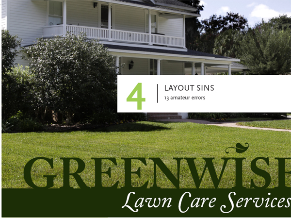
SINNERS: 13 Amateur Layout Errors
1.Centering Everything
In general, avoid centered layouts.
2.Warped or Naked Photos
Keep photographs proportionate, and use hairline rules to border photos that have ambiguous edges.
3.Too Many Fonts
Try to stick to two per layout.
4.Bulky Borders & Boxes
Use negative space to group or separate things. If you must use a border or box, choose an understated one.
5.Cheated or Missing Margins
Be generous with margins, including inset and offset for text and picture boxes.
6.Stairstepping
Keep headlines in a straight line.
7.4 Corners & Clutter
Clutter: Bad. Clustering: Good.
8.Trapped Negative Space
Push extra negative space to the outside edges of your layout.
9.Busy Backgrounds
Design backgrounds as negative space. Save tiling for the bathroom.
10. Tacky Type Emphasis
Think twice about reversing, stroking, using all caps or underlining.
11. Bad Bullets
Use real bullets for lists, and use hanging indents to properly align lists.
12. Widows & Orphans
Avoid inelegant breaks at the bottoms and tops of legs of type.
13. Justified Rivers
Avoid unsightly rivers of negative space flowing through legs of justified type.

Regarding layout sins, there are a host of them. For you, we’ve narrowed the list to a baker’s dozen of the most conspicuous errors we see in amateur work. Making any of these mistakes pretty much advertises that you don’t know what you’re doing. Until spotting these sins in others’ work fills you with pity, keep the checklist handy:
1.Centering Everything
2.Warped or Naked Photos
3.Too Many Fonts
4.Bulky Borders & Boxes
5.Cheated or Missing Margins
6.Stairstepping
7.4 Corners & Clutter
8.Trapped Negative Space
9.Busy Backgrounds
10.Tacky Type Emphasis: Reversing, Stroking, Using All Caps & Underlining
11.Bad Bullets
12.Widows & Orphans
13.Justified Rivers
Sin No. 1: Centering Everything
Amateurs tend to center everything. Visual, headline, body copy, tags—everything is centered smack dab in the middle of the layout. Admit it, that’s your first instinct. Centering feels safe but results in a visual yawn.
While centered content can communicate traditional, formal and conservative, it also creates visual flow issues. Left or right aligned layouts give the viewer’s eye a nice straight vertical line on the right or the left to follow top to bottom. Centered layouts have no such line. The eye bounces around in search of the next eye entry point.
Centering is a composition issue, meaning how you compose or arrange items on the layout. (By the way, sins 7, 8 and 9 are composition issues, too.)
Sin No. 2: Warped or Naked Photos
Warped photos. It goes like this: The size of your photo doesn’t fit your layout. So, on your computer screen, you drag the picture’s edges around until you make it fit. Bad idea. Now you have a new problem: a warped photo. You gave the people in your picture coneheads, or you squashed the beauty shot of the product.
You must resize pictures in proportion to their original size. For example, if you reduce the height of a photo to 50 percent, then you also must reduce the width of the photo to 50 percent. Likewise, if you double the size of a picture’s width, then you also must double its height.
Just look at your picture. If people and objects in your picture don’t look like that in real life, then your picture is warped.
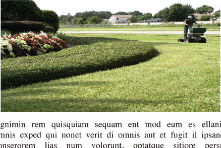
Warped and naked? Is that a very short person driving the mower or is this photo warped? (hint: It’s not a very short person.)
And without a border, our sky blends right into the background. the photo needs a hairline border.
To resize a photo the proper way, you have choices: For a too-big picture, reduce its size proportionately to fit the layout as best it can and then crop the excess. Crop means cut.
For a too-small picture, enlarge it proportionately to fit the layout as best it can before cropping the excess.
Naked photos. This sin applies to photography only, and we’re not talking about nudes. A naked photo is a photograph that needs a border. Not all photos need borders. But some do. If you can’t tell where the photo begins or ends because the photo color blends with the color of the screen or paper, then the photo probably needs a border to mark its edges. If one photo in your layout needs a border, then give all your photos the same border to be consistent.
When a photo border is necessary, use a hairline rule (as thin as a strand of hair). Or change the background color outside the photo to contrast with the edge of the photo. The idea is subtly to mark the photo’s edges without distracting from the photo. You want the viewer to think, “Cool photo,” not, “Whoa, check out that bulky border.”
Sin No. 3: Too Many Fonts
Fonts have tremendous communicative power, and not just because they are used to spell out words. The right fonts bring character, color, texture and pattern to layouts. Which means they must be chosen carefully and with purpose. It also means you don’t want to put too many in the same layout. Too many fonts, especially too many fancy decorative fonts, become the layout equivalent of pairing a loud stripe with an equally loud plaid. You get visual overload and clutter.
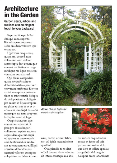
Winners: 5 Steps to Visual Success
Avoiding the sins results in a very different look. This is how to make a layout work:
1.Establish a clear focal point. A properly proportioned photo and large contrasting headline provide a clear eye entry point into this design’s layout.
2.Minimize the number of groupings the eye must scan. Cluster like with like, and make negative space work for not against flow. Instead of “4 corners & clutter” all over the page, this layout clusters everything into four key groupings: photo and headline, bullet list, body copy and tags.
3.Guide the eye with visual sightlines. Strong verticals from left-aligned copy blocks and tags give the eye a clear visual path to follow.
4.Set type properly. This design limits all caps to a large one-word headline. Choosing a single font family for type readability creates visual unity through similarity. Other typesetting details such as proper bullets are spot on. No tacky type here.
5.Use simplicity and restraint. Need we say more?

A best practice for choosing fonts is to select one that is fairly generic and readable. Think Times Roman for print or Helvetica for screen, but don’t use either one because they are both default fonts and have been used to death. Use your generic font for your reading copy, then choose a second font that contrasts for use in headlines or subheads. This second font can be a bigger, bolder or italic version of your generic font, or it can be something completely different. Bottom line: Try to limit yourself to two fonts per layout.
Sin No. 4: Bulky Borders & Boxes
Bulky borders and boxes are sins, too. Beginners tend to go border and box crazy in their layouts, mostly because they worry about visually separating layout items.
Borders and boxes are like fences. They communicate, “Stop.” You have to ask yourself what you’re fencing in or out. Chunky borders and boxes are worse because they call attention to themselves. Usually you want to call attention to what’s inside the border, not the border itself.
* Mowing
* Hedging
* Weed trimming
* Edging
* Blowing
* Mulching
Chunky borders and cheated margins. Choking hazard warning. The problem here is clutter choking all the negative space. The fat border clutters the overall layout while the lack of margins inside the border strangles the content.
If you need to border or box, think “barely there.” Think lingerie straps. Even better, think twice before using a border or box at all. Negative space can do the same separating job only without the showboating and claustrophobic effect.
Sin No. 5: Cheated or Missing Margins
In situations when you must have a border or box, you have to start all over again with margins inside the border or box. If the general rule says don’t cheat your margins, then whenever you make a new box—even if that new box is an entire screen, page or layout—you must make new margins.
Collateral and news design, for example, employs boxes for related sidebars, breakouts and pull quotes, etc. So do Web pages, totally comprised of grids of boxes. All those boxes each require a set of margins. Margins inside a text box are called inset. Margins outside a text box or picture box are referred to as offset. You need a bit of offset, for example, on the outside of a photo to keep its cutline from butting up against the photo’s edges. Without inset and offset, your type will squish up against the box, inside and out. This not only looks bad but also cuts down readability.
Don’t be stingy with your margins—wherever they appear. Train your eyes to spot areas where margins of negative space have been cheated. Remember, white space is not your enemy.
Sin No. 6: Stairstepping
This is another sin we attribute to the beginner’s pathological fear of white space. Instead of listing text (words or phrases) or visuals in a neat vertical or horizontal row, beginners will try to fill the space by
| stairstepping | ||
| their chosen elements | ||
| down the page. |

Centering everything, cluttering the corners. We think people who center everything and clutter all four corners probably need therapy. Symmetrical balance is comforting, like having a blankie. But your design should not make people want to nap.
There are few things that kill readability and flow more than stairstepping. Align your elements vertically or horizontally, and let the remaining white space do what it does best: Frame and highlight your important content.
Sin No. 7: 4 Corners & Clutter
After centering, the other beginner’s temptation is to fill up all four corners of the layout, along with every other available bit of space. This results in a cluttered, thus unappealing and confusing, visual message. White space is not your enemy.
Think of the Zen of good design as a balance between the yin and yang of negative space and positive space. Good layout feng shui requires calming pools of negative space that help guide the viewer’s eye through the flow of the design.
Rather than spreading out your layout’s content to fill every corner, group items together that belong together. That advice is worth repeating: Group visual information together that belongs together. Call this the clustering effect. Clustering results in fewer groupings of visual positive space.
Take tags, for example. Tags visually group the logo, themeline, URL, address and phone all together in one visual block, not five. Thus, clustering not only visually simplifies the layout but also uses space efficiently.
Clustering: good. Clutter: bad.
Sin No. 8: Trapped Negative Space
Another composition rule encourages you to push extra negative space toward the outside edges of your layout. Trapped space is a puddle of negative space landlocked inside the layout. It’s like a bubble that can’t escape.
Because it creates a big blob in the middle of your layout, trapped space can draw attention away from your other layout items. To prevent this, make sure your white space opens out to the layout’s margins.
Why is there a hole in this layout? Push extra white space to the outer edges of the layout.
Sin No. 9: Busy Backgrounds
Speaking of negative space, remember that the whole point of it is to balance the busy-ness of positive-space visuals and type. So why do some folks tile their websites with eyeball-stabbing backgrounds busy enough to induce psychosis?
About backgrounds, whether digital or print, have mercy on your design and your audience. White space is not your enemy. Don’t turn your calming negative space background into busy cluttered positive space that competes with your visuals and type. Background shouldn’t interfere with your visual communication. Background shouldn’t blink, either, by the way.

Busy backgrounds. enough said.
Sin No. 10: Tacky Type Emphasis: Reversing, Stroking, Using All Caps & Underlining
The sin of tacky type emphasis refers to a quartet of risky behaviors: (1) reversing, (2) stroking, (3) using all caps and (4) underlining. Think twice before you do any of these things, and never do all four at once.
Reversing. Some say never (ever) reverse type. Others say judicious use of the reverse can add impact. The controversy stems from a couple things.
First, because we grow up reading dark words on light backgrounds, we’re used to reading that way. We find it easier to read dark copy on a light field. Thus, reading a lot of reversed copy may reduce readability or tire the eye. If your job is to communicate a great deal of textual information, then you don’t want to reduce your type’s readability or tire readers’ eyes.
Second, too often beginners reverse type by using fonts that have both thick and thin lines. In font lingo, hairline strokes refer to the thin lines. Stem strokes refer to the thick ones. Not all fonts have thicker and thinner parts, but many do.
If you reverse a font with very thin hairline strokes, you may create a production problem. Once printed, the hairline strokes of reversed letters may disappear. This is because paper is absorbent, and reversing floods a great deal of wet ink onto the page to create the dark background. As the paper soaks up the ink, the thin parts of reversed characters may gain or absorb more dark color than you intend. Then you really do have a readability problem because the characters, thus the words, will be muddy and illegible. But the phenomenon of thin hairline strokes “disappearing” also occurs on electronic screens.
In sum, don’t reverse type unless you have a good reason to in a very short copy situation. If you do reverse type, choose a font with sufficiently thick letterforms to maintain legibility.
Stroking. Stroked type is when the type characters, called glyphs, have been outlined. Amateurs do it because they can! Or because they think it looks neat-o or helps make an important word stand out. In truth, it distorts glyph proportions and obscures original hairline strokes. It’s like outlining the Mona Lisa with a big fat whiteboard marker. There are probably better ways to get people’s attention.
All caps. Imagine yourself driving down an unfamiliar roadway. In the distance you see a road sign. You’re not close enough to make out individual letters in the words, but you can tell what the sign says because of the shapes of the words.
People read words, not letters. But when you capitalize words, they lose their shapes.
The reason words have recognizable shapes is because of ascending and descending letters. Ascenders are tall lower case glyphs that go up: b, d, f, h, k, l, t. Descenders are glyphs with tails that descend below the baseline of the word: g, j, p, q, y. Ascenders and descenders give words their shapes.
Type in all caps has no ascenders or descenders and so requires the reader to do a little extra decoding. If you want to use all caps, make sure they don’t interfere with your visual communication purpose. And don’t even think about using all caps for body copy.
Underlining. Last, never underline type to emphasize it. The only correct time to underline text is to communicate a live hyperlink.
There are better ways to accentuate type than reversing, stroking, using all caps or underlining. In a headline, use a large point size and an interesting font for impact. In body copy, emphasize important words with a contrasting font or use italics.
A GALLERY OF BAD TYPE
Font details get lost in reverse
Stroking chokes letterforms
TYPESETTING IN ALL CAPS IS NOT ONLY HARD TO READ, BUT ALSO LIKE BEING SHOUTED AT.
Want to typeset like a 13-year-old kid? Underline for emphasis!!!
(And use a bunch of exclamation points while you’re at it.)
In fact, the uninformed often emphasize type by committing multiple tacky type sins at once. Then, to make a bad situation worse, they add three exclamation points! (If an exclamation point is warranted, one is always enough.) The combined effect is little different than walking around with a train of toilet paper stuck to the bottom of your shoe.
Sin No. 11: Bad Bullets
The sin of bad bullets refers to two issues:
1.Using the wrong kinds of bullets for lists
2.Improperly aligning bulleted lists
Simple but elegant dots or numerals are almost always a good choice. Asterisks, hyphens and smiley faces are not. For decorative bullets, match their tone to your design. Avoid cheese. That takes care of the first bad bullets issue.
Pressure Wasahing
* Lanai’s
* Decks
* Driveways
* Window cleaning (exterior only)
Bad bullets, good bullets. remember that asterisks are not bullets. Use real bullets, and please learn how to create hanging indents.
Pressure Wasahing
• Lanai’s
• Decks
• Driveways
• Window cleaning (exterior only)
The second bad bullets issue has to do with proper alignments. Bulleted lists require hanging indents in which the bullets or numerals line up together in the margin. Then the type all hangs together, too, in a separate vertical line:
- Always align bullets with bullets vertically.
- Always align type with type vertically.
Get the point?
Sin No. 12: Widows & Orphans
The terminology for widows and orphans is unfortunate. The typographic problems they refer to are as well. A typographic widow refers to a few lonely words or a hyphenated word stranded at the bottom of a column or leg of type. An orphan refers to a few lonely words stranded at the top of a leg. If you can’t remember the difference between widows and orphans, just remember to avoid visually incomplete type at the tops and bottoms of legs. As always, look. Train your eyes to spot visual awkwardness.
Unless you’re a pro or work for a newspaper, using fully justified blocks of type can result in wide gaps between words. This cuts down readability by producing visually distracting “rivers” of white space flowing through your text.
Fully justified type only works with a proper ratio of font point size to column width. You can drain justified rivers of negative space by:
1. Increasing the width of your column, thus the length of your line of type.
2. Reducing the font size.
3. Or both.
Our best recommendation on fully justified text? Don’t. Align your text flush left/ragged right instead. Problem solved.

Count the gaps. Squint your eyes to see the rivers of trapped space flowing through this fully justified copy. Ugly, isn’t it?
That covers all 13 offenses. Now go forth and sin no more. Don’t forget to take the checklist with you.
► Try This
1.Go back and look at the “Try This” work you did for chapters 1, 2 and 3. Identify your own layout sins, if any.
2.Design a handout flyer explaining the 13 layout sins. Make sure your flyer doesn’t commit any of the sins.
3.Find an example of the world’s worst design. (Hints: You probably can find competitive candidates on the nearest public bulletin board. Do not, however, nominate anything your boss or client designed.) Circle and name all the layout sins the world’s worst design commits.
4.Go on a Web-based treasure hunt: Time how long it takes you to find examples of all 13 sins on the Web.