
While we appear to be moving in the direction of a paperless society, printing is unlikely to disappear completely. Printed documents have a couple things electronic documents don’t: portability and tactile quality. Handheld devices such as smartphones and tablets are starting to make a dent in the portability claims of paper, but nothing yet replicates the feel of paper. Because of this added sensory input, paper can strengthen your ability to communicate through design.
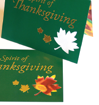
Like choosing the right font or the right color, the right paper selection can communicate volumes in an instant. If you need to send banquet invitations to the most important people in your city, we’re thinking an invitation printed on textured linen paper enclosed in a translucent envelope with a matching reply card would be more persuasive than an electronic invitation.
In this chapter we talk about choosing papers and printers, as well as getting your print job done right from estimate through delivery.
Plan Ahead for Printing: Choosing Paper
Even though printing and distribution occur at the end of the design process, paper selection and output decisions happen at the beginning. Deciding what paper and which printing method hinge on three things: how you want the finished piece to look and feel, the communication job the finished piece has to do and the size of your budget for accomplishing both.
Paper communicates.
Paper offers a tactile experience that electronic documents can’t replicate.
Getting the Look & Feel with Paper.
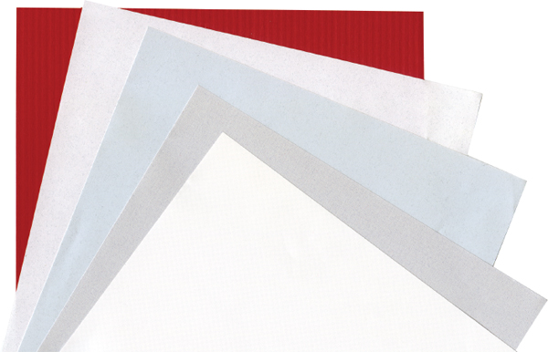
Paper is sexy. It comes in varieties of colors, weights and textures. Slick glossy paper might suggest a modern forward-thinking document. Thicker uncoated (not glossy) paper might imply a document of greater substance or importance. A heavily textured paper might lend the document a rustic quality. There are papers with pearly finishes, printed patterns, built-in textures and even flecks of flower petals.
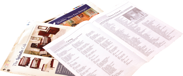
To aid the paper selection process, paper manufacturers produce swatch books that include paper samples. Swatch books are free for the asking from paper distributors or manufacturers. These folks are only too happy to share what they know with you in the hope you’ll “spec” or specify their papers for your printing projects.
But you ought to bring yourself up to speed on the most common paper varieties. Basically, there are three categories of paper: coated, uncoated and specialty. Within each of those categories lies tremendous selection in terms of paper finish, use and price.
To aid the paper selection process, paper manufacturers produce swatch books that include paper samples. Swatch books are free for the asking from paper distributors or manufacturers.
Choosing the Right Paper for the Right Task.
For choosing paper, functionality is as important as appearance. You can’t, for example, make a pocket folder out of paper intended for a copy machine. Copy paper simply doesn’t have the weight and strength to make a functional folder. Weight is just one of many paper properties you must consider in your selection process.
Paper properties also impact the way ink behaves on the paper’s surface. For example, uncoated sheets absorb ink, which can cause fine lines, such as the thin strokes on modern fonts, to appear slightly soft and even a little blurry. Depending on the paper’s level of absorbency, photographs and illustrations may appear duller when printed on uncoated sheets. Color and brightness of the underlying paper influence photo and illustration color as well. Photo and illustration colors are truest and most vibrant when printed on the brightest whitest papers.
Again, a swatch book is helpful when looking for information on paper properties. Swatch books usually indicate a paper’s properties as well as compatibility with laser and inkjet printers. Because it can be difficult for designers to guess how inks will appear printed on particular papers, many swatch books include print samples. These are often drop-dead gorgeous designs demonstrating how ink and other finishing treatments behave on a paper product.
Paper Types, Finishes & Best Uses
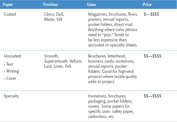
Paper varies across a number of qualities, such as opacity (see-throughness) and smoothness (tactile quality). You need to understand how these properties impact the printing process before you can choose the right paper for the job.
Being Green is Easier than it Used to be.
As a print designer, your paper and printing choices directly impact the environment. And you have cause for concern. Traditional papermaking and printing processes are not exactly eco-friendly. Aside from promoting deforestation, the methods for making paper and subsequently printing on it are energy-intensive, water-intensive and use caustic chemicals like bleach and petroleum-based inks. Printed paper often ends up in landfills.
Paper Properties
Paper Property |
What it is |
Why it’s important |
Opacity |
The degree to which the paper is see-through. |
If you need to print a sheet front and back, as in magazines and newsletters, you need a more opaque sheet. |
Grain |
The natural line-up of paper fibers as a result of the paper-making process. |
Paper folds and tears more easily with the grain, so when you design folds and perforated tear-off cards, design with the grain. |
Brightness/whiteness |
Brightness is the amount of light reflected by the paper’s surface; whiteness is the shade of white: warm, balanced or cool. |
Colors print best on brighter papers. But the brighter/whiter the paper, the more expensive it is. When printing documents with pictures of people, choose warmer whites. For landscapes, choose cooler whites. |
Weight |
In the United States, a paper’s weight is equal to the weight of 500 sheets in a specific size, listed in pounds. Paper weight influences stability, rigidity and often Opacity. |
Weight impacts the structure of the final document. If you don’t choose the right paper weight, your brochure may flop over in a rack, or your direct mail piece may be mangled by post office equipment or, worse, be rejected or require additional postage. |
Formation |
The overall distribution of fiber throughout a paper sheet. |
Good quality sheets have even fiber distribution. Poorer quality sheets have uneven fiber distribution. Uneven distribution results in uneven ink absorption, which means printing that’s less crisp than it could be. |
Smoothness |
The tactile quality of the paper, sometimes referred to as “tooth.” |
The level of paper smoothness imparts character. It also impacts the way ink lies on the paper. |
For years, the go-to solution for environmentally concerned designers was recycled paper. Unfortunately, recycled paper was not exactly high-end stuff. Designers chose it for its green message, not because it was a quality medium.
In recent years, the quality of recycled papers has improved. Designers no longer have to sacrifice quality when they choose to use recycled. Nor is recycled paper the only option. Papers made from other sustainable materials such as bamboo and hemp are on the market, as are soy-based inks.
Paper manufacturers are also stepping up to the plate to clean up their processes. Some have stopped harvesting trees from virgin forests. Others have switched to nonchlorine bleach and other less-harmful chemicals. Manufacturers are making efforts to reduce energy and water usage.
Is printing on paper still an environmentally dirty business? Yep. But you have options. Educate yourself. Look for printers and papers that have environmentally friendly certifications such as FSC (Forest Stewardship Council), SFI (Sustainable Forestry Initiative), Green Seal and others. Do some research. Ask your local printer. Don’t be shy about making inquiries.
Go Green
Looking for environmentally friendly papers? Consult swatch books and ask your printer about options.
you also can find information about environmentally-friendly papers and paper-making on these Web sites:
Forestry Stewardship Council
Sustainable Forestry Initiative
Green Seal

Keeping it Within Budget.
Paper and ink are typically the most expensive parts of producing a printed piece. So budget is often the single most important criterion in the print decision-making process. Available budget dictates whether your paper will be an economy or premium sheet. Budget also dictates whether you’ll print the job in-house or hire a commercial printer. A larger budget allows for printing extras such as four-color printing, specialty-printing processes like holographic (3D) and stochastic printing (cool use of dots to replicate images) or even finishing touches such as perforating, die-cutting, foil stamping or embossing.
While you’re drooling over the paper possibilities for your design, you also need to be thinking about the kind of printing process best suited to your design.
Types of Printing & Printers
The quality of your finished printed design is not the only criterion for choosing a printer. There is also budget to consider, not to mention deadlines, timing and turnaround. As Rebecca says: “Speed, quality, price. Pick any two.”
When you need it fast, have little or no budget and need relatively small quantities, in-house printing might be fine. You can use whatever software you have available, and font issues are less likely to occur.
But there are significant drawbacks. You’ll need to know what paper sizes you printer can accommodate (usually letter or legal, and sometimes ledger) and design within these parameters.
Unless you own a printing device capable of printing to the edge of the paper (and most people don’t), your design cannot bleed. Most printers have a built-in margin of approximately ¼ inch on the top and sides and ½ inch on the bottom. Anything you put outside the live area too close to the paper’s edge won’t reproduce.
You also can expect limited paper options. You may be restricted to inkjet or laser printer paper depending on your specific printer.
Printing documents designed to fold, such as newsletters and brochures, is painful to do in-house. When you take such projects to a commercial printer, the printer’s prepress team manages page impositioning, that is, re-positioning pages so they will print front to back in the proper order. When you print in-house, you have to do this yourself. And getting text to line up properly and space evenly around folds is no easy task. Plus, even if you do manage alignments, uh, how many of those things are now sitting on the conference room table waiting for a folding party?

Why won’t my design print with a bleed? Most personal printers cannot print ink to the edge of the paper. If you are designing a piece to be printed in-house, build a border into the design. If you don’t, you’ll get one anyway, and you may be unhappy with the results.
As a final insult, when you print in-house, don’t expect any consistency with color. You can’t assume your onscreen color will match your printer’s output.
If you plan to print in-house, you need to design accordingly from the start.
Surprisingly, depending on the quality of the quick printer, you may find printing with a quick printer as limiting as trying to print in-house. Nevertheless, quick printers have more paper choices, can print bleeds and offer a few more binding and finishing options.
Commercial/Offset.
Offset printers offer the greatest flexibility. If your job is 500 pieces or more, commercial/offset printers can print and assemble almost anything you throw at them. They can print on a wide variety of paper sizes and offer a full range of paper stock. They handle bleeds, impositioning, folding, collating, some types of binding and even address labeling.
Offset printers also offer services such as die cutting (perforations, cut-out windows, pocket folders), embossing and foil stamping, either in-house or through subcontractors.
You can expect commercial/offset printers to produce matched and process colors faithfully to swatches, such as PANTONE® solid coated or process coated chip sets. Remember, however, that the color of your design as seen on your desktop screen will not match print output unless your computer and monitor are calibrated to your printer’s.
Offset printers offer the greatest flexibility. If your job is 500 pieces or more, commercial/offset printers can print and assemble almost anything you throw at them.
It is important to note that with offset printing, the greater the print run, the lower the printing cost per piece. All the expense in printing is in the first run, meaning the setup. The cost of additional copies is negligible. For example, an initial print run of 500 pieces for a full-color flyer might cost $1,000. To print 1,000 of the same flyer might cost only $1,050. That’s double the quantity for another $50.
You save money per piece by printing the greatest number you can use.
Web Offset.
Once upon a time in graphic design, “web” referred to a particular kind of offset printing press, not the World Wide Web. The time to use web offset printing services is when you need to print a very large run, 10,000–20,000 pieces or more. Documents typically printed by web offset printers include newspapers, magazines, catalogs and books.
The biggest difference between standard offset and web offset printing is in the paper. Web offset utilizes extremely large rolls of paper as opposed to cut sheets used in traditional offset.
Four Really Neat Paper Treatments
Ink is not the only thing printers can put on paper. There are a number of after-printing finishes and treatments you can apply to make your finished piece special. Here are four of the most common:

Foil Stamping
Foil stamping involves applying a thin layer of shiny metallic foil to parts of your design. Foil comes in different shades from copper to silver to gold.
The effect is rich and becomes even richer when foil is applied with an emboss.
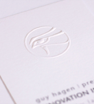
Embossing
To create an emboss, printers press a metal die into the paper to pop up a pattern on the surface of the paper. A raised pattern is called an “emboss” while a recessed pattern is called a “deboss.” This technique can be paired with ink or foil stamping. If no ink or foil is used, the technique is called a “blind” emboss.

Varnishing
Varnish is a clear coat applied to parts of a layout (spot varnish) or to the whole page (flood varnish). Applied on press like ink, varnish provides a protective coat to the finished piece. Since it comes in glossy and dull finishes, it also can be used to create two-tone shiny and dull effects.
Die Cutting
Die cutting is any paper cutting that is not strictly straight across trimming. Die cutting is used to create everything from rounded corners on business cards to the pockets on pocket folders. It also is used to create the perforations on tear-off cards.
Digital Printing.
Digital printing has gained in popularity in recent years. While offset printing uses traditional ink, digital printing uses toner and is closer to the processes of color laser printing or color photocopying.
The quality of digital printing has improved to the point where it approaches that of offset printing. Price-wise, for small print runs of 500 pieces or less, digital printing can be cost-effective. But, unlike offset printing, there is no price break for greater quantities. If 500 pieces cost $500, then printing 1,000 pieces will cost $1,000. Digital printing is best reserved for small press runs.
One compelling reason to use digital printing is its ability to output variable data printing (VDP). Think of VDP as a mail merge on steroids. Variable data printing allows a printer to take a database of names, images and other information specific to a recipient, and print customized pieces on the fly.
For example, say a pet store wants to send out a sale-promoting postcard to each of its customers. The pet store provides a database of customer names, addresses, pet names and breeds. The postcard is designed with placeholders for customer name, pet name and picture of the breed. During printing, specific customer information is fed into the appropriate placeholder. As each printed piece comes off the press, then, it has been tailored to one particular customer.
Whatever your grand vision for your design, to determine whether or not you have the budget to match it, get an estimate. Get several estimates.

RFQ. Use a Request for Quote form to get accurate prices from your printer.
Get a Printing Estimate
Some organizations actually require estimates from a minimum of three different printers before awarding the job to one. Even so, most working designers have relationships with a variety of commercial printers and so can predict which printing outfits fit the bill for which jobs, which have the most to least competitive pricing and which are accommodating and appreciative of your business. Newbie designers, however, really ought to get competitive estimates for comparison. Furthermore, as in all things, the cheapest estimate is not always the best choice.
To provide the best most accurate estimates, printers need details and particulars about the printing job. You need to gather some information:

Flat vs. finished size.
The size of a flat versus a finished print piece can differ significantly. Printers order paper based on the flat size so be sure to include this measurement in your RFQ.
» Quantity. How many pieces do you need to print? It’s a good idea to include a range of quantities on your request for estimate—for example 500, 1,000 and 1,500. You might even ask your printer where the price break starts on quantity, if any. Remember, while overall budget outlay is important to consider, you also need to consider price per piece.
» Flat and finished sizes. These are the dimensions of the document before assembly and the size of the finished document when fully assembled. For example, the flat dimensions of a tri-fold brochure might be 9 × 12 inches, and the finished size after folding might be 4 × 9 inches.
» Number of pages. With a brochure, specify number of panels. For larger documents like newsletters or annual reports, a page count is required. Because of the way printers print multiple-page documents, all printed pieces have page counts divisible by four. That requires a little forethought. If your cover design prints on the same paper stock as the inside pages of the design, then include the front, back and two inside covers in your page count. If your covers print on different paper, you’ll need a separate estimate for the cover, too.
» Choice of paper and weight. This can be very specific if you are choosing your paper from a swatch book, for example “Neenah Classic Columns 100lb cover, chili pepper red.” Or it may be less specific, such as “100lb gloss text cool white.” When you don’t specify a paper by name, your printer may spec your job on a “house sheet” that meets your criteria. House sheets or house papers are those that the printer keeps in stock and tend to be serviceable if generic. House sheets save money if paper quality is not an issue for your project.
Common Paper Folds
Folding makes a larger sheet of paper easier to manage. This lets you pack a lot of information in a small portable package.
Here are some examples of common types of folds used for posters, brochures and other printed material. Since these are common, they tend to be fairly cost-effective when created in standard sizes.
If you really want to make an impact with a printed piece, consider an out-of-the-ordinary shape with an interesting fold. Be sure to consult with your printer first. For the most part, printers can print almost anything you come up with. However, they may have suggestions regarding paper, paper sizes and cost savings.

» Number of inks. The notation for indicating the number of inks looks like a fraction. The top number indicates the number of inks required on one side of the paper, and the bottom number indicates the number of inks required on the other side. A document that prints full-color front and back would be noted as 4/4—four-color process on both sides—and pronounced as “four over four.” A two-color document would be indicated as 2/2 along with a notation on which inks to use. Your estimate request also should note if the project requires any varnishes— coatings that add shine and/or protection. Varnishes may cover the entire paper surface (flood varnish) or just specific areas such as photographs (spot varnish).
» Bleeds. Does the design bleed to the edge of the paper? Yes or no, and on how many sides of the page?
» Binding and finishing. Beyond putting ink on the paper, make note of anything the printer must do to or with the paper in order to achieve your design. This includes folds, binding, die cutting (including slots for business cards and CDs, perforations for tear-offs and pockets for pocket folders), foil stamping, embossing, debossing, putting sheets into pads, etc.
» Delivery date. At any given time, a printer may have several jobs in production. To help your printer meet your schedule and the schedules of others, be specific about your due date.
» Delivery instructions. What happens to the completed job? Will it be delivered to you, the boss or the client? Are you sending it to a mail house for distribution? Do you need the job shipped to multiple locations? Make sure your printer knows what to do when the printing job is complete.
Common Binding Types
Binding style is determined by a variety of factors: budget, presentation quality, the need to update the document and the needs of the document’s end user.
Here are some of the more common binding types.

When proofreading, pay particular attention to headlines, cutlines and other non-body type. Nothing is worse than a big fat error in a big bold headline.
Prepare your Document for Printing
Of course you want to do everything possible to make sure your project gets done right and on time and on budget. Here are some tips for getting there:
Give the document a thorough proofread.
Yes, someone does have to proofread. Additionally, pay particular attention to headlines, cutlines and other non-body type. When people proofread, they tend to focus on body copy and often skim over potential typos elsewhere. Nothing is worse than a big fat error in a big bold headline.
Beyond someone taking responsibility for typos, give your design a second (and third) look before it goes to press. Pay attention to typographic consistency. Do you accidentally change font styles, sizes or colors anywhere? Are there elements that don’t line up, especially across facing pages? Are all images or visuals treated consistently, such as outlining?
A good way to look for design errors is to print a draft copy of each page, put it all on the floor and look at each page upside-down. When reading the copy doesn’t distract you, potential design errors are easier to spot.
If your design includes binding, folding, die cutting or other specialized techniques, create a full-blown working mockup to make sure things line up properly and that your measurements are accurate.
With certain types of binding, especially perfect and spiral bindings, double-check the gutters. You don’t want copy that folks need to read to fall too far into the gutter, be swallowed up by the binding or get perforated to make room for spiral or comb bindings.
Once you’re happy with the shape of the document, make sure that the boss or client gets a final chance to approve the work before it goes to print.
Other Document Details.
In addition to correcting any design typos, you’ll need to check a few more things:
» Image resolutions. Make sure all your images are high resolution and in the proper format.
» Spot or process? Make sure your color setup is appropriate for your final output (change spot colors to process or process colors to spot depending on your needs).
» Set up document bleeds. If you’re printing anywhere other than in-house, and your design bleeds to the edge of the paper, you’ll need to go through your document and extend your bleeds 1/8 inch beyond the document edge. When printers print a document with a bleed, they print the design on a bigger piece of paper and trim it down to size. If your design doesn’t extend the extra 1/8-inch, you risk ending up with white edges around your design where the bleed should have been.
» Clean up your pasteboard. Remove any extra/ unused graphics and text boxes from your file’s pasteboard. Nonessential materials cluttering up the document just add unnecessary file size. This can cause problems with commercial printing processes.
» Clean up your swatch palettes. For the same reason as above, remove unused colors from your list of available swatches, too.
What to Take to the Printer
To ensure your final print product matches your original vision, give the following items to your printer:
» A copy of your document in its native format
» A copy of each visual used in your layout
» A copy of each font used in your layout
» A hardcopy of your document, preferably mocked-up
» A note with your contact information
or:
» A press-quality PDF file. If you choose this option, ask your printer for PDF specifications and create your file accordingly
Do Your Own Flight Check.
When you give your design files to your printer of choice, the first thing she or he does is a flight check, a quick test to make sure you’ve included all the parts necessary for printing. If the flight check turns up missing parts, you’ll get a call. Tracking down missing parts and having to correct design errors at this stage costs time and money. So wouldn’t it be smart to run your own flight check ahead of time?
Professional-grade page layout applications include flight check options. When you run them, they check for missing fonts, missing graphics and graphics in the wrong format or the wrong color space. The program dialog boxes typically allow you to correct any errors on the spot.
The final beauty of the flight check process is that it allows you to package your document to take to the printer. The packaging process creates a copy of your document, including all fonts and graphics.
What to Give the Printer: A Checklist
To print your project, any printer will require the following files:
» Your layout. Include a complete copy of your design document in the software format in which you created it. And, yes, that would be professional-grade design software.
» All images used. Include a copy of every visual or image in your design, at high resolution, saved at the size required for the design and in the proper file format (usually TIF or EPS).
» Fonts. Include files for all fonts used in your design.
» (If you use the preflight package option in your professional-grade software, it will assemble the previous three items for you.)
» A hardcopy of your document. If your document has unique folds, pockets or anything other than standard pages, provide an assembled mockup of the design as it should be in its final form. Your printer will use your mocked-up hardcopy to make sure everything shows up in the right places when she or he opens up your original files.
» Contact information. Include a note with your name and contact information, a list of the contents of any and all files, and the name and edition/version of the software program(s) you used. Include your after-hours phone numbers in case the printer has an emergency with your print job.
If you’re new to the design process, working with a new printer or have a complex design (more than a couple pages and a couple of pictures), meet with your print rep in person to deliver your files and hardcopy proof. This gives you both an opportunity to discuss the job and ask questions, such as confirming proper resolution of the files you will provide.
Alternatively, most commercial printers can accept files electronically, and, no, we do not mean via email. By the time you have more than one high-res image in a document, you’ve already exceeded the file size capacity of a lot of email programs.
If your combined folder of file, font and graphic is more than 5MB, you will need to use your printer’s File Transfer Protocol (FTP) site to transfer files. FTP clients allow you electronically to transfer huge amounts of data not possible to send through email. FTP requires some software on your end and some access information. When you plug in the correct information (host location, username and password), you gain access to a Web server. You can copy files to and from that server.
If you choose to submit your files to the printer this way, we recommend two things. First, use some software to compress your folder. We’ve seen strange corruptions in files transferred without compression so better safe than sorry. We also recommend that you email a PDF of your completed document to your print rep separately from the file upload. This PDF serves as your proof in lieu of a hardcopy.
Now What?
Once your printer has your files, the next thing you can expect is a printer proof. This is just another hardcopy mockup that your printer produces using inks and paper closer to those you have specified. This is your last opportunity to make sure the document is in order before the whole project is printed.
Ask your printer ahead of time what kind of proof you can expect— and when. If color quality and consistency is important, ask for a color proof. If your project includes multiple pages, folds, die cuts or any other special features, ask for a paper dummy. A paper dummy is a full-size, fully functional mockup of the final product.
Your printer will require you (or the boss or client) to approve the proof before the project goes on the press. When you get your printer proof, pull a copy of your own most recent draft and compare the two. Systematically examine the following:
» Text. Make sure none is missing. Also look for rewrapped text.
» Fonts. Make sure there are no dropped fonts. Dropped fonts typically default to Courier, are ugly as sin and easy to spot.
Printer proofs. Printer proofs come in many forms, including full color composites and paper dummies. Paper dummies are full-size fully functional mockups.
What Type of Proof Should You Expect?
Document Type |
Proof to expect |
| Letterhead, Business Card, Envelope | Composed Color Proof/Color Laser Proof |
| Poster | Composed Color Proof, Loose Color Proof (may be ½ actual size) |
| Pocket Folder | Paper Dummy, Composed Color Proof, Die Strike |
| Brochure | Composed Color Proof, Loose Color Proof, Paper Dummy with scoring sample—if needed |
| Newsletter | Paper Dummy, Loose Color Proof, Composed Color Proof |
| Annual Report | Paper Dummy, Loose Color Proof, Composed Color Proof |
| Postcard Mailer | Loose Color Proof |
» Folios. Look to see that every page is accounted for and in the correct order.
» All photos and/or visuals. Check for proper placement and cropping.
» Margins. Look at all margins, inner and outer, and all elements, including alignments, that cross over spreads.
» Spot colors. Check placement of spot colors as needed.
» Specialty items. Double check special design elements such as die cuts, perforations, folds and foil stamps.
» Typos. Proof one last time, paying particular attention to headlines and cutlines, as well as any chatter, etc., associated with infographics and figures/exhibits.
Right on the proof, circle any errors or things that need correcting. Your printer’s rep will ask you to sign a form indicating one of the following:
» The job is ready to print with corrections indicated.
» A new proof is required.
You would be surprised how many previously overlooked errors miraculously appear when the printer proof shows up. Sadly, once the printer provides a proof, further edits will cost you. Printers charge for each “author alteration” you request. So do your best proofing and editing before you turn over the files for a printer’s proof.
When to do a press check.
For extremely important print jobs where color matching and quality are essential, consider a press check.
A press check allows you to view the first sheets of your actual print run as they come off the press. It’s an opportunity to check color and other details before the full run is completed. Be warned, if you want a press check, you’ll be at the mercy of the printer’s run schedule. Your job might be scheduled for the middle of the night, and neither you nor your boss or client can ask the printer to reschedule to accommodate your sleep.
If you decide your project is important enough for a press check, here’s what you should be looking at:
» Paper. Confirm that the project is being printed on the correct paper, in the specified weight, finish and color.
» Visuals and type. Look closely at the flat sheets to make sure no elements are missing and that none of your typography is re-flowing itself incorrectly.
» Registration. Check the registration of multiple sheets. Registration marks printed on the corners and center points of each sheet should line up. If you see that they don’t align, ask your pressperson. Sometimes paper stretches a bit on the press, which can cause registration marks to misalign.
» Color. Look closely at the color on the sheets. Make sure your spot and process colors are printing properly—the printer should have a swatch book handy, but you may want to bring your own. Also make sure that the color is even across the whole sheet. You may have to fold the sheet to see a color comparison from front to back.
» Varnishes and other finishes. Check locations of varnishes and other coatings, if any. Also confirm the correct finish (gloss, matte) is being used.
» Ink. Using a loupe, take a good look at the actual dots of ink. They should be sharp. If not, there may be issues with the ink mixture. Ask your pressperson about this.

Matching spot colors. Do a press check when a close color match is important to the final product. Be sure to bring a swatch book along for comparison.

Other services. In addition to printing, commercial printers also may offer collating, labeling, mailing and other services.
Reproduced by permission of Odyssey Marine Exploration.
Look for and circle any visible defects on the sheet.
Once everything is working to your satisfaction, give the go-ahead to finish the press run. Be sure to thank everyone for the extra time and trouble.
The Finished Product.
Once the final print job arrives, check it one last time against your own proof to make sure everything is in order. If you find something on the final piece that wasn’t on your original, ask the printer to check the printer proof. If the glitch occurred between the printer proof and the final output, you are justified in asking the printer to reprint your job on the printer’s dime.
Other things Your Printer can do
Your print representative can be a fantastic resource for other things aside from just printing your work. Consulting with a printer while still in the planning stages of your project also can help you avoid design and printing pitfalls. Print reps can help you get samples of papers you are considering and even plain paper mockups of your print pieces so you can get a better sense of weight and other properties before you commit.
Once your print job is complete, your printer also may be able to help with distribution. Many printers have the ability to print mailing addresses directly to your pieces. They may be able to tab-seal folding pieces per postal requirements. Printers sometimes have in-house mailing services or relationships with mail houses if they do not offer those services themselves.
While you carefully are planning your design, dotting your I’s and crossing your T’s from design and paper choice through the press check, a good working relationship with the printer is worth its weight in gold.
► Try This
1. Locate several printed pieces. Complete a request for estimate form as the pieces’ designers originally would have “spec’d” them. Or create a request for estimate based on one of your own designs.
2. Find the preflight and package functions for your design software. Practice using them with a design you’ve created. Try it on a single page document and a multiple-page document. Compare the results.
3. Make your own full-color mockup of a multi-page design you’ve been working on. Some document types to try: a tri-fold brochure, a multi-page newsletter, a mini pocket folder, a restaurant menu, a table tent-card for a party or event. Or how about that banquet invitation to the city’s movers and shakers—the one we talked about at the beginning of the chapter?
4. Visit a local quick printer or the website of a local quick printer. Get a list of available services. Does the company bind? fold? score? die cut? emboss? What papers are available? What other services are available?
5. Do some research on the greening of graphic design and printing. Then write and design an electronic newsletter alert on the topic.
6. Figure out a way to get an invitation to a press check.
7. Acquire several swatch books from a local paper distributor or paper manufacturer. Using the swatch books, see if you can find the answers to the following questions.
What are the available colors and weights?
Is this an economy sheet, a premium sheet or something in between?
What is the paper’s brightness?
What finishes does the paper come in?
Is the paper laser compatible? Does it have recycled content?
Does it come with matching envelopes? If so, in what sizes?
Then invite your paper distributor representative to come and chat with you about paper lines.