While it’s certainly possible to create readable print and online materials without the use of images, most of us prefer pictures to accompany our reading material. In fact, when it comes to communication, visuals are just as important as type.
Images—photos, illustrations, infographics—set tone, add interest, provide additional information and visually break up intimidating blocks of type. The right image can add color, texture, line and movement to your layouts. The use of images adds eye entry points and communicates visual hierarchy. Images help create rhythm to assist flow, thus providing your readers with much-needed direction, i.e. where do I start, where do I go next and where is the end?
When it comes to choosing the right images for your particular project, there are several factors to consider from image content to image quality.

Tonal range. Choose photos that display a range of dark and light colors. Photos that lack tonal range may appear flat and lifeless.
Image Content
Of course you should choose your photos and illustrations to fit the overall tone of the piece you’re producing. Tone, obviously, is determined by what you or the boss want to project and, more importantly, what will resonate with your audience. You just don’t put pictures of circus clowns on the front of an investment-banking brochure.
Say, for example, you really are choosing images for an investment-banking brochure. You might have a selection of appropriately serious-looking photos of people in suits shaking hands or conversing with other people in suits. How do you pick the best suits from the bunch?
Image Quality.
One of the first and easiest things you can do to whittle your photo selections is to throw out the technically defective images. This is the photo equivalent of weeding out resumes by tossing out those with typos. Scrap any photos that are out of focus, that lack good tonal range (value and grayscale) and that lack proper resolution (more about this shortly). Despite the availability of photo-correcting software, it’s still best to start with a good-quality photo that needs little to no correction. Some things can be fixed. Others, like lack of focus and resolution, cannot.
Clear Subject.
Read any book on what makes a good photo, and you’ll learn that simple subjects are best. In a simple photo, its subject is clear. Don’t leave your reader wondering.
If you’re shooting new photos, remove distracting objects from the composition’s background. If moving items is not possible (or is inappropriate, as in news-gathering), reframe the shot so the distracting items aren’t visible. Avoid photos in which background objects such as trees or lampposts appear to grow out of people’s heads. In order to eliminate distraction, consider shallow depth of field, in which the subject remains in focus while the background goes out of focus.
Photos of people doing things are more interesting than photos of people standing around. The “grip-and-grin” shot—a picture of one person giving an award of some sort to another—is about as dull as it gets. A much better approach would be to show the award winner engaged in the activity for which she won that award. Equally dull is the “police line-up” image, which consists of a group of people (board members, committee members, team members) all lined up against the wall. Again, it’s much more powerful and interesting to show these people in action and in context. If you must photograph the group, at the very least vary the heights of your subjects. Some people seated plus some people standing makes better composition.

Choose wisely. Always choose the best available art. Poor quality art brings down the quality of the whole project.

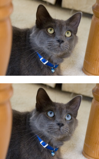
Rule of thirds. If we divide this image into a nine-square grid, our subject’s face falls at the intersection of two of the gridlines. This makes for a photo with more interesting composition.
Nevertheless, people always make good subjects for photos. Particularly engaging are photos of people looking right at the camera. While such photos may or may not be appropriate for journalistic applications, they are powerful in advertising, marketing and public relations materials. Don’t forget to consider the diversity of people you represent in your photos as well as the diversity of people in your audience. Ethically speaking, gone are the days when white men symbolically stood for everyone. Tactically speaking, you want your audience to identify with your photos.
A Well-Composed Photo.
Technical qualities aren’t the only considerations for judging a “good” photo. A boring subject in perfect focus saved as a 300 dpi TIF image is still a lousy image. To qualify as a good photo—one that will be a compelling addition to your document—the photo also needs to be well composed.
Professional photographers know that the most interesting photos share some characteristics:
Asymmetrical balance and the rule of thirds. Centered photos are boring. Asymmetrical balance makes interesting shots, and using the rule of thirds is the quickest way to compose for asymmetry. Imagine the shot as a 3 × 3 grid, then position the focal point on one of the resulting four gridline intersections.
Tight cropping. Images that fill the frame communicate in no uncertain terms what the subject matter is about, and they also crowd out background distraction. Extreme tight crops and close-ups are particularly interesting, as they force us to look at the subject in a new way.
Natural lines to create movement. As in all visual communication, you want to control the eye’s movement and flow through a photograph.
Interesting light. We’ve already touched on good tonal range. Playing with interesting highlights and shadows also results in compelling atmospheric images.
Resolution, File Format & Size
Resolution is extremely important when it comes to digital images. If an image doesn’t have high enough resolution—usually expressed in dots per inch (dpi) or more accurately pixels per inch (ppi)—the image will appear pixellated and fuzzy in the final output.
One resolution does not fit all, however. The end product dictates optimal image resolution. For high-end printing such as magazines, brochures and annual reports, optimal resolution usually comes close to 300 dpi, so most designers simply use 300 dpi for all images destined for print. Graphics for the newspaper are the exception. Newspapers require a 200 dpi because of the presses involved and the nature of newsprint. Additional dots per inch on an absorbent paper like newsprint produce muddy images.
Common File Formats and their Uses
|
FORMATS FOR PRINT |
FORMATS FOR WEB |
Encapsulated Postscript (EPS) |
File format of most vector graphic files rendered through mathematical calculation, not pixel by pixel. Can be resized without loss of resolution. Best for logos, word art. Required for “duotone” images where only two spot colors can be used |
|
Graphic Interchange Format (GIF) |
Best format for Web graphics with broad, flat areas of colors—such as logos and word art. Supports transparency |
|
Joint Photographic Experts Group (JPG) |
Can be used for print pieces, but not recommended. Lossy format means poorer print resolution |
Excellent for publishing photos on the Web. Use a photo-editing program to optimize and save at 72 dpi |
Tagged Image File format (TIF) |
Best format for saving photos for commercial print purposes |
|
Portable Network Graphics (PNG) |
When you need gradients and higher degree of transparency (drop shadows). Note, only png-24 offers full transparency support |
|
Scalable Vector Graphic (SVG) |
Vector graphics format for Web. Excellent for charts and graphs. Not widely used due to browser incompatibilities |
For Web graphics, lower resolution is required. Typically, images for the Web are saved at a low resolution of 72 dpi. On the screen, low-resolution images look just fine, and the smaller dpi will load more quickly to capture the attention of impatient readers.
File formats are also an important consideration. Even though there are several file formats for saving images, you’re better off sticking to a few. For Web and screen, you’ll want to save images as JPG (Joint Photographic Experts Group), GIF (Graphic Interchange Format) or PNG (Portable Network Graphic). All are low-resolution image formats. The big difference between them is GIFs and PNG files will support transparency and a JPG will not. Transparency by definition means “see-through.” In the case of Web graphics, transparency is essentially the ability to make certain color groups “invisible.” If you’ve ever tried to put a logo in JPG format on top of a colored background and discovered that your logo has a white box around it, you’ve encountered lack of transparency. By creating your Web graphic in the correct software application and saving as a GIF or PNG image, you can eliminate the white box.
The optimizing process lets you find the sweet spot between image quality and lowest file size for Web images.

Adobe Photoshop® CS4 product screen shot(s) reprinted with permission from Adobe Systems Incorporated.
Preparing Simple Web Graphics
Even if you never have to touch a website, at some point someone is likely to ask you to provide graphics for an existing site.
Working with a designer or developer. When you’re working with professional designers and developers, your goal is to provide them with the best quality images at the highest resolutions available. When providing photos, send JPGs. When providing logos, offer vector graphics. Your designer or developer will be able to resize and reformat your images as needed.
Preparing graphics on your own. Preparing graphics for the Web requires a few steps. First, the graphic must be resized to the appropriate dimensions. Next, if the image is a bitmap (raster) image, its resolution must be changed to 72 dpi.
Generally speaking, 72 dpi images are not large in terms of file size. Even so, it is possible to reduce the file size of a low-res image even further. Because large file sizes make for slow-loading pages, you want to make your file sizes as small as possible while retaining as much visual quality as possible. This process is called optimization.
Professional-grade photo-editing programs make it easy to optimize both vector and bitmap (raster) graphics. For bitmap images, optimizing involves choosing a level of quality for the final image from minimum to maximum. For vector images, the optimizing process requires you to choose from sets of colors ranging from a low of two colors to a full range of 256 colors. A preview screen shows you how the finished image will appear at each level. When you find the sweet spot between small file size and acceptable image quality, you save the image in the appropriate format. The most common vector formats are GIF and PNG.
The final optimized image is ready for uploading.

The right format for the right job. All logos above have been optimized for the Web. however, the GIF format (at top left) is the best choice for a graphic with broad flat areas of color. The GIF text is much crisper, and since the GIF format supports transparency, the graphic does not have a white bounding box like the JPG image on the top right.
While GIFs support transparency, they fail when the transparency needs a gradient, as in the case of drop shadows (lower left). For this, you need a PNG-24 file (lower right). Perfect.

Vector vs. bitmap. The circles above both have been magnified by 1000 percent. The image on the top is a vector graphic while the image on the bottom is a bitmap, or raster graphic. Because vector images are built through mathematical calculation, they can be scaled up or down infinitely without loss of quality. Bitmaps, however, get fuzzy on the edges when you try to scale up as seen in the image at bottom.
JPGs are great for the Web, but you should avoid them for print. The JPG is a “lossy” format, which means that each time you open or manipulate a JPG, it loses data. For print purposes, your best choice will be TIF (Tagged Image Format). TIF images are larger in file size and do not lose data. So choose TIF for print purposes.
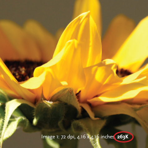
Which is high resolution? Despite the fact one image is 72 dpi and the other 300 dpi, the file sizes are the same, and both could be used as high-res images.
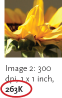
Making Image 1 high-resolution (300 dpi) without losing file size would result in an image with a physical size of 1 × 1 inch, the same as Image 2.
Yet another file type for printing, EPS (Encapsulated Postscript) is used for some specific kinds of images. Vector graphics, usually illustrations, are saved in EPS format, as are some photographs that have certain styling applied. EPS format is typically used for logos and, like GIF and PNG, supports transparency.
Does My Image have Enough Resolution?
One of the most confusing things to grasp when it comes to digital images is the relationship between image resolution, file size and physical image size. Though we specify 300 dpi for print and 72 dpi for screen, there is more to it than that. Take, for example, two images:
One image is 300 dpi at 1 × 1 inch with a file size of 263K.
The other is 72 dpi at 4.16 × 4.16 inches with a file size of 263K.
Which of these files is appropriate for use in a print document?
If you guessed that the 300 dpi image is the only print-appropriate image, you would be incorrect. Even though the resolution and dimensions are different, the file size (263K) is the same. It is the file size that is crucial to determining image usability.
Using photo-editing software, you can take any image and change its size and resolution, including our “low-res” example listed here. But what you need to look at is what happens to the file size when you make the change. As a rule, you want the file size to stay the same or get smaller. If you make your changes and your file size gets bigger (sampling-up), your photo quality will drop (the image gets pixellated and fuzzy).
When you sample up, you are asking your software to add more pixels to the image, increasing both physical and file size. Software does a crummy job of this, and the result is a fuzzy image. Software does a better job of “down-sampling” (when your file size goes down). In this case, the software is choosing existing pixels to throw out, rather than having to create new ones.
Choosing More than One Photo
In many instances, such as websites, brochures, feature news and magazine stories, you may find that you need more than one image. When choosing multiple images for your project, you should start your selection process using the same criteria discussed earlier in this chapter. Once you’ve eliminated any poor quality images from consideration, your next step is to look at your potential images with an eye towards contrast. (Remember the element of contrast from mini art school?) While there are many types of contrast, in this case, the contrast you should look for is contrast in image content.
In terms of content, think about using establishing shots, which are wider in scope and content, or detail shots, which are typically closer to the subject and more tightly cropped. For example, an image showing the width of the Grand Canyon is an establishing shot. A close-up image of a rabbit on the canyon rim is a detail shot.

Establishing and detail shots.
When your layout calls for more than one image, consider pairing an establishing shot like the room view on the left with a detail shot like the image of the blue willow dishes. The contrast of subject makes for a more interesting layout.
Pairing an establishing shot with a detail shot increases your storytelling power. The establishing shot sets the stage: time, location and action. The detail shot provides additional information, and by nature of close cropping puts your reader “inside” the story.
If your project requires more than two images, the same process applies. You should weed out poor quality images first, then make your remaining selections based on content contrast.
A little cosmetic photo retouching is common. But retouching that results in false or misleading communication will get you in serious trouble.
Ethics of Shooting & Editing
To be clear from the start, shooting images for documentary and news purposes is very different than shooting images for commercial or political purposes. Documentary or news photography, however artful or evocative, strictly adheres to the principles of truth, accuracy, fairness and balance. Such principles are necessary to maintain viewer trust that such images are factual and reality-based. Photos staged for advertising, publicity and marketing purposes, not so much. Differences between photojournalism and commercial photography persist after the images have been shot, too.
If you’ve played with photo-editing software, then you know there are all kinds of things you can do to alter photos—from turning them into watercolor paintings to removing an inch or two from your subject’s buns and thighs. It is certainly true that most, if not all, images of professional models are digitally retouched. We are greeted daily by photographic images that have added effects for visual interest. However, let codes of professional conduct, if not your personal integrity, guide your decisions about the ethics of altering photographs. Fear of unemployment and lawsuits can be persuasive forms of conscience, too.
If the photo represents news, regardless of format or context, restrict photo-editing to only those techniques you could accomplish in a traditional darkroom. This limits your editing to cropping, overall value adjustments and dodging and burning (lightening or darkening specific areas in an image). For news photos, edits other than darkroom-based techniques run the risk of altering or negating the truth of the image. That rule applies to media relations folks on the public relations side of the news business, too.
Formal rules are looser in non-news contexts when the photo merely sets tone or delivers a message in advertising, public relations and marketing materials.
However, be aware that truth reigns here, as well, according to the Federal Trade Commission and the Supreme Court. Professional ethics say you should avoid puffery, photos that seem to exaggerate commercial claims. But the law prohibits false, misleading and deceptive commercial claims, including those implied by photos. Proceed with caution in taking artistic license when it comes to altering photography.

Diversity. We live in a wonderfully diverse world. Successful design reflects and respects this asset.
Reproduced by permission, J. Michael McBride, P.C.
Diversity as Craft Excellence
While we’re talking about professional conduct and ethics, this is an appropriate time to remind you of your responsibility to rise above the lowest common denominator when it comes to doing the right thing. Journalism, advertising and public relations all define diversity as part of craft excellence. Just look at those professional codes of conduct again. First, you have an ethical responsibility to deploy images free of stereotypes, whether based on gender, race, ethnicity, sexuality, religion, nationality, age, disability, class or any other kind of physical, social or cultural difference. “Everyone else does it” is no excuse. You’re better than that. But accidental harm is no excuse, either. Symbolic annihilation refers to images that injure via symbolic messages about individuals or groups of people. Second, sometimes the problem has less to do with what actually appears in your image and instead has more to do with what does not appear in your image. Ask yourself who or what is missing from the images in your design work. Learn to look critically at images with an eye toward mitigating prejudice and ignorance. Plus, working against the grain by avoiding visual stereotypes can offer the added benefit of capturing people’s attention, as well as surprising and delighting them, with something unexpected. Sad but true.
Where to Get Photos
To lay photographers tempted to shoot their own photos, we say—as diplomatically as possible—don’t. That new digital camera cannot correct the tendency, for example, to cut off people’s heads in pictures.
On the other hand, many graphic designers take up photography in the interest of being able to shoot exactly what is needed at a moment’s notice. Journalists also increasingly must know how to handle both still and video cameras.
If you are still inclined to try your hand at photography, familiarize yourself with the appropriate file formats and resolutions needed for design work and learn how to set them on your camera. Also educate yourself on what makes a good photograph (re-reading this chapter is a good start). And, remember, no photographic beheadings.
Digital Stock Sites.
If photography is not your thing, consider buying images from digital stock sites. There are scores out there, and their inventory is immense. Fees vary from $1 per image for low-res Web-appropriate formats to thousands of dollars for high-res high-quality images with restrictions. You can purchase single images or subscriptions that allow multiple downloads over a given timeframe. In addition to photos, many stock sites also offer vector illustrations, video clips and stock animation.
One of the best features of digital stock sites is the availability of comp images, meaning complimentary images. Comp images are lower-resolution versions of stock images available for free. They give you the chance to test-drive one or more images in a design so you can decide what you like before you buy. Often, comp images are watermarked with the name of the stock site to prevent people from using the images without paying.
At the point you do have to cough up some cash, you usually have the option of purchasing images royalty-free or rights-managed. Royalty-free images are typically cheaper, but the drawback is that you don’t get exclusive use of the image. You could choose a splendid image for your project only to discover another organization in town is using the same image for its project. We’ve seen it happen.
Using rights-managed images solves this issue. However, rights-managed images are more expensive than their royalty-free counterparts. You may find yourself paying once to use the image for one project then paying again later if you want to use the same image for another project. While you don’t want to pay for rights-managed images you’ll never use, good planning suggests thinking about how, for example, a photo you use for an expensive brochure might also create some continuity if you use it for your next website update as well as in this year’s annual report.
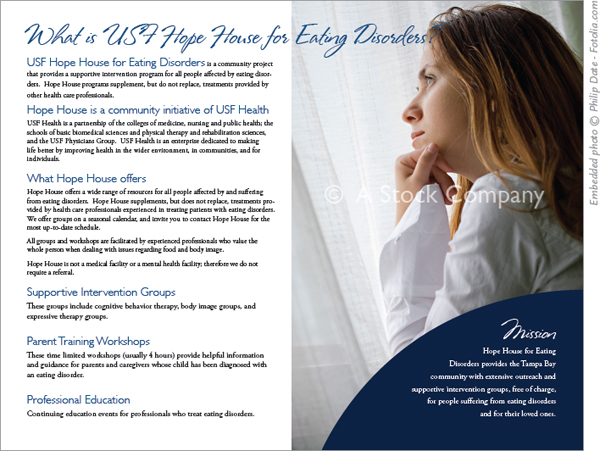
Comp images. The brochure above includes a comp image from a digital stock company. Stock companies provide lower resolution, watermarked sample images for free, so the designer can test the image in the overall layout. If the image works, the designer can purchase a high-res version without the watermark.
No matter where you get stock, or what type of stock you get, be prepared to agree to various restrictions. Stock sites have restrictions on reselling images and may have limits on alterations, types of use and frequency of use. When purchasing and using stock images, do read the fine print.
Working with Photographers.
If you have sufficient budget and time, hiring a professional photographer to take custom photos is the best possible scenario.
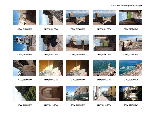
Contact sheets. Photographers shoot hundreds of photos yet few images actually make it to publication. To help you select the images you want, photographers typically provide a contact sheet. Originally printed on photographic paper, most contact sheets today come in the form of an online Web gallery.
Depending on the project, you’ll want to find a photographer who has experience in the type of photography you need. Portrait, landscape, product, catalog and food photography each require a different eye and, often, different equipment. Freelance photojournalists and documentary photographers, bound by stricter ethical constraints than commerical photographers, also vary widely in skill sets. So find someone with the expertise you need.
You could check a local directory, but finding your photographer by word-of-mouth is safer. Ask colleagues and friends in the business for recommendations.
When you do find a photographer, be prepared to discuss a number of things up front. Specifically, everyone will need to be clear on the timetable and the actual deliverables. You may want a high-res copy of every image, but the photographer may want to give you only a set of retouched images. From the beginning, make sure everyone is on the same page.
If a commercial photo shoot involves people, make sure all the models (professional or otherwise) sign photo release forms. Whether news or commercial photography, in the case of minors, parents or guardians do have to sign consent for underage photo subjects. Photographers often have their own release forms. You’ll want to have a form of your own for your specific project.
You’ll have a better chance of getting the best photos if you arm the photographer with all the necessary project knowledge. Are you producing images for print or Web? What is the overall feel you are shooting for? A good photographer will ask you many of the same questions you asked the boss at the start of the project. Be prepared to give concrete, detailed answers.

Just because you can doesn’t mean you should. There are two really good reasons not to steal graphics from the Web: Optimized Web graphics likely will lack the resolution you need, and it’s illegal.
Show the photographer a rough or comp mock-up of the design. This visual will help the photographer plan and frame the shots, including, for example, such things as vertical versus horizontal formats or left-versus right-facing content.
Keep in mind that photographers are creatives, too. Give them as much information as you can then step back and let them work. But don’t be shy about providing feedback when necessary.
Where not to Get Photos
Why go to a photographer or digital stock site when there are billions of images out there on countless Web galleries? Two reasons. One, as we’ve already discussed, Web images do not have enough resolution to work in print. Two, and more importantly, it’s illegal.
Copyright law in the United States protects ownership of most things (art, the written word, music, photography) from the moment of creation, with or without notice of copyright. Because something is posted to the Internet doesn’t mean it’s free for the taking. To pull an image (or text, or anything) off someone’s website and use it without permission is essentially stealing. Depending on the circumstances and severity, a person can be charged with a felony for engaging in this sort of practice. Transcendent of the fear of legal action, ripping off other people’s creative work generates bad karma.

Architect’s renderings. Architects use illustration to show clients what a project will look like before work begins.
Illustration by Carrie Matteoli, AIA.
Unless the owner of an image explicitly states that the image is available to all for any use, do not assume you can use it without arranging for permission. If you find a must-have image on the Web, track down the owner and get written permission to use the image before you proceed.
Alternatives to Photos
Maybe you’re on a tight timetable, maybe you have a really low budget or maybe it’s the particular concept, but sometimes a photo just isn’t the right thing.
As we’ve already noted, you still need something to break up lots of text. The good news is that illustrations, clip art and text-based elements such as pull quotes provide first-rate alternatives to photos.
Illustrations.
Under no circumstances should you think of illustrations as second-rate substitutes for photos. On the contrary, illustrations are often the best choice, if not the only choice, for a design project.

Illustration brings the imagined to life. However, if you do manage to put your hands on a photo of a fire-breathing dragon, let us know. We might want a copy.
Illustration gives form to the imaginary. Say, for example, you are writing a story about fire-breathing dragons. Let’s say you want to find a photo to accompany your story. Good luck with that. For hundreds of years, illustrators have been giving visual form to people, places and things found only in the imagination. Fiction (for both adults and children) is full of wonderful illustrations that bring everything from fairies to flying monkeys to life.
Illustration isn’t just for the fantastic. Architects, landscape designers and interior designers sell concepts to clients through the use of renderings. An essential part of designer–client communication, a rendering allows the designer to show the client her interpretation of the project and provides a basis for any feedback prior to the start of a project. It’s far easier to provide an illustration of what the fountain, walkways and shrubbery will look like than it is to explain it verbally.
Illustration for sensitive subject matter. Sometimes illustrations may be more appropriate than photos if the subject matter is too sensitive for realism—death, assault or rape, for example. Caricatures can be used to illustrate stories about public figures such as celebrities or politicians, especially when the story is commentary, satire or feature news. Political cartoons are another example of this type of illustration.
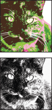
Photo to illustration. Photo-editing software can turn ordinary photos into interesting illustrations.
Illustration to show change over time. While photos capture a single moment in time, illustration has the power to show change over time. Attorneys use illustration for this purpose. Consider a court case involving a traffic accident. Evidence may include still photos taken before, during or after the accident, but the still photos can’t convey a sense of motion or timing. For this, attorneys hire illustrators to create illustrations showing a simplified layout of the street and position of the vehicles involved. Arrows, time stamps and other devices are used to add the information still photos can’t provide.

Clip art. Clip art is one of many alternatives to photos. However, all clip art is not created equal. Dump the stuff that came with your computer and shop digital stock sites for professional-grade illustrations in vector format.
Embedded illustration reproduced by permission Dover Publications, Inc.
Illustration to evoke history. Before photography, illustration was the method of choice to record both day-to-day life and special events. Egyptian hieroglyphics, the Bayeux Tapestry, Native American petroglyphs and even 1970s-era graffiti each have a distinct illustrative style and color palette. By echoing historic illustration styles in contemporary design work, it is possible to evoke a specific sense of time and place.
Using photo-editing tools, you can turn a simple photograph into an illustration. If your skill isn’t up to the illustration task, hire a professional illustrator or search digital stock sites for art you can purchase.
Clip Art.
Clip art is another visual alternative to photos. But not all clip art is created equal. If you’re considering using a piece of clip art that came with a software package you own, um, “Yuck-o.” Clip art that comes with computer programs is notoriously bad. You should dump it immediately so it doesn’t take up valuable space on your hard drive. If you really want to use clip art, visit a digital stock site to purchase something appropriate. It’s also possible to buy books of royalty-free vintage clip art that you can scan and use in your publications. If you’re lucky, your book will include a CD so you won’t even have to scan.
Animation as focal point. An animated sequence of appearing images and moving type replaces a traditional static photo on this website.
Video and Multimedia Components.
The popularity of video-sharing sites on the Web leaves no doubt that the democratization of design has hit video production as well. Websites are just as likely to include video clips and animation as they are photos and illustrations. Video and animation make excellent focal points because they include the eye-catching element of motion.
Some extra planning is required if you want motion elements to carry the same compositional punch as still images in your project. If your clip is a slideshow, each image in the sequence should coordinate with the overall layout in terms of color, shape or content.
Traditional video clips also must work with your layout. You should choose a title slide that provides a good tease for the video content and coordinates with your other layout elements. Quality, style and speed of video and animation transitions also impact your layout. Video that is choppy and animation transitions that are too fast or slow can be distracting. Like a poor quality photograph, poor quality video and animation bring down the quality of the whole project.
Type as image. Letterforms are so interesting they can take the place of images in layouts.

Maybe, for whatever reason, you have been reduced to choosing between a poor photo and a cheesy piece of clip art for your project. Trust your judgment and skip both, then. Instead plan for creative type to do the job of adding visual interest to your long copy.
Letterforms are interesting. For most of us, the last time we really looked at individual letters was in kindergarten. When we learned to read, we were taught to recognize each letterform in upper- and lowercase and to associate each letterform with a particular sound. Once we trained our brains to equate the shape with the sound, and letter pairings with the sound and meaning of words, conscious thought regarding the shapes of letters fell off our radar screens.
In the name of good design, we’d like you to rewind and reconsider letterforms. As design elements, letterforms are fantastic. Set alone, or as individual words, letterforms can have the same compositional impact as photos. Letterforms have curves. They have negative space. They have line. And of course, they can have color. Set large and in color, the right letterforms can turn a basic headline into the focal point for any layout. Individual decorative characters can be used as watermarks. Repeated decorative characters add background texture.
“Highlighting a quirky quote is a good way to entice readers to read all your copy.”
We discussed some of the more traditional uses of type in Chapter 7 on typesetting. But there are a couple of type treatments more closely related to image and illustration that we’ll discuss here: pull quotes and rendered type.
Rendered type. For some really interesting effects, try filling your letterforms with an image. Or use image-editing software to make your type look like chiseled gold.

Pulling out all the stops. By combining interesting images, illustration, decorative type and rendered type, you can create rich textural compositions.
Pull quotes. A pull quote (also called a lift-out or callout) does exactly what its name implies—it pulls a quote from the copy for the purpose of highlighting it. Choosing a particularly interesting, compelling or quirky quote is a good way to entice readers to read all your copy.
You often box a pull quote. Because a quote is relatively short, you significantly increase the font size so that it will pop off the page to read as a graphic element or visual. If you’re feeling really wild and crazy, you might replace your standard quotation marks with decorative ones. If the source of the quotation is as eye-catching as the quotation, provide an attribution line.
Some design tips for creating pull quotes include:
» Don’t forget to include margins outside and inside the box. Don’t cheat your margins!
» When adding color to pull quotes, there are two options. The whole quote can be in color, or you might put your color in the box’s background (the fill) or the box’s outline or border (stroke). If you choose a background color, make sure the text is set in a color that contrasts with the background color.
» Use a hanging indent to pull the first quotation mark outside the margin bounding the text box. Set your second and subsequent lines to align with the first letter after the first quotation mark.
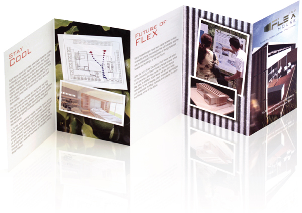
Don’t limit yourself. Try using photos for an unexpected background texture or pattern. Apply filters for extra dimension or depth. Pair photos with other types of graphics such as diagrams for a richer visual experience.
FLeX House brochure designed by Hunter Taylor.
Rendered type. Rendered type is a character, word or string of words that has been filled with an image, or otherwise transformed using photo-editing software. Rendered type is commonly seen in magazines, newspaper features, posters, websites, video, television and movie title sequences. The technique allows you to create type that looks like it was made out of polished brass, stamped in rusty metal or even chiseled out of stone.
To summarize what you’ve learned about adding visual appeal with photos and illustrations, be selective in terms of quality. Choose the appropriate resolution, file format and size, too. If photos aren’t an option, don’t discount using illustrations, clip art, video and decorative type for visual impact. Remember the lessons of mini art school when you compose and place any kind of visuals. If you hire outside help, treat photographers and illustrators with the professional respect they deserve. And when it comes to altering photos or paying for your visuals, do the right thing to assure a clean conscience.
Maybe, however, your design is begging for something more. Maybe you need something with the jaw-dropping appeal of a visual and the ad-reeling power of information. For that kind of one-two punch, you’re talking infographics, which we cover in the next chapter.
► Try This
1. Find an example of a printed piece with a photo that does not work (poor quality, inappropriate subject, whatever). Visit a digital stock site and find a suitable replacement image. Redesign the piece using your new image. Explain why the photo you chose is a better solution to the design problem.
2. Brainstorm photo options for the following situations. Create a set of thumbnail sketches for each scenario. Use two or more images in each sketch.
A feature story on a famous artist for the leisure section of a broadsheet newspaper. The artist is opening a show at a local venue in the coming week.
A trifold brochure for a small independent bookstore. This piece needs to have some “shelf-life.” In other words, the brochure content cannot be time-sensitive.
A website homepage for the bookstore in letter b.
A 24 × 36-inch poster for an upcoming Latin Jazz Festival.
3. Collect several advertisements relating to the following topics:
Luxury goods (watches, perfume, jewelry, expensive cars)
Baby products
Clothing for teens and tweens
Sporting goods/athletics
Compare and contrast the photo treatments. Consider compositional techniques, color use and alterations applied using photo-editing software. Choose one of the topics and create two ads of your own: one in a style consistent with convention and one using an entirely different style. Use digital stock imagery for this assignment and photo-editing software of your choice.
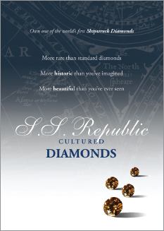
Promotional materials for luxury goods have a distinct look and feel. These ads for synthetic diamonds were designed to look upscale and expensive.
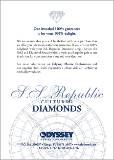
Reproduced by permission of Odyssey Marine Exploration.
4. Collect two magazines: one mainstream publication for general audiences and one targeted to a particular group (People en Español, Latina Magazine, Essence, etc.). Compare and contrast the use of imagery throughout both magazines. What are the similarities, differences? Take the ad you designed in exercise three, or an ad from another exercise, and redesign it to better reflect diverse audiences.
5. Design a two-page magazine-style spread for a story on a campus martial arts club. The completed spread will appear in the campus alumni magazine. Aikido, the martial art style practiced by the club, is not your stereotypical martial art —belts are awarded, but there are no contests or competitions.
Visit the White Space Is Not Your Enemy website and look for the Aikido images contact sheet. How many images will you need? Which ones will you choose? Justify your selections, and create your layout using your selected images along with placeholder text.