Chapter 10. XPages Goes Mobile
Mobile is the technology of the age, and owning a mobile device is no longer a luxury but a necessity. This fact is becoming increasingly important in business as desktops and laptops are being superseded by tablets and smartphones. This transition has many challenges ranging from the user interface (UI) design to security. XPages and the Extension Library are in place to meet these mobile challenges. This chapter will show how to meet and overcome these obstacles.
In the Beginning...
Mobile or cellular phones are essentially two-way radios; they allow you to send and receive messages wirelessly. These kinds of devices have been around since the early 1920s. Early two-way radio communication was capable of only one station transmitting while the other was receiving because they were using the same frequency. This limitation was solved to allow simultaneous transmitting and receiving by tuning them into different frequencies, allowing people to talk and listen at the same time. Of course, it was many years before electronics, circuitry, and battery power caught up before the first truly publicly available mobile telephone was introduced. Early models required users to hold the phone with both hands because they were so big and heavy. The brick became smaller and cheaper, and 15 years after the first mobile phone came into being, nearly everyone in the world has one.
The mobile phone feature set evolution is interesting because it draws parallels with software: voice communication, followed by text messaging, embedded camera, the leap to smartphones, mobile apps, and finally in management of a user’s social network. Communication software has had a similar progression: e-mail messaging with ccMail, Lotus Notes databases and applications, and now team collaboration and social software. Now mobile phone and communication software are merging; soon it will be hard to tell the difference and remember what it used to be like.
Trends are now moving toward businesses using smartphones, which is changing the way people communicate and collaborate. That notion presents interesting challenges to application design. For the Domino application, not only do developers have to contend with implementing a desktop and web design, but the mobile element is becoming more prevalent. Use of mobile devices in business tends to follow the features that are available. The availability of affordable mobile or cell phones has transformed the way business is conducted. Everyone from plumbers to company CEOs has been affected. There’s greater flexibility and faster response times because people no longer need to be tied to one desk or location. Early smartphones included e-mail, which meant office workers could break free from their desks to engage with customers more closely. The smartphones of today are part of a technology that is expanding and advancing rapidly and may be on their way to replacing laptops and desktops. The future is mobile.
The XPages Mobile Controls in the Extension Library
The mobile space is one of the most rapidly developing areas of computing. The XPages Extension Library (ExtLib) provides several new controls and themes to make creating a mobile web experience for your Domino application as quick and easy as possible. These controls leverage the power of the Dojo Mobile framework to provide the interface metaphors and transitions familiar to users of native applications in a web setting.
Because these applications are provided over the web, an enterprise can quickly and securely roll out changes and updates to the mobile workforce while keeping tight control on sensitive data.
With Lotus Notes Domino 8.5.3 and the ExtLib, a whole avenue of application development opens. You can easily build these ancillary features onto existing XPages applications.
The Basics of the XPages Mobile Controls
An XPages mobile application is built in a way similar to any other XPages application in that both are web applications. One difference in the way an XPages mobile app is structured may be unfamiliar, however. To allow for the transition animations between the different pages, mobile apps are usually structured using a single XPage containing all the required mobile pages and controls. These may be loaded lazily on an as-needed basis to reduce bandwidth usage or loaded up front to improve performance.
Figure 10.1 shows what the XPages mobile application is composed of. It is made up of a Single Page Application control (xe:singlePageApp) containing one or more Mobile Pages controls (xe:appPage). The mobile page typically has a Page Heading control (xe:djxmHeading).
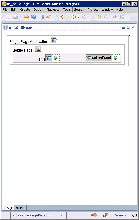
Figure 10.1. The mobile app in Designer.
You can add the other controls required for the functionality of the page to the mobile page. These may be other XPages mobile controls or even a limited number of existing XPages controls that can become valid mobile controls. All this is possible with a little bit of styling magic provided by the XPages mobile theme.
Once the new 8.5.3 ExtLib has been installed in Designer, XPages developers are presented with the mobile controls placed in their own palette, as shown in Figure 10.2. These controls are used to develop XPage mobile applications.
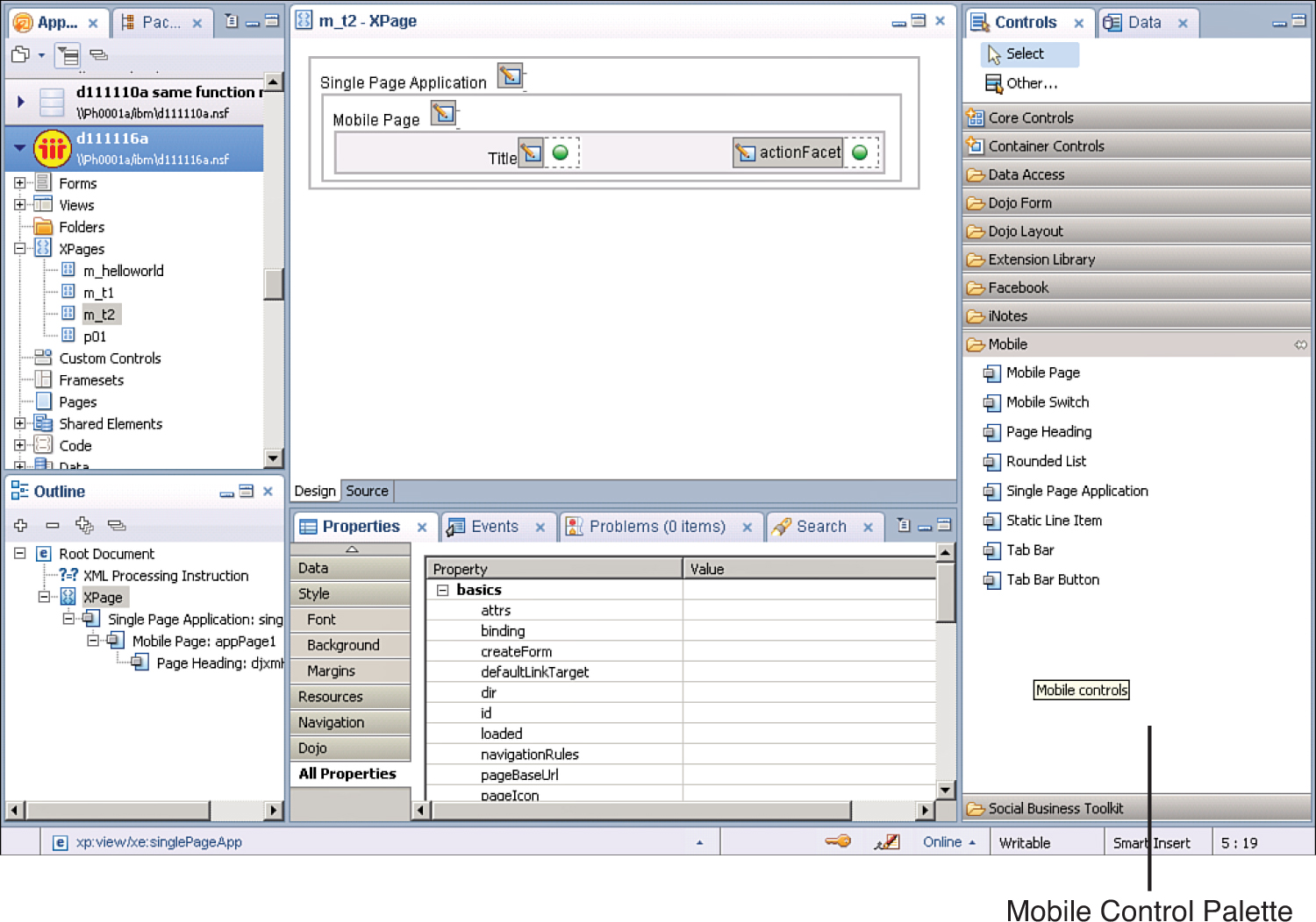
Figure 10.2. Mobile control palette.
The mobile controls provide specific functionality or a specific user experience that is designed to match native smartphone and tablet applications. They aren’t the only controls you can use in mobile applications. Other controls can take on the mobile theme’s look and feel. The controls in the Mobile palette are designed just for mobile and don’t have an application elsewhere. The following sections review these controls and their use in mobilizing XPage applications.
The Single Page Application Control (xe:singlePageApp)
Essentially, the Single Page Application control is the container for the XPages mobile application. All components involving the mobile application, mobile pages, navigation, data reading, data input, styling, and so forth are enclosed within the Single Page Application control. In the markup, everything is contained within this control’s tag, xe:singlePageApp, as shown in Listing 10.1.
Listing 10.1. The Single Page Application Control Contained Within the View Tag
<xp:view xmlns:xp="http://www.ibm.com/xsp/core"
xmlns:xe="http://www.ibm.com/xsp/coreex">
<xe:singlePageApp
id="singlePageApp1"
selectedPageName="mobilePage1">
<xe:appPage
id="appPage1"
pageName="mobilePage1">
<xe:djxmHeading
id="djxmHeading1"></xe:djxmHeading>
<xe:djxmLineItem
id="djxmLineItem1"
label="Click to go to Mobile Page 2"
moveTo="mobilePage2">
</xe:djxmLineItem>
</xe:appPage>
<xe:appPage
id="appPage2"
pageName="mobilePage2">
<xe:djxmHeading
id="djxmHeading2"
back="Back"
moveTo="mobilePage1">
</xe:djxmHeading>
<xe:djxmLineItem
id="djxmLineItem2"
label="This is Mobile Page 2">
</xe:djxmLineItem>
</xe:appPage>
</xe:singlePageApp></xp:view>
The Single Page Application has few attributes, only one of which is needed for mobile applications. That attribute is the selectedPageName property, which must be set to the name of a mobile page name that exists with this container control. In the listing, the selectedPageName property is set to "mobilePage1". Therefore, the Mobile Page (xe:appPage) named "mobilePage1" becomes the default page that the Single Page Application displays. The Single Page Application displays only one Mobile Page at a time; in Listing 10.1, this alternates between "mobilePage1" and "mobilePage2".
The Mobile Page Control (xe:appPage)
Each page on a mobile application must be a mobile page. Multiple pages can be defined in two ways:
Each page is a new XPage (including an <xe:singlePageApp> in each).
Each page is defined inside one XPage with multiple <xe:appPage> tags.
Using the second method, each appPage is given an appPageId that can be used to switch pages, rather than a given URL. To move to a new <xe:appPage>, type the URL (the XPage filename followed by a hash [#]) and then the appPageId. An example would be mobileHome.xsp#document.
The Mobile Page control is the web page fragment used in a mobile application. Only one of these mobile pages is displayed at a time. Several notable properties affect the behavior of this control.
The pageName property is the mobile page name and the property used for navigation between the mobile pages. The singlePageApp control uses pageName to decide what page to show initially. You use the resetContent property to indicate whether the page contents should be re-created each time the page is displayed. Another property affecting performance is preload, which you can use to force the Mobile Page to be loaded when the whole XPage is loaded.
The Page Heading Control (xe:djxmHeading)
Mobile applications should have a heading. On a mobile screen, a heading is typically a bar at the top of the screen specifying the title of the page. It has various options to perform on the page, such as going backward. The Back button is defined in the heading tag.
<xe:djxmHeading id="djxmHeading1" label="Topic" back="Home"
moveTo="home"></xe:djxmHeading>
The back property is the label for the Back button. The moveTo property should contain the pageName of the Mobile Page destination.
The Heading control can also act as a container for other controls such as buttons and the mobile application’s Tab Bar.
The Heading control also contains a callback or editable area for actions called actionFacet, which is typically a plus (+) button to create a new document. Listing 10.2 includes an example from the TeamRoom XL template. Buttons placed inside this facet take on the styling of the create buttons that are common to native buttons on that platform.
Listing 10.2. The Action Facet for a Heading Control
<xp:this.facets>
<xp:panel
xp:key="actionFacet">
<xp:this.rendered>
<![CDATA[#{javascript:userBean.canCreateDocs}]]>
</xp:this.rendered>
<xp:button
value="+"
id="button1">
<xp:eventHandler
event="onclick"
submit="true"
refreshMode="complete">
<xp:this.action>
<xe:moveTo
direction="Left to Right"
forceFullRefresh="true"
targetPage="newDiscussion"
transitionType="slide">
</xe:moveTo>
</xp:this.action>
</xp:eventHandler>
</xp:button>
</xp:panel>
</xp:this.facets>
Rounded List (xe:djxmRoundRectList)
As the name suggests, this is a component that displays a rectangle with rounded corners. It is mainly used as a styling container when documents are displayed and edited (see Listing 10.3 and Figure 10.3).
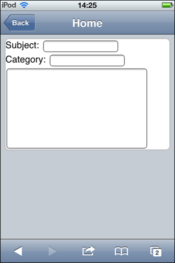
Figure 10.3. Rounded list container for a document.
Listing 10.3. Rounded List Container for Data Input
<xe:djxmRoundRectList
id="djxmRoundRectList1">
<xp:label
value="Subject: "
id="labelSubject2"></xp:label>
<xp:inputText
id="inputTextSubject2"
value="#{document1.Subject}">
</xp:inputText>
<xp:br />
<xp:label
value="Category: "
id="labelCategory2"></xp:label>
<xp:inputText
id="inputTextCategory2"
value="#{document1.NewCats}">
</xp:inputText>
<xp:br />
<xp:inputTextarea
id="inputTextareaBody"
value="#{document1.Body}"
cols="40"
rows="10">
</xp:inputTextarea>
</xe:djxmRoundRectList>
Static Line Item (xe:djxmLineItem)
The Static Line Item control is a Dojo control mainly used to link to other mobile pages. This control can perform a number of functions. Listing 10.4 shows an example of its use as a link to a mobile page; this example would render as in Figure 10.4.
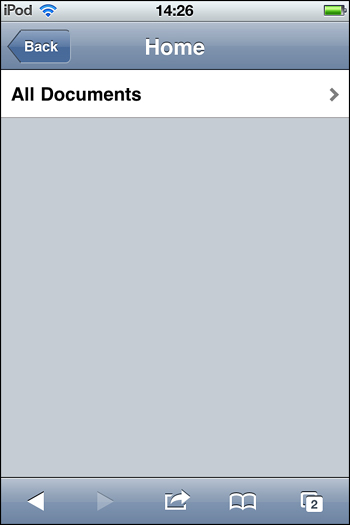
Figure 10.4. Static Line Item control example.
The moveTo property points to another mobile page contained within the same Single Page Application. For this, a hash (#) prefix may be used to enable the link to navigate to a location within the existing XPage; however, for most cases this isn’t necessary because the runtime assumes that the value of the moveTo property is a location within the current page. You can use the transition property with the moveTo property to control how the mobile page appears to move with pages. By default, the transition is slide, although fade and flip are options here if desired.
Listing 10.4. Static Line Item Example
<xe:appPage
id="appPage1"
pageName="homePage">
<xe:djxmHeading
id="homePageHeading"
label="Home"></xe:djxmHeading>
<xe:djxmLineItem
id="djxmLineItem1"
moveTo="#viewPage"
label="All Documents">
</xe:djxmLineItem>
</xe:appPage>
<xe:appPage
id="appPage2"
pageName="viewPage"
resetContent="false">
<xe:djxmHeading
id="djxmHeading1"
label="Hello LS12"></xe:djxmHeading>
<xe:dataView
id="dataView1"
pageName="documentPage"
openDocAsReadonly="true">
<xe:this.data>
<xp:dominoView
var="view1"
viewName="xpAllDocuments"></xp:dominoView>
</xe:this.data>
<xe:this.summaryColumn>
<xe:viewSummaryColumn
columnName="Topic"></xe:viewSummaryColumn>
</xe:this.summaryColumn>
</xe:dataView>
</xe:appPage>
You can also add images to the Static Line Item control using the icon property. You set the value of the property in the same way that other XPages control reference images usually reside in the same Domino application.
The rightText property allows an additional label to be set on this control.
Mobile Switch (xe:djxmSwitch)
The Mobile Switch control (xe:djxmSwitch) is probably best described as an on/off switch that behaves like a check box. It’s not to be confused with a Switch facet control (xe:switchFacet), which allows the developer to dynamically change content that depends on a certain value.
The Mobile Switch control is used mainly in mobile applications for configuration, enabling an option as shown in Listing 10.5 and illustrated in Figure 10.5.
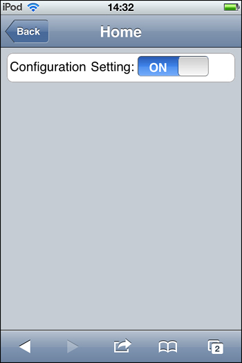
Figure 10.5. Mobile Switch control example.
Listing 10.5. Enabling an Option with a Mobile Switch Control
<xe:singlePageApp
id="singlePageApp1"
selectedPageName="mobilePage1">
<xe:appPage
id="appPage1"
pageName="mobilePage1">
<xe:djxmHeading
id="djxmHeading1"
label="Mobile Switch Control">
</xe:djxmHeading>
<xe:djxmRoundRectList
id="djxmRoundRectList1">
<xp:table>
<xp:tr>
<xp:td>
<xp:label
value="Configuration Setting: "
id="label1"></xp:label>
</xp:td>
<xp:td>
<xe:djxmSwitch
leftLabel="ON"
rightLabel="OFF"
id="djxmSwitch4"
value="#{javascript:viewScope.vs01}">
<xp:eventHandler
event="onStateChanged"
submit="true"
refreshMode="complete">
<xe:this.action><![CDATA[#{javascript:var v1 =
viewScope.vs01;
if (v1!=="off"){viewScope.put("vs01","off")
}
else{viewScope.put("vs01","on")
}}]]></xe:this.action>
</xp:eventHandler>
</xe:djxmSwitch>
</xp:td>
<xp:td>
<xp:text
escape="true"
id="computedField1"
value="#{viewScope.vs01}">
</xp:text>
</xp:td>
</xp:tr>
</xp:table>
</xe:djxmRoundRectList>
</xe:appPage>
</xe:singlePageApp>
There are four events attached to the Mobile Switch control; onTouchStart, onTouchEnd, onTouchMove, and onStateChanged. Each of these events is designed to be triggered conditionally. All the onTouch controls have been specifically designed to be triggered by the movement of the finger on the touch screen of a mobile device. Their behaviors are similar to the mouse events that are developed for desktop applications. In the same vein, the onStateChanged event is like an onChange event. It is triggered when the mobile switch is changed from on to off and vice versa. An example is shown in Listing 10.5.
Tab Bar (xe:tabBar)
The Tab Bar is mainly used as a container control for the Tab Bar Button. By default, the Tab Bar displays like a banner across the mobile page. In this scenario, it is usually used as an action bar at the bottom of the mobile device’s screen, where black buttons will appear on a black background regardless of platform. These buttons are usually accompanied by an image on the button, as shown in Listing 10.6 and Figure 10.6.
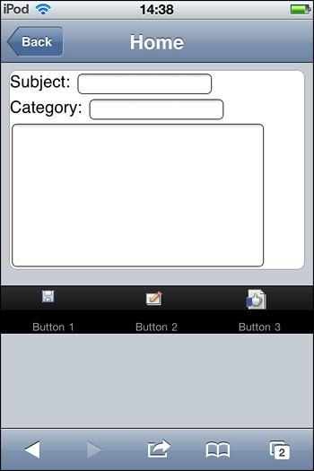
Figure 10.6. Tab Bar at the bottom of a mobile page with images.
Listing 10.6. Default Tab Bar with Buttons
<xe:tabBar
id="tabBar1">
<xe:tabBarButton
id="tabBarButton1"
label="Button 1"
icon1="/act_saveandclose.gif">
</xe:tabBarButton>
<xe:tabBarButton
id="tabBarButton2"
label="Button 2"
icon1="/authprof.gif">
</xe:tabBarButton>
<xe:tabBarButton
id="tabBarButton3"
label="Button 3"
icon1="/intprof.gif">
</xe:tabBarButton>
</xe:tabBar>
When the barType property is set to "segmentedControl", the Tab Bar buttons display together as one, although they’re separated into their individual buttons by a vertical separator line, as shown in Listing 10.7 and Figure 10.7.
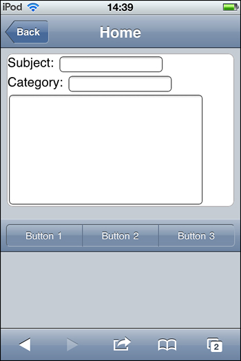
Figure 10.7. Tab Bar as a segmentedControl.
Listing 10.7. The Tab Bar as a Segmented Control
<xe:tabBar
id="tabBar2"
barType="segmentedControl">
<xe:tabBarButton
id="tabBarButton4"
label="Button 1">
</xe:tabBarButton>
<xe:tabBarButton
id="tabBarButton5"
label="Button 2">
</xe:tabBarButton>
<xe:tabBarButton
id="tabBarButton6"
label="Button 3">
</xe:tabBarButton>
</xe:tabBar>
In this fashion, the segmentedControl is used for the Tab Bar in a header or on its own on the mobile page. When placed in the header, the Tab Bar’s contents are merged into that of the heading, as shown in Figure 10.8.
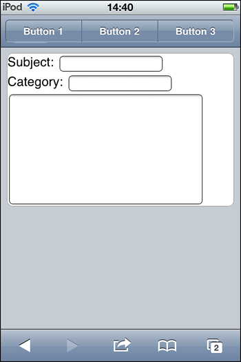
Figure 10.8. The Tab Bar in a header.
Tab Bar Button (xe:tabBarButton)
The Tab Bar button is similar to the conventional XPages button (xp:button) but with different styling for XPages Mobile applications. This button will not display as expected if it is not contained within the Tab Bar. When the barType property is set to "segmentedControl" on the Tab Bar, the multiple Tab Bar buttons on the bar appear together, as shown previously in Figure 10.7.
This control has several properties worth noting that make it applicable to mobile applications. You can add images to the button with the icon1 and icon2 properties. These display images depending on whether you select the button, as shown in Listing 10.8. The position of each of the images can change from the default if you use the iconPos1 and iconPos2 properties. This use of images is common when the Tab Bar is using its default barType setting.
Listing 10.8. Button Icon and Icon Position Properties
<xe:tabBarButton
id="tabBarButton6"
label="Button 3"
icon1="/act_saveandclose.gif"
icon2="/authprof.gif"
iconPos1="top"
iconPos2="bottom">
</xe:tabBarButton>
Note
When the barType is set to segmentedControl, images don’t display on Apple’s iOS platforms. There are already set styling conventions for this platform that excludes icon images.
The XPages Mobile Theme
XPages mobile applications are not native mobile applications but web browser applications that run on a mobile device and appear to be native. A special theme has been created to provide the native application look and feel for XPages mobile applications. This theme provides all the mobile styling for all the XPages mobile controls in the palette plus a few other controls like the Data View (xe:dataView), Outline (xe:outline), and Form Table (xe:formTable). Without this theme, XPages applications would look like regular websites on the mobile device’s web browser.
This theme isn’t activated or set in the same way that regular XPages themes are. It’s activated per XPages that must have a prefix corresponding to a setting in the application’s properties—xsp.theme.mobile.pagePrefix. So, for example, if xsp.theme.mobile.pagePrefix=mobile and the XPages are to inherit the mobile theme’s look and feel, they must start with a prefix like mobileApp.xsp. When XPages is launched in the web browser, it will ignore all other themes and use the mobile theme.
Select a prefix that won’t conflict with other XPages within the application. Avoid actual prefixes that are whole words or tend to form whole words in themselves. Don’t use prefixes like the preceding example: mobile. Choose a pattern that makes more sense, such as "m_".
The mobile theme provides styling for many XPages controls; the Mobile controls are covered, of course, but so are the Data View (xe:dataView) and Accordion (xe:accordion). All other core, custom, and extension library controls will render in the mobile application using their existing web styling. In these cases, developers need to be selective of which controls they use and then apply their own custom styling. A case in point is using buttons (xp:button), as shown in Listing 10.9, from the TeamRoom XL template. Here the developer has created two new style classes: one for Android, "mblSaveButton_android", and another for other platforms, "mblSaveButton". These style classes are not stored in the mobile theme but in a CSS file added to the application: .mobile.css.
Listing 10.9. Custom Button Styling for Mobile Applications
<xp:button
value="Save"
id="button1">
<xp:this.styleClass>
<![CDATA[#{javascript:
if(isAndroidCheck())
{return "mblSaveButton_android";
}
else {
return "mblSaveButton";}
}]]>
</xp:this.styleClass>
<xp:this.style><![CDATA[#{javascript:
if(!isAndroidCheck())
{
return "margin-top:6px;";}
}]]></xp:this.style>
...
</xp:button>
Listing 10.9 is an example from the TeamRoom XL template of how to style items that are outside the mobile theme. There, specific styling has been created for these elements—in this case, inline buttons. This look and feel is available as style classes stored in a custom-built CSS file from the TeamRoom application. These style classes are then applied dynamically when the application in this case is opened on an iOS platform or an Android platform. This is something the developer needs to keep in mind when styling an XPages mobile application.
Currently, the mobile theme provides styling for two main platforms: Apple’s iOS and Android. The mobile theme should cover the most popular design styling cases for developers, but they may find that a control they are using doesn’t have the correct or desired styling. In these cases, developers must custom-style the component and may have to do two of these styles for Apple iOS and Android. When the application runs, developers have to know which platform the application is running on and what style to apply. The XPages runtime helps with the global variable context.getUserAgent().getUserAgent(). It returns the name of the platform, which could be Android, iPad, or iPhone. From here, developers can decide which styling to use. XPages Mobile caches the detected browser’s User-Agent string on the first request. Developers can override this by specifying a platform in the query string, such as ?platform=iphone or ?platform=android:http://myserver/myapp.nsf/mobileApp.xsp?platform=iphone.
Hello Mobile World Tutorial
In this tutorial, developers are shown how to build a simple XPages mobile application on an existing Domino database, which gives them the first steps to creating a mobile web experience.
This tutorial builds a mobile app from scratch, displays the contents of a view from another application, opens a document from that view, and edits and saves a document. A more detailed tutorial is available on the Lotus Notes and Domino Development wiki at http://www-10.lotus.com/ldd/ddwiki.nsf/dx/XPages_Mobile_Controls_Tutorial_.
1. Enable the App for the Extension Library and Mobile
Take any existing application and launch it in Designer. Go to the Application Properties and check the box for com.ibm.xsp.extlib.library in the XPages Libraries section on the Advanced tab. This enables the application to use the ExtLib if it hasn’t been done already. Save and close the Application Properties.
Next, open the Application Properties, xsp.properties, in source mode from the Package Explorer. The Package Explorer isn’t visible by default in the Domino Designer perspective. To get it to display here, select Window → Show Eclipse Views → Package Explorer. Once this has been launched, go to the WebContentWEB-INF folder and launch the xsp.properties file. Then select the Source tab and add the prefix for the XPages to use the mobile theme. Choose any desired prefix, such as m_: in xsp.theme.mobile.pagePrefix=m_.
2. Create a New XPage and Mobile Application
Create a new XPage called m_helloworld. Note the use of the prefix here: m_.
On the blank XPage, add a Mobile Application control (xe:singlePageApp). Then add a Mobile Page control (xe:appPage) between the tags of the Mobile Application. Finally, add a Page Heading control (xe:djxmHeading) between the Mobile Page tags, and give the heading a label of "Hello XPages Mobile World".
Provide a name to the Mobile Page control—pageName="viewPage"—and then set the selectedPageName property to that page name.
This should generate the markup shown in Listing 10.10, which is enough to render a first look at the new XPages mobile application (see Figure 10.9) when launched in a mobile device’s web browser.
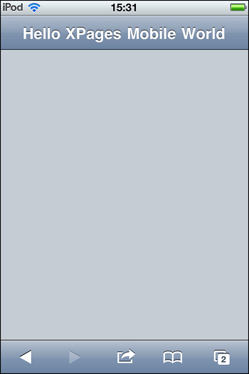
Figure 10.9. Hello XPages Mobile World example.
Listing 10.10. XPages Markup of a Heading Tag Inside a Mobile Application Tag
<?xml version="1.0" encoding="UTF-8"?>
<xp:view
xmlns:xp="http://www.ibm.com/xsp/core"
xmlns:xe="http://www.ibm.com/xsp/coreex">
<xe:singlePageApp
id="singlePageApp1"
selectedPageName="viewPage">
<xe:appPage
id="appPage1"
pageName="viewPage">
<xe:djxmHeading
id="djxmHeading1"
label="Hello XPages Mobile World">
</xe:djxmHeading>
</xe:appPage>
</xe:singlePageApp>
</xp:view
3. Add a View Document Collection to the Mobile Page
The next step is to create a content Mobile Application that is contained within Mobile Pages controls (xe:appPage).
The purpose of the mobile page viewPage is to display a list of documents, a view collection of records. The datasource for this will come from another application on the server: the ExtLib Demo App (XPagesExt.nsf). To display this data collection, you use a Data View (xe:dataView) control to connect and retrieve the data and present it in a list form.
On the source pane in Designer, drag and drop a Data View control inside the Mobile Page control. This prompts the developer to select a view datasource from the current database. However, for this simple tutorial, a view collection from another database, the XPagesExt.nsf, is selected. This view name is to be AllContacts.
Clicking OK on this dialog generates the markup for the XPage. From here, some minor configuration is done to the Data View to display text to represent the records per row. The summaryColumn property, which is also a complex property for xe:viewSummaryColumn, is used for this purpose. To use a Data View inside a mobile application, select a column from the original view. In this case, it will be a column named Name, so columnName="Name".
We have selected a column named Name. The naming will work in this case, but in general it isn’t best practice because the column title could be changed when localized, and the mobile application would likely break. It is more correct to use the programmatic name of a view column to ensure that the use case will work.
The Data View displays the view collection with the name of the contact representing the row record. At this stage, it is recommended that you restrict the number of rows to 10 so the view fits inside the small screen of the mobile device.
The markup should now look something like what is shown in Listing 10.11 and display on the mobile device like that in Figure 10.10.
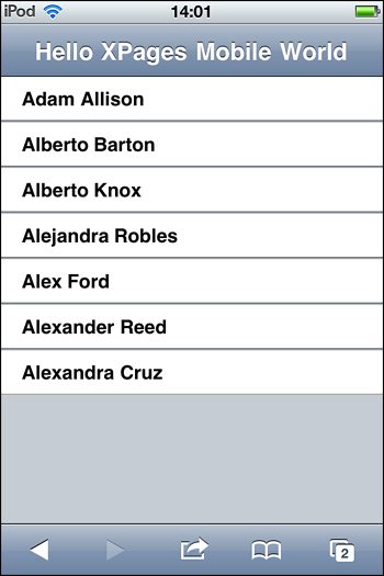
Figure 10.10. The view collection on an XPages Mobile Page.
An additional property is set here, too. The property resetContent is set to "false". It will be the default page of the mobile application because we do not want the page to be re-created every time the page is displayed.
Listing 10.11. XPages Markup of a Heading Tag Inside a Mobile Application Tag
<xe:appPage
id="appPage2"
pageName="viewPage"
resetContent="false">
<xe:djxmHeading
id="djxmHeading2"
label="Hello XPages Mobile World">
</xe:djxmHeading>
<xe:dataView
id="dataView1"
rows="10">
<xe:this.data>
<xp:dominoView
var="view1"
databaseName="XPagesExt.nsf"
viewName="AllContacts"></xp:dominoView>
</xe:this.data>
<xe:this.summaryColumn>
<xe:viewSummaryColumn
columnName="Name"></xe:viewSummaryColumn>
</xe:this.summaryColumn>
</xe:dataView>
</xe:appPage>
4. Display More Rows
Typically, when a user is presented with a limited list of records from a view collection, a button is provided to allow the user to add a few more rows. This can be done in the XPages mobile applications, too; the Extension Library has a control that can provide this feature.
The Add Rows (xe:addRows) control is attached to any event and added through the simple Actions dialog. But first, there is an editable area on the Data View control called "pagerBottom" and to this add a link (xp:link) control. This link becomes a facet of the Data View container. A simple Add Rows to the Data Iterator action is added to the onClick event of the link, with the rowCount property set to "5" and the for property set to the ID of the Data View: "dataView1", as shown in Listing 10.12.
Listing 10.12. Data View with Add Rows Simple Action
<xe:dataView
id="dataView1"
rows="7">
<xp:this.facets>
<xp:link
escape="true"
text="Load 5 more rows"
id="link1"
xp:key="pagerBottom">
<xp:eventHandler
event="onclick"
submit="false">
<xp:this.script>
<xe:addRows
for="dataView1"
rowCount="5"></xe:addRows>
</xp:this.script>
</xp:eventHandler>
</xp:link>
</xp:this.facets>
<xe:this.data>
<xp:dominoView
var="view1"
databaseName="XPagesExt.nsf"
viewName="AllContacts">
</xp:dominoView>
</xe:this.data>
<xe:this.summaryColumn>
<xe:viewSummaryColumn
columnName="Name"></xe:viewSummaryColumn>
</xe:this.summaryColumn>
</xe:dataView
Figure 10.11 shows the Add Rows action: the Load 5 More Rows link on the mobile page. When this is selected, five rows are added to the list. Note here that the link now looks like a button. This is all part of the mobile theme, which uses buttons instead of links on mobile devices because they’re easier to click.
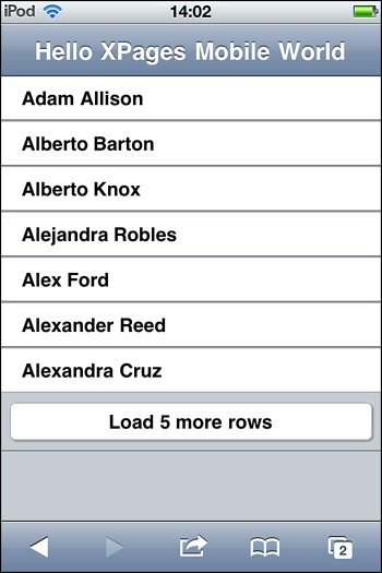
Figure 10.11. The Add Rows action.
5. Opening a Document from the Data View
The next step is to open a document from the Data View in another mobile page. For this action, another Mobile Page control is added to the Single Page Application. This is given an easily recognizable ID or pageName, documentPage. This ID is needed to configure the Data View pageName property, which should be prefixed with a hash tag, such as pageName="#documentPage".
The hash tag is important here. If it’s not used, the Data View attempts to open the document selected in that row in an XPage in the pageName property. With the hash tag, the navigation stays within the current XPage, as demonstrated in the following segment of a URL:
/m_helloworld.xsp#documentPage?documentId=D2EB6...E1DFC&action=openDocument
A Heading control is added to the Mobile page, which includes navigation to the view mobile page. The back property is the label of the Back button, and the moveTo property is set to "viewPage".
What’s added next to the mobile page is a rounded rectangle list (xe:djxmRound RectList). It will be the container for the document data and provide the styling surrounding the document when it displays in the device.
After this, the mobile page is developed much like a conventional XPage. A Panel control is added to the mobile page. Then a Domino document datasource is configured to this Panel control. Labels and input controls, bound to datasources, are added to the Panel next.
Finally, the openDocAsReadonly property is set to "true" on the Data View, as shown in Listing 10.13. The document now opens in the second mobile page in read mode.
To ensure that the document selected in the data view is opened in the documentPage every time, the property resetContent is set to "true" here. Without doing that, the first document opened would remain in memory.
Listing 10.13. Opening Documents from a Data View in Another Mobile Page
<xe:appPage
id="appPage2"
pageName="documentPage"
resetContent="true">
<xe:djxmHeading
id="djxmHeading2"
label="Document Page"
back="Back"
moveTo="viewPage">
</xe:djxmHeading>
<xe:djxmRoundRectList
id="djxmRoundRectList1">
<xp:panel>
<xp:this.data>
<xp:dominoDocument
var="document1"
databaseName="XPagesExt.nsf"
formName="Contact"></xp:dominoDocument>
</xp:this.data>
<xp:table>
<xp:tr>
<xp:td>
<xp:label
value="First name:"
id="firstName_Label1"
for="firstName1"></xp:label>
</xp:td>
<xp:td>
<xp:inputText
value="#{document1.FirstName}"
id="firstName1">
</xp:inputText>
</xp:td>
</xp:tr>
...
...
</xp:table>
</xp:panel>
</xe:djxmRoundRectList>
</xe:appPage>
Figure 10.12 shows the changes to the viewPage, particularly the chevrons that now appear on the Data Table rows to indicate that an action applies to these rows.
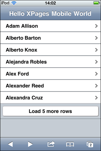
Figure 10.12. Changes to the Data View.
Figure 10.13 shows what should happen when a row is selected on the Data View. It should navigate to the documentPage and open the selected document there.
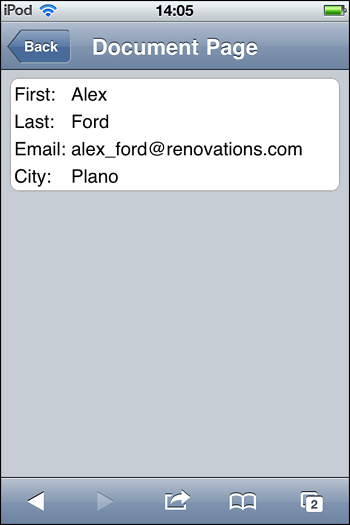
Figure 10.13. The document is opened in Read Mode.
Data View and Other View Containers in Mobile Apps
The Data View control is an enhancement of the XPages View Panel (xp:viewPanel) control. The way documents can be selected from rows that are opened in an XPage is built into this control. The developer doesn’t need to configure further here. As demonstrated, all the developer needs to do is set the pageName property, and at runtime the control processes the document and opens it in the desired page. If that page has a corresponding document datasource that matches the document selected, it will be read in that page. All this is done automatically for the most part.
Extra configuration is needed if the developer chooses an alternative to the Data View, like the View Entries Tree node (xe:dominoViewEntriesTreeNode). In these cases, the developer needs to get the universal ID of the document in the selected row (the view datasource var plus getUniversalID()) and add a parameter on what to do with that document. Usually this involves the openDocument action. All this is computed inside the href property, as shown in Listing 10.14.
Listing 10.14. Computing the href Action to Open a Document from a View Row
<xe:outline
id="outlineXPage">
<xe:this.treeNodes>
<xe:dominoViewEntriesTreeNode
viewName="AllStates"
labelColumn="Key"
var="o1">
<xe:this.href><![CDATA[#{javascript:var id =
o1.getUniversalID();
var str = "/p02.xsp?documentId="+id+"&action=openDocument";
return str}]]></xe:this.href>
/xe:dominoViewEntriesTreeNode>
</xe:this.treeNodes>
</xe:outline
In Listing 10.14, the URL is composed to open a document in another XPage. For mobile applications, the document needs to be opened in the same XPage—another mobile page contained within the same single page application. Listing 10.15 shows how to do this—selecting a document in one mobile page and opening it in another. At first glance, there doesn’t seem to be a difference. A closer look reveals one crucial difference in the page name part used to compute the URL. Instead of using a relative path to the XPage, ‘/p02.xsp’ as in Listing 10.14, just the mobile page name is inserted, "documentPage", and without the hash tag. This hash tag is inserted automatically during runtime so the developer doesn’t have to insert it, as shown in Listing 10.15.
Listing 10.15. Opening a Document in Another Mobile Page
<xe:outline
id="outlineMobile">
<xe:this.treeNodes>
<xe:dominoViewEntriesTreeNode
viewName="AllStates"
labelColumn="Key"
var="o1">
<xe:this.href><![CDATA[#{javascript:var id =
o1.getUniversalID();
var str = "documentPage&documentId="+id+"&action=openDocument";
return str}]]></xe:this.href>
</xe:dominoViewEntriesTreeNode>
</xe:this.treeNodes>
<xe:this.treeRenderer>
<xe:mobileAccordionMenu></xe:mobileAccordionMenu>
</xe:this.treeRenderer>
</xe:outline
6. Editing and Saving Document Changes
There are two actions in this section: one to edit the document and another to save the document. The Tab Bar and Tab Bar buttons are used here, but developers aren’t restricted to these controls. In fact, they can use any control as long as it can perform these actions in a mobile page. All they need to worry about is the styling.
Using button or link controls in this scenario requires the developer to create custom styling. Without this, these controls display with their typical XPages web rendering. However, some container controls, like the Data View (xe:dataView) and Form Table (xe:formTable), have mobile styling. Using XPages buttons or links, these controls inherit this mobile style automatically. The developer should use these controls when developing XPages Mobile applications.
For this exercise, the Tab Bar and Tab Bar button is used because they have their own mobile styling and don’t depend on other container controls. You can configure the Tab Bar Button like an existing XPages button (xp:button), although it has just one event associated with it: onClick. A conventional edit document simple action is applied for the Edit Tab Bar Button. And for the Save Tab Bar Button, a new Extension Library simple action is available: Move To Mobile Page (xe:moveTo). This action contains properties that allow it to be used for other actions and not just saving document changes. Transition after the event is catered for with the direction and transitionType properties. The targetPage property indicates to which page to transition. And with the saveDocument set to "true", document changes are submitted to the document datasource.
Listing 10.16 shows the markup of the Tab Bar and Tab Bar Buttons contained within the panel that contains the document datasource.
Listing 10.16. Edit and Save Tab Bar Buttons
...
</xp:table>
<xe:tabBar
id="tabBar1"
barType="segmentedControl">
<xe:tabBarButton
id="tabBarButton1"
label="Edit"
rendered="#{javascript:!document1.isEditable()}">
<xp:eventHandler
event="onClick"
submit="true"
refreshMode="complete">
<xp:this.action>
<xp:changeDocumentMode
mode="edit"
var="document1">
</xp:changeDocumentMode>
</xp:this.action>
</xp:eventHandler>
</xe:tabBarButton>
<xe:tabBarButton
id="tabBarButton2"
label="Save"
rendered="#{javascript:document1.isEditable()}">
<xp:eventHandler
event="onClick"
submit="true"
refreshMode="complete">
<xp:this.action>
<xe:moveTo
direction="Right to Left"
forceFullRefresh="true"
saveDocument="true"
targetPage="viewPage"
transitionType="slide">
</xe:moveTo>
</xp:this.action>
</xp:eventHandler>
</xe:tabBarButton>
</xe:tabBar>
</xp:panel>
</xe:djxmRoundRectList>
Figure 10.14 shows how the Tab Bar appears in the documentPage at runtime. Notice that the Edit button is showing and the Save button is not.
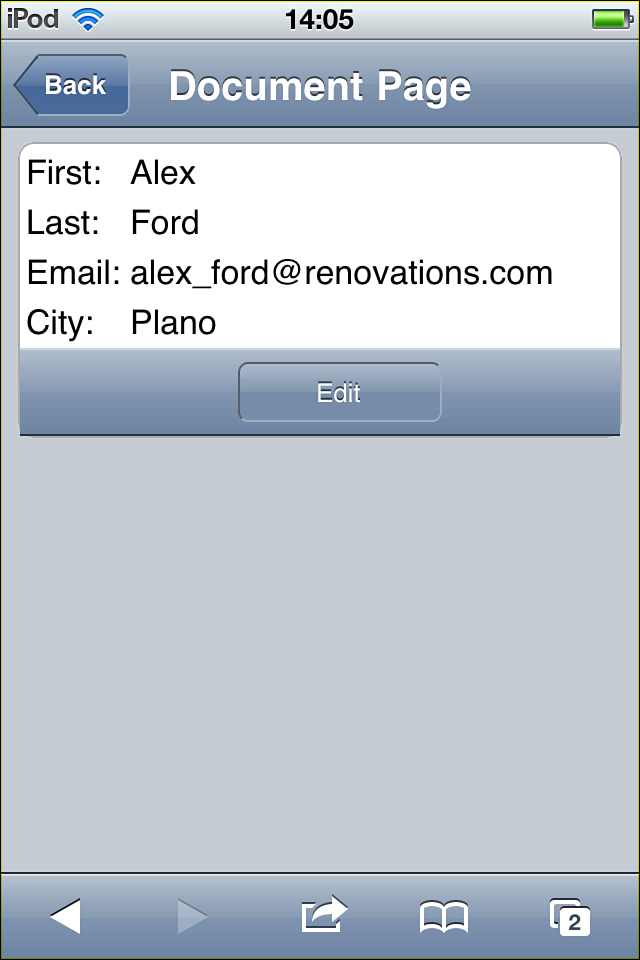
Figure 10.14. Mobile document in Read Mode.
Figure 10.15 shows the same mobile page when the Edit button is selected, which changes the mode of the document to edit mode. Here the Save button becomes visible.
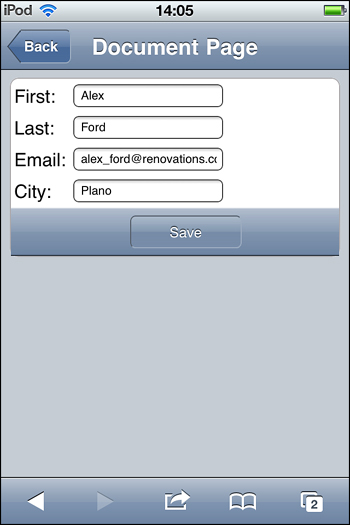
Figure 10.15. Mobile document in Edit Mode.
Using the actionFacet in the Heading for Buttons
Action buttons like these, although not the Tab Bar buttons, could also be placed in the actionFacet of the Heading control. Here they take on the mobile styling that’s typical for buttons located at the top-right corner of the mobile page. Listing 10.17 shows these same Edit and Save actions but in the header.
Listing 10.17. Action Buttons in a Header
<xe:djxmHeading
id="djxmHeading2"
label="Document Page"
back="Back"
moveTo="viewPage">
<xp:this.facets>
<xp:panel
xp:key="actionFacet">
<xp:button
value="Edit"
id="buttonEdit"
rendered="#{javascript:!document1.isEditable()}">
<xp:eventHandler
event="onclick"
submit="true"
refreshMode="complete">
<xp:this.action>
<xp:changeDocumentMode
mode="edit">
</xp:changeDocumentMode>
</xp:this.action>
</xp:eventHandler>
</xp:button>
<xp:button
value="Save"
id="buttonSave"
rendered="#{javascript:document1.isEditable()}">
<xp:eventHandler
event="onclick"
submit="true"
refreshMode="complete">
<xp:this.action>
<xe:moveTo
direction="Right to Left"
saveDocument="true"
targetPage="viewPage"
transitionType="slide"
forceFullRefresh="true">
</xe:moveTo>
</xp:this.action>
</xp:eventHandler>
</xp:button>
</xp:panel>
</xp:this.facets>
</xe:djxmHeading
For the example shown in Listing 10.17, the panel used to contain the document datasource also needs to enclose the Heading control. This is so the actions are performed on that datasource and the buttons change their rendering dynamically based on that document.
Deep Dive into the Controls in the Extension Library, with Examples of Their Use
It may surprise you as you read through this section that you may be familiar with many of the controls mentioned. These are the same Extension Library controls that are used elsewhere in this book, and they’re the same controls that are used in regular XPages applications. You can exploit these same controls—with a few minor tweaks—for XPages mobile applications. That topic will be described in this section.
Outline Control
The Outline control is perfect as a menu or a way to navigate through various pages. The typical use of the outline is to display a menu of items, perhaps as a root screen or home page. A typical example of this is shown in Listing 10.18.
Listing 10.18. Outline Control with Various Navigators
<xe:outline
rendererType="com.ibm.xsp.extlib.MobileOutlineNavigator"
id="outline1">
<xe:this.treeNodes>
<xe:basicLeafNode
href="#profile"
label="My Profile: #{javascript:sessionScope.commonUserName;}">
</xe:basicLeafNode>
<xe:basicContainerNode
label="Documents">
<xe:this.children>
<xe:basicLeafNode
href="#newTopic"
label="New Topic">
</xe:basicLeafNode>
<xe:basicLeafNode
href="#allDocs"
label="All Documents">
</xe:basicLeafNode>
<xe:basicLeafNode
href="#mostRecent"
label="By Most Recent">
</xe:basicLeafNode>
<xe:basicLeafNode
href="#docsByAuthor"
label="By Author">
</xe:basicLeafNode>
<xe:basicLeafNode
href="#tags"
label="By Tag">
</xe:basicLeafNode>
<xe:basicLeafNode
href="#myDocs"
label="My Documents">
</xe:basicLeafNode>
</xe:this.children>
</xe:basicContainerNode>
</xe:this.treeNodes>
<xe:this.treeRenderer>
<xe:MobileAccordionMenu></xe:MobileAccordionMenu>
</xe:this.treeRenderer>
</xe:outline
Notice that <xe:outline> has its renderType attribute set to "com.ibm.xsp. extlib.MobileOutlineNavigator". This is an example of overriding the default renderType to provide a more appropriate styling for a mobile device. In many cases the mobile theme does this automatically, but it may be overriden if you have an alternative rendering that you’d prefer.
The Tree Nodes <xe:this.treeNodes> define a group of options to click on, each one of them a Basic Leaf Node xe:basicLeafNode in which the href property is the link to the mobile page. Include a hash symbol (#) before the page name to avoid any future issues with redirecting and parameter passing. You can use a Basic Container Node xe:basicContainerNode to create a group inside a single element in the outline when the developer might have a lot of options and want to break it into sections so the user can read it more easily. Figure 10.16 shows an example of this with the Documents section. Finally, the treeRenderer defines which way to display the sections.
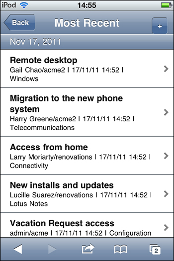
Figure 10.16. The home page of the Mobile Discussion template.
The My Profile label displays the username of the person logged in; a CSS styling is applied to this "overflow: hidden". This means if there is any overflow because of a long name stretching past the end of the row, it will be obscured rather than pushing text down on top of the next row.
As shown in Figure 10.16, all the functionality of the discussion template’s viewMenu is replicated here, alongside a profile and new topic link. From this screen, the user can navigate to all the major sections of the application.
The outline has a renderer applied to it; this is not the way it appears when it’s created. This renderer is used as a standard control on smartphones and is how mobile users expect to navigate through an application.
An outline with the renderer and a single leaf node is a useful way to create a link to a new page. In the document mobile page, in each reply the standard link has been replaced with this link to ensure mobile users can interact with it and understand that it opens a new page.
Hash Tags
With the mobile controls, the developer can define multiple pages inside the one XPage. The developer can set their navigation by appending a hash and then the name of the mobile page to the name of the file, such as mobileHome.xsp#byAuthor.
Some controls include properties that accept a mobile page as an attribute and offer other settings, such as the type of transition and the direction of movement.
Form Table Control (xe:formTable)
Form tables are an extremely easy way to make a detail entry or display form for a mobile device. A form table can have many form rows, each of which can have controls such as a label and text field added. See Listing 10.19.
Listing 10.19. Form Table Control
<xe:formTable
id="formTable1"
formTitle="#{profileDoc.enterWho}"
xp:key="profile"
style="font-size:14px; font-weight:normal;"
formDescription="Profile document of user">
<xe:formRow
id="formRow1"
labelPosition="none">
<xp:image
id="photo"
alt="#{profileDoc.enterWho}"
height="130px"
width="130px">
<xp:this.url><![CDATA[#{javascript:var imageName =
"profileNoPhoto-118px.png";
var al:java.util.List =
profileDoc.getAttachmentList("thumbnailUrl");
if(!al.isEmpty()){
var lastItemIndex = al.size() - 1;
if(lastItemIndex > 0){var eo:NotesEmbeddedObject =
al.get(lastItemIndex);
imageName = eo.getHref();
}else{
var eo:NotesEmbeddedObject = al.get(0);
imageName = eo.getHref();}}
return(imageName);}]]>
</xp:this.url>
</xp:image>
</xe:formRow>
<xe:formRow
id="formRow3"
label="Email: "
style="word-wrap: break-word">
<xp:link
text="#{profileDoc.Email}">
<xp:this.value><![CDATA[#{javascript:"mailto:" +
profileDoc.getItemValueString('Email')}]]></xp:this.value>
</xp:link>
</xe:formRow>
...
</xe:formTable
The properties formTitle and formDescription are displayed in the top-left corner before the actual rows are displayed, as a means of giving instructions and describing the action to take. Each xe:formRow is going to be rendered as a row and in this case will contain a label and input text that is connected to a Domino document.
When you’re running the sample in Listing 10.20, when the Edit button is selected, the document datasource behind this document is set to Edit Mode and the input text boxes are enabled; the user can change the content. The Edit button changes to a Save button.
Listing 10.20. Button with Change Dynamic Action
<xp:button
id="buttonEdit"
value="Edit">
<xp:eventHandler
event="onclick"
submit="true"
refreshMode="complete">
<xp:this.action>
<xp:actionGroup>
<xp:changeDocumentMode
mode="edit"
var="profileDoc">
</xp:changeDocumentMode>
<xe:changeDynamicContentAction
facetName="saveControl"
for="dynamicContent4">
</xe:changeDynamicContentAction>
</xp:actionGroup>
</xp:this.action>
</xp:eventHandler>
</xp:button>
Also, the button causes a Dynamic Content control to switch the front end UI, so users can press the Save button when they are finished editing.
Dynamic Content Control
Previously, it was mentioned that developers can use the Dynamic Content control to change such things as groups of buttons. Dynamic content allows developers to specify multiple panels inside the container and assign them values using the xp:key property. Then when the developers define a dynamic control, they set which panel is the default. The default panel is loaded first; using an event can change which panel is loaded thereafter. In Listing 10.20, the Edit and Cancel buttons are on a panel, and Save and Cancel are on a panel that is not being rendered. When the Edit button is clicked, the changeDynamicContentAction action is fired, and a new panel key is specified (see Listing 10.21).
Listing 10.21. Dynamic Content Example
<xe:dynamicContent
id="dynamicContent2"
defaultFacet="viewContent">
<xp:this.facets>
<xp:panel
id="panel4"
xp:key="viewContent">
.
</xp:panel>
<xp:panel
id="panel6"
xp:key="editContent">
..
</xp:panel>
</xp:this.facets>
</xe:dynamicContent
Dynamic controls are simple to use. The developer specifies panels inside with xp:key="" and a name. The default one is displayed first. Then a control in that panel or somewhere else on the page can call a changeDynamicContent action, where the developer can supply the name of the dynamic control and the name of the facet to change it to.
If the user created the document, an Edit button appears. Clicking the Edit button switches to an edit content section with text boxes and Save and Cancel buttons.
The dynamic control can be useful, because another screen doesn’t have to be rendered. Only the section that is changing needs to be loaded, which can save resources and time. This control also provides different functionality to users.
The document view screen uses the same XPages code taken from the Discussion template to display the parent document and its replies. The only difference is that the Read More link was replaced with an outline with a single entry to make it more usable on a mobile device. Another issue was limiting the number of indents that are made when you reply to a response to a reresponse. The desktop version has no limit on indents, but a mobile device is limited to four indents. Any replies after that are kept at the same level as the one before it.
Data View Control
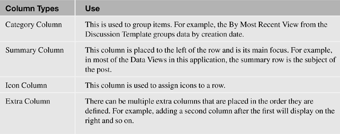
Data Views are much better than tables for displaying data on mobile devices. Tables aren’t appropriate in this case because of all the formatting that takes place; the formatting is generally too wide to see most of it, or it’s condensed to the point that the user can’t read it. Data View takes care of this because the content is fit to the width of the device. Table 10.1 shows the column types and their uses.
Table 10.1. Column Types and Their Uses
However, the layout of the Data View is a little bit different when a renderer is applied to it. In the All Documents page, the summary row is in the top left and the extras appear beneath it.
When developers are using a category column, such as the ones used in Most Recent or By Author from the Discussion template, they need to make sure the expand level is set correctly. (Not including it returns a default value, which is acceptable.) The expand level is a property that denotes whether replies are included; only the parent documents are displayed, but anything categorized won’t display if the expand level is set not to allow replies (see Listing 10.22).
Listing 10.22. Expand Level Example
<xp:this.expandLevel>
<![CDATA[#{javascript:if(sessionScope.ec==null ||
sessionScope.ec==0){return 1}{return 0}}]]>
</xp:this.expandLevel>
The developer can add facets to a row. On the All Documents page on the Discussion XL template’s mobile application, a panel has been added to the detail facet and text has been added to the panel. The panel is the abstract of the post content.
More Link
Every Data View page should have a More link at the bottom that is equivalent to the desktop’s Next button. With a Data View, the developer specifies how many rows are displayed at the start. The developer should try not to have too many rows, because it will take longer to load the first view the user wants to see. In the example in Listing 10.23, the first 10 rows are loaded, and each time the user presses More, an additional 5 are added to the view. This task is done relatively easily using the addRows tag (xe:addRows). The code shows the addRows tag, but it also determines whether the More link needs to be displayed.
Listing 10.23. More Link Example
<xp:this.facets>
<xp:link
escape="true"
text="More..."
id="link6"
xp:key="pagerBottom">
<xp:this.rendered>
<![CDATA[#{javascript:
var num = parseInt(dominoView2.getTopLevelEntryCount());
if(num > 10)
return true;
else
return false;}]]>
</xp:this.rendered>
<xp:eventHandler
event="onclick"
submit="false">
<xp:this.script>
<xe:addRows
rowCount="5"
for="dataView2"
disableId="link6">
</xe:addRows>
</xp:this.script>
</xp:eventHandler>
</xp:link>
</xp:this.facets>
This code adds a label as the bottom-left facet of the Data View. Some of these Domino views are categorized; the categorized rows count as rows when Add Rows is used.
Note
The Data View never adds blank rows. If you have an addRows tag that says to add five rows and only three are left, only three rows are added.
Filter Data
In a similar way to the desktop version, the developer can specify a filter for the data that is applied to the Category column: categoryFilter. So, for example, in Listing 10.24, the My Documents page is similar to the By Author page with the exception of adding a category filter of the username of the logged-in user. The result is one category being returned instead of many.
Listing 10.24. Category Filtering Example
<xe:this.data>
<xp:dominoView
var="dominoView"
viewName="xpAuthorPosts"
dataCache="full"
categoryFilter="#{javascript:sessionScope.authorName}:Main">
</xp:dominoView>
</xe:this.data>
Multiple Controls
The last thing you need to know about Data Views is how to combine them with other controls. A Data View is like any other control; it doesn’t need to be the size of the page. Listing 10.25 is an example of a form table and two Data Views. The user can click on a username onscreen to view the details of that user.
The first part of the listing is the same as the Profile View except that it searches for the username that was clicked on. Two Data Views must exist, because the Data View returns just one of the sections at a time when it’s filtering the categories. Viewing both sections side by side requires the developer to have two views.
Listing 10.25. Multiple Controls
<![CDATA[#{javascript:
var nNotesName:NotesName = session.createName(sessionScope.authorName);
var sCanonicalName:String = nNotesName.getCanonical();
var nameAbbreviated = nNotesName.getAbbreviated();
var text = res.getString("authorProfile.description") + ": " +
nameAbbreviated;
//Details
var db:NotesDatabase = database;
var view:NotesView = db.getView(VIEW_PROFILES);
view.setAutoUpdate(false);
var entry:NotesViewEntry =
view.getEntryByKey(nNotesName.getCanonical(), true);
if (entry != null)
{
var cols = entry.getColumnValues();
//viewScope.mAlocation = cols[location];
viewScope.mAemail = cols[COLUMN_EMAIL];
viewScope.mAphone = cols[COLUMN_PHONE];
viewScope.mArole = cols[COLUMN_ROLE];
viewScope.mAgoal = cols[COLUMN_GOAL];
viewScope.mAprofileFound = true;
}
else
{
viewScope.profileFound = false;
}
return text;}]]>
Move to Mobile Page Action
Similar to a redirect with the understanding of how the hash tags work, the Move To (xe:moveTo) mobile page action allows the developer to specify properties such as the type of transition the developer would like to see and the direction it moves. The target page is the mobile page (for example, document would be the target, not mobileHome.xsp#document). See Listing 10.26.
Listing 10.26. Move To Example
<xp:this.action>
<xe:moveTo
transitionType="slide"
direction="Left to Right"
forceFullRefresh="true"
targetPage="replyThread?action=openDocument
&documentId=#{javascript:dominoDoc.getNoteID()}
&parentNoteID=#{javascript:dominoDoc.getNoteID()}">
</xe:moveTo>
</xp:this.action>
One important property is forceFullRefresh. Sometimes when you’re moving between pages, you want nothing to be saved. Without forceFullRefresh, after entering a new topic and returning to the screen, the previous elements you entered will still be there, which could affect security because of passwords and usernames.
The Move To action also allows the user to save the document. In other words, this action can leave the current screen and update a document.
Heading (xe:djxmheading)
The heading is just a normal control that displays the title of the mobile page and can have a Back button declared to return to a previous page. The Heading also has events. Developers can’t apply an event handler to this type of control, so they have to add content to the events the same way as a property. These events can be useful for running code similar to what was loaded before/after page load that is missing from defining all pages in the same file (see Listing 10.27).
Listing 10.27. A Mobile Page Heading
<xe:djxmHeading
id="djxmHeading1"
label="Home"
back="Home"
moveTo="home">
<xp:this.onShow>
<![CDATA[#{javascript:
sessionScope.from = "allDocs";
sessionScope.fromName = "All Docs";
}]]>
</xp:this.onShow>
</xe:djxmHeading
This example shows a heading defined with a Back button to the home page. The onShow event updates a session variable that the page currently on is the all documents page. Using this session variable is not required; it is an example of using dynamic breadcrumbs on the application. That is, instead of hard-coding back buttons, the developer could query this session variable.
Large Content
One problem with making a mobile version that connects to the same datasource as a desktop is that the desktop version can have a rich text box, meaning large tables can be in the data. That, in turn, can cause a mobile page that displays it to stretch out. A dijit, xsp.largeContent, has been created to handle this problem; Listing 10.28 is an example of how to call it.
Listing 10.28. Outline Control with Various Navigators
<div
id="largeContentDiv"
dojoType="xsp.largeContent"
content="#{dominoDoc.Body}"
url="largeContent#{sessionScope.backURL}"
from="document">
</div>
The example in Listing 10.28 contains all three available properties: content is used to specify the content to be displayed; url is used to specify the URL to the page that will display this content; and the From property is used to tell which mobile page that the transition will be called on (that is, the mPage ID).
The control takes the content that has been given to it and renders it in a div. Then it looks at this div to determine its scroll width. If the width is greater than a threshold, a button is rendered. (The div is set to hide overflow, so it won’t stretch the screen if it’s wide.) The button is linked to the page defined by the URL that’s passed in. This way if the content is large, it gets cut off, and the user sees a button to view the content on a separate page that has no mobile controls. Nothing will be affected by the size of the content.
The xsp.largeContent dijit is found only in the Discussion XL and TeamRoom XL templates. It is not distributed as part of the ExtLib plugins. To use the xsp.largeContent dijit, developers must implement this feature in their own NSF.
Using Dojo to Modify Controls
Dojo is a powerful tool to have alongside XPages. Using dojo.query, you can easily access elements using a simple query syntax that’s based on CSS selectors. This allows you to quickly perform operations on one or more elements.
For example, if you wanted to add '[XPages]' to every link on the page, you could use the following:
dojo.query('a').addContent('[XPages]'),
Selecting with the ID selector is not recommended. Because of the way XPages renders the underlying HTML, it can be difficult to predict the value of an ID unless you calculate it on the server. That’s why it’s often easier to use a unique styleClass instead.
What follows is an example of a unique styleClass, where we hide a particular label row:
dojo.query('.labelRows1').style('display', 'none'),
XPages Mobile Phone Application Gotchas
Developers need to remember numerous things when developing Mobile XPages application as opposed to regular XPages applications. For the most part, they can continue as they are, developing XPages, and they will work on a mobile device, with a couple of mobile rendering stylings, of course. However, there are a few things to look out for when developing XPages for mobile.
The Differences Between Web App and Mobile App Layout
There are a number of differences between XPages web applications and XPages mobile applications that don’t always translate between the two.
Tables
Tables don’t lend themselves well to mobile applications. A lot of formatting is applied to views like All Documents and Most Recent, leaving superfluous blank space. Mobile applications just don’t have room for that blank space because of their limited screen size. Trying to make the content fit would mean that little of the data would be displayed.
The Data View component in the Extension Library is the mobile phone’s equivalent of displaying data in a table. This allows developers to render the same data but in a way that fits the screen. More importantly, it is the standard means of displaying data that mobile users will be familiar with.
Menus
In desktop applications, menus generally go along the left or the top. (The Discussion template defines a component called a menuView that is in the top-left corner.) This layout doesn’t suit mobile applications, however, because the controls would be quite small. The mobile equivalent involves using an outline and giving it a rendererType to display it as a standard mobile control.
Tag Clouds
The Discussion template uses tag clouds along the left to filter authors who have left posts and tags that people have assigned to their post. This template renders in a mobile application, but if it’s not the width of the screen, it can be quite hard to use. When the template is that size, it is visually poor as a design element for mobile.
Link Tags
Link tags don’t lend themselves well to mobile applications. That can become a problem when there are many close to each other, because they can be hard to click with a finger on a touch screen. Mobile users are used to seeing either a button or an outline with a single basic leaf node. Applications should be tailored to the market that will be using them.
Custom Controls
With mobile applications, defining each mobile page as a Custom Control can be useful. Defining them in a single file can make it hard to navigate the code searching for a problem. Simply delete everything that would have gone between the Mobile Page control tags (<xe:appPage>) and place it in a Custom Control. Then add back the Custom Control reference between the same mobile page. No further changes are needed.
The Discussion and TeamRoom template applications use this technique, which is shown in Listing 10.29.
Listing 10.29. Mobile Pages Containing Custom Controls
<xe:singlePageApp
id="DiscussionApp"
selectedPageName="mostRecent">
<xe:appPage
resetContent="true"
id="home"
pageName="home">
<xc:mobile_home></xc:mobile_home>
</xe:appPage>
<xe:appPage
resetContent="true"
preload="true"
id="profile"
pageName="profile">
<xc:authorProfileForm></xc:authorProfileForm>
</xe:appPage>
<xe:appPage
resetContent="true"
preload="true"
id="newTopic"
pageName="newTopic">
<xc:mobile_newTopic></xc:mobile_newTopic>
</xe:appPage>
...
</xe:singlePageApp>
Setting a Right Navigation Button
On the iPhone, the developer can define a right navigation button, which is the same as the Back button, to a Save or Edit button. The Heading control contains a callback or editable area called actionFacet to allow the developer to locate actions on the top right of a mobile page, as shown in Listing 10.30.
Listing 10.30. Right Navigation Button Example
<xp:this.facets>
<xp:button
value="Save"
id="button2"
xp:key="actionFacet">
<xp:eventHandler
event="onclick"
submit="true"
refreshMode="complete">
<xp:this.action>
<xe:moveTo
saveDocument="true"
targetPage="#{javascript:sessionScope.from}"
direction="Left to Right"
transitionType="slide"
forceFullRefresh="true">
</xe:moveTo>
</xp:this.action>
</xp:eventHandler>
</xp:button>
</xp:this.facets>
What Stays the Same?
There are a number of techniques the XPages developer will not have to rethink when developing XPages mobile applications.
Repeat List/Table Used to Display Replies
It was previously mentioned that you shouldn’t really use tables; however, there is one exception. One section of the Discussion application displays replies. A table can be used to lay out the controls placed on that page. Using a repeat to display multiple replies works well on a mobile device. What’s more, that entire section of code can nearly be copied and placed in another.
JavaScript
With a few exceptions, any JavaScript—whether in a script file or used in CDATA sections, for example—will not need to be changed. The same code will work in both web applications, be it on a desktop or mobile device.
Events
For the most part, events used in buttons and links will work if the developer can change the URL, because it won’t have hash tags for XPage mobile pages. Sometimes it’s necessary to change the event to a Move To mobile page action.
Domino Documents
Domino document datasources port quite well from a regular XPages app to an XPages Mobile app. Developers shouldn’t run into as many problems as with JavaScript, because they can define a Domino document inside a mobile page. A document is applied to the container it is in. So, for example, creating one datasource inside a panel means only objects in that panel can access it.
What Has Changed?
However, there are a few areas the developer needs to be mindful of when hoping to bring existing XPages functionality to the mobile application.
Rich Text
Traditional and XPages Rich Text content is not rendered inside an XPage mobile application because it becomes incomprehensible when it’s scaled down to a small screen even though the rich text will display in read mode. Generally, the solution is to replace the rich text control with a multiline editbox (xp:inputTextarea), but that solution means that the user won’t have features associated with a rich text format.
Note
If developers intend to use some kind of text box in place of a rich text editor, they need to set the escape property to false if both applications are connecting to the same datasource. Otherwise, if the desktop version has a rich text box allowing for table creation, the user will see the tags used to create it rather than the table itself.
Escaping is the default behavior, and removing that option is likely to cause security concerns. That’s why it’s recommended that this text be run through the Active Content Filter if escaping is turned off. The Active Content Filter is configured through the htmlFilter and htmlFilterIn properties of the input control in XPages.
Tablet devices in general have a bigger screen, so rich text can be displayed more easily without having to resort to using the “large content technique” as mentioned previously in this chapter. Here rich content should display in Read Mode and Edit Mode although this does depend on the operating system of the tablet.
Note
At the time of writing, support for rich text editing in mobile browsers is still very limited; only the very latest devices have the capabilities to do so. In addition, an issue in Notes Domino 8.5.3 with the XPages runtime’s wrapping of the CKEditor editor, the default rich text editor in XPages, is that it isn’t possible to edit rich text in a mobile device. The suggested workaround for this issue is to use the Dojo rich text editor in place of the CKEditor. IBM aims to address this issue in future releases.
Renderers
Certain components can have a renderer attached to them to make them display differently. For example, if you add an outline and give it leaf nodes, it displays something like a bulleted list. However, adding com.ibm.xsp.extlib.MobileOutlineNavigator to the rendererType property makes it display as a standard mobile tableView object, which is normally used on mobile devices to navigate pages or as a main menu.
File Upload
File upload doesn’t work because mobile directories aren’t the same as desktop directories, and for the most part, the file system on mobile devices isn’t accessible through the browser or web view.
Breadcrumbs
For mobile applications, developers must provide a means of moving back to previous screens. The mobile header tags allow developers to specify a Back button and a link to the given page. There are two ways to accomplish this:
• Hard-code Back buttons to force a certain flow if the layout of the app means that a given page is the only possible one to return to.
• Use JavaScript and session scope to keep track of the previous page, and dynamically generate the Back button on the page’s creation.
Setting Back Button
Setting the Heading property moveTo to "document" is an example of hard-coding the Back button. It is recommended that this should be calculated dynamically as shown in Listing 10.31. Here the property is given a session scoped variable "from" to allow this button’s destination to be determined dynamically.
Listing 10.31. Setting the Back Page with JavaScript
<xp:this.moveTo>
<![CDATA[#{javascript:var from = sessionScope.get("from"); return
from;
}]]>
</xp:this.moveTo>
Setting Back Title
Similarly, backButtonTitle and back are the properties for setting the titles in the given controls. The developer can use the same session variable for the title, but it might not make a good design because of the names assigned.
Setting Current Page
The idea behind the breadcrumb is that every time the user navigates to a new page using some sort of onLoad method (maybe of a component), the user accesses the session scope variable and modifies it to the current page. Therefore, when the following page loads, it reads the last screen.
#{javascript:sessionScope.from = "docsByAuthor"; sessionScope.fromName
= "By Author";
Sometimes it can be an issue to refresh the current page. Going back to a page may not allow it to run again because it is not being reloaded. An example of a place to use this is using an execute script action inside a control during an event such as a click.
Conclusion
The new mobile XPages controls in the ExtLib have broken new ground for Domino application development. They pull this technology into the present day and beyond, while still keeping to the core Domino philosophy of building powerful applications rapidly. There are many challenges ahead while mobile standards converge. The XPages mobile controls have met these challenges, and future developments may even see these features lead the way.