Chapter 7. Views
The previous three chapters have covered the various controls in the Extension Library designed for creating and editing content. The next step is to present documents in a view. Before the Extension Library, three core container controls were available for displaying a collection of documents: the View Panel, the Data Table, and the Repeat. The Extension Library provides several new controls, ranging from those designed to reproduce Notes Client views, those designed to maximize data sources, and those to view layout controls. Also included are new pager controls for enhancing navigation.
Dynamic View Panel (xe:dynamicViewPanel)
Just as the View Panel was the simplest core container control for displaying a Domino View or Folder, the Dynamic View Panel is the simplest Extension Library control for displaying a Domino View or Folder. As the name suggests, the Dynamic View Panel generates the same kind of tabular display that the View Panel provides. However, it is more tightly bound to the DominoView datasource, the underlying View design element. Whereas the View Panel allows the developer to select a subset of the columns from the dominoView datasource as well as add content, the Dynamic View Panel simply renders the underlying View design element in an XPage.
To see this in action, take the core TeamRoom database design and apply the Dynamic View Panel. For developers who are familiar with the database, this example will showcase the strengths of the Dynamic View Panel.
First, create an XPage called TeamroomViews.xsp. Listing 7.1 shows the code to add to the XPage. Lines 2 through 22 add a ComboBox control bound to a viewScope variable called viewName. The options for the ComboBox control are all the views in the database. Lines 25 through 54 add a second ComboBox bound to the same viewScope variable. But this one accesses the "OtherVOutline" NotesOutline on line 32. Lines 36 through 45 loop through the entries in the NotesOutline and, if the outline points to a Named Element that is a View design element, it builds an array where the label is the entry’s label and the alias is the view name. Finally, lines 56 through 67 add a Dynamic View Panel to the page. This is the target for a partial refresh when the value of the ComboBox is changed. Because the Dynamic View Panel renders all the columns that are in the underlying View design element, you can add a DominoView datasource whose viewName variable is #{javascript:viewScope.get("viewName")}.
Listing 7.1. TeamroomViews.xsp
1 All Views 
2 <xp:comboBox
3 id="comboBox1"
4 value="#{viewScope.viewName}">
5 <xp:selectItem
6 itemLabel="—Select—"
7 itemValue=""></xp:selectItem>
8 <xp:selectItems>
9 <xp:this.value><![CDATA[#{javascript:var v =
database.getViews();
10 var a = []
11 for(var i=0; i<v.size(); i++) {
12 a[i] = v[i].getName()
13 }
14 return a}]]></xp:this.value>
15 </xp:selectItems>
16 <xp:eventHandler
17 event="onchange"
18 submit="true"
19 refreshMode="partial"
20 refreshId="dynamicViewPanel1">
21 </xp:eventHandler>
22 </xp:comboBox>
23 <xp:br></xp:br>
24 Main Outline Views 
25 <xp:comboBox
26 id="comboBox2"
27 value="#{viewScope.viewName}">
28 <xp:selectItem
29 itemLabel="—Select—"
30 itemValue=""></xp:selectItem>
31 <xp:selectItems>
32 <xp:this.value><![CDATA[#{javascript:var
outline:NotesOutline=database.getOutline("OtherVOutline");
33 var entry:NotesOutlineEntry=outline.getFirst();
34 var i=0;
35 var a=[];
36 while (entry != null) {
37 // If it's a named element pointing to a view
38 if (entry.getEntryClass() == 2191 && entry.getType() == 2187) {
39 a[i]=entry.getLabel() + "|" + entry.getNamedElement();
40 i = i+1;
41 }
42 var tmpEntry:NotesOutlineEntry=outline.getNext(entry);
43 entry.recycle();
44 entry=tmpEntry;
45 }
46 return a;}]]></xp:this.value>
47 </xp:selectItems>
48 <xp:eventHandler
49 event="onchange"
50 submit="true"
51 refreshMode="partial"
52 refreshId="dynamicViewPanel1">
53 </xp:eventHandler>
54 </xp:comboBox>
55 <xp:br></xp:br>
56 <xe:dynamicViewPanel
57 rows="30"
58 id="dynamicViewPanel1"
59 showCheckbox="true"
60 showHeaderCheckbox="true">
61 <xe:this.data>
62 <xp:dominoView
63 var="viewEnt">
64 <xp:this.viewName><![CDATA[#{javascript:
viewScope.get("viewName")}]]></xp:this.viewName>
65 </xp:dominoView>
66 </xe:this.data>
67 </xe:dynamicViewPanel>
When this XPage is previewed, which should look like Figure 7.1, the output is extremely powerful. Not only does it allow access to any of the views in the database and display the documents from the view, it reproduces functionality that will be familiar to Domino developers who have developed applications for the Notes Client. If a column in the corresponding View design element is set to display view icons, the icons are faithfully reproduced. If columns are sortable in the corresponding View design element, they are sortable in the Dynamic View Panel using the same functionality familiar to developers who have used the View Panel control. The only aspect of the View design element that the Dynamic View Panel does not reproduce is the Calendar display style.

Figure 7.1. Dynamic View Panel.
As with the View Panel, you can allow the user to select entries from the view via the showCheckbox and showHeaderCheckbox properties. See Listing 7.1. Although they are not visibly exposed, you can add header and footer facets to the Dynamic View Panel, as you can for the core View Controls. The queryOpenView and postOpenView events are available, as they are for other DominoView datasources. You can also add events when a column is clicked via the onColumnClick event; because you are not adding columns directly to the Dynamic View Panel control, unlike the core View Controls, there is a single event for the whole control.
Like the View Panel, the Dynamic View Panel allows developers to quickly and easily reproduce the View design element. However, the only way to customize the presentation of the underlying View design element is via the customizerBean property, which allows column values to be modified via Java. But if the View design element contains all the functionality you need, the Dynamic View Panel is a good option to reproduce it in an XPage.
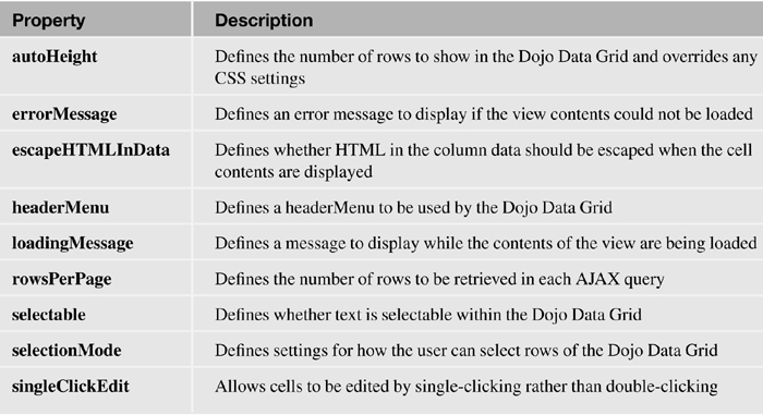
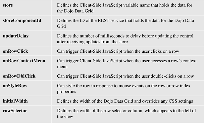
Table 7.1 outlines the main properties for the Dynamic View Panel control.
Table 7.1. xe:dynamicViewPanel Properties

Data Grid
The Dojo DataGrid is a view control with a fully functioning scrollbar that offers a rich user experience similar to that of the Notes Client, as Figure 7.2 shows. Like the View Panel in the core controls, the Dojo DataGrid is presented as a flat table of columns, usually with just one row per document, although content other than just the columns in the underlying View design element can be shown.
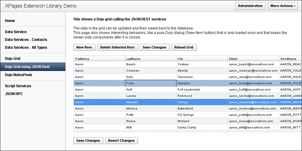
Figure 7.2. Dojo DataGrid.
A rich set of functionality is implemented. Columns can be re-sorted or reordered, and contents can be edited in place. Entries in the view can also be selected for bulk processing. There is no pager, but instead a scrollbar. As the user scrolls through the view, additional contents are retrieved from the server via AJAX calls and presented to the user. Using AJAX calls optimizes initial page load and performance.
REST Service
The Dynamic View control, as with the View Panel core control, uses a dominoView datasource. But XPages is about separating the presentation layer from the data layer. So the Extension Library controls covered in the rest of this chapter use data stores. This might be a new concept to XPages developers coming from a Notes Client development background, but not to developers from a web development background. Effectively, data stores allow uniform methods of access to the data layer. This chapter does not go into more detail than is necessary about the various data stores, concentrating on the presentation layer. Chapter 11, “REST Services,” and Chapter 12, “XPages Gets Relational,” cover the data stores in more detail, whether they are REST services or RDBMS data stores, retrieving information from Domino or non-Domino databases.
Listing 7.2 generates a viewJsonService REST service. You will investigate the code later, but the output is effectively a collection of objects, each of which contains items composed of name-value pairs, as shown in Figure 7.3.
Listing 7.2. viewJsonService REST Service Control
1 <xe:restService
2 id="restService1">
3 <xe:this.service>
4 <xe:viewJsonService
5 viewName="AllContacts"
6 var="entry"
7 formName="Contact">
8 defaultColumns="true"
9 contentType="application/json"
10 <xe:this.columns>
11 <xe:restViewColumn
12 name="ShortName">
13 <xp:this.value><![CDATA[#{javascript:var e =
entry.getColumnValue("EMail")
14 if(e) {
15 var p = @UpperCase(@Left(e,"@"))
16 return p
17 }
18 return ""}]]></xp:this.value>
19 </xe:restViewColumn>
20 </xe:this.columns>
21 </xe:viewJsonService>
22 </xe:this.service>
23 </xe:restService>

Figure 7.3. JSON REST output.
The REST Service control displayed here is also the most familiar type available: the viewJsonService. It is similar to the ?ReadViewEntries URL command. For this type of REST service, each object relates to a View Entry in an underlying View design element. The REST Service is similar to the viewItemFileService, except that the viewItemFileService is read-write, whereas the viewJsonService is read only. Unless editability (including deletion of the underlying documents) is required, the viewJsonService is recommended as a more robust implementation.
Some of the items are specific to the View Entries, such as @entryid, @unid, and @noteid. These items are automatically generated and the naming convention is consistent for any REST service based on a View. Others are columns from the View, such as Id, Firstname, and Created. The naming convention for these items is generated from the programmatic name of the column. Of particular note is the ShortName item, whose value is AARON_BEACH. This will not be found in the underlying View design element, but it has been defined programmatically on the REST service. This is one of the benefits of the REST service.
Understanding the output makes it easier to deconstruct the REST service to create it. Returning to Listing 7.2, the properties viewName, formName, and var will be familiar from any other dominoView datasource. The unfamiliar properties are on lines 8 and 9. The defaultColumns property ensures that all the columns in the underlying View design elements are transferred to the REST service. Although it is a viewJsonService, contentType still needs to be set to application/json. The column’s complex property beginning on line 6 is where any items not in the relevant View Entries are defined. Lines 11 through 19 create a column called ShortName. Lines 13 through 18 retrieve the EMail column from the relevant View Entry and return capitalized the portion to the left of the @ symbol. As can be seen in Figure 7.3, this adds an item named ShortName with the relevant value. This functionality allows developers to easily extend an existing view with content from the View Entry, the underlying document, or even content from a related document or database. Although this influences performance because only a certain number of rows are returned for each call to the REST service, the performance impact is mitigated.
The REST service is disconnected from the underlying View design element, so no changes, whether as updates or deletes, are reflected in the underlying documents until the changes are committed back to the server. For more information on editability of REST services, see Chapters 11 and 12.
Table 7.2 outlines the significant additional properties for the viewJsonService RESTService control.
Table 7.2. xe:viewJsonService Properties (Omitting Properties Generic for Datasources)

Dojo Data Grid Control (xe:djxDataGrid)
The main container component is the Dojo Data Grid control, shown in Listing 7.3. The Dojo Data Grid is bound to a REST service by the storeComponentId property, the ID of the REST Service control on the XPage. Alternatively, if the store is created in Client-Side JavaScript, you can use the store property, the value being the JavaScript variable name. If the store needs to be accessed from Client-Side JavaScript, for example in the Client-Side JavaScript events covered later in this section, you must also set the jsId property. Three properties of the Dojo Data Grid control are relevant to the REST service. Two relate to messages presented to the user: loadingMessage, which defines the message presented to users as the data is being retrieved from the store, and errorMessage, which defines the message presented to users if an error occurs while retrieving the data. The third is updateDelay, which defines the number of milliseconds before loading more content to the Dojo Data Grid.
By default, the size of the Dojo Data Grid is six rows high and 100% width, but you can modify this easily by using Cascading Style Sheets (CSS) height and width on the Dojo Data Grid control. However, these settings are overridden by using properties of the Dojo Data Grid control. You can set the height by using the autoHeight property, set to the number of rows to show. The width is slightly harder to change. You can set it in the initialWidth property, but this takes effect only if autoWidth is set to true. However, this Dojo attribute is not exposed in the All Properties panel, so you need to set it using the dojoAttributes property, in the same way you set Dojo attributes on core controls. So in Listing 7.3, although a height and width are defined using CSS in line 7, the number of rows in the autoHeight property in line 4 and the width in the initialWidth property in line 8 are used when the Dojo Data Grid is drawn.
Listing 7.3. Dojo Data Grid Part One: Dojo Data Grid Control
1 <xe:djxDataGrid
2 id="djxDataGrid1"
3 storeComponentId="restService1"
4 autoHeight="10"
5 jsId="restService1"
6 rowSelector="2em"
7 style="width:85em; height: 25em;"
8 initialWidth="500px"
9 selectionMode="multiple">
10 <xe:this.dojoAttributes>
11 <xp:dojoAttribute
12 name="updateDelay"
13 value="0">
14 </xp:dojoAttribute>
15 <xp:dojoAttribute
16 name="autoWidth"
17 value="true">
18 </xp:dojoAttribute>
19 </xe:this.dojoAttributes>
Listing 7.3 and Figure 7.4 also demonstrate an implementation of the rowSelector property in line 6. This adds an additional column whose width is the value of the rowSelector property, inserted to the left of the Dojo Data Grid. This is not required to enable row selection, but it does provide a column with no other single-click event designed to make selection easier. However, this will have no effect if the selectionMode property is set to none. The default setting for selectionMode is extended, which allows multiple rows to be selected but also allows a range of rows to be selected by holding down the Shift key. The multiple option allows rows to be toggled as selected or deselected, but it does not allow the use of the Shift key to select a range of rows. The final option, single, allows only one row to be selected; as soon as another row is selected, the previously selected row is deselected.

Figure 7.4. Dojo Data Grid rowSelector.
Two other properties are worthy of comment. The first property, selectable, allows text within each cell to be selected and the text to be copied and pasted. The second property is escapeHTMLInData. By default, any HTML in any content in the cells is escaped, but if set to false, the columns show HTML. However, because this can be used to run malicious code, it is recommended that you only change the default setting with caution.
Table 7.3 outlines the main properties for the Dojo Data Grid control.
Table 7.3. xe:djxDataGrid Properties
Dojo Data Grid Contents
The Dojo Data Grid is effectively a table, so the content is added by means of Dojo Data Grid Row controls and Dojo Data Grid Column controls. Listing 7.4 continues the Dojo Data Grid from line 18 of Listing 7.3. However, unlike a normal table, there is no requirement to explicitly add a Dojo Data Grid Row control if the columns will be in the same row. There are no properties of note for the Dojo Data Grid Row control.
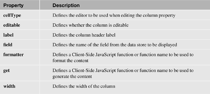
The Dojo Data Grid Column control has three important properties. The field property defines which item’s value from the REST service should be displayed and holds the item’s name. The label property can override the column header, which, by default, will be the item name. The width property specifies the width of the column and can be a specific width or Auto. In most cases, the Dojo Data Grid Column is shown, but if the column should be accessible to Client-Side JavaScript but not shown to the user, you can set the hidden property to false.
Sometimes the REST service provided cannot be modified or has been provided via a JavaScript function. However, you still might need to modify the output. The formatter property allows you to do this by specifying the name of a Client-Side JavaScript function that takes the value and returns a modified output. This can be seen in line 45 and lines 52 through 55 in Listing 7.4, where the formatEmail() function reproduces the ShortName item from the REST service.
In addition, the get property enables the developer to call a function instead of using the field property. The function takes two parameters—colIndex and item—both populated automatically by the Dojo Data Grid. The getShortName function called in line 38 and shown in lines 56 through 58 in Listing 7.4 simulated the previous column that uses field="ShortName" to get the same content.
Listing 7.4. Dojo Data Grid Part Two: Dojo Data Grid Columns and Formatter
1 <xe:djxDataGridColumn
2 id="djxDataGridColumn6"
3 field="FirstName"
4 width="auto"
5 editable="true">
6 </xe:djxDataGridColumn>
7 <xe:djxDataGridColumn
8 id="djxDataGridColumn7"
9 field="LastName"
10 width="auto"
11 editable="true">
12 </xe:djxDataGridColumn>
13 <xe:djxDataGridColumn
14 id="djxDataGridColumn8"
15 field="City"
16 width="auto">
17 </xe:djxDataGridColumn>
18 <xe:djxDataGridColumn
19 id="djxDataGridColumn2"
20 field="State"
21 width="auto"
22 editable="true"
23 cellType="dojox.grid.cells.Select">
24 <xe:this.options><![CDATA[#{javascript:
@DbColumn(@DbName(),"AllStates",1)}]]></xe:this.options>
25 </xe:djxDataGridColumn>
26 <xe:djxDataGridColumn
27 id="djxDataGridColumn9"
28 field="EMail"
29 width="auto">
30 </xe:djxDataGridColumn>
31 <xe:djxDataGridColumn
32 id="djxDataGridColumn10"
33 field="ShortName"
34 width="auto">
35 </xe:djxDataGridColumn>
36 <xe:djxDataGridColumn
37 id="djxDataGridColumn1"
38 get="getShortName"
39 label="Get Short Name"
40 width="auto">
41 </xe:djxDataGridColumn>
42 <xe:djxDataGridColumn
43 id="djxDataGridColumn11"
44 field="EMail"
45 formatter="formatEmail"
46 label="ShortName"
47 width="auto">
48 </xe:djxDataGridColumn>
49 </xe:djxDataGrid>
50 <xp:scriptBlock
51 id="scriptBlock1">
52 <xp:this.value><![CDATA[function formatEmail(value) {
53 var val=value.substr(0,value.indexOf("@"));
54 return val.toUpperCase();
55 }
56 function getShortName(colIndex,item) {
57 if (item) return item.ShortName;
58 }]]></xp:this.value>
59 </xp:scriptBlock>
InViewEditing
Editability is provided by setting the editable property on a Dojo Data Grid Column control to true. On double-clicking a cell in that column (or single-clicking it if the Dojo Data Grid control’s singleClickEdit property is set to true), it becomes editable to free-type a new textual value. But by changing the cellType property on the Dojo Data Grid Column control, different editors can be provided. The other settings are dojox.grid.cells.Bool, which provides a check box, and dojox.grid.cells.Select, which provides a drop-down list of options. For dojox.grid.cells.Select, the options property allows the developer to define the values the user can select from as a comma-separated list or array. Listing 7.4 shows an example of this for the Dojo Data Grid Column control on lines 23 and 24.
Table 7.4 shows the key properties available for the Dojo Data Grid Column control.
Table 7.4. xe:djxDataGridColumn Properties
Although this will enable editability of a column, Client-Side JavaScript needs to be run to pass the changes back to the REST service. This is shown in Listing 7.5. Line 10 saves the Dojo store, whereas line 21 cancels any changes.
Listing 7.5. Saving Dojo Data Grid Edits
1 <xp:button
2 value="Save Changes"
3 id="button1">
4 <xp:eventHandler
5 event="onclick"
6 submit="false">
7 <xp:this.script><![CDATA[var args = {
8 onError: function() { alert('Update error'), }
9 }
10 restService1.save(args)
11 ]]></xp:this.script>
12 </xp:eventHandler>
13 </xp:button>
14 <xp:button
15 value="Revert Changes"
16 id="button2">
17 <xp:eventHandler
18 event="onclick"
19 submit="false">
20 <xp:this.script><![CDATA[var ds = eval('restService1')
21 ds.revert()
22 ]]></xp:this.script>
23 </xp:eventHandler>
24 </xp:button>
View Events
There are additional events available for the Dojo Data Grid control, such as onRowClick and onRowDblClick, detailed in Table 7.3. These are Client-Side JavaScript events, but the event has arguments including grid, rowIndex, rowNode, cell, cellIndex, and cellNode. Listing 7.6 shows code for the onRowClick event, which triggers an alert. Line 1 creates a CDATA block because quotes are used, but because this is Client-Side JavaScript, the content is a literal string. Line 1 gets the rowIndex attribute of the arguments. Line 2 uses that index to retrieve the relevant row from the REST service and pull the @unid attribute.
1 <xe:this.onRowClick><![CDATA[var idx=arguments[0].rowIndex;
2 var unid=restService1._items[idx].attributes["@unid"];
3 alert("Row is " + idx +
+ "UNID is " + unid);]]>
4 </xe:this.onRowClick>
Line 3 issues an alert with both pieces of information, as in Figure 7.5. Note that this is referencing the jsId property of the service, because it is accessing the REST service via Client-Side JavaScript. The onRowContextMenu allows Client-Side JavaScript to be triggered when right-clicking on a row.
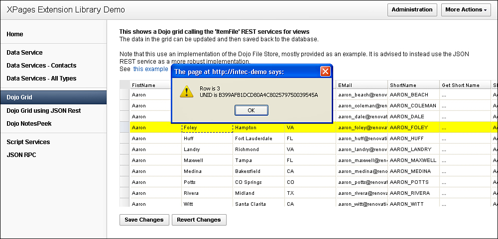
Figure 7.5. Dojo Data Grid Events.
There is an onStyleRow event that triggers when the Dojo Data Grid is drawn and as the cursor moves over each row. You can use this to manipulate the styling of the content within the cell based on the arguments that are passed in, which include index, selected, odd, over, customClasses, and customStyles. Whether changing the style of a row using customStyles or a CSS class in customClasses, this allows you to set a variety of styling depending on row position or user activity. For example, you can use Listing 7.7 to add a yellow background based on the over argument (that is, if the mouse hovers over the row, as seen in Figure 7.5).
<xe:this.onStyleRow><![CDATA[var arg=arguments[0];
if (arg.over) arg.customStyles+="background-color:#FFFF00";]]>
</xe:this.onStyleRow>
iNotes ListView (xe:listView)
The iNotes ListView control is a rich view component based on the view widgets in the iNotes Mail template. In styling, it looks similar to the Dojo Data Grid control, but there is different and additional functionality available, such as showing icons, image resizing, and a variety of events.
The iNotes ListView also uses a REST service. For a Notes View, you can use a viewJsonService REST service for the Data Grid control, employing the default columns from the view or adding columns.
Dynamic ListView
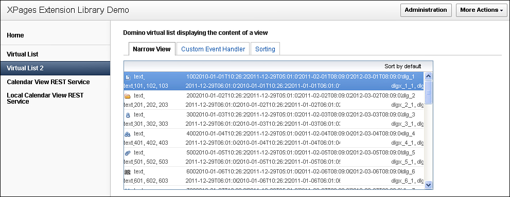
Unlike the Dojo Data Grid, you can implement the iNotes ListView control without including any columns. If no ListView Column controls are added to the iNotes ListView control, it works similarly to the Dynamic View Panel control, as can be seen in Figure 7.6. Namely, it creates a view with all the columns from the underlying View design element. Moreover, columns set to display icons will be reproduced, showing the icons instead of the numbers that are the actual values in the view. Any columns enabled for sorting in the underlying View design element also allow sorting on the XPage. By default, any hidden columns are still shown, unless the hideColumns property on the iNotes ListView is set to true. Then hidden columns are also suppressed from the XPage. The alternateRows property enables the developer to have alternate rows styled differently to help readability of a large view. The showColumnName4EmptyTitle property can ensure that if there is no column title in the underlying View design element, the item name from the REST service is used as the column title. This can ensure that column titles always appear, but it should be used only if the item name will be meaningful to users.

Figure 7.6. iNotes ListView.
To compare the output of the iNotes ListView with the Dynamic View Panel, create an XPage called TeamroomiNotesListView.xsp in the core TeamRoom database used for the Dynamic View Panel. Insert the code in Listing 7.8. Much of the code will look similar to the TeamroomViews.xsp XPage. But instead of the Dynamic View Panel, there is a viewJsonService REST Service control and an iNotes ListView control.
Listing 7.8. TeamroomiNotesListView.xsp
1 All Views 
2 <xp:this.resources>
3 <xp:script
4 src="/OpenLogXPages.jss"
5 clientSide="false">
6 </xp:script>
7 </xp:this.resources>
8 <xp:comboBox
9 id="comboBox1"
10 value="#{viewScope.viewName}">
11 <xp:selectItem
12 itemLabel="—Select—"
13 itemValue="">
14 </xp:selectItem>
15 <xp:selectItems>
16 <xp:this.value><![CDATA[#{javascript:var v =
database.getViews();
17 var a = []
18 for(var i=0; i<v.size(); i++) {
19 a[i] = v[i].getName()
20 }
21 return a}]]></xp:this.value>
22 </xp:selectItems>
23 <xp:eventHandler
24 event="onchange"
25 submit="true"
26 refreshMode="partial"
27 refreshId="listView1">
28 </xp:eventHandler>
29 </xp:comboBox>
30 <xp:br></xp:br>
31 Main Outline Views 
32 <xp:comboBox
33 id="comboBox2"
34 value="#{viewScope.viewName}">
35 <xp:selectItem
36 itemLabel="—Select—"
37 itemValue="">
38 </xp:selectItem>
39 <xp:selectItems>
40 <xp:this.value><![CDATA[#{javascript:var
outline:NotesOutline=database.getOutline("OtherVOutline");
41 var entry:NotesOutlineEntry=outline.getFirst();
42 var i=0;
43 var a=[];
44 while (entry != null) {
45 // If it's a named element pointing to a view
46 if (entry.getEntryClass() == 2191 && entry.getType() == 2187) {
47 a[i]=entry.getLabel() + "|" + entry.getNamedElement();
48 i = i+1;
49 }
50 var tmpEntry:NotesOutlineEntry=outline.getNext(entry);
51 entry.recycle();
52 entry=tmpEntry;
53 }
54 return a;}]]></xp:this.value>
55 </xp:selectItems>
56 <xp:eventHandler
57 event="onchange"
58 submit="true"
59 refreshMode="partial"
60 refreshId="listView1">
61 </xp:eventHandler>
62 </xp:comboBox>
63 <xp:br></xp:br>
64 <xe:restService id="restService1">
65 <xe:this.service>
66 <xe:viewJsonService
67 defaultColumns="true"
68 viewName="#{viewScope.viewName}">
69 </xe:viewJsonService>
70 </xe:this.service>
71 </xe:restService>
72 <xe:listView
73 id="listView1"
74 style="height:250.0px;width:800.0px"
75 storeComponentId="restService1"
76 alternateRows="true"
77 showColumnName4EmptyTitle="true"
78 autoResize="true">
79 </xe:listView>
The iNotes ListView has numerous events, all of which support only Client-Side JavaScript. This is because the control and its functionality are an extension of what is available in iNotes, which, because it is not built on XPages, does not have access to Server-Side JavaScript (SSJS). The events onCellClick and onCellDblClick, not surprisingly, reproduce the onRowClick and onRowDblClick events of the Data Grid. However, the underlying content is accessed differently. For both events, there is an object available, ext, that gives access to all the necessary elements. The ext.tumbler attribute gives access to the row number, but note that this starts with the first row as 1, not 0. For greater ease than the onRowClick and onRowDblClick events, there is actually an ext.item object that gives direct access to the item from the store with all the properties from the underlying View design element, as well as the other automatically generated attributes from the store. The ext object also gives access to the row and cell that were clicked.
Some of the other events, such as onContextMenu, onDeleteEntry, onNewEntry, onOpenEntry, and onSelectEntry, are covered in the “iNotes Calendar” section. The events work identically for both, with the same arguments available. One additional event available for iNotes ListView is onSortChanged. This event is triggered when a sortable column is clicked. No arguments are available for this event.
Table 7.5 defines the main properties for the iNotes ListView control.
Table 7.5. xe:listView Properties


ListView Column
When ListView Column controls are added to the iNotes ListView, the process is more analogous to the Dojo Data Grid control. The output is specifically the columns chosen—nothing more, nothing less. Consequently, the hideColumn property is ignored. The assumption is that if you choose to add the column to the iNotes ListView, you want it to show.
The two properties under the dojo-widget category—columnName and title—define the content of the column. The columnName property defines the item’s attribute name to be shown, and the title property defines the column header title to appear for the user. Note that if the content for the column is an array, it does not currently show. The gradient property can add a gradient for the whole column. Bear in mind that if gradient is set, alternate row colors have no effect for this column.
Reviewing the properties of the ListView Column, it is evident it will support all the Notes Client functionality available in view columns. If the column should show an icon, you should set the icon property. If response documents should show, you can define the response property. If the column is categorized, you can use the twistie property to ensure that a twistie appears. If the column should extend to take up the remaining width of the view, you can set the extendable property; otherwise, the final column spans the remaining view width defined on the iNotes ListView control. The fixedWidth property allows you to fix the column to a specific width. The sort property allows you to define a sort order: 1 for descending, or 2 for ascending.
Because the hideColumn property is applicable only if no ListView Columns are defined, the canBeNarrowMode property is only applicable if ListView Columns are defined. This becomes apparent when ListView Columns are added and the properties for them are inspected. However, this does not need to be set to true to take advantage of the narrow mode functionality. But what is this narrow mode functionality? It occurs when the iNotes ListView goes far beyond the Dynamic View Panel or Dojo DataGrid controls. The narrow mode functionality enables a multirow layout, with contents for a single entry spanning multiple rows, as in Figure 7.7.
In Narrow Mode, the columnTitle property of the ListView Column has no effect. The column headings are not displayed, because the header does not support multiple rows. But as is apparent, the alternate row colors affect each item in the store. Narrow Mode supports three additional properties. The first property is narrowDisplay, which determines how the column displays (or not). The available options for narrowDisplay are top (appearing on the first row), wrap (appearing on the second row) or hide. The second property is beginWrapUnder, which determines which column the wrapping starts under; it does not necessarily have to start under the first column. The final property is sequenceNumber, which determines the column order and provides a rich view layout.
Table 7.6 summarizes the properties for the ListView Column control.
Table 7.6. xe:listViewColumn Properties

iNotes Calendar (xe:calendarView)
One of the common requests of developers using XPages was for a Calendar view control. Although jQuery provided a plugin and some developers used Repeat Controls to generate a calendar-style layout and display content, there were still calls for a standard XPages control for displaying content in a calendar layout.
Considerable effort had already been spent in developing a fully functioning web-based calendar layout control for iNotes, so the approach taken was to package the iNotes functionality within an XPages control in the Extension Library. This approach provides a wealth of functionality but does mean some peculiarities in event handling.
Calendar Views in the Notes Client
For XPages developers who have never developed for the Notes Client, it will be useful to outline the process of creating a Calendar View for display in the Notes Client. This is because many of the columns required by a Notes Calendar View are also required by the iNotes Calendar Control.
The most important step when creating a Calendar View for the Notes Client is to set the Style property on the first tab of the View’s properties panel to Calendar instead of the default Standard Outline setting, as shown in Figure 7.8. This is the ($Calendar) view in a database based on the Mail template that comes with the Lotus Notes install.
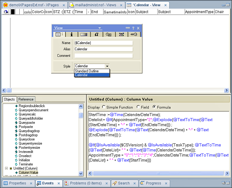
Figure 7.8. Notes Calendar View in Domino Designer.
The first column of the Calendar View must be a Notes Date/Time. This is the output of the formula shown in Figure 7.8. There are some additional settings to be defined in the first Column’s Properties box. The column needs to be sorted on the second tab of the Column’s properties panel in ascending order. On the fourth tab of the Column’s properties, the column must be set to display a Date/Time with both Display Date and Display Time checked. The second column must be the duration in minutes of the event. There are a variety of other settings you can apply to the View’s properties panel for display purposes, but the refinements available are unnecessary for the purposes of comparison with the iNotes Calendar View control. If further information is required, it is best to consult the Domino Designer Help database page titled “Creating a Calendar View.”
In Figure 7.8, a number of additional columns are shown that bear further comment. There is an icon used to determine the calendar entry type. The Time and End columns hold the start and end time for the calendar entry. The Subject column holds the title for the calendar entry, and the Chair column holds the chair of the meeting or person who originated the calendar entry.
REST Service: calendarJsonLegacyService
The previous view controls that use REST services allow the developer to define which columns should be presented to the user. The iNotes Calendar control, however, expects certain predefined columns, like the Notes Client Calendar view, so the REST service needs to present specific information in a specific format. The calendarJsonLegacyService is specifically designed to enable developers to map from a Notes View and ensures the data is output with the appropriate labels, as used in the calendarView.xsp Custom Control in the TeamRoom. The code for that REST service is in Listing 7.9. Note the pathInfo property in line 3. Previously, the REST service was referenced from other components by its ID. But the iNotes Calendar control references its content via a URL, the URL set for the store in the pathInfo property.
Listing 7.9. calendarJsonLegacyService
1 <xe:restService
2 id="restService2"
3 pathInfo="/inoteslegacyjson"
4 preventDojoStore="false">
5 <xe:this.service>
6 <xe:calendarJsonLegacyService
7 viewName="calendarOutline"
8 var="entry"
9 contentType="text/plain"
10 colCalendarDate="CalDateTime"
11 colEntryIcon="Icon"
12 colStartTime="StartDateTime"
13 colEndTime="EndDateTime"
14 colSubject="For"
15 colChair="Chair">
16 <xe:this.compact><![CDATA[#{javascript:
sessionScope.CompactJson2=="true"}]]></xe:this.compact>
17 </xe:calendarJsonLegacyService>
18 </xe:this.service>
19 </xe:restService>
The other significant difference with the previous REST services is the value of the contentType property on the service. Previously, the JSON was output with the setting application/json, meaning that each column was output as another item within the entry object. For the iNotes Calendar control, the property’s value must be text/plain. The difference in the output can be seen by comparing Figure 7.3 and Figure 7.9. The latter shows a single viewentry, with all the usual system columns such as @unid and @noteid. However, there is one item called entrydata for all the other mapped rows. This contains an object with other objects within it, one for each of the relevant columns. Note also that instead of the property names defined in the REST service, programmatic names like $134 are output. This is another of the benefits of the calendarJsonLegacyService: that those programmatic names are automatically generated, with the mapping done against human-readable property names.

Figure 7.9. calendarJsonLegacyService REST output.
The compact property of the calendarJsonLegacyService enables the JSON data to be compacted when it’s pushed out to the browser. This is managed in the TeamRoom database with a sessionScope variable.
REST Service: Notes Calendar Store
The other option for utilizing a Notes Calendar view is to use the Notes Calendar Store control. This takes a REST service with appropriately named columns and converts it into a store that the iNotes Calendar Control can understand.
The first step is to set up a REST service. Note that the REST service needs to provide columns with the specific names seen in Figure 7.9. This can be seen in Listing 7.10, which shows the CalendarStoreCustomRestService.xsp in the XPages Extension Library Demo database. The default columns existing in the underlying View design element are suppressed by setting the defaultColumns property to "false" in line 8. Then the specific columns required from lines 11 through 65, each with programmatic names mapping to the relevant columns in the ($Calendar) view of the Notes Mail Template, are added to the columns property. In this scenario, all the required columns exist in the underlying View design element because the REST service is actually pointing to the ($Calendar) view in a Notes Mail Template, so defaultColumns could be set to "true", and the columns property could be omitted. But it is a useful example to show the columns required for the REST service and the specific names the columns must have.
The pathInfo, contentType, and compact properties have the same values for the viewJsonLegacyService as the calendarJsonLegacyService.
Listing 7.10. viewJsonLegacyService
1 <xe:restService
2 id="restService2"
3 pathInfo="inoteslegacyjson">
4 <xe:this.service>
5 <xe:viewJsonLegacyService
6 databaseName="${compositeData.databaseName}"
7 viewName="${compositeData.viewName}"
8 defaultColumns="false"
9 var="entry"
10 contentType="text/plain">
11 <xp:this.columns>
12 <!— Cal Date —>
13 <xe:restViewColumn
14 name="$134" columnName="$134">
15 </xe:restViewColumn>
16 <!— Icon —>
17 <xe:restViewColumn
18 name="$149"
19 columnName="$149">
20 </xe:restViewColumn>
21 <!— Start Date —>
22 <xe:restViewColumn
23 name="$144"
24 columnName="$144">
25 </xe:restViewColumn>
26 <!— End Date —>
27 <xe:restViewColumn
28 name="$146"
29 columnName="$146">
30 </xe:restViewColumn>
31 <!— Description —>
32 <xe:restViewColumn
33 name="$147"
34 columnName="$147">
35 </xe:restViewColumn>
36 <!— Alt Description —>
37 <xe:restViewColumn
38 name="$151"
39 columnName="$151">
40 </xe:restViewColumn>
41 <!— Type —>
42 <xe:restViewColumn
43 name="$152"
44 columnName="$152">
45 </xe:restViewColumn>
46 <!— Chair —>
47 <xe:restViewColumn
48 name="$153"
49 columnName="$153">
50 </xe:restViewColumn>
51 <!— Confidential —>
52 <xe:restViewColumn
53 name="$154"
54 columnName="$154">
55 </xe:restViewColumn>
56 <!— Status —>
57 <xe:restViewColumn
58 name="$160"
59 columnName="$160">
60 </xe:restViewColumn>
61 <xe:restViewColumn
62 name="$UserData"
63 columnName="$UserData">
64 </xe:restViewColumn>
65 </xp:this.columns>
66 <xe:this.compact>
67
<![CDATA[#{javascript:sessionScope.CompactJson2=="true"}]]>
68 </xe:this.compact>
69 </xe:viewJsonLegacyService>
70 </xe:this.service>
71</xe:restService>
Once the REST service has been provided, the final step is to add a Notes Calendar Store control to the XPage, as in Listing 7.11. Note the setting of the dojoType and the dojoAttribute properties. The xpagesext.CalendarStore Dojo type will not be found among the other Dojo files on the Domino server or Notes Client. The control takes advantage of Dojo-style properties to add a pathInfo attribute that maps to the same pathInfo property set on the REST service.
Listing 7.11. Notes Calendar Store
<xe:notesCalendarStore
id="${compositeData.storeComponentId}"
jsId="nstore1"
dojoType="xpagesext.CalendarStore">
<xe:this.dojoAttributes>
<xp:dojoAttribute
name="pathInfo"
value="/inoteslegacyjson">
</xp:dojoAttribute>
</xe:this.dojoAttributes>
</xe:notesCalendarStore>
Notes Calendar Control
Once the REST service has been set up and, if necessary, a Notes Calendar Store control or iCal Store control added, the final step is to add an iNotes Calendar control. This is the control that actually adds the calendar to the XPage, providing the same functionality available in the Notes Client or on iNotes. Listing 7.12 shows the Notes Calendar control settings from the calendarView.xsp Custom Control in the TeamRoom database. Because this is mapping directly to a calendarJsonLegacyStore REST service, the storeComponentId property is set to that REST service’s ID, restService2. If a Notes Calendar Store or iCal Store is used, the storeComponentId will be the ID of the relevant intermediary store rather than the REST service that actually provides the data.
Listing 7.12. Notes Calendar Control
<xe:calendarView
id="calendarView1"
jsId="cview1"
type="#{javascript:sessionScope.dateRangeActions_selectedValue}"
storeComponentId="restService2"
style="width:100%">
<xe:this.summarize>
<![CDATA[#{javascript:summarize =
sessionScope.calendarFormatActions_selectedValue == "true";}]]>
</xe:this.summarize>
</xe:calendarView>
The summarize property is a boolean. If false, the full range of date or time slots is shown regardless of whether there is a calendar slot for that date or time, as in Figure 7.10. If true, a list of calendar entries grouped under the date or time slots used is shown instead, as in Figure 7.11.

Figure 7.10. Calendar—summarize="false".
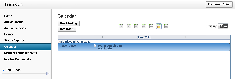
Figure 7.11. Calendar—summarize="true".
The type property determines the range for the calendar. In the TeamRoom, it maps to an instance of the actionManager.xsp Custom Control shown in Listing 7.13, although an Image Select control, covered in Chapter 5, “Dojo Made Easy,” could have been used instead. This Custom Control allows a set of action buttons to be added to the XPage to provide a single-select style group of buttons. As one button is selected, the others are deselected, and the group’s value is set from the selectedValue of the currently selected button. This shows that the defaultSelectedValue for the groups of actions is M, but the available options that can be provided are as follows:
One day: D
Two days: T
Work week: F
Seven-Day Week: W
Two Weeks: 2
Month: M
Year: Y
Not all options must be provided to set the range for the calendar, but this shows all options available.
Listing 7.13. dateRangeActions
<xc:actionManager
refreshId="mainPanel"
actionGroupName="dateRangeActions"
padActions="true"
defaultSelectedValue="M">
<xc:this.actions>
<xc:actions
deselectedImage="/1_Day_deselected_24.gif"
selectedImage="/1_Day_selected_24.gif"
imageAlt=""
selectedValue="D">
</xc:actions>
<xc:actions
deselectedImage="/2_Days_deselected_24.gif"
selectedImage="/2_Days_selected_24.gif"
imageAlt=""
selectedValue="T">
</xc:actions>
<xc:actions
deselectedImage="/1_Work_Week_deselected_24.gif"
selectedImage="/1_Work_Week_selected_24.gif"
imageAlt=""
selectedValue="F">
</xc:actions>
<xc:actions
deselectedImage="/1_Week_deselected_24.gif"
selectedImage="/1_Week_selected_24.gif"
imageAlt=""
selectedValue="W">
</xc:actions>
<xc:actions
deselectedImage="/2_Weeks_deselected_24.gif"
selectedImage="/2_Weeks_selected_24.gif"
imageAlt=""
selectedValue="2">
</xc:actions>
<xc:actions
deselectedImage="/Month_deselected_24.gif"
selectedImage="/Month_selected_24.gif"
imageAlt=""
selectedValue="M">
</xc:actions>
<xc:actions
deselectedImage="/All_Entries_deselected_24.gif"
selectedImage="/All_Entries_selected_24.gif"
imageAlt=""
selectedValue="Y">
</xc:actions>
</xc:this.actions>
</xc:actionManager>
View Events
The Notes Calendar control also supports some events specifically for calendars. As with the iNotes ListView and for the same reason, all these events support only Client-Side JavaScript.
The onNewEntry events allow the developer to intercept a click and capture the relevant date or time slot clicked. Listing 7.14 shows the onNewEntry event in the TeamRoom calendar. Line 2 verifies that the user has access to create documents. Because the event supports only Client-Side JavaScript, the code is wrapped in the #{javascript:} syntax to run SSJS through the XSP Command Manager when the XPage is parsed. It also verifies that the user can write the result to the Client-Side JavaScript function printed on the rendered web page. Line 4 uses the getDate() function of the calendar object to access the JavaScript date for the clicked slot. The calendar object is passed as an argument into the function. If there’s any doubt, a review of the HTML generated by the event will show those arguments, as demonstrated in the HTML that’s produced: <script language="JavaScript" event="newEntryAction" type="dojo/connect" args="calendar">. The date is manipulated into yyyymmdd format in lines 6 through 13 and in line 25 is appended as a query string parameter to the URL to which the user will be redirected. The final parameter added in lines 28 and 29 is a calendar type of Meeting, held in a properties file. The browser is then redirected to the complete URL, and the calendarEntry.xsp XPage populates the relevant fields from the query string parameters.
Listing 7.14. onNewEntry Event
1 <xe:this.onNewEntry><![CDATA[
2 if(#{javascript:(userBean.accessLevel >=
lotus.domino.ACL.LEVEL_AUTHOR) && userBean.canCreateDocs}){
3 var yyyymmdd = null;
4 var calDate = calendar.getDate();
5 // if we have a calendar date, format it as a yyyymmdd string
6 if (calDate != null) {
7 var yyyy = new String(calDate.getFullYear());
8 var month = calDate.getMonth() + 1;
9 var mm = month < 10 ? new String('0' + month) : month;
10 var day = calDate.getDate();
11 var dd = day < 10 ? new String('0' + day) : day;
12 yyyymmdd = yyyy + mm + dd;
13 }
14
15 var path = "";
16 if(dojo.isMozilla || dojo.isWebKit){
17 path = #{javascript:""" + @FullUrl('/') + """};
18 }
19
20 // append the XPage to create a calendar entry
21 path += "calendarEntry.xsp";
22
23 // add a parameter value for the selected date if available
24 if (yyyymmdd != null) {
25 path += "?date=" + yyyymmdd;
26 }
27 // Add a docType=Meeting parameter so meetings are selected by
default;
28 var sDocTypeParam =
("#{javascript:strings.getString('defaultdoctype3')}");
29 path += "&docType=" + sDocTypeParam;
30
31 //change the current URL
32 document.location.href = path;
33 }]]>
34 </xe:this.onNewEntry>
The onRescheduleEntry event receives the calendar argument in addition to an item argument. This is the calendar entry that’s being rescheduled, enabling the developer to access the Notes Universal ID of the calendar entry by using item.unid. The onOpenEntry and onDeleteEntry events receive only a single argument—items—an array of the calendar entry or entries selected. There are also events for onSelectEntry, onChangeView (for when the view type is being changed), and onContextMenu.
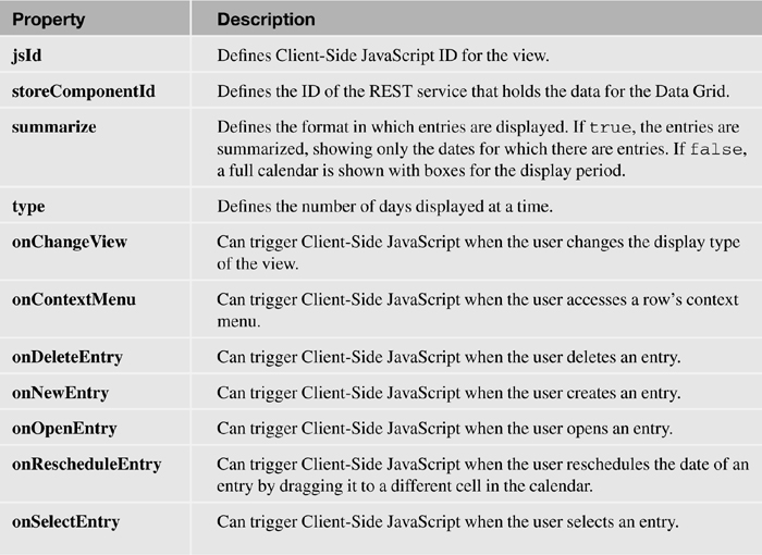
Table 7.7 summarizes the main properties for the iNotes Calendar control.
Table 7.7. xe:calendarView Properties
Data View (xe:dataView)
The Data View is the main view component used in the TeamRoom database. It is a rich view component with several similarities to the core view controls but greater flexibility in layout. Indeed, the repeatControls and removeRepeat properties show the control’s relationship to the Repeat control. Similarly, alternate row coloring has to be done in the same way it would be done for Repeat Controls, because just a single rowClass property is applied to all rows rather than a rowClasses property found on the View Panel or Data Table. But beyond the core controls, the Data View allows properties and facets for categorization, expandable sections, sorting, multiple column layouts, images, and navigation, either by means of pagers or an AJAX request to the server to add more rows—a means of navigation becoming more and more prevalent on the web but until now not easily implemented in XPages.
The data properties for the Data View will be familiar. It has the traditional properties of var, indexVar, rows, first, and openDocAsReadonly. When it comes to the source for the data, there are similarities but even greater flexibility. You can set the data property to any of the three datasources now available to XPages: the core dominoView datasource, available for a View Panel or Data Table; and the core dominoDocument or the new Extension Library objectData datasource, both available for the Data Table control. But the Data View provides even greater flexibility, because the value property can be used instead and set to any type of collection, just as developers have always done for Repeat controls. This provides total flexibility in defining the data.
Like the View Panel, the Data View control is built to manage document selection via the showCheckbox and showHeaderCheckbox. Indeed, the control uses the same SSJS method to access the documents: getSelectedIds().
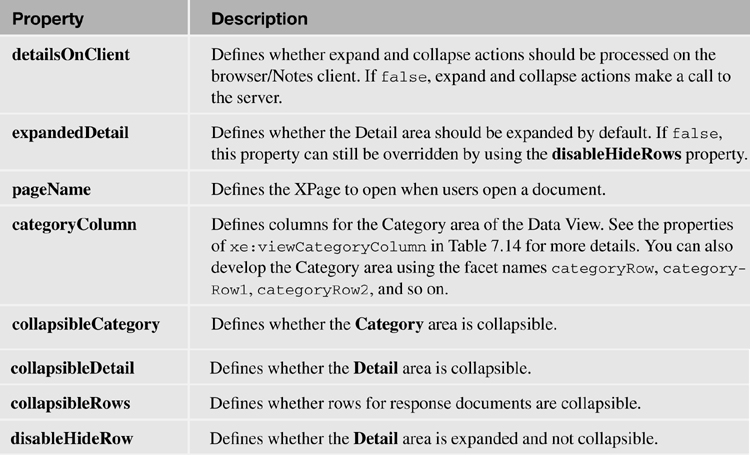
Table 7.8 outlines the main properties for the Data View control.
Table 7.8. xe:dataView Properties

Pagers
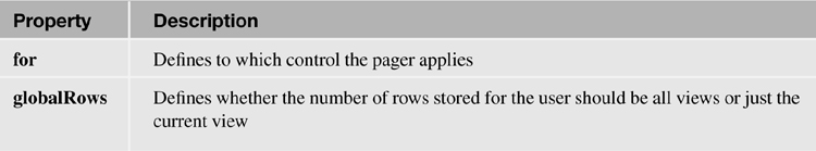
The Data View control itself is a framework providing a layout with facets, or customizable areas of the control. Like the core view controls—the Data Table, the View Panel, and the Repeat control—the Data View control has a header and a footer area, each divided into three areas: one left-aligned, one center-aligned, and one right-aligned. These are nominally called pagerTopLeft, pagerTop, and pagerTopRight for the header and pagerBottomLeft, pagerBottom, and pagerBottomRight for the footer.
You’ll see new areas for adding functionality. That’s deliberate. The Extension Library also adds new pager controls to the core Pager control, which allows the user to move from one page to the next. These pager controls allow developers to quickly and easily implement view manipulation functionality that developers have until now had to code manually. Because the additional content is not initially passed to the browser, the new pager controls do a round-trip to the server for all events.
The Pager Expand/Collapse control (xe:pagerExpand) is appropriate for categorized content, providing the facility to expand and collapse the categories. This can be found on many of the views in the TeamRoom database, most notably the All Documents page in Figure 7.12, shown working when showing by date, by author, or by team. As with the core Pager control, for this and the other Pager controls added by the Extension Library, there are properties to determine partial refresh and the component to attach the Pager Expand/Collapse to, unless it is already within a View control. The default textual labels are “Expand All” and “Collapse All”, but you can override these with the expandText and collapseText properties.

Figure 7.12. Pager controls 1.
Table 7.9 defines the main properties for the Pager Expand/Collapse control.
Table 7.9. xe:pagerExpand Properties
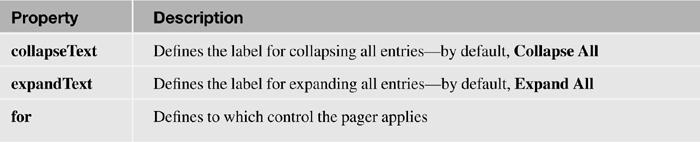
Figure 7.13 shows the Pager Show/Hide Details (xe:pagerDetail) control in action on the Events page (the eventView.xsp Custom Control). If the Data View has a details row, this pager allows all details to be shown or hidden at a single click. For this control, the text, defaulting to Show Details and Hide Details, is managed by the showText and hideText properties.
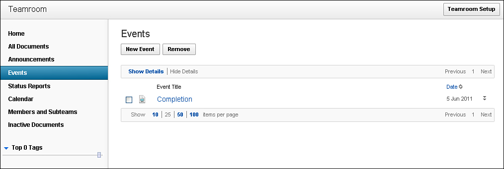
Figure 7.13. Pager controls 2.
Table 7.10 defines the main properties for the Pager Show/Hide Details control.
Table 7.10. xe:pagerDetail Properties
The Pager Sizes (xe:pagerSizes) control allows the user to determine how many documents show per page, although the initial value is still controlled by the developer on the relevant view control. The sizes property allows the developer to define the options to allow the user to select from. A comboBox provides some options to select from. Any values can be entered, but non-numeric options are ignored. The text property enables the developer to define the text to appear. As with the Group Pager Child control, using {0} inserts the first parameter of the pager—in this case, the sizes property. So, the code in Listing 7.15 produces a pager saying Please select from 10 | 20 | 50. The Pager Sizes control is visible on most pages in the TeamRoom database, as Figure 7.13 shows.
Listing 7.15. Pager Sizes Control Code
<xe:pagerSizes
id="pagerSizes1"
sizes="10|20|50"
text="Please select from {0}">
</xe:pagerSizes>
Table 7.11 outlines the key properties for the Pager Sizes control.
Table 7.11. xe:pagerSizes Properties
Figure 7.14 shows the final pager control, the Pager Add Rows control (xe:pagerAddRows). This control can be found on the Home page of the TeamRoom application. Although the core Pager control replaces the current content with the next page of content, this control still shows the current page content while appending additional content. This control would usually be used instead of the core Pager. That control adds the same number of rows as currently displayed to the user, and the Pager Add Rows control adds the number of rows defined by the rowCount property of the Pager Add Rows control. As with the other pager controls, the developer can override the default text, this time using the text property. An additional property, the store property, is available for this control. It enables the developer to define whether the view’s state in terms of the additional rows should be stored on the server. If the property is set to false, when the user returns to the view, it shows only the number of rows defined in the Data View control, not any additional rows the user has added.
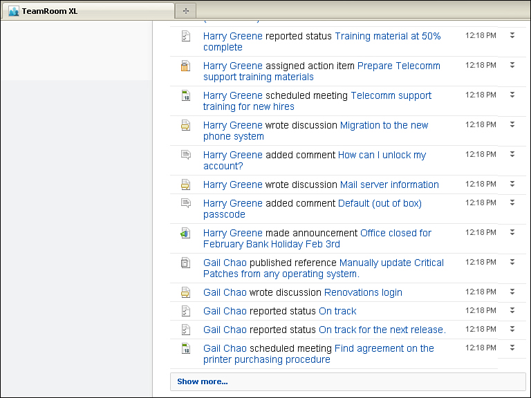
Figure 7.14. Pager controls 3.
Table 7.12 summarizes the main properties of the Pager Add Rows control.
Table 7.12. xe:pagerAddRows Properties

PagerSaveState (xe:pagerSaveState) /View State Beans
One new Pager control has not yet been covered: the Pager Save State. For developers whose experience has been predominantly with the Notes Client, certain user experiences and their implementation are taken for granted. Because the Notes Client opens documents in a separate tab, when the document is closed, the view’s original state is retained. Also, when switching between views, each view is positioned to the last selected document in that view, although there is no retention of the view’s state—which categories were opened/closed to which depth. Because the web is stateless, by default a view is always positioned to the first document in that view. To position the view differently, the usual method of development has been to add more coding to store and retrieve cookies within the user’s browser on the local PC.
With the introduction of XPages, because of its basis on JSF, a server-side model of the page is kept and sessionScope variables can be stored, removing the need to store cookies on a user’s PC. But in its initial implementation, there was no native functionality to take advantage of this and make it easier to reproduce the functionality that users expect if they have come from a Notes Client background. So coding still needed to be added to datasources to set the startKey property to reposition the view to the relevant document.
In this respect, the Extension Library again provides functionality to easily enhance the developer and user experience, by means of the Pager Save State control and the viewStateBean. In addition to automatically capturing which page the user was on, which developers can reproduce programmatically, the viewStateBean captures which categories were expanded or collapsed, so the user can be returned to the view in that state.
Table 7.13 defines the properties for the Pager Save State control.
Table 7.13. xe:pagerSaveState Properties
The functionality is implemented in the TeamRoom database, as evidenced on the All Documents page. It comprises two parts: a Pager Save State control to manage storing the state of the view, and an additional SSJS call to tell the server to restore the view’s state.
As Listing 7.16 shows, the first part is done on the XPage or Custom Control, which holds the viewpart of the code for the allDocsAllTab.xsp Custom Control in the TeamRoom. A Pager Save State control is added to the XPage or Custom Control in lines 1 through 5. The for property is set in line 2 to ID of the Data View or other repeating control for which the view’s state should be saved. The globalRows property is used in line 3 to store the state globally across all views of the application. Otherwise, the view state is stored specifically for the view provided for the user. The Data View or other repeating control also needs to be bound to the viewStateBean’s data Iterator, as shown in line 10. Other than these additions, the Data View is created as normal.
Listing 7.16. Pager Save State and viewStateBean Binding
1 <xe:pagerSaveState
2 for="allDocumentsDataView"
3 globalRows="true"
4 id="pagerSaveState1">
5 </xe:pagerSaveState>
6 <xe:dataView
7 xp:key="tabAll"
8 id="allDocumentsDataView"
9 var="viewEntry"
10 binding="#{viewStateBean.dataIterator}"
11 collapsibleRows="true"
12 pageName="/topicThread.xsp"
13 collapsibleDetail="true"
14 columnTitles="true"
15 rowStyleClass="xspHtmlTrView"
16 rows="25"
17 detailsOnClient="true">
18 <xe:this.data>
19 <xp:dominoView var="view1" viewName="xvwDocsByActiveDate"
20 ...
The second part is done on the document when closing and returning to the relevant view. The restoreState property of the viewStateBean is set to true using SSJS, as shown in line 10 of Listing 7.17. Then when the view is opened, its state is restored, with the view positioned at the relevant row and any expanded or collapsed categories also restored.
Listing 7.17. Restoring the viewStateBean
1 <xp:link
2 id="backLink">
3 <xp:eventHandler
4 event="onclick"
5 submit="true"
6 refreshMode="complete"
7 immediate="false"
8 save="false">
9 <xp:this.action><![CDATA[#{javascript://
10 viewStateBean.restoreState = true;
11 return sessionScope.topicThreadPreviousXPage;
12 }]]></xp:this.action>
13 </xp:eventHandler>
14 </xp:link>
Columns
The pagers are added to the Data View control via the specific facets. You can add the columns in two ways. There are properties on the Data View control for categoryColumn, extraColumns, iconColumn, and summaryColumn, where you can enter various column properties. But you can manage the data for those areas via optional facets whose names are displayed in the visual representation of the Data View control, Figure 7.15. The categoryColumn and extraColumns areas can hold multiple facets, as previously detailed in Table 7.6. This is part of the flexibility of the Data View control: that it is effectively a rich content layout control that allows data or a datasource to be bound to it.
Figure 7.15. Data View control.
Adding content to a facet might be a process that XPages developers will be very familiar with. The various column components that can be added will be more unfamiliar. The following sections run through both methods of defining the column content.
Category Column (xe:viewCategoryColumn)
The outermost area of the data within the Data View is the Category area. Because the Data View control is basically just a layout control, so is the category row. This can be either values from a column in the underlying view or content placed into the categoryRow facet, as in the home.xsp XPage. For the Home page of the TeamRoom database, it is the date(s) of the view entries, as in Listing 7.18. You can see the output in Figure 7.16. Here the value shown is the date of the entry and, if it is today or yesterday, it is prefixed with the relevant string. Because this is using viewEntry, even though the content of the categoryRow facet is more than just a column from the view, the Data View will respect the categorization and put entries under the relevant category heading.
Figure 7.16. home.xsp category row.
Listing 7.18. categoryRow Facet on home.xsp
<xp:span
style="font-weight:bold">
<xp:text
disableTheme="true">
<xp:this.value><![CDATA[#{javascript:var date =
@Date(viewEntry.getColumnValue("ActivityDate"));
if(@Today().equals(date)){
return strings.getString("today") + " ";
}
if(@Yesterday().equals(date)){
return strings.getString("yesterday") + " ";
}
return "";}]]></xp:this.value>
</xp:text>
<xp:text
value="#{javascript:viewEntry.getColumnValue('ActivityDate')}"
disableTheme="true"
id="dateCategoryField"
escape="true">
<xp:this.converter>
<xp:convertDateTime
pattern="MMMM d, yyyy">
</xp:convertDateTime>
</xp:this.converter>
</xp:text>
</xp:span>
There is nothing stopping the facet from having content that bears no relationship to the data held by the Data View, in which case it appears just as a heading above the data.
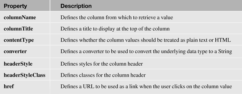
The other method of applying content to the categoryRow facet is to use the categoryColumn property on the Data View to add a viewCategoryColumn component. Figure 7.17 shows all the properties available for the viewCategoryColumn component. Only one viewCategoryColumn can be added to the categoryColumn property, so it is not possible with the Data View to have multilevel categorization. The viewCategoryColumn, viewSummaryColumn, and viewExtraColumn components have the same properties. The most important category is the columnName property, which maps the column to a column in the underlying datasource. If the column value should be a link, the href property can determine the URL to redirect to. There are some properties for managing styling, the contentType can be set as HTML, and a converter can be applied to the result. The columnTitle property is not applicable to a viewCategoryColumn component.

Figure 7.17. viewCategoryColumn properties.
The whole row (or rows if the category provides multiple values relating to the data in the Data View) can be made collapsible by setting the collapsibleCategory property on the Data View.
Table 7.14 summarizes the key properties for the viewCategoryColumn, viewSummary-Column, and viewExtraColumn controls.
Table 7.14. xe:viewCategoryColumn, xe:viewSummaryColumn, xe:viewExtraColumn Properties
Icon Column (xe:viewIconColumn)
The icon area appears as the first column for each entry. As with the other areas, you can set it by adding content to the icon facet or adding a viewIconColumn to the iconColumn property of the Data View. As with the categoryColumn property, you can add just one column to the property.
The viewIconColumn is similar to the Multi-image control, which was covered in Chapter 4, “Forms, Dynamic Content, and More!,” in that it maps a value to the selectedValue property of an iconEntry component. Indeed, the icon for the home.xsp XPage is set by adding a Custom Control using a Multi-Image control to the icon facet. That value can come from a column using the columnName property or can be set using the value property.
Table 7.15 shows the additional properties relevant for the viewIconColumn control.
Table 7.15. xe:viewIconColumn Properties
Summary Column and Extra Columns (xe:viewSummaryColumn and xe:viewExtraColumn)
The next column shown, in a more prominent format than the other columns, is set by adding a viewSummaryColumn to the summaryColumn property or adding content to the summary facet on the Data View. Again, only one viewSummaryColumn can be added. Therefore, if additional content is required, the summary facet might be preferable, as on the home.xsp XPage. All the properties for the viewSummaryColumn are the same as for the viewCategoryColumn.
You cannot define the subsequent columns using a facet. You must use the extraColumns property on the Data View. This can take one or more viewExtraColumn components, which again have the same properties as the viewCategoryColumn.
Column titles for the summary column and extra columns show only if the columnTitles property is true. If column titles show, any columns in the underlying View design element that are sortable are also sortable in the Data View without additional properties being set.
Detail
So far, the Data View shows only a single row per entry. But the Data View provides functionality to add additional detail, appearing below the summary column. You cannot manage the content for the detail using columns; only the detail facet allows you to manage the content. This allows great flexibility in building the look and feel of the detail area.
Some additional properties on the Data View affect how the detail shows. The collapsibleDetail property handles whether the detail can be expanded or collapsed. The expandedDetail determines whether the detail row is expanded by default. You can ensure that detail shows by setting collapsibleDetail to false and setting expandedDetail to true, but it’s easier to set disableHideRow to true. Setting disableHideRow forces the detail to show and prevents the detail from being hidden. As with almost any other property of an XPage, the setting can be computed as well as hard-coded to true or false.
One more property is applicable only for the Notes Client. For the browser, the detail content is only passed to the browser if it should be visible, to maximize performance of initial page load. You can set the detailsOnClient property to ensure detail is passed to the XULRunner within the Notes Client when the page is first loaded to prevent an additional call to the server when showing and hiding detail. This is because server connection speeds are predominantly better for XPiNC, whereas calls to the server currently take longer than they do from a browser.
Multiple Columns
As if the flexibility so far seen for the Data View control was not enough, there is more, as shown in the Members area in the membersMembersTileView.xsp Custom Control, shown in Figure 7.18. On initial viewing, this looks quite different from the Data View. But this has the showCheckbox property set to true and has a summary column—details that always show.
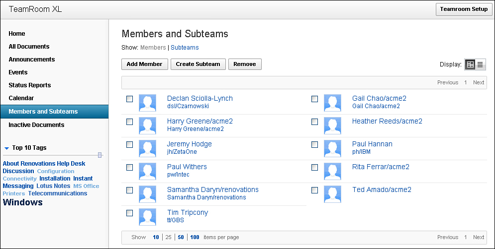
Figure 7.18. Members Tile View.
The only real difference in implementation is that the multiColumnCount property of the Data View control is set to 2. This means that the whole Data View is shown tiled with two entries per row. If the content will not take up much space in the width of the screen, such as in a business card format, developers can maximize the screen real estate available with greater ease of development.
Forum View
The Forum View is similar to the Data View, but the Forum View does not include the categoryRow, icon, and extraColumn areas. Instead, the Data area includes just the Summary and Detail areas. Other than this, all the properties and implementation are the same as the Data View control.
The Forum View control is found in the TeamRoom database on the topicThread.xsp XPage in the topicThreadForum.xsp Custom Control. Figure 7.19 is a screenshot of that XPage, demonstrating how it can show threads and allow the user to expand and collapse the content as required. This again showcases the flexibility of the Data View and Forum View controls, in that the Custom Control displayed in the Forum View—topicPost.xsp—is the same one used to show the main topic above the Forum View.

Figure 7.19. Forum View in topic thread.
Conclusion
The preceding chapters have covered displaying content for editing and viewing an individual document. The Extension Library provides a wealth of new view components from controls that reproduce Notes Client styling, enable developers to easily take advantage of the Dojo Data Grid, reproduce iNotes functionality, and add flexible layouts.