Chapter 8. Outlines and Navigation
Chapter 7, “Views,” covered how to display the data in your applications using one of the new view controls in the XPages Extension Library. For the end user to be able to switch between the different views in the application, the developer needs to create an application layout and navigation. This chapter covers both the Dojo layout controls and the navigation controls that have been added to the XPages Extension Library.
The Dojo Layout Controls
As covered in Chapter 3, “TeamRoom Template Tour,” the XPages-based TeamRoom application uses a special control in the XPages Extension Library for its application layout. This control is described in full detail in Chapter 9, “The Application’s Layout.” Developers, however, do not have to use this control in their XPages design, especially if they won’t be using the OneUI look and feel for their application. To allow developers full control over their application layout, the XPages Extension Library provides several Dojo layout controls that can be used instead.
Neither the XPages TeamRoom application nor the XPages Extension Library Demonstration application uses these Dojo layout controls; however, another Open Source application on OpenNTF called XPages Help Application does. You can download the application from http://xhelp.openntf.org. It makes a great learning resource for developers who want to use the Dojo layout controls in their own applications.
The Content Pane
The basis of any Dojo layout is the Dojo Content Pane (xe:djContentPane). Although there are specific controls—the Border Pane control (xe:djBorderPane) for the Border Container control (xe:djBorderContainer), the Tab Pane control (xe:djTabPane) for the Tab Container control (xe:djTabContainer), the Stack Pane for the Stack Container (xe:djStackPane), and the Accordion Pane (xe:djAccordionPane) for the Accordion Container (xe:djAccordionContainer)—all of these are analogous to the Content Pane control. In fact, another implementation of the Content Pane control was already covered in Chapter 6, “Pop-Ups: Tooltips, Dialogs, and Pickers.” There are additional properties for some of the other pane controls, but they are only extensions to the Content Pane.
The Content Pane, as its name suggests, is just an area to contain content, similar to a div or a panel. The benefit is that there are performance-related properties to allow flexible loading of data. Figure 8.1 shows content panes loaded through partial refresh. Whereas the rest of the content on the page is loaded along with the XPage, the two content panes with the partialRefresh property set to true are loaded via AJAX calls. This means the content is loaded after the rest of the page and, potentially in the scenario of a Tab Pane or Accordion Pane, only as and when the user can see the pane. This can be useful with complex pages across a connection suffering from latency issues.
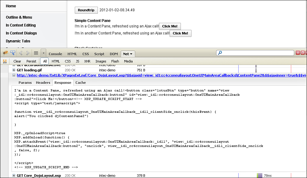
Figure 8.1. Content Pane from XPages Extension Library Demo database, loaded via partial refresh.
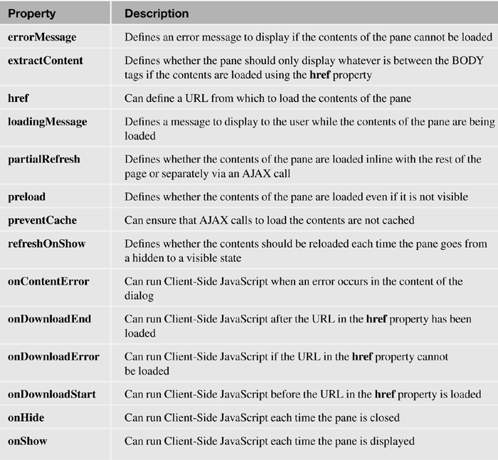
The other performance-related properties—parseOnLoad, preload, preventCache, and refreshOnShow—also start to become more appropriate and more powerful. Table 8.1 lists the notable properties for the Content Pane control.
Table 8.1. xe:djContentPane Properties
The Border Container and Border Pane
The Border Container (xe:djBorderContainer) provides a clean, simple, but flexible layout for the whole application, as shown in Figure 8.2. The layout comprises panes for content within specific regions of the page. As with many of the other Dojo controls, the Border Container supports keyboard events. The Tab key cycles through the splitters. You can change the size of the pane by using the cursor keys: left / right for a vertical pane, and up / down for a horizontal pane.
The main control is the Border Container control. The key setting for the Border Container is to set a height via Cascading Style Sheets (CSS) in either the style or styleClass properties. The width setting is optional. But if no height is set, the Border Container is not displayed.

Figure 8.2. Border Container in the XPages Help Application from OpenNTF.
The Border Container can comprise up to five Border Pane controls. The order in which the panes appear in the source is irrelevant. It is the region property on each Border Pane that defines where in the Border Container each pane appears. The five options are displayed in Figure 8.3, although not all five have to be used (see Figure 8.2). In combination with the panes, the Design property on the Border Container handles how the panes are laid out. Figure 8.2 uses the default design option, headline, where the top and bottom panes extend the whole width of the Border Container. The other option is sidebar, where the right and left panes extend the whole height of the Border Container.

Figure 8.3. Border Pane region property.
The other piece of functionality relating to the panes is splitters. Panes are, by default, fixed to a specific height or width, either handled automatically by the Border Container or overridden by CSS. However, when you define splitters, users are permitted to change the height or width of the panes, as shown in Figure 8.4.
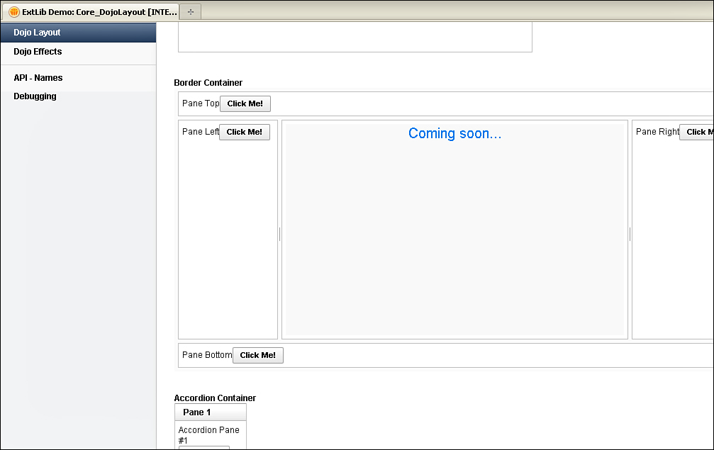
Figure 8.4. Border Container with splitters, including content loaded from href.
The availability of a splitter is defined on each specific Border Pane, so splitters do not necessarily need to be applied to all panes in the Border Container. In addition, there are two properties on the Border Container to control the behavior of the splitters. The liveSplitters property controls whether the panes are dynamically resized as the user drags the splitter or on the onmouseup event. The other property is persist. By default, this property is set to false; when the page is refreshed, the panes revert to their default height and width. If set to true, the resized height and width are stored in cookies in the user’s browser, so a page refresh renders the Border Container with the preferred height and width of each pane, as changed by the user. These and other prominent properties are detailed in Table 8.2.
Table 8.2. xe:djBorderContainer Properties

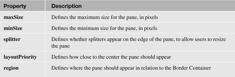
Even with splitters enabled, the developer can maintain some control of the content display by setting the minSize and maxSize properties of a specific Border Pane. These properties take a numeric value controlling the height for top or bottom panes and controlling the width for others. However, the minSize and maxSize properties only take effect when the user tries to resize the pane, so the height or width of the pane should always be set by default as well.
The content of the Border Pane does not necessarily have to be coded on the XPage. With the Border Pane, unlike the normal Content Pane, you can load the content from an external URL in the same trusted domain, using the href property. This can be useful, for example, with a header stored centrally or for content from an existing web application. Figure 8.4 shows soon.xsp loaded into the central pane of the Border Container. However, if you’re loading an XPage using the href property, you should set the extractContent property to true to avoid issues caused by the HTML headers from both pages.
When you load external content into a Border Pane control, additional properties are relevant. You can use the loadingMessage and errorMessage properties to customize the messages displayed to the user. Three additional Client-Side JavaScript events are available: onDownloadStart, onDownloadEnd, and onDownloadError. These are triggered before the relevant URL is loaded, after it’s loaded, and if there’s an error.
Table 8.3 details more properties of the Border Pane that help with the appearance and sizing of the pane. These properties extend those of the Content Pane; see Table 8.1.
Table 8.3. xe:djBorderPane Properties
Accordion Container and Accordion Pane
The Border Container gives a framework for laying out content. Within that framework, navigation can be managed by using the Accordion Container. The Accordion Container is a vertical container of content panes, one of which shows at any one time, as in Figure 8.5. Clicking on the title for a pane expands that pane. You can also use keyboard shortcuts. The cursor keys navigate through the panes. Right (→) or down (↓) navigates one way, and left (←) or up (↑) navigates the other. The Tab key then navigates into the content.
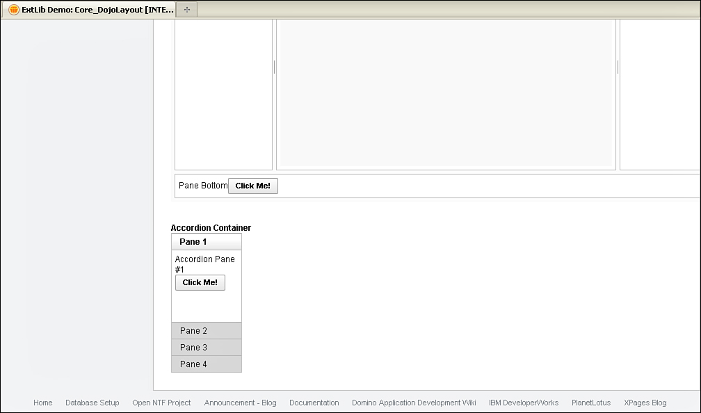
Figure 8.5. Accordion Container.
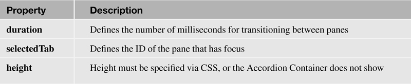
As with the Border Container, the Accordion Container needs to have a height specified, or it will not show. There are only two additional properties for the Accordion Container. The selectedTab property defines which pane is expanded. The value is the ID of the Accordion Pane control that should be expanded. The other property of note is duration, which defines the number of milliseconds for the transition between one pane and the other. Other properties used for the Accordion Container are detailed in Table 8.4.
Table 8.4. xe:djAccordionContainer Properties
The Accordion Container comprises multiple Accordion Pane controls—multiple, because what would be the point in having just one pane? There are no additional properties provided over the Content Pane, but the title property defines the label for the pane. As with the Content Pane, the Accordion Pane can be built up from any other controls, or it can use the href property to load its content from an external source from the same trusted domain. You can use this to load an XPage containing navigation from another application.
The Tab Container and the Tab Pane
The Tab Container is the Dojo equivalent of the core Tabbed Panel that has been familiar to XPages developers since Release 8.5.0. However, there is one significant difference: Only the first tab is loaded initially. Clicking on the second tab makes an AJAX call to load the additional content, as Figure 8.6 shows. Similar to the other Dojo controls, the Tab Container supports keyboard shortcuts at the basic level using cursor keys to move between tabs. Tab Containers can be nested within one another, giving a flexibility of layout. Also, similar to the other Dojo container controls, the height must be specified for the Tab Container to display as expected.

Figure 8.6. AJAX call for Tab Pane content.
The Tab Container has numerous properties for managing its look and feel and behavior. The doLayout property overrides the default height set for the Tab Container, expanding and collapsing the height of the Tab Container depending on the contents of the selected tab. You can position tabs on any side of the container by using the tabPosition property. The default setting is top, but Figure 8.7 shows the other options. You can use the tabStrip property, false by default, to add a background behind the tabs.
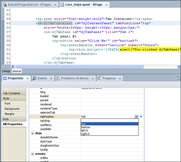
Figure 8.7. Tab Container tabPosition, tabStrip property, and other properties.
As Figure 8.8 shows, tabStrip="true" adds a class to the main div called dijitTabContainerTopStrip, which you can use to manipulate the styling.

Figure 8.8. tabStrip property as true.
If there are too many tabs to fit into the space, you can add slider buttons at either end of the Tab Container to scroll through the tabs, and add a menu to select tabs, as Figure 8.9 shows. The useSlider and useMenu options, defaulting to true, control these settings. Just like the Tabbed Panel, the selectedTab property enables you to define the initial tab by referencing the ID of the relevant tab, such as djTabPane1. However, unlike the Tabbed Panel, the persist property allows the currently selected tab to be stored in a cookie so it can persist across sessions.

Figure 8.9. useSlider and useMenu.
The Tab Pane has two additional properties over the Content Panes covered so far. The tabUniqueKey property allows a unique key to be assigned to each tab, used when programmatically selecting the tab. The closable property, defaulting to false, determines whether you can delete the tab (see Figure 8.10).
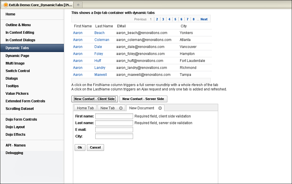
Figure 8.10. New tabs.
You can also use the Tab Container to create dynamic tabs by taking advantage of its methods. As with many of the other methods of the Dojo Extension Library controls, you can do this via Client-Side JavaScript or Server-Side JavaScript (SSJS). Line 3 of Listing 8.1 shows the Client-Side JavaScript method createTab(). In SSJS, the same method exists, but there is an additional method, createTab(Map<String,String>), to create a tab passing parameters, such as the tabUniqueKey and title properties of the Tab Pane, as shown on line 8 of Listing 8.1.
Listing 8.1. createTab Methods
1 <xp:button
2 value="New Contact - Client Side"
3 id="button4">
4 <xp:eventHandler event="onclick" submit="false">
5 <xp:this.script>
<![CDATA[dijit.byId('#{id:djTabContainer1}').createTab()]]>
</xp:this.script>
6 </xp:eventHandler>
7 </xp:button>
8 <xp:button
9 value="New Contact - Server Side"
10 id="button6">
11 <xp:eventHandler
12 event="onclick"
13 submit="true"
14 refreshMode="partial"
15 refreshId="tabs">
16 <xp:this.action><![CDATA[#{javascript:
getComponent("djTabContainer1").createTab({tabUniqueKey:@Unique(),
tabTitle:"New Tab"})}]]></xp:this.action>
17 </xp:eventHandler>
18 </xp:button>
Figure 8.10 shows the output when the Server-Side and Client-Side buttons are clicked. Note specifically the tab titles.
Buttons are available to create the tabs. The content of the tabs is handled through the defaultTabContent property of the Tab Container, which contains a variable name relating to a facet key (see Listing 8.2). Line 5 shows the defaultTabContent property set to doc. Line 6 creates a facet, and Lines 7 onward show the start of the code for the TabPane template that should be used to create the new tab. Note that some default property settings are defined, such as closable and title, but you can override these either in a postOpenDocument setting or in the SSJS createTab(Map<String,String>) method. The tab created with Client-Side JavaScript in Figure 8.10 has the default title "New Document," whereas the tab created in SSJS has the "New Tab" title passed through the method.
Listing 8.2. defaultTabContent
1 <xe:djTabContainer
2 id="djTabContainer1"
3 tabPosition="top"
4 style="width:500px; height:300px; margin:5px;"
5 defaultTabContent="doc">
6 <xp:this.facets>
7 <xe:djTabPane
8 xp:key="doc"
9 id="djTabPane2"
10 title="New Document"
11 closable="true"
12 partialEvents="true">
13 <xp:panel>
14 <xp:this.data>
15 <xp:dominoDocument
16 var="document1"
17 formName="Contact">
18 <xp:this.postOpenDocument> <![CDATA[#{javascript:var
fn = document1.getItemValueString("FirstName")
19 var ln = document1.getItemValueString("LastName")
20 var title = fn + " " + ln
21 var pane = getComponent("djTabPane2")
22 pane.setTitle(title)
23 pane.setTabUniqueKey(document1.getNoteID())
24 }]]></xp:this.postOpenDocument>
25 </xp:dominoDocument>
26 </xp:this.data>
27 <xp:table>
28 <xp:tr>
29 <xp:td>
30 <xp:label
31 value="First name:"
32 id="firstName_Label1"
33 for="firstName1">
34 </xp:label>
35 </xp:td>
36 <xp:td>
37 <xp:inputText
38 value="#{document1.FirstName}"
id="firstName1"
39 required="true">
40 </xp:inputText>
41 </xp:td>
Two other methods are worthy of mention. Just like the Dojo method for creating a tab in Client-Side JavaScript, there is another method for switching to a tab, namely selectChild(), taking the Client-Side ID of the tab to open. SSJS provides a similar method, setSelectedTab(), taking the ID of the tab to open.
Table 8.5 details more properties of the Dojo Tab Container.
Table 8.5. xe:djTabContainer Properties

The Stack Container and the Stack Pane
The Stack Container is similar to the Tab Container, except that only one Content Pane is shown at any one time. There are no new properties over the Tab Container, so all the properties in Table 8.5 are relevant for the Stack Container. Indeed, the Tab Container Java class, UIDojoTabContainer, actually extends the Stack Container Java class, UIDojoStackContainer. Like the Tab Container, the selectedTab and persist properties can be defined to handle Stack Pane behavior. However, unlike the other containers, it’s not necessary to define a height on the Stack Container. If it is defined, that height is used across all Stack Panes.
The Stack Pane control works the same as the basic Content Pane, and indeed it adds no additional properties to the Content Pane class. As a summary, Figure 8.11 shows the hierarchy of the various Layout Containers, and Figure 8.12 shows the hierarchy of the various Content Panes, including their Java classes.

Figure 8.11. Layout Container hierarchy.
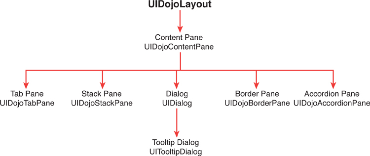
Figure 8.12. Content Pane hierarchy.
Understanding the Tree Node Concept
Also included in the XPages Extension Library are controls that give the developer further navigation techniques. Most of these controls are designed for use within the Application Layout control described in the next chapter, but they can also be used within an application to provide navigation for the end user. These controls allow the developer to provide breadcrumbs, pop-up menus, toolbars, generic outlines, lists of links, and tag clouds. Apart from the tag cloud, each of these controls uses a concept of tree nodes to define contents of the control. Listing 8.3 shows a basic navigator control with three basicLeafNode children.
Listing 8.3. Basic Navigator Control with Nodes
<xe:navigator
id="navigator1">
<xe:this.treeNodes>
<xe:basicLeafNode
onClick="option1"
label="This is option 1" />
<xe:basicLeafNode
onClick="option2"
label="This is option 2" />
<xe:basicLeafNode
onClick="option3"
label="This is option 3" />
</xe:this.treeNodes>
</xe:navigator>
Before developers can implement any of the navigation controls in the XPages Extension Library, they should understand the different tree nodes they can use within the controls. There are basic node types in which the developer can define the functionality of the node, and there are advanced node types in which the data for the node can come from Domino view resources and Java Beans.
Standard Node Types
The basicLeafNode (xe:basicLeafNode)
The basicLeafNode, as shown in Listing 8.4, is the standard node that all other tree nodes are modeled upon. With the exception of the separatorTreeNode, described later in this chapter, all the other tree nodes, both basic and advanced, contain the same general properties as the basicLeafNode.
Listing 8.4. Simple basicLeafNode Examples
<xe:basicLeafNode
label="Home"
selected="true"
href="/">
</xe:basicLeafNode>
...
<xe:basicLeafNode
style="color:rgb(128,128,128)">
<xe:this.label><![CDATA[#{javascript:var v =
com.ibm.xsp.extlib.util.ExtLibUtil.getExtLibVersion();
return "XPages ExtLib version: "+v}]]></xe:this.label>
</xe:basicLeafNode>
...
<xe:basicLeafNode
label="Go to Mobile App"
href="http://myServer/home.nsf/mobileApp.xsp">
</xe:basicLeafNode>
As with most of the standard XPages controls, the basicLeafNode contains both loaded and rendered properties. The developer can compute these properties to determine if the node should be loaded or shown to the end user.
To manage the look and feel of the node, the developer can set the CSS or style class of the node using the style and styleClass properties. The text that is rendered to the web browser is set with the label property, and the developer can specify an image using the image, imageAlt, imageHeight, and imageWidth properties if required. The selected property is a Boolean value. If it is set or computed to true, an additional CSS style class of lotusSelected is added to the node when it is rendered to the web browser.
The developer has different options to determine what happens when a node is clicked in the web browser. The href property renders the node as a standard link to the specified URL. This could be a URL within the application or a link to a different application or website. The onClick property allows the developer to execute a piece of Client-Side JavaScript code, and the submitValue property allows the developer to specify a value that is passed back to the server. This value is accessed from the onItemClick event of the control that contains the tree nodes and is described in more detail later in this chapter.
The basicContainerNode (xe:basicContainerNode)
As its name suggests, the basicContainerNode, as demonstrated in Listing 8.5, is a container; as such, it can have its own subset of child nodes. It’s like a branch on a tree that can contain its own leaves and branches. In addition to all the properties that can be found on the basicLeafNode, the basicContainerNode has two more properties called children and transparent.
Listing 8.5. A basicContainerNode Example
<xe:basicContainerNode
label="More Actions">
<xe:this.children>
<xe:pageTreeNode
page="Core_Home"
label="Goto Home">
</xe:pageTreeNode>
<xe:pageTreeNode
page="Domino_Home"
label="Goto Domino">
</xe:pageTreeNode>
<xe:separatorTreeNode></xe:separatorTreeNode>
<xe:basicContainerNode
label="Server side redirect">
<xe:this.children>
<xe:basicLeafNode
label="Goto Home"
submitValue="home">
</xe:basicLeafNode>
<xe:basicLeafNode
label="Goto Domino"
submitValue="domino">
</xe:basicLeafNode>
</xe:this.children>
</xe:basicContainerNode>
</xe:this.children>
</xe:basicContainerNode>
The children property is where developers can add in any number of other nodes in the same way that they would add nodes directly to the treeNode root. Any of the treeNode types can be added to the children node of a basicContainerNode, and multiple levels can be achieved by adding basicContainerNode entries that can in turn contain other nodes and container nodes.
The transparent property is a Boolean value that defaults to false. When it is set or computed to true, the container node is not rendered as part of the tree; however, the child nodes still render. One suggested use for this is allowing the developer to create a single tree that contains two sets of nodes and then using the loaded or rendered properties to display only one set of child nodes to the end user rather than have to use the loaded or rendered properties on each of the leaf nodes.
The separatorTreeNode (xe:separatorTreeNode)
The separatorTreeNode is used when it’s necessary to add a visual separator to the tree. This is the most basic of all the tree node types and only contains, in addition to the standard styling properties, a loaded and rendered property that allows the developer to define if and when to display this node.
The loginTreeNode (xe:loginTreeNode)
The loginTreeNode in its most basic form when there are no properties set automatically produces a tree node that contains a link to log the user into the database using the standard ?opendatabase&login URL format.
If the Domino server is configured for session-based login, this control will not be rendered if the user is already authenticated. It has been discovered that this functionality does not work so these lines should be removed to avoid confusion.
The userTreeNode (xe:userTreeNode)
Normally used in conjunction with the loginTreeNode, the userTreeNode simplifies the display of the currently logged in user. In its simplest form, when added to the page with no properties set, it either displays Anonymous if there is no logged in user, or displays the user’s common name if the user is authenticated with the server. If the label property is set or to be used, the developer needs to compute what is displayed in both cases.
You can use the userField property here to display the user data. This property is usually left blank, so by default it displays the displayName value from the data provider. For Domino, the user’s abbreviatedName, commonName, canonicalName, and so on can be used, as shown in Listing 8.6.
Listing 8.6. A userTreeNode Example
<xe:userTreeNode
userField="abbreviatedName"
style="font-weight:bold">
</xe:userTreeNode>
The Advanced Node Types
The pageTreeNode (xe:pageTreeNode)
The pageTreeNode gives the developer an easy way to link to another page within the application. In addition to the properties found on the basicLeafNode, the pageTreeNode provides three extra properties.
The page property is a drop-down list of all the XPages within the application. The developer can select a page from the list or compute the page if desired. This property replaces the href property in the basicLeafNode. In addition to the page property, there is a queryString property. When a developer uses this property, the text specified here is added to the page selected in the page property.
The last of the additional properties in the pageTreeNode is the selection property, as demonstrated in Listing 8.7. It is used in conjunction with the navigationPath property in the applicationLayout control described in the next chapter. If the selection property matches the navigationPath property, the lotusSelected CSS class is automatically added to the node when it is rendered to the web browser. The XPages Extension Library Demo Application uses this control extensively, and the markup in Listing 8.7 is from this application. Figure 8.13 displays this example, rendered as tabs above the placebar for Core, Domino, iNotes, Mobile, and REST.

Figure 8.13. The selection property in action on the Demo application.
Listing 8.7. A pageTreeNode Example with the Selection Property
<xe:this.titleBarTabs>
<xe:pageTreeNode
page="Core_Home"
selection="/Core/.*"
label="Core">
</xe:pageTreeNode>
<xe:pageTreeNode
page="Domino_Home"
selection="/Domino/.*"
label="Domino">
</xe:pageTreeNode>
<xe:pageTreeNode
page="DWA_Home"
selection="/DWA/.*"
label="iNotes">
</xe:pageTreeNode>
<xe:pageTreeNode
loaded="false"
page="iWidget_Home"
selection="/iWidget/.*"
label="iWidget">
</xe:pageTreeNode>
<xe:pageTreeNode
page="Mobile_Home"
selection="/Mobile/.*"
label="Mobile">
</xe:pageTreeNode>
<xe:pageTreeNode
page="OneUI_Home"
selection="/OneUI/.*"
label="OneUI">
</xe:pageTreeNode>
<xe:pageTreeNode
page="REST_Home"
selection="/REST/.*"
label="REST">
</xe:pageTreeNode>
</xe:this.titleBarTabs>
If you are not using the selection property but the current page matches the page listed in the page property, the lotusSelected CSS class is added to the node when it is rendered in the web browser. In this particular case, the queryString property is not considered. This may mean that if you have multiple pageTreeNode entries that point to the same page but have different queryString values, all the entries may show as being selected.
This control is used extensively throughout the Xpages Extension Library Demo application to manage and control the application’s navigation.
The repeatTreeNode (xe:repeatTreeNode)
The repeatTreeNode is a cross between a core XPages repeat control and a basicContainerNode. Just like a standard repeat control, you set up a value for it to repeat in the value property. This could be a datasource attached to the XPage or just a simple JavaScript array. The values of the repeat are accessed using the variable name supplied in the var property. The current repeat index value is accessed in the variable name supplied in the indexVar property.
The items that are repeated are specified in the children property. Just like the basicContainerNode, this property can contain one or more tree nodes and can even contain other basicContainerNode or repeatTreeNode entries, as shown in Listing 8.8.
Unlike the basicContainerNode, however, the repeatTreeNode does not render its own entry in the tree, and the children are rendered at the same level as the repeatTreeNode.
Listing 8.8. A repeatTreeNode Example
<xe:repeatTreeNode
var="val">
<xe:this.children>
<xe:basicLeafNode>
<xe:this.submitValue><![CDATA[#{javascript:return
val[1]}]]></xe:this.submitValue>
<xe:this.label><![CDATA[#{javascript:return
val[0]}]]></xe:this.label>
</xe:basicLeafNode>
</xe:this.children>
<xe:this.value><![CDATA[#{javascript:return [
["Home","home"],
["Domino","domino"],
["OneUI","oneui"]
];}]]>
</xe:this.value>
</xe:repeatTreeNode>
The beanTreeNode (xe:beanTreeNode)
The beanTreeNode contains only two properties: a loaded property that can specify whether the beanTreeNode should be loaded, and a nodeBean property that specifies which bean you should use to provide the tree items.
A nodeBean is a Java class bean that implements components of the ITreeNode interface. Listing 8.9 shows a basic nodeBean from the XPages Extension Library demo application. This bean creates three basicLeafNode entries. You can find more information on creating beans in Java in Chapter 14, “Java Development in XPages.”
package extlib.tree;
import com.ibm.xsp.extlib.tree.impl.BasicLeafTreeNode;
import com.ibm.xsp.extlib.tree.impl.BasicNodeList;
public class SimpleTreeNode extends BasicNodeList {
private static final long serialVersionUID = 1L;
public SimpleTreeNode() {
addLeaf("Node 1");
addLeaf("Node 2");
addLeaf("Node 3");
}
private void addLeaf(String label) {
BasicLeafTreeNode node = new
BasicLeafTreeNode();
node.setLabel(label);
addChild(node);
}
}
The dominoViewListTreeNode (xe:dominoViewListTreeNode)
The dominoViewListTreeNode creates a list of nodes based on the views and folders within an application. Additional properties are available for this node type, the first being the databaseName property. When it is blank, the database this node type uses is the current database; otherwise, it uses the database that you have specified. If you do specify an external database, the end user must have access to it via the Access Control List (ACL). Without access, an error occurs.
Similar to the repeatTreeNode is a var property that accesses the current entry in the list. You can then use this variable as part of the onClick or submitValue properties to pass the selected node back to the server.
The dominoViewListTreeNode also contains both views and folders properties, which allow the developer to decide if just the views or the folder or both should be displayed as node entries.
The dominoViewEntriesTreeNode (xe:dominoViewEntriesTreeNode)
The dominoViewEntriesTreeNode is a specialized version of the repeatTreeNode in that the developer can specify a Domino View datasource directly in the node’s properties. As in the dominoViewListTreeNode, a databaseName property specifies which database to use. Also, a viewName property allows the developer to specify which view to use within that database.
Developers can pass in a key or array of keys similar to the Domino getAllDocumentsByKey method using the keys property. In addition, they can specify that an exact match is made using the keysExactMatch property.
To set the label for each node that is rendered, developers can use the variable name set in the var property to access the returned document to extract a value or, if there is a column in the view they are accessing, they can use the labelColumn property to specify which column to use as the label.
Finally, like the dominoViewListTreeNode, the onClick and submitValue properties can detect which node the end user has clicked in the web browser, as shown in Listing 8.10.
Listing 8.10. Sample of the dominoViewEntriesTreeNode
<xe:dominoViewEntriesTreeNode
var="viewEntry"
viewName="AllStates"
labelColumn="Name">
<xe:this.submitValue><![CDATA[#{javascript:var v =
viewEntry.getColumnValues(); return v[0]}]]></xe:this.submitValue>
</xe:dominoViewEntriesTreeNode>
Using the Navigator Controls
Now that the concept of the TreeNode has been explained, it is time to put it to use in the different navigation controls supplied by the XPages Extension Library. You can use each of these navigation controls within an XPages application to allow the user to move between different parts of the application.
The Navigator Control
The most standard control used in applications is the side menu. You normally use it to move between different sections of the application. For example, in the TeamRoom application, this control allows the user to move from the All Documents section to the Calendar section. Figure 8.14 shows the standard navigator menu from the TeamRoom application.

Figure 8.14. Standard TeamRoom navigator.
The xe:navigator control allows the developer to set up both flat and multi-level navigation menus depending on how the TreeNode has been set up. Also, three special properties define how the navigator handles multi-level menus. The expandable property, when set to true, renders a twisty arrow on all the basicContainerNode entries within the TreeNode. When rendered to the web browser, the end user can click on the twisty arrow to show or hide that level in the menu.
When the expandable property is set to true, the developer can also set the expandEffect property and the expandLevel property. The expandEffect property allows the developer to add a CSS-based user interface (UI) effect that shows to end users when they click the twisty arrow; currently, only a wipe effect is available. The expandLevel property allows the developer to decide which levels of the menu are automatically expanded when the menu is rendered to the web browser. Setting this to 0 makes the Navigator control show only the parent levels; setting it to 1 shows all the parents and expands them out one level.
As mentioned earlier, all the TreeNodes contain a property called submitValue. The counterpart to this property is onItemClick, which allows the developer to write a block of Client-Side JavaScript that can act upon the submitted value. On the Events tab of the property is an onItemClick event, which allows the developer to write Client-Side JavaScript or SSJS.
It is recommended that the onItemClick event be used to provide greater flexibility to the developer. Listing 8.11 shows a sample Navigator control with three basicLeafNodes that contain a submitValue property. The onItemClick event has been used to set a viewScope variable and then perform a partial refresh to display the selected value to the end user.
Listing 8.11. Navigator Control Using the onItemClick Event
<xe:navigator
id="navigator1">
<xe:this.treeNodes>
<xe:basicLeafNode
label="Option 1"
submitValue="Option 1" />
<xe:basicLeafNode
label="Option 2"
submitValue="Option 2" />
<xe:basicLeafNode
label="Option 3"
submitValue="Option 3" />
</xe:this.treeNodes>
<xp:eventHandler
event="onItemClick"
submit="true"
refreshMode="partial"
refreshId="computedField1">
<xp:this.action><![CDATA[#{javascript:viewScope.menuChoice =
context.getSubmittedValue()}]]></xp:this.action>
</xp:eventHandler>
</xe:navigator>
<xp:br />
Selected Value : 
<xp:text
escape="true"
id="computedField1"
value="#{javascript:viewScope.menuChoice}" />
The Bread Crumbs Control (xe:breadCrumbs)
When it comes to application design, the term breadcrumbs does not reflect the original meaning of the term, which is to lay a trail of breadcrumbs that allows users to retrace their steps. Modern UI design patterns define breadcrumbs as a way to show users where they are in relation to the application’s hierarchy.
In the XPages Extension Library, the xe:breadCrumbs control, as shown in Listing 8.12, renders its list of TreeNodes as a single inline list with a > separating each entry. The label property allows the developer to define a label that appears before the first entry in the breadcrumb list. As with the Navigator control, the onItemClick property and the onItemClick events exist for this control and can be used in the same way.
Listing 8.12. Breadcrumbs Control Sample from the Demo App
<xe:breadCrumbs
id="outline"
label="You are in: ">
<xe:this.treeNodes>
<xe:pageTreeNode
page="Domino_Home"
label="Home">
</xe:pageTreeNode>
<xe:pageTreeNode
page="Domino_UserBean"
label="User Bean">
</xe:pageTreeNode>
<xe:pageTreeNode
page="Domino_ViewState"
label="View State">
</xe:pageTreeNode>
</xe:this.treeNodes>
</xe:breadCrumbs>
The List of Links Control (xe:linkList)
The xe:linksList control renders its TreeNodes as an unordered list using standard HTML. By default, the OneUI class of lotusInlineList is added to the rendered list. If you are using OneUI, the list renders as a single line with a separator between each item. Again, you can use the onItemClick property or event to determine what happens when the end user clicks one of the TreeNode entries in the list, as shown in Listing 8.13.
Listing 8.13. List of Links Sample from the ExtLib Demo App
<xe:linksList
id="linksList1">
<xe:this.treeNodes>
<xe:basicLeafNode
label="Hide"
href="#list1"></xe:basicLeafNode>
<xe:basicLeafNode
label="Reply"
href="#list2"></xe:basicLeafNode>
<xe:basicLeafNode
label="Edit"
href="#list3"></xe:basicLeafNode>
</xe:this.treeNodes>
</xe:linksList>
The Sort Links Control (xe:sortLinks)
The xe:sortLinks control is the same as the xe:listLinks control except that it adds an additional CSS class of lotusSort to its container. If you are using OneUI, it changes the look of the list of links, making them slightly smaller.
The Link Container Controls
In addition to the xe:linksList and xe:sortLinks controls, the XPages Extension Library provides three controls that the developer can use to create and maintain lists. Unlike some of the other navigation type controls, the xe:list and xe:listInline controls do not use the TreeNode concept. Instead, they render any child controls as the list items. Listing 8.14 shows an example of both of these controls with a number of children that will be rendered as list entries.
Listing 8.14. Example of the xe:list and xe:listInline Controls
<xe:listInline
id="listInline1">
<xp:link
escape="true"
text="Link 1"
id="link1" />
<xp:link
escape="true"
text="Link 2"
id="link2" />
<xp:link
escape="true"
text="Link 3"
id="link3" />
</xe:listInline>
<xe:list
id="list1">
<xp:link
escape="true"
text="Link 1"
id="link4" />
<xp:link
escape="true"
text="Link 2"
id="link5" />
<xp:link
escape="true"
text="Link 3"
id="link6" />
</xe:list>
The Pop-up Menu Control (xe:popupMenu)
The xe:popupMenu control creates a list of menu options that can be hidden until you need them. You need to use this control in conjunction with any other control that can trigger an event to display the menu. Normally, this is either an xp:link control or an xp:button control, and the event is triggered on the Client-Side onClick event. Listing 8.15 shows a sample popupMenu control being triggered by a standard button control. It uses a Client-Side function called XSP.openMenu that is part of the XPages Extension Library.
Listing 8.15. popupMenu Control Bound to a Button
<xp:button
value="Display Popup Menu"
id="button1">
<xp:eventHandler
event="onclick"
submit="false">
<xp:this.script>
<![CDATA
[XSP.openMenu(thisEvent,
#{javascript:getComponent('popupMenu1').getMenuCtor()})
]]>
</xp:this.script>
</xp:eventHandler>
</xp:button>
<xe:popupMenu
id="popupMenu1">
<xe:this.treeNodes>
...
<xe:basicContainerNode
label="Hierarchical Choice 3">
<xe:this.children>
<xe:basicContainerNode
label="SubChoice 1">
<xe:this.children>
<xe:basicLeafNode
label="Menu 3-1-1"
submitValue="Menu 311">
</xe:basicLeafNode>
<xe:basicLeafNode
label="Menu 3-1-2"
submitValue="Menu 312">
</xe:basicLeafNode>
<xe:basicLeafNode
label="Menu 3-3-3"
submitValue="Menu 313">
</xe:basicLeafNode>
</xe:this.children>
</xe:basicContainerNode>
...
</xe:this.treeNodes>
<xp:eventHandler
event="onItemClick"
submit="true"
refreshMode="partial"
refreshId="computedField4">
<xp:this.action><![CDATA[#{javascript:viewScope.ppChoice=context.
getSubmittedValue()
}]]></xp:this.action>
</xp:eventHandler>
</xe:popupMenu>
Figure 8.15 illustrates how the pop-up menu example from Listing 8.15 appears in the XPages Extension Library Demo Application.

Figure 8.15. The Pop-Up Menu example.
Like the previous navigational controls that use the TreeNode concept, this control also contains both the onItemClick property and the onItemClick event that the developer can use to determine what happens when the end user clicks on one of the menu’s entries.
The Toolbar Control (xe:toolbar)
Another common navigation design pattern is the toolbar, which has been implemented in the XPages Extension Library using the xe:toolbar control. The toolbar is normally displayed at the top of a document and gives the end users different actions they can perform on the document.
Similar to the other navigation controls, the toolbar uses the TreeNode concept to define the options that appear in the toolbar and fully supports the basicContainerNode to allow for dynamic drop-down menus in the toolbar. It also uses the same onItemClick events to define what happens when a menu option is selected. For the developer, there is also a showButtonLabels property that defaults to true. When this property is set to true, the labels defined in the TreeNode objects are shown when the toolbar is rendered. When it’s set to false, the labels are not shown, so each TreeNode object must have its image property defined for the node to appear, as shown in Listing 8.16.
Listing 8.16. Sample Toolbar Control
<xe:toolbar
id="toolbar1">
<xe:this.treeNodes>
<xe:basicLeafNode
label="Accept"
image="/accept.png" />
<xe:basicContainerNode
image="/email.png"
label="Email">
<xe:this.children>
<xe:basicLeafNode
label="Email To Author" />
<xe:basicLeafNode
label="Email To Reviewers" />
</xe:this.children>
</xe:basicContainerNode>
<xe:basicLeafNode
label="Lock"
image="/lock.png" />
</xe:this.treeNodes>
</xe:toolbar>
The Outline Control (xe:outline)
The xe:outline control, as shown in Figure 8.16, is again similar to the other navigation controls insofar as it renders the TreeNodes as an unordered list. However, developers have access to an additional property called TreeRenderer, which allows them to select a custom rendering style to render the different nodes.

Figure 8.16. The Outline control sample on the Demo app.
By default the outline is rendered using the xe:htmlDivSpanRenderer using preset styles from the oneUI theme. However, if you explicitly set this as the TreeRenderer, you can optionally set your own css classes and styles for the container and for items in the outline.
You can also optionally select the TreeRenderer of xe:htmlListRender to produce a container with an HTML list of items; when developing for mobile devices, you can select the xe:mobileAccordionMenu renderer, which is covered in more detail in Chapter 10 “XPages Goes Mobile.”
The Accordion Control (xe:accordion)
Earlier in this chapter, you learned how the developer can create an Accordion Container and Accordion Panes using the Dojo layout controls. The xe:accordion control produces the same code for rendering to the web browser but instead uses the TreeNodes to define the content of the Accordion Panes.
For the best results, the main TreeNodes should be based on the basicContainerNode node types. The label for the basicContainerNode will be used as the title for the Accordion Pane, and the child nodes will be rendered as an unordered list within the Accordion Pane, as shown in Figure 8.17.
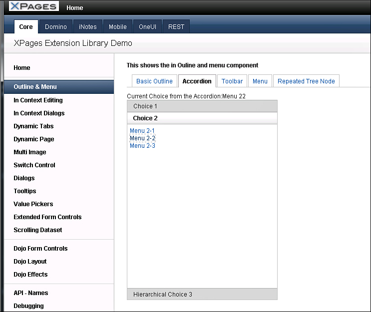
Figure 8.17. Accordion sample from the Extension Library Demo App.
Again, like the other controls that use the TreeNode concept, this control has an onItemClick property and event that the developer can use to determine what happens when the end user selects one of the options within the Accordion Pane.
The Tag Cloud Control (xe:tagCloud)
Another common design pattern for web-based applications is the tag cloud. This normally shows the different tags that documents are listed under and uses a method of varying sizes and color shades to indicate which tags are more popular than others. In the XPages Extension Library, this design pattern has been implemented using the xe:tagCloud control.
In its simplest form, the tag cloud can be composed from any categorized Notes view. The control computes the number of documents per category, rendered as links, with links in a larger font size for the more numerous records in a certain category. This displays perfectly and performs functionally as expected, although the developer may want to do more to enable the links to navigate to another XPage or set a view filtering variable to only display documents by that selected category. For this case, further configuration of the view datasource and the control on XPage is recommended.
In the TeamRoom template, which has been enhanced using the XPages Extension Library, the tag cloud is configured using a Notes view, which is a single categorized column that displays the categories as separate entries for counting. This view, "xpByCategory", is the view data-source used by the tag cloud, as in Listing 8.17. Here, too, the property linkTargetPage is set to another XPage, which instructs the link where to navigate. The request parameter property, linkRequestParam, is also set here so that the query string for "categoryFilter" equals that of the selected link.
Listing 8.17. The TeamRoom Tag Cloud
<xe:tagCloud
alternateText="{0} documents"
id="tagCloud1"
sliderVisible="true">
<xe:this.cloudData>
<xe:dominoViewCloudData
cacheMode="auto"
viewName="xpByCategory"
cacheRefreshInterval="120"
maxTagLimit="30"
linkTargetPage="/allDocumentsByTag.xsp"
linkRequestParam="categoryFilter"
sortTags="alphabet">
</xe:dominoViewCloudData>
</xe:this.cloudData>
</xe:tagCloud>
A basic configuration of the tag cloud needs only a few properties to be filled out. You can set other properties to enhance how the control functions in the application. Most of these are provided by the xe:dominoViewCloudData complex type control from the cloudData property.
The categoryColumn property, which is set to zero by default, is optional. If the categorized view column isn’t the first column in that view, the developer must enter the number of the desired categorized column for the tag cloud to use.
The sortTags property is optional. By default, the tag cloud displays the tags alphabetically. But the developer can use weight for sorting by the occurrence count of that category.
The maxTagLimit property is useful for limiting the number of tags to be displayed in the cloud; otherwise, all the tags are displayed in the categorized view. You might consider this if there are concerns about the performance of this control.
The properties cacheMode and cacheRefreshInterval are linked. When the cacheMode property is set to auto (automatic), the cache refresh interval is dynamically computed based on the number of entries in the view. When it’s set to Manual, the developer can specify the cache refresh interval in the cacheRefreshInterval property, which is set as a number in seconds. Valid values are Auto, Manual, and Off. Value defaults to Auto. It is not recommended that you apply the Off setting, thus disabling caching, except for debug purposes.
The linkMetaSeparator property is an optional character that acts as a delimiter between tag data and metadata, to be used in conjunction with the linkRequestParam value. Using a linkMetaSeparator character requires the backend categorized view column to output the data in the format xxx | yyy, where xxx is the tag name, | is the linkMetaSeparator character, and yyy is the metadata used as the request parameter. If no linkMetaSeparator is specified, the actual tag value is used for the request parameter value. Listing 8.18 shows an example of its use from the XPages Extension Library Demo App, and Figure 8.18 shows how this tag cloud renders in the browser.

Figure 8.18. The Demo App Tag Cloud control.
Listing 8.18. Tag Cloud Sample from the Demo App
<xe:tagCloud
alternateText="{0} Entries"
sliderVisible="true">
<xe:this.cloudData>
<xe:dominoViewCloudData
cacheMode="auto"
cacheRefreshInterval="120"
viewName="AuthorCloud"
maxTagLimit="25"
linkMetaSeparator="~"
linkTargetPage="/Domino_ViewUserProfile.xsp"
linkRequestParam="name"
minEntryCount="3">
</xe:dominoViewCloudData>
</xe:this.cloudData>
</xe:tagCloud>
The Widget Container Control (xe:widgetContainer)
The widget container is a simple container that displays content in a set box, as shown in Figure 8.19, with a few notable properties.

Figure 8.19. Widget Container samples.
You can use the titleBarText and the titleBarHref together. The Title Bar text appears in the title bar at the top of the widget. When it’s absent, no text is displayed. The titleBarHref turns this title into a link.
The dropDownRendered property defines the drop-down menu to be displayed on the title bar. It defaults to true, so the drop-down is displayed if any drop-down nodes are present. Then the complex type control xe:dropDownNodes displays a menu containing these actions. It can contain all the nodes that help developers build navigation into their applications.
Conclusion
The controls described in this chapter can help developers build complex navigation patterns into their applications without much effort. This chapter covered some basics of layout and placement of this navigation. It serves as grounding for the next chapter on the Application Layout control to complete a more rounded knowledge of the next generation of XPages controls.