
Chapter 5. Dojo Made Easy
Ever since IBM Lotus Domino Release 8.5.0, the Dojo toolkit has been IBM’s JavaScript framework of choice. It comes preinstalled with the Domino server and is intrinsically linked with the XPages runtime. Much of the standard XPages functionality extends the standard Dojo toolkit. Developers have been integrating Dojo with XPages since its introduction into Domino, taking advantage of the prebuilt code libraries to enhance their XPages applications. Subsequent releases have specifically targeted making it easier to combine XPages and Dojo. To this end, the Extension Library Dojo controls are designed to make it easier still to implement some of the more frequently used modules, whether for novice developers or seasoned developers making extensive use of the Dojo modules and attributes available.
Developers already familiar with Dojo might want to jump to the section “Dojo Modules and Dojo in the Extension Library.” For those who have never or rarely used Dojo, the following sections will give some background and walk through a couple of examples of Dojo modules in XPages.
What Is Dojo?
Dojo is an open source JavaScript framework, a free collection of cross-browser-compatible functions and widgets, first released in 2006. Each JavaScript file is an object with various attributes and functions, referred to as a Dojo module. For example, dijit.form.TextBox is a Dojo module that converts an HTML input tag to a Dojo-styled text box. Modules can also extend other Dojo modules, so dijit.form.ValidationTextBox and dijit.form.NumberTextBox both extend dijit.form.TextBox. This allows developers to add functionality by creating their own extensions without needing to modify the preinstalled files. One of the strengths of these Dojo modules is that they are specifically designed to support developers in addressing accessibility requirements.
All the XPages Client-Side JavaScript functionality can be found in script libraries in the Dojo root folders; most either extend or mimic standard Dojo modules. For example, any partial refresh calls dojo.xhrGet() or dojo.xhrPost(), the standard Dojo AJAX requests to the server. The XPages DateTimeHelper extends a number of Dojo modules, including dijit.form.Button, dojo.date, and dijit._widget. Client-Side validation also mimics the format of Dojo functions. Consequently, the core Dojo libraries are loaded in an XPage by default, so even a blank XPage in which you are not explicitly including Client-Side JavaScript libraries will include the following Dojo JavaScript libraries, as shown in Figure 5.1:
/xsp/.ibmxspres/dojoroot-1.6.1/dojo/dojo.js
/xsp/.ibmxspres/.mini/dojo/.en-gb/@Iq.js (for English)

Figure 5.1. Dojo libraries loaded.
Default Dojo Libraries Using Dojo Modules in XPages
Before Domino 8.5.2, incorporating Dojo modules into XPages was challenging because many controls did not have a dojoType attribute. The only way to implement Dojo on an EditBox, for example, was to apply it programmatically. So in addition to the core control client side, JavaScript was required to trigger on load. Listing 5.1 demonstrates this programmatic implementation of the dijit.form.ValidationTextBox. Lines 1 to 4 show the core Edit Box control. Line 6 then begins an Output Script control, triggering XSP.addOnLoad() in line 16. The addOnLoad() calls a function that generates a new dijit.form.ValidationTextBox on line 9 adding various attributes. Line 13 adds the parameter to the new function, which applies the Dojo module to the Edit Box control.
Listing 5.1. Programmatic Implementation of dijit.form.ValidationTextBox
1 <xp:inputText
2 id="response"
3 value="#{ansDoc.response}">
4 </xp:inputText>
5
6 <xp:scriptBlock
7 id="scriptBlock1">
8 <xp:this.value><![CDATA[var convertInput = function() {
9 new dijit.form.ValidationTextBox(
10 {name:"#{id:response}",
11 required: true,
12 promptMessage: "Please complete the field"},
13 XSP.getElementById("#{id:response}")
14 );
15 };
16 XSP.addOnLoad(convertInput);
17 ]]></xp:this.value>
18 </xp:scriptBlock>
There is no reason you cannot use programmatic conversion of a core control to a Dojo module, if applicable. But with Domino 8.5.2, it became possible to declaratively convert the control thanks to the addition of the dojoType attribute to a variety of core controls. So for the Edit Box control, for example, in Domino 8.5.2 a Dojo panel was added and dojoType and dojoAttributes properties appeared on the All Properties panel, as shown in Figure 5.2. Not only is this easier to implement, but text strings entered as Dojo attribute values are picked up if localization is required and turned on for an application.
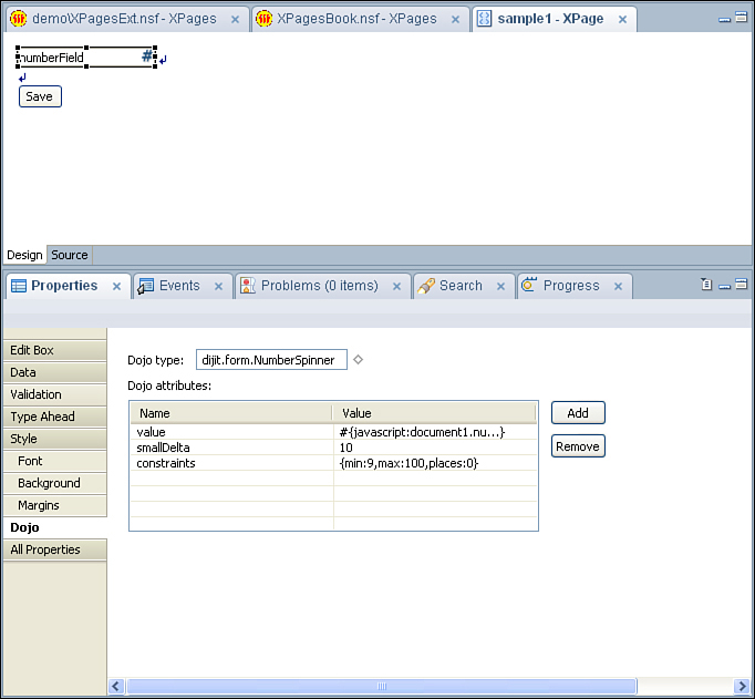
Figure 5.2. Dojo panel on Edit Box control.
Before digging into the Extension Library, let’s review several examples of implementing Dojo in XPages. Any developer who has used Dojo modules in XPages is aware of the steps required, ingrained quite probably by forgetting one of the steps at one time or another. The first critical step is to set dojoParseOnLoad and dojoTheme attributes to "true", as shown in lines 4 and 5 of Listing 5.2. The former tells the browser that after loading it needs to convert all content with a dojoType property; the latter tells the browser to load the relevant theme for styling all Dojo widgets (or dijits). The final step is to add as resources on the XPage any Dojo modules referenced on the page in a dojoType property.
Listing 5.2. dojoParseOnLoad and dojoTheme
1 <?xml version="1.0" encoding="UTF-8"?>
2 <xp:view
3 xmlns:xp="http://www.ibm.com/xsp/core"
4 dojoParseOnLoad="true"
5 dojoTheme="true">
6
7 </xp:view>
Of course, you can perform all this on either an XPage or a Custom Control, but for simplicity, the reference will only be made to XPages. To provide a more appropriate comparison with the Extension Library controls, the examples in the sections that follow focus on declarative implementations of Dojo modules.
Simple Dojo Example: dijit.form.ValidationTextBox
The Dojo modules applied to an Edit Box are among the simplest implementations of Dojo. The dijit.form.ValidationTextBox is a simple extension to the Edit Box, which adds Client-Side validation with a styling consistent with other dijits to offer immediate validation and a prompt message. It has a number of Dojo attributes, some of which you can see in Listing 5.3. Figure 5.3 shows the resulting output. There is a host of printed and online documentation of Dojo (for examples, see the Dojo Toolkit website http://dojotoolkit.org/reference-guide/index.html). This book will not seek to exhaustively reproduce a glossary of the Dojo attributes and what they do.
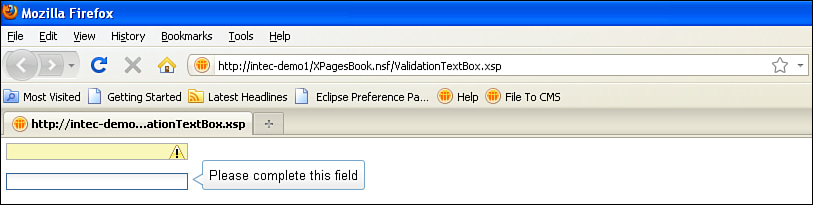
Figure 5.3. dijit.form.ValidationTextBox.
Listing 5.3. dijit.form.ValidationTextBox
<xp:this.resources>
<xp:dojoModule
name="dijit.form.ValidationTextBox">
</xp:dojoModule>
</xp:this.resources>
<xp:inputText
id="inputText1"
value="#{viewScope.validationBox}"
dojoType="dijit.form.ValidationTextBox">
<xp:this.dojoAttributes>
<xp:dojoAttribute
name="required"
value="true">
</xp:dojoAttribute>
<xp:dojoAttribute
name="promptMessage"
value="Please complete this field">
</xp:dojoAttribute>
</xp:this.dojoAttributes>
</xp:inputText>
Defining Dojo modules and attributes is made a little challenging because there is no type-ahead or other context-sensitive help to advise on the Dojo modules available for use. There is also no validation of the correct naming conventions for the modules or validation of additional resources that need to be included. But this is to provide developers with the flexibility to take advantage of new releases of Dojo at the earliest opportunity and develop their own Dojo modules. For developers who are comfortable with the attributes available, this is not a problem; however, novice developers might find the size of the Dojo toolkit daunting.
Dojo Example for Slider
Some dijits are more involved than just setting a Dojo type and attributes to a Core control. A good example of this is the slider. There are actually two types of sliders: dijit.form.HorizontalSlider and dijit.form.VerticalSlider. The implementations are similar, so we shall just cover the HorizontalSlider.
As with dijit.form.ValidationTextBox, the slider is an input control, so you need to store the value in an Edit Box control (or, in most implementations, a Hidden Input control). However, you cannot directly attach the slider to the Edit Box. Instead, you apply the Dojo styling to a div and add an onchange event to pass the value to the Edit Box. Although the XPages Div control has dojoType and dojoAttributes properties, it does not have an onchange event, so it is easier to use an HTML div.
Further code is required to apply labels to the horizontal slider. You must apply an additional Dojo module to an HTML ordered list, dijit.form.HorizontalRuleLabels. Listing 5.4 shows the combination of XPage and HTML markup used to create a horizontal slider, which allows the user to select a value (in multiples of 10) within a range of 0 and 100, showing labels at increments of 20. The code required is rather extensive for a simple slider. Figure 5.4 shows the resulting output.
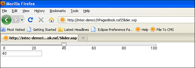
Figure 5.4. dijit.form.HorizontalSlider.
Listing 5.4. dijit.form.HorizontalSlider
<xp:this.resources>
<xp:dojoModule
name="dijit.form.HorizontalSlider">
</xp:dojoModule>
<xp:dojoModule
name="dijit.form.HorizontalRuleLabels"> </xp:dojoModule>
</xp:this.resources>
<div
id="horizontalSlider"
dojoType="dijit.form.HorizontalSlider"
value="50"
minimum="0"
maximum="100"
discreteValues="11" style="width:500px"
showButtons="false"
onChange="dojo.byId('#{id:horizontalHolder}').value =
dijit.byId('horizontalSlider').value">
<ol
dojoType="dijit.form.HorizontalRuleLabels"
container="bottomDecoration">
<li>0</li>
<li>20</li>
<li>40</li>
<li>60</li>
<li>80</li>
<li>100</li>
</ol>
</div>
<br />
<xp:inputText
id="horizontalHolder"
value="#{viewScope.horizontalSlider}"
defaultValue="50">
</xp:inputText>
Dojo Themes
All the dijits are styled according to a theme. The theme is defined on the XPages tab in the Application Properties, accessed from designer, using the Application Theme dialog list, as in Figure 5.5. The OneUI and Server Default themes use tundra by default. If the property Use runtime optimized JavaScript and CSS resources at the bottom of this tab is checked, a single aggregated stylesheet is delivered to the browser. This includes the following stylesheet:
/xsp/.ibmxspres/dojoroot-1.6.1/dijit/themes/tundra/tundra.css
In addition, the tundra theme is applied to the body tag, so the output HTML is <body class="xsp lotusui tundra">.
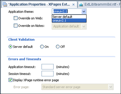
Figure 5.5. XPages tab of Application Properties in Domino Designer.
Dojo provides three other themes: nihilo, soria and, since Dojo 1.5.0, claro. Implementing these themes is just a matter of including the relevant stylesheets and applying the style to the body tag. The former is straightforward in XPages, the latter a little more involved. Within an XPage, you are limited on the attributes you can manipulate. However, via a custom theme, you can apply the Dojo theme to the body tag and reference the relevant stylesheets. If an application is not currently using a theme, just create a new Theme design element, found under the Resources category in the Application pane.
You can insert the code in Listing 5.5 between the theme tags. Lines 1 through 5 include the Dojo-themed stylesheet. Lines 8 through 14 apply the Dojo theme to the ViewRoot control, which becomes the body tag when the web page is loaded. Note in particular the inclusion in lines 2 and 8 of dojoTheme="true". By adding this, the logic checks whether the developer has set dojoTheme to "true" on the XPage or CustomControl. If the developer has set dojoTheme to "true", the stylesheet is loaded and the class is applied. If not, the stylesheet is not loaded and the class is not applied. To use soria or claro, just replace the three instances of nihilo with the relevant theme name.
Listing 5.5. Applying a Dojo Theme
1 <!— Include Dojo stylesheet —>
2 <resource dojoTheme="true">
3 <content-type>text/css</content-type>
4 <href>/.ibmxspres/dojoroot/dijit/themes/nihilo/nihilo.css</href>
5 </resource>
6
7 <!— Add style to body element —>
8 <control dojoTheme="true">
9 <name>ViewRoot</name>
10 <property mode="concat">
11 <name>styleClass</name>
12 <value>nihilo</value>
13 </property>
14 </control>
Dojo Modules and Dojo in the Extension Library
As the examples in the preceding sections demonstrate, some Dojo modules are easy to implement into XPages, but others are more convoluted. Even for a confident developer already accustomed to using dijits in applications, it could get annoying to have to keep adding dojoTypes and dojoAttributes to all core controls, which was one of the driving forces behind implementing the Dojo controls in the Extension Library. Using native controls offered several other benefits:
• Easier to implement drag-and-drop functionality
• Promoting some of the more common Dojo modules available for use within XPages
• Validating and manipulating values
• Limiting the number of controls that need to be dropped onto the XPage or Custom Control
That is not to say that the Extension Library precludes the need to implement Dojo manually within XPages. It does not, nor is it intended to. Some Dojo modules, such as the dojox.image.Lightbox control, are not available in the Extension Library controls. Equally, there might be instances in which developers have created their own Dojo extensions that they still intend to use but do not have the skills or are not ready to componentize.
Benefits and Differences of Dojo Extension Library Components
By componentizing the Dojo modules as extended controls, the Extension Library offers several benefits. Performance is one aspect. Another is that if a Dojo control from the Extension Library is used, dojoParseOnLoad or dojoTheme does not need to be set and the relevant Dojo module(s) does not need to be added to an XPage. Whether accustomed or not to adding the gamut of dojo attributes to Dojo controls, the extended controls also avoid the need to remember (and indeed avoid mistyping!) dojo attributes. This also means that it is quicker to implement the extended controls than just setting a Dojo type and attributes, whether dragging and dropping and using the “pretty panels” or typing directly into the Source pane. And for developers who are integrating with Java beans, controls also allow options for integration with backend Java classes, whether with valueChangeListeners or for controlling return types of, for example, the Dojo Number Text Box or Dojo Number Spinner.
However, for dijits to use a Dojo theme other than tundra, the code outlined in Listing 5.5 for a Theme design element is still required to apply the relevant Dojo theme to the body tag. There is nothing within the Extension Library to short-circuit that requirement.
In the examples that follow, properties of the Extension Library are hard-coded, for ease of explanation. But remember that, as with any other property in XPages, the value of all the properties of the Extension Library controls can be programmatically calculated, either using on page load or dynamically.
Without further ado, let’s start looking at the Dojo form controls from the Extension Library that add to the form controls we covered in the previous chapter. Other Dojo controls are covered in subsequent chapters. For example, the Dojo Data Grid control is covered in Chapter 7, “Views.”
Dojo Extensions to the Edit Box Control
Many controls extend the Edit Box control, whether for storing text values, number values, or date/time values. These controls are not used in the TeamRoom database, so we will review the Extension Library demo database, which is available from OpenNTF. Specifically, we will review the Core_DojoFormControls.xsp XPage.
Dojo Text Box (xe:djTextBox)
The Dojo Text Box control is an excellent example of a control that appears to be simple but can provide functionality not available in the core Edit Box control. In most implementations, all that is required is to drag and drop it onto the XPage or custom control.
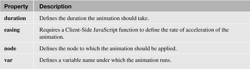
When you look at the properties available and compare them to the core Edit Box control, some differences become apparent. Table 5.1 describes the main properties that are standard across the Dojo widgets.
Table 5.1. Dojo Widget Properties

Table 5.2 describes the properties specific for the Dojo Text Box controls. On the All Properties panel of the Dojo Text Box, the data category contains the same properties as the Edit Box (xp:inputText) control. But a smaller subset of properties is listed under the basics category. Some of the options, including autocomplete, password, htmlFilterIn, and htmlFilter—visible on an Edit Box control—are not available for this control. Note that some properties like readonly and maxlength are camel case for the Dojo controls and become readOnly and maxLength on the Dojo Text Box control.
Table 5.2. xe:djTextBox Properties
The Dojo Text Box also offers some additional properties. Some properties, such as alt, tabIndex, title, waiRole, and waiState, are standard for the Dojo extended controls, always appearing under the accessibility category. WAI might be unfamiliar to some Domino developers who are not used to web development. WAI is an initiative by the World Wide Web Consortium (W3C) to ensure that websites follow accessibility guidelines. This has been extended for applications by Web Accessibility Initiative—Accessible Rich Internet Applications (WAI-ARIA), which differentiates applications from static web pages. It is not yet standard, but it is good practice. A full taxonomy of roles (http://www.w3.org/WAI/PF/GUI/roleTaxonomy-20060508.html) and states (http://www.w3.org/WAI/PF/adaptable/StatesAndProperties-20051106.html) is available on the W3C site. The good news is that even if you do not define the waiRole and waiState properties on the Dojo extended controls, default roles and states are added. But, if required, the properties are exposed to allow you to override the defaults.
Other properties are exposed that offer additional functionality over the Edit Box control or even the standard TextBox control in the Dojo toolkit. In the basics category, the maxLength property enables developers to ensure that users are restricted to a certain number of characters. This is triggered on key press, so rather than alerting users after they have left the field, the user physically cannot type more characters than you allow. However, bear in mind that if the field should include punctuation, decimal separators, and so on, each counts as one character. You can use the trim property to remove any leading or trailing spaces. It does not remove duplicate spaces within the string.
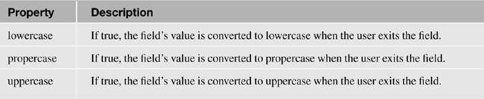
The dojo category is expanded from the Edit Box control with some additional Dojo properties: dragRestriction, intermediateChanges, and tooltip. These properties are standard for the Dojo widgets and may not be appropriate for all controls. For example, the tooltip property is used only for controls such as the Dojo Tab Pane, where the title property has a different function than applying hover text. The format category provides boolean properties lowercase, uppercase, and propercase to force case conversion. The formatting takes effect as soon as the user exits the field.
Some of the differences in the events category between the Edit Box control and the Dojo Text Box control are just minor. Properties like onfocus, onblur, onchange, and onclick become onFocus, onBlur, onChange, and onClick. It’s not a major difference, and indeed there is no difference in implementation. But there are a few additions. The mousing events are supplemented by onMouseEnter and onMouseLeave, ostensibly no different from onMouseOver and onMouseOut. A simple alert statement will show that the onMouseOver event is triggered before the onMouseEnter event. Likewise, onMouseOut is triggered before onMouseLeave.
Dojo Validation Text Box (xe:djValidationTextBox)
There are no prizes for guessing that the Dojo Validation Text Box control is similar to the Dojo Text Box control, except that it adds validation. All the properties we outlined on the Dojo Text Box control are available, including those for dynamically setting the value to lowercase, uppercase, or propercase and trimming the value.
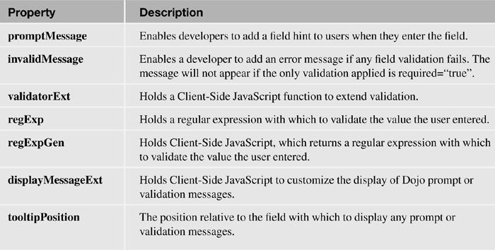
However, the Dojo Validation Text Box is not, by default, mandatory. Initially, this sounds incomprehensible. What’s the point of the Dojo Validation Text Box if it’s not validated? But if we investigate a little further, we will come across the promptMessage property. This enables the developer to add a message for the user. At runtime, this is delivered to the user by default as a tooltip, as in Figure 5.6.

Figure 5.6. Dojo Validation Text Box promptMessage.
Basic validation is managed in the same way as for any other input control: by using the required property. But validation for the traditional Edit Box control is handled on the client or the server, as determined by the developer in the Application Properties or the administrator in the Server Settings. In the Dojo Validation Text Box, validation is always handled Client-Side, even if client validation is switched off in the Application Properties. That is because the Dojo Validation Text Box is a Dojo control, and Dojo validation runs Client-Side (because Dojo is a set of Client-Side JavaScript libraries). So as soon as the user tabs out of the field, the validation is triggered and the field is highlighted, as in Figure 5.7. As with the dijit.form.ValidationTextBox Dojo module, an error message in the invalidMessage property has no effect if the control just has the required property set to "true" but no other validation applied.

Figure 5.7. Dojo Validation Text Box error message.
But the Dojo Validation Text Box doesn’t just validate that a value has been entered. In the dojo-widget category, the regExp property takes as its value a regular expression, a standard web development validation notation that is designed to be agnostic of programming language. The regExpGen property can generate a regular expression using Client-Side JavaScript. Rather than researching and typing a regular expression, Dojo provides some prebuilt objects for validating standard regular expressions, such as dojo.regexp.realNumber and dojo.regexp.ipAddress. These can be found in files like dojo.number and dojox.validate, all of which extend dojo.regexp, the object that defines the function to validate against regular expressions. For example, Listing 5.6 takes the ipAddress function in dojox.validate.regexp.js, amending it only to expect no parameters. As a function in the regExpGen property, this code will validate that the user enters a valid IP address, without the need to work out or type in the relevant regular expression. As with traditional XPages validation, there is a default, but developers can also provide their own message, using the invalidMessage property.
Listing 5.6. Validating an IP Address
<xe:djValidationTextBox
value="#{sessionScope.djValidationTextBox1}"
invalidMessage="Please enter a valid ip address">
<xe:this.regExpGen><![CDATA[// summary: Builds an RE that matches an
IP address
//
// description:
// Supports five formats for IPv4: dotted decimal, dotted hex, dotted
octal, decimal, and hexadecimal.
// Supports two formats for Ipv6.
//
// flags An object. All flags are boolean with default = true.
// flags.allowDottedDecimal Example, 207.142.131.235. No zero
padding.
// flags.allowDottedHex Example, 0x18.0x11.0x9b.0x28. Case
insensitive. Zero padding allowed.
// flags.allowDottedOctal Example, 0030.0021.0233.0050. Zero
padding allowed.
// flags.allowDecimal Example, 3482223595. A decimal number between
0-4294967295.
// flags.allowHex Example, 0xCF8E83EB. Hexadecimal number between
0x0-0xFFFFFFFF.
// Case insensitive. Zero padding allowed.
// flags.allowIPv6 IPv6 address written as eight groups of four
hexadecimal digits.
// FIXME: ipv6 can be written multiple ways IIRC
// flags.allowHybrid IPv6 address written as six groups of four
hexadecimal digits
// followed by the usual four dotted decimal digit notation of
IPv4. x:x:x:x:x:x:d.d.d.d
// assign default values to missing parameters
flags = {};
if(typeof flags.allowDottedDecimal != "boolean"){
flags.allowDottedDecimal = true; }
if(typeof flags.allowDottedHex != "boolean"){ flags.allowDottedHex =
true; }
if(typeof flags.allowDottedOctal != "boolean"){ flags.allowDottedOctal
= true; }
if(typeof flags.allowDecimal != "boolean"){ flags.allowDecimal = true;
}
if(typeof flags.allowHex != "boolean"){ flags.allowHex = true; }
if(typeof flags.allowIPv6 != "boolean"){ flags.allowIPv6 = true; }
if(typeof flags.allowHybrid != "boolean"){ flags.allowHybrid = true; }
// decimal-dotted IP address RE.
var dottedDecimalRE =
// Each number is between 0-255. Zero padding is not allowed.
"((\d|[1-9]\d|1\d\d|2[0-4]\d|25[0-5])\.){3}(\d|[1-
9]\d|1\d\d|2[0-4]\d|25[0-5])";
// dotted hex IP address RE. Each number is between 0x0-0xff. Zero
padding is allowed, e.g. 0x00.
var dottedHexRE = "(0[xX]0*[\da-fA-F]?[\da-fA-F]\.){3}0[xX]0*[\da-
fA-F]?[\da-fA-F]";
// dotted octal IP address RE. Each number is between 0000-0377.
// Zero padding is allowed, but each number must have at least four
characters.
var dottedOctalRE = "(0+[0-3][0-7][0-7]\.){3}0+[0-3][0-7][0-7]";
// decimal IP address RE. A decimal number between 0-4294967295.
var decimalRE = "(0|[1-9]\d{0,8}|[1-3]\d{9}|4[01]\d{8}|42[0-
8]\d{7}|429[0-3]\d{6}|" +
"4294[0-8]\d{5}|42949[0-5]\d{4}|429496[0-
6]\d{3}|4294967[01]\d{2}|42949672[0-8]\d|429496729[0-5])";
// hexadecimal IP address RE.
// A hexadecimal number between 0x0-0xFFFFFFFF. Case insensitive. Zero
padding is allowed.
var hexRE = "0[xX]0*[\da-fA-F]{1,8}";
// IPv6 address RE.
// The format is written as eight groups of four hexadecimal digits,
x:x:x:x:x:x:x:x,
// where x is between 0000-ffff. Zero padding is optional. Case
insensitive.
var ipv6RE = "([\da-fA-F]{1,4}\:){7}[\da-fA-F]{1,4}";
// IPv6/IPv4 Hybrid address RE.
// The format is written as six groups of four hexadecimal digits,
// followed by the 4 dotted decimal IPv4 format. x:x:x:x:x:x:d.d.d.d
var hybridRE = "([\da-fA-F]{1,4}\:){6}" +
"((\d|[1-9]\d|1\d\d|2[0-4]\d|25[0-5])\.){3}(\d|[1-
9]\d|1\d\d|2[0-4]\d|25[0-5])";
// Build IP Address RE
var a = [];
if(flags.allowDottedDecimal){ a.push(dottedDecimalRE); }
if(flags.allowDottedHex){ a.push(dottedHexRE); }
if(flags.allowDottedOctal){ a.push(dottedOctalRE); }
if(flags.allowDecimal){ a.push(decimalRE); }
if(flags.allowHex){ a.push(hexRE); }
if(flags.allowIPv6){ a.push(ipv6RE); }
if(flags.allowHybrid){ a.push(hybridRE); }
var ipAddressRE = "";
if(a.length > 0){
ipAddressRE = "(" + a.join("|") + ")";
}
return ipAddressRE; // String]]></xe:this.regExpGen>
</xe:djValidationTextBox>
Alternatively, if developers already have a prexisting Client-Side JavaScript function to validate the value entered, the validatorExt property in the dojo-widget category provides an extension point to call the function. The beauty of this is that developers only need to enter a Client-Side JavaScript object that is a function; the XPage runs the validation in all the events that are appropriate. This speeds up development and minimizes the effort of refactoring.
By default, your validation triggers only when the user has finished editing the field. To trigger validation or other events with each key press, you can set intermediateChanges to true. (By default, it is false.)
On top of all this, the validator and validators properties still exist for core XPages validation. Overall, the Dojo Validation Text Box provides an extremely flexible mechanism for validating the control while maintaining the Dojo look and feel.
Two additional formatting properties are available: displayMessageExt and tooltipPosition. The tooltipPosition property defines the position relative to the field in which any tooltip messages will appear. With the displayMessageExt property, a developer can write a Client-Side JavaScript function to override the appearance of the prompts and validation error messages.
Table 5.3 summarizes the additional properties of the Dojo Validation Text Box, extending those already covered under the Dojo Text Box.
Table 5.3. xe:djValidationTextBox Properties
Dojo Number Text Box, Dojo Currency Text Box (xe:djNumberTextBox and xe:djCurrencyTextBox)
The Dojo Number Text Box and Dojo Currency Text Box controls extend the Dojo Validation Text Box still further in relation to validating numeric values. All the validation methods we have covered are already available, although the required property is virtually redundant, because a blank value is translated to 0 on save. But the power of the Dojo Number Text Box lies in the xe:djNumberConstraints extension. It is a complex property comprising a variety of child properties, as can be seen in Figure 5.8. The significant property, as shown, is type. This determines the output format from the control, but because of an issue with Dojo, scientific is not yet supported. Similarly, the value currency and the related properties currency and symbol are only applicable for the Dojo Currency Text Box.

Figure 5.8. xe:djNumberConstraints.
The main strength of the xe:djNumberConstraints extension, whose properties are shown in Table 5.4, is enforcing appropriate data entry by the user. Percentages can be messy to enforce, handling the percentage sign if users do or do not enter it, manipulating the value for subsequent calculations, and so on. Setting type to percent gets around this by ensuring the user enters a number followed by the percentage sign, such as “50%”, which the control then converts to the decimal value “0.5”. Likewise, specifying a pattern or places can translate the value entered by the user into an expected format, such as with a certain number of leading zeros or decimal places. With use of min and max, the entered value can be validated against a range, with an appropriate message defined in the rangeMessage property, specific for these controls. See Figure 5.9.
Table 5.4. xe:djNumberConstraints Properties
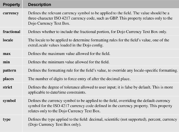
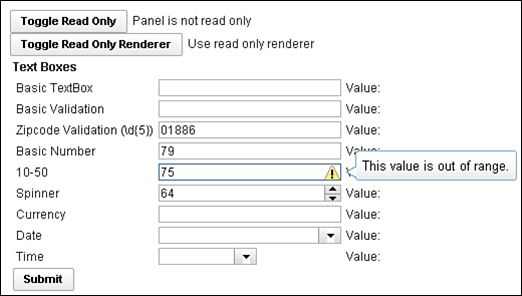
Figure 5.9. Dojo Number Text Box, Dojo Number Spinner, and Dojo Currency Text Box.
The Dojo Number Text Box has one further property that is of particular benefit if the entered value is passed to a managed bean or another Java object. This is the javaType property. Anyone who has worked with managed beans will be aware that the value is sometimes handled as a java.util.Long, sometimes as a java.util.Double, but never consistently. It all depends on the value the user enters, which can be annoying. The javaType property enables developers to override the type of the value passed to your underlying Java object and ensure it is always an int, always a double, always a float, and so on. Table 5.5 summarizes these additional properties available for the Dojo Number Text Box and Dojo Currency Text Box.
Table 5.5. xe:djNumberTextBox and xe:djCurrencyTextBox Properties

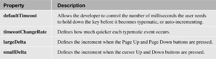
Dojo Number Spinner (xe:djNumberSpinner)
The Dojo Number Spinner allows the user to either type in a number or scroll up and down through the range with the keyboard or the buttons provided on the right edge of the control. This control is an implementation of dijit.form.NumberSpinner and an extension of the Dojo Number Text Box with all the properties applicable to that control (so currency-related properties of the xe:djNumberConstraints extension are not applicable). The control provides two properties for managing the incremental steps of the spinner: smallDelta and largeDelta. By default, the implicit increments are 1 and 10 respectively, but this can be overridden as required. The smallDelta increment is used when the user clicks the buttons provided or uses the cursor up and down keys. To take advantage of the largeDelta increment, users need to click the Page Up or Page Down keys.
If you hold down one of the buttons or keys, the increments are repeated after half a second and subsequently applied quicker and quicker. The defaultTimeout property, expecting an integer in milliseconds, determines how long the user needs to hold down the key before the increment is repeated; by default, it is 500 milliseconds. You configure the degree to which the increments are sped up using the timeoutChangeRate property. Because this is 0.9, the increments are applied progressively quicker the longer the key or button is held down, until the maximum speed is reached. If you set it at 1.0, the increments are always applied at the same time interval, never increasing. A value of greater than 1.0 has no effect.
Table 5.6 summarizes the properties of the Dojo Number Spinner control.
Table 5.6. xe:djNumberSpinner Properties
Dojo Date Text Box and Dojo Time Text Box (xe:djDateTextBox and xe:djTimeTextBox)
The Dojo Date Text Box and Dojo Time Text Box controls extend the Dojo Validation Text Box control. However, like the Dojo Number Text Box, Dojo Currency Text Box, and Dojo Number Spinner, they have their own constraints complex property. For the Dojo Date Text Box and Dojo Time Text Box, the constraints complex property implements the xe:djDateTimeConstraints extension, as detailed in Table 5.7 and illustrated in Figure 5.10.
Table 5.7. xe:djDateTimeConstraints Properties
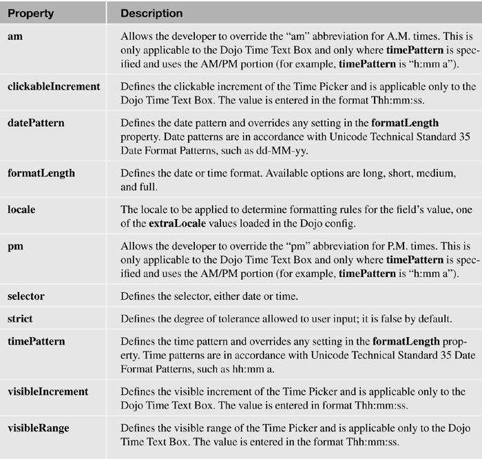
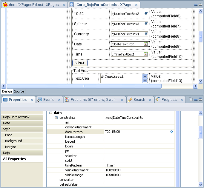
Figure 5.10. xe:djDateTimeConstraints.
The main one for the Dojo Date Text Box is the datePattern property, which allows developers to define the format of the date presented to the user in the Dojo Date Text Box. For example, dd-MM-yyyy overrides the locale format to show 16th June 2011 as 16-06-2011, and dd MMM yyyy shows as 16 Jun 2011. Alternatively, the formatLength property can be used to choose one of four predefined date or time formats. If both are used, the datePattern property takes precedence.
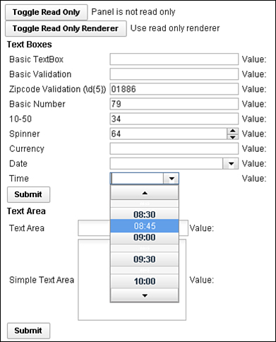
The Dojo Time Text Box control also uses the xe:djDateTimeConstraints property. But unlike the Dojo Date Text Box, properties are surfaced to allow the developer to manage the display of the control. To control how many hours are shown, you can define the visibleRange property. The visibleIncrement property defines the labels presented to the user, and the clickableIncrement property defines the increment for each value the user can select. You define each property using the format THH:mm:ss, so a visibleIncrement of 30 minutes is T00:30:00, as in Figure 5.11. With datePattern for the Dojo Date Text Box, the timePattern property defines the format for the times displayed to the user and presented in the field. Therefore, a format of h:mm presents, for example, 9:00, 9:30, and so on.
Dojo Extensions to the Multiline Edit Box Control
There are two Dojo controls in the Extension Library that extend the Multiline Edit Box: the Dojo Text Area (xe:djTextarea) and the Dojo Simple Text Area (xe:djSimpleTextarea). One of the advantages of these controls is that they also have some of the string manipulation properties familiar from the Dojo extensions that are based on the Edit Box controls. So trim, propercase, lowercase, and uppercase are implemented, which makes it easy to manipulate the content as soon as the user leaves the field. There is no built-in Dojo functionality to validate the Dojo Text Area control, but you can utilize all the core XPages validation techniques.
One of the strengths of XPages is that you can present and edit a collection of documents in the same web page. However, the challenge for a developer is that, unless the user is editing a small document such as a Comments document, the editable form can take up a large amount of real estate. If that includes the Multiline Edit Box as well, it takes up even more real estate when rows and cols properties are defined. But the beauty of the Dojo Text Area control is that it is auto-expanding. This means it takes up less screen real estate while still expanding as much as is required to show the user all the content. The Dojo Simple Text Area control, however, is fixed size. Of course, size attributes can be computed using Server-Side JavaScript, just as they can for any other XPages properties.
As with the Multiline Edit Box, you can define the width of the field using the rows property or using CSS to specify the width. Of course, because the Dojo Text Area is auto-expanding, the rows property has no effect for that control, only for the Dojo Simple Text Area control.
Table 5.8 details two additional properties of the Dojo Text Area and Dojo Simple Text Area.
Table 5.8. xe:djTextArea and xe:djSimpleTextArea Properties

Dojo Extensions to the Select Control
As with the other input controls, the Dojo modules for selecting values have been included in the Extension Library. Besides the Dojo Radio Button (xe:djRadioButton) and Dojo Check Box (xe:djCheckBox) controls, there are two Dojo versions of the core Combo Box control: the Dojo Combo Box (xe:djComboBox) and Dojo Filtering Select (xe:djFilteringSelect).
The core Combo Box control is good for ensuring that users select from a restricted list of options, but it does not allow type-ahead. The Edit Box control offers this kind of type-ahead functionality, but it does not force the user to select one of the options provided. The benefit of the Dojo Combo Box and Dojo Filtering Select controls in the Extension Library is that they combine the type-ahead and restrict the user to just the options available. The sole difference between the two is that the Dojo Combo Box control holds a list only of values, whereas the Dojo Filtering Select control holds a list of label/value pairs.
Dojo Combo Box and Dojo Filtering Select (xe:djComboBox and xe:djFilteringSelect)
Developers who are more familior with dojo.data stores such as the ItemFileReadStore can take advantage of the store property and reference a JavaScript store. This is just a JSON object returning a collection of items that could be returned by an XAgent or some other API to return a JSON object. However, if the source data has been provided by a third party, it might not return a name attribute for the Dojo Combo Box to search. In this situation, the searchAttr property can be used to specify a different attribute in the JSON object on which to search. By default, any search, whether against defined items or against a dojo.data store, is case insensitive, but you can enforce case sensitivity by setting the ignoreCase property to true.
By default, whether querying a coded list of options or a dojo.data store, a starts with query will be performed. That is, the only results returned will be those that start with the letter or letters. Sometimes developers might prefer to query the store differently; Dojo provides this functionality. There are three expressions to be used for starts with searches, contains searches, and exact match searches. However, the expressions use the phrase "${", which has a specific meaning to the XSP Command Manager, so the easiest method of entering the expressions is using Server-Side JavaScript. The three variants are included in Listing 5.7, Listing 5.8, and Listing 5.9.
Listing 5.7. Contains Search Expression
<xe:djComboBox
id="djComboBox2"
value="#{sessionScope.djComboBox1}"
tooltipPosition="before"
title="This is a comboBox" pageSize="2">
<xe:this.queryExpr><![CDATA[${javascript:"*${0}*"}]]></xe:this.queryEx
pr>
<xp:selectItem
itemLabel="Ford"
itemValue="ford">
</xp:selectItem>
<xp:selectItem
itemLabel="Toyota"
itemValue="toyota">
</xp:selectItem>
<xp:selectItem
itemLabel="Renault"
itemValue="renault">
</xp:selectItem>
<xp:selectItem
itemLabel="Mercedes"
itemValue="mercedes">
</xp:selectItem>
</xe:djComboBox>
Listing 5.8. Exact Match Search Expression
<xe:djComboBox
id="djComboBox2"
value="#{sessionScope.djComboBox1}"
tooltipPosition="before"
title="This is a comboBox"
pageSize="2">
<xe:this.queryExpr><![CDATA[${javascript:"${0}"}]]></xe:this.queryExpr
>
<xp:selectItem
itemLabel="Ford"
itemValue="ford">
</xp:selectItem>
<xp:selectItem
itemLabel="Toyota"
itemValue="toyota">
</xp:selectItem>
<xp:selectItem
itemLabel="Renault"
itemValue="renault">
</xp:selectItem>
<xp:selectItem
itemLabel="Mercedes"
itemValue="mercedes">
</xp:selectItem>
</xe:djComboBox>
Listing 5.9. Starts with Search Expression
<xe:djComboBox
id="djComboBox2"
value="#{sessionScope.djComboBox1}"
tooltipPosition="before"
title="This is a comboBox" pageSize="2">
<xe:this.queryExpr><![CDATA[${javascript:"*${0}"}]]></xe:this.queryExp
r>
<xp:selectItem
itemLabel="Ford"
itemValue="ford">
</xp:selectItem>
<xp:selectItem
itemLabel="Toyota"
itemValue="toyota">
</xp:selectItem>
<xp:selectItem
itemLabel="Renault"
itemValue="renault">
</xp:selectItem>
<xp:selectItem
itemLabel="Mercedes"
itemValue="mercedes">
</xp:selectItem>
</xe:djComboBox>
To ease selection, a number of properties are available. The pageSize property allows you to define some entries that the drop-down box should show. If the query returns more entries, a link is added to allow the user to page down and page up through the available options, as shown in Figure 5.12 and Figure 5.13. This property doesn’t enhance performance by minimizing the number of options delivered to the browser, but you can use it to enhance presentation. As with the Dojo Number Spinner control, it is also possible to manage the response to the selection. In this case, the searchDelay property allows you to set the number of milliseconds delay before matching results are returned.

Figure 5.12. More choices on Dojo Combo Box.
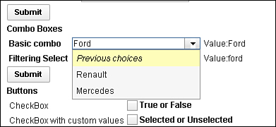
Figure 5.13. Previous choices on Dojo Combo Box.
Because the Dojo Filtering Select uses label/value pairs and the Dojo Combo Box uses just a list of values, Dojo Filtering Select takes advantage of two additional properties and an event to handle the labels displayed. The first is labelType. By default, the labels are treated as plain text, but by setting this property to html, the labels are treated as HTML. The second is labelAttr, applicable for developers using a datastore. As with the searchAttr property, you can use this with a Dojo datastore to tell the Dojo Filtering Select to display labels from the store based on an attribute other than name. This does not affect the attribute from the store that is used to search on as the user types. To do that, you need to define the searchAttr property as well. An additional event is available on the Dojo Filtering Select called labelFunc. This triggers on selection of a valid entry and can trigger either Client-Side or Server-Side JavaScript.
Chapter 11, “REST Services,” covers REST services and other data integration, so at this point only a brief example of this functionality is shown in Listing 5.10. Lines 1 to 22 cover the REST service. Note that the jsId defined for the service in line 3 is allocated to the djFilteringSelect in line 26. In line 27, the FilteringSelect shows a list of U.S. states using the labelAttr property, but searches on the two-character abbreviation using the searchAttr property. The results are limited to 10 per page using the pageSize property in line 29.
Listing 5.10. Dojo Filtering Select Using DataStore
1 <xe:restService
2 id="restService1"
3 jsId="stateStore">
4 <xe:this.service>
5 <xe:viewItemFileService
6 viewName="AllStates"
7 defaultColumns="true"
8 dojoType="dojo.data.ItemFileReadStore"
9 count="400">
10 <xe:this.columns>
11 <xe:restViewColumn
12 columnName="Name"
13 name="Name">
14 </xe:restViewColumn>
15 <xe:restViewColumn
16 columnName="Key"
17 name="Key">
18 </xe:restViewColumn>
19 </xe:this.columns>
20 </xe:viewItemFileService>
21 </xe:this.service>
22 </xe:restService>
23 <xe:djFilteringSelect
24 id="djComboBox3"
25 value="#{sessionScope.djComboBox2}"
26 store="stateStore"
27 labelAttr="Name"
28 searchAttr="Key"
29 pageSize="10">
30 </xe:djFilteringSelect>
Table 5.9 details the noteworthy properties of the Dojo Combo Box and Dojo Filtering Select.
Table 5.9. xe:djComboBox and xe:djFilteringSelect Properties

Dojo Check Box and Dojo Radio Button
The primary intention of the Dojo Check Box and Dojo Radio Button controls is to style the controls appropriate for other Dojo controls. Both controls support the same functionality as the core control versions, so you can assign them to a group with custom values defined. The main difference with the Radio Button Group or Check Box Group is that the core controls for groups display their options in a table within a fieldset. The Dojo Check Box and Dojo Radio Button controls display options inline. In addition to this standard functionality and similarity to the other Dojo controls, the Dojo Check Box and Dojo Radio Button are enabled for accessibility. So the title property and the WAI-related properties can be defined, as can any of the other Dojo controls.
Dojo Extensions to Buttons
There are two Dojo Extensions to Buttons: the Dojo Button control and the Dojo Toggle Button control. Like the Dojo Check Box and Dojo Radio Button controls, the Dojo Button is not appreciably different from the core control version. Again, the main differences are the Dojo styling and the inclusion of properties for accessibility, the same ones covered earlier. Just like the core Button control, the Dojo Button control can have a label, show an icon, or both. The label property allows the developer to control the text to show, but the showLabel property can suppress the label from appearing. However, showing an icon is not merely a case of selecting an image. CSS handles the icon, with the relevant class defined as a string in the iconClass property. Dojo has some built-in icons for various editing functions, defined in the <dojoroot>dijit hemes folder and shown in Listing 5.11. Line 4 shows the Dojo theme classes dijitEditorIcon and dijitEditorIconCut applied to the button. The former loads a sprite (a collection of images, held in a single file to minimize calls to the server), and the latter positions the sprite to show a specific image—in this case, the Cut icon. Line 15 applies an icon to a second button, this time using a CSS class. Listing 5.12 shows the stylesheet that loads an image from the icons folder on the server. Note that because this is a stylesheet, it is loaded using the HTTP server, not the XSP Command Manager, so standard Domino web URL syntax applies rather than /.ibmxspres/.... You can see the buttons produced in Figure 5.14. If multiple images from the icons folder are to be included in the application, using a sprite would be the recommended approach.

Figure 5.14. Dojo buttons.
Listing 5.11. Dojo Button Icons
1 <xe:djButton
2 id="djButton2"
3 label="Execute Client Code"
4 iconClass="dijitEditorIcon dijitEditorIconCut">
5 <xp:eventHandler
6 event="onClick"
7 submit="false">
8 <xp:this.script><![CDATA[alert("You clicked me,
#{javascript:@UserName()}!")]]></xp:this.script>
9 </xp:eventHandler>
10 </xe:djButton>
11 <xe:djButton
12 id="djButton3"
13 showLabel="false"
14 label="Increase Value on Server"
15 iconClass="testIcon">
16 <xp:eventHandler
17 event="onClick"
18 submit="true"
19 refreshMode="partial"
20 refreshId="computedField19">
21 <xp:this.action><![CDATA[#{javascript:if
(sessionScope.djButton4) {
22 sessionScope.djButton4+=1
23 } else {
24 sessionScope.djButton4 = 1
25 }}]]></xp:this.action>
26 </xp:eventHandler>
27 </xe:djButton>
.testIcon {
background-image: url(/icons/actn010.gif); /* editor icons sprite
image */
background-repeat: no-repeat;
width: 18px;
height: 18px;
text-align: center;
}
Dojo Toggle Button Control
The Dojo Toggle Button is a control that is new to developers who are not familiar with Dojo. The control is similar to the Dojo Check Box control but is styled like the Button control. Like the Dojo Check Box, it can be bound to a datasource, with a value set when the button is unclicked and a different value set when the button is clicked. From inspecting the source HTML produced for the Dojo Toggle Button control, it becomes apparent that the Dojo Toggle Button consists of a button with a dojoType and a hidden input field, as shown in Figure 5.15—a similar technique to the way developers have built the kind of functionality the Dojo Toggle Button provides. Not surprisingly, when the user clicks the Dojo Toggle Button, a value is set into the hidden field. The toggle effect runs Client-Side, although Server-Side events can also be triggered. The hidden field has the same ID as the button, except that it is suffixed with _field. The value of the hidden field is not the checkedValue or uncheckedValue properties, but an empty string if unchecked or on if checked.

Figure 5.15. Dojo Button HTML.
By default, as with the Dojo Check Box, the values are false when unclicked and true when clicked. But you can override these values by defining the checkedValue and uncheckedValue properties, the property names highlighting that this is an extension of the Dojo Check Box control. The only downside is that the styling of the toggle button does not change depending on whether the button is clicked or unclicked. But with the understanding of the HTML produced by the control, it is a simple matter to add that functionality as in Listing 5.13. Lines 8 to 20 add an onChange xp:eventHandler to the control. Note that this has to be defined as an xp:eventHandler rather than the default xe:eventHandler, which does not exist. Line 11 loads the Client-Side ID of the button into a variable. Line 12 gets the button itself using dojo.byId() because of the classneeds setting, not a dojoAttribute. Lines 13 and 14 get the field and test whether the value is on. Lines 15 and 17 then set the class of the button.
Listing 5.13. Styling the ToggleButton Control
1 <xe:djToggleButton
2 id="djToggleButton1"
3 title="Toggle Button"
4 value="#{sessionScope.djButton3}"
5 label="Toggle Button"
6 checkedValue="Checked..."
7 uncheckedValue="Not Checked...">
8 <xp:eventHandler
9 event="onChange"
10 submit="false">
11 <xe:this.script><![CDATA[var id="#{id:djToggleButton1}";
12 var btn=dojo.byId(id);
13 var field = dojo.byId(id+"_field");
14 if (field.value == "on") {
15 btn.setAttribute("class","btnRed");
16 } else {
17 btn.setAttribute("class","btnGreen");
18 }
19 ]]></xe:this.script>
20 </xp:eventHandler>
21 </xe:djToggleButton>
Listing 5.14 shows the CSS for the classes.
Listing 5.14. btnRed and btnGreen Classes
.btnRed {
color: rgb(255,0,0);
}
.btnGreen {
color: rgb(0,255,0);
}
Composite Dojo Extensions
Some extension controls are available under the Dojo category that do not fit into the previous categories. Rather than extending core controls available, these controls add new functionality not previously available as controls in XPages.
As Listing 5.3 shows, the dijit.form.HorizontalSlider requires multiple HTML elements. In the same way, some of the Dojo controls are more complex. Sliders comprise multiple components for their implementation, whereas the Dojo Link Select and Dojo Image Select controls have complex properties to define the values.
Sliders
The beginning of this chapter covered adding a slider with traditional Dojo. The code was covered in Listing 5.4, where the slider comprised a div with an ordered list of labels and an onchange event passing the value to a hidden field via Client-Side JavaScript. The sliders in the Extension Library remove the necessity to use a div with an onChange event to store the value. Rather, the sliders themselves are bound directly to the field.
There are two types of sliders, the Dojo Horizontal Slider (xe:djHorizontalSlider) and the Dojo Vertical Slider (xe:djVerticalSlider), as Figure 5.16 shows. Although the properties for both are identical and shown in Table 5.10, you need to choose the relevant slider at development time.
Table 5.10. xe:djHorizontalSlider and xe:djVerticalSlider Properties

The values of the slider are controlled by four properties: defaultValue defines the initial starting value (if the field the control is bound to does not already have a value), whereas minimum and maximum define the bounds of the slider, and discreteValues defines the number of steps between the minimum and maximum. By default, whenever the user clicks on a part of the slider, that value is selected, and this is controlled by the clickSelect property. If set to false, this functionality is suppressed. Also, by default, there are buttons on either end of the slider for moving the current position. Again, these can be suppressed by setting the showButtons property to false.

Besides clicking on a position of the slider or using the buttons, you can use keyboard shortcuts to control the movement, like you did for the spinner controls. All four cursor keys can be used for both sliders: left (←) and down (↓) moving in one direction, right (→) and up (↑) moving in the other direction. Although the cursor keys can be used to increment in small amounts, Page Up and Page Down increment in larger amounts. The smaller increment is always one step on the slider, but the developer can override the larger increment—by default 2 steps—using the pageIncrement property. Furthermore, because the speed of increment could be controlled for the spinners, it can also be controlled for the sliders, by means of the slideDuration property. This is a value in milliseconds that the slider will take to move from one end of the slider to the other; by default, it is one second.
As with the traditional Dojo implementation, you can add labels. This comprises two further controls: the Dojo Slider Rule (xe:djSliderRule) for the markers and the Dojo Slider Rule Labels (xe:djSliderRuleLabels) for the actual labels. For both controls, two properties determine how many and where the rules appear: count and container. The container provides a ComboBox list of options, with all four options available regardless: topDecoration, leftDecoration, bottomDecoration, and rightDecoration. Obviously, you must choose the relevant container for the relevant slider; rightDecoration and leftDecoration are not applicable for the Dojo Horizontal Slider.
You can map styling to CSS classes for both controls. You can style the markers by using the ruleStyle property on the Dojo Slider Rule, whereas you can style the labels by using the labelStyle property on the Dojo Slider Rule Labels.
You can set a number of additional properties for the Dojo Slider Rule Labels. The minimum and maximum properties set the top and bottom level for the labels, and numericMargin can define how many labels to omit at either end of the label list. So setting the value to 1 omits 0% and 100% from a default Dojo Slider Rule Labels control. As this suggests, the default labels are percentages, running from 0% to 100%. But you can override this in two ways. You can pass an array of labels into the labels property or use the labelList property, as shown in Listing 5.15. This method is recommended over <li> tags because it supports localization.
Listing 5.15. Dojo Horizontal Slider
<xe:djHorizontalSlider
id="djHorizontalSlider2"
value="#{sessionScope.djSlider1}"
maximum="100"
minimum="0"
style="margin: 5px;width:200px; height: 20px;"
discreteValues="10"
pageIncrement="3">
<xp:this.converter>
<xp:convertNumber
integerOnly="true">
</xp:convertNumber>
</xp:this.converter>
<xe:djSliderRuleLabels
id="djSliderRuleLabels2"
container="topDecoration"
style="height:10px;font-size:75%;color:gray;"
count="6"
numericMargin="1">
</xe:djSliderRuleLabels>
<xe:djSliderRule
id="djSliderRule5"
container="topDecoration"
style="height:5px;" count="6">
</xe:djSliderRule>
<xe:djSliderRule
id="djSliderRule6"
style="height:5px;"
count="5"
container="bottomDecoration">
</xe:djSliderRule>
<xe:djSliderRuleLabels
id="djSliderRuleLabels5"
container="bottomDecoration"
style="height:10px;font-size:75%;color:gray;">
<xe:this.labelsList>
<xe:djSliderRuleLabel
label="green tea">
</xe:djSliderRuleLabel>
<xe:djSliderRuleLabel
label="coffee">
</xe:djSliderRuleLabel>
<xe:djSliderRuleLabel
label="red bull">
</xe:djSliderRuleLabel>
</xe:this.labelsList> </xe:djSliderRuleLabels>
</xe:djHorizontalSlider>
Table 5.11 shows the properties for the Dojo Slider Rule and Dojo Slider Rule Labels.
Table 5.11. xe:djSliderRule and xe:djSliderRuleLabels Properties

Dojo Link Select (xe:djLinkSelect)
The Dojo Link Select control allows developers to group link options so that when one link is selected, the others are deselected. You can see this in action with the filter area of the All Documents page on the TeamRoom database. Here, for example, selecting All by Date not only selects that entry but deselects the default All link. Unlike the traditional link functionality, you can bind the Link Select to a field or scoped variable. In addition, you can trigger a wealth of events from the Link Select.
Despite having properties multipleTrim and multipleSeparator, the control allows only one value to be selected at any one time. You can define the available options in a number of ways. The All Documents page (allDocumentsFilter.xsp custom control) uses selectItem controls, but you can also use a selectItems control. As with the ComboBox and FilteringSelect controls covered earlier, there is currently no mechanism to add an xp:selectItem or xp:selectItems control from the palette. So you can use the core ComboBox or ListBox control to define the values; then you can cut and paste the code across from the core control to the Dojo control.
Alternatively, there are three dataProviders available. Those who are comfortable with Java may choose to use the beanValuePicker. The other options are the simpleValuePicker and the dominoViewValuePicker. The simpleValuePicker allows a developer to define a list of options as a string of label value pairs. The label values themselves are defined in the valueList property. You can define the separator between the label and the value using the labelSeparator property, and you can define the separator between values using the valueListSeparator property. The dominoViewValuePicker allows you to select the options from a view, by defining the databaseName and viewName properties. The labelColumn property defines the column from which the values will be picked. The value set when the label is clicked is pulled from the first column in the view. So Listing 5.16 shows a Dojo Link Select where the options are pulled from the AllStates view, showing the Names column. Figure 5.17 shows the resulting output. As you can see, the onChange event refreshes the computed field with the value whenever you select a new link.
Figure 5.17. Link Select with dominoViewValuePicker.
Listing 5.16. Link Select Control with dominoViewValuePicker
<xe:djextLinkSelect
id="djextLinkSelect2"
defaultValue="MA"
value="#{viewScope.link3}">
<xe:this.dataProvider>
<xe:dominoViewValuePicker
viewName="AllStates"
labelColumn="Name">
</xe:dominoViewValuePicker>
</xe:this.dataProvider>
<xp:eventHandler
event="onChange"
submit="true"
refreshMode="partial"
refreshId="computedField3">
</xp:eventHandler>
</xe:djextLinkSelect>
Table 5.12 shows the pertinent properties for the Dojo Link Select control.
Table 5.12. xe:djLinkSelect Properties
Dojo Image Select
The Dojo Image Select control is similar to the Link Select in that it provides a group of links, or in this case images, only one of which can be selected. Again, it is bound to a field or scoped variable, with a default value that can be set. The images are defined using selectImage child controls of the imageValues property. Each selectImage has image and selectedImage properties, to define the images that appear when the link is deselected or selected. The selectedValue property defines the value that will be set when the image is clicked. In addition, properties are available for styling each image, both in its deselected state and its selected state. The example on the Core_FormControl.xsp XPage in the Extension Library Demo database, reproduced in Listing 5.17 and shown in Figure 5.18, shows buttons appropriate for a Calendar View control, although, as will be shown in Chapter 7, a slightly different method is used for the calendar view in the TeamRoom database.

Figure 5.18. Dojo Link Select for Calendar Picker.
Listing 5.17. Dojo Image Select for Calendar Picker
<xe:djextImageSelect
id="djextImageSelect1"
title="Select a value default is two days"
value="#{viewScope.image1}"
defaultValue="T">
<xe:this.imageValues>
<xe:selectImage
selectedValue="D"
selectedImage="/.ibmxspres/.extlib/icons/calendar/1_Day_selected_24.
gif"
image="/.ibmxspres/.extlib/icons/calendar/1_Day_deselected_24.gif"
imageAlt="One Day">
</xe:selectImage>
<xe:selectImage
selectedValue="T"
selectedImage="/.ibmxspres/.extlib/icons/calendar/2_Days_selected_24.
gif"
image="/.ibmxspres/.extlib/icons/calendar/2_Days_deselected_24.gif"
imageAlt="Two Days">
</xe:selectImage>
<xe:selectImage
selectedValue="F"
selectedImage="/.ibmxspres/.extlib/icons/calendar/1_Work_Week_selected_
24.gif"
image="/.ibmxspres/.extlib/icons/calendar/1_Work_Week_deselected_24.gif"
imageAlt="One Work Week">
</xe:selectImage>
<xe:selectImage
selectedValue="W"
selectedImage="/.ibmxspres/.extlib/icons/calendar/1_Week_selected_24.
gif"
image="/.ibmxspres/.extlib/icons/calendar/1_Week_deselected_24.gif"
imageAlt="One Week">
</xe:selectImage>
<xe:selectImage
selectedValue="2"
selectedImage="/.ibmxspres/.extlib/icons/calendar/2_Weeks_selected_24.
gif"
image="/.ibmxspres/.extlib/icons/calendar/2_Weeks_deselected_24.gif"
imageAlt="Two Weeks">
</xe:selectImage>
<xe:selectImage
selectedValue="M"
selectedImage="/.ibmxspres/.extlib/icons/calendar/Month_selected_24.
gif"
image="/.ibmxspres/.extlib/icons/calendar/Month_deselected_24.gif"
imageAlt="One Month">
</xe:selectImage>
<xe:selectImage
selectedValue="Y"
selectedImage="/.ibmxspres/.extlib/icons/calendar/All_Entries_selected_
24.gif"
image="/.ibmxspres/.extlib/icons/calendar/All_Entries_deselected_24.gif
"
imageAlt="All Entries">
</xe:selectImage>
</xe:this.imageValues>
<xp:eventHandler
event="onClick"
submit="true"
refreshMode="partial"
refreshId="computedField3">
</xp:eventHandler>
</xe:djextImageSelect>
Table 5.13 details the additional properties available for the Dojo Image Select control.
Table 5.13. xe:djImageSelect Properties
Dojo Effects Simple Actions
The inclusion of Dojo within the Extension Library extends beyond controls for storing user-entered content. Some commonly used Dojo effects have also been added, implemented as Simple Actions. So you can easily add them to buttons, links, or anything else that has an event. These simple actions add animations to a form, to enhance the user experience.
So, for example, you can use a Dojo effect to fade in or wipe in helper text beside a field when the user clicks into it, and fade out or wipe out when the user exits the field. And because all the Dojo effects run Client-Side, there is no performance hit of round-tripping to the server.
Dojo Fade and Wipe Effects
The fade or wipe effects—either in or out—have additional properties that can be set. The node property is the component to be faded/wiped, a Server-Side component ID, as can be seen from Figure 5.19. The var property, as elsewhere, is a variable name the function uses to play the Dojo effect. You cannot reference it elsewhere on the XPage via Client-Side JavaScript, because it is scoped only to the eventHandler.

Figure 5.19. Dojo Fade In Effect.
The duration property defines how long in milliseconds the effect takes to run, whereas the easing property takes a function that will handle how the effect runs, such as accelerating the rate with which the node fades in. You can write this function from scratch, as on the Core_DojoEffects.xsp XPages Extension Library Demo database, or as a predefined function, such as those in the dojo.fx.easing object (see Listing 5.18).
Listing 5.18. Dojo Fade Out with dojo.fx.easing
<xp:this.resources>
<xp:dojoModule
name="dojo.fx.easing">
</xp:dojoModule>
</xp:this.resources>
<xp:button
value="Fade Out - Duration 2s"
id="button3">
<xp:eventHandler
event="onclick"
submit="false">
<xp:this.script>
<xe:dojoFadeOut
node="effect1"
duration="200"
easing="dojo.fx.easing.expoInOut">
</xe:dojoFadeOut>
</xp:this.script>
</xp:eventHandler>
Table 5.14 shows the main properties for the Dojo Fade and Wipe simple actions.
Table 5.14. xe:dojoFadeIn, xe:dojoFadeOut, xe:dojofxWipeIn, and xe:dojofxWipeOut Properties
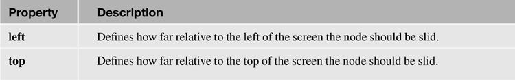
Dojo Slide To Effect
The slide effect has all the properties of the fade and wipe effects but also two additional properties, top and left, for defining how far relative to the top and left of the screen the relevant node should be slid. You can set all the properties available with a specific value or calculate them via Server-Side JavaScript. The slide effect in Listing 5.19 shows how or why to use the attributes property: namely, to enable the developer to set any of the effects via Client-Side JavaScript. Why not just type dojo.coords(_id).t directly into the top property? First, because _id has a specific meaning to the XSP Command Manager, so it throws an error. Second, because the top property must be a number, not a string. So you must use the attributes property to pass the function, which sets top to the node’s current top property, to the browser. This function also shows how to retrieve a node’s current position to slide a node relative to that current position.
Listing 5.19. Slide Effect with attributes Property
<xp:button
value="Slide left"
id="button8">
<xp:eventHandler
event="onclick"
submit="false">
<xp:this.script>
<xe:dojofxSlideTo
node="effect1"
left="0">
<xp:this.attributes>
<xp:parameter
name="top"
value="dojo.coords(_id).t">
</xp:parameter>
</xp:this.attributes>
</xe:dojofxSlideTo>
</xp:this.script>
</xp:eventHandler>
</xp:button>
Table 5.15 shows the significant properties of the Dojo Slide To Effect.
Table 5.15. xe:dojofxSlideTo Properties
Dojo Animation
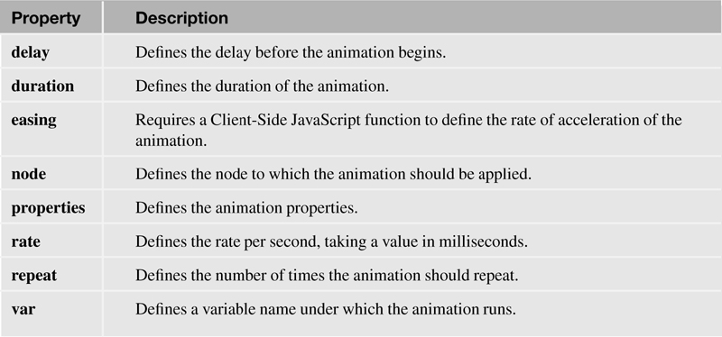
The Dojo animation effect implements the dojo.animateProperty object within a simple action. The effect has all the properties already covered in the other Dojo effect simple actions. In addition, there are some specific properties. You can use the delay property to add a delay in milliseconds before the effect should start. You can use the rate property to change the number of frames per second at which the animation runs; by default, it is 100 frames per second, which is rather quick. The value of the rate property is a number in milliseconds, so to change it to 5 frames per second, the value would be 200 (200 × 5 = 1000 milliseconds = 1 second). You can use the repeat property to repeat the animation a certain number of times. But the most important property is the properties property, allowing one or more xe:dojoAnimationProps objects to be added. These handle what animation runs and its varying settings.
Table 5.16 shows the main properties for the Dojo animation effect.
Table 5.16. xe:dojoDojoAnimateProperty Properties
In addition to the loaded property, the xe:dojoAnimationProps object has four properties shown in Table 5.17. The Extension Library demo database has an example of this on the Core_DojoEffects.xsp XPage, for increasing the size of a box, shown in Listing 5.20. Line 9 sets the animation to run on the bluebox component. Lines 14 and 15 define the starting and ending width and height of the box.
Table 5.17. xe:dojoDojoAnimationProps Properties

Listing 5.20. Core_DojoEffect.xsp Dojo Animation Simple Action
1 <xp:button
2 value="Grow the box"
3 id="button5">
4 <xp:eventHandler
5 event="onclick"
6 submit="false">
7 <xp:this.script>
8 <xe:dojoAnimateProperty
9 node="bluebox"
10 duration="3000">
11 <xp:this.properties>
12 <xe:dojoAnimationProps
13 name="width"
14 start="200"
15 end="400">
16 </xe:dojoAnimationProps>
17 <xe:dojoAnimationProps
18 name="height"
19 start="200"
20 end="400">
21 </xe:dojoAnimationProps>
22 </xp:this.properties>
23 </xe:dojoAnimateProperty>
24 </xp:this.script>
25 </xp:eventHandler>
26 </xp:button>
Earlier in this chapter, code was provided to style the ToggleButton control. At this point, it is appropriate to revisit that code, shown in Listing 5.13. Listing 5.21 shows alternate code for the ToggleButton using a Dojo animation simple action, with the output shown in Figure 5.20. To revisit the functionality, the animation should change the font color of the ToggleButton, alternating between red and green. However, the properties of the xe:dojoAnimationProps object can only accept literal values or Server-Side JavaScript returning a literal value. It is not possible to add Client-Side JavaScript code to ensure the end color alternates. As a result, you must use the attributes property to compute the properties object in Client-Side JavaScript, in lines 16 to 29. Line 18 creates the color object (the name property of an xe:dojoAnimationProps object). Line 19 sets the start attribute of the color object, although _id.style.color is not set when the page is loaded. Lines 20 to 26 set the end attribute to a function that sets the color to red if it is initially green, otherwise red.
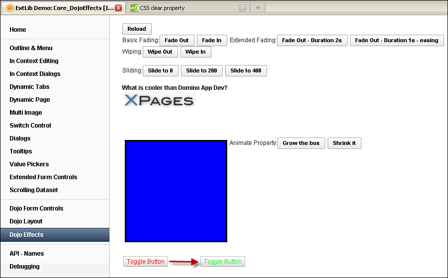
Figure 5.20. Dojo Fade In Effect.
Listing 5.21. Using Dojo Animation Simple Action to Style the ToggleButton
1 <xe:djToggleButton
2 id="djToggleButton2"
3 value="#{sessionScope.djButton3}"
4 label="Toggle Button"
5 checkedValue="Checked..."
6 uncheckedValue="Not Checked..."
7 style="color:rgb(255,0,0)">
8 <xp:eventHandler
9 event="onclick"
10 submit="false">
11 <xp:this.script>
12 <xe:dojoAnimateProperty
13 node="djToggleButton2"
14 duration="500">
15 <xe:this.attributes>
16 <xp:parameter
17 name="properties">
18 <xp:this.value><![CDATA[{"color":
19 {"start":_id.style.color,
20 "end":function() {
21 if (_id.style.color=="rgb(0, 255, 0)") {
22 return "rgb(255,0,0)";
23 } else {
24 return "rgb(0,255,0)";
25 }
26 }
27}
28}]]></xp:this.value>
29 </xp:parameter>
30 </xe:this.attributes>
31 </xe:dojoAnimateProperty>
32 </xp:this.script>
33 </xp:eventHandler>
34 </xe:djToggleButton>
Conclusion
This chapter covered many of the Dojo controls provided by the Extension Library to add to the content controls covered in the previous chapter. These Dojo controls offer little additional functionality to the traditional Dojo controls, but they do make it easier to implement the controls and minimize the risk of mistyping or misremembering Dojo attributes.