
Developer Name: Dennis Crowley and Naveen Selvadurai
Development Company: Foursquare
Tags: Visual Design; Connectivity; Client App; Workflow
URL: http://foursquare.com
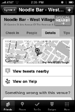
Foursquare is a location-based social networking game that lets users "check-in" at venues and meet up with friends nearby (Foursquare for iPhone is shown in Figure 4-1). The app handily combines everything from Core Location to push notifications, and its ambitions run deep. It aspires to be a multipurpose tool for socializing, complete with Yelp reviews, maps, nearby tweets, and user profiles. Despite its breadth, Foursquare maintains an economically-designed interface that makes the iPhone's screen feel bigger than it is.
Dennis Crowley and Naveen Selvadurai are Foursquare's founders, and built Foursquare for iPhone as a team. Determined to build their app as a standalone tool discrete from Foursquare.com, Crowley and Selvadurai had to navigate not only technical challenges but social consequences, privacy concerns, and new-user foibles. Tempted to explore new UI elements but wary of scaring off new users, the pair has settled on a solid, accessible design after studying some of the iPhone's UI experimenters—two of whom are featured elsewhere in this book.
Crowley is also the founder of a similar service called Dodgeball, which he and a partner sold to Google in 2005. In addition to its iPhone iteration, Foursquare is available as an Android app and on other phones via an SMS interface.
Dennis: We knew we wanted to reproduce some of the features of Dodgeball, like the fun-finder stuff. We knew conceptually that we wanted to make a smarter city guide. I don't think we've fleshed out all the conceptual hurdles yet. But we did a lot of paper mockups, sketching things out on paper. Naveen has a pretty good sense for interaction and design, so we just ran with a lot of that stuff; he was building much of the iPhone stuff, and I was building the backend that would talk to the database. My work figured out how [Foursquare] would spit out a bunch of data and he'd find a way to look it pretty on the iPhone.
Dennis: We're trying to make it look different than other apps, and trying to find an aesthetic that we like.
Naveen: Having a slightly different look is important to making [Foursquare] a standout among all the other apps in the space. But it's not just to make it look different; the other factor is that we have so much information to cram on the screen. To show a lot of different types of content, we had to introduce some new styles. You don't necessarily want to load all that data onto the same screen—even though we probably could've done that—so we tried to set different priorities, since people place different weight on different types of information.
For instance, for the user profile: you probably take a look at the badges tab maybe a tenth of the time you do one of the other primary tabs. So we realized it has to be cleanly pushed into some sort of side-loader section.
On the home screen, we decided the Check In button and the Shout button have to be central. Not only does that show you information about yourself, and kind of give you a list of all your friends nearby, but we realized that we needed a direct call to action. Front and foremost is the idea of checking in, because without checking in, you're not going to get any of the other candy, you're not going to be able to meet up with your friends, or you're not going to be able to earn badges, and so on.
Naveen: We do. One issue is the case of new users vs. experienced users, and that's some of the stuff that we're iterating on right now. We put this [UI] together kind of selfishly—we built it for our friends, and all those use-cases always involve, say, ten or twenty friends. In other words, we built for people who already had Foursquare friends. We realized after we got it out and after we started using it, that most users had only like five friends, maybe ten at most, so we needed to make the experience really good for them at the same time.
Dennis: We're going through a UX redesign now. Those tabs are going to look a little bit nicer. We're trying to do a lot in the app. In fact, we might actually be doing too much; we've got tabs in the bottom, tabs in the middle of the screen. All users have been able to understand it, I don't think it's a huge technical challenge, whether it's exactly the right UX for that experience, I'm not sure. Some of the stuff we were just racing to get done as quickly as possible [for South by Southwest] but a good 90% of it is pretty solid and pretty functional.
Naveen: I actually had screenshots of every positive development. The tabbed browsing was there from the beginning—I don't even remember if there was a version before the tab browsing where we tried to cram everything onto a single list. I think the way it worked, we realized, was our menu screen had to have the ability to check in the ability to see all that related stuff. But on the menu page users also want to see details: they wanted to see a map, they wanted to see Yelp information, or which friends are at [a venue].
So what are our options? We can either give them a button or some sort of table show that is basically built into the view, and which basically says "tap here for more details." Or we can adopt some sort of tab approach. We knew we were going to have many styles of data in the future, like a People tab in the menus, so we opted for the latter.
Dennis: The Facebook app, of course. And the apps that come free on the device, like the ones that most people are used to playing with. Naveen and I have been going through and looking at the latest round of Twitter clients, looking at some what some of the clever UI looks like, and salivating over some of it, and wanting to build it in. Apple's re-standardizing a lot of their UI, because a lot of it has to go. The question is, should we build that new stuff in? Do people understand how to use it?[6]
Naveen: I think Facebook still continues to standout in a good way, cause they have very similar structured data in many different buckets, so to speak. One bucket of data is the user's profile, one bucket of data is the user's News Feed, and so on—we're very similar in that sense.
I would also say that some of the elements in Tweetie are really nice, but what I think what's really confusing about Tweetie [2] is that it breaks the model of the navigation bar at the bottom. One of the best parts about the toolbar is that there's a definite hierarchy, there are definite stacks, as soon as you tap any button in the toolbar, it'll automatically bring you back to the superview of that tab. But what Tweetie has done is take that idea of the toolbar, and break that hierarchy, so the tabs are very much topic-sensitive; you can't really tap to go to the superview. I find it actually to be more difficult to follow than all the other apps, because the hierarchy works when you're drilling into it, but there's no way to come back to the top of the view to see all of my replies, or to see all of my public online views. Maybe it's because I'm a developer and I'm focused on the code [behind] the tab approach.[7]
Dennis: The new Tweetie does have a lot of cool stuff—there's a little widget on the 140-character thing where you flip it and the screen pops up with a bunch of different options; there's the pull down the screen to refresh which we both like. There's another application called StarMap that is really great. It's an astronomy program, it turns the standard five-tab thing at the bottom of the screen so you can rotate it, which is kind of hot. So because you can swivel it to see different views, you basically get 20 buttons instead of 5 buttons.
Naveen: I think Joe [Hewitt] has really solved some navigation problems really well, with the grid [button] at the top, which allows you to get to whatever view you want to. I should add that one of the things I really appreciate about both Tweetie 2.0 and Facebook is that they preserve not only all of your data, but the path you took to get to that data. Your entire path into a view stack is saved. That's part of what makes those apps so fast and so efficient.
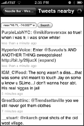
Naveen: The more I started using the app, the more I realized there's a lot of value in keeping the user within our app as much as possible. It makes the experience easier. So there's more value in me being able to say, "Oh my friend is hanging out at this bar downtown, Where is it?" And tap into a map in the app.
I can also see Yelp data from within the app, and I can see tweets nearby. I think it's kind of powerful because it keeps me in that mode of, "I'm looking at foursquare data right now," and I am not tempted to jump contexts. If the users really want to jump out of our local native maps into the native Maps app, or if they really wanted to jump out of the built-in tweet view into the native tweet view, they have that option. But I'm trying to avoid that if possible, because I feel once you jump out of the app your train of thought is broken, and it's harder to jump back in. Figure 4-2 shows Foursquare's in-app tweet stream, based on WebKit.
Dennis: There are certain screens in the app that we want to target first. The screens with a lot of data on them—where we did the bare minimum of design—we need to come back and really revisit. Our strategy is generally to do things piece by piece. A couple of screens will get redesigned and then a couple more in the next revision, and then after two or three more builds the whole thing will look totally different. First and foremost, what we're trying to do is cut down the number of tabs and taps that get you to do whatever you want to do in the app.
Dennis: I think over time different UIs from different apps have helped teach people how to use apps differently. So rather than just having one row or one data element represented by one tab, you can now have multiple tabs in a specific row, with different items you can click on. I know people are doing more complex stuff as people are getting more comfortable with the iPhone UX. I think users are becoming experts at it. I don't know if we're the app to start inventing new UX widgets, but the apps that have a critical mass of users, like the Facebook app and Tweetie and some of these other clients with a large number of users, they can progressively expand. We might inherit ideas from those guys.
Dennis: A lot of the stuff we built in to the app was done with WebKit so that we could change it very quickly with HMTL, and not have to create updates for the app. That's how the Leaderboard works. It's also much faster for us to develop that way.
Naveen: The Leaderboard is a great example, because we weren't sure at the time how we were going to reveal stats about a user, but we knew there was going to be this "leader board" concept that compared your points to your friends. We were playing with the idea of using pie charts to display the data. We figured it would be a little more dynamic if we could control it all on the server.
Dennis: Yeah it did, with their App Store [Buy Now] buttons. We handed those off to our designer, and she came back with little tweaks to it. I think when you look at some of the sizing of those smaller elements, how they are supposed to work, and the minimal font size, I think it's safe to assume that Apple probably nailed it the first time, so we use them as inspiration or guidance on how those things should look or be sized.
Naveen: That was actually one of the points I was debating, like how would I show that button. I definitely did not want to show a native button, and I did not want to make a UI table button. I looked around for a little bit and I realized Apple had come up with this new style approach, this "call to action" button, you could almost call it. In almost every case we only use one of those on any screen, and they almost always use one per item sort of thing.
Dennis: Some of it comes from user experience and user feedback, where people are like, "I don't know what to do with this page" or, "This didn't act the way I expected it to." And that's just from aggressively testing with our friends and listening to their feedback. I think one of the things we're missing in the app is the welcome screen or the walkthrough process, and that's something you'll see in the next build or the next two builds, where we hold users by the hand and turn them from newbies into users.
Naveen: I think the only two places we really had any help text are the two places that I felt that people would be turned off by a function, either because of privacy issues, or from an annoyance standpoint.
The first place we use [help text] is when you add a friend; we make it known when you add a friend that your phone number and your email are shown to them by default. We wanted to make that clear there because we got a lot of complaints from users who particularly just added anyone and everyone, and complaints from them that, "Hey they can see my phone numbers, what's going on?" And our approach is that it's just easier to have their phone number—they're your friends, so you should be able to call them and you should be able to go out and meet up with them. It's like a Facebook-style approach. On Facebook, if you're friends with someone, of course you should be able to email them. But we realized well we're not like Facebook, we're not that big, so we can't just get away with doing it without letting the user know.
The second instance we [used help text] was right after push notification was launched. We wanted to be one of the first apps to use push, to really use it reliably, because we realized that push is very valuable for an app like ours; it buzzes in your pocket if you have a friend nearby. Of course power users were concerned—the people with 50 or 100 friends in there—that they would get very annoyed very quickly if they got a buzz in their pocket for everyone of their 50 friends. So we made very clear our rules behind pings and how we handle them: we basically said, "Hey, do you want to turn push off for everyone, or do you want to turn it off for an individual user?" Then we told them, "Here's how you do it." We had to be very clear and explicit about that because it's a feature that we launched after the fact. In other words, it's a feature that will sneak onto people's phones through an update, so they may not realize it, and all of a sudden they are going to get these messages.
Not only did we put the help text in the app, but also alongside the update for the app. We sent out an email newsletter with the app that basically said, "By the way, you're going to notice this, but it's going to give you hints on how to get fewer messages, or how to make these messages a little more valuable." Then we actually set up a web page on our site that went into how do you most effectively manage 15 ping requests from your friends—[questions] along those lines.
Dennis: No, I haven't looked at the iTunes reviews or anything in a long time. We use a system called GetSatisfaction to collect feedback from users, it's actually really fantastic. We're horribly far behind in the queue, but it's great for aggregating and stuff, we find that a lot of users are helping other users, too.
Naveen: I don't know what to think. I know a lot of people use something like Twitter, and go to the web site for Twitter, and Facebook, too. Based on that, I didn't think the app would be this powerful where people would be experiencing [Foursquare] on the iPhone first. A lot of our close friends hardly ever go to the web site. And we don't really push them to the web site; we want to build as much of the core experience into the app as possible. But I still find it really surprising. I ran some numbers the other day, and I realized that a lot of people that use the app use exclusively the app—it's like they don't even know the web site exists.
Dennis: We kind of had intuited this when we were building things, so we built in a sign up process. So this is totally opposite what Facebook does; Facebook's first "in" is through the web site, and there's nothing else you can do. Sometimes I wish we had that kind of power, because we'd be able to collect data; people are more likely to type in their full names, phone numbers, email addresses, gender, and age on a web site.
Dennis: We've definitely learned some things since Dodgeball. Initially you'd get check-ins from all of your friends across all cities, and you'd be like, "Why would I care what coffee shop my friend is at in San Francisco?"
We realized that it's not like collecting friends on Facebook—there's some kind of consequence to having too many friends, so we had build in a graceful way to say, "Okay, I want to be friends with you, but I don't want you to see my location." We call those "ex-girlfriend" bugs. There are situations like this that come up all the time; it's really interesting and fascinating stuff to play with.
There are all also all these odd niche behaviors that happen within Foursquare that we're learning from. We'll have people that check in early at a place so they can draw a crowd there, and we'll have people that check in after they leave, because they still want to get the points but they didn't want anyone to show up while they're there. We have people that check in across time, so they can brag about places we know they weren't at. At the same time, there are people checking in at obscure places to throw people off their course. There's all sorts of weird stuff that goes on. On the data side we can tell, but we really don't care what people use this for; if people want to use it to mask their location, that's an important part.
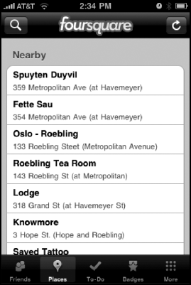
But it's different when you start adding the points, rewards badges, mayors and the other [game] stuff. We're working on is finding a way to say, "You're a little bit too far away from the coffee shop, so we'll tell your friends you're there, but we're not going to give you any points for it." Figure 4-3 shows Foursquare's list of nearby places.
Dennis: I think we're pretty reactive. I think both of us are pretty proficient at UX stuff, but we're not visionaries in it, and we'd prefer to leave the experimenting to Apple and a bunch of the other apps that have extremely talented UX people. Through that evolution, we'll pick the UX elements that we decided are the most interesting or the most relevant to our stuff.
Some of the things we've deliberately stayed away from: anything that involves the auto-rotation of the phone, just because we both are not huge fans of it. We also haven't looked at doing [geo-location] maps because we didn't want people to just be dots on a map, initially; we wanted people to see past that. But now it's at the point where I think we should build that stuff in because it really enhances the experience.
Dennis: Naveen and I are always arguing back and forth about what the next version of the product is going to look like and what screens take priority. I think the most recent one was about Apple's pull-down search menus? They're kind of hidden; you have to scroll down until they appear. We were arguing whether that is standard UI, and whether people understand how to use that yet. I'm saying it's not implicit, and Naveen is saying it is. It's one of those things where we'll probably build it in and run it by a bunch of people. A lot of our changes come from very informal user testing.
Naveen: Regarding the search bar being hidden, I want to follow that path because Apple has already done it. They set the precedent, so people are going to be responding to that. I think it works well because it saves those 50 pixels in height, or whatever it is, and it cleans up the interface a little bit. But it is more of a power user thing, and I understand we have to build the app for both newbies and power users.
In fact, you could argue we have to build it more for the newbies than the power users.