Development Company: Delicious Monster
Tags: Client App; Visual Design; Memory Management; Efficient Code
URL: http://delicious-monster.com/
What the iPhone lacks in size it does not have to lack in luster. Delicious Library, the companion app to the Mac desktop program Delicious Library 2, allows a user to sync his Mac's database of scanned books, movies, albums, and other sundries via iPhone, complete with Amazon information, covers, summaries, reviews, and other data. (See Figure 8-1.) It's a model iPhone client for the desktop version: quick to update its database, easy to navigate, beautiful to behold and massively scalable.
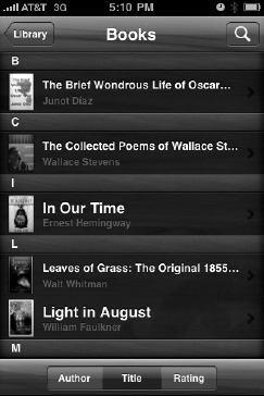
Figure 8.1. Library for iPhone is a model client app, and shares aesthetics with its desktop version.
Delicious Library for iPhone was built by Wil Shipley and two outside UI designers. Shipley is the founder and sole engineer of his company, Delicious Monster, and also an original co-founder of the Omni Group. Over the course of his career, he has won seven ADAs, one for the desktop version of Delicious Library in 2005. You can find his popular Pimp My Code blogging series at his personal site, http://wilshipley.com.
This app is interesting not only in its execution, but also as a reminder that the rules of this platform have yet to be wholly defined. In July 2009, the Delicious Library for iPhone was removed from the App Store due to a violation of Amazon's API terms, which dictate that Amazon content cannot be used in mobile applications.[10] When Shipley protested, Amazon didn't provide a reason for its policy; should it change, we'll again see Library in the App Store. Until then, this app will have to be appreciated post-mortem.
It was a pain to get that wood paneling working, because we wanted to use standard objects, just in terms of programming. But the iPhone doesn't have a super-fast processor, so we were constantly [making] a trade-off between animation and graphic performance, to have it actually be responsive. Responsiveness is as important to the feel of an app as the graphical interface is. You end up spending a lot of time trying to get everything both fast and beautiful, which is really not fun.
I actually spent six months on this app, which is a pretty long time. It was a read-only app, but I really sweated all the details. The foundation of it was, it was supposed to be part one of a three-part app, where I was upgrading it to have more functionality. But that's obviously on hold.
Yes. What most [Delicious Library users] said was, "We want an iPhone app." I was like, wait: there are a lot of issues, more than you might think. So I started [with aesthetics].
One of the things we wanted to do was go a little beyond flat table views, although I didn't want to get too fancy. I wanted to keep it very conceptually simple, and also I wanted to keep it simple, programming-wise, because every time you add any animation, it's just a ton of programming work.
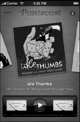
There's an app called Pantscast, which is really funny app—it's one of these farting apps, for putting fart sounds into podcasts. But what's funny about it is that it's so well done—just incredibly polished. It's an absolute work of art. When you switch from the podcast, it kind of slides from side to side, like the old first version of AppleTV. You slide, slide, slide, and the thing sort of swooshes in and swishes out, and it looks just fantastic. [Scrolling through podcasts in Pantscast, Figure 8-2.]
My artists were pitching me on that as well, like, "Let's add it to when you switch between books, animate and animate out, resize...," and I'm like, "No, No, No! We're going to use the standard scroll view, and it's going to scroll side to side."
From Delicious Library, I learned that animations can take so long to get feeling right, that if you do them in a half-ass way, they just feel horrible. It also complicates programming amazingly, because everything we program right now, where we say, "Hey do this," then it's done. When you animate, you sort of say, "Hey start doing this," and then you're in weird in-between state, and you have to start handling that. You're not showing Card A, and you're not showing Card B, you're showing something in-between. That gets really tricky. It's a lot of extra code, and I don't want to spend an extra three months doing animation.
Yeah, I was really proud of what we did. When you drill all the way down to books or CDs, and you flip between them, I'm particularly proud of the flipping. I showed it to Apple, and they were, at the time, really impressed—but this was before the new frameworks had come out. It was really tricky to do scrolling left and right and up and down at the same view, and they really liked how mine felt. I ended up sending them the sample code to do that. Under the 3.0 framework, there's like a single check mark you had to do, but in 1.0 and 2.0, it was a little bit harder.
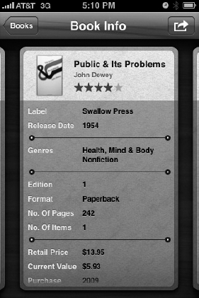
But regardless of [3.0], I was also proud of just the feel of speed—that you could switch between items, when you're drilling all the way down to CDs, and you swipe your fingers to see another CD—it's all really fast. It was a real trick and it was fun, and then the Palm Pre came out, and we started using that same sort of metaphor with the UI, and I felt really good about it. We had semi-anticipated it on the app. (Figure 8-3 shows Delicious Library's card system at work.)
There were a bunch of different speed-ups to be done. One thing was being very careful to manage when I actually draw the new cards, so I don't draw them in the middle of the animations: I try really hard to do all the other [processing] after the animations are done, or before the animation starts. If you're looking at an item, I'll draw on an item from the left or right of it, so if you switch, it will just flick a random bitmap on the screen, without having to render it, because it turns out during scrolling it's really expensive to do almost anything. Allocating memory during scrolling, even the tiniest bit of memory, is phenomenally better. So I did process of elimination, where I made sure these objects are reused and these objects are pre-allocated, all these little tricks. You can do a bunch of different things, it's just all about allocating memory. I had no idea, at first: that's just some real weird quirk of the software, that allocating is way more expensive than anything else. If you allocate two bytes, you're waiting forever.
I made sure my memory [usage] just never grew above 5MB, ever, and that was a really neat thing, because this is an app where I was thinking of collections of 10,000 books and their high-res covers—that's a huge database. There's no one out there that has 10,000 contexts, there's almost nothing on the phone 10,000 of anything, except iTunes, and maybe the photo browser. Because I used a real database, it was very smooth. It was a really fun thing to program; it was like programming the Apple II.
It was pretty interesting to solve that problem. Right now the [desktop] app just bundles up a special version of the database, and ships the whole database off to the iPhone, and there's some really great advantages to that. It was really cool cause I didn't know I could do that, and then I went to a tech talk with the guy who wrote SQLite 3, and he explained that SQLite can go from any device to any other device and will always be compatible with the data file, and that suddenly made everything a lot easier. I figured, I'll just take my existing Core data database, sort it out to SQLite.
What I do on the Mac side is I create another Core database, because at the time, there was no Core data on the iPhone. I thought it would probably come, so I wanted to be compatible. So what I do is instead of having to write my own SQL on the Mac side, I just wrote out a second Core data database which has only the fields and information that you're going to be interested in on the iPhone, like much smaller versions of the pictures—stuff like that.
Then I just manually compressed and copied the raw binary across to the iPhone, and it ended up being surprisingly fast when I got the networking cleaned up.
Yeah, it's really surprising how fast the iPhone can squirt data across the wireless. I was actually stunned at the transfer rate. I felt really good: it was squirting across this 30MB file, which the receiving processor sits there and collects into memory, and writes out to disk before reading the file back from disk. It then compresses, and then writes the uncompressed one back to disk.
I did it this way because it was very fast way to do it on the Mac. But this was before I knew anything about the iPhone's memory. Then I started getting crashes the second or third time I'd sync, and I finally found out these limits—you can't read a 30MB file into memory, you'll crash and blow up the RAM. It's funny cause that shouldn't even have worked once.
I went back and looked around, and it's not just in the common documentation. Not anywhere. There's nowhere in the documentation that you'll read these magic 5MB and 20MB numbers. They're trying to protect themselves against the future, but it's total bullshit, because then I have no clue. What am I working with? Is it gigabytes? They don't even publish how much physical RAM you have, much less how much you can use. Worse, there's no system call to get it. Most of the stuff they've written is to play up the iPhone, not call out its limitations. [Apple] is like, "Yeah we have a real virtual memory system," and I'm like, "Oh, real virtual memory, then it won't ever crash?"
Then finally they're like, "Oh we have a real virtual memory system, but we don't have demand paging for RAM allocation." And I'm saying, "What!?" That's when I realized that I had written this program as if I were writing on a big computer when I really should have been thinking of it as an embedded device.
I had to go back and rewrite it to graph 5 bytes off the network, and immediately run this through the SQL uncompressor, and then, immediately write that to disk, and then flush that memory and do it again. And so it never, so it went from using 60MB to transfer a 30MB database to using 10k, and it got a little faster in the process. It was a good win. But when you're switching from the Mac to this device, you really have to remember, "Oh I just can't just magically map in a 30MB file."
I seriously considered it, and there were people that were trying to talk me into it. Maybe if I got [barcode] scanning to work well, I would've thought about it more. There are some apps that are pretty valid as standalones on the iPhone.
Here's the thing: I really think the future is gonna be about families of apps, where you have the same data on different devices, and you just have different capabilities on every device. I just don't see someone wanting to spend a lot of time on their little iPhone, editing their particular library—but I could be wrong about that. I'm planning a very functional desktop app for my next project, with hopefully an iPhone or tablet app that is a viewer, but a "viewer-plus." It won't be just static, but a viewer you can really interact with.
I definitely knew what I didn't want to do. There are a lot of apps out there that are, you know, really half-assed. Like, there's this Lonely Planet guide out in which they just kind of dumped a flat list of information into an app as quickly as possible. That really stinks.
I also have mixed feelings about Apple's remote app for their iTunes, which I use all the time and think is pretty damn cool. But honestly the flow of it is a little bizarre, so I get lost a lot in it, and if I'm getting lost, it seems like other people would also get lost. So I kept that in mind.
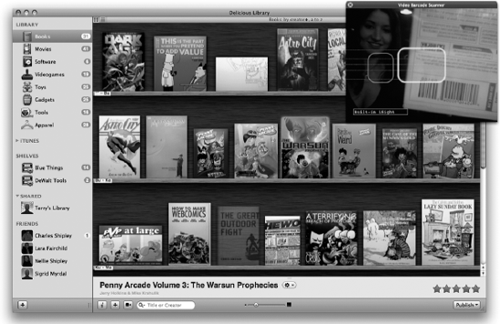
I wanted something where you could instantly dive into it if you knew the desktop. So we wanted to keep the hierarchies intact, but the way you switch between the items in detail view is new, even though it still feels kind of like the desktop. [Delicious Library 2, pictured in Figure 8-4.]
I knew from the beginning that I didn't just want to do what a lot of people would do, which is to just make a miniature version of Delicious Library: have nine books on the screen, in a three-by-three matrix. I knew from the beginning that just wasn't going to cut it, it's just not enough information for the screen. I always thought that maybe we'd go back to that—that at some point, if you turned the phone sideways it would switch to shelf view, or if you turned it back it would switch to the table view. But obviously they killed my app before I got a chance to do it.
I didn't really want to mimic it at all. I don't actually use my iPhone as an iPod, so honestly, I don't even really know how their iPod app works. It's really funny: for a while I kept thinking, this is really cool, when I did this app. Then I realized Apple's actually done much the same thing for their app in the iPod.
When I first did the album view in Delicious Library 2, I was really happy with that look, and then iTunes [for Mac] came out and mimicked it, but they never tried to go quite as far for it. They don't have the backgrounds, they are not trying to make it quite as rich. They're not trying to be the same thing, and I think that's sort of respectable.
In sort of the same way, I almost put in iTunes syncing through Delicious Library 2 with the iPhone, but then I realized that this is different. People like me don't have all their music on their iPhones, but they still love it to store all of their albums there. It's a very chic way to see if you own something or not, because you don't store the actual thing on the device.
Absolutely. In just re-skinning the widgets, the whole toolkit is so new that half of those functions, those message calls, have never been called by man. They're just bizarre. They're telling you that you can do this, but no one has ever done it. So at the time that I did my table view, no one had done a table view with a repeating text or background. There was just a bunch of calls that hadn't been called, and didn't really work the way you want them to, or would think they would. It's truly all-new, and new stuff keeps showing up.
What's interesting is that they always err on the side of not giving you enough tools instead of giving you too many. There was just a bunch of stuff in 2.0 like that. They gave you buttons, but they're like, "If you'd like to draw buttons, it will be a white button with black border and black text, and that's it, that's the only kind of button we have." Of course, this kind of button appears nowhere in Apple's apps, so this is total bullshit. They use these beautiful app buttons, and give us absolutely no way to draw them ourselves, without completely doing it from scratch, or completely reinventing the whole button. "Here this is your toolkit, and it looks like ass, and here's our toolkit and it looks great."
Specifically, they gave us absolutely no way to do primary shines or primitive washes or colors or anything. If you're making a button toolkit, you really should say, "Here's our standard button shine," and you could call it whatever, and you'd get the shine, and you're good to go. That's obvious.
Yeah, but they're always like, "Blah blah blah, we didn't have enough time."
The memory thing is the biggest. It's just absolutely the biggest. It's not about the processor with this thing; it's about the memory. And that's a big lesson. In the Apple IIE it was about the processor first, and the memory second. So this is a real switch for me to be like, wow, when it's not encumbered by stuff, the iPhone is a surprisingly fast little guy. And so it's really all about finding ways to not allocate memory repeatedly; that is, to reuse objects again and again and again. That's just something you'd never do on a Mac. It doesn't help your performance, and it kind of can hurt it in a lot of cases, so it's something I was trained out of doing. I used to do it in the old days, back in 1993 and 1994, but not since. So it's weird to go back to that.
Another thing was I learned was to use tricks to allocate blocks of things when the user is idle. You want to pre-compute some stuff, when the user is just staring at you, so that you can have it right there ready.
The third thing is just making sure that any operation you do, you do it in tiny little chunks. Don't download an entire file and then save it like you would on the Mac, though that's still pretty dumb on the Mac, honestly. And if you're processing something, you should load in a couple bytes, and process them and squirt them out.
[In the following example, Shipley shares his way of reusing UI text views. "I have this in my superclass for my data-bearing objects," he says. "Note that it's up to the implementer to write the clearProperties method to clean up the object when it's getting recycled or freed — this method essentially replaces 'dealloc'."
To use, just call +newInstance. Note that this code doesn't return an auto-released object, since auto-releasing on the iPhone isn't always optimal.]
static NSMutableDictionary *classesToReusableInstanceArrays = nil;

#pragma mark NSObject

- (void)release;
{
    if (self.retainCount > 1)
        return [super release];

    if (!classesToReusableInstanceArrays)
        classesToReusableInstanceArrays = [[NSMutableDictionary alloc] init];

    NSMutableArray *reusableInstanceArray = [classesToReusableInstanceArrays objectForKey:[self class]];
    if (!reusableInstanceArray) {
        reusableInstanceArray = [[NSMutableArray alloc] init];
        [classesToReusableInstanceArrays setObject:reusableInstanceArray forKey:[self class]];
        [reusableInstanceArray release];
   }

   [self clearProperties];
   [reusableInstanceArray addObject:self];
   [self release];
}

- (void)dealloc;
{
    [self clearProperties];
    [super dealloc];
}


#pragma mark API

+ (id)newInstance;
{
    NSMutableArray *reusableInstanceArray = [classesToReusableInstanceArrays objectForKey:[self class]];
    id newInstance = [reusableInstanceArray lastObject];
    if (newInstance) {
        [newInstance retain];
        [reusableInstanceArray removeLastObject];
return newInstance;
}
return [[self alloc] init];
}
- (void)clearProperties;
{
self.foo = nil;
self.bar = nil;
}It's interesting, because certainly some of the tricks are something you'd have used twenty years ago, but there's all these new mechanisms, and all these new beautiful objects and all this other stuff around it, so it doesn't make the code super unreadable to code that way. It's just something you have to be aware of when you're reading it or modifying it or writing it.
Here's an example. In [Delicious Library] the books are little cards, modeled after playing cards: the idea was a Magic the Gathering card that says, here's your item and here's its little description and its abilities. So each card has a little text field below, and it turns out one of the biggest impediments to my scrolling was drawing that text. There were a few big things that were killing me: one was database access, and one was my naïve imitation scrolling, which would start to create a new card as soon as you scrolled. In creating it, I would create a little image, and then all the text fields below, and there'd be like 25 text fields.
Now, on the Mac, allocating 20 NSTextFields takes, oh, I want to say a billionth of a second. It is unbelievably fast. [On the iPhone] these text fields were resulting in visible stutters, we're talking a tenth of a second stutter, and I would never have guessed it. The Apple engineers had to tell me, you can't do that when you're scrolling, because there's some weird thing where if you allocate any memory during scrolling it screws everything up and it hates you. Every byte. Because we're not talking that many bytes, a couple UI text fields, maybe 40 bytes are lost, literally. That's 25 times 40 [bytes] that I'm allocating, and it just absolutely murders performance.
Here's what I did instead: I created a pool of UI text fields, or whatever they call them, ahead of time, and just pulled out of the pool when I'm scrolling. So the app pulls one out of the pool and sticks it on the screen, and when the other card goes off screen, it recycles all UI text views.
So in your code, what it looks like is, instead of saying, "Hey I'm going to lay out another line, allocating another text view," it looks like, "I'm going to allocate another line, so, hey pool please give me a new text view or create one in the unusual circumstance I've pulled them all out."
Bottom line: the code's still readable, but then somewhere else you've got all this machinery you had to write. These pools where the device can recycle logic and stuff like that. So I had to upgrade to a generic pool handler, which is a great thing to do, honestly, because it turns out this trick is used a lot everywhere in the iPhone. However, in my case I just created it myself as a class.
It's totally self-documenting. The reusing of those fields is never going to be too problematic, and if it was, like some field didn't want to be reused, you can just fix it in one choke point, and you're done.
There was actually one type of object that because of a bug in the 2.0 framework you couldn't reuse. Like, if you tried to use the UIImageView, you could put it onscreen and give it an image, and it would work great; and if you pull it offscreen and give it another image, and put it back onscreen, it just won't draw as second time.
So because of that bug, it's not design-efficient to do things like that. I couldn't put those in pools, so those slow me down a little bit. But as soon as they fix that bug, I was able to go back to the code and enable pooling to that object.
Yeah it did, actually. When the iPhone just came out, you'd be looking at table view, and then you'd click on something, and that whole table view would slide to the left, and a whole new table would slide in from the right. That was new on the iPhone; that was a really new idea. And I started thinking about that sort of thing in desktop apps: kind of, like, slide out this old thing, slide in all new thing, and have it be animated. I actually pitched it at Omni, after I was there, for OmniGraffle. I pitched it as a way to deal with it some of the clutter they have with their document browser view. They didn't do it. But plenty of good designers will look at what works on the iPhone and see that some of those things they want to add to a bigger device.
What's interesting about the iPhone is that you could make a really, really gorgeous app that does nothing, and people will buy it. And some people, honestly, think Delicious Library is that app. I understand that to some people it's not their cup of tea, and they're like, "Well this is pretty, and people buy it because it's pretty." I take that as a compliment. It's good that they see that first. But obviously there's a lot more.
[10] http://www.delicious-monster.com/downloads/Delicious%20Library%202/DeliciousLibraryVersionTwo.html
