
Developer Name: Alykhan Jetha and Brandon Walkin
Development Company: Marketcircle
Tags: Iteration; Client App; Team Development; Visual Design
URL: http://marketcircle.com
"It never occurred to me that it would be so tough for us," says Alykhan Jetha, the founder of Marketcircle. "But time was more of a deciding factor in Billings than anything else." Of course, time is a factor in all invoicing applications; you can't charge clients in hectares.
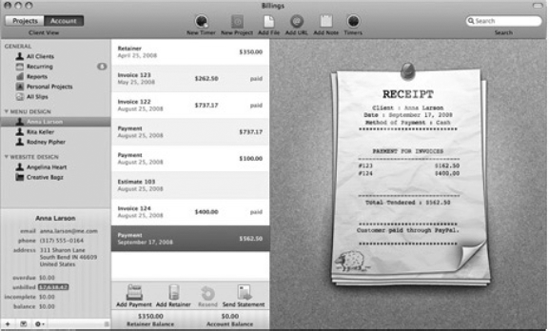
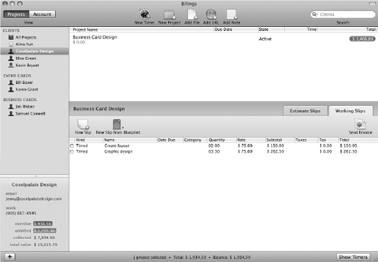
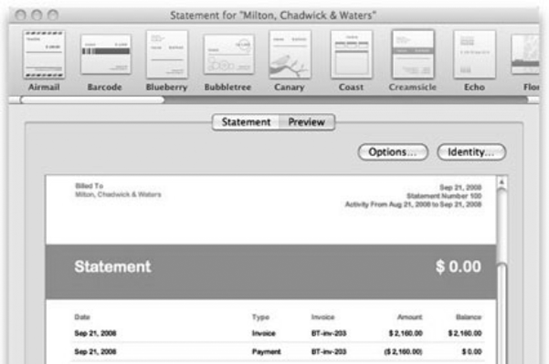
But the extra consideration that has gone into Billings 3, shown in Figure 12-1, and its companion app Billings Touch, make both apps case studies in iterative design.
But Jetha, or "AJ" as most people call him, isn't talking about billable hours. And he's not talking about the urgent kind of time right before a looming deadline. He's talking about a much more whimsical version: time to stew.
Unlike most of the apps that Mac users see and use every day, Billings 3 and its companion iPhone app Billings Touch exist under the principle that time takes productivity, not the other way around. It's an app that knows when you're working and when you're not, and it can tell you when to stop working and bill somebody on schedule. And it has to be intuitive, meticulous, streamlined, and steadfast, because it's not just another productivity tool: when it comes to invoicing apps, a bum feature or confusing workflow means literally screwing with users' livelihoods. When Billings is done bouncing in your dock, time isn't of the essence. It is the essence.
Fitting, then, that it would be the clock—not technical prowess, inspiration, or any number of more nebulous ingredients—that would be Billings' perennial threat. It started, says AJ, with Billings 2. "There was a tremendous amount of debate about workflow back then," he says. "One of our developers at the time was an interaction expert. So we went back and forth with him trying to find a good medium, but ultimately development stopped for a good two or three weeks," he says. Work pushed on, but problems bubbled up. "We'd get into heated debates, taking off more weeks to hash out ideas. Then we'd come back to the original idea, and that's how we'd know it was right."
Billings 3, which launched in September 2008, was burdened by the same democratic stalling, but it may have been the secret to the app's success. "A lot of times customers make requests, but if you dig deeper and ask for the use cases behind them, you find they don't necessarily know what they're asking for," he says, echoing other developers in this book. "What appears to be the solution initially isn't always the best solution. If you jump in, you might miss more elegant ways of solving a problem." And elegance is what wins customers—and ADAs.
In a chapter about iterative design, it's only fitting to start at the beginning. The Marketcircle of 2009, winner of its second little silver cube from Apple in June's WWDC, is a capable 25-person Mac development shop based in an office just outside Toronto, in Markham, Ontario. They're consummate software pros today, but it's tempting to make an ancestral link between the company's deliberative process and its hapless stumble into Mac development in 1999.
Americans like to stereotype Canadians as a bunch of friendly, bandying socialists in Uncle Sam's attic, and the founding of Marketcircle happens to feel particularly Canadian. They didn't start selling software for the Mac because they thought they could get rich, or because they were hardcore enthusiasts of the platform. Simply put, they started selling Mac software because Apple deigned to ask them to, and they said yes. Because they're nice guys like that.
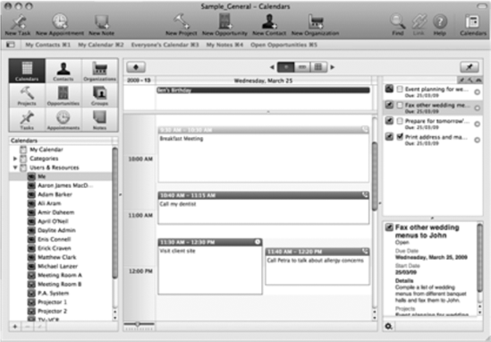
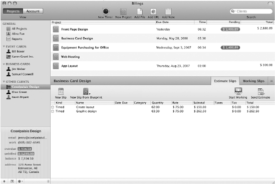
Marketcircle was initially founded as a Web startup in 1999, at first with AJ as the lone employee and soon after with Michael Clark as the VP of engineering. But the timing was inauspicious. Their .com startup, a marketplace where buyers and sellers could negotiate instead of bid at auction, never won venture funding, and when the tech bubble burst, they turned to web consulting and then software development ("to catch our breath," says AJ). It was a pretty easy transition; the web work they had planned on doing was object-based, and AJ himself had been developing object-based applications for the NeXTStep platform doing large system data analysis since 1990. In 1997, Apple bought out Steve Jobs' second startup, and NeXTStep began its metamorphosis into Cocoa. So in 2002, when it was clear that Marketcircle needed to build an in-house business management program to manage its consulting clients, they built it for the Mac instead of for NeXTStep (the program, Daylite, is shown in Figure 12-2). "Up until 1997, I didn't know anything about the Mac," says AJ.
Daylite, as their internal management app came to be called, wasn't meant for public consumption. Then Cupertino came calling. "Apple got wind of it and asked us to sell it," says AJ. The Mac-maker was hoping to rebuild its developer base app by app. "They saw the internal app that we used as a showcase, which was meant for customization. We had already built the app. Their argument was, 'Hey it's not that much more work to make it available to market,'" AJ recalls. Apple pre-iPod was a humbler beast, and AJ says they asked nicely. "It wasn't an arm-twisting kind of thing," he says, "it was a logical argument." As contractors, Marketcircle was used to building specialized systems for highly technical users, but on the Mac, they would be dealing with a horizontal market. "We knew the users were more discerning about interface. We weren't prepared for that. It turned out to be a lot of work."
They agonized over building an interface that end users could make sense of, and their efforts paid off. In 2002 they were granted an runner-up ADA for Daylite 1, and by 2004, they were doing enough business selling Daylite to small businesses that they could afford to quit contract work. In 2005, they reasoned it was time for a sophomore product. "We were already in small business space, so that narrowed it down to small business applications," he said of their brainstorming sessions. "We had a tremendous number of requests for time-billing with Daylite, and I felt like we could do a better job that what was out there." The company's crash course in interface design had heightened their sensitivity to the software marketplace, and they saw a gaping opening. "One of our motivations was that all the invoicing [applications] then—all those apps look like crap. We wanted an app that produced good looking invoices." AJ's working definition of interactivity is as follows: "intuitive use of what's important on the screen." To hear him tell the story, the original version of Billings had its head on straight, but possessed almost none of that interactive aptitude. "We had a very specific market and specific target, but we stumbled at the beginning. Billings 1 was ... a first step," he says haltingly, "but it wasn't anything a lot of people would buy. It wasn't until we hit Billings 2 that we got the interaction semi-decent."
What makes Billings such a knot of problems is, paradoxically, its simplicity. An invoicing application is, conceptually, perhaps one of the simplest applications that any knowledge worker will use on a daily basis—AJ compares it to iCal, calling it "deceptively deep." At its core, it's a stopwatch; wrapped around the stopwatch are features that let you take the time you log and turn it into proof of billable hours. The forefathers of the generic invoicing app are the dumb standbys of the industrial era: the log-book, the punch-clock. So how did things get so complicated?
The problem may lie in the disparity between what the user expects of the app—to get them paid—and the very specific fields of information that the app needs to do its job: addresses, phone numbers, rates, schedules, dates, times, estimates, and receipts. When you sit down to use, say, CAD software, you expect a learning curve. But something so conceptually intuitive as timed billing needs a low barrier of mastery for users—encounter a little bit of cognitive load using a "simple" billing app, and you begin to feel like a moron. Needless to say, that's not what you want in a user experience. "Billings is a very focused app, with a smaller problem-area than Daylite," AJ says, "but between versions one and two, we had many more discussions about the workflow," which AJ says wasn't much of a focus in version 1.0. "[Talks] lasted for weeks until we found something that we all agreed upon." At the time, the team was just AJ, two developers, and two other engineers dividing their time between Daylite and Billings. (Since then, the company's Billings dev team has swelled as high as seven, with three developers minimum on the project at all times.)
In figuring out just why Billings' workflow became such an engineering knot, there's much to be learned from Marketcircle's head user experience designer, Brandon Walkin. Thoughtful and precocious, he has been at Marketcircle since 2007, when he left a computer engineering program at the University of Waterloo after losing interest in his undergraduate degree. Walkin didn't study art, design, or even computer science—though he says he took one class in C#—but is wholly responsible for most of the interface makeover that went into Billings 3. He was left alone at the switch after just four months on the job as Billings' junior interface guru. His boss, the company's original interface designer, absconded to Google. "They hired me for user interface design," he says, "but I had never done any proper UI design. They hired me based on interview." Walkin wasn't a total user experience noob. At the time, he was running a site called IndieHIG, a kind of wiki that built upon Apple's human interface guidelines. "They didn't update that article for a really long time," he says of Apple's HIG site, "so I started a project for the community to contribute new guidelines." (Later, he realized that the real problem was that AppKit, the Cocoa Application Framework, wasn't being updated with new UI elements as they were introduced in Apple's own apps. More on that later.)
Just a couple of years before, Walkin was far from contemplating Apple's user experience; in fact, he was sure that he wanted to do Windows IT work full-time as a career. "IT work was all I ever did," he says, "and I had this really expensive PC at the time." As a resume-builder he bought a Mac in 2005. "I was just interested in it because I wanted to gain experience with the platform," he says. "It was a PPC Mac Mini, and it was the slowest thing ever. But I ended up being so much more productive on this super-slow machine that I ended up selling my pimped-out PC and going full Mac," he says.
For someone so influential to the look and feel of Billings 3, Walkin says he was woefully out of touch with the world of design when he arrived at Marketcircle. "It was a really steep learning curve," he says. "I had taste; I could recognize what looked good and what didn't, from a visual perspective. But I didn't have much knowledge of interactive, user-centric design," he says. His boss, Adam Baker, trained him on the basics of Photoshop and interaction design. When Baker left for Google, Walkin was thrown into his former boss' management role, taking the interface development lead for Billings 3. "When I got hired, I had started learning about Objective C. I got some books, but I couldn't actually make something working," he says. "Once I started working at Marketcircle, six months in, I started really trying to build something."
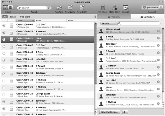
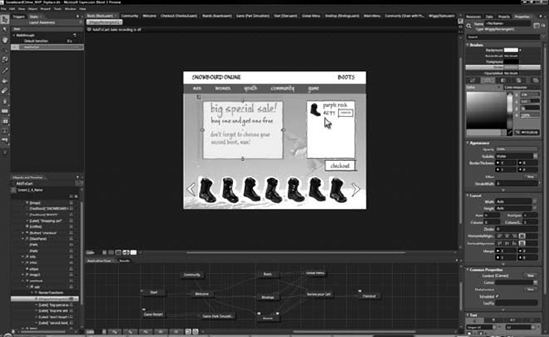
One of the masterworks that Walkin says was formative in his interface training was Checkout, the point-of-sale application made by Dutch developers Sofa, who also won a 2009 ADA for their desktop app, Versions. "They're extremely talented—the interaction design is well thought out, and the visual design is stunning," Walkin says. "Take the icon work; it's second to none. If you just go through their apps bundle and look at the icons at 512 pixels it's just unbelievable." (Sofa's app Checkout, is pictured in Figure 12-3, and its Disco app icon in Figure 12-4.)

But how did Checkout get so good? For that matter, how did Apple itself get so good?
The guys at Sofa have their theories about both. Jasper Hauser and Koen Bok, two of the Sofa ten (counting the cat), echo the Marketcircle guys, but with a corollary: good design takes time, but also the discipline to be jealously protective of your final product. Experiment as much as you want with awful, abominable iterations, they say, but never let the customer see your dirty laundry. "I think even Apple works this way," says Hauser. "I think Apple does a lot of iterative designing where the first initial versions have some nasty interaction shit," he says, but they don't let timelines or "goals" force that stuff onto shelves. "You can feel free to make some bad stuff, but you have to make sure that whatever goes out the door is good."
"The majority of the stuff we make here sucks, and the interaction is horrible," Hauser says, "but we work on it long enough at some point that we're all happy with it. But that takes a lot of time and a lot of effort and a lot of iteration to go beyond that point, to get to where you're happy with it and it works," he says. "That's the only way to do it. It's not some magic thing that happens every time you touch Photoshop or start coding a project."
Bok believes that Apple owes its own successful iteration to the way it responded to its near-failure in the 1990s. Instead of reinventing the Mac in one product cycle, the company adopted a decade-plus iterative schedule for Mac OS X. "They had the option of restarting their entire OS, and they had some very visionary people onboard. They kept all the good parts from the old OS, and while it was technically a step forward from the old OS, the UI was just ridiculously different than the old Macs," he says. "But they took it slowly, and it caught on, also because they had great industrial design that matched the UI design stuff," he says. Time not only allowed Apple to avoid missteps with OS X, but to bring its entire product line in sync.
Their carefully-developed products earned them a "kind of avant-garde crew," Bok says, that made Macs—and Mac development—more lucrative. "If you sell a PC, its target audience is maybe twenty times as big as the Mac's, but it's pretty tough to sell some copies of software there," he says. "The people that are on the Mac are, for whatever reason, very willing to give you ten bucks for beautifully a designed app. Maybe it's because they're richer, or maybe because they respect UI design more. But if you can make a living from it, suddenly it becomes interesting to a lot of talented people," he says.
Those talented people caused a groundswell of good design. "That [market] sparked the idea of being an 'independent developer,'" says Bok, "which is basically the closest thing [a developer] can get to a rock band." The haute market for software gave Mac developers the ability to quit their day jobs, Bok says, and suddenly they had enough time and money to concentrate on usability. As other chapters in this book have shown, revenue and design are inextricably linked; earning money gives you the time and freedom to let the designs stew until they are truly ready.
That time, Bok says, necessarily results in a more personal, opinionated product, which adds even more to the software's appeal. "With these kind of apps, you can kind of have a 'look in the kitchen,' if you know what I mean," Bok says. "With those developers it is very enjoyable to buy an app from them because you really feel like you are a part of this culture that respected the best possible design in software." As Elias Pietilä theorized in Chapter 9 of this book, it was partly his last name that caused his app to sell so well; people found it "cute" that he was just one person, not a faceless company. "It's a mix between supporting your local artist and supporting your local grocery store," Bok says. "It's helping you, the customer, to beat the big companies."
The superiority of small development teams is one of the underlying, if unintentional, conceits of this book. "If you look in general at software from small companies, it has that personal feel," Hauser adds. "You almost have the sense that you bought it from the guy himself. If you buy from big companies like Microsoft or even Adobe, there is no personality attached to it." Apple is no exception, he says. "Everyone who talks about Apple day-to-day has Steve [Jobs] in his mind; there's still some real personality in mind," he says.
Sofa, like Marketcircle, is a small company. Look at other prized dev shops in the Mac community—Boinx, Cultured Code, Potion Factory, Red Sweater, FlyingMeat—and you see similar business models: small groups of tight-knit talents perfecting a handful of careful, beautiful products. The people behind these companies lay much of the praise for their design at Apple's feat: the Cocoa API creates gorgeous apps, they say, or Interface Builder makes aesthetic consistency easy. But little is said about the institutional efficiency and single-mindedness that is available in a small team, and what a profound effect that has on software for the Mac. Apple—who, by most measures, is its own biggest developer, aside from Adobe—is due credit for making development for Mac OS X cheap and easy. But it has also benefitted from the sanctitude of second place, as Bok implies; while Microsoft was struggling to get out of the way of its own success earlier this decade, Apple was quietly—and personally—encouraging talented developers like Marketcircle to build fluid, thoughtful applications for Mac OS X, without any of the cut-throat competition that drives Windows development. Unlike the Windows platform, there were few enterprise sales to chase on the Mac, and its limited market share meant that growth happened deliberately and slowly.
Of course, not all big companies produce bad products, and not all small shops produce good ones. And it would be reasonable to think that a big company's repressive organizational structure is, at the worst, a kind of creative carcinogen—something that leaks into products quietly and does indiscreet damage, in a way the user would only begin to notice after constant use. But according to Walkin, a company that isn't conducive to thoughtful design leaves obvious markers on the face of its software. "There are companies that do purely visual design," he says—meaning fancy icons, glossy windows, and dialogue boxes—"and use that for interaction design. And it always produces bad results." Windows Vista, he says, is a case in point. "They hired this designer to re-make the interface, and she basically went and made things glossy in Photoshop," he says. "But there's been no attention paid to the interaction with that software. It was made without considering the user at all." He laughs. "I almost don't see how it could have been designed by anyone," he says of Vista.
The designers at Microsoft, he says, aren't actually culpable for the company's interactive downfalls; it's simply the byzantine structure of their product development that creates problem after problem. The more important a project, the more designers assigned to it, and in turn, the more agendas competing to shoe-horn features into the apps and make their mark. ("Microsoft hires tons and tons of designers—it's horrible," he says.) Nowhere is this more evident than Redmond's email app for the Mac platform, Entourage. "If you use the 'My Day' window in Entourage, it has buttons in that window that are extremely small," Walkin says. "If you're on a laptop with a track pad, good luck clicking those buttons," he says. "It's clear they didn't pay any attention to how the user experience works." (Figure 12-5 shows Entourage's "My Day" window.)
The root problem is size without leadership. Walkin acknowledges that all organizations have their problems, but the larger the company, the more easily the end user's interests get lost in the shuffle. Echoing off-the-record comments of other engineers interviewed for this book, Walkin describes Microsoft's problem as a series of conflicts of interest. "There are managers of other teams, and people who aren't even in engineering trying to get a feature in a product," he says. Their motivations vary from careerist to truly well-intentioned, but the effect is the same. "They use their leverage to make changes, and it creates this weird power dynamic," he says. "And that causes the software to suffer."
"I put a lot of focus on trying to readjust the way things worked at Marketcircle so we wouldn't have these issues," Walkin says, of the feature-vetting process. While the company may not have suffered from the institutional bungling of a large firm like Microsoft, it was threatened by an opposite phenomenon: people in the company cared too much about the software. Marketing or salespeople could be eager to tout a new advantage over a competitor, or one of the top brass could be emotionally attached to a hard-won feature from a previous version. Walkin's challenge was to direct all that goodwill into creative energy, instead of letting discussions devolve into a power struggle. "I like a positive discussion," he says, "and I put tons of effort into making that productive. But you also have to stand your ground and clearly articulate these issues to stakeholders in the company. If there's someone in sales trying to get ideas in the app, you have to go explain to them that ideas can only go in after a vigorous design process," he says. "Part of my promotion to head [of user experience team] is that we now have a lot more control of design and marketing. We can go and do things without going and verifying with AJ."
In a sense, Walkin has introduced a pinch of absolutism into the company, and in doing so, he's helped change Marketcircle's chain of authority into something much more like Apple's. While Steve Jobs undeniably keeps a level power over his company that borders on despotic, he has given the constituent parts of Apple surprising autarchy. The aesthetic and functional lure of Apple's hardware, for example, comes from the mind of Senior Vice President of Industrial Design, Jonathan Ive, who is said to have enjoyed independence designing the original iMac, the click-wheel iPod, the Titanium PowerBook G4, and the iPhone. Credit for Cupertino's drool-worthy marketing and its world-class developer support are due to Phil Schiller, Senior Vice President of worldwide product marketing and one of Jobs' right-hand men. And as the New York Times noted in 2006, the wild success of the Apple store doesn't belong to Jobs, either: it's the product of former Target retailing executive Ron Johnson, who was given complete creative control to make Apple's stores "big and spacious, a physical embodiment of the Apple brand."[13]
In the same spirit, AJ retains veto power over Marketcircle, but his designers have earned a degree of independence that has worked to the benefit of Billings. Which is to say, they've earned AJ's trust—something that is increasingly difficult to do the larger a company gets. Nowhere is that more evident than Google, Walkin says. Though he has immense respect for the search giant's products ("they really get interaction design," he says), he notes that they are tentative about giving their visual designers real creative control. "Their apps are visually acceptable—Gmail, for instance, is nothing to look at—but usability-wise, they have it down," he says. "They have talented interaction designers, but have large institutional problems with respect to visual design. They're very focused on user testing there." Walkin tells the story of a colleague who worked as a visual designer at Google, but later quit in frustration. "I think he was doing an interface: the border of a window. Google made him test with users which thickness—two, three, four pixels—and which shade of 44 different shades of blue would be optimal," he says. "When you have an organization with distrust of visual designers to that extent, you can't really have a designer who has a vision, who makes an excellent design. Imagine if Apple did that with MobileMe—it would be terrible. You pretty much can't synthesize a coherent visual design language by user testing. That's impossible." In essence, Marketcircle has discovered the Apple model of interactive design. Call it "group single-mindedness": ideas float freely up the chain of command, and discussion happens across the breadth of the company. But ultimately, the creativity of many is funneled into the agenda of a small group of strong-willed decision-makers with a very personal vision about how software is supposed to work.
Marketcircle's principals are in no shortage of vision for Apple's software, too. "Back when we were developing Daylite, I fundamentally hated AppleScript," says AJ. "There were limitations, and we had issues with it." The company explored other scripting languages, like Ruby and Python, but none had an easy hook into the Cocoa environment. Then AJ found F-script, which he calls a "phenomenal piece of work." The engineers used it for Daylite Mail Integration, the app's email plug-in. Then they figured out what else it could do.
F-script works on top of Mac OS X's Cocoa API, and is even more purely objective than Objective C itself. Although the latter simply introduces Smalltalk-like messaging into C, every item that is manipulated with F-script is treated as an object. The beauty of F-script, says Walkin, is that it supercharges Objective C's ability to do type introspection. "You can do reverse engineering in Cocoa applications to figure out how they work," he says, "so you can really figure out how to do certain functionality that [Apple] doesn't let you do." He's talking about the company's beloved Interface Builder, which he says is too stiff about some of its interaction design. Because Apple doesn't document the methods inside Interface Builder, and doesn't make them public, Walkin took it upon himself to look under the hood and fix his pet peeves. (See Figure 12-6.)
The result is a popular Interface Builder plug-in called BWToolkit that lets designers do things the normal builder kit doesn't allow. In some ways, BWToolkit is an outgrowth of his IndieHIG project: it documents all the UI elements that aren't in AppKit, and lets you alter them. (It's available for free under the BSD license via Walkin's web site).[14] One example of BWToolkit's features, he says, is the ability to set which panes inside an app resize when you resize the window. Mail and iTunes are examples. "Whenever you have two panes side by side, Apple has those panes resize proportionally. In every app in Leopard, like iTunes, when you resize a window, the source list window resizes, too."
But you don't want that, he says, because it ends up crunching the names of your playlists or sources. "In BWToolkit, you can specify what resizes and what doesn't. To do that without BWToolkit, you have to write a lot of code." Though BWToolkit is Walkin's pet project, he acknowledges that the engineers at Marketcircle helped him immensely when he began building it in the spring of 2008. "In fact, it's pretty much how I learned programming," he says.
What follows is one of BWToolkit's shorter Interface Builder additions, a transparent pop-up button cell.
//  BWTransparentPopUpButtonCell.m
//  BWToolkit
//
//  Created by Brandon Walkin (www.brandonwalkin.com)
//  All code is provided under the New BSD license.
//

#import "BWTransparentPopUpButtonCell.h"
#import "NSImage+BWAdditions.h"

static NSImage *popUpFillN, *popUpFillP, *popUpRightN, *popUpRightP, *popUpLeftN, *popUpLeftP, *pullDownRightN, *pullDownRightP;
static NSColor *disabledColor, *enabledColor;

@interface NSCell (BWTPUBCPrivate)
- (NSDictionary *)_textAttributes;
@end

@interface BWTransparentPopUpButtonCell (BWTPUBCPrivate)
- (NSColor *)interiorColor;
@end

@implementation BWTransparentPopUpButtonCell

+ (void)initialize;
{
                  NSBundle *bundle = [NSBundle bundleForClass:[BWTransparentPopUpButtonCell class]];

                  popUpFillN = [[NSImage alloc] initWithContentsOfFile:[bundle pathForImageResource:@"TransparentPopUpFillN.tiff"]];
                  popUpFillP = [[NSImage alloc] initWithContentsOfFile:[bundle pathForImageResource:@"TransparentPopUpFillP.tiff"]];
                  popUpRightN = [[NSImage alloc] initWithContentsOfFile:[bundle pathForImageResource:@"TransparentPopUpRightN.tiff"]];
popUpRightP = [[NSImage alloc] initWithContentsOfFile:[bundle pathForImageResource:@"TransparentPopUpRightP.tiff"]];
popUpLeftN = [[NSImage alloc] initWithContentsOfFile:[bundle pathForImageResource:@"TransparentPopUpLeftN.tiff"]];
popUpLeftP = [[NSImage alloc] initWithContentsOfFile:[bundle pathForImageResource:@"TransparentPopUpLeftP.tiff"]];
pullDownRightN = [[NSImage alloc] initWithContentsOfFile:[bundle pathForImageResource:@"TransparentPopUpPullDownRightN.tif"]];
pullDownRightP = [[NSImage alloc] initWithContentsOfFile:[bundle pathForImageResource:@"TransparentPopUpPullDownRightP.tif"]];
enabledColor = [[NSColor whiteColor] retain];
disabledColor = [[NSColor colorWithCalibratedWhite:0.6 alpha:1] retain];
}
- (void)drawBezelWithFrame:(NSRect)cellFrame inView:(NSView *)controlView
{
cellFrame.size.height = popUpFillN.size.height;
if ([self isHighlighted])
{
if ([self pullsDown])
NSDrawThreePartImage(cellFrame, popUpLeftP, popUpFillP, pullDownRightP, NO, NSCompositeSourceOver, 1, YES);
else
NSDrawThreePartImage(cellFrame, popUpLeftP, popUpFillP, popUpRightP, NO, NSCompositeSourceOver, 1, YES);
}
else
{
if ([self pullsDown])
NSDrawThreePartImage(cellFrame, popUpLeftN, popUpFillN, pullDownRightN, NO, NSCompositeSourceOver, 1, YES);
else
NSDrawThreePartImage(cellFrame, popUpLeftN, popUpFillN, popUpRightN, NO, NSCompositeSourceOver, 1, YES);
}
}
- (void)drawImageWithFrame:(NSRect)cellFrame inView:(NSView *)controlView
{
NSImage *image = [self image];
if (image != nil)
{
[image setScalesWhenResized:NO];
if ([[image name] isEqualToString:@"NSActionTemplate"])
[image setSize:NSMakeSize(10,10)];
NSImage *newImage = image;
if ([image isTemplate])
newImage = [image bwTintedImageWithColor:[self interiorColor]];NSAffineTransform* xform = [NSAffineTransform transform];
[xform translateXBy:0.0 yBy:cellFrame.size.height];
[xform scaleXBy:1.0 yBy:-1.0];
[xform concat];
[newImage drawInRect:[self imageRectForBounds:cellFrame] fromRect:NSZeroRect operation:NSCompositeSourceOver fraction:1];
NSAffineTransform* xform2 = [NSAffineTransform transform];
[xform2 translateXBy:0.0 yBy:cellFrame.size.height];
[xform2 scaleXBy:1.0 yBy:-1.0];
[xform2 concat];
}
}
- (NSRect)imageRectForBounds:(NSRect)bounds;
{
NSRect rect = [super imageRectForBounds:bounds];
rect.origin.y += 3;
if ([self imagePosition] == NSImageOnly || [self imagePosition] == NSImageOverlaps || [self imagePosition] == NSImageAbove || [self imagePosition] == NSImageBelow)
{
rect.origin.x += 4;
}
else if ([self imagePosition] == NSImageRight)
{
rect.origin.x += 3;
}
else if ([self imagePosition] == NSImageLeft || [self imagePosition] == NSNoImage)
{
rect.origin.x -= 1;
}
return rect;
}
- (NSRect)titleRectForBounds:(NSRect)cellFrame
{
NSRect titleRect = [super titleRectForBounds:cellFrame];
titleRect.origin.y -= 1;
titleRect.origin.x -= 2;
titleRect.size.width += 6;
if ([self image] != nil)
{
if ([self imagePosition] == NSImageOnly || [self imagePosition] == NSImageOverlaps || [self imagePosition] == NSImageAbove || [self imagePosition] == NSImageBelow){
}
else if ([self imagePosition] == NSImageRight)
{
if ([self alignment] == NSRightTextAlignment)
titleRect.origin.x -= 3;
}
else if ([self imagePosition] == NSImageLeft || [self imagePosition] == NSNoImage)
{
titleRect.origin.x += 2;
}
}
return titleRect;
}
- (NSDictionary *)_textAttributes
{
NSMutableDictionary *attributes = [[[NSMutableDictionary alloc] init] autorelease];
[attributes addEntriesFromDictionary:[super _textAttributes]];
[attributes setObject:[NSFont systemFontOfSize:11] forKey:NSFontAttributeName];
[attributes setObject:[self interiorColor] forKey:NSForegroundColorAttributeName];
return attributes;
}
- (NSColor *)interiorColor
{
NSColor *interiorColor;
if ([self isEnabled])
interiorColor = enabledColor;
else
interiorColor = disabledColor;
return interiorColor;
}
- (NSControlSize)controlSize
{
return NSSmallControlSize;
}
- (void)setControlSize:(NSControlSize)size
{
}
@endDespite BWToolkit's additions, Walkin—like all of the developers in this book—praises Apple's IDE. "Apple has done a fantastic job. If you compare it to other apps that do interface visual development, it just doesn't even compare," from both a programming and interactive perspective.
Walkin compares it to Sketchflow (seen in Figure 12-7), a new prototyping feature in Microsoft's Expression design studio that he saw demonstrated by one of Microsoft's program managers at the MIX Web development conference in Las Vegas in the spring of 2009.[15] "They're giving a presentation on it, and the guy drags a button onto the interface, and double-clicks it to change the title. He types in reasonable title, and pressed Enter." But the button isn't big enough for the text. "And then he says, 'Oh, the title was too long, I've got to enlarge the button.' On Interface Builder, the button would automatically resize," Walkin says. "Why wouldn't you want that? This is their new application!" he says, incredulous. "Speed is really important in a wire-framing application. It's important that every time I make a button, the button will resize for me."
Another example, he says, is "a nice little optimization" in the iPhone SDK: drag and drop a label from the library onto a part of an interface that's black, and it turns white. "In any other program, that label would effectively become invisible," Walkin points out. Another crucial feature in Interface Builder, Walkin says, is Apple's suite-wide support for baseline guides, which help ensure that objects onscreen are aligned and spaced correctly. "Very rarely in other OSes do their baselines show up," he says. (The canvas code that enables the guides appear in all of Apple's creative apps, which Walkin says is the reason he uses Keynote for prototyping.) "They're not gonna get tons of people complementing them on that feature," Walkin says, "but the Interface Builder team actually thought, 'Okay, let's get this really working.'"
It's clear that Apple's forethought inspired not only Walkin, but the entire Marketcircle team to do more with Billings 3. One example, says AJ, is the new sidebar that combines recurring billing with the "overdue clients" view. "We had this idea that came up: how do you see overdue clients? You could run a report, or add another window and hit a button and get a list," AJ says. But the real question, he recalls, became: What do you do with overdue clients? "If I have overdue clients, I want to send them statements," Jetha says. They considered adding a button for that, too, or a menu item that could run an "overdue client" feature. "But that's too deep, too hard to find," he says.
At the same time, they were chewing on another feature that customers were asking for: groupings for customers that could be enabled and disabled. "Our solution to all of this was to redo the sidebar," AJ says. "We took all those features and put them all into the pot, and out came this sidebar that has a red icon around overdue clients. Now when you mouse over an overdue amount, it becomes a button that you allows you to send them a statement." The new sidebar also let designers show invoices and payments more clearly, knocking down another customer request. "You can always slap in a new window, and off you go. But that's not the best way," says AJ.
Walkin says it's important to think about the most common user scenarios, and prioritize them. "I know every user is going to send an invoice at some point in the life of a project," he says, "and it's likely they will send multiple invoices. So I just design it for that. There's no reason they should have to select multiple slips." When Apple's Director of Software Technology Evangelism and User Interface Evangelist John Geleynse got on stage at WWDC 2009, it was the mouse-over invoicing button that he cited as one of Marketcircle's most elegant features. For Walkin, it encapsulated his career at Marketcircle; Geleynse was the primary contributor to the Apple HIG that he had monkeyed with to create IndieHIG, the site that got Marketcircle's attention in 2007. "It was a great feeling watching John Geleynse, who I highly respect, talking about Billings on stage," Walkin says.
At WWDC, another of Billings 3's innovations won particular admiration. "Some of the ADA judges asked us afterward what made us decide to build in the Client and Account button," AJ recalls. "We had this notion of seeing invoices and receipts in line, or at a higher level. We could have had a tab-based interface," he says. "We struggled. We explored. Finally we came to the solution of putting that button at the top to toggle between billing mode or account mode," he says. "It took weeks."
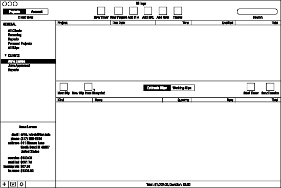
This time, though, the deliberation was less of a stalemate and more a result of due process. AJ says Marketcircle does very deep prototyping, but keeps their initial wireframes flexible so that they can drop in new ideas on the spot and get a reaction from the whole team. "A developer comes up with an idea, and then we'll have a meeting where ideas are presented. And since everything is in wireframe mode, things can be moved around easily," he says. (Walkin says he does detailed black-and-white outlines of the application in Keynote, "So you can figure out what goes where.") "It used to be that we Photoshopped [a prototype] for the final look, and then it would go off [for development]," says AJ. "Now our head of engineering, Mike, demands more wireframes, so we go deeper inside so we know, 'What happens in this case? What happens in that case?'" (A Billings 3 wireframe is shown in Figure 12-8.)
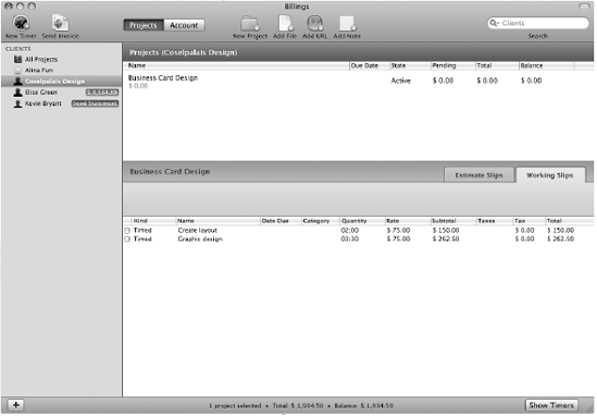
The obsessive preparations have made Billings 3 an archetypal example of how to make a simple program robust without making it ungainly. But it is also a cautionary tale in scheduling, and what can be lost when a release calendar takes priority over the product. "When we started Billings 3, we didn't want to make a new application—we didn't have time," says Walkin. The company's execs had given him two months to make its improvements. "I kinda knew that wasn't going to happen," he says. He approached the management team and told them he wanted to restructure the app's main window and how it worked, and make real improvements in interaction design instead of simple prettification. "Luckily, I was allowed to do that," he says. "We try and do an 18-month release cycle," AJ says, but acknowledges that "you need time to let it brew." (A progression of three Billings 3 prototypes is shown in Figures 12-9, 12-10 and 12-11.)
As Marketcircle gets closer to releasing Billings Touch, an iPhone version of the app, the team has begun developing new software automation as well. "One of our engineers wrote a custom app that goes and downloads [mockup] images from a server and puts them full screen on an iPhone app." It can also do basic prototyping, Walkin says. "You can set it up to have certain hot rectangles on the screen, hit a certain rectangle, switch to another image—it's pretty cool, because you can actually see real workflows." (Other developers have said they use Ideo Labs' free LiveView desktop and iPhone apps for this same purpose, but Walkin contends that that app's presentation on the iPhone doesn't accurately reproduce colors. "It's too dark," he says.)
Billings Touch will be the company's second iPhone app; it released Daylite Touch at the end of June 2009, and won a MacWorld Best of Show award for it. "We've been working on Billings Touch for a number of months now," AJ says, "but we're running into problems: where we made assumptions that there'd be a natural fit, sometimes there's not." On Daylite Touch, for example, performing an action on the iPhone syncs it with the desktop version of Daylite. But because Billings is a single-user product, its mobile version is set up more as a standalone invoicing app that doesn't talk to the desktop version. "We're playing around with it right now: in our internal build, you sync [to iPhone] from the desktop," but not visa-versa, AJ says. "So far I'm thinking that it's better to do it from the desktop." (Figures 12-12 and 12-13, mockups of Billings Touch.)
At around $15.00 or $20.00, Walkin says Billings Touch will be one of the fully-functional iPhone apps that explores the upper price ceiling of the App Store. "The apps we're making having insane levels of functionality versus your basic iPhone app," he says. "Daylite Touch is basically a full-featured CRM for your phone." Setting the bar so high has made Marketcircle engineers question the wisdom of treating the iPhone like a full-fledged platform. "It's challenging to design [for the iPhone], in that the interactive paradigms on the iPhone were constructed for very simple applications that do one thing," he says. "They designed it for an app that looks at photos, for example, but not for an app that edits photos or compares photos," he says. Billings Touch will be "functionally equivalent" to Billings 3, he says, "and we're doing this with pretty basic interface. It's a fun challenge; it's what I like doing," he says, but admits it can be trying. "On the Mac, it's just easier; there are a lot more ways to fix problems." From a bottom-line perspective, Marketcircle is looking at a mobile version of Billings as a kind of leader to introduce Billings to a new group of more amateur users. "I'm sure when Billings Touch comes out, there will be a bump in sales [for the desktop version of Billings, which represents about 35 percent of Marketcircle's annual revenue]," says AJ.
Developing the iPhone app will ultimately have consequences for the desktop version of Billings, according to the team. Because Billings 3 requires users to keep their clients' contact information in Apple's Address Book, it stands to reason that the mobile version of the app will use the iPhone's native Address Book in the same way. "Some people have problems with that, because it requires you to have all your business contacts in your phone. If you want to have that distinction between friends—who you call often—and other people who you don't, then you won't want [clients] to appear in your phone," says Walkin. "We're looking at ways to decouple ourselves from Address Book while still maintaining the ability to import from it."
Developing a "power-user" app for the iPhone OS has made Marketcircle's designers intimately familiar with the limitations of the interface, but neither Jetha nor Walkin have any interest in designing for a competing platform. "In Daylite Touch, we used a tab bar at bottom of screen, just like the black bar at the bottom of the iPod app. We also had a nav bar at top of the window." But with the necessary window-title up top, Walkin says, "you can only really put two buttons at the top of the screen. If you need any more functionality that that on one screen, you need another bar below that, and visually that looks complicated," he says. "If you look at the Palm Pre, every app has it's own app-wide menu," Walkin says of the Sprint device released in June 2009. "For certain things that make context of the entire app, say like exporting a file, it makes sense to put that in an application menu." Still, Walkin says he's content to treat the iPhone's limitations as design challenges. "We're a Cocoa shop," he says. "It's what we do."
Chart the growth of that Cocoa shop against the development of Billings, and the importance of the company environment comes into stark relief. In very small dev shops, there's no problem; the engineers are also the business people, the marketers, and the PR department. When a company begins grows and its employees begin to specialize, it can be a struggle to keep the creatives feeling enfranchised. To let them lose hope is to deal a fatal blow to innovation. But the responsibility isn't entirely on the management to nurture its band of developers; instead, the onus is frequently on the developers to translate their ideas and opinions into saleable features. Sometimes, Walkin points out, the best way to do that is by building them.
"There were certain things we had to do under the radar," he says of Billings 3. "In the Send Invoice window, we had a pop-up. I always complained about that, because we had twenty invoice styles, so you'd have to go to the 'Preview' tab and click twenty items; there was no other way of previewing them. It was just insane. I really wasn't happy shipping Billings 3 with that feature," he says.
He decided to go underground. "Me and another developer started this project we called Yellow Canary, after one of the templates. I made thirty invoice icons in a couple nights, he went and coded this invoice gallery that lets you change the style. AJ had no idea this was going on," he says. "They had told us, 'You cannot make any changes to the send window,' because they knew that I would try to redesign everything," Walkin says. (The invoice gallery, Figure 12-14.)
Instead of censuring Walkin or reasserting his authority by throwing out the changes, AJ recognized a good thing when he saw it. ("I'm never against making something better, but I give people friction when something takes too much time," AJ says. "What made [Project Yellow Canary] okay was that there was no additional delay," he says.) The preview window stayed. Walkin believes that wouldn't have been possible in a team any larger than Marketcircle's. "There are people who argue that you can't make any effective institutional change. If you've seen the show 'The Wire,' that's what they argue in that show," he says, referencing the HBO cop drama. "The only effective change can be made on an individual basis. I just had to make that change with AJ. In a big company, you can't go up to the CEO and make a bunch of changes." He says he sees himself being frustrated by having to angle for power at a bigger company, where he wouldn't be allowed to control the user experience. "I do this for the design, for the end product," he says.
Software companies and Baltimore cop dramas aren't usually metaphorical bedfellows, but the comparison works—and it's not just about the depressing state of Canadian or American bureaucracies. In fact, it's more about the French—or at least, one Frenchman in particular. Emmanuel Levinas (pictured in Figure 12-15) was a 20th century Parisian philosopher who wrote a series of essays between called Alterity and Transcendence. He didn't talk about Baltimore, or invoicing software, or even F-script. Instead, he defined the titular concept, alterity, as the pursuit of "otherness"—or more specifically, the principle by which an individual can exchange his perspective for an opposite one.

Figure 12.15. Emmanuel Levinas. What's this guy doing in an iPhone book? (Photo by Bracha L. Ettinger)
The term "alterity" made somersaults through numerous academic disciplines before landing in the fourth season of "The Wire," when an impulsive narcotics cop named Prez gets fired and becomes an inner-city middle-school teacher. Seeing the desperate family lives of the kids he used to rough up on the corners, he becomes their advocate. Sometimes, the show seems to suggest, the best person for a job is the one whose relevant experience is on the opposite side of the given spectrum.
Project "Yellow Canary," then, was Marketcircle's "Prez" transition come full-circle: the company that began as a small team serving vertical markets with ho-hum interface design had ultimately become a place where engineers and designers were assuming a bigger workload—and risking their positions—just to improve the user experience.
During Daylite's development, AJ says, "We were all code monkeys, and so interface was a secondary thought. We got a lot of complaints. Usability was where the problem was. But I started getting more conscious about these things." Then the company got an ADA runner-up for Daylite 1, but AJ says that "interaction-wise there was much left to be desired." Once they hired Brandon Walkin's predecessor, Adam Baker, away from Apple, interaction design became a priority. "Especially after we started packing on features—it got out of hand," AJ says. "He started opening the door for us in terms of interface design; he had to really work on us, we were code people. But you really can't just do a veneer."
Now that design is in Walkin's hands, AJ has brought the company completely through that "door" of interface design. "I give him a lot of leeway—more than I would typically," AJ says of Walkin. Maybe that's an economic instinct: better usability equals more sales. Maybe it's the coders' conscientiousness, tackling interaction design with the same perfectionism. Whatever the case, Marketcircle's history seems to defy the old adage that tells us to "do what you know," and Billings 3 seems to suggest that novel territory isn't an obstacle, but an opportunity for thoughtful deliberation—and success.