
Development Company: Facebook
Tags: Layout; Open Source; Client App
URL: http://facebook.com
The largest social network on earth wields tremendous power on the iPhone: its technical and visual innovations are so widely used they can become an immediate part of the iPhone UI cannon. Its task is daunting: transport Facebook's entire app platform on top of an OS that is years younger than Facebook itself (see Figure 2-1).
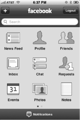
Joe Hewitt, who developed Facebook for iPhone, has open source roots—he worked on the Netscape on Mozilla Firefox projects—so it stands to reason that he has opened up much of his backend work to the masses. Here he discusses Facebook for iPhone's unique home screen, pictured in Figure 2-1, and its evolution from a web app to a fully-featured "phone" of its own.
As this book was going to press, Hewitt announced he would be quitting iPhone development over objections to the App Store approval process. "My decision to stop iPhone development has had everything to do with Apple's policies," he told TechCrunch.com. "I respect their right to manage their platform however they want; however I am philosophically opposed to the existence of their review process. I am very concerned that they are setting a horrible precedent for other software platforms, and soon gatekeepers will start infesting the lives of every software developer." He will remain at Facebook pursuing other projects.[5]
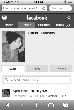
When I started at Facebook, I built iphone.facebook.com, which is now touch.facebook.com (Figure 2-2). After that, I asked to do an iPhone app. Pretty much my whole two years at Facebook has been doing iPhone things.
The touch web site is now geared, not only for iPhone, but Android, Palm, and so on, so we're limited in how much we want to make it modeled after the iPhone conventions. I think the two will diverge more, if anything; other people are working on the touch web site now. They might take it in a slightly different direction.
The first version of the app did have the tab bar at the bottom, but I took it out because I feel like Facebook is a platform in itself, and each of the tabs were almost like apps in and of themselves that really called for use of the full screen.
I had to look forward; we have a lot of new apps coming down the pipe, and I felt like the model Facebook works on lends itself better to sort of being a "phone" in and of itself. Facebook has its own chat, phone book, mail, photos, and applications, so squeezing it all into tabs made it feel too limited. Going with this model—it's a home screen just like the iPhone home screen—will let it grow and become full-featured. It also gives us room to add more apps within our app.
I haven't really seen other apps that do this, and I wouldn't really recommend that anyone else do it. Facebook is kind of unique in its breadth and the amount of stuff people do on it. I really hesitated to build in the grid for a while, but as I kept moving things around and trying to make it all fit into the tab bar, I just felt like this was the best solution. I was expecting more people to complain about it, but it seems to have worked out pretty well.
The grid came first; the feed filters you're referring to were, in the previous version, in a horizontally-scrolling tab-bar at the top. It just didn't seem that people were using it enough to justify having a full-time piece of screen allocated to it, so I thought the new design was just more appropriate for how infrequently [feeds are] used. (Figure 2-3 shows the Facebook feed filter, which uses Apple's rolling dial selector.)
![Facebook's feed filter. "The new design was just more appropriate for how infrequently [feeds are] used," says Hewitt.](http://imgdetail.ebookreading.net/business/81/9781430272359/9781430272359__iphone-design-award-winning__9781430272359__figs__0203.png)
Economy [of taps] is always a motivating factor, but the grid adds an extra tap [because you need to press the grid button] versus the full-time tab bar. That was a compromise I felt was necessary. There's always that balance between screen clutter—adding tabs—and the number of taps.
I did a lot of custom stuff. The app is built on an open source framework I created called Three20, and it uses its own view controllers, all of which I had to write. I had to try to reinvent the Apple photo browsing app and the Apple Mail composing tool, among other stuff.
Three20 also has a style system meant to emulate CSS. If you want to draw any graphics, Apple normally requires you to use Quartz and these heavy-handed frameworks. And I wanted a simpler way of doing that, so I created one in Three20 and a lot of people have picked it up and added things to it for their own purposes.
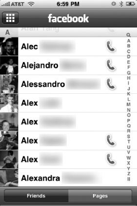
Another custom thing is in the friends list (shown in Figure 2-4). When I first started working on the app, I thought it would be cool to have phone numbers be really handy. The first two versions didn't really convey that information well; you could get the numbers by clicking on a profile and clicking over to the info tab, but I thought it'd be better to surface the numbers in an icon in the list.
Yes, definitely. I don't have much I can talk about there, but it's definitely something we think about a lot. I wouldn't be surprised if that's in Facebook in the future.
On the 3GS, I don't feel like I'm pushing that limit yet, but the previous devices were sluggish for sure. The 3GS gives us a lot of room to grow. When you're looking at photos on the 3G, we definitely see a lot more out-of-memory crashes [than on the 3GS.] The JPEGs that you download are not exactly scaled to the screen of the iPhone, so you're downloading images that are a little bigger than they need to be—so holding them in memory and juggling them can cause the device to freak out sometimes. I've spent a lot time optimizing.
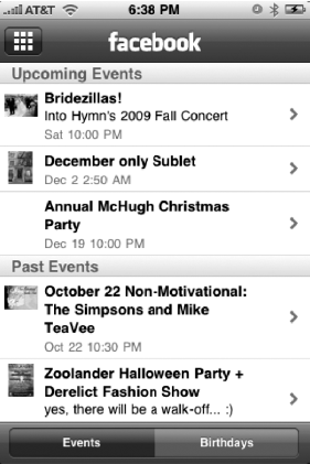
Well, there's a lot of data that's cached. For instance, when you load the news feed, you're getting each individual update, but also the names and pictures of the user that posted the update. We cache all that so you don't have to keep loading that if you go to another part of the app (Figure 2-5 shows Facebook's events page). That way if you go to view a message from someone who have in memory from a news feed update, their information is already there. If there's a low memory warning then all that stuff gets flushed and has to be downloaded again.
Everything in the app works that way. There's a disk cache so if you load events, notes, or requests, it's cached so when you go back to the app, and we show the cached version. And as we show it, we try to load the latest version. If it's a week old—or some number of days, I forget the exact number—the app will just show you "loading" and clear the old stuff.
Before that system was in place, you were constantly looking at a little spinner wherever you went —loading, loading, loading. I think it feels nicer to see something right away that you can interact with while the new stuff is coming in.
We actually didn't even have events until this third version. That kind of stuff definitely could be surfaced in a lot of other places, which would also feel nice. I've been thinking about putting your upcoming events on the top of news feed, so you don't have to go to the Events app.
Listing 2-1 is an excerpt of the Three20 framework. It illustrates that composing a POST response to a Web server can involve a lot of work -- and how Three20 takes care of all that verbosity for you.
Example 2.1. The Facebook App's Disk Cache Framework (Snippet)
(NSData*)generatePostBody {
  NSMutableData *body = [NSMutableData data];
  NSString *beginLine = [NSString stringWithFormat:@"
--%@
", kStringBoundary];

  [body appendData:[[NSString stringWithFormat:@"--%@
", kStringBoundary]
    dataUsingEncoding:NSUTF8StringEncoding]];

  for (id key in [_parameters keyEnumerator]) {
    NSString* value = [_parameters valueForKey:key];
    if (![value isKindOfClass:[UIImage class]]) {
      [body appendData:[beginLine dataUsingEncoding:NSUTF8StringEncoding]];
      [body appendData:[[NSString
        stringWithFormat:@"Content-Disposition: form-data; name="%@"

", key]
          dataUsingEncoding:NSUTF8StringEncoding]];
      [body appendData:[value dataUsingEncoding:NSUTF8StringEncoding]];
    }
  }

  NSString* imageKey = nil;
  for (id key in [_parameters keyEnumerator]) {
    if ([[_parameters objectForKey:key] isKindOfClass:[UIImage class]]) {
      UIImage* image = [_parameters objectForKey:key];
      CGFloat quality = [TTURLRequestQueue mainQueue].imageCompressionQuality;
      NSData* data = UIImageJPEGRepresentation(image, quality);

      [body appendData:[beginLine dataUsingEncoding:NSUTF8StringEncoding]];
      [body appendData:[[NSString stringWithFormat:
                       @"Content-Disposition: form-data; name="%@";
filename="image.jpg"
",
                       key]
          dataUsingEncoding:NSUTF8StringEncoding]];
      [body appendData:[[NSString
        stringWithFormat:@"Content-Length: %d
", data.length]
          dataUsingEncoding:NSUTF8StringEncoding]];
      [body appendData:[[NSString
        stringWithString:@"Content-Type: image/jpeg

"]
          dataUsingEncoding:NSUTF8StringEncoding]];
      [body appendData:data];
      imageKey = key;
    }
  }

  for (NSInteger i = 0; i < _files.count; i += 3) {
    NSData* data = [_files objectAtIndex:i];
    NSString* mimeType = [_files objectAtIndex:i+1];
    NSString* fileName = [_files objectAtIndex:i+2];

    [body appendData:[beginLine dataUsingEncoding:NSUTF8StringEncoding]];
    [body appendData:[[NSString stringWithFormat:
                       @"Content-Disposition: form-data; name="%@";
filename="%@"
",
fileName, fileName]
dataUsingEncoding:NSUTF8StringEncoding]];
[body appendData:[[NSString stringWithFormat:@"Content-Length: %d
", data.length]
dataUsingEncoding:NSUTF8StringEncoding]];
[body appendData:[[NSString stringWithFormat:@"Content-Type: %@
", mimeType]
dataUsingEncoding:NSUTF8StringEncoding]];
[body appendData:data];
}
[body appendData:[[NSString stringWithFormat:@"
--%@--
", kStringBoundary]
dataUsingEncoding:NSUTF8StringEncoding]];
// If an image was found, remove it from the dictionary to save memory while we
// perform the upload
if (imageKey) {
[_parameters removeObjectForKey:imageKey];
}
//TTLOG (@"Sending %s", [body bytes]);
return body;
}
//////////////////////////////////////////////////////////////////////////////////////////////////Well, tabs are very effective as long as you only have one level of tabs. A lot of apps—including the previous Facebook app—have two levels of tabs, which I think becomes troubling. I see that a lot, that people are trying to cram a lot onto this little screen, and that second row of tabs becomes tempting when you have two levels of hierarchy to navigate. But having one level of tabs is a great way to navigate.
That's a big question. I hear it both ways and I do emulate Apple quite a bit. Our message inbox is a lot like Mail. But where I feel like it doesn't fit, I just do things a little differently. I'm not crazy about the way they do push notifications. Once you get more than one app sending you notifications, including SMS, it becomes very awkward. I have a Palm Pre to play around with, and the way they handle notifications is just perfect. Any app can send something to that little bar on the bottom, and they all balance really well; the card spec is also really great. I think that apple has a lot of work to do. We're working on push notifications for our app now [for messages, but not chat], but if it worked the way it does on the Pre, I'd be a lot happier. On the iPhone, you actually have to hit OK to dismiss it, which sucks. On the Pre you're not forced to attend to it at all.
Our app does use the Settings app for preferences right now, but we only have three toggles and they're not that important. We're going to have a few more, and I've been planning to switch over to putting all our settings inside the app. Otherwise people just don't find them.
I think exploring the idea of sharing your location is very exciting. It's a huge untapped opportunity, and a challenging one for us. It's so obvious. People are like, why haven't you done it yet? But it's a really difficult thing to get right, and can easily be semi-useless if not done carefully. We could build the technical stuff very easily, but it's tougher to make it so that people actually want to use it, and would habitually use it. There are a ton of services out there that do that right now, but how many have really picked up steam? Foursquare tries to make a game out of it to motivate people that way, but I'm not sure we want to make a game out of it. I think part of it is just people's expectations; if everyone decided to use it, they would start to expect to be able to go on Facebook to find out where their friends are. You wouldn't have to update your status to say, "I'm at the bar," because it would just implicitly include that information. If we can ever get there, to have people using it by default, then it'll be useful. But getting people to do it when no one else is doing it isn't easy.
I don't think we have a good answer for that yet.
When I was building this app, I was always kind of thinking that someday people will use [Facebook] more from their mobile devices than from their computers. So much of what goes into Facebook is useful to you when you're out and about—a lot of status updates are mobile, and things like calendar events obviously are very useful, and photo uploads, too. The percentage of our traffic that goes through mobile is incredible, and growing rapidly.
If anything's going to change, it's that Facebook mobile will become the most frequently used version of Facebook, and the desktop version will only be used for certain tasks—writing long messages or uploading a ton of photos. But as we see our traffic numbers swinging toward mobile, it changes how we decide what features to add and what to promote. There's been some features that started on the mobile side and came over [to the Web], and definitely the iPhone app has started to be the model for all our mobile apps and web sites.
I think I've actually under-used Apple's frameworks. There's a lot of really cool stuff in there that I haven't found a good use for—like Core Location, OpenGL, and MapKit. But at the same time, I've found Apple's actual tools to be under-serving my needs. I had to write my own photo-browser and my own message-composer, which was a huge effort. It would be nice if they could include something so commonly needed. They have a framework for picking a photo from your collection, but only from the albums on the phone—you can't insert your own photos into that UI. It's a very generic thing. A lot of apps use that finger-flicking display of images. That's the most popular part of the Three20 framework. I would not be surprised if a future iPhone OS has that baked in.
I know the Flickr app uses it, and there are quite a few others. I developed it under my name; there's no dedicated site for it, but it's hosted on GitHub. The Facebook app was just so big that I ended up writing a lot of code that was worth sharing, so I thought it would be useful to open-source it.
I'm an employee of Facebook, so I'm not out there trying to make money on the market. It was work I was being paid to do, and Facebook has a good policy toward open source—they try to let their engineers open source anything that's not too uniquely valuable to the company. I've had a history of doing open source before, with Mozilla, so I try to make things open whenever I can. People do appreciate that, and it makes me feel good that my work is affecting more than one app on the store.
[5] http://www.techcrunch.com/2009/11/11/joe-hewitt-developer-of-facebooks-massively-popular-iphone-app-quits-the-project/