If you’re anything like me, not all your photos come out perfect. In fact, lots of them are probably pretty bad, and those you can delete after import. No harm, no foul, and you didn’t pay for developing.
What about those pictures that are okay, but not great? Much of the time they merely require a little work. Perhaps you need to crop out extraneous background that distracts the eye from the subject of the photo, or maybe you want to remove the red glow from that cute baby’s eyes (it’s the fault of the camera flash, not necessarily the sign of a demon child). iPhoto can help with those tasks and more.
I’m not suggesting that you whip out an image-editing application, clip your cousin’s ex-husband out of the family reunion photo, and use filters that sound like alien death rays (Gaussian blur?) to make it appear as though he was never there. If you can do that, great, and iPhoto will even let you use any other image-editing application, including Photoshop and Photoshop Elements. But for most people, iPhoto provides all the basic editing tools that they need.
The main thing to remember is that there’s no shame in editing photos to improve them. All the best photographers do it, and you can do it, too.
Since you can edit in the main window, in full screen mode, in a separate window, or in another application, it makes sense that you can enter edit mode in several ways. Which you choose is purely personal preference.
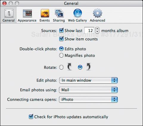
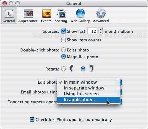
From the iPhoto application menu, choose Preferences (
 ).
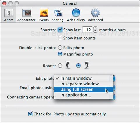
).iPhoto opens the Preferences window. Click the General button (Figure 4.1).
Select whether double-clicking a photo edits it (what I’m used to) or magnifies it.
From the Edit Photo pop-up menu, choose how you want iPhoto to edit photos by default.
To use another program, choose In Application, and select a program in the Open dialog (Figure 4.2).
Close iPhoto’s Preferences window.
Double-click a photo in any mode (
 -double-click in organize mode if you set double-click to magnify), or double-click a photo twice if it’s a small photo on a calendar page. In organize mode, you can also just press
  .
.iPhoto switches to edit mode and displays the photo.
In organize mode, click the Full Screen button or choose Full Screen from the View menu (
 ) to edit the selected photos in full screen mode.
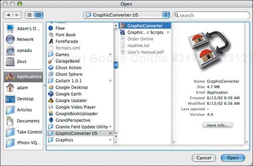
 -click a photo in organize mode, and choose an editing command from the contextual menu (Figure 4.3). Book mode offers a different contextual menu that also has an Edit Photo command.
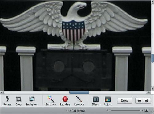
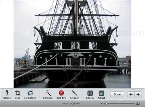
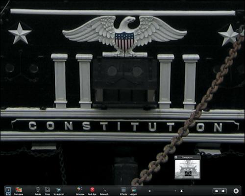
Here’s a quick look at the tools available when you edit an image in the main window (Figure 4.4).

When you edit a photo in full screen mode, the editing tools and thumbnails are the same, but they automatically appear and disappear at the bottom and top of the screen when you move your pointer to those locations, and there are several other buttons that provide necessary features (Figure 4.5).

✓ Tips
The image-editing window doesn’t remember its size, so you may need to resize or zoom the window each time.
Editing in windows can be a good way to compare multiple images, or even multiple copies of the same image.
Hide or show the Thumbnail list by choosing Hide/Show Thumbnail (
 ) from the View menu.
Use the Window menu to switch to windows you can’t see.
When you edit a photo in a separate window, the tools are the same as in edit mode, except for the Size menu that lets you resize the image; it replaces the size slider (Figure 4.6).

Some digital cameras offer the option of shooting in RAW format, in which the image isn’t compressed at all. RAW is considered a “digital negative” format that isn’t to be modified, which has some implications when you want to edit a RAW photo in iPhoto.
When you edit a RAW file in iPhoto, a small RAW badge appears in the lower-right corner of the display pane.
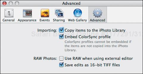
Most photos are stored in JPEG format, which is an inherently lossy compression format, meaning that some detail is lost on save. iPhoto offers you the option to save edited RAW files in TIFF format, which uses lossless compression to preserve all the original detail in the RAW file. Change this setting in the Advanced pane of iPhoto’s Preferences window by selecting Save Edits as 16 Bit TIFF Files (Figure 4.7).
If you prefer to edit RAW files in an external editor like Adobe Photoshop, you can select Use RAW Files When Using External Editor in the Advanced pane of iPhoto’s Preferences window (Figure 4.7). That setting overrides iPhoto’s normal preferences for how you edit photos.
If you select an edited RAW photo, the normal Revert to Original command in the Photos menu changes to Reprocess RAW. However, the end result is the same—all your changes are thrown away and you start again with the original RAW file.
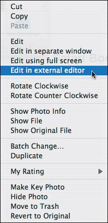
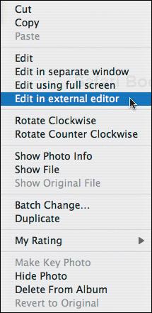
You can ![]() -click (or, if you have a two-button mouse, right-click) a photo in edit mode to bring up a contextual menu that lets you perform a few actions without going to the toolbar (Figure 4.8).
-click (or, if you have a two-button mouse, right-click) a photo in edit mode to bring up a contextual menu that lets you perform a few actions without going to the toolbar (Figure 4.8).
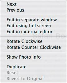
Use Next and Previous to move to the next and previous photos in the album.
The Edit commands are useful for opening the current photo in full screen mode or a separate window, and for opening the photo in an external editor without changing iPhoto’s preferences. Oddly, the Edit commands are available only if you
-click a photo being edited in the main window.The Rotate, Show Photo Info, Duplicate, and Revert to Original commands are exactly the same as those in the Photos menu, so you can use whichever feels most comfortable.
I’ve never seen the Reset command be enabled, so I’m not sure what it does. I would guess that it’s meant to be equivalent to the Reset button in the Adjust panel, but that’s just speculation.
It can be helpful to zoom in and out while editing, particularly when using the Retouch tool or clicking eyes for red-eye reduction.
With an image showing in the main window in edit mode, drag the size slider to the right to zoom in (Figure 4.9).To zoom out, drag the slider to the left (Figure 4.10).
Drag the size slider to the right to zoom in and to the left to zoom out. As soon as you zoom in, the Navigation panel appears to help you scroll around in the photo (Figure 4.11).
With the Size menu set to Fit to Window, drag the resize handle to resize the window and the photo. The window resizes proportionally. This approach limits zooming to the maximum and minimum window sizes.
Choose the desired zoom level from the Size menu.
✓ Tips
If your mouse or trackball has a scroll wheel, you can use it to scroll vertically within a zoomed photo, even in full screen mode. Press
 while moving the scroll wheel to scroll horizontally.
On modern Mac laptops, you can scroll by dragging two fingers on the trackpad. Turn on two-fingered scrolling in the Trackpad view of the Keyboard & Mouse preference pane in System Preferences. It’s a great way to scroll around in photos.
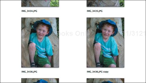
iPhoto lets you duplicate photos, which can be useful in a variety of situations.
If you want a photo to appear twice in a book (as you might if you want it to be the cover image and to show up inside as well), you must duplicate that photo.
If you want to print the same photo in color and black-and-white, you must duplicate the photo first.
In any mode, select photos and from the Photos menu, choose Duplicate (
 ).
).- -click a photo and choose Duplicate from the contextual menu.
iPhoto switches to import mode, duplicates the photo, appends “copy” to the title of the duplicate, and switches back to organize mode (Figure 4.12).
✓ Tips
The duplicate image shows up next to the original in the Library, and iPhoto does not create a new event.
The Last Import album does not show the duplicated photo.
If a specific source (calendar, slideshow, book, etc.) is selected when you duplicate a photo, the duplicate is added to that source too. However the photo won’t be duplicated in any other sources that contain it.
There’s no need to duplicate photos to open multiple copies in separate editing windows; you can do that by using the contextual menu.
iPhoto duplicates everything about the original, including keywords and ratings.
If you’ve turned your camera to switch from landscape view (horizontal) to portrait view (vertical), you may need to rotate the image in iPhoto to view it right side up.
In organize or edit mode, to rotate one or more photos clockwise, select them and click the Rotate button (Figure 4.13 and Figure 4.14). To rotate the selected photos counter-clockwise, hold down
and click the Rotate button.In organize or edit mode, select one or more photos,
-click one, and choose the desired rotation direction from the contextual menu that appears.In organize, edit, or slideshow mode (but not book mode), select one or more photos and choose either Rotate Clockwise (
 ) or Rotate Counter Clockwise (
 ) from the Photos menu.
✓ Tips
Some cameras automatically rotate the image, eliminating the need for Rotate.
You can change the direction used by the Rotate button in iPhoto’s Preferences window;
-clicking always reverses the default direction (Figure 4.15).It may be easiest to rotate photos in batches in organize mode. Shrink the thumbnail size so you can see a number of photos at once,
 -click the ones that need rotating clockwise, and click Rotate. Repeat with any images that need counter-clockwise rotation, holding down when you click Rotate.
If you rotate a GIF image, iPhoto converts the image to a JPEG, which may be undesirable.
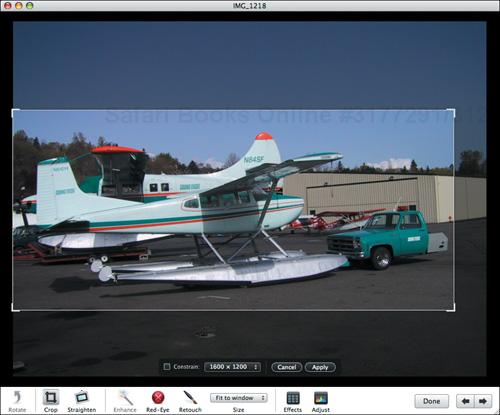
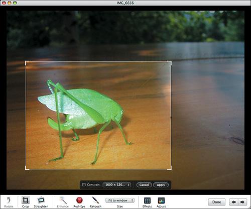
In iPhoto 7, unlike previous versions of the program, you must click the Crop button before you can select a portion of the picture to crop. Before proceeding with the rest of this page, click the Crop button.
Drag to create a selection rectangle in the image. iPhoto darkens the photo outside your selection rectangle to help you focus on what you have selected (Figure 4.16).
To move your selection rectangle around, drag it (your pointer should be a hand). You may need to move a selection rectangle to align it to the edges of a picture.
To resize a selection rectangle, drag the rectangle’s edge or corner.
To constrain the selection rectangle to specific proportions, choose an aspect ratio from the Constrain pop-up menu in the constrain panel. If you haven’t created a selection rectangle, it will be constrained when you do; if you have one already, iPhoto resizes it (Figure 4.17). To remove a constraint, deselect the checkbox in the constrain panel or press
as you resize the rectangle.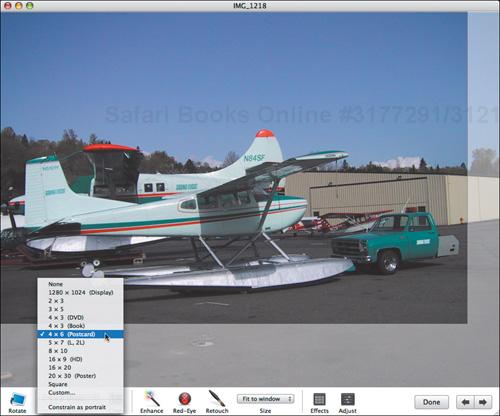
Figure 4.17. To constrain an image to specific proportions, choose an aspect ratio from the Constrain pop-up menu in the constrain panel (in this screenshot I’ve chosen 4 × 6, which will make a good print while not detracting from the subject of the picture). You can move and resize the selection rectangle while maintaining the selected aspect ratio.
To constrain the selection rectangle to custom proportions, choose Custom from the Constrain pop-up menu, and enter the desired aspect ratio before you start selecting (Figure 4.18).
To switch the orientation of the selection rectangle, choose Constrain as Landscape or Constrain as Portrait from the Constrain pop-up menu.
The next two pages have more details abut aspect ratios and cropping.
If you want to order prints of a photo, you first should crop it to the appropriate aspect ratio (Figure 4.19). See the opposite page to learn about cropping photos and see “Understanding Aspect Ratios” on pages 186 and 187 for more details about aspect ratios.
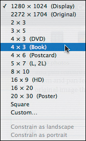
Use 1280 × 1024 (Display) before you crop the image for use as a Desktop picture. These numbers are specific to your monitor’s resolution.
Use 4 × 3 (DVD) and 16 × 9 (HD) for a landscape image for a DVD slideshow created with iDVD.
Use Square when you want a square selection; I’ve found it helpful for making images for use on the Web.
Use a custom ratio if some external use, such as a Web page, calls for a specific aspect ratio.
✓ Tips
iPhoto assumes you want to crop in the same orientation as the photo, but you can change that by choosing Constrain as Landscape or Constrain as Portrait from the Constrain pop-up menu.
iPhoto has some duplicate aspect ratios, presumably for people who don’t realize that aspect ratios are ratios between numbers and multiplying those numbers by some value doesn’t change the ratio.
Don’t bother cropping for books, cards, calendars, and printing on your own printer; it’s better to use the zoom and center feature instead because the zoom and pan feature doesn’t modify the original image the way cropping does. See “Editing Photos on Pages” on page 148.
If you plan to order a print of a photo or display it on your Desktop, you should crop it using an appropriate aspect ratio. Even if you don’t plan to print a photo, cropping extraneous detail can improve an image. See “Understanding Aspect Ratios” on pages 186 and 187 for more information.
Click the Crop button, and select the desired portion of the image, using a constrain setting if you plan to use the image for display or printing. See the previous two pages for additional instructions.
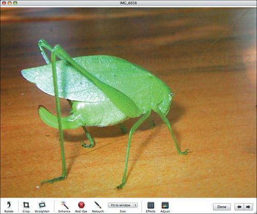
Click the Apply button in the constrain panel.
iPhoto deletes the darkened area of the picture, leaving just what you had selected (Figure 4.20 and Figure 4.21).
✓ Tips
Press and release
to toggle between the “before” and “after” views.If your selection rectangle is very close to one of the standard aspect ratios, it’s best to use the standard aspect ratio in case you want to print the image later.
When you crop a photo, you remove pixels from it. So if you crop a 1600 × 1200 pixel photo (1,920,000 pixels) down to 1200 × 900 (1,080,000 pixels), you’ve removed almost half the image. Thus, if you print the original and the cropped version at the same size, the original will be of a much higher quality. Heavy cropping is one reason why iPhoto shows a low-resolution warning icon when you’re creating books or prints. For details, see “Understanding Resolution” on pages 188 and 189.
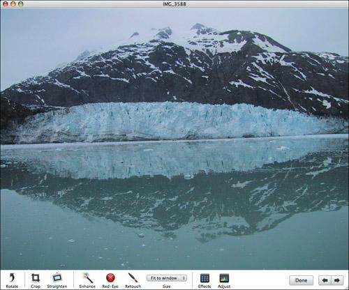
Most of the time, we’re pretty good at keeping the horizon level in photos, but every now and then we mess up, as in the picture of a glacier in Figure 4.22. Since iPhoto can straighten images, it was easy to rotate the angle by 1.6 degrees to make it straight, as you can see in Figure 4.23.
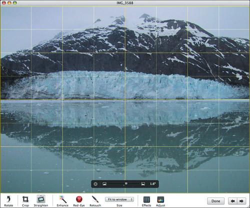
Click the Straighten button or press
 to display the straighten panel.
Drag the slider in the straighten panel to the right to rotate the image clockwise or to the left to rotate the image counter-clockwise, using the yellow grid lines as a reference for true vertical and horizontal.
When you’re done, click the × button or switch to any other editing tool to save your changes and close the panel.
✓ Tips
The straighten slider actually zooms in on your photo and crops it slightly to keep the edges straight.
You can use the straighten slider to tweak the angles of photos up to 10 degrees in either direction.
If 10 degrees isn’t enough (and remember that the greater the angle, the more iPhoto is cropping), save your changes, edit the photo again, and use the straighten slider one more time.
Traditional photo processors learned long ago that fiddling with brightness and contrast and messing with the colors could turn a plebeian picture into a luminescent photo. iPhoto aims to help you do the same for your photos with its one-click Enhance tool.
In edit mode, click the Enhance button.
iPhoto adjusts several aspects of your photo, including color levels, color saturation, and exposure.
Press and release
to toggle between the “before” (Figure 4.24—too dark) and “after” (Figure 4.25—too light) views of your photo.If you like what Enhance has done to your photo, continue working. If not, choose Undo Enhance Photo (
 ) from the Edit menu.
✓ Tips
Don’t assume Enhance will always improve your photo. It’s worth trying, but only you can decide if its results are better or worse than the original.
If the photo is way too dark or way too bright, Enhance isn’t likely to work as well as using the Adjust tools manually (Figure 4.26—much closer to the near-dusk conditions of the scene).
Enhance seems to key off the main color in the image when tweaking color saturation, which can lead to unwanted effects.
The order in which you perform edits can make a difference. For instance, if you plan to crop a photo, try Enhance before you crop, and if you don’t like the results, undo the enhance, crop, and try Enhance again to see if you get different results.
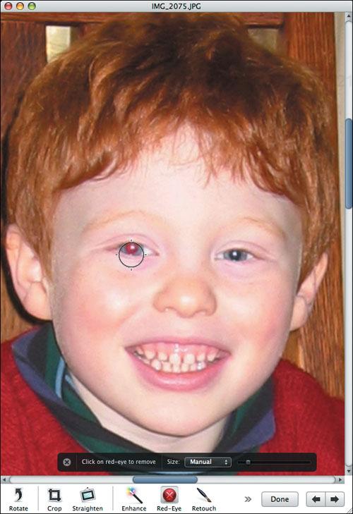
Perhaps the most annoying thing that can go wrong in a photograph is red-eye, a demonic red glow to subjects’ eyes that plagues flash photography. iPhoto provides a solution to red-eye, though its results aren’t always ideal.
Click the Red-Eye button or press
 to open the red-eye panel.
Click the subject’s eyes.
If all goes well, iPhoto converts the red shades in the clicked areas to dark gray.
If iPhoto changes too much or too little of the eye, choose Manual from the red-eye panel’s pop-up menu, adjust the slider to get a large enough circle, position it over the eye, and click (Figure 4.27).
When you’re done, click the × button or switch to any other editing tool to save your changes and close the panel.
✓ Tips
It can be easier to click the subject’s eyes accurately if you zoom in first.
Press and release
to toggle between the “before” and “after” views.The Red-Eye tool works poorly in automatic mode if the subject isn’t facing the camera directly. Manual mode will likely work better.
iPhoto’s technique makes people look as though they have black eyes, and it won’t work on green-eye in dogs. You may be able to achieve better results in other image-editing programs. Also consider converting the photo to black-and-white.
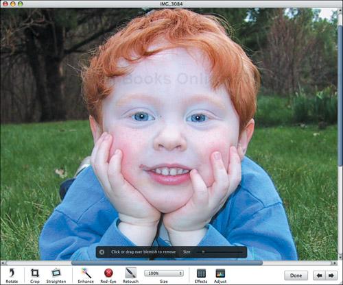
Cindy Crawford’s famous mole notwithstanding, many otherwise great photos are marred by small blemishes. Perhaps it’s a smear of jelly on your toddler’s face, or someone’s chapped lips. Either way, iPhoto’s Retouch tool can help.
Click the Retouch button or press
 to open the retouch panel (Figure 4.28).
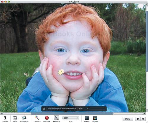
Click and scrub over the blemish you want to remove, using short strokes (Figure 4.29).
iPhoto blurs the area under the circle pointer, blending it with the surrounding colors and textures.
If you can’t scrub accurately enough, press
to undo, adjust the slider to get a smaller circle, and try again.Press and release
to toggle between the “before” (Figure 4.28) and “after” (Figure 4.30) views of your photo.When you’re done, click the × button or switch to any other editing tool to save your changes and close the panel.

✓ Tips
For additional accuracy, zoom in first.
Retouch is not a panacea. It can fix small blemishes but will make large ones look like dust bunnies. It works best on skin.
Avoid the Retouch tool on sharp color edges, such as between Tristan’s hands and his blue shirt. When the Retouch tool hits edges, it smears the sharp lines. Luckily, you can always undo mistakes.
Retouch can be good for taking the flash shine off eyes or other reflective surfaces.
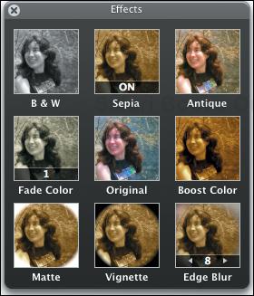
iPhoto’s Effects panel provides single-click access to a variety of different effects.
Click the Effects button or press
 to open the Effects panel (Figure 4.31; opposite page).
Click a button in the Effects panel to apply the associated effect to the current photo.
✓ Tips
Click the Original button to revert to the original look of the photo; this is a fast way to undo a number of changes in the Effects panel.
For all the buttons other than B & W and Sepia, clicking the button multiple times applies the effect again and again. I recommend you do this because you can achieve some really interesting results with multiple applications of an effect.
iPhoto adds a number at the bottom of the button to remind you how many times you’ve clicked, and provides arrows so you can reduce the number of applications of an effect.
When you click B & W or Sepia, iPhoto puts a small ON badge underneath so you know it’s on. Click again to remove the effect.
You can combine effects simply by clicking multiple buttons. For instance, make a photo look old by clicking Antique and Vignette a few times.
Edge Blur, combined with cropping, can be a good way to focus attention on the subject of the photo.
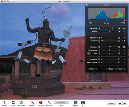
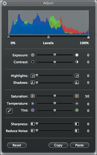
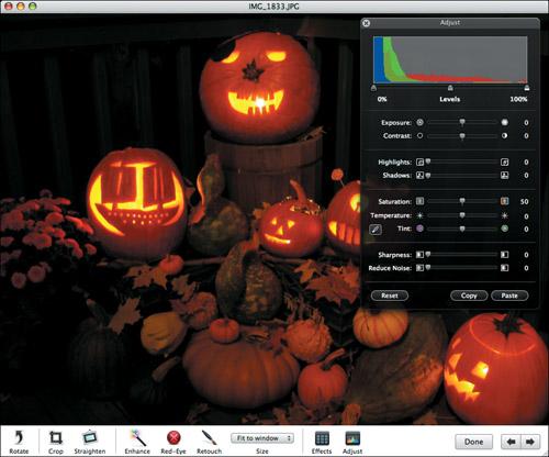
The Adjust panel enables you to modify photos in all sorts of useful ways. Although using the Adjust panel can be a fair amount of effort, it’s usually worth the results.
Click the Adjust button or press
 to open the Adjust panel (Figure 4.32).
Drag the various sliders until the photo looks the way you want (see the following pages in this chapter for details).
To apply the same slider settings to another image, click the Copy button, switch to the other image, and click Paste.
✓ Tips
There is no “right” way to adjust a given photo other than what looks good to you!
Click the icons at either end of a slider to nudge the slider in one-point increments.
Pressing
to toggle between the “before” and “after” views shows you the view before you started working with the Adjust panel, not in between the use of each individual slider, so it doesn’t help discern the effect of a given slider.It’s difficult to center a slider, so if you decide you don’t like the effect of one, use Undo (
) immediately rather than trying to reset it to the middle manually.Click Reset to reset all the sliders to the middle.
Click the × button in the upper left of the Adjust panel to close it, but note that there’s no need to do so unless you want to avoid the screen clutter.
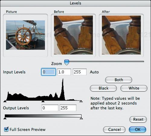
Since all the sliders affect the Levels histogram at the top of the Adjust panel, it’s helpful to understand what it’s telling you.
A histogram is a bar chart with each value on the horizontal axis representing a brightness value (0 equals black, and 100 equals white) and the height of each bar representing the proportionate distribution of pixels with that brightness value. iPhoto’s Levels histogram contains three separate graphs, one each for red, blue, and green. I like to think of them as mountain ranges.
So, if a picture has a lot of blue in it, the blue mountain range will probably be large, and will likely be on the right side (since it’s the brightest color). The red and green mountain ranges may also be large, but will likely be further to the left, since they’re being used combinatorially to provide the exact shade of blue that you see.
The histogram for a too-dark photo will be pushed over to the left (Figure 4.33) and one that’s too light will be pushed to the right (Figure 4.34). In general, a good photo has a balanced histogram, with roughly equal areas shown on either side of the midpoint (Figure 4.35). Balancing the histogram is a suggestion, not a rule, but keep it in mind when you’re editing.
Every photo’s histogram looks different, and every change you make to the contents of the image will change the histogram in some way, since it’s merely another way of representing the content of the photo.
As we look at each of the Adjust controls, I’ll explain what each does to the histogram so you can use them effectively to create balanced, attractive photos.
Exposure is the most fundamental aspect of photography, since it refers to the amount of light that strikes the camera’s sensor. Most cameras control exposure automatically and do a good job, but they can be fooled, producing an underexposed (too dark) or overexposed (too light) image. If that happens, you’ll want to use iPhoto’s Exposure and Levels (discussed on the next page) sliders.
In the Adjust panel, drag the Exposure slider to the left to make it seem as though less light hit the camera sensor or to the right to make it seem as though more light hit the camera sensor.
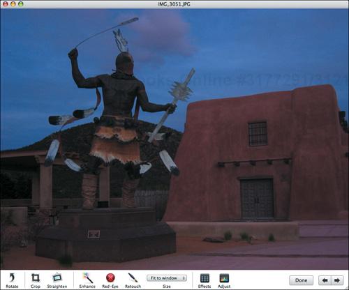
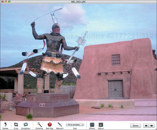
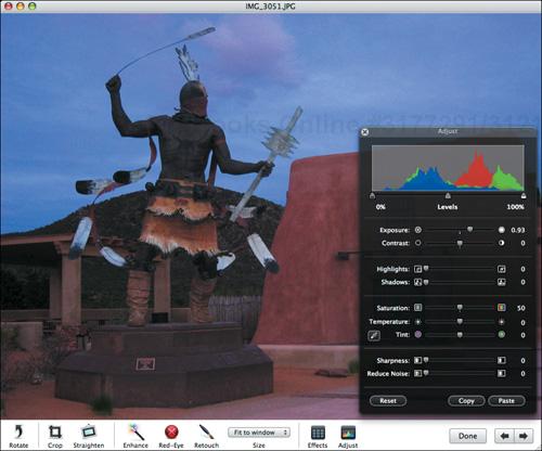
This photo of statue in Santa Fe in Figure 4.36 is somewhat underexposed, since I took it at dusk. By increasing the exposure in Figure 4.37, I’ve lightened the photo and brought out more detail.
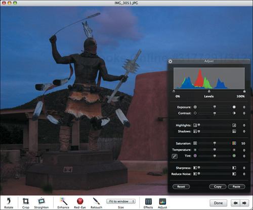
Increasing exposure generally squishes the mountain ranges and slides them to the right, and decreasing exposure makes them taller and moves them left.
The Levels slider under the histogram gives you independent controls for adjusting the black and white points, which define the pixels that should be considered pure black and those that should be considered pure white. New in iPhoto 7 is a midtone control for adjusting the overall brightness within the new range.
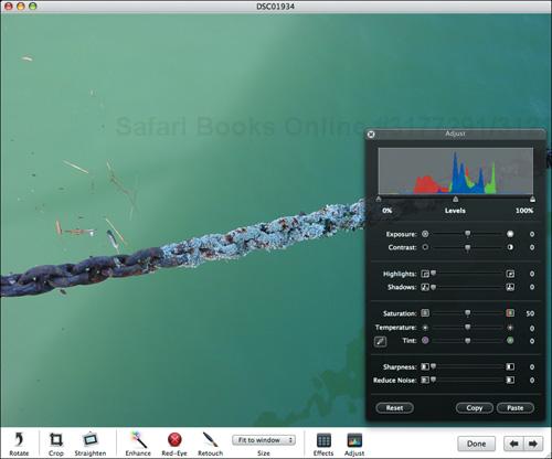
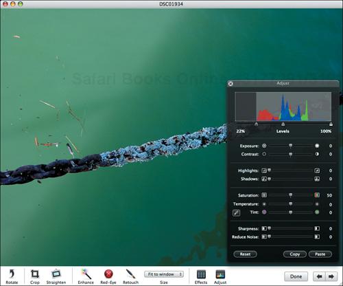
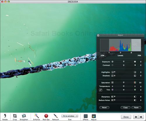
If, when you look at a photo’s histogram, you see a blank space between the end of the mountain ranges and the black or white points (Figure 4.38), it’s often safe to move those sliders toward the middle of the histogram, which is conceptually the same as grabbing the edges of the mountain ranges and pulling them out to the edges of the histogram. In Figure 4.39, I’ve moved the black point to the right to deepen the shadows; it’s redefining what was a dark gray as total black. In Figure 4.40, I’ve moved the white point to the left to set a new value for what should be considered white, thus making the water glow a bit.
Moving the midtone slider moves the entire mountain range left or right, thus brightening or darkening the entire image but without going (much) beyond the new black and white points. Play with it to get a feel for how it might help your photos.
The contrast of a photo is the difference between the darkest and lightest areas of a photo. With too much contrast, you end up with overly dark and bright areas; with too little contrast, your photo appears flat.
In the Adjust panel, drag the Contrast slider to the left to decrease the contrast or the right to increase the contrast.
In Figure 4.41, the photo of a leaf under the water in a slow-moving stream was quite flat, with little difference between the light and dark areas. In Figure 4.42, I’ve increased the contrast significantly to give the photo more depth and vibrancy. Note that most photos are unlikely to need significant contrast adjustments; usually a little nudge will be all you need.
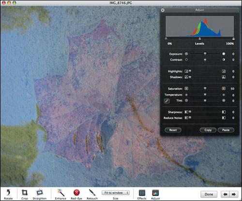
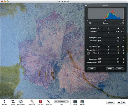
Note how the mountain ranges in the histogram have been flattened and spread out by the increase in contrast. If I had reduced contrast, the mountain ranges would have been squished in and up instead. Put another way, increasing contrast distributes the pixels in the photo over a greater range of brightness values, whereas reducing the contrast increases the number of pixels within a small range.
✓ Tip
The Contrast slider is a relatively unsophisticated tool. You’re better off using the black and white point sliders in the Levels histogram to set which colors should be considered pure black and pure white, which has essentially the same effect as using the Contrast slider. For details, see “Adjusting Levels” on the previous page.
Adjusting the exposure of a photo lightens or darkens the entire photo. But when you have just a portion of the photo that’s overexposed, you can use the Highlights slider to darken just those too-bright spots, increasing the detail in those areas.
In the Adjust panel, drag the Highlights slider to the right to darken the brightest spots while leaving the darker spots alone.
If you look closely at the clematis flower petals in the upper left of Figure 4.43, you can see that the bright sunlight caused a lot of white spots. By dragging the Highlights slider to the right, I darkened just those burnt-out spots and increased the detail in those spots, as you can see in Figure 4.44. Try using the Highlights slider whenever you have a photo where only parts of it are overexposed, or where adjusting the exposure would mess up dark areas.
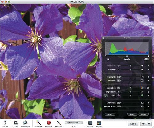
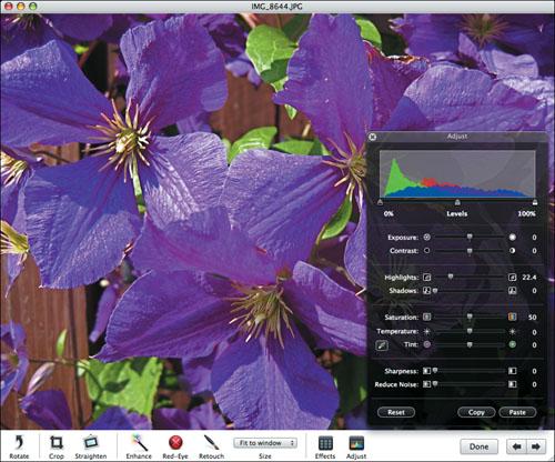
When you increase the highlight detail, you’re flattening the higher mountain peaks toward the right (light) end of the histogram while leaving the left (dark) end alone.
Whereas increasing the highlight detail helps photos that are overexposed in places, increasing the shadow detail improves pictures that have too-dark areas mixed with properly exposed sections. Again, simply increasing the exposure won’t work because that would blow out the already-light areas.
In the Adjust panel, drag the Shadows slider to the right to lighten the too-dark areas while leaving brighter portions of the photo alone.
The problems with Figure 4.45 should be obvious—the woods are too dark to see much detail at all, but the bright sun at the end of the path means that increasing the exposure for the entire photo would ruin it.
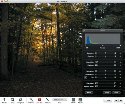
By dragging the Shadows slider to the right a fair amount, I can throw some more light on the darker areas of the image, increasing the detail significantly, as you can see in Figure 4.46. The lesson to take away from this is that the Shadows slider can rescue photos that lose detail in the dark areas while still having some bright spots.
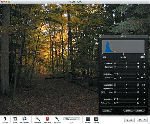
When you increase the shadow detail, you’re moving the mountain peaks on the left (dark) side of the histogram toward the right (light) side while leaving the right end alone.
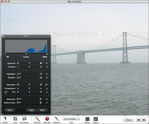
The saturation of a photo is a measure of how intense the colors are. Highly saturated colors are said to be deep, vivid, or rich, whereas desaturated colors (think pastels) are often thought of as being dull, weak, or washed out.
In the Adjust panel, drag the Saturation slider to the left to make the colors weaker or the right to make them more intense.
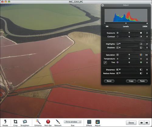
This example is a bit subtle, but in essence, Figure 4.47, taken of coastal wetlands and salt flats while landing at the San Francisco International Airport, was fairly light and washed out. By increasing the color saturation, as in Figure 4.48, I’ve made a fairly dull photo far more vivid and arresting. Most photos are unlikely to need significant saturation adjustments.
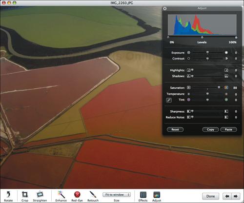
When you increase saturation, the mountain ranges move to the left (the picture gets a little darker) and they tend to separate, since each color has more independent brightness values (the reds are redder, the greens are greener, and the blues are bluer).
If you decrease saturation, the mountain ranges move to the right (the picture gets lighter) and overlap more. Decreasing the saturation entirely causes the mountain ranges to overlap entirely, giving you a monochrome image.
The temperature of a photo refers to your perception of which wavelengths of light illuminate the scene in a photo. That’s a roundabout way of saying that the Temperature slider lets you adjust the colors of a photo from cool (bluish) to warm (yellowish).
In the Adjust panel, drag the Temperature slider to the left to make the colors cooler and bluer or the right to make them warmer and more yellow.
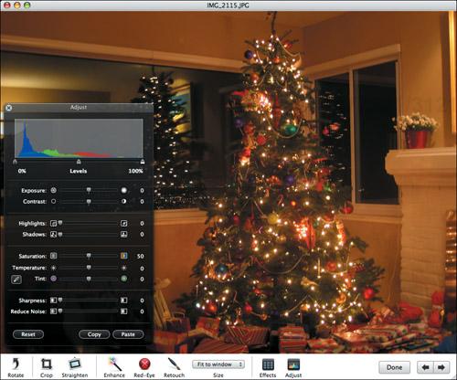
Figure 4.49 is a picture of a Christmas tree taken indoors with incandescent light, which resulted in too-warm tones. By decreasing the temperature a bit in Figure 4.50, I’ve compensated for the overly yellow cast.
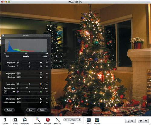
When you decrease the temperature, as I’ve done here, the green mountain range stays put, the blue mountain range moves to the right to increase the amount of blue in the photo, and the red mountain range moves to the left to decrease the amount of red. If you increase temperature, the red mountain range moves to the right to increase the yellow, and the blue mountain range moves to the left to decrease the amount of blue.
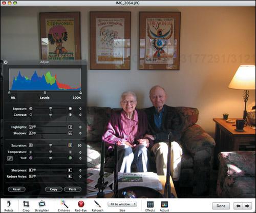
Whereas the Temperature slider helps you adjust the blue and yellow colors in a photo, the Tint slider modifies the magenta and green colors in a photo.
In the Adjust panel, drag the Tint slider to the left to add magenta to the photo or to the right to add green.
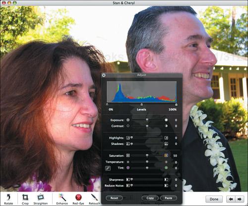
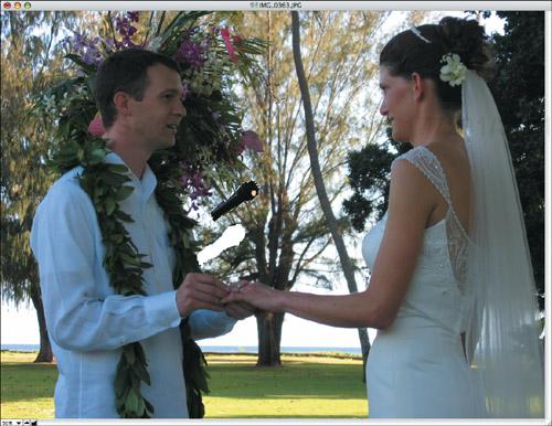
Check out Figure 4.51, a picture of my aunt and uncle at my sister’s wedding in Hawaii. For whatever reason, their skin tones ended up a bit too pink. By moving the Tint slider slightly to the right in Figure 4.52, I’ve added just a touch of green, which gives them more normal skin tones.
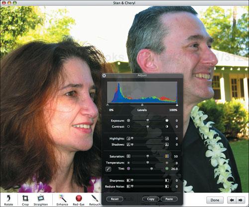
As you would expect, moving the Tint slider toward the right moves the green mountain to the right as well, and slides both the red and blue mountain ranges to the left, increasing the amount of green and decreasing the amount of magenta (since magenta is composed of both red and blue). Moving the Tint slider to the left has the opposite effect. Also, note that the mountain ranges also change in size and shape somewhat.
✓ Tip
To adjust tint and temperature simultaneously by setting the white balance, click the eyedropper button next to the Tint slider, and then click on a portion of the photo you think should be white or light gray (a white shirt, or the white of an eye), but which is not overexposed. Honestly, I can’t say that I’ve ever gotten this method of controlling the white balance to work, but perhaps your luck will be better than mine.
Many photos are slightly blurry due to motion of the subject or the camera. You can use the Sharpen slider to increase the sharpness—the contrast between adjacent pixels—and thus sharpen the perceived focus of the photo (sharpening the actual focus can be done only with the camera lens, and it’s too late for that).
In the Adjust panel, drag the Sharpness slider to the right to increase the sharpness of the image.
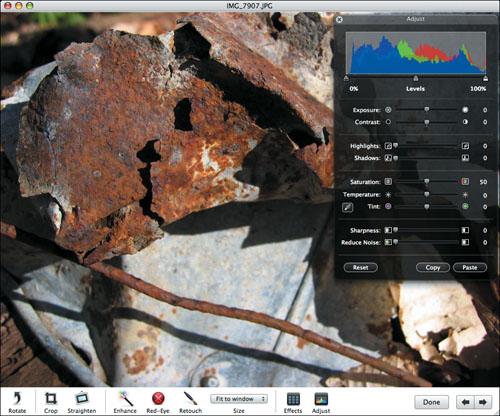
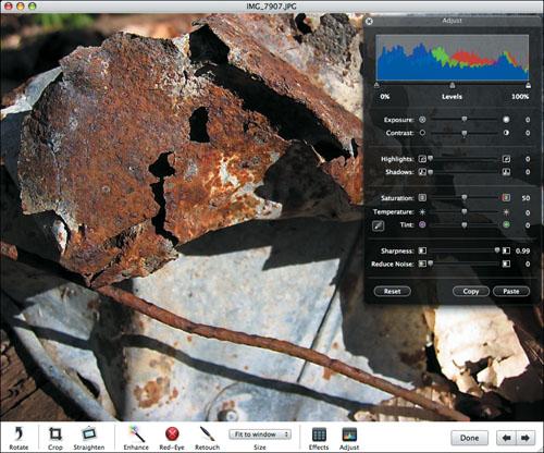
The photo in Figure 4.53 is a picture of an old, rusted pail next to some rusty wire. I had good light and managed to hold the camera still, but there was still a little more blur than I would have liked. So I increased the sharpness quite a lot in Figure 4.54, and you can hopefully see that the result is more sharply defined edges on the rusted metal. I find that many photos are similarly improved by increased sharpness.
It’s a little hard to predict exactly what changes to the sharpness will do to the histogram’s mountain ranges, but in general, increasing the sharpness tends to “erode” them away, making them shorter and wider, whereas decreasing the sharpness makes them taller and narrower.
✓ Tips
Be careful when increasing the sharpness on photos that contain a lot of mostly solid colors, since the increased contrast between adjacent pixels will make those previously solid colors appear blotchy.
In iPhoto 6, you could reduce the sharpness of a photo, making it fuzzier. Use the Reduce Noise slider for that in iPhoto 7.
Photos taken in low light conditions can suffer from noise, which most commonly appears as spots or blotches within areas of solid color. Since we expect areas of solid color to be, well, solid, the blotching is quite off-putting.
In the Adjust panel, drag the Reduce Noise slider to the right to reduce the noise and smooth out blotches.
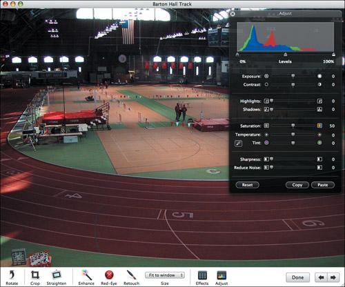
Figure 4.55 is a photo of the indoor track in Barton Hall, at Cornell University. Because of the high ceilings and poor lighting (for photography), there is quite a lot of noise in the solid colored areas of the track, even though I was able to avoid blur by resting the camera on a railing in the stands.
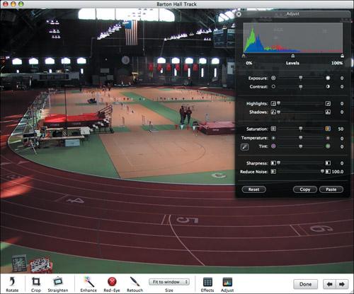
With the Reduce Noise slider, I was able to smooth out the blotches in the red of the track and the green of the infield, as you can see in Figure 4.56. You’ll know if you need to use Reduce Noise by the blotches in large areas of solid color, but expect it most commonly in pictures taken in low light conditions.
Reducing the noise in a photo causes the mountain ranges to adopt a picket fence look, trading their relatively smooth lines for a jagged, up-down, up-down display.
We all make mistakes, and that’s certain to happen on occasion when you’re working with your photos too. With iPhoto, though, your changes aren’t irrevocable.
After you’ve performed an action, to undo just that action, choose Undo from the Edit menu (
). Keep choosing Undo to undo earlier actions.To remove all the changes to a photo in a particular editing session, but not changes made in a previous session, choose Revert to Previous from the Photos menu or the contextual menu. You can also press
 when editing in the main window or in full screen mode.
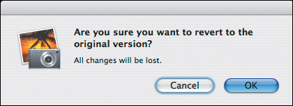
To remove all changes from a photo, select it and choose Revert to Original from the Photos menu or the contextual menu.
iPhoto warns that you’ll lose all changes to the photo, and swaps in the original image (Figure 4.57).
To revert to the original look of a photo while working in the Effects panel, click its Original button.
✓ Tips
You can undo individual changes made in edit mode only until you save the changes to that photo.
To see what the photo would look like if you were to undo a change, press
. You must still choose Undo if desired.iPhoto modifies the Undo command in the Edit menu to reflect your last action.
Anything you can undo via the Undo command, you can redo via the Redo command in the Edit menu.
Recovering Originals
It turns out that Revert to Original isn’t doing anything complicated. When you edit a photo, iPhoto makes a copy of the original in a folder named for the photo’s event, stored in the Modified folder. As long as this happens, you can recover the original image no matter what edits you make to it.
In fact, this is why Revert to Original works even if you edit a photo in another program—iPhoto starts tracking the original as soon as you double-click the photo. However, don’t drag a photo from iPhoto to the Dock icon of another program to edit it; if you do so, iPhoto can’t track the changes.
You can locate an original image in the Finder by ![]() -clicking it in iPhoto and choosing Show File (to find the original if unedited, or the modified version if it has been edited) or Show Original File (to find the original file if the photo has been edited).
-clicking it in iPhoto and choosing Show File (to find the original if unedited, or the modified version if it has been edited) or Show Original File (to find the original file if the photo has been edited).
iPhoto’s editing tools are sufficient for most tasks, but for more involved changes to photos, iPhoto lets you turn to another image-editing program.
From the iPhoto menu, choose Preferences (
) to open the Preferences window. If necessary, click the General button.From the Edit Photos pop-up menu, choose In Application (Figure 4.58).
In the Open dialog that appears, choose the desired program.
Set a default external editor, but don’t set iPhoto to open photos in it by default.
- -click one or more photos and choose Edit in External Editor from the contextual menu (Figure 4.59).
You can use any image-editing program with iPhoto. However, a good one to start with is Lemke Software’s GraphicConverter, which costs only $34.95 shareware, or may already be on your Macintosh for free, since Apple bundles it with many Macs. If you don’t have it, you can download a copy from www.lemkesoft.com.
Most of iPhoto’s tools work only on the entire photo. GraphicConverter provides similar tools for sharpening, adjusting levels, and changing contrast, but you can apply those to selections, and those selections don’t have to be rectangular as they are with iPhoto.
Although GraphicConverter’s interface is significantly more technical than iPhoto’s, it offers additional flexibility and control in some places (Figure 4.60).
Not only can you apply changes to selections, but you can also delete them and paste or paint in new pixels in place of them, as I’m about to do here to eliminate the microphone sticking out of my brother-in-law’s side (Figure 4.61).
If you wish to add text to a photo, you can do so quite easily (Figure 4.62).
iPhoto can import and export a relatively small number of file formats, whereas GraphicConverter can import about 190 file formats and export about 80. If you need to work with a photo in an unusual format, you need GraphicConverter.
What if you want more power than GraphicConverter offers? Look to the $79.99 Adobe Photoshop Elements, the baby brother of industry heavyweight Photoshop. Learn more about it at www.adobe.com/products/photoshopelmac/.
Some Photoshop Elements tools, like Red-Eye, are more capable than iPhoto’s.
Photoshop Elements enables you to select and edit portions of a photo in easier and more powerful ways than is possible in GraphicConverter.
Photoshop Elements offers a helpful set of “recipes,” or canned procedures that walk you through fixing photos in common ways. The recipes are useful in their own right and help you learn how to use many tools in Photoshop Elements (Figure 4.63).
Whereas editing in the other programs I’ve mentioned involves changing the actual image, Photoshop Elements lets you create a layer (like a sheet of clear plastic over the image) and overlay changes on the layer over the original.
You can use the filters and effects in Photoshop Elements to turn normal photos into amazing images that look like they were painted, embossed, photocopied, or drawn with charcoal.
You can buy other books about Photoshop Elements. Check that any book you buy covers the right version of Photoshop Elements on the Mac; Adobe has not kept the Mac and Windows versions in sync. Books about Photoshop may also offer useful techniques.
