Right off the bat, let me say that you don’t need to read this appendix. It’s deep background, the kind of detail that you might wish to delve into when you’re attempting to understand how iPhoto works, perhaps because you’ve just printed a photo and you’re unhappy with the results.
The following pages contain “Understanding Aspect Ratios,” “Understanding Resolution,” and “Understanding Color Management.” Each of these discussions examines an aspect of digital photography from which iPhoto, for the most part, tries to shield you. That’s great most of the time, but if you’re trying to understand how cropping removes information from a photo, thus making it print at a lower quality, you’ll want to come here for the explanation.
Lastly, although I’ve called this appendix “Deep Background,” these topics are so complex that entire books have been written about each one. If these discussions leave you with more questions, I’d encourage you to visit a library or bookstore and browse its collection of books on photography, digital imaging, and pre-press. I especially recommend Real World Scanning and Halftones, Third Edition, by David Blatner, Conrad Chavez, Glenn Fleishman, and Steve Roth.
iPhoto makes it easy to select and crop a portion of a photo using a specific aspect ratio, but why is this important? It matters because aspect ratios differ between traditional and digital photos.
An aspect ratio is the ratio between the width of the image and its height, generally expressed with both numbers, as in the line from Arlo Guthrie’s song “Alice’s Restaurant Massacree” about “Twenty-seven, eight-by-ten, color glossy photographs with circles and arrows and a paragraph on the back of each one.”
The aspect ratio of 35mm film is 4 × 6 (using the standard print size rather than the least common denominator of 2 × 3) because the negative measures 24mm by 36mm. Thus, traditional photographs are usually printed at sizes like 4″ × 6″, 5″ × 7″, or 8″ × 10″, all of which are close enough to that 4 × 6 aspect ratio so photos scale well. When there’s a mismatch between the aspect ratio of the original negative and the final print, either the image must be shrunk proportionally to fit (producing unsightly borders) or some portion of the image must be cropped. (The alternative would be to resize the image disproportionally, which makes people look like they’re reflected in a funhouse mirror.)
The equivalent of film in digital photography is the CCD (charge-coupled device), which is essentially a grid of many light-sensitive elements that gain a charge when exposed to light. Through much digital wizardry, the camera translates those charges into the individual dots (called pixels) that, put together, make up the image. Zoom in on a picture all the way, and you can actually see these pixels. So if your digital camera uses a CCD that can capture a picture composed of 1600 pixels wide by 1200 pixels high, basic math shows that your photos will have a 4 × 3 aspect ratio.
Why did digital camera manufacturers choose a 4 × 3 aspect ratio when 4 × 6 is the 35mm film standard? It matches the aspect ratios of most computer monitors. Whether a monitor runs at 640 × 480, 800 × 600, or 1024 × 768, division reveals that it has a 4 × 3 aspect ratio. Displaying a photo at full screen size without cropping thus requires a 4 × 3 aspect ratio. (And why do computer monitors use a 4 × 3 aspect ratio? Because that’s the aspect ratio used by televisions. However, since HDTV uses a 16 × 9 aspect ratio, some monitors now use that or 16 × 10.)
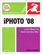
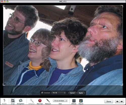
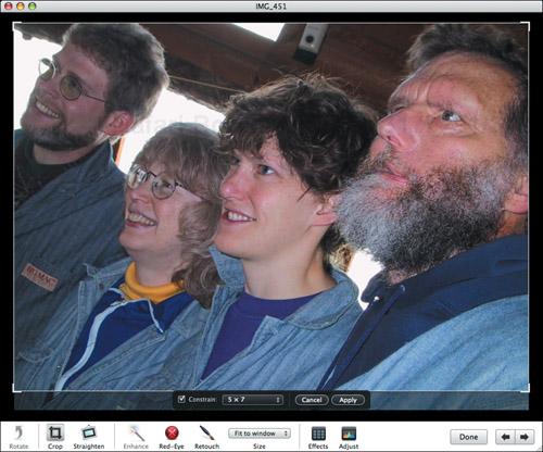
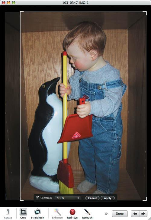
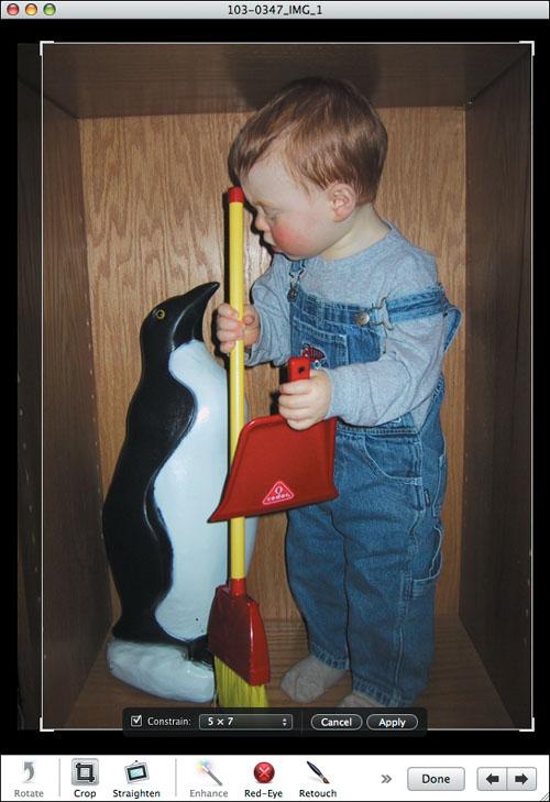
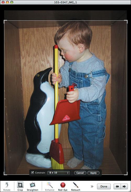
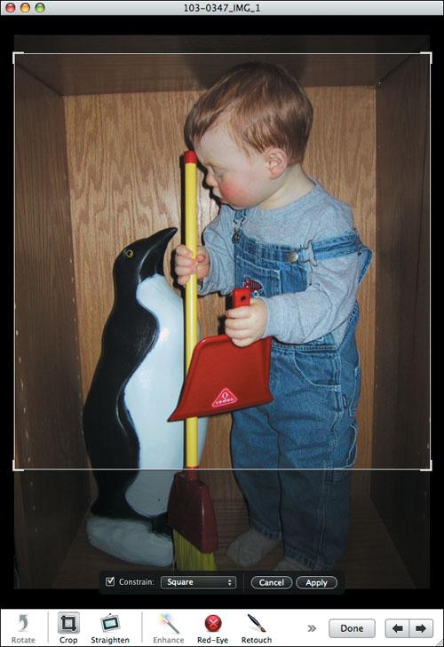
Hopefully the choices in iPhoto’s Constrain pop-up menu make more sense now. If you’re starting from a photo with a 4 × 3 aspect ratio, and you want a 20″ × 30″ print (a 4 × 6 aspect ratio), there’s no way to print that photo without adding borders or cropping because of the mismatch in aspect ratios. The same applies to other standard print sizes—they don’t match the 4 × 3 aspect ratio of most digital photos. Rather than suffering borders or automatic cropping, it’s better to crop the image yourself so you can be sure the important parts are retained. Figures A.1 through A.7 show how cropping a 4 × 3 image at the other common aspect ratios works for two sample images (results will vary by image).
The 4 × 3 aspect ratio plays an important role in output too, since iPhoto’s book designs all assume images in the 4 × 3 aspect ratio. The books vary the final image size depending on the page design, and you can zoom in and re-center the image to crop temporarily, but as long as the aspect ratio of your images remains 4 × 3, the layout will work as Apple intended. You can use different aspect ratios in a book, but the layout may not work well.
Understanding how the dimensions of a digital photo relate to what comes out of a printer is hard. That’s why iPhoto merely alerts you with a warning icon when a photo won’t print well at a specific size. Read these two pages to learn why iPhoto displays warning icons; “Dealing with Warning Icons” on page 182 offers help.
Every digital photo is made up of a rectangular grid of points, called pixels, each of which can display one of sixteen million colors or several hundred shades of gray. For instance, photos from one of my cameras are 1600 pixels wide by 1200 pixels high. Monitors also display rectangular grids of pixels, often 1024 pixels wide by 768 pixels high.
Not all of a 1600 × 1200 photo can fit on a 1024 × 768 monitor when every pixel in the image is mapped to a pixel on the monitor. To display a photo so it fills a monitor, iPhoto removes pixels on the fly, a process called downsampling.
You can’t perform the same one-to-one mapping when it comes to print, though, because most printers (which have only four or six colors) can’t display a pixel’s exact color in a single dot. Instead, they use collections of single-colored dots to fool the eye into seeing that color. For this reason and other more complex ones, the main fact to grok is that, in general, the more pixels in the image, the better it will look printed.
This fact is particularly relevant when you’re printing images at large sizes. For instance, why does an image that looks fine when printed at 4″ × 6″ appear fuzzy at 8″ × 10″?
Imagine a knitted blanket. If you stretch it to make it larger, you can see through the holes between the strands of yarn. Expanding a photo to print at a larger size works similarly, except the printer fills in each hole with dots of roughly the same color as the dots surrounding the hole, a process called interpolation. The more pixels in the image, the smaller the holes that need to be filled, and the less interpolation is necessary.
Downsampling onscreen works well, since it’s easy to remove similarly colored pixels without changing the image much. Even though the photo loses pixels and thus some detail, quality doesn’t suffer too much (Figure A.8 and Figure A.9 on the previous page). Along with the fact that onscreen images are extremely bright because monitors emit light, whereas paper reflects light, minimal downsampling helps explain why photos look good on monitors at full size.
Interpolation, particularly on a printer, is different. There’s no way to avoid the fact that expanding a photo requires adding dots that didn’t exist before, and because those dots exist only by virtue of the dots around them, they make the image look fuzzier (Figure A.8 and Figure A.10 on the previous page). Interpolation simply cannot add details to the image that weren’t originally present. Scale an image too large, and iPhoto warns you that so much interpolation will be needed that you won’t like the result.
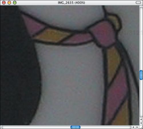
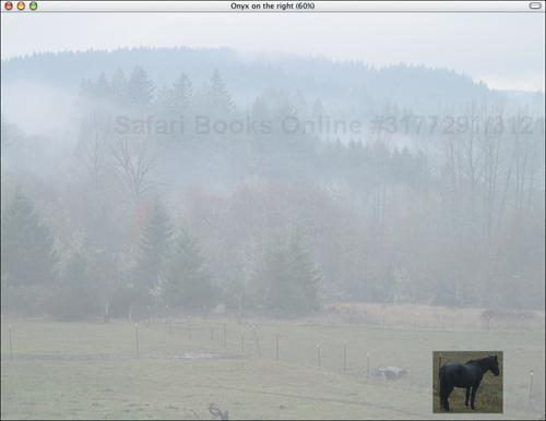
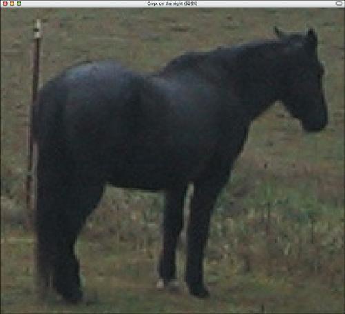
Cropping exacerbates the problem because it removes pixels, making the photo smaller and requiring more interpolation to expand the image back up to the desired size.
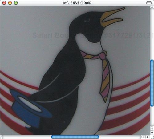
To see this, compare the original image in Figure A.11 with Figure A.12, which shows a heavily cropped version of the same image, displayed at the same size as the original. Notice how the cropped horse is fuzzier.
iPhoto 5 first introduced tools for manually adjusting color saturation, temperature, and tint. Why did it take Apple so long to add these tools? Color correction of any sort is devilishly difficult to do right (and as you may have noticed, even the automatic Enhance tool gets it wrong at times). Color correction suffers from two basic problems: the fact that color is highly perceptual and the fact that different devices render color in different ways.
Everyone sees color in different ways. My wife and I, for instance, frequently disagree on whether a given color is green or blue, and the fact that my opinion generally seems to match what others think as well doesn’t change the fact that she is perceiving a different color. Add that to the fact that at least 10 percent of the population suffers from some level of color blindness.
The conditions in which color is perceived also make a huge difference, as you have probably realized if you’ve ever purchased a shirt in a store lit with fluorescent lights and were surprised by how the shirt looked when you tried it on at home under incandescent lights. Similarly, when painting a room, you have to consider how the color will look in sunlight during the day and with artificial lighting at night. The differences can be striking.
The lesson here is that you cannot define color objectively—there is no right answer. Always keep that in mind, and it will remove some of the stress about achieving the “perfect” color in your photos.
Digital cameras, computer monitors, inkjet printers, and commercial photo processing equipment all use different methods of rendering color. Even with monitors, there’s little common ground between CRT-based monitors and LCD flat-panel monitors.
When you take a picture with your camera, look at it on your Mac, print a copy on your printer, and order a large print of the image from Kodak, you would like the colors in the image to match closely at each step. The engineers designing these devices have managed to make the color produced by each one match fairly well, but not perfectly. Here’s how it works.
Imagine a three-dimensional graph, with the X-, Y-, and Z-axes representing the amount of red, green, and blue in every possible color. (Don’t worry about this turning technical; that’s as bad as it gets.) Now imagine an amorphous blob in the graph that represents the specific set of colors any given device can capture (for digital cameras) or display (for monitors or printers). That blob is called the gamut, and every device has a gamut that’s at least slightly different.
The problem with matching color across completely different devices is that each device can render only colors in its gamut. When a color, say a specific dark blue, falls into an area where there’s overlap between gamuts, each device does the right thing and renders the exact same dark blue. However, when a color falls outside the set of colors a device can render, it’s a problem. The device cannot render a color outside its gamut, so it makes an educated guess about what color to render instead.
Many efforts have been made to address this problem, but the one you’re most likely to have heard about, being a Mac user, is Apple’s ColorSync technology. The particular approach it uses to make educated guesses about which colors to render on different devices is immaterial; suffice to say that its goal is consistency. In theory, if you have chosen or set up a ColorSync profile for your monitor and your printer, for instance, it should help ensure that the colors you see on your monitor match those printed by your printer.
Without getting into too many details, you can calibrate your monitor by choosing System Preferences from the Apple menu, clicking the Displays preference pane, clicking the Color button, and clicking the Calibrate button to run and work through the Display Calibrator Assistant. Then, when you’re printing, look for a ColorSync setting in the Color Management panel of the Print dialog. Whether it’s present or not depends on your printer driver, but if the setting is present at all, it’s usually the default. That’s all there is to basic use of ColorSync, and on the whole, it works pretty well.
You may not be limited to ColorSync’s educated guesses about how to render color (my Epson’s Photo-Realistic mode sometimes produces better results), and in fact, none of the commercial photo processing companies, including Kodak, uses it. Why not? Two reasons.
First, photos are displayed on monitors and on paper totally differently. Monitors emit light, causing photos to be extremely bright. Paper reflects light, so unless you shine a floodlight on a photo, you can’t come close to the amount of light emanating from a monitor.
Second, color is highly perceptual, and Kodak and other photography companies have done incredible amounts of research to determine not so much how to match colors exactly, but how to print photographs that meet people’s expectations.
In the end, the problem of matching color perfectly among devices is just too hard. Even with technologies like ColorSync, the differences between a photo on a light-emitting monitor and light-reflecting paper mean that the photo processing companies have a better chance of satisfying customers if they concentrate more on producing a photograph that looks desirable than on matching colors perfectly in an imperfect world where everyone sees color differently.
Color correction is complex, and the necessary tools are also usually complex. Apple did a good job with giving iPhoto basic color-correction tools in the Adjust window, and many photos can be improved with judicious color correction. Of course, iPhoto’s tools are still limited in comparison to those in programs like Adobe Photoshop; in particular, iPhoto’s tools always affect the entire image, rather than letting you select a portion of the image to correct.
Now that you know how hard it is to achieve reliable, predictable results, should you color correct your photos using iPhoto or another program? It depends on how much you want to play. For those who don’t like to fuss, don’t bother. If you like fiddling with your photos so you can make them just right, go ahead. And for the majority of us who fall between those two poles, I recommend doing manual color correction on those images you like the most and that will benefit from it the most. Remember, the “right” color is the one that looks right to you.