27. MTF CHARTS
![]()
ONE OF THE easier ways of judging the sharpness of a given lens is with an MTF (Modulation Transfer Function) chart. These charts are often distributed by the lens manufacturer when a new product is introduced. These charts indicate the level of sharpness at different apertures, in different parts of the lens, and with different types of contrast.
However, the system of generating the MTF charts has a few flaws. Firstly, the charts are usually theoretical; the data has been derived from technical specification regarding the lens elements, shape, construction, and coatings, and not necessarily from actual photographic tests. It speaks to a lens’s potential more than its actual results. Secondly, these charts are created by the company that makes the lens, so the methods for deriving the information may vary from one manufacturer to another. Additionally, this information is based on an interpretation of technical data, and as a result there can be a broad spectrum for results. This means you can’t fairly compare charts between brands.
These charts generally show a bunch of squiggly lines going from left to right. In theory, a line, or series of lines, straight across the top would be a perfect lens. The X-axis along the bottom measures, in millimeters, from the center of the frame to the corner of the frame. As most lenses are for full-frame cameras with sensors 43.26mm in diagonal, the charts usually measure from 0 to 22. Lenses designed for smaller sensors will use a different scale.
The vertical Y-axis measures contrast from 0% at the bottom to 100% at the top, which means sharpness is greatest at the top of the chart. Lines usually start pretty high on the left side of the chart and dip down to the right, indicating the lens is sharper in the middle of the frame (this is very common). Most charts measure sharpness in a variety of ways and each line will signify a different set of data.
Aperture Setting
One set of lines will likely measure the lens wide open. In some cases, a second line will indicate a smaller aperture, like f/8. As sharpness tends to be higher at middle aperture settings, such as f/8, those lines will likely be closer to the top of the chart.
Line Pairs
Tightly spaced black-and-white lines are used to judge sharpness. The thickness of the lines will indicate different relationships between contrast and sharpness and can give a clearer look at the total performance of a lens. Line pairs (black line, white line) are often measured at spatial frequencies of 10 lines per mm or 30 lines per mm.
Sagittal and Meridional
Lens sharpness may vary depending on the orientation of the line pairs. Sagittal lines emanate from the center going outward and Meridional lines are those that circle the center point. These ratings may be a good indicator of the quality of bokeh (section 50) exhibited by a lens. Bokeh is a Japanese term for the quality of the out-of-focus area in the image. A lens with pleasing bokeh will often come with lenses that have similar sharpness levels in both Sagittal and Meridional lines.
How to Judge
As mentioned, you can’t directly judge charts from different manufacturers because they may use different standards. Within a brand, it’s best to compare similar lenses, such as zoom versus zoom or telephoto versus telephoto. Generally speaking, results above 0.6 can be considered very good and lines above 0.8 are excellent.
With a short study of different MTF charts, a few things become clear: Fixed focal length lenses tend to score better than zooms; and telephoto lenses tend to do better than wide-angle lenses. Does this mean you should avoid zooms and wide lenses? Not at all. Certain types of lenses are simply more complicated to make sharp, and balancing that with all the other factors can be challenging.
Looking at MTF charts can be intriguing because they show what the inherent ability of a lens is. However, there are more factors to consider before dismissing a lens that appears to have poor chart-based results. You should first compare similar lenses to get a sense for what is expected or normal for a particular type of lens. Second, a real world test will help you see how potential shortcomings may or may not affect your photography.
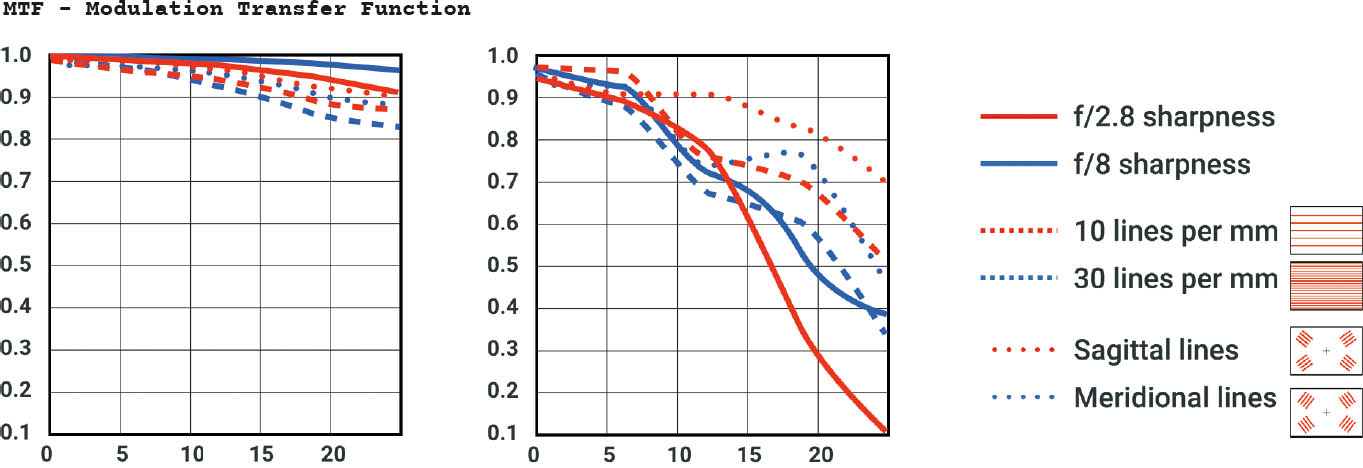
MTF charts are a quick and easy way to see how sharp a lens has the potential to be. The chart’s key will display a wide variety of useful information. The lines measure sharpness starting on the left side of the chart representing the middle of the lens to the right side, which represents the corner of the frame. Lines closer to the top indicate greater sharpness.