3
Visualization Tools
If I can’t picture it, I can’t understand it.
— Albert Einstein
In this chapter we discuss the tools needed to visualize data produced by simulations and measurements. Whereas other books may choose to relegate this discussion to an appendix, or not to include it at all, we believe that visualization is such an integral part of computational science, and so useful for your work in the rest of this book, that we have placed it right here, up front. (We do, however, place our OpenDx tutorial in Appendix C since it may be a bit much for beginners.)
ALL THE VISUALIZATION TOOLS WE discuss are powerful enough for professional scientific work and are free or open source. Commercial packages such as Matlab, AVS, Amira, and Noesys produce excellent scientific visualization but are less widely available. Mathematica and Maple have excellent visualization packages as well, but we have not found them convenient when dealing with large numerical data sets.1 The tools we discuss, and have used in preparing the visualizations for the text, are
PtPlot: Simple 2-D plotting callable from within a Java program, or as standalone application; part of the Ptolemy package. Being Java, it is universal for all operating systems.
Gnuplot: 2-D and 3-D plotting, predominantly stand-alone. Originally for Unix operating systems, with an excellent windows port also available.
Ace/gr (Grace): Stand-alone, menu-driven, publication-quality 2-D plotting for Unix systems; can run under MS Windows with Cygwin.
OPenDX: Formerly IBM DataExplorer. Multidimensional data tool for Unix or for Windows under Cygwin (tutorial in Appendix C).
3.1 Data Visualization
One of the most rewarding uses of computers is visualizing the results of calculations. While in the past this was done with 2-D plots, in modern times it is regular practice to use 3-D (surface) plots, volume rendering (dicing and slicing), and animation,as well as virtual reality (gaming) tools. These types of visualizations are often breathtakingly beautiful and may provide deep insights into problems by letting us see and “handle” the functions with which we are working. Visualization also assists in the debugging process, the development of physical and mathematical intuition, and the all-around enjoyment of your work. One of the reasons for visualization’s effectiveness may arise from the large fraction (∼10% direct and ∼50% with coupling) of our brain involved in visual processing and the advantage gained by being able to use this brainpower as a supplement to our logical powers.
In thinking about ways to present your results, keep in mind that the point of visualization is to make the science clearer and to communicate your work to others. It follows then that you should make all figures as clear, informative, and self-explanatory as possible, especially if you will be using them in presentations without captions. This means labels for all curves and data points, a title, and labels on the axes.2 After this, you should look at your visualization and ask whether there are better choices of units, ranges of axes, colors, style, and so on, that might get the message across better and provide better insight. Considering the complexity of human perception and cognition, there may not be a single best way to visualize a particular data set, and so some trial and error may be necessary to see what looks best. Although all this may seem like a lot of work, the more often you do it the quicker and better you get at it and the better you will be able to communicate your work to others.
3.2 PtPlot: 2-D Graphs Within Java
PtPlot is an excellent plotting package that lets you plot directly from Java programs.3 PtPlot is free, written in Java (and thus runs under Unix, Linux, Mac OS, and MSWindows), is easy touse, and is actually part of Ptole my, an entire computing environment supported by the University of California Computer Science Department. Figure 3.1 is an example of a PtPlot graph. Because PtPlot is not built into Java, a Java program needs to import the PtPlot package and work with its classes. You can download the most recent version over the Web.
The program EasyPtPlot.java in Listing 3.1 is an example of a how to construct a simple graph of sin2(x) versus x with PtPlot (Figure 3.1 top). On line 2 we see the statement import ptolemy.plot.*; that imports the PtPlot classes from the ptolemy directory. (In order for this to work, you may have to modify your CLASSPATH environmental variable or place the ptolemy directory in your working directory.) PtPlot represents your plot as a Plot object, which we name plotObj and create on line 9 (objects are discussed in Chapter 4, “Object-Oriented Programs: Impedance & Batons”). We then add various features, step by step, to plotObj to make it just the plot we want. As is standard with objects in Java, we first give the name of the object and then modify it with “dot modifiers.” Rather than tell PtPlot what ranges to plot for x and y, we let it set the x and y ranges based on the data it is given. The first argument, 0 here, is the data set number. By having different values for the data set number, you can plot different curves on the same graph (there are two in Figure 3.1 right). By having true as the fourth argument in myPlot.addPoint(0, x, y, true), we are telling PtPlot to connect the plotted points. For the plot to appear on the screen, line 21 creates a PlotApplication with the plot object as input.
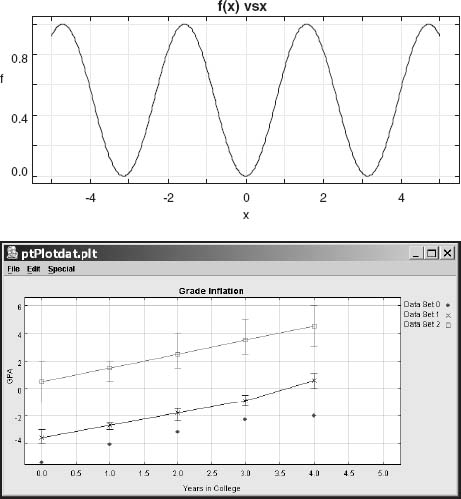
Figure 3.1 Top: Output graph from the program EasyPtPlot.java. Bottom: Output PtPlot window in which three data sets (set number = the first argument in addPoint) are placed in one plot. Observe the error bars on two of the sets.

Listing 3.1 EasyPtPlot.java plots a function using the package PtPlot. Note that the PlotApplication object must be created to see the plot on the screen.
We encourage you to make your plot more informative by including further options in the commands or by using the pull-down menus in the PtPlot window displaying your plot. The options are found in the description of the methods at the PtPlot Web site [PtPlot] and include the following.
Calling PtPlot from Your Program
Plot myPlot = new Plot(); |
Name and create plot object myPlot |
PlotApplication app |
|
= new PlotApplication(myPlot); |
Display |
myPlot. setTitle(“f(x) vs x”); |
Add title to plot |
myPlot. setXLabel(“x”); |
Label x axis |
myPlot. setYLabel(“f(x)”); |
Label y axis |
myPlot. addPoint(0, x, y, true); |
Add (x,y) to set 0, connect points |
myPlot. addPoint(1, x, y, false); |
Add (x,y) to set 1, no connect points |
myPlot.addLegend(0, “Set 0”); |
Label data set 0 in legend |
myPlot.addPointWithError |
|
Bars(0, x, y, yLo, yHi, true); |
Plot (x,y -yLo), (x, y +yHi) + error bars |
myPlot. clear(0); |
Remove all points from data set 0 |
myPlot. clear(false); |
Remove data from all sets |
myPlot. clear(true); |
Remove all points, default options |
myPlot. setSize(500, 400); |
Set plot size in pixels (optional) |
myPlot. setXRange(–10., 10.); |
Set an x range (default fit to data) |
myPlot. setYRange(–8., 8.); |
Set a y range (default fit to data) |
myPlot.setXLog(true); |
Use log scale for x axis |
myPlot.setYLog(true); |
Use log scale for y axis |
myPlot. setGrid(false); |
Turn off the grid |
myPlot. setColor(false); |
Color in black and white |
myPlot. setButtons(true); |
Display zoom-to-fit button on plot |
myPlot. fillPlot(); |
Adjust x, y ranges to fit data |
myPlot. setImpulses(true, 0); |
Lines from points to x axis, set 0 |
myPlot.setMarksStyle(“none,” 0); |
Draw none, points, dots, various, pixels |
myPlot. setBars(true); |
Display data as bar charts |
String s = myPlot. getTitle(); |
Extract title (or other properties) |
Once you have a PtPlot application on your screen, explore some of the ways to modify your plot from within the application window:
1. Examine the Edit pull-down menu (underlined letters are shortcuts). Select Edit and pull it down.

Figure 3.2 The Format submenu located under the Edit menu in a PtPlot application. This submenu controls the plot’s basic features.
2. From the Edit pull-down menu, select Format. You should see a window like that in Figure 3.2, which lets you control most of the options in your graph.
3. Experiment with the Format menu. In particular, change the graph so that only points are plotted, with the points being pixels and black, and with your name in the title.
4. Select a central portion of your plot and zoom in on it by drawing a box (with the mouse button depressed) starting from the upper-left corner and then moving down before you release the mouse button. You zoom out by drawing a box from the lower-right corner and moving up. You may also resize your graph by selecting Special/Reset Axes or by resetting the x and y ranges. And of course, if things get really messed up, you always have the option of starting over by closing the Java window and running the java command again.
5. Scrutinize the File menu and its options for printing your graphs, as well as exporting them to files in Postscript (.ps) and other formats.
![]()
It is also possible to have PtPlot make graphs by reading data from a file in which the x and y values are separated by spaces, tabs, or commas. There is even the option of including PtPlot formatting commands in the file with data. The program TwoPlotExample.java on the CD (available online: http://press.princeton.edu/landau_survey/) and its data file data.plt show how to place two plots side by side and how to read in a data file containing error bars with various symbols for the points. In its simplest form, PtPlot Data Format is just a text file with a single (x, y) point per line. For example, Figure 3.1 was produced from the data file PtPlotdat.plt:
Sample PtPlot Data file PtPlotdat.plt

To plot your data files directly from the command line, enter
![]()
This causes the standard PtPlot window to open and display your data. If this does not work, then your CLASSPATH variable may not be defined properly or PtPlot may not be installed. See “Installing PtPlot” in Appendix B.
Reading in your data from the PtPlot window itself is an alternative. Either use an already open window or issue Java’s run command:
![]()
To look at your data from the PtPlot window, choose File → Open → FileName. By default, PtPlot will look for files with the suffix .plt or .xml. However, you may enter any name you want or pull down the Filter menu and select * to see all your files. The same holds for the File → SaveAs option. In addition, you may Export your plot as an Encapsulated PostScript (.eps) file, a format useful for inserting in printed documents. You may also use drawing programs to convert PostScript files to other formats or to edit the output from PtPlot, but you should not change the shapes or values of output to alter scientific conclusions.
As with any good plot, you should label your axes, add a title, and add what is needed for it to be informative and clear. To do this, incorporate PtPlot commands with your data or work in the PtPlot window with the pull-down menus under Edit and Special. The options are essentially the same as the ones you would call from your program:
TitleText: f(x) vs. x |
Add title to plot |
XLabel: x |
Label x axis |
YLabel: y |
Label y axis |
XRange: 0, 12 |
Set x range (default: fit to data) |
YRange: –3, 62 |
Set y range (default: fit to data) |
Marks: none |
(Default) No marks at points, lines connects points |
Marks: points |
or: dots, various, pixels |
Lines: on/off |
Do not connect points with lines; default: on |
Impulses: on/off |
Lines down from points to x axis; default: off |
Bars: on/off |
Bar graph (turn off lines) default: off |
Bars: width (, offset) |
Bar graph; bars of width and (optional) offset |
DataSet: string |
Specify data set to plot; string appears in legend |
x, y |
Specify a data point; comma, space, tab separators |
move: x, y |
Do not connect this point to previous |
x, y, yLo, yHi |
Plot (x,y -yLo), (x,y +yHi) with error bars |
If a command appears before DataSet directives, then it applies to all the data sets.
If a command appears after DataSet directives, then it applies to that data set only.
3.3 Grace/ACE: Superb 2-D Graphs for Unix/Linux
Our favorite package for producing publication-quality 2-D graphs fromnumerical data is Grace/xmgrace. It is free, easy to work with, incredibly powerful, and has been used for many of the (nicer) figures in our research papers and books. Grace is a WYSIWYG tool that also contains powerful scripting languages and data analysis tools, although we will not get into that. We will illustrate multiple-line plots, color plots, placing error bars on data, multiple-axis options and such. Grace is derived from Xmgr, aka ACE/gr, originally developed by the Oregon Graduate Institute and now developed and maintained by the Weizmann Institute [Grace]. Grace is designed to run under the Unix/Linux operating systems, although we have had success using in on an MS Windows system from within the Cygwin [CYG] Linux emulation.4
3.3.1 Grace Basics
To learn about Grace properly, we recommend that you work though some of the tutorials available under its Help menu, study the user’s guide, and use the Web tutorial [Grace]. We present enough here to get you started and to provide a quick reference. The first step in creating a graph is to have the data you wish to plot in a text (ASCII) file. The data should be broken up into columns, with the first column the abscissa (x values) and the second column the ordinate (y values). The columns may be separated by spaces or tabs but not by commas. For example, the file Grace.dat on the CD (available online: http://press.princeton.edu/landau_survey/) and in the left column of Table 3.1 contains one abscissa and one ordinate per line, while the file Grace2.dat in the right column of Table 3.1 contains one abscissa and two ordinates (y values) per line.
![]()
1. Open Grace by issuing the grace or xmgrace command from a Unix/ Linux/Cygwin command line (prompt):
TABLE 3.1
Text Files Grace.dat and Grace2.dat∗
Grace.dat |
|
Grace2.dat |
|||
x |
y |
|
x |
y |
z |
1 |
2 |
|
1 |
2 |
50 |
2 |
4 |
|
2 |
4 |
29 |
3 |
5 |
|
3 |
5 |
23 |
4 |
7 |
|
4 |
7 |
20 |
5 |
10 |
|
5 |
10 |
11 |
6 |
11 |
|
6 |
11 |
10 |
7 |
20 |
|
7 |
20 |
7 |
8 |
23 |
|
8 |
23 |
5 |
9 |
29 |
|
9 |
29 |
4 |
10 |
50 |
|
10 |
50 |
2 |
* The text file Grace.dat (on the CD (available online: http://press.princeton.edu/landau_survey/) under Codes/JavaCodes/Data) contains one x value and one y value per line. The file Grace2.dat contains one x value and two y values per line.
In any case, make sure that your command brings up the user-friendly graphical interface shown on the left in Figure 3.3 and not the pure-text command one.
2. Plot a single data set by starting from the menu bar on top. Then
a. Select progressively from the submenus that appear, Data/Import/ASCII.
b. The Read sets window shown on the right in Figure 3.3 appears.
c. Select the directory (folder) and file in which you have the data; in the present case select Grace.dat.
d. Select Load as/Single set, Set type/XY and Autoscale on read/XY.
e. Select OK (to create the plot) and then Cancel to close the window.
3. Plot multiple data sets (Figure 3.3) is possible in step 2, only now
a. Select Grace2.dat, which contains two y values as shown in Table 3.1.
b. Change Load as to NXY to indicate multiple data sets and then plot.
Note: We suggest that you start your graphs off with Autoscale on read in order to see all the data sets plotted. You may then change the scale if you want, or eliminate some points and replot.
4. Label and modify the axis properties by going back to the main window. Most of the basic utilities are under the Plot menu.
a. Select Plot/Axis properties.
b. Within the Axis Property window that appears, select Edit/X axis or Edit/Y axis as appropriate.
c. Select Scale/Linear for a linear plot, or Scale/Logarithmic for alogarithmic or semilog plot.
d. Enter your choice for Axis label in the window.
e. Customize the ticking and the numbers’ format to your heart’s desire.
f. Choose Apply to see your changes and then Accept to close the window.

Figure 3.3 Left: The main Grace window, with the file Grace2.dat plotted with the title,subtitle, and labels. Right: The data input window.
5. Title the graph, as shown on the left in Figure 3.3, by starting from the main window and again going to the Plot menu.
a. Select Plot/Graph appearance.
b. From the Graph Appearance window that appears, select the Main tab and from there enter the title and subtitle.
6. Label the data sets, as shown by the box on the left in Figure 3.3, by starting from the main window and again going to the Plot menu.
a. Select Plot/Set Appearance.
b. From the Set Appearance window that appears, highlight each set from the Select set window.
c. Enter the desired text in the Legend box.
d. Choose Apply for each set and then Accept.
e. You can adjust the location, and other properties, of the legend box from Plot/Graph Appearance/Leg. box.
7. Plotting points as symbols (Figure 3.4 left) is accomplished by starting at the main menu. Then
a. Select Plot/Set Appearance.
b. Select one of the data sets being plotted.
c. Under the Main/Symbol properties, select the symbol Type and Color.
d. Choose Apply, and if you are done with all the data sets, Accept.
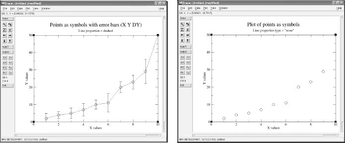
Figure 3.4 Left: A plot of points as symbols with no line. Right: A plot of points as symbols with lines connecting the points and with error bars read from the file.
8. Including error bars (Figure 3.4 left) is accomplished by placing them in the data file read into Grace along with the data points. Under Data/Read Sets are, among others, these possible formats for Set type:
(XY DX), (XY DY), (XY DX DX), (XY DY DY), (XY DX DX DY DY)
Here DX is the error in the x value, DY is the error in the y value, and repeated values for DX or DY are used when the upper and lower error bars differ; for instance, if there is only one DY, then the data point is Y ± DY, but if there are two error bars given, then the data point is Y+ DY1, -DY2. As a case in point, here is the data file for (XY DY):
X |
1 |
2 |
3 |
4 |
5 |
6 |
7 |
8 |
9 |
10 |
Y |
2 |
4 |
5 |
7 |
10 |
11 |
20 |
23 |
29 |
50 |
DY |
3 |
2 |
3 |
3.6 |
2.6 |
5.3 |
3.1 |
3.9 |
7 |
8 |
9. Multiple plots on one page (Figure 3.5 left) are created by starting at the main window. Then
a. Select Edit/Arrange Graphs.
b. An Arrange Graphs window (Figure 3.5 right) opens and provides the options for setting up a matrix into which your graphs are placed.
c. Once the matrix is set up (Figure 3.5 left), select each space in sequence and then create the graph in the usual way.
d. To prevent the graphs from getting too close to each other, go back to the Arrange Graphs window and adjust the spacing between graphs.
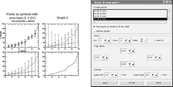
Figure 3.5 Left: Four graphs placed in a 2 × 2 matrix. Right: The window that opens under Edit/Arrange Graphs and is used to set up the matrix into which multiple graphs are placed.
10. Printing and saving plots
a. To save your plot as a complete Grace project that can be opened again and edited, from the main menu select File/Save As and enter a filename.agr as the file name. It is a good idea to do this as a backup before printing your plot (communication with a piece of external hardware is subject to a number of difficulties, some of which may cause a program to “freeze up” and for you to lose your work).
b. To print the plot, select File/Print Setup from the main window
c. If you want to save your plot to a file, select Print to file and then enter the file name. If you want to print directly to a printer, make sure that Print to file is not selected and that the selected printer is the one to which you want your output to go (some people may not take kindly to your stuff appearing on their desk, and you may not want some of your stuff to appear on someone else’s desk).
d. From Device, select the file format that will be sent to the printer or saved.
e. Apply your settings when done and then close the Print/Device Setup window by selecting Accept.
f. If now, from the main window, you select File/Print, the plot will be sent to the printer or to the file. Yes, this means that you must “Print” the plot in order to send it to a file.
If you have worked through the steps above, you should have a good idea of how Grace works. Basically, you just need to find the command you desire under a menu item. To help you in your search, in Table 3.2 we list the Grace menu and submenu items.
TABLE 3.2
Grace Menu and Submenu Items
Edit |
Data |
Data sets |
Data set operations |
Set operations |
sort, reverse, join, split, drop points |
copy,move,swap |
Transformations |
Arrange graphs |
expressions, histograms, transforms, |
matrix, offset, spacing |
convolutions,statistical ops, interpolations |
Overlay graphs |
Feature extraction |
Autoscale graphs |
min/max,average, deviations, frequency, |
Regions |
COM, rise/fall time, zeros |
Hot links |
Import |
Set/Clear local/fixed point |
Export |
Preferences |
|
Plot |
View |
Plot appearance |
Show locator bar (default) |
background, time stamp, font, color |
Show status bar (default) |
Graph appearance |
Show tool bar (default) |
style, title, labels, frame, legends |
Page setup |
Set appearance |
Redraw |
style, symbol properties,error bars |
Update all |
Axis properties |
|
labels,ticks, placement |
|
Load/Save parameters |
|
Window |
|
Command |
Font tool |
Point explorer |
Console |
Drawing objects |
|
3.4 Gnuplot: Reliable 2-D and 3-D Plots
Gnuplot is a versatile 2-D and 3-D graphing package that makes Cartesian, polar, surface, and contour plots. Although PtPlot is good for 2-D plotting with Java, only Gnuplot can create surface plots of numerical data. Gnuplot is classic open software, available free on the Web, and supports many output formats.

Figure 3.6 A Gnuplot graph for three data sets with impulses and lines.
Begin Gnuplot with a file of (x, y) data points, say, graph.dat. Next issue the gnuplot command from a shell or from the Start menu. A new window with the Gnuplot prompt gnuplot> should appear. Construct your graph by entering Gnuplot commands at the Gnuplot prompt or by using the pull-down menus in the Gnuplot window:

Plot a number of graphs on the same plot using several data files (Figure 3.6):
![]()
The general form of the 2-D plotting command and its options are
plot{ranges} function {title} {style} {, function …} Command
![]()
with points |
Default. Plot a symbol at each point. |
with lines |
Plot lines connecting the points. |
with linespoint |
Plot lines and symbols. |
with impulses |
Plot vertical lines from the x axis to points. |
with dots |
Plot a small dot at each point (scatterplots). |
For Gnuplot to accept the name of an external file, that name must be placed in ‘single’ or “double” quotes. If there are multiple file names, the names must be separated by commas. Explicit values for the x and y ranges are set with options:
![]()
3.4.1 Gnuplot Input Data Format 
The format of the data file that Gnuplot can read is not confined to (x, y) values. You may also read in a data file as a C language scanf format string xy by invoking the using option in the plot command. (Seeing that it is common for Linux/ Unix programs to use this format for reading files, you may want to read more about it.)
This format explicitly reads selected rows into x or y values while skipping past text or unwanted numbers:

This last command skips past the first six characters, reads one x, skips the next seven characters, and then reads one y. It works for reading in x and y from files such as

Observe that because the data read by Gnuplot are converted to floating-point numbers, you use %f to read in the values you want.
Besides reading data from files, Gnuplot can also generate data from user-defined and library functions. In these cases the default independent variable is x for 2-D plots and (x, y)for 3-D ones. Here we plot the acceleration of an on harmonic oscillator:

A useful feature of Gnuplot is its ability to plot analytic functions along with numerical data. For example, Figure 3.7 compares the theoretical expression for the period of a simple pendulum to experimental data of the form


Figure 3.7 A Gnuplot plot of data from a file plus an analytic function.
Note that the first line of text is ignored since it begins with a #. We plot with

3.4.2 Printing Plots
Gnuplot supports a number of printer types including PostScript. The safest way to print a plot is to save it to a file and then print the file:
1. Set the “terminal type” for your printer.
2. Send the plot output to a file.
3. Replot the figure for a new output device.
4. Quit Gnuplot (or get out of the Gnuplot window).
5. Print the file with a standard print command.
For a more finished product,you can import Gnuplot’s output .ps file into a drawing program such as CorelDraw or Illustrator and fix it up just right. To see what types of printers and other output devices are supported by Gnuplot, enter the set terminal command without any options into a gnuplot window. Here is an example of creating a PostScript figure and printing it:


3.4.3 Gnuplot Surface (3-D) Plots
A 2-D plot is fine for visualizing the potential field V(r) = 1/r surrounding a single charge. However, when the same potential is expressed as a function of Cartesian coordinates, ![]() we need a 3-D visualization. We get that by creating a world in which the z dimension (mountain height) is the value of the potential and x and y lie on a flat plane below the mountain. Because the surface we are creating is a 3-D object, it is not possible to draw it on a flat screen, and so different techniques are used to give the impression of three dimensions to our brains. We do that by rotating the object, shading it, employing parallax, and other tricks.
we need a 3-D visualization. We get that by creating a world in which the z dimension (mountain height) is the value of the potential and x and y lie on a flat plane below the mountain. Because the surface we are creating is a 3-D object, it is not possible to draw it on a flat screen, and so different techniques are used to give the impression of three dimensions to our brains. We do that by rotating the object, shading it, employing parallax, and other tricks.
The surface (3-D) plot command is splot, and it is used in the same manner as plot—with the obvious extension to (x, y, z). A surface (Figure 3.8) is specified by placing the z(x, y) values in a matrix but without ever giving the x and y values explicitly. The x values are the row numbers in the matrix and the y values are the column values (Figure 3.8). This means that only the z values are read in and that they are read in row by row, with different rows separated by blank lines:
row 1 (blank line) row 2 (blank line) row 3 … row N.
Here each row is input as a column of numbers, with just one number per line. For example, 13 columns each with 25 z values would be input as a sequence of 25 data elements, followed by a blank line, and then another sequence followed by a blank line, and so on:
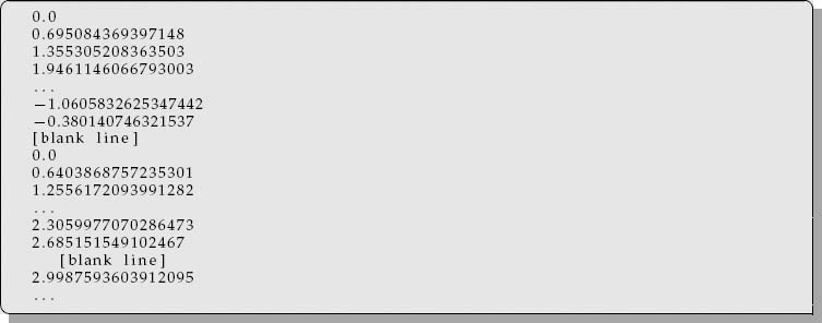
Although there are no explicit x and y values given, Gnuplot plots the data with the x and y assumed to be the row and column numbers.
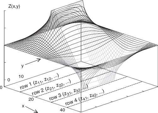
Figure 3.8 A surface plot z(x, y) = z (row, column) showing the input data format used for creating it. Only z values are stored, with successive rows separated by blank lines and the column values repeating for each row.
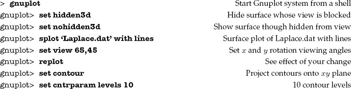
Versions 4.0 and above of Gnuplot have the ability to rotate 3-D plots interactively. You may also adjust your plot with the command
where 0 ≤ rotx ≤ 180◦ and 0 ≤ rotz ≤ 360◦ are angles in degrees and the scale factors control the size. Any changes made to a plot are made when you redraw the plot using the replot command.
To see how this all works, here we give a sample Gnuplot session that we will use in Chapter 17, “PDEs for Electrostatics & Heat Flow,” to plot a 3-D surface from numerical data. The program Laplace.java contains the actual code used to output data in the form for a Gnuplot surface plot.5

3.4.4 Gnuplot Vector Fields
Even though it is simpler to compute a scalar potential than a vector field, vector fields often occur in nature. In Chapter 17, “PDEs for Electrostatics & Heat Flow,” we show how to compute the electrostatic potential U(x, y) on an x + y grid of spacing ∆. Since the field is the negative gradient of the potential, E = −![]() U(x, y), and since we solve for the potential on a grid, it is simple to use the central-difference approximation for the derivative (Chapter 7 “Differentiation & Searching”) to determine E:
U(x, y), and since we solve for the potential on a grid, it is simple to use the central-difference approximation for the derivative (Chapter 7 “Differentiation & Searching”) to determine E:

Gnuplot contains the vectors style for plotting vector fields as arrows of varying lengths and directions (Figure 3.9).
![]()
Here Laplace_field.data is the data file of (x, y, Ex, Ey) values, the explicit columns to plot are indicated, and additional information can be provided to control arrow types. What Gnuplot actually plots are vectors from (x, y) to (x + ∆x, y +∆y), where you input a data file with each line containing the (x, y, ∆x, ∆y) values. Thousands of tiny arrows are not very illuminating (Figure 3.9 left), nor are overlapping arrows. The solution is to plot fewer points and larger arrows. On the right in Figure 3.9 we plot every fifth point normalized to unit length via
![]()
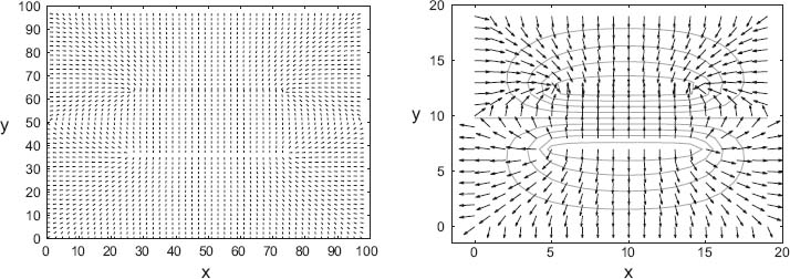
Figure 3.9 Two visualizations created by Gnuplot of the same electric field within and around a parallel plate capacitor. The figure on the right includes equipotential surfaces and uses one-fifth as many field points,and longer vectors,but of constant length. The x and y values are the column and row indices.
The data file was produced with our Laplace.java program with the added lines

We have also been able to include contour lines on the field plots by adding more commands:

By setting terminal to table and setting out to equipot.dat, the numerical data for equipotential lines are saved in the file equipot.dat. This file can then be plotted together with the vector field lines.
3.4.5 Animations from a Plotting Program (Gnuplot)
An animation is a collection of images called frames that when viewed in sequence convey the sensation of continuous motion. It is an excellent way to visualize the time behavior of a simulation or a function f(x,t), as may occur in wave motion or heat flow. In the Codes section of the CD (available online: http://press.princeton.edu/landau_survey/), we give several sample animations of the figures in this book and we recommend that you view them.
Gnuplot itself does not create animations. However, you can use it to create a sequence of frames and then concatenate the frames into a movie. Here we create an animated gif that, when opened with a Web browser, automatically displays the frames in a rapid enough sequence for your mind’s eye to see them as a continuous event. Although Gnuplot does not output .gif files, we outputted pixmap files and converted them to gif’s. Because a number of commands are needed for each frame and because hundreds or thousands of frames may be needed for a single movie, we wrote the script MakeGifs.script to automate the process. (A script is a file containing a series of commands that might normally be entered by hand to execute within a shell. When placed in a script, they are executed as a single command.) The script in Listing 3.2, along with the file samp_color (both on the CD (available online: http://press.princeton.edu/landau_survey/) under Codes/Animations_ColorImages/Utilities), should be placed in the directory containing the data files (run.lmn in this case).
![]()
The #! line at the beginning tells the computer that the subsequent commands are in the korn shell. The symbol $i indicates that i is an argument to the script. In the present case, the script is run by giving the name of the script with three arguments, (1) the beginning time, (2) the maximum number of times, and (3) the name of the file where you wish your gifs to be stored:
The > symbol in the script indicates that the output is directed to the file following the >. The ppmquant command takes a pixmap and maps an existing set of colors to new ones. For this to work, you must have the map file samp_colormap in the working directory. Note that the increments for the counter, such as i=i+99, should be adjusted by the user to coincide with the number of files to be read in, as well as their names. Depending on the number of frames, it may take some time to run this script. Upon completion, there should be a new set of files of the form OutfileTime.gif, where Outfile is your chosen name and Time is a multiple of the time step used. Note that you can examine any or all of these gif files with a Web browser.
The final act of movie making is to merge the individual gif files into an animated gif with a program such as gifmerge:
![]()

Listing 3.2 MakeGifs.script, a script for creating animated gifs.
Here the –10 separates the frames by 0.1 s in real time, and the * is a wildcard that will include all .gif files in the present directory. Because we constructed the .gif files with sequential numbering, gifmerge pastes them together in the proper sequence and places them in the file movie, which can be viewed with a browser.
3.5 OpenDX for Dicing and Slicing
See Appendix C and the CD (available online: http://press.princeton.edu/landau_survey/).
3.6 Texturing and 3-D Imaging
In §13.10wegive a brief explanation of how the inclusion of textures (Perlin noise) in a visualization can add an enhanced degree of realism. While it is a useful graphical technique, it incorporates the type of correlations and coherence also present in fractals and thus is in Chapter 13, “Fractals & Statistical Growth.” In a related vein, in §13.10.1 we discuss the graphical technique of ray tracing and how it, especially when combined with Perlin noise, can produce strikingly realistic visualizations.
Stereographic imaging creates a virtual reality in which your brain and eye see objects as if they actually existed in our 3-Dworld. There area number of techniques for doing this, such as virtual reality caves in which the viewer is immersed in an environment with images all around, and projection systems that project multiple images, slightly displaced, such that the binocular vision system in your brain (possibly aided by appropriate glasses) creates a 3-D image in your mind’s eye.
Stereographics is often an effective way to let the viewer see structures that might otherwise be lost in the visualization of complex geometries, such as in molecular studies or star creation. But as effective as it may be, stereo viewing is not widely used in visualization because of the difficulty and expense of creating and viewing images. Here we indicate how the low-end, inexpensive viewing technique known as ChromaDepth [Chrom] can produce many of the same effects as high-end stereo vision without the use of special equipment. Not only is the technique easy to view and easy to publish, it is also easy to create [Bai 05]. Indeed, the OpenDX color images (visible on the CD) work well with ChromaDepth.
ChromaDepth consists of two pieces: a simple pair of glasses and a display methodology. The glasses contain very thin, diffractive gratings. One grating is blazed so that it shifts colors on the red end of the spectrum more than on the blue end, and this makes the red elements in the 3-D scene appear to be closer to the viewer. This often works fine with the same color scheme used for coding topographic maps or for scientific visualizations and so requires little or no extra work. You just write your computer program so that it color-codes the output in a linear rainbow spectrum based on depth. If you do not wear the glasses, you still see the visualization, yet with the glasses on, the image appears to jump out at you.
1 Visualization with Maple and Mathematica is discussed in [L 05].
2 Although this may not need saying, place the independent variable x along the abscissa (horizontal), and the dependent variable y = f(x) along the ordinate.
3 Connelly Barnes assisted in the preparation of this section.
4 If you do this, make sure to have the Cygwin download include the xorg-x11-base package in the X11 category (or a later version), as well as xmgrace.
5 Under Windows, there is a graphical interface that is friendlier than the Gnuplot subcommands. The subcommand approach we indicate here is reliable and universal.