Appendix C: OpenDX: Industrial-Strength Data Visualization
Most of the visualizations we use in this book are 2-D, y(x) plots, or 3-D, z(x, y) (surface) plots. Some of the applications, especially the applets, use animations, which may also be 2-Dor3-D. Samples are found on the CD (available online: http://press.princeton.edu/landau_survey/). We use and recommend Grace (2-D) and Gnuplot (2-D, 3-D) for stand-alone visualizations, and PtPlot for visualizations callable from Java programs[L 05].All have the power andflexibility for scientific work, as well as being free or open source.
An industrial-strength tool for data visualization, which we also recommend, is OpenDX, or DX for short.1 It was originally developed as IBM Data Explorer but has now joinedthe ranksofopen-source software[DX1, DX2] andisroughly equivalent to the commercial package AVS. DX works under Linux, Unix, or a Linux emulator (Cygwin) on a PC. The design goals of DX were to
• Run under many platforms with various data formats.
• Be user-friendly via visual programming, a modern technique in which programs are written by connecting lines between graphical objects, as opposed to issuing textual commands (Figure C.3 right).
• Handle large multidimensional data sets via volume rendering of f(x,y,z) as well as slicing and dicing of higher-dimensional data sets.
• Create attractive graphics without expensive hardware.
• Have a graphical user interface that avoids the necessity of learning many commands.
The price to pay for all this power is the additional time spent learning how to do new things. Nevertheless, it is important for students of computational physics to get some experience with state-of-the-art visualization.
This appendix is meant as an introduction to DX. We use it to visualize some commonly encountered data such as scalar and vector fields and 3-D probability densities. DX can do much more than that, and, indeed, is a standard tool in visualization laboratories around the world. However, the visualizations in this text are just in gray, while DX uses color as a key element. Consequently, we recommend that you examine the DX visualizations on the CD (available online: http://press.princeton.edu/landau_survey/) to appreciate their beauty and effectiveness.
![]()
Analogous to the philosophy behind the Unix operating system, DX is a toolbox containing tools that permit you to create visualizations customized to your data. These visualizations may be created by command-line programming (for experienced users) or by visual programming. Typically, six separate steps are involved:
1. Store the data in a file using a standard format.
2. Use the Data Prompter to describe the data’s organization and to place that description in a .general file.
3. Import the data into DX.
4. Chose a visualization method appropriate for the data type.
5. Create a visual program with the Visual Program Editor by networking modules via drawn lines.
6. Create and manipulate an image.
C.1 Getting DX and Unix Running (for Windows)
If you do not have DX running on your computer, you can download it free from the DX home page [DX1]. Once running, just issue the dx or DX command and the system starts up. DX uses the Unix X-Windows system. If you are running under MS Windows, then you will first need to start an X-server program and then start DX at the resulting X-Windows prompt. We discussed this in Chapter 3, where we recommended the free Unix shell emulator Cygwin [CYG].
In order to run DX with Cygwin, you must start your X server prior to launching DX. You may also have to tell the X server where to place the graphical display:
Here we issued the dx command from an X11 window. This works if your PATH variable includes the location of DX. We have had problems getting the dx command to work on some of our Cygwin installations, and in those cases we followed the alternative approach of loading DX as a regular MS Windows application. To do that, we first start the X11 server from a Cygwin bash shell with the command startxwin.sh and then start DX from the Start menu. While both approaches work fine, DX run from a Unix shell looks for your files within the Unix file system at /home/userid, while DX run under Windows looks within the MS Windows file system at C:Documents and SettingsuseridMy Documents. Another approach, which is easier but costs money, is to install a commercial X11 server such as X-Win 32 [XWIN32] coupled with your DX. Opening DX through MS Windows then automatically opens the X11 server with no effort on your part.
C.2 Test Drive of DX Visual Programming
Here we lead you through a test drive that creates a color surface plot with DX. This is deliberately cookbook-style in order to get you on the road and running. We then go on to provide a more systematic discussion and exploration of DX features, but without all the details.
If you want to see some of the capabilities of DX without doing any work, look at some of the built-in Samples accessible from the main menu (we recommend ThunderStreamlines.net and RubberTube.net). Once the pretty picture appears, go to Options/ViewControl/Mode and try out Rotate and Navigate. If you want to see how the graphical program created the visualization, go to Windows/Open Visual Program Editor and rearrange the program elements.
1. Prepare input data: Run the program ShockLax.java that describes shock wave formation and produces the file Shock.dat we wishtovisualize; alternatively, copy the file ShockLax.dat from the CD (Codes/JavaCodes) (available online: http://press.princeton.edu/landau_survey/). If you are running DX under Cygwin, you will need to copy this file to the appropriate folder in /home/userid, where userid is your name on the computer.
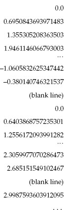
2. Examine input data: Take note of the structure of the data in Shock.dat. It is in a file format designed for creating a surface plot of z(x, y) with Gnuplot. It contains a column of 25 data values, a blank line, and then another 25 values followed by another blank lines, and so forth, for a total of 13 columns each with 25 data values:
Recall that the data are the z values, the locations in the column are the x values, and the column number gives the y values. The blank lines were put in to tell Gnuplot that we are starting a new column.
3. Edit data: While you can leave the blank lines in the file and still produce a DX visualization, they are not necessary because we explicitly told DX that we have one column of 25 ×13 data elements. Try both and see!
4. Start DX: Either key in dx at the Unix prompt or start an X-Windows server and then start DX. A Data Explorer main window (Figure C.1 left) should appear.

Figure C.1 Left: The main Data Explorer window. Right: The Data Prompter window that opens when you select Import Data.
5. Import data: Press the Import Data button in the main Data Explorer window. The Data Prompter window (Figure C.1 right) appears after a flash and a bang. Either key in the full path name of the data file (/home/mpaez/numerical.dat in our case) or click on Select Data File from the File menu. We recommend that after entering the file name, you depress the Browse Data button in the Data Prompter. This gives youawindow (Figure C.2 right) showing you what DX thinks is in your data file. If you do not agree with DX, then you need to find some way to settle the dispute.
6. Describe data: Press the Grid or Scattered file button in the Data Prompter window. The window now expands (Figure C.2 left) to one that lets you pick out a description of the data.
a. Select the leftmost Grid type, that is, the one with the regular array of small squares.
b. For these data, select Single time step, which is appropriate because our data contain only a single column with no explicit (x, y) values.
c. Because we have only the one z component to plot (a scalar field), set the slider at 1.
d. Press the Describe Data button. This opens another window that tells DX the structure of the data file. Enter 25 as the first entry for the Grid size, and 13 as the second entry. This describes the 13 groups of 25 data elements in a single long column. Press the button Column.
e. Under the File menu, select Save as and enter a name with a .general extension, for example, Shock.general. The file will contain
file = /home/mpaez/Shock.dat grid = 25 x 13 format = ascii interleaving = field majority = column field = field0 structure = scalar type = float dependency = positions positions = regular, regular, 0, 1, 0, 1 end

Figure C.2 Left: The expanded Data Prompter window obtained by selecting Grid or Scattered File. Right: The File Browser window used to examine a data file.
Now close all the Data Prompter windows.
7. Program visualization with a visual editor: Next design the program for your visualization by drawing lines to connect building blocks (modules). This is an example of visual programming in which drawing a flowchart replaces writing lines of code.
a. Press the button New Visual Program from the Data Explorer main window. The Visual Program Editor window appears (Figure C.3 left).There is a blank space to the right known as the canvas, upon which you will draw, and a set of Tools on the left. (We list the names of all the available tools in §C.3, with their descriptions available from DX’s built-in user’s manual.)
b. Click on the  to the left of Import and Export. The box changes to
  and opens up a list of categories. Select Import so that it remains highlighted and then click near the top of the canvas. This should place the Import module on the canvas (Figure C.3 left).
c. Close Import and Export and open the Transformation box. Select AutoColor so that it remains highlighted and then click below the Import module. The AutoColor image that appears on the canvas will be used to color the surface based on the z values.
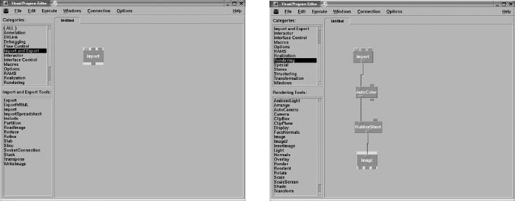
Figure C.3 The Visual Program Editor with Tools or Categories on the left and the canvas on the right. In the left window a single module has been selected from Categories,while in the right window several modules have been selected and networked together.
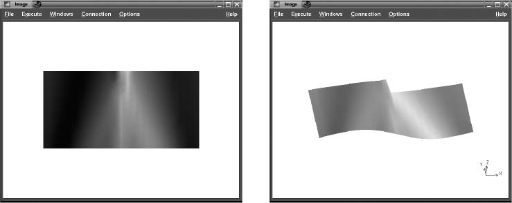
Figure C.4 Left: The image resulting from selecting Execute Once in the Visual Program Editor. Right: The same image after being rotated with the mouse reveals its rubber sheet nature.
d. Connect the output of Import to the left input of Autocolor by dragging your mouse, keeping the left button pressed until the two are connected.
e. Close the Transformation box and look under Realization. Select RubberSheet (a descriptive name for a surface plot), place it on the canvas below Autocolor, and connect the output of Autocolor to the left input tag of RubberSheet.
f. Close the Realization box and look under the Rendering tool. Select Image and connect its input to the output of RubberSheet. You should now have a canvas (Figure C.3 right).
g. A quick double-click on the Import block should bring up the Import window. Push the Name button so that it turns green and ensure that the .general file that you created previously appears underValue. If not, enter it by hand. In our case it has the name "/home/mpaez/numer.general". Next press the Apply button and then OK to close the window.
h. Return to the Visual Program Editor. On the menu across the top, press Execute/Execute Once, and an image (Figure C.4 left) should appear.
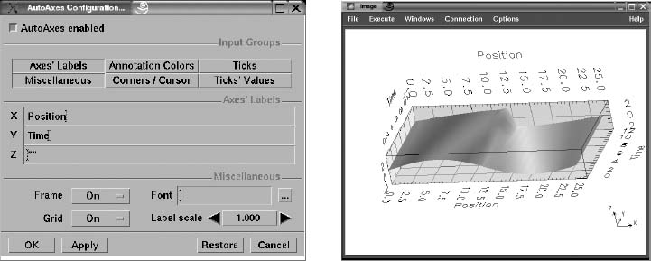
Figure C.5 Left: The AutoAxes Configuration window brought up as an Option from the Visual Program Editor. Right: The final image with axes and labels.
8. Manipulating the image: Try grabbing and rotating the image with the mouse. If that does not work, you need to tell DX what you want:
a. From the menu at the top of the Image window select Options; in the drop-down window select Mode; in the next drop-down window select Rotate. For instance, the rather flat-looking image on the left in Figure C.4 acquires depth when rotated to the image on the right.
b. Again select Options from the Image window’s menu (Figure C.5 left), but this time select AutoAxes from the drop-down window. In the new window key in Position in the X space and Time in the Y space. Press Apply/OK, and an image (Figure C.5 right) should appear.
c. Now that you have the image you desire, you need to save it. From the File menu of the Image window, select Save Image. A pop-up window appears, from which you select Format, then the format you desire for the image, then the Output file name, and finally Apply.
d. You want to ensure that the visual program is saved (in addition to the data file). In the Image window select File/Save Program As (we selected Shock2.net).
9. Improved scale: Often the effectiveness of a surface plot like Figure C.5 can be improved by emphasizing the height variation of the surface. The height is changed in DX by changing the scale:
a. Go to the Visual Program Editor, select Rendering/scale (Figure C.6 right). Place the Scale icon between the RubberSheet and Image icons and connect.
b. Double-click the Image icon, and a Scale window opens (Figure C.6 right).

Figure C.6 On the left the Scale option is selected under Rendering and placed on the canvas. Double-clicking on the Image icon produces the Scale window on the right. By changing the second line under Value to [112],the z scale is doubled.
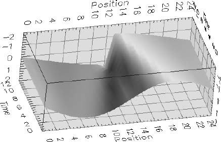
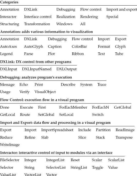
Figure C.7 The graph with a better scale for the z axis.
c. Change the second line under Value from [111] to [112] to double the z scale. Press Apply/OK.
d. Select Execute, and then under Option, select Execute once. The improved image in Figure C.7 appears.
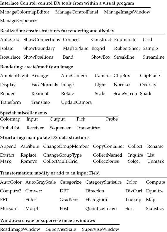
C.3 DX Tools Summary
DX has built-in documentation that includes a QuickStart Guide, a User’s Guide, a User’s Reference, a Programmer’s Reference, and an Installation and Configuration Guide. Here we give a short summary of some of the available tools. Although you can find all this information under the Tools categories in the Visual Program Editor, it helps to know what you are looking for! The DX on-line help provides more information about each tool. In what follows we list the tools in each category.
C.4 DX Data Structure and Storage
Good organization or structuring of data is important for the efficient extraction (mining) of signals from data. Data that are collected in fixed steps for the independent variables, for example, y(x = 1), y(x = 2),. . ., y(x = 100), fit a regular grid.
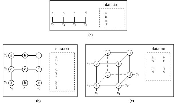
Figure C.8 Geometric and file representations of 1-D, 2-D, and 3-D data sets. The letters a, b, c, d, … represent numerical values that may be scalars or vectors.
The corresponding data are called regular data. The coordinates of a single datum within a regular set can be generated from three parameters:
1. The origin of the data, for instance, the first datum at (x = 0, y = 0).
2. The size of the steps in each dimension for the independent variables, for example, (Δx, Δy).
3. The total number of data in the set, for example, N.
The data structures used by spreadsheets store dependent variables with their associated independent variables, for instance, {x, y, z(x, y)}. However, as already discussed for the Gnuplot surface plot (Figure 3.8 right), if the data are regular, then storing the actual values of x and y is superfluous for visualization since only the fact that they are evenly spaced matters. That being the case, regular data need only contain the values of the dependent variable f (x, y) and the three parameters discussed previously. In addition, in order to ensure the general usefulness of a data set, a description of the data and its structure should be placed at the beginning of the set or in a separate file.
Figure C.8 gives a geometric representation of 1-D, 2-D, and 3-D data structures. Here each row of data is a group of lines, where each line ends with a return character. The columns correspond to the different positions in the row. The different rows are separated by blank lines. For the 3-D structure, we separate values for the third dimension by blank spaces from other elements in the same row.
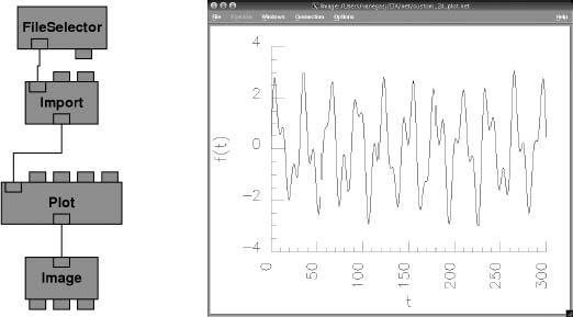
Figure C.9 The visual program Simple_linear_plot.net on the left imports a simple linear data file and produces the simple x+y plot shown on the right.
C.5 Sample Visual Programs
We have included on the CD (available online: http://press.princeton.edu/landau_survey/) a number of DX programs we have found useful for some of the problems in this book and which produce the visualizations we are about to show. Because color is such an important part of these visualizations, we suggest that you look at these visualizations on the CD (available online: http://press.princeton.edu/landau_survey/) as well. Although you are free to try these programs, please note that you will first have to edit them so that the file paths point to your directory, for example, /home/userid/DXdata, rather than the named directories in the files.
![]()
C.5.1 Sample 1: Linear Plot
The visual program simple_linear_plot.net (Figure C.9 left) reads data from the file simple_linear_data.dat and produces the simple linear plot shown on the right. These data are the sums of four sine functions,
stored at regular values of t.

Figure C.10 The visual program on the left computes the discrete Fourier transform of the function (3.1), read in as data, resulting in the plot on the right.
C.5.2 Sample 2: Fourier Transform
As discussed in Chapter 10,“Fourier Analysis; Signals and Filters,” the discrete Fourier transform (DFT) and the fast Fourier transform (FFT) are standard tools used to analyze oscillatory signals. DX contains modules for both tools. On the left in Figure C.10 you see how we have extended our visual program to calculate the DFT. The right side of Figure C.10 shows the resulting discrete Fourier transform with the expected four peaks at ω = 25, 38, 47, and 66 rad/s, as expected from the function (3.1). Note how in the visual program we passed the data through a Compute module to convert it from doubles to floats. This is necessary because DX’s DFT accepts only floats. After computing the DFT, we pass the data through another Compute module to take the absolute value of the complex transform, and then we plot them.
C.5.3 Sample 3: Potential of a 2-D Capacitor
While a vector quantity such as the electric field may be more directly related to experiment than a scalar potential, the potential is simpler to visualize. This is what we did in Chapter 17, “PDEs for Electrostatics and Heat Flow,” with the program Lapace.java when we solved Laplace’s equation numerically. Some output from that simulation is used in the DX visualization of the electric potential in a plane containing a finite parallel-plate capacitor (Figure C.11). The visual program Laplace.net1 shown on the left creates the visualization, with the module AutoColor coloring each point in the plane according to its potential value.

Figure C.11 The visual program on the left produces visualization of the electric potential on a 2-D plane containing a capacitor. Colors represent different potential values.
Another way to visualize the same potential field is to plot the potential as the height of a 3-D surface, with the addition of the surface’s color being determined by the value of the potential. The visual program Laplace.net_2 on the left in Figure C.12 produces the visualization on the right. The module RubberSheet creates the 3-D surface from potential data. The range of colors can be changed, as well as the opacity of the surface, through the use of the Colormap and Color modules. The ColorBar module is also included to show how the value of the potential is mapped to each color in the plot.
C.5.4 Sample 4: Vector Field Plots
Visualization of the scalar field V(x,y) required us to display one number at each point in a plane. A visualization of the vector electric field E(x, y) = —VV requires us to display three numbers at each point. In addition to it being more work to visualize a vector field, the increased complexity of the visualization may make the physics less clear even if the mathematics is more interesting. This is for you, and your mind’s eye, to decide.

Figure C.12 The visual program on the left produces the surface plot of the electric potential on a 2-D plane containing a capacitor. The surface height and color vary in accord with the values of the potential.
DX makes the plotting of vector fields easy by providing the module Gradient to compute the gradient of a scalar field. The visual program Laplace.net_3 on the left in Figure C.13 produces the visualization of the capacitor’s electric field shown on the right. Here the AutoGlyph module is used to visualize the vector nature of the field as small vectors (glyphs), and the Isosurface module is used to plot the equipotential lines. If the 3-D surface of the potential were used in place of the lines, much of the electric field would be obstructed.
C.5.5 Sample 5: 3-D Scalar Potentials
We leave it as an exercise for you to solve Laplace’s equation for a 3-D capacitor composed of two concentric tori. Although the extension of the simulation from 2-D to 3-D is straightforward, the extension of the visualization is not. To illustrate, instead of equipotential lines, there are now equipotential surfaces V (x,y, z), each of which is a solid figure with other surfaces hidden within. Likewise, while we can again use the Gradient module to compute the electric field, a display of arrows at all points in space is messy. Such being the case, one approach is to map the electric field onto a surface, with a display of only those vectors that are parallel or perpendicular to the surface. Typically, the surface might be an equipotential surface or the xy or yz plane. Because of the symmetry of the tori, the planes appear to provide the best visualization.
The visual program Laplace-3d.net_1 on the left in (Figure C.14) plots an electric field mapped onto an equipotential surface. The visualization on the right shows that the electric field is perpendicular to the surface but does not provide information about the behavior of the field in space. The program Laplace-3d.net_2 (Figure C.15) plots the electric field on the y + z plane going through the tori. The plane is created by the module Slab. In addition, an equipotential surface surrounding each torus is plotted, with the surfaces made semitransparent in order to view their relation to the electric field. The bending of the arrows is evident inthe closeup on the far right.
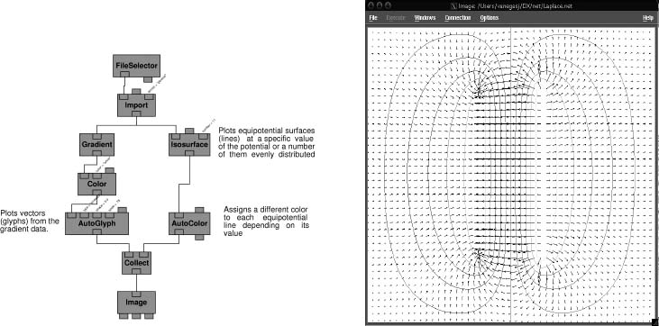
Figure C.13 The visual program on the left produces the electric field visualization on the right.
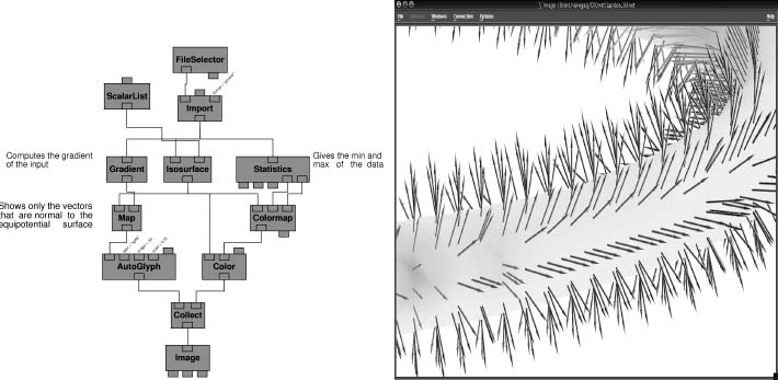
Figure C.14 The visual program on the left plots a torus as a surface and maps the electric field onto this surface. The visualization on the right results.

Figure C.15 The visual program at the top plots two equipotential surfaces in yellow and green, as well as the electric field on a y + z plane going through the tori. The blue and red surfaces are the charged tori. The image on the far right is a close-up of the middle image.
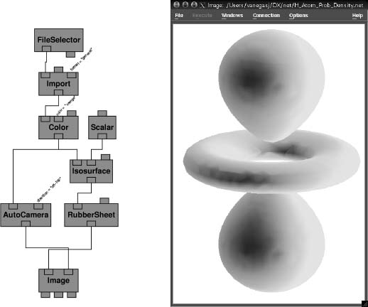
Figure C.16 The visual program on the left produces the surface plot of constant probability density for the 3-D state on the right.
C.5.6 Sample 6: 3-D Functions,the Hydrogen Atom
The electron probability density ρnlm(r, θ, φ) (calculated by H_atom_wf.java) is a scalar function that depends on three spatial variables [Libb 03]. Yet because the physical interpretation of a density is different from that of a potential, different visualization techniques are required. One way of visualizing a density is to draw 3-D surfaces of constant density. Because the density has a single fixed value, the surfaces indicates regions of space that have equal likelihood of having an electron present. The visual program H_atom_prob_density.net_1 produced the visualization in Figure C.16. This visualization does an excellent job of conveying the shape and rotational symmetry of the state but does not provide information about the variation of the density throughout space.
A modern technique for visualizing densities is volume rendering. This method, which is DX’s default for 3-Dscalar functions, represents the density as a translucent cloud or gel with light shining through it. The program H_atom_prob_density.net_2 produces the electron cloud shown in Figure C.17. We see a fuzziness and a color change indicative of the variation of the density, but no abrupt edges. However, in the process we lose the impression of how the state fills space and of its rotational symmetry.In addition, our eye equates the fuzziness with a low-quality image, both because it is less sharp and because the colors are less intense. We now alleviate that shortcoming.
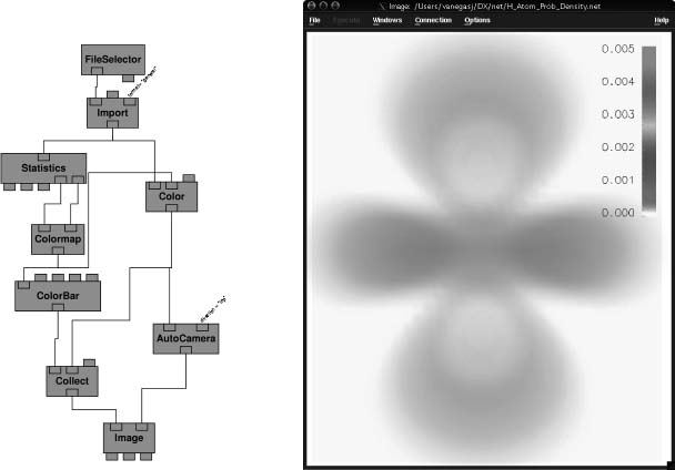
Figure C.17 The visual program on the left produces the 3-D cloud density on the right.
As we have seen with the electric field, visualizing the variation of a field along two planes is a good way to convey its 3-D nature. Because the electron cloud is rotationally symmetric about the z axis, we examine the variation along the xy and yz planes (the xz plane is equivalent to the yz one). Figure C.18 shows the visualization obtained with the visual program H_atom_prob_density.net_3. Here Slab modules are used to create the 2-D plots of the density on the two planes, and the planes are made semitransparent for ease of interpretation. This visualization is clearly an improvement over those in Figure C.17, both in sharpness and in conveying the 3-D nature of the density.
C.6 Animations with OpenDX
An animation is a collection of images called frames that when viewed in sequence convey the sensation of continuous motion. It is an excellent way to visualize the behavior in time of a simulation or of a function f(x, t), as might occur in wave motion or heat flow. In the Codes section of the CD (available online: http://press.princeton.edu/landau_survey/), we give several sample animations of the figures in this book and we recommend that you try them out to see how effective animation is as a tool.

Figure C.18 The visual program on the left produces the 3-D probability density on the right. The density is plotted only on the surface of the xy and yz planes,with both planes made semitransparent.
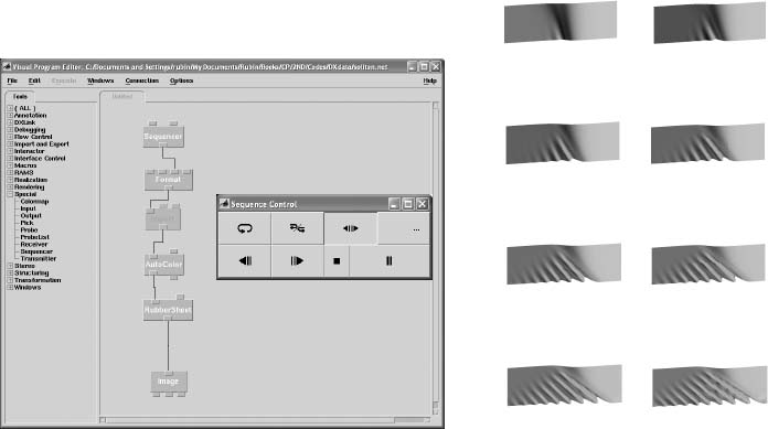
Figure C.19 Left: The visual DX program used to create an animation of the formation of a soliton wave. The arrows on the Sequence Control are used to move between the frames. Right: Nine frames from the DX animation.
The easiest animation format to view is an animated gif, which can be viewed with any Web browser. (The file ends with the familiar .gif extender but has a series of images that load in sequence.) Otherwise, animations tend to be in multimedia/video file formats such as MPEG, DivX, mp3, yuv, ogg, and avi. Not all popular multimedia players such as RealPlayer, Windows Media Player, and QuickTime player play all formats, so you may need to experiment. We have found that the free multimedia players VLC and ImageMagick work well for various audio and video formats, as well as for DVDs, VCDs, and streaming protocols (the player starts before all the media are received).
![]()
Asimple visual program to create animations of the formation of solitons (Chapter 19, “Solitons and Computational Fluid Dynamics”) with OpenDX is shown on the left in Figure C.19. The new item here is the Sequencer module, which provides motion control (it is found under Tools/Special). As its name implies, Sequencer produces a sequence of integers corresponding to the frame numbers in the animation (the user sets the minimum, maximum, increment, and starting frame number). It is connected to the Format module, which is used to create file names given the three input values: (1) soliton, (2) the output of the Sequencer, and (3) a .general for the suffix. The Import module is used to read in the series of data files as the frame number increases.
On the right in Figure C.19 we show a series of eight frames that are merged to form the animation (a rather short animation). They are plots of the data files soliton001.dat, soliton002.dat,… soliton008.dat, with one file for each frame and with a specified Field in each file imported a teach time step. The Sequencer outputs the integer 2, and the output string from the Format becomes soliton002.general. This string is then input to Import as the name of the .general file to read in. In this way we import and image a whole series of files.
C.6.1 Scripted Animation with OpenDX
By employing the scripting ability of OpenDX, it is possible to generate multiple images with the Visual Editor being invoked only for the first image. The multiple images can then be merged into a movie. Here we describe the steps followed to create an .mpg movie:
1. Assemble a sequence of data files, one for each frame of the movie.
2. Use OpenDX to create an image file from the first data file. Also create. general and .net files.
3. Employ OpenDX with the –script option invoked to create a script. Read in the data file and the .net file and create a .jpg image. (Other image types are also possible, but this format produces good quality without requiring excessive disk space.)
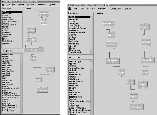
Figure C.20 Left: Use of the Visual Program Editor to produce the image of a wave packet that passes through a slit. Right: The visual program used to produce frames for an OpenDX animation.
4. Merge the .jpg image files into a movie by using a program such as Mplayer in Linux. We suggest producing the movie in the .avi or .mpg format.
To illustrate these steps, assume that you have a solution to Laplace’s equation for a two-plate capacitor, with the voltage on the plates having a sinusoidal time dependence. Data files lapl000.dat, lapl001.dat,. . ., lapl120.dat are produced in the Gnuplot 3-D format, each corresponding to a different time. To produce the first OpenDX image, lapl000.dat is copied to data.dat, which is a generic name used for importing data into OpenDX, and the file lapl.general describing the data is saved:
Next, the Visual Program Editor is used to create the visual program (Figure C.20 right), and the program is saved as the file lapl.net.
To manipulate the first image so that the rest of them have the same appearance, we assembled the visual program in Figure C.20.
1. In the Control panel, double-click FileSelector and enter the path and name (lapl.general) of the .general file saved in the previous step.
2. The images should be plotted to the same scale for the movie to look continuous. This means you do not want autoscale on. Select AutoColor and expand the box. For min select –100 and for max select 100. Do the same in RubberSheet. This sets the scale for all the figures.
3. From the rotate icon, select axis, enter x, and in rotation enter –85. For the next axis button enter y, and in the next rotation button enter 10.0. These angles ensure a good view of the figure.
4. To obtain a better figure, on the Scale icon change the default scale from [1 1 1] to [1 4 3].
5. Next the internalDXscript dat2image.sh is written by using the Script option.
6. Now we write an image to the disk. Select WriteImage and in the second box enter image as the name of a generic image. Then for format select tiff to create image.tiff.
7. You now have a script that can be used to convert other data files to images.
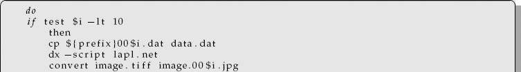
We have scripted the basic DX procedure for producing an image from data. To repeat the process for all the frames that will constitute a movie, we have written a separate shell script called dat2image.sh (it is on the CD (available online: http://press.princeton.edu/landau_survey/)) that
1. Individually copies each data file to a generic file data.dat, which is what DX uses as input with lapl.general.
2. Then OpenDX is called via
dx -script lapl.net
to generate images on the disk.
3. The tiff image image.tiff is transformed to the jpg format with names such as image.001. jpg, image.002. jpg, and so on (on Linux this is done with convert).
4. The Linux program MPlayer comes with an encoder called mencoder that takes the. jpg files and concatenates them into an .avi movie clip that you can visualize with Linux programs such as Xine, Kaffeine, and MPlayer. The last-mentioned program can be downloaded for Windows, but it works only in the System Symbol window or shell:
> mplayer -loop 0 output.avi
You will see the film running continuously. This file is called dat2image.sh and is given in Listing C.1. To run it in Linux,
> sh dat2image.sh

Listing C.1 The shell script dat2image.sh creates an animation. The script is executed by entering its name at a shell prompt.
In each step of this shell script, the script copies a data file, for example, lapl014.dat in the fifteenth iteration, to the generic file data.dat. It then calls dx in a script option with the generic file lapl.net.An image image.14.tiff is produced and written to disk. This file is then transformed to image.14.jpg using the Linux convert utility. Once you have 120 .jpg files, Mplayer is employed to make the .avi animation, which can be visualized with the same Mplayer software or with any other that accepts .avi format, for example, Kaffeine, Xine, and MPlayer in Linux. In Windows you have todownload MPlayer for Windows, which works only in the DOS shell (system symbol window). To use our program, you have to edit lapl.net to use your file names. Ensure that lapl.general and file data.dat are in the same directory.
C.6.2 Wave Packet and Slit Animation
On the left in Figure C.20 we show frames from an OpenDX movie that visualizes the solution of the Schrödinger equation for a Gaussian wave packet passing through a narrow slit. There are 140 frames (slit001.dat– slit140.dat), with each generated after five time iterations, with 45 × 30 data in a column. A separate program generates the data file SlitBarrier.dat that has only the potential (the barrier with the slit). The images produced by these programs are combined into one showing the wave packet and the potential. On the left side of the visual program:
• Double-click FileSelector and enter /home/mpaez/slit.general, the path, and the name of the file in the Control Panel under Import name.
• Double-click AutoColor and enter 0.0 for min; for max enter 0.8.
• Double-click RubberSheet and repeat the last step for min and max.
• Double-click the left Scale icon and change [111] to [113].
• Double-click WriteImage and write the name of the generic image slitimage and format = tiff.
On the right side of the visual program:
• Double-click Import and enter the path and the .general file name /home/ mpaez/SlitBarrier.general.
• Double-click AutoColor and select 0.0 for min (use expand) and 0.8 for max.
• Double-click the right-hand Scale and enter [1 1 2]. The scale for the barrier is smaller than the one for the wave packet so that the barrier does not hide too much of the wave packet.
In this scheme we use the Image icon to manipulate the image to obtain the best view. This needs to be done just once.
1 Juan Manuel Vanegas Moller and Guillermo Avendaño assisted in the preparation of this appendix.