
Modern graphical user interfaces are founded on the concept of direct manipulation of graphical objects on the screen: buttons, sliders, and other function controls, as well as icons and other representations of data objects. The ability to choose and modify objects on the screen is fundamental to the interfaces we design today. But to perform these manipulations, we also require input mechanisms that give us the flexibility to do so. This chapter discusses both the basics of direct manipulation and the various devices that have been employed to make such manipulation possible.
In 1974, Ben Shneiderman coined the term direct manipulation to describe an interface design strategy consisting of three important components:
Visual representation of the objects that an application is concerned with
Visible and gestural mechanisms for acting upon these objects (as opposed to text commands)
Immediately visible results of these actions
A less rigorous definition would say that direct manipulation is clicking and dragging things, and although this is true, it can easily miss the point that Shneiderman subtly makes. Notice that two of his three points concern the visual feedback the program offers to users. It might be more accurate to call it “visual manipulation” because of the importance of what users see during the process. Unfortunately, many attempts at direct-manipulation idioms are implemented without adequate visual feedback, and these interactions fail to effectively create an experience of direct manipulation.

Another important consideration is that users can directly manipulate only things that are displayed by the application. In other words, it must be visible to manipulate it. If you want to create effective direct-manipulation idioms in your software, you must take care to render data, objects, controls, and cursors with a certain amount of rich graphic detail.
Direct manipulation is simple, straightforward, easy to use, and easy to remember. However, when most users are first exposed to a given direct-manipulation idiom, they do not immediately intuit or discover how to use it. Direct manipulation idioms often must be taught, but their strength is that teaching them is easy, and once taught, they are seldom forgotten. It is a classic example of idiomatic design. Because the visible and direct nature of these interactions bears such similarity to interactions with the objects in the physical world, we are well suited to remember these skills.
With regard to direct manipulation, Apple’s classic Human Interface Style Guide says, “Users want to feel that they are in charge of the computer’s activities.” The Macintosh user interface itself makes it clear that Apple believes in direct manipulation as a fundamental tenet of good user-interface design. However, user-centered design guru Don Norman says “Direct manipulation, first-person systems have their drawbacks. Although they are often easy to use, fun, and entertaining, it is often difficult to do a really good job with them. They require the user to do the task directly, and the user may not be very good at it.” Whom should we believe?
The answer, of course, is both of them. Direct manipulation is an extremely powerful tool; but it can require skill development for users to become effective. Many direct manipulation idioms require motor coordination and a sense of purpose. For example, even moving files between folders in Windows Explorer can be a complicated task requiring dexterity and foresight. Keep these challenges in mind as you design direct manipulation idioms — some amount of direct manipulation is usually a good thing, but depending on the skills and usage contexts of your personas, it’s also possible to go overboard. You should always consider what users need to manipulate themselves, and what the application can help them with, more indirectly.
Most direct manipulation interaction idioms fall into one of seven categories:
Pointing
Selection
Drag and drop
Control manipulation
Palette tools
Object manipulation (such as positioning, shaping, and resizing)
Object connection
We discuss each of these as we progress through the chapter, starting with the fundamentals of pointing devices (such as the mouse), the input methods that are used to drive modern graphical user interfaces.
Direct manipulation of objects on a screen is made possible through the use of a pointing device. Clearly, the best way to point to something is with your fingers. They’re always handy; you probably have several nearby right now. The only real drawback they have is that their ends are too blunt for precisely pointing at high-resolution screens, and most high-resolution screens also can’t recognize being pointed at. Because of this limitation, we use a variety of other pointing devices, the most popular of which is a mouse.
As you roll the mouse around on your desktop, you see a visual symbol, the cursor, move around on the computer screen in the same way. Move the mouse left and the cursor moves left; move the mouse up and the cursor moves up. As you first use the mouse, you immediately get the sensation that the mouse and cursor are connected, a sensation that is extremely easy to learn and equally hard to forget.
This is good, because perceiving how the mouse works by inspection is nearly impossible. In a scene from the movie Star Trek IV: The Voyage Home, Scotty (one of the best engineers from the 24th century) comes to 20th-century Earth and tries to work a computer. He picks up the mouse, holds it to his mouth, and speaks into it. This scene is funny and believable: The mouse has no visual affordance that it is a pointing device. However, as soon as we are shown how the movements of the mouse and the cursor are related, understanding is instantaneous. As we’ve said, all idioms must be learned, but good idioms need be learned only once. The mouse is certainly a good idiom in that regard.
Of course, there are several other options for pointers that a designer should take into consideration, including trackballs, touchpads (or trackpads), tablets, and touch screens. It’s worth considering that while the first two basically behave like mice (with different ergonomic factors), tablets and touch screens are a bit different.
Although the mouse is a relative pointing device — moving the mouse moves the cursor based upon the current cursor position — tablets usually absolute pointing devices — each location on the tablet maps directly to a specific location on the screen. If you pick up the pen from the top-left corner and put it down in the bottom-right corner, the cursor immediately jumps from the top-left to the bottom-right of the screen. The same is true of touch screens.
When you mouse around on the screen, there is a distinct dividing line between near motions and far motions: Your destination is either near enough that you can keep the heel of your hand stationary on your desktop, or you must pick up your hand. When the heel of your hand is down and you move the cursor from place to place, you use the fine motor skills of the muscles in your fingers. When you lift the heel of your hand from the desktop to make a larger move, you use the gross motor skills of the muscles in your arm. Transitioning between gross and fine motor skills is challenging. It involves coordinating two muscle groups that require dexterity to use together, which typically requires time and practice for computer users to master. (It’s actually similar to drawing, another skill that requires practice to do well.) Touch-typists dislike anything that forces them to move their hands from the home position on the keyboard because it requires a transition between their muscle groups. Similarly, moving the mouse cursor across the screen to manipulate a control forces a change from fine to gross and back to fine motor skills. Don’t force users to do this continually.
Clicking a mouse button also requires fine motor control — without it, the mouse and cursor will inadvertently move, botching the intended action. A user must learn to plant the heel of his hand and go into fine motor control mode to position the cursor in the desired location, then he must maintain that position when he clicks. Further, if the cursor starts far away from the desired control, the user must first use gross motor control to move the cursor near the control before shifting to fine motor control to finish the job. Some controls, such as scrollbars, compound the problem by forcing users to switch back and forth between fine and gross motor skills several times to complete an interaction (see Figure 19-1).

Figure 19-1. The familiar scrollbar, shown on the left, is one of the more difficult-to-use GUI controls. To go between scrolling up and scrolling down, a user must transition from the fine motor control required for clicking the up button to the gross motor control needed to move her hand to the bottom of the bar, and back to fine motor control to accurately position the mouse and click the down button. If the scrollbar were modified only slightly, as in the center, so that the two buttons were adjacent, the problem would go away. (Macintosh scrollbars can be similarly configured to place both arrow buttons at the bottom.) The scrollbar on the right is a bit visually cluttered, but has the most flexible interaction. Scroll wheels on the input device are also a great solution to the problem. For more on scrollbars, see Chapter 21.
It is absolutely critical that designers pay significant attention to users’ aptitudes, skills, and usage contexts and make a conscious decision about how much complex motor work using an interface should require. This is a delicate balancing act between reducing complexity and user effort and providing useful and powerful tools. It’s almost always a good idea for things that are used together to be placed together.
Not only do the less manually dexterous find the mouse problematic, but also many experienced computer users, particularly touch-typists, find the mouse difficult at times. For many data-intensive tasks, the keyboard is superior to the mouse. It is frustrating to have to pull your hands away from the keyboard to reposition a cursor with the mouse, only to have to return to the keyboard again. In the early days of personal computing, it was the keyboard or nothing, and today, it is often the mouse or nothing. Programs should fully support both the mouse and the keyboard for all navigation and selection tasks.
A significant portion of computer users have some trouble using a mouse, so if we want to be successful, we must design our software in sympathy with them as well as with expert mouse users. This means that for each mouse idiom there should be at least one non-mouse alternative. Of course, this may not always be possible — it would be ridiculous to try to support drawing interactions without a mouse. However, most enterprise and productivity software lends itself pretty well to keyboard commands.
The inventors of the mouse tried to figure out how many buttons to put on it, and they couldn’t agree. Some said one button was correct, whereas others swore by two buttons. Still others advocated a mouse with several buttons that could be clicked separately or together so that five buttons could yield up to 32 distinct combinations. Ultimately, though, Apple settled on one button for its Macintosh, Microsoft went with two, and the Unix community (Sun Microsystems in particular) went with three. Apple’s extensive user testing determined that the optimum number of buttons for beginners was one, thereby enshrining the single-button mouse in the pantheon of Apple history. This was unfortunate, as the right mouse button usually comes into play soon after a person graduates from beginner status and becomes a perpetual intermediate. A single button sacrifices power for the majority of computer users in exchange for simplicity for beginners. Recently, Apple has admitted the importance of right-click contextual menus and Macintoshes now come with two-button mice.
In general, the left mouse button is used for all the primary direct-manipulation functions, such as triggering controls, making selections, drawing, and so on. The most common meaning of the left mouse button is activation or selection. For standard controls, such as buttons or check boxes, clicking the left mouse button means pushing the button or checking the box. If you are clicking in data, the left mouse button generally means selecting. We’ll discuss selection idioms later in the chapter.
The right mouse button was long treated as nonexistent by Microsoft and many others. Only a few brave programmers connected actions to the right mouse button, and these actions were considered to be extra, optional, or advanced functions. When Borland International used the right mouse button as a tool for accessing a dialog box that showed an object’s properties, the industry seemed ambivalent towards this action although it was, as they say, critically acclaimed. This changed with Windows 95, when Microsoft finally followed Borland’s lead. Today the right mouse button serves an important and extremely useful role: enabling direct access to properties and other context-specific actions on objects and functions.
Generally speaking, you can’t count on users having a mouse with a middle button, unless they are using specialized tools that are so important that they will buy any hardware that is required to use the product. As a result, most applications use only the middle button as a shortcut. In its style guide, Microsoft states that the middle button “should be assigned to operations or functions already in the interface,” a definition it once reserved for the right mouse button. We have some friends who swear by the middle button. They use it as a shortcut for double-clicking with the left mouse button — which is enabled by configuring the mouse driver.
One of the most useful innovations in pointing devices is the scroll wheel. There are several variations, but it is typically a small wheel embedded in the mouse under the user’s middle finger. Rolling the wheel forward scrolls the window up, and rolling it backwards scrolls the window down. The fantastic thing about the scroll wheel is it allows users to avoid dealing with the challenges of interacting with scrollbars (see Figure 19-1).
Using meta-keys in conjunction with a mouse can extend direct manipulation idioms. Meta-keys include the Ctrl key, the Alt key, the Command key (on Apple Computers), and the Shift keys.
Commonly, these keys are used to modify the functions of selection and drag-and-drop interactions. For example, in Windows Explorer, holding the Ctrl key while dragging and dropping a file turns the function from a Move into a Copy. These keys are also commonly used to adjust mouse behavior — holding Shift while dragging often constrains cursor movement to a single direction (either up/down or right/left). We’ll discuss more about these conventions later in the chapter.
Apple has had a history of well-articulated standards for use of meta-keys in combination with a mouse, and there tends to be a fair amount of consistency in their usage. In the Windows world, no single voice articulated user-interface standards in the same way, but some conventions (often rather similar to Apple’s) have emerged.
Using cursor hinting to dynamically show the meanings of meta-keys is a good idea. While the meta-key is pressed, the cursor should change to reflect the new function of the idiom.
At its most basic, there are two atomic operations you can perform with a mouse: You can move it to point at different things, and you can click the buttons. Any further mouse actions beyond pointing and clicking will be made up of a combination of one or more of those actions. The complete set of mouse actions (that can be accomplished without using meta-keys) is summarized in the following list. For the sake of discussion, we have assigned a short name to each of the actions (shown in parenthesis).
Point (Point)
Point, click left button, release (click)
Point, click right button, release (right-click)
Point, click left button, drag, release (click and drag)
Point, click left button, release, click left button, release (double-click)
Point, click left button, click right button, release, release (chord-click)
Point, click left button, release, click, drag, release (double-drag)
An expert mouse user may perform all seven actions, but only the first five items on the list are within the scope of normal users.
This simple operation is a cornerstone of the graphical user interface and is the basis for all mouse operations. A user moves the mouse until the onscreen cursor is pointing to, or placed over, the desired object. Objects in the interface can take notice of when they are being pointed at, even when they are not clicked. Objects that can be directly manipulated often change their appearance subtly to indicate this attribute when the mouse cursor moves over them. This property is called pliancy and is discussed in detail later in this chapter.
While a user holds the cursor over a target, he clicks the button down and releases it. In general, this action is defined as triggering a state change in a control or selecting an object. In a matrix of text or cells, the click means, “Bring the selection point over here.” For a pushbutton control, a state change means that while the mouse button is down and directly over the control, the button will enter and remain in the pushed state. When the mouse button is released, the button is triggered, and its associated action occurs.
If, however, the user, while still holding the mouse button down, moves the cursor off the control, the pushbutton control returns to its unpushed state (though input focus is still on the control until the mouse button is released). When the user releases the mouse button, input focus is severed, and nothing happens. This provides a convenient escape route if a user changes his mind or inadvertently clicks the wrong button. The mechanics of mouse-down and mouse-up events in clicking are discussed in more detail later in this chapter.
This versatile operation has many common uses including selecting, reshaping, repositioning, drawing, and dragging and dropping. We’ll discuss all of these in this chapter and the rest of the book.
As with clicking, it’s often important to have an escape hatch for users who become disoriented or have made an error. The Windows scrollbar provides a good example of this: It allows users to scroll successfully without having the mouse directly over the scrollbar (imagine how hard it would be to use if it behaved like a button). However, if a user drags too far from the scrollbar, it resets itself to the position it was in before being clicked on. This behavior makes sense, since scrolling over long distances requires gross motor movements that make it difficult to stay within the bounds of the narrow scrollbar control. If the drag is too far off base, the scrollbar makes the reasonable assumption that the user didn’t mean to scroll in the first place. Some programs set this limit too close, resulting in frustratingly temperamental scroll behavior.
If double-clicking is composed of single-clicking twice, it seems logical that the first thing double-clicking should do is the same thing that a single-click does. This is indeed its meaning when the mouse is pointing at data. Single-clicking selects something; double-clicking selects something and then takes action on it.
This fundamental interpretation comes from the Xerox Alto/Star by way of the Macintosh, and it remains a standard in contemporary GUI applications. The fact that double-clicking is difficult for less dexterous users — painful for some and impossible for a few — was largely ignored. The solution to this accessibility problem is to include double-click idioms but ensure that their functions have equivalent single-click idioms.
Although double-clicking on file and application icons is well defined, double-clicking on most controls has no meaning, and the extra click is discarded. Or, more often, it will be interpreted as a second, independent click. Depending on the control, this can be benign or problematic. If the control is a toggle button, you may find that you’ve just returned it to the state it started in (rapidly turning it on, then off). If the control is one that goes away after the first click, like the OK button in a dialog box, for example, the results can be quite unpredictable — whatever was directly below the pushbutton gets the second button-down message.
Chord-clicking means clicking two buttons simultaneously, although they don’t really have to be clicked or released at precisely the same time. To qualify as a chord-click, the second mouse button must be clicked before the first mouse button is released.
There are two variants to chord-clicking. The first is the simplest, whereby the user merely points to something and clicks both buttons at the same time. This idiom is very clumsy and has not found much currency in existing software, although some creative and desperate programmers have implemented it as a substitute for a Shift key on selection.
The second variant is using chord-clicking to cancel a drag. The drag begins as a simple, one-button drag, then the user adds the second button. Although this technique sounds more obscure than the first variant, it actually has found wider acceptance in the industry. It is well suited for canceling drag operations, and we’ll discuss it in more detail later in the chapter.
This is another expert-only idiom. Faultlessly executing a double-click and drag can be like patting your head and rubbing your stomach at the same time. Like triple-clicking, it is useful only in specialized, sovereign applications. Use it as a variant of selection extension. In Microsoft Word, for example, you can double-click text to select an entire word; so, expanding that function, you can extend the selection word by word by double-dragging.
In a big sovereign application that has many permutations of selection, idioms like this one are appropriate. But for most products, we recommend that you stick with more basic mouse actions.
Each time the user clicks a mouse button, the program must deal with two discrete events: the mouse-down event and the mouse-up event. How these events are interpreted varies from platform to platform and product to product. Within a given product (and ideally a platform), these actions should be made rigidly consistent.
When selecting an object, the selection should always take place on mouse-down. The button click may be the first step in a dragging sequence, and you can’t drag something without first selecting it.
On the other hand, if the cursor is positioned over a control rather than selectable data, the action on the mouse-down event is to tentatively activate the control’s state transition. When the control finally sees the button-up event, it then commits to the state transition (see Figure 19-2).
Figure 19-2. These images depict feedback and state change of a check box in Windows XP. The first image shows an unselected check box, the second is the mouseover state (or hover), the third shows the feedback to the click (or mouse-down), the fourth shows what happens when the button is released (mouse-up) but with a hover, and the final image shows the selected state of the check box without a hover. Notice that while there is visual feedback to the click, the check box control doesn’t register a state change until the mouse-up or release.
This mechanism allows users to gracefully bow out of an inadvertent click. After clicking a button, for example, a user can just move the mouse outside of the button and release the mouse button. For a check box, the meaning is similar: On mouse-down the check box visually shows that it has been activated, but the check doesn’t actually appear until the mouse-up transition. This idiom is called “pliant response hinting” and is further described in the section on object hinting.
The cursor is the visible representation of the mouse’s position on the screen. By convention, it is normally a small arrow pointing diagonally up and left, but under program control it can change to any shape as long as it stays relatively small (32 x 32 pixels in Windows XP). Because the cursor frequently must resolve to a single pixel in order to point at small things, there must be some way for the cursor to indicate precisely which pixel is the one pointed to. This is accomplished by designating one single pixel of any cursor as the actual locus of pointing, called the hotspot. For the standard arrow, the hotspot is, logically, the tip of the arrow. Regardless of the shape the cursor assumes, it always has a single hotspot pixel.
As discussed, the key to successful direct manipulation is rich visual feedback. It should be obvious to users which aspects of the interface are manipulable, which are informational, and which are décor. Especially important for creating effective interaction idioms is attention to mouse cursor feedback.
Returning to Norman’s concept of affordance (see Chapter 13), it’s absolutely critical to communicate visually how various interface elements may be used. We use the term pliant to refer to objects or screen areas that may be manipulated by a user. For example, a button control is pliant because it can be “pushed” by the mouse cursor. Any object that can be picked up and dragged is pliant, and every cell in a spreadsheet and every character in a word processor document is pliant.
In most cases, the fact that an object is pliant should be communicated to users. The only situation where this isn’t true is when you are concerned with presenting rich, complex functionality solely to expert users with no concern about their ability to learn and use the application. In these cases, the screen real estate and visual attention that would otherwise be devoted to communicating pliancy may be more appropriately used elsewhere. Do not make the decision to take this route lightly.
There are three basic ways to communicate — or hint at — the pliancy of an object to users: by creating static visual affordances of the object itself, by dynamically changing visual affordances of the object, or by changing the visual affordances of the cursor as it passes over and interacts with the object.
Static object hinting is when the pliancy of an object is communicated by the static rendering of the object itself. For example, the three-dimensional sculpting of a button control is static visual hinting because it provides manual affordance for pushing (see Figure 19-3).
Figure 19-3. The buttons on the left are an example of static visual hinting: Their “clickability” is suggested by the dimensional rendering. The toolbar butcons on the right demonstrate dynamic visual hinting: While the Bold toggle doesn’t appear to be a button at first glance, passing the mouse cursor over it causes it to change, thereby creating affordance.
For interfaces with a lot of objects and controls, static object hinting can require an impractical amount of rendered screen elements. If everything has a three-dimensional feel to provide affordance, your interface can start to look like a sculpture garden. Also, static hinting requires that objects be large enough to accommodate the creation of affordance. These impracticalities call for dynamic visual hinting.
Dynamic visual hinting works like this: When the cursor passes over a pliant object, it changes its appearance (see Figure 19-3). This action occurs before any mouse buttons are clicked and is triggered by cursor fly-over only, and is commonly referred to as a “rollover.” A good example of this is behavior of butcons (iconlike buttons) on toolbars: Although there is no persistent buttonlike affordance of the butcon, passing the cursor over any single butcon causes the affordance to appear. The result is a powerful hint that the control has the behavior of a button, and the elimination of the persistent affordance dramatically reduces visual clutter on the toolbar.
Pliant response hinting should occur if the mouse is clicked (but not released) while the cursor is inside a control. The control must visually show that it is poised to undergo a state change (see Figure 19-2). This action is important and is often neglected by those who create their own controls.
A pushbutton needs to change from a visually raised state to a visually indented state; a check box should highlight its box but not show a check just yet. Pliant response is an important feedback mechanism for any control that either invokes an action or changes its state, letting the user know that some action is forthcoming if she releases the mouse button. The pliant response is also an important part of the cancel mechanism. When the user clicks down on a button, that button responds by becoming indented. If the user moves the mouse away from that button while still holding the mouse button down, the onscreen button should return to its quiescent, raised state. If the user then releases the mouse button, the onscreen button will not be activated (which is consistent with the lack of pliant response).
Cursor hinting communicates pliancy by changing the appearance of the cursor as it passes over an object or screen area. For example, when the cursor passes over a window’s frame, the cursor changes to a double-ended arrow showing the axis in which the window edge can be stretched. This is the only visual affordance that the frame can be stretched.
Cursor hinting should first and foremost make it clear to users that an object is pliant. It is also often useful to indicate what type of direct-manipulation action is possible.
Generally speaking, controls should offer static or dynamic visual hinting, whereas pliant (manipulable) data more frequently should offer cursor hinting. For example, it is difficult to make dense tabular data visually hint at pliancy without disturbing its clear representation, so cursor hinting is the most effective method. Some controls are small and difficult for users to spot as readily as a button, and cursor hinting is vital for the success of such controls. The column dividers and screen splitters in Microsoft Excel are good examples, as you can see in Figure 19-4.

Figure 19-4. Excel uses cursor hinting to highlight several controls that are not obviously pliant by themselves. The width of the individual columns and height of rows can be set by dragging on the short vertical lines between each pair of columns, so the cursor changes to a two-headed horizontal arrow both hinting at the pliancy and indicating the permissible drag direction. The same is true for the screen-splitter controls. When the mouse is over an unselected editable cell, it shows the plus cursor, and when it is over a selected cell, it shows the drag cursor.
There is a variant of cursor hinting called wait cursor hinting that is often used when an application is doing something that causes it to be unresponsive — like performing calculation-intensive functions or opening a file. Here, the cursor is used to visually indicate that the application has become unresponsive. In Windows, this image is the familiar hourglass. Other operating systems have used wristwatches, spinning balls, and steaming cups of coffee.
When this idiom was introduced in GUIs, if one application became unresponsive then the cursor would change for all applications. This was confusing and misleading. Modern, multithreaded operating systems no longer feature this shortcoming, but it is important to provide as much context as possible about the source of any latency or lack of responsiveness.
The act of choosing an object or a control is referred to as selection. This is a simple idiom, typically accomplished by pointing and clicking on the item in question (though there are other keyboard- and button-actuated means of doing this). Selection is often the basis for more complex interactions — once a user has chosen something, she is then in the appropriate context for performing an action on that thing. The sequence of events implied by such an idiom is called object verb ordering.
At the foundation of every user interface is the way in which a user can express commands. Almost every command has a verb that describes the action and an object that describes what will be acted upon (in more technical parlance, these are the operation and the operands, respectively).
If you think about it, you can express a command in two ways: With the verb first, followed by the object; or with the object first, followed by the verb. These are commonly called verb-object and object-verb orders, respectively. Modern user interfaces use both orders.
Verb-object ordering is consistent with the way that commands are formed in English. As a result, it was only logical that command-line systems mimic this structure in their syntax (for example, to delete a file in Unix, one must type “rm filename.txt”.
When graphical user interfaces first emerged, it became clear that verb-object ordering created a problem. Without the rigid, formal structures of command-line idioms, graphical interfaces must use the construct of state to tie together different interactions in a command. If a user chooses a verb, the system must then enter a state — a mode — to indicate that it is waiting for the user to select an object to act on. In the simple case, the user will then choose a single object, and all will be well. However, if a user wants to act on more than one object, the system can only know this if the user tells it in advance how many operands he will enter, or if the user enters a second command indicating that has completed his object list. These are both very clumsy interactions and require users to express themselves in a very unnatural manner that is difficult to learn. What works just fine in a highly structured linguistic environment falls apart completely in the looser universe of the graphical user interface.
With an object-verb command order, we don’t need to worry about termination. Users select which objects will be operated upon and then indicate which verb to execute on them. The application then executes the indicated function on the selected data. A benefit of this is that users can easily execute a series of verbs on the same complex selection. A second benefit is that when a user chooses an object, the application can then show only appropriate commands, potentially reducing the user’s cognitive load and reducing the amount of visual work required to find the command (in a visual interface, all commands should be visually represented).
Notice that a new concept has crept into the equation — one that doesn’t exist, and isn’t needed in a verb-object world. That new concept is called selection. Because the identification of the objects and the verb are not part of the same user interaction, we need a mechanism to indicate which operands are selected.
The object-verb model can be difficult to understand in the abstract, but selection is an idiom that is very easy to grasp and, once shown, is rarely forgotten (clicking an e-mail in Outlook and deleting it, for example, quickly becomes second nature). Explained through the linguistic context of the English language, it doesn’t sound too useful that we must choose an object first. On the other hand, we use this model frequently in our nonlinguistic actions. We pick up a can, and then use a can opener on it.
In interfaces that don’t employ direct manipulation, such as some modal dialog boxes, the concept of selection isn’t always needed. Dialog boxes naturally come with one of those object-list-completion commands: the OK button. Here, users may choose a function first and one or more objects second.
While object-verb orderings are more consistent with the notion of direct manipulation, there are certainly cases where the verb-object command order is more useful or usable. These are cases where it isn’t possible or reasonable to define the objects up front without the context of the command. An example here is mapping software, where a user probably can’t always select the address he wants to map from a list (though we should allow this for his address book); instead, it is most useful for him to say “I want to create a map for the following address....”
Selection is a pretty simple concept, but there are a couple of basic variants worth discussing. Because selection is typically concerned with objects, these variants are driven by two broad categories of selectable data.
In some cases, data is represented by distinct visual objects that can be manipulated independently of other objects. Icons on the Desktop and vector objects in drawing applications are examples. These objects are also commonly selected independently of their spatial relationships with each other. We refer to these as discrete data, and their selection as discrete selection. Discrete data is not necessarily homogeneous, and discrete selection is not necessarily contiguous.
Conversely, some applications represent data as a matrix of many small contiguous pieces of data. The text in a word processor or the cells in a spreadsheet are made up of hundreds or thousands of similar little objects that together form a coherent whole. These objects are often selected in contiguous groups, and so we call them contiguous data, and selection within them contiguous selection.
Both contiguous selection and discrete selection support single-click selection and click-and-drag selection. Single-clicking typically selects the smallest useful discrete amount and clicking and dragging selects a larger quantity, but there are other significant differences.
There is a natural order to the text in a word processor’s document — it consists of contiguous data. Scrambling the order of the letters destroys the sense of the document. The characters flow from the beginning to the end in a meaningful continuum and selecting a word or paragraph makes sense in the context of the data, whereas random, disconnected selections are generally meaningless. Although it is theoretically possible to allow a discrete, discontiguous selection — several disconnected paragraphs, for example — the user’s task of visualizing the selections and avoiding inadvertent, unwanted operations on them is more trouble than it is worth.
Discrete data, on the other hand, has no inherent order. Although many meaningful orders can be imposed on discrete objects (such as sorting a list of files by their modification dates), the lack of a single inherent relationship means that users are likely to want to make discrete selections (for example, Ctrl+clicking multiple files that are not listed adjacently). Of course, users may also want to make contiguous selections based upon some organizing principle (such as the old files at the bottom of that chronologically ordered list). The utility of both approaches is evident in a vector drawing application (such as Illustrator or PowerPoint). In some cases, a user will want to perform a contiguous selection on objects that are close to each other, and in other cases, she will want to select a single object.
Typically, when a selection is made, any previous selection is unmade. This behavior is called mutual exclusion, as the selection of one excludes the selection of the other. Typically, a user clicks on an object and it becomes selected. That object remains selected until the user selects something else. Mutual exclusion is the rule in both discrete and contiguous selection.
Some applications allow users to deselect a selected object by clicking on it a second time. This can lead to a curious condition in which nothing at all is selected, and there is no insertion point. You must decide whether this condition is appropriate for your product.
Mutual exclusion is often appropriate for contiguous selection because users cannot see or know what effect their actions will have if selections can readily be scrolled off the screen. Selecting several independent paragraphs of text in a long document might be useful, but it isn’t easily controllable, and it’s easy for users to get into situations where they are causing unintended changes because they cannot see all of the data that they are acting upon. Scrolling, not the contiguous selection, creates the problem, but most programs that manage contiguous data are scrollable.
However, if there is no mutual exclusion for interactions involving discrete selection, a user can select many independent objects by clicking on them sequentially, in what is called additive selection. A list box, for example, can allow users to make as many selections as desired and to deselect them by clicking them a second time. After the user has selected the desired objects, the terminating verb acts on them collectively.
Most discrete-selection systems implement mutual exclusion by default and allow additive selection only by using a meta-key. In Windows, the Shift meta-key is used most frequently for this in contiguous selection; the Ctrl key is frequently used for discrete selection. In a draw program, for example, after you’ve clicked to select one graphical object, you typically can add another one to your selection by Shift-clicking.
While interfaces employing contiguous selection generally should not allow additive selection (at least without an overview mechanism to make additive selections manageable), contiguous-selection interfaces do need to allow selection to be extended. Again, meta-keys should be used. In Word, the Shift key causes everything between the initial selection and the Shift+click to be selected.
Some list boxes, as well as the file views in Windows (both examples of discrete data), do something a bit strange with additive selection. They use the Ctrl key to implement “normal” discrete additive selection, but then they use the Shift key to extend the selection, as if it were contiguous, not discrete data. In most cases this mapping adds confusion, because it conflicts with the common idiom for discrete additive selection.
The click-and-drag operation is also the basis for group selection. For contiguous data, it means “extend the selection” from the mouse-down point to the mouse-up point. This can also be modified with meta-keys. In Word, for example, Ctrl+click selects a complete sentence, so a Ctrl+drag extends the selection sentence by sentence. Sovereign applications should rightly enrich their interaction with these sorts of variants as appropriate. Experienced users will eventually come to memorize and use them, as long as the variants are manually simple.
In a collection of discrete objects, the click-and-drag operation generally begins a drag-and-drop move. If the mouse button is clicked in an area between objects, rather than on any specific object, it has a special meaning. It creates a drag rectangle, shown in Figure 19-5.

Figure 19-5. When the cursor is not on any particular object at mouse-down time, the click-and-drag operation normally creates a drag rectangle that selects any object wholly enclosed by it when the mouse button is released. This is a familiar idiom to users of drawing programs and many word processors. This example is taken from Windows Explorer. The rectangle has been dragged from the upper left to the lower right.
A drag rectangle is a dynamically sizable rectangle whose upper-left corner is the mouse-down point and whose lower-right corner is the mouse-up point. When the mouse button is released, any and all objects enclosed within the drag rectangle are selected as a group.
As we’ve established, selection indicates on which object subsequent actions will operate. If that action involves creating or pasting new data or objects (via keystrokes or a PASTE command), they are somehow added to the selected object. In discrete selection, one or more discrete objects are selected, and the incoming data is handed to the selected discrete objects, which process the data in their own ways. This may cause a replacement action, where the incoming data replaces the selected object. Alternatively, the selected object may treat the incoming data in some predetermined way. In PowerPoint, for example, when a shape is selected, incoming keystrokes result in a text annotation of the selected shape.
In contiguous selection, however, the incoming data always replaces the currently selected data. When you type in a word processor or text-entry box, you replace what is selected with what you are typing. Contiguous selection exhibits a unique quirk: The selection can simply indicate a location between two elements of contiguous data, rather than any particular element of the data. This in-between place is called the insertion point.
In a word processor, the caret (usually a blinking vertical line that indicates where the next character will go) indicates a position between two characters in the text, without actually selecting either one of them. By pointing and clicking anywhere else, you can easily move the caret, but if you drag to extend the selection, the caret disappears and is replaced by the contiguous selection of text.
Spreadsheets also use contiguous selection but implement it somewhat differently than word processors do. The selection is contiguous because the cells form a contiguous matrix of data, but there is no concept of selecting the space between two cells. In the spreadsheet, a single-click will select exactly one whole cell. There is currently no concept of an insertion point in a spreadsheet, although the design possibilities are intriguing (that is, select the line between the top and bottom of two vertically adjacent cells and start typing to insert a row and fill a new cell in a single action).
A blend of these two idioms is possible as well. In PowerPoint’s slide-sorter view, insertion-point selection is allowed, but single slides can be selected, too. If you click on a slide, that slide is selected, but if you click in between two slides, a blinking insertion-point caret is placed there.
If a program allows an insertion point, objects must be selected by clicking and dragging. To select even a single character in a word processor, the mouse must be dragged across it. This means that the user will be doing quite a bit of clicking and dragging in the normal course of using the program, with the side effect that any drag-and-drop idiom will be more difficult to express. You can see this in Word, where dragging and dropping text involves first a click-and-drag operation to make the selection, then another mouse move back into the selection to click and drag again for the actual move. To do the same thing, Excel makes you find a special pliant zone (only a pixel or two wide) on the border of the selected cell. To move a discrete selection, the user must click and drag on the object in a single motion. To relieve the click-and-drag burden of selection in word processors, other direct manipulation shortcuts are also implemented, like double-clicking to select a word.
Selected objects must be clearly, boldly indicated as such to users. The selected state must be easy to spot on a crowded screen, must be unambiguous, and must not obscure normally visible details of the object.
You must ensure that, in particular, users can easily tell which items are selected and which are not. It’s not good enough just to be able to see that the items are different. Keep in mind that a significant portion of the population is color-blind, so color alone is insufficient to distinguish between selections.
Historically, inversion has been used to indicate selection (e.g., making the white pixels black and black pixels white). Although this is visually bold, it is not necessarily very readable, especially when it comes to full-color interfaces. Other approaches include colored backgrounds, outlines, pseudo-3D depression, handles, and animated marquees.
In drawing, painting, animation, and presentation programs, where users deal with visually rich objects, it’s easy for selections to get lost. The best solution here is to add selection indicators to the object, rather than merely indicating selection by changing any of the selected object’s visual properties. Most drawing programs take this approach, with handles: little boxes that surround the selected object, providing points of control.
With irregularly shaped selections (such as those in a image-manipulation program like Adobe Photoshop), handles can be confusing and get lost in the clutter. There is, however, one way to ensure that the selection will always be visible, regardless of the colors used: Indicate the selection by movement.
One of the first programs on the Macintosh, MacPaint, had a wonderful idiom where a selected object was outlined with a simple dashed line, except that the dashes all moved in synchrony around the object. The dashes looked like ants in a column; thus, this effect earned the colorful sobriquet marching ants. Today, this is commonly called a marquee, after the flashing lights on old cinema signs that exhibited a similar behavior.
Adobe PhotoShop uses this idiom to show selected regions of photographs, and it works extremely well (expert users can toggle it off and on with a keystroke so that they can see their work without visual distraction). The animation is not hard to do, although it takes some care to get it right, and it works regardless of the color mix and intensity of the background.
Of all the direct-manipulation idioms, nothing defines the GUI more than the drag-and-drop operation: clicking and holding the button while moving some object across the screen and releasing in a meaningful location. Surprisingly, drag-and-drop isn’t used as widely as we’d like to think, and it certainly hasn’t lived up to its full potential.
In particular, the popularity of the Web and the myth that Web-like behavior is synonymous with superior ease of use have set back the development of drag-and-drop on the desktop, as developers mistakenly emulated the crippled interactions of Web browsers in other, far less appropriate contexts. Luckily, as Web technology has been refined, programmers have been able to provide rich drag-and-drop behavior in the browser, and while this is still somewhat challenging, it seems that there is a resurgence in rich, expressive command idioms for all platforms.
We might define drag-and-drop as “clicking on an object and moving it to a new location,” although that definition is somewhat narrow in scope for such a broad idiom. A more accurate description of drag-and-drop is “clicking on some object and moving it to imply a transformation.”
The Macintosh was the first successful system to offer drag-and-drop. It raised a lot of expectations with the idiom that were never fully realized for two simple reasons. First, drag-and-drop wasn’t a systemwide facility, but rather an artifact of the Finder, a single program. Second, as the Mac was at the time a single-tasking computer, the concept of drag-and-drop between applications didn’t surface as an issue for many years.
To Apple’s credit, they described drag-and-drop in their first user-interface standards guide. On the other side of the fence, Microsoft not only failed to put drag-and-drop aids in its early releases of Windows but didn’t even describe the procedure in its programmer documentation. However, Microsoft eventually caught up and even pioneered some novel uses of the idiom, such as movable toolbars and dockable palettes.
While we generally use the term “direct manipulation” to refer to all kinds of GUI interaction idioms, when it comes to drag-and-drop, there are two levels of directness. First we have the true direct manipulation idioms where dragging-and-dropping represents putting the object somewhere, such as moving a file between two directories, opening a file in a specific application (by dropping a file icon on an application icon), or arranging objects on a canvas in drawing programs.
The second type of drag-and-drop idiom is little more indirect: A user drags the object to a specific area or onto another object in order to perform a function. These idioms are less popular but can be very useful. A good example of this can be found in the Mac OS X Automator (see Figure 19-6).

Figure 19-6. Apple’s Automator tool in Mac OS X allows users to set up common workflows, such as renaming an image, that are then represented as an icon. Users can then drag and drop files or folders onto the workflow icon to perform the function. While this isn’t, strictly speaking, direct manipulation, it does provide a reasonably direct way to invoke a command.
As we’ve discussed, an interface should visually hint at its pliancy, either statically, in the way it is drawn, or actively, by animating as the cursor passes over it. The idea that an object can be dragged is easily learned idiomatically. While it is difficult for a user to forget that an icon, selected text, or other distinct object can be directly manipulated after learning the behavior, he may forget the details of the action, so feedback is very important after the user clicks on the object and starts dragging. The first-timer or very infrequent user will probably also require some additional help to get them started (e.g., textual hints built into the interface). Forgiving interactions and Undo encourage users to try direct manipulation without trepidation.
As soon as a user clicks the mouse button with the cursor on an object, that object becomes the source object for the duration of the drag-and-drop. As the user moves the mouse around with the button held down, the cursor passes over a variety of objects. It should be obvious which of these objects are meaningful drop targets. Until the button is released, these are called drop candidates. There can only be one source and one target in a drag, but there may be many drop candidates.
The only task of each drop candidate is to visually indicate that the hotspot of the captive cursor is over it, meaning that it will accept the drop — or at least comprehend it — if the user releases the mouse button. Such an indication is, by its nature, active visual hinting.
The weakest way to offer the visual indication of receptivity to being dropped upon is by changing the cursor. It is the primary job of the cursor to represent what is being dragged. It is best to leave indication of drop candidacy to the drop candidate itself.
It is important that these two visual functions not be confused. Unfortunately, Microsoft seems to have done so in Windows, with its use of cursor hinting to indicate that something is not a drop target. This decision was likely made more for the ease of coding than for any design considerations. It is much easier to change the cursor than it is to highlight drop candidates to show their drop receptivity. The role of the cursor is to represent the master, the dragged object. It should not be used to represent the drop candidate.
As if that wasn’t bad enough, Microsoft performs cursor hinting using the detestable circle with a bar sinister, the universal icon for Not Permitted. This symbol is an unpleasant idiom because it tells users what they can’t do. It is negative feedback. A user can easily construe its meaning to be, “Don’t let go of the mouse now, or you’ll do some irreversible damage,” instead of “Go ahead and let go now and nothing will happen.” Adding the Not Permitted symbol to cursor hinting is an unfortunate combination of two weak idioms and should be avoided, regardless of what the Microsoft style guide says.
After a user finally releases the mouse button, the current drop candidate becomes the target. If the user releases the mouse button in the interstice between valid drop candidates, or over an invalid drop candidate, there is no target and the drag-and-drop operation ends with no action. Silence, or visual inactivity, is a good way to indicate this termination. It isn’t a cancellation, exactly, so there is no need to show a cancel indicator.
Active cursor hinting to indicate drag pliancy is a problematic solution. In an increasingly object-oriented world, more things can be dragged than not. A cursor flicking and changing rapidly can be more visual distraction than help. One solution is to just assume that things can be dragged and let users experiment. This method is reasonably successful in the Windows Explorer and Macintosh Finder windows. Without cursor hinting, drag pliancy can be a hard-to-discover idiom, so you might consider building some other indication into the interface, maybe a textual hint or a ToolTip-style pop-up.
After the source object is picked up and the drag operation begins, there must be some visual indication of this. The most visually rich method is to fully animate the drag operation, showing the entire source object moving in real time. This method can be hard to implement, can be annoyingly slow, and may introduce too much visual complexity into the interface. The problem is that a drag-and-drop operation can require a pretty precise pointer. For example, the source object may be 6-centimeters square, but it must be dropped on a target that is 1-centimeter square. The source object must not obscure the target, and because the source object is big enough to span multiple drop candidates, we need to use a cursor hotspot to precisely indicate which candidate it will be dropped on. What this means is that dragging a transparent outline or a thumbnail of the object may be much better than actually dragging an exact image of the source object or data. It also means that the dragged object can’t obscure the normal arrow cursor. The tip of the arrow is needed to indicate the exact hotspot.
Dragging an outline also is appropriate for most repositioning, as the outline can be moved relative to the source object, still visible in its original position.
As the cursor traverses the screen, carrying with it an outline of the source object, it passes over one drop candidate after another. These drop candidates must visually indicate that they are aware of being considered as potential drop targets. By visually changing, the drop candidate alerts users that they can do something constructive with the dropped object. (Of course, this requires that the software be smart enough to identify meaningful source-target combinations.)
A point, so obvious that it is difficult to see, is that the only objects that can be drop candidates are ones that are currently visible. A running application doesn’t have to worry about visually indicating its readiness to be a target if it isn’t visible. Usually, the number of objects occupying screen real estate is very small — a couple of dozen at most. This means that the implementation burden should not be overwhelming.
In some applications, the source object can be dropped in the spaces between other objects. Dragging text in Word is such an operation, as are most reordering operations in lists or arrays. In these cases, a special type of visual hinting is drawn on the background “behind” the GUI objects of the program or in its contiguous data: an insertion target.
Rearranging slides in PowerPoint’s slide-sorter view is a good example of this type of drag-and-drop. A user can pick up a slide and drag it into a different place in the presentation. As our user drags, the insertion target (a vertical black bar that looks like a big text edit caret) appears between slides. Word, too, shows an insertion target when you drag text. Not only is the loaded cursor apparent, but you also see a vertical gray bar showing the precise location, in between characters, where the dropped text will land.
Whenever something can be dragged and dropped on the space between other objects, the program must show an insertion target. Like a drop candidate in source-target drag-and-drop, the program must visually indicate where the dragged object can be dropped.
If the source object is dropped on a valid drop candidate, the appropriate operation then takes place. A vital step at this point is visual feedback that the operation has occurred. For example, if you’re dragging a file from one directory to another, the source object must disappear from its source and reappear in the target. If the target represents a function rather than a container (such as a print icon), the icon must visually hint that it received the drop and is now printing. It can do this with animation or by otherwise changing its visual state.
When we are first exposed to the drag-and-drop idiom, it seems simple, but for frequent users and in some special conditions, it can exhibit problems and difficulties that are not so simple. As usual, the iterative refinement process of software design has exposed these shortcomings, and in the spirit of invention, clever designers have devised equally clever solutions.
What action should the program take when the selected object is dragged beyond the border of the enclosing application? Of course, the object is being dragged to a new position, but is that new position inside or outside of the enclosing application?
Take Microsoft Word, for example. When a piece of selected text is dragged outside the visible text window, is the user saying “I want to put this piece of text into another program” or is he saying “I want to put this piece of text somewhere else in this same document, but that place is currently scrolled off the screen”? If the former, we proceed as already discussed. But if the user desires the latter, the application must automatically scroll (auto-scroll) in the direction of the drag to reposition the selection at a distant, not currently visible location in the same document.
Auto-scroll is a very important adjunct to drag-and-drop. Wherever the drop target can possibly be scrolled offscreen, the program needs to auto-scroll.
In early implementations, auto-scrolling worked if you dragged outside of the application’s window. This had two fatal flaws. First, if the application filled the screen, how could you get the cursor outside of the app? Second, if you want to drag the object to another program, how can the app tell the difference between that and the desire to auto-scroll?
Microsoft developed an intelligent solution to this problem. Basically, it begins auto-scrolling just inside the application’s border instead of just outside the border. As the drag cursor approaches the borders of the scrollable window — but is still inside it — a scroll in the direction of the drag is initiated. If the drag cursor comes within about 30 pixels of the bottom of the text area, Word begins to scroll the window’s contents upward. If the drag cursor comes equally close to the top edge of the text area, Word scrolls down.
Thankfully, in recent times developers have commonly implemented a variable auto-scroll rate as shown in Figure 19-7, where the automatic scrolling increases in speed as the cursor gets closer to the window edge. For example, when the cursor is 30 pixels from the upper edge, the text scrolls down at one line per second. At 15 pixels, the text scrolls at two lines per second, and so on. This gives the user sufficient control over the auto-scroll to make it useful in a variety of situations.

Figure 19-7. This image expresses the concept of variable-speed auto-scroll, as it could be applied to Windows Explorer. Unfortunately, in Windows XP, auto-scroll scrolls at a single speed that is impossible to control. It would be better if the auto-scroll went faster the closer the cursor gets to the edge of the window (though it’s also important to have a speed limit — it doesn’t help anyone if it goes too fast). To their credit, Microsoft’s idea of auto-scrolling as the cursor approaches the inside edges of the enclosing scrollbox, rather than the outside, is very clever indeed.
Another important detail required by auto-scrolling is a time delay. If auto-scrolling begins as soon as the cursor enters the sensitive zone around the edges, it is too easy for a slow-moving user to inadvertently auto-scroll. To cure this, auto-scrolling should begin only after the drag-cursor has been in the auto-scroll zone for some reasonable time cushion — about a half-second.
If a user drags the cursor completely outside of the Word’s scrollable text window, no auto-scrolling occurs. Instead, the repositioning operation will terminate in a program other than Word. For example, if the drag cursor goes outside of Word and is positioned over PowerPoint, when the user releases the mouse button, the selection will be pasted into the PowerPoint slide at the position indicated by the mouse. Furthermore, if the drag cursor moves within three or four millimeters of any of the borders of the PowerPoint Edit window, PowerPoint begins auto-scrolling in the appropriate direction. This is a very convenient feature, as the confines of contemporary screens mean that we often find ourselves with a loaded drag cursor and no place to drop its contents.
When an object can be either selected or dragged, it is vital that the mouse be biased towards the selection operation. Because it is so difficult to click on something without inadvertently moving the cursor a pixel or two, the frequent act of selecting something must not accidentally cause the program to misinterpret the action as the beginning of a drag-and-drop operation. Users rarely want to drag an object only one or two pixels across the screen. (And even in cases where they do, such as in drawing programs, it’s useful to require a little extra effort to do so, in order to prevent frequent accidental repositioning.)
In the hardware world, controls like pushbuttons that have mechanical contacts can exhibit what engineers call bounce, which means that the tiny metal contacts of the switch literally bounce when someone presses them. For electrical circuits like doorbells, the milliseconds the bounce takes aren’t meaningful, but in modern electronics, those extra clicks can be significant. The circuitry backing up such switches has special logic to ignore extra transitions if they occur within a few milliseconds of the first one. This keeps your stereo from turning back off a thousandth of a second after you’ve turned it on. This situation is analogous to the oversensitive mouse problem, and the solution is to copy switch makers and debounce the mouse.
To avoid inadvertent repositioning, programs should establish a drag threshold, in which all mouse-movement messages that arrive after the mouse-down event are ignored unless the movement exceeds a small threshold amount, such as three pixels. This provides some protection against initiating an inadvertent drag operation. If a user can keep the mouse button within three pixels of the mouse-down point, the entire click action is interpreted as a selection command, and all tiny, spurious moves are ignored. As soon as the mouse moves beyond the three-pixel threshold, the program can confidently change the operation to a drag. This is shown in Figure 19-8. Whenever an object can be selected and dragged, the drag operation should be debounced.

Figure 19-8. Any object that can be both selected and dragged must be debounced. When the user clicks on the object, the action must be interpreted as a selection rather than a drag, even if the user accidentally moves the mouse a pixel or two between the click and the release. The program must ignore any mouse movement as long as it stays within the uncommitted zone, which extends three pixels in each direction. After the cursor moves more than three pixels away from the mouse-down coordinate, the action changes to a drag, and the object is considered “in play.” This is called a drag threshold.
Some applications may require more complex drag thresholds. Three-dimensional applications often require drag thresholds that enable movement in three projected axes on the screen. Another such example arose in the design of a report generator for one of our clients. A user could reposition columns on the report by dragging them horizontally; for example, he could put the First Name column to the left of the Last Name column by dragging it into position from anywhere in the column. This was, by far, the most frequently used drag-and-drop idiom. There was, however, another, infrequently used, drag operation. This one allowed the values in one column to be interspersed vertically with the values of another column — for example, an address field and a state field (see Figure 19-9).

Figure 19-9. This report-generator program offered an interesting feature that enabled the contents of one column to be interspersed with the contents of another by dragging and dropping it. This direct-manipulation action conflicted with the more frequent drag-and-drop action of reordering the columns (like moving City to the left of Address). We used a special, two-axis drag threshold to accomplish this.
We wanted to follow the persona’s mental model and enable him to drag the values of one column on top of the values of another to perform this stacking operation, but this conflicted with the simple horizontal reordering of columns. We solved the problem by differentiating between horizontal drags and vertical drags. If a user dragged the column left or right, it meant that he was repositioning the column as a unit. If the user dragged the column up or down, it meant that he was interspersing the values of one column with the values of another.
Because the horizontal drag was the predominant user action, and vertical drags were rare, we biased the drag threshold towards the horizontal axis. Instead of a square uncommitted zone, we created the spool-shaped zone shown in Figure 19-10. By setting the horizontal-motion threshold at four pixels, it didn’t take a big movement to commit users to the normal horizontal move, while still insulating users from an inadvertent vertical move. To commit to the far less frequent vertical move, the user had to move the cursor eight pixels on the vertical axis without deviating more than four pixels left or right. The motion is quite natural and easily learned.

Figure 19-10. This spool-shaped drag threshold allowed a bias towards horizontal dragging in a client’s program. Horizontal dragging was, by far, the most frequently used type of drag in this application. This drag threshold made it difficult for a user to inadvertently begin a vertical drag. However, if the user really wanted to drag vertically, a bold move either up or down would cause the program to commit to the vertical mode with a minimum of excise.
This axially nonsymmetric threshold can be used in other ways, too. Visio implements a similar idiom to differentiate between drawing a straight and a curved line.
The weakness of the mouse as a precision pointing tool is readily apparent, particularly when dragging objects around in drawing programs. It is darned hard to drag something to the exact desired spot, especially when the screen resolution is 72 pixels per inch and the mouse is running at a six-to-one ratio to the screen. To move the cursor one pixel, you must move the mouse about 1/500th of an inch. Not easy to do.
This is solved by adding a fine scrolling function, whereby users can quickly shift into a mode that allows much finer resolution for mouse-based manipulation of objects. During a drag, if a user decides that he needs more precise maneuvering, he can change the ratio of the mouse’s movement to the object’s movement on the screen. Any program that might demand precise alignment must offer a fine scrolling facility. This includes, at a minimum, all drawing and painting programs, presentation programs, and image-manipulation programs.
There are several variants of this idiom. Commonly, using a meta-key while dragging puts the mouse into vernier mode. In vernier mode, every 10 pixels of mouse movement will be interpreted as a single pixel of object movement.
Another effective method is to make the arrow keys active during a drag operation. While holding down the mouse button, a user can manipulate the arrow keys to move the selection up, down, left, or right — one pixel at a time. The drag operation is still terminated by releasing the mouse button.
The problem with such a vernier is that the simple act of releasing the mouse button can often cause a user’s hand to shift a pixel or two, causing the perfectly placed object to slip out of alignment just at the moment of acceptance. The solution to this is, upon receipt of the first vernier keystroke, to desensitize the mouse. This is accomplished by making the mouse ignore all subsequent movements under some reasonable threshold, say five pixels. This means that a user can make the initial gross movements with the mouse, then make a final, precise placement with the arrow keys, and release the mouse button without disturbing the placement. If the user wants to make additional gross movements after beginning the vernier, he simply moves the mouse beyond the threshold, and the system shifts back out of vernier mode.
If the arrow keys are not otherwise spoken for in the interface, as in a drawing program, they can be used to control vernier movement of the selected object. This means that a user does not have to hold the mouse button down. Adobe Illustrator and Photoshop do this, as does PowerPoint. In PowerPoint, the arrow keys move the selected object one step on the grid — about 2 millimeters using the default grid settings. If you hold the Alt key down while using the arrow keys, the movement is one pixel per arrow keystroke.
Controls are the fundamental building blocks of the modern graphical user interface. While we discuss the topic in detail in Chapter 21, in our current discussion of direct manipulation it is worth addressing the mouse interactions required by several controls.
Many controls, particularly menus, require the moderately difficult motion of a click-and-drag rather than a mere click. This direct-manipulation operation is more demanding of users because of its juxtaposition of fine motions with gross motions to click, drag, and then release the mouse button. Although menus are not used as frequently as toolbar controls, they are still used very often, particularly by new or infrequent users. Thus, we find one of the more intractable conundrums of GUI design: The menu is the primary control for beginners, yet it is one of the more difficult controls to physically operate.
There is no solution to this problem other than to provide additional idioms to accomplish the same task. If a function is available from the menu, and it is one that will be used more than just rarely, make sure to provide idioms for invoking the function that don’t require a click-and-drag operation, such as a toolbar button.
One nice feature in Windows, which Mac OS has also adopted, is the capability to work its menus with a series of single clicks rather than clicking and dragging. You click on the menu, and it drops down. You point to the desired item, click once to select it and close the menu. Microsoft further extended this idea by putting programs into a sort of menu mode as soon as you click once on any menu. When in this mode, all the top-level menus in the program and all the items on those menus are active, just as though you were clicking and dragging. As you move the mouse around, each menu, in turn, drops down without your having to use the mouse button at all. This can be disconcerting if you are unfamiliar with it, but after the initial shock has worn off, the behavior is a definite improvement over having to hold the mouse button down, mostly because it is easier on the wrist.
In many drawing and painting programs, when a user selects a tool from a palette the cursor changes so that it will perform specific functions upon clicking and dragging. Palette tools have their own unique behaviors, which are worthy of separate mention here. There are two basic variants of palette tool behavior: modal tools and charged cursor tools.
With modal tools, the user selects a tool from a list or specialized toolbar, usually called a toolbox or palette. The display area of the program is then completely in that tool’s mode: It will only do that one tool’s job. The cursor usually changes to indicate the active tool.
When a user clicks and drags with the tool on the drawing area, the tool does its thing. If the active tool is a spray can, for example, the program enters Spray Can mode and it can only spray. The tool can be used over and over, spraying as much ink as the user desires until he clicks on a different tool. If the user wants to use some other tool on the graphic, like an eraser, he must return to the toolbox and select the eraser tool. The program then enters Eraser mode and on the canvas, the cursor will only erase things until the user chooses another tool. There is usually a selection-cursor tool on the palette to let the user return the cursor to a selection-oriented pointer, as in Adobe Photoshop, for example.
Modal tools work for tools that perform actions on drawings — such as an eraser — or for shapes that can be drawn — such as ellipses. The cursor can become an eraser tool and erase anything previously entered, or it can become an ellipse tool and draw any number of new ellipses. The mouse-down event anchors a corner or center of the shape (or its bounding-box), the user drags to stretch out the shape to the desired size and aspect, and the mouse-up event confirms the draw.
Modal tools are not bothersome in a program like Paint, where the number of drawing tools is very small. In a more advanced drawing program, such as Adobe Photoshop, however, the modality is very disruptive because, as users get more facile with the cursor and the tools, the percentage of time and motion devoted to selecting and deselecting tools — the excise — increases dramatically. Modal tools are excellent idioms for introducing users to the range of features of such a program, but they don’t usually scale well for intermediate users of more sophisticated programs. Luckily, Photoshop makes extensive use of keyboard commands for power users.
The difficulty of managing a modal tool application isn’t caused by the modality as much as it is by the sheer quantity of tools. More precisely, the efficiencies break down when the quantity of tools in a user’s working set gets too large. A working set of more than a handful of modal tools tends to get hard to manage. If the number of necessary tools in Adobe Illustrator could be reduced from 24 to 8, for example, its user interface problems might diminish below the threshold of user pain.
To compensate for the profusion of modal tools, products like Adobe Illustrator use meta-keys to modify the various modes. The Shift key is commonly used for constrained drags, but Illustrator adds many nonstandard meta-keys and uses them in nonstandard ways. For example, holding down the Alt key while dragging an object drags away a copy of that object, but the Alt key is also used to promote the selector tool from single vertex selection to object selection. The distinction between these uses is subtle: If you click something, then press the Alt key, you drag away a copy of it. Alternately, if you press the Alt key and then click on something, you select all of it, rather than a single vertex of it. But then, to further confuse matters, you must release the Alt key or you will drag away a copy of the entire object. To do something as simple as selecting an entire object and dragging it to a new position, you must press the Alt key, point to the object, click and hold the mouse button without moving the mouse, release the Alt key, and then drag the object to the desired position! What were these people thinking?
Admittedly, the possible combinations are powerful, but they are very hard to learn, hard to remember, and hard to use. If you are a graphic arts professional working with Illustrator for eight hours a day, you can turn these shortcomings into benefits in the same way that a race car driver can turn the cantankerous behavior of a finely tuned automobile into an asset on the track. The casual user of Illustrator, however, is like the average driver behind the wheel of an Indy car: way out of his depth with a temperamental and unsuitable tool.
With charged cursor tools, users again select a tool or shape from a palette, but this time, rather than the cursor switching permanently (until the user switches again) to the selected tool, the cursor becomes loaded — or charged — with a single instance of the selected object.
When a user clicks once in the drawing area, an instance of the object is created on the screen at the mouse-up point. The charged cursor doesn’t work too well for functions (though Microsoft uses it ubiquitously for its Format Painter function), but it is nicely suited for graphic objects. PowerPoint, for example, uses it extensively. A user selects a rectangle from the graphics palette, and the cursor then becomes a modal rectangle tool charged with exactly one rectangle.
In many charged cursor programs like PowerPoint, a user cannot always deposit the object with a simple click but must drag a bounding rectangle to determine the size of the deposited object. Some programs, like Visual Basic, allow either method. A single click of a charged cursor creates a single instance of the object in a default size. The new object is created in a state of selection, surrounded by handles (which we’ll discuss in the next section), and ready for immediate precision reshaping and resizing. This dual mode, allowing either a single-click for a default-sized object or dragging a rectangle for a custom-sized object, is certainly the most flexible and discoverable method that will satisfy most users.
Sometimes charged cursor programs forget to change the appearance of the cursor. For example, although Visual Basic changes the cursor to crosshairs when it’s charged, Delphi doesn’t change it at all. If the cursor has assumed a modal behavior — if clicking it somewhere will create something — it is important that it visually indicate this state. A charged cursor also demands good cancel idioms. Otherwise, how do you harmlessly discharge the cursor?
Like controls, data objects on the screen, particularly graphical objects in drawing and modeling programs, can be manipulated by clicking and dragging. Objects (other than icons, which were discussed earlier in this chapter) depend on click-and-drag motions for three main operations: repositioning, resizing, and reshaping.
Repositioning is the simple act of clicking on an object and dragging it to a new location. The most significant design issue regarding repositioning is that it usurps the place of other direct-manipulation idioms. The repositioning function demands the click-and-drag action, making it unavailable for other purposes.
The most common solution to this conflict is to dedicate a specific physical area of the object to the repositioning function. For example, you can reposition a window in Windows or on the Macintosh by clicking and dragging its title bar. The rest of the window is not pliant for repositioning, so the click-and-drag idiom is available for functions within the window, as you would expect. The only hints that the window can be dragged are its color and slight dimensionality of the title bar, a subtle visual hint that is purely idiomatic. (Thankfully, the idiom is very effective.)
In general, however, you should provide more explicit visual hinting of an area’s pliancy. For a title bar, you could use cursor hinting or a gripable texture as a pliancy hint.
To move an object, it must first be selected. This is why selection must take place on the mouse-down transition: The user can drag without having to first click and release on an object to select it, then click and drag it to reposition it. It feels so much more natural to simply click it and then drag it to where you want it in one easy motion.
This creates a problem for moving contiguous data. In Word, for example, Microsoft uses this clumsy click-wait-click operation to drag chunks of text. You must click and drag to select a section of text, wait a second or so and click, then drag to move it. This is unfortunate, but there is no good alternative for contiguous selection. If Microsoft were willing to dispense with its meta-key idioms for extending the selection, those same meta-keys could be used to select a sentence and drag it in a single movement, but this still wouldn’t solve the problem of selecting and moving arbitrary chunks of text.
When repositioning, a meta-key (such as Shift) is often used to constrain the drag to a single dimension (either horizontal or vertical). This type of drag is called a constrained drag. Constrained drags are extremely helpful in drawing programs, particularly when drawing neatly organized diagrams. The predominant motion of the first five or ten pixels of the drag determines the angle of the drag. If a user begins dragging on a predominantly horizontal axis, for example, the drag will henceforth be constrained to the horizontal axis. Some applications interpret constraints differently, letting users shift angles in mid-drag by dragging the mouse across a threshold.
Another way to assist users as they move objects around onscreen is by providing guides. In the most common implementations (such as in Adobe Illustrator), they are special lines that a user may place as references to be used when positioning objects. Commonly, a user may tell the application to “snap” to the guides, which means that if an object is dragged within a certain distance of the guide, the application will assume that it should be aligned directly with the guide. Typically this can be overridden with a keyboard nudge.
A novel and useful variation on this concept is OmniGraffle’s Smart Guides, which provide dynamic visual feedback and assistance with the positioning of objects, based upon the (very reasonable) assumption that users are likely to want to align objects to each other and to create evenly spaced rows and columns of these aligned objects. Google’s SketchUp (described at greater length later in the chapter) provides similar help with three-dimensional sketches.
When it comes to windows in a GUI, there isn’t really any functional difference between resizing and reshaping. A user can adjust a window’s size and aspect ratio at the same time by dragging a control on the lower-right corner of a window. It is also possible to drag on any window edge. These interactions are typically supported by clear cursor hinting.
Such idioms are appropriate for resizing windows, but when the object to be resized is a graphical element (as in a drawing or modeling program), it is important to communicate clearly which object is selected, and where a user must click to resize or reshape the object. A resizing idiom for graphical objects must be visually bold to differentiate itself from parts of the drawing, especially the object it controls, and it must not obscure the user’s view of the object and the area around it. The resizer must also not obscure the resizing action.
A popular idiom accomplishes these goals; it consists of eight little black squares positioned one at each corner of a rectangular object and one centered on each side. These little black squares, shown in Figure 19-11, are called resize handles (or, simply, handles).
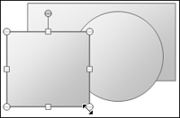
Figure 19-11. The selected object has eight handles, one at each corner and one centered on each side. The handles indicate selection and are a convenient idiom for resizing and reshaping the object. Handles are sometimes implemented with pixel inversion, but in a multicolor universe they can get lost in the clutter. These handles from Microsoft PowerPoint 2007 feature a small amount of dimensional rendering to help them stand out on the slide.
Handles are a boon to designers because they can also indicate selection. This is a naturally symbiotic relationship because an object must usually be selected to be resizable.
The handle centered on each side moves only that side, while the other sides remain motionless. The handles on the corners simultaneously move both the sides they touch, an interaction that is quite visually intuitive.
Handles tend to obscure the object they represent, so they don’t make very good permanent controls. This is why we don’t see them on top-level resizable windows (although windows in some versions of Sun’s Open Look GUI come close). For that situation, frame or corner resizers are better idioms. If the selected object is larger than the screen, the handles may not be visible. If they are hidden offscreen, not only are they unavailable for direct manipulation, but they are also useless as indicators of selection.
As with dragging, a meta-key is often used to constrain the direction of a resize interaction. Another example of a constrained drag idiom, Shift is again used to force the resize to maintain the original aspect ratio of the object. This can be quite useful. In some cases, it’s also useful to constrain the resize to either a vertical, horizontal, or locked aspect ratio.
Notice that the assumption in this discussion of handles is that the object in question is rectangular or can be easily bounded by a rectangle. If a user is creating an organization chart this may be fine, but what about reshaping more complex objects? There is a very powerful and useful variant of the resize handle: a vertex handle.
Many programs draw objects on the screen with polylines. A polyline is a graphics programmer’s term for a multisegment line defined by an array of vertices. If the last vertex is identical to the first vertex, it is a closed form and the polyline forms a polygon. When the object is selected, the program, rather than placing eight handles as it does on a rectangle, places one handle on top of every vertex of the polyline. A user can then drag any vertex of the polyline independently and actually change one small aspect of the object’s internal shape rather than affecting it as a whole. This is shown in Figure 19-12.
Freeform objects in PowerPoint are rendered with polylines. If you click on a freeform object, it is given a bounding rectangle with the standard eight handles. If you right-click on the freeform object and choose Edit Points from the context menu, the bounding rectangle disappears and vertex handles appear instead. It is important that both these idioms are available, as the former is necessary to scale the image in proportion, whereas the latter is necessary to fine-tune the shape.
If the object in question is curved, rather than a collection of straight lines, the best mechanism to allow for reshaping is the Bézier handle. Like a vertex of a polyline, it expresses a point on the object, but it also expresses the shape of the curve at the point. Bézier curves require a good deal of skill to operate effectively and are probably best reserved for specialized drawing and modeling applications.
Working with precision on three-dimensional objects presents considerable interaction challenges for users equipped with 2D input devices and displays. Some of the most interesting research in UI design involves trying to develop better paradigms for 3D input and control. So far, however, there seem to be no real revolutions but merely evolutions of 2D idioms extended into the world of 3D.
Most 3D applications are concerned either with precision drafting (for example, architectural CAD) or with 3D animation. When models are being created, animation presents problems similar to those of drafting. An additional layer of complexity is added, however, in making these models move and change over time. Often, animators create models in specialized applications and then load these models into different animation tools.
There is such a depth of information about 3D-manipulation idioms that an entire chapter or even an entire book could be written about them. We will, thus, briefly address some of the broader issues of 3D object manipulation.
Perhaps the most significant issue in 3D interaction on a 2D screen is that surrounding lack of parallax, the binocular ability to perceive depth. Without resorting to expensive, esoteric goggle peripherals, designers are left with a small bag of tricks with which to conquer this problem. Another important issue is one of occlusion: near objects obscuring far objects. These navigational issues, along with some of the input issues discussed in the next section, are probably a large part of the reason virtual reality hasn’t yet become the GUI of the future.
Use of multiple viewpoints is perhaps the oldest method of dealing with both of these issues, but it is, in many ways, the least effective from an interaction standpoint. Nonetheless, most 3D modeling applications present multiple views on the screen, each displaying the same object or scene from a different angle. Typically, there is a top view, a front view, and a side view, each aligned on an absolute axis, which can be zoomed in or out. There is also usually a fourth view, an orthographic or perspective projection of the scene, the precise parameters of which can be adjusted by the user. When these views are provided in completely separate windows, each with its own frame and controls, this idiom becomes quite cumbersome: Windows invariably overlap each other, getting in each other’s way, and valuable screen real estate is squandered with repetitive controls and window frames. A better approach is to use a multipane window that permits one-, two-, three-, and four-pane configurations (the three-pane configuration has one big pane and two smaller panes). Configuration of these views should be as close to single-click actions as possible, using a toolbar or keyboard shortcut.
The shortcoming of multiple viewpoint displays is that they require users to look in several places at the same time to figure out the position of an object. Forcing a user to locate something in a complex scene by looking at it from the top, side, and front, and then expecting him to triangulate in his head in real time is a bit much to expect, even from modeling whizzes. Nonetheless, multiple viewpoints are helpful for precisely aligning objects along a particular axis.
Baseline grids, depthcueing, shadows, and poles are idioms that help get around some of the problems created by multiple viewpoints. The idea behind these idioms is to allow users to successfully perceive the location and movement of objects in a 3D scene projected in an orthographic or perspective view.
Baseline grids provide virtual floors and walls to a scene, one for each axis, which serve to orient users. This is especially useful when (as is usually the case) the camera viewpoint can be freely rotated.
Depthcueing is a means by which objects deeper in the field of view appear dimmer. This effect is typically continuous, so even a single object’s surface will exhibit depthcueing, giving useful clues about its size, shape, and extent. Depthcueing, when used on grids, helps disambiguate the orientation of the grid in the view.
One method used by some 3D applications for positioning objects is the idea of shadows — outlines of selected objects projected onto the grids as if a light is shining perpendicularly to each grid. As the user moves the object in 3D space, she can track, by virtue of these shadows or silhouettes, how she is moving (or sizing) the object in each dimension.
Shadows work pretty well, but all those grids and shadows can get in the way visually. An alternative is the use of a single floor grid and a pole. Poles work in conjunction with a horizontally oriented grid. When a user selects an object, a vertical line extends from the center of the object to the grid. As she moves the object, the pole moves with it, but the pole remains vertical. The user can see where in 3D space she is moving the object by watching where the base of the pole moves on the surface of the grid (x- and y-axes), and also by watching the length and orientation of the pole in relation to the grid (z-axis).
The idioms described in the previous section are all examples of rich visual modeless feedback, which we will discuss in detail in Chapter 25. However, for some applications, lots of grids and poles may be overkill. For example, Google’s SketchUp is an architectural sketching program where users can lay down their own drafting lines using tape measure and protractor tools and, as they draw out their sketches, get color-coded hinting that keeps them oriented to the right axes. Users can also turn on a blue-gradient sky and a ground color to help keep them oriented. Because the application is focused on architectural sketching, not general-purpose 3D modeling or animation, the designers were able to pull off a spare, powerful, and simple interface that is easy to both learn and use (see Figure 19-13).
Figure 19-13. Google’s SketchUp is a gem of an application that combines powerful 3D architectural sketching capability with smooth interaction, rich feedback, and a manageable set of design tools. Users can set sky color and real-world shadows according to location, orientation, and time of day and year. These not only help in presentation but also help orient users. Users also can lay down 3D grid and measurement guides just as in a 2D sketching application. Camera rotate and zoom functions are cleverly mapped to the mouse scroll wheel, allowing fluid access while using other tools. ToolTips provide textual hints that assist in drawing lines and aligning objects.
Wire frames and bounding boxes solve problems of object visibility. In the days of slower processors, all objects needed to be represented as wire frames because computers weren’t fast enough to render solid surfaces in real time. It is fairly common these days for modeling applications to render a rough surface for selected objects, while leaving unselected objects as wire frames. Transparency would also work, but is still very computing-intensive. In highly complex scenes, it is sometimes necessary or desirable, but not ideal, to render only the bounding boxes of unselected objects.
3D applications make use of many idioms such as drag handles and vertex handles that have been adapted from 2D to 3D. However, there are some special issues surrounding 3D input.
One of the fundamental problems with direct manipulation in a 2D projection of a 3D scene is the problem of translating 2D motions of the cursor in the plane of the screen into a more meaningful movement in the virtual 3D space.
In a 3D projection, a different kind of drag threshold is required to differentiate between movement in three, not just two, axes. Typically, up and down mouse movements translate into movement along one axis, whereas 45-degree-angle drags are used for each of the other two axes. SketchUp provides color-coded hinting in the form of dotted lines when the user drags parallel to a particular axis, and it also hints with ToolTips. In a 3D environment, rich feedback in the form of cursor and other types of hinting becomes a necessity.
The other significant problem in 3D manipulation is known as the picking problem. Because objects need to be in wire frame or otherwise transparent when assembling scenes, it becomes difficult to know which of many overlapping items a user wants to select when she mouses over it. Locate highlighting can help but is insufficient because the object may be completely occluded by others. Group selection is even trickier.
Many 3D applications resort to less direct techniques, such as an object list or object hierarchy that users can select from outside of the 3D view. Although this kind of interaction has its uses, there are more direct approaches.
For example, hovering over a part of a scene could open a ToolTip-like menu that lets users select one or more overlapping objects (this menu wouldn’t be necessary in the simple case of one unambiguous object). If individual facets, vertices, or edges can be selected, each should hint at its pliancy as the mouse rolls over it.
Although it doesn’t address the issue directly, a smooth and simple way to navigate around a scene can also ameliorate the picking problem. SketchUp has mapped both zoom and orbit functions to the mouse scroll wheel. Spin the wheel to zoom in towards or away from the central zero point in 3D space; press and hold the wheel to switch from whatever tool you are using to orbit mode, which allows the camera to circle around the central axes in any direction. This fluid navigation makes manipulation of an architectural model almost as easy as rotating it in your hand.
One more issue specific to 3D applications is the number of spatial manipulation functions that can be performed. Objects can be repositioned, resized, and reshaped in three axes. They can also be rotated in three axes. Beyond this, the camera viewpoint can be rotated in place or revolved around a focal point, also in three axes. Finally, the camera’s field of view can be zoomed in and out.
Not only does this mean that assignment of meta-keys and keyboard shortcuts is critical in 3D applications, there is another problem: It can be difficult to tell the difference between camera transformations and object transformations by looking at a camera viewpoint, even though the actual difference between the two can be quite significant. One way around this problem is to include a thumbnail, absolute view of the scene in a corner of the screen. It could be enlarged or reduced as needed, and could provide a reality check and global navigation method in case the user gets lost in space (note that this kind of thumbnail view is useful for navigating large 2D diagrams as well).
A direct-manipulation idiom that can be very powerful in some applications is connection, in which a user clicks and drags from one object to another, but instead of dragging the first object onto the second, a connecting line or arrow is drawn from the first object to the second one.
If you use project management or organization chart programs, you are undoubtedly familiar with this idiom. For example, to connect one task box in a project manager’s network diagram (often called a PERT chart) with another, you click and drag an arrow between them. In this case the direction of the connection is significant: The task where the mouse button went down is the from task, and the task where the mouse button is released is the to task.
As a connection is dragged between objects, it provides visual feedback in the form of rubber-banding: The arrow forms a line that extends from the first object to the current cursor position. The line is animated, following the movement of the cursor with one end, while remaining anchored at its other end. As a user moves the cursor over connection candidates, cursor hinting should suggest that the two objects may be connected. After the user releases the mouse button over a valid target, the program draws a more permanent line or arrow between the two objects. In some applications, it also links the objects logically. As with drag-and-drop, it’s vital to provide a convenient means of canceling the action, such as the Esc key or chord-clicking.
Connections can also be full-fledged objects themselves, with reshape handles and editable properties. This sort of implementation would mean connections could be independently selected, moved, and deleted as well. For programs where connections between objects need to contain information (such as in a project-planning application), it makes sense for connections to be first-class citizens.
Connection doesn’t require as much cursor hinting as other idioms do because the rubber-banding effect is so clearly visible. However, it would be a big help in programs where objects are connected logically, to show which currently pointed-to objects are valid targets for the arrow. In other words, if the user drags an arrow until it points to some icon or widget on the screen, how can he tell if that icon or widget can legally be connected to? The answer is to have the potential target object engage in some active visual hinting. This hinting for potential targets can be quite subtle, or even eschewed completely when all objects in the program are equally valid targets for any connection. Target objects should always highlight, however, when a connection is dragged over them, in order to indicate willingness to accept the connection.