In the previous chapter, we talked about the first part of the design process: developing scenarios to imagine ideal user interactions, and then defining requirements from these scenarios and other sources. Now we’re ready to design.
Rather than jump into the nuts and bolts right away, we want to stay at a high level and concern ourselves with the overall structure of the user interface and associated behaviors. We call this phase of the Goal-Directed process the Design Framework. If we were designing a house, at this point, we’d be concerned with what rooms the house should have, how they should be positioned with respect to each other, and roughly how big they should be. We would not be worried about the precise measurements of each room, or things like the doorknobs, faucets, and countertops.
The Design Framework defines the overall structure of the users’ experience, from the arrangement of functional elements on the screen, to interactive behaviors and underlying organizing principles, to the visual and form language used to express data, concepts, functionality, and brand identity. In our experience, form and behavior must be designed in concert with each other; the Design Framework is made up of an interaction framework, a visual design framework, and sometimes an industrial design framework. At this phase in a project, interaction designers use scenarios and requirements to create rough sketches of screens and behaviors that make up the interaction framework. Concurrently, visual designers use visual language studies to develop a visual design framework that is commonly expressed as a detailed rendering of a single screen archetype, and industrial designers execute form language studies to work towards a rough physical model and industrial design framework. Each of these processes is addressed in this chapter.
When it comes to the design of complex behaviors and interactions, we’ve found that focusing on pixel-pushing, widget design, and specific interactions too early can get in the way of effectively designing a comprehensive framework that all of the product’s behaviors can fit within. By taking a top-down approach, concerning ourselves first with the big picture and rendering our solutions without specific detail in a low-fidelity manner, we can ensure that we and our stakeholders stay initially focused on the fundamentals: serving the personas’ goals and requirements.
Revision is a fact of life in design. Typically, the process of representing and presenting design solutions helps designers and stakeholders refine their vision and understanding of how the product can best serve human needs. The trick, then, is to render the solution only in enough detail to provoke engaged consideration, without spending too much time or effort creating renderings that are certain to be modified or abandoned. We’ve found that sketchlike storyboards, accompanied by narrative in the form of scenarios, are a highly effective way to explore and discuss design solutions without creating undue overhead and inertia.
Research about the usability of architectural renderings supports this notion. A study of people’s reactions to different types of CAD images found that pencil-like sketches encouraged discourse about a proposed design, and also increased understanding of the renderings as representing work-in-progress.[1] Carolyn Snyder covers this concept at length in Paper Prototyping, where she discusses the value of such low-fidelity presentation techniques in gathering user feedback. While we believe that usability testing and user feedback is often most constructive during design refinement, there are certainly cases where it is useful as early as the Framework phase. (More discussion of usability testing can be found at the end of the chapter.)
The interaction framework defines not only the high-level structure of screen layouts but also the flow, behavior, and organization of the product. The following six steps describe the process of defining the interaction framework:
Define form factor, posture, and input methods
Define functional and data elements
Determine functional groups and hierarchy
Sketch the interaction framework
Construct key path scenarios
Check designs with validation scenarios
While we’ve broken the process down into numerically sequenced steps, this is not typically a linear effort, but rather occurs in iterative loops. In particular, Steps 3–5 may be swapped around, depending on the thinking style of the designer (more on this later). The six steps are described in the following sections.
The first step in creating a framework is to define the form factor of the product you’ll be designing. Is it a Web application that will be viewed on a high-resolution computer screen? Is it a phone that must be small, light, low-resolution, and visible in both the dark and bright sunlight? Is it a kiosk that must be rugged to withstand a public environment while accommodating thousands of distracted, novice users? What are the constraints that each of these imply for any design? Each of these form factors has clear implications for the design of the product, and answering this question sets the stage for all subsequent design efforts. If the answer isn’t obvious, look to your personas and scenarios to better understand the ideal usage context and environment. Where a product requires the design of both hardware and software, these decisions also involve industrial design considerations. Later in the chapter we discuss how to coordinate interaction design with industrial design.
As you define the form, you should also define the basic posture of the product, and determine the input method(s) for the system. A product’s posture is related to how much attention a user will devote to interacting with the product, and how the product’s behaviors respond to the kind of attention a user will be devoting to it. This decision should be based upon usage contexts and environments as described in your context scenario(s) (see Chapter 6). We discuss the concept of posture in greater depth in Chapter 9.
The input method is the way users will interact with the product. This will be driven by the form factor and posture, as well as by your personas’ attitudes, aptitudes, and preferences. Choices include keyboard, mouse, keypad, thumb-board, touch screen, voice, game controller, remote control, dedicated hardware buttons, and many other possibilities. Decide which combination is appropriate for your primary and secondary personas. In cases where it may be appropriate to use a combination of input methods (such as the common Web site or desktop application that relies on both mouse and keyboard input), decide upon the primary input method for the product.
Functional and data elements are the representations of functionality and data that are revealed to the user in the interface. These are the concrete manifestations of the functional and data requirements identified during the Requirements Definition phase. Where the requirements were purposely described in general terms, from the personas’ perspective, functional and data elements are described in the language of user-interface representations. It is important to note that these elements must each be defined in response to specific requirements defined earlier. This is how we ensure that every aspect of the product we are designing has a clear purpose that can be traced back to a usage scenario or business goal.
Data elements are typically the fundamental subjects of interactive products. These objects, such as photos, e-mail messages, customer records, or orders, are the basic units to be referred to, responded to, and acted upon by the people using the product, and ideally should fit with the personas’ mental models. At this point, it is critical to comprehensively catalog the data objects, because the product’s functionality is commonly defined in relation to them. We are also concerned with the significant attributes of the objects (for example, the sender of an e-mail message or the date a photo was taken), but it is less important to be comprehensive about the attributes at this point, as long as you have an idea whether the personas care about a few attributes or a lot.
It’s useful to consider the relationships between data elements. Sometimes a data object may contain other data objects; other times there may be a more associative relationship between objects. Examples of such relationships include a photo within an album, a song within a playlist, or an individual bill within a customer record.
Functional elements are the operations that can be done to the data elements and their representations in the interface. Generally speaking, they include tools to act upon data elements and places to put data elements. The translation of functional requirements into functional elements is where we start making the design concrete. While the context scenario is the vehicle to imagine the overall experience we will be creating for our users, this is where we make that experience real.
It is common that a single requirement will necessitate multiple interface elements. For example, Vivien, our persona for a smartphone from Chapter 6, needs to be able to telephone her contacts. Functional elements to meet that need include:
Voice activation (voice data associated with contact)
Assignable quick-dial buttons
Selecting a contact from a list
Selecting a contact from an e-mail header, appointment, or memo
Auto-assignment of a call button in appropriate context (for example, upcoming appointment)
Again, it is imperative to return to context scenarios, persona goals, and mental models to ensure that your solutions are appropriate to the situation at hand. This is also the place in the process where design principles and patterns begin to become a useful way to arrive at effective solutions without reinventing the wheel. You also must exercise your creativity and design judgment here. In response to any identified user requirement, there are typically quite a number of possible solutions. Ask yourself which of the possible solutions is most likely to:
Accomplish user goals most efficiently?
Best fit our design principles?
Fit within technology or cost parameters?
Best fit other requirements?
As you saw in Chapter 6, pretending a tool, product, or system is magic is a powerful way to imagine the ideal user experience to be reflected in concept-level context scenarios. In the same way, pretending the system is human is a powerful tool to structure interaction-level details. This simple principle is discussed in detail in Chapter 12. In a nutshell, interactions with a digital system should be similar in tone and helpfulness to interactions with a polite, considerate human.[2] As you determine the interactions and behavior along with the functional elements and groupings, you should ask yourself: What would a helpful human do? What would a thoughtful, considerate interaction feel like? Is the primary persona being treated humanely by the product? In what ways can the software offer helpful information without getting in the way? How can it minimize the persona’s effort in reaching his goals?
For example, a mobile phone that behaves like a considerate person knows that, after you’ve completed a call with a number that isn’t in your contacts, you may want to save the number, and provides an easy and obvious way to do so. An inconsiderate phone forces you to scribble the number on the back of your hand as you go into your contacts to create a new entry.
Critical to the translation of requirements to functional elements (as well as the grouping of these elements and the exploration of detailed behavior in scenarios and storyboards) is the application of general interaction principles and specific interaction patterns. These tools leverage years of interaction design experience. Neglecting to take advantage of such knowledge means wasting time on problems whose solutions are well known. Additionally, deviating from standard design patterns can create a product where the users must learn every interaction idiom from scratch, rather than recognizing behaviors from other products and leveraging their own experience (we discuss the idea of design patterns in Chapter 8). Of course, sometimes it is appropriate to invent new solutions to common problems, but as we discuss further in Chapter 14, you should obey standards unless you have a darn good reason not to.
Scenarios provide an inherently top-down approach to interaction design. They iterate through successively more detailed design structures, from main screens down to tiny subpanes or dialogs. Principles and patterns add a bottom-up approach to balance the process. Principles and patterns can be used to organize elements at all levels of the design. Chapter 8 discusses the uses and types of principles and patterns in detail, and the chapters of Parts II and III provide a wealth of useful interaction principles appropriate to this step in the process.
After you have a good list of top-level functional and data elements, you can begin to group them into functional units and determine their hierarchy.[3] Because these elements facilitate specific tasks, the idea is to group elements to best facilitate the persona’s flow (see Chapter 10) both within a task and between related tasks. Some issues to consider include:
Which elements need a large amount of video real estate and which do not?
Which elements are containers for other elements?
How should containers be arranged to optimize flow?
Which elements are used together and which aren’t?
In what sequence will a set of related elements be used?
What interaction patterns and principles apply?
How do the personas’ mental models affect organization?
At this point it’s important to organize data and functions into top-level container elements, such as screens, frames, and panes. These groupings may change somewhat as the design evolves (particularly as you sketch out the interface), but it’s still useful to provisionally sort elements into groups as this will speed up the process of creating initial sketches.
Consider which primary screens or states (which we’ll call views) the product requires. Initial context scenarios give you a feel for what these might be. If you know that a user has several end goals and needs where data and functionality don’t overlap, it might be reasonable to define separate views to address them. On the other hand, if you see a cluster of related needs (for example, to make an appointment, your persona needs to see a calendar and contacts), you might consider defining a view that incorporates all these together.
When grouping functional and data elements, consider how they should be arranged given the product’s platform, screen size, form factor, and input methods. Containers for objects that must be compared or used together should be adjacent to each other. Objects representing steps in a process should, in general, be adjacent and ordered sequentially. Use of interaction design principles and patterns is extremely helpful at this juncture; Part III of this book provides many principles that can be of assistance at this stage of organization.
Now we’re ready to sketch the interface. This visualization of the interface should be extremely simple at first. Around the studio, we often refer to this as “the rectangles phase” because our sketches start out by subdividing each view into rough rectangular areas corresponding to panes, control components (such as toolbars), and other top-level containers (see Figure 7-1). Label the rectangles, and illustrate and describe how one grouping or element affects others.

Figure 7-1. Example of an early framework sketch from designs Cooper created for Cross Country TravCorps, an online portal for traveling nurses. Framework sketches should be simple, starting with rectangles, names, and simple descriptions of relationships between functional areas. Details can be visually hinted at to give an idea of contents, but don’t fall into the trap of designing detail at this stage.
You may want to sketch different ways of fitting top-level containers together in the interface. Sketching the framework is an iterative process that is best performed with a small, collaborative group of one or two interaction designers and a visual or industrial designer. This visualization of the interface should be extremely simple at first: boxes representing each functional group and/or container with names and descriptions of the relationships between the different areas (see Figure 7-1).
Be sure to look at the entire, top-level framework first; don’t let yourself get distracted by the details of a particular area of the interface (although imagining what goes into each container will help you decide how to arrange elements and allocate real estate). There will be plenty of time to explore the design at the widget level later; trying to do so too soon may risk a lack of coherence in the design as you move forward. At this high-level, “rectangle phase,” it’s very easy to explore a variety of ways of presenting information and functionality and to perform radical reorganizations, if necessary. It’s often useful to try several arrangements on for size, running through validation scenarios (see Step 6, below), before landing on the best solution. Spending too much time and effort on intricate details early in the design process discourages designers from changing course to what might be a superior solution. It’s easier to discard your work and try another approach when you don’t have a lot of effort invested.
Sketching the framework is an iterative process that is best performed with a small, collaborative group of one or two interaction designers (or ideally an interaction designer and a “design communicator” — someone who thinks in terms of the narrative of the design) and a visual or industrial designer. We haven’t found a better tool for initial sketches than a simple whiteboard. Working at a whiteboard promotes collaboration and discussion and, of course, everything is easy to erase and redraw. A digital camera provides a quick and easy means to capture ideas for later reference.
Once the sketches reach a reasonable level of detail, it becomes useful to start rendering in a computer-based tool. Each has its strengths and weaknesses, but tools commonly used to render high-level interface sketches include Adobe Fireworks, Adobe Illustrator, Microsoft Visio, Microsoft PowerPoint, and Omni Group’s OmniGraffle. The key here is to find the tool that is most comfortable for you, so you can work quickly, roughly, and at a high level. We’ve found it useful to render Framework illustrations in a visual style that suggests the sketchiness of the proposed solutions (recall that rough sketches tend to do a better job promoting discourse about design). It is also critical to be able to easily render several related, sequential screen states to depict the product’s behavior in the key path scenario (the “Frames” construct in Fireworks makes it a particularly good tool for doing this).
A key path scenario describes how the persona interacts with the product, using the vocabulary of the interaction framework. These scenarios depict the primary pathways through the interface that the persona takes with the greatest frequency, often on a daily basis. Their focus is at the task level. For example, in an e-mail application, key path activities include viewing and composing mail, not configuring a new mail server.
These scenarios typically evolve from the context scenarios, but here we specifically describe the persona’s interaction with the various functional and data elements that make up the interaction framework. As we add more and more detail to the interaction framework, we iterate the key path scenarios to reflect this detail in greater specificity around user actions and product responses.
Unlike the goal-oriented context scenarios, key path scenarios are more task oriented, focusing on task details broadly described and hinted at in the context scenarios. This doesn’t mean that we can ignore goals — goals and persona needs are the constant measuring stick throughout the design process, used to trim unnecessary tasks and streamline necessary ones. However, key path scenarios must describe in exacting detail the precise behavior of each major interaction and provide a walkthrough of each major pathway.
By using a sequence of low-fidelity sketches accompanied by the narrative of the key path scenario, you can richly portray how a proposed design solution helps personas accomplish their goals. This technique of storyboarding is borrowed from filmmaking and cartooning, where a similar process is used to plan and evaluate ideas without having to deal with the cost and labor of shooting actual film. Each interaction between the user and the product can be portrayed on one or more frames or slides. Advancing through them provides a reality check for the coherence and flow of the interactions (see Figure 7-2).

Because creative human activities are rarely a sequential, linear process, the steps in the Framework phase shouldn’t be thought of as a simple sequence. It is common to move back and forth between steps and to iterate the whole process several times until you have a solid design solution. Depending on how you think, there are a couple different ways to approach Steps 3–5. You may find that one works better for you than another.
Verbal thinkers may want to use the scenario to drive the process and approach Steps 3–5 in the following sequence (as described above):
Key path scenarios
Work out the groupings verbally
Sketch
Visual thinkers may find starting from the illustration will help them make sense of the other parts of the process. They may find this easier:
Sketch
Key path scenarios
See if your groupings work with the scenarios
After you have storyboarded your key path scenarios and adjusted the interaction framework until the scenario flows smoothly and you’re confident that you’re headed in the right direction, it is time to shift focus to less frequent or less important interactions. These validation scenarios are not typically developed in as much detail as key path scenarios. Rather, this phase consists of asking a series of “what if . . .” questions. The goal here is to poke holes in the design and adjust it as needed (or throw it out and start over). There are three major categories of validation scenarios that should be addressed in the following order:
Key path variant scenarios are alternate or less-traveled interactions that split off from key pathways at some point along the persona’s decision tree. These could include commonly encountered exceptions, less frequently used tools and views, and variations or additional scenarios based upon the goals and needs of secondary personas. Returning to our smartphone scenario from Chapter 6, an example of a key path variant would be if Vivien decided to respond to Frank by e-mail in Step 2 instead of calling him.
Necessary use scenarios include those actions that must be performed, but only infrequently. Purging databases, configuring, and making other exceptional requests might fall into this category. Necessary use interactions demand pedagogy because they are seldom encountered: Users may forget how to access the function or how to perform tasks related to it. However, this rare use means that users won’t require parallel interaction idioms such as keyboard equivalents, nor do such functions need to be user-customizable. An example of a necessary use scenario for the design of a smartphone is if the phone was sold second-hand, requiring the removal of all personal information associated with the original owner.
Edge case use scenarios, as the name implies, describe atypical situations that the product must nevertheless be able to handle, albeit infrequently. Programmers focus on edge cases because they often represent sources of system instability and bugs, and typically require significant attention and effort. Edge cases should never be the focus of the design effort. Designers can’t ignore edge case functions and situations, but the interaction needed for them is of much lower priority and is usually buried deep in the interface. Although the code may succeed or fail on its capability to successfully handle edge cases, the product will succeed or fail on its capability to successfully handle daily use and necessary cases. Returning once again to Vivien’s smartphone (in Chapter 6), an example of an edge case scenario would be if Vivien tried to add two different contacts with the same name. This is not something she is likely to want to do, but something the phone should handle if she does.
As the interaction framework establishes an overall structure for product behavior, and for the form as it relates to behavior, a parallel process focused on the visual and industrial design is also necessary to prepare for detailed design unless you’re working with a well-established visual style. This process follows a similar trajectory to the interaction framework, in that the solution is first considered at a high level and then narrows to an increasingly granular focus.
The visual design framework typically follows this process:
Develop visual language studies
Apply chosen visual style to screen archetype
The first step in defining a visual design framework is to explore a variety of visual treatments through visual language studies (see Figure 7-3). These studies include color, type, and widget treatments, as well as the overall dimensionality and any “material” properties of the interface (for example, does it feel like glass or paper?).
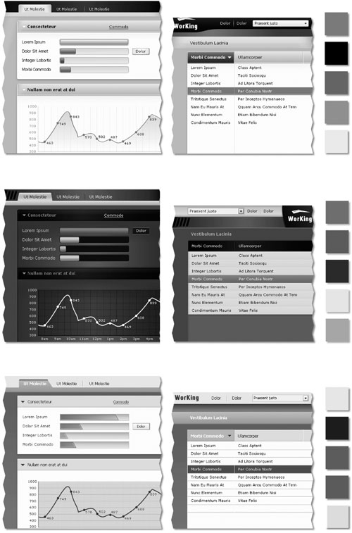
Figure 7-3. Visual language studies are used to explore a variety of visual styles abstractly and somewhat independently of the interaction design. This is useful because it allows us to have initial discussions about visual language without getting hung up on interaction design details. Of course, eventually visual design and interaction design must be conducted in lockstep.
These studies should show these aspects abstractly and independently of the interaction design, because our goal here is to assess the overall tone and suitability for general interactions, and we want to avoid running the risk of distracting our stake-holders with highly rendered versions of rough interaction designs.
Visual language studies should relate to the experience goals of the personas, as well as any experience or brand keywords that were developed in the Requirements Definition phase. Commonly, a company’s brand guidelines form a good starting point for this activity, but it should be noted that brand guidelines rarely consider the interactive experience. “Brand guidelines” commonly consist of a document explaining how a company’s brand identity should be visually and textually conveyed.
Substantial work is often required to translate a style guide for marketing collateral into a meaningful look-and-feel for an interactive product or Web site. It’s also important to consider environmental factors and persona aptitudes when devising visual styles. Screens that must be visible under bright lights or from a distance require high contrast and more saturated colors. The elderly and other sight-impaired users require larger and more readable type faces.
We typically show between three and five different approaches during our initial review with stakeholders. This is a little different from our approach to interaction design, where there is usually one optimal behavioral framework for a product. Visually, there can be several different styles that are all consistent with experience keywords and goals. And of course, “beauty is in the eye of the beholder.” We’ve found many stakeholders to have quite unpredictable taste for which colors should be used in the interface.
It is often useful to develop one or two extreme options that push the look-and-feel a bit too far in one direction. Doing this makes it easier to differentiate between the various approaches and helps stakeholders to decide upon an appropriate direction. There is ample opportunity later in the process to tame a particularly extreme visual style. That said, all the choices you present to your stakeholders should be reasonable and appropriate. It’s almost an unwritten rule that if there’s one direction that you don’t want your client or stakeholders to choose, that’s the one that they’re guaranteed to like.

Once you’ve developed a good spectrum of visual language studies reflecting persona experience goals and brand and experience keywords, it’s time to present them to stakeholders for feedback. It’s important to contextualize them in terms of these goals and keywords, and to describe the rationale for each direction and its relative merits. We ask stakeholders to first give us their initial emotional reaction and then talk through things in a more rational fashion. By the end of this presentation, we usually have consensus to move forward with some aspects of several of the visual styles, and it is common to iterate the visual language studies before moving forward to the next step.
The next step is to apply one or two selected visual styles to key screens. We typically coordinate our visual and interaction design efforts so this step is performed close to the end of the interaction framework, when the design has begun to stabilize and there is sufficient specific detail to reflect the visual style. This further refines the visual style so that it reflects key behaviors and information. By making the design more concrete, you can better assess the feasibility of the proposed solution without the overhead of updating numerous screens for each minor change. Additionally, it’s easier to elicit feedback from stakeholders.
We develop the industrial design framework in much the same manner as the visual design framework, but because the form factor and input method have significant implications for both the industrial and interaction design, it’s useful to collaborate early to identify relevant issues.
The industrial design framework typically follows this process:
Collaborate with interaction designers about form factor and input methods
Develop rough prototypes
Develop form language studies
If the product you are designing relies upon custom hardware (as with a cell phone or medical device), it is important for interaction designers and industrial designers to agree upon a general physical form and input methods. While the course of the design framework will certainly help to refine the design, decisions should be made at this point about the general size and shape of the product, the screen size (if any), the number and general orientation of hard and soft buttons, and if it has a touch screen, keyboard, voice recognition, and so on. This collaboration typically starts with a couple of days at the whiteboard and a condensed set of scenarios.
Important things to consider when making these decisions include persona experience goals (refer to Chapter 5), attitudes, aptitudes, and environmental factors, as well as brand and experience keywords, market research, manufacturing costs, and pricing targets. Because the cost of a hinge can make or break the margin on hardware, and because internal components (such as a battery) can have a tremendous impact on form, an early sanity check with mechanical and electrical engineers is critical.
There is only one user experience, and it comes from the combination of the physical form and the interactive behavior of the product. The two must be designed in concert, and according to the old adage of Modern architecture: form should follow function. The demands of interaction must guide the industrial design, but concerns about fabrication and cost will also impact the possibilities available to interaction design.
It is often the case that even after the overall form and input methods are defined, there are still a variety of approaches that the industrial designers can take. For example, when we’ve designed office phones and medical devices, there’s often been the question of whether the screen angle should be fixed or if it should be adjustable, and if so, how that will be accomplished. Industrial designers sketch and create rough prototypes from foam board and other materials. In many cases, we’ll show several to stakeholders because there are different cost and ergonomic considerations with each.
In a fashion similar to the visual language studies described above, the next step is to explore a variety of physical styles. Unlike the visual language studies, these are not abstract composites but rather represent various looks applied to the specific form factors and input mechanisms determined in Steps 1 and 2. These studies include shape, dimensionality, materials, color, and finish.
As with visual style studies, form language studies should be informed by persona goals, attitudes, aptitudes, experience keywords, environmental factors, and manufacturing and pricing constraints. Typically these studies require several rounds of iteration to land upon a feasible and desirable solution.
When a solid, stable framework definition is reached, designers see the remaining pieces of the design begin to smoothly fall into place: Each iteration of the key path scenarios adds detail that strengthens the overall coherence and flow of the product. At this stage, a transition is made into the Refinement phase, where the design is translated into a final, concrete form.
In this phase, principles and patterns remain important in giving the design a fine formal and behavioral finish. Parts II and III provide useful principles for the Refinement phase. It is also critical for the programming team to be intimately involved throughout the Refinement phase; now that the design has a solid conceptual and behavioral basis, programmer input is critical to creating a finished design that will be built, while remaining true to concept.
The Refinement phase is marked by the translation of the sketched storyboards to full-resolution screens that depict the user interface at the pixel level (see Figure 7-4).
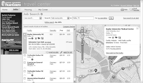
Figure 7-4. Full-resolution bitmap screens for Cross Country TravCorps based on the Framework illustration from Figure 7-2. Note that there are minor changes to the layout that naturally result from the realities of pixels and screen resolution. Visual and interaction designers need to work closely together at this stage to ensure that visual changes to the design continue to reinforce appropriate product behaviors and meet the goals of the primary personas.
The basic process of design refinement follows the same steps we used to develop the design framework, this time at deeper and deeper levels of detail (though, of course, it isn’t necessary to revisit the form factor and input methods unless an unexpected cost or manufacturing issue crops up with the hardware). After following Steps 2–6 at the view and pane levels, while incorporating the increasingly refined visual and industrial designs, use scenarios to motivate and address the more granular components of the product.
Address every primary view and dialog possible. Throughout the refinement phase, visual designers should develop and maintain a visual style guide. Programmers use this guide to apply visual design elements consistently when they create low-priority parts of the interface that the designers typically don’t have time and resources to complete themselves. At the same time, industrial designers work with engineers to finalize components and assembly.
While the end product of the design process can be any one of a variety of outputs, we typically create a printed form and behavior specification. This document includes screen renderings with callouts sufficiently detailed for a programmer to code from, as well as detailed storyboards to illustrate behaviors over time. It can also be valuable to produce an interactive prototype in HTML or Flash that can augment your documentation to better illustrate complex interactions. However, keep in mind that prototypes alone are rarely sufficient to communicate underlying patterns, principles, and rationale, which are vital concepts to communicate to programmers. Regardless of your choice of design deliverable, your team should continue to work closely with the construction team throughout implementation. It requires vigilance to ensure that the design vision is faithfully and accurately translated from the design document to a final product.
In the course of an interaction design project, it’s often desirable to evaluate how well you’ve hit the mark by going beyond your personas and validation scenarios to put your solutions in front of actual users. This should be done once the solution is detailed enough to give users something concrete to respond to, and with enough time allotted to make alterations to the design based upon your findings.
In our experience, user feedback sessions and usability tests are good at identifying major problems with the interaction framework and at refining things like button labels and activity order and priority. They’re also essential for fine-tuning such behaviors as how quickly a screen scrolls in response to turning a hardware knob. Unfortunately, it’s difficult to craft a test that assesses anything beyond first-time ease of learning. There are a number of techniques for evaluating the usability of a product for intermediate or expert users, but it can be quite time consuming, and is imprecise at best.
There are a variety of ways to validate your design with users, from informal feedback sessions where you explain your ideas and drawings and see what the user thinks, to a more rigorous usability test where users are asked to complete a predetermined set of tasks. There are advantages to each approach. The more informal style can be done spontaneously and requires less preparation. The downside to this approach is that the designer is often guilty of “leading the witness” by explaining things in a persuasive manner. In general, we’ve found this approach to be acceptable for a technical audience that is capable of imagining how a few drawings might represent a product interface. It can be a useful alternative to usability testing when the design team doesn’t have time to prepare for formal usability testing.
Given sufficient time, we prefer more formal usability testing. Usability tests determine how well a design allows users to accomplish their tasks. If the scope of a test is sufficiently broad, it can also tell you how well the design helps users reach their end goals.
To be clear, usability testing is, at its core, a means to evaluate, not to create. It is not an alternative to interaction design, and it will never be the source of that great idea that makes a compelling product. Rather, it is a method to assess the effectiveness of ideas you’ve already had and to smooth over the rough edges.
Usability testing is also not the same as user research. For some practitioners, “tests” can include research activities such as interviews, task analyses, and even creative “participatory design” exercises. This is conflating a variety of needs and steps in the design process into a single activity.
User research must occur before ideation, usability testing following it. In fact, when project constraints force us to choose between ethnographic research and usability testing, we find that time spent on research gives us much more leverage to create a compelling product. Likewise, given limited days and dollars, we’ve found that spending time on design provides more value to the product design process than testing. It’s much more important to spend time making considered design decisions based upon a solid research foundation than to test a half-baked design created without the benefit of clear, compelling models of the target users and their goals and needs.
In his 1993 book Usability Engineering, Jakob Nielsen distinguished between summative evaluations, which are tests of completed products, and formative evaluations, conducted during design as part of an iterative process. This is an important distinction.
Summative evaluations are used in product comparisons, to identify problems prior to a redesign, and to investigate the causes of product returns and requests for training and support. Summative studies are generally conducted and thoroughly documented by professional, third-party evaluators. In some cases, particularly in competitive product comparisons, summative studies are designed to yield quantitative data that can be tested for statistical significance.
Unfortunately, summative evaluations are often used as part of the quality assurance process near the end of the development process. At this point, it’s usually too late to make meaningful design changes; that train has left the station. Design should be evaluated before the coding begins (or at least early enough that there is time to change the implementation as designs are adjusted). However, if you need to convince stakeholders or programmers that there is a usability problem with the current product, nothing beats watching real users struggle through basic tasks.
Formative evaluations do just this. These quick, qualitative tests are conducted during the design process, generally during the Refinement phase. When effectively devised and moderated, a formative evaluation opens a window to the user’s mind, allowing the designers to see how their target audience responds to the information and tools they’ve provided to help them accomplish their tasks.
Though summative evaluations have their uses, they are product- and program-management activities conducted to inform product lifecycle planning. They can be useful “disaster checks” during development, but the costs of changes at this point — in time, money, and morale — can be high. Formative evaluations are conducted in the service of design, during the design process.
There are a wide variety of perspectives on how to conduct and interpret usability tests. Unfortunately, we’ve found that many of these approaches either presume to replace active design decision making, or are overly quantitative, resulting in nonactionable data about things like “time to task.” A good reference for usability testing methods that we’ve found to be compatible with Goal-Directed interaction design methods is Carolyn Snyder’s Paper Prototyping. It doesn’t discuss every testing method or the relationship between testing and design, but it covers the fundamentals well and provides some relatively easy-to-use techniques for usability testing.
In brief, we’ve found the following to be essential components to successful formative usability tests:
Test late enough in the process that there is a substantially concrete design to test, and early enough to allow adjustments in the design and implementation
Test tasks and aspects of the user experience appropriate to the product at hand
Recruit participants from the target population, using your personas as a guide
Ask participants to perform explicitly defined tasks while thinking aloud
Have participants interact directly with a low-tech prototype (except when testing specialized hardware where a paper prototype can’t reflect nuanced interactions)
Moderate the sessions to identify issues and explore their causes
Minimize bias by using a moderator who has not previously been involved in the project
Focus on participant behaviors and their rationale
Debrief with observers after tests are conducted to identify the reasons behind observed issues
Involve designers throughout the study process
Misunderstanding between the designer and the user is a common cause of usability problems. Personas help designers understand their users’ goals, needs, and points of view, creating a foundation for effective communication. A usability study, by opening another window on the user’s mind, allows designers to see how their verbal, visual, and behavioral messages are received, and to learn what users intend when interacting with the designed affordances.
Designers (or, more broadly, design decision makers) are the primary consumers of usability study findings. Though few designers can moderate a session with sufficient neutrality, their involvement in the study planning, direct observation of study sessions, and participation in the analysis and problem-solving sessions are critical to a study’s success. We’ve found it important to involve designers in the following ways:
Planning the study to focus on important questions about the design
Using personas and their attributes to define recruiting criteria
Using scenarios to develop user tasks
Observing the test sessions
Collaboratively analyzing study findings