Controls are manipulable, self-contained screen objects through which people interact with digital products. Controls (otherwise known as widgets, gadgets, and gizmos) are the primary building blocks for creating a graphical user interface.
Examined in light of users’ goals, controls come in four basic flavors: imperative controls, used to initiate a function; selection controls, used to select options or data; entry controls, used to enter data; and display controls, used to directly manipulate the program visually. Some controls combine one or more of these flavors.
Most of the controls that we are familiar with are those that come standard with Windows, the Mac OS, and other common windowing interfaces. This set of canned controls has always been very limited in scope and power.
The easiest thing to build in most windowing systems is a dialog box. The dialog box facility offers automatic tools for specifying how and where controls will be placed. Unfortunately, it’s quite easy for developers to create user interfaces composed mostly of control-laden dialog boxes. It’s much more difficult to create a visual interface with direct manipulation idioms that are consistent with user mental models and workflows. As a result, most existing literature covers the canned-control world reasonably well, while ignoring other approaches. However, control-laden dialog boxes are not the key to successful user-interface design. (For more about the strengths of a user interface based around direct manipulation, see Chapter 19. For more about dialogs boxes, see Chapter 24.)

To be clear, we’re not suggesting the elimination of standard controls. However, while using these controls in your designs may guarantee ease of implementation, it absolutely won’t guarantee ease of use. Controls must be used appropriately and judiciously, like all elements of a good user interface.
We’ll now look at each of the four types of controls — imperative, selection, entry, and display — in more detail.
In the interaction between humans and computers, there is a language of nouns (sometimes called objects), verbs, adjectives, and adverbs. When we issue a command, we are specifying the verb — the action of the statement. When we describe what the action will affect, we are specifying the noun of the sentence. Sometimes we choose a noun from an existing list, and sometimes we enter a new one. We can modify both the noun and the verb with adjectives and adverbs, respectively.
The control type that corresponds to a verb is called the imperative control because it commands immediate action. Imperative controls take action, and they take it immediately. Menu items (which we discuss in Chapter 22) are also imperative idioms. In the world of controls, the quintessential imperative idiom is the button; in fact, it is the only one, although it comes in numerous guises. Click the button and the associated action — the verb — executes immediately.
Buttons are most often identified by their simulated-3D raised aspect (see Figure 21-1). If the control is rectangular (or sometimes oval) and appears raised (due to its shadow on the right and bottom and highlight on the top and left), it has the visual affordance of an imperative. It will execute as soon as a user clicks and releases it with the mouse cursor. In dialogs, a default button is often highlighted to indicate the most reasonable typical action for a user to take.
The button is arguably the most visually compelling control in the designer’s toolkit. It isn’t surprising that it has evolved with such diversity across the user interface. The manipulation affordances of contemporary faux three-dimensional buttons have prompted their widespread use. It’s a good thing — so why not use it a lot?
Part of the affordance of a button is its visual pliancy, which indicates its “press-ability.” When a user points to it and clicks the mouse button, the button onscreen visually changes from raised to indented, indicating that it is activated. This is an example of dynamic visual hinting, as discussed in Chapter 19. Poorly designed programs and many Web sites contain buttons that are painted on the screen but don’t actually move when clicked. This is cheap and easy for the developer to do (especially on the Web), but it is very disconcerting for users, because it generates a mental question: “Did that actually do something?” Users expect to see the button move — the pliant response — and you must satisfy those expectations.
With the release of Windows 3.0 came the introduction of the toolbar (which we discuss at length in Chapter 23), an idiom that has grown into a de facto standard as familiar as the menu bar. To populate the toolbar, the button was adapted from its traditional home on the dialog box. On its way, it expanded significantly in function, role, and visual aspect.
On dialog boxes, the button is rectangular (with rounded edges on the Mac) and exclusively labeled with text. When it moved to the toolbar, it became square, lost its text, and acquired a pictograph, an iconic legend. Thus was born the butcon: half button, half icon (see Figure 21-2). In Windows 98, the butcon, or toolbar button, continued to develop, losing its raised affordance except when used — a move to reduce visual clutter in response to the overcrowding of toolbars. Unfortunately, this makes it more difficult for newcomers to understand the idiom; starting with Windows 2000, the toolbar butcon now reveals its button affordance only when pointed at.
Butcons are, in theory, easy to use: They are always visible and don’t demand as much time or dexterity as a drop-down menu does. Because they are constantly visible, they are easy to memorize, particularly in sovereign applications. The advantages of the butcon are hard to separate from the advantages of the toolbar — the two are inextricably linked. The consistently annoying problem with the butcon derives not from its button part but from its icon part. Most users have no problem understanding the visual affordance. The problem is that the image on the face of the butcon is seldom that clear.
Most icons are difficult to decipher with certainty upon first glance, but ToolTips can help with this. It takes a skilled and talented visual designer to be able to create an icon that is sufficiently recognizable and memorable that users aren’t required to rely upon ToolTips every time they look for a butcon. A good icon will be learned and remembered when users return to that function frequently. This is the type of behavior we typically see from intermediate and advanced users.
However, even the best icon designer in the world will be hard pressed to devise an icon system that will be usable without text labels by novice users. Of course, ToolTips will help them, but it is terribly awkward to move a mouse cursor over each icon and wait for the ToolTip for every butcon. In these cases, menus with their explicit wording are a much better command vector. For more about menus, see Chapter 22. We’ll speak more about butcons, toolbars, and ToolTips in Chapter 23.
Hyperlinks, or links, are a Web convention that have found their way into all sorts of different applications. Typically taking the form of underlined text (though of course, images can be linked too), a link is an imperative control used for navigation. This is a simple, direct, and useful interaction idiom. If a user is interested in an underlined word, she may click on it and will be brought to a new page with more information.
Unfortunately, the idiom’s success and utility have given many designers the wrong idea: They believe that replacing more common imperative controls such as buttons or butcons with underlined words will automatically result in a more usable and successful user interface. By and large this is not the case. Because most users have learned that links are a navigational idiom, they will be confused and disoriented if clicking a link results in the execution of an action. In general, you should use links for navigation through content, and buttons or butcons for other actions and functions.
Because the imperative control is a verb, it needs a noun upon which to operate. Selection and entry controls are the two controls used to define nouns (in addition to direction manipulation idioms). A selection control allows the user to choose this noun from a group of valid choices. Selection controls are also used to configure actions — in the case of a direct manipulation idiom, the noun may be defined and the selection control is used to define an adjective or adverb. Common examples of selection controls include check boxes, list boxes, and drop-down lists.
Traditionally, selection controls do not directly result in actions — they require an imperative control to activate. This is no longer always the case. In some situations, such as the use of a drop-down list as a navigation control on a Web page, this can be disorientating to users. In other cases, such as using a drop-down to adjust type size in a word processor, this can seem quite natural.
As in many things in interaction design, there are advantages and disadvantages to both approaches. In cases where it is desirable to allow a user to make a series of selections before committing to the action, there should be an explicit imperative control (i.e., button). In cases where users would benefit from seeing the immediate impact of their actions, and those actions are easy to undo, it is completely reasonable for the selection control to double as an imperative control.
The check box was one of the earliest visual control idioms invented, and it is the favorite for presenting a single, binary choice (see Figure 21-3). The check box has a strong visual affordance for clicking; it appears as a pliant area because of a mouseover highlight or a 3D “recessed” visual treatment. After a user clicks on it and sees the checkmark appear, he has learned all he needs to know to make it work at will: Click to check; click again to uncheck. The check box is simple, visual, and elegant.

Figure 21-3. These are standard check boxes from Microsoft Windows (on the left) and Apple OS X (on the right). Again, the use of shading and highlights suggest dimensionality, which gives the check boxes affordance or clickability. Notice how the Windows check boxes feature the more typical recessed look, whereas those from OS X are raised.
The check box is, however, primarily a text-based control. The check box is a familiar, effective idiom, but it has the same strengths and weaknesses as menus. Well-written text can make check boxes unambiguous. However, this exacting text forces users to slow down to read it, and takes a considerable amount of real estate.
Traditionally, check boxes are square. Users recognize visual objects by their shape, and the square check box is an important standard. There is nothing inherently good or bad about squareness; it just happens to have been the shape originally chosen and many users have already learned to recognize this shape. There is no good reason to deviate from this pattern. Don’t make them diamond-shaped or round, regardless of what the marketing or graphic arts people say.
However, it is possible to implement a more graphical approach to the check box function by expanding on the butcon. The button evolved into the butcon by replacing its text with an icon, then migrating onto the toolbar. Once there, the metamorphosis of the button continued by the simple expedient of allowing it to stay in the recessed — or pushed-in — state when clicked, then returning to the raised aspect when it is clicked again, a latching butcon or toggle (see Figure 21-4). The state of the toggle is no longer momentary, but rather locks in place until it is clicked again. The character of the control has changed sufficiently to move it into an entirely different category: from imperative to selection control.
The toggle button is widely superseding the check box as a single-selection idiom and is especially appropriate in modeless interactions that do not require interruption of a user’s flow to make a decision. Latching butcons are more space efficient than check boxes are: They are smaller because they can rely on visual recognition instead of text labels to indicate their purpose. Of course, this means that they exhibit the same problem as imperative butcons: the inscrutability of the icon. We are saved once again by ToolTips. Those tiny, pop-up windows give us just enough text to disambiguate the butcon without permanently consuming too many pixels.
Flip-flop buttons are an all-too-common control variant used to save interface real estate. Unfortunately, this savings comes at the cost of considerable user confusion. The verb on the flip-flop button is always one of multiple states that the control can be in. A classic example here is collapsing play and pause onto the same button on an audio player, where it contains the universal play triangle icon until you click it, and then it contains the universal pause icon of two vertical bars.
The control suggests that you can click it, so when it displays the play icon it intends to mean that by clicking it music will start. The button then changes to display the pause icon to indicate that clicking it again will pause playback. The problem with this approach is that the control could be interpreted to serve as an indicator of the state of the player (paused or playing). This means that there are two very reasonable and contradictory interpretations of the icons on the button. The control can either serve as a state indicator or as a state-switching selection control, but not both (see Figure 21-5).

Figure 21-5. Flip-flop button controls are very efficient. They save space by controlling two mutually exclusive options with a single control. The problem with flip-flop controls is that they fail to fulfill the second duty of every control — to inform users of their current state. If the button says ON when the state is off, it is unclear what the setting is. If it says OFF when the state is off, however, where is the ON button? Don’t use them.
The solution to this one is to either spell it out on the button as a verb or verb phrase — Play or Pause — or better yet, to use some other technique entirely, such as replacing it with two buttons. The downside is that this consumes more screen real estate.
Similar in appearance to the check box is the radio button (see Figure 21-6). The name says it all. When radios were first put in automobiles, we all discovered that manually tuning an analog radio with a rotating knob while driving was dangerous to your health. So automotive radios were offered with a newfangled panel consisting of a half-dozen chrome-plated buttons, each of which would twist the tuner to a preset station. Now you could tune to your favorite station, without taking your eyes off of the road, just by pushing a button. The idiom is a powerful one, and it still has many practical uses in interaction design.
The behavior of radio buttons is mutually exclusive, which means that when one option is selected, the previously selected option automatically deselects. Only one button can be selected at a time.
In consequence of mutual exclusion, radio buttons always come in groups of two or more, and one radio button in each group is always selected. A single radio button is undefined — it must act like a check box instead. (You should use a check box or similar nonmutual selection control in this instance.)
Radio buttons can consume even more screen real estate than check boxes. They use the same amount of space as check boxes, but radio buttons are only meaningful in groups, so their use of space is always multiplied. In some cases, the space is justified, particularly where it is important to show users the full set of available choices at all times. Radio buttons are well suited to a teaching role, which means that they can be justified in infrequently used dialog boxes, but drop-down list boxes are often a better choice on the surface of a sovereign application which must cater to daily users.
For the same reason that check boxes are traditionally square — that’s how we’ve always done it — radio buttons are round (except in the case of Motif, where radio buttons were diamonds, but this seems not to have caught on).
As you might imagine, the butcon has also done to the radio button what it did to the check box: replaced it on the surface of an application. If two or more latching butcons are grouped together and mux-linked — so that only one of them at a time can be latched — they behave in exactly the same way as radio buttons. They form a radio butcon.
They work just like radio buttons: One is always selected — latched down — and whenever another one is pressed, the first one returns to its normal — raised — position. The alignment controls on Word’s toolbar are an excellent example of a radio butcon, as shown in Figure 21-7.
Just as in all butcon idioms, these are very efficient consumers of space, letting experienced users rely on pattern recognition to identify them and letting infrequent users rely on ToolTips to remind users of their purpose. First-time users will either be clever enough to learn from the ToolTips or will learn more slowly, but just as reliably, from other, parallel, pedagogic command vectors.
A variant of the radio butcon is a drop-down version. Because of its similarity to the combo box control, we call this a combutcon (see Figure 21-8). Normally, it looks like a single butcon with a small down-arrow to its right (in Windows), but if you click the arrow, it drops down a menu of several butcons, which users may choose among. The selected butcon now appears on the toolbar next to the arrow. Clicking on the butcon itself actuates the imperative indicated by the selected state. Like menus, the butcons should also activate if the user clicks and holds on the arrow, drags and then releases over the desired selection.

Variations on combutcons include drawing a small, downward- or right-pointing triangle in the lower-right corner of the combutcon icon in place of the separate down arrow that is seen in Microsoft toolbars. Adobe products make use of this variant in their palette controls; this variant also requires a click and hold on the butcon itself to bring up the menu (which, in Adobe palette controls, unfolds to the right rather than down, as shown in Figure 21-9). You can vary this idiom quite a bit, and creative software designers are doing just that in the never-ending bid to cram more functions onto screens that are always too small.

Figure 21-9. These combutcons taken from Adobe Photoshop (left) and Mozilla Firefox (right) show the diversity of applications of the idiom. In Photoshop, the combutcon is used to switch between various modal cursor tools, whereas in Firefox it is used to select a previously visited Web page to return to. In the first example, it is used to configure the user interface, whereas in the second it is used to perform an action.
You can see a Microsoft variant in Word, where the butcon for specifying the colors of highlights and text show combutcon menus that look more like little palettes than stacks of butcons. As you can see from Figure 21-9, these menus can pack a lot of power and information into a very compact control. This facility is definitely for frequent users, particularly mouse-heavy users, and not at all for first-timers. However, for a user who has at least a basic familiarity with the available tools, the idiom is instantly clear after it is discovered or demonstrated. This is an excellent control idiom for sovereign-posture programs with which users interact for long hours. It demands sufficient manual dexterity to work a menu with relatively small targets, but it is much faster than going to the menu bar, pulling down a menu, selecting an item, waiting for the dialog box to deploy, selecting a color on the dialog box, and then clicking the OK button.
List controls allow users to select from a finite set of text strings, each representing a command, object, or attribute. These controls are sometimes called picklists because they offer lists of items from which the user can pick a selection; they are also known as list boxes or listviews, depending on which platform and which control variant you are talking about. Like radio buttons, list controls are powerful tools for simplifying interaction because they eliminate the possibility of making an invalid selection.
List controls are small text areas with a vertical scrollbar on the right-hand edge (see Figure 21-9). The application displays objects as discrete lines of text in the box, and the scrollbar moves them up or down. A user can select a single line of text at a time by clicking on it. A list control variant allows multiple selection, where a user can select multiple items at one time, usually by pressing the Shift or Ctrl key while clicking with the mouse.
The drop-down is a variant of the list control. These ubiquitous controls show only the selected item in a single row, until the arrow button is pressed, which reveals other available choices (also illustrated in Figure 21-10).
Early list controls handled only text. Unfortunately, that decision often affects their behavior to this day. A list control filled with line after line of text unrelieved by visual symbols is a dry desert indeed. However, starting with Windows 95, Microsoft has allowed each line of text in a listview control to be preceded with an icon (without need of custom coding). This can be quite useful — there are many situations in which users benefit from seeing a graphical identifier next to important text entries (see Figure 21-11). A newer convention is to use the list items in a drop-down or other listview control as a preview facility. This is commonly used in cases where the control is doubling as a selection control and an imperative control, such as the selection of a style in Microsoft Word (also see Figure 21-11).

Listviews are, true to their name, good for displaying lists of items and allowing users to select one or more of them. They are also good idioms for providing a source of draggable items (though clearly not with the drop-down variant). If the items are draggable within the listview itself, it makes a fine tool for enabling the user to put items in a specific order (see the “Ordering lists” section later in this chapter).
Generally speaking, users select items in a list control as input to some function, such as selecting the name of a desired font from a list of several available fonts. Selection in a list control is conventional, with keyboard equivalents, focus rectangles, and selected items shown in highlighted colors.
Occasionally, however, list controls are used to select multiple items, and this can introduce complications. The selection idiom in list controls is very well suited for single selection but much weaker for multiple selection. In general, the multiple selection of discrete objects works adequately if the entire playing field is visible at once, like the icons on a desktop. If two or more icons are selected at the same time, you can clearly see this because all the icons are visible.
But if the pool of available discrete items is too large to fit in a single view and some of it must be scrolled offscreen, the selection idiom immediately becomes unwieldy. This is the normal state of affairs for list controls. Their standard mode of selection is mutual exclusion, so when you select one thing, the previous selected thing is deselected. It is thus far too easy, in the case of multiple selection, for users to select an item, scroll it into invisibility, and then select a second item, forgetting that they have now deselected the first item because they can no longer see it.
The alternative is equally unpalatable: The list control is programmed to disable the mutual-exclusion behavior of a standard list control in its selection algorithm, allowing users to click on as many items as they like with them all remaining selected. Things now work absolutely perfectly (sort of): A user selects one item after another, and each one stays selected. The fly in the ointment is that there is no visual indication that selection is behaving differently from the norm. It is just as likely that a user will select an item, scroll it into invisibility, then spot a more desirable second item and select it expecting the first — unseen — item to automatically be deselected because the control is mutually exclusive. You get to choose between offending the first half of your users or the second half. Bad idea.
When objects can scroll off the screen, multiple selection requires a better, more distinct idiom. The correct action is to use a different idiom from simple selection, one that is visually distinct. But what is it?
It just so happens we already have another well-established idiom to indicate that something is selected — the check box. Check boxes communicate their purposes and their settings quite clearly and, like all good idioms, are extremely easy to learn. Check boxes are also very clearly disassociated from any hint of mutual exclusion. If we were to add a check box to every item in our problematic list control, the user would not only clearly see which items were selected and which were not, he would also clearly see that the items were not mux-linked, solving both of our problems in one stroke. This check box alternative to multiple selection is called earmarking, an example of which is shown in Figure 21-12.

Figure 21-12. Selection is normally a mutually exclusive operation. When the need arises to discard mutual exclusivity in order to provide multiple selection, things can become confusing if some of the items can be scrolled out of sight. Earmarking is a solution to this. Put check boxes next to each text item and use them instead of selection to indicate the user’s choices. Check boxes are a clearly non–mutually exclusive idiom and a very familiar GUI idiom. Users grasp the workings of this idiom right away.
List controls can be treated as palettes of goodies to use in a direct-manipulation idiom. If the list were part of a report-writing program, for example, you could click on an entry and drag it to the surface of the report to add a column representing that field. It’s not selection in the usual sense, because it is a completely captive operation. Without a doubt, many programs would benefit if they made use of list controls that supported dragging and dropping.
Such draggable items can help users gather items into a set. Providing two adjacent list controls, one showing available items and the other showing chosen items, is a common GUI idiom. One or sometimes a bidirectional pair of buttons placed between them allows items to be selected and transferred from one box to the other, as shown in Figure 21-13. It is so much more pleasant when the idiom is buttressed with the capability to just click and drag the desired item from one box to another without having to go through the intermediate steps of selection and function invocation.

Figure 21-13. This dialog from Microsoft Outlook Express would benefit from the capability to drag a contact from the list at the left into the To, Cc, and Bcc lists at the right. Also notice the unfortunate use of horizontal scrollbars in all list fields. In the left-hand field, in particular, ToolTips could show the full row of information in the left-hand box. (Alternately, the dialog could be expanded. There’s no practical reason to limit it to this size.)
Sometimes the need arises to drag an item from a list control to another position in the same list control. (Actually, this need arises far more often than most interaction designers seem to think.) Many programs offer automatic sort facilities for important lists. Windows Explorer, for example, allows sorting files by name, by type, by modification date, and by size. That’s nice, but wouldn’t it be even better if users could order them by importance? Algorithmically, the program could order them by frequency of user access, but that won’t always get the right results. Adding in a factor of how recently files were accessed, as well, would get closer but still wouldn’t be exactly right. (Microsoft does this with its font picker in some applications, and it works pretty well for this purpose.) Why not let users move what’s important to them to a region at the top, and sort those things separately (in alphabetical or whatever order), in addition to sorting the full directory below? For example, you might want to rearrange a list of the people in your department in descending order by where they sit. There is no automatic function that will do this; you just have to drag them until it’s right. Now, this is the kind of customizing that an experienced user wants to do after long hours of familiarization with an application. It takes a lot of effort to fine-tune a directory like this, and the program must remember the exact settings from session to session — otherwise, the capability to reorder things is worthless.
Being able to drag items from one place to another in a list control is powerful, but it demands that auto-scrolling be implemented (see Chapter 19). If you pick up an item in the list but the place you need to drop it is currently scrolled out of view, you must be able to scroll the listview without putting down the dragged object.
List controls normally have a vertical scrollbar for moving up and down through the list. List controls can also be made to scroll horizontally. This feature allows the programmer to put extra-long text into the list controls with a minimum of effort. However, it offers nothing to users but a major pain.
Scrolling text horizontally is a terrible thing, and it should never, ever be done, except in large tables such as spreadsheets where locked row and column headers can provide context for each column. When a text list is scrolled horizontally, it hides from view one or more of the first letters of every single line of text showing. This makes none of the lines readable and the continuity of the text is utterly destroyed.
If you find a situation that seems to call for horizontal scrolling of text, search for alternative solutions. Begin by asking yourself why the text in your list is so long. Can you shorten the entries? Can you wrap the text to the next line to avoid that horizontal length? Can you allow the user to enter aliases for the longer entries? Can you use graphical entries instead? Can you use ToolTips? Ideally, you should alternatively be asking yourself if there is some way to widen the control. Can you rearrange things on the window or dialog to expand horizontally?
Absent the ability to widen the control, the best answer will usually be to wrap the text onto the next line, indenting it so it is visually different from other entries. This means that you now have a list control with items of variable height, but this is still better than horizontal scrolling.
Remember, we’re just talking about text. For graphics or large tables, there is nothing wrong with horizontal scrollbars or horizontally scrollable windows in general. But providing a text-based list with a required horizontal scrollbar is like providing a computer with a required pedal-powered electrical generator — bad news.
Little work has been done historically to enable users to make direct text entry into an item in a list control. Of course, the need to enter text where text is output is widespread, and much of the kludginess of dialog box design can be directly attributed to programmers trying to dodge the bullet of having to write edit-in-place code.
However, modern list and tree controls in Windows and other platforms offer an edit-in-place facility. Windows Explorer uses both of these controls, and you can see how they work by renaming a file or directory. To rename a file in the Mac OS or in Windows 95, you click twice — but not too quickly (lest it be interpreted as a double-click and open the object in question) — on the desired name. You then enter whatever changes are desired. (This changed a bit in Windows XP, so that in some views you need to select Rename from a right-click menu to get into Rename mode — is this progress?) Items that are editable in other circumstances should, when displayed in list controls, be editable there as well.
The edge case that makes edit-in-place a real problem is adding a new entry to the list. Most designers use other idioms to add list items: Click a button or select a menu item and a new, blank entry is added to the list and the user can then edit-in-place its name. It would be more sensible if you could, say, double-click in the space between existing entries to create a new, blank entry right there, or at least have a perpetual open space at the beginning or end of the list with a Click to Add Entry label on it to make it discoverable. Another solution to this problem is the combo box, which we’ll talk about next.
Windows 3.0 introduced a new control called the combo box. It is — as its name suggests — a combination of a list box and an edit field (see Figure 21-14). It provides an unambiguous method of data entry into a list control. As with normal list boxes, there is a drop-down variant that has a reduced impact on screen real estate.

Combo boxes clearly differentiate between the text-entry part and the list-selection part, minimizing user confusion. For single selection, the combo box is a superb control. The edit field can be used to enter new items, and it also shows the current selection in the list. When the current selection is showing in the edit field, a user can edit it there — sort of a poor man’s edit-in-place.
Because the edit field of the combo box shows the current selection, the combo box is by nature a single-selection control. There is no such thing as a multiple-selection combo box. Single selection implies mutual exclusion, which is one of the reasons why the combo box is fast replacing groups of radio buttons for selection amongst mutually exclusive options. (The Mac OS had pop-up menus before Windows had the combo box, and these served to replace large banks of radio buttons on that platform. The Mac versions didn’t have the combo box’s edit feature, however.) The other reasons include its space efficiency and its capability to add items dynamically, something that radio buttons cannot do.
When the drop-down variants of the combo box are used, the control shows the current selection without consuming space to show the list of choices. Essentially, it becomes a list-on-demand, much like a menu provides a list of immediate commands on demand. A combo box is a pop-up list control.
The screen efficiency of the drop-down combo box allows it to do something remarkable for a control of such complexity: It can reasonably reside permanently on a program’s main screen. It can even fit comfortably on a toolbar. It is a very effective control for deployment on a sovereign-posture application. Using combo boxes on the toolbar is more effective than putting the equivalent functions on menus, because the combo boxes display their current selection without requiring any action on the user’s part, such as pulling down a menu to see the current status.
If drag-and-drop is implemented in list controls, it should also be implemented in combo boxes. For example, being able to open a combo box, scroll to a choice, and then drag the choice onto a document under construction is a very powerful idiom. Drag-and-drop functionality should be a standard part of combo boxes.
Mac OS 7 and Windows 95 both brought us general-purpose tree controls, which had already been in use in the Unix world for some time. Tree controls are listviews that can present hierarchical data. They display a sideways tree, with icons for each entry. The entries can be expanded or collapsed the way that many outline processors work. Programmers tend to like this presentation. It is often used as a file system navigator, and is a highly effective way to present inherently hierarchical information.
Unfortunately, hierarchical trees are one of the most inappropriately used controls in the toolbox. They can be highly problematic for users; many people have difficulty thinking in terms of hierarchical data structures. We have seen countless interfaces where programmers have forced nonhierarchical data into a tree control with the rationale that trees are “intuitive.” While they certainly are intuitive for programmers (and other people are certainly becoming more accustomed to them), the big problem is that they do not allow users to capitalize on other, more interesting relationships between objects other than a strict hierarchy.
In general, it only makes sense to use a treeview (no matter how tempting it may be) in the case where what is being represented is “naturally” thought of as a hierarchy (such as a family tree). Using a treeview to represent arbitrary objects organized in an arbitrary fashion at the whim of a programmer is asking for big trouble when it comes to usability.
Entry controls enable users to enter new information into an application, rather than merely selecting information from an existing list.
The most basic entry control is a text edit field. Like selection controls, entry controls represent nouns to the program. Because a combo box contains an edit field, some combo box variants qualify as entry controls, too. Also, any control that lets users enter a numeric value is an entry control. Controls such as spinners, gauges, sliders, and knobs fit in this category.
Any control that restricts the available set of values that a user can enter is a bounded entry control. A slider that moves from 1 to 100, for example, is bounded. Regardless of a user’s actions, no number outside those specified by the program can be entered with a bounded control. It is thus impossible for users to enter an invalid value with bounded entry controls.
Conversely, a simple text field can accept any alphanumeric data a user keys into it. This open-ended entry idiom is an example of an unbounded entry control. With an unbounded entry control, it is easy for users to enter invalid values. The program may subsequently reject it, of course, but users can still enter it.
Simply put, bounded controls should be used wherever bounded values are needed. If the program needs a number between 7 and 35, presenting users with a control that accepts any numeric value from –1,000,000 to +1,000,000 is not doing anyone any favors. People would much rather be presented with a control that embodies 7 as its bottom limit and 35 as its upper limit (clearly indicating these limits is also useful). Users are smart, and they will immediately comprehend and respect the limits of their sandbox.
It is important to understand that we mean a quality of the entry control and not of the data. To be a bounded control, it needs to clearly communicate, preferably visually, the acceptable data boundaries to the user. A text field that rejects a user’s input after he has entered it is not a bounded control. It is simply a rude control.
Most quantitative values needed by software are bounded, yet many programs allow unbounded entry with numeric fields. When a user inadvertently enters a value that the program cannot accept, the program issues an error message box. This is cruelly teasing the user with possibilities that aren’t. “What would you like for dessert? We’ve got everything,” we say. “Ice cream,” you respond. “Sorry, we don’t have any,” we say. “How about pie?” you innocently ask. “Nope,” we say. “Cookies?” “Nope.” “Candy?” “Nope.” “Chocolate?” “Nope.” “What, then?” you scream in anger and frustration. “Don’t get mad,” we say indignantly. “We have plenty of fruit compote.” This is how users feel when we put up a dialog box with an unbounded edit field when the valid values are bounded. A user types 17, and we reward this innocent entry with an error message box that says “You can only enter values between 4 and 8.” This is poor user-interface design; a much better scheme is to use a bounded control that automatically limits the input to 4, 5, 6, 7, or 8. If the bounded set of choices is composed of text rather than numbers, you can still use a slider of some type, or a combo box, or list box. Figure 21-15 shows a bounded slider used by Microsoft in the Windows Display Settings dialog. It works like a slider or scrollbar, but has four discrete positions that represent distinct resolution settings. Microsoft could easily have used a noneditable combo box in its place, too. In many cases, a slider is a nice choice because it telegraphs the range of valid entries. A combo box isn’t much smaller but it keeps its cards hidden until clicked — a less friendly stance.

Figure 21-15. A bounded control lets users enter only valid values. It does not let them enter invalid values, only to reject them when then try to move on. This figure shows a bounded slider control from the Display Settings dialog in Windows XP. The little slider has four discrete positions. As you drag the slider from left to right, the legend underneath it changes from “800 by 600 pixels” to “1024 by 768 pixels” to to “1280 by 1024” to “1400 by 1050 pixels.”
If a user must express a choice that requires a numeric value within specific boundaries, give her a control that intrinsically communicates those limits and prevents her from entering a value outside of the boundaries. The slider control does this. Although sliders have significant drawbacks, they are exemplary in one area: They allow users to enter quantitative information by analogy. Sliders allow users to specify numeric values in relative terms, rather than by directly keying in a number. That is, a user moves the sliding thumb to indicate, by its relative position, a proportional value for use inside the program. Sliders are less useful for entering precise numbers, though many programs use them for that purpose. Controls such as spinners are better for entering exact numbers.
Spinner controls are a common form of numeric entry control that permit data entry using either the mouse or keyboard. Spinners contain a small edit field with two half-height buttons attached, as shown in Figure 21-16. Spinners blur the difference between bounded and unbounded controls.
Figure 21-16. The Page Setup dialog from MS Word makes heavy use of the spinner control. On the left side of the dialog, you see a stack of seven of these controls. By clicking on either of the small, arrowed buttons, a user may increase or decrease the specific numeric value in small, discrete steps. If the user wants to make a large change in one action or to enter a precise setting, he can use the edit field portion for direct text entry. The arrow button portion of the control embodies bounding, whereas the edit field portion does not. Does that make this a bounded control?
Spinners blur the difference between bounded and unbounded controls. Using either of the two small arrow buttons enables a user to change the value in the edit window in small, discrete steps. These steps are bounded — the value won’t go above the upper limit set by the program or below the lower limit. If a user wants to make a large change in one action or to enter a specific number, he can do so by clicking in the edit window portion and directly entering keystrokes into it, just like entering text into any other edit field. Unfortunately, the edit window portion of this control is unbounded, leaving users free to enter values that are out of bounds or even unintelligible garbage. In the page setup dialog box in the figure, if a user enters an invalid value, the program behaves like most other rude programs, issuing an error message box explaining the upper and lower boundaries (sometimes) and requiring the user to click the OK button to continue.
Overall, the spinner is an excellent idiom and can be used in place of plain edit fields for most bounded entry. In Chapter 25, we will discuss ways to improve control error handling.
Dials and sliders are idioms borrowed directly from Mechanical-Age metaphors of rotating knobs and sliding levers. Dials are very space efficient, and both can do a nice job of providing visual feedback about settings (see Figure 21-17).
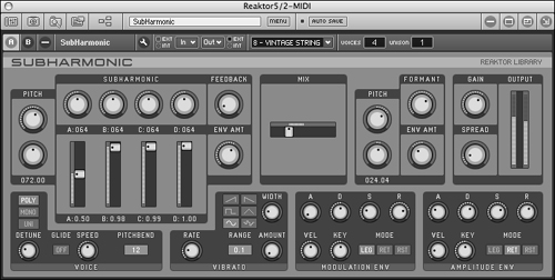
Figure 21-17. Native Instruments’ Reaktor, a modular software synthesizer, makes heavy use of dials and sliders. These are effective interface elements, not only because musicians and producers are familiar with them from hardware, but more importantly because they provide users with more visual and easy-to-comprehend feedback about parameter settings than a long list of numbers, which aren’t that exciting to look at while making music.
Improperly implemented, dials can be extremely difficult to manipulate. Sometimes programmers erroneously force users to trace a circular arc with their mouse, which can be quite challenging. Proper implementation of a dial should allow linear input in two dimensions: clicking on the dial and moving up or right should increase the value of the dial, and moving down or left should decrease the value. Of course, this idiom must be learned by users (otherwise, they may be inclined to try to mouse in an arc), so dials are best suited for specialized applications where users become accustomed to the idiom. Sliders are often a better option, because they visually suggest the fact that movement is along just one axis. Because of their compact size and visual qualities (not to mention heritage), they are popular in audio software.
Although sliders and dials are primarily used as bounded entry controls, they are sometimes used and misused as controls for changing the display of data. For most purposes, scrollbars do a better job of moving data in a display because the scrollbars can easily indicate the magnitude of the scrolling data, which sliders can’t do as well. However, sliders are an excellent choice for zooming interactions, such as adjusting the scale of a map or the size of photo thumbnails.
The thumbwheel is a variant of the dial, but one that is much easier to use. Onscreen thumbwheels look rather like the scroll wheel on a mouse, and behave in much the same way. They are popular with some 3D applications because they are a compact, unbounded control, which is perfect for certain kinds of panning and zooming. Unlike a scrollbar, they need not provide any proportional feedback because the range of the control is infinite. It makes sense to map a control like this to unbounded movement in some direction (like zoom), or movement within data that loops back on itself.
Breaking free from the heritage of traditional GUI controls and the baggage of mechanical analogs, a new generation of more experimental user interfaces allows more visual and gestural idioms. These range from a simple two-dimensional box where a click at any point defines the values for two input mechanisms (the vertical and horizontal coordinates each drive the value of a parameter), to more complex direct manipulation interfaces (see Figure 21-18 for examples). These controls are typically bounded, as their implementation requires careful thought about the relationship between gesture and function. Such control surfaces often provide a mechanism for visual feedback. These controls are also most appropriate for situations where users are attempting to express themselves in regards to a number of variables, and are willing to spend some effort developing proficiency with a challenging idiom.

Figure 21-18. Ableton Live, a computer-based music production and performance tool, employs a variety of two-dimensional bounded input controls. These provide good visual feedback, allow users to adjust multiple parameters from a single control, and support more expressive gestural user interactions. Their bounded nature also provides users with context about how the current settings fit within the allowable ranges, and eliminates the chance that a user will make an invalid entry (because no musician wants to be stopped by an error dialog).
The primary unbounded entry control is the text edit control. This simple control allows users to key in any alphanumeric text value. Edit fields are often small areas where a word or two of data can be entered by a user, but they can also be fairly sophisticated text editors. Users can edit text within them using the standard tools of contiguous selection (as discussed in Chapter 19) with either the mouse or the keyboard.
Text edit controls are often used either as data-entry fields in database applications (including Web sites connected to databases), as option entry fields in dialog boxes, or as the entry field in a combo box. In all these roles, they are frequently called upon to do the work of a bounded entry control. However, if the desired values are finite, the text edit control should not be used. If the acceptable values are numeric, use a bounded numeric entry control such as a slider, instead. If the list of acceptable values is composed of text strings, a list control should be used so users are not forced to type.
Sometimes the set of acceptable values is finite but too big to be practical for a list control. For example, a program may require a string of any 30 alphabetic characters excluding spaces, tabs, and punctuation marks. In this case, a text edit control is probably unavoidable even though its use is bounded. If these are the only restrictions, however, the text edit control can be designed to reject nonalphabetic characters and similarly disallow more than 30 characters to be entered into the field. This, however, brings up interaction issues surrounding validation.
In cases where an unbounded text-entry field is provided, but the field may only accept entries of a certain form, it may be necessary to help users to construct a “valid” entry. Typically, this is done by evaluating a user’s entry after she has finished entering it, and throwing up an error message if it is invalid. Obviously, this can be irritating for users, and ultimately undermine their effectiveness.
As we’ve been alluding to, the best solution to this problem is to use bounded controls to make invalid entries impossible. (A common example of this is providing a drop-down list of months, rather than requiring a user to properly spell “February.”)
In other cases, this isn’t immediately practical (a serial number on a registration screen, for example). Programmers have dealt with this dilemma by creating validation controls, or a type of unbounded text-entry control with built-in validation and feedback. Many data-entry types are commonplace, including formats such as dates, phone numbers, zip codes, and Social Security numbers. Specialized text edit controls are commercially available; you can purchase variants of the text-entry control that will only allow numbers or letters or phone numbers, or reject spaces and tabs, for example.
Although the validation control is a very widespread idiom, most such controls can be improved. The key to successfully designing a validation control is to give users generous feedback. An entry control that merely refuses to accept input is just plain rude and will guarantee an angry and resentful user.
One fundamental improvement is based on the design principle: Visually distinguish elements that behave differently (Chapter 14). Make validation controls visually distinct from nonvalidation controls, whether through the typeface used in the text edit field, the border color, or the background color for the field itself.
However, the primary way to improve validation controls is to provide rich feedback to users. Unfortunately, the text edit control, as we know it today, provides virtually no built-in support for feedback of any kind. Designers must specify such mechanisms in detail, and programmers will likely need to implement them as custom controls.
Some controls reject users’ keystrokes as they are entered. When a control actively rejects keystrokes during the entry process, this is an example of active validation. A text-only entry control, for example, may accept only alphabetic characters and refuse to allow numbers to be entered. Some controls reject any keystrokes other than the numeric digits 0 through 9. Other controls reject spaces, tabs, dashes, and other punctuation in real time. Some variants can get pretty intelligent and reject some numbers based on live calculations, for example, unless they pass a checksum algorithm.
When an active validation control rejects a keystroke, it must make it clear to the user that it has done so. It should also alert the user as to why it made the rejection. If an explanation is offered, users will be less inclined to assume the rejection is arbitrary (or the product of a defective keyboard). They will also be in a better position to give the application what it wants.
Sometimes the range of possible data is such that the program cannot validate it until the user has completed his entry (rather than at each individual keystroke). The validation then takes place only when the control loses focus, that is, when a user is done with the field and moves on to the next one. The validation step must also take place if a user closes the dialog — or invokes another function if the control is not in a dialog box (for example, clicks “Place Order” on a Web page). If the control waits until a user finishes entering data before it edits the value, this is passive validation.
The control may wait until an address is fully entered, for instance, before it interrogates a database to see if it is recognizable as a valid address. Each character is valid by itself, yet the whole may not pass muster. The program could attempt to verify the address as each character is entered but could introduce some undesirable latency with the extra workload. Besides, while the program would know at any given instant whether the address was valid, the user could still move on while the name was in an invalid state.
A way to address this is by maintaining a countdown timer in parallel with the input and reset it on each keystroke. If the countdown timer ever hits zero, do your validation processing. The timer should be set to something around half a second. The effect of this is that as long as a user is entering a keystroke faster than once every half a second, the system is extremely responsive. If the user pauses for more than half a second, the program reasonably assumes that he has paused to think (something that takes months in CPU terms) and goes ahead and performs its analysis of the input so far.
To provide rich visual feedback, the entry field could change colors to reflect its estimate of the validity of the entered data. The field could show in shades of pink until the program judged the data valid, when it would change to white or green.
Another good solution to the validation control problem is the clue box. This little pop-up window looks and behaves just like a ToolTip (but could be made distinguishable from a ToolTip by background color). Its function is to explain the range of acceptable data for a validation control, either active or passive. Whereas a ToolTip appears when the cursor sits for a moment on a control, a clue box would appear as soon as the control detects an invalid character (it might also display unilaterally just like a ToolTip if the cursor sits unmoving on the field for a second or so). If a user enters, for example, a non-numeric character in a numeric-only field, the program would put up a clue box near the point of the offending entry, yet without obscuring it. It would say, for example, 0–9. Short, terse, but very effective. Yes, the user is rejected, but he is not also ignored. The clue box also works for passive validation, as shown in Figure 21-19.

Figure 21-19. The ToolTip idiom is so effective that it could easily be extended to other uses. Instead of yellow ToolTips offering fly-over labels for butcons, we could have pink ones offering fly-over hints for unbounded edit fields. These clue boxes could also help eliminate error message boxes. In this example, if a user enters a value lower than allowable, the program could replace the entered value with the lowest allowable value and display the cluebox that modelessly explains the reason for the substitution. The user can enter a new value or accept the minimum without being stopped by an error dialog.
Typically, an edit field is used to enter a numeric value needed by the program, such as the point size of a font. A user can enter anything he wants, from 5 to 500, and the field will accept it and return the value to the owning program. If a user enters garbage, the control must make some kind of decision. In Microsoft Word, for example, if you enter asdf as a font point size, the program issues an error message box informing you: This is not a valid number. It then reverts the size to its previous value. The error dialog is rather silly, but the summary rejection of my meaningless input is perfectly appropriate. But what if you had keyed in the value nine? The program rejects it with the same curt error message box. If instead the control were programmed to think of itself as a numeric entry control, it could perhaps behave better. It doesn’t bother me if the program converts the nine into a 9, but it certainly is incorrect when it says that nine is not a valid number. Without a doubt, it is valid, and the program has put its foot in its mouth.
It’s nice when a text edit control is smart enough to recognize appropriate units. For example, if a program is requesting a measurement, and a user enters “5i” or “5in” or “5 inches,” the control should not only report the result as five, but it should report inches as well. If a user enters “5mm,” the control should report it as five millimeters. SketchUp, an elegant architectural sketching application, supports this type of feedback. Similarly, well-designed financial analytics applications should know that “5mm” means five million.
Say that the field is requesting a column width. A user can enter either a number or a number and an indicator of the measurement system as described above. Users could also be allowed to enter the word “default” and the program would set the column width to the default value for the program. A user could alternately enter “best fit” and the program would measure all the entries in the column and choose the most appropriate width for the circumstances. There is a problem with this scenario, however, because the words default and best fit must be in the user’s head rather than in the program somewhere. This is easy to solve, though. All we need to do is provide the same functionality through a combo box. The user can drop down the box and find a few standard widths and the words default and best fit. Microsoft uses this idea in Word, as shown in Figure 21-20.

Figure 21-20. The drop-down combo box makes an excellent tool for bounded entry fields because it can accommodate entry values other than numbers. The user doesn’t have to remember or type words like Page Width or Whole Page because they are there to be chosen from the drop-down list. The program interprets the words as the appropriate number, and everyone is satisfied.
The user can pull down the combo box, see items like Page Width or Whole Page, and choose the appropriate one. With this idiom, the information has migrated from the user’s head into the program where it is visible and choosable.
In most text editors there is a user-settable option toggling between insert mode, where text following the insertion point is preserved by sliding it out of the way as new text is added, and overtype mode, where text following the insertion point is lost as the user types over it. These two modes are omnipresent in the world of word processors and, like FORTRAN, never seem to die. Insert and overtype are modes that cause a significant change in the behavior of an interface, with no obvious indication until after a user has interacted, and there is no clear way into or out of these modes (at least in Windows) except by means of a rather obscure keystroke.
Today, with modern GUI word processors, it’s hard to imagine anyone using overtype mode, but undoubtedly such people are out there. But for edit fields of a single line, adding controls beyond simple insert-mode entry and editing is foolish — the potential for trouble is far greater than the advantages. Of course, if you are designing a word processor, the story is different.
The text edit control, with its familiar system font and visually articulated white box, encourages data entry. Yet software developers frequently use the text edit control for read-only output fields. The edit control certainly works as an output field, but to use this control for output only is like pulling a bait and switch on your user, and he will not be amused. If you have text data to output, use a text display control and not a text edit control. If you want to show the amount of free space on disk, for example, don’t use a text edit field, because users are likely to think that they can get more free space by entering a bigger number. At least, that is what the control is telling them with its equivalent of body language.
If you are going to output editable information, go ahead and output it in a fully editable text control and wire it up internally so that it works exactly as it will appear. If not, stick to display controls, described in the next section.
Display controls are used to display and manage the visual presentation of information on the screen. Typical examples include scrollbars and screen-splitters. Controls that manage the way objects are displayed visually on the screen fall into this category, as do those that display static, read-only information. These include paginators, rulers, guidelines, grids, group boxes, and those 3D lines called dips and bumps. Rather than discuss all of these at length, we focus on a few of the more problematic controls.
Probably the simplest display control is the text control, which displays a written message at some location on the screen. The management job that it performs is pretty prosaic, serving only to label other controls and to output data that cannot or should not be changed by users.
The only significant problem with text controls is that they are often used where edit controls should be (and vice versa). Most information stored in a computer can be changed by users. Why not allow them to change it at the same point the software displays it? Why should the mechanism to input a value be different from the mechanism to output that value? In many cases, it makes no sense for the program to separate these related functions. In almost all cases where the program displays a value that could be changed, it should do so in an editable field so a user can click on it and change it directly. Special edit modes are almost always examples of excise.
For years, Adobe Photoshop insisted on opening a dialog box in order to create formatted text in an image. Thus, a user could not see exactly how the text was going to look in the image, forcing her to repeat the procedure again and again to get things right. Finally Adobe fixed the problem, letting users edit formatted text directly into an image layer, in full WYSIWYG fashion — as it should be.
Scrollbars serve a critical need in the modern GUI — they enable smallish rectangles (i.e., windows or panes) to meaningfully contain large amounts of information. Unfortunately, they are also typically quite frustrating, difficult to manipulate, and wasteful of pixels. The scrollbar is, without a doubt, both overused and under-examined. In its role as a window content and document navigator — a display control — its application is appropriate.
The singular advantage of the scrollbar — aside from its near universal availability — is that it provides useful context about where you are in the window. The scrollbar’s thumb is the small, draggable box that indicates the current position, and, often, the scale of the “territory” that can be scrolled.
Many scrollbars are quite parsimonious in doling out information to users. The best scrollbars use thumbs that are proportionally sized to show the percentage of the document that is currently visible, as well as:
How many pages there are in total
The page number (record number, graphic) as we scroll with the thumb
The first sentence (or item) of each page as we scroll with the thumb
Additionally, many scrollbar implementations are stingy with functions. To better help us manage navigation within documents, they should give us powerful tools for going where we want to go quickly and easily, such as:
Buttons for skipping ahead by pages/chapters/sections/keywords
Buttons for jumping to the beginning and end of the document
Tools for setting bookmarks that we can quickly return to
Recent versions of Microsoft Word make use of scrollbars that exhibit many of these features.
Shortcomings in contextual information aside, one of the biggest problems with scrollbars is that they demand a high degree of precision with the mouse. Scrolling down or up in a document is generally much easier than scrolling down and up in a document. You must position the mouse cursor with great care, taking your attention away from the data you are scrolling. Some scrollbars replicate both their up and down nudge arrows at each end of the scrollbar; for windows that will likely stretch across most of the screen, this can be helpful; for smaller windows, such replication of controls is probably overkill and simply adds to screen clutter (see Chapter 19 and Figure 19-1 for more discussion of this idiom).
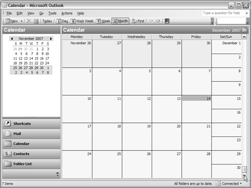
The ubiquity of scrollbars has unfortunately resulted in some unfortunate misuse. Most significant here is their shortcomings in navigating time. Without getting too philosophical or theological, we can all hopefully agree that time has no meaningful beginning or end (at least within the perception of the human mind). What, then, is the meaning of dragging the thumb to one end of a calendar scrollbar? (See Figure 21-21).
There are some viable alternatives to scrollbars. One of the best is the document navigator, which uses a small thumbnail of the entire document space to provide direct navigation to portions of the document (see Figure 21-22). Many image editing applications (such as Photoshop) utilize these for navigating around a document when zoomed in. These can also be very useful when navigating time-based documents, such as video and audio. Critical to the success of such idioms is that it is possible to meaningfully represent the big picture of the document in visual form. For this reason, they aren’t necessarily appropriate for long text documents. In these cases, the structure of the document itself (in outline form) can provide a useful alternative to scrollbars. A basic example of this can be seen in Microsoft Word’s Document Map (which is well intended, but of only limited utility — it deems only first-and second-level headers worth displaying).
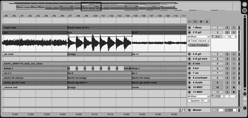
Figure 21-22. Ableton Live features a document navigator on the top of the arrangement screen that provides an overview of the entire song. The black rectangle denotes part of the song that the work area below is zoomed in on. The navigator both provides context in a potentially confusing situation and simultaneously provides a direct navigation idiom where a user may move the rectangle to focus on a different part of the song.
Splitters are useful tools for dividing a sovereign application into multiple, related panes in which information can be viewed, manipulated, or transferred. Movable splitters should always advertise their pliancy with cursor hinting. Though it is easy and tempting to make all splitters movable, you should exercise care in choosing which ones to make movable. In general, a splitter shouldn’t be able to be moved in such a way that makes the contents of a pane completely unusable. In cases where panes need to collapse, a drawer may be a better idiom.
Drawers are panes in a sovereign application that can be opened and closed with a single action. They can be used in conjunction with splitters if the amount that the drawer opens is user configurable. A drawer is usually opened by clicking on a control in the vicinity of the drawer. This control needs to be visible at all times and should either be a latching button/butcon or a lever, which behaves similarly, but typically swivels to indicate an open or closed state.
Drawers are a great place to put controls and functions that are less frequently used but are most useful in context of the main work area of the application. Drawers have the benefit of not covering up the main work area the way a dialog does. Property details, searchable lists of objects or components, and histories are perfect candidates for putting in drawers.
Although the big-picture principles discussed throughout this book can provide enormous leverage in creating products that will please and satisfy users, it’s always important to remember that the devil is in the details. Frustrating controls can lead to a constant low-level annoyance, even if an overall product concept is excellent. Be sure to dot your i’s and cross your t’s, and ensure that your controls are well behaved.