Ubiquitous, toolbars are actually a relatively recent GUI development. Unlike so many GUI idioms that were popularized on the Apple Macintosh, Microsoft was the first to introduce these to mainstream user interfaces. An important complement to a menu system, the toolbar has proven to be an effective mechanism for providing persistent, direct access to functions. Whereas menus are complete toolsets with the main purpose of teaching, toolbars are for frequently used commands and offer little help to new users.
In this chapter, we’ll discuss the merits and shortcomings of the toolbar command idiom. We’ll also talk about ToolTips and toolbar variants such as the ribbon.
The typical toolbar is a collection of butcons (icons that serve as buttons), usually without text labels, in a horizontal slab positioned directly below the menu bar or in a vertical slab attached to the side of the main window (see Figure 23-1). Essentially, a toolbar is a single row (or column) of visible, immediate, graphical, functions.
Great ideas in user-interface design often seem to spring from many sources simultaneously. The toolbar is no exception. It appeared on many programs at about the same time, and nobody can say who invented it first. What is clear is that its advantages were immediately apparent to all. In a stroke, the invention of the toolbar solved the problems of the pull-down menu. Toolbar functions are always plainly visible, and users can trigger them with a single mouse click.
Toolbars are often thought of as just a speedy version of the menu. The similarities are hard to avoid: They offer access to the program’s functions, and they usually form a horizontal row across the top of the screen. It seems that some designers imagine that toolbars, beyond being a command vector in parallel to menus, are an identical command vector to menus. They think that the functions available on toolbars should be the same as those available on menus.
In fact, in many cases, toolbars should serve a different purpose than menus do. Toolbars and their controls should be designed to provide immediate access to functions frequently accessed by users who are already familiar with the application’s basics. Because of their concise nature, toolbars are typically not an ideal way for beginners to understand an application’s capabilities and operation (though ToolTips alleviate this to some extent). Menus provide a much more comprehensive and descriptive view of an application, and are often more appropriate as the pedagogic vector for beginners.

The great strength of menus is their completeness and verbosity. Everything a user needs can be found somewhere on the program’s menus. Of course, this very richness means that menus can get big and cumbersome. To avoid consuming too many pixels, these big menus have to be folded away most of the time and only popped-up on request. The act of popping up excludes menus from the ranks of visible and immediate commands. The trade-off with menus is thoroughness and power in exchange for a small but uniform dose of clunkiness applied at every step. The butcons on toolbars, on the other hand, are incomplete and inscrutable; but they are undeniably visible, immediate, and very space-efficient compared to menus.
The toolbar gave birth to the butcon, a happy marriage between a button and an icon. As a visual mnemonic of a function, butcons are excellent. They can be hard for newcomers to interpret, but then, they’re not for newcomers.
If the butcons on a toolbar act the same as the items on a drop-down menu, why are the menu items almost always shown with text and the toolbar buttons almost always shown with little images? There are good reasons for the difference, although we almost certainly stumbled on them accidentally.
Text labels, like those on menus, can be very precise and clear — they aren’t always, but precision and clarity is their basic purpose. To achieve this, they demand that a user take the time to focus on them and read them. As we discussed in Chapter 14, reading is slower and more difficult than recognizing images. In their pedagogic role, menus must offer precision and clarity — a teacher who isn’t precise and clear is a bad teacher. Taking the extra time and effort is a reasonable trade-off in order to teach.
On the other hand, well-designed pictorial symbols are easy for humans to recognize, but they often lack the precision and clarity of text. Pictographs can be ambiguous until you learn their meaning. However, once you learn it, you don’t easily forget it, and your recognition remains lightning fast (whereas you still have to read the text every time).
Because toolbars are primarily for providing quick access to frequently used tools, their identifiers must elicit quick recognition from experienced users. The pictorial imagery of symbols suits that role better than text does. Butcons have the pliancy of buttons, along with the fast-recognition capability of images. They pack a lot of power into a very small space, but their great strength is also their great weakness: the icon.
Relying on pictographs to communicate is reasonable as long as the parties have agreed in advance what the icons mean. They must do this because the meaning of an icon of any kind is by nature ambiguous until it is learned. Many designers think that they must invent visual metaphors for butcons that adequately convey meaning to first-time users. This is a Quixotic quest that not only reflects a misunderstanding of the purpose of toolbars but also reflects the futile hope for magical powers in metaphors, which we discussed in Chapter 13.
The image on the butcon doesn’t need to teach users its purpose; it merely needs to be easily recognizable. Users should have help learning its purpose through other means. This is not to say that the designer shouldn’t strive to achieve both ends, but don’t fool yourself: It can’t be done very often. It’s a lot easier to find images that represent things than it is to find images that represent actions or relationships. A picture of a trash can, printer, or chart is somewhat easy to interpret, but it’s much more difficult to convey “apply style,” “connect,” or “convert.” And when it comes down to it, perhaps a user will find himself wondering what a picture of a printer means. It could mean “find a printer,” “change the printer’s settings,” or “report on the status of the printer.” Of course, after he learns that the little printer means “print one copy of the current document on the default printer now,” he won’t have trouble with it again.
It might seem like a good idea to label butcons with both text and images. There is not only logic to this argument but precedent, too. The original icons on the Macintosh desktop had text subtitles, as did the icon controls on some older Web browsers. Icons are useful for allowing quick classification, but beyond that, we need text to tell us exactly what the object is for.
The problem is that using both text and images is very expensive in terms of pixels. Except in rare circumstances, screen space is far too valuable to use this way. Designers who choose to label their icons are trying to satisfy two groups of users with different needs: One wants to learn in a gentle, forgiving environment; the other knows where the sharp edges are but sometimes needs a brief reminder. ToolTips provide an effective way to bridge the gap between these two classes of users.
The biggest problem with toolbars is that although their controls are fast and quickly memorable, they are not initially decipherable. How is a new user supposed to learn what butcons and other toolbar controls do?
Apple was the first to attempt a solution with the introduction of balloon help in the System 7 OS, which provided comic-book-style speech balloons describing the purpose and operation of whatever a user’s mouse cursor passed over (this is called a fly-over, rollover, or mouseover facility).
Despite good intentions, balloon help was ill-received. Because there was no lag between when the cursor passed over an object and when the balloon was displayed, it rendered the application largely unusable when balloon help was enabled. As a result, it was basically a modal help system. Users had to choose between learning about the application and using the application, and it hardly needs to be pointed out that this is not consistent with the way people learn most effectively. Of course, experienced users would usually keep balloon help off. Then, when they had to use a part of the application they weren’t familiar with, they had to go up to the Help menu, pull it down, turn balloon help on, point to the unknown object, read the balloon, go back to the menu, and turn balloon help off. What a pain.
Needless to say, balloon help never really caught on, and developers typically created content only for the most obvious and well-known functions, ultimately undermining its usefulness. Mac OS X marked the death of balloon help in favor of a ToolTip mechanism similar to that popularized in Microsoft products.
Though not historically known for inventive user interfaces, Microsoft created a variant of balloon help called ToolTips that is one of the cleverest and most effective user-interface idioms we’ve ever seen (see Figure 23-2). At first, ToolTips may seem similar to balloon help, but on closer inspection you can see the minor physical and behavioral differences that have a huge effect from a user’s point of view. First of all, ToolTips have a well-timed lag that displays the helpful information only after a user has dwelled on the item for a second or so. This is just enough time for a user to point to and select the function without getting the ToolTip. This ensures that users aren’t barraged by little pop-ups as they move the mouse across the toolbar trying to do actual work. It also means that if a user forgets what a rarely used butcon is for, she only need to invest a half-second to find out.
ToolTips typically contain a single word or a very short phrase that describes the function. They don’t traditionally attempt to explain in prose how the object is used; they assume that you will get the rest from context. This illustrates the difference in design intent between Microsoft and Apple. Apple wanted their bubbles to teach things to first-time users. Microsoft figured that first-timers would just have to learn how things work through “F1 Help” or by reading the manual and that ToolTips would merely act as a memory jogger for frequent users.
Super ToolTips in Microsoft Office 2007 now integrate help content into the ToolTip, in a manner very similar to balloon help. While it remains to be seen how this is received, there’s no reason why it shouldn’t be effective, provided that it doesn’t get in the way of experienced users. By taking advantage of the inherent context sensitivity of ToolTips, better integration with other help mechanisms can only serve to reduce the excise involved in learning an application.
ToolTips make the controls on the toolbar much more accessible for intermediate users, which has allowed the toolbar to evolve beyond simply providing alternative access to menu commands. As a result, toolbars were able to take the lead as the main idiom for issuing commands to sovereign applications. This has allowed the menu to recede into the background as a command vector for beginners and for invoking advanced or occasionally used functions. The natural order of butcons as the primary idiom, with menus as a backup, makes sovereign applications much easier to use. In fact, this trajectory has continued into Microsoft Office 2007 with its Ribbon control, which replaces the menu altogether with a visually and textually expressive tabbed toolbar. We further discuss the ribbon later in this chapter.
Toolbar controls should become disabled if they are not applicable to the current selection. They must not offer a pliant response: The butcon must not depress, for example, and controls should also gray themselves out to make matters absolutely clear.
Some programs make disabled toolbar controls disappear altogether, which can have undesirable effects. Users remember toolbar layouts by position. If butcons disappear, the trusted toolbar becomes a skittish, tentative idiom that scares the daylights out of new users and disorients even those more experienced.
After people started to regard the toolbar as something more than just an accelerator for the menu, its growth potential became more apparent. Designers began to see that there was no reason other than habit to restrict the controls on toolbars to butcons. Soon designers began to invent new idioms expressly for the toolbar. With the advent of these new constructions, the toolbar truly came into its own as a primary control device, separate from — and in many cases superior to — menus.
After the butcon, the next control to find a home on the toolbar was the combo box, as in Microsoft Word’s Style, Font, and Font Size controls. It is perfectly natural that these selectors be on the toolbar. They offer the same functionality as those on the drop-down menu, but they also show the current style, font, and font size as a property of the current selection. The idiom delivers more information in return for less effort by users.
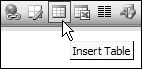
After combo boxes were admitted onto the toolbar, the precedent was set, and all kinds of idioms appeared, as we have already discussed in Chapter 21. Some of these toolbar idioms are shown in Figure 23-1.
This variety of controls contributed to a broadening use of the toolbar. When it first appeared, the toolbar was merely a place for fast access to frequently used functions. As it developed, controls on it began to reflect the state of the program’s data. Instead of a butcon that simply changed a word from plain to italic text, the butcon now began to indicate — by its state — whether the currently selected text was already italicized. The butcon not only controlled the application of the style, but it also represented the status of the selection with respect to the style.
As the variety of controls on the toolbar grows, we find ourselves in the ironic position of adding menus to it. The Word toolbar shown in Figure 23-3 shows the Undo drop-down. Sophisticated and powerful idioms such as this are pushing the old-fashioned menu bar further into the background as a secondary command vector.

Microsoft has done more to develop the toolbar as a user-interface idiom than any other software publisher. This is reflected in the quality of its products. In its Office suite, all the toolbars are very customizable. Each program has a standard battery of toolbars that users can choose to make visible or invisible. If they are visible, they can be dynamically positioned in one of five locations. They can be attached — or docked — to any of the four sides of the program’s main window. If a user drags the toolbar away from the edge, it configures itself as a floating toolbar, complete with a mini title bar, as shown in Figure 23-4.

Allowing users to move toolbars around also provided the possibility for users to obscure parts of toolbars with other toolbars. Microsoft handily addresses this problem with an expansion combutcon or drop-down menu that appears only when a toolbar is partly obscured, and provides access to hidden items via a drop-down menu, as shown in Figure 23-5.

Figure 23-5. Microsoft’s clever way of allowing users to overlap toolbars but still get at all their functions. This provides a very lightweight kind of customization; power users would more likely perform full toolbar customization to address similar needs via the Customize . . . item at the bottom of the drop-down menu. It’s also important to note that these toolbars do have a default anchored location — users aren’t forced to move them around without good reason, which would be pure excise.
Microsoft has clearly seen the dilemma that arises because toolbars represent the frequently used functions for all users, but at least a few of those functions are different for each user. Microsoft apparently arrived at this solution: Ship the program with the best guess at what typical users’ daily-use controls are, and let the others customize this. This solution has been diluted somewhat, however, by the addition of non-daily-use functions. For example, the Word toolbar’s default butcon suite contains functions that certainly are not frequently used. Controls like Insert Auto-text or Insert Excel Spreadsheet seem more like feature checklist items than practical, daily options for the majority of users. Although they may be useful at times, most users do not frequently use them. The use of personas and scenarios is a useful tool for sorting out situations such as these (see Chapters 5 and 6).
Word gives more advanced users the ability to customize and configure the toolbars to their hearts’ content. There is a certain danger in providing this level of customizability to the toolbars, as it is possible for a reckless user to create a really unrecognizable and unusable toolbar. However, it takes some effort to totally wreck things. People generally won’t invest much effort into creating something that is ugly and hard to use. More likely, they will make just a few custom changes and enter them one at a time over the course of months or years. Microsoft has extended the idiom so that you can create your own completely new, completely custom toolbars. The feature is certainly overkill for normal users, but there are those who appreciate such flexibility.
As we discussed earlier in this chapter and in Chapter 22, Microsoft introduced a new GUI idiom with Office 2007: The ribbon (see Figure 23-6). In essence, it is a tabbed toolbar with textual labels for groups of functions, as well as a heterogeneous presentation of butcons and textual commands. The tabs provide groupings similar to those used in menus (such as Home, Insert, Page Layout, References, Mailings, Review, and View in Word 2007).

Aside from creating a more visually structured way of presenting a considerable number of functions, which is certainly of value, it isn’t clear that the ribbon is quite as innovative as Microsoft suggests. (And although positioned differently, it also seems quite similar to Apple’s “Inspectors.” For example, iWeb has a tool palette that changes contents based on selection of a tool at the top. It is not represented as a tab, but it behaves as one.)
In fact, the near abandonment of text commands as found in traditional menus (which users have to go to Options to turn on) in favor of butcons may have grave implications for users learning to use the products. At the time of writing, this idiom has only been in widespread use for a few months, and it is too early to assess its success.
A truly useful evolution of the toolbar idiom is the contextual toolbar. Similar to a right-click contextual menu, it provides a small group of butcons adjacent to the mouse cursor. In some implementations, the specific butcons presented are dependent on the object selected: If text is selected, the buttons provide text-formatting options; if a drawing object is selected, the buttons enable users to change object properties. A variation of this idiom was also popularized with Microsoft Office 2007 (where it is called the “Mini Toolbar”), though similar idioms have been used in several applications, including Adobe Photoshop (where the toolbar is docked) and Apple’s Logic music production environment (where the toolbar is a modal cursor palette).