If our goal is to make the people who use our products more productive, effective, and engaging, we must ensure that users remain in the right frame of mind. This chapter discusses a kind of mental ergonomics — how we can ensure that our products support user intelligence and effectiveness and how we can avoid disrupting the state of productive concentration that we want our users to be able to maintain.
When people are able to concentrate wholeheartedly on an activity, they lose awareness of peripheral problems and distractions. The state is called flow, a concept first identified by Mihaly Csikszentmihalyi in Flow: The Psychology of Optimal Experience.
In Peopleware: Productive Projects and Teams, Tom DeMarco and Timothy Lister describe flow as a “condition of deep, nearly meditative involvement.” Flow often induces a “gentle sense of euphoria” and can make you unaware of the passage of time. Most significantly, a person in a state of flow can be extremely productive, especially when engaged in constructive activities such as engineering, design, development, or writing. To state the obvious, then, to make people more productive and happy, it behooves us to design interactive products to promote and enhance flow, and for us to go to great pains to avoid any potentially flow-disturbing behavior. If the application consistently rattles a user and disrupts her flow, it becomes difficult for her to maintain that productive state.
In most cases, if a user could achieve his goals magically, without your product, he would. By the same token, if a user needs the product but could achieve his goals without messing about with a user interface, he would. Interacting with a lot of software will never be an entirely aesthetically pleasing experience (with many obvious exceptions, including things like games, creative tools like music sequencers, and content-delivery systems like Web browsers). For a large part, interacting with software (especially business software) is a pragmatic exercise.

Directing your attention to the interaction itself puts the emphasis on the side effects of the tools and technology rather than on the user’s goals. A user interface is an artifact, not directly associated with the goals of a user. Next time you find yourself crowing about what cool interaction you’ve designed, just remember that the ultimate user interface for most purposes is no interface at all.
To create a sense of flow, our interaction with software must become transparent. When a novelist writes well, the craft of the writer becomes invisible, and the reader sees the story and characters with clarity undisturbed by the technique of the writer. Likewise, when a product interacts well with a person, interaction mechanics disappear, leaving the person face to face with his objectives, unaware of the intervening software. The poor writer is a visible writer, and a poor interaction designer looms with a clumsily visible presence in his software.
To a novelist, there is no such thing as a “good” sentence in isolation from the story being told. There are no rules for the way sentences should be constructed to be transparent. It all depends on what the protagonist is doing, or what effect the author wants to create. The writer knows not to insert an obscure word in a particularly quiet and sensitive passage, lest it sound like a sour note in a string quartet. The same goes for software. The interaction designer must train himself to hear sour notes in the orchestration of software interaction. It is vital that all the elements in an interface work coherently together towards a single goal. When an application’s communication with a person is well orchestrated, it becomes almost invisible.
Webster defines orchestration as “harmonious organization,” a reasonable phrase for what we should expect from interactive products. Harmonious organization doesn’t yield to fixed rules. You can’t create guidelines like, “Five buttons on a dialog box are good” and “Seven buttons on a dialog box are too many.” Yet it is easy to see that a dialog box with 35 buttons is probably to be avoided. The major difficulty with such analysis is that it treats the problem in vitro. It doesn’t take into account the problem being solved; it doesn’t take into account what a person is doing at the time or what he is trying to accomplish.
While there are no universal rules to define a harmonious interaction (just as there are no universal rules to define a harmonious interval in music), we’ve found these strategies to be effective at getting interaction design moving in the right direction:
Follow users’ mental models.
Less is more.
Enable users to direct, don’t force them to discuss.
Keep tools close at hand.
Provide modeless feedback.
Design for the probable; provide for the possible.
Provide comparisons.
Provide direct manipulation and graphical input.
Reflect object and application status.
Avoid unnecessary reporting.
Avoid blank slates.
Differentiate between command and configuration.
Provide choices.
Hide the ejector seat levers.
Optimize for responsiveness; accommodate latency.
Each principle is discussed in detail below.
We introduced the concept of mental models in Chapter 2. Different people have different mental models of a given activity or process, but they rarely imagine them in terms of the detailed mechanics of how computers function. Each user naturally forms a mental image about how the software performs its task. The mind looks for some pattern of cause and effect to gain insight into the machine’s behavior.
For example, in a hospital information system, the physicians and nurses have a mental model of patient information that derives from how they think about patients and treatment. It therefore makes most sense to find patient information by using names of patients as an index. Each physician has certain patients, so it makes additional sense to filter the patients in the clinical interface so that each physician can choose from a list of her own patients, organized alphabetically by name. On the other hand, in the business office of the hospital, the clerks there are worried about overdue bills. They don’t initially think about these bills in terms of who or what the bill is for, but rather in terms of how late the bill is (and perhaps how big the bill is). Thus, for the business office interface, it makes sense to sort first by time overdue and perhaps by amount due, with patient names as a secondary organizational principle.
For many things, more is better. In the world of interaction design, the contrary is true. We should constantly strive to reduce the number of elements in user interfaces without reducing the capabilities of the products we are creating. To do this, we must do more with less; this is where careful orchestration becomes important. We must coordinate and control the power of the product without letting the interface become a gaggle of windows and dialogs, covered with a scattering of unrelated and rarely used controls.
It is very common for user interfaces to be complex but not very powerful. Products like this typically segregate functionality into silos and allow a user to perform a single task without providing access to related tasks. When the first edition of this book was published in 1995, this problem was ubiquitous. Something as common as a “Save” dialog in a Windows application failed to provide the ability for users to also rename or delete the files they were looking at. This required users to go to an entirely different place to accomplish these very similar tasks, ultimately requiring applications and operating systems to provide more interface. Thankfully, contemporary operating systems are much better at this sort of thing. Because they have started to offer appropriate functionality based upon a user’s context, users are less often required to shuffle off to various places in the interface to accomplish simple and common tasks.
We have, however, a rather long way to go. In our work we see a lot of enterprise software where each function or feature is housed in a separate dialog or window, with no consideration for the way people must use these functions together to accomplish something. It is not uncommon for a user to use one menu command to open a window to find a bit of information, copy that information to the clipboard, and then use a different menu command for a different window, merely to paste that bit of information in a field. Not only is this inelegant and crude, but it is error-prone and fails to capitalize on a productive division of labor between humans and machines. Typically, products don’t end up this way on purpose — they have either been built in an ad hoc manner over years, or by several disconnected teams in different organizational silos.
Motorola’s popular Razr phone is an example of the problem: while the industrial design of the phone is deservedly award-winning for its elegance, the software was inherited from a previous generation of Motorola phones, and appears to have been developed by multiple teams who didn’t coordinate their efforts. For example, the phone’s address book uses a different text-entry interface than its calendar application. Each software team must have devised a separate solution, resulting in two interfaces doing the job that one should have done — both a waste of development resources and a source of confusion and friction to Motorola’s users.
Mullet and Sano’s classic Designing Visual Interfaces includes a useful discussion of the idea of elegance, which can be thought of as a novel, simple, economical, and graceful way of solving a design problem. Because the software inside an interactive product is typically so incredibly complex, it becomes all the more important to value elegance and simplicity; these attributes are crucial for technology to effectively serve human needs.
A minimalist approach to product design is inextricably tied to a clear understanding of purpose — what the user of a product is trying to accomplish using the tool. Without this sense of purpose, interactive products are just a disorganized jumble of technological capabilities. A model example where a strong sense of purpose has driven a minimal user interface is the classic Google search interface consisting of a text field, two buttons (“Google Search,” which brings the user to a list of results, and “I’m Feeling Lucky,” which brings the user directly to the top result), the Google logotype, and a couple of links to the broader universe of Google functionality (see Figure 10-1). Other good examples of minimal user interfaces include the iPod Shuffle, where by carefully defining an appropriate set of features to meet a specific set of user needs, Apple created a highly usable product with one switch and five buttons (and no screen!), and Hog Bay Software’s WriteRoom, an incredibly simple text editor with no user interface aside from an area in which to write text, which is automatically saved, eliminating the need to even interact with files.

It’s worth noting that the quest for simplicity can be taken too far — reduction is a balancing act that requires a good understanding of users’ mental models. The iPod hardware interface mentioned as an example of elegance and economy in design is also at odds with some users’ expectations. If you’re coming from the world of tape decks and CD players, odds are it feels a bit weird to use the iPod’s Play/Pause toggle to shut the device off, and the Menu button to turn the device on. This is a classic case of visual simplicity leading to cognitive complexity. In this situation, these idioms are simple enough to learn easily, and the consequences of getting it wrong are fairly small, so it’s had little impact on the overall success of the product.
It seems that many developers imagine the ideal interface to be a two-way conversation with a user. However, most people don’t see it that way. Most people would rather interact with the software in the same way they interact with, say, their cars. They open the door and get in when they want to go somewhere. They step on the accelerator when they want the car to move forward and the brake when it is time to stop; they turn the wheel when they want the car to turn.
This ideal interaction is not a dialogue — it’s more like using a tool. When a carpenter hits nails, she doesn’t discuss the nail with the hammer; she directs the hammer onto the nail. In a car, the driver gives the car direction when he wants to change the car’s behavior. The driver expects direct feedback from the car and its environment in terms appropriate to the device: the view out the windshield, the readings on the various gauges on the dashboard, the sound of rushing air and tires on pavement, and the feel of lateral g-forces and vibration from the road. The carpenter expects similar feedback: the feel of the nail sinking, the sound of the steel striking steel, and the heft of the hammer’s weight.
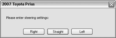
The driver certainly doesn’t expect the car to interrogate him with a dialog box, nor would the carpenter appreciate one (like the one in Figure 10-2) appearing on her hammer.
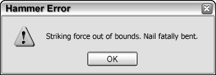
Figure 10-2. Just because programmers are accustomed to seeing messages like this, it doesn’t mean that people from other walks of life are. Nobody wants his machine to scold him. If we guide our machines in a dunderheaded way, we expect to get a dunderheaded response. Sure, they can protect us from fatal errors, but scolding isn’t the same thing as protecting.
One of the reasons interactive products often aggravate people is that they don’t act like cars or hammers. Instead, they often have the temerity to try to engage us in a dialogue — to inform us of our shortcomings and to demand answers from us. From a user’s point of view, the roles are reversed: It should be the person doing the demanding and the software doing the answering.
With direct manipulation, we can point to what we want. If we want to move an object from A to B, we click on it and drag it there. As a general rule, the better, more flow-inducing interfaces are those with plentiful and sophisticated direct manipulation idioms.
Most applications are too complex for one mode of direct manipulation to cover all their features. Consequently, most applications offer a set of different tools to users. These tools are really different modes of behavior that the product enters. Offering tools is a compromise with complexity, but we can still do a lot to make tool selection and manipulation easy and to prevent it from disturbing flow. Mainly, we must ensure that information about tools and application state is clear and present and that transitions between tools are quick and simple.
Tools should be close at hand, commonly on palettes or toolbars for beginner and intermediate users, and accessible by keyboard command for expert users. This way, a user can see them easily and can select them with a single click or keystroke. If a user must divert his attention from the application to search out a tool, his concentration will be broken. It’s as if he had to get up from his desk and wander down the hall to find a pencil. Also, he should never have to put tools away.
When users of an interactive product manipulate tools and data, it’s usually important to clearly present the status and effect of these manipulations. This information must be easy to see and understand without obscuring or interfering with a user’s actions.
There are several ways for an application to present information or feedback to users. Unfortunately, the most common method is to pop up a dialog box on the screen. This technique is modal: It puts the application into a special state that must be dealt with before it can return to its normal state, and before the person can continue with her task. A better way to inform users is with modeless feedback.
Feedback is modeless whenever information for users is built into the structures of the interface and doesn’t stop the normal flow of activities and interaction. In Microsoft Word, you can see what page you are on, what section you are in, how many pages are in the current document, and what position the cursor is in, modelessly just by looking at the status bar at the bottom of the screen — you don’t have to go out of your way to ask for that information.
If you want to know how many words are in your document, however, you have to call up the Word Count dialog from the Tools menu, from there you can open a persistent Word Count toolbar, but even this requires users to click Recount to see accurate information (see Figure 10-3). For people writing magazine articles, who need to be careful about word count, this information would be better delivered modelessly. Even though many people don’t use it, there’s plenty of space on the bottom of the screen in the status bar to deliver such statistics.
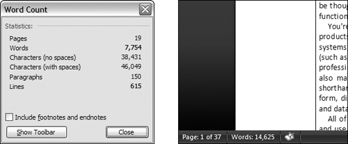
Figure 10-3. In Word 2003, if you want to know the number of words in your document, you must choose Word Count... from the Tools menu. This opens a dialog box. To get back to work, you must first click the Close button on the Word Count dialog. This behavior is the opposite of modeless feedback, and it hampers flow. In Word 2007, Microsoft has improved the situation considerably: The number of words in the document is modelessly displayed on the lower-left edge of the window, next to the page count, a similar bit of information.
Jet fighters have a heads-up display, or HUD, that superimposes the readings of critical instrumentation onto the forward view of the cockpit’s windscreen. The pilot doesn’t even have to use peripheral vision but can read vital gauges while keeping her eyes glued on the opposing fighter. Applications can use the edges of the display screen to show users information about activity in the main work area of applications. Many drawing applications, such as Adobe Photoshop, already provide ruler guides, thumbnail maps, and other modeless feedback in the periphery of their windows. We will further discuss these types of rich modeless feedback in Chapter 25.
There are many cases where interaction, usually in the form of a dialog box, slips into a user interface unnecessarily. A frequent source for such clinkers is when an application is faced with a choice. That’s because programmers tend to resolve choices from the standpoint of logic, and it carries over to their software design. To a logician, if a proposition is true 999,999 times out of a million and false one time, the proposition is false — that’s the way Boolean logic works. However, to the rest of us, the proposition is overwhelmingly true. The proposition has a possibility of being false, but the probability of it being false is minuscule to the point of irrelevancy. One of the most potent methods for better orchestrating your user interfaces is segregating the possible from the probable.
Programmers tend to view possibilities as being the same as probabilities. For example, a user has the choice of ending the application and saving his work, or ending the application and throwing away the document he has been working on for the last six hours. Either of these choices is possible. Conversely, the probability of this person discarding his work is at least a thousand to one against, yet the typical application always includes a dialog box asking the user if he wants to save his changes, like the one shown in Figure 10-4.
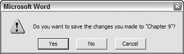
Figure 10-4. This is easily the most unnecessary dialog box in the world of GUI. Of course, we want to save our work! It is the normal course of events. Not saving it would be something out of the ordinary that should be handled by some dusty dialog box. This single dialog box does more to force users into knowing and understanding the useless and confusing facts about RAM and disk storage than anything else in their entire interaction with their computer. This dialog box should never be used.
The dialog box in Figure 10-4 is inappropriate and unnecessary. How often do you choose to abandon changes you make to a document? This dialog is tantamount to your spouse telling you not to spill soup on your shirt every time you eat. We’ll discuss the implications of removing this dialog in Chapter 17.
Programmers are judged by their ability to create software that handles the many possible, but improbable, conditions that crop up inside complex logical systems. This doesn’t mean, however, that they should render that readiness to handle off-beat possibilities directly into a user interface. The obtrusive presence of edge case possibilities is a dead giveaway for user interfaces designed by programmers. Dialogs, controls, and options that are used a hundred times a day sit side by side with dialogs, controls, and options that are used once a year or never.
You might get hit by a bus, but you probably will drive safely to work this morning. You don’t stay home out of fear of the killer bus, so don’t let what might possibly happen alter the way you treat what almost certainly will happen in your interface.
The way that an application represents information is another way that it can obtrude noisily into a person’s consciousness. One area frequently abused is the representation of quantitative, or numeric, information. If an application needs to show the amount of free space on disk, it can do what the Microsoft Windows 3.x File Manager did: give you the exact number of free bytes, as shown in Figure 10-5.
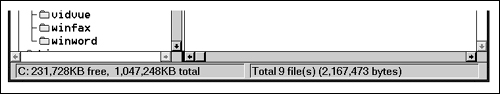
Figure 10-5. The Windows 3.x File Manager took great pains to report the exact number of bytes used by files on the disk. Does this precision help us understand whether we need to clear space on the disk? Certainly not. Furthermore, is a seven-digit number the best way to indicate the disk’s status? Wouldn’t a graphical representation that showed the space usage in a proportional manner (like a pie chart) be more meaningful? Luckily, Microsoft Windows now uses pie charts to indicate disk usage.
In the lower-left corner, the application tells us the number of free bytes and the total number of bytes on the disk. These numbers are hard to read and hard to interpret. With more than ten thousand million bytes of disk storage, it ceases to be important to us just how many hundreds are left, yet the display rigorously shows us down to the kilobyte. But even while the application is telling us the state of our disk with precision, it is failing to communicate. What we really need to know is whether or not the disk is getting full, or whether we can add a new 20 MB application and still have sufficient working room. These raw numbers, precise as they are, do little to help make sense of the facts.
Visual presentation expert Edward Tufte says that quantitative presentation should answer the question, “Compared to what?” Knowing that 231,728 KB are free on your hard disk is less useful than knowing that it is 22% of the disk’s total capacity. Another Tufte dictum is, “Show the data,” rather than simply telling about it textually or numerically. A pie chart showing the used and unused portions in different colors would make it much easier to comprehend the scale and proportion of hard disk use. It would show us what 231,728 KB really means. The numbers shouldn’t go away, but they should be relegated to the status of labels on the display and not be the display itself. They should also be shown with more reasonable and consistent precision. The meaning of the information could be shown visually, and the numbers would merely add support.
In Windows XP and Vista, Microsoft’s right hand giveth, while its left hand taketh away. The File Manager shown in Figure 10-5 is long dead, replaced by the Explorer dialog box shown in Figure 10-6. This replacement is the properties dialog associated with a hard disk. The Used Space is shown in blue and the Free Space is shown in magenta, making the pie chart an easy read. Now you can see at a glance the glad news that GranFromage is mostly empty.
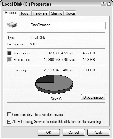
Figure 10-6. In Windows XP and Vista, Microsoft has replaced the electric chair with lethal injection. Instead of long, inscrutable numbers at the bottom of the File Manager, you can request a Properties dialog box from Windows Explorer. The good news is that you can finally see how your disk is doing in a meaningful, graphic way with the pie chart. The bad news is that you have to stop what you’re doing and open a dialog box to see fundamental information that should be readily available. In Windows 2000, this graph was automatically displayed on the left side of the Explorer window when a disk was selected; XP’s solution represents a step backwards.
Unfortunately, that pie chart isn’t built into the Explorer’s interface. Instead, you have to seek it out with a menu item. To see how full a disk is, you must bring up a modal dialog box that, although it gives you the information, takes you away from the place where you need to know it. The Explorer is where you can see, copy, move, and delete files, but it’s not where you can easily see if things need to be deleted. That pie chart should have been built into the face of the Explorer. In Windows 2000, it was shown on the left-hand side when you selected a disk in an Explorer window. In XP, however, Microsoft took a step backwards, and the graphic has once again been relegated to a dialog. It really should be visible at all times in the Explorer, along with the numerical data, unless a user chooses to hide it.
Software frequently fails to present numerical information in a graphical way. Even rarer is the capability of software to enable graphical input. A lot of software lets users enter numbers, then, on command, it converts those numbers into a graph. Few products let a user draw a graph and, on command, convert that graph into a vector of numbers. By contrast, most modern word processors let you set tabs and indentations by dragging a marker on a ruler. Someone can say, in effect, “here is where I want the paragraph to start,” and let the application calculate that it is precisely 1.347 inches in from the left margin instead of forcing a user to enter 1.347.
This principle applies in a variety of situations. When items in a list need to be reordered, a user may want them ordered alphabetically, but he may also want them in order of personal preference; something no algorithm can offer. A user should be able to drag the items into the desired order directly, without an algorithm interfering with this fundamental operation.
When someone is asleep, he usually looks asleep. When someone is awake, he looks awake. When someone is busy, he looks busy: His eyes are focused on his work and his body language is closed and preoccupied. When someone is unoccupied, he looks unoccupied: His body is open and moving, his eyes are questing and willing to make contact. People not only expect this kind of subtle feedback from each other, they depend on it for maintaining social order.
Our applications and devices should work the same way. When an application is asleep, it should look asleep. When an application is awake, it should look awake, and when it’s busy, it should look busy. When the computer is engaged in some significant internal action like performing a complex calculation and connecting to a database, it should be obvious to us that it won’t be quite as responsive as usual. When the computer is sending a fax, we should see a small representation of the fax being scanned and sent (or at least a modeless progress bar).
Similarly, the status of user interface objects should be apparent to users. Most e-mail programs do a good job making it obvious which messages have not been read and which have been responded to or forwarded. Taking this concept a step further, wouldn’t it be great if, when you were looking at events on a calendar in Microsoft Outlook or IBM Lotus Notes, you could tell how many people had agreed to attend and how many hadn’t responded yet?
Application and object state is best communicated using forms of rich modeless feedback, briefly discussed earlier in this chapter. More detailed examples of rich modeless feedback may be found in Chapter 25.
For programmers, it is important to know exactly what is happening in a program. This is necessary to be able to control all the details of the program. For users, it is disconcerting and distracting to know all the details of what is happening. Nontechnical people may be alarmed to hear that the database has been modified, for example. It is better for the application to just do what has to be done, issue reassuring clues when all is well, and not burden users with the trivia of how it was accomplished.
Many applications are quick to keep users apprised of the details of their progress even though a user has no idea what to make of this information. Applications pop up dialog boxes telling us that connections have been made, that records have been posted, that users have logged on, that transactions were recorded, that data have been transferred, and other useless factoids. To software engineers, these messages are equivalent to the humming of the machinery, the babbling of the brook, the white noise of the waves crashing on the beach: They tell us that all is well. They were, in fact, probably used while debugging the software. To a normal person, however, these reports can be like eerie lights beyond the horizon, like screams in the night, like unattended objects flying about the room.
As discussed before, the application should make clear that it is working hard, but the detailed feedback can be offered in a more subtle way. In particular, reporting information like this with a modal dialog box brings the interaction to a stop with no particular benefit.
It is important that we not stop the proceedings to report normalcy. When some event has transpired that was supposed to have transpired, never report this fact with a dialog box. If you must use them at all, reserve dialogs for events that are outside of the normal course of events.
By the same token, don’t stop the proceedings and bother a user with problems that are not serious. If the application is having trouble creating a connection to a server, don’t put up a dialog box to report it. Instead, build a status indicator into the application so the problem is clear to the interested user but is not obtrusive to someone who is busy elsewhere.
The key to orchestrating a user interaction is to take a goal-directed approach. You must ask yourself whether a particular interaction moves a person rapidly and directly to his goal. Contemporary applications are often reluctant to take any forward motion without a person directing them in advance. But most people would rather see the application take some “good enough” first step and then adjust it to what is desired. This way, the application has moved a person closer to his goal.
It’s easy to assume nothing about what your users want, and rather, ask a bunch of questions up front to help determine what they want. How many applications have you seen that start with a big dialog asking a bunch of questions? But normal people — not power users — aren’t always capable or comfortable explaining what they want to an interactive product. They would much rather see what the application thinks is right and then manipulate that to make it exactly right. In most cases, your application can make a fairly correct assumption based on past experience. For example, when you create a new document in Microsoft Word, the application creates a blank document with preset margins and other attributes rather than opening a dialog that asks you to specify every detail. PowerPoint does a less adequate job, asking you to choose the base style for a new presentation each time you create one. Both applications could do better by remembering frequently and recently used styles or templates, and making those the defaults for new documents.
Just because we use the word think in conjunction with an interactive product doesn’t mean that the software needs to be intelligent (in the human sense) and try to determine the right thing to do by reasoning. Instead, it should simply do something that has a statistically good chance of being correct and then provide a user with powerful tools for shaping that first attempt, instead of merely giving the user a blank slate and challenging him to have at it. This way the application isn’t asking for permission to act but rather for forgiveness after the fact.
For most people, a completely blank slate is a difficult starting point. It’s so much easier to begin where someone has already left off. A user can easily fine-tune an approximation provided by the application into precisely what he desires with less risk of exposure and mental effort than he would have from drafting it from nothing. As we discuss in Chapter 11, endowing your application with a good memory is the best way to accomplish this.
Another problem crops up quite frequently whenever functions with many parameters are invoked by users. The problem comes from the lack of differentiation between a function and the configuration of that function. If you ask an application to perform a function itself, the application should simply perform that function and not interrogate you about your precise configuration details. To express precise demands to the program, you would request the configuration dialog.
For example, when you ask many applications to print a document, they respond by launching a complex dialog box demanding that you specify how many copies to print, what the paper orientation is, what paper feeder to use, what margins to set, whether the output should be in monochrome or color, what scale to print it at, whether to use PostScript fonts or native fonts, whether to print the current page, the current selection, or the entire document, and whether to print to a file and if so, how to name that file. All those options are useful, but all we wanted was to print the document, and that is all we thought we asked for.
A much more reasonable design would be to have a command to print and another command for print setup. The print command would not issue any dialog but would just go ahead and print, either using previous settings or standard, vanilla settings. The print setup function would offer up all those choices about paper and copies and fonts. It would also be very reasonable to be able to go directly from the configure dialog to printing.
The print control on the Word toolbar offers immediate printing without a dialog box. This is perfect for many people, but for those with multiple printers or printers on a network, it may offer too little information. A user may want to see which printer is selected before he either clicks the control or summons the dialog to change it first. This is a good candidate for some simple modeless output placed on a toolbar or status bar (it is currently provided in the ToolTip for the control, which is good, but the feedback could be better still). Word’s print setup dialog is called “Print...” and is available from the File menu. Its name could be more descriptive, although the ellipsis does, according to GUI standards, give some inkling that it will launch a dialog.
There is a big difference between configuring and invoking a function. The former may include the latter, but the latter shouldn’t include the former. In general, any user invokes a command ten times for every one time he configures it. It is better to make a user ask explicitly for configuration one time in ten than it is to make a user reject the configuration interface nine times in ten.
Microsoft’s printing solution is a reasonable rule of thumb. Put immediate access to functions on buttons in the toolbar and put access to function-configuration dialog boxes on menu items. The configuration dialogs are better pedagogic tools, whereas the buttons provide immediate action.
Asking questions is quite different from providing choices. The difference between them is the same as that between browsing in a store and conducting a job interview. The individual asking the questions is understood to be in a position superior to the individual being asked. Those with authority ask questions; subordinates respond. Asking users questions makes them feel irritated or inferior.
Dialog boxes (confirmation dialogs in particular) ask questions. Toolbars offer choices. The confirmation dialog stops the proceedings, demands an answer, and it won’t leave until it gets what it wants. Toolbars, on the other hand, are always there, quietly and politely offering up their wares like a well-appointed store, giving you the luxury of selecting what you would like with just a flick of your finger.
Contrary to what many software developers think, questions and choices don’t necessarily make users feel empowered. More commonly, they make people feel badgered and harassed. Would you like soup or salad? Salad. Would you like cabbage or spinach? Spinach. Would you like French, Thousand Island, or Italian? French. Would you like lo-cal or regular? Stop! Just bring me the soup! Would you like chowder or chicken noodle?
Users don’t like to be asked questions. It cues a user that the application is:
Ignorant
Forgetful
Weak
Lacking initiative
Unable to fend for itself
Fretful
Overly demanding
These are qualities that we typically dislike in people. Why should we desire them in software? The application is not asking us our opinion out of intellectual curiosity or desire to make conversation, the way a friend might over dinner. Rather, it is behaving ignorantly or presenting itself with false authority. The application isn’t interested in our opinions; it requires information — often information it didn’t really need to ask us in the first place (for more discussion on how to avoid questions, see Chapter 12).
Worse than a single question is a question that is asked repeatedly and unnecessarily. Many ATMs continually ask users what language they prefer: “Spanish, English, or Chinese?” This is not an answer that is likely to change after a person’s first use. Interactive products that ask fewer questions appear smarter to users, and more polite and considerate.
In The Media Equation (Cambridge University Press, 1996), Stanford sociologists Clifford Nass and Byron Reeves make a compelling case that humans treat and respond to computers and other interactive products as if they were people. We should thus pay real attention to the “personality” projected by our software. Is it quietly competent and helpful, or does it whine, nag, badger, and make excuses? We’ll discuss more about how to make software more polite and considerate in Chapter 12.
Choices are important, but there is a difference between being free to make choices based on presented information and being interrogated by the application in modal fashion. Users would much rather direct their software the way they direct their automobiles down the street. Automobiles offer drivers sophisticated choices without once issuing a dialog box. Imagine the situation in Figure 10-7.
Directly manipulating a steering wheel is not only a more appropriate idiom for communicating with your car, but it also puts you in the superior position, directing your car where it should go. No one likes to be questioned like a suspect in a lineup, yet that is exactly what our software often does.
In the cockpit of every jet fighter is a brightly painted lever that, when pulled, fires a small rocket engine underneath the pilot’s seat, blowing the pilot, still in his seat, out of the aircraft to parachute safely to earth. Ejector seat levers can only be used once, and their consequences are significant and irreversible.
Just as a jet fighter needs an ejector seat lever, complex desktop applications need configuration facilities. The vagaries of business and the demands placed on the software force it to adapt to specific situations, and it had better be able to do so. Companies that pay millions of dollars for custom software or site licenses for thousands of copies of shrink-wrapped products will not take kindly to a program’s inability to adapt to the way things are done in that particular company. The application must adapt, but such adaptation can be considered a one-time procedure, or something done only by the corporate IT staff on rare occasion. In other words, ejector seat levers may need to be used, but they won’t be used very often.
Applications must have ejector seat levers so that users can — occasionally — move persistent objects (see Chapter 11) in the interface, or dramatically (sometimes irreversibly) alter the function or behavior of the application. The one thing that must never happen is accidental deployment of the ejector seat (see Figure 10-8). The interface design must assure that a user can never inadvertently fire the ejector seat when all he wants to do is make some minor adjustment to the program.
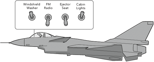
Figure 10-8. Ejector seat levers have catastrophic results. One minute, the pilot is safely ensconced in her jet, and the next she is tumbling end over end in the wild blue yonder, while her jet goes on without her. The ejector seat is necessary for the pilot’s safety, but a lot of design work has gone into ensuring that it never gets fired inadvertently. Allowing an unsuspecting user to configure an application by changing permanent objects is comparable to firing the ejection seat by accident. Hide those ejector seat levers!
Ejector seat levers come in two basic varieties: those that cause a significant visual dislocation (large changes in the layout of tools and work areas) in the program and those that perform some irreversible action. Both of these functions should be hidden from inexperienced users. Of the two, the latter variety is by far the more dangerous. In the former, a user may be surprised and dismayed at what happens next, but she can at least back out of it with some work. In the latter case, she and her colleagues are likely to be stuck with the consequences.
By keeping in mind principles of flow and orchestration, your software can keep users engaged at maximum productivity for extended periods of time. Productive users are happy users, and customers with productive, happy users are the goal of any digital product manufacturer. In the next chapter, we further discuss ways to enhance user productivity by eliminating unnecessary barriers to use that arise as a result of implementation-model thinking.
An application can become slow or unresponsive when it performs a large amount of data processing or when it talks to remote devices like servers, printers, and networks. There isn’t much that is more disturbing to a user’s sense of flow than staring at a screen waiting for the computer to respond. It’s absolutely critical to design your interfaces so that they are sufficiently responsive — all the lush visual style in the world isn’t going to impress anyone if the interface moves like molasses because the device is maxed out redrawing the screen.
This is one arena where collaboration with developers is quite important. Depending on the platform and technical environment, different interactions can be quite “expensive” from a latency perspective. You should both advocate for implementation choices that provide the user with appropriately rich interactions with as little latency as possible, and design solutions to accommodate choices that have been made and cannot be revisited. When latency is unavoidable, it’s important to clearly communicate the situation to users and provide them the ability to cancel the operation causing the latency and ideally perform other work while they are waiting.
If your application executes potentially time-consuming tasks, make sure that it occasionally checks to see if a person is still out there, banging away on the keyboard or madly clicking on the mouse, whimpering “No, no, I didn’t mean to reorganize the entire database. That will take 4.3 million years!”
In a number of studies dating back to the late 1960s, it’s generally been found that users’ perception of response times can be roughly categorized into several buckets.[1]
Up to 0.1 seconds, users perceive the system’s response to be instantaneous. Here, they feel that they are directly manipulating the user interface and data.
Up to about 1 second, users feel that the system is responsive. Users will likely notice a delay, but it is small enough for their thought processes to stay uninterrupted.
Up to about 10 seconds, users clearly notice that the system is slow, and their mind is likely to wander, but they are capable of maintaining some amount of attention on the application. Providing a progress bar is critical here.
After about 10 seconds, you will lose your users’ attention. They will wander off and get a cup of coffee or switch to a different application. Ideally, processes that take this long should be conducted offline or in the background, allowing users to continue with other work. In any case, status and progress should be clearly communicated, including estimated time remaining, and a cancel mechanism is absolutely critical.
In summary, creating a successful product requires more than delivering useful functionality. You must also consider how different functional elements are orchestrated to enable users to achieve a sense of flow as they go about their business. The best user interfaces often don’t leave users in awe of their beauty, but rather are hardly even noticed because they can be used effortlessly.