
In Chapter 24, we discussed the bulletin dialog, commonly issued by applications when they have problems or confront decisions they don’t feel capable of making, or really any time they have something to notify users about. In other words, these dialog boxes are used for error messages, alerts, and confirmations, three of the most abused components of modern GUI design. With proper design, these dialogs can all but be eliminated. In this chapter, we explore how and why.
There is probably no user-interface idiom more abused than the error dialog. They are typically poorly written, unhelpful, rude, and worst of all, are never in time to prevent the error in the first place. Users never want error messages. Users want to avoid the consequences of making errors. This is very different from saying that they want error messages — it’s like saying that people want to abstain from skiing when what they really want to do is avoid breaking their legs. As usability heavyweight Donald Norman points out, users frequently blame themselves for errors in product design. Just because you aren’t getting complaints from your users doesn’t mean that they are happy getting error messages.
The idea that an application doesn’t have the right — even the duty — to reject a user’s input is so heretical that many practitioners dismiss it summarily. Yet, we’d like to suggest that if you examine this assertion rationally and from a user’s point of view, it is not only possible, but quite reasonable.
The first computers were undersized, underpowered, and expensive, and didn’t lend themselves easily to software sensitivity. The operators of these machines were white-lab-coated scientists who were sympathetic to the needs of the CPU and weren’t offended when handed an error message. They knew how hard the computer was working. They didn’t mind getting a core dump, a bomb, an “Abort, Retry, Fail?” or the infamous “FU” message (File Unavailable). This is how the tradition of software treating people like machines began. Ever since the early days of computing, programmers have accepted that the proper way for software to interact with humans was to demand input and to complain when the human failed to achieve the same perfection level as the CPU.
Examples of this approach exist wherever software demands that users do things its way instead of the software adapting to the needs of humans. Nowhere is it more prevalent, though, than in the omnipresence of error messages.
Error messages stop the proceedings with a modal dialog box. Many designers and programmers imagine that their error message boxes are alerting users to serious problems. This is a widespread misconception. Most error message boxes are informing users of the inability of the program to work flexibly and are an admission of real stupidity on the application’s part. In other words, to most users, error message boxes are seen not just as the program stopping the proceedings but as stopping the proceedings with idiocy. We can significantly improve the quality of our interfaces by eliminating error message boxes.

Humans have emotions and feelings: Computers don’t. When one chunk of code rejects the input of another, the sending code doesn’t care; it doesn’t scowl, get hurt, or seek counseling. Humans, on the other hand, get angry when they are flatly told they are stupid.
When a user sees an error message box, it is as if another person has told her that she is stupid. Users hate this (see Figure 25-1). Despite the inevitable user reaction, most programmers just shrug their shoulders and put error message boxes in anyway. They don’t know how else to create reliable software.

Many programmers and user-interface designers labor under the misconception that people need to be told when they are wrong. This assumption is false in several ways. First of all, it ignores human nature. Very few people wish to hear from a machine that they’re wrong. You may call it denial, but it is true, and users will blame the messenger before they blame themselves.
The assumption that users need to know when they are wrong is similarly false. How important is it for you to know that you requested an invalid type size? Most programs can make a reasonable substitution.
We consider it very impolite to tell people when they have committed some social faux pas. Telling someone they have a bit of lettuce sticking to their teeth or that their fly is open is equally embarrassing for both parties. Sensitive people look for ways to bring the problem to the attention of the victim without letting others notice. Yet programmers assume that a big, bold box in the middle of the screen that stops all the action and emits a bold “beep” is the appropriate way to behave.
Conventional wisdom says that error messages tell users when they have made a mistake. Actually, most error bulletins report when the computer gets confused. Users make far fewer substantive mistakes than imagined. Typical “errors” consist of a user inadvertently entering an out-of-bounds number, or entering a space where the computer doesn’t allow it. When a user enters something unintelligible by the computer’s standards, whose fault is it? Is it a user’s fault for not knowing how to use the program properly, or is it the fault of the program for not making the choices and effects clearer?
Information that is entered in an unfamiliar sequence is usually considered an error by software, but people don’t have this difficulty with unfamiliar sequences. Humans know how to wait, to bide their time until the story is complete. Software usually jumps to the erroneous conclusion that out-of-sequence input means wrong input, so it issues an evil error message box.
When, for example, a user creates an invoice for a customer without an ID number, most applications reject the entry. They stop the proceedings with the idiocy that the user must enter a valid customer number right now. Alternatively, the application could accept the transaction with the expectation that a customer number will eventually be entered, or that a user may even be trying to create a new customer. The program could provide a little modeless feedback that the number isn’t recognized, then watch to make sure the user enters the necessary information to make that customer number valid before the end of the session, or even the end of the month book closing. This is the way most humans work. They don’t usually enter “bad” codes. Rather, they enter codes in a sequence that the software isn’t prepared to accept.
If a person forgets to fully explain things to the computer, the computer can, after some reasonable delay, provide more insistent signals to the user. At day’s or week’s end, the program can make sure that irreconcilable transactions are apparent to the user. The application doesn’t have to bring the proceedings to a halt with an error message. After all, the application will remember the transactions, so they can be tracked down and fixed. This is the way it worked in manual systems, so why can’t computerized systems do at least this much? Why stop the entire process just because something is missing? As long as users remain well informed throughout, there shouldn’t be a problem. The trick is to inform without stopping the proceedings. We’ll discuss this idea more later in the chapter.
If the application were a human assistant and it staged a sit-down strike in the middle of the Accounting Department because we handed it an incomplete form, we’d be pretty upset. If we were the bosses, we’d consider finding a replacement for this uptight, petty, sanctimonious clerk. Just take the form, we’d say, and figure out the missing information. The authors have used Rolodex programs that demand you enter an area code with a phone number even though the person’s address has already been entered. It doesn’t take a lot of intelligence to make a reasonable guess at the area code. If you enter a new name with an address in Menlo Park, the program can reliably assume that the area code is 650 by looking at the other 25 people in your database who also live in Menlo Park and have 650 as their area code. Sure, if you enter a new address for, say, Boise, Idaho, the program might be stumped. But how tough is it to access a directory on the Web, or even keep a list of the 1,000 biggest cities in America along with their area codes?
Programmers may now protest: “The program might be wrong. It can’t be sure. Some cities have more than one area code. It can’t make that assumption without approval of the user!” Not so.
If we asked an assistant to enter a client’s phone contact information into our Rolodex, and neglected to mention the area code, he would accept it anyway, expecting that the area code would arrive before its absence was critical. Alternatively, he could look the address up in a directory. Let’s say that the client is in Los Angeles so the directory is ambiguous: The area code could be either 213 or 310. If our human assistant rushed into the office in a panic shouting “Stop what you’re doing! This client’s area code is ambiguous!” we’d be sorely tempted to fire him and hire somebody with a greater-than-room-temperature IQ. Why should software be any different? A human might write 213/310? into the area code field in this case. The next time we call that client, we’ll have to determine which area code is correct, but in the meantime, life can go on.
Again, squeals of protest: “But the area code field is only big enough for three digits! I can’t fit 213/310? into it!” Gee, that’s too bad. You mean that rendering the user interface of your program in terms of the underlying implementation model — a rigidly fixed field width — forces you to reject natural human behavior in favor of obnoxious, computer-like inflexibility supplemented with demeaning error messages? Not to put too fine a point on this, but error message boxes come from a failure of applications to behave reasonably, not from any failure of users.
There is a final irony to error messages: They don’t prevent users from making errors. We imagine that users are staying out of trouble because our trusty error messages keep them straight, but this is a delusion. What error messages really do is prevent the program from getting into trouble. In most software, the error messages stand like sentries where the program is most sensitive, not where users are most vulnerable, setting into concrete the idea that the program is more important than users. Users get into plenty of trouble with our software, regardless of the quantity or quality of the error messages in it. All an error message can do is keep me from entering letters in a numeric field — it does nothing to protect me from entering the wrong numbers — which is a much more difficult design task.
We can’t eliminate error messages by simply discarding the code that shows the actual error message dialog box and letting the program crash if a problem arises. Instead, we need to redesign applications so that they are no longer susceptible to the problem. We must replace the error message with more robust software that prevents error conditions from arising, rather than having the program merely complain when things aren’t going precisely the way it wants. Like vaccinating it against a disease, we make the program immune to the problem, and then we can toss the message that reports it. To eliminate the error message, we must first reduce the possibility of users making errors. Instead of assuming error messages are normal, we need to think of them as abnormal solutions to rare problems — as surgery instead of aspirin. We need to treat them as an idiom of last resort.
Every good programmer knows that if module A hands invalid data to module B, module B should clearly and immediately reject the input with a suitable error indicator. Not doing this would be a great failure in the design of the interface between the modules. But human users are not modules of code. Not only should software not reject the input with an error message, but the software designer must also reevaluate the entire concept of what “invalid data” is. When it comes from a human, the software must assume that the input is correct, simply because the human is more important than the code. Instead of software rejecting input, it must work harder to understand and reconcile confusing input. A program may understand the state of things inside the computer, but only a user understands the state of things in the real world. Remember, the real world is more relevant and important than what the computer thinks.
Making it impossible for users to make errors is the best way to eliminate error messages. By using bounded widgets (such as spinners and drop-down list boxes) for data entry, we can prevent users from entering bad numbers. Instead of forcing a user to key in his selection, present him with a list of possible selections from which to choose. Instead of making a user type in a state code, for example, let him choose from a list of valid state codes or even from a picture of a map. In other words, make it impossible for the user to enter a bad state.
Another excellent way to eliminate error messages is to make the application smart enough that it no longer needs to make unnecessary demands. Many error messages say things like “Invalid input. User must type xxxx.” Why can’t the program, if it knows what the user must type, just enter xxxx by itself and save the user the tongue-lashing? Instead of demanding that a user find a file on a disk, introducing the chance that the user will select the wrong file, the program should remember which files it has accessed in the past and allow a selection from that list. Another example is designing a system that gets the date from the internal clock instead of asking for input from users.
Undoubtedly, all these solutions will cause more work for programmers. However, it is the programmer’s job to satisfy users and not vice versa. If the programmer thinks of the user as just another input device, it is easy to forget the proper pecking order in the world of software design.
Users of computers aren’t sympathetic to the difficulties faced by programmers. They don’t see the technical rationale behind an error message box. All they see is the unwillingness of the program to deal with things in a human way. They see all error messages as some variant of the one shown in Figure 25-2.

One of the problems with error messages is that they are usually ex post facto reports of failure. They say, “Bad things just happened, and all you can do is acknowledge the catastrophe.” Such reports are not helpful. And these dialog boxes always come with an OK button, requiring the user to be an accessory to the crime. These error message boxes are reminiscent of the scene in old war movies where an ill-fated soldier steps on a landmine while advancing across the rice paddy. He and his buddies clearly hear the click of the mine’s triggering mechanism and the realization comes over the soldier that although he’s safe now, as soon as he removes his foot from the mine, it will explode, taking some large and useful part of his body with it. Users get this feeling when they see most error message boxes, and they wish they were thousands of miles away, back in the real world.
One of the reasons why software is so hard to learn is that it so rarely gives positive feedback. People learn better from positive feedback than they do from negative feedback. People want to use their software correctly and effectively, and they are motivated to learn how to make the software work for them. They don’t need to be slapped on the wrist when they fail. They do need to be rewarded, or at least acknowledged, when they succeed. They will feel better about themselves if they get approval, and that good feeling will be reflected back to the product.
Advocates of negative feedback can cite numerous examples of its effectiveness in guiding people’s behavior. This evidence is true, but almost universally, the context of effective punitive feedback is getting people to refrain from doing things they want to do but shouldn’t: things like not driving over 55 mph, not cheating on their spouses, and not fudging their income taxes. But when it comes to helping people do what they want to do, positive feedback is best. If you’ve ever learned to ski, you know that a ski instructor who yells at you isn’t helping the situation.
Keep in mind that we are talking about the drawbacks of negative feedback from a computer. Negative feedback by another person, although unpleasant, can be justified in certain circumstances. One can say that a coach is helping your mental toughness for competition, and the imperious professor is at least preparing you for the vicissitudes of the real world. But to be given negative feedback by a machine is an insult. The drill sergeant and professor are at least human and have bona fide experience and merit. But to be told by software that you have failed is humiliating and degrading. There is nothing that takes place inside a computer that will be helped by humiliating or degrading a human user. We only resort to negative feedback out of habit.
As our technological powers grow, the portability and flexibility of our computer hardware grows, too. Modern computers can be connected to and disconnected from networks and peripherals without having to first power down. This means that it is now normal for hardware to appear and disappear ad hoc. Printers, modems, and file servers can come and go like the tides. With the development of wireless networks such as WiFi and Bluetooth, our computers can frequently connect and disconnect from networks. Is it an error if you move between two wireless networks? Is it an error if you print a document, only to find that no printers are connected? Is it an error if the file you are editing normally resides on a drive that is no longer reachable?
None of these occurrences should be considered as errors. If you open a file on the server and begin editing it, then wander out to a restaurant for lunch, taking your notebook with you, the program should see that the normal home of the file is no longer available and do something intelligent. It could use a wireless network and VPN to log on to the server remotely, or it could just save any changes you make locally, synchronizing with the version on the server when you return to the office from lunch. In any case, it is normal behavior, not an error, and you shouldn’t have to tell the computer what it should do every single time it encounters the situation.
Almost all error message boxes can be eliminated. If you examine the situation from the point of view that the error message box must be eliminated and that everything else is subject to change in search of this objective, you will see the truth of this assertion. You will also be surprised by how little else needs to be changed in order to achieve it. In those rare cases where the rest of the program must be altered too much, that is the time to compromise with the real world and go ahead and use an error message box. But programmers need to start thinking of this compromise as an admission of failure on their part, as a solution of last resort.
All this said, there are certainly some time-critical situations where users must be notified in an obtrusive, attention-demanding manner. For example, if during market hours, an investment manager sets up some trades to be executed by the end of the day, and then sends them down to the trading desk after market close, she should be interrupted from whatever else she’s working on to be warned that the trades can’t be executed until the market opens tomorrow, at which point she may no longer want to make the trades.
In the case that it is truly infeasible to redesign your application to eliminate the need for error dialogs, we offer you some ways to improve the quality of error message boxes. Use these recommendations only as a last resort, when you run out of other reasonable options for actually eliminating the error dialog.
An error dialog should always be polite, illuminating, and helpful. Never forget that an error dialog is the application’s way of reporting on its failure to do its job, and that it is interrupting the user to do this. The error message box must be unfailingly polite. It must never even hint that the user caused this problem, because that is simply not true from the user’s perspective.
The error message box must illuminate the problem for the user. This means that it must give him the information he needs to make an appropriate plan to solve the program’s problem. It needs to make clear the scope of the problem, what the alternatives are, what the program will do as a default, and what information was lost, if any.
It is wrong, however, for the program to just dump the problem on a user’s lap and wipe its hands of the matter. It should directly offer to implement at least one suggested solution right there on the error message box. It should offer buttons that will take care of the problem in various ways. If a printer is missing, the message box should offer options for deferring the printout or selecting another printer. If the database is hopelessly trashed and useless, it should offer to rebuild it to a working state, including telling the user how long that process will take and what side effects it will cause.
Figure 25-3 shows an example of a reasonable error message. Notice that it is polite, illuminating, and helpful. It doesn’t even hint that the user’s behavior is anything but impeccable.

Like error dialogs, alerts and confirmations stop the proceedings, often with idiocy. Alerts and confirmations do not report malfunctions. An alert notifies a user of the program’s action, whereas a confirmation also gives a user the authority to override that action. These dialogs pop up like weeds in most programs and should, like error dialogs, be eliminated in favor of more useful idioms.
Alerts usually violate one of our basic design principles: A dialog box is another room; you should have a good reason to go there (see Chapter 20). Even if a user must be informed about an action taken by the application, why go into another room to do it?
When it comes down to it, an application should either have the courage of its convictions or it should not take action without a user’s direct instruction. If the application, for example, saves a user’s file to disk automatically, it should have the confidence to know that it is doing the right thing. It should provide a means for users to find out what the application did, but it doesn’t have to stop the proceedings to do so. If the application really isn’t sure that it should save the file, it shouldn’t save the file but should leave that operation up to the user.
Conversely, if a user directs the program to do something — dragging a file to the trash can, for example — it doesn’t need to stop the proceedings with idiocy to announce that the user just dragged a file to the trashcan. The program should ensure that there is adequate visual feedback regarding the action, and if the user has actually made the gesture in error, the program should unobtrusively offer him a robust Undo facility so he can backtrack.
The rationale for alerts is to keep users informed. This is a great objective, but it need not come at the expense of smooth interaction flow.
The alert shown in Figure 25-4 is an example of how alerts are more trouble than help. The Find dialog (the one underneath) already forces a user to click Cancel when the search is completed, but the superimposed alert box adds another flow-breaking button. To return to his work, a user must first click the OK button on the alert, then the Cancel button on the Find dialog. If the information provided by the alert were built into the main Find dialog, the user’s burden would be reduced by half.

Alerts are so numerous because they are so easy to create. Most programming languages offer some form of message box facility in a single line of code. Conversely, building an animated status display into the face of a program might require a thousand or more lines of code. Programmers cannot be expected to make the right choice in this situation. They have a conflict of interest, so designers must be sure to specify precisely where information is reported on the surface of an application. The designers must then follow up to be sure that the design wasn’t compromised for the sake of rapid coding. Imagine if the contractor on a building site decided unilaterally not to add a bathroom because it was just too much trouble to deal with the plumbing. There would be consequences.
Of course, software must keep users informed of its actions. It should have visual indicators built into its main screens to make such status information immediately available to users, should they desire it. Launching an alert to announce an unrequested action is bad enough. Putting up an alert to announce a requested action is pathological.
Software should be flexible and forgiving, but it doesn’t need to be fawning and obsequious. The dialog box shown in Figure 25-5 is a classic example of an alert that should be put out of our misery. It announces that the application successfully completed a synchronization — its sole reason for existence. This occurs a few seconds after we told it to synchronize. It stops the proceedings to announce the obvious. It’s as though the application wants approval for how hard it worked. If a person interacted with us like this, we’d find it uncomfortable and him overbearing. Of course some feedback is appropriate, but is another dialog that must be dismissed really necessary?

When an application does not feel confident about its actions, it often asks a user for approval with a dialog box, like the one shown in Figure 25-6. This is called a confirmation. Sometimes a confirmation is offered because the application second-guesses one of the user’s actions. Sometimes the program feels that is not competent to make a decision it faces and uses a confirmation to give the user the choice instead. Confirmations always come from the program and never from the user. This means that they are often a reflection of the implementation model and are not representative of user goals.

Figure 25-6. Every time we delete a file in Windows, we get this confirmation dialog box asking if we’re sure. Yes, we’re sure. We’re always sure. And if we’re wrong, we expect Windows to be able to recover the file for us. Windows lives up to that expectation with its Recycle Bin. So, why does it still issue the confirmation message? When a confirmation box is issued routinely, users get used to approving it routinely. So, when it eventually reports an impending disaster to the user, he goes ahead and approves it anyway, because it is routine. Do your users a favor and never create another confirmation dialog box.
Revealing the implementation model to users is a surefire way to create an unpleasant and inferior product. This means that confirmation messages are inappropriate. Confirmations get written into software when a programmer arrives at an impasse in her coding. Typically, she realizes that she is about to direct the program to take some bold action and feels unsure about taking responsibility for it. Sometimes the bold action is based on some condition the program detects, but more often it is based on a command the user issues. Typically, the confirmation will be launched after the user issues a command that is either irrecoverable or whose results might cause undue alarm.
Confirmations pass the buck to users. Users trust the application to do its job, and the application should both do it and ensure that it does it right. The proper solution is to make the action easily reversible and provide enough modeless feedback so that users are not taken off-guard.
As a program’s code grows during development, programmers detect numerous situations where they don’t feel that they can resolve issues adequately. Programmers will unilaterally insert buck-passing code in these places, almost without noticing it. This tendency needs to be closely watched, because programmers have been known to insert dialog boxes into the code even after the user-interface specification has been agreed upon. Programmers often don’t consider confirmation dialogs to be part of the user interface, but they are.
Confirmations illustrate an interesting quirk of human behavior: They only work when they are unexpected. That doesn’t sound remarkable until you examine it in context. If confirmations are offered in routine places, users quickly become inured to them and routinely dismiss them without a glance. Dismissing confirmations thus becomes as routine as issuing them. If, at some point, a truly unexpected and dangerous situation arises — one that should be brought to a user’s attention — he will, by rote, dismiss the confirmation, exactly because it has become routine. Like the fable of the boy who cried “Wolf,” when there is finally real danger, the confirmation box won’t work because it cried too many times when there was no danger.
For confirmation dialog boxes to work, they must only appear when a user will almost definitely click the No or Cancel button, and they should never appear when a user is likely to click the Yes or OK button. Seen from this perspective, they look rather pointless, don’t they?
Three design principles provide a way to eliminate confirmation dialog boxes. The best way is to obey the simple dictum: Do, don’t ask. When you design your software, go ahead and give it the force of its convictions (backed up, of course, by user research, as discussed in Chapter 4). Users will respect its brevity and its confidence.
Of course, if an application confidently does something that a user doesn’t like, it must have the capability to reverse the operation. Every aspect of the program’s action must be undoable. Instead of asking in advance with a confirmation dialog box, on those rare occasions when the program’s actions were out of turn, let the user issue the Stop-and-Undo command.
Most situations that we currently consider unprotectable by Undo can actually be protected fairly well. Deleting or overwriting a file is a good example. The file can be moved to a directory where it is kept for a month or so before it is physically deleted. The Recycle Bin in Windows uses this strategy, except for the part about automatically erasing files after a month: Users still have to take out the garbage.
Even better than acting in haste and forcing users to rescue the program with Undo, you can make sure that applications offer users adequate information so that they never issue a command (or omit a command) that leads to an undesirable result. Applications should use rich visual feedback so that users are constantly kept informed, the same way the instruments on dashboards keep us informed of the state of our cars.
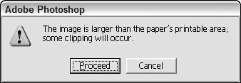
Occasionally, a situation arises that really can’t be protected by Undo. Is this a legitimate case for a confirmation dialog box? Not necessarily. A better approach is to provide users with protection the way we give them protection on the freeway: with consistent and clear markings. You can often build excellent, modeless warnings right into the interface. For instance, look at the dialog from Adobe Photoshop in Figure 25-7, telling us that our document is larger than the available print area. Why has the program waited until now to inform us of this fact? What if guides were visible on the page at all times (unless a user hid them) showing the actual printable region? What if those parts of the picture outside the printable area were highlighted when a user moused over the Print butcon in the toolbar? Clear, modeless feedback (see the next section) is the best way to address these problems.
Much more common than honestly irreversible actions are those actions that are easily reversible but still uselessly protected by routine confirmation boxes. The confirmation in Figure 25-6 is an excellent specimen of this species. There is no reason whatsoever to ask for confirmation of a move to the Recycle Bin. The sole reason the Recycle Bin exists is to implement an undo facility for deleted files.
Most computers (and many devices) come with high-resolution displays and high-quality audio systems. Yet, very few applications (outside of games) even scratch the surface of using these facilities to provide useful information about the status of the program, the users’ tasks, and the system and its peripherals in general. An entire toolbox is available to express information to users, but designers and programmers have stuck to using the same blunt instrument — the dialog — to communicate information. Needless to say, this means that subtle status information is simply never communicated to users at all, because even the most clueless designers know that you don’t want dialogs to pop up constantly. But constant feedback is exactly what users need. It’s simply the channel of communication that needs to be different.
In this section, we’ll discuss rich modeless feedback, information that can be provided to users in the main displays of your application, which doesn’t stop the flow and can all but eliminate pesky dialogs.
Perhaps the most important type of modeless feedback is rich visual modeless feedback (RVMF). This type of feedback is rich in terms of giving in-depth information about the status or attributes of a process or object in the current application. It is visual in that it makes idiomatic use of pixels on the screen (often dynamically), and it is modeless in that this information is always readily displayed, requiring no special action or mode shift on the part of a user to view and make sense of the feedback.
For example, in Microsoft Outlook 2007, a small icon next to an e-mail sender’s name visually indicates whether that person is available for a chat session or a phone call, if it turns out that a real-time conversation is preferable to an e-mail exchange. This small icon (as well as the ability to start a chat session from a right-click menu), means that users don’t have to open their chat client and find the sender’s name to see if that person happens to be available. This is so easy and convenient that a user literally does not have to think about it. Another example of the strategy, as designed for a Cooper client, can be seen in Figure 25-8.
Here’s another example, this time from the Mac: When you download a file from the Internet, the downloading file appears on the desktop as an icon with a small dynamically updating progress bar, indicating visually what percentage has downloaded.
A final example of RVMF is from the computer gaming world: Sid Meier’s Civilization. This game provides dozens of examples of RVMF in its main interface, which is a map of the historical world that you, as a leader of an evolving civilization, are trying to build and conquer. Civilization uses RVMF to indicate a half-dozen things about a city, all represented visually. If a city is more advanced, its architecture is more modern. If it is larger, the icon is larger and more embellished. If there is civil unrest, smoke rises from the city. Individual troop and civilian units also show status visually, by way of tiny meters showing unit health and strength. Even the landscape has RVMF: Dotted lines marking spheres of influence shift as units move and cities grow. Terrain changes as roads are laid, forests are cleared, and mountains are mined. Although dialogs exist in the game, much of the information needed to understand what is going on is communicated clearly with no words or dialogs whatsoever.
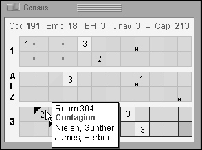
Figure 25-8. This pane from a Cooper design for a long-term health-care information system is a good example of RVMF. The diagram is a representation of all the rooms in the facility. Color-coding indicates male, female, empty, or mixed-gender rooms; numbers indicate empty beds; tiny boxes between rooms indicate shared bathrooms. Black triangles indicate health issues, and a tiny “H” means a held bed. This RVMF is supplanted with ToolTips, which show room number and names of the occupants of the room, and highlight any important notices about the room or the residents. A numeric summary of rooms, beds, and employees is given at the top. This display has a short learning curve. Once mastered, it allows nurses and facility managers to understand their facility’s status at a glance.
Imagine if all the objects that had pertinent status information on your desktop or in your application were able to display their status in this manner. Printer icons could show how near they were to completing your print job. Disks and removable media icons could show how full they were. When an object was selected for drag and drop, all the places that could receive it would visually highlight to announce their receptiveness.
Think about the objects in your application, what attributes they have — especially dynamically changing ones — and what kind of status information is critical for your users. Figure out how to create a representation of this. After a user notices and learns this representation, it tells him what is going on at a glance. (There should also be a way to get fully detailed information if the user requests it.) Put this information into main application windows in the form of RVMF and see how many dialogs you can eliminate from routine use!
One important point does need to be made about rich modeless visual feedback. It isn’t for beginners. Even if you add ToolTips to textually describe the details of any visual cues you add (which you should), it requires users to perform work to discover it and decode its meaning. RVMF is something that users will begin to use over time. When they do, they’ll think it’s amazing; but, in the meantime, they will need support of menus and dialogs to find what they’re looking for. This means that RVMF used to replace alerts and warnings of serious trouble must be extraordinarily clear to users. Make sure that this kind of status is visually emphasized over less critical, more informational RVMF.
In data-entry environments, clerks sit for hours in front of computer screens entering data. These users may well be examining source documents and typing by touch instead of looking at the screen. If a clerk enters something erroneous, he needs to be informed of it via both auditory and visual feedback. The clerk can then use his sense of hearing to monitor the success of his inputs while he keeps his eyes on the document.
The kind of auditory feedback we’re proposing is not the same as the beep that accompanies an error message box. In fact, it isn’t a beep at all. The auditory indicator we propose as feedback for a problem is silence. The problem with much current audible feedback is the still prevalent idea that, rather than positive audible feedback, negative feedback is desirable.
People frequently counter the idea of audible feedback with arguments that users don’t like it. Users are offended by the sounds that computers make, and they don’t like to have their computer beeping at them. Despite the fact that Microsoft and Apple have tried to improve the quality of alert sounds by hiring sound designers (including the legendary Brian Eno for Windows 95), all the warm ambience in the world doesn’t change the fact that they are used to convey negative, often insulting messages.
Emitting noise when something bad happens is called negative audible feedback. On most systems, error message boxes are normally accompanied by a shrill beep, and audible feedback has thus become strongly associated them. That beep is a public announcement of a user’s failure. It explains to all within earshot that you have done something execrably stupid. It is such a hateful idiom that most software developers now have an unquestioned belief that audible feedback is bad and should never again be considered as a part of interface design. Nothing could be further from the truth. It is the negative aspect of the feedback that presents problems, not the audible aspect.
Negative audible feedback has several things working against it. Because the negative feedback is issued at a time when a problem is discovered, it naturally takes on the characteristics of an alarm. Alarms are designed to be purposefully loud, discordant, and disturbing. They are supposed to wake sound sleepers from their slumbers when their house is on fire and their lives are at stake. They are like insurance: We hope that they will never be heard. Unfortunately, users are constantly doing things that programs can’t handle, so these actions have become part of the normal course of interaction. Alarms have no place in this normal relationship, the same way we don’t expect our car alarms to go off whenever we accidentally change lanes without using our turn indicators. Perhaps the most damning aspect of negative audible feedback is the implication that success must be greeted with silence. Humans like to know when they are doing well. They need to know when they are doing poorly, but that doesn’t mean that they like to hear about it. Negative feedback systems are simply appreciated less than positive feedback systems.
Given the choice of no noise versus noise for negative feedback, people will choose the former. Given the choice of no noise versus soft and pleasant noises for positive feedback, however, many people will choose the feedback. We have never given our users a chance by putting high-quality, positive audible feedback in our programs, so it’s no wonder that people associate sound with bad interfaces.
Almost every object and system outside the world of software offers sound to indicate success rather than failure. When we close the door, we know that it is latched when we hear the click, but silence tells us that it is not yet secure. When we converse with someone and they say, “Yes” or “Uh-huh,” we know that they have, at least minimally, registered what was said. When they are silent, however, we have reason to believe that something is amiss. When we turn the key in the ignition and get silence, we know we’ve got a problem. When we flip the switch on the copier and it stays coldly silent instead of humming, we know that we’ve got trouble. Even most equipment that we consider silent makes some noise: Turning on the stovetop returns a hiss of gas and a gratifying “whoomp” as the pilot ignites the burner. Electric ranges are inherently less friendly and harder to use because they lack that sound — they require indicator lights to tell us of their status.
When success with our tools yields a sound, it is called positive audible feedback. Our software tools are mostly silent; all we hear is the quiet click of the keyboard. Hey! That’s positive audible feedback. Every time you press a key, you hear a faint but positive sound. Keyboard manufacturers could make perfectly silent keyboards, but they don’t because we depend on audible feedback to tell us how we are doing. The feedback doesn’t have to be sophisticated — those clicks don’t tell us much — but they must be consistent. If we ever detect silence, we know that we have failed to press the key. The true value of positive audible feedback is that its absence is an extremely effective problem indicator.
The effectiveness of positive audible feedback originates in human sensitivity. Nobody likes to be told that they have failed. Error message boxes are negative feedback, telling the user that he has done something wrong. Silence can ensure that the user knows this without actually being told of the failure. It is remarkably effective, because the software doesn’t have to insult the user to accomplish its ends.
Our software should give us constant, small, audible cues just like our keyboards. Our applications would be much friendlier and easier to use if they issued barely audible but easily identifiable sounds when user actions are correct. The program could issue a reassuring click every time the user enters valid input to a field, and an affirming tone when a form has been successfully completed. If an application doesn’t understand some input, it should remain silent, subtly informing the user of the problem, allowing her to correct the input without embarrassment or ego-bruising. Whenever a user starts to drag an icon, the computer could issue a low-volume sound reminiscent of sliding as the object is dragged. When it is dragged over pliant areas, an additional percussive tap could indicate this collision. When the user finally releases the mouse button, he is rewarded with a soft, cheerful “plonk” from the speakers for a success or with silence if the drop was not meaningful.
As with visual feedback, computer games tend to excel at positive audio feedback. Mac OS X also does a good job with subtle positive audio feedback for activities like document saves and drag and drop. Of course, the audible feedback must be at the right volume for the situation. Windows and the Mac offer a standard volume control, so one obstacle to beneficial audible feedback has been overcome, but audible feedback should also not overpower music playing on the computer.
Rich modeless feedback is one of the greatest tools at the disposal of interaction designers. Replacing annoying, useless dialogs with subtle and powerful modeless communication can make the difference between a program users will despise and one they will love. Think of all the ways you might improve your own applications with RVMF and other mechanisms of modeless feedback!