
Menus are perhaps the oldest idioms in the GUI pantheon — revered and surrounded by superstition and lore. Most designers, programmers, and users accept without question that traditional menu design is correct — there are so many existing programs that attest to its excellence. But this belief is like snapping your fingers to keep the tigers away. There aren’t any tigers here, you say? See, it works! That said, a well-designed menu can be a very useful way to provide access to application functionality in certain contexts. We start this chapter with a brief history of menus and then discuss some problems with menus and how to use them appropriately.
While the modern GUI with its drop-down menus and dialog boxes has only been mainstream since the Macintosh’s introduction in 1984, it is now so ubiquitous that it’s easy to take for granted. Before diving into the details of contemporary menu idioms, it’s useful to look back and examine the path we’ve taken in the development of modern interaction idioms as a basis for our understanding of menus’ strengths and potential pitfalls.
If you wanted to talk to an IBM mainframe computer in the 1970s, you had to manually keypunch a deck of computer cards, use an obscure language called JCL (Job Control Language), and submit this deck of cards to the system through a noisy, mechanical card reader. Each line of JCL or program had to be punched on a separate card. Even the first microcomputers, small, slow, and stupid, running a primitive operating system called CP/M, had a much better conversational style than those hulking dinosaurs in their refrigerated glass houses. You could communicate directly with microcomputers running CP/M merely by typing commands into a standard keyboard. What a miracle! The program issued a prompt on the computer screen that looked like this:
A>
You could then type in the names of programs, which were stored as files, as commands and CP/M would run them. We called it the command-line interface, and it was widely considered a great leap forward in man-machine communications.
The only catch is that you had to know what to type. For frequent users, who at that time were mostly programmers, the command-line prompt was very powerful and effective because it offered the quickest and most efficient route to getting the desired task done. With his hands on the keyboard in the best tradition of touch typists, a user could rip out copy a:*.* b:, and the disk was copied. Even today, for users who have mastered the command set, the command line is still considerably faster (and often more powerful) than using a mouse for many operations.
The command-line interface really separated the men (and women) from the nerds. As software got more powerful and complex, however, the memorization demands that the command-line interface made on users were just too great, and it had to give way to something better.
Finally, sometime in the late-1970s, some very clever programmer came up with the idea of offering users a list of choices. You could read the list and select an item from it the way that you choose a dish at a restaurant by reading the menu. The appellation stuck, and the age of the sequential hierarchical menu began.
The sequential hierarchical menu enabled users to forget many of the commands and option details required by the command-line interface. Instead of keeping the details in his head, a user could read them off the screen. Another miracle! Circa 1979, your program was judged heavily on whether or not it was menu-based. Those vendors stuck in the command-line world fell by the wayside in favor of the more modern paradigm.
Although the paradigm was called menu-based at the time, we refer to these menus as sequential and hierarchical to differentiate them from the menus in widespread use today. The old pre-GUI menus were deeply hierarchical: After you made a selection from one menu, it would be replaced by another, then another, drilling down into a tall tree of commands.
Because only one menu at a time could be placed on the screen and because software at that time was still heavily influenced by the batch style of mainframe computing, the hierarchical menu paradigm was sequential in behavior. Users were presented with a high-level menu for choosing between major functions, for example:
1. Enter transactions
2. Close books for month
3. Print Income Statement
4. Print Balance Sheet
5. Exit
After a user chose a function, say 1. Enter transactions; he would then be prompted with another menu, subordinate to his choice from the first one, such as:
1. Enter invoices
2. Enter payments
3. Enter invoice corrections
4. Enter payment corrections
5. Exit
A user would choose from this list and, most likely, be confronted with a couple more such menus before the actual work would begin. Then, the Exit option would take him up only one level in the hierarchy. This meant that navigating through the menu tree was a real chore.
Once a user made his selection, it was set in concrete — there was no going back. People, of course, made mistakes all the time, and the more progressive developers of the day added confirmation menus. The program would accept the user’s choice as before, then issue another menu to enquire: Press the Escape Key to Change Your Selection, Otherwise Press Enter to Proceed. This was an incredible pain, because regardless of whether you had made a mistake or not, you needed to answer this awkward and confusing meta-question, which could lead you to make exactly the kind of mistake you were hoping to avoid.
Such menu-based interfaces would be terrible judged by today’s standards. Their chief failing was that with such a limited command vector, the hierarchies became quite deep. They also demonstrated a striking lack of flexibility and clarity in communicating with people. Still, they were better than command lines, where you had to remember a sometimes complex command syntax, as well as the exact spelling of every operand you wanted to act upon. Sequential hierarchical menus lightened the amount of memory work required of users, but forced them to laboriously navigate a maze of confusing choices and options. They, too, had to give way to something better. (Though it doesn’t take much looking to find current-day devices and kiosks that fall back on these idioms — take most ATMs, for example.)
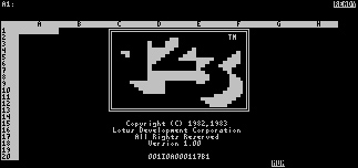
The next great advance in user-interface technology came in 1979 from Lotus Corporation with the original 1-2-3 spreadsheet program. 1-2-3 was still controlled by a deeply hierarchical menu interface, but Lotus added its own twist — the visible hierarchical menu. This helped make it the most successful piece of software ever sold at that point.
In 1979, a computer screen offered exactly 2000 characters per screen (see Figure 22-1), arranged in 25 horizontal rows of 80 characters each. 1-2-3 presented its menu horizontally along the top of the screen, where it consumed only two rows out of the 25 available. This meant that the menu could coexist on the screen with the actual spreadsheet program. Unlike the hierarchical menu programs that came before it, a user didn’t have to leave a productive screen to see a menu. He could enter a menu command right where he was working in the program.
Lotus used its new menu idiom with great abandon, creating a hierarchical menu structure of remarkable proportions. There were dozens of nodes in the menu tree and several hundred individual choices available. Each one could be found by looking at the top line of the screen and tabbing over and down to the desired selection. The program differentiated between data for the spreadsheet and a command for the menu by detecting the presence of a backslash character (). If a user typed a slash, the keystrokes that followed were interpreted as menu commands rather than data. To select an item on the menu, all you had to do was read it and type in its first letter preceded by a slash. Submenus then replaced the main menu on the top line.
Frequent users quickly realized that the patterns were memorable, and they didn’t necessarily have to read the menu. They could just type /-s to save their work to disk. They could just type /-c-g-x to add up a column of numbers. They could, in essence, bypass the use of the menu entirely. They became power users, memorizing the letter commands and gloating over their knowledge of obscure functions.
It may seem silly now, but it illustrates a very powerful point: A good user interface enables users to move in an ad hoc, piecemeal fashion from beginner to expert. A given power user of 1-2-3 may have been on intimate terms with a couple of dozen functions, while simultaneously being completely ignorant of several dozen others. If he had memorized a particular slash-key sequence, he could go ahead and access it immediately. Otherwise, he could read the menu to find those less frequently used ones that he hadn’t committed to memory. We discuss the significance of menus as a means of discovering and learning the functions of an application at length later in this chapter.
But 1-2-3’s hierarchical menu was hideously complex. There were simply too many commands, and every one of them had to fit into the single hierarchical menu structure. The program’s designers bent over backwards to make logical connections between functions in an attempt to justify the way they had apportioned the commands in the hierarchy. In the delirium of revolutionary success and market dominance, such details were easily ignored.
As you might imagine, because of 1-2-3’s success, the mid-1980s were a time of widespread 1-2-3 cloning. The always visible, hierarchical menu found its way into numerous programs, but the idiom was really the last gasp of the character-based user interface in the same way that the great, articulated steam locomotives of the late 1940s were the final, finest expression of a doomed technology. As surely as diesel locomotives completely eliminated all steam power within the span of a decade, the GUI eliminated the 1-2-3-style hierarchical menu within a few short years.
Many concepts and technologies had to come together to make the GUI possible: the mouse, memory-mapped video, powerful processors, and pop-up windows. A pop-up window is a rectangle on the screen that appears, overlapping and obscuring the main part of the screen, until it has completed its work, whereupon it disappears, leaving the original screen behind, untouched. The pop-up window is the mechanism used to implement drop-down menus (also called pull-down menus) and dialog boxes.
In modern GUIs, menus are visible across the top row of a screen or window in a menu bar. A user points and clicks on a menu bar and its immediately subordinate list of options appears in a small window just below it. A variant of the drop-down menu is a menu that “pops up” when you click (or more frequently, right-click) on an object, even though it has no menu title: a pop-up menu.
After the menu is open, a user makes a single choice by clicking once or by dragging and releasing. There’s nothing remarkable about that, except that the menus most frequently go no deeper than this. The selection a user makes on the menu either takes immediate effect or calls up a dialog box. The hierarchy of menus has been flattened down until it is only one level deep. In many cases, especially when optimizing interactions for novice users, flattening the organization of user choices (whether they be among commands or objects) can greatly improve the scanability of the user interface.
Arguably the most significant advance of the GUI menu was this retreat from the hierarchical form into monocline grouping. The dialog box, another use of the pop-up window, was the tool that simplified the menu. The dialog box enabled the software designer to encapsulate all the subchoices of any menu item within a single, interactive container. With dialogs, menu hierarchies could flatten out considerably, gathering all the niggling details further down the menu tree into a single dialog window. The deeply hierarchical menu was a thing of the past.
With the higher resolution of GUI displays, enough choices could be displayed on the menu bar to organize all the program’s functions into about a half-dozen meaningful groups, each group represented by a one-word menu title. The menu for each group was also roomy enough to include all its related functions. The need to go to additional levels of menus was made almost superfluous.
(Of course, Philistines and reprobates are always with us, and they have created methods for turning pull-down menus back into hierarchical menus. They are called cascading menus, and although they are occasionally useful, more often they merely tempt the weaker souls in the development community to gum up their menus for little gain. We discuss this in more detail later in this chapter.)
As the modern GUI evolved, two idioms fundamentally changed the role of the menu in the user interface: direct manipulation and toolbars. The development of direct-manipulation idioms has been a slow and steady progression from the first days of graphical user interfaces. Conversely, the toolbar was an innovation that swept the industry around 1989. Within a couple of years, virtually every Windows program had a toolbar filled with butcons. A few years before, nobody had seen a toolbar.
In the same way that a stranger to town may take a roundabout route to her destination while a native will always proceed on the most economical path, experienced users of a program will commonly invoke a function with the most immediate command rather than one that requires intermediate steps. As a result, the most frequently used commands in a program are often invoked by butcons on the toolbar. Ultimately, menus are commonly needed less and less for functions that are used on a daily basis, and instead become a way of learning about infrequently used tools.
The butcons and other controls on the toolbar are usually redundant with commands on the menu. Butcons are immediate, whereas menu commands remain relatively slow and hidden. Menu commands have a great advantage, however, in their verbal descriptions of functions. This makes them amongst the most useful interaction techniques for the purpose of teaching users about the capabilities of the product. In other words, menus provide a pedagogic vector.
For people to best learn how to use an interactive product, they should be able to examine and experiment without fear of commitment or causing irreparable harm. The Undo function and Cancel button on each dialog box supports this function well. Contrary to user-interface paradigms of 20 years ago, menus and dialog boxes shouldn’t be the main method by which normal users perform everyday functions. Many programmers and designers haven’t yet realized this fact, and they continue to confuse the purpose of the menu command vector. Its primary role should be to teach new users, to remind those who have forgotten, and to provide a way to access infrequently used functions.

When a user looks at an application for the first time, it is often difficult to size up what that application is capable of. An excellent way to get an impression of the power and purpose of an application is to glance at the set of available functions by way of its menus and dialogs. We do this in the same way we look at a restaurant’s menu posted at its entrance to get an idea of the type of food, the presentation, the setting, and the price.
Understanding the scope of what a program can and can’t do is one of the fundamental aspects of creating an atmosphere conducive to learning. Many otherwise easy-to-use programs put users off because there is no simple, unthreatening way for them to find out just what the program is capable of doing.
Toolbars and direct-manipulation idioms can be too inscrutable for a first-time user to understand, but the textual nature of the menus serves to explain the functions. Reading the words “Format Gallery” (see Figure 22-2) is more enlightening to the new user than trying to interpret a butcon that looks like this (although ToolTips obviously help).
For an infrequent user who is somewhat familiar with an application, the menu’s main task is as an index to tools: A place to look when he knows there is a function but can’t remember where it is or what it’s called. This works the same way as its namesake, the restaurant menu, which permits him to rediscover that delightful fish curry thing he ordered a year ago, without having to remember its precise name. The drop-down menu lets him rediscover functions whose names he’s forgotten. He doesn’t have to keep such trivia in his head, but can depend on the menu to keep it for him, available when he needs it.
If the main purpose of menus were to execute commands, terseness would be a virtue. But because the main justification of their existence is to teach us about what is available, how to get it, and what shortcuts are available, terseness is really the exact opposite of what we need. Our menus have to explain what a given function does, not just where to invoke it. Because of this it behooves us to be more verbose in our menu item text. Menus shouldn’t say “Open...,” but rather “Open Report...”; not “Auto-arrange,” but rather “Auto-arrange icons.” We should stay away from jargon, as our menu’s users won’t yet be acquainted with it.
Many applications also use the status bar that goes across the bottom of their main window to display an even longer line of explanatory text associated with the currently selected menu item. This idiom can enhance the teaching value of the command vector — if a user knows to look for it. The location ensures that such information will often go unnoticed.
To provide a good pedagogic vector, menus must be complete and offer a full selection of the actions and facilities available in the application. A scan of the menus should make clear the scope of the program and the depth and breadth of its various facilities.
Another teaching purpose is served by providing hints pointing to other command vectors in the menu itself. Repeating button icons next to menu commands and including hints that describe keyboard equivalents teach users about quicker command methods that are available (we discuss this further later in this chapter). By putting this information right in the menu, the user may register it subconsciously. It won’t intrude upon his conscious thoughts until he is ready to learn it, and then he will find it readily available and already familiar.
Almost every GUI these days has at least a File and an Edit menu in (or near) its two leftmost positions and a Help menu to the right (Mac OS X has a menu named after the in-focus application in the furthest left position — followed by File and Edit). The Windows, Macintosh, and even the Motif style guides state that these File, Edit, and Help menus are standard. It is tempting to think that this de facto cross-platform standard is a strong indication of the proven correctness of the idiom. Wrong! It is a strong indication of the development community’s willingness to blithely accept mediocre design, changing it only when the competition forces us to do better. The File menu’s name is the result of implementation model thinking about how our operating systems work, the Edit menu is based on a very weak clipboard, and the Help menu is frequently not terribly helpful and often only contains a single item that is actually directly related to helping users.
These menu conventions can trap us into designing weak user interfaces. The menus on most of our programs may be familiar, but are they good ways to organize functions? Selections like View, Insert, Format, Tools, and Options sound like tools and functions, not goals. Why not organize the facilities in a more goal-directed way?
Can’t you hear the programmers shouting, “How can you change something that has become a standard? People expect the File menu!” The reply is simple: People may get used to pain and suffering, but that is no reason to perpetuate them. Users will adapt just fine if we change the File menu so that it delivers a better, more meaningful model. The key to figuring out a reasonable menu structure goes back to understanding users’ mental models. How do they think about what they are doing? What terms make the most sense to them? If your users are computer-savvy, and you’re designing a productivity application, it might make sense to stick to recognizable standards, at least at the top level (and then again, it might not). If, however, you’re designing a specialized and purposeful application, the structure might very well need to be different.
All that said, there is obviously still a place for the standard menu structures. In the many situations where it is not appropriate to restructure an application’s menu structure, much good can be done merely by making good choices about how menu standards are applied.
Most users only think of files when they’re forced to understand the implementation model. A much more Goal-Directed term for the menu is “Document.” If your application deals with one primary document or object type, it’s worth considering whether it makes sense to use that for the menu name. For example, in a music sequencer, “Song” would be a much more user-friendly term than “File.” We assure you, there’s nothing worse to be thinking about when making music than a computer’s file system.
In Chapter 17 we described a better File (or Document) menu. One useful feature we didn’t mention there is the Most Recently Used list on Microsoft applications (see Figure 22-3).
Figure 22-3. The File menu from Microsoft Word shows off the excellent Most Recently Used (MRU) list. In Chapter 17, you saw how to reconstruct the first six items so that they better reflect the user’s mental model, rather than following the technically faithful implementation model as shown here.
The Edit menu contains facilities for selecting, cutting, pasting, and making modifications to selected objects (though if there are a lot of functions to do this, they should be grouped in a separate Modify or Format menu). Don’t use the Edit menu as a catch-all for functions that don’t seem to fit anywhere else.
The Windows menu is for arranging, viewing, and switching between multiple windows opened by the program. It can also offer tools for laying out multiple documents onscreen simultaneously. Nothing else should go on this menu. It should be noted that unless you have a multiple document interface (MDI), this menu is seldom necessary.
Today’s Help menus tend to reflect poorly designed and implemented help systems. We talk much more about help in general in Chapter 25, but suffice to say, this menu should contain a variety of methods for helping people learn to use your application. One thing sorely lacking on most Help menus is an item labeled Shortcuts that explains how to go beyond relying on the menus. It could offer pointers on more powerful idioms such as accelerators, toolbar buttons, and direct-manipulation idioms.
The following menus are commonly used, but considered optional in most style guides. An application of moderate complexity is likely to make use of at least some of these menus.
The View menu should contain all options that influence the way a user looks at the program’s data. Additionally, any optionally displayed structural interface elements such as rulers, toolbars, grids, drawers, sidebars, or palettes should be controlled here.
The Insert menu provides the facility to introduce new objects in a document. In a word processor, appropriate examples include inserting tables, graphs, and symbols. In a music sequencer, appropriate examples include inserting new instruments, effects, and key changes.
If you have a Settings menu in your application, you are making a commitment to a user that anytime he wants to alter a setting in the program he will easily find the way to do it here. Don’t offer up a settings menu and then scatter other setting items or dialogs on other menus. This includes printer settings, which are often erroneously found on the File menu.
The Format menu is one of the weakest of the optional menus because it deals almost exclusively with properties of visual objects and not functions. In a more object-oriented world, properties of visual objects are controlled by more visual direct-manipulation idioms, not by functions. The menu serves its pedagogic purpose, but you might consider omitting it entirely if you’ve implemented a more object-oriented format property scheme.
The page setup commands that typically reside on the File menu should be placed here. (Notice that page setup is very different from printer setup.)
The Tools menu, sometimes less clearly called the Options menu, is where big, powerful functions go. Functions like spell checkers and goal finders are considered tools. Also, the Tool menu is where the hard-hat items should go.
Hard-hat items are the functions that should only be used by real power users. These include various advanced settings. For example, a client-server database program has easy-to-use, direct-manipulation idioms for building a query, while behind the scenes the program is composing the appropriate SQL statement to create the report. Giving power users a way to edit the SQL statement directly is most definitely a hard-hat function! Functions like these can be dangerous or dislocating, so they must be visually set off from the more benign tools available. Another possible approach is to place them in an Expert or Advanced menu, to the right of the more benign Tools menu, which Apple has done in iPhoto, for example, though some of the functions there may be improperly placed.
Over the years, simple menus have been embellished with new and more complex behavioral idioms. Some have their uses, and others simply get in the way. This section discusses these idioms and their appropriate uses.
One variant of the standard drop-down menu provides a secondary menu when a user selects certain items in the primary menu. This mechanism, called a cascading menu (see Figure 22-4), presents some serious issues for ease of use.
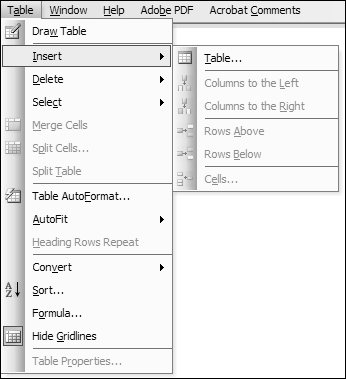
Where standard drop-down menus provide clear, easy-to-navigate monocline grouping, cascading menus move us into the complex territory of nesting and hierarchies. They not only make it much more difficult for users to locate items, but they also require well-coordinated mouse movements in two dimensions to navigate them smoothly. (If you trace the path required to select an item in a multilevel cascading menu [such as the Windows Start menu], you will notice that it quite literally takes the form of a path through a maze).
However, cascading menus are not entirely without worth. They also allow menus to contain much larger command sets, and they provide a hierarchical method of organizing these command sets. As useful as this may sound, please pay close attention to your users before choosing to employ this idiom.
It should be clear that cascading menus should only be employed in sophisticated sovereign applications for rarely used functions or as a secondary command vector for something more directly provided in the interface. Also, if you implement cascading menus, be sure to allow for a wide threshold in mouse movement, so the submenu doesn’t disappear.
With Office 2000, Microsoft introduced adaptive menus, which display only those items accessed most frequently by a specific user (see Figure 22-5). This menu idiom was enabled by default in Office 2000 and 2003, but Office 2007 marked a departure from this approach (and menus in general) in favor of the ribbon bar, which we discuss below and in Chapter 23.
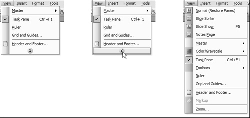
With adaptive menus, Microsoft attempted to make their products seem simpler and easier by hiding those items that a user never accesses. To see the hidden menu items, users are required to click or hover on an icon at the bottom of the menu. When displayed, the previously hidden items are interspersed with the originally shown items.
The adaptive menu is well intended, and we certainly applaud the attempt to customize a user interface based upon usage behavior. Unfortunately, the idiom is annoying and severely compromises user effectiveness. Adaptive menus significantly increase the amount of work performed by users as the idiom runs contrary to the two primary roles of a menu system: to teach users about the breadth and depth of application functionality and to provide access to less-frequently used functions.
It’s worth noting that usability studies support this assessment. In a 1989 study, subjects took a significantly longer time to complete tasks with adaptive menus than with static menus, and 81% reported preferring static menus to adaptive menus.[1] We would caution readers about interpreting these findings to mean that users will never feel well supported by adaptive interfaces. Rather, we suggest that this particular application of adaptability was directly at odds with the purpose of menus.
In Office 2007, Microsoft introduced a new command control — the ribbon, a tabbed panel at the top of the application window that combines the menus and toolbars into a single unified structure (see Figure 22-6). The idea behind the ribbon is to combine the visually expressive and pliant characteristics of toolbar buttons and butcons with the verbose and more explicit and comprehensive depiction of functionality of a menu system.

Unlike adaptive menus, the ribbon appears to have been designed with the strengths and uses of both menus and toolbars. As with a menu, clicking through the tabs of the ribbon provides a good overview of the capabilities of an application (though the visual complexity and the fact that some items are vertically stacked somewhat compromises its scanability). Like a toolbar, the ribbon provides fairly direct and visual access to functions, though a user is sometimes required to change tabs to find the right button. This is somewhat mitigated by the fact that a contextual toolbar is provided immediately next to a selected item in the document workspace (more on this in Chapter 23), and the tabs are meant to change automatically to provide access to appropriate tools. While the ribbon idiom is appealing and intriguing, it seems that this is not entirely effective in initial releases of Office 2007. After repeated use, we find ourselves continually hunting for commonly used functions. Perhaps this will improve — at the time of writing, Office 2007 has only been available for six months.
In the early days of the Mac and Windows, some applications featured a menu variant that has, for good reason, fallen out of favor: the immediate menu or bang menu. In programmer’s jargon, an exclamation mark is a bang, and, by convention, top-level immediate menu items were always followed with a bang.
As the name implies, it is a menu title — directly on the menu bar next to other menu titles — that behaves like a menu item. Rather than displaying a drop-down menu for subsequent selection, the bang menu causes a function to execute right away! For example, a bang menu title for printing would be called Print!.
This behavior is so unexpected that it generates instant disorientation (and sometimes even anger). The bang menu title has virtually no instructional value (except perhaps through shock value). It is dislocating and disconcerting. The same immediacy on a toolbar button or butcon bothers nobody, though. The difference is that butcons on a toolbar advertise their immediacy because they are known by convention to be imperative controls. This is a classic example where breaking from standard and convention without sufficient cause can result in serious cognitive friction for users. Immediate commands belong in toolbars.
An important menu convention is to disable (make nonfunctional) menu items when they are unavailable in a given state or not relevant to the selected data object or item. The disabled state is typically indicated by lightening or “graying out” the text for the item in the menu. This is a useful and expected idiom — it helps the menu become an even better teaching tool, as users can better understand the context in which certain commands are applicable.
Checkmarks next to menu items are usually used for enabling and disabling aspects of the program’s interface (such as turning toolbars on and off) or adjusting the display of data objects (such as wire frame versus fully rendered images). This is an idiom easily grasped by users and is effective because it not only provides a functional control but also indicates the state of that control.
This idiom is probably best used in programs with fairly simple menu structures. If the application is more complex and sophisticated, the menu space will be sorely needed, and opening and scrolling through a menu to find the right item may become laborious. If the attributes in question are frequently toggled, they should also be accessible from a toolbar. If they are infrequently accessed and menu space is at a premium, all similar attributes could be gathered in a dialog box that would provide more instruction and context (as is commonly required for infrequently used functionality).
A checkmark menu item is vastly preferable to a flip-flop menu item that alternates between two states, always showing the one currently not chosen. The problem with the flip-flop menu is the same issue we identified with flip-flop buttons in Chapter 21 — namely that users can’t tell if it is offering a choice or describing a state. If it says Display Toolbar, does that mean tools are now being displayed or does it mean that by selecting the option you can begin displaying them? By making use of a single checkmark menu item instead (Status bar is either checked or unchecked), you can make the meaning unambiguous.
Visual symbols next to text items help users recognize them without having to read, so they can be identified faster. They also provide a helpful visual connection to other controls that do the same task. In order to create a strong visual language, a menu item should show the same icon as the corresponding toolbar butcon.
Windows provides powerful tools for putting graphics in menus. Too few programs take full advantage of this opportunity for providing an easy, visual learning trick. For example, the applications in Microsoft’s Office suite all use an icon depicting a blank sheet of paper to indicate the New Document function on their toolbars. The same icon is used in the File menu to the left of the New... menu item. Users soon make the connection, probably without even thinking about it. Microsoft Office applications have done an excellent job incorporating graphics into their menus, as shown in Figure 22-3.
Accelerators or “keyboard shortcuts” provide an easy way to invoke functions from the keyboard. These are commonly function keys (such as F9) or combinations involving meta-keys (e.g., Ctrl, Alt, Option, and Command). By convention, they are shown to the right of drop-down menu items to allow users to learn them as they continue to access a menu item. There are standards defined for Windows, Mac OS X, and other platforms, but their implementation is up to the individual designer, and they are too often forgotten.
There are three tips for successfully creating good accelerators:
Follow standards.
Provide for their daily use.
Show how to access them.
Where standard accelerators exist, use them. In particular, this refers to the standard editing set as shown on the Edit menu. Users quickly learn how much easier it is to type Ctrl+C and Ctrl+V than it is to remove their mouse hands from the home row to pull down the Edit menu, select Copy, then pull it down again and select Paste. Don’t disappoint them when they use your program. Don’t forget standards like Ctrl+P for print and Ctrl+S for save.
Identifying the set of commands that will be needed for daily use is the tricky part. You must select the functions that are likely to be used frequently and ensure that those menu items are given accelerators. The good news is that this set won’t be large. The bad news is that it can vary significantly from user to user.
The best approach is to perform a triage operation on the available functions. Divide them into three groups: Those that are definitely part of everyone’s daily use, those that are definitely not part of anyone’s daily use, and everything else. The first group must have accelerators and the second group must not. The final group will be the toughest to configure, and it will inevitably be the largest. You can perform a subsequent triage on this group and assign the best accelerators, like F2, F3, F4, and so on, to the winners in this group. More obscure accelerators, like Alt+7, should go to those least likely to be part of someone’s everyday commands.
Don’t forget to show the accelerator in the menu. An accelerator isn’t going to do anyone any good if they have to go to the manual or online help to find it. Put it to the right of the corresponding menu item, where it belongs. Users won’t notice it at first, but eventually they will find it, and they will be happy to make the discovery as perpetual intermediates (see Chapter 3). It will give them a sense of accomplishment and a feeling of being an insider. These are both feelings well worth encouraging in your customers.
Some programs offer user-configurable accelerators, and there are many instances where this is a good idea, and even a necessity, especially for expert users. Allowing users to customize accelerators on the sovereign applications that they use most of the time really lets them adapt the software to their own style of working. Be sure to include a Return to Defaults control along with any customization tools.
Access keys or mnemonics are another Windows standard (they are also seen in some Unix GUIs) for adding keystroke commands in parallel to the direct manipulation of menus and dialogs.
The Microsoft style guide covers access keys and accelerators in detail, so we will simply stress that they should not be overlooked. Mnemonics are accessed using the Alt key, arrow keys, and the underlined letter in a menu item or title. Pressing the Alt key places the application into mnemonic mode, and the arrow keys can be used to navigate to the appropriate menu. After it opens, pressing the appropriate letter key executes the function. The main purpose of mnemonics is to provide a keyboard equivalent of each menu command. For this reason, mnemonics should be complete, particularly for text-oriented programs. Don’t think of them as a convenience so much as a pipeline to the keyboard. Keep in mind that your most experienced users will rely heavily on their keyboards; so to keep them loyal, ensure that the mnemonics are consistent and thoroughly thought out. Mnemonics are not optional.
Most of the preceding discussion is based in pattern and convention for traditional desktop software platforms. Of course, things change a bit when you consider other platforms. On devices such as mobile phones and palmtops, menus must often be relied upon as a primary command vector. While applications on handhelds typically do provide some functions in the form of buttons, due to screen real-estate limitations, toolbars and more direct idioms are not always possible, so the only way to provide access to the vast majority of functions is through a menu system.
PalmOS and Windows Mobile feature drop-down menus much like those found on modern desktop GUIs, complete with accelerators. This is, by and large, a useful translation, but it’s worth considering that some idioms don’t work as well with smaller screens, styluses, and four-way rocker switches. First of all, cascading menus are to be avoided at all costs. It is next to impossible to fit two adjacent open menus on the screen, and having one overlay another can cause serious confusion and dislocation for a mobile user. Second, due to space constraints, it may not be feasible to include icons on menus, despite the fact that they may be of great utility to a walking user who may find an icon easier to identify than a word.
Mobile phones and other small-screened devices (such as blood glucose meters) are typically even a generation behind drop-down menus and provide interaction idioms much in the vein of the sequential hierarchical menu (which you’ll recall from earlier in the chapter). When designing for such a platform, you have little to work with, so every decision really counts. In applications where choices are mapped to the numeric keypad (and some choices may be relegated to the “More” submenu), it is of utmost importance to make sure the most frequently used functions are mapped to the number keys. Similarly, the sequence of functions should provide both cognitive guidance (by locating similar functions next to each other) and the most commonly used functions at the top of the list.