
Create and edit text on Keynote slides
</objective> <objective>Learn to use a variety of fonts to add interest to presentations
</objective> <objective>Work with spacing, bullets, and numbering for a more professional look
</objective> <objective>Make text work in your presentation for a variety of purposes
</objective> </feature>Let’s face it: For all the bells and whistles Keynote (or any other presentation software, for that matter) provides, the crux of any presentation is the text that the audience sees on the slides. After all, the purpose of any presentation, regardless of the type, is to provide information to audience members. Without that information, your presentation has no meat. It’s like having a small appetizer and no meal.
Obviously, it’s more fun to work with graphics and photos than with text in a program like Keynote, and that’s fine. We’ll get to graphics in upcoming chapters, but before you get carried away with the cool features of Keynote, you need to stop and think about what you want to say in your presentation. From there, you can build the text for your slides and make your presentation great.
Before we get into the Keynote interface and start working with text, let’s consider a few truths about text on slides. No, this information isn’t in Keynote, but it comes from someone who has used Keynote and other similar applications for presentations and who knows a thing or two about presentations.
All too often, speakers and presenters end up using presentation software, such as Keynote, as a crutch. In other words, the slides actually become the presentation, and the speaker becomes someone who “helps” the slides. In reality, the slides should simply be a visual aid for a presentation. You should use slides to help convey your message, point out important issues, or show graphics that help explain what you are talking about. The slides you use should back up what you are saying: The slides shouldn’t be the presentation itself, with you making a few comments here and there. Don’t let your slides take over! You are the presenter, so stay in charge and make your slides work for you.
Tip
You should know what you want to say in your presentation before you come to Keynote to develop your presentation. Your best starting point may still be the old pencil and paper!
With that thought in mind, then, what are some things you should do when you create text for slides? There are few important ideas to keep in mind, and the following sections highlight those ideas.
As a Keynote user, you have a lot of different font and text style options available to you. In fact, you can make any text look just about any way that you want, and you’ll see how later in this chapter. At this point, however, the main question you need to ask yourself is, “Should I?” Just because Keynote gives you a bunch of text and font style options doesn’t mean that you should try to use all of them. The available options are there to give you the flexibility you need when you create a presentation, but all text is not created equal. In fact, many text fonts and styles are entertaining but difficult to read. For example, take a look at Figure 2.1.
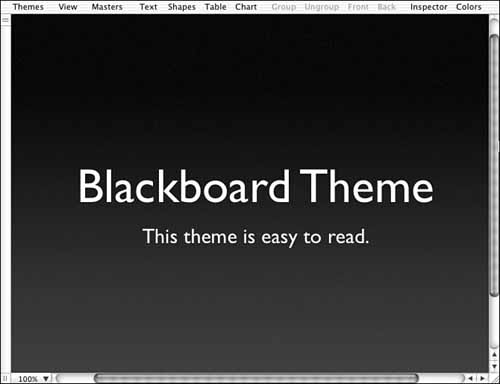
Notice that the text on this slide is easy to read. The text option you see here comes directly from one of the theme templates, and I have not modified it in any way. Now, take a look at Figure 2.2.
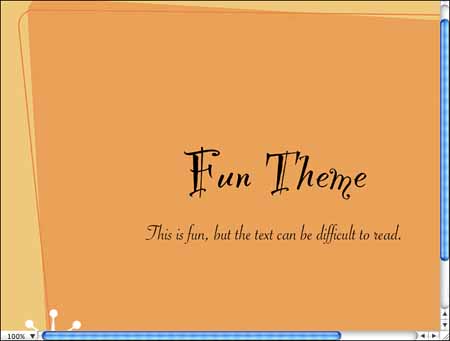
This text also comes directly from a theme. It looks cool, but the problem is that the text may be difficult for audience members to read.
As you are planning text, think carefully about the presentation. You want your slides easy to read and easy to understand. If someone has to stare at the slide for a moment to decipher the text, that is a moment he or she is trying to understand your slide and not listening to you. You should choose text that is quickly and easily readable. Sure, you can use interesting or odd text as needed, but always think in terms of readability, and as the old adage goes, “better safe than sorry.”
Slide text should be used to present bursts of information—ideas the audience can quickly read and remember. Think of it this way: If audience members are taking notes, what do you really want them to remember? This guiding question will help you create great slide text every time. As you are writing text, make sure you keep it short. For example, take a look at the slide in Figure 2.3.

As you can see, this slide has too much information. If you start creating a paragraph of text on a slide, that should be a warning sign to you. Audience members will pause and read the slide, ignoring you as they do. Also, from a distance, a paragraph of text is difficult to read. Sure, you can use a paragraph if absolutely necessary, but just remember that paragraphs of text on slides do not work well and greatly slow down your presentation. Figure 2.4 shows the same information as Figure 2.3 but presents it in a bullet-point format.

As you can see, the bullet-point text conveys the same information as the paragraph text, is easy and quick to read, and keeps the audience’s attention focused on you, the speaker!
Due to kinesic communication behavior, a public speaker may inadvertently display nonverbal communication cues.
Body language has a great impact on what you say.
These sentences say exactly the same thing. Kinesic communication refers to communication of the body, or nonverbal communication, and it has a great impact on what a public speaker says. Now, imagine these statements on a slide. Which one would work best?
The point is simply this: The information that you put on your slides should be simple and clear. Audience members should not have to grapple with the meaning of the text on a slide. Make the slide text clear and then feel free to add information about the text as you talk with your audience. Your audience has the job of understanding your message, so don’t make the audience’s job more difficult than necessary!
As you prepare slide text, think carefully about what you want the text to say; make every word count. Your best bet is to always think in terms of main ideas. Following is an example of information you might want to convey to an audience:
This year, with the release of new products, we are expecting to see a thirty percent increase in domestic sales, a twenty percent increase in foreign sales, and a staggering sixty percent increase in Internet sales. This upturn in sales is good news for all of us. Since most of us have some kind of profit sharing attached to our base pay, we’ll all make more money this year!
What are the main ideas you could pull out on a slide? As you might guess, your slide could look something like the example in Figure 2.5.

The object here is to highlight the main ideas on the slide. As you talk about the main ideas, you can add any necessary details you like, but you should keep the slide focused on the main ideas. Ask yourself “What do I really want my audience members to know?” when you create your slide text. This will help you scale down your text to the main points.
First things first: You are not writing a formal paper for a Composition 101 class when you create text for your slides. You are free to use incomplete sentences as needed, which is often the case when you use bullet points. As long as the bullet points are easy to read and make sense, you’re in good shape.
However, this doesn’t mean you can ignore every rule in the English language either. You need to be careful to watch your spelling and comma usage and make sure you use periods where they are needed. Mistakes on Keynote slides make you look unprepared, so give your slides a thorough editing. It is also a good idea to have someone else read your slide text for common usage and punctuation errors.
When you create Keynote slides, you might have a tendency to overcrowd the slides with text in order to use fewer slides. Keynote lets you be the boss, and it lets you put a lot of text on a slide, but please don’t. Always use more slides instead of crowding text onto slides. When you think about text, try to keep each individual slide to a heading and a few bullet points or other chunks of text. Your audience should be able to read your slide in a few moments.
Tip
Everyone loves a good joke or pun, but jokes and puns are often best left said instead of written on a slide. For some reason, jokes and puns on slides often do not come across well. I’m not saying that you can’t use them in a presentation; you just need to be wary when you do. Cartoons often work well on slides, but you need to make sure you are not violating any copyright laws and that any cartoon you decide to use is appropriate and comes off well.
After you have chosen a theme and decided on the text you want to show, you are ready to enter the text on your slides. The good news is that Keynote attempts to help you by giving you slide templates and styles to work with. If you are happy with what you see, all you have to do is double-click the text and type over it (see Figure 2.6). It doesn’t get any easier than this. Using the provided text boxes, you simply enter your own text, and you get a smooth-looking presentation without any hard work.

After you create the slide title page, click the New button on the toolbar to move to the next slide. The next slide you see is a content slide, as shown in Figure 2.7. It has a title field and generally a place to type bullets, depending on the template you have chosen to work with.

To type bullet points, just type your text and press the Enter (or Return) key. This will move you down a line and give you another bullet point. As you can see, the text feature in Keynote works similarly to a basic word processing program.
If you need to change or edit any text you have already typed, just click where you need to make the change, and the cursor will move to that location. Then you simply fix the text as needed.
What do you do if a slide gives you a text box that you don’t need? For example, let’s say you are using a template, and a slide gives you a title and a field for text. However, you don’t want to use text on the slide, but you want to insert a photograph (which you’ll learn more about in Chapter 5, “Working with Graphics”). No problem. You can lose the text box. Click it one time, and little boxes appear around the outside of the box, as shown in Figure 2.8. These boxes are called selection handles, and they give you control over the text box, graphic, table, chart, and anything else that you select. Simply press the Delete key, and the box disappears.

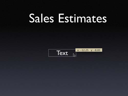
What if you need to add a text box to a slide? No problem. Just click the Text button on the toolbar, and a new text box appears on the Slide Canvas. You can drag the text box around so that it is placed where you need it, or you can simply double-click inside the box and start typing your text. You can also expand the text box so that the text is centered on the slide by dragging the handles at either end of the box, as shown in Figure 2.9. As you can see, Keynote is rather versatile and easy to work with!
Fonts, also called typefaces, are a lot fun to work with because they allow you to customize your presentation and make the font look exactly as you like. You aren’t stuck with the font that accompanies the template you selected.
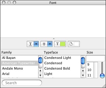
To change a font, just select the text you want to change (or just click inside the text box to change it all) and select Format, Font, Show Fonts. As you can see in Figure 2.10, the Font dialog box that appears is the same thing you see in Mac OS X. All you have to do is select the font you want to use and change the size if necessary.
What fonts should you use? That is entirely up to you and the needs of your presentation, but here are a few pointers. First, serif fonts, such as Times New Roman, Baskerville, New York, and Palatino, work great for titles. They have a formal feeling and are easy to read. For a less formal approach and for bullet or body text, sans serif fonts, such as Arial, Tahoma, and Optima, all work great. You don’t need to memorize font types in order to make a good selection; just let your eyes guide you. Choose a font and take a critical look at the text. Then ask yourself if the style works well with your discussion and if the font is easy to read. Some fonts have a lot of curly-cues and other features that may take up more room on your slide, so take that issue into consideration as well.
To use the Font dialog box, you simply choose a font family, a typeface, and a size. First, you use the scrollbar and under the Family category to choose a font family, such as Arial, Helvetica, or Baskerville. Depending on the family you choose, you might have some Typeface options. The Typeface options determine how the font looks, such as condensed, light, bold, regular, and so on. The options differ, depending on the font. Simply scroll through the Typeface list of options and select anything you like. Next, under Size category, scroll through the size list and select the font size that you want to use.
Notice that above the Family, Typeface, and Size options are drop-down menus for Spacing (the options are none, single, double, and color), Text Strikethrough (the options are none, single, double, and color), Text Color (if you click this option, the Colors dialog box appears), and Document Color (if you click this button, the Colors dialog box appears). As you can see, you simply click your way to the fonts and styles that you want.
Note

You can use the Size box’s scrollbar to choose a size variation. Just move it up or down, and you’ll see examples of the font size options in the dialog box.
Now, there are some extras on the Font dialog box that I want to point out, simply because you’ll probably find some of the features useful. Click the Action drop-down menu (the button that looks like a wheel or gear in the lower-left corner of the Font dialog box, next to the Add [+] and Delete [-] buttons) to access the menu (see Figure 2.11).

The following options are available:
Add to Favorites—. This option adds the font selection to your favorites list.
Show/Hide Preview—. I like this option because it shows a preview of the font in the Font dialog box. This way, you can see exactly how the font will look before you apply it to your text. You can also choose to hide this option if you do not want to see a preview.
Show/Hide Effects—. This feature allows you to see or not see effects that you add to fonts, such as shadowing, color, and so on.
Color—. The Color option opens the Colors dialog box so you can change the color of your text. See the next section, “Using the Text Inspector,” for more details about working with color.
Characters—. This allows you to see characters that you can insert into text, such as math characters, stars, arrows, and a host of others.
Edit Sizes—. This feature allows you to edit the default slider list of font sizes and even enter new sizes and create fixed size lists.
Manage Fonts—. This option takes you to the Internet, where you can find more fonts and download them to your computer.
As you are thinking about fonts, it is important not to get “font happy.” For example, take a look at Figure 2.12.

Have you ever visited a Web site that looked like the author tried to use every Web graphic in the world? I thought so. You can get into the same kind of trouble with Keynote fonts. Just because you can use multiple fonts on a slide doesn’t mean that you should. Sure, feel free to mix fonts, but always ask yourself why you’re doing so. Contrasting fonts work well to highlight certain ideas, but for the most part, your slides will be easiest to read if you stick to the same font. Avoid using different fonts excessively because that makes slides start to look comical and detracts from their content.
You can use the Text Inspector to manage text quickly and easily. Like most things in Keynote, the Inspector gives you some helpful features and quick options for working with text. You can access the Text Inspector by first selecting some text on a slide and then clicking the Inspector icon on your toolbar. As you can see in Figure 2.13, the Text Inspector gives you a few helpful options. The following sections explore these features.

Keynote doesn’t keep you tied to the same text color that the theme provides. In fact, you can easily change the text color to anything you want. The Colors dialog box gives you several options for quickly selecting color (see Figure 2.14). First, you can choose a color by simply clicking the color wheel. If you don’t like using the wheel, you can choose to use the color sliders, color palettes, image palettes, or crayons. These variations simply give you more options for selecting color. Also, notice the Opacity slider at the bottom of the dialog box. The opacity of a color refers to how transparent the color appears. The higher the opacity setting, the darker or brighter the color appears. The lower the opacity setting, the lighter or more transparent the color appears. This feature allows you to increase or decrease the opacity of a base color to effectively get the color shade that you want.

To change the color of text, follow these steps:
Select the text and then click the Inspector button on the toolbar.
Click the color box on the Text Inspector, which opens the Colors dialog box, as shown in Figure 2.14. Or, you can just click the Colors button on the Keynote toolbar.
Click a color picker option at the top of the Colors dialog and then select a color. In Figure 2.14, the color wheel is selected. Simply click a color on the wheel to apply it to your text.
Drag the slider to adjust the opacity of the color as needed.
Take a look at the opacity on the slide. If you like what you see, close the Text Inspector. If not, go back to the Text Inspector and adjust the opacity again.
As you can see, changing text’s color is quick and easy, but you need to make sure the text color you choose looks good and matches with the theme you are using. The color should contrast against any background colors or graphics so that audience members can easily read the text. White text on a black background or black text on a white background is always safe. Be careful with combinations such as pale yellow on a gray background.
You can use the Text Inspector to align text in a text box. Keep in mind that when you work with text, alignment and even spacing are maintained within the text box. Therefore, if you choose a left-justified alignment, the text is left-justified within the text box where it resides.
You can easily change the alignment of text by selecting the text and accessing the Text Inspector. Then you can choose an alignment option by clicking a provided button (refer to Figure 2.14). You can choose left alignment, center, right alignment, or block alignment. You can also choose to align the top, center, or bottom of the text box. This feature can be particularly helpful with titles. For example, take a look at Figure 2.15.
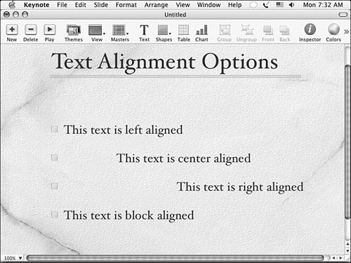
For the most part, the left alignment option is the best choice. After all, most text that we read is left-aligned. So when might you use the other options? That all depends on the slide. As you work with different slides, you might include both text and graphics text and tables or charts. In this case, you might work with text that needs to fit into a certain area or look a certain way to match up with other slide elements. In this case, the alignment options may help you because you can justify the text within the text box in a way that looks best on the slide.
Note
Of course, you need to use some reason and common sense when you use the Spacing options. As you can see in Figure 2.16, the spacing feature is a great way to make text fit in a certain area as you might need it to.
In the center of the Text Inspector are some helpful spacing options. Select the text you want to change and use the Character, Line, and Bullet slider bars to adjust the spacing of text that appears between characters, lines, and bullets, respectively. As you can see in Figure 2.16, I have changed the character alignment to make the title characters spread out.

Bullets and numbering are a key part of most slides that have text. In fact, most information that you choose to put in text form in a presentation uses a bullet or number format. The simple fact is that bullets and numbers are easier for people to read and remember.
When you choose to use bullet text, Keynote provides you with a default bullet or number list. However, you can make some changes to the bullets or numbers by using the Text Inspector. If you select a bulleted or numbered list and then click the Inspector button on the toolbar to open the Text Inspector, you see the Text Inspector, as shown in Figure 2.17.

Notice, first of all, that the Text Inspector has a drop-down menu where you can choose Text Bullet, Number, Custom Image, Image Bullet, or None. However, you might want to use a custom bullet, such as a GIF or JPEG image you have downloaded from the Internet or that you have in another graphics program. Keynote gives you a lot of flexibility with bullets and numbers.
Notice also that you can align the bullets and numbers to move them up and down as needed so that they align correctly with the text. Also, you can adjust the size of the bullets or numbers by using the spinners next to the Size field or by typing in a new size. You can change the color of the bullets or numbers by using the Color box. Just click the Color box, and you’ll see the Colors dialog box once again. Finally, the Scale with Text check box is selected by default so that Keynote can try to keep the bullets or numbers from overwhelming the text.
If all this sounds a bit overwhelming, just keep in mind that these options are provided to give you the extreme flexibility you want. You don’t have to actually use any of them, but the point is that you can adjust the bullets and numbering in just about anyway that you like.
Let’s take a look at an example. The following steps show you how to use a custom image as a bullet:
In Keynote, click the New button to create a new slide.
Click the Masters drop-down menu and choose the Title & Bullets master.
On the slide, type the first bullet and then click the Inspector button on the toolbar.
Choose the Text Inspector, and under Bullets and Numbering, choose the Custom Image option.
Click the Choose button at the bottom of the Text Inspector and then browse your computer to choose any image file. A picture file will work nicely.
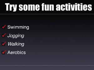
Select the image file you want and click Open. The picture now appears on your slide as a bullet, and each bullet you add to this slide will also use the image (see Figure 2.18). Very cool!

As is often the case in Keynote, you have a lot of options, but be wary of overdoing it with bullets and numbers. The image bullet options can be a lot of fun, as you can see in Figure 2.19, but be careful. In the end, bullets and numbers are just organizational features, and you shouldn’t liven them up so much that they get more attention than the text or other graphic on your slide. You need to take a hard look at the bullets and numbers and make sure they fit with the style of your slide and, of course, exercise some common sense.
By default, each theme is preset with its own text tabs. Text aligns and falls based on you pressing the Tab key and entering that text. However, if you want to change the text tabs, you can do that easily in order to make the slide look the way you want. In Keynote, click View, Show Rulers. This turns on the Rulers features, as you can see in Figure 2.20. You can see the text tab marks on the top ruler. Simply move the slider arrows to adjust the tabs as necessary. If you want to adjust only one line of text, select it first and then use the slider arrows.

Tip
If you get text tab happy and foul everything up, don’t worry: You can go back to the theme’s defaults easily. Just click Format, Reapply Master to Selection. This, however, will also change the bullet styles and font settings back to those of the master theme as well.
You may have already created text in a word processing program that you would like to import into Keynote. Due to the nature of slides in Keynote, you can’t directly import text. You can, however, copy and paste text from any other Mac application, and you can directly import PowerPoint presentations into Keynote. See Chapter 9, “Viewing and Printing a Presentation,” to learn more about importing PowerPoint presentations.