Make chart data look great
</objective> <objective>Choose and work with different chart types
</objective> <objective>Use and master chart components to give a presentation an extra edge
</objective> </feature>A chart is a graphical representation of some information, usually numbers, percentages, and other basic types of data. In a nutshell, a chart is used to make data easier to understand. A chart is a lot like a table in that it presents data in a logical manner. Unlike a table, a chart is a visual representation of data.
In this chapter, you’ll learn just about everything there is to know about creating and using charts in Keynote, and you’ll see just how easily and beautifully Keynote handles charts.
As you work with Keynote, you’ll probably find many opportunities to create charts, depending on the kind of presentations you do. Sales figures, quarterly earnings, growth plans, income and expense, and other types of comparative data are great chart fodder. The good news is that Keynote makes charting rather easy, but Keynote offers a number of formatting and usage options that you need to know about in order to make the most of charts in Keynote.
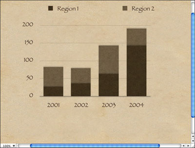
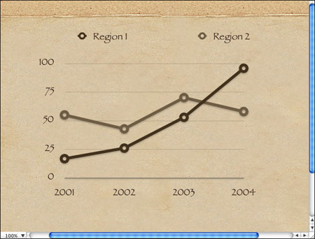
Chapter 3, “Using Tables,” mentions that tables are helpful in a variety of situations, although they’re not the most exciting part of creating Keynote presentations. Charts are a different story. Charts give you a great way to make data visual, and the great news about visual data is that it is easier for audience members to understand and retain. In short, a chart gives you a way to make otherwise static data come to life, and that’s always a great thing in a presentation. For example, take a look at the chart in Figure 4.1.

As you can see, this chart makes data interesting. Without the chart, as the speaker, I have to say some things like, “In 2001, Region 1 saw growth of 25,000 while Region 2 saw growth over 50,000, and in 2002...blah, blah, blah.” Spoken data like this can lull you into a coma. That’s where the beauty of charts comes into play. If I use a Keynote chart, I can easily display the data in a chart format and then talk about the chart content in a much more dynamic way.
When should you use a chart? Here are some quick tips to remember:
Use a chart to represent income and expense figures—. These figures take on extra meaning in a chart format.
Use a chart to show data over a period of time, such as income, growth, and so forth—. You can use the graphical nature of a chart to display the time factor and how the data fits into that time frame.
Use a chart to show relationships between data—. In this case, a typical pie chart can do wonders.
As with any other Keynote element, charts should be clear, concise, and easily understandable. Avoid overly complex charts that are difficult to understand.
Like most things in Keynote, an initial chart is quite easy to create. Keynote creates a default chart and plugs in some sample data for you, so with just a couple mouse clicks, you actually have a real chart. Of course, you’ll need to customize the chart to meet your needs and so that it displays your actual data, but we’ll get to that in upcoming sections. For now, let’s create an initial chart:
Start a new presentation or open an existing one. If you are starting a new presentation, choose a theme.
To make things easier for now, click the New button to create a new slide, and then from the Masters drop-down menu, choose the Blank slide option, as shown in Figure 4.2. This will keep any other template items from getting in your way until you are familiar with charts.
Now you are ready to create the chart. Click the Chart button on the Keynote toolbar. When you click this button, three things happen automatically, as you can see in Figure 4.3. First, a default chart is created on your slide. Second, the Chart Data Editor appears. Third, the Chart Inspector appears. This is a little overwhelming at first, for certain, but don’t worry—you’ll learn how to use the Chart Data Editor and the Chart Inspector in upcoming sections.
For now, close the Chart Data Editor and the Chart Inspector.

The first thing you might notice is that your chart may take up the entire slide. In fact, you might have to scroll around a bit to even see the entire chart. The good news is that you can resize the chart just as you would any other object, such as a text box, a table, or an image. Just click the chart one time, and the selection handles appear. Then simply drag the selection handles as needed to resize the chart, as shown in Figure 4.4.

After you have created a basic chart, you can use the Chart Inspector to choose a chart style. The different styles available allow you to display your data in a variety of formats. Certain formats are useful for displaying specific kinds of data. For example, parts of a whole work great in a pie chart, and contrasting figures look great in a column chart.
To choose a chart style, you need to open the Chart Inspector. If it is not open already, just click Inspector on the toolbar and choose the Chart icon on the Inspector.
In the Chart Inspector, you see a chart icon with a drop-down menu. If you click the drop-down menu, you see several different chart style options, as shown in Figure 4.5.
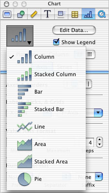
The following sections briefly explain the various chart styles and when you are likely to find each style most helpful. Keep in mind that you have a lot of creative latitude when you choose a chart style, but you can use the following sections as a general guide.
A column chart, which is the default chart Keynote makes for you, presents information in column blocks. The column format uses a different color column for each block of data, and this format works great for showing contrasting data between different items over time. For example, the column format works great if you are showing sales or growths for different regions, stores, products, and so on over a period of time.
A stacked column chart, as shown in Figure 4.6, can be helpful when you want to show groupings of different data over time. For example, a stacked column chart allows you to use different data items, but they are displayed over time and in a stacked fashion. This kind of chart can be helpful for showing relationships, but it is not very helpful for showing contrasts of data because it tends be confusing to the audience.
The bar style essentially does the same thing as a column chart, but it displays the information in a left-to-right bar format, as you can see in Figure 4.7. Therefore, the same kinds of information that work great in a column format also generally work great in a bar format.

The stacked bar chart is the same concept as the stacked column format. Rather than show different regions, it stacks the bars into single bars, noting the differences with different color shading. Once again, this approach can be good for showing relationships or overall progress, but it can be confusing to audience members, so be sure to inspect the choice carefully and ensure that the data is clearly presented.
Note

There is a lot to be said about the aesthetics of a chart. Although bar and column styles can essentially display the same kind of data, one may be better than the other, depending on the data content. For example, a column format may work best when you are talking about revenue because the columns are vertical. We tend think of “rising” or “increasing” revenue, so the vertical columns often look better than horizontal bars would look. However, if you are showing growth or speed, a bar style may work better because we often think of growth or speed in terms of distance, which we conceptualize as horizontal.
Line charts, as you can see in Figure 4.8, are great for showing growth or a decline in growth, whether that growth is concerning income, expenses, numbers of people, numbers of departments, or something else. You can use this type of chart to show how several different items compare to each other over time. For example, in Figure 4.8, you can see how Region 1 has grown much more than Region 2 over a period of four years. When you choose a line chart, think in terms of growth because the line feature really helps drive your point home in a graphical way.
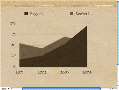
Area charts are similar to line charts in that they can show growth or a decline in growth, but an area chart fills in the area of growth or decline, as you can see in Figure 4.9. The area style often works great when you are trying to dynamically show growth or decline of one or two items, such as the growth of a company or two departments. Be wary of using more than two contrasting items in an area chart because the chart can quickly become confusing to read.
A stacked area chart works in much the same way as a stacked column chart. Sections of data are stacked in order to show relationships or overall growth. A stacked area chart works well with collections of related data but can be confusing if you are showing contrasting data groups.
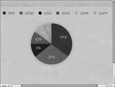
The pie chart, shown in Figure 4.10, is a mainstay of charts and one that you’ll use often. Pie charts can show parts of a whole and are especially helpful when you need to break data that belongs to a whole into parts (for example, sales, growth, company divisions). You’ll see some additional examples of cool things you can do with pie charts later in this chapter.
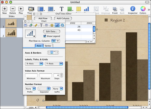
Of course, a chart isn’t very helpful unless you can customize the data in it. After all, the purpose of a chart is to show a set of data in a graphical way. So, in order to effectively use charts, you have to manipulate the data so that the chart has real meaning in your presentation. In Keynote, you manage chart data with the Chart Data Editor.
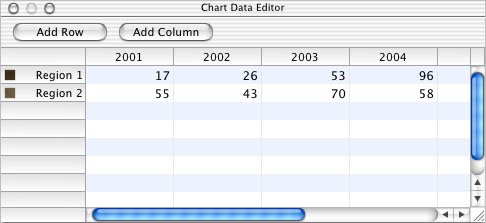
The Chart Data Editor appears automatically when you create a new chart, and if you need to access it after the chart has been created, you can just open the Chart Inspector and click the Edit Data button. You can also open it by selecting Format, Chart, Show Data Editor. The Chart Data Editor is shown in Figure 4.11.
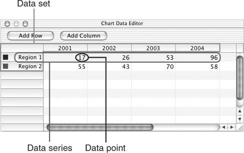
Before you start editing chart data, it is important that you understand how the Chart Data Editor handles data. A chart contains two different kinds of data: data series and data sets. A data series is a collection of data taken over time. For example, let’s say you are creating a chart that shows income from three different companies over a period of three years. The data series is the three companies over three specific years. In other words, it is a series of data. On the other hand, a data set is the income levels of one of those companies. The set represents income of that particular company. With the other companies and the amount of time, the collection of sets becomes a series.
Now, you don’t have to study the terms data series and data set; there is no test, of course, but if you have a firm understanding that charts represent collections of data sets that make up data series, it will make your work with Keynote much less confusing.
As you are creating data sets, a single piece of information in a set is called a data point. For example, if a company made 10.3 million dollars in 2002, that is a data point.
Data points make up data sets, and data sets make up data series. The whole chart, then, is used to communicate what could be head-spinning information in an easy-to-understand graphical format.
As you work with the Chart Data Editor, you see that it is essentially a spreadsheet made up of data series, data sets, and data points. Figure 4.12 shows the Chart Data Editor again, with some callouts to make things a bit easier.
So, to get the data you want in your chart, you have to edit the data series values, the data sets, and the individual points of the data sets. The good news is that this is easy because the Chart Data Editor allows you to simply change and enter those values.
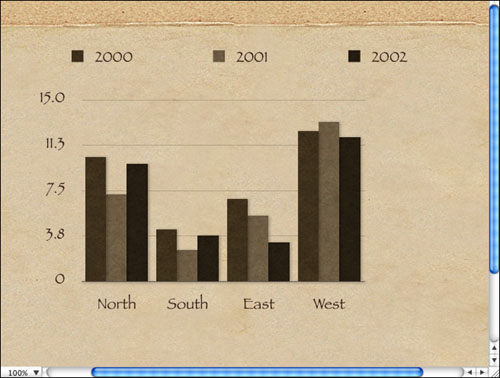
Let’s walk through an example together, and you’ll see how to use the Chart Data Editor. Let’s say you are giving a presentation on income for a company. The company has four divisions: North, South, East, and West. You want to create a column graph showing income over the years 2000, 2001, and 2002. Here is how to create the chart:
The first thing you want to do in the Chart Data Editor is to make some changes to the overall data series. First, you are going to change the default Region 1 and Region 2 to represent your values, which are North, South, East, and West. To change the value, just click the cell to highlight it and then double-click so that a cursor appears.
Press the Delete key to remove the default label and then retype your own. Repeat this process as needed. Figure 4.13 shows the values to North, South, East, and West being changed.
Notice that when you add a new cell value, a color box is automatically added. These colors are used to distinguish the different data in your chart. For example, if you use a column format, then each column of data will have a different color (refer to Figure 4.13).
Change the year values. The default chart already has some time values plugged in, but you can change them by simply selecting the cell and then double-clicking it so that you see a cursor. Simply retype the value you want (see Figure 4.14).
Notice that you have a leftover column from the default chart. This is no problem. You can delete any column by simply clicking the column heading one time. This selects the column, as you can see in Figure 4.15. Then you just press the Delete key to remove it.
Enter the desired data points. In this case, you are entering sales figures for each region for the three years. Just click inside a cell and type your new data.

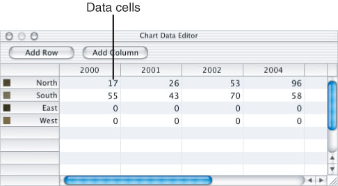
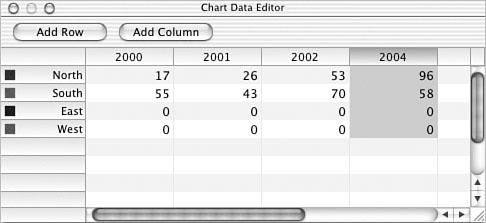
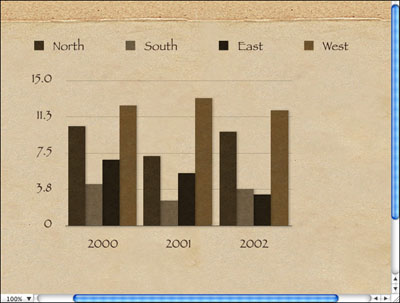
Figure 4.16 shows the completed changes in the Chart Data Editor, and Figure 4.17 shows the changes applied to the chart. You have easily and quickly created a chart that displays the income data over the years 2000–2002 for each of the regions. That’s all there is to it!

Of course, you might need to add rows or columns, and that’s no problem. Just use the Add Row and Add Col umn buttons in the Chart Data Editor as needed to increase the number of rows and columns in the chart.
Caution

Charts need to be somewhat simple. Excess rows and columns become difficult to understand, so always try to stay on the side of simplicity. Using two slides with two different charts to convey data is much better than using one slide with a very complicated chart. Keep your message clear and simple!
You need to consider two more items concerning chart data. These items are found on the Chart Inspector instead of the Chart Data Editor, which may cause you some confusion at first.
The Chart Inspector, shown in Figure 4.18, has a Show legend check box and a Plot Row vs. Column button option directly below the Edit Data button. Here’s what you can do with these:
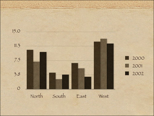
Show Legend—. When this option is unchecked, the legend is removed from the slide. For example, in Figure 4.17, you see the North, South, East, and West labels and the color legend at the top of the slide. Clearing the Show legend check box would remove these from the slide. Doing this might help clean up your slide a bit. A chart can be difficult to understand without a legend, though, so think carefully before you remove it. If you are providing handouts to your audience members, they may be able to understand the chart when referring to it at a later time, so unless you have a specific reason for doing so, keep the legend on the chart.
Plot Row vs. Column—. This option transposes the basic flow of the chart. For example, in Figure 4.17, the data series is represented by the rows in the Chart Data Editor. If you transpose the row and column, the data set is represented by the row instead of the column, as you can see in Figure 4.19. Naturally, this causes the chart not to make any sense because I wrote the data series information into the Chart Data Editor using rows. However, the point is that you can use rows or columns of data in the Chart Data Editor if you like. Simply use the Plot Row vs. Column selection buttons on the Chart Inspector to transpose the data.

The elements, or different parts of a chart, can be formatted in basically any way so that your chart looks exactly the way you want it to. The following sections describe what you can do.
As you have learned in this chapter, a chart can use a legend or not—the decision is up to you. By using the Chart Inspector, you can remove the legend or leave it on a slide (as it is by default). However, what if you don’t like the location of the legend? By default, the legend appears at the top of the chart, but the legend is actually a separate text box that you can move around, enlarge, reduce, and change as you like.
You can move the legend around, and you can even reformat the fonts and colors. You can also move a legend to a different slide. However, there is a caveat you need to keep in mind: The legend is tied to the chart, even though it is an individual piece that can be moved around. When you change or update a chart, the legend is changed or updated as well. However, if you move the legend to a different slide, it becomes disconnected from the chart and will not be updated if you make any changes to your chart. Just keep this point in mind.
Tip
As a general rule, it is not a good idea to move the legend to a different slide because the legend helps audience members understand the chart.
To customize the legend, you just click it on the slide, and the familiar text box and selection handles appear. At this point, you can simply drag the legend to a new location (such as the bottom of the chart), and you can also use the selection handles to resize the legend if you like. As you can see in Figure 4.20, I have moved the legend to the side of the chart and resized it so that the legend items appear in a vertical fashion. This frees up more room at the top of the chart, where I can insert a title, a picture, or anything else I might want.
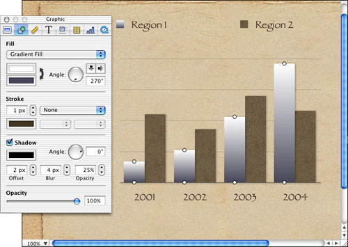
You can change the colors of bars, edges, and area shapes that appear on a chart, just as you can change the colors of any other object on a slide. You can change the colors, apply shading, fill with an image, adjust opacity, and do other tasks by using the Graphic Inspector. You’ll learn more about the Graphic Inspector in Chapter 5, “Working with Graphics,” but for now, here’s a quick sample to pique your curiosity:
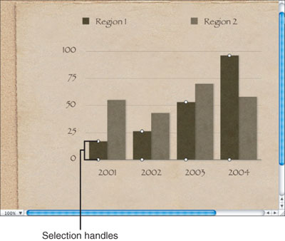
On your slide, select one of the chart elements, such as a column. When you do so, all columns in the series become selected, and you see the selection handles marking your selection, as shown in Figure 4.21.
Open the Inspector by clicking the Inspector icon on the toolbar and then click the Graphic button at the top of the Inspector. Using the Graphic Inspector, as shown in Figure 4.22, you can change any of the color qualities of your selection. (See Chapter 5 to learn more about the features of the Graphic Inspector.)
Just as you can change fonts and the color of text in a text box, you can also change them on a chart by simply selecting them and opening the Font dialog box. Just select Format, Font, Show Fonts. On the Font dialog box, choose a font family, a typeface (if necessary), and the desired font size. Use the Text button options on the Font dialog box to make style and color changes. (See Chapter 2, “Working with Text,” for more details.) Note that if you select text that is tied to a data point or an axis label (which we’ll talk about in the next section), all the text for that data is also selected.
In charts, axis markings basically determine the values that are displayed on the vertical axis (that is, the y-axis) from which you read the data point values. For example, if your data sets reflect income from 5 million to 25 million, the vertical axis reflects those values so you can understand what the columns or bars mean. For vertical charts, the y-axis shows the values (for example, the years in the previous examples).
You don’t have to worry about all those definitions, but you should know that you can do a lot of customization work with the flow of the axis markings and their labels by using the Chart Inspector.
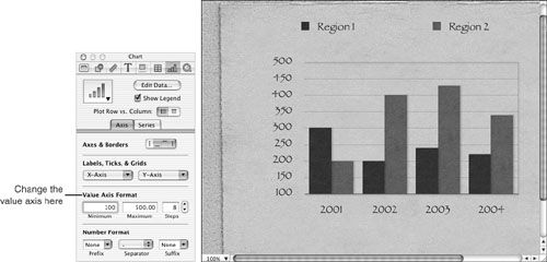
Select your chart on the slide and then open the Chart Inspector. Click the Axis tab, and you can see the axis options and features that you can customize according to your needs, as shown in Figure 4.23. The following sections describe what you can do.

The Axes & Borders portion of the Axis tab simply allows you to decide what borders you want to use around the axis and general border of a chart. Just click the button options to use them—that’s all you have to do. Figure 4.24 shows a chart with no borders enabled, and Figure 4.25 shows a chart with all borders enabled.


The Labels, Ticks, & Grids portion of the Axis tab enables you to control how labels, ticks, and grids are used on the x-axis and y-axis. If you click either the X-Axis or Y-Axis drop-down menu, you’ll see a number of options that allow you to customize the labels, ticks, and grids in the chart. These options are self-explanatory, but you should spend some time playing with the options so you can see the many different ways a chart can appear.
The Value Axis Format portion of the Axis tab allows you to control what you see on the value axis. For example, Figure 4.25 shows that the value axis on the chart has range of 0 to 100. You can easily change the values by entering new minimum and maximum values in the Minimum, Maximum, and Steps boxes under Value Axis Format. You can also change the number of steps on the chart. This feature allows you to adjust the value axis so that it is easier to read and understand. For example, Figure 4.26 shows Minimum being set to 100, Maximum being set to 500, and Steps being increased from 5 (refer to Figure 4.25) to 8. The results are made automatically in the chart.
The Number Format portion of the Axis tab gives you more customization options for the numbers on the value axis. It enables you to add prefixes, separators, and suffixes to the value axis. For example, if you are using value axis values such as 100, 200, 300, and so forth, you can use the Prefix drop-down menu to add a prefix so that they read $100, $200, $300, and so forth.
The Chart Inspector has a Series tab that provides some helpful and easy options for formatting data series elements. Note that some series options apply to certain kinds of charts, so not all options are enabled for each kind of chart, as you can see in Figure 4.27.

The data series options, described in the following list, are really easy to use:
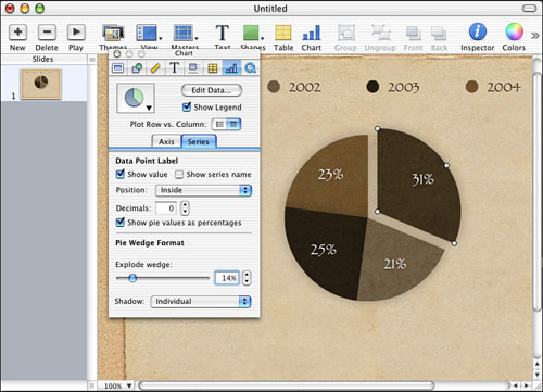
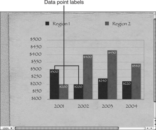
Data Point Label—. These options enable you to choose to show values on the data points. This basically puts the actual value on the column or bar, as you can see in Figure 4.28. If series are named, you can show that option, too, by checking the “Show series name” check box. You can use the Position drop-down menu to decide where you want the labels to be placed, such as on the top, bottom, and so forth. You can also add decimals if needed by typing the appropriate value in the Decimals text box or using the spinner arrows to choose a value. If you are using a pie chart, you can choose to select the “Show pie values as percentages” check box.
Bar Format—. This section of the Series axis enables you to put spaces between bars and sets of bars. It also enables you to adjust the shadowing used on the bars by using the Shadow drop-down menu. You just change the percentage values in the text boxes in this section to make adjustments for the visual appeal you want.
For the most part, all charts work basically the same. However, there are some special issues and features with pie charts that I want to point out. First, you use the Chart Data Editor to enter values for a pie chart, just as you do with any other chart. However, due to the nature of the pie chart, only the first row of a data series is used in the pie chart. Whereas multiple rows work great with bar charts, a pie chart simply cannot display data this way. However, you can choose to chart any data set by simply moving it to the first row in the Chart Data Editor.
In addition, keep in mind that you can use the Data Point Label section on the Series tab in the Chart Inspector to change the basic appearance of the data point labels, and you can format colors of each piece of the pie chart by using the Graphic Inspector, just as you can with any other element on a chart. You can also learn more about the Graphic Inspector in Chapter 5.
Tip
You can change the opacity and shadowing feature by using the Graphic Inspector. See Chapter 5 to learn more. Also, how would you like for individual pie wedges to fly on to the slide and build the pie before your audience’s eyes? You can do this by using builds, which you’ll learn more about in Chapter 8, “Exploring Transitions and Builds.”
One cool feature of the pie chart is that you can detach pieces of the pie for emphasis. To do so, just follow these steps:
Select the chart and then click the desired pie wedge to select it. If you want to select additional wedges, just hold down the
 key and click them as well.
Open the Inspector and then click the Chart button at the top of the Inspector.
On the Series tab, choose Individual from the Shadow menu.
Use the Explode Wedge slider bar to move the wedge away from the pie, as shown in Figure 4.29.