
Forms are all around us... You fill out forms to get your driver’s license, apply for a job; even to get married. A simple definition of a form would be some method for extracting information on a particular subject. For example, to fill out a job application form, you would have to enter your pertinent information on who you are (name, address), recent jobs, why you’re experienced enough to apply for the job, and government stuff, like your social security number. An even simpler definition would be to say that forms collect information... it’s how you collect that information that makes all the difference.
For example, you might design your form on paper, and the person filling out the form is required to write the information down with a pen or pencil. The information is collected by another person, and along with other forms, compiled (by hand) into a final readable product. Not very efficient; however, that’s the way it was done, many long years ago.
Today forms are filled out on a computer screen; the data is validated and compiled into a readable final product, along with relevant statistics and averages. What I’m describing is creating electronic forms, designed, implemented, and finished, all with the help of Adobe Dreamweaver.
Adobe Dreamweaver simplifies the process of creating and implementing forms of any size and complexity. In this chapter you learn how to create basic forms, and populate the forms with all the goodies, such as: check boxes, radio buttons, text input fields; even drop-down menus.
Once a form is created, it can deposit that information into an appended database, where other statistical applications can massage the data into any structure desired by the final user.
As mentioned in the previous section, forms are all about the collection and eventual processing of information. Considering the information-based society that we live and work in, without forms the entire world would probably fall apart in a matter of days. Well, maybe that’s a bit exaggerated; however, forms collect information, information drives our lives, and Dreamweaver makes the creation of those forms a virtual snap.
It’s important to understand that although Dreamweaver will make the overall creation of a form easy (buttons, check boxes, input fields, etc), it does not include the backend tools that make the form functional. For that you will need to install a form handler on your server. In many cases someone in the IT department performs this function. Understand that until the form handler is installed, your visitors will not be able to send you any data; no matter how many times they click the Submit button.
While the scope of the book is not to teach you how to write form handler code, there are many sites that offer free form-handler scripts. These sites typically provide scripts for collecting simple and predictable form data; for more complex scripts the services of an engineer might be required.
Forms can be populated with any number of elements. For example, you could create a simple bio form that asks for information such as name, address, phone number, sex, age, social security number, etc. Because of all this information, it’s a good idea to sketch out the general look and feel of the form on a piece of paper, and then use that as a visual guide to the creation of the form in Dreamweaver. When you create an interactive field, Dreamweaver inserts the code necessary to display the field in the browser.
A dynamic form element is a form object that gets its initial value by the Web server where the Web site is stored. When a visitor opens a form page in a browser, the dynamic form objects get information directly from the Web server before the page appears on the screen. When form objects are dynamic, it makes updating a snap. In order to use dynamic form objects, you need to have a data source set up and available on your Web server.
Once the various form elements are ironed out, you can look at the possibility of validating some of the fields. For example, it might be difficult to create a validation for a name field; however, you at least check to see that the field is not blank. In addition, you could check to see if all zip code fields contain five numbers and not alphabetic characters. Options that require specific answers, such as sex (male/female) could be placed as a pop-up with the correct choices, and other options could be designed using check boxes or radio buttons. In most cases, using check boxes allows the user to choose more than one option (check all that apply), and radio button typically allow for a single choice from a group (choose only one). When you choose form validation, Dreamweaver creates a script that instructs the browser how to handle the input.
Just because Dreamweaver makes the initial creation of the form easy for you, it doesn’t mean that you shouldn’t think about its construction. One of the rules in creating forms is that you’re designing the form for the person who is filling it out... not for you. The form should be as simplistic as possible with easy to understand instructions. When they make a mistake (not filling in a field), there should be a way to tell that person a mistake was made, and what to do to correct it. Studies show that the more difficult the form, the less likely that people are going to spend the time to fill it out. There are two stages in the creation of a form: The initial insertion of the form, and then populating the form with text and form objects.
 Create a new HTML document, or open an existing one.
 Click to place the insertion point where you want to insert a form.
 Insert the form using one of the following options:
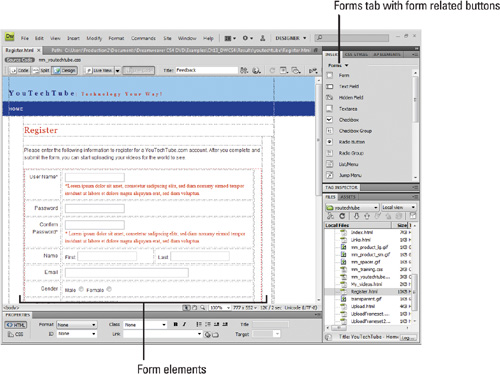
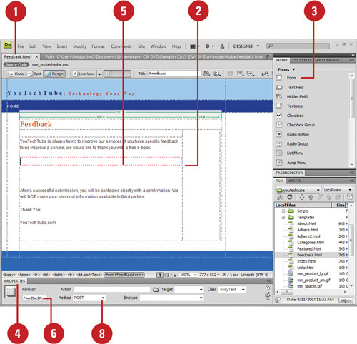
• Click the Forms tab on the Insert panel, and then click the Form button.
• Click the Insert menu, point to Form, and then click Form.
An empty form appears with a dotted red outline.
Trouble?
If you don’t see the outline, click the View menu, point to Visual Aids, and then click Invisible Elements.
 Open the Properties panel.
 Click the red form outline to select the form.
 Type a name to identify the form for reference purposes with a scripting language.
 Enter the path to the page or script that processes the form data, or click the Browse For File button to select a file (if you don’t have this information, you can add it later).
 Click the Method popup, and then select one of the following options:
• Default. Uses the browser’s default setting to send the form data to the server. Typically the default is the GET method.
• GET. Appends the value to the URL requesting the page.
• POST. Embeds the form data in the HTTP request.
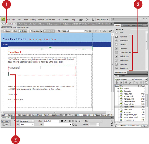
 Insert the form objects you want and specify the information in the Input Tag Accessibility Attributes dialog box. When you create form objects, follow these guidelines:
• Unique Names. Use a unique name that identifies the object for scripting purposes. Avoid using spaces or special characters.
• Layout. Use line and paragraph breaks, formatted text, and tables to design the form layout.
After you create a form, you can starting inserting form objects. Form objects are the individual elements—such as text field, text area, button, check box, radio button, or menu—that make up the form and visitors fill out. The form objects allow you to create a form that makes it easy for visitors to use, yet still provide you with the important information you need. Each form object is designed to gather a specific type of information. For example, if you have a list of categories and you can select more than one category, you should use the check box form object. If you can only select one category, you should use the radio button form object instead.
Open a page that contains a form, or create a new document and insert a form.
Click to place the insertion point to where you want to insert a form object.
Click the Forms tab on the Insert panel, or click the Insert menu, point to Form, and then select from the following commonly used form objects:
• Text Field. Select to create a text field that consists of one line or multiple lines. In addition, text fields are used to create a password field that hides the text the user enters.
• Text Area. Select to create a large text area that is commonly used by a visitor to enter large amounts of data; for example, a comment field.
• Button. Select to create a button object. Buttons are used to submit form data to the server or to reset the form. Standard form buttons are typically labeled Submit, Reset, or Send. You can also assign other processing tasks that you’ve defined in a script.
• Checkbox. Select to let users select more than one option from a set of options.
• Radio Button. Select to let users select only one choice from a set of options. Radio buttons are typically used in groups.
• List/Menu. Select to let users select one or more items from a list.
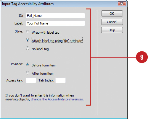
In the Input Tag Accessibility Attributes dialog box, specify the following options:
• ID. Enter a unique ID for the form object.
• Label. Enter a label for the form object.
• Style. Select a style for the form object.
• Position. Select a position for the label in relation to the form object.
• Access Key. Enter a keyboard equivalent (single letter) in the Access Key text box. For example, if you entered the letter N into the field, pressing Alt+N (Win) or Control+N (Mac) in the browser automatically selects that field.
• Tab Index. Enter a numerical value for the tab order of the form object in the Tab Index text box. For example, if you entered the number 3 into the field, pressing the tab key three times would cause the field to be selected.
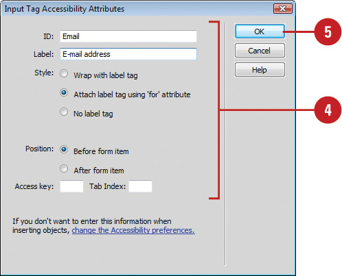
Click OK.
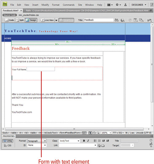
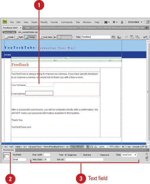
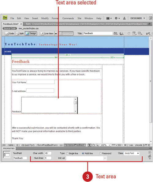
A text field consists of one line or multiple lines used to enter small distinct amounts of data or information, such as your name or address. You can also use a text field to create a password field that hides the text the user enters. A text area is a large text field commonly used to enter large amounts of data or information, such as comments. After you create a text field or text area, you can use the Properties panel to set or change options for the form objects.
Select a text input field or text area within a form document.
Open the Properties panel.
Select from the following text field or text area options:
• Char Width. Enter the maximum number of characters that can be displayed in the field.
• Max Chars. Enter the maximum number of characters that can be entered in the field for single-line text fields.
• Num Lines. Enter the height of the field for multiple-line text fields.
• Wrap. Determines how the user’s input will be displayed when the user enters more information than can be displayed within the defined text area.
• Off. Prevents text from wrapping to the next line.
• Virtual. Sets word wrap in the text area.
• Physical. Sets word wrap in the text area, as well as to the data when it is submitted for processing.
• Type. Designates the field as a single-line, multiple-line, or password field.
• Single-line. Selecting to cause the Char Width and Max Chars settings to map to a single line with defined boundaries.
• Password. Select to create a password field (information typed into the field appears as asterisks or dots).
• Multi-line. Select to create a multi-line field.
• Init Value. Enter an initial value that displays when the field first loads.
• Class. Click to apply CSS rules to the object directly or through a CSS Style sheet.
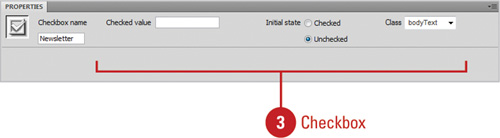
Radio buttons and check boxes allow you to create options for users to select. A radio button allows a user to select only one choice from a set of options, while a check box allows a user to select more than one option from a set of options. Radio buttons are typically used in groups. Both form objects are very often used when you want to create a survey. After you create a radio button or check box, you can use the Properties panel to set or change options for the form objects.
Select a radio button or checkbox within a form document.
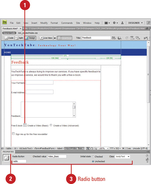
Open the Properties panel.
Select from the following radio button options:
• Radio Button/Checkbox. Enter a name for the Radio Button or Checkbox object.
Note
If the name of a group of radio buttons is the same, then the user will only be able to select one button (i.e. male or female). The name cannot contain spaces or special characters.
• Checked Value. Enter in a value to be sent to the server when the button is selected. For example, male or female.
• Initial State. Select whether to have the button selected or not when the form first loads.
• Class. Click to apply CSS rules to the object directly or through a CSS Style Sheet.
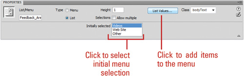
Lists and menus perform similar tasks; each allows you to select an item from a list of related items. However, there are some differences. A list allows you to scroll through the items as well as select multiple items, while a menu doesn’t. When you select an item from a list or menu, you can execute an action using a script or behavior. After you create a list or menu, you can use the Properties panel to set or change options for the form objects.
Select a list/menu field within a form document.
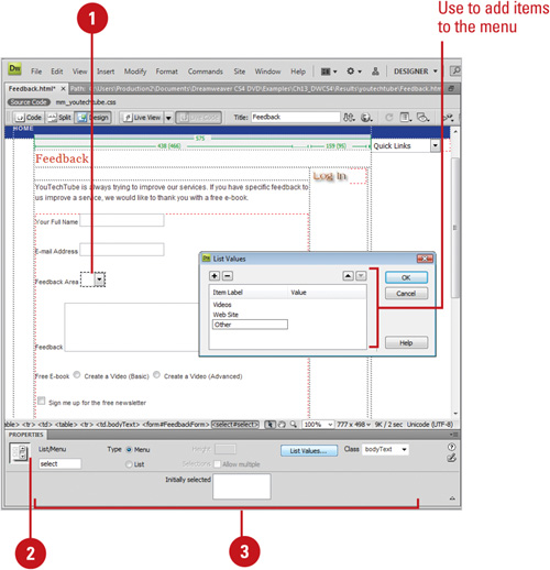
Open the Properties panel.
Select from the following list/menu options:
• List/Menu. Enter a unique name for the menu.
• Menu. Select to have the menu drop down when clicked.
• List. Select to display a scrollable list of items when clicked.
• Height. Enter a value to determine the number of items displayed in the menu (List type only).
• Selections. Select to allow the user to select multiple items from the list (List type only).
• List Values. Click to add items to the menu.
• Class. Click to apply CSS rules to the object directly or through a CSS Style Sheet.
• Initially Selected. Select from the available items to make the item initially selected when the browser loads the form.
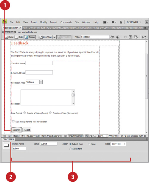
Buttons are used to execute an action. Form buttons are generally used to submit form data to the server or to reset the form. Standard form buttons are typically labeled Submit, Reset, or Send. In addition to the standard form buttons, you can assign other processing tasks that you’ve defined in a script or behavior to create a custom button. After you create a button, you can use the Properties panel to set or change options for the form objects.
Select a button field within a form document.
Open the Properties panel.
Select from the following button options:
• Label. Use to add a label next to a text field, check box, or radio button option. Click next to the object, and then type the label.
• Value. Enter the name of the button (appears directly on the button).
• Action. Determines what happens when the button is clicked.
• Submit Form. Select to submit the form data for processing when the button is clicked.
• Reset Form. Select to clear the contents of the form when the button is clicked.
• None. Select if you want to add a JavaScript behavior for the button.
• Class. Click to apply CSS rules to the object directly or through a CSS Style Sheet.
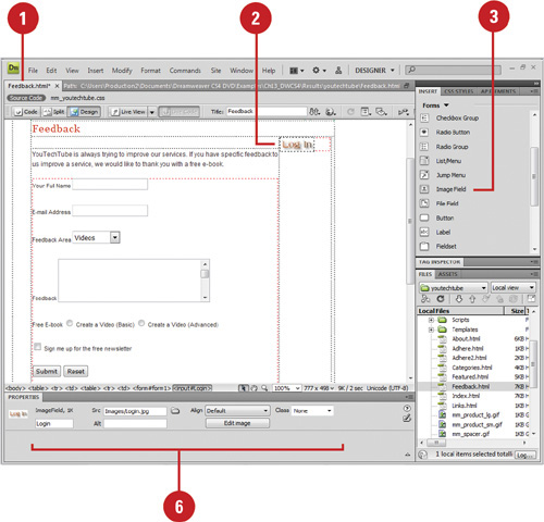
Instead of using one of the built-in buttons provided by Dreamweaver, you can insert an image and use it as a button. This allows you to create a custom look for your form, yet still provide the functionality you want. After you insert an Image button, you can use the Properties panel to set or change options for the form object.
Create a new HTML document, or open an existing page.
Click to place the insertion point where you want to insert an image button.
Insert the image using one of the following options:
• Click the Forms tab on the Insert panel, and then click the Image Field button.
• Click the Insert menu, point to Form, and then click Image Field.
Locate and select the image you want to use as a button.
Click OK.
In the Properties panel, select from the following options:
• Image Field. Enter a unique name for the image.
• Src. Enter the path and name for the image or click the Browse For File button to select the image file.
• Alt. Enter a description of the image.
• Align. Click to select an alignment option.
• Edit Image. Click to edit the image in your default editor.
• Class. Click to apply CSS rules to the object directly or through a CSS Style Sheet.
Instead of setting static form options in Dreamweaver, you can set form options dynamically (on the fly) from your Web server, known as a dynamic form object. For example, you can dynamically set a form menu or list menu with entries from a database, display content in text fields when viewed in a browser, or preset a radio button or check box when viewed in a browser.
When a page with a dynamic form object is displayed from a Web server, the initial state is determined by the server. Making form objects dynamic makes updating and maintaining a Web site much easier. Instead of manually changing a menu item, you can simply change an entry in a database table where the information is stored.
In order to use dynamic form objects, you need to have a data source set up, such as a MySQL database, and available on your Web server. The set up and connection of a data source is outside the scope of this book, so you should see your ISP or Web administrator for more details.
Select the form object you want to make dynamic within a form document.
Open the Properties panel.
Click the Dynamic button or click the Lighting Bolt icon.
Select the options you want to make the form object dynamic; the options vary depending on the form object.
Select an existing data source, or click the Plus (+) button to define a new data source.
Click OK.
When you create a table, it’s a simple matter to add form elements on a line-by-line basis. However, in many cases this simplistic method may not suit your particular form layout. In that case, it’s tables to the rescue. A smart form designer can use a table within the form (just like in standard design), to control the look and positioning of all the form elements. Once the table is inserted into the form, it’s a simple matter to use the individual table cells to insert the various elements (for more information on the creation of a table, turn to Chapter 8). The only requirement for the table is that it must be placed within the red dotted lines defining the form.
Create a new document or open an existing page.
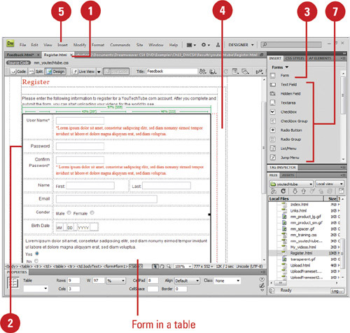
Click to place the insertion point to where you want to insert a form.
Insert the form using one of the following options:
• Click the Forms tab on the Insert panel, and then click the Form button.
• Click the Insert menu, point to Form, and then click Form.
An empty form appears with a dotted red outline.
Select the form.
Click the Insert menu, click Table, select the table options that you want, and then click OK.
Click into an individual cell.
Click the Forms tab on the Insert panel, or click the Insert menu, point to Form, and then select from the available form objects.
The table cells control the placement and design of the form.
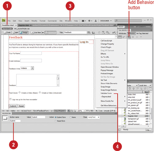
The Validate Form action checks the contents of specified text fields to ensure that the user has entered the correct type of data. You can attach this action to individual text fields using an onBlur event to validate the fields as the user is filling out the form, or attach it to the form with the onSubmit event to evaluate several text fields at once when the user clicks the Submit button. Attaching this action to a form prevents the form from being submitted to the server if any of the specified text fields contains invalid data. In addition, Dreamweaver can add JavaScript code that checks the contents of specified text fields to ensure that the user has entered the correct type of data.
Open a form document, or create a new form document.
Important
The form document must contain at least one text field and a Submit button. In addition, all text fields must have unique names.
Select the Submit button inside the form that you want to validate.
Click the Window menu, and then click Behaviors to display the Behaviors panel.
Click the Add Behavior button (the Plus (+) sign), and then click Validate Form.
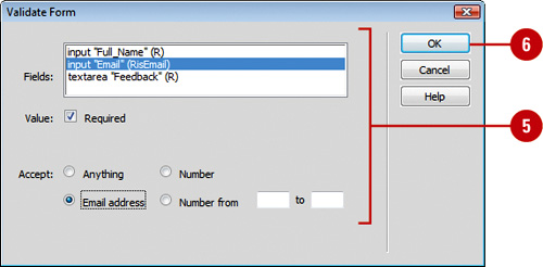
Select the form input fields one at a time, and then validate the form using the following options:
• Required. Select to make the form object required.
• Anything. Accepts any input entered by the user.
• Number. Restricts input to numeric.
• Email address. Looks for an e-mail address with the @ sign.
• Number from. Enables you to enter a minimum and maximum range for numeric values.
Click OK to add the validation information (in script) to the HTML form document.
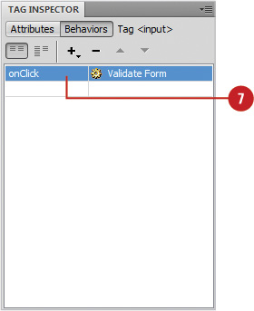
Click the Action button in the Behaviors panel, and then select one of the following options:
• OnSubmit. Select if you are validating multiple fields when the user submits the form.
• OnBlur or OnChange. Select if you are validating individual fields.
Click the File menu, point to Preview In Browser, and then check the current validation actions.
Most Web sites employ buttons to helps the visitor navigate through the various pages; however, it’s possible to create a jump menu, using a simple form element. A jump menu utilizes a form object to create a list of menu options. When the visitor clicks on the list, a drop-down menu displays a listing of all the available page options. Displaying a listing of all available page options within a single drop-down menu is a creative use of form objects that makes navigation through a complex site much easier for your visitors. After you create a jump menu, you can make changes to it as needed. You can add, delete, rename or change the order of items in the menu. In addition, you can modify the file an item links to. If you want to change the location in which a linked file opens, or to add or change a menu selection prompt, you need to apply the Jump Menu behavior from the Behaviors panel.
Create a new Web page or Open the Web page where you want to insert a jump menu.
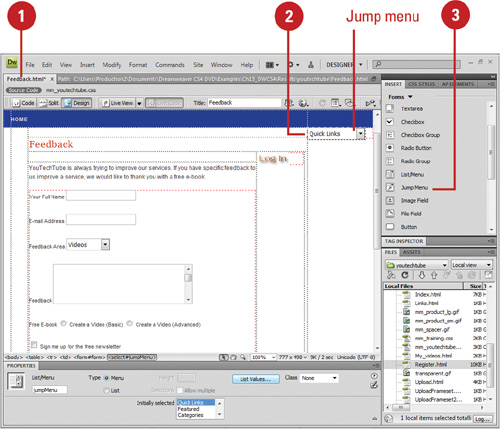
Click to place the insertion point to where you want to insert a jump menu.
Click the Forms tab on the Insert panel, or click the Insert menu, point to Forms, and then click Jump Menu.
Create the jump menu using the following options:
• Menu Items. Click the Plus (+) sign to add more “unnamed” menu items to the list. Click the Minus (-) sign to remove “unnamed” items from the list. Use the up and down arrows buttons to move selected items within the list.
• Text. Select an “unnamed” menu item in the Menu Items box, and then enter a name in the text field. Continue selecting “unnamed” items until all have been properly named.
• When Selected Go To URL. Select a menu item in the Menu Items box, and then enter the path and filename of the page you want opened for the selected item or click Browse to select the file.
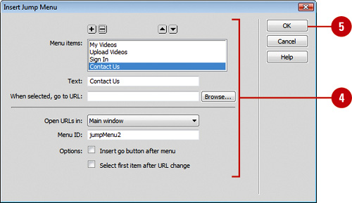
• Open URLs In. If you’re not working within a frameset, you have only one option: Main Window.
• Menu ID. Enter a unique name for the menu in the input field (optional).
• Insert Go Button After Menu. Select to add a button that activates the jump menu.
• Select First Item After URL Change. Select to reset the menu selection to the top item after each jump.
Click OK.
Open the Web page where you want to edit a jump menu.
Open the Properties panel.
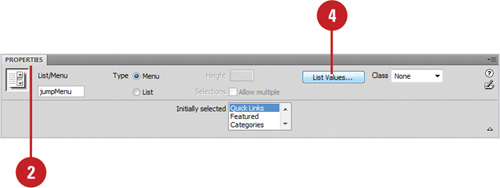
Select a jump menu object.
Click the List Values button.
Make the changes you want.
• Click the Plus (+) sign to add more “unnamed” menu items to the list. Click the Minus (-) sign to remove “unnamed: items from the list. Use the up and down arrows buttons to move selected items within the list.
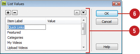
Click OK.
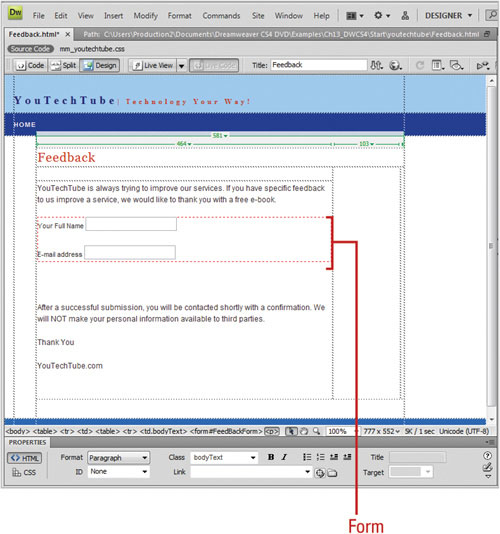
The first step in the creation of a form is to place the HTML <form></form> tags on your page. The form tags, when inserted into the document will be delineated by a red line, which will be invisible when the page loads into a standard browser. The red line is a visible design element that lets you know you’re working on a form. All items defining the form must be placed within those lines.
<html>
<head>
<meta http-equiv="Content-Type" content="text/html; charset=ISO-8859-1" />
<title>Untitled Document</title>
</head>
<body>
<form id="form1" name="form1" method="post" action="">
</form>
</body>
</html>
Forms can be populated with any number of elements. For example, you could create a simple bio form that asks for information such as name, address, phone number, sex, age, social security number, etc. Because of all this information, it’s a good idea to sketch out the general look and feel of the form on a piece of paper, and then use that as a visual guide to the creation of the form in Dreamweaver. When you create an interactive field, Dreamweaver inserts the code necessary to display the field in the browser. The following is an example of the HTML code necessary to display a text input field for a person’s name, address, city, state, and zip code.
<body>
<form id="form1" name="form1" method="post" action="">
<label>Name
<input type="text" name="textfield" />
</label>
<label>Address
<input type="text" name="textfield2" />
</label>
<label>City
<input type="text" name="textfield3" />
</label>
<label>State
<input type="text" name="textfield4" />
</label>
<label>Zip
<input type="text" name="textfield5" />
</label>
</form>
</body>
Once the various form elements are ironed out, you can look at the possibility of validating some of the fields. For example, it might be difficult to create a validation for a name field; however, you at least check to see that the field is not blank. In addition, you could check to see if all zip code fields contain five numbers and not alphabetic characters. Options that require specific answers, such as sex (male/female) could be placed as a pop-up with the correct choices, and other options could be designed using check boxes or radio buttons. In most cases, using check boxes allows the user to choose more than one option (check all that apply), and radio button typically allow for a single choice from a group (choose only one).
When you choose form validation, Dreamweaver creates a script that instructs the browser how to handle the input. The following is an example of a form validation script that validates an email address input field:
function MM_validateForm() { //v4.0
var
i,p,q,nm,test,num,min,max,errors='',args=MM_validateForm.arguments;
for (i=0; i<(args.length-2); i+=3) { test=args[i+2];
val=MM_findObj(args[i]);
if (val) { nm=val.name; if ((val=val.value)!="") {
if (test.indexOf('isEmail')!=-1) {
p=val.indexOf('@'),
if (p<1 || p==(val.length-1)) errors+='- '+nm+'
must contain an e-mail address.
';
} else if (test!='R') { num = parseFloat(val);
if (isNaN(val)) errors+='- '+nm+' must contain
a number.
';
if (test.indexOf('inRange') != -1) {
p=test.indexOf(':'),
min=test.substring(8,p); max=test.substring(p+1);
if (num<min || max<num) errors+='- '+nm+'
must contain a number between '+min+' and
'+max+'.
';
} } } else if (test.charAt(0) == 'R') errors += '-
'+nm+' is required.
'; }
} if (errors) alert('The following error(s)
occurred:
'+errors);
document.MM_returnValue = (errors == ''),