Flex applications have a default visual appearance that's determined by a combination of graphics that are embedded in the Flex framework, known as skins, and various visual settings that are set through Cascading Style Sheet declarations.
Web site developers may already be familiar with the concept of Cascading Style Sheets (CSS), because this technology has been increasingly used to control the visual appearance of Web pages since its introduction in 1996.
The Cascading Style Sheet recommendation is created and published by the World Wide Web Consortium (W3C), the same organization that publishes the recommendations for HTML, XML, and other critical Internet technologies.
Note
Information about the World Wide Web Consortium's CSS recommendation and other CSS resources is available at http://www.w3.org/Style/CSS/.
It's up to the vendors who actually create the Web browsers and other products to implement CSS for their own platforms. Web browsers, for example, implement various subsets of the W3C recommendation; it's only in recent years that the major browsers such as Internet Explorer and Firefox have approached compatibility in their CSS implementations.
The use of CSS to control visual appearance isn't limited to Web-based technologies. Flex applications that are installed on the desktop with the Adobe Integrated Runtime (AIR) use CSS in exactly the same manner as Flex Web applications.
The Flex framework implements significant parts of the W3C's CSS recommendation and adds features that make the technology particularly effective for implementing Flex application graphic designs.
In this chapter, I describe using CSS in Flex to control an application's visual appearance. I start by describing how to declare and control style sheets in a number of ways. At the end of the chapter, I describe a particular aspect of Flex styles called skinning that allows you to replace the default graphics that control a Flex application's appearance.
Note
To use the sample code for this chapter, import the chapter10.zip Flex project archive from the Web site files into your Flex Builder workspace.
A style sheet consists of rules that constitute a set of visual settings. Any particular style sheet can consist of three parts:
The selector determines the scope of a set of rules that are declared in the style sheet. A single selector can declare multiple styles, each requiring a name and a value.
The style name determines which style is being set.
The style value determines the new style setting.
MXML-based declarations of styles and non-style properties look the same. This VBox container declares a width property and a backgroundColor style:
To know that one is a property and the other a style, you'd have to look it up in the product documentation. You encounter differences between styles and properties when you set their values in ActionScript or actual style sheet declarations, or when you read about their use in the product documentation. Table 10.1 describes some of the differences between styles and properties.
Table 10.1. Differences between Styles and Properties
Styles | Properties |
|---|---|
Documentation is found in the Styles section for each component. | Documentation is found in the Properties section for each component. |
Styles can be applied to multiple objects through embedded or external style sheets. | Properties can apply only to a single object. |
When set at runtime with ActionScript, styles always use the setStyle() method. | Properties can be set at runtime in ActionScript with simple dot notation. |
Multiple style rules can be compiled into . | Properties cannot be compiled into separate . |
You can use these ways, among others, to declare styles in Flex:
Inline styles: Declared as attributes in an object's MXML declaration
Embedded style sheets: Declared within an MXML file in an
<mx:Style>tag setExternal style sheets: Created as text files with a file extension of .
cssCompiled style sheets: Created as .
swffiles and can be loaded at application runtime
Regardless of how you declare a style, the name of the style and its value are always the same. For example, a style of fontSize is always set as a numeric value indicating the font height in terms of pixels. This style can be set in inline, embedded, external, or compiled style sheets, and its effect is always the same.
Note
Unlike the HTML implementation of CSS, Flex applications do not support any unit of measurement other than pixels. If you try to use unit-of-measurement abbreviations like pt, em, or px, they are either ignored or result in a compiler error, depending on the context.
When you declare an object in MXML, you can declare any of its styles using XML attributes. The attribute's name matches the style's name, and the style's value is declared in various ways depending on its data type.
Note
Unlike the Web browser implementation of CSS, Flex does not support a CSS id selector that would allow you to apply a style in an embedded or external style sheet to a single object by its id property. If you need to apply a style to a single object, use an inline style declaration.
This Label control declares its color style to a value of red using an inline style declaration and a hexadecimal color code:
<mx:Label text="Hello World" color="#ff0000"/>
Caution
Many styles have two versions of their names. For example, the fontSize style has a name whose syntax is sometimes described as camel case, due to the use of uppercase characters in the middle of the style name. This style also can be declared in an embedded or external style sheet with the hyphenated name of font-size. However, when setting styles in an inline declaration, you must use the camel case version of the name, because the hyphenated version isn't recognized by the MXML parser.
Tip
One of XML's fundamental syntax rules is that the order of attribute declaration isn't meaningful. In the MXML language, this means that you can declare property, style, and event listener attributes in any order because the order doesn't have any effect on the function or performance of the object you're declaring.
You can declare complete style sheets either embedded within an MXML source code file or in a separate, external .css file. Either way, the style sheet contains one or more selectors, each of which determines the scope of a set of style declarations.
The Flex implementation of CSS has three kinds of selectors:
Type selectors declare a set of styles that are applied to all instances of that ActionScript type.
Style name selectors (traditionally known as class selectors) declare a set of styles within an arbitrarily named collection that is then applied to multiple components through the
styleNameproperty.The global selector declares a set of styles that are applied to all components within the application.
Regardless of which selector you use, the syntax is similar: the selector, followed by a block of style declarations wrapped in braces. Each style declaration consists of a name and a value, separated by a colon (:). The style declaration should be ended with a semicolon (;) to separate it from other style declarations.
A type selector consists of the name of an ActionScript class that represents a visual component, followed by a code block containing one or more style declarations. This type selector declares a set of styles that are applied to all Label controls:
Label {
  color:#ff0000;
  font-size:14;
}
Because ActionScript class names are case-sensitive, type selectors must be spelled exactly the same as the names of the ActionScript visual components to which the styles are being applied.
Caution
Type selectors can be declared only in the Application, not in a custom component. If you try to use a type selector in a component, a compiler warning is generated and the style(s) won't be applied.
Tip
Property names in embedded or external style sheets can use either camel case or hyphenated syntax. Flex Builder 3's code completion tool always suggests camel case names in inline style declarations (which are required) and hyphenated syntax in embedded or external styles. Because you get help with hyphenated names in the latter context, all code samples in this chapter follow that standard.
Multiple type selectors
You can apply a set of styles to multiple types using a selector consisting of a comma-delimited list. This declaration applies to all instances of the Label, Text, TextInput, and TextArea controls:
Label, Text, TextInput, TextArea {
  color:#ff0000;
  font-size:14;
}
Type selectors and custom components
Type selectors also can be used to apply styles to instances of your own custom components. For example, if you create a custom component in an MXML file named MyComponent.mxml, its type is MyComponent. This style sheet applies styles to all instances of the custom component:
MyComponent {
  color:#ff0000;
  font-size:14;
}
Type selectors and class inheritance
When you declare a type selector in a style sheet, the selector's inheritable styles apply to all instances of that type and to all instances of any of the type's subclasses. For example, because the VBox and HBox containers are both extended from the Box superclass, the Box selector applies its style declarations for all instances of either container:
Box {
background-color:silver;
border-style:solid;
border-color:black;
border-thickness:2;
padding-top:5;
padding-bottom:5;
padding-left:5;
padding-right:5;
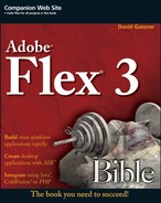
}Figure 10.1 shows the resulting application with an HBox and VBox that use the same styles.
Tip
Type selectors that designate a superclass are inherited by subclasses even when the styles used in the selector are marked in the documentation as not implementing CSS inheritance. The documentation is describing which styles are inherited based on containership.
For example, if you apply font-based styles, which are inheritable, to a VBox selector, all text controls nested in VBox containers use those styles. Non-inheritable styles such as the border styles shown in the previous example are only applied to the VBox itself, and not to its nested child objects.
Class inheritance also is taken into account with custom components. If a custom component named MyComponent is extended from the VBox or HBox containers, it also would apply the inheritable styles declared in the Box selector.
Because the Canvas container isn't extended from Box, to apply the same styles to this container as well, you could use a multiple type selector:
Box, Canvas {
  . . . style declarations . . .
}A style name selector, also sometimes known as a class selector, consists of any valid string, prepended with a period (.). Style names are typically created with an initial lowercase character and any mixture of uppercase and lowercase characters after that. This style name selector contains a single style declaration:
.redFont {
  color:#ff0000;
}
Tip
Style name selectors are identical in purpose and declaration syntax to the HTML concept of class selectors. As with the style class in HTML, a style name defines a set of rules that can be applied to any object arbitrarily.
A style name selector doesn't apply its styles to any object on its own. Instead, each object "opts in" to apply the selector's styles with the styleName property. This Label control uses the style rules in the redFont selector:
<mx:Label text="Hello World" styleName="redFont"/>
Style name selectors can be declared in the Application or within any custom component. If the same style name selector is declared at two levels of the application's containership and sets conflicting values for any particular style, the declaration in the custom component takes precedence.
Tip
You use the period as a prefix to the style name only in the selector definition, not in the styleName property. If you include the period in the styleName property, the settings are ignored.
The global selector has a reserved name of global (always typed in all lowercase). Styles declared within the global selector are applied to all visual components in the entire application.
Caution
There aren't many styles that you'd want to apply to the entire application. This feature's use is typically restricted to setting default font styles such as fontFamily and color. It wouldn't make sense, for example, to apply border or padding styles to every object in the application.
This global declaration sets the default font family and color for the entire application:
global {
  font-family:Times New Roman, Times, serif;
  color:purple;
}You can embed a style sheet in an MXML application or component with the <mx:Style> compiler tag set. As previously described, a style sheet embedded in a custom component can include only style name selectors. Style sheets embedded in the Application can contain a mixture of type, style name, and global selectors.
Caution
The <mx:Style> tag must be declared as a direct child element of the MXML file's root element. An <mx:Style> tag placed within any other child element in the MXML containership results in a compiler error.
The code in Listing 10.1 shows an application with an embedded style sheet. The embedded style sheet's selectors and rules are applied to the entire application.
Example 10.1. An embedded style sheet
<?xml version="1.0" encoding="utf-8"?>
<mx:Application xmlns:mx="<st>http://www.adobe.com/2006/mxml"
   horizontalAlign="center"
  layout="horizontal">

  <mx:Style>

    global {
      font-family:Times New Roman, Times, serif;
      color:purple;
    }

    Box {
      background-color:silver;
      border-style:solid;
      border-color:black;
      border-thickness:2;
      padding-top:5;
      padding-bottom:5;
      padding-left:5;
      padding-right:5;
    }

    .redFont {
      color:#ff0000;
    }

  </mx:Style>

  <mx:VBox>
    <mx:Label text="Hello World" styleName="redFont"/>
    <mx:Button label="Click me"/>
  </mx:VBox>

  <mx:HBox>
    <mx:Label text="Hello World"/>
    <mx:Button label="Click me"/>
  </mx:HBox>

</mx:Application>
Note
The code in Listing 10.1 is available in the Web site files as EmbeddedStyles.mxml in the chapter10 project. ON the WEB ON the WEB
You can store style sheets in text files with a file extension of .css. As with embedded style sheets, an external style sheet contains a collection of style selectors, each declaring one or more style and value.
Flex Builder can create a new style sheet for you in a couple of ways:
As a new blank style sheet file
By exporting existing styles from Design view to a new external style sheet
Creating a blank style sheet
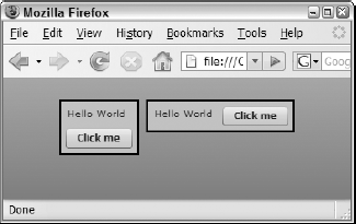
To create a new blank style sheet, select File → New → CSS File from the Flex Builder menu, or right-click in the Flex Navigator view and select New → CSS File . As shown in Figure 10.2, set the filename and location of the CSS file.
Note
You can save external style sheets anywhere in your project. The <mx:Style> tag styles are added to the application at compile time and are not loaded at runtime, so the style sheet file technically doesn't have to be in the source folder; however, I recommend that you place it in the source folder or somewhere in its subfolder structure.
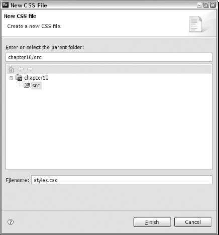
After you've created the external style sheet file, you can manually add selectors and properties. As shown in Figure 10.3, Flex Builder provides code completion support in external style sheets that helps you correctly type the property names and values. To get code completion help at any time, press Ctrl+spacebar to see available properties and values.
Listing 10.2 shows the contents of an external style sheet file. Notice that there is no <mx:Style> tag set, because this is no longer an MXML file.
Example 10.2. An external style sheet file
global {
  font-family:Times New Roman, Times, serif;
  color:purple;
}
Box {
  background-color:silver;
  border-style:solid;
  border-color:black;
  border-thickness:2;
  padding-top:5;
  padding-bottom:5;
  padding-left:5;
  padding-right:5;
}
.redFont {
color:#ff0000;
}Note
The code in Listing 10.2 is available in the Web site files as styles.css in the chapter10 project.
To incorporate an external style sheet into an application, declare the <mx:Style> tag set with a source property referring to the style sheet file by its name and relative location:
<mx:Style source="styles.css"/>
Caution
When you declare <mx:Style> with a source property, you cannot also include nested CSS declarations. You can, however, declare more than one <mx:Style> tag set in an application or component.
Listing 10.3 shows the application now referring to an external style sheet.
Example 10.3. An application referring to an external style sheet
<?xml version="1.0" encoding="utf-8"?>
<mx:Application xmlns:mx="<st>http://www.adobe.com/2006/mxml"
  horizontalAlign="center" layout="horizontal">
  <mx:Style source="styles.css"/>
  <mx:VBox>
    <mx:Label text="Hello World" styleName="redFont"/>
    <mx:Button label="Click me"/>
  </mx:VBox>
  <mx:HBox>
    <mx:Label text="Hello World"/>
    <mx:Button label="Click me"/>
  </mx:HBox>
</mx:Application>
Note
The code in Listing 10.3 is available in the Web site files as ExternalStyles.mxml in the chapter10 project.
Exporting existing styles
Flex Builder 3 adds a new feature that allows you to export inline styles of any component instance to an external style sheet and then link the current application to that external file.
When you export styles from a component instance, you can define what kind of selector the styles should be applied to the following:
All components (the global selector)
All components with style name
The current specific component's name
The current specific component's name plus a style name
Follow these steps to learn how this feature works:
Create a new MXML application named
ExportStyles.mxmlwith itslayoutproperty set tovertical.If the application opens in Source view, switch to Design view.
Drag a
Labelfrom the Components view into the application.In the Flex Properties view, set the
Labelcomponent's properties as follows:text: Hello World
color: #ff0000
fontSize: 14
Switch to Source view.
Your application code should look like this:
<?xml version="1.0" encoding="utf-8"?>
<mx:Application xmlns:mx="<st>http://www.adobe.com/2006/mxml"
  layout="vertical">

  <mx:Label text="Hello World" color="#ff0000" fontSize="14"/>

</mx:Application>
Switch back to Design view, and select the
Labelcontrol.In the Flex Properties view, click Convert to CSS, as shown in Figure 10.4.
If prompted to save changes to the application, click Yes.
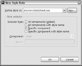
In the New Style Rule dialog box, shown in Figure 10.5, select New to create a new CSS style sheet.
In the New CSS File dialog box, name the new style sheet
newStyleSheet.cssin the project'ssrcfolder and click Finish.In the New Style Rule dialog box, select Specific component and click OK. Flex Builder should now display the new CSS file in Design view.
Return to the application and switch to Source view.
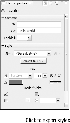
Click to export styles
The application's source now contains an <mx:Style> declaration pointing to the external style sheet, and the Label control's inline styles have been removed:
<?xml version="1.0" encoding="utf-8"?>
<mx:Application xmlns:mx="http://www.adobe.com/2006/mxml"
    layout="vertical">
    <mx:Label text="Hello World"/>
    <mx:Style source="newStyleSheet.css"/>
</mx:Application>
The external style sheet now contains the styles that were part of the Label declaration, now applied in a type selector:
/* CSS file */
Label
{
    color: #ff0000;
    fontSize: 14;
}
Note
The complete code from the preceding exercise is available in the Web site files as ExportStylesComplete.mxml and newStyleSheetComplete.css in the chapter10 project.
Style sheets can be compiled into external .swf files and then loaded at runtime.
Note
Neither Flash Player nor the Flex framework includes a CSS parser that would allow a Flex application to parse a "raw" CSS file at runtime. The ability to load a pre-compiled CSS file was added to Flex in version 2.0.1.
Flex Builder 3 can create a compiled style sheet with a simple menu selection. These steps describe how to compile a style sheet:
Create a new external style sheet named
compiledstyles.cssin the current project'ssrcfolder.Add a
Labelselector thatsetsthecolortoblue, the font-sizeto 18, and the font-weighttobold:Label { color:blue; font-size:18; font-weight:bold; }Save the external style sheet file.
As shown in Figure 10.6, right-click the style sheet file in the Flex Navigator view and select Compile CSS to SWF.
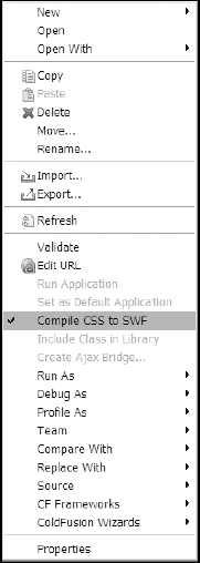
The compiled SWF file is created in the same folder as the external style sheet, and is also copied to the project's output folder.
Tip
Once the Compile CSS to SWF option has been selected for any particular external style sheet, the compilation option remains selected for that file until you deselect it. Whenever Flex Builder rebuilds the project, the CSS file is recompiled as well.
You should see the new compiledstyles.swf file in the project source folder.
The compiled style sheet file becomes an asset that can be dynamically loaded at runtime. Its styles can then immediately be applied to existing component instances in the application.
To load the precompiled application at runtime, use an ActionScript class named StyleManager. The class has a method named loadStyleDeclarations() that loads compiled style sheets and optionally updates the application's style declarations immediately.
Follow these steps to use the StyleManager class:
Create a new MXML application named
RuntimeStyles.css.Add a
Labelcontrol with atextproperty ofHello World.Add a
Buttoncontrol with a label ofLoad Styles. Set its click event listener to execute this code:StyleManager.loadStyleDeclarations('compiledstyles.swf'),Listing 10.4 shows the completed application.
Example 10.4. An application loading a compiled style sheet at runtime
<?xml version="1.0" encoding="utf-8"?>
<mx:Application xmlns:mx="http://www.adobe.com/2006/mxml"
    layout="vertical">

    <mx:Label text="Hello World"/>

    <mx:Button label="Load Styles"
    click="StyleManager.loadStyleDeclarations(
      'compiledstyles.swf'),"/>

</mx:Application>
Note
The code in Listing 10.4 is available in the Web site files as
RuntimeStylesComplete.mxmlin thechapter10project.Run the application.
Click Load Styles.
When the application first loads, the Label control is displayed with its default font color, weight, and size. When you click Load Styles, the application loads the compiled style sheet and updates the Label control's presentation.
Using the StyleManager class, you also can unload styles, delay style updates, and react to various events in the process of working with dynamic styles.
Note
For more information on runtime loading of styles, visit http://livedocs.adobe.com/labs/flex3/html/help.html?content=styles_10.html.
You can control styles at runtime in many ways. These tasks are available:
Loading of compiled style sheets (described in the preceding section)
Setting and getting styles for individual component instances
Modifying selectors and their properties
Changing a component instance's style name
Every visual component in the Flex framework supports methods named setStyle() and getStyle() that allow you to set or get any particular style's values. As described previously, you cannot use simple dot syntax to access style information (as you might with a component property). This code, for example, would produce a compiler error:
myLabel.fontSize=18;
The use of dot syntax to separate a component instance id and its members works with properties, but not with styles.
Instead, use the setStyle() method to reset a style's value at runtime:
myLabel.setStyle("fontSize", 18);And use the getStyle() method to get a style's value:
var currentSize:Number = myLabel.getStyle("fontSize");The code in Listing 10.5 shows an application with Label control and two Button controls. Clicking Change Font Size results in modifying the Label control's font size at runtime. Clicking Get Font Size displays the Label control's current font size.
Example 10.5. Setting and getting style values
<?xml version="1.0" encoding="utf-8"?>
<mx:Application xmlns:mx="http://www.adobe.com/2006/mxml"
      layout="vertical">

    <mx:Label id="myLabel" text="Hello World" fontSize="10"/>

    <mx:Button label="Change Font Size"
    click="myLabel.setStyle('fontSize', 18)"/>
<mx:Button label="Get Font Size"
click="myLabel.text='Current font size: ' +
myLabel.getStyle('fontSize')"/>
</mx:Application>Note
The code in Listing 10.5 is available in the Web site files as SettingAndGettingStyles.mxml in the chapter10 project.
As shown in Figure 10.7, the Label displays its own current font size when the second button is clicked.

Caution
Styles are never bindable at runtime. This code, which tries to bind to a style's current value at runtime, succeeds upon application startup, but fails to execute when the target component's style changes at runtime:
<mx:Label text="{'Current font size: ' + myLabel.getStyle('fontSize')}"/>You can modify style selectors at runtime with the CSSStyleDeclaration and StyleManager classes. You can use one of these approaches:
Using bound CSS declarations
To bind a CSSStyleDeclaration to a style selector, pass the selector as an argument to the class's constructor method:
var style:CSSStyleDeclaration = new CSSStyleDeclaration("Label");Then, to change the styles in the selector, use the object's setStyle() method using the same syntax as with individual component instances:
style.setStyle("fontSize", 18);When the setStyle() method is executed, the selector and any component instances it effects are updated immediately.
Binding CSS declarations with the StyleManager class
You can delay updates of styles by using unbound instances of CSSStyleDeclaration. To create an unbound style declaration, use the class's constructor method without any arguments:
var style:CSSStyleDeclaration = new CSSStyleDeclaration();
Set the style declaration's rules with the setStyle() method as described previously. Then, to bind the declaration to a style selector, call StyleManager.setStyleDeclaration() with three arguments:
The style selector name
The
CSSStyleDeclarationinstanceA Boolean value indicating whether you want to update the styles immediately
The code in Listing 10.6 declares an unbound instance of CSSStyleDeclaration, sets two styles, and then binds and updates the styles.
Example 10.6. Binding CSS declarations with StyleManager
<?xml version="1.0" encoding="utf-8"?>
<mx:Application xmlns:mx="http://www.adobe.com/2006/mxml"
      layout="vertical">
  <mx:Script>
    <![CDATA[
      private function setLabelStyles(size:Number, weight:String):void
      {
        var style:CSSStyleDeclaration = new CSSStyleDeclaration();
        style.setStyle("fontSize", size);
        style.setStyle("fontWeight", weight);
        StyleManager.setStyleDeclaration("Label", style, true);
}
]]>
</mx:Script>
<mx:Style>
Label {
font-size:12;
}
</mx:Style>
<mx:Label text="Hello World"/>
<mx:Button label="Change Label Styles"
click="setLabelStyles(18, 'bold')"/>
</mx:Application>Note
The code in Listing 10.6 is available in the Web site files as ChangingSelectors.mxml in the chapter10 project.
Skinning refers to the process of applying a set of graphics that replace a visual component's default appearance. You can create skins either graphically or programmatically. In this section, I describe the process of creating and applying programmatic skins.
A graphical skin is an image that is designed to replace the default appearance of a Flex visual component. You can create graphical skins in these formats:
GIF
PNG
JPG
SWF
When a skin graphic will always be displayed with the same dimensions, you can use bitmap graphics built in any of these formats and have the freedom to use any graphical editing application you like. Many applications successfully create .png, .gif, and .jpg format graphic files, including Adobe Fireworks, Photoshop, and Illustrator.
When you create a bitmap graphic to use as a skin, the original graphic should be sized exactly as you want it to appear in Flex. For example, all the graphical skins that will be used to visually represent the CheckBox controls typically share the same dimension of width and height (to create a square appearance).
Graphical skins are assigned to visual components through the styles API. The Styles documentation for any particular visual component will include both simple styles that require values typed as String, Number, and Array values and skinning styles that require embedded graphics. For example, the CheckBox component supports these graphical skins to represent the box and tick mark area of the control:
upIcondownIconoverIconupSelectedIcondownSelectedIconoverSelectedIcondisabledIcondisabledSelectedIcon
In order to properly skin the CheckBox component, each icon style should have a graphic assigned to it. To assign a skin, add the appropriate style name, followed by an Embed() declaration that references the graphic file. This declaration means the downIcon.png graphic is displayed when the mouse button is down over a CheckBox with a selected property of true:
downSelectedIcon: Embed(source="skins/downSelectedIcon.png");
Assuming you've created a bitmap graphic for each button state, the CheckBox selector might look like this:
CheckBox
{
    upIcon: Embed(source="skins/upIcon.png");
    downIcon: Embed(source="skins/downIcon.png");
    overIcon: Embed(source="skins/overIcon.png");
    disabledIcon: Embed(source="skins/disabledIcon.png");
    selectedUpIcon: Embed(source="skins/selectedUpIcon.png");
    selectedOverIcon: Embed(source="skins/selectedOverIcon.png");
    selectedDownIcon: Embed(source="skins/selectedDownIcon.png");
    selectedDisabledIcon:
      Embed(source="skins/selectedDisabled.png");
}
The first three types of graphics listed here are bitmap graphics, meaning that they store information about individual pixels in the graphic file. These types of graphics don't always scale well when stretched to accommodate a visual component that's been resized. A graphic created as a .png file may look fine when presented in its original size, but when its size is expanded at runtime, it shows the raw pixels in a phenomenon known as pixelating or stair steps.
Figure 10.9 shows a bitmap graphic in its original size of 30 pixels height and width and the same graphic displayed at three times its original size.
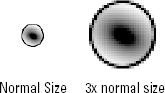
With a bitmap image, the graphic is distorted and pixelated when it's expanded to a scale greater than 100 percent of its original size.
Note
A Flex application file that displays the bitmap graphic is available in the Web site files as BitMapScaling.mxml in the chapter10 project.
Vector graphics store their information mathematically instead of one pixel at a time. As a result, when these graphics are scaled to a larger size, they don't distort in the same way. You can create vector graphics with either Adobe Flash or Illustrator CS3.
Figure 10.10 shows a vector graphic created in Flash with its original size of 30 pixels height and width and the same graphic displayed at three times its original size.
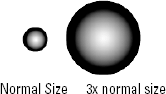
With the vector graphic, the edges of the graphic are recalculated as its scale is increased. The resulting smooth lines and gradients are clearly a better result than with the bitmap approach.
Note
A Flex application file that displays the vector graphic is available in the Web site files as VectorScaling.mxml in the chapter10 project.
The Flex framework uses a skinning library built in Flash CS3 to determine a Flex application's default visual appearance. The Flash source file that's used to build the graphical skinning library is named AeonGraphical.fla and is stored in this folder under the Flex Builder installation folder:
sdks/3.0.0/frameworks/themes/AeonGraphical/src
If you have Flash CS3, you can open this file and see how it's built. Follow these steps to build it yourself:
Open Flash CS3.
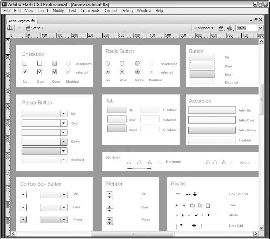
Open AeonGraphical.fla from
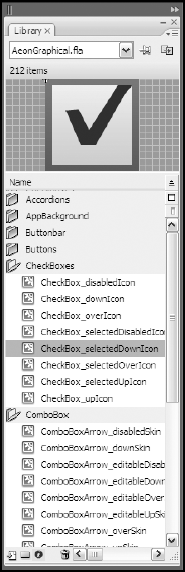
sdks/3.0.0/frameworks/themes/AeonGraphical/srcunder the Flex Builder installation folder. Figure 10.11 shows the Flash file's stage, which contains one instance of each skinning graphic.Select Window → Library from the Flash menu to open the Library panel. As shown in Figure 10.12, each skinning graphic is stored as a symbol in the Flash document library.
Follow these steps to create a new skinning graphic in Flash CS3:
Create a new graphic object in Flash.
Convert the graphic to a MovieClip symbol.
Add linkage to export the graphic for use in ActionScript.
Publish the Flash document to .
swfformat.
After the Flash document has been created, you're ready to use the skinning graphic in a Flex application.
If you're working with Flash and have downloaded the exercise files from the Web site, follow these steps to view a document showing simple skinning graphics for the CheckBox component:
Open Flash CS3.
Open
CheckBoxSkins.flafrom thechapter10project'ssrc/skinssubfolder. As shown in Figure 10.13, the Flash source file displays eight symbol instances.Select Window → Library to open the Library panel.
Double-click any symbol to open it in edit mode.
Notice that each skin consists of simple graphic and optional text elements.
Tip
To zoom in on the symbol and display it in a larger size, press Ctrl+=.
Click Scene 1 to return to the document stage.
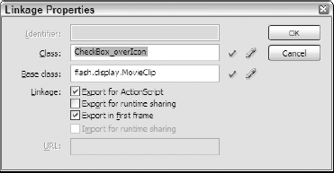
Right-click any symbol in the library, and select Linkage.
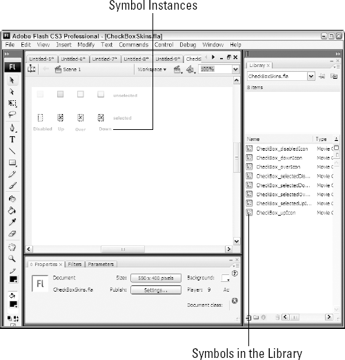
As shown in Figure 10.14, the Linkage properties for each symbol have a class consisting of the component name and the skinning style name, separated by an underscore (_) character.
Flash symbols that will be used as graphical skins have these requirements:
At least one instance of each symbol must be placed on the stage. If no instances of a symbol are on the stage, Flash doesn't include the symbol in the compiled .swf file.
Each symbol must have an external class set through its Linkage properties.
If any ActionScript code is included in the symbol, the document must be published as a Flash 9 document using ActionScript 3, because Flash Player 9 cannot execute both ActionScript 2 and ActionScript 3 in the same document.
After publishing a document as an .swf file, you're ready to use the Flash symbols as graphical skins.
As described previously, graphical skins are assigned to visual components through the styles interface. When you assign a Flash symbol as a graphical skin, the syntax is similar to that for a bitmap graphic, but you also need to tell the Flex compiler which symbol to use.
This declaration assigns the CheckBox component's downSelectedIcon skin to the appropriate symbol from a compiled Flash document:
downSelectedIcon: Embed(source="skins/CheckBoxSkins.swf",
  symbol="CheckBox_downSelectedIcon");
Flex Builder 3 adds a new feature that allows you to import bitmap or vector-based graphical skins and create the required style sheet declarations. The resulting output is stored in an external style sheet that can then be linked into the application with an <mx:Style> tag set.
You can import vector-based skins that are created in Flash CS3 or Illustrator CS3. In this section, I describe how to prepare skins for import in Flash and then how to import them into your project.
Preparing symbols in Flash for import
Before you can import graphical skins with the Flex Builder skin artwork import tool, the skins must be exported to a Flash component library. A component library is an archived file in .zip format with a file extension of .swc.
Follow these steps to export multiple MovieClip symbols from Flash CS3:
In the Flash document that contains the symbols, ensure that each symbol you want to export has Linkage properties with a valid class name.
Tip
For the best import results, set the symbol's Linkage class name as the name of the Flex component for which the graphical icon will be used and the skin name as described in the Flex documentation, separated by the underscore (_) character. When you import this symbol, the import tool suggests binding the graphic to the component and skin style name with this information. For example, the symbol for the
CheckBoxcomponent'supIconstyle would have a Linkage class name ofCheckBox_upIcon.Add one instance of each symbol to the stage.
Select all symbols you want to export, and select Modify→Convert to Symbol from the Flash menu.
In the Convert to Symbol dialog box, enter any descriptive string as the Name, and enter Movie Clip as the Type.
Right-click the new symbol in the Library, and select Linkage from the context menu.
In the Linkage Properties dialog box, select Export for ActionScript.
As shown in Figure 10.14, set the Class to a valid ActionScript class name (no spaces or other special characters are allowed), and click OK to save the Linkage properties.
Right-click the new symbol in the Library panel, and select Export SWC File.
Save the file into the Flex project folder.
You're now ready to import the graphical skin symbols.
Importing skin artwork
Flex Builder's skin artwork import tool can import graphical skins from these kinds of files:
Flash component libraries in .swc format
Flash .swf files created in Illustrator CS3
Bitmap graphics in .png, .gif, and .jpg format
Follow these steps to import graphics from a Flash component library created using the steps in the preceding section:
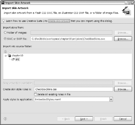
Select File → Import.Skin Artwork from the Flex Builder menu.
As shown in Figure 10.15, select the radio button for SWC or SWF file and then choose the .swc file you created in Flash.
Select a new or existing .css file in which the skin style rules should be created.
Select an application you want to use the graphical skins.
Click Next.
In the Import Skin Artwork dialog box, shown in Figure 10.15, select each Symbol Class you want to import and assign it a Style Selector and a Skin Part.
Tip
The settings shown in Figure 10.15 are assigned automatically by the import tool, because the skin symbol class names match the component and skin style names as described previously.
Click Finish to import the skin symbols.
The .css file you select now contains skin style declarations wrapped in the selectors you selected. Listing 10.7 shows the resulting style sheet declaration code.
Example 10.7. Imported style sheet declarations
CheckBox
{
    disabledIcon: Embed(skinClass="CheckBox_disabledIcon");
    downIcon: Embed(skinClass="CheckBox_downIcon");
overIcon: Embed(skinClass="CheckBox_overIcon");
selectedDisabledIcon:
Embed(skinClass="CheckBox_selectedDisabledIcon");
selectedDownIcon: Embed(skinClass="CheckBox_selectedDownIcon");
selectedOverIcon: Embed(skinClass="CheckBox_selectedOverIcon");
selectedUpIcon: Embed(skinClass="CheckBox_selectedUpIcon");
upIcon: Embed(skinClass="CheckBox_upIcon");
}Note
The code in Listing 10.7 is available in the Web site files as CheckBoxSkins.css in the chapter10 project.
Because the skin symbols are now stored as ActionScript classes in a component library, this syntax assigns each of them to the appropriate style name:
overIcon: Embed(skinClass="CheckBox_overIcon");
The import tool also explicitly adds the component library to the Flex project's build path, as shown in Figure 10.16. Each Flash symbol is exported as an ActionScript class in the component library, the library is in the project's build path, and the style declarations bind the Flash symbol classes to the Flex visual components.
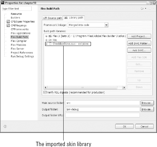
The imported skin library
A complete Flash-based skin library will contain many graphic symbols wrapped in a component library and an associated .css file that binds the symbols to the visual components during the compilation process.
In this chapter, I described the use of Cascading Style Sheets to effect the visual presentation of Flex applications. You learned the following:
Cascading Style Sheets (CSS) are implemented in the Flex framework as the primary mechanism for controlling a Flex application's visual appearance.
You can declare styles with inline style declarations, and with embedded or external style sheets.
Styles can be controlled at runtime with ActionScript code.
Skins are one type of style that can be used to dramatically change an application's appearance.
You can create skinning graphics in bitmap or vector formats.
Vector graphics designed for use as skins can be created in Illustrator CS3 or Flash CS3.
You can import skin artwork with Flex Builder's import tool.