In applications that are built for windows-style operating systems, such as Microsoft Windows, Mac OS X, and the various windowing interfaces on Linux and other operating systems, pop-up windows are commonly used to get the user's attention, provide information, and collect data. Not all Flex applications have or require pop-up windows, but they're a common interface that users of these operating systems easily recognize and know how to use.
Flex applications are able to present pop-up windows in a variety of forms. Whether you want to display a simple information message or create a more customized user experience, you have these options:
The
Alertclass creates a simple pop-up dialog box displaying simpleStringvalues. TheAlertclass also can be used to allow the user to confirm or cancel an operation before it's executed, and it can include a custom graphical icon.The
PopUpMenuButtoncontrol displays a two-partButtoncontrol that displays a single-level pop-up menu when clicked.The
PopUpButtoncontrol combines aButtonwith any other visual component that you want to display when clicked.Custom pop-up windows can be created with the
TitleWindowcontainer, and presented and managed with thePopUpManagerclass.
In this chapter, I describe each of these options and provide examples of how these classes and controls can be used.
Note
To use the sample code for this chapter, import the chapter13 .zip Flex project archive from the Web site files into your Flex Builder workspace.
The mx. controls . Alert class can present dialog boxes as pop-up windows that either present simple informational messages or allow the user to accept or decline an operation. In addition, the pop-up windows generated by the Alert class can include a custom icon graphic in their presentation.
The Alert class displays a pop-up dialog box in response to a call to the class's static show () method. The syntax of the method is:
show(text:String = "", title:String = "",
    flags:uint = 0x4, parent:Sprite = null,
    closeHandler:Function = null,
    iconClass:Class = null, defaultButtonFlag:uint = 0x4):Alert
Tip
All of the show() method's arguments are optional, but you almost always pass in the first text argument (the string you want to display in the body of the pop-up window).
Tip
Before calling the Alert class's methods, it must be imported. You can import the Alert class with this explicit import statement:
import mx.controls.Alert;
You also can import the class with a wildcard statement that includes all classes in the mx.controls package:
import mx.controls.*;
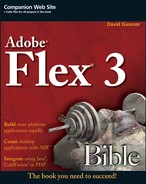
The most common use of the Alert class is to present a simple dialog box with up to two text messages. To present this sort of dialog box, call the class's show () method and pass in two String arguments:
Alert.show("This is a simple informational message", "Alert
   Title");
The first String argument passed into Alert. show () appears in the body of the dialog box, and the second String appears as the dialog box title.
Figure 13.1 shows a simple Alert pop-up dialog box with the two text messages.
A pop-up window that's modal blocks the user from interacting with the rest of the application as long as the dialog box appears on the screen. In Flex, some pop-up windows are modal and others aren't.
When you present a pop-up dialog box with the Alert class, it's modal by default, so the user has to click a button or otherwise close the window before continuing his work with the rest of the application.
Modal pop-up windows in Flex have a special feature that lets the user know the application isn't currently available as long as the pop-up window is visible. When the pop-up window appears on the screen, the rest of the application is blurred so that its appearance clearly indicates to the user that he can't use it until he takes some action. The visual result, where the dialog box is presented in clear resolution and the remainder of the application is blurry, is a visual indicator that the user must take some action to continue.
The Alert pop-up window is modal by default. You can make the Alert class present a non-modal window by passing the Alert .NONMODAL constant into the show() method as a flag. The Alert class has constants designed for use as flags. The others are used to present specific buttons in the pop-up dialog box.
Flags are passed into the show () method as the third argument. This code creates a non-modal pop-up window:
Alert.show("This is a non-modal Alert window",
    "Non-modal Alert", Alert.NONMODAL);
Figure 13.2 shows the resulting non-modal pop-up window. Notice that the application in the background isn't blurry and can accept user focus.

Tip
You also can present a non-modal pop-up window with a custom container based on i TitleWindow and managed with PopUpManager.
You can present a pop-up window created by the Alert class with buttons labeled Yes, No, OK, and Cancel. You determine which buttons will be presented with the show () methods flags argument. To include more than one flag, separate them with the bitwise OR operator (|) and wrap the entire expression in parentheses.
This call to Alert. show () presents a dialog box with Yes and No buttons, shown in Figure 13.3:
Alert.show("This is an Alert dialog box with custom buttons",
    "Alert with Buttons",
    (Alert.YES | Alert.NO));
Non-modal dialog boxes with multiple buttons
If you want to present an Alert dialog box with multiple buttons and make it non-modal, include the Alert .NONMODAL constant in the flags argument:
Alert.show("This is a non-modal Alert dialog box with custom
      buttons",
    "Non-modal Alert with Buttons",
(Alert.YES | Alert.NO | Alert.NONMODAL));The labels of the various buttons are determined by these static properties of the Alert class:
yesLabel:The label on the Yes buttonnoLabel:The label on the No buttonokLabel:The label on the OK buttoncancelLabel:The label on the Cancel button
These properties should be set prior to calling the Alert. show() method. In addition, because buttons in the Alert dialog box don't automatically resize themselves based on their labels, you may need to explicitly set the Alert .buttonWidth property to specific width in terms of pixels:
private function alertWithButtonLabels():void
{
    Alert.yesLabel = "Fer sure!!!";
    Alert.noLabel = "NO WAY!!";
    Alert.buttonWidth = 100;
    Alert.show("This is an Alert dialog box with custom button
      labels",
    "Alert with Button Labels", (Alert.YES | Alert.NO));
}
Figure 13.4 shows an Alert dialog box with custom button labels.
Caution
Changes to Alert button properties such as buttonWidth, okLabel, and ncelLabel survive only for a single call to Alert. show (). After the method has been called, the button labels return to their default values.

Setting a default button
When an Alert pop-up window has multiple buttons, the first button is the default. If the user presses Enter or Return without any other window interactions, it's the equivalent of clicking that button. To change the default button, pass the selected button's flag constant in the show () method's seventh argument. Because you have to pass in all other arguments, just pass null in the arguments you aren't using:
Alert.show("This Alert dialog box's default button is Cancel",
    "Alert with default Button",
    (Alert.OK | Alert.CANCEL),
    null, null, null,
    Alert.CANCEL);
The user can click other buttons or press the Tab key to move focus from one button to another, but if he presses Enter or Return immediately upon the pop-up dialog box's appearance, the close event handler indicates that the default button was clicked.
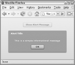
When you add multiple buttons to an Alert dialog box, you usually want to react in some way to whichever button the user clicks. When the user clicks any button to close the dialog box, an event object typed as mx. events . CloseEvent is generated. To find out which button was clicked, create a custom event handler function that accepts this event object as its only argument and returns void. Within the event handler function, the event object's detail property references the flag constant representing that button.
private function alertCloseHandler(event:CloseEvent):void
{
    if (event.detail == Alert.OK)
{
Alert.show("You clicked " + Alert.okLabel,
"Close Event Handler");
}
else
{
Alert.show("You clicked " + Alert.cancelLabel,
"Close Event Handler");
}
}Tip
You may want to use the close event handler function even if your pop-up window only has a single button. For example, you can use it to store a reminder that the user has been warned about a particular condition so you don't have to show the pop-up window again.
You designate the event handler function by passing the function name as the show () method's fifth argument:
Alert.show("An Alert dialog box with close event handler",
"Alert Event Handler", (Alert.OK | Alert.CANCEL),
null, alertCloseHandler);When the user clicks any of the pop-up dialog box's buttons, the close event is handled by the custom event handler and you have an opportunity to execute ActionScript code.
In the resulting application, shown in Figure 13.5, the user is informed as to which button was clicked.
You can display a graphical icon in the body of the Alert pop-up window with the iconClass argument. Graphical icons must be embedded in the application, so you first declare the graphic with the [Embed] metadata tag and assign it a Class variable name:
[Embed(source="assets/questionicon.png")] private var questionlcon:Class;
In the call to Alert. show (), pass the Class variable representing the graphic as the sixth argument:
Alert.show("An Alert dialog box with custom icon",
"Alert Event Handler", 0, null, null,
questionIcon);Figure 13.6 shows the Alert dialog box with the custom icon.

Tip
Graphics designed for use as icons in the Alert pop-up window should be small and their backgrounds either should be transparent (a reason to use .gif, .png, or .swf files) or should match the backgroundColor style of the window. The Alert class's backgroundColor style is set to #90A4AE by default.
Note
The graphic used in this example was created in Adobe Fireworks CS3, but you can use any graphics application you're familiar with to create the required assets.
The application in Listing 13.1 contains demo code for all of the preceding uses of the Alert, show () method.
Example 13.1. Using the Alert.show() method
<?xml version="1.0" encoding="utf-8"?>
<mx:Application xmlns:mx="http://www.adobe.com/2006/mxml"
layout="vertical"
backgroundColor="#eeeeee">
<mx:Script>
<![CDATA[
import mx.events.CloseEvent;
import mx.controls.Alert;
[Embed(source="assets/questionicon.png")]
private var questionIcon:Class;
private function simpleAlert():void
{
Alert.show("This is a simple informational message", "Alert
Title");
}
private function nonModalAlert():void
{
Alert.show("This is a non-modal Alert window", "Non-modal
Alert",
Alert.NONMODAL);
}
private function alertWithButtons():void
{
Alert.show("This is an Alert dialog box with multiple buttons",
"Alert with Buttons", (Alert.YES | Alert.NO));
}
private function alertWithButtonLabels():void
{
Alert.yesLabel = "Fer sure!!!";
Alert.noLabel = "NO WAY!!";
Alert.buttonWidth = 100;
Alert.show("This is an Alert dialog box with custom button
labels",
"Alert with Button Labels", (Alert.YES | Alert.NO));
}
private function alertWithDefaultButton():void
{
Alert.show("This Alert dialog box's
"Alert with default Button", (Alert.OK | Alert.CANCEL),
null, null, null, Alert.CANCEL);
}
private function alertWithCloseHandler():void
{Alert.show("An Alert dialog box with close event handler",
"Alert Event Handler", (Alert.OK | Alert.CANCEL),
null, alertCloseHandler);
}
private function alertCloseHandler(event:CloseEvent):void
{
if (event.detail == Alert.OK)
{
      Alert.show("You clicked " + Alert.okLabel,
        "Close Event Handler");
    }
    else
    {
      Alert.show("You clicked " + Alert.cancelLabel,
        "Close Event Handler");
    }
}
private function alertWithCustomIcon():void
{
Alert.show("An Alert dialog box with custom icon",
"Alert Event Handler", 0,null, null,
questionIcon);
}
]]>
</mx:Script>
<mx:Button label="Show Alert Message" click="simpleAlert()"
width="{widestButton.width}"/>
<mx:Button label="Show Non-modal Alert Message"
click="nonModalAlert()"
id="widestButton"/>
<mx:Button label="Alert with Buttons" click="alertWithButtons()"
width="{widestButton.width}"/>
<mx:Button label="Alert with event handler"
click="alertWithCloseHandler()" width="{widestButton.width}"/>
<mx:Button label="Alert with Button Labels"
click="alertWithButtonLabels()" width="{widestButton.width}"/>
<mx:Button label="Alert with Default Button"
click="alertWithDefaultButton()" width="{widestButton.width}"/>
<mx:Button label="Alert with custom icon"
click="alertWithCustomIcon()"
width="{widestButton.width}"/>
</mx:Application>Note
The code in Listing 13.1 is available in the Web site files as AlertDemos.mxml in the chapterl3 project. The graphic file used in the custom icon example is available as questionicon.png in the project's src/assets folder.
You can change the Alert pop-up windows appearance with these CSS selectors:
The Alert type selector affects the body of the pop-up window. Most styles that you might use with the Panel container also work on the Alert dialog box.
The .
windowStylesstyle name selector affects the title area of the pop-up window. You can change the name of this class selector with theAlertclass'stitleStyleName style, but it should always be set on a global basis for the entire application. Setting this value withsetStyle() for only one call toAlert. show() can result in incorrect sizing.
These styles can be set in the Alert type selector to change the overall appearance of the window:
Font styles such as
color, fontSize, fontFamily, and so on affect the text within the body of the window.Background styles such as
backgroundColor, backgroundlmage, andbackgroundAlphachange the background of the windows center area.Window styles, including
cornerRadiusandroundedBottomCorners, affect the outer edges of the window.Border styles such as
borderStyleandborderColoraffect the outer border of the window.
Font styles also can be set in the . windowStyles selector to change the appearance of text in the windows header region.
Caution
The windowStyles selector is also used by the Panel and TitleWindow containers. Any changes to the selector are applied to all instances of these containers as well as pop-up windows created by the Alert class.
The application in Listing 13.2 contains an embedded style sheet that changes styles for both the pop-up windows body and title area. The window has extreme round corners at the top and square corners at the bottom, a typewriter font in the body, and a sans serif font in the title.
Example 13.2. Changing the Alert window's appearance with styles
<?xml version="1.0" encoding="utf-8"?>
<mx:Application xmlns:mx="http://www.adobe.com/2006/mxml"
    backgroundColor="#eeeeee">
    <mx:Style>
Alert {
color:#000000;
background-color:#FFFFFF;
font-family:Courier, "_typewriter";
rounded-bottom-corners:false;
corner-radius:15;
border-color:#000000;
}
.windowStyles
{
font-family:Arial, "_sans";
font-size:14;
font-style:italic;
color:#FFFFFF;
}
</mx:Style>
<mx:Script>
<![CDATA[
import mx.controls.Alert;
private function simpleAlert():void
{
Alert.show("This is an Alert dialog box with styles applied",
"Alert Title");
}
]]>
</mx:Script>
<mx:Button label="Alert with Style" click="simpleAlert()"/>
</mx:Application>Note
The code in Listing 13.2 is available in the Web site files as AlertWithStyles.mxml in the chapter13 project.
As shown in Figure 13.7, the Alert dialog box uses the Alert and .windowStyles selectors to determine its visual presentation.

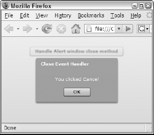
The PopUpMenuButton control combines the functionality of a Button with a menu. It's presented as a two-part visual component including a simple Button and an icon representing a down arrow. When the user clicks the control, it presents a menu populated with items from its data provider.
Caution
Unlike the Menu and MenuBar controls, the PopUpMenuButton doesn't support cascading menus. It's similar in some ways to the ComboBox control, in that it presents a single list of available items. But whereas the ComboBox presents only a single control and behavior, the Button control in the PopUpMenuButton supports all standard Button events.
The data provider for a PopUpMenuButton can be an XMLList, XMLList Collection, Array, or ArrayCol lection. If you use an XMLList, ensure that each of its XML nodes contains only simple values in the form of attributes or child nodes with text. Because cascading menus aren't possible, you can't use a deeply nested XML structure.
This XMLList is designed as a compatible data source for the PopUpMenuButton control:
<mx:XMLList id="xSizes">
    <node label="Small" value="S"/>
    <node label="Medium" value="M"/>
    <node label="Large" value="L"/>
</mx:XMLList>
The data provider also could be expressed as this ArrayCollection:
<mx:ArrayCollection id="acSizes">
       <mx:Object>
      <mx:label>Small</mx:label>
      <mx:value>Small</mx:value>
    </mx:Object>
    <mx:Object>
      <mx:label>Medium</mx:label>
      <mx:value>M</mx:value>
    </mx:Object>
    <mx:Object>
      <mx:label>Large</mx:label>
      <mx:value>L</mx:value>
    </mx:Object>
  </mx:ArrayCollection>
Whether you use an XMLor Array-based data set, the PopUpMenuButton displays a single-level menu when the user clicks the control's arrow icon, as shown in Figure 13.8.
As with the Menu and MenuBar controls, the PopUpMenuButton dispatches an itemClick event when the user selects an item from the pop-up menu. The same event is dispatched when the user clicks the Button portion of the control (the part of the control that displays its label). The itemClick event generates an event object typed as mx. events . MenuEvent, which has an item property that refers to the selected data item.
In the context of an event handler method, the expression event .item refers to the data item, and you can use E4X notation to refer to data node attributes or simple dot notation to refer to named properties of selected objects in an ArrayCollection.
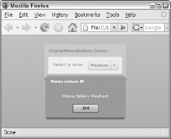
The application in Listing 13.3 uses a PopUpMenuButton control with data populated from an XMLList. When the user clicks the Button portion of the control or selects an item from its menu, the itemClick event is dispatched and the message displayed indicates which item has been selected.
Example 13.3. Using the PopUpMenuButton control
lt;?xml version="1.0" encoding="utf-8"?>
<mx:Application xmlns:mx="http://www.adobe.com/2006/mxml">
  <mx:Script>
  <![CDATA[
    import mx.controls.Alert;
    import mx.events.MenuEvent;
    public function itemClickHandler(event:MenuEvent):void {
      Alert.show("Menu label: " + event.item.@label,
      "Menu value: " + event.item.@value);
    }
    ]]>
    </mx:Script>
    <!-- A data provider in E4X format. -->
    <mx:XMLList id="xSizes">
      <node label="Small" value="S"/>
      <node label="Medium" value="M"/>
      <node label="Large" value="L"/>
    </mx:XMLList>
    <mx:Panel title="PopUpMenuButton Demo" layout="horizontal"
      paddingTop="10" paddingLeft="10" paddingRight="10"
     paddingBottom="10">
      <mx:Label text="Select a size:"/>
      <mx:PopUpMenuButton id="p2" dataProvider="{xSizes}"
        labelField="@label" itemClick="itemClickHandler(event);"/ >
  </mx:Panel>
</mx:Application>
Note
The code in Listing 13.3 is available in the Web site files as PopUpMenuButtoxiDemo.mxml in the chapterl3 project.
As shown in Figure 13.9, when the user clicks the Button portion of the control or selects an item from the pop-up menu, the itemClick event is handled.
The PopUpButton control allows you to create a Button made up of two sub-buttons, a main display button, and a pop-up button that, when clicked, presents any other visual control as a popup window. The only requirement for the component you use as the pop-up window is that it must include the UIComponent class in its inheritance hierarchy. You can use any pre-built container or control or any custom component as a pop-up window.
The PopUpButton control is commonly declared in MXML code somewhere in an Application or custom component:
<mx:PopUpButton id="myPopup" label="My Popup Button"/>
You then define the control's pop-up window and the window's events and data with ActionScript code.
The pop-up window displayed by a PopUpButton is created at runtime and is typically instantiated in ActionScript code. You first create an instance of the component you want to use, but don't add it to the current Application or component's display list. The component is then bound to the PopUpButton with the popup property.
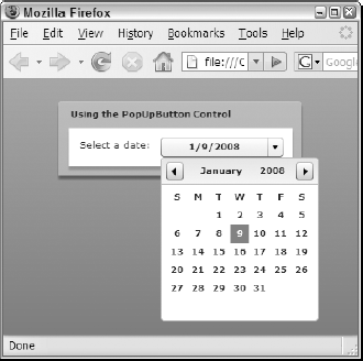
This code declares an instance of a DateChooser control outside any functions. Then, in a function that's called upon application startup, the component is bound to the PopUpButton control's popup property:
[Bindable]
     private var myDateChooser:DateChooser = new DateChooser();

     private function initPopUpButton():void {
       myDateChooser.selectedDate = new Date();
       myPopUpButton.popUp = myDateChooser;
}The rules for handling a PopUpButton control's events depend on which component you use as the pop-up window. For example, if you use a pre-built control such as the DateChooser, you depend on that control's data and events to manage behavior at runtime.
In the current example, when the user selects a date from the DateChooser control, it dispatches a change event with an event object typed as mx. events . CalendarLayoutChangeEvent. Because the DateChooser control has been instantiated with ActionScript code, any event listeners must be created with the addEventListener () method:
myDateChooser.addEventListener(CalendarLayoutChangeEvent.CHANGE,
       dateChangeHandler);

You can then call the PopUpButton control's close() method to close the pop-up window:

     private function dateChangeHandler(
       event:CalendarLayoutChangeEvent):void {
         myPopup.close();
     }
Tip
Even when objects aren't currently displayed on the screen, they still exist in application memory, allowing you access to any of their properties. In this example, you can use the selectedDate property of the DateChooser even after it's no longer displayed.
The application in Listing 13.4 uses a PopUpButton to display a DateChooser control as a popup window.
Example 13.4. Using a PopUpButton control
<?xml version="1.0"?>
<mx:Application xmlns:mx="http://www.adobe.com/2006/mxml"
     creationComplete="initPopUpButton()">
     <mx:Script>
     <![CDATA[
       import mx.events.CalendarLayoutChangeEvent;
       import mx.controls.DateChooser;
       [Bindable]
       private var myDateChooser:DateChooser = new DateChooser();
       private function initPopUpButton():void {
         myDateChooser.selectedDate = new Date();
         myDateChooser.addEventListener(
           CalendarLayoutChangeEvent.CHANGE, dateChangeHandler);
         myPopUpButton.popUp = myDateChooser;
         myPopUpButton.executeBindings(true);
       }
       private function dateChangeHandler(
         event:CalendarLayoutChangeEvent):void {
           myPopUpButton.close();
       }
     ]]>
     </mx:Script>
     <mx:DateFormatter id="df" formatString="M/D/YYYY"/>
     <mx:Panel title="Using the PopUpButton Control"
       paddingTop="10" paddingBottom="10" paddingRight="10"
      paddingLeft="10"
       layout="horizontal">
       <mx:Label text="Select a date:"/>
       <mx:PopUpButton id="myPopUpButton" width="135"
          label="{df.format(myDateChooser.selectedDate)}"/>
     </mx:Panel>
</mx:Application>
Note
The code in Listing 13.4 is available in the Web site files as PopUpButtonDemo.mxml in the chapter13 project.
Tip
The PopUpButton component implements a Boolean openAlways property that can :* be used to display component's pop-up obj'ect when the user clicks the main button. The pop-up obj'ect is always displayed when you click the pop-up button or press the spacebar, regardless of the setting of the openAlways property.
Figure 13.10 shows the resulting application displaying the DateChooser control in response to a user clicking the PopUpButton.
You can create custom pop-up windows in a Flex application for many purposes:
Presenting detailed information to the user that's too complex to easily fit into an
Alertdialog boxCollecting configuration and preference information before executing an operation
Providing a pop-up window that can be reused as a custom component
Collecting data through a data entry form wrapped in a pop-up window
A custom pop-up window component must be extended from a class that implements the IFlexDisplayObject interface. This interface is implemented by the UIComponent class, which in turn is in the inheritance hierarchy of all Flex containers and controls. This essentially means that any visual component can be used as a custom pop-up window.
Custom pop-up windows can be defined as custom MXML components. If you want to create a window that looks like a dialog box, you can use either the Panel or TitleWindow container.
Note
The TitleWindow is a subclass of the Panel that has the ability to display a close icon in its upper-right corner and dispatch a close event when the icon is clicked. Its details are described later in this chapter.
Creating the component
The steps for creating an MXML component that will be used as a pop-up window are the same as for any other MXML component:
Create a new MXML component.
Select the MXML components base class.
Save the new component in your project as a file with the .
mxmlfile extension.
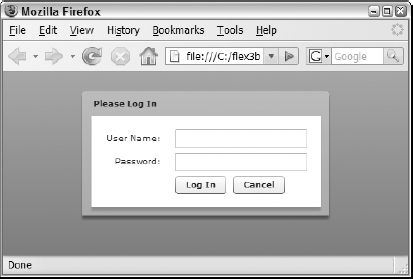
The following code defines an MXML component designed to collect login information, and it might be saved as a file named LoginWindow.mxml:
<mx:Panel xmlns:mx="http://www.adobe.com/2006/mxml"
       title="Please Log In">
       <mx:Form>
         <mx:FormItem label="User Name:">
           <mx:TextInput id="userInput"/>
         </mx:FormItem>
         <mx:FormItem label="Password:">
           <mx:TextInput displayAsPassword="true" id="passwordInput"/>
         </mx:FormItem>
         <mx:FormItem direction="horizontal">
           <mx:Button label="Log In"/>
           <mx:Button label="Cancel"/>
         </mx:FormItem>
       </mx:Form>
</mx:Panel>The custom component that will be used as a pop-up window should share information with the rest of the application using custom events. The LoginWindow component described in the preceding code sample would share events for logging in and for canceling the operation. In order to share the login information, you need to create a custom event class to contain the login data.
Listing 13.5 is a custom event class with public properties for the username and password values that will be collected by the custom component.
Example 13.5. A custom event class designed for use with a custom Login component
package events
{
    import flash.events.Event;
    public class LoginEvent extends Event
{
public var username:String;
public var password:String;
public function LoginEvent(type:String, bubbles:Boolean=false,
cancelable:Boolean=false)
{
super(type, bubbles, cancelable);
}
override public function clone():Event
{
var ev:LoginEvent = new LoginEvent(this.type);
ev.username = this.username;
ev.password = this.password;
return ev;
}
}
}Note
The code in Listing 13.5 is available in the Web site files as LoginEvent.as in the chapter13 project's src/events folder.
When the user clicks the custom components Log In button, the component shares data with the application by constructing and dispatching a custom event object:
var event:LoginEvent = new LoginEvent("login");
     event.username = userInput.text;
     event.password = passwordInput.text;
     dispatchEvent(event);
And if the user clicks Cancel, the custom component dispatches a cancel event, with the event object typed as the standard Event class:
dispatchEvent(new Event("cancel") ) ;Listing 13.6 shows a completed custom component designed for use as a pop-up window that can share data with the application using custom events. Nothing in the preceding code indicates that this component will be used as a pop-up window; it could just as easily be declared with an MXML tag set in the application to appear inline in the application.
Example 13.6. A custom component ready for use as a pop-up window
<?xml version="1.0" encoding="utf-8"?>
 <mx:Panel xmlns:mx="http://www.adobe.com/2006/mxml" title="Please Log
     In" >
     <mx:Metadata>
      [Event(name="login", type="events.LoginEvent")]
      [Event(name="cancel", type="flash.events.Event")]
     </mx:Metadata>
     <mx:Script>
      <![CDATA[
         import events.LoginEvent;
         private function login():void
         {
           var event:LoginEvent = new LoginEvent("login");
           event.username = userInput.text;
           event.password = passwordInput.text;
           dispatchEvent(event);
         }
         public function setInitialFocus():void
         {
           userInput.setFocus();
         }
      ]]>
     </mx:Script>
     <mx:Form>
      <mx:FormItem label="User Name:">
         <mx:TextInput id="userInput"/>
      </mx:FormItem>
      <mx:FormItem label="Password:">
         <mx:TextInput displayAsPassword="true" id="passwordInput"/>
      </mx:FormItem>
      <mx:FormItem direction="horizontal">
         <mx:Button label="Log In" click="login()"/>
         <mx:Button label="Cancel"
           click=" dispatchEvent(new
      </mx:FormItem>
     </mx:Form>
 </mx:Panel>
Note
The code in Listing 13.6 is available in the Web site files as LoginWindow.mxml in the chapter13 project's src/popups folder.
Figure 13.11 shows the completed data entry form as it would appear if instantiated with this MXML code:
<popups:LoginWindow id="myLoginWindow"/>
The PopUpManager is a singleton class with static methods that you use to manage custom popup windows at runtime. It has two methods that can be used to present a pop-up window:
addPopUp() adds a new top-level window using a component that's already been instantiated and is ready to use.createPopUp() creates a new instance of a component, presents the component as a pop-up window, and returns a reference.
Of these two methods, the addPopUp () method is more useful, because it allows you to construct and pre-configure a visual object prior to presenting it as a pop-up window.
The PopUpManager also has these methods that you use to manipulate the position and order of pop-up windows:
bringToFront() gives top-level presentation and focus to a particular window.centerPopUp() positions a pop-up window in the horizontal and vertical center of its parent window.
Finally, PopUpManager has a removePopUp () method to remove top-level windows from the display when they're no longer needed, though they will still exist in application memory.
Adding a pop-up window
To add a new pop-up window to the application interface at runtime using the addPopUp () method, first declare an instance of the custom component you want to present. This declaration should be outside of any functions so the pop-up window reference persists between function calls:
private var popup:LoginWindow;
Within a function that you call to display the pop-up window, instantiate the component and create any required event listeners with accompanying event handler functions. The LoginWindow component in this example dispatches events named login and cancel, so it requires two addEventListener () calls:
popup = new LoginWindow();
     popup.addEventListener("cancel", cancelHandler);
     popup.addEventListener("cancel", cancelHandler);
To present the window onscreen, call PopUpManager . addPopUp () with these arguments:
window: IFlexDisplayObjectis the component reference you just instantiated.parent: DisplayObjectis the parent window over which the pop-up window is displayed.modal: Booleandetermines whether the custom pop-up window is modal. If not passed in, it defaults to false.childList: Stringis the display child list in which you're adding the pop-up window. Possible values includePopUpManagerChildList .APPLICATION, PopUpManagerChildList.POPUP, andPopUpManagerChildList.PARENT(the default).
After adding the pop-up window to the application interface, you can center the window over its parent window with a call to PopUpManager .centerPopUp () . If necessary, you can ensure that the new window has top-level focus with a call to PopUpManager .bringToFront().
This makes a call to PopUpManager . addPopup () to present the LoginWindow custom component as a modal pop-up window and then centers it on the parent component:
PopUpManager.centerPopUp (popup this,     );
     PopUpManager.centerPopUp(popup);
Caution
If you don't explicitly center the pop-up window with PopUpManager. centerPopUp (), the window appears in the top-left corner of the parent window.
Figure 13.12 shows the resulting pop-up window. Notice the applications blurry appearance in the background, indicating that the user must dismiss the window before interacting with the rest of the application.

Removing a pop-up window
To remove a pop-up window, use the PopUpManager class's static removePopUp () method. The method takes a single argument that references the pop-up window instance:
PopUpManager.removePopUp(popup);
You also can call the method from within the component to cause it to remove itself from the interface:
PopUpManager.removePopUp(this);
The application in Listing 13.7 uses the LoginWindow component as a pop-up window. In each of its custom event handler functions, it explicitly closes the pop-up window with a call to PopUpManager.removePopUp ().
Example 13.7. An application using a custom pop-up window
<?xml version="1.0" encoding="utf-8"?>
<mx:Application xmlns:mx=http://www.adobe.com/2006/mxml>
    <mx:Script>
    <![CDATA[
    import events.LoginEvent;
    import mx.controls.Alert;
    import mx.managers.PopUpManager;
    import popups.LoginWindow;
    private var popup:LoginWindow;
    private function showLoginWindow():void
{
popup = new LoginWindow();
popup.addEventListener("login", loginHandler);
popup.addEventListener("cancel", cancelHandler);
PopUpManager.addPopUp(popup, this, true)
PopUpManager.centerPopUp(popup);
popup.setInitialFocus();
}
private function loginHandler(event:LoginEvent):void
{
Alert.show("You logged in as " + event.username +
" with a password of " + event.password, "Login Successful");
PopUpManager.removePopUp(popup);
}
private function cancelHandler(event:Event):void
{
Alert.show("You cancelled the login operation", "Login
Cancelled");
PopUpManager.removePopUp(popup);
}
]]>
</mx:Script>
<mx:Button label="Log In" click="showLoginWindow()"/>
</mx:Application>Note
The code in Listing 13.7 is available in the Web site files as UseCustomPopUp.mxml.as in the chapter13 project.
The TitleWindow container is a subclass of Panel, so it shares all of that containers features: It contains a title bar, a caption, a border, and a content area, and like the Panel, it can host a ControlBar container t wizard-like buttons at the bottom.
The TitleWindow adds the ability to display a close button in its upper-right corner, creating a common visual interface for pop-up windows. To use the TitleWindow container as a custom pop-up window with its own close icon, create the MXML component with a root element of <mx: TitleWindow> instead of <mx: Panel>. Then set the components showCloseButton property to true:
<?xml version="1.0" encoding="utf-8"?>
<mx:TitleWindow xmlns:mx="http://www.adobe.com/2006/mxml"
    title="Please Log In"  showCloseButton="true">
    ... remainder of component is the same as for a panel ...
</mx:TitleWindow>
When the TitleWindow component is displayed as a pop-up window, it now displays the close button, as shown in Figure 13.13.

The TitleWindow containers close button doesn't actually close the pop-up window. Instead, it dispatches a close event with an event object typed as mx. events . CloseEvent. Upon instantiating the custom component (and prior to adding it as a pop-up window), create a listener for the close event:
popup.addEventListener(CloseEvent.CLOSE, closeHandler);
Then, in the event handler function, call PopUpManager. removePopUp () to remove the popup window from the application interface:
private function closeHandler(event:CloseEvent):void
             {
               Alert.show("You canceled the login operation", "Login
                Canceled");
               PopUpManager.removePopUp(popup);
             }
Note
Versions of the pop-up window component and application that use the TitleWindow container instead of the Panel are available in the Web site files as LoginTitle Window.mxml and UseTitleWindow.mxml.as in the chapter13 project.
In this chapter, I described how to create pop-up windows as part of a Flex application interface. You learned the following:
Pop-up windows are typically used to present and collect information in a windowing style application.
The
Alertclass is used to present simple informational messages and to allow a user to confirm or decline an operation.The
PopUpMenuButtoncontrol combines aButtonand single-level Menu that's similar in presentation to aComboBox.The
PopUpButtoncontrol can be used to present any visual container or control as a pop-up window.Custom pop-up windows are defined in the same way as any custom component.
The
PanelandTitleWindowcontainers present a dialog box-style interface.The
PopUpManagersingleton class is used to add and remove custom pop-up windows at runtime.