
In any application that supports more than a single task on a single screen, you need to provide the user with a way of navigating from one area of the application to another. These areas of the application that can be presented only one screen at a time are commonly known as views.
In Flex applications, you handle navigation by switching between the application's views, or by modifying the current state of a view. Unlike classic Web applications, which define views as complete HTML pages that are requested and loaded by the browser one at a time, a Flex application's views are predefined and downloaded as part of the entire application. Unless you're using an advanced architecture such as runtime modules, switching from one view to another doesn't require new requests to a Web server, as it would in a Web site.
In this chapter, I describe how to manage navigation in a Flex application by managing stacks of views.
Note
The term view will be used throughout this chapter to describe a rectangular visual presentation that presents and/or collects information from the user. The term is taken from the application development architecture known as model-view-controller, a way of breaking up an application into small parts with specific functions.
Note
These sites have extensive technical information about the role of views in model-viewcontroller style development:
http://ootips.org/mvc-pattern.html
http://c2.com/cgi/wiki?
     ModelViewControllerAsAnAggregateDesignPattern
http://st-www.cs.uiuc.edu/users/smarch/st-docs/mvc.html
Note
To use the sample code for this chapter, import the chapter12.zip Flex project archive from the Web site files into your Flex Builder workspace.
in a Web site or an application built completely as a set of HTML pages is based on the capabilities of the Web browser. When a user clicks hyperlinks or submits information through HTML data entry forms, the Web browser handles navigation by sending HTTP requests to a Web server for each new page.
Classic Web applications, which dynamically generate their screens one page at a time, deliver each application view as a separate page upon request. The application's views don't exist in the browser until they're requested and delivered. And when the browser navigates to any new page, the current page is completely unloaded from memory.
Note
This discussion of classic Web application architecture does not take into account AJAXstyle development, which allows you to load more than one screen into browser memory at a time. Some, but not all, of the advantages of Flex development also can be realized with AJAX.
Classic Web application architecture has certain advantages, such as infinite scalability (measured by the number of views that are possible in an application without negatively affecting performance). But its limitations include the following:
Classic Web applications can't store data persistently in client-side memory. As each page is unloaded from the browser, the data in its memory is lost.
Some Web architectures solve data persistence by passing data from page to page as the user navigates through the application. ASP.NET, for example, has an architecture known as the
ViewStatethat passes data as part of each form post. This works with small amounts of data, but larger data packets can cause client-side performance issues because passing so much data to and from the server can create an impression of sluggishness.Other Web architectures solve the state issue by storing session data on the server and synchronizing client access to the data with cookies (variables generated by the server and returned by the client on each new page request). While server-side session management relieves the client of the need to manage data persistently, server-side session management can create user scalability issues. Each time a new user visits the application, additional server memory is required.
The browser has to rebuild the view each time it's visited. Because browsers have no inherent client-side state management, the graphical presentation of a page must be recalculated and rendered anew on each visit to the page. The browser offers caching of image and other assets to speed up this process, but graphical presentation in a Web page is necessarily limited.
HTML and JavaScript aren't interpreted identically by every Web browser. In fact, one of the most costly and time-consuming aspects of classic Web application development is testing, because you must test on each combination of operating system, browser, and version that you want to support. Some Web application vendors handle this issue by limiting the platforms on which an application is supported. For example, Intuit's QuickBooks Online, while a powerful and reliable Web application, is supported only on Microsoft Internet Explorer on Windows—no Mac or Firefox users allowed!
Navigation in Flex applications is handled at two levels, with navigator containers and view states. The difference between these concepts can be described as one of the scale of visual change during a move from one presentation to another:
Navigator containers should be used when you want to replace a rectangular region of a Flex application (a view) with a completely different visual presentation.
View states should be used when you want to modify an existing view, by adding or removing visual components or by changing components' properties, styles, or event listeners.
In some cases, either a navigator container or a view state can get the job done, but for the most part, the choice is clear: Use a navigator container to move from one view to another, and use a view state to change an existing view.
Note
Detailed information about view states is available in Chapter 15.
You create a stack of views using one of the navigator containers provided in the Flex framework. The ViewStack class is the simplest of these navigator containers. You declare the ViewStack container as a parent container that nests a collection of view components, and displays only one of its nested views at any given time.
The ViewStack container doesn't have any user interface controls that allow the user to select a current view, so it's typically controlled either with ActionScript code or with navigator bar components that use the ViewStack as a data provider and dynamically generate interactive components to control navigation.
To create a ViewStack in MXML, declare an <mx:ViewStack7gt; tag set. Then declare each nested container within the <mx:ViewStack> tag set. You can nest either pre-built containers from the Flex framework or your own custom components. The containers you nest within the ViewStack can be either layout or navigator containers.
Caution
Only containers can be nested directly within the ViewStack, TabNavigator, or Accordion navigator containers. This rule is enforced via the nested object's inheritance hierarchy: Each of the components nested directly within a ViewStack must include mx.core.Container as one of its superclasses. If you nest a control in a ViewStack that doesn't extend Container, a type coercion error is generated at runtime when the framework tries to cast the object as Container.
Each container nested within a navigator container, whether implemented as a ViewStack, TabNavigator, or Accordion, should have a label property. The label is an arbitrary String that's used in many circumstances to describe the container's purpose to the user. You don't always need the label property, but if you bind the stack to a navigator container that generates interactive components such as Buttons, or if you use the TabNavigator or Accordion containers, the value of each nested container's label is displayed on the interactive component that navigates to that child container.
This code creates a ViewStack with five views or layers:
<mx:ViewStack id="views">
  <mx:HBox/>
  <mx:VBox/>
  <mx:Canvas/>
  <mx:Panel/>
  <views:MyCustomComponent/>
</mx:ViewStack>
The first four views are instances of containers from the Flex framework, and the last is an instance of a custom component that's extended from a container component.
The views nested within a navigator container can be defined as custom components in MXML. As described previously, if you're going to nest a custom component in a navigator container, it must extend a component that includes mx.core.Container in its inheritance hierarchy. These components include HBox, VBox, Canvas, Panel, Form, and others.
The custom component in Listing 12.1 displays a Label and a DataGrid wrapped in a VBox container.
Example 12.1. A custom component suitable for use in a navigator container
<?xml version="1.0" encoding="utf-8"?>
<mx:VBox xmlns:mx="http://www.adobe.com/2006/mxml" width="400"
   height="300"
  backgroundColor="#FFFFFF">
  <mx:Label text="Author List" styleName="logo"/>
  <mx:DataGrid id="authorsGrid" width="100%" height="100%">
    <mx:columns>
      <mx:DataGridColumn dataField="title" headerText="First Name"/>
      <mx:DataGridColumn dataField="price" headerText="Last Name"/>
    </mx:columns>
  </mx:DataGrid>
</mx:VBox>
Note
The code in Listing 12.1 is available in the Web site files as views/Authors.mxml in the chapter12 project. View components named Books.mxml and ShoppingCart.mxml are used in these examples also.
You can use Flex Builder's Design view to visually create a ViewStack and its nested views. As described previously, each of the nested views must be a container, as an instance of either a Flex framework container class or a custom component that includes the Container class in its inheritance hierarchy.
Note
Flex Builder's Design view refers to the layers of a ViewStack as panes, and the documentation sometimes refers to them as panels. These terms refer to the nested view containers within the ViewStack.
Note
The steps in this section assume that you've downloaded the files from the Web site and imported the chapter12 project.
Follow these steps to create a ViewStack in Design view:
Open
BookStore.mxml from thechapter12project. Notice that the application already has an instance of a customHeadercomponent and a few visual settings:<?xml version="1.0" encoding="utf-8"?> <mx:Application xmlns:mx="http://www.adobe.com/2006/mxml" xmlns:views="views.*" layout="vertical" horizontalAlign="left" backgroundGradientAlphas="[1.0, 1.0]" backgroundGradientColors="[#908D8D, #FFFFFF]"> <mx:Style source="assets/styles.css"/> <views:Header/> </mx:Application>
Run the application.
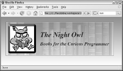
As shown in Figure 12.1, you should see that the Header component displays an image, some text, and a background image.
Return to Flex Builder, and switch to Design view.
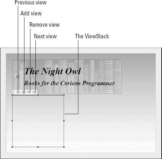
Look in the Components view's Navigators section, and drag a
ViewStackinto the application.As shown in Figure 12.2, the
ViewStackis represented visually by a rectangular outlined area and a toolbar with + and – buttons to add and remove views, and < and > buttons to navigate from one view to the next.Click the + button to add a new view to the
ViewStack.As shown in Figure 12.3, the Insert Pane dialog box prompts you to select a component to instantiate as a layer of the
ViewStack. The list of available components includes all containers from the Flex framework and all the application's custom components that are eligible for use in the context of a navigator container.Set the
Labelof the new pane as Catalog.Select Books from the list of available containers.
Click OK to add the new pane to the
ViewStack.Repeat Steps 5 through 8, and add an instance of the Authors container with a label of Authors.
Repeat Steps 5 through 8 again, and add an instance of the
ShoppingCartcontainer with a label of Shopping Cart.Run the application.
When the application appears, it should display the
Bookscontainer, because it was the first layer declared within theViewStack.The application displays only one layer at this point, because you haven't added any interactive components to control navigation.
Return to Flex Builder, and switch to Source view.

The generated ViewStack code looks like this:
<mx:ViewStack id="viewstack1" width="200" height="200">
  <views:Books label="Catalog" width="100%" height="100%">
  </views:Books>
  <views:Authors label="Authors" width="100%" height="100%">
  </views:Authors>
  <views:ShoppingCart label="Shopping Cart" width="100%"
    height="100%">
  </views:ShoppingCart>
</mx:ViewStack>
The Design view tool for generating ViewStack code makes a great start, but has these issues:
The
ViewStackis always generated with an initialheightandwidthof 200 pixels each. You can change theViewStackdimensions in Design view by dragging theViewStackhandles, or in the Flex Properties view. And of course, you can always change or remove the dimensions completely in Source view.Design view has no mechanism for visually reordering a
ViewStackcontainer's layers. If you want to change the order of the views, you must do so in Source view.All containers' MXML declarations are generated with tag sets, such as:
<views:Books label="Catalog" width="100%" height="100%">
</views:Books>
Particularly when using custom components, the MXML code would be more efficient with empty tag syntax:
<views:Books label="Catalog" width="100%" height="100%"/7gt;
This is purely a matter of code aesthetics though, and it doesn't have any negative effect on application functionality or performance.
After generating a ViewStack with Design view, be sure to revise the generated code as needed in Source view.
When a navigator container is initially constructed and displayed, it displays the currently active view (by default, the first view declared in the stack). You can change the active view at runtime with ActionScript commands that reference one of these ViewStack properties:
selectedIndex:int is the numeric index position of the active container within the stack.selectedChild:Containeris the object reference of the active container within the stack.
Using selectedIndex
The selectedIndex property returns the index position of the currently active container, as determined by the order of the ViewStack container's display list. When declaring a ViewStack in MXML, the display list order and the order of MXML declaration are the same.
As with all index operations in ActionScript, indexing starts at 0. So the first container with the view stack is at position 0, the second at position 1, and so on.
To change the currently selected view by index, set the stack's selectedIndex property to the numeric index of the container you want to activate. This code makes the viewstack1 container's second layer visible and active:
<mx:Button label="Authors" click="viewstack1.selectedIndex=1"/>
Because indexing always begins at 0, this Button would allow the user to navigate to the first layer of a stack:
<mx:Button label="First Layer"
   click="viewstack1.selectedIndex=0"/>
Using numChildren
The numChildren property returns the total number of layers in the stack as an int value.
Taking into account the 0-based indexing offset, this Button would allow the user to navigate to the last layer of a stack:
<mx:Button label="Last Layer"
  click="viewstack1.selectedIndex=viewstack1.numChildren-1"/>
Navigating forward and backward through view stack layers
You can navigate forward and backward through layers of a view stack by incrementing or decrementing the stack's selectedIndex property. This Button would allow the user to move to the previous layer of a stack:
<mx:Button label="Authors" click="viewstack1.selectedIndex--"/>
Tip
The selectedIndex property of a ViewStack can't be set to less than 0. If the Button control in the preceding code is clicked when the ViewStack container's selectedIndex is already set to 0, the command is ignored and there is no runtime error.
You also can navigate forward through a stack, but if you set the selectedIndex to a value greater than the stack's highest available index, an "array out of bounds" error results. You can prevent this by wrapping the code to navigate forward in a conditional clause that checks to be sure that the last container in the stack isn't already active:
private function navForward():void
{
  if (viewstack1.selectedIndex != viewstack1.numChildren-1)
  {
    viewstack1.selectedIndex++;
  }
}
Alternatively, you can set the Button control's enabled property to false when selectedIndex indicates that a forward or backward navigation either wouldn't work or would result in a runtime error. Binding expressions that evaluate selectedIndex and return a Boolean value to the enabled property can handle this task dynamically.
This Button control that navigates forward is enabled only when the ViewStack container's selectedIndex isn't already set to the highest index:
<mx:Button label="Next >>"
  click="viewstack1.selectedIndex++"
  enabled="{viewstack1.selectedIndex != viewstack1.numChildren-
1}"/>In the preceding code example, the binding expression used in the enabled property might be executed upon application startup before the ViewStack container's numChidren property can be correctly evaluated. If this happens, you might see that the Button controls are incorrectly enabled and disabled upon application startup.
To fix this sort of timing issue, call the ViewStack container's executeBindings() method with a recursive argument of true to re-evaluate all of its dependent binding expressions. If you call this method upon the ViewStack container's creationComplete event, it evaluates any bound property values such as numChildren again and the Button control's enabled states will be correctly calculated:
<mx:ViewStack id="viewstack1" width="400" height="200"
    creationComplete="executeBindings(true)">
<views:Books label="Catalog" width="100%" height="100%"/>
<views:Authors label="Authors" width="100%" height="100%"/7gt;
<views:ShoppingCart label="Shopping Cart" width="100%"
height="100%"/>
</mx:ViewStack>The application in Listing 12.2 implements forward and backward navigation with a ViewStack and Button controls. Each Button control has its enabled property set through a binding expression, and the ViewStack re-executes its bindings upon its creationComplete event.
Example 12.2. An application using forward and backward navigation
<?xml version="1.0" encoding="utf-8"?>
<mx:Application xmlns:mx="http://www.adobe.com/2006/mxml"
    xmlns:views="views.*" layout="vertical" horizontalAlign="left"
    backgroundGradientAlphas="[1.0, 1.0]"
    backgroundGradientColors="[#908D8D, #FFFFFF]">
    <mx:Style source="assets/styles.css"/>
    <views:Header/>
    <mx:HBox>
    <mx:Button label="<< Previous"
      click="viewstack1.selectedIndex--"
      enabled="{viewstack1.selectedIndex != 0}"/>
    <mx:Button label="Next >>"
      click="viewstack1.selectedIndex++"
      enabled="{viewstack1.selectedIndex != viewstack1.numChildren-1}"/>
    </mx:HBox>
    <mx:ViewStack id="viewstack1" width="400" height="200"
      creationComplete="executeBindings(true)">
    <views:Books label="Catalog" width="100%" height="100%"/>
    <views:Authors label="Authors" width="100%" height="100%"/>
    <views:ShoppingCart label="Shopping Cart" width="100%"
   height="100%"/>
  </mx:ViewStack>
</mx:Application>
Note
The code in Listing 12.2 is available in the Web site files as BookStoreIndexNavigation.mxml in the chapter12 project.
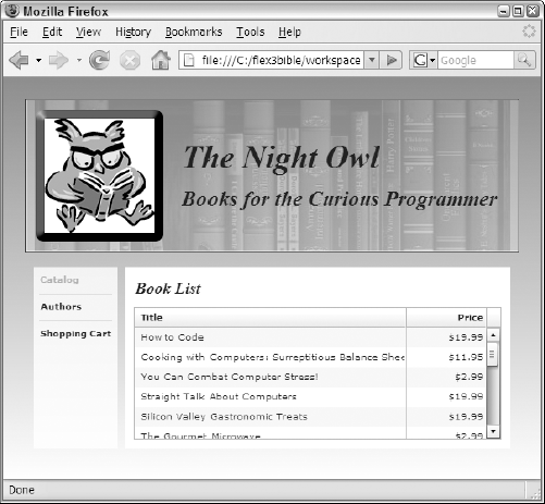
Figure 12.4 shows the resulting application, with Previous and Next buttons to handle backward and forward navigation.

Using selectedChild
The ViewStack container's selectedChild property accesses the stack's currently visible view by its object reference. To use this property, each of the stack's nested containers should be assigned a unique id:
<mx:ViewStack id="viewstack1">
  <views:Books id="booksView"/>
  <views:Authors id="authorsView"/>
  <views:ShoppingCart id="cartView"/>
</mx:ViewStack>
To select an active view by the container's unique id, set the ViewStack container's selectedChild:
<mx:Button label="Shoppping Cart"
 click="viewstack1.selectedChild=cartView"/>
Notice that there are no quotes around the cartView container's id when it's assigned in this way. You're accessing the id as a variable or component instance id, not a String value.
Tip
When navigating with selectedChild set to a container's unique id, because your navigation will be hard-coded, you typically don't need to assign a label property to each container. The label property becomes useful when dynamically generating user interface controls for navigation.
The application in Listing 12.3 implements navigation using Button controls for each of the nested containers in a ViewStack. Each Button control explicitly navigates to its container by the container's unique id.
Example 12.3. An application using explicit navigation by unique id
<?xml version="1.0" encoding="utf-8"?>
<mx:Application xmlns:mx="http://www.adobe.com/2006/mxml"
  xmlns:views="views.*" layout="vertical" horizontalAlign="left"
  backgroundGradientAlphas="[1.0, 1.0]"
  backgroundGradientColors="[#908D8D, #FFFFFF]">
  <mx:Style source="assets/styles.css"/>
  <views:Header/>
  <mx:HBox>
    <mx:Button label="Catalog"
      click="viewstack1.selectedChild=booksView"/>
    <mx:Button label="Authors"
      click="viewstack1.selectedChild=authorsView"/>
    <mx:Button label="Shoppping Cart"
      click="viewstack1.selectedChild=cartView"/>
  </mx:HBox>
  <mx:ViewStack id="viewstack1" width="400" height="200">
    <views:Books id="booksView" width="100%" height="100%"/>
    <views:Authors id="authorsView" width="100%" height="100%"/>
    <views:ShoppingCart id="cartView" width="100%" height="100%"/>
  </mx:ViewStack>
</mx:Application>
Note
The code in Listing 12.3 is available in the Web site files as BookStoreReferenceNavigation.mxml in the chapter12 project.
Figure 12.5 shows the resulting application, with explicit Button controls to handle navigation to each nested container.

The ViewStack, TabNavigator, and Accordion containers support a property named creationPolicy that manages the manner in which their nested view containers are instantiated at runtime. These are possible values of creationPolicy:
auto(the default)allnonequeued
When creationPolicy is set to the default of auto, only the initially active view is completely instantiated at first. The other view containers also are instantiated, but their child controls are left null. Any attempt to address these objects in ActionScript code while they're not yet instantiated results in a null error.
This behavior is known as deferred instantiation and is a strategy for optimizing client-side performance in Flash Player. In a navigator container that contains dozens of views or more, if the application has to instantiate all the content before the user can interact with anything, significant delays can occur. To prevent this issue, the default behavior makes content visible as early as possible.
You see the effect of deferred instantiation when you try to initialize some property of a nested component before the user decides to visit that content at runtime and get a runtime error. You can solve this by setting the navigator container's creationPolicy property to all, meaning that all the views are instantiated during the navigator container's instantiation. This strategy can work fine in a small- to medium-size application that doesn't have a large number of nested views.
Alternatively, you can set creationPolicy to none, meaning that you don't want the nested components ever to be instantiated automatically, and then take complete control over the process by explicitly calling the nested container's createComponentsFromDescriptors() method when you see fit.
Tip
The Container class implements such methods as addChild(), addChildAt(), and removeChild() that allow you to explicitly control the contents and order of a container's nested child objects at runtime. You can use these methods to control not just which objects have been instantiated, but which are currently nested children of a navigator container.
Tip
The creationPolicy property is also implemented in layout containers. Layout containers instantiate their child objects all at the same time by default. If you prefer to take control over the instantiation process, set the layout container's creationPolicy property to none, and then instantiate the child objects as necessary using with the container's createComponentsFromDescriptors() method.
Finally, the effect of setting creationPolicy to queued means that you want to instantiate all objects automatically, but instead of creating all objects simultaneously (as with the setting of all), each nested view component's content is instantiated only after the prior component's instantiation has been completed.
By default, navigator containers size to the first visible child container. Any subsequent navigation results in bumping the child container up to the top left if it is smaller than the instantiated size, or the implementation of scrollbars if the container is larger.
You can set the height and width of a navigator container using absolute pixel dimensions, percentage dimensions, or dynamic sizing. You can use two common strategies for handling navigator container sizing:
Set the navigator container's dimensions to specific pixel or percentage dimensions, and then set the nested container sizes to 100 percent height and width. Each of the nested view containers then resizes to fill the available space in the navigator container.
Set the nested containers to specific pixel dimensions, and set the navigator container's
resizeToContentproperty to true. The navigator container then resizes to accommodate each newly active view as the user navigates through the application.
Caution
Setting resizeToContent to true forces the navigator container to re-measure and re-draw itself as the user navigates through the application. This can cause interesting and unintended visual effects, particularly when the navigator container has a visible border or background.
If you want a user to be able to navigate to any container within a ViewStack, you can use one of the navigator bar containers that are included with the Flex framework. The framework uses four navigator bar containers:
Tip
You won't find a Tab component or ActionScript class in the Flex 3 documentation, but it's used internally as a style selector to manage a TabBar's visual presentation. Because each Tab is an instance of this internal class, you can change certain styles such as the amount of padding within each Tab:
<mx:Style>
 Tab {
   padding-left:10;
   padding-bottom:0;
   padding-top:0;
   padding-right:10;
}
</mx:Style7gt;Each of the navigator bar containers has a dataProvider property that you bind to a ViewStack. The navigator bar then generates one interactive component for each of the stack's nested containers.
Navigator bars generate nested controls based on information provided through their dataProvider property. The dataProvider can be either an Array of values (either simple strings or complex objects) or can be bound to a ViewStack.
This code generates a LinkBar using a dataProvider set as an Array of complex objects:
<mx:LinkBar itemClick="clickHandler(event)">
  <mx:dataProvider>
  <mx:Object>
    <mx:label>Adobe</mx:label>
    <mx:url>http://www.adobe.com</mx:url>
  </mx:Object>
  <mx:Object>
    <mx:label>Google</mx:label>
    <mx:url>http://www.google.com</mx:url>
  </mx:Object>
  <mx:Object>
    <mx:label>Microsoft</mx:label>
    <mx:url>http://www.microsoft.com</mx:url>
  </mx:Object>
 </mx:dataProvider>
</mx:LinkBar>
Tip
In the preceding MXML declaration, the <mx:Object> tags are not explicitly wrapped in an <mx:Array> tag set. This is a bit of shorthand; the MXML compiler understands that the dataProvider requires an Array and correctly interprets the declaration of multiple <mx:Object> tag sets as an Array of Object instances.
Tip
The label and url property names are arbitrary and not predefined in the Object class, but the mx prefix is required because they're declared within the <mx:Object> tag set. The value of the label property is used in the labels of the navigator bar container's generated controls because the container's labelField property defaults to label. You can use any other named object property for this purpose by setting the labelField to the property you want to use.
When a navigator bar's dataProvider is set as an Array of data, it doesn't automatically do anything when the user clicks one of its controls. Instead, you listen for the navigator bar's itemClick event and react to it by executing some ActionScript code.
The itemClick event generates an event object typed as mx.events.ItemClickEvent. This object has an item property that references underlying data of the interactive component that was clicked. Within an event handler function, the expression event.item returns the underlying data, and from that point you can reference the selected object's data properties.
With the preceding Array of Object instances as a navigator bar's dataProvider, the expression event.item.label returns the label property of the selected data item when an interactive control is clicked, and event.item.url returns its url property.
The application in Listing 12.4 handles the itemClick event of a LinkBar control and responds by navigating to the selected URL.
Example 12.4. An application using a navigator bar container with an Array as the dataProvider
<?xml version="1.0" encoding="utf-8"?>
<mx:Application xmlns:mx="http://www.adobe.com/2006/mxml"
   layout="vertical">
  <mx:Script>
    <![CDATA[
      import mx.controls.Alert;
      import mx.events.ItemClickEvent;
      private function clickHandler(event:ItemClickEvent):void
      {
        var request:URLRequest=new URLRequest(event.item.url);
        navigateToURL(request);
      }
    ]]>
  </mx:Script>
  <mx:LinkBar itemClick="clickHandler(event)">
    <mx:dataProvider>
      <mx:Object>
        <mx:label>Adobe</mx:label>
        <mx:url>http://www.adobe.com</mx:url>
      </mx:Object>
      <mx:Object>
        <mx:label>Google</mx:label>
        <mx:url>http://www.google.com</mx:url>
      </mx:Object>
      <mx:Object>
        <mx:label>Microsoft</mx:label>
        <mx:url>http://www.microsoft.com</mx:url>
      </mx:Object>
    </mx:dataProvider>
  </mx:LinkBar>
</mx:Application>
Note
The code in Listing 12.4 is available in the Web site files as NavBarWithArrayData.mxml in the chapter12 project.
When you pass a ViewStack to a navigator bar as its dataProvider, the navigator bar generates one interactive control for each of the ViewStack container's nested views. Each nested container's label property is passed to each generated Button, LinkButton, or Tab for display.
You set a ViewStack as a dataProvider with a binding expression:
<mx:ToggleButtonBar dataProvider="{viewstack1}"/>The application in Listing 12.5 uses a ToggleButtonBar that generates one toggle button for each nested container of a ViewStack.
Example 12.5. An application using a navigator bar container
<?xml version="1.0" encoding="utf-8"?>
<mx:Application xmlns:mx="http://www.adobe.com/2006/mxml"
  xmlns:views="views.*" layout="vertical" horizontalAlign="left"
  backgroundGradientAlphas="[1.0, 1.0]"
  backgroundGradientColors="[#908D8D, #FFFFFF]">
  <mx:Style source="assets/styles.css"/>
  <views:Header/>
  <mx:ToggleButtonBar dataProvider="{viewstack1}"/>
  <mx:ViewStack id="viewstack1" width="400" height="200">
    <views:Books label="Catalog" width="100%" height="100%"/>
    <views:Authors label="Authors" width="100%" height="100%"/>
    <views:ShoppingCart label="Shopping Cart" width="100%"
   height="100%"/>
  </mx:ViewStack>
</mx:Application>
Note
The code in Listing 12.5 is available in the Web site files as BookStoreNavBar.mxml in the chapter12 project.
Figure 12.6 shows the resulting application, with generated toggle button controls to handle navigation to each nested container.

Each of the navigator bar containers has a direction property that can be used to lay out the container vertically. For example, this LinkBar stacks its generated LinkButton controls vertically:
<mx:LinkBar dataProvider="{viewstack1}" direction="vertical"/>The application in Listing 12.6 uses a vertical LinkBar wrapped in an HBox container. Binding expressions are used to match the component's width and height properties as needed.
Example 12.6. An application using a vertical navigator bar container
<?xml version="1.0" encoding="utf-8"?>
<mx:Application xmlns:mx="http://www.adobe.com/2006/mxml"
  xmlns:views="views.*" layout="vertical" horizontalAlign="left"
  backgroundGradientAlphas="[1.0, 1.0]"
  backgroundGradientColors="[#908D8D, #FFFFFF]">
  <mx:Style source="assets/styles.css"/>
  <views:Header id="header"/>
<mx:HBox width="{header.width}">
  <mx:LinkBar dataProvider="{viewstack1}"
    direction="vertical"
    backgroundColor="white" backgroundAlpha=".8"
    height="{viewstack1.height}"/>
  <mx:ViewStack id="viewstack1" width="100%" height="200">
    <views:Books label="Catalog" width="100%" height="100%"/>
    <views:Authors label="Authors" width="100%" height="100%"/>
    <views:ShoppingCart label="Shopping Cart" width="100%"
 height="100%"/>
  </mx:ViewStack>
 </mx:HBox>
</mx:Application>
Note
The code in Listing 12.6 is available in the Web site files as BookStoreVerticalNav.mxml in the chapter12 project.
Figure 12.7 shows the resulting application, with a LinkBar displaying stacked LinkButton controls.
Flex provides three menu controls that can be used to create styles of navigation interfaces. They include the Menu, the MenuBar, and the PopupMenuButton. Of these three controls, the Menu and MenuBar define their menus with a hierarchical data structure, represented as XML, and notify you of user selections with both an itemClick and change event.
The PopupMenuButton control differs from the other menu controls, in that it displays only a single-level menu and notifies you of a user selection with its change event. This section describes the details of using the Menu and MenuBar controls. PopupMenuButton is described in Chapter 13.
You can use the Menu and MenuBar controls, combined with event listeners and ActionScript event handler functions, to create a customized navigation interface.
The data that determines the structure of a Menu or MenuBar is typically represented hierarchically and can be one of these types:
A
Stringcontaining valid XML textAn
XMLNodeAn
XMLListAny object that implements
ICollectionViewAn
Array
Any other object passed as a menu data provider is automatically wrapped in an Array with the object as its first and only item.
The most common sort of data used to determine menu structure is an XMLList. You can declare an XMLList in the application with MXML code and nested XML markup:
<mx:XMLList id="menuData">
  <menuitem label="Lists">
    <menuitem label="Catalog" view="catalogView"/>
    <menuitem label="Authors" view="authorsView"/>
  </menuitem>
  <menuitem label="Shopping">
    <menuitem label="Shopping Cart" view="cartView"/>
  </menuitem>
</mx:XMLList>
You can select any element and attribute names you like in the XML structure, but you should follow these recommendations when using a menu control with a ViewStack:
Each menu item should have a consistently named attribute to serve as the visible label for each menu node. In the preceding example, this attribute is named
label. Notice that all menu items at all levels of the hierarchy have this attribute.Menu items that cause navigation should have an attribute whose value matches the unique id of a nested container in a
ViewStack. This can help you simplify the ActionScript code you write to handle the menu control's events.
To use the data in a menu control, pass the XMLList structure to the control as its dataProvider property in a binding expression. Also set the menu control's labelField to an E4X expression that references the label attribute in each menu node:
<mx:MenuBar id="myMenuBar" dataProvider="{menuData}"
  labelField="@label"/>
Note
Detailed information about retrieving XML and parsing it with E4X is available in Chapters 21 and 22.
Caution
If you forget to set the menu control's labelField to a consistently named attribute or property of the underlying data, the labels of the menu items sometimes present raw XML because the control doesn't have any instructions for parsing the data.
When the user selects an item from either the Menu or MenuBar control, it dispatches an itemClick event that generates an event object typed as mx.events.MenuEvent. This event object has an item property that references the underlying data that drove the creation of the selected menu item. Within an event handler function, the expression event.item references the data, and the E4X expression can be used to access the selected XML node's attributes. For example, the expression event.item.@view references the XML node's view attribute.
You can listen for the itemClick event with MXML or ActionScript. This MenuBar has an attribute-based itemClick event listener that passes the event object to a custom event handler function named menuClickHandler():
<mx:MenuBar id="myMenuBar" dataProvider="{menuData}"
  labelField="@label" itemClick="menuClickHandler(event)"/>
To listen for the same event with an ActionScript statement, use the addEventListener() method to listen for the event named by the constant MenuEvent.ITEM_CLICK:
navMenu.addEventListener(MenuEvent.ITEM_CLICK, menuClickHandler);
The custom event handler can then access the selected XML node's attributes and use them to execute navigation. This event handler function retrieves the node's view attribute with an array-style expression to change the active view container of the ViewStack:
import mx.events.MenuEvent;
private function menuClickHandler(event:MenuEvent):void
{
  viewstack1.selectedChild = this[event.item.@view];
}The Menu control presents a set of cascading menus in response to a user event. Because this control is always presented in response to an event, and not as a static part of the application's visual interface, it can be instantiated only with ActionScript, not with MXML.
To create a Menu, instantiate it with the Menu class's static createMenu() method and pass two arguments:
The
Menuobject's parent containerThe
Menuobject's data provider
Then present the Menu with its show() method, passing optional xShow and yShow coordinates as arguments. This event handler function responds to a mouse event by creating a Menu with a data provider named menuData and the Application as the parent window, and then displays it at the mouse event's stageX and stageY coordinates.
The application in Listing 12.7 uses a Menu populated with an XMLList as its dataProvider.
Example 12.7. Using the Menu control
<?xml version="1.0" encoding="utf-8"?>
<mx:Application xmlns:mx="http://www.adobe.com/2006/mxml"
   layout="vertical">
  <mx:Script>
    <![CDATA[
      import mx.events.MenuEvent;
      import mx.controls.Alert;
      import mx.controls.Menu;
      private function showMenu(event:MouseEvent):void
      {
        var navMenu:Menu = Menu.createMenu(this, menuData);
        navMenu.labelField="@label";
        navMenu.addEventListener(MenuEvent.ITEM_CLICK,
   menuClickHandler);
        navMenu.show(event.stageX,event.stageY);
      }

      private function menuClickHandler(event:MenuEvent):void
      {
        Alert.show("You selected " + event.item.@label, "Menu
   Selection");
      }
    ]]>
  </mx:Script>
<mx:XMLList id="menuData">
<menuitem label="Lists">
<menuitem label="Catalog" view="catalogView"/>
<menuitem label="Authors" view="authorsView"/>
</menuitem>
<menuitem label="Shopping">
<menuitem label="Shopping Cart" view="cartView"/>
</menuitem>
</mx:XMLList>
<mx:Label text="Click for Menu" mouseUp="showMenu(event)"/>
</mx:Application>Note
The code in Listing 12.7 is available in the Web site files as MenuDemo.mxml in the chapter12 project.
Figure 12.8 shows the resulting application. The Menu pops up when the mouse button is released while over the Label control.

The MenuBar control presents a horizontal list of menu items with cascading pull-down submenus. It uses the same sort of data and generates the same events as the Menu control. Unlike the Menu, it's designed to be placed in a static position in the application and serve as a navigation or functional menu, so it's typically declared in MXML:
<mx:MenuBar id="myMenuBar" dataProvider="{menuData}"
  labelField="@label" itemClick="menuClickHandler(event)"/>
The application in Listing 12.8 uses a MenuBar for navigation in the sample bookstore application. Notice that the MenuBar is wrapped in an ApplicationControlBar that "glues" the navigation control to the top of the screen.
Example 12.8. Using the MenuBar control
<?xml version="1.0" encoding="utf-8"?>
<mx:Application xmlns:mx="http://www.adobe.com/2006/mxml"
  xmlns:views="views.*" layout="vertical" horizontalAlign="left"
  backgroundGradientAlphas="[1.0, 1.0]"
  backgroundGradientColors="[#908D8D, #FFFFFF]">
  <mx:Script>
    <![CDATA[
      import mx.events.MenuEvent;
      private function menuClickHandler(event:MenuEvent):void
      {
        viewstack1.selectedChild = this[event.item.@view];
      }
    ]]>
  </mx:Script>
  <mx:Style source="assets/styles.css"/>
  <mx:XMLList id="menuData">
    <menuitem label="Lists">
        <menuitem label="Catalog" view="catalogView"/>
        <menuitem label="Authors" view="authorsView"/>
    </menuitem>
    <menuitem label="Shopping">
      <menuitem label="Shopping Cart" view="cartView"/>
    </menuitem>
  </mx:XMLList>
  <mx:ApplicationControlBar dock="true">
    <mx:MenuBar id="myMenuBar"
      dataProvider="{menuData}"
      labelField="@label" itemClick="menuClickHandler(event)"/>
  </mx:ApplicationControlBar>
  <views:Header/>
  <mx:ViewStack id="viewstack1" width="400" height="200">
    <views:Books id="catalogView" label="Catalog"
      width="100%" height="100%"/>
    <views:Authors id="authorsView" label="Authors"
      width="100%" height="100%"/>
    <views:ShoppingCart id="cartView" label="Shopping Cart"
      width="100%" height="100%"/>
  </mx:ViewStack>
</mx:Application>
Note
The code in Listing 12.8 is available in the Web site files as BookStoreMenuBar.mxml in the chapter12 project.
Figure 12.9 shows the resulting application, with the MenuBar nested within the ApplicationControlBar.

The TabNavigator and Accordion navigator containers provide the same form of navigation functionality as the ViewStack in that they nest a stack of containers and display only one of the containers at a time. Unlike the ViewStack, though, the TabNavigator and Accordion have their own user interface to allow the user to navigate between views.
The TabNavigator container provides a set of tabs, similar in appearance to a TabBar, but more visually integrated with the rest of the container. Unlike the ViewStack, which is invisible by default, the TabNavigator has a default border.
The MXML syntax of the TabNavigator is identical to that of the ViewStack: You wrap its nested containers within the appropriate MXML tag set. As with the ViewStack, you can wrap only those components within a TabNavigator that include the Container class in their inheritance hierarchy:
<mx:TabNavigator id="views">
  <mx:HBox/>
  <mx:VBox/>
  <mx:Canvas/>
  <mx:Panel/>
  <views:MyCustomComponent/>
</mx:TabNavigator >
For example, in the bookstore application that's been used previously in this chapter, to use a TabNavigator instead of a ViewStack, you'd follow these steps:
Change the MXML tag set wrapping the custom components from
<mx:ViewStack>to<mx:TabNavigator>.Delete any navigator bar control or custom navigator controls that you might have been using to provide a navigation interface.
Listing 12.9 shows the application using a TabNavigator instead of a ViewStack.
Example 12.9. An application using a TabNavigator
<?xml version="1.0" encoding="utf-8"?>
<mx:Application xmlns:mx="http://www.adobe.com/2006/mxml"
  xmlns:views="views.*" layout="vertical" horizontalAlign="left"
  backgroundGradientAlphas="[1.0, 1.0]"
  backgroundGradientColors="[#908D8D, #FFFFFF]">
  <mx:Style source="assets/styles.css"/>
  <views:Header/>
  <mx:TabNavigator id="viewstack1" width="400" height="300">
    <views:Books label="Catalog" width="100%" height="100%"/>
    <views:Authors label="Authors" width="100%" height="100%"/>
    <views:ShoppingCart label="Shopping Cart" width="100%"
   height="100%"/>
  </mx:TabNavigator>
</mx:Application>
Note
The code in Listing 12.9 is available in the Web site files as BookStoreTabNav.mxml in the chapter12 project.
Figure 12.10 shows the resulting application, with a TabNavigator providing the navigation interface. Notice that the tabs are visually integrated with the container that wraps the application content.

The Accordion navigator container provides navigation through a set of headers that slide vertically to expose or hide nested views as needed.
Note
The Accordion container slides only vertically, not horizontally. Doug McCune has created and shared a horizontal Accordion that you can download from http://dougmccune.com/blog/2007/01/27/horizontal-accordion-component-for-flex.
The MXML syntax of the Accordion is identical to that of the ViewStack: You wrap its nested containers within the appropriate MXML tag set. As with the ViewStack and TabNavigator, you can wrap only those components within an Accordion that include the Container class in their inheritance hierarchy:
<mx:Accordion id="views">
  <mx:HBox/>
  <mx:VBox/>
  <mx:Canvas/>
  <mx:Panel/>
  <views:MyCustomComponent/>
</mx:Accordion >
For example, in the bookstore application that's been used previously as an example in this chapter, to use an Accordion instead of a ViewStack, you'd follow these steps:
Change the MXML tag set wrapping the custom components from
<mx:ViewStack>to<mx:Accordion>.Delete any navigator bar control or custom navigator controls that you might have been using to provide a navigation interface.
Listing 12.10 shows the application using an Accordion instead of a ViewStack.
Example 12.10. An application using an Accordion
<?xml version="1.0" encoding="utf-8"?>
<mx:Application xmlns:mx="http://www.adobe.com/2006/mxml"
  xmlns:views="views.*" layout="vertical" horizontalAlign="left"
  backgroundGradientAlphas="[1.0, 1.0]"
  backgroundGradientColors="[#908D8D, #FFFFFF]">
  <mx:Style source="assets/styles.css"/>
  <views:Header/>
  <mx:Accordion id="viewstack1" width="400" height="300">
    <views:Books label="Catalog" width="100%" height="100%"/>
    <views:Authors label="Authors" width="100%" height="100%"/>
    <views:ShoppingCart label="Shopping Cart" width="100%"
   height="100%"/>
  </mx:Accordion>
</mx:Application>
Note
The code in Listing 12.10 is available in the Web site files as BookStoreAccordion.mxml in the chapter12 project.
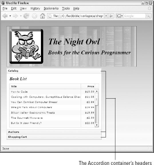
Figure 12.11 shows the resulting application, with an Accordion providing the navigation interface. Notice that the tabs are visually integrated with the container that wraps the application content.
The TabNavigator and Accordion containers support this set of keyboard shortcuts that allow the user to navigate with key presses instead of mouse gestures:
Page Down: Navigates to next view, wrapping from last to first.
Down Arrow and Right Arrow: Selects next tab or header, wrapping from last to first, but doesn't change the active view. Pressing Enter or the spacebar then triggers navigation.
Page Up: Navigates to previous view, wrapping from first to last.
Up Arrow and Left Arrow: Selects previous tab or header, wrapping from first to last, but doesn't change the active view. Pressing Enter or the spacebar then triggers navigation.
Home: Navigates to first view.
End: Navigates to last view.
In this chapter, I described techniques for creating navigation interfaces in Flex applications. You learned the following:
Class Web applications handle navigation by requesting and loading individual Web pages into the browser one at a time.
Flex applications contain all their views in the compiled application.
The
ViewStackcontainer nests multiple view containers and displays only one at a time.You can manage navigation with ActionScript commands or with a navigator bar container.
The navigator bar containers automate navigation when bound to a
ViewStack.The menu controls can be used with event listeners and ActionScript to create a navigation interface.
The
TabNavigatorandAccordioncontainers combineViewStackfunctionality with their own navigation interfaces.