
Flash Player was originally created as a platform for presenting animation over the Web. Future Splash Animator, the original ancestor of the Flash authoring environment and Flash Player, was a Java-based software product that was integrated into the browser in much the same manner as Flash Player is today.
Millions of Flash developers worldwide create compelling content designed for presentation in a Web application. Animation and related visual wizardry is the most common goal, and the most common result, of documents developed in the Flash authoring environment and distributed through Flash Player.
Animation in Flash depends largely on use of the timeline: a visual interface that allows the developer to create animations frame by frame or through a process known as tweening. Flex application developers don't have the timeline available to them. In fact, one of Macromedia's most important motivations in creating Flex was to free developers with a coding background from having to work with the timeline at all. But a Flex application is still distributed and viewed through Flash Player. So when it's time to move objects around the screen, a Flex developer needs code-based approaches to make it happen.
In this chapter, I describe the use of effects and triggers to define and execute animation in a Flex application. I also describe how to implement drag-and-drop interfaces to create an intuitive way to move data around an application.
Note
To use the sample code for this chapter, import the chapter14 .zip Flex project archive from the Web site files into your Flex Builder workspace.
An effect is an ActionScript class that defines changes in a visual components position, visibility, scaling, and other properties over a period of time. The Flex framework includes many pre-built effect classes that can be applied to visual components and played with explicit ActionScript statements or upon certain built-in effect triggers.
Most pre-built effect classes in the Flex framework define changes to visual properties of control. The following effects cause changes to one or more of a visual components properties over a period of time:
AnimateProperty:Changes any numeric property of a visual component over a period of time. Properties with numeric values includewidth, height, scaleX, scaleY, x, y, and others.Blur:Applies a blur filter to a component. The same visual result can be accomplished programmatically with theBlurFilterclass, but declaring it as an effect in a behavior takes less code and it can be applied gradually over time.Dissolve:Changes the alpha property of a component to affect transparency. An overlay rectangle of an arbitrary color is used to slowly hide or reveal the target component.Fade:Changes the alpha property of a component to affect transparency. It is similar to the Dissolve effect, but does not apply a colored overlay.Glow:Applies a glow filter to a component over a period of time. The same visual result can be achieved programmatically with theGlowFilterclass, but declaring it as an effect in a behavior takes less code and it can be applied gradually over time.Iris: Usesa rectangular mask to reveal or hide an object over a period of time. Unlike the Zoom effect, this does not change the components dimensions.Move:Changes the components x and y properties over time. To use this effectively, the container in which the target component is nested should be a Canvas or anApplication, Panel, orTitleWindowcontainer withlayoutset toabsolute.Resize:Changes the components width and height over a period of time.Rotate:Rotates a component around a specific point. You can control the coordinates of the rotation point and the angle of rotation.WipeLef t, WipeRight, WipeUp, and WipeDown:Reveals or hides a component by applying or removing a masking rectangle over a period of time.Zoom:Changes the scale of a component over time, zooming into and out of a component's center point.
The following effects are non-visual in nature, but are played with the same strategy as the visual effect classes:
Pause: Createsa time lag between multiple effects controlled in a Sequence (explained later in this chapter).SoundEffect:Plays an MP3 file. The MP3 file can be embedded or can be loaded at runtime.
Effects can be executed automatically at runtime by assigning effect instances to special members of visual components called triggers. When a trigger occurs, the assigned effect is played.
Each effect class in the Flex framework has its own unique set of properties that control its behavior at runtime. When you pass an effect to a trigger using the effect's class name, you're accepting the effect class's default property values:
<mx:Image source="assets/flower1.jpg"
        showEffect="Fade" hideEffect="Fade"/>
Tip
When you pass the name of a class in an MXML attribute, you don't wrap the class name in a binding expression. Instead, you just pass the class name as a String and, in some circumstances, include its package. In this case, the mx.effects package doesn't have to be included when it's included in an MXML trigger declaration.
The Flex framework creates an instance of the event class at runtime and then plays it. When the effect has been completed, the instance created by the framework is destroyed. Using effect class names in this manner is convenient and easy for these reasons:
You don't have to declare an
importstatement for effect classes when the effect class is used in an MXML trigger declaration.You don't have to remember the effect class's properties; when using the class in this manner, you cannot change its default behavior.
However, this method precludes the ability for controlling your effects, and because you frequently need to change an effect's default behavior, you should know how to set the property values of an effect's instance class.
You can override the default property values of any pre-built effect class with MXML or ActionScript code. To change the behavior of the Fade class, you can create an instance of the Fade class in MXML. Assign the MXML declaration a unique id so you can refer to the custom effect in your ActionScript code and binding expressions, and also set any of the class's properties to your custom values. This customized Fade effect has a customized duration of 2 000 milliseconds:
<mx:Fade id="myFade" duration="2000"/>
Because an effect's duration is measured in milliseconds, a duration of 2000 means that the effect takes two seconds to play. The duration property's default value is 500 milliseconds, so the custom Fade effect plays much more slowly than the default.
To apply the custom effect to a component, reference the custom effect's id in a binding expression, applied to the target component's appropriate trigger. This declaration uses the custom myFade effect for both the showEffect and the hideEffect triggers:
<mx:Image id="myImage" source="assets/flower1.jpg" x="150"
      y="100"
    showEffect="{myFade}" hideEffect="{myFade}"/>
Caution
Each effect class in the Flex framework has an equivalent instance class. For example, the Fade class is matched by a Fadelnstance class. The instance class is used internally by the framework to create new instances of the effect each time it's played. You should never declare the effect instance classes directly though.
Tip
Whenever an MXML property's value is assigned to a class instance or variable value, it should be expressed as a binding, wrapped in brace ({ }) characters. This is true for data providers, transition targets, effect objects, and many other types of data. In some cases, the Flex compiler allows you to omit the braces from the expression, but it's a best practice to use them universally.
A Flex behavior is a combination of a trigger and an effect that results in a visual animation or some other dynamic response to a change in application state.
Triggers play effects in response to a user gesture or change in application state. Triggers are similar to events, in that they occur when a user gesture or change in state is detected and reported by the Flex framework. But whereas an event such as mouseDown is handled with an event listener that executes arbitrary ActionScript code of your design, a trigger such as mouseDownEffect "plays" an effect class.
The Flex framework has many predefined triggers. Most triggers are defined in the UIComponent class and are supported by all visual components. These triggers are described in Table 14.1.
Table 14.1. Commonly Used Triggers
|
|
|
|---|---|---|
|
| Played when a component is added to a container's display list |
|
| Played when a component has been completely created in Flash Player memory |
|
| |
|
| Played when a component loses keyboard focus |
|
| Played when a component's |
|
| Played when the user presses the mouse button while the mouse pointer is over the component |
|
| Played when the user releases the mouse button while the mouse pointer is over the component |
|
| Played when the component is moved |
|
| Played when the component is removed from a container's display list |
|
| Played when a component's dimensions change |
|
| Played when the mouse pointer moves so that it's no longer over a component |
|
| Played when the mouse pointer moves so that it becomes positioned over a component |
|
| Played when a component's |
In addition to the triggers defined in the UIComponent class, certain triggers are defined for specific classes and their unique events. For example, the SWFLoader components completeEffect trigger plays when a Flash .swf document has been completely loaded from the server.
Tip
Triggers are described in the Flex API documentation under each visual component's Effects section. Each trigger has an equivalent triggering event. For example, the triggering event for the mouseDownEffect trigger is mouseDown. You could accomplish the same result as a traditional behavior by listening for the triggering event and explicitly playing an effect class, but it would take significantly more code than a simple behavior declaration.
Declaring triggers in MXML
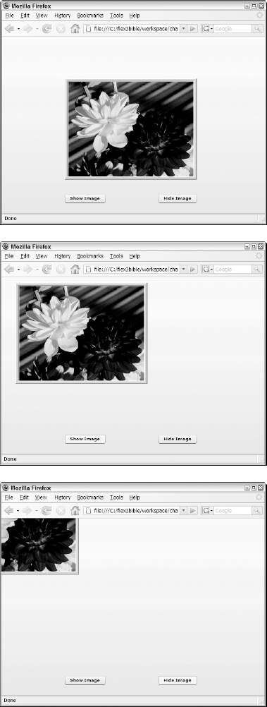
Triggers play effects when you apply them to a visual control. When an object is declared in MXML, you can apply the trigger with an MXML attribute declaration. In the following code, an Image control fades in and out of view when its visible property changes from true to false or back again:
<mx:Image source="assets/flower1.jpg"
      showEffect="Fade" hideEffect="Fade"/>
By default, the Image control appears and disappears abruptly. When the control's showEffect and hideEf fect triggers are set to play the Fade effect, the control appears and disappears gradually.
Listing 14.1 shows a complete application that uses the showEffect and hideEffect triggers to play the Fade effect.
Example 14.1. Using a simple trigger
<?xml version="1.0" encoding="utf-8"?>
<mx:Application xmlns:mx="http://www.adobe.com/2006/mxml"
      layout="absolute" backgroundColor="#eeeeee">
    <mx:Image id="myImage" source="assets/flower1.jpg" x="150" y="100"
    showEffect="Fade" hideEffect="Fade"/>
    <mx:Button x="150" y="375" label="Show Image"
    click="myImage.visible=true"/>
    <mx:Button x="374" y="375" label="Hide Image"
    click="myImage.visible=false"/>
</mx:Application>
Note
The code in Listing 14.1 is available in the Web site files as SimpleTrigger. mxml in the chapter14 project.
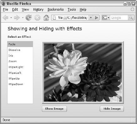
Figure 14.1 shows the resulting application in the process of fading from visible to invisible. The screenshot on the left shows the Image control with full visibility while the screenshot on the right shows the Image approximately 50 percent through the playing of the Fade effect.
Declaring triggers programmatically
Triggers are implemented internally as styles, so you can set a visual components trigger in ActionScript with a call to the components setStyle () method. The first argument in the call to setStyle () is the name of the trigger as a String. The second argument is an instance of the appropriate effect class.
The application in Listing 14.2 sets triggers on an Image control with the same result as in the MXML example, but it uses ActionScript to create the control, add it to the application, and set its behaviors.

Example 14.2. Setting component triggers in ActionScript
<?xml version="1.0" encoding="utf-8"?>
<mx:Application xmlns:mx="http://www.adobe.com/2006/mxml"
    layout="absolute" backgroundColor="#eeeeee"

    creationComplete="initApp()">
    <mx:Script>
    <![CDATA[
      import mx.controls.Image;
      import mx.effects.Fade;
      private var myImage:Image = new Image();
      private function initApp():void
      {
        this.addChild(myImage);
        myImage.source = "assets/flower1.jpg";
        myImage.x=150;
        myImage.y=100;
        myImage.setStyle("showEffect", new Fade());
        myImage.setStyle("hideEffect", new Fade());
      }
    ]]>
    </mx:Script>
    <mx:Button x="150" y="375" label="Show Image"
    click="myImage.visible=true"/>
    <mx:Button x="374" y="375" label="Hide Image"
    click="myImage.visible=false"/>
</mx:Application>
Note
The code in Listing 14.2 is available in the Web site files as SettingTriggers WithAS.mxml in the chapter14 project.
Tip
When you refer to an effect class in ActionScript code, the class must be imported before it's referenced:
import mx.effects.Fade;
You can explicitly construct and play an effect with ActionScript code with these steps:
Declare an instance of an effect class as a variable.
Set the effect variables
targetproperty to refer to the component you want to animate.Set other properties to modify the effects behavior.
Call the effect class's
play() method.
The application in Listing 14.3 creates and plays customized Fade effects to handle the hiding and showing of a visual component.
Example 14.3. Defining and playing an effect with ActionScript
<?xml version="1.0" encoding="utf-8"?>
<mx:Application xmlns:mx="http://www.adobe.com/2006/mxml"
      layout="absolute"
    backgroundColor="#eeeeee">
    <mx:Script>
    <![CDATA[
      import mx.effects.Fade;
      private function showImage():void
      {
        var myFade:Fade = new Fade();
        myFade.target = myImage;
        myFade.alphaFrom = 0;
        myFade.alphaTo = 1;
        myFade.play();
      }
      private function hideImage():void
      {
        var myFade:Fade = new Fade();
        myFade.target = myImage;
        myFade.alphaFrom = 1;
        myFade.alphaTo = 0;
        myFade.play();
      }
    ]]>
    </mx:Script>
    <mx:Image id="myImage" source="assets/flower1.jpg" x="150" y="100"/>
    <mx:Button x="150" y="375" label="Show Image" click="showImage()"/>
    <mx:Button x="374" y="375" label="Hide Image" click="hideImage()"/>
</mx:Application>
Note
The code in Listing 14.3 is available in the Web site files as PlayEffectWithAS.mxml in the chapter14 project.
Many of the pre-built effects in the Flex framework are specifically designed to show or hide a component with an animation instead of an abrupt appearance or disappearance.
Some of the effect classes accomplish this through a process known as tweening. A tweening effect changes an objects dimensions, transparency or position over time, but doesn't directly affect how much of the objects surface is visible until the effect is complete. The Flex framework includes tween effects such as Move, Blur, Dissolve, Resize, and Rotate.
Other effect classes control a components visibility through masking. A masking effect doesn't change the object's dimensions, transparency, or position; instead, it dynamically creates a visual object at runtime and uses that object to obscure or reveal the target component. The Flex framework includes such masking effects as Iris, WipeDown, WipeUp, WipeRight, and WipeLeft.
Both tweening and masking effects can be used to animate the process of showing or hiding a visual component. The application in Listing 14.4 demonstrates this, allowing you to apply selected effects to a control as its visible property is changed from true to false and back again.
Example 14.4. Showing and hiding a component with effects
<?xml version="1.0" encoding="utf-8"?>
<mx:Application xmlns:mx="http://www.adobe.com/2006/mxml"
      layout="absolute" backgroundColor="#eeeeee"
      creationComplete="changeEffect(event)">
  <mx:Script>
    <![CDATA[
      import mx.effects.*;

      private var myEffect:Effect;
      private function changeEffect(event:Event):void
      {
        switch (effectList.selectedItem)
        {
          case "Fade"       : myEffect = new Fade(); break;
          case "Dissolve"  : myEffect = myDissolve;  break;
          case "Iris"       : myEffect = new Iris(); break;
          case "Zoom"      : myEffect = new Zoom();break;
          case "WipeRight" : myEffect = new WipeRight(); break;
          case "WipeLeft"  : myEffect = new WipeLeft(); break;
          case "WipeUp"    : myEffect = new WipeUp(); break;
          case "WipeDown"  : myEffect = new WipeDown();
        }
        myImage.setStyle("showEffect", myEffect);
        myImage.setStyle("hideEffect", myEffect);
}
]]>
</mx:Script>
<mx:Dissolve id="myDissolve" color="red"/>
<mx:Label text="Showing and Hiding with Effects"
fontSize="18" x="24" y="10"/>
<mx:Image id="myImage" source="assets/flower1.jpg" x="158" y="72"/>
<mx:Button x="158" y="321" label="Show Image"
click="myImage.visible=true"/>
<mx:Button x="382" y="321" label="Hide Image"
click="myImage.visible=false"/>
<mx:Label x="24" y="46" text="Select an Effect" fontWeight="bold"/>
<mx:List id="effectList" change="changeEffect(event)"
x="24" y="72" width="100" height="241"
selectedIndex="0">
<mx:dataProvider>
<mx:String>Fade</mx:String>
<mx:String>Dissolve</mx:String>
<mx:String>Iris</mx:String>
<mx:String>Zoom</mx:String>
<mx:String>WipeRight</mx:String>
<mx:String>WipeLeft</mx:String>
<mx:String>WipeUp</mx:String>
<mx:String>WipeDown</mx:String>
</mx:dataProvider>
</mx:List>
</mx:Application>Note
The code in Listing 14.4 is available in the Web site files as ShowAndHide.mxml in the chapter14 project.
Figure 14.2 shows the resulting application. To see the different effects:
Select an effect from the list on the left.
Click the buttons to show and hide the control.
Fade and Dissolve
The Fade and Dissolve effects are similar to each other in that they both affect the components visibility and transparency over time. Both effect classes support properties of alphaFrom and alphaTo that can be used to control the direction and level of change in the components visibility. The default values for these properties are 0 and 1, applied as appropriate to show or hide the target component completely.
The Fade class implements a tweening effect that modifies the components transparency level over a period of time. By default, the Fade effect changes the target components alpha property from 0 to 1 when revealing it, and from 1 to 0 when hiding it. Whatever color or image is "behind" the target component shows through as its transparency level is changed.
The Dissolve class also implements a tweening effect, but it affects visibility by creating a rectangle object laid over the component and then changes the rectangles opacity to show and hide the underlying component. At the end of the effect, the rectangle is destroyed. The advantage of the Dissolve effect over the Fade effect is that you can control the color of the overlaid rectangle and more effectively blend the effect into the applications background.
When declaring a custom Dissolve effect in MXML, set its color to match the applications background or any other color you like. This Dissolve effect uses a red rectangle that appears at the end of the effect when hiding the component and at the beginning of the effect when showing it:
<mx:Dissolve id="myDissolve" color="red"/>
Iris and Zoom
The Iris and Zoom effects both resize a component over time, increasing its size to show it and decreasing its size to hide it. The two effects' resizing strategies, however, are very different.
The Iris class implements a masking effect that reveals a component from the center out and hides it from the outer borders inward. The components scale doesn't change when using the Iris; only the amount of the component's surface that's visible to the user is modified. The Iris class supports properties of scaleXFrom, scaleXTo, scaleYFrom, and scaleYTo. Each of these properties' values can be set from 0, meaning the object is completely masked, to 1, meaning the object is completely visible.
The Zoom class implements a tweening effect that changes the scale of the component. The Zoom effect supports properties of zoomWidthFrom, zoomWidthTo, zoomHeightFrom, and zoomHeightTo. When hiding the component, its zoom properties go from 1 to 0 . 01, and when showing the component, its scale changes from 0 . 01 to 1.
The application in Listing 14.5 plays an Iris and a Zoom effect simultaneously on two controls.
Example 14.5. Using the Iris and Zoom effects
<?xml version="1.0" encoding="utf-8"?>
<x:Application xmlns:mx="http://www.adobe.com/2006/mxml"
      layout="absolute"
    backgroundColor="#eeeeee">

    <x:Zoom id="myZoom" duration="2000"/>
    <x:Iris id="myIris" duration="2000"/>
    <x:Image id="irisImage" source="assets/flower1.jpg" x="22" y="55"
    showEffect="{myIris}" hideEffect="{myIris}"/>
    <x:Image id="zoomImage" source="assets/flower1.jpg" x="362" y="55"
    showEffect="{myZoom}" hideEffect="{myZoom}"/>
    <x:Button x="241" y="330" label="Show Images"
    click="zoomImage.visible=true;irisImage.visible=true;"/>
    <x:Button x="362" y="330" label="Hide Images"
    click="zoomImage.visible=false;irisImage.visible=false"/>
    <x:Label x="22" y="24" text="Iris Image" fontSize="14"
    fontWeight="bold"/>
    <x:Label x="362" y="24" text="Zoom Image" fontSize="14"
    fontWeight="bold"/>
</mx:Application>
Note
The code in Listing 14.5 is available in the Web site files as IrisAndZoom. mxml in the chapter14 project.
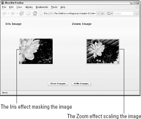
Figure 14.3 shows the difference between the Iris and Zoom effects. The screenshot reflects the appearance of two Image controls midway through playing the respective effects. The Iris effect masks the control, displaying only part of its surface, while the Zoom effect changes the object's size, showing it in its entirety but in a smaller scale.
Blur and Glow
The Blur and Glow classes implement tweening effects that use Flash Players BlurFilter and GlowFilter classes to change a components appearance over time. Unlike Iris, Zoom, and other effects that can be used effectively to show and hide a component, these filtering effects typically are used just to change an objects appearance but leave it visible.
The Blur effect supports properties of blurXFrom, blurXTo, blurYFrom, and blurYTo. The blurX properties determine the amount of horizontal blur, and the blurY properties determine the amount of horizontal blur.
The application in Listing 14.6 applies the Blur effect to an Image control. The effect is played explicitly upon a buttons click event.
Example 14.6. Using the Blur effect
<?xml version="1.0" encoding="utf-8"?>
<x:Application xmlns:mx="http://www.adobe.com/2006/mxml"
      layout="absolute"
    backgroundColor="#eeeeee">
    <x:Blur id="myBlur" target="{myBlurredImage}" blurXTo="20"
      blurYTo="20"/>
<x:Label x="22" y="24" text="Blurring an image" fontSize="14"
fontWeight="bold"/>
<x:Image source="assets/flower1.jpg" x="22" y="55"/>
<x:Image id="myBlurredImage" source="assets/flower1.jpg" x="366"
y="55"/>
<x:Button x="22" y="315" label="Show Images" click="myBlur.play()"/>
</mx:Application>Note
The code in Listing 14.6 is available in the Web site files as BlurDemo.mxml in the chapter14 project.
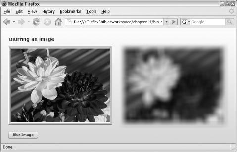
As shown in Figure 14.4, the application shows an image twice, with the Blur effect applied only to the second.
The Glow effect applies a colored glow around a components border. As with the Blur effect, the blurX and blurY properties determine the amount of blurriness to the effect, but instead of changing the whole component, only the glow area is affected.
In addition, the Glow effect supports these properties:
color: A named color or hexadecimal color value that determines the color of the glow areainner: ABooleanvalue which, when set totrue, causes the glow to be applied inward from the components border area instead of the default outward glowknockout: ABooleanvalue which, when set totrue, causes the surface area of the target component to be replaced with the color or component in the backgroundalphaFromandalphaTo: The amount of transparency to be applied
This Glow effect adds a red glow area around the outer edge of a target component. The alphaTo value of .5 means that after the effect has played, the glow area remains in place with 50 percent transparency.
<mx:Glow id="myGlowOn"
    blurXFrom="0" blurYFrom="0" blurXTo="20" blurYTo="20"
    color="#FF0000" alphaFrom="1.0" alphaTo="0.5"/>
Caution
When applying a Glow filter, if you don't set alphaTo to a value less than 1, the visual result disappears after the effect has finished playing.
The application in Listing 14.7 plays a Glow effect upon the target components rollOverEffect trigger and then plays a reverse effect to remove the glow upon the rollOutEffect trigger.
Example 14.7. Using the Glow effect
<?xml version="1.0" encoding="utf-8"?>
<mx:Application xmlns:mx="http://www.adobe.com/2006/mxml"
      layout="absolute"
    backgroundColor="#eeeeee">
    <mx:Glow id="myGlowOn"
    blurXFrom="0" blurYFrom="0" blurXTo="20" blurYTo="20"
    color="#ff0000" alphaFrom="1.0" alphaTo="0.5" knockout="true"/>
    <mx:Glow id="myGlowOff"
    blurXFrom="20" blurYFrom="20" blurXTo="0" blurYTo="0"
    color="#ff0000" alphaFrom=".5" alphaTo="1"/>
    <mx:Label x="22" y="24" text="Applying a Glow filter"
    fontSize="14" fontWeight="bold"/>
    <mx:Image source="assets/flower1.jpg" x="22" y="55"/>
    <mx:Image source="assets/flower1.jpg" x="366" y="55"
    rollOverEffect="{myGlowOn}" rollOutEffect="{myGlowOff}"/>
</mx:Application>
Note
The code in Listing 14.7 is available in the Web site files as GlowDemo.mxml in the chapter14 project.
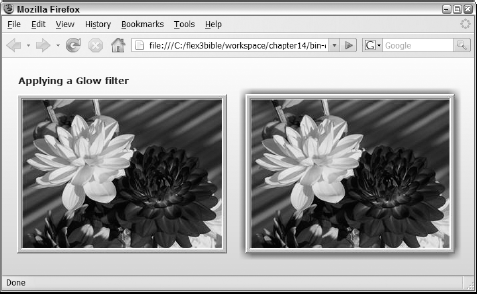
Figure 14.5 shows two Image controls. The Glow effect has been played on the second through the use of tri seers.
The Move effect
The Move class implements a tweening effect that does what it says: It moves the component on the screen to and from specific pixel positions over a period of time. The effect supports properties of xFrom, xTo, yFrom, and yTo that define the components position at the beginning and end of the effect. The objects intermediate positions are then recalculated over the period of time defined by the effects duration property.
When using the Move effect to control showing and hiding controls, you typically create two instances of the effect: one to show and one to hide. Each defines specific starting and ending coordinates and is applied to the target components appropriate triggers.
Caution
A Move effect's target component should always be nested in a Canvas or other container with absolute layout turned on. If the target component is nested in a container with vertical or horizontal layout and the container's dimensions change at runtime, the component's position is recalculated based on the container's layout rules.
The application in Listing 14.8 defines two Move effects that show and hide a target component by moving it on and off the application stage. Notice that the components positions at the start and end of the effect are either defined as specific coordinates or calculated based on the target component's dimensions.
Example 14.8. Using the Move effect
<?xml version="1.0" encoding="utf-8"?>
<mx:Application xmlns:mx="http://www.adobe.com/2006/mxml"
      layout="absolute"
    backgroundColor="#eeeeee">
    <mx:Move id="moveOn"
    xFrom="{0-myImage.width}" xTo="150"
    yFrom="{0-myImage.height}" yTo="100"/>
    <mx:Move id="moveOff"
    xTo="{0-myImage.width}" xFrom="150"
    yTo="{0-myImage.height}" yFrom="100"/>
    <mx:Image id="myImage" source="assets/flower1.jpg" x="150" y="100"
    showEffect="{moveOn}" hideEffect="{moveOff}"/>
    <mx:Button x="150" y="375" label="Show Image"
    click="myImage.visible=true"/>
    <mx:Button x="374" y="375" label="Hide Image"
    click="myImage.visible=false"/>
</mx:Application>
Note
The code in Listing 14.8 is available in the Web site files as MoveDemo.mxml in the chapter14 project.
Figure 14.6 shows the resulting application with the component in different positions as the effect is played.
The Rotate effect
The Rotate effect causes the target component to rotate in one direction or the other. You control the angle of rotation with the angleFrom and angleTo properties and values from 0 to 3 60. The rotation axis of the target component is controlled with the originX and originY properties, which default to the vertical and horizontal center point of the component.
This code defines a Rotate effect where the axis of rotation is dynamically calculated as the vertical and horizontal center of the object:
<mx:Rotate originX="{myImage.width/2}"
    originY="{myImage.height/2}"/>
Note
An example of using the Rotate effect is included in the section on composite effects, later in this chapter.
The wiping effects
Four wiping effects can mask a component using its top, bottom, left, and right borders as positions for the animation. The WipeRight, WipeLef t, WipeUp, and WipeDown effects are probably the simplest effects to use and understand. As with all effects, they support a duration property that controls the length of the effect.
In addition, the wiping effects support xFrom, xTo, yFrom, and yTo properties that control the beginning and ending position of the mask.
Note
Examples of the wiping effects are available in the Web site files ShowAndHide.mxml in the chapter14 project.
A composite effect plays two or more effects either simultaneously or consecutively. The Flex framework has two composite effects:
The
Paralleleffect plays two or more effects at the same time.The
Sequenceeffect plays two or more effects consecutively, with each effect starting after the previous effect has finished.
Both Parallel and Sequence effects can be declared in either MXML or ActionScript and can nest as many child effects, simple or composite, as you need to get the desired visual result.
Using Parallel effects
To create a Parallel effect in MXML, declare an <x: Parallel> tag set and assign a unique id. Then, within the tag set, nest two or more effects that you want to play simultaneously:
<mx:Parallel id="myParallelEffect">
...effect 1...
...effect 2...
...etc........
</mx:Parallel>
The effects defined with the <x: Parallel> tag set don't need unique id properties, because the entire effect is played either through association with a target component trigger or by an explicit call to the Parallel class's play () method.
The application in Listing 14.9 defines Parallel effects that include a Move and a Rotate nested effects. The visual result is an object that appears to roll on and off the application stage. Notice that the Rotate effect in the second Parallel has its angleFrom set to 360 and angleTo set to 0. The result is a counterclockwise rotation.
Example 14.9. Using a Parallel effect
<?xml version="1.0" encoding="utf-8"?>
<mx:Application xmlns:mx="http://www.adobe.com/2006/mxml"
      layout="absolute"
    backgroundColor="#eeeeee">
    <mx:Parallel id="moveOn">
    <mx:Move
      xFrom="{0-myImage.width}" xTo="150"
      yFrom="100" yTo="100"/>
    <mx:Rotate originX="{myImage.width/2}"
      originY="{myImage.height/2}"/>
    </mx:Parallel>
    <mx:Parallel id="moveOff">
    <mx:Move
      xTo="{0-myImage.width}" xFrom="150"
      yFrom="100" yTo="100"/>
    <mx:Rotate originX="{myImage.width/2}" originY="{myImage.height/2}"
      angleFrom="360" angleTo="0"/>
    </mx:Parallel>
    <mx:Image id="myImage" source="assets/flower1.jpg" x="150" y="100"
    showEffect="{moveOn}" hideEffect="{moveOff}"/>
    <mx:Button x="150" y="375" label="Show Image"
    click="myImage.visible=true"/>
    <mx:Button x="374" y="375" label="Hide Image"
    click="myImage.visible=false"/>
</mx:Application>
Note
The code in Listing 14.9 is available in the Web site files as ParallelDemo.mxml in the chapter14 project.
Using Sequence effects
The Sequence effect plays two or more nested effects consecutively In this code, a Sequence wraps two Move effects. The first nested effect moves the target object horizontally and the second moves it vertically:
<mx:Sequence id="moveOn" target="{myImage}">
    <mx:Move
    xFrom="{0-myImage.width}" xTo="150"
    yFrom="0" yTo="0"/>
    <mx:Move yTo="100"/>
</mx:Sequence>
Sometimes when using a Sequence, you want to create a delay between effects. The Pause effect is designed explicitly for this purpose: You add a Pause between other nested effects with a duration indicating how long the delay should be in milliseconds. This version of the Sequence plays the same set of Move effects, but it adds a one-second delay between them:
<mx:Sequence id="moveOn" target="{myImage}">
<mx:Move
xFrom="{0-myImage.width}" xTo="150"
yFrom="0" yTo="0"/>
<mx:Pause duration="1000"/>
<mx:Move yTo="100"/>
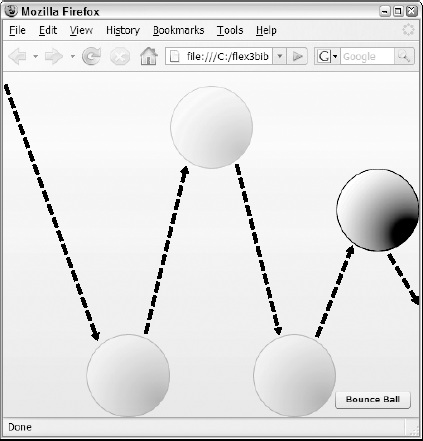
</mx:Sequence>A Sequence effect can nest any number of child effects, allowing you to choreograph objects on the screen in sometimes elaborate ways. The application in Listing 14.10 causes an image to "bounce" across the screen with multiple Move effects nested within a Sequence. Notice these features of the application:
The
Applicationhas itshorizontalScrollPolicyandverticalScroll Policyset to off to prevent scrollbars from appearing as the visual control moves off the visible area of the stage.The
Sequenceeffect handles itseffectEndevent by placing the image back in its original starting position.
Example 14.10. Listing 14.10
<?xml version="1.0" encoding="utf-8"?>
<mx:Application xmlns:mx="http://www.adobe.com/2006/mxml"
      layout="absolute"
    horizontalScrollPolicy="off" verticalScrollPolicy="off">
    <mx:Script>
    <![CDATA[
      [Bindable]
      private var stageWidth:Number;
      [Bindable]
      private var stageHeight:Number;
      private function bounce():void
      {
        stageHeight = stage.height;
        stageWidth = stage.width;
        bouncingBall.play();
      }
      private function replaceBall():void
      {
        myImage.x = 0-myImage.width;
        myImage.y = 0-myImage.height;
      }
    ]]>
</mx:Script>
<mx:Sequence id="bouncingBall" target="{myImage}"
effectEnd="replaceBall()">
<mx:Move xTo="{stageWidth/5}" yTo="{stageHeight-myImage.height}"/>
<mx:Move xTo="{stageWidth/5*2}" yTo="{stageHeight-
myImage.height*4}"/>
<mx:Move xTo="{stageWidth/5*3}" yTo="{stageHeight-myImage.height}"/>
<mx:Move xTo="{stageWidth/5*4}" yTo="{stageHeight-
myImage.height*3}"/>
<mx:Move xTo="{stageWidth}" yTo="{stageHeight-myImage.height}"/>
</mx:Sequence>
<mx:Image id="myImage" source="@Embed('assets/ball.
x="{0-myImage.width}" y="{0-myImage.height}"/>
<mx:Button label="Bounce Ball" click="bounce()" right="10"
bottom="10"/>
</mx:Application>Note
The code in Listing 14.10 is available in the Web site files as BouncingBall .mxml in the chapter14 project.
Figure 14.7 shows the reltulting application and the various positions of the image as it moves across the screen.
An easing function allows you to modify the behavior of an event that transforms a component on the screen. By default, an effect transforms an object with a linear timeline. For example, a Move effect changes an objects position on the screen with constant speed and motion. An easing function allows you to redefine the objects movement mathematically and modify its rate of change so that, for example, it appears to speed up as it moves.
Tip
Easing functions are most commonly demonstrated with object movement, but they work with any visual effect, because all such effects transform objects over a period of time.
Note
The easing functions included in the Flex framework are based on work by Robert Penner. More information on easing equations, including a valuable application for visualizing easing behavior, is available at his Web site at http://robertpenner.com/easing/.
The Flex framework includes a set of easing classes in the mx. effects . easing package, each of which modifies the rate of object transformation in a different way. The Bounce class, for example, can be used with a Move effect to cause the object to bounce against its final destination.
You use easing functions by assigning them to the effects easingFunction property. You can either use the pre-built easing functions in the Flex framework, or you can define and use your own custom functions.
To use a pre-built easing function, follow these steps:
In a Script section, import the class that includes the easing function you want to use.
Set the effects
easingFunctionproperty to the name of the class and function, using dot syntax. Don't include parentheses or pass any properties; include only the class and function name:easingFunction="Bounce.easeOut"
The application in Listing 14.11 uses the Bounce . easeOut () function to cause the Image control to bounce on a platform (created as a Canvas container) after dropping from the top of the application.
Example 14.11. Using an easing function
<?xml version="1.0" encoding="utf-8"?>
<mx:Application xmlns:mx="http://www.adobe.com/2006/mxml"
      layout="absolute"
    backgroundColor="#eeeeee">
    <mx:Script>
    <![CDATA[

      import mx.effects.easing.Bounce;
private function dropBall():void
{
myImage.y=0-myImage.height;
bouncingBall.play();
}
]]>
</mx:Script>
<mx:Move id="bouncingBall" target="{myImage}"
yTo="{platform.y-myImage.height}"
easingFunction="Bounce.easeOut" duration="2000"
suspendBackgroundProcessing="true"/>
<mx:Image id="myImage" source="@Embed('assets/ball.
horizontalCenter="0" y="{0-myImage.height}"/>
<mx:Button label="Bounce Ball" click="dropBall()" right="10"
bottom="10"/>
<mx:Canvas id="platform" width="200" height="75"
backgroundColor="#666666" horizontalCenter="0" bottom="0"/>
</mx:Application>Note
The code in Listing 14.11 is available in the Web site files as EasingDemo.mxml in the chapter14 project.
As shown in Figure 14.8, the image drops from the top of the application and appears to bounce on the Canvas container.

Tip
The suspendBackgroundProcessing property causes all visual processing of the application to be suspended while an effect is being played. This can greatly improve effect performance, especially on a slower client computer. The only reason not to set this property to true is if the user has to be able to interact with the application while an effect is playing, or if you're trying to play more than one effect at the same time.
Drag-and-drop interfaces allow users to give instructions to an application with simple mouse gestures. Pointing to an object that a person wants to manipulate is the most human of gestures, and grabbing and moving an object to change its current state is how we interact with the physical world in nearly every waking minute. The mouse turns that intuitive action into a computer instruction that graphical applications can interpret as needed.
Drag-and-drop operations can be created to represent various software operations:
Selecting data
Moving data from one location to another
Deleting data
Managing data relationships
Modifying structures of information
As the designer and developer of a Flex application, you must select or create the drag-and-drop architecture that makes your interface the easiest to use.
Flex applications can implement drag-and-drop operations with two different approaches:
All List-based controls in the Flex framework have built-in support for drag-and-drop operations. These controls include:
ListComboBoxDataGridTitleListHorizontalListTree
Each of these controls supports a set of properties that turn on and control drag-and-drop operations:
dragEnabledis aBooleanproperty that, when set totrue, allows a user to select one or more items from aListcontrol and drag them (and their underlying data) to another visual control in the application.dropEnabledis aBooleanproperty that, when set totrue, allows aListcontrol to accept a drop operation. When the user completes the operation, the target object adds the operation's underlying data to its data provider. If the initiating object'sdragMoveEnabledproperty is set totrue, the items that were dropped in the target object are removed from the initiating object's data source; otherwise, the initiating object's data provider is left in its current state.dragMoveEnabledis aBooleanproperty that, when set totruealong withdragEnabled, causes items dragged from a List control be removed from the initiating control's data provider. This property also allows users to reorder data in a control'sdataProviderif the control'sdropEnabledproperty is set totrue.
Caution
Setting dragMoveEnabled to true without also setting dragEnabled to true has no affect on the application. You must set dragEnabled to true to initiate a List-based drag-and-drop operation.
The following code creates a List control and a DataGrid control. The List control can initiate a drag-and-drop operation, and the DataGrid can accept the dropped data:
<mx:List dataProvider="{myData}" dragEnabled="true"/>
<mx:DataGrid dropEnabled="true">
Because the DataGrid control's dragMoveEnabled property isn't set to true, any objects dragged to the DataGrid are still displayed in the List after the operation is completed.
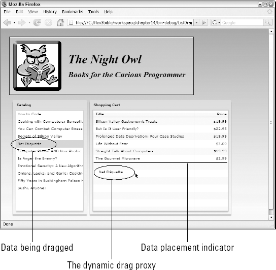
The application in Listing 14.12 uses List and DataGrid controls. Notice these features of the sample application:
As the
Listrow is dragged, an image of the row is generated and displayed as a visual indicator that the drag-and-drop operation is active. This image is known as the drag proxy.The drag proxy initially includes a white X in a red circle, indicating that the operation can't be completed yet. When the cursor moves over the target control with
dropEnabledset totrue, the white X and red circle disappear, indicating to the user that the operation can be completed.The
DataGridcontrol'sdragMoveEnabledproperty is set totrue, so the data is added to theDataGridand removed from the initiatingListwhen the operation is completed.
Example 14.12. Using a List-based drag-and-drop operation
<?xml version="1.0" encoding="utf-8"?>
<mx:Application xmlns:mx="http://www.adobe.com/2006/mxml"
      layout="vertical"
    backgroundGradientAlphas="[1.0, 1.0]" xmlns:views="views.*"
    horizontalAlign="left" backgroundGradientColors="[#908D8D, #FFFFFF]">
    <mx:Script>
    <![CDATA[
      import utilities.FormatUtilities;
    ]]>
    </mx:Script>
    <mx:Model id="bookModel" source="model/books.xml"/>
    <mx:ArrayCollection id="acBooks" source="{bookModel.book}"/>
    <mx:Style source="assets/styles.css"/>
    <views:Header/>
    <mx:HBox>
    <mx:Panel id="catalogPanel" title="Catalog">
      <mx:List dataProvider="{acBooks}" labelField="title"
        height="300" width="200"
        dragEnabled="true" dragMoveEnabled="true"/>
    </mx:Panel>
    <mx:Panel title="Shopping Cart" height="{catalogPanel.height}"
      width="100%">
      <mx:DataGrid id="cart" width="100%" height="100%"
      dropEnabled="true">
        <mx:columns>
          <mx:DataGridColumn dataField="title" headerText="Title"
            width="300"/>
          <mx:DataGridColumn dataField="price" headerText="Price"
            labelFunction="FormatUtilities.currencyFormat"
            textAlign="right"/>
        </mx:columns>
      </mx:DataGrid>
    </mx:Panel>
    </mx:HBox>
</mx:Application>
Note
The code in Listing 14.12 is available in the Web site files as ListDragAndDrop.mxml in the chapter14 project.
Figure 14.9 shows the drag-and-drop operation in action.
You also can implement drag-and-drop operations manually using a set of classes and events specifically designed for the purpose. The most critical tools for this job are these ActionScript classes:
DragSourcecontains data and formatting information, and serves a messaging envelope containing the data you want to move.DragManagerinitiates and manages drag-and-drop operations containing whatever data you want the user to move in the application.
Initiating a drag-and-drop operation
The DragSource and DragManager classes are members respectively of the mx. core and mx. managers packages and must be imported before use:
import mx.core.DragManager;
   import mx.managers.DragManager;
Tip
Custom drag-and-drop operations can be initiated upon any mouse event; they typically start upon a mouseDown, which indicates the user has pressed the mouse button but hasn't yet released it.
To initiate a custom drag-and-drop operation, follow these steps:
Create an instance of the
DragSourceclass with its no-arguments constructor method.Populate the
DragSourceclass with data by calling itsaddData() method.Call the static method
DragManager . doDrag() to start the drag-and-drop operation.
In the following code, a mouseDown event on an Image control that's generated in a Repeater is handled with a call to a custom method that will initiate the drag-and-drop operation:
<x:Image source="{booklmage}" mouseDown="initiateDrag(event)"/>The custom initiateDrag () method starts by creating a DragSource object and filling it with data with a call to the addData () method. DragSource . addData () has two required arguments:
A reference to the data that's being moved
A string that identifies the format of the data
Tip
When you initiate a drag-and-drop operation with a List control with dragEnabled set to true, the name of the format is always items.
In the following method, the expression event. target. getRepeaterltem () returns a reference to the initiating object's underlying data. The bookItem format is an arbitrary string that identifies the type of data being moved. The doDrag () method receives three required arguments: a reference to the visual component that initiated the operation, the DragSource object containing the data, and a reference to the MouseEvent object that was passed into the current method:
private function initiateDrag(event:MouseEvent):void
{
    var source:DragSource = new DragSource();
    source.addData(event.target.getRepeaterItem(),"bookItem");
    DragManager.doDrag(event.target as UIComponent, source, event);
}
Tip
You can call the DragSource class's addData () method multiple times to pass data in as many formats as you need. This is analogous to a clipboard operation, where data might be shared between applications in multiple formats through a copy-and-paste operation, but only formats that are common to the source and the target applications are used at any given time.
Creating a proxy image
A proxy image is displayed during a drag-and-drop operation as a visual indicator of the type or content of the data being moved. When you initiate drag-and-drop with List controls, the drag proxy image is created dynamically from the current screen display For custom drag-and-drop operations, you're responsible for providing the drag proxy image.
Tip
If you don't provide a drag proxy image for a custom drag operation, a blank, partially transparent rectangle is created by the framework of the same shape and dimension as the object that initiates the operation. While this can work okay, the visual result is bland and uninformative.
Drag proxy images should be embedded in the application for the best possible performance. Follow these two steps for this part of the process:
Embed a graphic using the [
Embed] metadata tag, and assign it aClassvariable name.Instantiate a
BitMapClassobject wrapped around a new instance of the embedded imageClass.
Tip
A class used as a proxy image must implement the IFlexDisplayObject interface. Classes that can be used for this purpose include BitmapAsset, ButtonAsset, MovleCllpAsset, MovieClipLoaderAsset, ProgrammaticSkin, SprlteAsset, SystemManager, TextFieldAsset, and UIComponent.
The following code embeds an image and wraps it in a BitMapAsset object that's suitable for use as a proxy image:
[Embed(source="assets/book.png")]
private var bookImage:Class;
private var bookProxy:BitmapAsset = BitmapAsset(new bookImage());
You cast the instance of the proxy image class as BitMapAsset to fulfill the requirement that the proxy image object implements IFlexDisplayObject interface.
To use the proxy image in a drag-and-drop operation, pass the proxy object as the fourth argument in the call to DragManager . doDrag ():
DragManager.doDrag(event.target as UlComponent, source,
      event, bookProxy);
You also can control the position of the drag proxy image relative to the cursor position and the image's level of transparency. The doDrag () method's fifth and sixth arguments, xOffset and yOffset, determine the image's horizontal and vertical relative position, and the seventh argument, imageAlpha, determines the amount of transparency. This code uses the same proxy image but ensures that it's fully opaque and positioned to the top and left of the cursor:
DragManager.doDrag(event.target as UIComponent, source, event,
    bookProxy, 20, 20, 1);
Tip
Positive offset values for the proxy image place the image above and to the left of the cursor, while negative values place it below and to the right.
Handling the dragEnter event
A target control, located where the data will be dropped, detects a drag-and-drop operation by listening for the dragEnter event. When the mouse cursor moves over the target object, this event generates a DragEvent object. The DragEvent class has a dragSource property that references the DragSource object that contains the operation's underlying data.
The first step in handling the dragEnter event is to determine whether the operation contains data in a format you can deal with in the current context. You do this by calling the DragSource class's hasFormat () method and passing in a format string you can handle. If the selected format exists in the drag source, you then accept the operation by calling DragManager. acceptDragDrop () and passing in a reference to the object that accepts the operation.
This code detects a particular drag format and accepts the operation:
private function dragEnterHandler(event:DragEvent):void
{
    if (event.dragSource.hasFormat("bookItem"))
    {
    DragManager.acceptDragDrop(event.target as UIComponent);
    }
}
When you call acceptDragDrop (), the red icon with the white X on the proxy image disappears, indicating to the user that the data is ready to be dropped.
Handling the dragDrop event
When the user drops the data over an object that has already accepted the operation (as described in the preceding section), the object dispatches a dragDrop event. This event also generates a DragEvent object. In addition to the dragSource property described previously, this object also has a dragInitiator property that references the object that initiated the operation.
The DragSource class has a method named dataForFormat () . To retrieve data that should be acted upon, call the method and pass in the format of the data you want:
var dragData:Object = event.dragSource.dataForFormat("bookltem");After you have a reference to the dropped data, you can manipulate it in a database, move it to other data buckets in the application, or simply remove it. The following code handles the drag-and-drop operation by first getting references to data through the initiating object's repeater and then removing the underlying data from the repeater's data provider:
private function dragDropHandler(event:DragEvent):void
{
    var dragData:Object =
      event.dragSource.dataForFormat("bookItem");
    var initiator:UIComponent = event.dragInitiator as UIComponent;
var bookTitle:String = initiator.getRepeaterItem().title;
acBooks.removeItemAt(initiator.repeaterIndex);
Alert.show("Book deleted: " + bookTitle, "Deleted!");
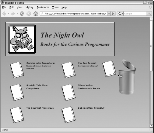
}The application in Listing 14.13 uses a custom drag-and-drop operation to allow a user to delete data using a trash can icon.
Example 14.13. A custom drag-and-drop operation
<?xml version="1.0" encoding="utf-8"?>
<mx:Application xmlns:mx="http://www.adobe.com/2006/mxml"
layout="vertical"
backgroundGradientAlphas="[1.0, 1.0]" xmlns:views="views.*"
horizontalAlign="left" backgroundGradientColors="[#908D8D, #FFFFFF]">
<mx:Script>
<![CDATA[
import mx.controls.Alert;
import mx.core.BitmapAsset;
import mx.core.UIComponent;
import mx.core.DragSource;
import mx.managers.DragManager;
import mx.events.DragEvent;
import utilities.FormatUtilities;
[Embed(source="assets/book.png")]
[Bindable]
private var bookImage:Class;
private var bookProxy:BitmapAsset = BitmapAsset(new bookImage());
private function initiateDrag(event:MouseEvent):void
{
var source:DragSource = new DragSource();
var itemData:Object = event.currentTarget.getRepeaterItem();
source.addData(event.target.getRepeaterItem(),"bookItem");
DragManager.doDrag(event.target as UIComponent, source, event,
bookProxy, 20, 20, 1);
}
private function dragEnterHandler(event:DragEvent):void
{
if (event.dragSource.hasFormat("bookItem"))
{
DragManager.acceptDragDrop(event.target as UIComponent);
}
}
private function dragDropHandler(event:DragEvent):void
{var dragData:Object =
event.dragSource.dataForFormat("bookItem");
var initiator:UIComponent = event.dragInitiator as UIComponent;
var bookTitle:String = initiator.getRepeaterItem().title;
    acBooks.removeItemAt(initiator.repeaterIndex);
    Alert.show("Book deleted: " + bookTitle, "Deleted!");
}
]]>
</mx:Script>
<mx:Model id="bookModel" source="model/books.xml"/>
<mx:ArrayCollection id="acBooks" source="{bookModel.book}"/>
<mx:Style source="assets/styles.css"/>
<views:Header id="header"/>
<mx:HBox verticalAlign="top">
<mx:Tile width="{header.width}">
<mx:Repeater id="bookRepeater" dataProvider="{acBooks}"
recycleChildren="true">
<mx:HBox width="250">
<mx:Image source="{bookImage}"
mouseDown="initiateDrag(event)"/>
<mx:Text text="{bookRepeater.currentItem.title}"
fontSize="10" fontWeight="bold" width="100%"
selectable="false"/>
</mx:HBox>
</mx:Repeater>
</mx:Tile>
<mx:Image source="@Embed('assets/garbagecan.
dragEnter="dragEnterHandler(event)"
dragDrop="dragDropHandler(event)"/>
</mx:HBox>
</mx:Application>Note
The code in Listing 14.13 is available in the Web site files as CustomDragAndDrop.mxml in the chapter14 project.
Figure 14.10 shows the resulting application, with an embedded book graphic used both as a data icon and as a drag proxy image. When the user drags a book to the trash can, the data is deleted from the application.
Custom drag-and-drop operations give you the freedom to react to user gestures in many ways. These are some other strategies you can use in your applications:
You can explicitly handle
dragDropevents on list-based controls instead of relying on the automatic list control behaviors. For example, you may react to thedragDropevent by calling a Web service and manipulating server-side data.In the case where an item can be dragged from multiple sources, you can detect the originator of a drag-and-drop operation like this:
if (Object(event.dragInitiator).id == "bookList")
{
    ... doWhatever() ...
}
You can find out where the item is being dropped in a list-based control with
this .bookList. calculateDropIndex(event) and passing theDragEventobject.
In this chapter, I described how to implement animation and drag-and-drop interfaces in Flex applications. You learned the following:
An effect is an ActionScript class that defines changes in a visual components position, visibility, scaling, and other properties over a period of time.
The framework has many pre-built effect classes that control animation.
Each effect class has a set of properties you can set to control animation.
A behavior is a combination of a trigger and an effect.
You can play an effect with explicit ActionScript statements or by associating it with a trigger.
A trigger has an associated event, but it plays an effect instead of executing arbitrary ActionScript.
You can define triggers in both MXML and ActionScript.
Drag-and-drop operations can be used to create an intuitive interface for managing data in a Flex application.
List-based controls implement drag-and-drop with the
dragEnabledanddropEnabledproperties.You can create highly customized drag-and-drop interfaces with the
DragManagerandDragSourceclasses.