As described in Chapter 8, there are two types of visual components in Flex:
Containers are visual components that can contain other objects.
Controls are visual components that display information or provide the application with user interaction capabilities.
The layout of a Flex application is determined through a combination of the applications containership hierarchy and the use of absolute layout tools. Applications are typically designed with a combination of vertical or horizontal flow-style containers that lay out their nested child components automatically and absolute layout components whose nested child components either set their positions with x and y or constraint properties.
The Flex framework includes two types of containers:
Layout containers are rectangular regions that contain other visual components (containers or controls). Examples of layout containers include:
In this chapter, I describe the pre-built layout containers in the Flex framework and how you use them to determine the application's visual appearance.
Note
To use the sample code for this chapter, import the chapter09 .zip Flex project archive file from the Web site files into your Flex Builder workspace.
The three simple Box containers in the Flex framework implement different layout styles:
VBox: A rectangular area that lays out its nested child objects in a single column from top to bottom
HBox: A rectangular area that lays out its nested child objects in a single row from left to right
Canvas: A rectangular area that places its nested child objects in specific positions relative to either top/left anchors or constraint-based anchors
These three containers support the height and width properties to determine their dimensions. If you don't declare these properties, the containers size themselves automatically to accommodate their child objects.
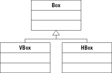
As shown in the UML diagram in Figure 9.1, the VBox and HBox components are extended from a superclass named Box.
Tip
While you're allowed to use the superclass Box component and set its direction property to either vertical or horizontal, which is the only difference between the subclasses, most often you already know which layout you want and can use the specific subclass.
The Box, VBox, and HBox components place their nested child visual components using two logical passes through the containership. In the first pass, the quantity and size of the nested child objects are collected. In the second pass, the nested objects are placed on the screen. Each time the Box component is resized, it re-executes this sizing and placement task.
The VBox container
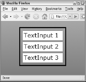
The VBox container behaves like the Application component when its layout is set to vertical: It lays out nested visual components in a single column from top to bottom. The application in Listing 9.1 uses a VBox to lay out three Textlnput controls.
Example 9.1. Using the VBox container
<?xml version="1.0" encoding="utf-8"?>
<mx:Application xmlns:mx="http://www.adobe.com/2006/mxml"
      layout="vertical">
    <mx:Style>
    TextInput { font-size:24 }
    </mx:Style>
    <mx:VBox
    borderStyle="solid" borderColor="#000000" borderThickness="4"
    horizontalAlign="center"
    paddingBottom="10" paddingLeft="10" paddingRight="10"
      paddingTop="10">
    <mx:TextInput text="TextInput 1"/>
    <mx:TextInput text="TextInput 2"/>
    <mx:TextInput text="TextInput 3"/>
    </mx:VBox>
</mx:Application>
Note
The code in Listing 9.1 is available in the Web site files as VBoxDemo.mxml in the chapter09 project.
Figure 9.2 shows the resulting application running in the Web browser.
The HBox container
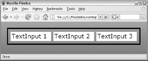
The HBox container behaves like the Application component when its layout is set to horizontal: It lays out nested visual components in a single column from top to bottom. The application in Listing 9.2 uses an HBox to lay out three Textlnput controls.
Example 9.2. Using the HBox container
<?xml version="1.0" encoding="utf-8"?>
<mx:Application xmlns:mx="http://www.adobe.com/2006/mxml"
      layout="vertical">
    <mx:Style>
    TextInput { font-size:24 }
    </mx:Style>
    <mx:HBox
    borderStyle="solid" borderColor="#000000" borderThickness="4"
    horizontalAlign="center"
    paddingBottom="10" paddingLeft="10" paddingRight="10"
      paddingTop="10">
    <mx:TextInput text="TextInput 1"/>
    <mx:TextInput text="TextInput 2"/>
    <mx:TextInput text="TextInput 3"/>
    </mx:HBox>
</mx:Application>
Note
The code in Listing 9.2 is available in the Web site files as VBoxDemo.mxml in the chapter09 project.
Figure 9.3 shows the resulting application running in the Web browser.
The Canvas container behaves like the Application component when its layout is set to absolute. As shown in Figure 9.4, the Canvas container extends the Container class directly.
Objects that are nested within a Canvas determine their positions in one of these ways:
Traditional absolute-layout properties of
xandy(the number of pixels from the left and top of theCanvascontainer)Constraint-based positioning using anchors of
left, right, top, bottom, horizontalCenter, andverticalCenterAdvanced constraints using row-based and column-based anchors
Visual components that are nested in a Canvas can use the following properties to set their positions relative to the Canvas containers top-left corner:
x: The number of horizontal pixels from the Canvas containers left border
y: The number of vertical pixels from the Canvas containers top border
The following code declares a Label component nested in a Canvas. The Label control's top-left corner is 10 pixels from the top and left of the Canvas:
<mx:Canvas>
    <mx:Label x="10" y="10" text="Hello World!"/>
</mx:Canvas>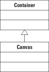
One benefit of the Canvas, Application, and other containers that support absolute positioning is the ability to layer objects on top of each other. Paired with alpha styles that control transparency, you can create visual effects where one object appears "behind" another, but shows through the "top" object.
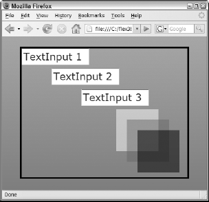
The code in Listing 9.3 declares a Canvas container wrapped around three Textlnput controls and three VBox containers. The VBox containers are arranged so that they overlap each other, and the backgroundAlpha setting of . 5 creates a 50 percent transparency effect.
Example 9.3. A Canvas container with overlapping objects
<?xml version="1.0" encoding="utf-8"?>
<mx:Application xmlns:mx="http://www.adobe.com/2006/mxml"
      layout="vertical">
    <mx:Style>
    TextInput { font-size:24 }
    </mx:Style>
    <mx:Canvas borderStyle="solid" borderColor="#000000"
      borderThickness="4"
    width="400" height="313">
    <mx:TextInput text="TextInput 1"/>
    <mx:TextInput text="TextInput 2" x="71" y="47"/>
    <mx:TextInput text="TextInput 3" x="141" y="97"/>

    <mx:VBox width="100" height="100" backgroundColor="#FFFFFF"
      backgroundAlpha=".5" x="224" y="144"/>
<mx:VBox width="100" height="100" backgroundColor="#666666"
backgroundAlpha=".5" x="249" y="169"/>
<mx:VBox width="100" height="100" backgroundColor="#000000"
backgroundAlpha=".5" x="274" y="194"/>
</mx:Canvas>
</mx:Application>Note
The code in Listing 9.3 is available in the Web site files as CanvasDemo.mxml in the chapter09 project.
Figure 9.5 shows the resulting application displayed in a browser. Notice the overlapping objects and the borders that show through.
The VBox and HBox containers support styles that help to determine placement of nested objects. These styles, described in Table 9.1, control the alignment and the area around and between objects nested within the container.
Table 9.1. Box Container Styles
The application in Listing 9.4 places nested visual components within a VBox container that sets gap, border, and padding styles using CSS syntax and MXML style attributes.
Example 9.4. An application with box styles
<?xml version="1.0" encoding="utf-8"?>
<mx:Application xmlns:mx="http://www.adobe.com/2006/mxml"
      layout="vertical"
    backgroundColor="#eeeeee">
    <mx:Style>
    TextInput {
      font-size:24;
      border-style:solid;
      border-color:black;
      border-thickness:4;
}
</mx:Style>
<mx:Spacer height="20"/>
<mx:VBox
borderStyle="solid" borderColor="#000000" borderThickness="4"
horizontalAlign="center"
paddingBottom="20" paddingLeft="20" paddingRight="20"
paddingTop="20"
verticalGap="20" backgroundColor="white">
<mx:TextInput text="TextInput 1"/>
<mx:TextInput text="TextInput 2"/>
<mx:TextInput text="TextInput 3"/>
</mx:VBox>
</mx:Application>Note
The code in Listing 9.4 is available in the Web site files as V VBoxGapAndPadding.mxml in the chapter09 project.
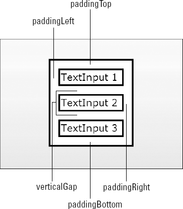
The diagram in Figure 9.6 shows the placement of gap and padding styles in a VBox container.
Tip
The alignment, gap, and padding styles have no effect on objects nested inside a Canvas container, because the objects' positions are determined solely by their absolute positioning properties.
Tip
Developers who are familiar with Cascading Style Sheets as implemented in Web browsers might be curious about the lack of margin styles. In HTML-based CSS, the "box model" includes padding on the inside of an object's borders, the borders themselves, and margins outside the borders that create space outside an object. Flex-based CSS omits the margin settings and implements only padding and border styles. The details of applying these and other styles are described in Chapter 10.
The Panel container creates a rectangular region that looks like a dialog box. Unlike the VBox, HBox, and Canvas, which don't have any default visual appearance, a Panel is used when you want to wrap content inside a visual presentation that sets it off from the rest of the application.
A simple Panel is declared in MXML with a pair of <mx: Panel> tags. The Panel containers nested components are declared between the paired tags:
<mx:Panel>
   ... place contents here ...
</Panel>
The Panel shares many properties with the Application and Box containers.
Using the layout property
Like the Application component, it supports the layout property and allows the Panel container's nest components to be laid out with vertical, horizontal, or absolute positioning. As with Application, the default value is vertical.
Using title and status
The Panel container has two properties that place labels in the container's header region:
The title property places a label in a bold font in the left side of the Panel header.
The status property places a label in normal font in the right side of the Panel header.
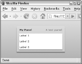
The code in Listing 9.5 declares a Panel with a title and a status property, and contains a set of Label controls.
Example 9.5. A Panel containing three Label controls
<?xml version="1.0" encoding="utf-8"?>
<mx:Application xmlns:mx="http://www.adobe.com/2006/mxml"
      layout="vertical"
    backgroundColor="#cccccc">
    <mx:Panel title="My Panel" status="A test panel" width="200">
    <mx:Label text="Label 1"/>
    <mx:Label text="Label 2"/>
    <mx:Label text="Label 3"/>
    </mx:Panel>
</mx:Application>
Note
The code in Listing 9.5 is available in the Web site files as PanelDemo.mxml in the chapter09 project.
Figure 9.7 shows a Panel containing the three Label controls and displaying the title and status values in the Panel header.
Tip
While a Panel looks like a dialog box, it's typically presented "in line" with the rest of the application layout, rather than as a pop-up window. When you present pop-up windows, you typically use the TitleWindow container or the Alert class, both of which extend the Panel container and share its capabilities but are specifically designed for that use.
The Panel container supports all the Box styles described previously and adds other styles that are specific to its functions and abilities.
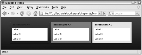
The Panel container and transparency
The Panel container has a borderAlpha style that controls the level of transparency in the container's title bar, control bar, and sides. Alpha values in Flex are set to a range of 0 to 1, where 0 is fully transparent and 1 is fully opaque. The default borderAlpha for a new Panel is .4, meaning that it has an opaqueness of 40 percent and the background color or image can show through the panel's outside area.
Tip
The Panel container displays a drop shadow by default. To remove the shadow, set the Panel object's dropShadowEnabled property to false.
The code in Listing 9.6 displays three Panel containers with borderAlpha settings of 0, .4 (the default), and 1.
Example 9.6. Panel containers with different borderAlpha values
<?xml version="1.0" encoding="utf-8"?>
<mx:Application xmlns:mx="http://www.adobe.com/2006/mxml"
    backgroundColor="#333333" layout="horizontal">
    <mx:Panel title="borderAlpha=0" width="200" borderAlpha="0"
      color="#ffffff">
    ... nested labels ...
    </mx:Panel>
    <mx:Panel title="borderAlpha=.4" width="200" borderAlpha=".4">
    ... nested labels ...
    </mx:Panel>
    <mx:Panel title="borderAlpha=1" width="200" borderAlpha="1">
    ... nested labels ...
    </mx:Panel>
</mx:Application>
Note
The code in Listing 9.6 is available in the Web site files as PanelTransparency.mxml in the chapter09 project.
Figure 9.8 shows the three Panel containers with the differing levels of transparency against a dark Application background.
Controlling Panel corners
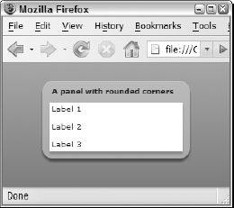
By default, a Panel presents rounded corners in the header and square corners in the footer. To instead present round corners for both the header and footer, set roundedBottomCorners to true, like this:
<mx:Panel title="My Panel" roundedBottomCorners="true">
       ...nested content...
     </mx:Panel>
The Panel container also supports the cornerRadius style, which determines the amount of curve in the containers corners. The default cornerRadius is 4 pixels. Setting this value to 0 results in square corners at the top and bottom of the container; increasing the value creates a softer curve.
The code in Listing 9.7 creates a Panel container with rounded corners at both top and bottom and a cornerRadius of 15.
Example 9.7. A Panel container with modified corner styles
<?xml version="1.0" encoding="utf-8"?>
<mx:Application xmlns:mx="http://www.adobe.com/2006/mxml">
    <mx:Panel title="A panel with rounded corners" width="200"
    roundedBottomCorners="true" cornerRadius="15">
    <mx:Label text="Label 1"/>
    <mx:Label text="Label 2"/>
    <mx:Label text="Label 3"/>
    </mx:Panel>
</mx:Application>
Note
The code in Listing 9.7 is available in the Web site files as PanelCorners.mxml in the chapter09 project.
Figure 9.9 shows the application with a Panel with rounded top and bottom corners and a cornerRadius of 15.
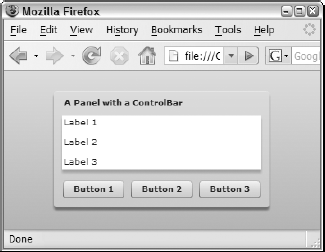
The ControlBar container is designed to be nested as the last component within a Panel or a TitleWindow. This container mimics the behavior of the HBox container, laying out its nested components horizontally, and creates a footer region below the other Panel containers nested objects with a style that matches the title bar. In addition to providing a container for objects in the Panel containers footer, it rounds the Panel containers bottom corners in the same manner as the roundedBottomCorners style. The code in Listing 9.8 creates a Panel with a ControlBar.
Example 9.8. A Panel with a ControlBar
<?xml version="1.0" encoding="utf-8"?>
<mx:Application xmlns:mx="http://www.adobe.com/2006/mxml"
      layout="vertical"
    backgroundColor="#cccccc">
    <mx:Panel title="A Panel with a ControlBar">
    <mx:Label text="Label 1"/>
    <mx:Label text="Label 2"/>
    <mx:Label text="Label 3"/>
    <mx:ControlBar>
      <mx:Button label="Button 1"/>
      <mx:Button label="Button 2"/>
      <mx:Button label="Button 3"/>
    </mx:ControlBar>
    </mx:Panel>
</mx:Application>
Note
The code in Listing 9.8 is available in the Web site files as ControlBarDemo.mxml in the chapter09 project.
Figure 9.10 shows the resulting application. Notice that the Button controls in the ControlBar lay out horizontally.
Tip
The ControlBar container always lays out its nested components horizontally. If you want to stack objects in a ControlBar vertically or place them with absolute positions, declare a VBox or Canvas container inside the ControlBar.
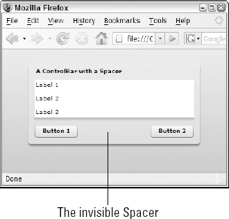
To separate controls within a ControlBar so that they "glue" themselves to the far left and right edges, add a Spacer control between the controls with a width of 100:
<mx:ControlBar>
    <mx:Button label="Button 1"/>
    <mx:Spacer width="100%"/>
    <mx:Button label="Button "/>
</mx:ControlBar>
Figure 9.11 shows that the component after the Spacer is pushed to the far right edge of the ControlBar.
Constraint-based layout allows you to place objects on the screen using anchors other than a container's top-left corner. You can implement constraint-based layout easily using Flex Builders Design and Flex Properties views or with a code-based approach. And, using the new ConstraintRow and ConstraintColumn classes, you can anchor objects to regions other than the borders of the container.
Note
Constraint-based layout works only in containers that support absolute layout. When used in the Application, Panel, or TitleWindow containers, the container's layout property must be set to absolute for constraint properties to have an effect. Because the Canvas container always uses absolute layout, constraint properties work within that container without any other changes to its property values. Constraint-based layout does not work in VBox, HBox, ControlBar, or other containers that don't support absolute layout.
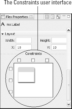
Flex Builders Design view has tools that can create constraint properties through a combination of selecting options in the Flex Properties view and dragging an object with anchors in the Design view editor. Figure 9.12 shows the Constraints interface in the Flex Properties view. This interface appears whenever a component in a container with absolute layout is selected in Design view.
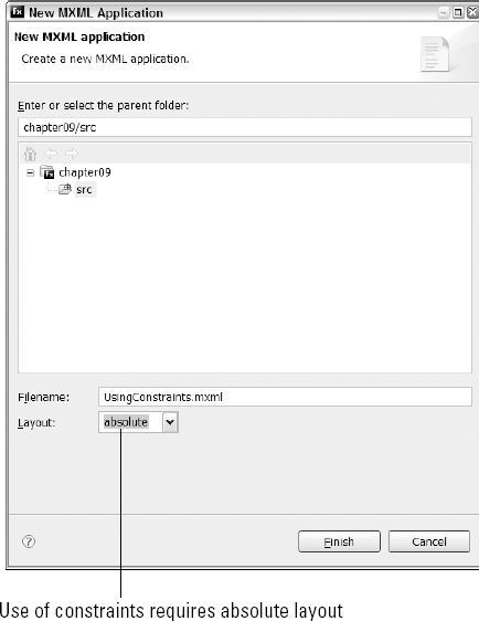
Follow these steps to create an application a text logo that's anchored to the application's bottom-right corner:
Open any Flex Builder project.
Select File → New → MXML Application from the Flex Builder menu.
As shown in Figure 9.13, enter UsingConstraints.mxml as the application filename and set the
layoutproperty toabsolute.If the application opens in Source view, click the Design button.
Drag a
Labelcontrol from the Components view into the application. Place it anywhere on the screen.Set the new
Labelcontrol'stextproperty to My Logo.With the
Labelcontrol still selected, click the Bold button in the Flex properties view.Set the
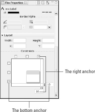
Labelcontrol's font size to 18 pixels.In the Constraints interface at the bottom of the Flex Properties view, place check marks in the right anchor and the bottom anchor, as shown in Figure 9.14.
Drag the
Labelcomponent toward the bottom-right corner of the Application until it snaps to the padding alignment guides.
You should see in the Constraints interface that the number of pixels from each anchor changes as you drag the Label control in Design view.
Note
The completed version of the preceding exercise is available in the Web site files as UsingConstraintsComplete.mxml in the chapter09 project.
Each visual component supports six constraint properties. Each of the properties is data typed as a Number and indicates the number of pixels from the named anchor:
left:This property sets the number of pixels from the left edge of the container to the left edge of the nested component.right:This property sets the number of pixels from the right edge of the container to the right edge of the nested component.top:This property sets the number of pixels from the top edge of the container to the top edge of the nested component.bottom:This property sets the number of pixels from the bottom edge of the container to the bottom edge of the nested component.horizontalCenter:This property sets the number of pixels from the horizontal center of the container to the horizontal center of the nested component. A positive number offsets the component to the right of the containers horizontal center; a negative number offsets to the left.verticalCenter:This property sets the number of pixels from the vertical center of the container to the vertical center of the nested component. A positive number offsets the component below the containers vertical center; a negative number offsets the component above the vertical center.
The following code is generated by Design view as the user sets properties in the Constraints interface and drags the component around the screen:
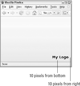
<mx:Label text="My Logo" right="10" bottom="10"
       fontWeight="bold" fontsize="18 " />
The right and bottom properties are set to values of 10 pixels each. As shown in Figure 9.15, each time the user resizes the application, the Label control changes its position relative to the applications bottom-right corner.
Four strategies are available to determine the dimensions of a container or control at runtime:
Content: Component dimensions are determined dynamically based on the cumulative size of the components child objects.
Absolute: Component dimensions are determined by its width and height properties set to numeric values, interpreted as pixels.
Percentage: Component dimensions are determined by percentage of available space.
Constraints: Component dimensions are determined by constraint-based anchor properties.
Content-based sizing means that a container or control expands to accommodate its contents. In the absence of any other sizing properties, this happens automatically. With containers, this means that the container sizes itself to accommodate and display its nested contents. With controls, this means that the control sizes itself to display its internal objects. For example, if you don't set a Button control's height or width properties, it sizes itself to display its full label and icon.
Default dimensions
Each container has a default height and width. For example, if you create a Panel with this code, it has no nested components and no title property that would affect its height or width:
<mx:Panel>
     </mx:Panel>
Then Panel container's default dimensions are driven by the size of its default border, gap, and padding styles. On my test system, the Panel container's default height is 40 pixels and its default width is 52 pixels.
Other containers have different default dimensions. In the absence of nested content, the VBox, HBox, and Canvas set their height and width to 0.
Minimum and maximum dimensions
You can set properties to constrain content-based sizing. These properties set minimum and maximum dimensions to place limits on a container's ability to dynamically grow and shrink:
minHeight:The container's minimum height in pixelsminWidth:The container's minimum width in pixelsmaxHeight:The container's maximum height in pixelsmaxWidth:The container's maximum width in pixels
This VBox container has a minimum width and height of 200 pixels each:
<mx:Panel minWidth="2 00" minHeight="2 00">
     ... nested components ...
     </mx:Panel>
The container can still expand if its contents require more space, but it can't contract to less than 200 pixels in either dimension.
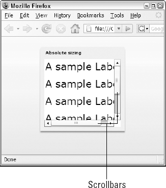
Absolute sizing means that you set a component's width and height properties in absolute pixel values. This Panel container is always displayed as 200 pixels high by 200 pixels wide, regardless of its nested contents:
<mx:Panel width="200" height="200">
     </mx:Panel>
When you use absolute sizing and a container is too small to display its nested contents, by default it displays scrollbars that allow the user to scroll to see the contents. Figure 9.16 shows a Panel container with nested Label components. Because nested components can't be displayed in the container's available space, it displays both vertical and horizontal scrollbars.
Percentage sizing means that you set a dimension as a percentage of available space. When you set a component's size in MXML, you can declare percentage sizing with either the height and width properties or with percentHeight and percentWidth.
Percentage sizing with height and width
When you set percentage sizing with the height and width properties, you declare the values with a percentage expression, such as 50%. This Label control's width is 50 percent of the available space within its container:
<mx:Label text="A sample Label" width="50%"/>
Percentage sizing with percentHeight and percentWidth
When you set percentage sizing with the percentHeight and percentWidth properties, you use numeric expressions such as 50. This Label control's width is also 50 percent of the available space within its container:
<mx:Label text="A sample Label" percentWidth="50"/>
Tip
The height and width properties cannot be set to new percentage values at runtime with ActionScript statements. Instead, always use percentHeight and percentWidth in ActionScript.
Tip
The PercentHeight and percentWidth properties return meaningful values only if they've been previously set through MXML declarations or ActionScript commands. Their values are not recalculated at runtime.
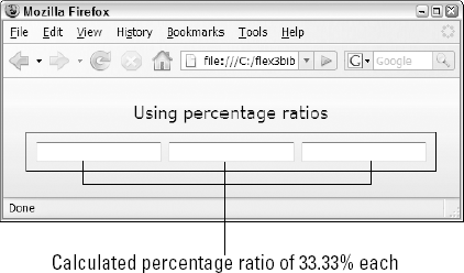
When you declare multiple components within a container and set sizes by percentage, you can declare a total percentage of greater than 100 percent. This VBox contains three Textlnput controls, each with a width property of 100 percent:
<mx:HBox width="450" borderStyle="solid" borderColor="#000000"
    paddingBottom="10" paddingLeft="10"
    paddingRight="10" paddingTop="10">
    <mx:TextInput width="100%"/>
    <mx:TextInput width="100%"/>
    <mx:TextInput width="100%"/>
</mx:HBox>
It might seem that this means the total width of the nested component is 300 percent and would exceed the available space. Instead, the Flex framework adds up the total percentage values and uses the ratio of the control's declared percentage value divided by the total to assign an actual percentage based on available space:
100% + 100% + 100% = 300% (the total)
For each component: 100% / 300% = 33.33%
Tip
If there is a combination of percentage-based and strict value sizing, space is allotted 8 first to the strict values. Then if the remaining space is not enough to fulfill the percentage-based items, the same ratio division is calculated and applied.
Figure 9.17 shows the resulting display. Each Textlnput control's width is set dynamically to 33.33% of the available horizontal space.
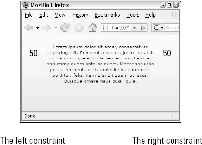
Constraint properties also can be used to control a components size. When a component is nested in a container with absolute layout and two constraint properties in the vertical or horizontal dimension are set, the component "stretches" at runtime to keep its edges the correct distance from the two anchors. Listing 9.9 creates a Text control with right and left properties that keep its edges 50 pixels from each of the Application containers horizontal edges.
Example 9.9. Using constraint-based sizing
<?xml version="1.0" encoding="utf-8"?>
<mx:Application xmlns:mx="http://www.adobe.com/2006/mxml"
    backgroundColor="#eeeeee" layout="absolute">

      <mx:Text id="myTextArea"
     left="50" right="50" top="20" textAlign="center"
     height="100%">
    <mx:text>
    <![CDATA[...text...]]>
    </mx:text>
    </mx:Text>

</mx:Application>
Note
The code in Listing 9.9 is available in the Web site files as ConstraintSizing.mxml in the chapter09 project.
Figure 9.18 shows the resulting display When the user resizes the application, the Text control expands and contracts to keep its edges the correct distance from the constraint anchors.
The Flex 3 framework added the ability to use constraints based on rows and columns that you define in a container using these properties:
constraintRows:An array ofConstraintRowinstances that divide a container verticallyconstraintColumns:An array ofConstraintColumninstances that divide a container horizontally
Tip
As with all constraint-based features, constraint rows and columns work only in a container that supports absolute layout.
You create rows and columns using MXML declarations. To divide a container vertically first declare an <mx: constraintRows> tag set, then nest multiple ConstraintRow instances. Be sure to assign an id property to each ConstraintRow.
Tip
Constraint rows and columns are not visible to the user; they're used only at runtime to calculate component positions and sizes. And, unlike simple constraints, you cannot edit advanced constraints in Design view.
Note
Flex Builder 3's second public beta featured a new user interface that allowed you to create ConstraintRow and ConstraintColumn instances in Design view. This interface was removed prior to the product's final release, so advanced constraints must now be directly coded.
The first ConstraintRow always starts at the top of the container, and subsequent ConstraintRow instances are placed below the first. Each ConstraintRow instances height property can be set to either an absolute numeric value indicating its height in pixels or a percentage value indicating its value in terms of percentage of available vertical space.
This code declares two ConstraintRow instances, each using 50 percent of the Application component's available vertical space:
<mx:constraintRows>
    <mx:ConstraintRow id="row1" height="50%"/>
    <mx:ConstraintRow id="row2" height="50%"/>
</mx:constraintRows>
Similarly, if you want to divide a container horizontally, you use ConstraintColumn instances wrapped in the constraintColumns property. Each column starts at the left edge of the container, and each subsequent column is added to its right. The following code sets up three columns, each filling 100 pixels of width:
<mx:constraintColumns>
    <mx:ConstraintColumn id="column1" width="100"/>
    <mx:ConstraintColumn id="column2" width="100"/>
    <mx:ConstraintColumn id="column3" width="100"/>
</mx:constraintColumns>
Tip
A container that supports absolute layout can declare both constraintColumns and constraintRows at the same time, allowing you to divide the container into grid-like regions.
You place or size components with constraint rows and columns using the same constraint properties described previously: top, bottom, left, right, verticalCenter, and horizontalCenter. Instead of assigning the property values with a simple numeric expression (as you would with simple constraints), you use a compound expression consisting of a constraint row or column id and a numeric value, separated with a colon. This declaration of the bottom constraint property means that a component should be placed 10 pixels from the bottom of a ConstraintRow with an id of rowl:
bottom="rowl:10"
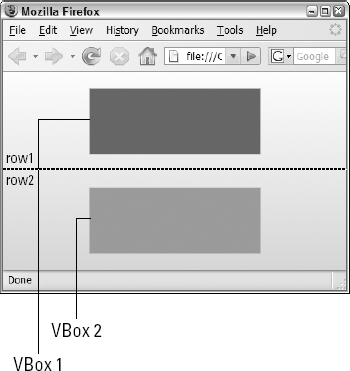
Just as with simple constraints, you can use multiple constraint properties to control a components size and make it stretch as a row or column expands. Listing 9.10 declares two constraint rows, each taking 50 percent of the applications available vertical space. Each of the VBox components sizes itself vertically, using the top and bottom constraint properties and anchoring itself to one of the constraint rows.
Example 9.10. An application with advanced constraints
<?xml version="1.0" encoding="utf-8"?>
<mx:Application xmlns:mx="http://www.adobe.com/2006/mxml"
    backgroundColor="#eeeeee" layout="absolute">

<mx:Application xmlns:mx="http://www.adobe.com/2006/mxml"
    backgroundColor="#eeeeee" layout="absolute">

    <mx:constraintRows>
    <mx:ConstraintRow id="row1" height="50%"/>
    <mx:ConstraintRow id="row2" height="50%"/>
    </mx:constraintRows>

    <mx:VBox top="row1:20" bottom="row1:20" horizontalCenter="0"
      width="50%"
    borderStyle="solid" backgroundColor="#666666"/>
    <mx:VBox top="row2:20" bottom="row2:20" horizontalCenter="0"
      width="50%"
    borderStyle="solid" backgroundColor="#999999"/>
</mx:Application>
Note
The code in Listing 9.10 is available in the Web site files as ConstraintSizing.mxml in the chapter09 project.
Figure 9.19 shows the resulting display. Each of the VBox containers uses width for horizontal sizing and horizontalCenter for horizontal placement, and sizes and places itself vertically with top and bottom properties that reference advanced constraint rows.
In this chapter, I described the use of layout containers, how to size components, and how to use constraint-based layout. You learned the following:
The Flex framework uses two types of containers: layout containers to control the application design and navigation containers to control application navigation.
The simple
Boxcontainers includeVBox, HBox, andCanvas.The
HBoxandVBoxcontainers place their nested components on the screen dynamically by calculating their cumulative size.The
Canvascontainer always uses absolute layout to place objects based onxandyproperties or with constraints.The
Panelcontainer creates a dialog-box presentation and supports the absolute property values of vertical, horizontal, and absolute.Constraint properties allow you to place and size objects with anchors to any of a containers borders or center positions.
Components can be sized based on content, absolute dimensions, percentage dimensions, or constraints.
Flex 3 adds advanced constraints that allow you to divide a container into multiple rows and columns.