
In visual effects, we often speak of The Eye, as in, “She has a good eye,” or “He's got good technical skills, but needs to develop his eye.” Sure, we admire the luminary visual effects supervisors because they can field-strip a Mitchell camera movement blindfolded or code their own HDR exposure-merging Shake plug-in from scratch, but they are most revered because they have The Eye.
What exactly does that mean? It's simple: Having The Eye means knowing the answer to the Ultimate Question:
Why doesn't this shot look real?
It's the question you're implicitly seeking to answer with every tweak of a slider, every opacity adjustment, every keyframe nudge. And it's the hardest question to answer about a shot. Worse still, as the shot progresses from take 1 to 10 to nearly final, the answer becomes more and more elusive.
This chapter focuses on some techniques for honing your eye. These are not compositing techniques—things you'll do sitting in front of your workstation—these are lifestyle techniques. Much to the chagrin of those close to you, being a great compositor means thinking like one all the time. The answer to the Ultimate Question, the hardest question you'll ever face, is all around you in the real world, especially when you're not near your computer.
The only tools you'll need are your eyes, your brain, and a really, really expensive digital camera. C'mon, you were looking for an excuse to buy one, right? No? Fine, a cheap film camera is just as good, if not better. Funny, that.
The ability to answer the Ultimate Question comes from developing two distinct skills:
Seeing the shot every time as if for the first time.
Using the left brain to understand what the right brain sees.
If those things sound easy, then this book worked better than I thought it would! Please send your resume to The Orphanage immediately.
The first skill is perhaps the most elusive. It is something I observed sitting in dailies with the great visual effects supervisors of Industrial Light + Magic. Complex shots on their 40th take loop relentlessly on a 30-foot screen. The animator can't see anything but the keyframe tweak he finally nailed five minutes after submitting this take. The technical director stares relentlessly at his particle simulation, pondering coefficients of elasticity. The compositor is the last line of defense. She feels like she's done a pretty good job of putting the shot together, but knows that the motion track could use one more pass of fine-tuning.
Everyone in the room has what is known as Familiarity Disorder. This is the condition that prevents my health plan administrator from successfully explaining my coverage options: He understands the various plans so well that he cannot possibly put himself in my position, which is that I need it explained to me as if I was four years old and mildly retarded. He can never do that because he's too close to the details. In '80s action movie police-chief-speak, he's “in too deep.” Everyone in dailies is in too deep. And that's why the chief needs to take each one's piece and badge and shout a spittle-drenched “You're off the case!”
But not Dennis Muren. His job is to remain objective, and this is a mighty challenge. But I would watch him do this—see the shot every time as if for the first time—and he would skip right past these nuances and details that the various contributors were sweating and say something like, “We should slip the sync of that explosion back a few frames. It will cut better with the next few shots that way.”
Not that Dennis would ignore the details. But he would not focus on them when something bigger, something about the storytelling properties of the shot, was still not quite right.
How do you develop this skill? It is a matter of discipline. You need to be intimately familiar with the details of the shot in order to work it to perfection, but to keep it from getting overworked, you have to consciously remind yourself to stand back and at least try to see it objectively. So cure number one for Familiarity Disorder is
Try.
As in, remind yourself that it's important. Take a deep breath, count to ten, and hear the chief's voice in your head, “You're in too deep!”
This may seem obvious, but in the heat of battle, with deadlines approaching pointy-end first, it requires a conscious effort to step back and evaluate the shot from as objective a perspective as possible.
Cure number two is
Look at it in the cut.
Check your shot in the context of the shots around it, preferably with sound and popcorn. I desperately wanted to add a very expensive, subtle enhancement to a shot I was compositing for Twister. An 18-frame shot. With four frame handles. Stefen Fangmeier showed me the cut sequence on the Avid and cured me of my desire in exactly half a second.
Cure number three is an easy one:
Flop it.
This is a trick that designers and matte painters use. Flop your shot horizontally and loop it. You'll be amazed how different it feels, and if you're lucky, something new will jump out at you and the problem you've been slaving over will seem far less important.
None of these three cures work as well as the last one. The last one is your ace in the hole—but you have to be selective about how you play it:
Show it to someone who actually is seeing it for the first time.
I know, duh. But it's amazing how often we forget to do this. We might even unconsciously not want our peers to point out the thing that we kind of suspect isn't quite working about the shot. Consult cure number one, swallow your pride, and show your buddy your shot.
One of the reasons that working against Familiarity Disorder is so important is, and I really hate to break this to you, there will always be something more you could do to make a shot better. But, chances are, you have a deadline to meet, so you have to pick your battles. I mentioned that Dennis Muren would be selective about how he would nitpick details. What I came to realize was that he was using his ability to emulate the audience's experience to pick which details to sweat. A well-designed shot leads a viewer's eye to specific places. When a defect in some remote corner of the frame was pointed out to Dennis, he'd say, “If they're looking there, we've lost them.” He makes shots for the people who are engrossed in the film, and he prioritizes storytelling over immaculateness.
The discipline of maintaining your freshness to the work your doing will be something you struggle with on every shot. But remembering to struggle with it puts you way ahead of the game. Keep at it.
The second skill that is required when struggling with the Ultimate Question is the reason that the chapter is called “Learning to See.”
Have you ever taken a life drawing class? You should. The supplies are cheap and you get to look at naked people. Don't make me spell this out for you.
In life drawing you'll learn that you have to fight off the part of your brain that knows what an arm is. You know an arm is a long, skinny thing. But the model has an arm draped over a knee, aiming right at you. You see the arm heavily foreshortened or compressed in perspective. In fact, from your specific point of view, the elbow is directly in front of the shoulder, and the wrist is almost blocking it.
Now, of course your life drawing is perfect, but look what that idiot in front of you did. He drew the arm as a long, skinny thing. He did that because he knows that's what an arm looks like. He drew what he knew, not what he saw. And his arm be lookin' fonky.
We do this all the time in visual effects without even realizing it. When asked to add an element, such as a haze effect, a lens flare, or a dust hit, you think “I know what that looks like” and add it to the shot. And it looks stupid. Why? Because in truth, we don't really know what things look like.
Let me use some theatrics here and ask you to read that last sentence again:
We don't really know what things look like.
Our brains are very complicated, sophisticated instruments that connect to our eyes in a slightly fancier way than an S-Video cable. When we visually absorb things, we don't see images, we recognize objects. We don't see colors and shapes, we see people and oncoming trains.
Don't believe me? Pop quiz: What color is the rearmost tomato in Figure 15.1?
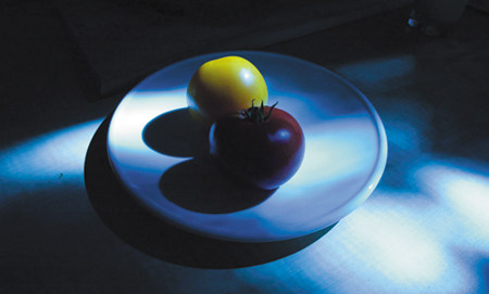
Did you say yellow? If so, you are correct. But check this out: Figure 15.2 is a crop of that image, showing just the tomato.

That patch of color is clearly green. How did you know it was yellow? Your brain looked past the color on the screen and saw that the whole image has a blue tint to it. Knowing this, and knowing a little about tomatoes, your brain filed that as a yellow object.
Your brain second-guesses your eyes like this all the time. College students quizzed on the height of a guest speaker guessed taller when they were told he was a visiting professor than when told he was a grad student. Eyewitnesses to crimes report widely differing descriptions of the criminal depending on their personal experiences and associations.
As compositors, it's our job to know that our brains are unreliable image banks—they store ideas, not pictures. So we can therefore correlate that if we create images based on what we know, we will be basing them on bad data. This is where that digital camera comes into play.
We have a great luxury in our industry, which is that every image we create is meant to look as though it was photographed by a camera. Hey, you have a camera!
You should be taking pictures all the time. Take your camera with you wherever you go. I actually forged a pact with a friend that we would each take a photo every day for the entire year of 2002. Not every one of those was going to be a masterpiece, but it got me thinking about creating an image at least once every day.
The other thing it did was fill my FireWire drive with thousands of photos. Photos of all kinds of crazy things. And these photos are great reference.
The single key to creating believable visual effects is reference. If you were to worship a pagan god of visual effects, it would be named Reference.
Now that brings up a catch, which is that the whole reason we do visual effects tends to be to create images of impossible things. You can search your image database all day long for snapshots you may have taken of Nazis opening ancient artifacts and unleashing God's wrath, but chances are the closest thing you'll find is your friend blowing chunks behind a wurst stand in Linz.
But there's always something to look at to help you combat the misconception that you already know what something should look like. What should a star going supernova look like? Better it look like your friend blasting your Digital Elph with a LED keychain light than the default lens flare preset number 47. What does a helicopter look like flying through the Chunnel? Well, the reflections on its metal surfaces won't be terribly dissimilar from those on a Geo Metro stuck in traffic in the midtown tunnel.
Getting in the habit of taking pictures all the time, even of mundane things, and really looking at those photos—examining what's happening with light and surfaces and transparencies—will do more than supply you with reference for future projects. It will get you thinking about these things in ways that will have a direct impact on your work.
Check out Figure 15.3's picture of the Golden Gate Bridge. Every once in a while this monument is half enshrouded in the “marine layer” like this. (I am told that to call it fog is blasphemous.) But what if it wasn't on the day when your shoot needed it to be, or what if you are compositing a matte painting of a future city with buildings so tall their tops get cut off by clouds?

Zooming way in, you can see how the cloud obscures the bridge in a way that is more complicated than a simple transparent overlay (Figure 15.4). The cloud actually acts like mist on your windshield, diffracting the light before completely occluding it.

When I first started seeing this in my photography, it changed the way I composited smoke elements. I got in the habit of using the alpha channel of the fog or cloud or water spray element to drive a compound blur of the background.
Here's an example. Figure 15.5 shows a clean photo of the bridge, and Figure 15.6 is the cloud element to be composited over it.


If you do a simple A over B comp, you'll end up with something like Figure 15.7.

Now check out that same comp with a subtle compound blur in Figure 15.8.

The blur simulates the diffraction of the light and ties the cloud element into the shot. This is a great example of how even the most basic layering requires pre-composing in After Effects. Compound Blur uses the pixels from one layer to control how much to blur another layer. But the trick is that it uses the pixels before any effects of transformations. So you need a pre-comp where you reposition and possibly even animate the cloud layer. Here's how to set it up:
Create a Cloud Anim comp that features just the semitransparent cloud with whatever animation you create.
Bring the Cloud Anim comp into a Cloud Over Bridge comp, and stack it on top of the bridge photo.
Because Compound Blur cannot directly use this layer's alpha channel as its blur layer (it uses Luminance of RGB), duplicate the Cloud Anim layer and apply Shift Channels, setting Alpha to Full On and Red, Green, and Blue to Alpha.
Because Compound Blur needs to see the pixels of a layer before any effects, pre-compose this layer (choosing the Move All Attributes option from the dialog), and name the pre-comp Cloud Blur Map.
Because Cloud Blur Map is used only to drive the Compound Blur, you can turn its visibility off in Cloud Over Bridge.
In Cloud Over Bridge, create a new adjustment layer between the cloud and the bridge and apply the Compound Blur effect. Choose Cloud Blur Map from the Blur Layer pull-down menu.
Adjust both the Maximum Blur and the Opacity of the adjustment layer to dial in the effect to match your reference.
If all goes well, your Flowchart view should look something like Figure 15.9. Now, if you move or even replace your cloud layer in the Cloud Anim comp, the rest of the comp will reflect those changes automatically.

In compositing, we talk about integration of elements. Yes, this means color correction, matching black levels, and tracking in the right motion, but the more advanced tricks of integration usually can be filed under the general idea of “everything in the scene affects everything else in the scene.” Much of the reference you collect will yield revelations along these lines.
Check out Figure 15.10. Imagine it's your job to add an annoying CG alien next to this handsome guy. The 3D artist has lit the alien to match, but dropping him in A over B leaves the shot looking sad.
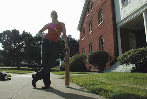
Take a closer look at the guy by extracting him from the shot (Figure 15.11).

When you isolate him from the scene, it becomes very clear that he has a lot of contamination from the bright background behind him. Your eye can cancel this out in the same way it can allow you to see that the green tomato is really yellow, but when you isolate the guy you prevent your brain from “knowing” that it's right for the dude to look washed out if he's against a bright sky.
That CG alien is going to need more than just color correction, he's going to need light wrap, or a simulation of this contamination. This is a popular effect that is available as a plug-in and tempting to overuse. Because of the order of operations in After Effects layers, however, it's also very easy to use light wrap effect plug-ins incorrectly. For example, if you apply light wrap to a foreground layer and you tell it to wrap to the background, it will grab the pixels of the background before any color correction you may have done to it, which is not good. In the interest of becoming more mighty, create a light wrap effect from scratch using only layer blend modes and the Fast Blur effect, using the process detailed back in Chapter 12, “Working with Light.” Here it is in brief:
Create a pre-comp with your background and foreground elements.
Set the foreground to the Silhouette Alpha blend mode. This punches a hole in the background.
Add an adjustment layer at the top, and apply Fast Blur.
Turn Repeat Edge Pixels on, and crank up Blurriness until you really can see it.
Duplicate the foreground layer, move the copy to the top, and switch this new top layer to the Stencil Alpha blend mode. You are left with a halo of background color that matches the shape of the foreground.
And that's your light wrap element. Create a new comp that has this light wrap pre-comp on top of the foreground on top of your color-corrected background. As with the last example, it's both the blur size and the opacity of the layer that you use to dial in this effect. Generally you will use big blurs and small opacities, but there are times where you might use just the opposite. And you can play with various blend modes for the light wrap layer; Normal, Screen, Lighten, and Add are all good options.
Note
Fast Blur and Gaussian Blur are the same (at Best quality), except that Gaussian Blur has no Repeat Edge Pixels option. So you might as well throw Gaussian Blur away.
Sometimes a photo will suggest a cool technique like this. Other times it will simply help you dial in the look of an effect. When I was asked to create the most dreaded of all compositing effects, a lens flare, for a shot in Star Wars, Episode One: The Phantom Menace, I asked John Knoll to shoot some reference the next time he was on the motion control stage. In between explosions and lightsaber sparks, John had the crew shoot a series of flare reference passes with various lenses. We picked the one we liked, and I spent three days (and about 17 nested After Effects comps) matching it exactly.
Photographic reference can help you get the facts straight in your shot. The highlights on your stompy robot look just like the ones on the live action car he's about to step on—no one can argue with the realism of that. But photos can also help us with another, far more nebulous concern.
Our clients are making movies, and movies are designed to do one thing: elicit an emotional reaction from the audience. Even though our clients know that they are using technical tools to achieve this goal, they are still reacting emotionally to the images we show them. This is true whether you're working for a first time indie auteur or James Cameron. Clients react from the gut—as well they should. But here's the catch: They critique in technical terms.
This is a problem that I suspect jazz musicians do not have. When they are jamming and creating a new tune, I bet they are totally comfortable talking in emotional terms about their work. “Dude, this just isn't reminding me enough about the ills of society. We need to get more strife into this track!” OK, clearly I know as much about jazz as I know about running an oil refinery. The point is that our clients are not comfortable saying things like “This shot isn't scary enough,” or “This shot just needs more umph!” That may well be their reaction, but rather than simply saying that, they feel compelled to suggest possible solutions. “Make his teeth more wet,” or “Throw a lens flare in there.”
At The Orphanage, we once had a very tech-savvy client who was obsessed with a shot that he felt was falling way short on photorealism. Every time it would come up, this client would explode with reasons why it was not realistic-looking. This contact shadow isn't right. There's not enough detail here. These particles are too bright. We looked at shots that had finaled already and saw what our shot was missing. We made it darker, more blue, and we added contrast. The shot finaled. We addressed the emotional shortcomings of the shot and the technical problems, legitimate as they may have been, magically went away.
The lesson here is: Don't be afraid to make your shots beautiful. And your photography should help you. Chances are you've taken a hundred sunset shots that look like you shot them with a camera phone. Sunsets are hard, especially with digital cameras. But I bet you've got one sunset shot that you just nailed. It's a thing of beauty. Well, compare it to your hundred crappy sunsets and analyze the differences. And when the time comes to create a dusk shot of the enemy base, eyedropper the color palette straight out of your good one.
The matte paintings of Cloud City in the original The Empire Strikes Back are perfect examples of this. These paintings by Ralph McQuarrie are not very photoreal. But it so does not matter. You know why? Because they are purple and orange. They are beautiful, and they strike an emotional chord in the viewer. Have a smooth Colt 45 and watch your precious laserdiscs of the original Star Wars movies, because you truly belong here with us among the clouds.
If you take enough boring pictures of your car (Figure 15.12), one of them will eventually look decent (Figure 15.13).


The emotional resonance of a shot can also be linked to a common technical mistake. One of the biggest sins of visual effects shots that are built up from scratch is that they tend to contain no overexposed or underexposed elements. Skies are often a good example of this. Show me a shot with a perfectly exposed blue sky with no blown-out detail, and I'll show you a visual effect. The reason that the notorious car comp, in which the view out the window of a vehicle shot on a green-screen stage is replaced with moving scenery, usually looks wrong is often that the artist failed to slightly overexpose the exterior. Figure 15.14 shows the kind of reference that can help you nail your next car comp.

Night exteriors are the worst culprits. In the middle of a sequence of inky black night shots set off by artificial but highly cinematic rim lighting, you can smell the matte painting coming from a mile away. It's the only shot where you can clearly see everything except where the light is coming from!
The eyedropper, the Info palette, and our friends Copy and Paste can help make tangible the intangible reasons why some images pop and some go thud. You are not just a technician assembling elements. You are a salesperson, trying to get the audience to buy the shot, warts and all. Use your reference and your dirty tricks, and close that deal.
When you use these techniques to start seeing the world, and then begin implementing your profound insights in your comps, you will begin to see the importance of this last point: It is almost always better to create effects from the basic toolkit of After Effects than to resort to an off-the-shelf, canned effect.
“Default” is a dirty word. Remember that weeklong effort to re-create a photoreal lens flare? It's worth noting that this effort was supported fully by the guy whose name is synonymous with digital lens artifacts. But even John Knoll knew that to appear unflinchingly huge on the big screen, his schwings were going to need some nuancing.
I hope you do have Knoll Light Factory(Red Giant Software; a demo is on the CD-ROM) because its documentation is an excellent treatise on the importance of good reference. John points out some of the vital design aspects of flares that he noticed when scrutinizing the real thing.
In Figure 15.15's real-life flare, the little septagonal reflections that slice through the center of the frame have seven sides because the camera's aperture has seven blades. The star-shaped core of the flare has 14 points (not counting the purplish CCD smear), each pair perpendicular to the edge of one of these blades. This is because the star is an artifact of light grazing off the edge of the aperture blades. This also means that if you were to defocus an element in this shot, you should use a five-sided camera blur shape for the proper boke effect for this lens.

Now, if you start throwing out terms like “boke” in dailies, even Dennis Muren will be impressed.
Most effects we use in After Effects are built up of smaller, simple filtering operations that themselves exist as effects. There's nothing about the built-in Glow effect, for example, that you cannot easily create on your own. You could wrestle with Glow all day long and never match the reference you shot of an F-18 afterburner, but with your homebrew glow not only will you have finer control, but you will have a better understanding of how glows work (Figure 15.16).

After Effects ships with hundreds of effects. Apple's Shake ships with far fewer nodes but is viewed as “high end.” Although some would say that the decision to eschew canned effects is one you arrive at after becoming an expert, I propose that the opposite is true: Skipping the all-in-one plug-ins and developing your own looks from scratch will propel you toward expert status.
This chapter is not composed of conclusions. It is a dog-eared page in the lifelong process of one visual effects supervisor. We will all struggle with the answer to the Ultimate Question with each new shot. Keep taking pictures, remember your cures for Familiarity Disorder, and beg those close to you for forgiveness—for you are a compositor for life.