
There are two kinds of light: the glow that illuminates and the glare that obscures. | ||
| --James Thurber | ||
Light is the most complex phenomenon a compositor must understand. In other areas of digital production, elaborate models are derived to simulate the way light works in the physical world. Accurate modeling of the physics of light is crucial to a good 3D rendering program. The science of light phenomena, such as radiosity, caustics, the inverse square law, environment mapping, and many more, have transitioned from theoretical papers delivered at SIGGRAPH to features readily available in high-end 3D software.
The world of the compositor is less pure and scientific, which if anything makes it that much more important to understand the workings of light phenomena in your scene. Like a painter, you must observe the workings of light in the three-dimensional world so that you can re-create them in a two-dimensional frame, using your software toolbox.
Note
Chapter 11 introduced the radical idea that there are alternative color models to the ones with which you're already familiar and that one of these in particular, linear color, represents the direction in which digital imaging is headed. Although linear color is not officially supported in After Effects, it is available via shareware called eLin. Buckle your seatbelt because the last section of this chapter is dedicated to exploring this, hands-on and in depth.
Several chapters in this book have already dealt with some of the principles of the behavior of light. Chapter 5, “Color and Light: Adjusting and Matching,” focused on the most fundamental work of the compositor: matching the brightness and color of a foreground layer to a background source. In Chapter 11, “Issues Specific to Film and HDR Images,” guest author Brendan Bolles explained alternate models for dealing with light at the bottom and beyond the top of the visible range.
This chapter is dedicated to situations in which you as a compositor must create or emulate specific light conditions in your scene. You'll explore the actual behavior of light, its direction, intensity, color, position, reflection, diffusion, occlusion, and volume, as well as look at methods of mimicking these in realistic and dramatic ways, including such special situations as backlighting, flares, glints, blurs, and defocused lenses. I'll distinguish between lighting conditions you can easily emulate and those that are essentially out of bounds—although, for a compositor with a good eye and patience, the seemingly “impossible” becomes a welcome challenge.
Often, when you need to match elements to a source, the steps outlined in Chapter 5, “Color and Light: Adjusting and Matching,” for matching brightness and color are sufficient. In many scenes, however, there is clearly more involved with light than brightness and color. In some cases, the direction of the light plays a role, especially where the quality of the light is hard (direct) rather than soft (diffuse).
There is such a huge variety of light situations possible in a shot, and in an infinite array of combinations, that it becomes difficult to make any broad statements stand up about lighting. This section, however, tries to pin down some general guidelines for manipulating the light situation of your scene.
You may have specific information about the lighting conditions that existed when your plate footage was shot. On a set, you can easily enough identify the placement and type of each light; this information is contained to some extent in a camera report also. If the source shot was taken only with natural lighting, you're seeking the position of the sun relative to the camera (Figure 12.1). This information can help you puzzle out highlights and shadows when it's not clear how to match the lighting of the plate.


Figure 12.1. Three shots lit only by the sun; in each case shadows tell you the light is coming from behind and to the right of camera, but as the sky becomes more overcast, the light becomes more diffuse and its direction more difficult to discern.
Sometimes the location and direction of light is readily apparent, but surprisingly often, it's not. As I write this, I'm looking out the window on an overcast day. The sunlight is coming from the south (on my left), but as I look at objects in my backyard, it seems to have no direction at all, because it's not direct, it's diffuse. Furthermore it keeps changing.
The quality of light in this scene is the most subjective and elusive of criteria. Hard, direct light casts clear shadows and raises contrast, and soft, diffuse light lowers contrast and casts soft shadows (if visible at all). That much seems clear enough. But these are broad stereotypes, which do not always hold as expected. For example, hard light aimed directly at a subject from the camera's point of view flattens out features, effectively decreasing contrast. And when multiple lights combine to light a subject, hard shadows can be diffused, a typical situation with artificial light (Figure 12.2).

Although the color and contrast of the scene can be nailed down precisely, light direction and quality can be slippery, surprising, changeable, and difficult to re-create. All true, but there's still plenty you can re-create—or get away with—if you follow a few basic guidelines:
Use elements with a similar quality of light. Matching hard- and soft-lit elements is generally going to be difficult, if not impossible. Sometimes you can raise contrast on soft shadows, or even lower it to soften existing shadows, but there's always a limit. If you can, start with elements that were shot, rendered, or painted with a similar quality of light to the plate.
Changing apparent light direction is just about impossible, particularly in a hard-lit scene (Figure 12.3). Incorrect light direction, in cases where it's evident, is one of the big giveaways of bad compositing, although for whatever reason it isn't always noticed by the audience the way matte lines and other such basic compositing mistakes are noticed. If you minimize its effects, this is one category where you can get away with something.
Shadows are often broken up by indirect or reflected (bounced) light in artificially lit scenes. This is the phenomenon that gave rise to radiosity rendering in 3D rendering programs. Study the world around you, and you start to notice that some of the most interesting things that light does are the result of reflected light mixing with direct light. A clear, black cast shadow is often not nearly so interesting as one contaminated by secondary light, and this can free you from the need to faithfully play it straight with cast shadows.
Natural light can change rapidly over time. Clouds overhead, trees rustling, an open flame, the sunlight reflected off of a shimmering pool—all of these create dramatic, interesting interactive lighting in your scene, helping bring it to life (or distracting the viewer if there's too much of it). If they're part of the story, you want these elements, but there are only limited ways you can add them in 2D (Figure 12.4). Some of these are explored in this chapter.
Figure 12.4. Trying to re-create the effect of dappled natural light caused by an overhanging canopy of trees blowing in the breeze? Good luck. Although with planning, you can fake this lighting on set using the old trick of a bicycle wheel with pieces of paper woven through its spokes. Spinning the wheel slowly back and forth in front of the key light re-creates the effect of the moving canopy.
Foreground elements that you add can change the lighting situation. Be aware that if the element you're adding to your scene is highly reflective (and obviously, if it is self-illuminating), you must account for its interacting with the other elements.
Mastering the use of light in a scene is no simple matter. For centuries, painters defined themselves as much by their observation and use of light as anything; a new school of thought would develop, typically driven by a “master” who had observed something novel and revolutionary about how light works, and the course of art history would be changed. So instead of looking for the lazy quick fix, you are encouraged as always to keep shooting reference and scouring it for details you can steal.
If your source was shot with a light direction that is incorrect for the composited shot, that's a pretty big problem, depending on how hard and directional the light actually is. The solution is generally to neutralize, rather than to try to fix the discrepancy.
For the purposes of discussion, consider a situation in which shadows and highlights give a clear indication from where the light is coming. Also assume that a simple quick fix, such as flopping the shot, is not possible, which it usually isn't.
In such a case, you would first look for light direction clues that you could remove from the element; for example, look for cast shadows falling on an area of the shot that can either be removed or replaced (probably via matting and rotoscoping, as in Figure 12.5). In areas of the footage that can't be removed or replaced, use the Levels control to reduce contrast, raising Output Black to neutralize shadows and Output White to knock down highlights. There will likely be unwanted side effects, so you must do your best to strike a happy medium (Figure 12.6).

Figure 12.5. The most immediate indication that Sir Isaac has been lit from the left is his long cast shadow, but you have the option of including it or not when pulling the key.

Figure 12.6. Removing the shadow and raising the black levels helps to eliminate at least the first impression of the strong direction of the light, even in a case as extreme as this.
If adjusting the image directly to soften highlights and shadows isn't looking so good, you can get creative in adding the equivalent of a soft filter on the image. To do this
Duplicate the image.
Set a modest Fast Blur (say, 10 pixels for a film-resolution source) and an Add (or Screen) blending mode to the duplicate.
Knock down Opacity to 30%.
Make a second duplicate with the new settings, and change the blending mode of the top layer to Multiply (or Overlay).
These blurred layers soften the highlights and shadows, respectively. With Screen mode, the overall levels will not change; with Add, they will brighten slightly (Figure 12.7).

Figure 12.7. The effect of a soft lens filter is created with two extra duplicates of the source, each blurred and then set to Add (or Screen) and Multiply, respectively, each with an Opacity of approximately 30%.
Far from being the only such adjustment you can make, this is one pretty much devised on the fly to give a specific example; different shots might well require different settings. More generally, the principle of combining an image with blurred and matted versions of itself can be a highly effective way to change not only its lighting qualities but also its overall look.
There is a simple trick that you can use to even out the lighting in cases where it should appear uniform. The basic idea is simple: Create a counter gradient and use it to weight to your image adjustment by bringing up the shadows, bringing down the highlights, or both. What's surprising is how powerful the technique is—and to how many situations it applies.
You can create the gradient to do this by eye. In some cases, such as scenes with low contrast, you can use the inverted, blurred source itself to create the matte. But as a compositor used to looking at light, you should be able to discern where the hotspot is, and how far it reaches (Figure 12.8). You might even find this kind of fun.
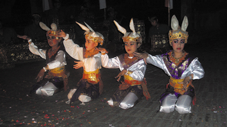
Figure 12.8. This scene is lit by a single key light aimed at the center of the scene, causing a distracting hotspot on the torso of the second bunny from the left.
The next step is to create a white-to-black gradient using the Ramp effect that matches your perception of the hotspot in the scene (Figure 12.9). You could apply the result directly to the scene with a blending mode, but you'll have more control if you apply it as a luma track matte to an adjustment layer containing a Levels or Curves effect. This allows you to select whether you're adjusting highlights and shadows or gamma.

Figure 12.9. A simple gradient created to match the offensive area of the hotspot. The center and edge of the radial gradient, created with the Ramp effect, have been positioned by eye to match Figure 12.8.
The result won't necessarily obliterate all evidence that there was hot lighting in some area of your scene (Figure 12.10), but as always, the goal is not only aesthetic beauty but also the viewer's focus. If there seems to be a distracting spotlight on the middle of some part of the scene, there's a problem. The same technique can even help when you're attempting to pull a key from an unevenly lit set, although tools such as Keylight already compensate for these types of image defects. Should the camera move during the shot, you can even consider marrying the gradient start and end points to a tracker with an offset, either via expressions or parenting. (See Chapter 8, “Effective Motion Tracking,” for more on this.)

Figure 12.10. It's not as though all traces of the single hard key light have been eliminated, but that was not the aim of this adjustment. Instead, the effect of the light has been reduced so that it no longer puts the viewer's focus in the wrong place.
Conversely, you can also create a lighting effect this way; a radial gradient at the center of the frame, with the corners slipping away to darkness, creates a vignette or eye light effect, often associated with projected or heavily treated film and with handheld low-light shooting. The easiest way to do this is not with Ramp but with a heavily feathered and inverted elliptical mask applied to a black solid (Figure 12.11).


Figure 12.11. Reference of film footage that was shot and processed with a vignette, and addition of the equivalent vignette effect in After Effects, by double-clicking the Elliptical Mask tool to fill the frame, then opening the mask controls (MM), checking Invert, and setting a very high Mask Feather (500 for this 2 K resolution source) and Mask Expansion (50 pixels).
3D artists and lighting directors out there will be aware that a linear gradient is not the perfect model for light falloff and that light's intensity diminishes proportionally to its distance from the source squared. So if I'm twice as far from a single light source as you are, I will be illuminated by one-quarter the amount of light.
So I suppose you want a gradient that behaves this way? Simple. Duplicate your layer with the radial gradient, and set the upper of the two layers to a Multiply blending mode. There you have it: inverse square dissipation of intensity (Figure 12.12). Instead of using a gradient layer directly as a luma matte, put the two combined gradients into a single pre-composition, and you're good to go.


Figure 12.12. The same gradient as in Figure 12.9, but duplicated with the duplicate layer set to Multiply mode, creating the inverse-square fall-off that is a phenomenon of light. Because the example in Figure 12.8 has only a single light that would fall off in this manner, this gradient was used to create Figure 12.10. Ordinary incandescent lights exhibit this phenomenon.
Who knows, maybe you'll even find a situation where you notice the difference; the number of shots taken with a single light source is not high, but the same adjustment would work with any single light that is too hot. If nothing else, you've just avoided paying money for one more third-party plug-in that offers one more capability you can easily create for yourself.
Go back and study a movie that you consider to be visually compelling. Chances are that the use of color in that film was bold and deliberate. If you ever saw behind-the-scenes footage of one of your favorite films, you might be startled at how flat and boring all the action seems, taken directly on set with standard video ENG (electronic news gathering) equipment.
Some of that movie magic process is the direct result of photochemical processes applied to the film. For example, much of the strange, detached, futuristic appearance of the film Minority Report was derived from the use of the bleach bypass method in processing the film. To some degree, it is possible to re-create these kinds of looks purely in After Effects, particularly if you have good reference.
Note
To see what I mean, compare the behind-the-scenes footage on The Matrix DVD with the look of the film itself.
Suppose your client or supervisor asks you to make your overall shot look warmer or cooler. What tool do you reach for first? Levels, Hue/Saturation, Tint, Color Balance—all of these effects and more are capable of satisfactorily altering the color look of your shot.
You don't have to use an effect at all, however, because there is a more direct and interactive way of doing this. The results look like you added a colored filter over the imaginary lens of your virtual camera. Add a colored solid with its blending mode set to Color. Choose a color that is pleasing to your eye, has brightness and saturation well above 50%, and fits your criteria: blue or green for a cooler look, red or yellow for a warmer one (Figure 12.13).


Figure 12.13. The source shot and four different colored looks blended over it, each using deep-colored, saturated solids: blue, yellow, green, and blue and green combined. Each is set to Color mode at 33% Opacity. Note how this method permits the source colors to be perceived, while changing the feel of the shot.
At 100%, this is the equivalent of a full-color tint of the image, which is not really what you're after, so don't be horrified by how your shot looks when you first turn this on. Instead, reveal the Opacity control for the solid (keyboard shortcut: T), and dial it back to somewhere between 10% and 50%. You are looking for the threshold where the source colors still come through but are filtered by the color you're adding. What I find powerful about this approach is that, assuming you've gotten the color right, you need only adjust it with that Opacity slider. With this approach, you are only ever two adjustments away from transforming the look of your shot. Furthermore, the effect is more natural and subtle, allowing more of the source color through than the alternatives of adding a Tint or an HSB effect (Figures 12.14a, b, and c).


Figure 12.14a, b, and c. Three methods for tinting the plate green; the timeline exposes the effects used for each. The effects of a solid (12.14a) and an HSB adjustment (12.14b) probably appear similar in print, but note that colors such as the yellow blanket on the wall at the left of frame change disproportionately (to orange in that case). The Tint approach has the shot looking like it was taken in a fog of pea soup (12.14c).
The last section of this chapter discusses using overlaid colors to create a more deliberate film look.
It's such a classic old Hollywood effect that it became the title of French “new wave” filmmaker Francois Truffaut's ode to filmmaking: the day-for-night effect, or as he would have called it in French, la nuit américaine. The trick is a simple one: Shoot a normally lit scene with a dark blue filter on the lens, giving the appearance of night. This was done, especially prior to the introduction of much faster film stocks in the 1970s, because of the low light-gathering capabilities of film stock, particularly in sweeping exterior shots as were favored by westerns. Ideally, the scene would be shot with diffuse, cloudy light, but circumstances didn't always cooperate, so the shadows cast by the sun were supposed to become moonlit shadows. Sometimes it was amazing how bright a specular highlight the moon could cause, kicking off the barrel of the hero's drawn gun.
Lighting techniques and film itself have improved at the high end, but the context in which you would want (or need) to completely change the lighting conditions of a shot have by no means vanished. Digital cameras are notoriously poor at getting anything but grain out of low-lit scenes; witness the popularity of the cheesy Sony Handicam Nightshot feature, which is destined to go down as a hallmark look of our era the way Super 8 film says 1960s and '70s.
Figure 12.15 shows a demonstration of a day-for-night effect achieved primarily with a very dark, desaturated blue solid, applied with the Overlay blending mode. In this case, simply overlaying the solid is only part of the job: the underlying image has had its gamma and Output White values knocked down significantly, as well as lowering the Blue Output White. (I use Levels terms to describe these, having actually made the changes using Curves, as shown in Figure 12.16.)


Figure 12.15. Day-for-night effect accomplished with a deep-blue solid and lowering of the white point, gamma, and saturation of the plate. You'll have to trust me that the effect is quite spectacular onscreen; in print, most of the color subtleties are lost.

Figure 12.16. Here is the Curves equivalent of reducing Output White and gamma in the RGB channel of the plate image.
The other key here is to desaturate the background image; bright colors will punch through, when the reality is that color cannot be seen without light. This is not to say that no color will come through, but in this example Master Saturation is reduced by –60. The effect of yellow moonlight on the clouds is achieved not in Hue/Saturation but by the drop in the Blue Output White. Drop one color, and you raise its opposite (yellow in the case of blue). Of course, the yellow does not really show up very well in print—sorry about that.
Solids are great for instantaneously filtering the color of an entire shot, but what about cases where you want to colorize just a single element or take it from color to grayscale? In such a case, color solids become cumbersome, and you will most typically want to employ either Hue/Saturation or Tint.
For cases in which you want to remove color from footage, there is an important distinction between these two effects. Tint maintains the difference in luminance perceived by the eye between red and green and blue. Hue/Saturation does not. Figures 12.17a through d illustrate this distinction using the Mars flag, a red, green, and blue tricolor selected by the Mars Society and flown into orbit by the Space Shuttle Discovery. Seriously.


Figure 12.17a through d. Ladies and gentlemen, the Flag of Mars: three fields of pure red, green, and blue—a perfect candidate for showing the difference between how Tint (default settings, 12.17b), Hue/Saturation (Saturation set to –100, 12.17c), and a monochrome (white) solid set to Color blending mode (12.17d) weight the colors. Hue/Saturation takes into account only the average luminance of the channels, not how the human eye sees them.
Each color of the flag is fully saturated in one channel. Mathematically, the correct thing to do is to average the luminance of each channel for each color, turning them all an equivalent gray; this is what Hue/Saturation does. It causes all of the apparent contrast between the colors to vanish, because it ignores the way the eye sees color.
As was mentioned in Chapter 6, “Color Keying,” there is a standard weighting used in digital imaging programs to replicate the relative brightness at which the eye sees color. This weighting comes into play when using the Tint effect, and in most situations where After Effects is converting color into luminance. For example, a solid with a 0% Saturation value set with the Color blending mode has a similar result to a black-and-white Tint at 100%.
Therefore, Hue/Saturation is ill advised for desaturating footage. It is, however, very useful and convenient for quickly colorizing an element. On The Day After Tomorrow all of us on the compositing team at The Orphanage came to memorize the exact Hue value that the supervisor tended to love (if I recall correctly, it was 237°) and applied it to various snow and fog overlay elements that had been created as grayscale mattes.
Note
One seldom-used effect that is rather nice is Color Balance, not to be confused with Color Balance (HLS), which is useful only for animating Hue/Saturation channels individually. If you find yourself wanting to shift a color channel only in one luminance range and you like thinking in terms of shadows, midtones, and highlights, give it a whirl (Figure 12.18).

Figure 12.18. The soil in the image from Figure 12.11 is given a nice reddish appearance by increasing Shadow Red Balance in the Color Balance effect. According to the After Effects documentation, toggling on Preserve Luminosity “preserves the average brightness of the image while changing the color. This control maintains the tonal balance in the image,” which strengthens the overall effect.
The other obvious use for Hue/Saturation is to desaturate footage (or less often, to boost saturation). What is not so obvious to the novice artist is when to desaturate an element or a whole shot. The most succinct advice I can offer is that if you find yourself fighting a color correction and you're focused only on brightness and contrast (say, because you're using Levels), keep in mind that your contrast may be just right, but your overall saturation may be too high.
Note
“Kiss of love” is not a technical term. It is attributed to Stu Maschwitz from when he supervised Star Wars, Episode One: The Phantom Menace at Industrial Light + Magic. “I still use that term today,” he says. “It's a great way to get an artist to think of a shot as theirs. Examples of kisses of love are reflections in things that might not strictly need it, aperture flares for lights leaving the frame (carefully matched to reference), or animating a starfighter pilot's head to turn as he banks.”
Situations in which light sources appear prominently in a scene are something of a gift to a compositor: They give you a very direct detail to shoot for. Get these right, and you will sell your scene in ways that the viewer can hardly perceive. This is the kiss of love, that something extra that isn't necessary to get the shot finaled but that adds to the shot.
The early days of computer graphics were littered with bad examples of light artifacts. Any shot, say, in outer space that had a sun or a star appearing in shot would be accompanied by a big, prominent lens flare, and these seemed to appear with such regularity, it was as if the camera was always being pointed at the sun, which it probably was. These were largely failures on the part of visual artists to recognize what really goes on with light; instead they used stereotyped ideas and tricks that seemed cool at the time. It was years before NewTek's LightWave 3D, which actually can render beautiful images, lost its reputation as “the lens flare software” due to its overuse in science-fiction television of the 1990s.
Ironically, big, bold, daring choices about light can and should become almost invisible if they are appropriate to a scene. Generally, the rule about strong lighting choices is this: If the choice is going to stand out, it should do something to place the viewer's attention where it needs to be to serve the story. If a strong choice doesn't serve the story, it had better not take focus in the shot.
The conditions of a backlit scene are a classic example of when the compositor typically does not go far enough to match what actually happens in the real world. This is the general subject of Chapter 15, “Learning to See,” in which guest author Stu Maschwitz alludes specifically to light wrap. Here, then, is his methodology for creating your own light wrap.
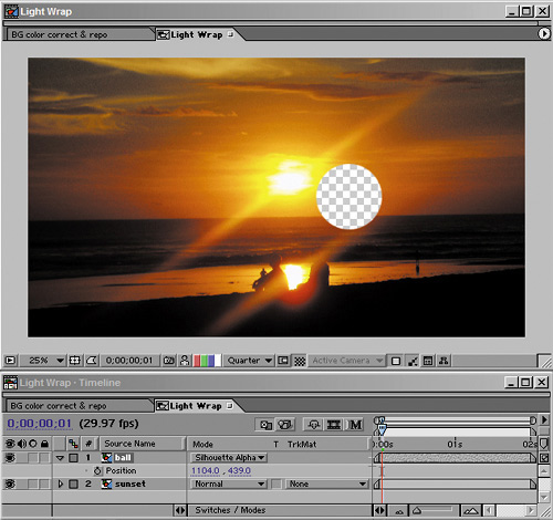
True, light wrap plug-in effects have been developed by third-party developers for After Effects. As is often the case, however, there is an easy way to develop your own equivalent that works as well as, if not better than, what is available out there. Say you began with a background that contains backlighting conditions and a foreground that is lit to match those conditions but does not have any light wrapping around the edges, as is called for (Figure 12.19).

Figure 12.19. I promised myself I wouldn't do any of those classic computer graphics demos with spheres or teapots in them. I lied. That's not an eclipse you see, it's a sphere that has been color-matched to the figures seen on the beach, yet somehow it still appears as a black hole in the scene.
You set up the light wrap effect as follows:
Create a new composition that contains the background and foreground layers, exactly as they are positioned and animated in the master composition. You can do this simply by duplicating the master comp and renaming it something intuitive, such as Light Wrap. If the foreground or background consists of several layers, it will probably be simpler to pre-compose them into two layers, one each for the foreground and background.
Set Silhouette Alpha blending mode for the foreground layer, punching a hole in the background (Figure 12.20).
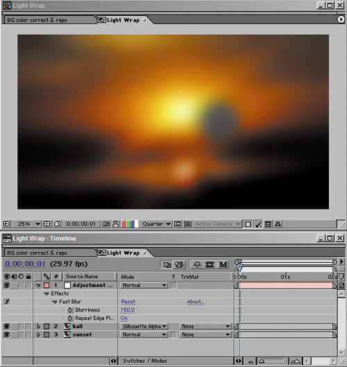
In Fast Blur, check the Repeat Edge Pixels toggle on and crank up the blurriness (Figure 12.21).
Duplicate the foreground layer, move the copy to the top, and set its blending mode to Stencil Alpha, leaving a halo of background color that matches the shape of the foreground (Figure 12.22).
Place the resulting comp in the master comp and adjust opacity (and optionally switch the blending mode to Add, Screen, or Lighten) until you have what you're after. You may need to go back to the Light Wrap comp to further adjust the blur (Figure 12.23).


One final thing to keep in mind as you adjust a scene with backlit conditions: If there is no fill light on the foreground subject whatsoever, most cameras are incapable of picking up as much detail in the foreground as your eye might see. In your reference photo, an unlit foreground subject might appear completely silhouetted. Because the foreground subjects are often the actors in the scene, you might have to compensate, allowing enough light and detail in the foreground that the viewer can see facial expressions and other important dramatic detail.
In other words, this might be a case where your reference conflicts with what is needed for the story. Try to strike a balance, but remember, if the story loses, everyone loses.
Just because that big lens flare coming from the sun peeking around the side of that sci-fi moon looks cheesy doesn't mean all lens flares are cheesy. Of course, real lens flares are never cheesy: Our eyes accept them as natural, even beautiful artifacts without necessarily understanding anything about what actually causes them (Figures 12.24a, b, and c).
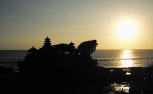


Figure 12.24a, b, and c. Three situations in which what the camera yielded in reality might not be what you'd expect in theory. Figure 12.24a has no lens flare, when you might expect one; 12.24b has just the barest suggestion of a flare spiking out of the huge light source pouring in through the window, and 12.24c has a lens flare that is more natural but far less apparent than the flares you would get from the Lens Flare effect.
You won't see lens flares in many films made before the 1970s. Prior to that era, flares were seen as mistakes on the part of the cinematographer, and shots containing them were noted on the camera report and retaken. Then along came such films as Easy Rider, whose stories seemed to demand a less casual, more “pick up the camera and shoot” documentary style of filmmaking, as well as pictures coming back from space showing dramatic shots of the sun emerging around the curve of our own planet.
If you are going to get lens flares or even simple glints right, it is vital to get good reference. This will seem strange if you think about it; probably only a tiny percentage of your viewers can tell the difference between lens flares from a 50 mm prime and a 120 mm zoom lens. Yet somehow, if you get the lens flare wrong, it reads as phony to a majority of viewers. Weird.
In Chapter 15, Stu Maschwitz speaks of having created his own lens flare effect using well over a dozen nested compositions, based on reference that John Knoll had taken on set of the kind of flares the camera in use picked up.
Although I'm not going to give an example of doing this, there are two very cool things to be learned:
This is one more case where, with good enough reference, you can roll your own. Lens flares are consistent for a given lens. Their angles vary according to the position of the light, but not the shape or arrangement of the component flares.
Although a 17-element lens flare makes for a good battle story, some of the most natural-looking lens flares barely grab your attention at first and have only one or two simple components—just a bright spot in the frame, sometimes.
Geek Alert: What Causes Lens Flares?
Lens flares are artifacts that are never seen with your naked eye. They are artifacts created within the camera lens itself, caused by secondary reflections bouncing around between the camera elements. Because they are caused within the lens, they will always appear superimposed over the image, even over objects in the foreground that partially block the background light.
Unlike your eye, which has only one very flexible lens, camera lenses are typically made up of a series of inflexible lens elements. These elements are coated to prevent light reflecting off of them under normal circumstances. Extreme amounts of light, however, are reflected somewhat by each element.
Zoom lenses contain many focusing elements and tend to generate a complex-looking flare with lots of individual reflections. Prime lenses generate fewer.
Several other factors besides the lens elements also contribute to the look of a flare. Aperture blades within the lens cause highly reflective corners that often result in streaks, the number of streaks corresponding to the number of blades. The shape of the flares sometimes corresponds to the shape of the aperture (a pentagon for a five-sided aperture, a hexagon for six). Dust and scratches on the lens also reflect light.
Finally, lens flares look very different depending on whether they were shot on film or video, the excess light bleeding out in different directions and patterns.
Moreover, not every bright light source that appears in frame will cause a lens flare—not even the sun. (Look again at Figure 12.24a.)
Most After Effects users will prefer a built-in solution that goes beyond the three settings included with the program's rather useless built-in Lens Flare (useless because everyone knows those three flares; they haven't changed in the better part of a decade). There is more than one option available on the market.
John Knoll himself is responsible for a great lens flare package called Knoll Light Factory, available from Red Giant Software. A demo (Mac only) is included on the book's CD-ROM. Without lapsing into a full-fledged product endorsement, there are two very helpful things about this set: First is that John knows flares, and the presets that are contained in these plug-ins are derived from careful studies of the corresponding lenses. If they're in there, it's probably because Industrial Light + Magic shot a project with that lens, and John took the time to get the preset right. Second, you don't have to rely on presets with this one; it is modular, allowing you to pick and choose various flare effects. In the interest of fairness, I will say that many users like to use the lens flare plug-in offered by The Foundry as part of Tinderbox. You can create a realistic looking flare with that plug-in, but I've seen a lot of pretty goofy-looking flares made with it as well. No matter which software you use, the key, as always, is to do your visual research.
Glints are related to lens flares in that they are also the result of bright light in the scene, but glints are totally different in that they are a natural effect seen with the naked eye rather than being a lens effect. Figure 12.25 shows an example of a glint in the footage that was used in the Chapter 5 color matching example.

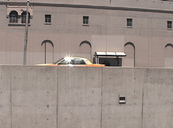

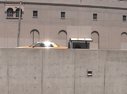


Figure 12.25. This sequence shows the glint that plays off the chrome areas of the taxi as it passes a spot in the frame where the sun is reflected directly into the camera lens.
The glints observed on passing cars, then, represent an opportunity to replicate them directly on the computer-generated plane passing through the shot. This is a great example of a detail that is rarely added, which constitutes a kiss of love for the shot.
The great thing about glints is that they're easily observed (especially if they're already in the shot) and easily repli-cated, although in the taxi example shown, getting them right may involve adding unique glints to several frames in a row. The glint is caused when something in the frame (chrome along the taxi's windows in the example) acts like a mirror, reflecting the overhead sun directly toward the camera.
In the shot from Chapter 5, the plane moves rather quickly through frame, and the glints on the taxi seem to occur just to the left of the frame's center, so that's the reference. You're looking for a hotspot on the plane that passes that point in the frame, and you get one on the tail.
By zooming in on your reference, you get the color and shape of a typical isolated glint (Figure 12.26). And behold: It's a white blotch with six thin streaks coming off of it (which probably corresponds to a six-sided aperture). Looks like you can paint it in a few minutes, no?

This is a perfect case for not being a perfectionist. Close-up, the result of my quickly painted glint looks most unimpressive indeed. But place it into a fast-moving shot that was never meant to be studied frame by frame, and I've just bought myself a good dose of extra realism for a few minutes' extra work (Figure 12.27).

The phenomena of light scattering and its most dramatic and visible result, volumetric light, are the result of what happens to rays of light as they encounter particles in the air.
Chapter 5 looked at adjustments for re-creating the phenomenon of atmospheric haze, which causes items in the far distance to appear with lowered detail and contrast. The cause of this phenomenon is that the atmosphere does not permit light to travel directly to the camera, uninterrupted. Instead, the light ricochets off tiny particles in the air, causing it to scatter on even the clearest day.
There are other situations in which this phenomenon occurs, closer up and more dramatically. Lights that appear in the scene, casting their beams at the camera, tend to have a glowing halo around them. If the light traveled directly to the camera, the outline of the source light would be clear. Instead, light rays hit particles on their way to the camera and head off in slightly new directions, causing the halo (Figure 12.28).


Figure 12.28. The glows of a full moon on a clear night, of a taillight receding into the distance, of stadium lights at dusk—we get so used to seeing the halo around these we hardly notice it after a while.
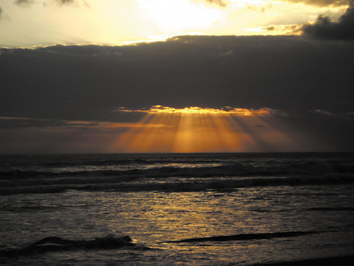
Place more particles in the air (in the form of smoke, fog, or mist), and you get more of a halo, as well as the conditions under which volume light and such related phenomena as God rays can occur. These are the result not only of light scattering, but of the fact that light from an omnidirectional source, such as the sun, travels away from the source at a continuous arc of possible angles (Figure 12.29).
What does all this mean to you? You ought to re-create these phenomena when they're called for, not only because they look realistic but because they tend to look cool. As a compositor you don't want to miss an opportunity like that. After Effects has no built-in, one-button function for adding these type of effects, and so your method will vary depending on the shot.
You can do a lot with a soft feathered mask outlining the shape of the light volume, applied to a solid that is roughly the color of the intended effect. For visible particulate matter, you can animate a Fractal Noise effect (as is detailed in the following chapter).
Note
On The Day After Tomorrow, one of the shots done at The Orphanage required inverse God rays caused by the Empire State Building blocking the sun in a heavy snowfall. In other words, just as the rays themselves array outward, so do the shadows caused by large objects blocking them. With this phenomenon nailed, the shot was not only more accurate but more interesting to watch.
Although After Effects contains no ability to create and render direct visible lights and their effects (for example, if you place a point light in your scene, you see its result but not the light itself), a plug-in from Trapcode called Lux adds that capability, so it is an option as well. A demo of Lux is included on the book's CD-ROM.
Uh-oh, I guess the time has come to talk about creating shadows. If lighting is complex, so are shadows, and maybe more so. At least with lights, if you know where they were placed in your source scene, you can gamely try to directly re-create those conditions. With shadows, however, you could have at your disposal the full dimensional information of the scene and all the lighting, but only a notion of how they should behave (although you have the advantage that your audience wouldn't know, either). Furthermore, because the world of After Effects is not fully three-dimensional, if you have to create realistic shadows from scratch, you're basically faking it.
The addition of 3D features, including lights and shadow casting, to After Effects 5.0 improved the fakery potential, if only somewhat. The problem remains that you're still basically stuck using a flat 2D plane (or planes) to project a shadow and a flat plane (or planes) to receive it, and the greater the angle of difference between the camera and a given light, the less possible it is for that shadow to be accurate.
Figure 12.30 illustrates the problem, using our old friend Sir Isaac lit from the left side with a spot. Keying to keep the shadow proved difficult. But re-creating it using the silhouette of the character is nearly impossible; clearly, his outline from the side bears almost no resemblance to his outline as seen by the camera. As you saw in Figure 12.6, there's not much possibility of changing his light direction here; it seems pretty evident that all of his lighting is coming from the left.

Figure 12.30. Positioning a 3D light to the left of the character, where his appearance indicates it belongs, works even worse than you might expect. It yields a fake-looking shadow that includes details that shouldn't be there, such as the extended leg, and misses others that should be there, such as the outline of a head above two shoulders—not to mention how difficult it is to match the ground plane. Horrifying.
Figure 12.31 shows the classic 2D solution for cast shadows, corner-pinning the matte to an angle that is something like that at which the camera sees the object, with a figure whose outline is complex and lit from an angle more than 10 or 15 degrees off axis from the camera. It doesn't work very well here, but it is certainly possible to pull it off with simpler objects.

Figure 12.31. Sigh. Not much better is the corner pin approach, whereby a duplicate of the layer is made black and semi-opaque, then a Corner Pin effect is added to skew the layer as if it's lying down. This one would need a lot of hand-painting to get it right at all, and the angle in this case is completely wrong. Dismal.
Another 2D trick is one borrowed from the games industry; The Orphanage was actually able to use this one extensively for the Level Four sequence of Spy Kids 3-D because the story of the movie was characters trapped inside a video game. The cheat is that characters only cast a small pool of shadow beneath their feet or where they're sitting, and so on. The simple way to create this one is to mask off part of the matted character and translate only that into position. By feathering the mask and blurring the matte contained inside it quite a lot, you add some subtle interactivity between the character and the ground plane and basically just hope nobody really thinks about it too much (Figure 12.32).

Figure 12.32. Not much better, but almost acceptable if you dial it back to where it's almost imperceptible. The pool of shadow is created by masking the parts of the figure nearest the floor, offsetting and blurring them, then using the result as the alpha channel of an adjustment layer (or just sending it to black and semi-opaque and applying it directly). It's basically a hand-done variation on a drop shadow. Yeesh.
Note
You can use the shadow matte itself directly, setting its Outpoint White (in Levels) to 0 and then adjusting its Opacity down to soften the shadow. If you instead apply it as a luma track matte to an adjustment layer, then adjust the shadow using a Levels or Curves control, this gives you a bit of extra control over how the shadow interacts with the background, its effect on highlights versus already dark areas, and so on.
Overall, the Sir Isaac example has demonstrated that when there are shadows present on set, it would be preferable to do everything you can to try to bring them back—even rotoscope them and give them a key all their own—rather than submit to the humiliation of the desperate approaches outlined here. Or better yet, composite your character into an environment—say, a grassy clearing—in which the shadows would be mostly obscured.
It's easy to forget the actual physics of what gives an object a certain color, probably because it's strange and even counterintuitive. The color of the surface is made up of the colors of light that it does not absorb. Most of what we see as light and color is the result of reflected light.
Most surfaces in the natural world are diffuse, and the light that they reflect is sent out softly in all directions.
The addition of virtual lights and 3D compositing to After Effects means that you can aim a light at the matted layer and cast a shadow onto a 3D plane that corresponds to an actual surface in the scene (Figures 12.33a through f). This works especially well if a 3D camera match move has been solved for the scene using third-party 3D tracking software. There are still several strong limiting factors, however. Your shadow is still only as good as the matte that casts it, and the surface receiving the shadow is going to be made up of flat planes only (although you can use several of them if you have the patience). As you saw, this technique has serious limitations if the light angle doesn't match that of the camera that shot the element.


Figure 12.33a through f. Here's an opportunity to finally get away with something. The source shot (12.33a) is dominated by a big, brightly lit swath of pavement—not nice. Grab footage of silhouetted trees swaying in the breeze (12.33b), matte them (12.33c), and lay them into the scene as a 3D layer (12.33d). The key to the final result (12.33e) is not to simply layer the shadow directly with opacity (12.33f), but to apply it as an alpha track matte to an adjustment layer and add the shadow effect with color correction. This retains much more of the richness of the image.
Thus in some subtle way, objects in a shot together light one another, and characters or objects that pass through a scene are relit to some degree as they change position. Two objects composited together are completely missing the light interactions that would be present between them had they been photographed together.
Computer software is becoming better at re-creating these types of interactions. Global illumination and radiosity features have been added to 3D rendering programs in recent years to re-create the many effects of reflected light, enhancing the realism of completely synthesized scenes. For the compositor, however, this is still all more art than science, and the subjective evaluation of observed phenomena will in many cases go farther than the application of objective principles. In other words, the 3D artist can be more like a sculptor, letting the light play over the created work, but the compositor is still more like a painter, observing and artistically interpreting the world.
Light that interacts directly with objects in your scene is something of an opportunity for you as a compositor. Nail down appropriate interactive lighting, and you infuse your scene with life and realism, helping to tell the story.
Hopefully there will not be too many cases in which your source footage was shot so incorrectly, in terms of fundamentals such as light direction, quality, or intensity that you're asked to do the seemingly impossible: to completely relight a scene. Particularly with exteriors, however, there are bound to be cases in which natural conditions didn't cooperate at the time of the shoot.
Even more likely, there will be cases in which the footage that was shot is adequate but lacks something. You could call it visual punch, artistic style, essential drama. With episodic television, your establishing shot can't tell the viewer much more than “downtown, daytime.” But feature films and other more ambitious stories demand that the shot do more than that; that it propel the drama and mood of the story forward, and it's not always possible to get what's needed with the camera alone.
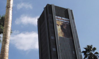
The two chapters that follow will look at creating specific effects related to weather and pyrotechnics that would be difficult, expensive, or both to capture on camera. For now, consider taking a source shot with rather ordinary lighting conditions, on a rather ordinary pretty day in Holly-wood (Figure 12.34) and giving it lighting conditions that could be shot at only one particular time of day and only on certain days of the year (Figure 12.35).

Note
The example compares tried and true color models with one that is available in After Effects 6.5 only via particular shareware from The Orphanage. The persons responsible for this shareware were also integral participants in the creation of this book, and have been my colleagues on feature film projects. The following in-depth look at compositing using the eLin toolset is not intended to sell copies of the software, it is intended to open your eyes to how high-end compositing is being done in the twenty-first century.
This example is directly inspired by a similar video demonstration by Stu Maschwitz, to show the basics of using eLin, the set of tools for linear color compositing that Brendan Bolles described in Chapter 11. Stu and Brendan know a lot about eLin—they worked together to develop it for use at The Orphanage. Most of the rest of the world knows very little about eLin, although the plug-in has been available as shareware for several months at this writing. (It is included on the book's CD-ROM, free for noncommercial use; a pop-up appears on start-up reminding you to register if you're using it commercially, but you are free to work and render with the full features.)
I'm going to show how much less cheating you have to do to make a dramatic metamorphosis of light conditions if you work in true linear color space. I'll also describe where the tried and true method falls short. It's a comparison of old school and new school compositing methods. With eLin, After Effects is among the last of the major compositing packages to have the capacity to work with linear color at a 1.0 gamma (if the concept eludes you, check out Chapter 11 for a thorough run-down). For work on feature films, this is fast becoming the standard approach at facilities using such competing packages as Apple's Shake and Digital Fusion's Nuke. If you apply for a job compositing at a company that relies on one of those, you may be downgraded as an After Effects user for not having any familiarity with radiometrically linear images (also called photometrically linear, scene-referred values, gamma 1.0, linear, or lin). Don't let this happen; win them over, if not to After Effects and eLin, then at least to your skills and knowledge.
Nomenclature
As was already touched upon in Chapter 11, there are terms for color that tend to be used interchangeably, inconsistently, and therefore, confusingly. For example, the Cineon Converter claims to perform “log to linear” conversion, but I would call it log to video and preserve the word “linear” for a color space with a 1.0 gamma, not the 2.2 gamma you are used to working with.
For the purposes of this section, linear, true linear, scene referred, and even high dynamic range color spaces are those in which eLin operates, that look exceptionally dark on your monitor, but that composite together in a nondestructive manner that is faithful to the way light works in the natural world. Video or vid spaces look fine on your monitor and are what you're used to working with, but can easily clip and do not offer the ample benefits of linear.
After using these plug-ins extensively on The Day After Tomorrow and subsequent projects, I am convinced that linear color spaces and the ability to calculate brightness values that are higher than your monitor can display are the wave of the future. Most other software used for film compositing includes this feature set, and it is likely to trickle down to other types of users and more software packages because, once you understand the underlying concepts, this method of working makes so much sense. Getting used to it takes time, however; in many ways it marks the biggest change to occur to digital compositing since its inception.
But why take my word for it? Following is my version of the demo that helped convince me. Check out the steps involved in transforming a neutrally lit scene into a dramatically lit one, specifically showing where eLin compositing eliminates compromises that you've probably become accustomed to accepting. Even if you're not ready to switch your workflow, you'll get an idea what's involved with or without linear color
Before you can compare linear and video workflows, you need to get familiar with eLin. Working with eLin requires a little bit of preparation. If you want to play along, you should first install eLin using the installer from the book's CD-ROM. This adds a set of Effect plug-ins under the category eLin (Figure 12.36), as well as a couple of useful scripts that I'll get to in a moment.

Figure 12.36. The full set of eLin effects in the Effects palette and the eLin palette. You'll use three effects more than all others: vid2eLin, elin2vid (which convert in and out of lin space, respectively), and eLevels (which gives access to adjusting pixels whose values are above the brightest white your monitor can display).
As was pointed out in Chapter 11, there are two predominant benefits to working in linear color space. The first is that light adjustments interact as they would in the real world, and the second is that you get access to overbright pixels, areas of the image that have become brighter than your monitor can display.
Note
You could get the first benefit simply by changing the gamma setting of all visible layers to 0.4545 (using Levels), compositing them, and viewing the result by setting its gamma to 2.2. Strange, but true (Chapter 11 explains why). To get the tools to properly manage the pipeline in After Effects 6.5, however, you need eLin.
Just in case that doesn't sound life-changing and exciting, there is a major side-benefit to consider: The combination of light adjustments behaving naturally and the overhead for overbright pixels means that you can layer color adjustment upon color adjustment, turning the exposure up and down, dialing color up and then pulling it back, without ever seeing the color turn flat and quantized. This example makes that distinction very clear.
As a source image, the example uses Figure 12.34, a normal 8-bit-per-channel file, lightly JPEG compressed, similar to one you would get out of any digital camera (this one came from an Olympus point-and-shoot). The key here is that the source image is not overexposed (save that bright spot on the side of the palm, which can be eliminated). If there were highlights in the sky that were already looking blown out, the image would not be a suitable candidate for this treatment because no matter what you did they would still appear blown out.
Figure 12.37 shows the image looking just the same, but now set to work in linear color space using eLin. If you've installed eLin and want to try this yourself, a few simple steps will offer you this basic setup. You'll use the same basic steps every time you prepare footage for eLin:
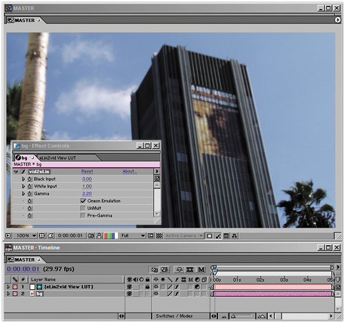
Figure 12.37. The image is the same, but three changes were made automatically using the eLin palette. The layer was set with a vid2eLin adjustment, sending it to lin space and an adjustment guide layer was added with a view LUT, sending it back to vid space so you can see it look as it should.
Create a new composition by importing tower.jpg (found on the book's CD-ROM) and dragging it to the new composition icon at the bottom of the Project window. Rename the comp MASTER, and leave the other settings alone.
Choose File > Run Script > 02_eLin_Palette_Rel.jsx. This brings up the eLin palette containing all of eLin's necessary setups as shortcuts.
With the image layer selected, click the VID to eLin button on the eLin palette. Clear the warning about commercial usage, and note the red striping across your image (Figure 12.38). This is not because you don't own the software, but because you need to use these plug-ins in 16-bit mode.
Switch to 16-bit mode by Alt-clicking (Option-clicking) on the 8bpc button at the bottom of your Project window to toggle it to 16bpc.
Your image has turned very dark; at best, you can see just the faintest outline of the shapes in it. Your image has had its gamma reduced to 0.4545, changing the standard video gamma to linear gamma. To see the image look normal again, counter-correct this with a view LUT by clicking the eLin LUT button in the palette.

You're now set up for eLin compositing, but your image looks just the same as it did. All of your visible images will include the VID to eLin adjustment, which allows their compositing operations to be performed in linear space, and will have to be converted back out of linear space in order to be seen normally.
And that is the major downside to eLin: You now need that LUT adjustment over the eLin layers for things to look right. A LUT is a look up table, a reference adjustment that tells each pixel how it should be displayed differently from its own value.
At this point, nothing is different because you've only lowered gamma and raised it back up again with the LUT. If you were to render this frame right now, you would get the almost black version because the LUT is on a guide layer and does not render.
Now you're ready to begin reaping the benefits. Here's the first one: You can change the exposure values of the image in exactly the way a camera would, and freely adjust the image back and forth above and below the top visible white point.
Figure 12.39 shows the completely disastrous result of adding the source layer to itself in regular video space—yuck. As you will recall from way back in Chapter 3, “Selections: The Key to Compositing,” Add mode simply adds pixel values together. In this case, many pixels in the image start with a value above the midpoint (0.5 or 128 in RGB colors), so adding that value to itself blows out the value. It looks horrible. You would never brighten an image this way, certainly not without dialing it way back.

Figure 12.39. This is one big reason Add mode is seldom used in normal After Effects work. It is often much too strong an effect when a pixel above middle gray is added to another of that value, in which case the result is pure white.
Figure 12.40 demonstrates the same operation but in linear color space. Only the detail in the clouds and on the palm tree is blown out, and the image looks less like a disaster and more like an image that has been overexposed by one f-stop, which is exactly what it is compared with the source.

Figure 12.40. Adding an image to itself in eLin space is the equivalent of opening the camera's aperture one stop, and it looks just as natural as a slightly overexposed version of the source image.
That's cool, you think, but I could get the comp in video color space (or vid space) to look like that, if I wanted to. All I have to do is reduce the Opacity of the top layer to 45%, and it looks identical (Figure 12.41). This brings us to the second cool thing about linear space: You can dial it back without undoing prior corrections. Colors can travel above absolute white and be brought back.
Figure 12.42 shows an overlaid solid that is the equivalent of adding a filter over the lens to bring the exposure down one stop; it is masked to cover only part of a cloud so you can see that the masked area looks identical to how the source image looked in that area, yet the previous correction remains behind. This was done by creating the solid at a color of exactly 50% gray (RGB values of R: 128, G: 128, B: 128) and setting its blending mode to Multiply, which is the perfect inverse of Add in linear space.

Figure 12.42. That disc in the image is only a 50% gray solid, but it acts like a filter, knocking the exposure down exactly one stop. Detail that was at values above full white is recovered.
Try the same thing in vid space (Figure 12.43), and behold the ugliness of the result. The detail is gone, and the color under the multiplied gray is the exact color of the solid: flat gray. Now you're thinking, “Why would I do that? Ever since I started adjusting digital images I've understood that once my color values are clipped, there's no bringing them back, so I just don't do it.”

Figure 12.43. Where did the detail go? In video space, once it's gone, it's not coming back, so you've become used to taking great care never to let this happen.
And what that means is that you've been creating kludges to live with digital color. You may have avoided creating anything that looks as bad as that darkened area in the adjusted video image, but you haven't been using your digital imaging programs as if they were a real camera, shooting real film.
None of which may bother you—yet. But now, try some practical applications of this information and see what you can learn about the real benefits.
An actual Levels adjustment to this image to make it look like it was illuminated by the bright, warm light of dusk will employ the eLin version of Levels, called eLevels. It is similar to Levels with the one major difference that its controls and histogram can account for values greater than 1.0, pure white on your monitor. Figures 12.44a and b show that there are two modes for eLevels: one for the visible range and one showing the extended range.


Figure 12.44a and b. The normal view of eLevels (12.44a) looks like Levels. But, what happens if you click that white space at the right? You get access to the overbright range (12.44b) where all of the pixels that are beyond white are kept. At this stage, there's not much there.
Revealing the eLevels settings you need, Figure 12.45 shows your first step toward giving the shot a look that corresponds more to the golden hour of sunset. Looking at the histogram for the red channel (Figure 12.46), you can see that the Red Input White has come in quite a bit, breaking the usual rule about clipping white values. (Remember, Chapter 5 recommended you stay just to the outside of the whitest white).

Figure 12.45. You can introduce a more golden hour look with eLevels in much the same way as you would with Levels, channel by channel.

Figure 12.46. In regular Levels this setting, with Red Input White below the visible range, would be considered clipped.
That looks pretty good, except for the already clipped values on the palm tree at the left. Those could be painted out, but in this case, you have the option of adding a foreground element instead, heightening the dramatic composition of the shot. Drama in this case means contrast; you've already added a little color contrast and now you're adding contrast between the foreground and background.
Import a close-up of the tree, tree_fg.jpg, which was taken at higher resolution than the same source shot. It needs to have the same settings as the existing tower.jpg layer, so duplicate that one and swap tree_fg.jpg for the duplicated layer (by Alt-dragging/Option-dragging tree_fg.jpg to the selected duplicate layer of tower.jpg). To simplify things, rename these layers bg and fg, meaning background and foreground, respectively.
Next, look at the foreground layer with the same levels settings as the background (Figure 12.47). To remove it from its background, give it a quick six-point roto mask; the sky is probably good enough to actually key it, but you only need a quick-and-dirty removal here because the element will also be heavily blurred to match its depth of field in the shot (Figure 12.48).
Figure 12.47. The foreground element is added, but not masked. It does not blow out with the levels settings the way the tree at the left of the plate did.

Figure 12.48. The mask is added in the Layer window. The mask doesn't have to be as perfect as a blue-screen key would be because it will be heavily in the foreground and have camera blur.
Figure 12.49 shows the before and after of adding camera blur to the foreground tree. Box Blur is a quick way to create a pretty good-looking representation of a defocused element; Blur Radius is set to 12, and Repeat Edge Pixels is turned on.


The result looks good, but the equivalent settings in video color space aren't holding up so well (Figure 12.50). By dialing them back, you're able to visually match the other shot, except that the clouds are becoming more blown out and subtle highlights are lost in the blur of the foreground. These aren't deal-killers yet, although it's not good to see what should be warm highlights turning green (due to the overweighting of the blue sky in vid space).

Now it's time to alter the shot more dramatically. The story calls for it to be a smoggy day, at sunset. You need to add the equivalent of a lens filter over the lens for the smog look (as is often done with a physical camera). To do so, add a solid the size of the comp, call it filter, and place it between the fg and bg layers. The color doesn't matter, because you next apply a Ramp effect. Yes, it looks very strange; that's because it's in video space (Figure 12.51).
Figure 12.51. Whoa, what happened to Ramp? It should appear as a smooth black-to-white gradient, but it has been crushed by the LUT. This is exactly what eLin does: pushes the middle gray point down to make room for highlights. I include this image only because these types of surprises will occur along the way as you work with an adjusted gamma.
Anytime something looks completely blown out or dark, there is a missing LUT involved. It's managing little shocks, such as things not looking right because of the view LUT, that constitutes the downside of eLin. In this case, you're not going to add a LUT, however. Solo the layer, disabling the view LUT, and change the Start Color in the Ramp effect to a bright, medium saturation orange smog color. Now apply this with a Multiply blending mode, turn off the Solo setting, and it behaves just like a lens filter (Figure 12.52).


Figure 12.52. The Ramp was adjusted to behave similarly to a real camera's lens filter, creating the smog look. It's multiplied to burnish the image with its orange color.
The same step applied in video color space lacks subtlety and flattens out detail in the clouds more; the result looks a lot like early computer graphics work, before common cheats were devised. Your best option is to dial back its Opacity to about 70%. That's better, but look at the clouds: They're really starting to look flat and discolored in comparison (Figures 12.53a and b).

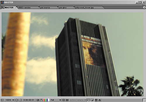
Figure 12.53a and b. The filter doesn't work as subtly in ordinary vid space (12.53a). It has to be dialed back (12.53b), just as with Add earlier, and you're losing detail in the clouds.
To complete the smog look, you can add a couple of layers of haze in the foreground and midground using an orange-hued solid with luminance and saturation values each around 30% (fairly dark and gray). These layers will be visible as-is, no blending mode, so they need the vid2eLin plug-in (click VID to eLin with the solids selected). Dial back midground haze (between the fg and bg layers) to 45% Opacity and the foreground haze (above the fg layer) to 20% Opacity. It's starting to look smoggy enough that I can feel the itch in my scalp (Figure 12.54).

Figure 12.54. I've seen L.A. days like this, achieved by adding dark gray solids with a hint of orange at medium opacity settings.
In the video version, you'll encounter more trouble with this approach. The overall contrast flattens out even more, and there is a comparatively greenish-gray look to the highlights (although it may not be visible in the printed Figure 12.55).

Figure 12.55. The same trick just doesn't work very well in ordinary vid space. The highlights can't punch through the overlapping layers, so the image just becomes muddy.
At this point the haze has dimmed down the overall image a bit much, so I'd be inclined to add more white contrast by bringing down the Input White value in eLevels for the bg layer and copying the result to fg. And here the video color approach is dealt its final, fatal blow: The equivalent adjustment in vid space makes the image painful to behold (Figures 12.56a and b). Detail in the clouds is completely gone, and the building, which is real, now looks like a cheap, computer-generated model.


Figure 12.56a and b. Here's where the serious benefits start to kick in. The image was looking a bit dim in both versions, so Input White in the background eLevels is moved in to punch up the highlights (12.56a). You can make that simple adjustment in linear color space, but in video color, the image is pretty much wrecked (12.56b). What was a straightforward approach with eLin is untenable with normal methods.
Where the benefits of the eLin approach really kick in, though, is with the addition of the bright sun peeking out behind the building. The brightness and glow of the sun can be built up, step by step, without concern for blowing it out and with results in the scene that are very realistic.
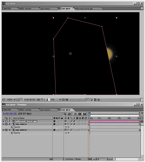
Figure 12.57 shows the basic sun glow element: a glowing orange ball, masked by the edge of the building. It looks like a masked solid in the color of a 1970's kitchen countertop, and so it is. How the heck is that going to look like a sun?
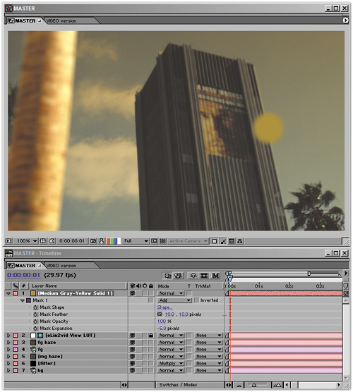
You're not going to convert this element to eLin. Instead, you're going to let it blow out the way that Ramp in Figure 12.51 did. Furthermore, to make it blow out in a really interesting, sun-in-the-sky kind of way, combine it with itself, using an Add and a heavy 75-pixel Fast Blur on the upper layer; set both to 70% Opacity to allow them to interact (Figure 12.58).
This still looks like a masked orange solid in vid space, but pop the element into the scene, just above the bg layer, and you've already got a pretty nice sun (Figure 12.59). The hotspot rolls off well, and the glow interacts with the layers of haze. You can keep building the effect from here, using what you already have.

Figure 12.59. Suddenly, those dark orange tones are rocketed above whitest white, but the overlaid blur is paying off with a nice glowing decay. The Add trick is performed again, twice, with the Opacity and Fast Blur settings on the upper levels used to fine-tune the look of the glowing ball.
Output
The resulting sun is blown out on three channels. This is how it should look if the camera were pointed straight at the sun. But what if the image needs to be adjusted after you output it?
This is the reason why Cineon log files (described in Chapter 11) are so useful. Figure 12.60 shows the eLin composite converted to log instead of video, channel by channel. The sun remains hot but is not completely blown out, even on the red channel. So if, at the next stage of production, it is decided that the shot needs to be half a stop darker, this adjustment remains possible without starting over.

Duplicate the layer, and the sun gets bigger and hotter. Knock back Opacity to 25%, add a modest Fast Blur, move this duplicate sun above the foreground haze, and you've created a glow that reaches around the edge of the building in a very photographic way. Duplicate this and raise the blur much higher (to 100), and you have your desired result: the dramatic descent of the sun on a smoggy day.
Even if you only skimmed this eLin discussion, getting the idea from the figures, you have engaged with a complex, bewildering concept: The color model you have used in After Effects and Photoshop is not an accurate model of how light works in the world.
With this model, some of the most pleasing behaviors and phenomena associated with light come along for free. Without this model, I hate to tell you, but you are left to cheat and compensate, boosting and duplicating instances in an attempt to build up the lighting naturally. Often, however, you succeed only in losing the naturalness of the image, or you abandon the idea for an easier work-around.
If you did follow along, you should have an idea of exactly how radiometrically linear color faithfully re-creates the workings of light in the real world and on the medium that is still best designed to capture that reality: film.
I encourage you to keep learning about this subject and to make your own explorations with the eLin demo and its excellent documentation, which further explores topics introduced here. True linear color and the use of a high dynamic range image pipeline undeniably are where the future of digital compositing lies, and that future can be sampled by After Effects users today.