5. Working with Color
Lesson overview
In this lesson, you’ll learn how to do the following:
Set up color management.
Specify output requirements.
Create color swatches.
Apply colors to objects, strokes, and text.
Search and replace colors.
Create and apply a tint.
Create and apply a gradient swatch.
Work with color groups.
Create color themes and add them to CC Libraries.

This lesson will take about 60 minutes to complete. To get the lesson files used in this chapter, download them from the web page for this book at adobepress.com/InDesignCIB2023. For more information, see “Accessing the lesson files and Web Edition” in the Getting Started section at the beginning of this book.

You can create and apply process and spot color swatches to objects, strokes, and text. Color themes make it easy to achieve color harmony in layouts. For consistent color usage across projects and workgroups, you can add color themes to CC Libraries. Using a preflight profile helps ensure that colors output properly.
Getting started
In this lesson, you’ll add colors, tints, and gradients to a full-page flyer for a gardening clinic. The flyer consists of CMYK colors and a spot metallic color along with imported CMYK images. (You’ll learn more about CMYK later in this lesson.) Before you get started, however, you will do two things to ensure that the document looks as good in print as it does onscreen: You will review color management settings and use a preflight profile to review the color modes of the imported images. When the flyer is finished, you will organize the colors into a color group.
To ensure that the preferences and default settings of your Adobe InDesign program match those used in this lesson, move the InDesign Defaults file to a different folder following the procedure in “Saving and restoring the InDesign Defaults file” on pages 3–4.
 Note
NoteIf you have not already downloaded the project files for this lesson to your computer from your Account page, make sure to do so now. See “Getting Started” at the beginning of the book.
Start InDesign.
The InDesign Home screen displays. Click Open at the left. (If the Home screen does not display, choose File > Open from the InDesign menu bar.)
Open the 05_Start.indd file in the Lesson05 folder, located inside the Lessons folder in the InDesignCIB folder on your hard drive.
If an alert informs you that the document contains links to sources that have been modified, click Update Modified Links.
Choose File > Save As, rename the file 05_Color.indd, and save it in the Lesson05 folder.
NoteTo better view the interface onscreen or in print, the screen captures in this book reflect the Medium Light interface rather than the default setting of Medium Dark. In addition, some screen captures illustrate User Interface Scaling for a closer look at interface elements. You can modify interface settings in Preferences.
To ensure that the panels and menu commands match those used in this lesson, choose Window > Workspace > [Advanced], and then choose Window > Workspace > Reset Advanced.
If you want to see what the finished document looks like, open the 05_End.indd file located in the same folder. You can leave this document open to act as a guide as you work.
When you’re ready to resume working on the lesson document, click its tab in the upper-left corner of the document window.
Managing color
Color management works to reproduce colors consistently across a range of output devices, such as monitors, laptops, tablets, smartphones, color printers, and high-resolution printing presses. InDesign gives you easy-to-use color management features that help you achieve good, consistent color without needing to become a color management expert. With color management enabled out of the box, you’ll be able to view colors consistently while ensuring more accurate colors from edit to proof to final output (print or digital).
![]() Tip
Tip
Consider a red sweater you spot in a store’s app on your smartphone, in a printed catalog, and in a web browser on a laptop. You don’t really know what shade of red that sweater is unless you see the real thing. Many factors impact the color displayed, including the quality and lighting of the original picture, any retouching done on the photo, the paper and print quality, the screen resolution, and more. This is why graphic designers use color management.
Translating colors across devices
No screen, film, printer, copier, or printing press can produce the full range of color visible to the human eye. Each device has specific capabilities and makes different kinds of compromises in reproducing color images. The unique color-rendering abilities of a specific output device are known collectively as its “gamut.” InDesign and other graphics applications, such as Adobe Photoshop and Adobe Illustrator, use color numbers to describe the color for each pixel. The color numbers correspond to the color model, such as the RGB values for red, green, and blue, or the CMYK values for cyan, magenta, yellow, and black.
Color management is simply a way of translating the color numbers for each pixel from the source (the document or image) to the output device (such as a smartphone or color printer). Because each source and output device has its own specific gamut (or range) of colors that it is capable of reproducing, the aim of the color translation is color accuracy across devices.
Creating a viewing environment for color management
Your work environment influences how you see color on your monitor and on printed output. For best results, control the colors and light in your work environment by doing the following:
![]() Tip
Tip
You can find additional information about color management in the InDesign Help file, online at adobe.com (search for “manage color in InDesign”), and in videos such as Peachpit’s Color Management for Photographers and Designers: Learn by Video.
View your documents in an environment that provides a consistent light level and color temperature. For example, the color characteristics of sunlight change throughout the day and alter the way colors appear onscreen, so keep shades closed or work in a windowless room.
To eliminate the blue-green cast from fluorescent lighting, you can install D50 (5000° Kelvin) lighting. You can also view printed documents using a D50 light box.
View your document in a room with neutral-colored walls and ceiling. A room’s color can affect the perception of both monitor color and printed color. Neutral gray is the best color for a viewing room.
The color of your clothing reflecting off your monitor may affect the appearance of colors onscreen.
Remove colorful background patterns on your monitor desktop. Busy or bright patterns surrounding a document interfere with accurate color perception. Set your desktop to display a neutral gray.
View document proofs in the real-world conditions under which your audience will see the final piece. For example, you might want to see how a housewares catalog looks under the typical light bulbs used in homes, or view an office furniture catalog under the LED or fluorescent lighting used in offices.
For print, always make final color judgments under the lighting conditions specified by the legal requirements for contract proofs in your country.
—From Adobe Help
Displaying images at full resolution
In a color management workflow, even using default color settings, you should display images at high quality for the best possible color representation that your monitor is capable of showing.
To see the difference in one of your documents, experiment with the options in the View > Display Performance menu.
Fast Display: Ideal for quick text editing because images do not display.
Typical Display: Displays images more quickly, but colors are less precise; the default for most computers.
High Quality Display: Displays images at high resolution.
For this lesson, be sure View > Display Performance > High Quality Display is selected.
You can specify Display Performance defaults in the Preferences dialog, and you can change the display of an individual object using the Object > Display Performance menu.
Specifying color settings in InDesign
For consistent color in InDesign, you can specify a color settings file (CSF) with preset color management policies and default profiles. The default setting is North America General Purpose 2, which is the best option for beginners.
![]() Tip
Tip
According to Adobe, only those who are knowledgeable about color management should change color settings. The preset color settings have been tested by Adobe Systems. A graphic design firm or ad agency may have a color-managed workflow and provide specifications for you.
In this section, we review some of the preset color settings in InDesign that you can use to help achieve consistent color in your projects. However, you will not change any color settings.
Choose Edit > Color Settings. These settings apply to the InDesign application rather than to individual documents.
Click the various options in the Color Settings dialog to see what is available.
Point at the Working Spaces title to see a description of this feature in the Description box at the bottom of the dialog.
Point at various other features to see their descriptions.
Click Cancel to close the Color Settings dialog without making changes.
Proofing colors onscreen
When you proof colors onscreen, also known as “soft proofing,” InDesign attempts to display colors according to specific output conditions. The accuracy of the simulation depends on various factors, including the lighting conditions of the room and whether your monitor is calibrated. To experiment with soft proofing, do the following:
![]() Tip
Tip
To be sure that your screen is displaying colors to the best of its ability, calibrate it according to information supplied with your monitor.
Choose Window > Arrange > New Window for 05_Color.indd to open a second window for your lesson document.
If necessary, click the 05_Color.indd:2 window to activate it.
Choose View > Proof Colors. This displays a soft proof of the colors according to the current settings under View > Proof Setup. Notice the minor differences between the original view of the document and the soft proof view.
 Tip
TipThe Proof Setup default is Document CMYK - U.S. Web Coated SWOP V2, which reflects the typical output method for print documents in the United States. SWOP stands for Specifications for Web Offset Publications.
To customize the soft proof, choose View > Proof Setup > Custom.
In the Customize Proof Condition dialog, click the Device To Simulate menu and review the available presses, desktop printers, and output devices such as monitors and HDTV.
Scroll down in the menu and select Dot Gain 20% from the Device To Simulate menu, and click OK.
Grayscale profiles such as Dot Gain 20% let you preview how a document will print in black and white. Notice that the InDesign document’s title bar shows which device is being simulated, such as (Dot Gain 20%) or (Document CMYK).
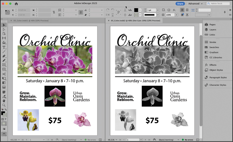
Try different soft-proofing options. When you’re finished reviewing the various soft-proofing options, click 05_Color.indd:2’s close box to close the second window.
Defining printing requirements
Whether you are working on a document for delivery in a print or a digital format, it’s a good idea to know the output requirements before you start working. For example, for a print document, meet with your printer and discuss your document’s design and use of color—particularly if you plan to use a special paper or metallic ink. Because printers understand the capabilities of their equipment, they may suggest ways for you to save time and money, increase quality, and avoid potentially costly printing or color problems. The flyer used in this lesson was designed to be printed by a commercial printer using CMYK colors and a metallic spot color. (Color modes are described in more detail later in this lesson.)
![]() Tip
Tip
Your commercial printer may provide a preflight profile with all the necessary specifications for output. You can import the profile and use it to check your work against these criteria.
To confirm that your document matches the printing requirements, you can check it against a preflight profile, which contains a set of rules regarding the document’s size, fonts, colors, images, bleeds, and more. The Preflight panel can alert you to anything in the document that does not follow the rules set in the profile. In this exercise, you will import a preflight profile, select it in the Preflight panel, and resolve an issue with the document.
Loading a preflight profile
First, you will load a preflight profile provided by the printer.
Choose Window > Output > Preflight.
Choose Define Profiles from the Preflight panel menu (
 ).
).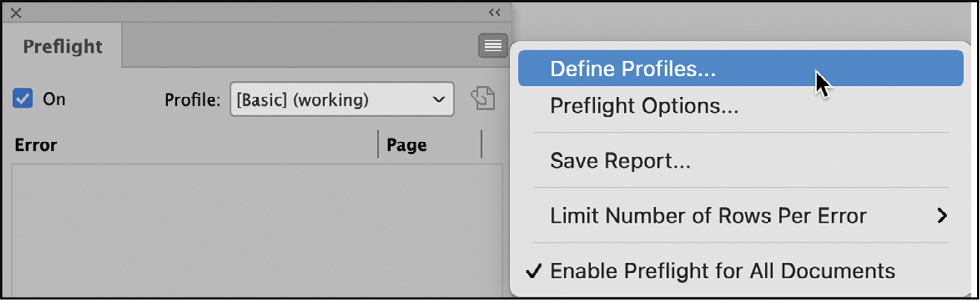
In the Preflight Profiles dialog, click the Preflight Profile Menu button (
) below the list of preflight profiles at the left. Choose Load Profile.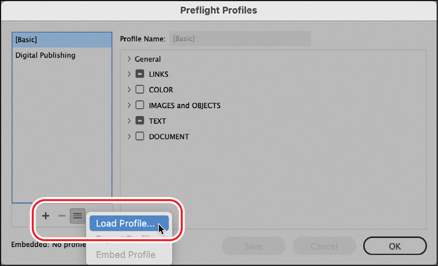
Select the Flyer Profile.idpp file in the Lesson05 folder, located inside the Lessons folder within the InDesignCIB folder on your hard drive. Click Open.
With Flyer Profile selected, look through the settings specified for the output of this flyer. Click the arrows next to a few different categories to see the options you can include in a preflight profile.
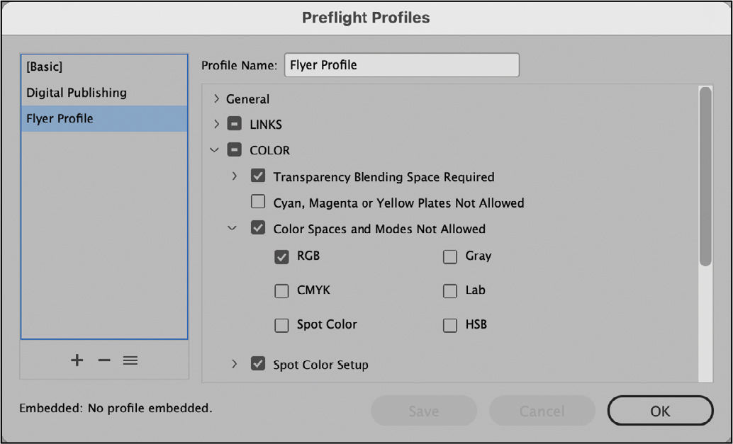
InDesign will flag violations for the checked options. For example, under Color > Color Spaces And Modes Not Allowed, RGB is selected. As a result, all uses of RGB colors will be reported as errors.
Click OK to close the Preflight Profiles dialog.
Selecting a preflight profile
Now, you will select the Flyer Profile and review any errors that it flags.
![]() Tip
Tip
The lower-left corner of the document window displays the number of preflight errors in a document (provided that On is selected in the upper-left corner of the Preflight panel). If you start to see a lot of errors, open the Preflight panel to see more information.
From the Profile menu in the Preflight panel, choose Flyer Profile. Notice that the profile detects one issue with the colors that currently exist in the document.
To view the error, click the triangle next to COLOR (1).
Click the triangle next to Color Space Not Allowed (1).
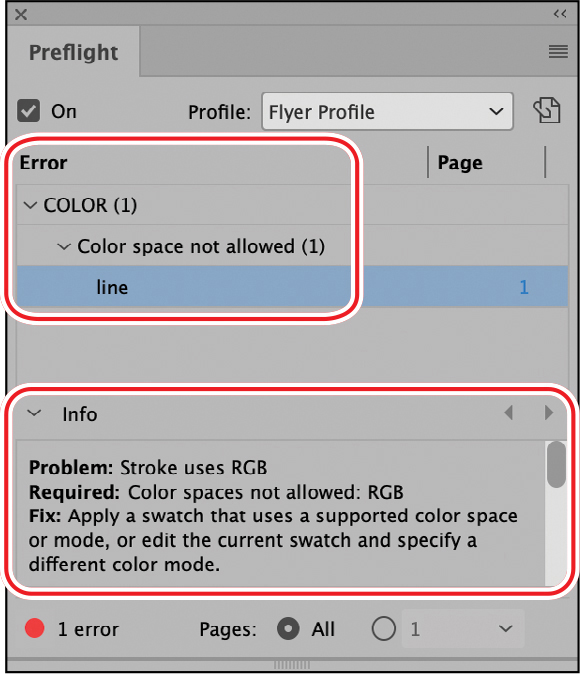
Double-click Line to select the line on the page that is triggering the error.
If necessary, click the triangle next to Info to see details of the problem. Leave this panel open for the next exercise.
Because this document is destined for CMYK printing, colors in the RGB color mode are not allowed. The stroke color of the line is in the RGB color model. You will resolve this in the next exercise.
Converting a color mode for a swatch
Now, you will resolve the preflight error by converting the color mode of the swatch applied to the line.
Choose Window > Color > Swatches to display the Swatches panel.
TipWhen you package a document for final output (File > Package), InDesign may flag issues with color models. You will change the color mode in the same way as shown here.
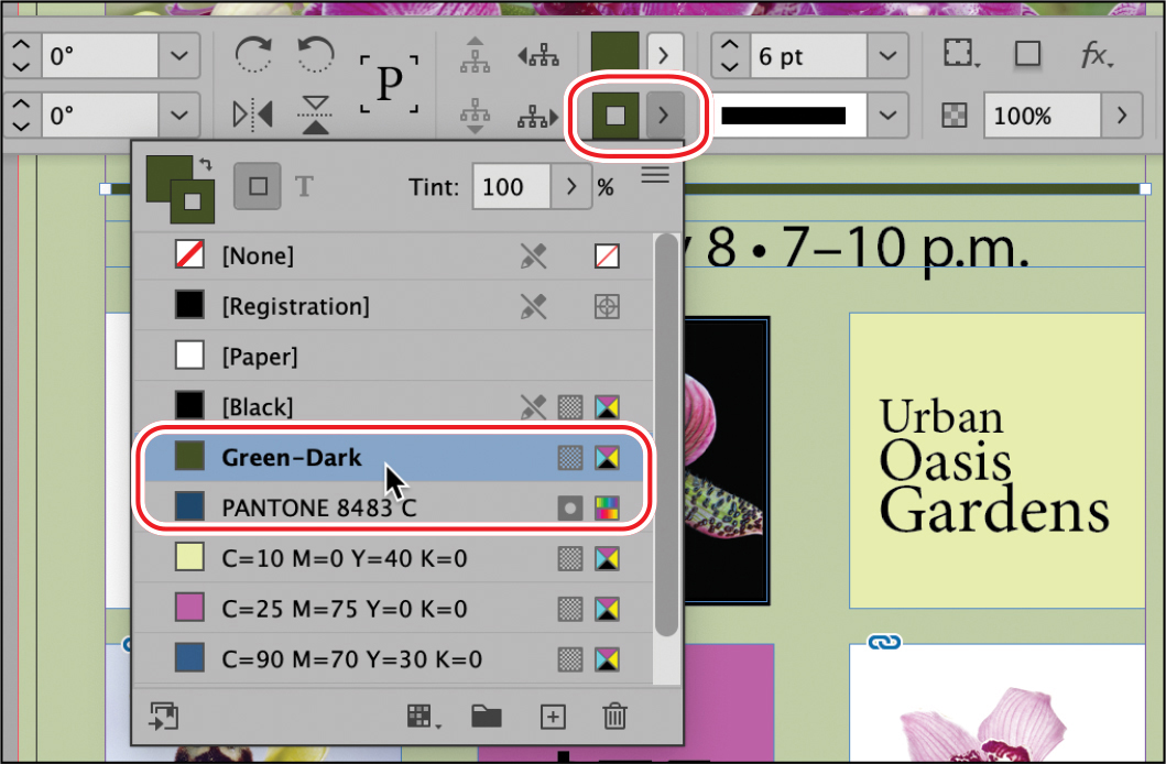
In the list of colors in the Swatches panel, double-click the Green-Dark swatch to open the Swatch Options dialog.
Select CMYK from the Color Mode menu, and then click OK. (If necessary, scroll up in the menu to see CMYK.)
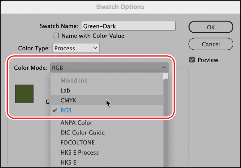
Notice that the error no longer displays in the Preflight panel.
Close the Preflight panel, and choose File > Save.
Creating colors
For maximum design flexibility, InDesign provides a variety of methods for creating colors. Once you create colors and color swatches, you can apply them to objects, strokes, and text in the layout. For consistent color usage, you can share colors among documents and users. You can create colors in the following ways:
![]() Note
Note
As you work through the lesson, you can move panels around and change the zoom level to a setting that works best for you. For more information, see “Working with panels” and “Changing the magnification of a document” in Lesson 1.
Create colors on the fly using the Color panel.
Create named color swatches for repeated and consistent usage with the Swatches panel.
Select a color from an image using the Eyedropper tool.
Use the Color Theme tool or Object > Extract From Image > Color Themes command to choose among color themes generated from images or objects.
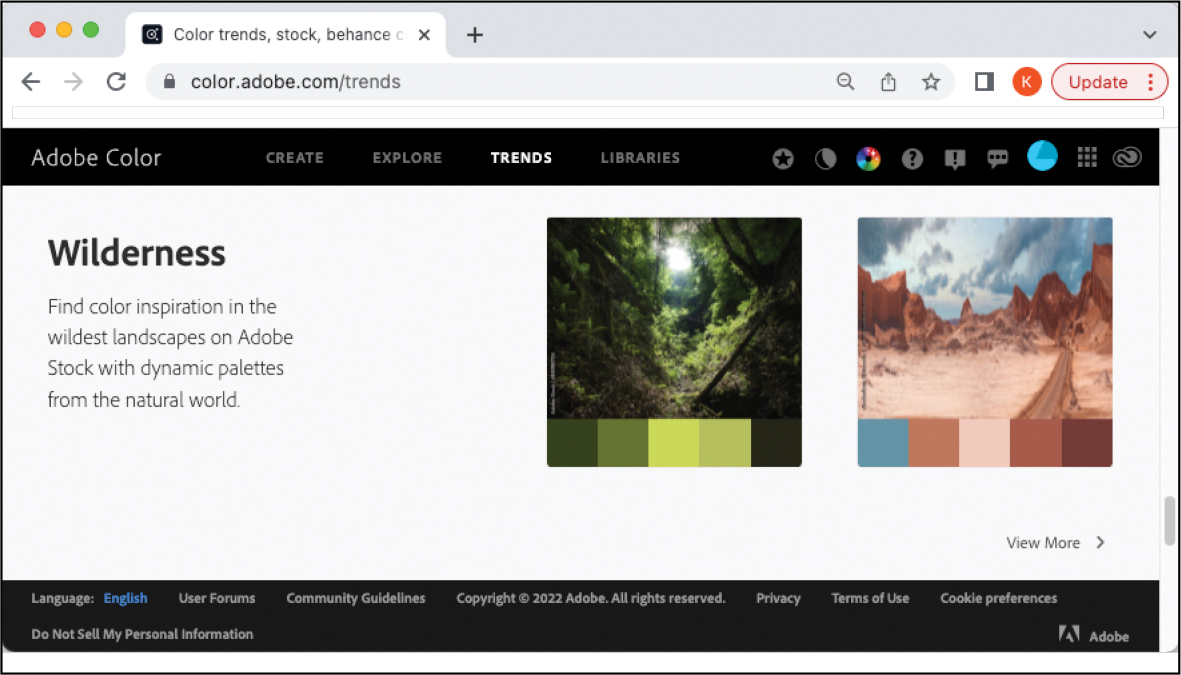
Create and select themes from Adobe Color (color.adobe.com).
Use the CC Libraries feature to share colors with Photoshop and Illustrator, with other members of your workgroup, and with other documents.
You can define colors in a variety of color modes, including RGB, CMYK, HSB, and “spot color” modes such as PANTONE. The difference between spot and process (CMYK) colors is discussed later in this exercise.
![]() Tip
Tip
Many corporate identities, including logos, specify a color from the PANTONE Color books. Customers who rely on the PANTONE Color book colors in their creative workflows will need a Pantone license via the Pantone Connect plug-in available on Adobe Exchange (exchange.adobe.com).
This flyer will be printed by a commercial printer using CMYK color, which requires four separate plates for printing—one each for cyan, magenta, yellow, and black. However, the CMYK color mode has a limited range of colors, which is where spot colors are useful. Spot colors are used to add colors beyond the range of CMYK (for example, metallic inks) and to ensure consistent color (for example, the color used in a company logo).
In this exercise, you will use the Swatches panel to create a PANTONE metallic spot color for a headline. You will then use the Eyedropper tool, Color panel, and Swatches panel to create a CMYK color swatch for the flyer’s background color.
Creating a PANTONE color swatch
In this flyer, the “Orchid Clinic” headline calls for a metallic ink for an eye-catching and elegant look. You’ll now add a metallic spot color from a color library. Note that the metallic color looks like any other color onscreen. You would see the difference in the metallic ink on the press, particularly with high-quality paper. Be sure to consult a printer about their capabilities and the extra costs of using metallic inks.
Using the Selection tool (
 ), click the pasteboard surrounding the page to make sure nothing is selected.
If necessary, choose Window > Color > Swatches to display the Swatches panel.
NoteIf you have room onscreen, tear the Swatches panel off the dock for easier access.
Choose New Color Swatch from the Swatches panel menu (
).In the New Color Swatch dialog, choose Spot from the Color Type menu.
Select PANTONE+ Metallic Coated from the Color Mode menu.
In the PANTONE C field, type 8483 to automatically scroll the list of Pantone swatches to the color you want for this project, which is PANTONE 8483 C.
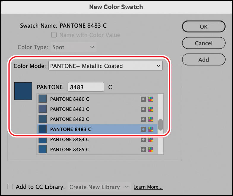
Click OK. The spot color is added to your Swatches panel.
TipWhen selecting PANTONE colors for print, it’s a good idea to select them from a printed PANTONE color guide, available from pantone.com. Selecting PANTONE colors from the screen may not be reliable.
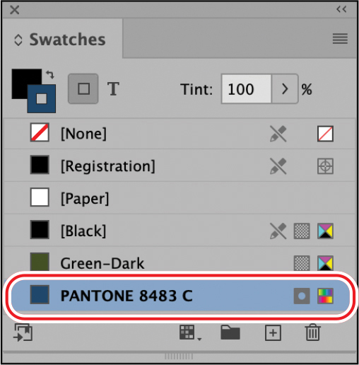
The icon (
 ) to the right of the color name in the Swatches panel indicates that it is a spot color. New colors added to the Swatches panel are stored with the document in which they are created.
Choose File > Save.
You’ll apply the newly added spot color to the “Orchid Clinic” headline later in this lesson.
Creating CMYK color swatches
To create a CMYK color swatch from scratch, you need an understanding of color mixing and color values. Alternatively, you can experiment with defining colors in the Colors panel and add the color as a color swatch. You can also use the Eyedropper tool to “pick up” a color from an image. In this exercise, you will use the Eyedropper tool to get a head start on creating a CMYK color swatch. Then, you will create three additional colors by entering color values.
![]() Tip
Tip
Using the Swatches panel to name colors makes it easy to apply, edit, and update colors for objects in a document. Although you can also use the Color panel to apply colors to objects, there is no quick way to update these colors, which are considered “unnamed colors.” Instead, if you want to change an unnamed color on multiple objects, you need to change each one individually.
Zoom as necessary to view the yellow flower in the lower-left corner of the page.
Choose Edit > Deselect All to be sure nothing is selected on the page.
Choose Window > Color > Color to display the Color panel.
Press I on the keyboard to select the Eyedropper tool (
 ).
).Click the Eyedropper tool on a lighter area of the yellow flower in the lower-left corner of the page as shown.
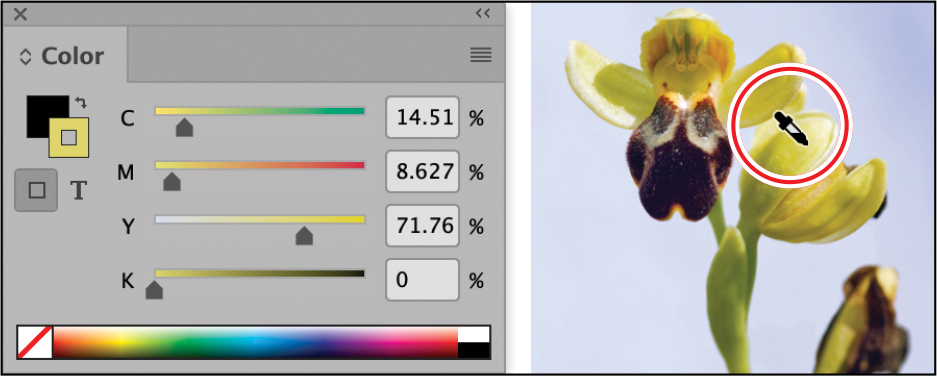
The color picked up from the image displays in the Color panel. The color values may differ depending on precisely where you clicked. To create the intended color, you will fine-tune the color values.
In the Color panel, enter the values shown below in the C, M, Y, and K fields. You can tab between fields, and when you’re finished entering values, press Enter (Windows) or Return (macOS).
C (Cyan): 10
M (Magenta): 0
Y (Yellow): 40
K (Black): 0
Choose Add To Swatches from the Color panel menu (
).A color swatch is added to the bottom of the list in the Swatches panel, and it is automatically selected. Close the Color panel.
Click the New Swatch icon (
 ) at the bottom of the Swatches panel. This makes a copy of the currently selected swatch; you can use this swatch as a starting place for a new swatch.
Double-click the new swatch added to the bottom of the Swatches panel. This opens the Swatch Options dialog so that you can edit the swatch.
NoteTo see all the swatches, drag the lower-right corner of the Swatches panel to expand it.
Make sure Color Type is set to Process and Color Mode is set to CMYK. Adjust the color by typing values in the following fields; you can tab from field to field.
Cyan: 25
Magenta: 75
Yellow: 0
Black: 0
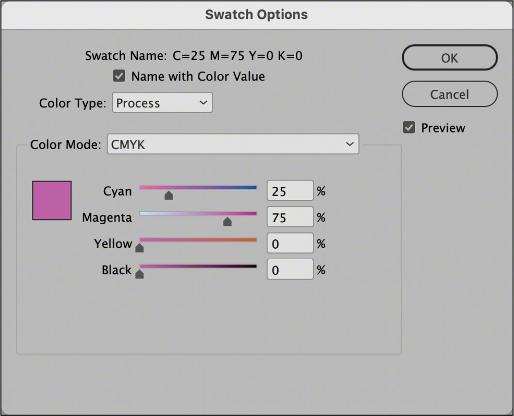
Click OK to close the Swatch Options dialog and add the new swatch.
Press Alt (Windows) or Option (macOS) while you click the New Swatch icon (
) at the bottom of the Swatches panel. This creates a new swatch and automatically opens the New Color Swatch dialog.Make sure that Color Type is set to Process and that Color Mode is set to CMYK.
TipIf you want to give a color a recognizable name, such as Aqua or Forest Green, deselect Name With Color Value in the Swatch Options dialog. You can then enter a name in the Swatch Name field.
Enter the following values in the fields, tabbing between fields:
Cyan: 90
Magenta: 70
Yellow: 30
Black: 0
Click OK to update the color.
Choose New Color Swatch from the Swatches panel menu (
).Make sure that Color Type is set to Process and Color Mode is set to CMYK.
Enter the following values in the fields, tabbing between fields:
Cyan: 65
Magenta: 25
Yellow: 100
Black: 0
Click OK to update the color, and then choose File > Save.
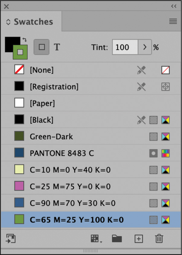
You have now created a spot color swatch (metallic blue) and three CMYK color swatches (pink, blue, and green) in addition to the yellow swatch created with the Eyedropper tool. In the next exercise, you will apply colors to objects on the page.
About spot and process colors
You can designate colors as either spot or process color types, which correspond to the two main ink types used in commercial printing. In the Swatches panel, you can identify a color’s type by the icon that displays next to its name. When applying colors in InDesign, keep in mind the final output (print or digital) so that you create and apply colors with the appropriate color model.
![]() Tip
Tip
In addition to spot and process colors, InDesign provides Mixed Ink colors to expand the color palette of a publication that uses multiple spot colors. To use this feature, select New Mixed Ink Swatch from the Swatches panel menu. You can then mix a spot color and black (or two spot colors) to create an additional color, offering the tonal range you would see in a duotone image. If the New Mixed Ink Swatch option is not available, make sure that the document includes a spot color swatch.
A spot color is a special premixed ink used instead of, or in addition to, CMYK process inks. Each spot color requires its own printing plate on a printing press, so use spot colors when few colors are specified and color accuracy is critical. Spot color inks can accurately reproduce colors outside the gamut of process colors. However, the exact appearance of the printed spot color is determined by the combination of the ink as mixed by the commercial printer and the paper it’s printed on, not by color values you specify or by color management.
A process color is printed using a combination of the four standard process inks: cyan, magenta, yellow, and black (CMYK). Use process colors when a job requires so many colors that using individual spot inks would be expensive or impractical, as when printing color photographs.
For best results in a high-quality printed document, specify process colors using CMYK values printed in process color reference charts, such as those available from a commercial printer.
The final color values of a process color are its values in CMYK, so if you specify a process color using RGB, those color values are converted to CMYK when you print color separations. These conversions differ based on your color-management settings and document profile.
Don’t specify a process color based on how it looks on your monitor, unless you are sure you have set up a color-management system properly and you understand its limitations for previewing color.
Avoid using process colors in documents intended for onscreen viewing because CMYK has a smaller color gamut than that of a typical screen.
Sometimes, you will use process and spot inks in the same job. For example, you might use one spot ink to print the exact color of a company logo on the same pages of an annual report where you need process colors to reproduce photos. You can also use a spot-color printing plate to apply a varnish over areas of a process color job. In both cases, your print job would use a total of five inks—four process inks and one spot ink or varnish.
Each spot color you create generates an additional spot-color plate for the press. In general, commercial printers produce either two-color (using black and one spot color) or four-color CMYK work, with the possibility of adding one or more spot colors. Using spot colors typically increases printing costs. It is a good idea to consult with your printer before using spot colors in a document.
—Condensed from InDesign Help
Applying colors
Once you create color swatches, you can apply them to objects, text, and more. The Swatches panel, Control panel, Properties panel, and CC Libraries panel offer the primary tools for applying colors. There are three general steps to applying a color:
Select the text or object.
Select the stroke (edge) or fill (background) option, depending on what you want to change.
Select a swatch.
You use the Stroke/Fill box (![]() ) to specify whether you want to apply color to a selection’s stroke (outline) or fill (background). You can find the Stroke/Fill box on the Tools panel, the Swatches panel, and the Color panel. Whenever you apply colors, keep an eye on this box, as it’s easy to apply color to the wrong part of an object.
) to specify whether you want to apply color to a selection’s stroke (outline) or fill (background). You can find the Stroke/Fill box on the Tools panel, the Swatches panel, and the Color panel. Whenever you apply colors, keep an eye on this box, as it’s easy to apply color to the wrong part of an object.
![]() Tip
Tip
The Control and Properties panels provide separate Fill and Stroke menus, which can make it easier to apply colors.
InDesign provides many other options for applying colors, including dragging swatches onto objects, copying color from an object with the Eyedropper tool, and specifying colors in styles. As you work with InDesign, you will discover which methods work best for you.
In this exercise, you will apply color swatches to strokes, fills, and text using various panels and techniques.
Applying fill colors to objects
In this task, you will apply fill colors to various objects on the page by using the Swatches panel, dragging a swatch, and using the Eyedropper tool.
If necessary, choose View > Fit Page In Window, and choose Window > Color > Swatches.
TipClicking the small arrow on the Fill/Stroke box (
 ) swaps the stroke and fill colors of a selected object.
Choose View > Screen Mode > Normal to see the frame edges.
Using the Selection tool (
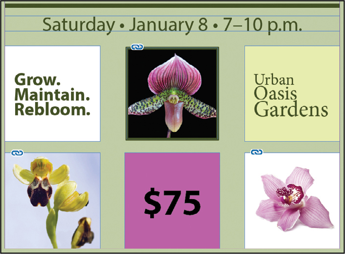
), click anywhere in the margin of the page (outside the margin guides) to select the large background frame.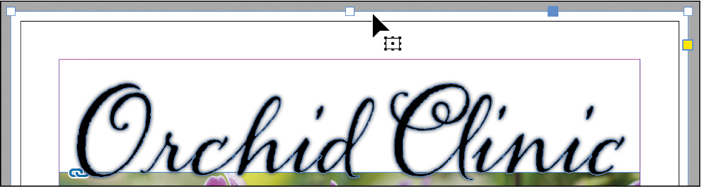
Click in the margins of the page to select the large text frame as shown here. The square resizing handles show that the frame is selected.
Click the Fill box (
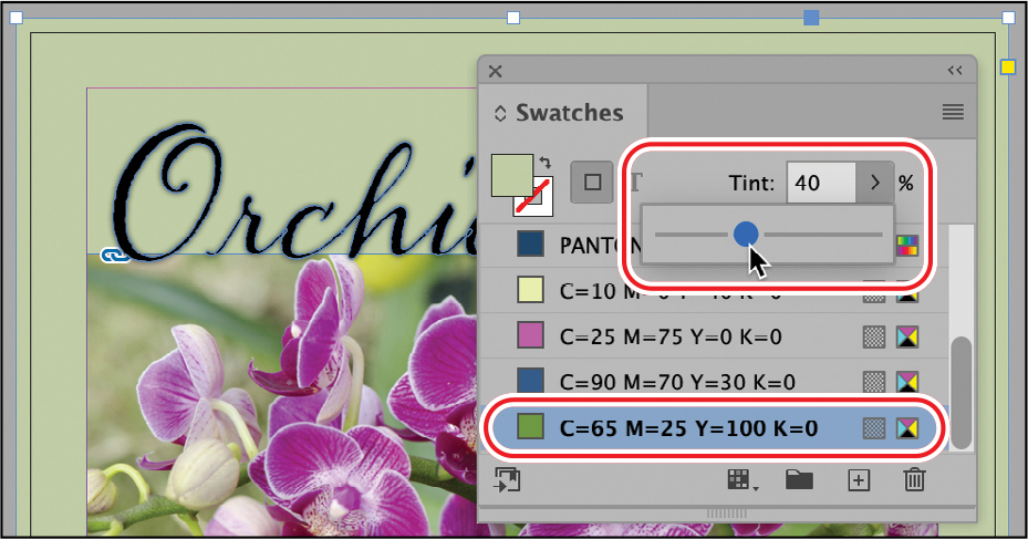
) on the Swatches panel.Click the green color swatch named C=65 M=25 Y=100 K=0.
At the top of the Swatches panel, drag the Tint slider to 40.
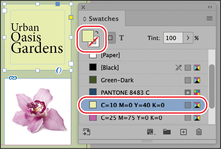
Using the Selection tool, select the text frame at the lower right containing the words “Urban Oasis Gardens.”
With the Fill box still selected, click the yellow color swatch named C=10 M=0 Y=40 K=0.
Click the pasteboard to make sure nothing is selected on the page.
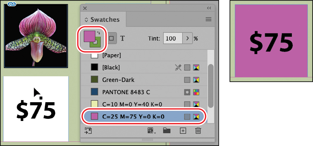
In the Swatches panel, drag the pink color swatch (C=25 M=75 Y=0 K=0) to the text frame centered at the bottom of the page containing “$75.”
Click the pasteboard to make sure nothing is selected.
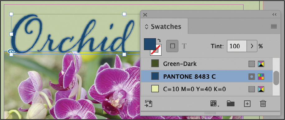
Using the Selection tool, click “Orchid Clinic” at the top of the page.
TipThe “Orchid Clinic” text at the top of the page is an object created by choosing Type > Create Outlines for a selected text frame. This creates a frame (shaped like the text) that may be filled with a graphic or otherwise manipulated.
With the Fill box still selected, click the PANTONE 8483 C spot color swatch.
Choose File > Save. To prepare for the next exercise, click the pasteboard to make sure nothing is selected, and choose View > Fit Page In Window.
Applying colors to strokes
The Stroke panel (Window > Stroke) lets you apply a border to lines, frames, and text. Here, you will apply color to an existing line and a graphics frame stroke using options on the Control panel.
Using the Selection tool (
), click the horizontal line above the date in the middle of the page.Click the Stroke menu on the Control panel.
Resize the Swatches panel as necessary (or scroll down) and select the Green-Dark swatch.
NoteIf you apply color to the wrong object or the wrong part of an object, you can always choose Edit > Undo and try again.
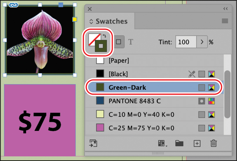
Using the Selection tool, click the graphics frame containing the orchid bud. Be sure to click outside the content grabber to select the frame.
Click the Stroke box (
 ) on the Swatches panel.
Scroll down and click the Green-Dark color swatch.
Choose File > Save.
Applying colors to text
You will now select text with the Type tool and apply a fill color to it using the Swatches panel and the Control panel.
![]() Tip
Tip
To create reverse type, which is lighter text on a dark background, you apply a lighter color to text and a darker color to the paragraph shading or text frame.
Using the Type tool (
 ), click in the text frame containing the date “Saturday • January 8 • 7–10 p.m.” Drag to select all the text.
On the Swatches panel, notice that the Fill box has changed to indicate that text is selected: (
 ).
).With the Fill box still selected, click the Green-Dark swatch.
Using the Type tool, click in the frame at the left containing the words “Grow. Maintain. Rebloom.” Press Ctrl+A (Windows) or Command+A (macOS) to select all the text in the paragraph.
With the Fill box still selected, click the Green-Dark swatch.
Using the Type tool, click in the frame at the right containing the words “Urban Oasis Gardens.” Click four times to select all the text.
Locate the text Fill button (
 ) on the Control panel. Click the Fill button, and select the Green-Dark swatch. Tip
As you’re creating and applying colors, be sure you are staying within your client’s or company’s branding guidelines. Ask for a style guide or branding guide, which will typically spell out approved colors, fonts, logo usage rules, and more.
Choose Edit > Deselect All to see your progress in applying colors.
If the Swatches panel is taking up too much space onscreen, you may close it.
Choose Window > Properties to display the Properties panel.
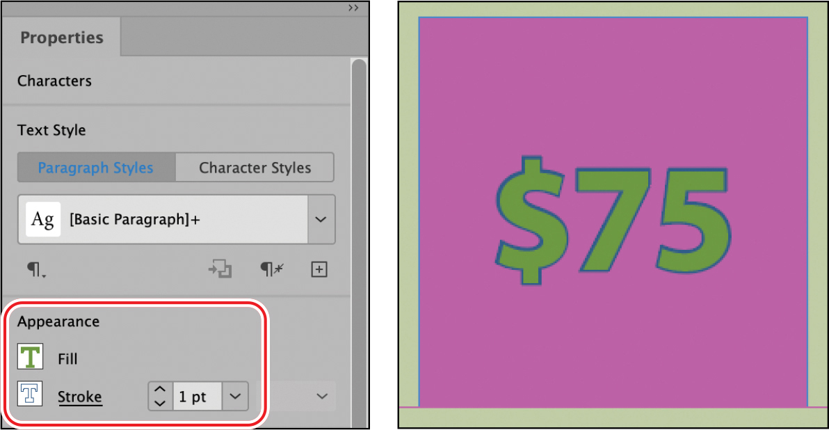
Using the Type tool, click in the text frame centered at the bottom of the page containing “$75.” Choose Edit > Select All to select all the text.
In the Properties panel, click the Fill button, and then select the lighter green color swatch named C=65 M=25 Y=100 K=0.
Type 1 pt in the Weight field (next to the Stroke button). Press Enter or Return.
Click the Stroke button, and then select the blue color swatch named C=90 M=70 Y=30 K=0.
Click the pasteboard to deselect the text, and then zoom as necessary to see how the formatting looks. Choose Window > Properties to close the Properties panel.
Choose Edit > Deselect All, and then choose File > Save.
Finding and changing color swatches
If you need to selectively make changes to color usage in a document, you can do so through a search-and-replace operation. For example, you may decide to change the color of the rules on the chapter opening pages in a book without changing the rules on the other pages.
![]() Tip
Tip
If you no longer want to use a color in a document, you can delete it from the Swatches panel and replace it with another color.
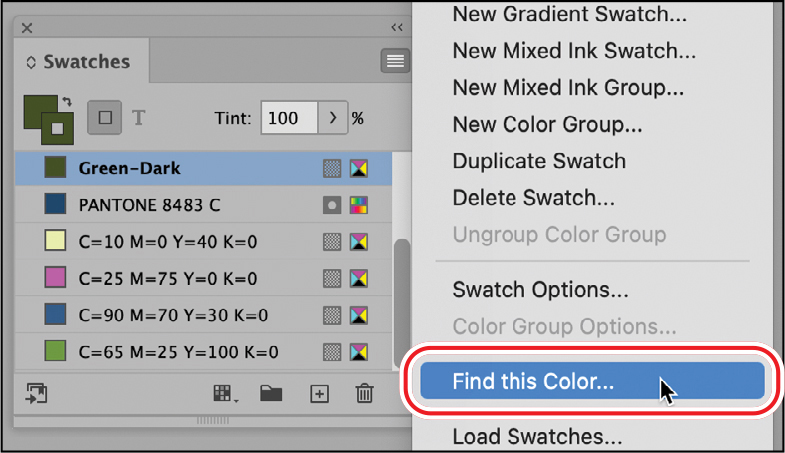
The Find This Color option in the Swatches panel menu lets you selectively search and replace colors. In this exercise, you will experiment with this feature by finding where the Green-Dark color swatch is applied and then change two instances to a different color. You will see that this feature can save time and ensure consistency in a longer document.
Using the Selection tool (
), click the horizontal line above the date in the middle of the page.On the Swatches panel, note the Green-Dark color swatch is applied to the line.
With the Green-Dark color swatch still selected, choose Find This Color from the Swatches panel menu.
The Find/Change dialog displays with the Color tab selected. Leave Find Color set to Green-Dark. In the Change Color area, select the blue color swatch: C=90 M=70 Y=30 K=0.
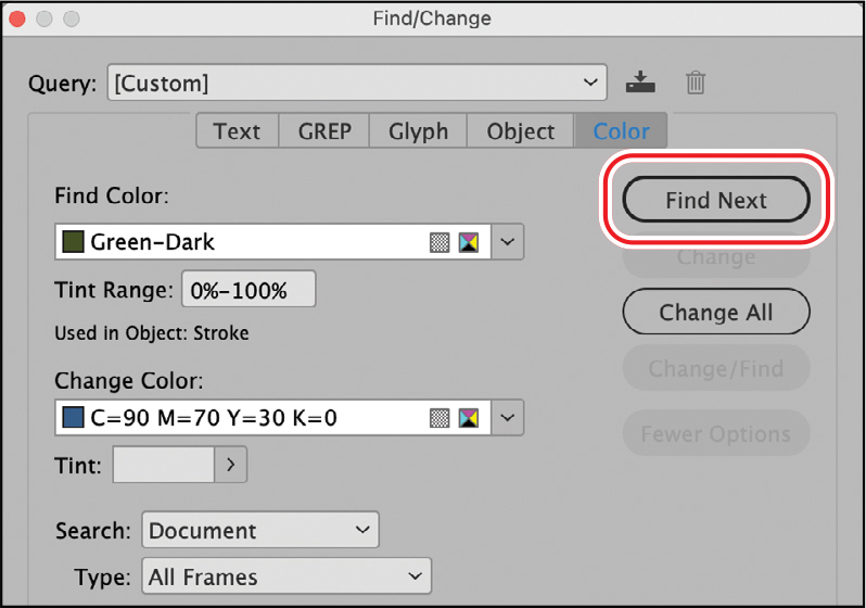
Click Find Next to highlight text or objects where the color is used. When the text is selected, click Find Next to skip those instances.
NoteDrag the Find/Change dialog out of the way as necessary to see the page.
When the stroke on the flower image is selected, click Change. When the horizontal line above the date is selected, click Change.
After you change the two instances of the stroke color, click Done to close the Find/Change dialog.
Choose File > Save.
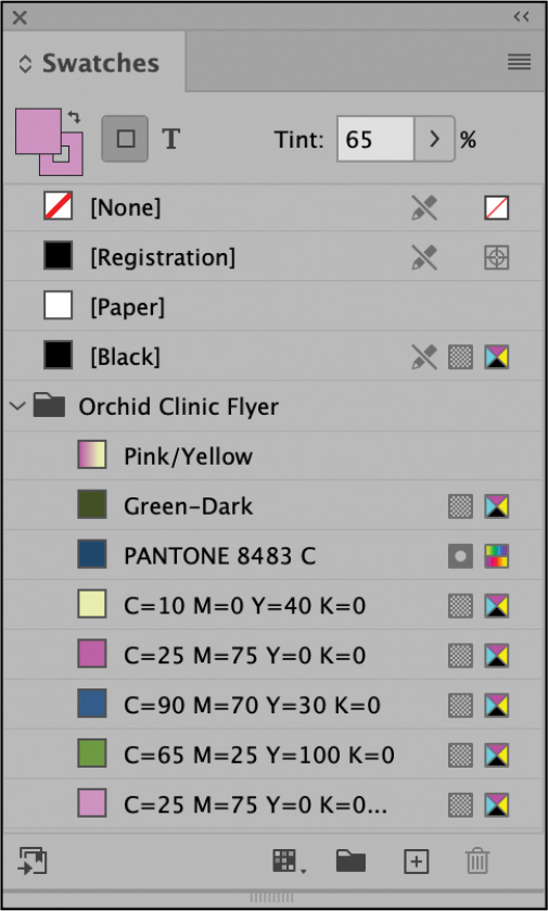
Working with tint swatches
A tint swatch is a screened (lighter) version of a color that you can apply quickly and consistently. The tint swatch is available on the Swatches panel and in other color menus, such as in the Control panel. You can share tint swatches with other documents by using the Load Swatches command on the Swatches panel menu. You will now create a light green tint swatch and apply it to the yellow text frame.
Creating a tint swatch
You create a tint swatch from an existing color swatch.
Choose View > Fit Page In Window to center the page in the document window.
Using the Selection tool (
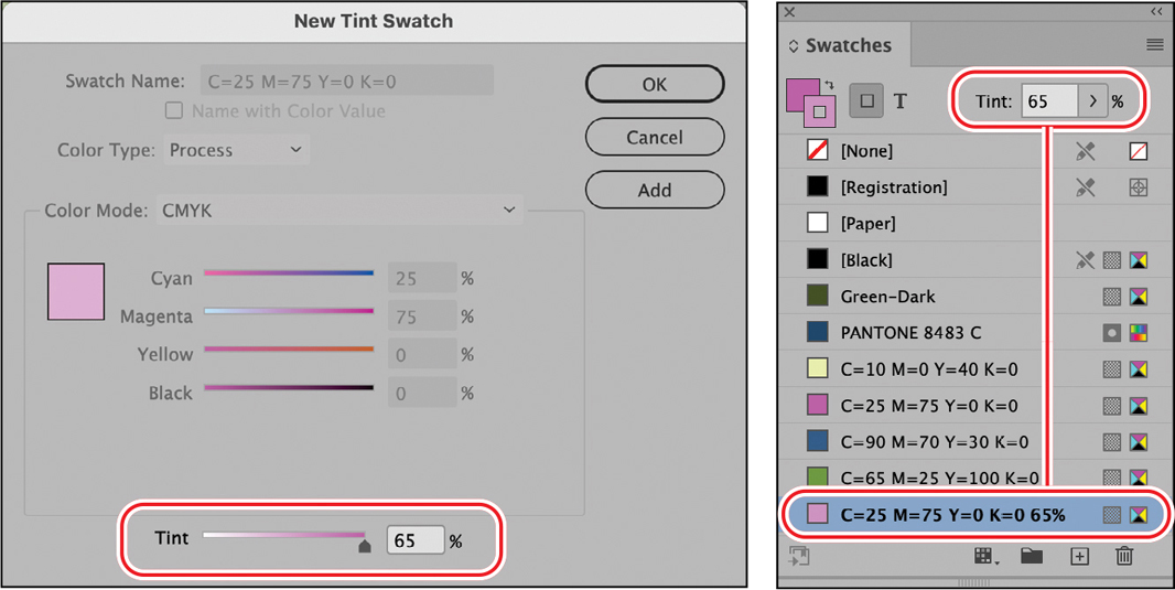
), click the pasteboard surrounding the page to make sure nothing is selected.In the Swatches panel, select the pink color swatch named C=25 M=75 Y=0 K=0.
NoteTo see all the swatches, drag the lower-right corner of the Swatches panel to expand it.
Choose New Tint Swatch from the Swatches panel menu (
).In the New Tint Swatch dialog, the Tint option at the bottom is the only option you can modify. Type 65 in the Tint field, and then click OK.
The new tint swatch appears at the bottom of the list of swatches. The Tint field at the top of the Swatches panel displays information about the selected swatch.
Applying a tint swatch
You will apply the tint swatch as a fill color.
![]() Tip
Tip
Tint swatches are helpful because InDesign maintains the relationship between a tint and its parent color. So if you change the parent color swatch to a different color, the tint swatch becomes a lighter version of the new color.
Using the Selection tool (
), click the text frame at the bottom containing “$75.”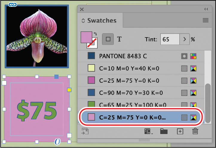
Click the Fill box (
) on the Swatches panel.Click the new tint you just created in the Swatches panel. Its tint swatch name will be C=25 M=75 Y=0 K=0 65%. Notice how the color changes.
Choose File > Save.
Working with gradients
A gradient is a graduated blend between two or more colors or between tints of the same color. You can create either a linear or a radial gradient. In this exercise, you will create a linear gradient swatch with the Swatches panel, apply it to an object, and adjust the gradient with the Gradient Swatch tool.
![]() Tip
Tip
It’s a good idea to test gradients on the intended output device, whether it’s digital or print.

Linear gradient.

Radial gradient.
Creating a gradient swatch
When you create a gradient in the New Gradient Swatch dialog, the gradient is defined by a series of color stops in the gradient ramp. A stop is the point at which each color is at full intensity between the transitions; it is identified by a square below the gradient ramp. Every InDesign gradient has at least two color stops. By editing the color of each stop and adding color stops, you can create custom gradients.
Choose Edit > Deselect All to make sure no objects are selected.
Choose New Gradient Swatch from the Swatches panel menu (
).For Swatch Name, type Pink/Yellow. Leave the Type menu set to Linear.
Click the left stop marker (
 ) on the gradient ramp. Tip
To create a gradient that uses a tint of a color, first create a tint swatch in the Swatches panel.
From the Stop Color menu, select Swatches, and then scroll down the list and select the pink color swatch named C=25 M=75 Y=0 K=0.
Notice that the left side of the gradient ramp is now pink.
With the left stop marker still selected, type 5 in the Location field.
Click the right stop marker (
), and select the yellow color swatch named C=10 M=0 Y=40 K=0. Type 70 in the Location field.The gradient ramp shows a color blend between pink and yellow.
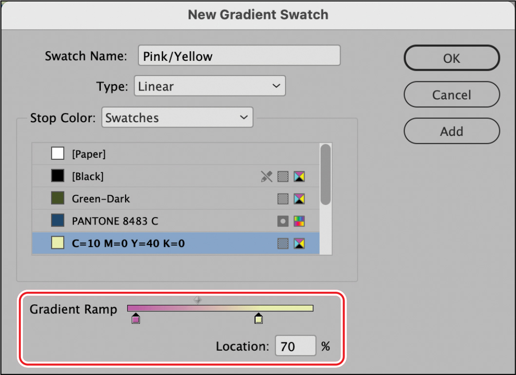
Click OK. The new gradient swatch appears at the bottom of the list in the Swatches panel.
Choose File > Save.
Applying a gradient swatch
Now you’ll replace the fill in one of the text frames with the gradient.
Using the Selection tool (
), click the text frame at the left containing the words “Grow. Maintain. Rebloom.”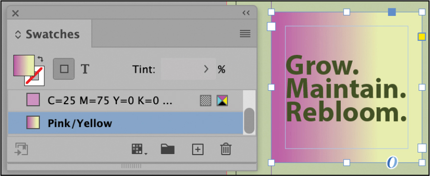
Click the Fill box (
) on the Swatches panel.Click the new gradient you just created in the Swatches panel: Pink/Yellow.
Choose File > Save.
Adjusting the direction of the gradient blend
Once you have filled an object with a gradient, you can modify the gradient by using the Gradient Swatch tool to “repaint” the gradient along an imaginary line that you draw. This tool lets you change the direction of a gradient and change its beginning point and end point. When using the Gradient Swatch tool, the farther away you start from the outer edges of the object, the more gradual the gradient blend will be. You’ll now change the direction of the gradient.
Make sure the “Grow. Maintain. Rebloom.” text frame is still selected, and then press G on the keyboard to select the Gradient Swatch tool (
 ) in the Tools panel.
To create a less gradual gradient effect, position the cursor close to the left edge of the selected text frame, and drag to the right as shown.
TipTo constrain gradient angles to horizontal, vertical, or 45-degree angles, press the Shift key while dragging with the Gradient tool.
When you release the mouse button, you’ll notice that the transition between pink and yellow is less gradual than it was previously.
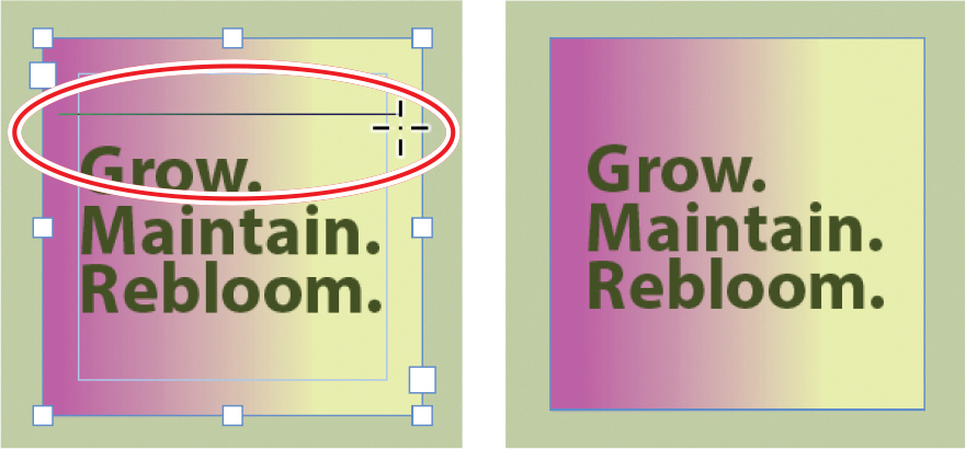
To create a diagonal gradient, drag from the upper-left corner to the lower-right corner using the Gradient Swatch tool. Continue to experiment with the Gradient Swatch tool so that you understand how it works.
TipThe farther you drag the Gradient Swatch tool, the more gradual the resulting gradient will be.

When you are finished experimenting, drag from the top to the bottom of the text frame to form a gradient from top to bottom. That’s how you’ll leave the gradient for the “Grow. Maintain. Rebloom.” text frame.

Choose File > Save.
Working with color groups
If a document contains many color swatches intended for specific purposes (such as chapter openers or divider pages), you can group the swatches in the Swatches panel. You can then easily share the color group with other documents and with other designers working on the marketing campaign.
![]() Tip
Tip
As you design a document, you often create more color swatches than you use. When you settle on a final design and color palette, you will want to delete any unused colors to make sure they aren’t applied accidentally. To do this, choose Select All Unused from the Swatches panel menu (![]() ). Then, click the Delete Selected Swatch/Groups button (
). Then, click the Delete Selected Swatch/Groups button (![]() ) at the bottom of the panel.
) at the bottom of the panel.
Adding colors to a color group
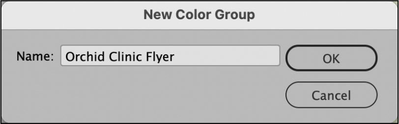
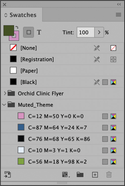
You will organize the colors in this document into a new color group.
Press V on the keyboard to switch to the Selection tool (
).Click the pasteboard to make sure no objects are selected.
To create a new color group, choose New Color Group from the Swatches panel menu (
). Click None in the Swatches panel.In the New Color Group dialog, type Orchid Clinic Flyer. Click OK.
Now, you will drag the color swatches, tint swatch, and gradient swatch created for the flyer into the new color group.
To select the swatches, Shift-click the first swatch and last swatch you want to move. Be sure that [None], [Registration], [Paper], and [Black] are not selected.
Click in the blue highlighted area to the left of the selected swatches, and drag them below the Orchid Clinic Flyer folder until a line displays.
Choose File > Save.
Previewing the final document
As a final step, you’ll preview the document in its finished state.

Choose View > Screen Mode > Preview.
Choose View > Fit Page In Window.
Press Tab to hide all the panels and review the results of your work.
Press Tab again to restore your panels.
Congratulations! You have now completed this lesson.
Exploring on your own
Follow these steps to learn more about working with color themes.
Creating a color theme
To create colors that complement an image in a document, you can use the InDesign Color Theme tool. The tool analyzes an image or object, selects representative colors, and generates five different themes. You can select and apply swatches from a color theme, add a color theme’s swatches to the Swatches panel, and share the color themes through CC Libraries. To use the Color Theme tool:
Click an image or object with the Color Theme tool to create a color theme from a small area.
Drag the Color Theme tool to marquee images and/or objects on a page from which to create a color theme.
Alt-click (Windows) or Option-click (macOS) the Color Theme tool to clear the existing color theme and create a new one.
Viewing color themes
First, you will view the possible color themes from the orchid bud image. Then, you will select the color theme you want to use.
On the Tools panel, click the Eyedropper tool (
). Hold down the mouse button to view the pop-out menu, and then select the Color Theme tool ( ). Tip
To select the Color Theme tool from the keyboard, press Shift+i.
Locate the orchid bud image in the center of the page.
Click the Color Theme tool anywhere on the image.
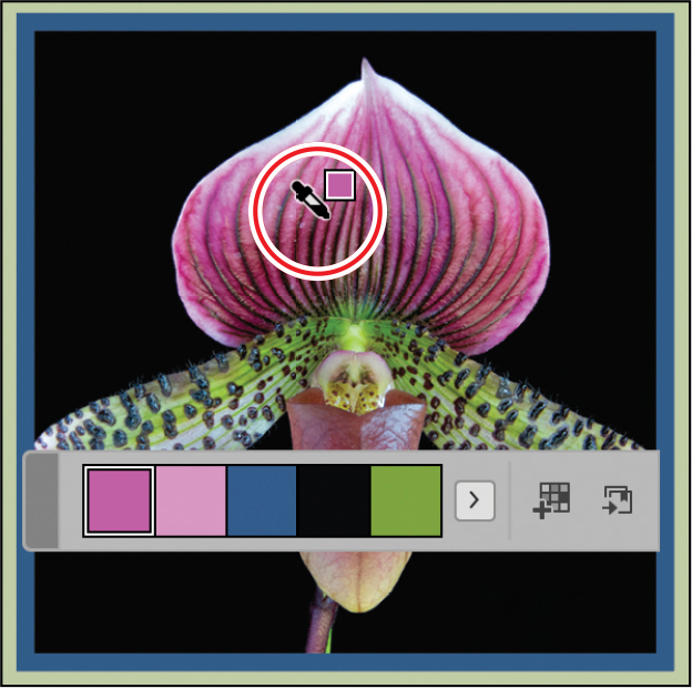
Notice that the Color Theme panel appears with a color theme picked up from the image.
On the Color Theme panel, click the Current Theme menu. Select the Muted theme.
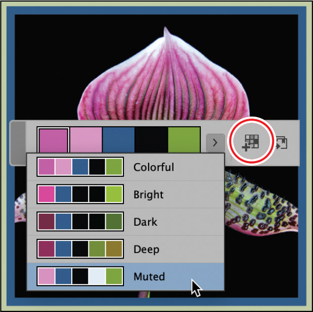
You can select and use any of the swatches shown here, but instead you will add the entire color theme to the Swatches panel.
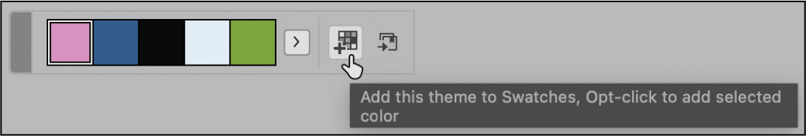
Adding a theme to the Swatches panel
You can add a single color from a color theme to the Swatches panel in addition to adding an entire theme. To add a single swatch, select it on the Color Theme panel, and then Alt-click (Windows) or Option-click (macOS) the Add To Swatches button.
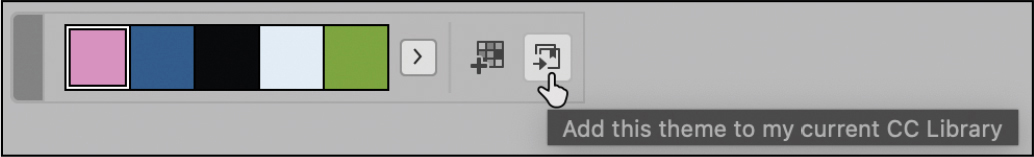
The Muted color theme will work best for the flyer in progress. First, you will add the color theme to the Swatches panel. Then, you will share this color theme with others in your workgroup who are working on other pieces in the marketing campaign.
With the Muted theme selected on the Color Theme tool’s panel, click the Add This Theme To Swatches button (
 ).
).
If necessary, choose Window > Color > Swatches to open the Swatches panel.
Scroll down as necessary to see the Muted theme added to the Swatches panel as a color group (organized in a folder).
NoteThe CMYK color values in the Muted theme’s colors may vary slightly. This will not affect your ability to explore these features.
Choose File > Save.
Adding a color theme to your CC Library
The InDesign Creative Cloud Libraries feature makes it easy to share assets, such as color swatches and themes, with a workgroup. If multiple designers are working on a magazine or marketing campaign, this ensures that everyone on the creative team has easy access to the same content. Here, you will add two color themes to your Creative Cloud library. For more information about CC Libraries, see Lesson 11, “Importing and Modifying Graphics.”
On the Color Theme tool’s panel, with the Muted theme still showing, click the Add This Theme To My Current CC Library button (
 ). Note
To use the Creative Cloud Libraries features, make sure the Adobe Creative Cloud application is running on your system.
Another way to create and add color themes is with the Extract panel. You will try this now.
Using the Selection tool (
), click the image of the orchids at the top of the page under the headline “Orchid Clinic.” TipIf you choose an option from Object > Extract From Image with no image selected, you can import a graphics file from your computer.
Choose Object > Extract From Image > Color Themes.
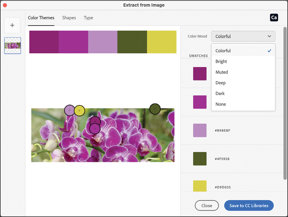
Click the Color Mood menu to see the various color themes extracted from the image.
Choose one of the themes from the menu, and then click Save To CC Libraries. Click the Extract From Image panel’s close button.
To view the themes in your CC Libraries panel, choose Window > CC Libraries.
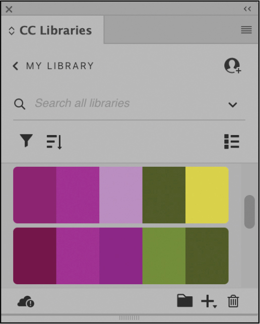
If necessary, click Sort Options (
 ) and select Group By Type to view the color themes.
Click the CC Libraries panel menu to see the collaboration options: Invite People and Get Link.
Choose File > Save.
Managing color themes
InDesign users have many options for creating and managing color themes. These tools help you synchronize colors across your applications and projects and collaborate with other users.
The Adobe Capture app for iPad, iPhone, and Android lets you create color themes from anything you point at with your device’s camera.
The Adobe Color website at color.adobe.com lets you create your own color themes, explore other users’ themes, and review your themes.
The CC Libraries panel (Window > CC Libraries) allows you to share color themes with a workgroup and manage color themes by copying, moving, or deleting them.
For more information about any of these features, consult InDesign Help.
Review questions
1 What is the advantage of creating colors in the Swatches panel instead of the Color panel?
2 What are the three general steps involved in applying a swatch of color?
3 What are the pros and cons of using spot colors versus process colors?
4 After you create a gradient and apply it to an object, how do you adjust the direction of the gradient blend?
Review answers
1 If you use the Swatches panel to apply a color to text and objects and then decide you want to use a different color, you don’t need to update each use of the color individually. Instead, change the color’s definition in the Swatches panel, and the color changes automatically throughout the layout.
2 The three general steps to applying a color swatch are: (1) selecting the text or object, (2) selecting the stroke or fill box, depending on what you want to change, and (3) selecting the color. You can access color swatches in various panels, including Swatches, Control, Properties, and Tools.
3 By using a spot color, you can ensure color accuracy. However, each spot color requires its own plate on the press, so using spot colors can be more costly. Use process colors when a job requires so many colors that using individual spot inks would be expensive or impractical, such as when printing color photographs.
4 To adjust the direction of the gradient blend, use the Gradient Swatch tool to repaint the fill along an imaginary line in the direction you want.