
12. Working with Transparency
Lesson overview
In this lesson, you’ll learn how to do the following:
Change the opacity of objects drawn in InDesign.
Apply transparency settings to imported graphics.
Apply transparency settings to text.
Apply blending modes to overlapping objects.
Apply feathering effects to objects.
Add a drop shadow to text.
Apply multiple effects to an object.
Copy effects between objects.
Apply an effect to one layer of a Photoshop file.
Edit and remove effects.

This lesson will take about 75 minutes to complete. To get the lesson files used in this chapter, download them from the web page for this book at adobepress.com/InDesignCIB2023. For more information, see “Accessing the lesson files and Web Edition” in the Getting Started section at the beginning of this book.

Adobe InDesign offers an array of transparency features to feed your imagination and creativity. These include controls over opacity, special effects, and color blends. You can also import graphic files that use transparency and apply additional transparency effects.
Getting started
The project for this lesson is the cover of a menu for a fictional restaurant, Edible Blossoms Bistro & Bar. By applying transparency effects and using multiple layers, you’ll create a visually rich design.
To ensure that the preferences and default settings of your InDesign program match those used in this lesson, move the InDesign Defaults file to a different folder following the procedure in “Saving and restoring the InDesign Defaults file” on pages 3–4.
 Note
NoteIf you have not already downloaded the project files for this lesson to your computer from your Account page, make sure to do so now. See “Getting Started” at the beginning of the book.
Start InDesign. Click Open from the Home screen, or choose File > Open, and open the 12_Start.indd file in the Lesson12 folder, which is located within the Lessons folder in the InDesignCIB folder on your hard drive.
Choose File > Save As, name the file 12_Menu.indd, and save it in the Lesson12 folder.
The menu appears as a blank page because all the layers that contain objects are currently hidden. You’ll reveal these layers one by one as you need them, so it will be easy to focus on the specific objects and tasks in each exercise.
To ensure that the panels and menu commands match those used in this lesson, choose Window > Workspace > [Advanced], and then choose Window > Workspace > Reset Advanced.
NoteTo better view the interface onscreen or in print, the screen captures in this book reflect the Medium Light interface rather than the default setting of Medium Dark. In addition, some screen captures illustrate User Interface Scaling for a closer look at interface elements. You can modify interface settings in Preferences.
To see what the finished project looks like, open the 12_End.indd file in the Lesson12 folder.

When you are ready to start working, either close the 12_End.indd file or leave it open for your reference. Then return to your lesson document by choosing 12_Menu.indd from the Window menu or by clicking the 12_Menu.indd tab in the upper-left corner of the document window.
Creating a background graphic
By applying transparency effects, you can create see-through objects that reveal any objects underneath. You’ll begin by working with the bottommost layer, which will interact in different ways with the objects on layers above. This layer serves as a textured background visible through the objects above it that have transparency effects applied.
Because nothing is below the bottommost layer in the layer stack, there are no objects that would be revealed by applying transparency, so you won’t apply any transparency effects to objects on this layer. Since this is the bottommost layer, any objects above this layer will interact with objects on this layer when transparency effects are applied to those objects stacked above.
Choose Window > Layers to display the Layers panel, or click the Layers panel icon (
 ) in the panel dock. Note
Many of the steps in this lesson refer to the Control panel. You can use the Properties panel if you prefer, but it is not part of the default [Advanced] workspace. To open it, choose Window > Properties. To save screen space, dock it with the rest of the panel dock.
In the Layers panel, select the layer labeled Background, scrolling as necessary to find it at the bottom of the layer stack. You’ll import an image onto this layer.

Make sure that the two boxes to the left of the layer name show that the layer is visible (the eye icon [
 ] appears) and unlocked (the layer lock icon [
 ] does not appear).
The pen icon (
 ) to the right of the layer name indicates that this is the layer on which any imported objects will be placed and new frames will be created.
Choose View > Grids & Guides > Show Guides. You’ll use the guides on the page to align the background image that you import.
Choose File > Place, and then open the 12_Background.tif file in your Lesson12 folder. This file is a grayscale TIFF.
 Tip
TipTIFF stands for Tagged Image File Format, a common bitmap graphic format often used for print publishing.
Move the loaded raster graphics icon (
 ) slightly outside the upper-left corner of the page; then click the corner where the red bleed guides meet so that the placed image fills the entire page, including the margins and bleed area. Keep the graphics frame selected.
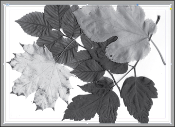
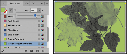
Choose Window > Color > Swatches or click the Swatches icon (
 ) in the panel dock. You’ll use the colors saved in the Swatches panel to apply color to the graphics frame and the image.
In the Swatches panel, select Fill Color (
 ). Scroll down the list of swatches to find the Green-Bright-Medium swatch and select it. Click the arrow to the right of the Tint field, and drag the slider to 80%. Tip
InDesign offers many convenient ways to apply colors. You can also double-click the Fill box at the bottom of the Tools panel, and you can choose a fill color from the Fill menu in the Control and Properties panels.
The white background of the graphics frame is now an 80% tint of the green color, but the gray areas of the graphic remain unchanged.
After applying a fill color and tint to the frame.
Using the Selection tool (
 ), double-click the image or move the pointer within the frame and click the content grabber (
 ) to select the graphic instead of the frame. Select Green-Medium in the Swatches panel. Green-Medium replaces gray in the image, leaving the fill color for the frame unchanged. Set the tint of the image color to 73%. Tip
You can also use the Direct Selection tool to select the graphic; move the pointer within the frame and click when the hand pointer appears.

After applying a fill color and tint to the content (the image).
InDesign can apply color to grayscale or bitmap images saved in PSD, TIFF, BMP, or JPEG format. When you select the graphic within a graphics frame and then apply a fill color, the color is applied to the gray portions of the image rather than to the background of the frame.
In the Layers panel, click the empty box to the left of the Background layer name to lock the layer. Leave the Background layer visible so that you can see the results of the transparent objects you will be placing above this layer.

Choose File > Save to save your work.
You’ve just learned a quick method for colorizing a grayscale image. Although this method works well for some purposes, you may find the color controls available in Adobe Photoshop more effective for creating your final artwork.
Applying transparency settings
InDesign has extensive transparency controls that, when applied to an object, enable you to reveal underlying objects and control how those objects interact with objects below them. Additional transparency features, such as drop shadows, glows, and other effects, provide a wide range of possibilities for creating visual effects. You’ll learn about these additional features later in the lesson.
In this part of the project, you’ll practice using a variety of transparency features on several objects placed on the various layers in the menu file.
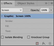
About the Effects panel
You use the Effects panel (Window > Effects) to specify the opacity and blending mode of objects and groups, apply a transparency effect, isolate blending to a particular group, and knock out objects in a group. The Effects panel (![]() ) is also available in the panel dock as part of the default [Advanced] workspace.
) is also available in the panel dock as part of the default [Advanced] workspace.

Changing the opacity of solid-color objects
With the background graphic complete, you can start applying transparency effects to objects on layers stacked above it. You’ll start with a series of simple shapes that were drawn using InDesign.
![]() Note
Note
The shapes mentioned are named by the color swatch applied to the fill of the object. If the Swatches panel is not open, choose Window > Color > Swatches to open it, or open it from the panel dock.
In the Layers panel, select the Art1 layer so that it becomes the active layer, and click the lock icon (
) to the left of the layer name to unlock the layer. Click the empty box on the far left of the Art1 layer name so that the eye icon () appears, indicating that the layer is now visible.
Using the Selection tool (
), click the circle filled with the Red-Dark swatch in the center of the page. This ellipse frame was drawn in InDesign and filled with 100% of the Red-Dark color.Choose Window > Effects to display the panel or click the Effects icon (
 ) in the panel dock to the right of the document.
Effects panel overview
Blending mode—Specifies how colors in transparent objects interact with the objects behind them.
Opacity—Determines the opacity of an object, stroke, fill, or text, from 100% (completely opaque) to 0% (completely transparent). As you lower the opacity value of an object, the object becomes increasingly translucent and underlying objects become increasingly visible.
Levels—Indicates the opacity settings and any transparency effects applied to the selected page element (object, stroke, fill, text)—for example, an object’s stroke may have 20% opacity and an effect applied, while the fill has no transparency settings. Click the triangle to the left of the word “Object” (or “Group” or “Graphic”) to hide or display these level settings. The FX icon (
) appears on a level after you apply transparency settings there, and you can double-click the FX icon () to edit the settings.Clear effects—Clears effects (object, stroke, fill, or text) from an object, sets the blend mode to Normal, and changes the Opacity setting to 100% throughout the object—that is, removes all transparency.
FX button—Displays a list of transparency effects.
Delete—Removes effects, but not a blending mode or opacity, from an object.
Isolate Blending—Applies a blending mode to a selected group of objects.
Knockout Group—Makes the opacity and blending attributes of individual objects in a group knock out, or block out, underlying objects within the group, while effects set on the group will still interact with objects outside the group.
— Adapted from InDesign Help
In the Effects panel, click the arrow on the right side of the Opacity percentage. An Opacity adjustment slider appears. Drag the slider to 70%. Alternatively, enter 70% in the Opacity field, and press Enter (Windows) or Return (macOS).
NoteThe FX icon (
 ) is displayed in the Effects panel when you select the Red-Dark circle because it already has a drop shadow effect applied.
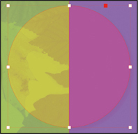
After you change the opacity of the Red-Dark circle, it becomes translucent. In the right half of the circle, the resulting color is a combination of the Red-Dark fill of the circle and the purple rectangle below. The left half of the circle combines the Red-Dark fill of the circle with the background image that shows through because the circle is no longer 100% opaque.
Select the semicircle in the upper-left area of the page filled with the Blue-Bright swatch, and in the Effects panel set the Opacity value to 50%. The semicircle now appears as a subtler variation in color against the background because it’s now partially transparent, and you can see the leaves from the background image. Note that the opacity is applied at the Object level, which is the default behavior.

Before applying 50% Opacity.

After applying 50% Opacity.
Select the full circle at the lower left filled with the Green-Medium swatch, and in the Effects panel set the Opacity value to 60%.
Choose File > Save to save your work.
Applying a blending mode
Changing an object’s opacity creates a color that combines the color applied to an object with the colors applied to objects below it. Different blending modes change how the colors in stacked objects interact.
In this exercise, you’ll apply a blending mode to objects on the page.
Using the Selection tool (
), again select the circle in the center of the page filled with the Red-Dark swatch.In the Effects panel, choose Overlay from the Blending Mode menu. Notice how the appearance of the colors changes.

70% opacity, Normal blending mode.
Same opacity with Overlay blending mode.
Select the Blue-Bright-filled semicircle in the upper-left corner of the page (the same object you set to 50% opacity in the previous exercise). In the Effects panel, choose Multiply from the Blending Mode menu.

50% Opacity, Normal blending Mode.


50% Opacity, Multiply blending Mode.
Choose File > Save.
For more information on the different blending modes, see “Specify how colors blend” in InDesign Help.
Adding transparency effects to imported vector and bitmap graphics
So far in this lesson, you have applied various transparency settings to objects drawn using InDesign. You can also apply opacity values and blending modes to imported graphics created with other applications, such as Adobe Illustrator and Adobe Photoshop.
Applying transparency to a vector graphic
In the Layers panel, select the Art2 layer. Unlock this layer and make it visible.
In the Tools panel, choose the Selection tool (
). On the left side of the page, select the graphics frame that contains the black spiral image by clicking within the frame. This frame is in front of a Green-Medium-colored circle.With the black spiral frame still selected, hold down the Shift key and click to select the graphics frame that contains a black spiral on the right side of the page. This frame is in front of a Purple-Cool-colored circle. Both of the graphics frames with spirals should now be selected.
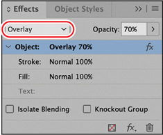
In the Effects panel, choose Color Dodge from the Blending Mode menu, and set the Opacity value to 30%.
NoteThe effects display more clearly when you use High Quality Display. However, this may slow down your computer. To set the whole document to High Quality Display, choose View > Display Performance > High Quality Display. To set High Quality Display on individual objects, choose Object > Display Performance > High Quality Display while an object is selected.
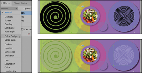
Selected frames before applying blending mode and opacity.
After applying blending mode and opacity.
Next you will apply a blending mode to a stroke, separately from the rest of the object.
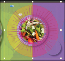
With the Selection tool (
), select the circular graphics frame with the salad image in the center of the page.A level indicates which part of an item has opacity settings or a blending mode, as well as whether transparency effects have been applied. It can be the item as a whole (Object), or it can be only parts of the item (Stroke, Fill, or Text). Levels enable you to apply different transparency settings or effects to different parts of the same object.
TipYou can hide or display level settings in the Effects panel by clicking the triangle to the left of the word Object (or Group or Graphic, depending on the selection).
In the Effects panel, click the triangle to the left of Object to reveal the levels (it may already be open). Click Stroke (beneath Object) to select it. Selecting the Stroke level applies any blending mode or opacity changes you make only to the stroke of the selected object.
From the Blending Mode menu, choose Hard Light. Notice how the result is different where the stroke is over different backgrounds. Because the stroke is over different objects, the left and right sides of the circle now look different. Compare the inside of the stroke that is over the image (the content of this frame) to the outside of the stroke that is not over the image.
NoteEach area of an object interacts with what’s behind it. Different blending modes produce different interactions.

Choose Edit > Deselect All, and then choose File > Save to save your work.
Applying transparency to a bitmap graphic
Next you’ll apply transparency effects to an imported bitmap graphic. Although this example uses a monochromatic image, you can apply transparency settings to multicolor photographs as well. The process is the same as applying transparency effects to any other InDesign object.
In the Layers panel, select the Art3 layer. Unlock this layer and make it visible. You can lock either the Art1 layer or the Art2 layer to make it easier to prevent them from being modified accidentally.
Using the Selection tool (
), select the graphics frame with the black starburst image in the center of the page. Because it’s on the Art3 layer, the frame edge is displayed in blue, the color of the layer.In the Effects panel, enter 70% as the Opacity value, and press Enter or Return.
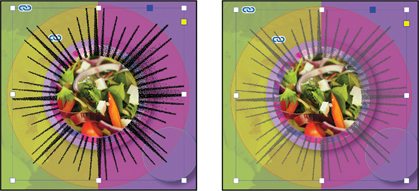
Double-click within the black starburst image to select the content rather than the frame, or click the content grabber (
). You’ll know when the content is selected rather than the frame, because the content boundaries change color and show the size of the content rather than the frame.In the Swatches panel, select Fill Color (
), and then select the Red-Bright color swatch. That color replaces the black areas of the image.In the Effects panel, choose Screen from the Blending Mode menu, and leave the Opacity value at 100%. The starburst changes colors based on how the Screen blending mode interacts with objects beneath it.
Content selected and color swatch applied.
Effect applied to content.
Choose Edit > Deselect All, and then choose File > Save to save your work.
Importing and adjusting Illustrator files that use transparency
When you import Adobe Illustrator (.ai) files into an InDesign layout, InDesign recognizes and preserves any transparency settings that were applied in Illustrator. You can also adjust opacity, add a blending mode, and apply additional transparency effects in InDesign.
Now you will place a vector image of some drinking glasses that have transparency applied in Illustrator and then add additional transparency in InDesign.
Choose View > Fit Page In Window, if necessary.
In the Layers panel, make sure that the Art3 layer is the active layer and that the Art3, Art2, Art1, and Background layers are visible (
).
Lock the Art2, Art1, and Background layers if not yet locked to prevent them from being modified.
Choose the Selection tool (
) in the Tools panel, and then choose File > Place. Locate the 12_Glasses.ai file in your Lesson12 folder, press the Shift key and then double-click, or click Open. Adding the Shift key opens the Place PDF dialog showing the import options without the need to click Show Import Options in the Place dialog first.In the Place PDF dialog, choose Bounding Box (All Layers) from the Crop To menu, and make sure that Transparent Background is selected.

Click OK. The dialog closes, and the pointer becomes a loaded vector graphics icon (
 ) with a preview of the file.
Position the loaded vector graphics icon (
) within the Purple-Cool-colored circle on the right side of the page and then click to place the graphic at full size. Drag the graphics frame to center it within the purple circle. Smart Guides are displayed when the frame is centered. TipWhen you’re repositioning the image, Smart Guides can help you center the image perfectly within the purple circle.
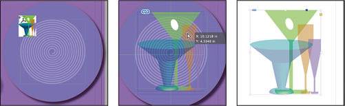
In the Layers panel, click to hide the Art2, Art1, and Background layers so that only the Art3 layer is visible. This shows the placed image on its own, and you can see that the transparent color interactions within the Illustrator image itself are visible (no effects have been applied in InDesign).
TipTo show only the Art3 layer and hide all other layers, Alt-click (Windows) or Option-click (macOS) the Toggle Visibility icon for the Art3 layer in the Layers panel.
Click to redisplay the Art2, Art1, and Background layers. Notice that the white “olive” shape is completely opaque, whereas the other shapes of the drinking glasses are partly transparent.
With the glasses image still selected, change the Opacity setting in the Effects panel to 60%. Choose Color Burn from the Blending Mode menu. Now the colors and interactions of the image take on a completely different appearance, and the olive shape has become transparent as well.

Choose Edit > Deselect All, and then choose File > Save.
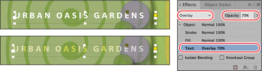
Applying transparency settings to text
Changing the opacity of text is as easy as applying transparency settings to graphic objects in your layout. You’ll try the technique now as you change the color of text.
In the Layers panel, lock the Art3 layer, and then unlock the Type layer and make it visible. Click the Type layer to make it the active layer (
).Using the Selection tool (
), click the text frame “URBAN OASIS GARDENS” in the lower left. If necessary, zoom in so that you can read the text easily.To apply transparency settings to text or to a text frame and its contents, you must select the frame with the Selection tool. You cannot specify transparency settings when text is selected with the Type tool.
TipEffects are applied to all text within a text frame. You cannot apply an effect to some words and not others. To achieve that look, the words with an effect applied must be in separate text frames from the words without an effect applied.
In the Effects panel, select the Text level so that any opacity and blending mode changes you make will apply to the text only.
Choose Overlay from the Blending Mode menu, and change Opacity to 70%.
Double-click the Hand tool (
 ) to fit the page in the window, and then choose Edit > Deselect All.
Now you’ll change the opacity of a text frame’s fill, separately from the text.
Using the Selection tool (
), click the text frame at the bottom of the page that contains “Breakfast | Lunch | Dinner | Events | Catering.” If necessary, zoom in so that you can read the text easily.Select the Fill level in the Effects panel, and change Opacity to 70%. Notice that this changes the white background while the text remains black.

Try the same effect with the Object level selected, and notice how this time the text turns gray, which is not what we want.

You’ve now seen the advantage of being able to apply effects to different parts of the same object. Choose Edit > Undo Set Transparency Parameters.
Choose Edit > Deselect All, and then choose File > Save.
Working with effects
So far in this lesson, you’ve learned how to apply transparency by changing the blending mode and the opacity of objects drawn in InDesign, imported graphics, and text. Another way to apply transparency is by using the nine transparency effects in InDesign.
You’ll try some of these effects now as you fine-tune the menu’s artwork.
Applying a basic feather to the edges of an image
Feathering is another way to apply transparency to an object. Feathering creates a subtle transition from opaque to transparent so that any underlying object or the page background is visible through the feathered area. InDesign features three types of feathering:
Basic Feather softens or fades the edges of an object over a distance that you specify.
Directional Feather softens the edges of an object by fading the edges to transparent from directions that you specify.
Gradient Feather softens the areas of an object by fading them to transparent.
First, you’ll apply Basic Feather, and then you’ll move on to Gradient Feather.
In the Layers panel, unlock the Art1 layer if it’s locked, and ensure it’s the active layer.
If necessary, choose View > Fit Page In Window to see the entire page.
With the Selection tool (
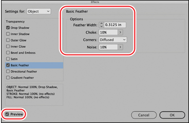
), select the Purple-Warm-filled circle on the upper-right side of the page.Choose Object > Effects > Basic Feather. The Effects dialog appears, displaying a list of the transparency effects on the left and an accompanying set of controls on the right.
TipYou can also open each of the effects dialogs from the Effects panel menu.
Make sure that Preview is selected and, if necessary, move the dialog to view the effects of your changes. In the Options area of the Effects dialog, set these options:
In the Feather Width field, type 0.3125 in.
Change both the Choke value and Noise value to 10%.
Leave the Corners option set to Diffused.
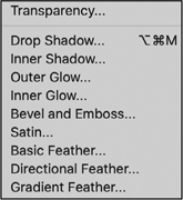
Transparency effects
 Tip
TipIn addition to applying transparency effects by choosing Object > Effects and then choosing an option from the submenu, you can add effects from the Effects panel menu, or you can click the Effects button (
) at the bottom of the Effects panel and then choose an option from the submenu.Drop Shadow—Adds a shadow that falls behind the object, stroke, fill, or text.
Inner Shadow—Adds a shadow that falls just inside the edges of the object, stroke, fill, or text, giving it a recessed appearance.
Outer Glow and Inner Glow—Add glows that emanate from the outside or inside edges of the object, stroke, fill, or text.
Bevel and Emboss—Adds various combinations of highlights and shadows to give text and images a three-dimensional appearance.
Satin—Adds interior shading that makes a satiny finish.
Basic Feather, Directional Feather, and Gradient Feather—Soften the edges of an object by fading them to transparent.
—From InDesign Help
Notice how the edges of the purple circle are now shaded and look more dimensional.

Click OK to apply the settings, and close the Effects dialog.
Choose Edit > Deselect All, and then choose File > Save.
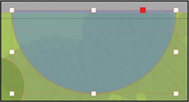
Applying a gradient feather
You can use the Gradient Feather effect to fade an object from opaque to transparent.
Using the Selection tool (
), click the Purple-Warm-filled vertical rectangle that covers the right half of the page.At the bottom of the Effects panel, click the FX button (
) and choose Gradient Feather from the menu.
The Effects dialog appears, displaying the Gradient Feather options. In the Gradient Stops area, click the Reverse Gradient button (
 ) to reverse the location of solid and transparent colors.
Click OK. The purple rectangle will now be solid on the right and fade to transparent on the left.
Now you will use the Gradient Feather tool to adjust the direction of the fade.
In the Tools panel, select the Gradient Feather tool (
 ). (Be careful not to choose the Gradient Swatch tool.) Drag the pointer up from the bottom left of the purple rectangle toward the right about halfway up to the top of the rectangle to change the gradient direction. Note
You can also set an exact angle in the Effects dialog as seen in step 3. Using the Gradient Feather tool allows you to work more visually and experiment with the result of dragging at different angles.

Left, The gradient feather moves horizontally from right to left—that is, the fill is solid on the right and fades to transparent as it moves left.
Right, The direction has been changed. The purple fill is solid at the top right and fades to transparent at the bottom left.
Choose Edit > Deselect All, and then choose File > Save.
Adding a drop shadow to text
When you add a drop shadow to an object, the result is a 3D effect that makes the object appear to float above the page and cast a shadow on the page and objects below. You can add a drop shadow to any object, and you have the option to assign a shadow independently to an object’s stroke or fill or to the text within a text frame.
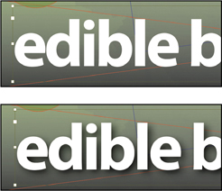
Now you’ll try this technique by adding a drop shadow to the “edible blossoms” text. A key concept to understand when applying effects to text is that effects can be applied only to a whole text frame, not to some of the words within a frame. You work with the Selection tool and select the text frame, not the Text tool.
Using the Selection tool (
), select the text frame that contains the words “edible blossoms.” Hold down the Z key to temporarily access the Zoom tool, or select the Zoom tool ( ) and magnify the frame so that you can see the text clearly.
At the bottom of the Effects panel, click the FX button (
), and choose Drop Shadow from the menu.In the Blending area of the Effects dialog, enter 85% for Opacity. In the Position area, enter .06 in for both X Offset and Y Offset. In the Options area, enter 0.125 in for Size and 5% for Spread. Make sure that Preview is selected so that you can see the effects on your page.
TipBy making sure the shadow is tucked under the object, the shadow is creating the desired 3D effect on the object. When there is space between the shadow and the object, too much visual attention is drawn to the shadow itself.

You can also adjust the distance and angle of a drop shadow with the settings in the Position area, either by typing numbers in the settings or by dragging the line in the angle circle to a new position.
Click OK to apply the drop shadow to the text.
Choose Edit > Deselect All, and then choose File > Save to save your work.
Next, you will apply multiple effects to a single object and then edit them.
Applying multiple effects to an object
You can apply more than one transparency effect to an object. For example, you can create the impression that an object is embossed and that it has a glow around it by applying two transparency effects.
![]() Note
Note
The Effects dialog allows you to apply multiple effects to a single object and shows you which effects are applied to a selected object (indicated by a checkmark on the left side of the dialog).
In this exercise, you’ll apply an embossed effect and an outer glow effect to two vector objects on the page.
Choose View > Fit Page In Window. In the Layers panel, turn off the visibility of the Art3 layer.
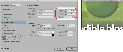
Using the Selection tool (
), select the Blue-Bright-filled semicircle in the upper-left corner of the page.At the bottom of the Effects panel, click the FX button (
), and choose Bevel And Emboss from the menu. If necessary, move the dialog so that you can preview the effects.In the Effects dialog, make sure that Preview is selected so that you can view the effects on the page. Then specify the following settings in the Structure area:
Size: 0.3125 in; Soften: 0.25 in; Depth: 60%
You can also click the up arrow to click through increments and stop at these values for the Size and Soften settings and use the slider for the Depth setting.
Leave the rest of the settings as they are, and keep the Effects dialog open.
From the list on the left side of the dialog, click the words “Outer Glow” to add another effect to the semicircle. The box next to Outer Glow will be checked, and the settings dialog will change to display the options for Outer Glow rather than for Bevel And Emboss. Specify these settings:
Mode: Multiply; Opacity: 80%; Size: 0.25 in; Spread: 10%

Click the Set Glow Color box to the right of the Mode menu. In the Effect Color dialog, make sure that Swatches is selected in the Color menu, choose Black from the list of colors, and then click OK.

Click OK again in the Effects dialog. This object now has multiple effects applied.
Next, you will apply the same effects to another object on the page in the simplest way: select the object with the effect you want to copy, drag the FX icon (![]() ) next to this effect in the Effects panel, and drop it on another object.
) next to this effect in the Effects panel, and drop it on another object.
Copying effects between objects
Double-click the Hand tool (
) to fit the page in the window, if needed.Using the Selection tool (
), select the blue semicircle in the upper-left corner of the page again, if necessary (it should still be selected).With the Effects panel open, drag the FX icon (
) on the right side of the Object level in the panel directly on top of the small green circle on the page to the left of the semicircle with the multiple effects. A gripping hand icon with a plus sign will appear. Release the mouse button. The same effect settings are now applied to the small green circle. Note that only the effects are applied; the color of the green circle is not changed.
Choose Edit > Deselect All, and then choose the Preview screen mode from the menu at the bottom of the Tools panel to see the results without guides and frame edges. Return to Normal mode.
TipWhen nothing is selected (Edit > Deselect All), you can press the W key to toggle between Preview and previous screen modes.

Choose File > Save.
You can use the same technique to apply effects to objects in other documents:
Choose File > Open and open the file 12_Start.indd again. If you left the 12_End.indd file open for reference, close it now.
Choose Window > Arrange > 2-Up Vertical so that you can see the 12_Menu.indd and 12_Start.indd files side by side.

In the file 12_Start.indd, make sure that the Background layer is active (since it is already unlocked).
Draw a shape, such as a rectangle or ellipse frame, with one of the drawing tools, and choose any color for the fill from the Swatches panel.
Select the tab of the 12_Menu.indd file to make it the active file, and using the Selection tool (
), select the same Blue-Bright-filled semicircle in the upper-left corner of the page, which now has multiple effects applied.Use the same technique as in step 3 of the previous exercise: with the Effects panel open, drag the FX icon (
) on the right side of the Object level, and drop it directly on top of the shape you just drew in the other InDesign file. Release the mouse button when you see the gripping hand with a plus sign. The effect settings are applied to the object in the other document. Notice again that it’s the effects that are copied, not the fill color or other attributes.
Close the 12_Start.indd file without saving.
Another way to apply effects to other objects is to create an object style, as you learned in Lesson 9. You can then import that object style into other documents by using Load Object Styles in the Object Styles menu.
Applying an effect to a layer of an imported image
In Lesson 11 you learned how to turn layers in an imported Photoshop file off and on. We’ll use that technique and also apply an InDesign effect to one of the layers.
In the Layers panel, make sure the Art3 layer is visible and unlocked.
Using the Selection tool (
), click the squash blossom image above the words “edible blossoms.” Press Ctrl+= (Windows) or Command+= (macOS) a few times to zoom in on the image.
Notice that the shadow on this image doesn’t look right. The grays are on top of the background colors without interacting with them. The technique to correct this requires two copies of the image placed exactly on top of each other. You’ll do that first.
Ensure that the frame with the squash blossom image (Squash-Blossom.psd) is selected. Choose Edit > Copy, and then choose Edit > Paste In Place. There are now two copies of this image exactly on top of each other.
Choose Object > Hide. The topmost copy of the image is now hidden.
Click to select the remaining copy of the image. Choose Object > Object Layer Options. If necessary, move the dialog so that you can preview the effects. Click the Preview button so that you can watch the change, and then turn off the Foreground layer so that only the Shadow layer is visible and click OK.

Open the Effects panel and change Blending Mode to Multiply. Notice the dramatic difference in how the grays of the Shadow layer now interact with the colors below.
NoteTo see the results most clearly, switch to the Preview screen mode by pressing the W key. Then press the W key again to switch back to Normal screen mode so that you can see the frame edges.

Bottom copy of the squash blossom image with the foreground layer turned off.

Shadow layer of the bottom copy set to Multiply blending mode.
Choose Object > Show All On Spread. The second copy of the squash blossom image is visible again. Now you need to make sure you are selecting the topmost copy of the image. One easy way to be sure which one you are selecting is to click a different object and then click back on the squash blossom. The second copy will be selected because it’s on top.
Choose Object > Object Layer Options again. This time turn the Shadow layer off and click OK. Now the shadow to which you applied the Multiply effect is the only one that’s visible. The result is much more visually pleasing because the gray values in the shadow are now interacting with the colors below them.
NoteThe Object Layer Options visibility settings work like they do in the Layers panel. You make a layer visible by clicking in the left square next to the layer name to make the eye icon visible. You make a layer invisible by clicking the eye icon so that it disappears, turning that layer off.


Lock all of the layers below Art3. Then drag across an edge of the squash blossom image. Because the two images are exactly on top of each other, you’ll select both instances of the image. Choose Object > Group. Grouping both instances makes it easy for you to reposition this image while keeping them aligned exactly on top of each other.
Experiment with moving this object above different backgrounds. For example, while the group is selected, open the Layers panel and move the solid blue square from the Art3 layer to the Type layer. Then drag the squash blossom down so that part of the shadow crosses the white letters of “edible blossoms.” Notice that the shadow blends with the green colors while remaining black only where it crosses the white areas. Using only the black channel for shadows in Photoshop ensures that they will stay a neutral gray when printed.
TipBy using this technique, you can blend the shadow with background colors, while at the same time ensuring that the shadow will print with black ink only when it’s over white (the paper).

Move the image back to the Art3 layer and position it above the “edible blossoms” type, near its original location. The position does not have to be exact.
Choose Edit > Deselect All, and then choose File > Save.
Editing and removing effects
Applied effects can easily be edited or removed. You can also quickly check whether any effects have been applied to an object.
First you’ll edit the gradient fill behind the restaurant title, and then you’ll remove the effects applied to one of the circles.
In the Layers panel, make sure that the Art1 layer is unlocked and that it is visible and active. If you switched to Preview screen mode in the previous exercise, switch back to Normal mode. Choose View > Fit Page In Window.
TipTo quickly see which pages in your document contain transparency, choose Panel Options from the Pages panel menu, and then select Transparency. A small icon (
 )is displayed next to any pages containing transparency.
Using the Selection tool (
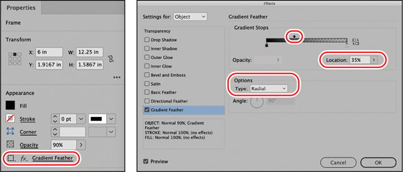
), click the frame with the gray gradient fill that’s behind the text “edible blossoms.”Choose Window > Properties to display the Properties panel. One of the properties available is Effects. In this case, the effect is Gradient Feather, which is displayed with an underline to the right of the Effects button (
). Click it, and the Effects panel opens. In the menu that appears, the Gradient Feather effect has a checkmark next to it, which indicates that it is already applied to the selected object.In the Effects dialog, turn on Preview and move the dialog so that you can see this object (if necessary). Under Options, change Type to Radial. Under Gradient Stops, click the midpoint (the small diamond shape above the gradient ramp). Slide it left and right, and watch how it changes the look. The black color radiating from the center spreads farther across the page or becomes much smaller. The setting is shown as a percentage in the Location field. Set the midpoint to about 35%. Click OK to update the Gradient Feather effect.
Click the Fill button in the Appearance area of the Properties panel. Change the fill color to Blue-Dark and press the Enter key. Choose Edit > Deselect All. Close the Properties panel.

When not to use transparency
Transparency vs. tints: Transparency eff ects are great creative tools, but they do result in a more complex fi le. They should be used purposefully and not when the visual style can be accomplished more simply.
![]() Tip
Tip
If you like to use the sliding function of the Opacity slider to see a color change before making a choice, note that you can also use the same slider functionality in the Swatches panel to make tints. Click the arrow to the right of the Tint value and use the slider that pops up. You can see the tint change as you move the slider.

The most common scenario is when you want to make the color of a frame lighter and that frame has nothing behind it that needs to show through, such as when it’s on a white background. In those cases you should use a tint of the color, not an Opacity setting. Use the slider in the Color or the Swatches panel, or use a tint swatch. See Lesson 5 for more details on tints.

Now you will remove the effects applied to an object.
In the Layers panel, turn on visibility for all layers and unlock all layers.
TipWhen you hold down the Ctrl key (Windows) or Command key (macOS) and click overlapping objects, the first click selects the topmost object, and each successive click selects the next object below in the stacking order.
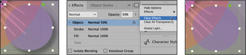
Select the Selection tool (
). While holding down the Ctrl key (Windows) or Command key (macOS), click the small Purple-Warm circle to the right of and below the salad image in the center of the page. Your first click may select the rectangular frame above the circle. Click again within the small circle to select it. Or lock the Art3 layer (the larger rectangle is on this layer) to more easily work with objects on the Art2 layer below (the Purple-Warm circle is on this layer).In the Effects panel menu, choose Clear Effects. This will remove the Drop Shadow effect applied to the circle while leaving the Opacity setting applied. That’s why the purple color of the circle is still interacting with the objects below.
 Tip
TipThe Clear Effects button (
 ) at the bottom of the Effects panel also removes blending mode and opacity settings from the object (clears all transparency) in addition to clearing effects.
Choose Edit > Deselect All, and then choose File > Save.
Double-click the Hand tool (
) to fit the page in the window, and change to the Preview screen mode to admire your work.
Congratulations! You have completed the lesson.
Exploring on your own
Try some of the following ways of working with InDesign transparency options:
Navigate to page 2. Experiment with the buttons at the bottom of the Effects panel, Isolate Blending and Knockout Group, which work only with grouped objects. The objects at the top of the page show the difference between these options; the resulting effects are the opposite of each other. In the example, each leaf has a blending mode applied, and the three leaves are grouped.

Left, Isolate Blending is turned on; objects in the group interact with one another, but not with objects below.
Right, Knockout Group is turned on; objects in the group interact with objects below, but not with one another.
Experiment with changing the blending modes and effects applied to the text frame and objects at the bottom. The text frame is filled with a gradient, and an effect is applied, but the text is editable, so you can select the text and type whatever you’d like.

Now create some shapes yourself on a new layer (by using the drawing tools, by copying objects from page 1, or by importing new copies of some of the image files used in this lesson). Apply fill colors to any shapes that don’t have content, and position your shapes so that they overlap each other, at least partially. Then:
Select the uppermost object in your arrangement of shapes. Using the controls in the Effects panel, experiment with other blending modes, such as Luminosity, Hard Light, and Difference. Then select a different object and choose the same blending modes in the Effects panel to compare the results.
In the Effects panel, change the Opacity value of some of the objects but not others. Then select different objects in your arrangement and use the Object > Arrange > Send Backward and Object > Arrange > Bring Forward commands to observe different results.
Experiment with combinations of different opacities and different blending modes applied to an object. Do the same with other objects that partially overlap the first object to explore the variety of effects you can create.
Review questions
1 How do you apply a transparency setting or effect to different parts of an object?
2 If you’ve applied transparency effects to an object, what is the easiest way to apply the same effects to a different object?
3 What is the importance of the stacking order of layers and of objects within layers when you work with transparency?
4 What’s the quickest and easiest way to remove transparency effects from an object to which multiple effects are applied?
5 What is a limitation of applying effects to text?
6 When is it better to use a tint instead of an opacity setting?
Review answers
1 Choose one of the levels in the Effects panel: Object level applies to the object as a whole, but you can also choose Stroke, Fill, or Text levels and apply separate settings to each.
2 Select the object to which you’ve applied transparency effects, and then drag the FX icon displayed on the right side of the Effects panel to another object.
3 The transparency of an object affects the view of objects below (behind) it in the stacking order and the appearance of the front object. For example, objects below a semitransparent object can be seen behind it—like objects behind a colored plastic film. By changing which objects are above (in front) or below (behind), the resulting color and/or effect can be quite different.
4 Select the object, and then click the Clear Effects button at the bottom of the Effects panel. This clears effects, blending modes, and opacity settings. The trash can button clears only effects. You can also choose Clear All Transparency from the Effects panel menu.
5 Effects can be applied to the entire text frame only. They cannot be applied to separate words within a text frame.
6 It’s better to use a tint when the object has nothing below it with which a transparency effect will interact, such as when it’s on top of a white background. In other words, if you simply want to make the object lighter and not have anything behind show through, use a tint.