Chapter Eleven. Adding Interactivity with Behaviors
Animated and interactive Web pages are more dynamic, more active, and often more effective than static pages. Animation refers to page elements moving on the page. Interactivity means that objects on the page react when a visitor performs an action at a Web site. A box drops from the top of the browser window informing visitors of exciting news. A button changes color when a visitor hovers a mouse cursor over it. A sound goes off when a visitor clicks a button. These and many other animated and interactive elements can be generated right in Dreamweaver.
Dreamweaver generates animation and interactivity through something called behaviors. These behaviors mainly use JavaScript—a coding language that enables animation and interactivity. Small (relatively small, compared to most programming) scripts become part of the page code.
Dreamweaver generates behaviors using the Behaviors panel. In the Behaviors panel, you define two elements to every action: events and actions. Events trigger actions. An event might be a page opening. Or closing. Or a visitor hovering a mouse cursor over an object on the page. An action is generated by an event. Examples of actions include an image changing, a pop-up window opening, or a sound going off.
Many behaviors are defined interactively in the Behaviors panel—you choose from a list of possible events, and then choose an associated action. Other animated and interactive elements in Dreamweaver can be generated from the main menu in the Document window.
#87. Defining Browsers for Behaviors
JavaScript is interpreted by browsers, but some browsers don’t support all Dreamweaver-generated JavaScript. For this reason, the first step in defining most behaviors is to identify the browsing environment you are designing for. Browsers like Safari, Firefox, and Internet Explorer have built-in support for JavaScript. Older browsers and older versions of Internet Explorer do not support as much JavaScript as newer browsers.
By default, Dreamweaver displays only behaviors that work in nearly all browsers. If you accept this default setting, your set of available behaviors is quite restricted. And, in most cases, unnecessarily so. Very few Web surfers are still cruising the Web with Netscape Navigator 4.0.
To change the default set of available behaviors, click the “+” button in the Behaviors panel. Choose Show Events For from the pop-up menu, and then select one of the available browsers and browser versions.
Dreamweaver’s set of available browsers remains oddly out of date. However, Internet Explorer 6 is a de facto standard that most other browsers adhere to, and so behaviors that work in Internet Explorer 6 are likely to work in other browsers.
Tip
If you want to detect the browser used by a visitor, and direct that visitor to another page if their browser does not support your behaviors, you can do so with behaviors that check browser compatibility. These behaviors are explained in Chapter 12, “Testing and Maintaining Sites,” #95, “Checking Browser Compatibility.”
#88. Opening a Browser Window
They’re often called pop-ups—those little browser windows that open when you load a page in your browser, or when you activate the window by some action on the Web page. In Dreamweaver’s terminology, they are referred to as browser windows, which is actually an accurate description of what most people call pop-ups.
The first step in creating a behavior that will open a browser window is to create a special Web page that will appear in that browser window. Since this page is likely to be displayed in a small browser window (you will be defining the size of that browser window as part of the behavior), you should design a page that will work well in a small browser window (Figure 88a).
Figure 88a. Defining a small Web page to use as a pop-up.

With the Web page that will open in a new browser window prepared and saved, follow these steps to define the window:
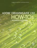
- From the Behaviors panel, click the “+” button and choose Open Browser Window from the list of behaviors.
- In the URL to display field, navigate to or enter the Web page that will open in the new browser window.
- Use the Window width and Window height fields to define the size of the browser window.
- The display options available in the Attributes section of the Open Browser Window dialog are generally not enabled—the new browser window that pops up is usually displayed without features like a navigation toolbar or status bar. So, leave these options deselected.
- A window name will be helpful as you edit this behavior. Enter a name in the Window name field, and click OK in the Open Browser Window dialog (Figure 88b).
Figure 88b. Defining an open browser window behavior.
Test your new browser window behavior by opening the page that launches it in a browser.
You can change the triggering event that opens a new browser window. For example, you can have a visitor click specific text to open the new browser window. To do this, follow these steps:
- In the Behaviors panel, click the Open Browser Window behavior in the list. Click the “-” button to delete this behavior. You will define a new behavior that will launch the new browser window using a different event.
- Enter text on your page that will serve as a link to open the new browser window. In the Property inspector, enter the pound symbol (“#”) in the Link field to create a self-referring link. This will display the text as a link, even though the result of clicking the link will be defined by a behavior (Figure 88c).
Figure 88c. Preparing text to trigger an open browser window event.

- With the text you defined as a self-referring link in Step 2 selected, define an Open Browser Window behavior just as you did in Steps 1 to 5 earlier in this technique. However, this time—because you had link text selected—the default triggering event is not onLoad (when the page opens) but onClick (when the selected text is clicked).
If onClick is not set as the triggering event, you can select that from the first column pop-up menu in the Behaviors panel. Or, if you want to use a different triggering event (such as onMouseOver—when a visitor hovers a mouse cursor over the selected text), you can choose a different event from the first column pop-up menu in the Behaviors panel.
#89. Designing a Pop-up Message
Pop-up messages present dialogs with information and require a visitor to OK them before they will go away.
To create a pop-up message that displays a dialog, follow these steps:
- If you want the pop-up to appear when the page loads, click the <body> tag in the Tag Selector bar on the bottom of the Document window. If you want the pop-up to be triggered by clicking (or applying some other action to) text or an image, select the text or image.
- In the Behaviors panel, click the “+” button to activate the list of available behaviors, and choose Popup Message.
- In the Popup Message dialog, enter the message visitors will see when the pop-up message is triggered.
- Test the pop-up by previewing the page in a browser.
- If you want the pop-up message to be triggered by clicking (or performing another action on) link text or an image, select that image before generating the pop-up behavior. If it is difficult to tell what object you have selected, you can select the object in the Tag Selector bar, or verify that the object is selected in the Tag Selector bar. Choose a triggering event like onClick from the Events column in the Behaviors panel.
#90. Creating a Timeline
Timelines appear in a browser as an animated box that moves across, up and down, or diagonally on top of a Web page. Timelines often appear when a page opens—displaying content and providing an animated component to a page.
Timelines consist of a layer and a JavaScript that defines where and how the layer will move. The path that defines where the layer will move to and from is the “line” in timeline. The “time” element is defined by how fast (measured in frames per second) the layer moves along the line.
The first step in creating a timeline is to place a layer on the page in the Document window.
- Choose Insert > Layout Objects > AP Div. Format the layer, and place images and/or text inside the layer. This is the content that will move on the page.
Tip
See Chapter 4, “Designing Pages with Absolute Placement Objects,” for a full exploration of how to create and format AP Divs.
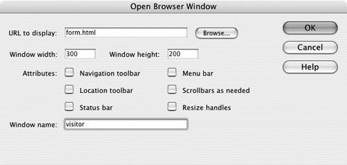
- Choose Modify > Timeline > Add Object to Timeline. A warning dialog appears informing you that some features of your timeline are not supported in Netscape Navigator 4.0. Click OK. The Timelines panel appears. When the timeline is first generated, it consists of 15 frames. The keyframes define the start and end positions of the animation (Figure 90a).
Figure 90a. The Timelines panel and a selected layer.

- With the first keyframe selected in the Timelines panel, drag the selected object (like a Div or AP Div) to the position on the page of the animation (or even off the page if you want the timeline to move onto the page from off the page).
- In the Timelines panel, click the second (right) keyframe. With the second keyframe selected, drag the Div or AP Div in the Document window to the end point for the animation (Figure 90b).
Figure 90b. Placing the start point and the end point for a timeline animation.

Note
After you define the positions for the first and last keyframes in your timeline, a line appears in the Document window indicating the path the animation will take.
- With the AP Div still selected in the Document window, you can define timeline attributes in the Timelines panel. Select the Autoplay check box to launch the timeline when the page is opened in a browser. Select the Loop check box to have the timeline repeat as long as the page is open. The default fps (frames per second) rate is 15. To slow down the animation, enter a lower value in the Fps field in the Timelines panel.
- At any point in the process, you can edit the content of the layer itself—change the background color, add or change an image, or add text.
- Test the timeline in a browser. You can adjust timeline features in the Timelines panel.
A very complex timeline might include more than 15 frames. You can extend the length of a timeline by dragging the final keyframe in the Timelines panel (Figure 90c).
Figure 90c. Extending the length of a timeline.
#91. Deleting Behaviors
Deleting behaviors can be confusing and frustrating. This is one of the things my students most often call me over to their workstations to help them with. So, let me demystify that process.
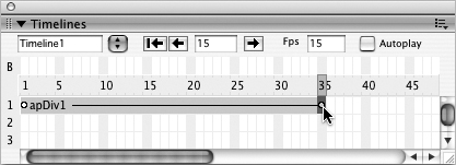
Deleting a behavior involves two things—finding the behavior in the Behaviors panel, and deleting it. The first step is the hard part. The trick to locating a behavior in the Behaviors panel is to first select the object to which the behavior is associated. Only then will the behavior be easy to find in the Behaviors panel. Once you select the behavior in the Behaviors panel, click the “–” (Remove Event) icon to delete the behavior (Figure 91a).
Figure 91a. Removing a behavior in the Behaviors panel.
What about events that are not attached to any object on a page, but to the page itself? These behaviors are the ones that can be the hardest to find. But you can see them in the Behaviors panel if you click the <body> tag in the Tag Selector bar at the bottom of the Document window. Events that launch when a page is loaded or exited will likely be associated with the <body> tag.
#92. Designing a Rollover
Rollover images change their display when a visitor hovers over the image. Rollover images are often, but not necessarily, used as links. There are always two images in a rollover—the original image that displays before a visitor rolls over the image, and the rollover image that displays when a visitor rolls over the image with his or her mouse.
The main work in preparing a rollover is to prepare two identically sized images. The rollover image displays in the same box as the original image. And if the rollover image has different dimensions than the original image, the rollover image will distort to fill the original image box.
With two same-sized images prepared, follow these steps to create a rollover:
- Choose Insert > Image Objects > Rollover Image. The Insert Rollover Image dialog will appear (Figure 92a).
Figure 92a. Defining a rollover.

- You can accept the default image name in the Image name field; this is used for scripting. However, it is easier to keep track of your image rollovers if you define an intuitive name; for example, you can name a button after the text on that button (like “Home” or “Contact”).
- Use the Browse button in the Original image field to locate and select an original image.
- Use the Browse button in the Rollover image field to locate and select a rollover image.
- Leave the Preload rollover image check box selected; this will ensure that visitors don’t have to wait for the rollover image to download when they hover a mouse cursor over the original image.
- If you want your rollover to serve as a link, enter a URL in the When clicked, Go to URL field, or use the Browse button to locate a link target in your Web site.
- You can enter alternate text to make the rollover accessible to visitors with reader software or with image display disabled in their browsing device. When you have defined the rollover, click OK.
#93. Creating an Interactive Navigation Bar
Interactive navigation bars generated by Dreamweaver use four different image buttons. One button displays as a typical static button on the page. The second button displays when a visitor hovers a mouse cursor over the button. The third displays when a visitor clicks the button. The fourth image displays when a visitor hovers a mouse cursor over the button (while in down state).
This means that you need four versions of every button you use in a navigation bar. If your navigation bar has four options, for example, you need 16 buttons (four versions of each button).
To create a navigation bar, follow these steps:
- In the Dreamweaver Document window, choose Insert > Image Objects > Navigation Bar. The Insert Navigation Bar dialog will open.
- Each navigation bar element is a four-state button. Each button is defined separately as a four-image element. Enter the name of the first button in the Element name field, and use the four browse buttons to navigate to and select the four button states for the first button.
- Enter alternate text in the Alternate text box to provide accessibility for visitors who will not see the button.
- In the When clicked, Go to URL field, enter the link for the button, or use the Browse button to navigate to and select a file in your site. You can choose _blank from the in pop-up menu to open the link in a new browser window.
- Leave the Preload images check box selected so that images that display in alternate button states are downloaded and ready to display when a visitor hovers a mouse cursor over or clicks the button.
- In the Insert pop-up menu, choose between Horizontally (a button bar running across the top or bottom of a page) and Vertically (a button bar running down the left side of the page). The Use tables check box generates tables to lay out the navigation bar. This is generally helpful unless you have already defined a table structure for the navigation bar.
- When you have defined the first button, do not click OK. You have more buttons to define.
- After you define the four states of your first button, click the “+” button in the Insert Navigation Bar dialog to add a second button. Define the second button. Continue defining four states for each button in your navigation bar (Figure 93a).
Figure 93a. Defining four images for the different states of a single button in a navigation bar.

- You can use the Up and Down arrow buttons at the top of the dialog to move selected elements up or down in the list of elements. By doing so, you can change the order in which the buttons appear in a navigation bar. When you define all the buttons in the navigation bar, click OK to generate the navigation bar.
You can’t test the navigation bar in the Dreamweaver Document window. To test the navigation bar, you need to preview the page in a browser. Choose File > Preview in Browser and, if you have more than one browser configured, choose from the available browsers.
#94. Editing a Navigation Bar
You can edit the navigation bar content by choosing Modify > Navigation Bar. This opens the Modify Navigation Bar dialog. The Modify Navigation Bar dialog is just like the Insert Navigation Bar dialog, and you can edit the images and links in the navigation bar (Figure 94a).
Figure 94a. Modifying a navigation bar.

You edit the table that formats a navigation using the same table formatting techniques covered in Chapter 3, “Designing Pages with Tables and Frames.”