CHAPTER 5
Bollinger Bands, PSAR, Channels, Zones, and FTL
The Bollinger band (BB) is another very important technical indicator. It is represented by the red lines on the chart in Figure 5.1. The bands are plotted at two standard deviations above and below M2 (green). When using two standard deviations, we know that 95 percent of the price data (the line chart of the stock) will fall between the two Bollinger bands. In this chapter we study in greater detail how the line chart will travel between the Bollinger bands and M1 (white) and why this is a vital indicator to increase our profits.
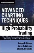
FIGURE 5.1 Chart of FULT—UBB, LBB
In Figure 5.1, the upper red line is called the upper BB (or UBB). The lower red line is called the lower BB (or LBB). Keep in mind that only 5 percent of the price move of the stock occurs outside either of these bands. That means that 95 percent of the stock movement occurs between these two red lines. Note that the tic went outside the Bollinger bands only nine times in six months.
The Bollinger band indicator provides a quick picture of where the stock price is relative to its overall cycle. This does not mean that if the price tic is at the LBB we should enter a new position or if it is at the UBB we should tethered slingshot (TSS). The price tic can be at the UBB or LBB, and the stock could continue to move upward or downward. Therefore, we must use our MAs and lower indicators with the Bollinger bands. Other technical indicators, which we study later in this chapter, will verify this. Bollinger bands also show another very important indicator: volatility.
As standard deviation is a measure of volatility, Bollinger bands adjust themselves to market conditions. When the market becomes more volatile, the bands widen and move farther away from M2 (green). During less volatile periods, the bands contract, moving closer to M2 (green). Traders often use the tightening of the bands, which creates a pinch, as an early indication that the volatility is about to increase sharply. The pinch is often an indication of a change in the cycle.
Also, it is important to note that the stock price in a strong uptrend will hug the UBB. In a strong downtrend, the stock price will hug the LBB. These are important characteristics to identify, as they allow us to stay in a position (10-cent rule) for greater profits when the stock is strongly increasing or to stay in a TSS for greater profits when the stock is strongly decreasing. The stock price tick hugging the Bollinger band and being supported or resisted by M1 (white) is one factor we use to identify the false V. In Figure 5.2, notice the false Vs occurring when the stock is hugging the UBB or LBB as discussed later in this chapter.
FIGURE 5.2 Chart of IRET—Support, Resistance

The “hippo” is an amazing technical indicator. Why? It was formulated to create a “visual” of strength or weakness of resistance and support but more importantly to give the trader the ability to “see” three important developments unfold. 1. A “pinch” occurs when the upper and lower bands begin to turn towards each other to form a compression. When this happens, we know that a “flare” will soon occur. 2. A flare occurs when both the upper and lower bands begin to turn away from each other and begin to flare open. This indicates that volume is increasing and that resistance and support are moving further apart. This is followed often times by a hippo. 3. A hippo occurs when the upper and lower bands keep flaring farther apart from each other. This is a sign that there is very strong “momentum” and volume occurring. Applying the methodologies of Advanced Charting–and using the “hippo” as an important indicator–very profitable trades are realized by knowing that momentum is continuing with strength. After a hippo has formed and one of the bands turns to follows the direction of the opposite band–a trader can expect tremendous movement in the stock.
■ PSAR
In Advanced Charting on Window 1—Chart 1, the PSAR indicator is turned on as a default indicator. It can be unchecked to turn it off, if we need to remove the indicator for more clarity of reading the chart.
PSAR stands for parabolic stop and reversal. Advanced Charting does not use this definition. The sole purpose of the newly formulated Advanced Charting PSAR is to identify a lower indicator crossover of red line to blue line. When an arrow appears either red or blue, a crossover has occurred in one or more of the lower indicators. The basic crossover is an important technical indicator, and an arrow is a pay-attention indicator.
We do not place a trade on PSAR, as this indicator is intended only to be an alert indicator that a crossover has occurred. There are many subtleties to be aware of when reviewing the lower indicators to gauge the importance of the appearance of the PSAR arrow.
If the PSAR indicator is triggered, a yellow dot first appears. If the new direction of M1 (white) is true, an arrow appears. Once the arrow appears, it is followed by more yellow dots. If a new cycle has developed, a series of dots appears, pulls away from the previous dots, and moves either up or down, depending on the direction of the cycle. This movement confirms and validates that a new cycle has developed.
The more dramatically the dots move up or down in either direction, the stronger the momentum moving in that direction. PSAR tracks the long and short legs of the Vs and M1 and ignores all false Vs.
Again, we do not trade with PSAR but use this indicator to identify that a crossover has occurred. It is one more indicator to validate and confirm true or false Vs.
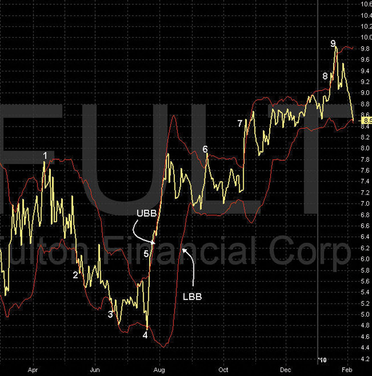
On the chart in Figure 5.3, note the green arrow and the upward bias cycle beginning in early August and the series of yellow dots through mid-September. Note the many false Vs that occurred, but PSAR ignored them, confirming and validating continued upward momentum.
FIGURE 5.3 Chart of AMD—PSAR
The appearance of the arrow in either direction is a sign to pay attention and watch for more confirmation that a new birth phase of a cycle has begun.
We study how PSAR responds to various changes of the price tic as a stock cycles up and down in greater detail in this chapter.
Upward bias exists when…
On the chart in Figure 5.4, note the red arrow and downward bias cycle beginning in early September and the series of yellow dots to mid-October. Note the many false Vs that occurred, but PSAR ignored them, confirming and validating continued downward momentum.
FIGURE 5.4 Chart of AMD—PSAR

The appearance of the arrow in either direction is a sign to pay attention and watch for more confirmation that a new birth phase of a cycle has begun.
We study how PSAR responds to various changes of the price tic as a stock cycles up and down in greater detail in this chapter. Downward bias exists when:
■ Channel Indicators: C1, C2, C3
Drawing the parallel straight-line channel indicator to identify support and resistance for a security has been an important tool for Compound Stock Earnings (CSE). It is the simplest method to help traders identify the lower 25 percent and upper 75 percent area of a stock’s cycle.
CSE has used the hand-drawn straight-line channel indicator to establish bias of the trend successfully for years. The human element, however, can present challenges for many traders who do not know where to draw the first line. The decision can be subjective and biased. However, with straight-line parallel channels, we do not need an exact position of the lines, only a general direction of the trend.
To remove the human element and improve the accuracy of the parallel channel indicator, a new channel indicator was formulated to confirm and validate the direction of the cycle and therefore the overall trend. Advanced charting parallel channels are determined by tracking the long and short legs of the price tic and the extreme highs and lows of the modified candlewicks. This combined formula establishes the direction of the channel, which is the direction of the current cycle, and establishes true points of support and resistance.
The channel indicator was formatted specifically for Advanced Charting to identify cycle support and resistance points. It is a valuable indicator for trading covered calls, LEAPS, and credit spreads when used in conjunction with the Bollinger bands.
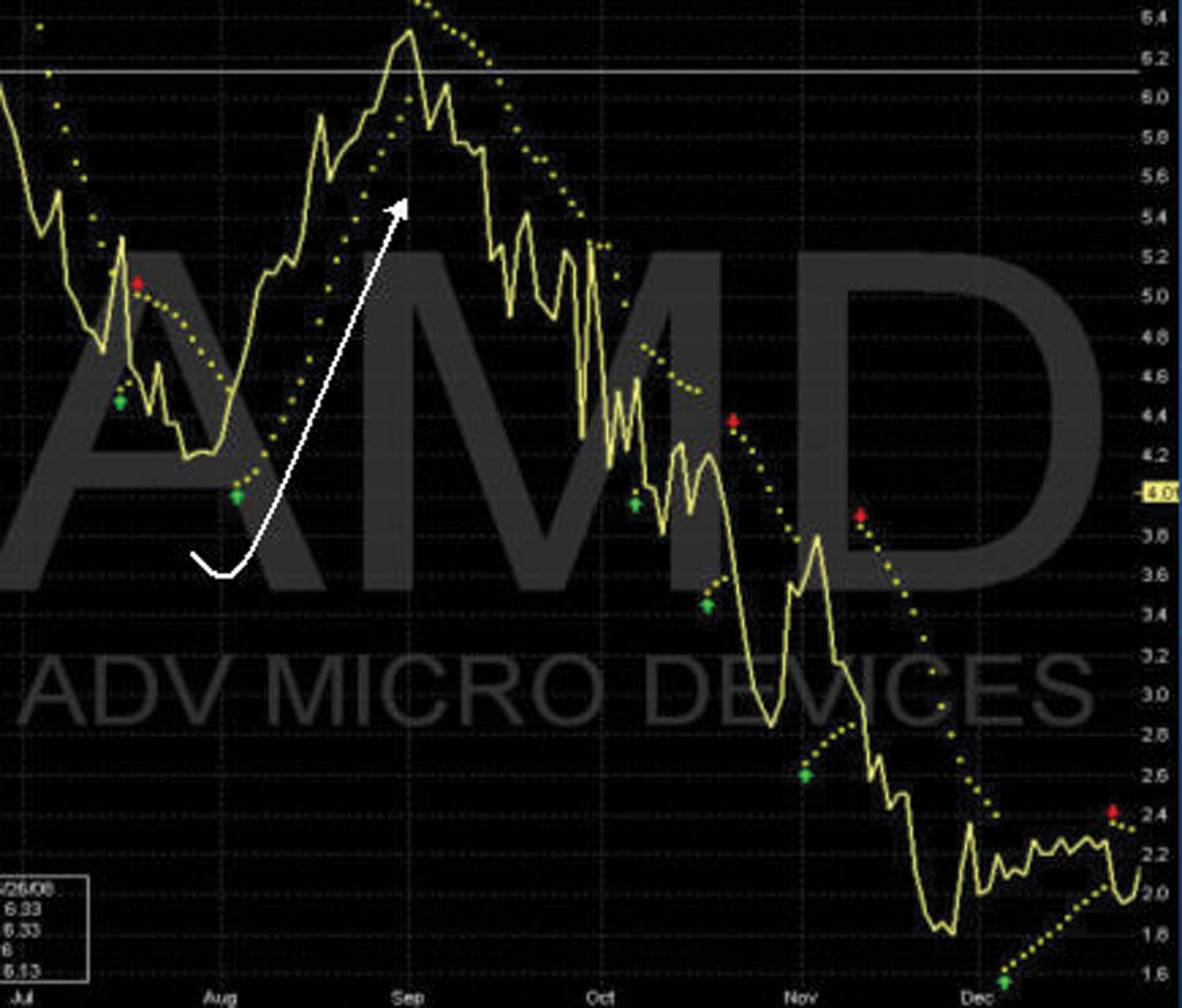
The channels shown on the chart in Figure 5.5 track the movement of the daily price tic. A series of price tics moving up or down will determine a point to break the path and change direction, turning the channels up, down, or flat. If a series of up tics with long up-leg Vs breaks through resistance, the channels will break their path, change direction, and turn upward. This change indicates a new direction of the next cycle.
FIGURE 5.5 Chart of ALL—Channels
The same applies to a series of down tics with long down-leg Vs. When this happens and the price tic breaks through support, the channel line, C2, will reposition its path and change from upward to a downward direction. C1 and C3 will position themselves according to the highest high and lowest low of the modified candle wicks.
We do not place trades with channels but use them only to visualize the cycle and its direction. As the price tic advances up or down toward C1, C2, and C3, these various points are critical resistance and support points and must be respected.
The channel lines are mathematically determined by the movement of the price tic. The movement of the price tic establishes the direction or angle of the channels. A series of price moves in a given direction will establish the C2 line. From this line, both C1 and C2 lines are determined. C1 defines resistance of the pattern based on the highest price points during the period. It most likely appears much higher than the tic based on close prices versus highest intraday trades. C1 is the highest potential price at expiration based on the current pattern. If the index breaks the pattern, we have strategies to manage the position. As the price tic moves closer to C1 resistance, the other indicators may show the probabilities of the tic breaking through C1.
■ Zones
Earlier we discussed that the price tic will cycle up and down between the UBB and LBB. As the tic moves through its cycles, it moves closer to C1 or closer to C3. As this happens, zones are created by major points of support and resistance. A zone is the area between C1 and UBB, UBB and M1, M1 and LBB, and LBB and C3.
Figure 5.6 illustrates the four zones in the current cycle starting in mid-January. If we look back in history to November as the price tic and M1 moved higher and lower, the zones changed in width. The four zones got wider or narrower as the price tic cycled up and down.
FIGURE 5.6 Chart of OEX—Zones
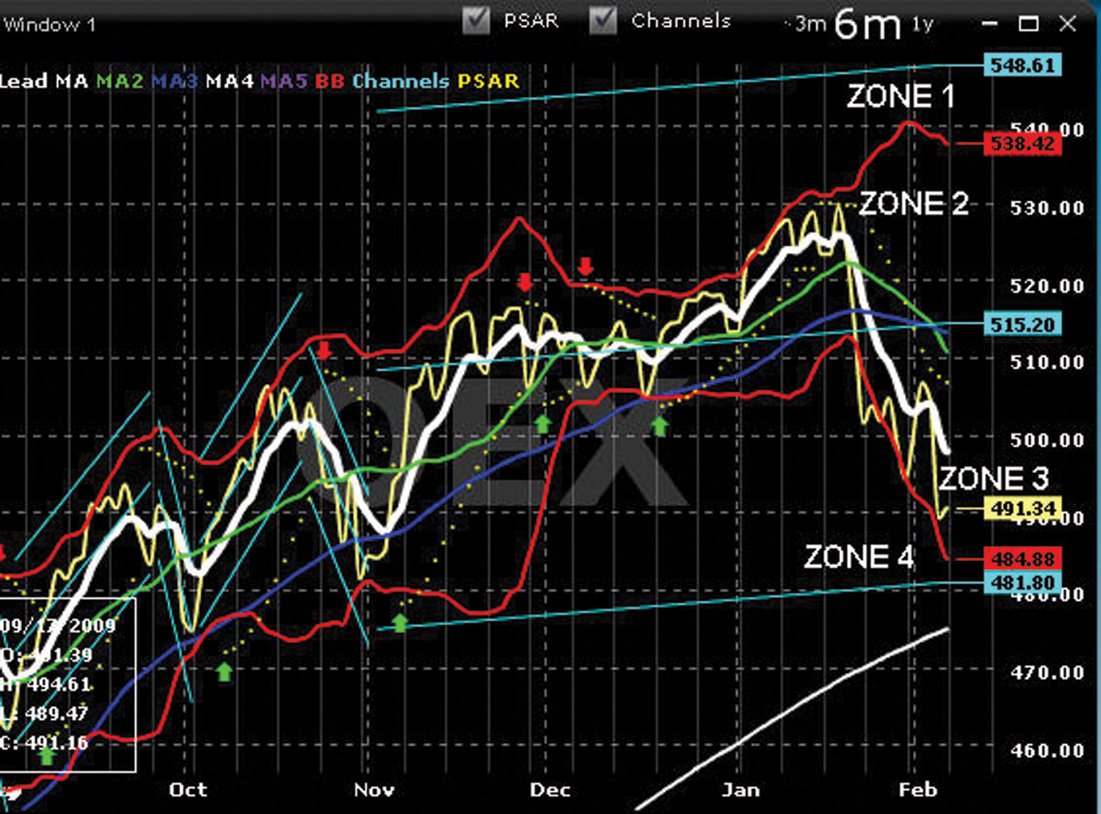
The channel indicator and the zones can help credit spread traders to see the probabilities of where the price tic may move to by the Friday target line or by expiration Friday. The Advanced Charting channel lines define true extreme levels of support and resistance. We know the probabilities of how high and how low the price tic may move during the current cycle of the stock or index. The tic either stays in a zone or moves out and into the next zone. The channels lines identify the four trading zones.
How do we use the zones to improve our credit spread entries and exits? We know the price tic moves up and down in cycles. At the market close on February 7, 2010, the tic for OEX is in Zone 3, between M1 and the LBB. This zone is tight, or close together. Because M1 is dramatically down, the probability is very high for an inverted V on Monday. Or the tic may advance lower and could enter into Zone 4 (between the LBB and C3). If M1 remains dramatically down, the tic eventually will move into Zone 4. Because Zone 4 is so tight, the tic could break below C3. Should this happen, the next support level is M4. If the tic breaks below C3 support, a new set of channels will be drawn and OEX will continue to cycle downward. Or if M1 turns flat to slightly up, the tic will remain in Zone 3 by Friday. By trusting M1 and understanding the relationship of M1 to the other moving averages, we can predict with a high degree of accuracy which zone the tic will be in at the Friday target line.
A trader’s knowledge of these zones and of the probability of the tic remaining in or moving out of a zone and into a higher or lower zone will help him or her in entering new credit spread trades.
Upper Bollinger Band and C1
Both the upper Bollinger band (UBB) and C1 are important points of resistance. However, C1 is the most important resistance line. Selecting a short strike above the UBB and below C1 for a call spread ensures that, based on history, it is unlikely that the index will move to that price. There are, however, many subtleties that must be considered. Ideally, the short strike of a call spread will be above the UBB and as close to C1 as possible. This zone is the sweet spot because the chart pattern indicates a low chance of the price tic moving there. Note: Understanding the spread of the Bollinger bands is also critical in determining the zone and sweet spot. The spread of the Bollinger bands is the distance between the upper and lower bands, whether they are pinching toward each other or opening up from each other.
Lower Bollinger Band and C3
Both the lower Bollinger band (LBB) and C3 are important points of support. However, C3 is the most important support line. C3 is support based on the lowest intraday price points during the time period being evaluated. Put spreads should always be more conservative than call spreads, so ideally the short put strike should be outside (below) the LBB or between the LBB and C3. The zone or sweet spot is the area between the channels and the Bollinger bands.
Note the C2 channel line will act as resistance or support, depending on where the price tic is relative to being above or below it. The C1 and C2 channel lines are typically closer together. A credit spread trade constructed between C1 and C2 or C2 and C3 would be considered a very high risk trade and is not advisable.
■ Friday Target Line
Advanced charting is the only charting program that I know of with a target line showing a future date. This line is called the Friday target line, or FTL. The purpose of the FTL is to show a fixed target as the price tic and the technical indicators move forward from one trading day to the next, getting closer to the FTL.
The chart in Figure 5.7 shows a dashed vertical gray line followed by a series of light gray solid vertical lines. The light gray solid vertical lines are all the Fridays of the month. The light gray vertical line at the extreme far right of each chart is the next Friday date.
FIGURE 5.7 Chart of HOT—Friday Target Line

The figure shows the closing of the market on January 25, 2010, and the next FTL of January 29, 2010 (the light gray vertical line to the right of the price tic). The interpretation of the Advanced Charting indicators shows the probability of where the price tic may close by the next Friday date.
Trusting M1 (white) and understanding how to interpret all of the indicators in an exact order enable traders to forecast the probability of where the price tic will be by Friday. The FTL is especially helpful for trading weekly credit spreads and LEAPS trades.