
CHAPTER 4
Moving Average Crossovers
Now that we understand the movement of the three key moving averages, the lead moving average (MA) M1 (white), M2 (green), and M3 (blue), it is time to discuss moving average crossovers in depth and why MA crossovers are extremely important to Advanced Charting. As a stock or index moves up, down, or flat in its cycle, it moves through four phases. We reviewed this briefly on the chart in Figure 3.3 and study this topic in detail in this chapter. All cycles have four phases:
■ M1 (White) Crossing M2 (Green)
As mentioned earlier, these four phases indicate the stock is about to change direction. To determine this, we look at the lead dog—M1 (white). When a stock is rising, we know that eventually M1 (white) will flatten out and go horizontal, turn over, point down, and then cross over M2 (green).
Crossovers of M1 (white) to M2 (green) give us a very good early indication of a possible change in cycle direction. This is a very important relationship to understand. When we are tracking the stock in real time, we should be watching for M1 (white) to turn direction and head toward M2 (green). This is an early indication of a possible change in cycle direction. Watching for this change allows us to pick up a move from a declining cycle to a rising cycle, or vice versa, before there is a break to the top or bottom of the cycle (as identified by a parallel channel).
Look at the chart in Figure 4.1 in mid-February. See how M1 (white) turns up sharply and crosses over M2 (green). This crossover actually happens within the declining cycle. The MAs are telling us that the cycle direction is about to change. More important, they are telling us before the stock breaks to the top of the declining cycle.
FIGURE 4.1 Chart of DE—M1, M2 Crossover
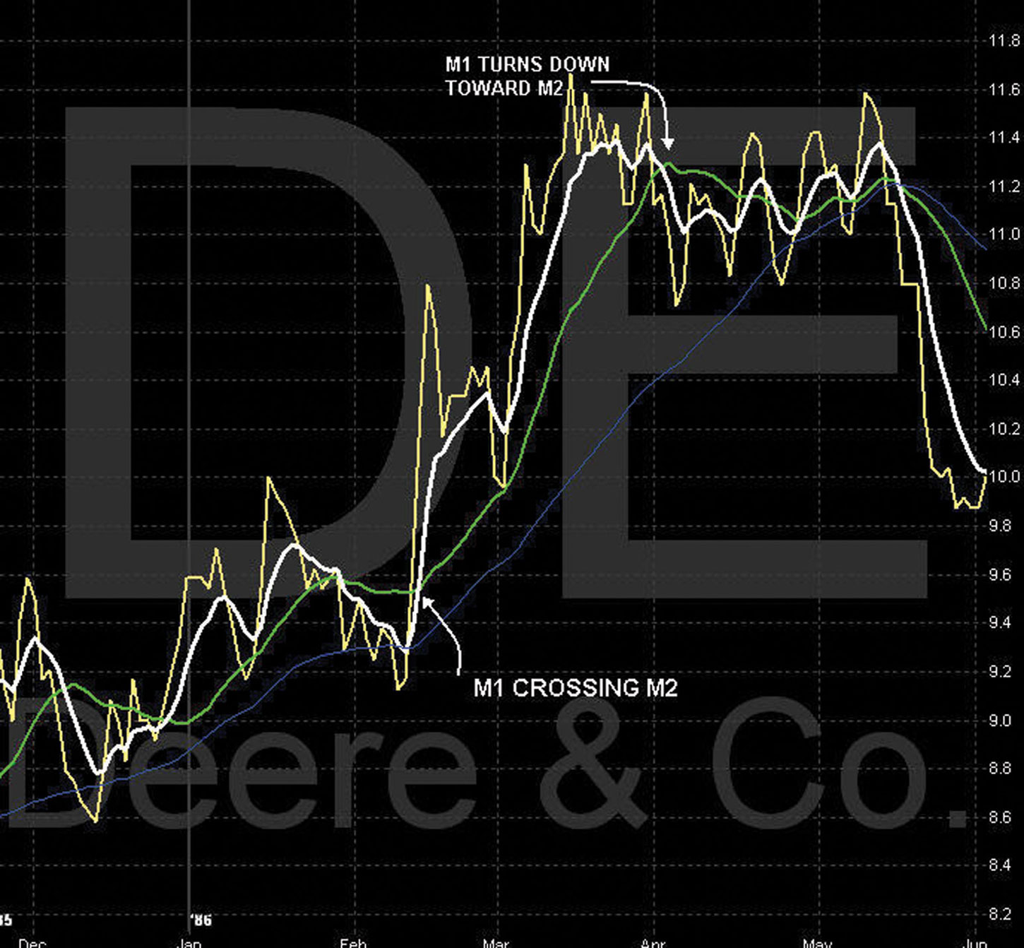
Look at the same chart in mid-March. As the stock reaches the overbought area of its cycle, M1 (white) flattens out or starts to move horizontally. If the cycle has entered into the exhaustion phase, M1 (white) will continue to arch over. See M1 (white) as it turns down sharply and starts heading toward M2 (green). For the first time since early March, it is actually pointing down. Again, this movement provides us with a very early indication that the cycle direction may be about to change from up to down. When M1 (white) actually crosses M2 (green), we may have a change in cycle direction. Again, the MAs are picking up a potential change in cycle direction before the stock breaks to the bottom of the next rising cycle.
This is an important point and an enhancement over traditional channel lines of line charts.
■ M1 (White) Crossing M2 (Green) and Then Crossing M3 (Blue)
In the previous example, we saw an early indication of a change in cycle direction by watching M1 (white) cross M2 (green). We are now going to extend this an extra step and look at M1 (white) continuing on to cross M3 (blue).
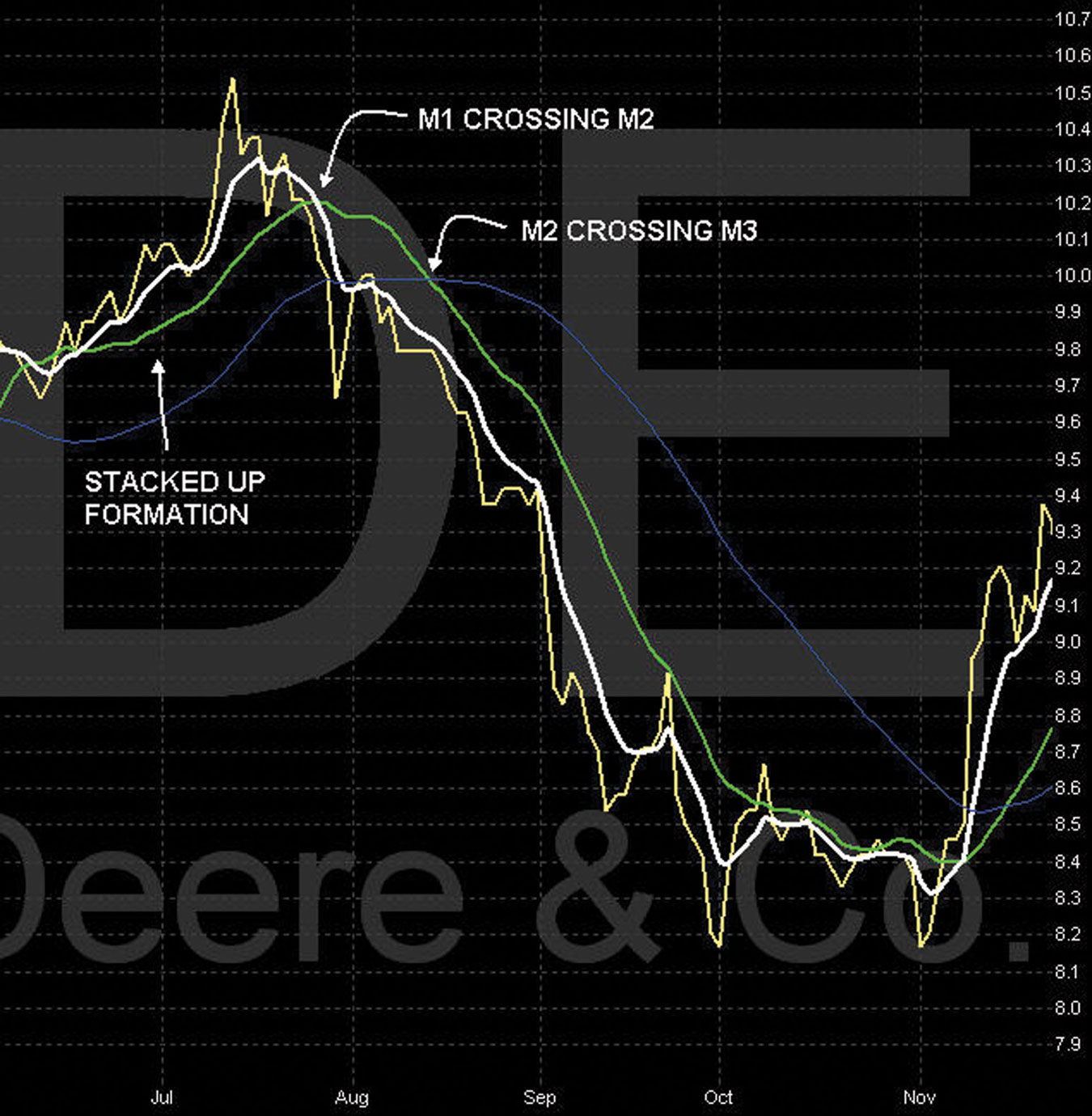
M2 (green) continues and crosses M3, and the MAs are now all stacked in one direction.
Look at the chart in Figure 4.2. In mid-June, we see the moving averages crossing over and becoming stacked up. We now know this is a period of upward momentum. In early August, we see M1 (white) cross M2 (green). We now know that this is a strong indication that the cycle has exhausted itself. We then see M1 (white) continue to move downward and M2 (green) cross M3 (blue). Now we have all MAs stacked down, indicating strong downward momentum.
FIGURE 4.2 Chart of DE—M1, M2, M3 Crossover
■ 12 Key Points of M1, M2, and M3 Crossovers
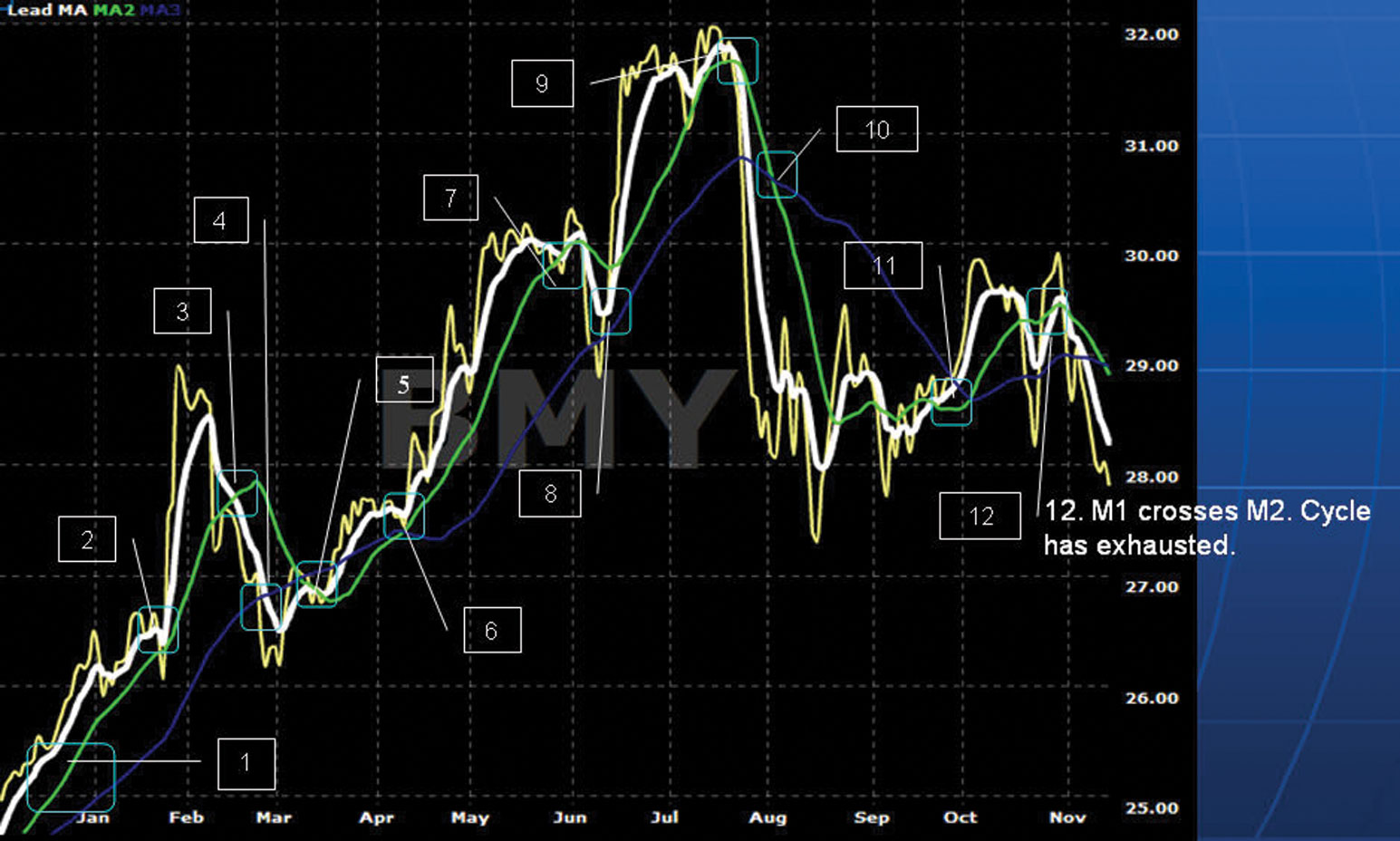
The chart of BMY (Figure 4.3) shows various moving average crossovers. What do these crossovers indicate, and what are we watching for? Let’s highlight the crossovers at each point and discuss their meaning (see Figures 4.4 through 4.15). The four phases of a cycle—birth, momentum, exhaustion, and death—are all illustrated in these examples.
FIGURE 4.3 Chart of BMY—12 Key Points
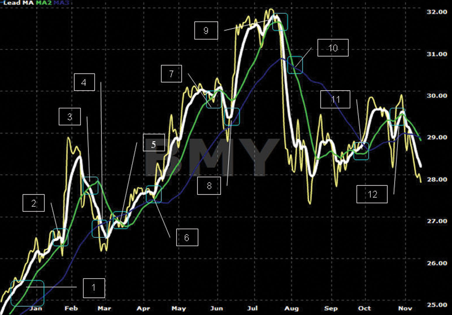
FIGURE 4.4 Chart of BMY—#1
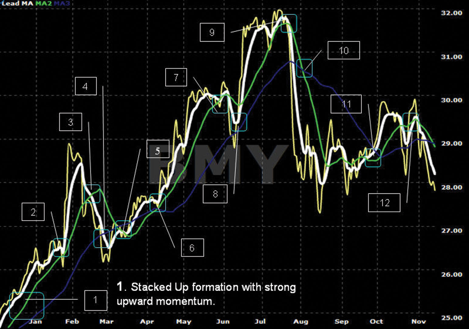
FIGURE 4.5 Chart of BMY—#2
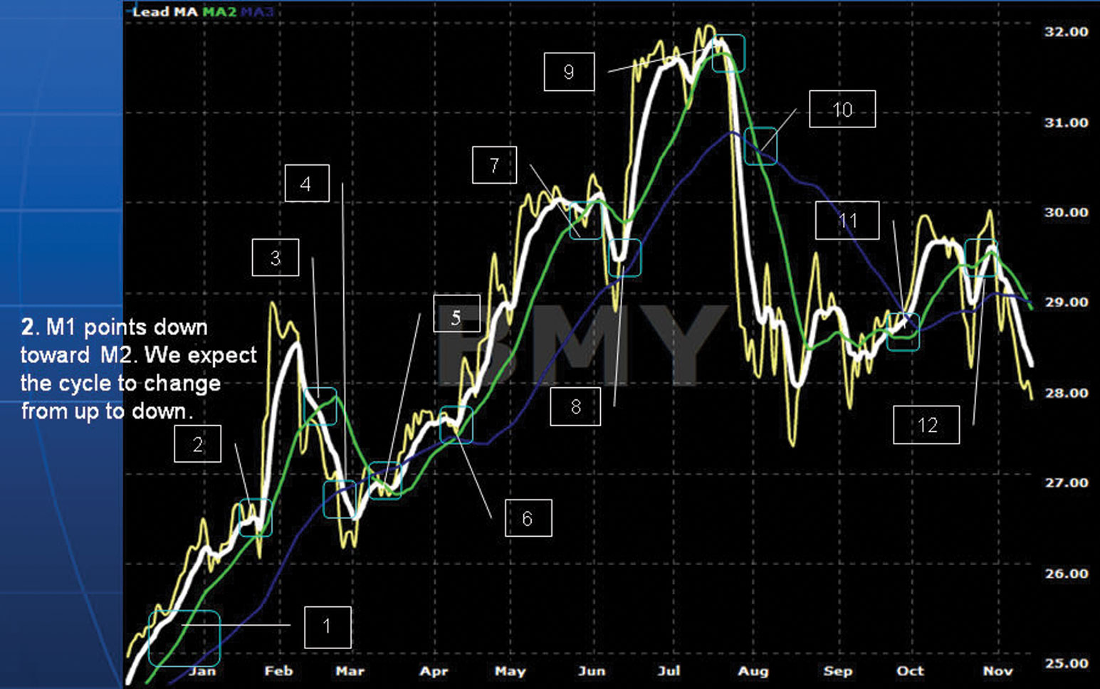
FIGURE 4.6 Chart of BMY—#3
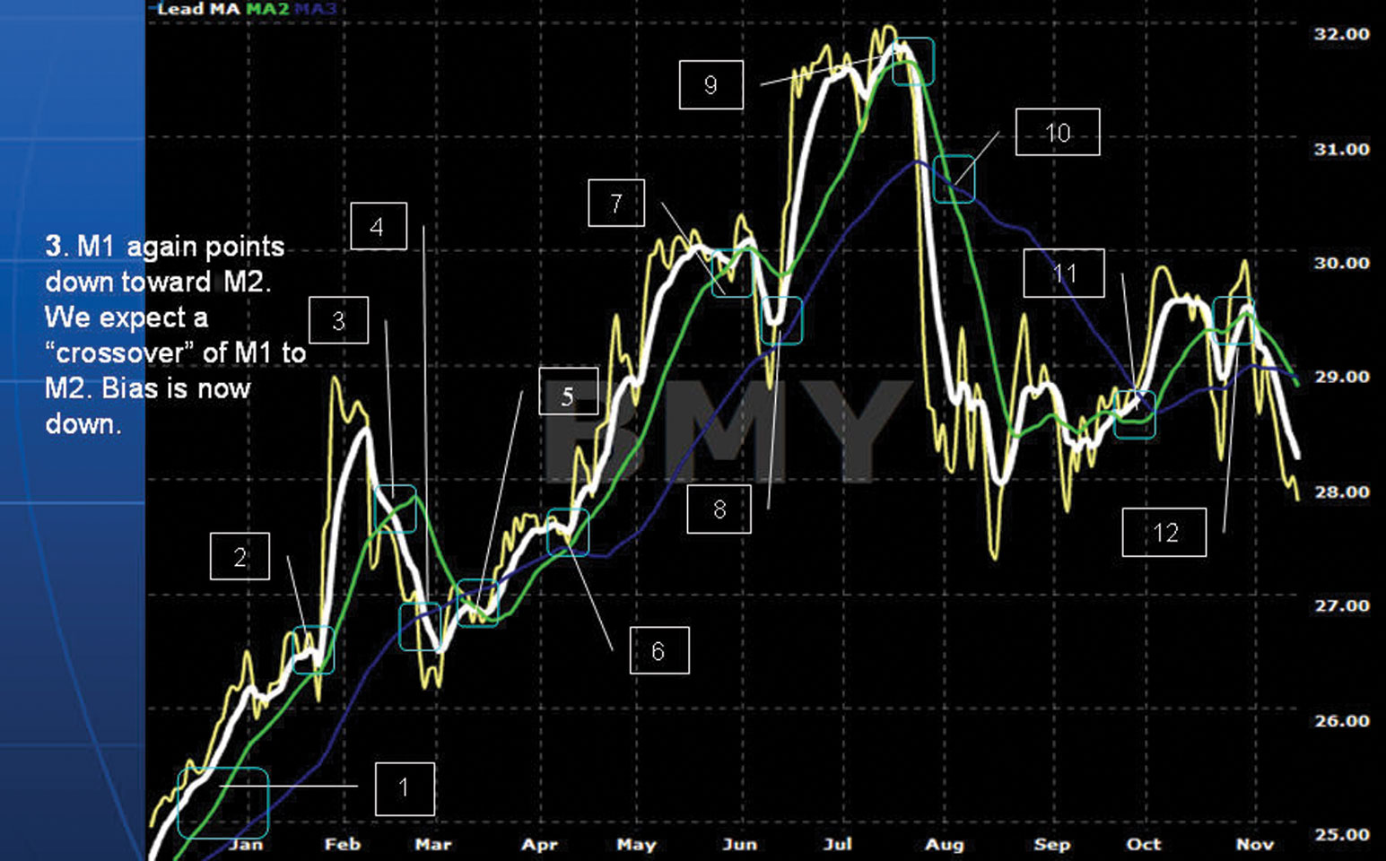
FIGURE 4.7 Chart of BMY—#4
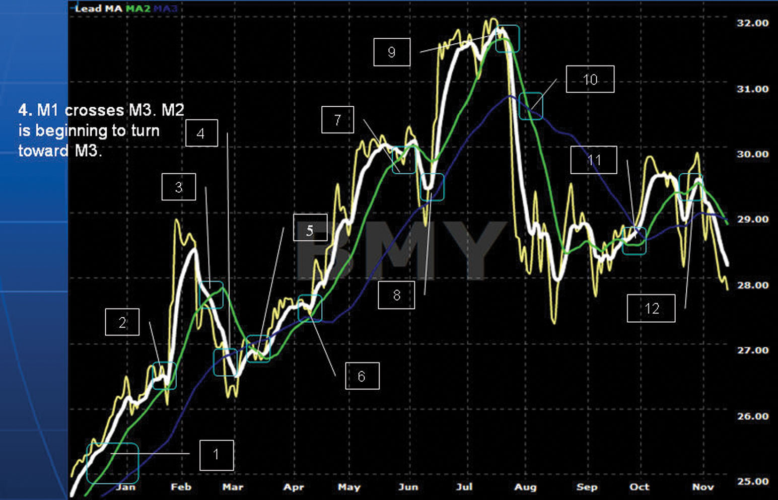
FIGURE 4.8 Chart of BMY—#5
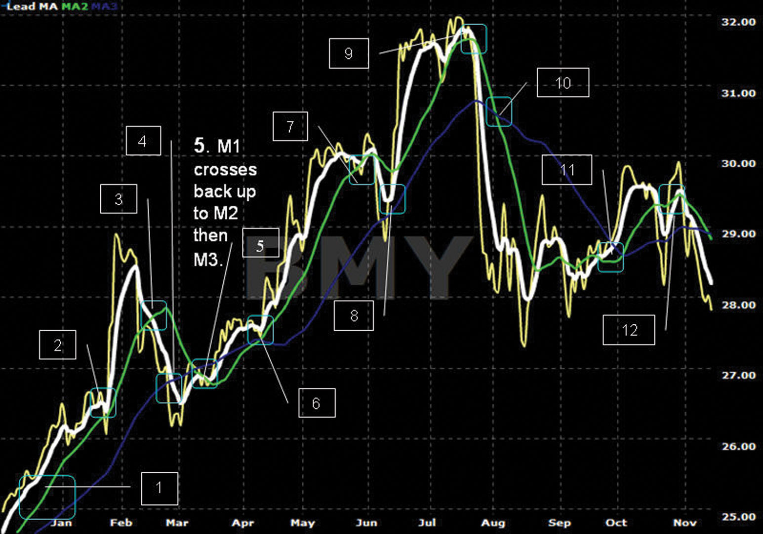
FIGURE 4.9 Chart of BMY—#6
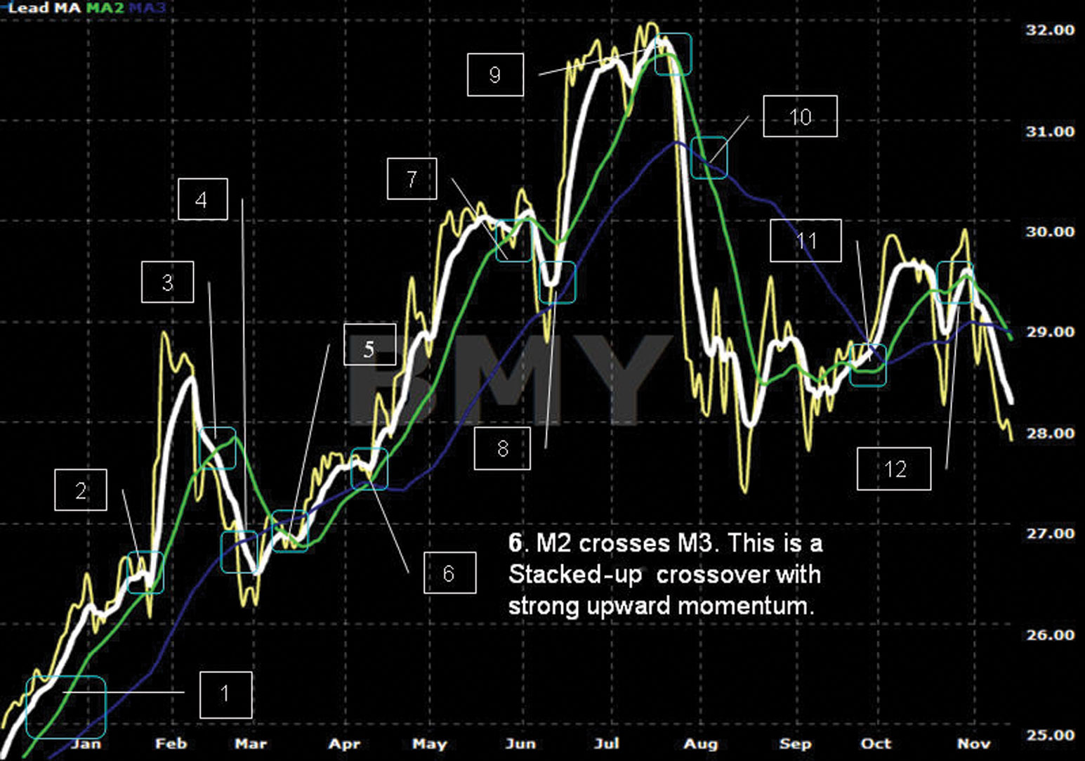
FIGURE 4.10 Chart of BMY—#7
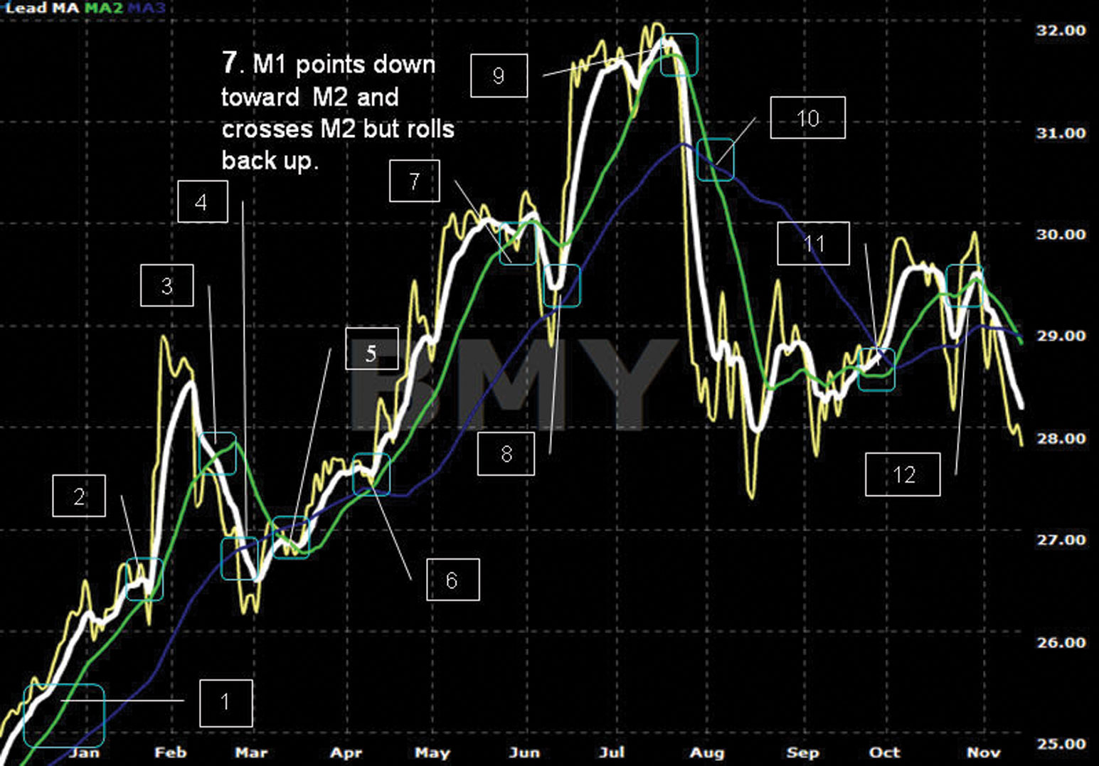
FIGURE 4.11 Chart of BMY—#8
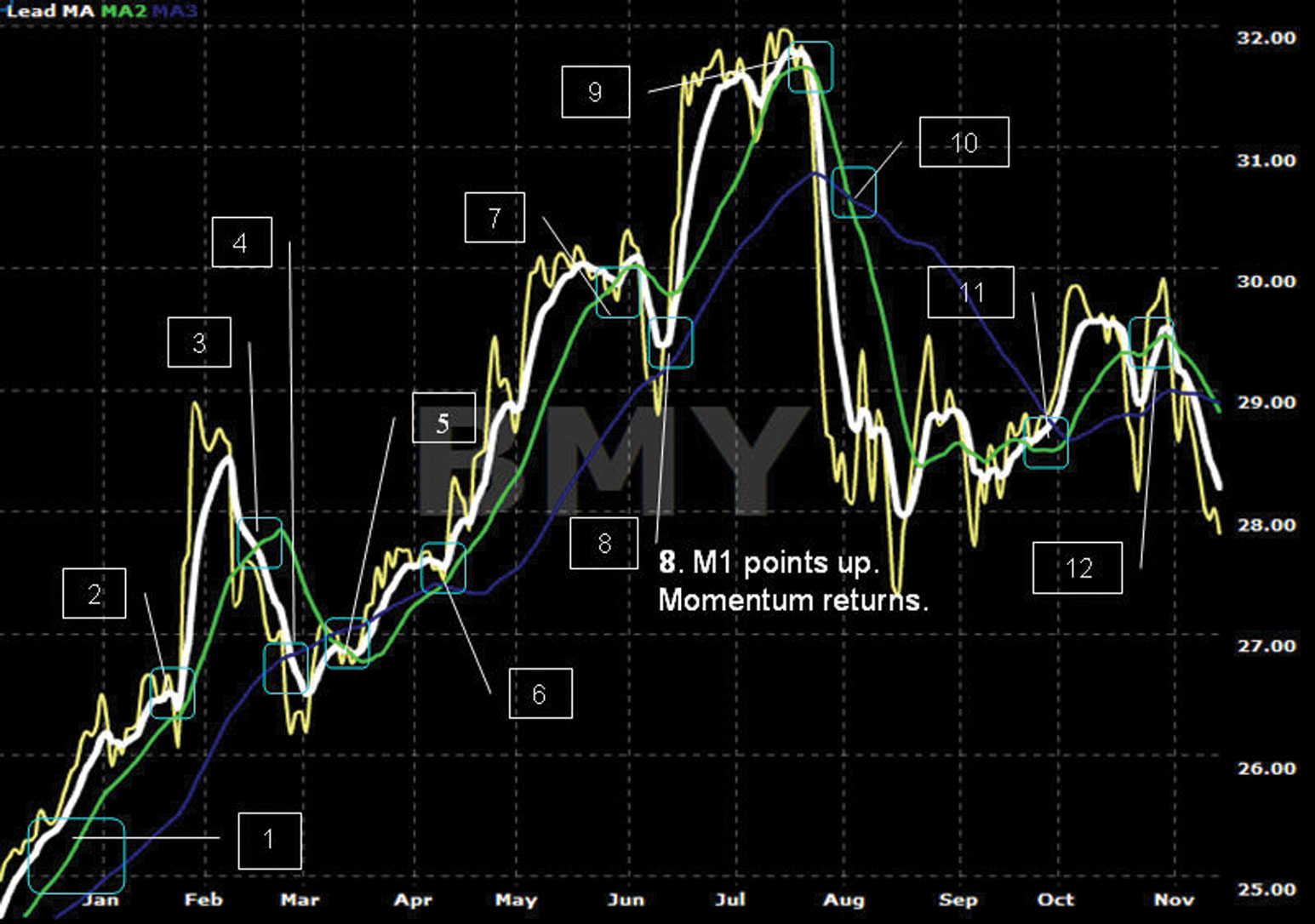
FIGURE 4.12 Chart of BMY—#9
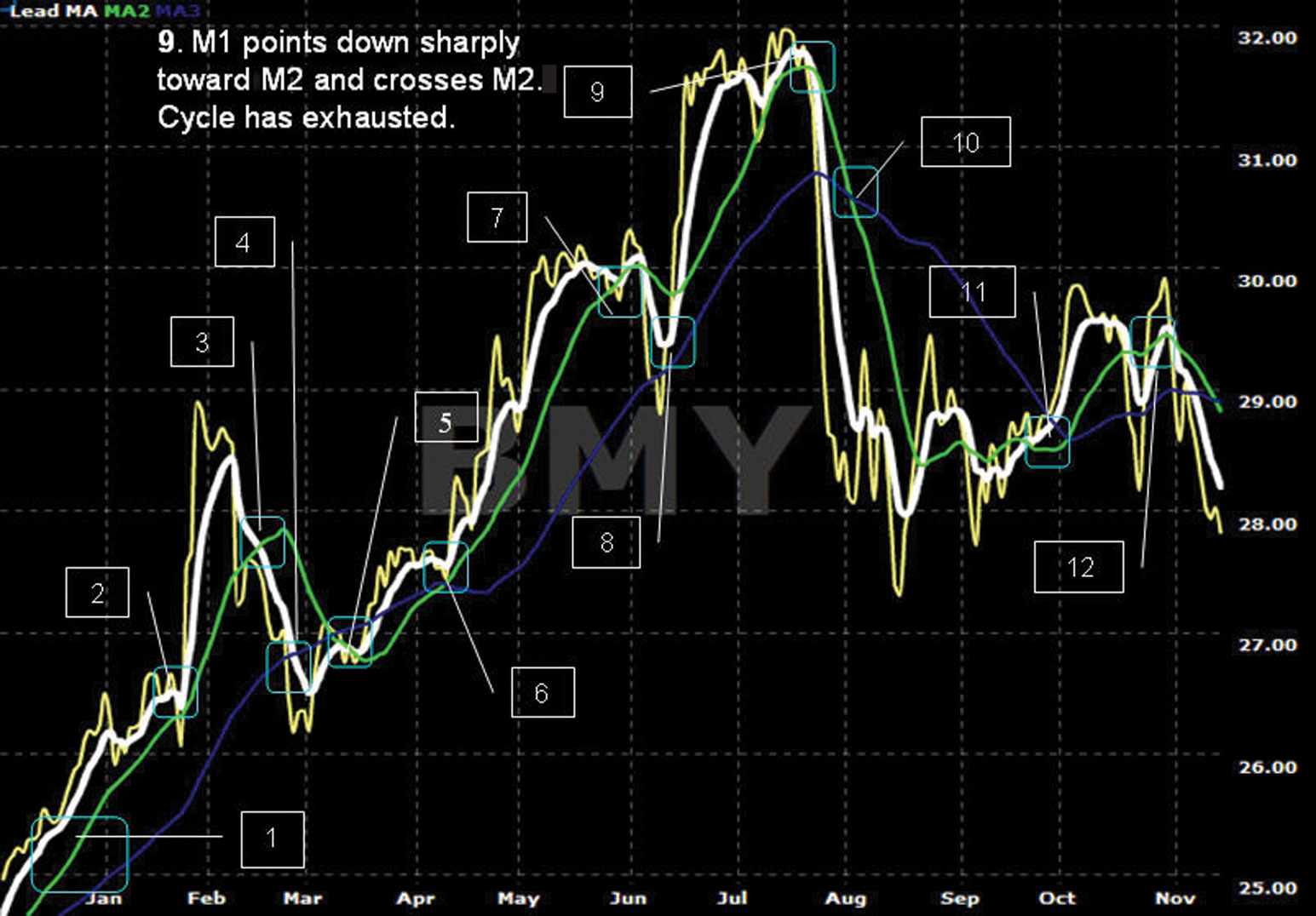
FIGURE 4.13 Chart of BMY—#10
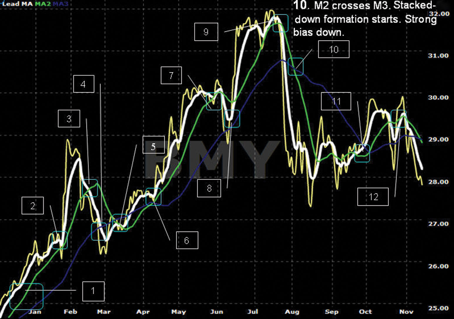
FIGURE 4.14 Chart of BMY—#11
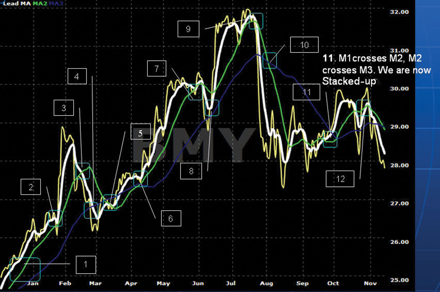
FIGURE 4.15 Chart of BMY—#12
■ Supplementary Moving Averages
We place two supplementary MAs on the chart for the purposes of understanding the long-term trend of the stock. In order to understand cycles, we must understand the power of the trend indicators. The sum total of repeating cycles defines a trend direction of a stock. The saying that “The trend is your friend” is very true. We must learn to trade with the trend, not against it.
Moving Average 4—M4 (White)
M4 (white) is the fourth moving average and represented by the thinner white line on the chart in Figure 4.16. This line will always be more horizontal] or be gently trending up or gently trending down. This indicator plots the average price of a security over a long period, with all data given equal weight in the average.
FIGURE 4.16 Chart of DE—M4
M4 (white) is used to identify the trend direction of the security. If the price tic, M1 (white), M2 (green), and M3 (blue) are cycling above M4 (white), this generally indicates an up-trending stock. If the M4 (white) trend line is above M1 (white), M2 (green), and M3 (blue), this indicates a downward-trending stock.
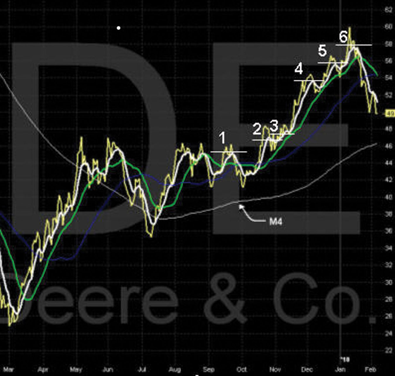
The DE chart shows M4 (thinner white line) trending upward in September. Note M1 as it cycles up higher. These repeating upward cycles are defining the direction of the M4 trend line. Also note the higher highs and higher lows of M1. There is a direct relationship of a dramatic upward or downward M4 trend line and the higher highs and lower highs of M1 as it cycles up and down.
Trusting M1 (white) as it cycles up and down is absolutely vital to understanding cycles and trends. You will never reach your full potential as an Advanced Charting trader unless you trust M1.
Note: As M1 cycles up and down with higher highs and higher lows or lower highs and lower lows, each new birth to death phase of the cycle forecasts a future cycle.
The correct pattern recognition, understanding, and interpretation of Window 1—Chart 1, Window 2—Chart 2, and their lower indicators will give Advanced Charting traders phenomenal control to know when to enter, exit, and wait to trade.This will be discussed in greater detail throughout the next several chapters.
Notice the higher highs and higher lows of M1 as it rolls higher with each cycle, #1 through #6, on the chart in Figure 4.16. Also note the longer up cycles followed by shorter down cycles of M1. This clearly shows an up-trending stock as the price tic moves higher with each cycle.
Chart of DE—M1 (White), M2 (Green), M3 (Blue), and M4 (White)
On the chart of DE in Figure 4.17, note that the positions of the moving averages and the stock price are all above M4 (white). Note the upward angle of M4 (white). It is easy to see the general upward trend of DE over the one-year timeline. Also note where the stock price in mid-July rolled over and went stacked down. This strong deep down cycle caused M4 to begin to change its path. This is a sign of upward-cycle weakness in the current and possibly future cycles.
FIGURE 4.17 Chart of DE—M4 Bending
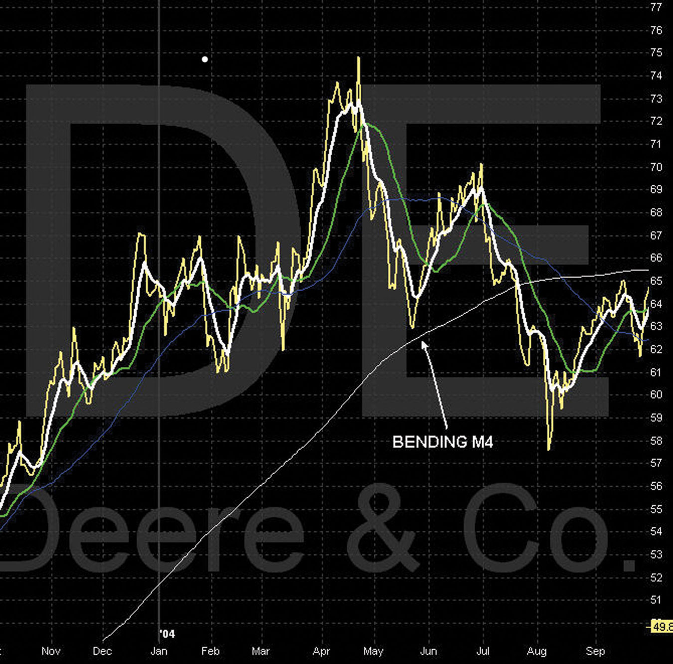
The bending of M4 is a key indicator to watch. Will M4 continue to bend flat and then down? Will the price tic break through the M4 support level? Will the moving averages begin to cycle under M4? These are questions that you should begin to ask yourself when you analyze this chart.
The price tic breaking through the M4 support level in August is a key indicator of a possible change in the trend of DE.
Chart of C—Lead MA M1 (White), M2 (Green), M3 (Blue), M4 (White)
The chart of C in Figure 4.18 is another example of the stock price and moving averages crossing over and under M4 (white). Note the dramatic decline of this stock and the validation of the downward trend by the crossovers of all the moving averages.
FIGURE 4.18 Chart of C—M4 Bending
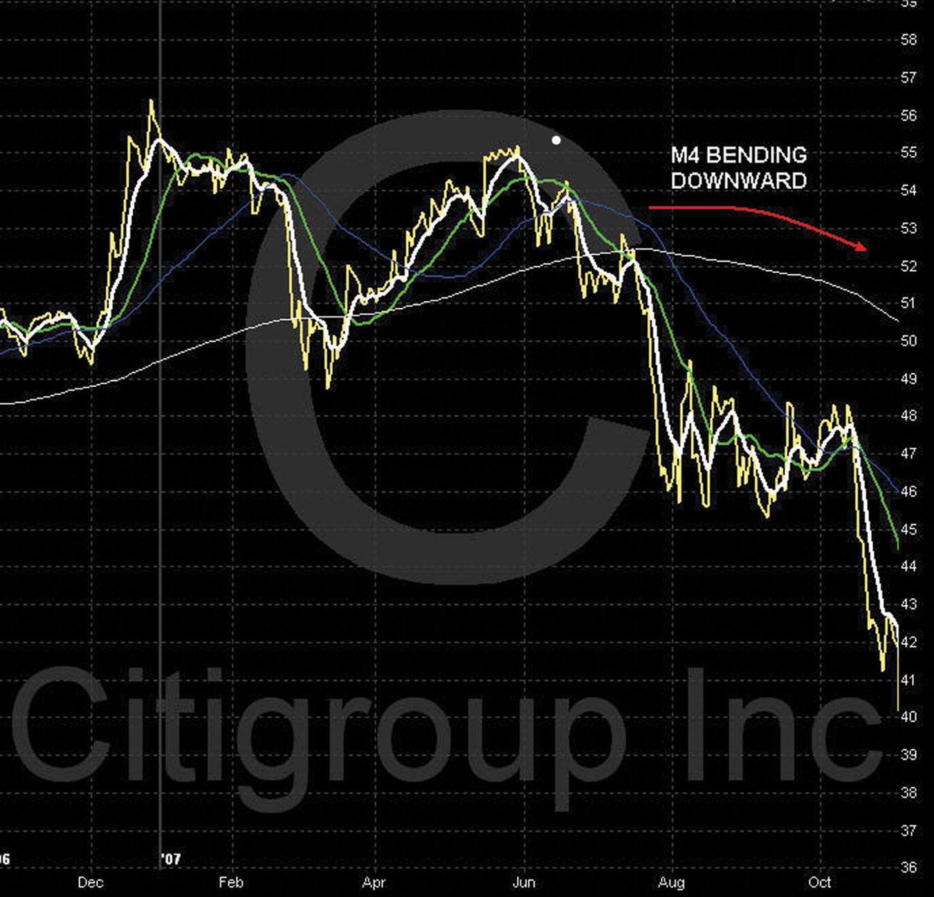
Note the position of the moving averages and the stock price all above M4 (white) in January. Also note the upward-slopping angle of M4 (white). It is easy to see the general upward trend of C over this time period. Also note where the stock price in March rolled over and went through M4. This is the first sign of a possible change in the trend. In July, M1 again broke through M4 support and went stacked down under M4. This is confirmation of the possible change in the trend line. In August, M1 (white) began to cycle under M4. This strong deep down cycle caused M4 to begin to change its path and begin to arch downward.
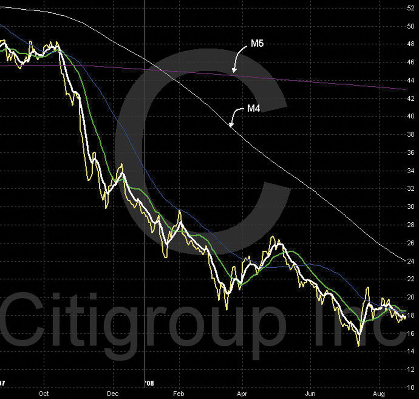
Moving Average—M5 (Purple)
The fifth and last moving average indicator is the M5 (purple). This indicator plots the average price of a security over a very long period, with all data given equal weight in the average. On the C chart in Figure 4.19, a one-year chart, we can see the purple M5 MA line is almost horizontal across the chart. When a chart of a shorter time period, such as one year, six months, or three months, does not show the M5 (purple), the stock is trading either extremely high above or below the present M5 (purple). Such a chart also can suggest that the stock is relatively new and there isn’t enough history gathered to create the M5 indicator. To see a broader view of the chart to determine where the stock is trading relative to the M5, move out to a one-year or two-year view. These wider views are used especially for LEAPS trading.
FIGURE 4.19 Chart of C—M4, M5
Now that we have reviewed all of the moving average indicators and understand their relationships one to another, it is important to review again cycles and trends.
Note: Do not enter or exit positions just on these cycle characteristics of Window 1—Chart 1, a topic that is explained in more depth in chapter 6. To ensure correct entry and exit of all positions, it is vital to apply the information provided by the lower indicators.