CHAPTER 8
The Second Chart: Window 2—Chart 2
You have now learned how to interpret the dramatic upward or downward movement of M1 (white). You also know when to look at the lower chart indicators for additional confirmation and validation of the V when M1 (white) flattens out. It is now time to discuss the second chart.
Window 2 – Chart 2 provides a visual indication of strength. It also shows signs of the four phases of a cycle. This helps us in confirming when to enter a new position, 10-cent rule, or trailing stop, and how long to remain in these trades. Chart 2 also helps to stay in a tethered slingshot (TSS) by showing us the strength and momentum of any downward movement during the momentum phase before the cycle enters into the exhaustion phase.
■ Modified Candlestick
For the second chart, we use a modified candlestick chart rather than a line chart. The main difference between a standard candlestick chart and the modified candlestick is the value used to create each bar or candle. Instead of using the open-high-low-close (OHLC) bars like in a standard candlestick, in the modified candlestick chart we use a modified version that smoothes the chart, making it very easy to read. Therefore, the modified candle shows the relative strength of a cycle and also notes key turning points in price action, reacting much like a moving average (MA).
Standard candlestick charts remove the visual noise of the charts, but they are complicated technical indicators that are extremely difficult to learn to use. Therefore, we have reformulated the standard candlestick chart to remove the noise and make it easier to use this important indicator.
Figures 8.1 and 8.2 are examples of two charts for LOW. Figure 8.1 is a standard candlestick chart, while Figure 8.2 is a modified candlestick chart.
FIGURE 8.1 Chart of LOW—Standard Candlesticks

FIGURE 8.2 Chart of LOW—Modified Candlesticks
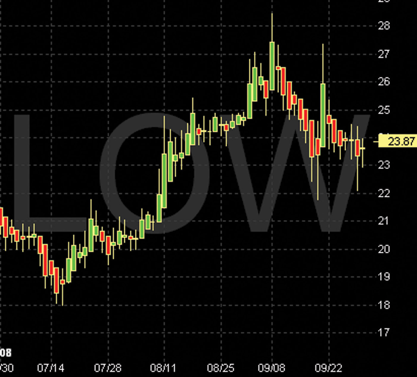
Notice that the modified candlestick chart looks much smoother. In particular, it does not show the many false Vs that would occur on a line chart. Rather, the modified candlestick predominantly displays only key turning points in the stock. These key turning points are denoted by the candle changing from one color to another and also by the shortening of the candle body, which we discuss later in this chapter.
The simplicity of the modified candlestick chart should be evident. We have studied in detail what causes a cycle to move up, down, or turn flat. We have studied the lower indicators to show the correct timing to enter or exit a trade. The modified candlestick in Figure 8.2 simply shows when a cycle is about to be born. It shows when momentum begins and moves into exhaustion and finally when the cycle ends in the death phase. This is clearly visible in Figure 8.2 as the candle changes from red to green and the candle body length changes.
Understanding this indicator is very easy. All that is required is practice reviewing hundreds of charts to learn the unique characteristics of the modified candlestick as it cycles up and down and changes color from red to green and back to red.
■ Understanding the Modified Candlestick
Now that we have established the modified candlestick as a valuable tool to give us a clear indication of momentum and turning points in price action, let’s look a little deeper into exactly what the candles are telling us. We intentionally ignore technical details on the modified candlestick, such as how the candles are calculated and the individual names of candlestick patterns; knowing these details will not increase the ability to apply the modified candlestick technique.
Breaking Down Each Candle
Each point in the candle represents a piece of data. The chart in Figure 8.3 indicates the terms used to refer to each part of the candle (left) and what data various points on the candle are actually measuring (right).
FIGURE 8.3 Parts of the Candle
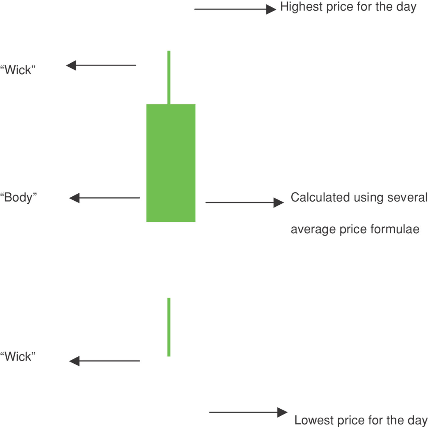
The wick is the vertical line extension at the top and bottom of each candle. The body is the candle and is calculated using several average price formulas that are discussed in this book. When using the modified candlestick, the color (red or green) of the candle is not the only indicator; the size of the body and wicks relative to the previous day’s candle are also indicators.
Using the Modified Candlestick to Understand Bias
Here we discuss and highlight precisely what indicators modified candlestick charts provide. As elsewhere, we break this analysis up into sections demonstrating upward bias, downward bias, and change in cycle.
At the end of this section, we integrate both Chart 1 and the modified candlestick Chart 2. Combining both charts in our analysis provides an extremely powerful picture of cycle direction, strength, and duration.
Upward bias in the stock price exists when:
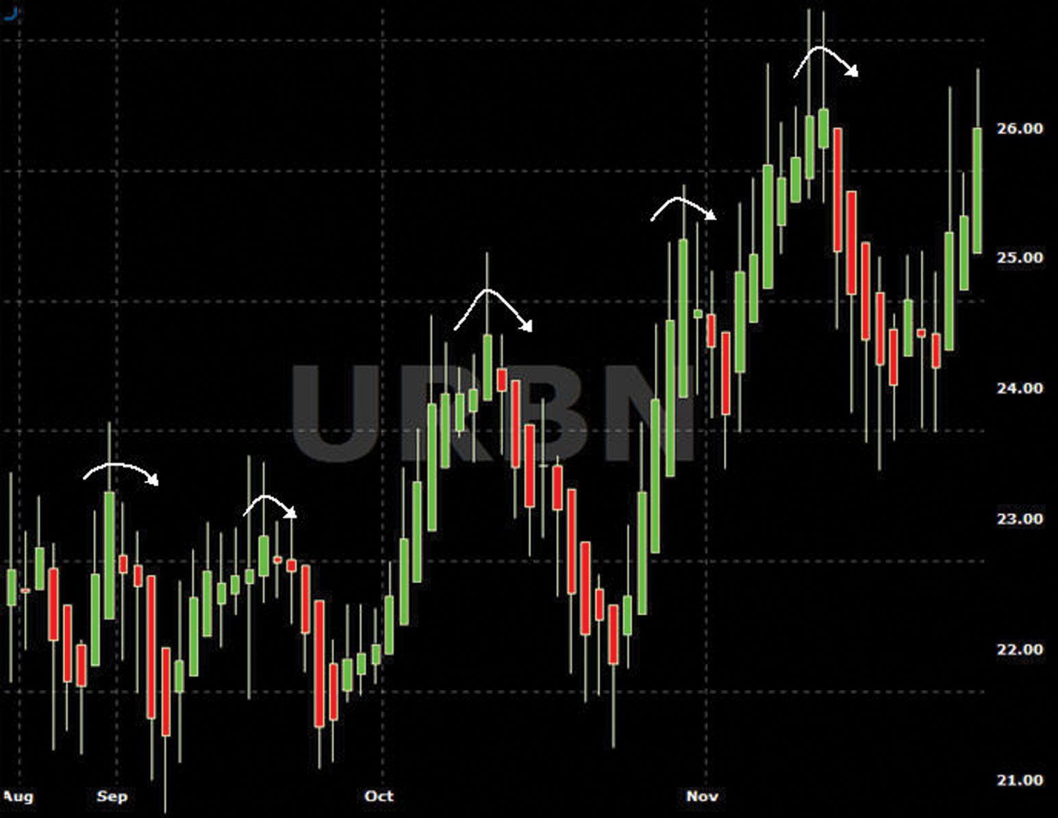
Size is an important point to note. When the candle body remains large or is increasing in size from the previous day, this indicates strong upward momentum.
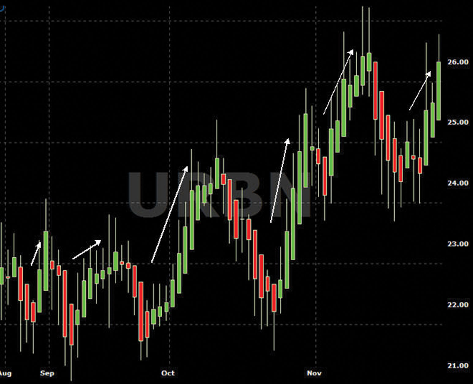
On the chart in Figure 8.4, note the increasingly large stepping-up candle bodies. This indicates increasing upward momentum.
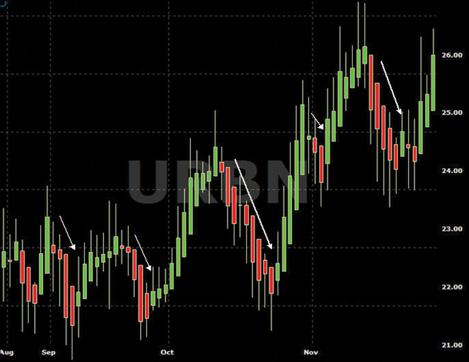
FIGURE 8.4 Chart of URBN—Modified Green Candles Bias Up
Downward bias in the stock price exists when…
Size is an important point to note. When the candle body remains large or is increasing in size from the previous day, this indicates strong downward momentum.
On the chart in Figure 8.5, note the increasingly larger candle bodies stepping down. This indicates increasing downward momentum.
FIGURE 8.5 Chart of URBN—Modified Red Candles Bias Down
Cycle Exhausting/Potential Change in Trend
Another useful function of the modified candlestick gives a very good indication of a change in cycle direction. The changing of the length of the candle body is an early sign of the cycle entering into the exhaustion phase. The modified candlestick is a very helpful indicator in all aspects of the Compound Stock Earnings (CSE) covered call/LEAPS techniques including entering new positions and for assisting with TSS timing.
Changes from Upward Moving to Downward Moving
When the current upward movement in the stock price enters into the exhaustion phase, we see the changes on the modified candlestick shown in Figure 8.6:
FIGURE 8.6 Chart of URBN—Modified Red Candles Bias Down
Changes from Downward Moving to Upward Moving
When the current downward movement in the stock price is beginning to exhaust, we see the changes on the modified candlestick shown in see Figure 8.7:
FIGURE 8.7 Chart of URBN—Modified Candlestick Bias Up

Adding the Moving Average Indicators to the Modified Candlestick Chart
Now that we understand the modified candlestick chart, it is time to add our moving average indicators. We use exactly the same moving averages as in the first chart (see Fig. 8.8). The combination of the modified candlesticks and these moving averages provides us with a powerful view of stock price direction and momentum and also smooths out the vast majority of false Vs. When looking at the modified candlestick, as shown in Figure 8.8, we use a three-month chart to see the detail.
FIGURE 8.8 Chart of URBN—Modified Candle and Moving Averages
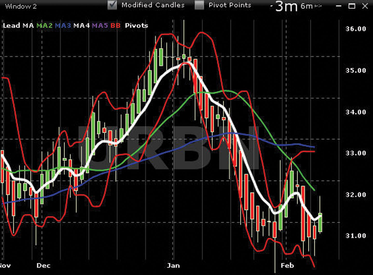
From everything you have learned so far, you know that you can look at this chart and very clearly understand bias. To identify a change in price direction, you want to see M1 (white) flatten out with exhaustion. You want to see the price movement being confirmed by the modified candlestick bodies shortening and the wicks lengthening and eventually changing color. When these data are combined with the lower indicators, discussed in Chapter 7, you have a very clear view of future cycle and stock price direction.
The moving average indicators are necessary on Chart 2 for the modified candlesticks to calibrate the candle bodies. Do not use the moving averages shown on Chart 2. Use only the moving average indicators shown in Chart 1.
Modified Candlestick Chart—Bollinger Band
One notable difference on Chart 2 is that we are using a shorter-period Bollinger band (BB). This shorter time setting will cause the Bollinger band to be more reactive and will show the BB pinch or squeeze discussed in Chapter 5. When the bands become pinched or squeezed, volatility is decreasing. This usually indicates a trend reversal. When you combine this information with the other indicators, you can decide when to enter new positions or TSSs.
The AA chart in Figure 8.9 shows another example of modified candles with all moving averages and the faster Bollinger bands.
FIGURE 8.9 Chart of AA—Modified Candle and Bollinger Band
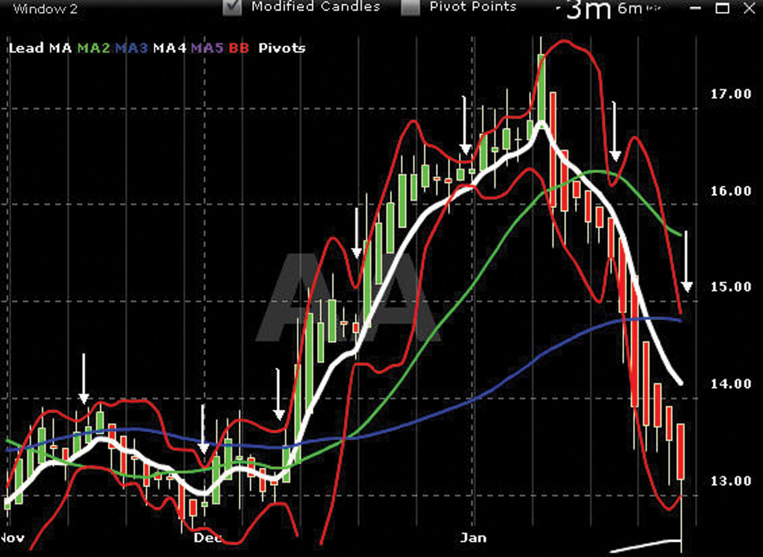
Again, what is important to see here is M1 (white) flattening out and going horizontal, and the coinciding changes in the modified candlesticks (shortening of the bodies, increasing of the wicks, and changing color). These changes also coincide with a pinching of the Bollinger bands.
Detailed rules and chart examples of when to enter a new position, when to utilize a tethered slingshot (TSS), and when to buy to close (BTC) are presented in later in Chapter 9.
■ Pivot Points: Support and Resistance
Window 2 of Chart 2 (the right chart in Figure 8.10) shows the pivot point indicator turned on. This indicator has an on/off feature so we can turn pivot points on or off with either standard or modified candlesticks.
FIGURE 8.10 Chart of LOW—Pivot Points

The pivot point is a technical indicator derived by calculating the numerical average of a stock’s high, low, and closing prices. As a technical indicator, the pivot price is similar to resistance or support levels. If the price tic exceeds r1, a higher breakout is expected to occur. If the price tic exceeds r2, a higher breakout is expected to occur to the next point of resistance.
The same applies for support levels s1 and s2. If the price tic exceeds s1, a lower breakout is expected to occur. If the price tic exceeds s1, a lower breakout is expected to occur, and the tic may reach to the s2 level of support. As the price tic cycles up and down, it meets various levels of resistance and support. The pivot point serves as a predictive indicator showing different levels of where the price tic may cycle as it meets resistance and support.
Advanced charting provides 18 indicators to confirm and validate the possible direction of the price tic in either up or down cycles. By applying the information that the Bollinger bands and channels are showing on Chart 1 with the pivot points on Chart 2, you can gain increased accuracy when entering or exiting a trade as the tic nears these levels of resistance and support.
Figure 8.10 (left) shows Window 1—Chart 1 channels, Bollinger bands with their price tic levels of resistance and support, and Window 2—Chart 2 (right) pivot points on levels of resistance and support.
Charting is all about tracking cycle resistance and support. Therefore, advanced charting provides numerous indicators all searching for these data. The price tag shown on Chart 1 channel line (r1) and the price tag shown on Chart 2 pivot point (r1) may not be the same. Use the data shown as a guide to the general area of resistance and support. The same logic applies to r2 and s2 levels of resistance and support.
■ Lower Indicators: L5 to L8
As with the lower chart indicators on the line chart, the modified candlestick chart also has several lower chart indicators. Again, we use these lower chart indicators to get a better understanding of bias when lead MA M1 (white) goes flat.
The lower indicators on Chart 2 are very different from those on Chart 1. We use the modified candlesticks to identify key changes in price direction and momentum. Then we use Chart 2 lower indicators to confirm and validate that objective.
Lower Indicator 5—L5
Lower indicator L5 is another oscillator that provides an indication of overbought versus oversold. A signal line above 80 indicates an overbought condition. A signal line below 20 indicates an oversold condition. When interpreting this indicator, it is important to understand that a stock regularly continues to rise after lower indicator L5 has reached 80 and regularly continues to fall after it has reached 20. As such, when using L5, we are looking for the oscillator to move from overbought territory back below 80 and from oversold territory back above 20. Do not use L5 as an early indicator; use it just to validate the overbought versus oversold versus neutral position of stocks.
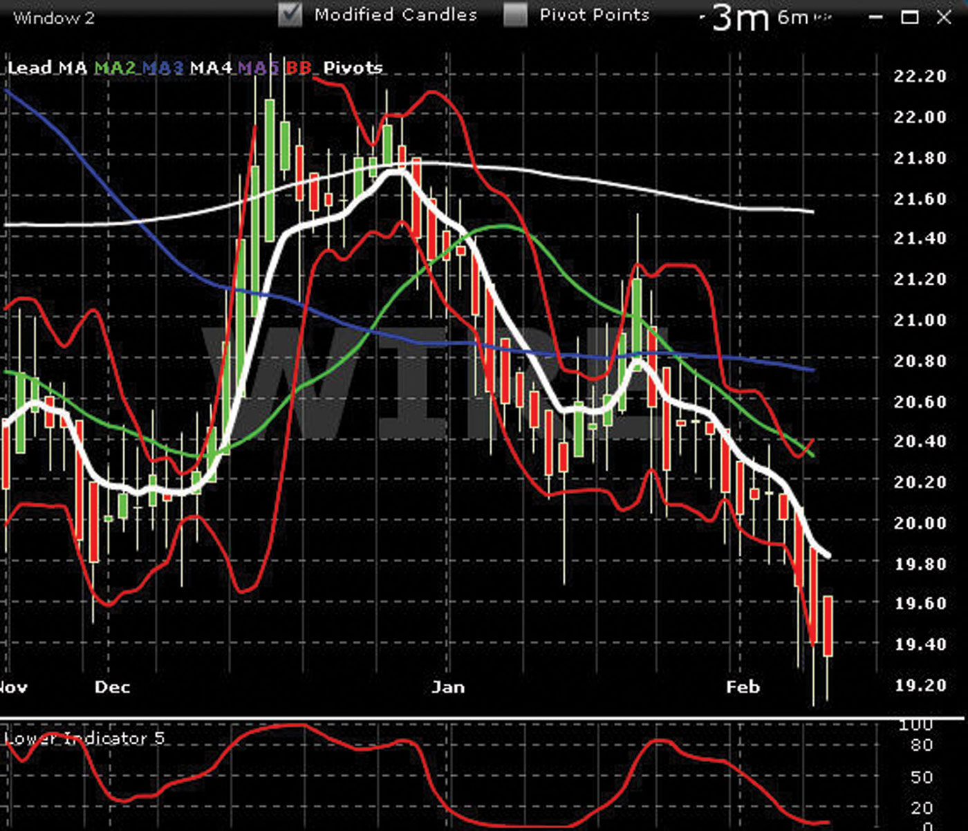
The chart in Figure 8.11 of WIRE is typical of what L5 will show relative to overbought versus oversold. Note the modified candlesticks and the position of L5 relative to its scale. Along with the modified candlestick, L5 does a fine job of smoothing out the Vs.
FIGURE 8.11 Chart of WIRE —L5
Lower Indicator 6—L6
Lower indicator L6 is another oscillator. It is smoothed to produce less, but much more accurate, signals. Like the modified candle, L6 removes the noise from the chart and helps smooth out the false Vs.
The chart of NDX in Figure 8.12 shows the L6 indicator. Notice the red line crossing the blue line and the relationship of these crossovers and the modified candles.
FIGURE 8.12 Chart of NDX—L6
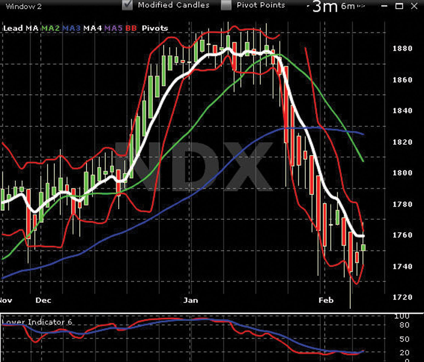
It is important to watch where the red and blue lines are relative to the scale on the right. Where is the red line relative to the blue? Is the red above the blue line, or is it under the blue line? Is the red line moving away from the blue? L6 is an important indicator for timing entries into new positions and for TSSing.
Note that we do not trade with this indicator. When we use it in conjunction with all other indicators, our timing will improve.
Lower Indicator 7—L7
Lower indicator L7 in Figure 8.13 is another oscillator. It is smoothed to produce much more accurate signals than L6. Like the modified candlesticks and lower indicator L6, L7 removes the noise from the chart and helps smooth out the false Vs.
FIGURE 8.13 Chart of CSCO—L7
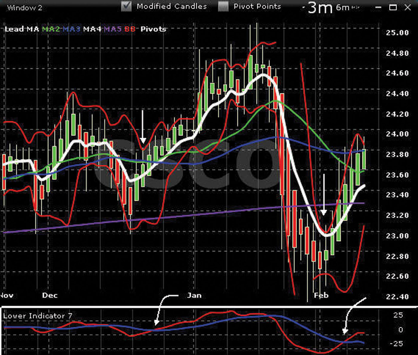
We interpret L7 in the same way as lower indicator L6. Where are the red and blue lines relative to the scale? Where is the red line relative to the blue signal line? Is the red line moving away toward the blue line? There is an obvious relationship between where L7 is relative to its scale and the high or low of the cycle on the chart. Notice the red line crossing the blue line in mid-December and the relationship of the crossovers to the red candles on the chart.
The lower indicators of advanced charting were designed and formulated to forecast the probabilities of cycle direction. Refer to the lower indicators when M1 turns flat, building your case to support your opinion of bias of the cycle and trend on Chart 1.
The momentum phase is the most important and most profitable phase of a cycle. This phase is also the most difficult to time for the perfect entry and exit.
L7 was formulated specifically to address this problem. L7 is a completely reformulated indicator that will show better than any indicator presented previously the perfect entry point of momentum after the L6 red to blue has crossed.
In Figure 8.13, we are watch L7 move from overbought territory at the top of its scale toward the oversold territory at the bottom of the scale. The crossover of the red line crossing the blue signal line is a critical event in applying the L7 indicator to our timing. As long as the blue signal line is pointed upward, momentum is still present, and we can remain in the trade. Exhaustion is not present. The same rule applies to the blue signal line pointed downward. It indicates that downward momentum is still present and we can remain in the TSS. Remember to watch both L6 and L7 closely as the red lines flatten out and turn back toward their blue signal lines.
We do not trade just with L7 but use it only in conjunction with all other indicators. Remember: You are looking for agreement, confirmation, and validation with the lower indicators. You are building your case to support your opinion of bias on Chart 1.
In Figure 8.14, note the first sign of a possible birth of a new cycle when the red line turns up from the bottom of the scale toward the blue signal line. Look for additional agreement and confirmation from other indicators that a new birth cycle is about to begin. L6 and L7 are formulated to track each other and also the modified candlesticks.
FIGURE 8.14 Chart of UIS—L6, L7
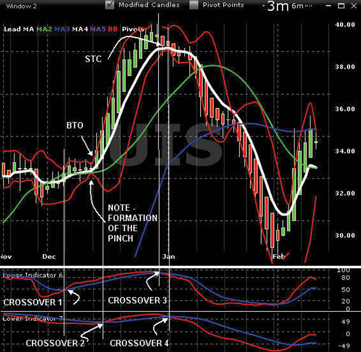
When the red line crosses the blue signal line at L6 (crossover 1) and is supported by other indicators agreeing that this is a new birth phase, enter the trade. You also can wait for more confirmation if the crossover is flat or enter the trade at L7 (crossover 2). Other indicators may indicate the probabilities that this will happen. In advanced charting, you must consider many subtleties.
This fact is important to understand: L6 tracks the modified candlesticks and detects the probability of the birth of a new cycle. Note the crossover of L6 and then soon after that the crossover of L7. A trade can be executed any time L6 red crosses blue and before red crosses blue on L7. If you place a trade after red has crossed blue on L7, you miss potential profits. The longer a trade is placed after L7 has crossed, it is possible the momentum phase is nearing the exhaustion phase.
When the red line turns flat or goes back toward the blue on L6 (crossover 3), this is the first sign of exhaustion.
In Figure 8.15, as M1 turns flat near the top of its cycle, the red line on L6 turns down toward the blue signal line (crossover 1). The cycle may have moved from the birth phase (crossover 2) to the momentum phase or onto the exhaustion phase (crossover 3). If this is confirmed as M1 continues to roll over, the next phase will be the death phase. The red line turning down and crossing the blue signal line on L7 confirms the death of one cycle and the birth of a new cycle (crossover 4).
FIGURE 8.15 Chart of UIS—L6, L7
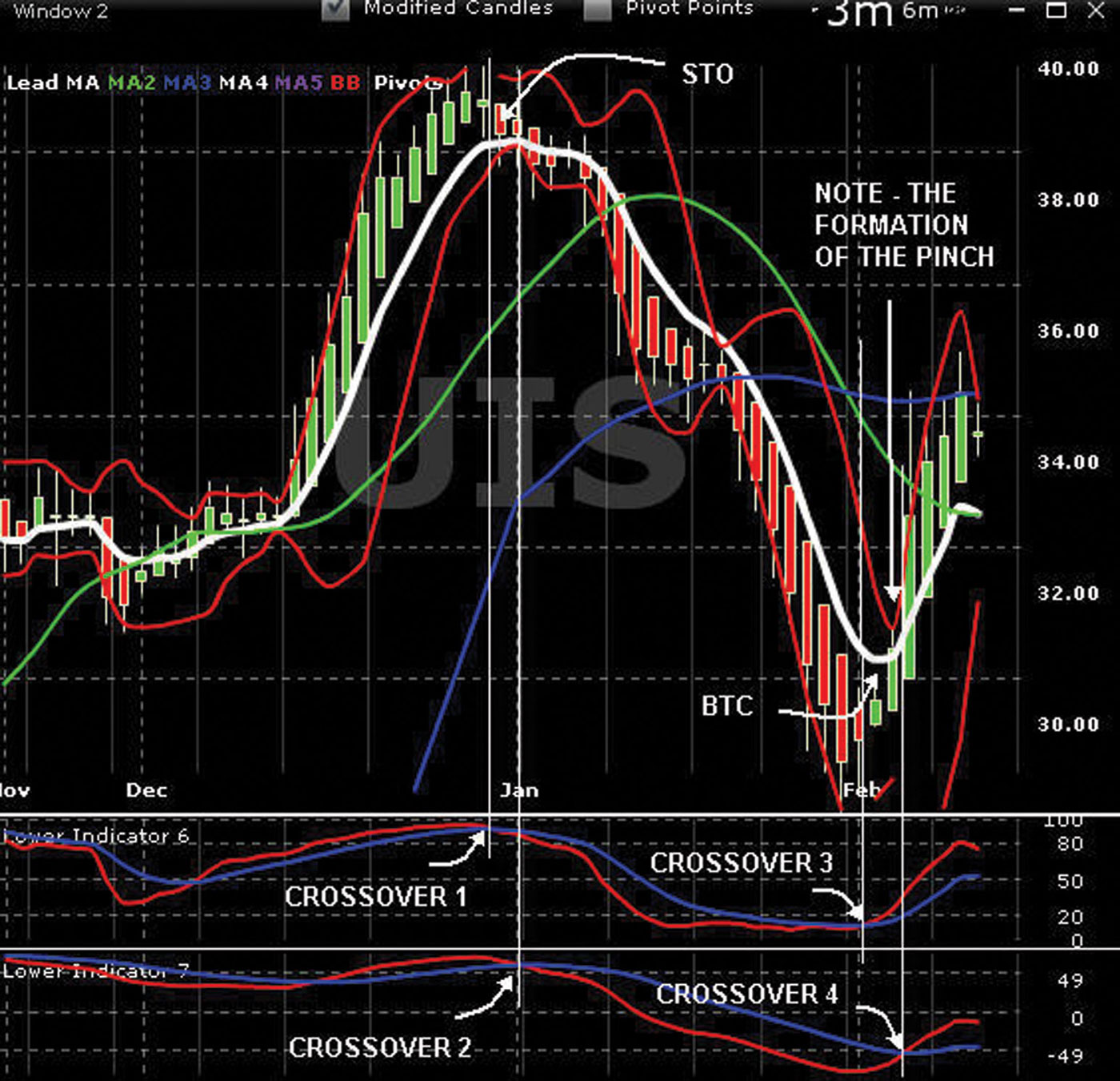
Remember that we do not trade based on the data that we see with L6 and L7 but always refer back to our analysis of Chart 1 as to where the stock or index is relative to its current cycle. The lower indicators are used only to confirm when to enter or exit the trade.
Lower Indicator 8—L8
All lower indicators of advanced charting are designed and formulated to assist in confirming and validating our opinion of bias of the cycle and trend on Chart 1. Identifying the birth phase of a cycle is paramount.
As previously discussed, the momentum phase is the most profitable phase. Therefore, L8 is another indicator to help visualize the probabilities that a new birth cycle is about to begin. This, of course, may be followed by the momentum phase.
Refer to the chart in Figure 8.16. When using L8, we are watching the red and green colored bars move above and below the 0 line. The 0 line is M2. Prior to the beginning of a new birth phase, we are forewarned by the changing length of the bars as they get shorter toward the 0 line.
FIGURE 8.16 Chart of BTU—L8
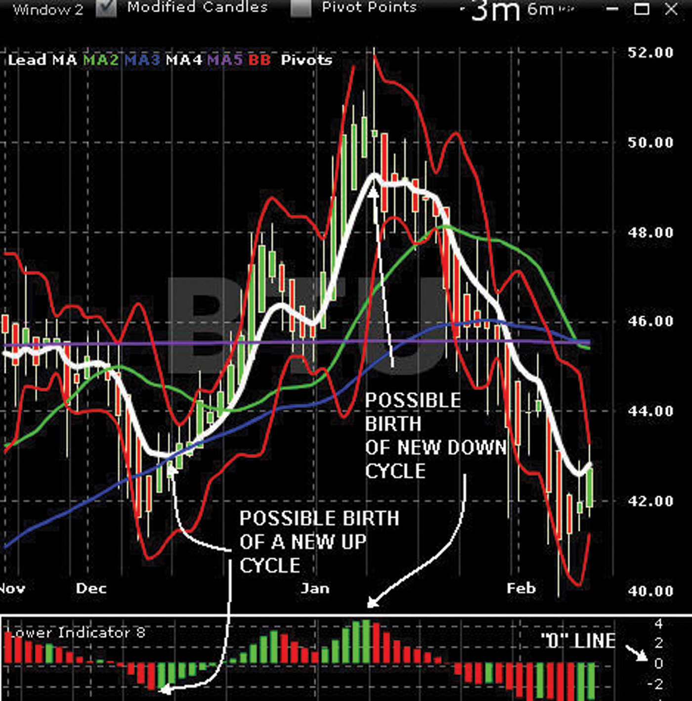
The crossing of the bars at the 0 line is the crossing of M1 to M2, either bias up or bias down. If the red and green bars remain above the 0 line, we know that the stock has been cycling up for weeks and perhaps months.
The same applies to the red or green bars. If they remain below the 0 line, we know the stock has been cycling down for weeks or perhaps months.
To identify a possible birth phase of a new up cycle, watch (refer to Figure 8.17, January) for the red bars as they extend to the lowest area relative to the L8 scale on the right. The red bars will continue to go lower. They may flatten out or a green bar may appear. This change from red to green is confirmation and validation that a new cycle may be about to start or has already started.
FIGURE 8.17 Chart of DIA—L8

The new green bars get shorter in length as they move closer to the 0 line; this indicates that M1 is moving closer to M2. If the new cycle is true, the green bars continue to shorten until they cross the 0 line. After the crossover has occurred, a new set of green bars will continue to extend above the 0 line. The green bars will continue to extend upward as long as the momentum phase is still valid.
When the upward momentum phase is about to change to exhaustion, the green bars begin to level off at the top of the scale. A red bar will appear followed by other shorter red bars. This may be a sign of a new birth phase as the red bars continue toward the 0 line.
We do not trade with L8 but use the data provided by the red/green bar graphic to visualize the probabilities of the birth of a new cycle.
Remember that advanced charting is designed to search for agreement, confirmation, and validation that a cycle is moving upward or downward. The 18 indicators that we have reviewed are all designed and formulated to search for that data. The indicators may agree or they may not agree. There are cases where there might be 100 percent agreement with the indicators. Therefore, different agreement/disagreement percentages increase risk and lower reward.